I want to say, whenever our couples take the time to include different textures in their wedding details it is ALWAYS worth the effort. Any creative knows that layered textures are sure to elevate an event. I’m excited to show you what White Ink created for Mae and Casey on their big day!
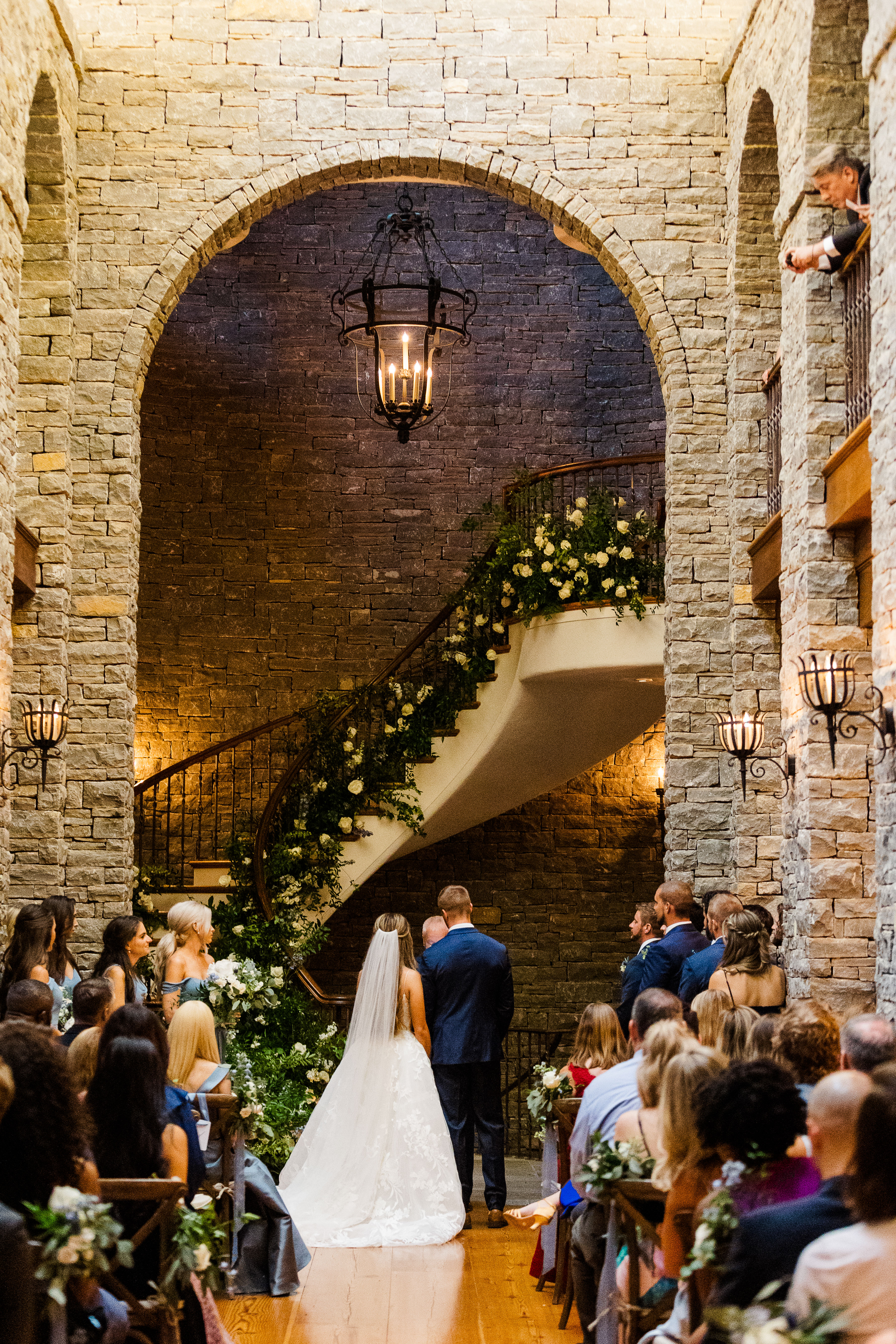
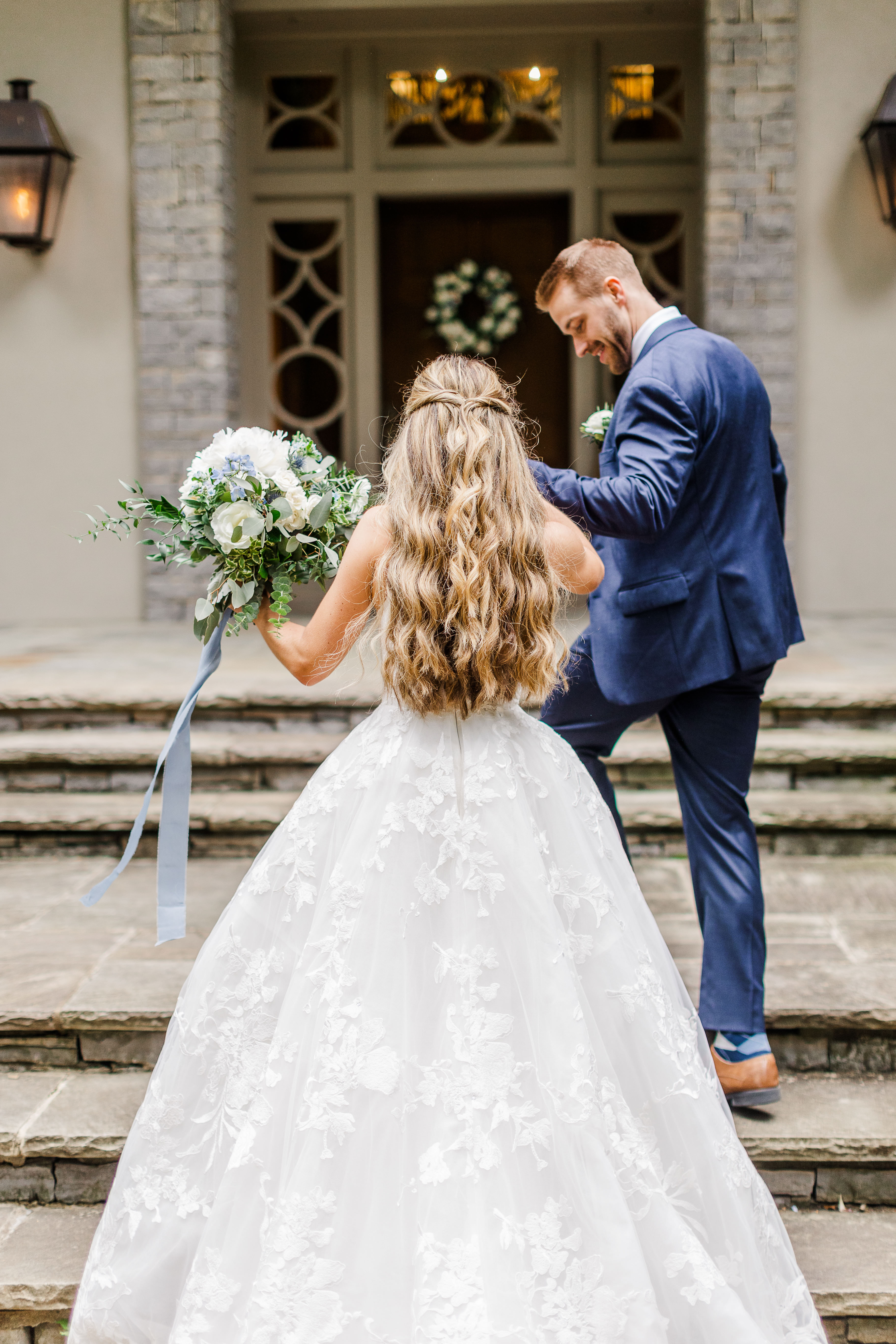
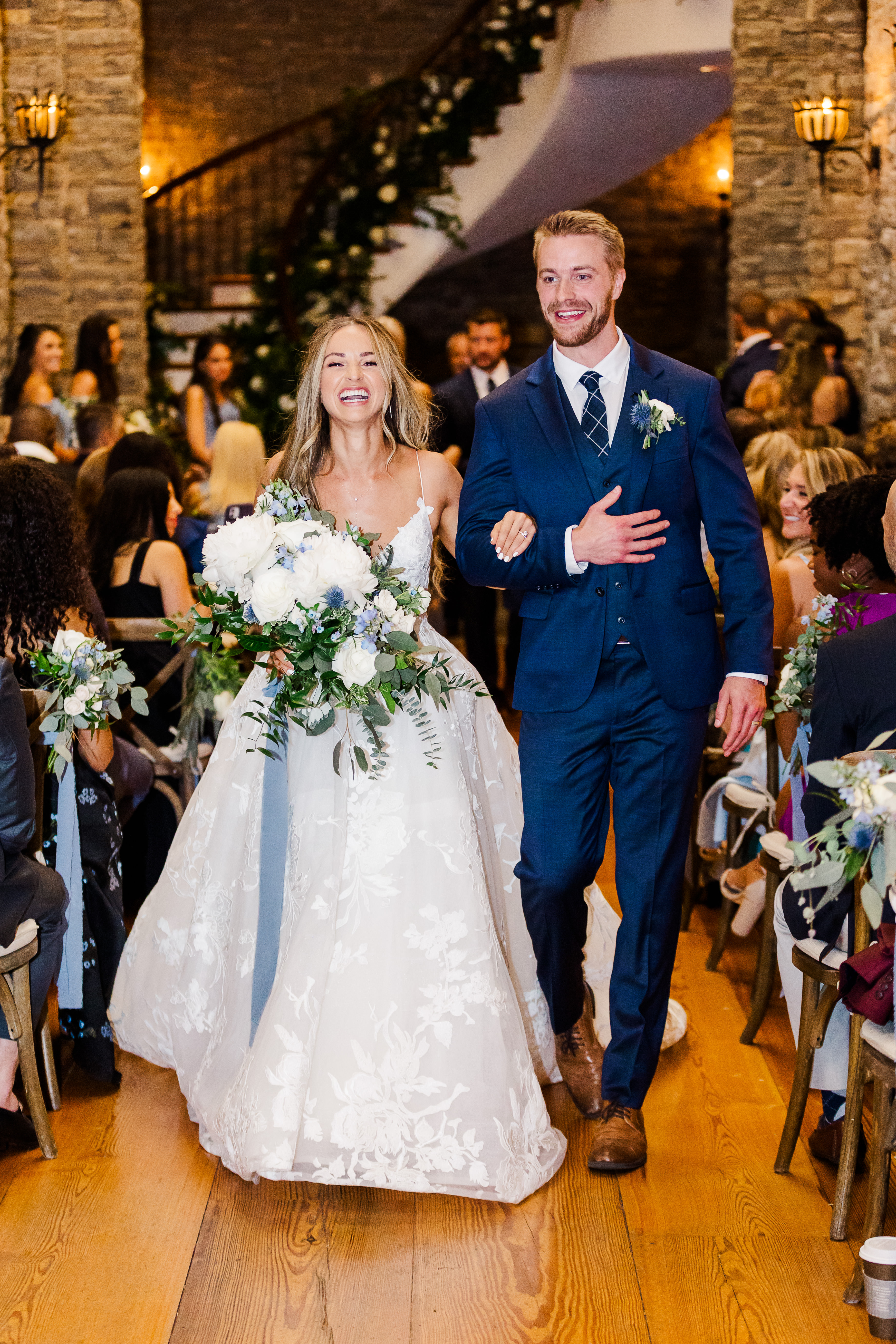
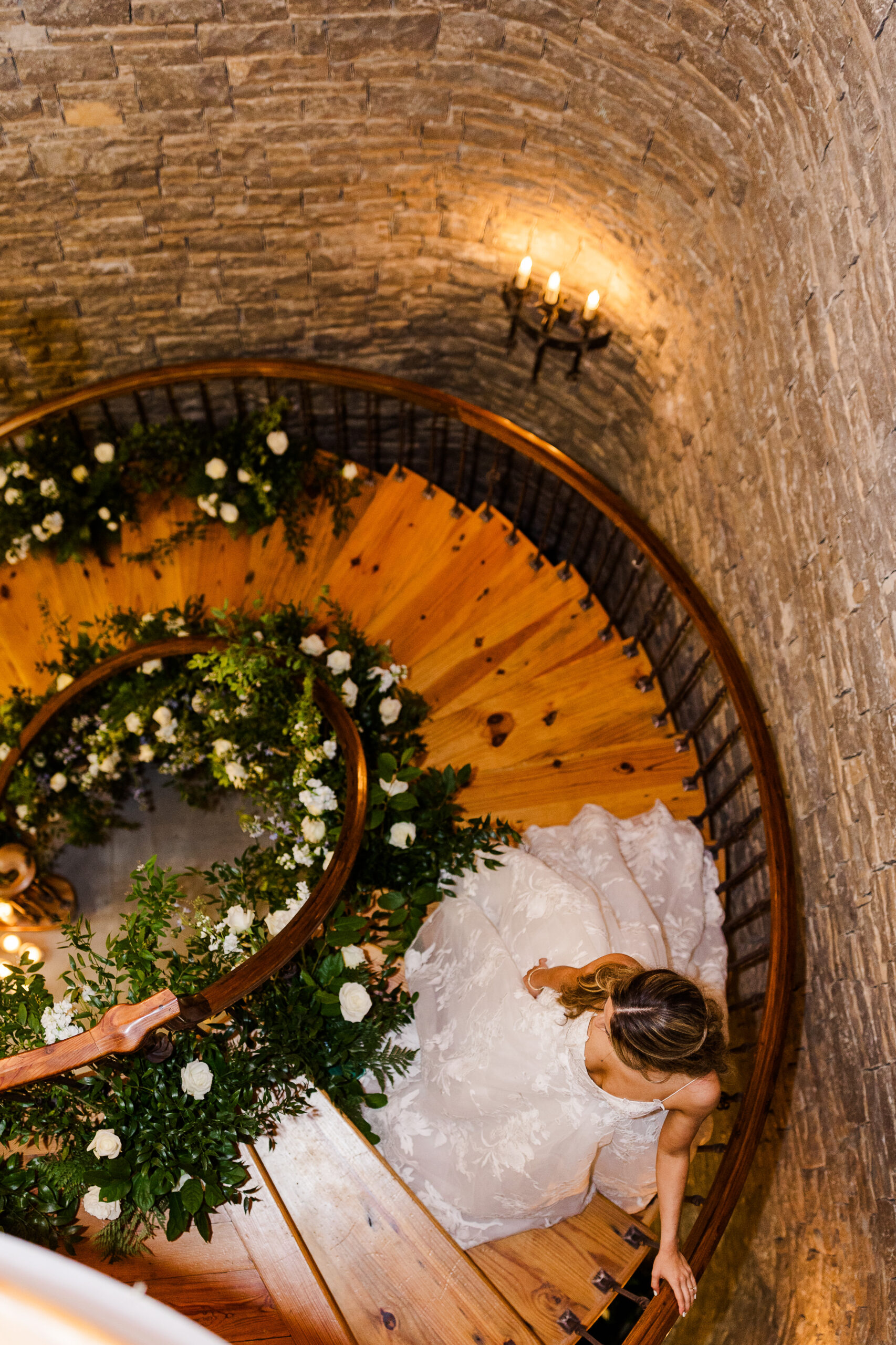
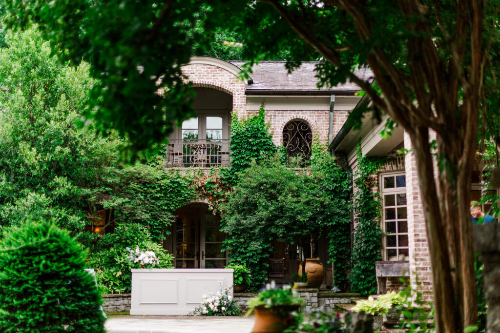
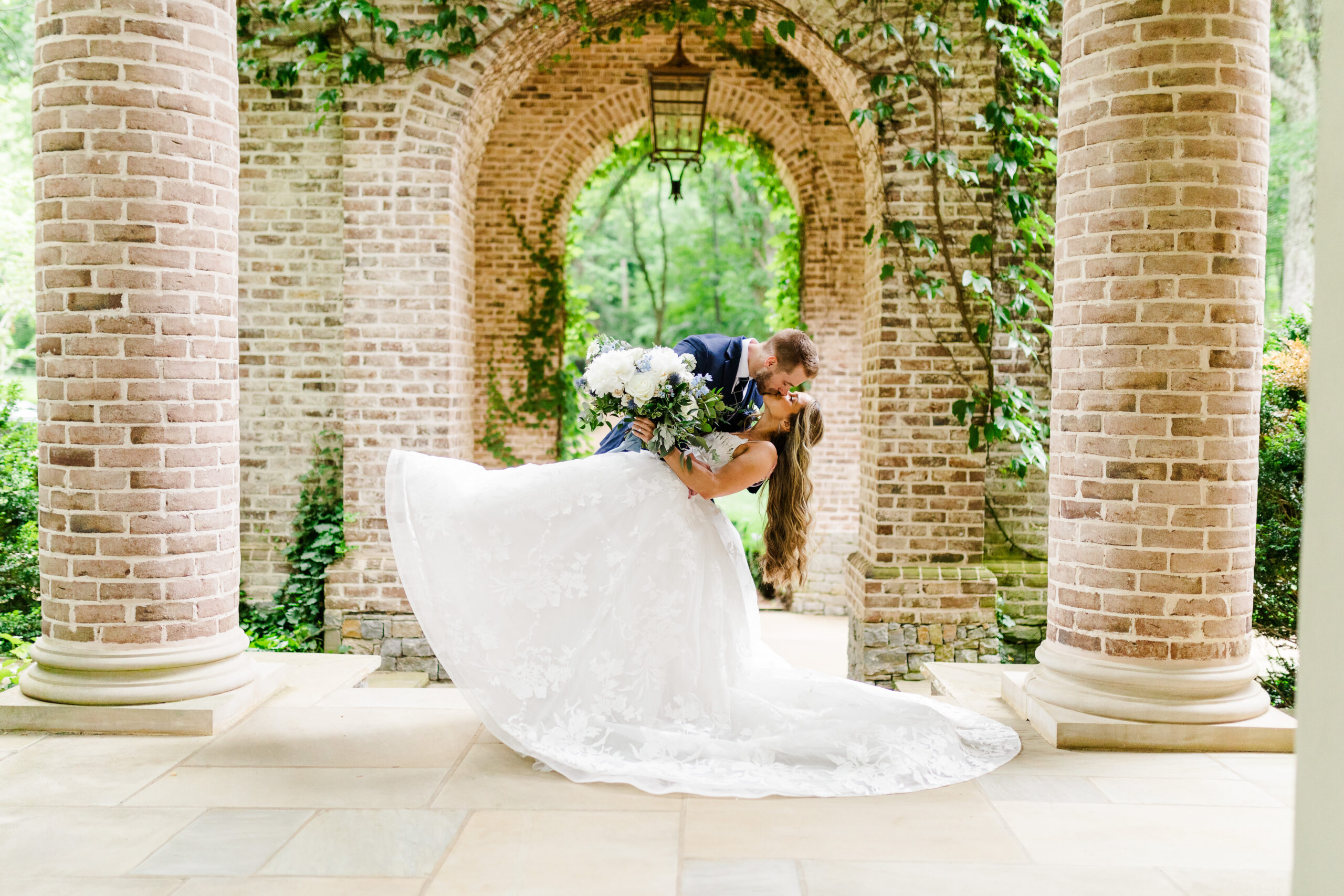
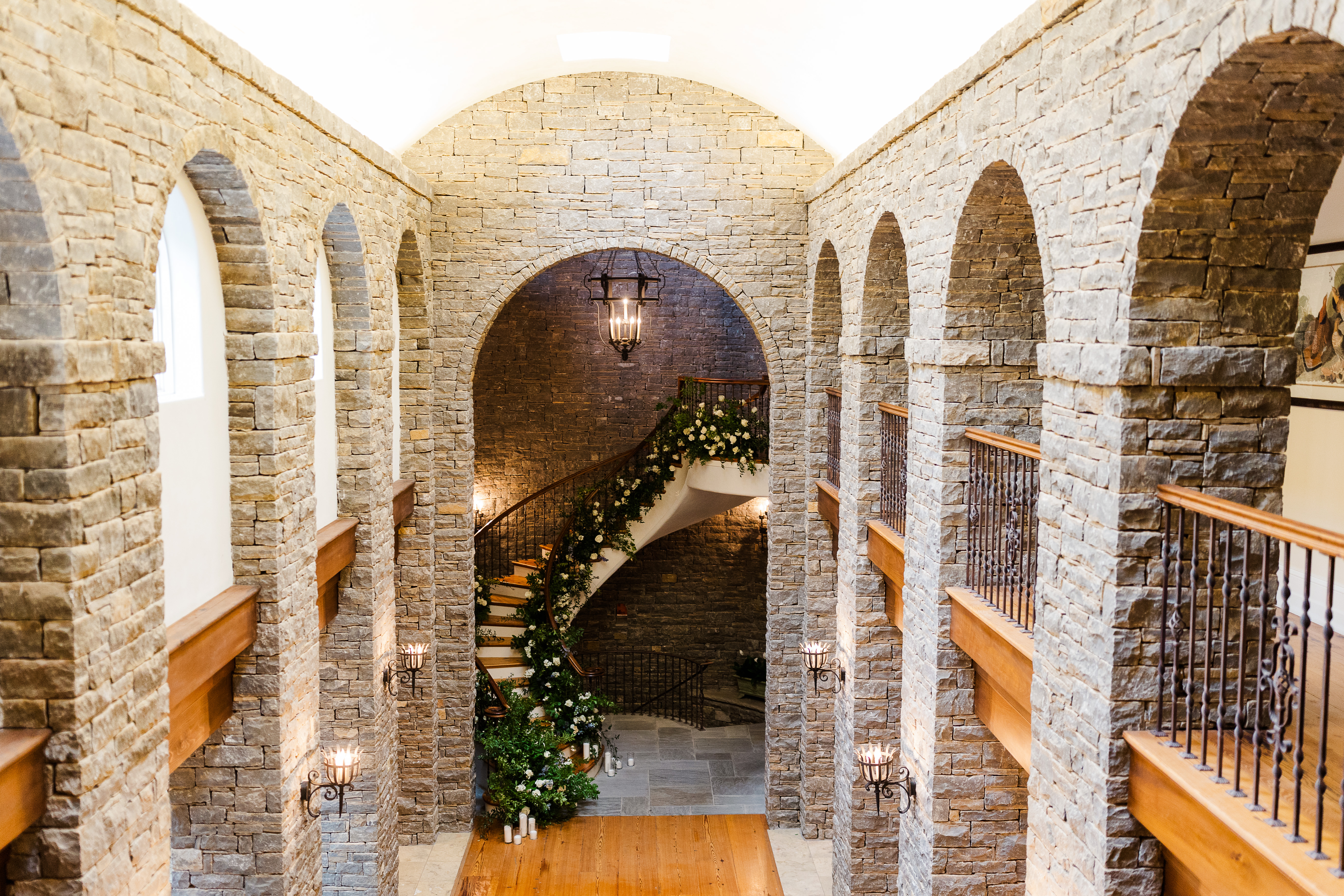
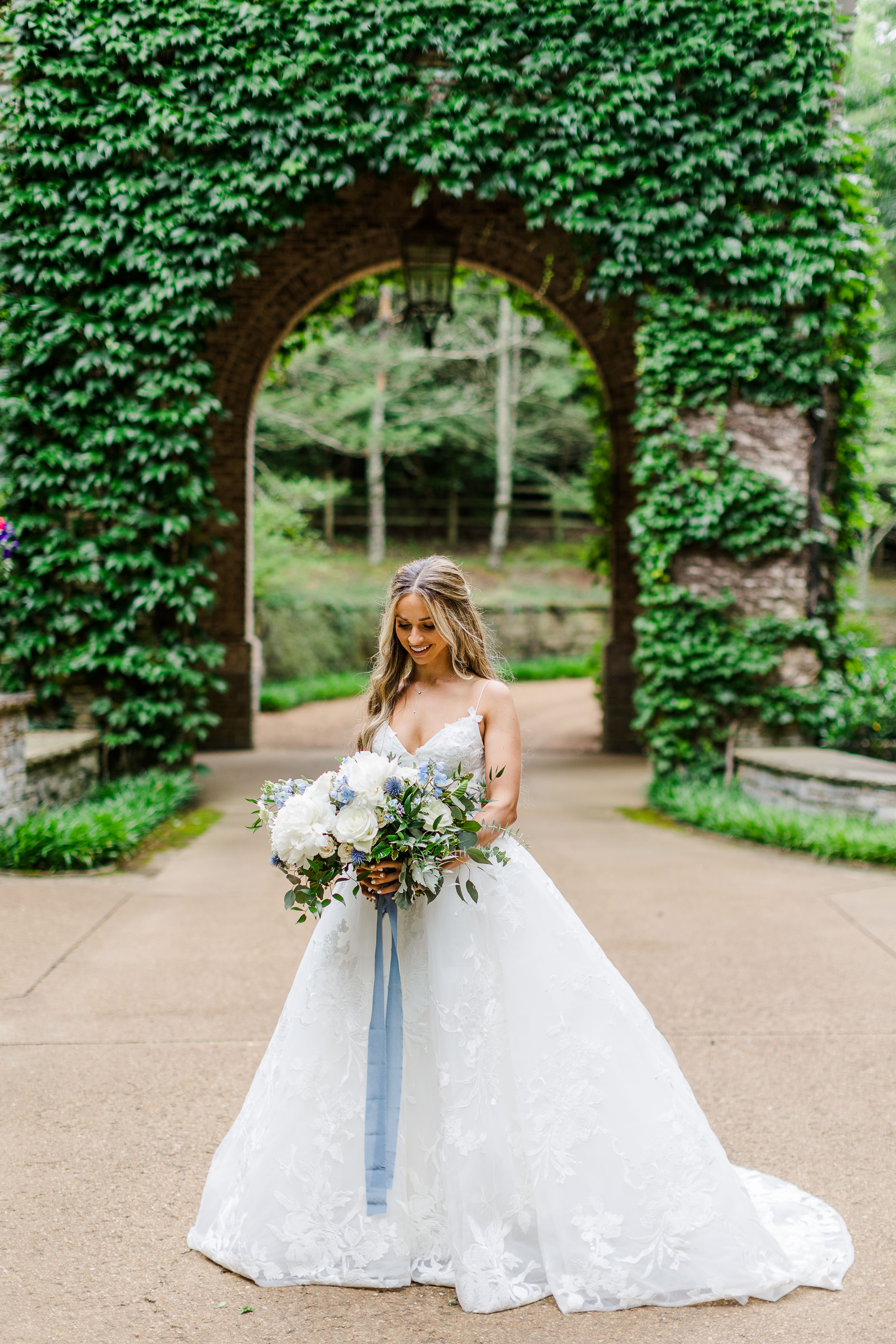
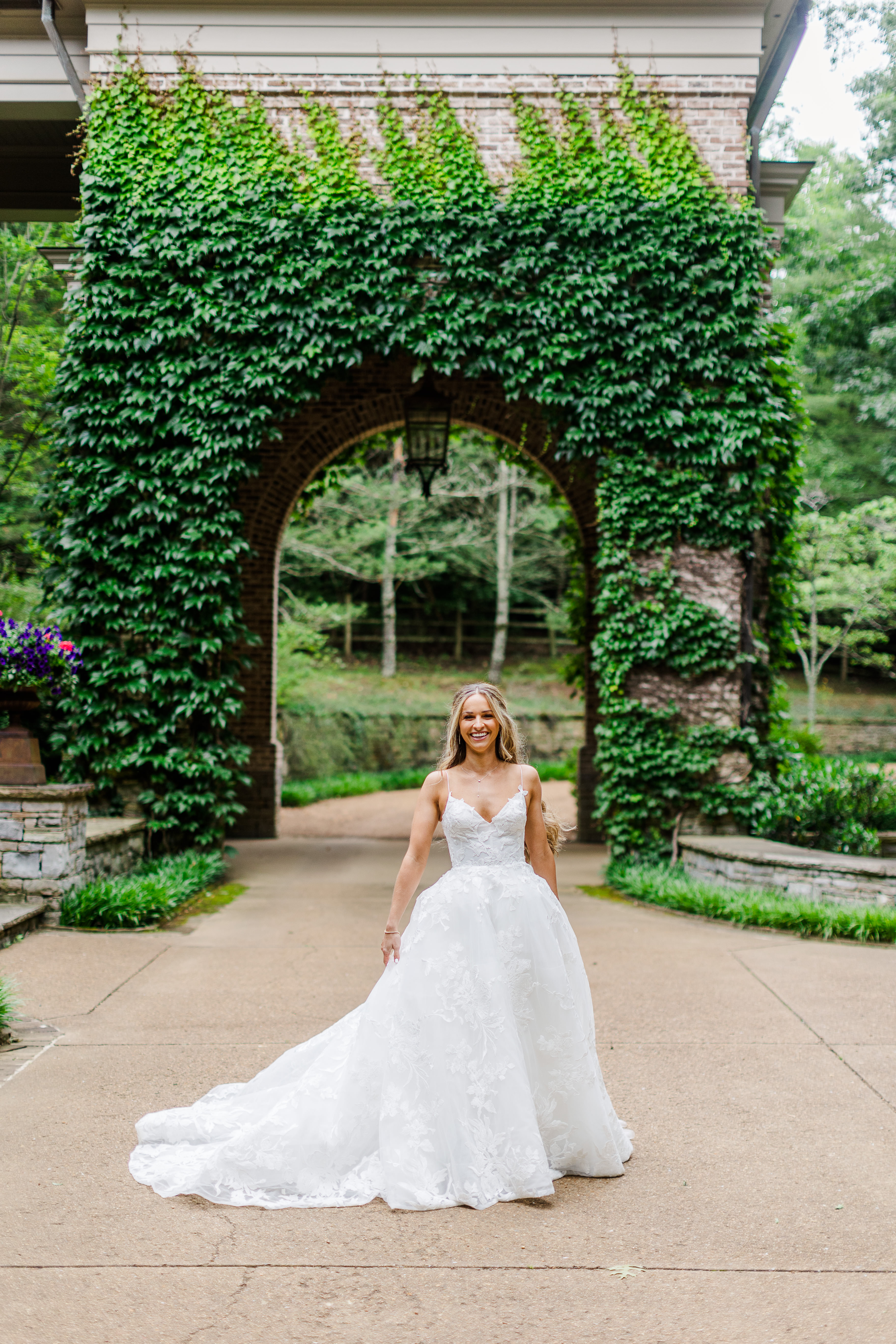
For starters, the home our couple chose as their venue was the most eye-pleasing, awe-inspiring place. There was no shortage of ivy laced brick, beautiful archways, iron gates or spiral staircases; I could go on and on. Fun fact: this home was also filmed in the show, “Nashville”, for all of you fans out there.
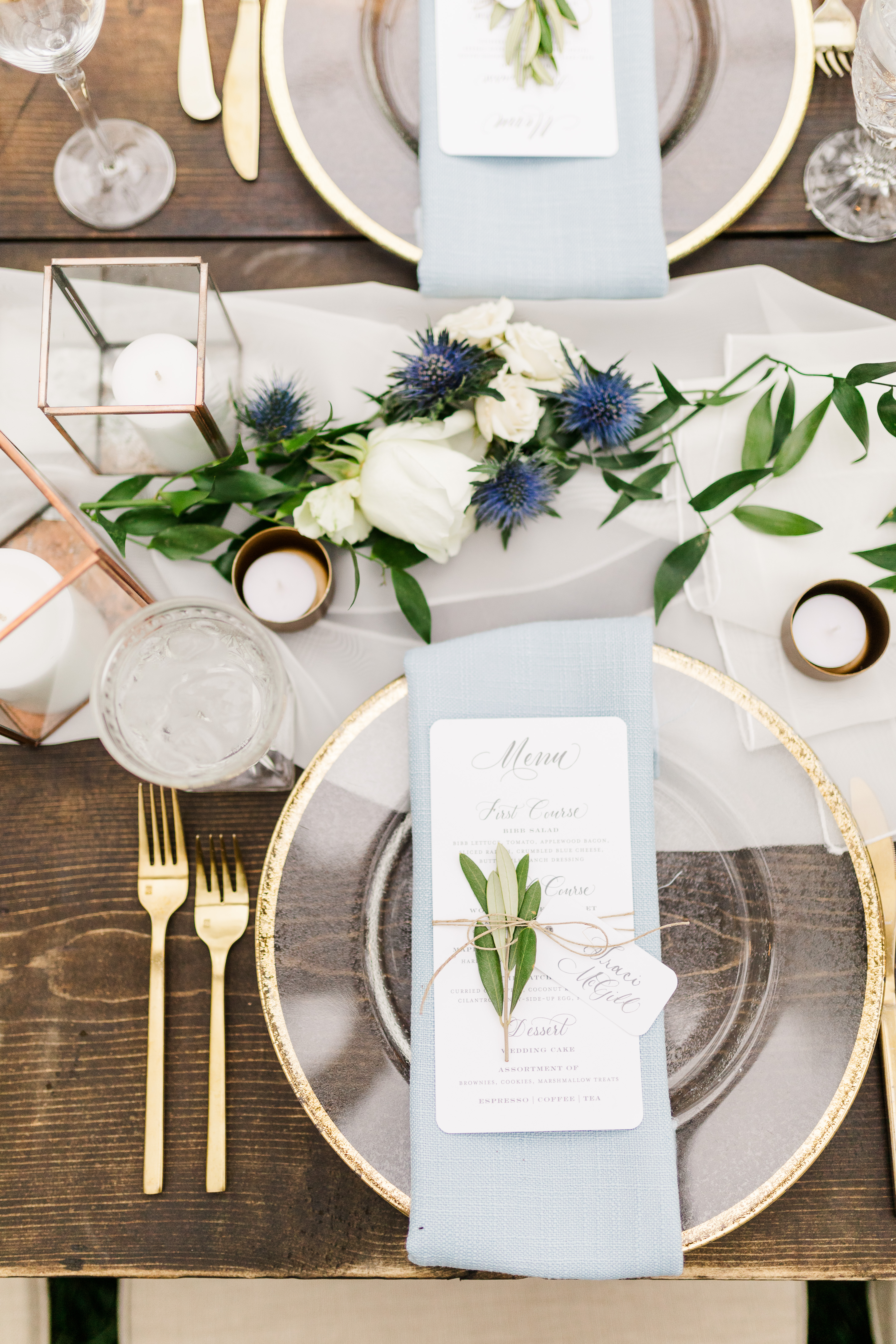
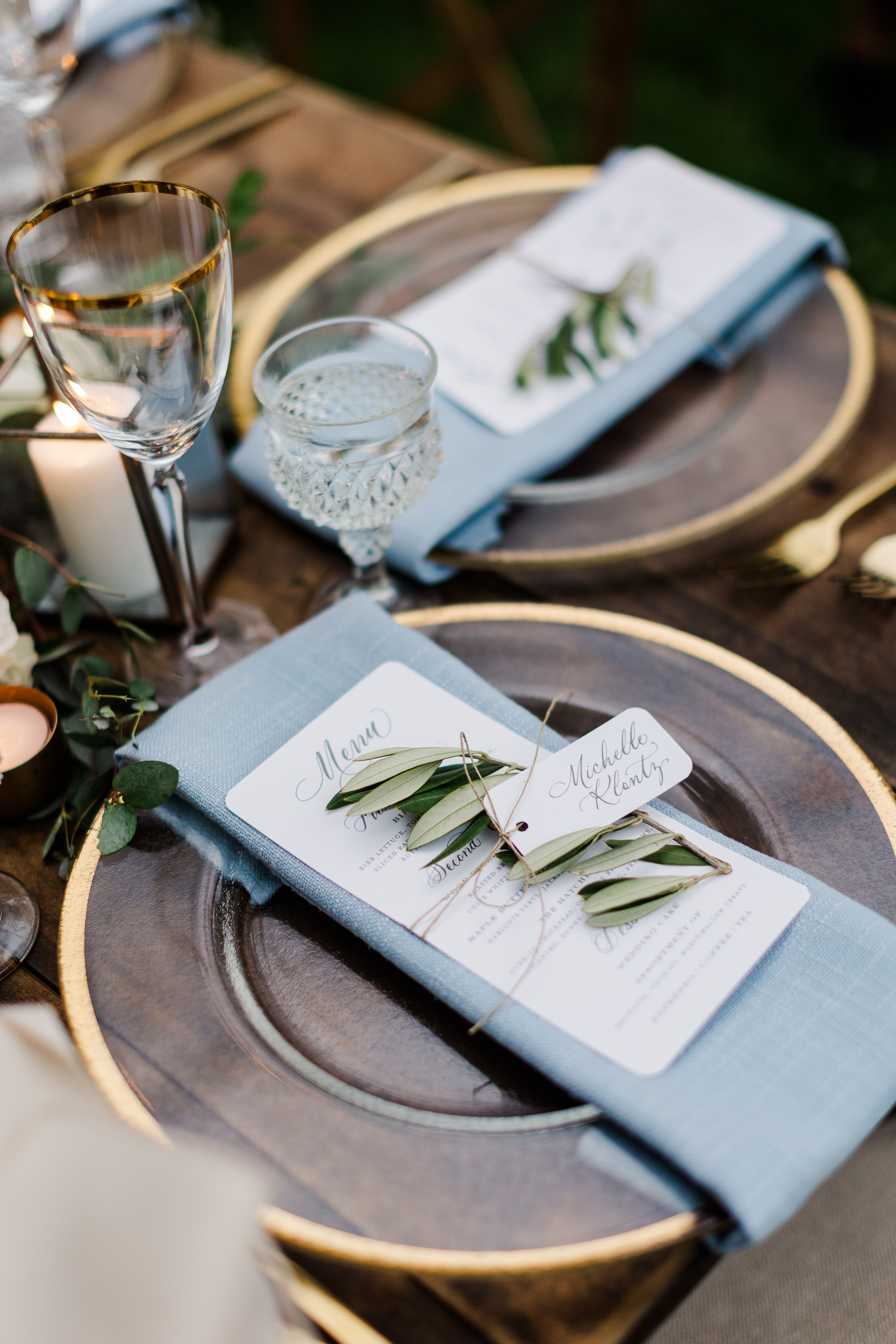
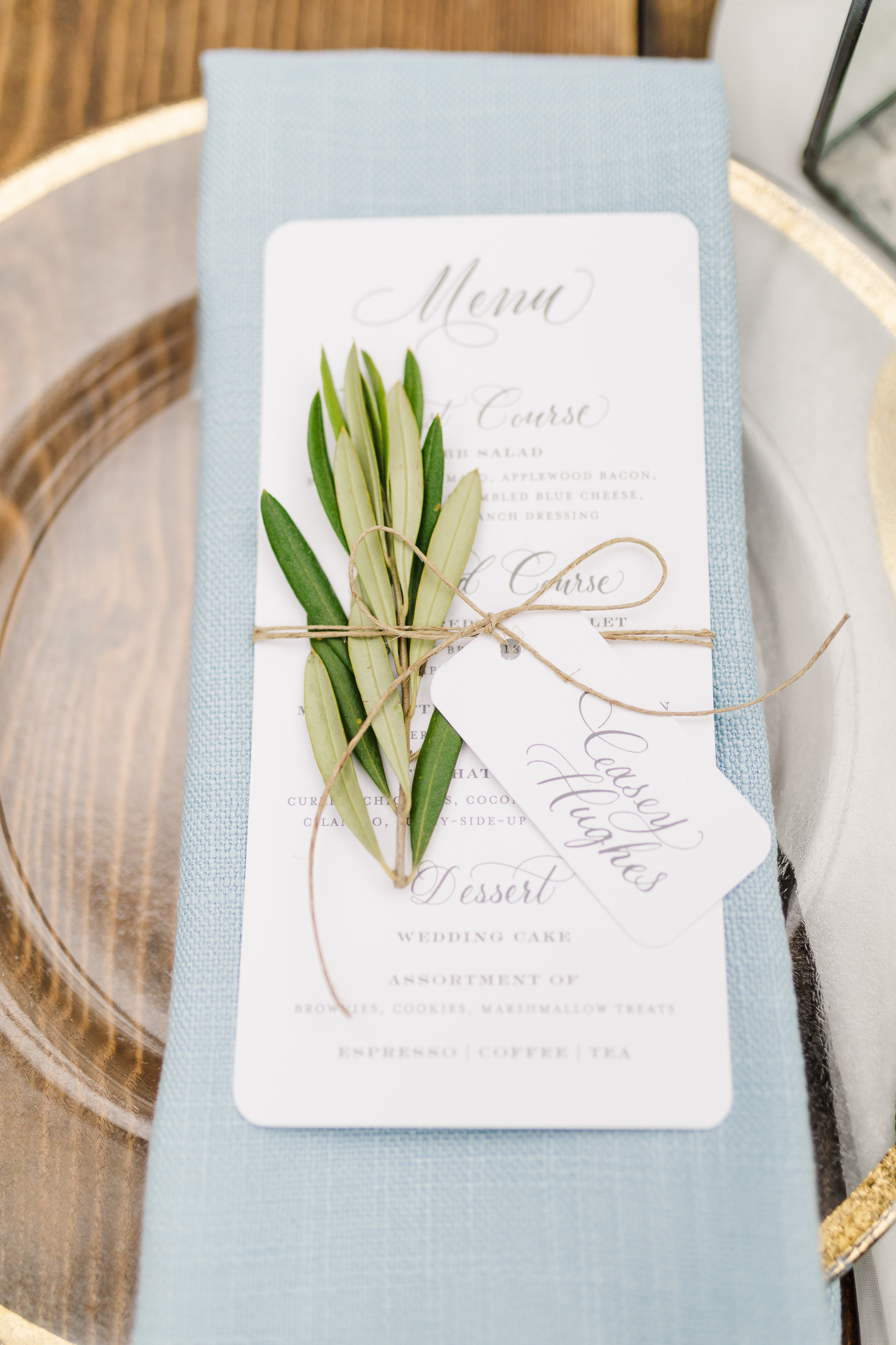
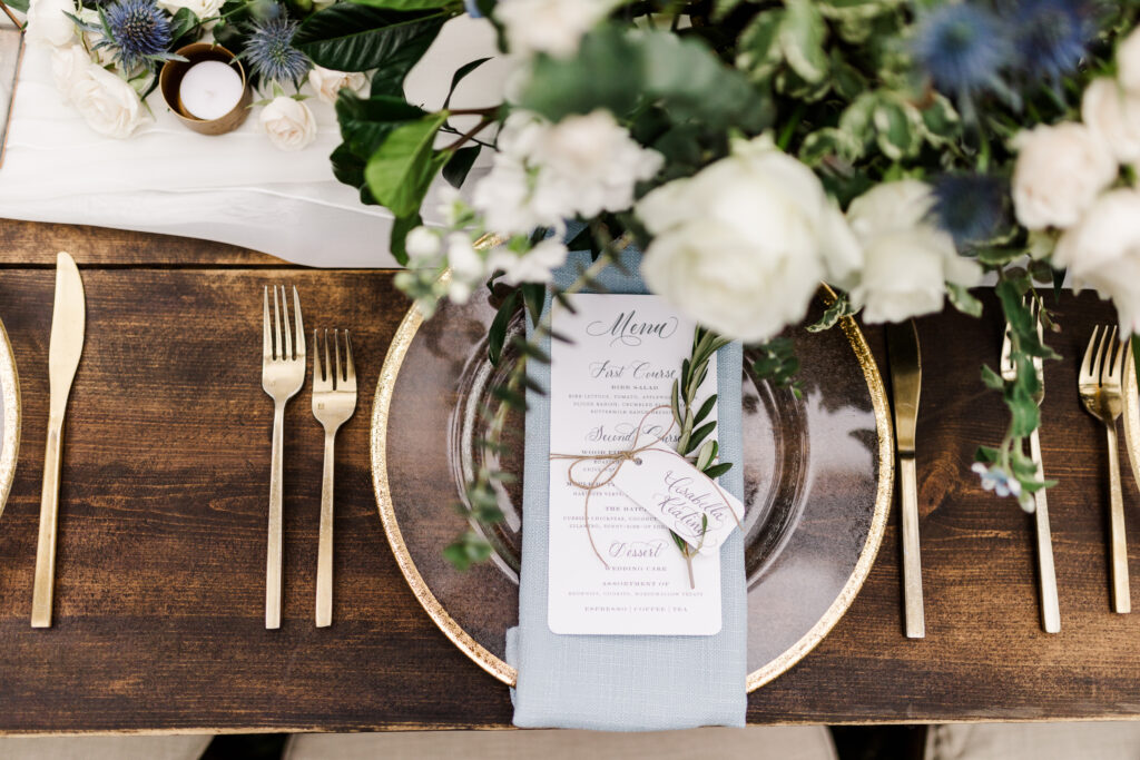
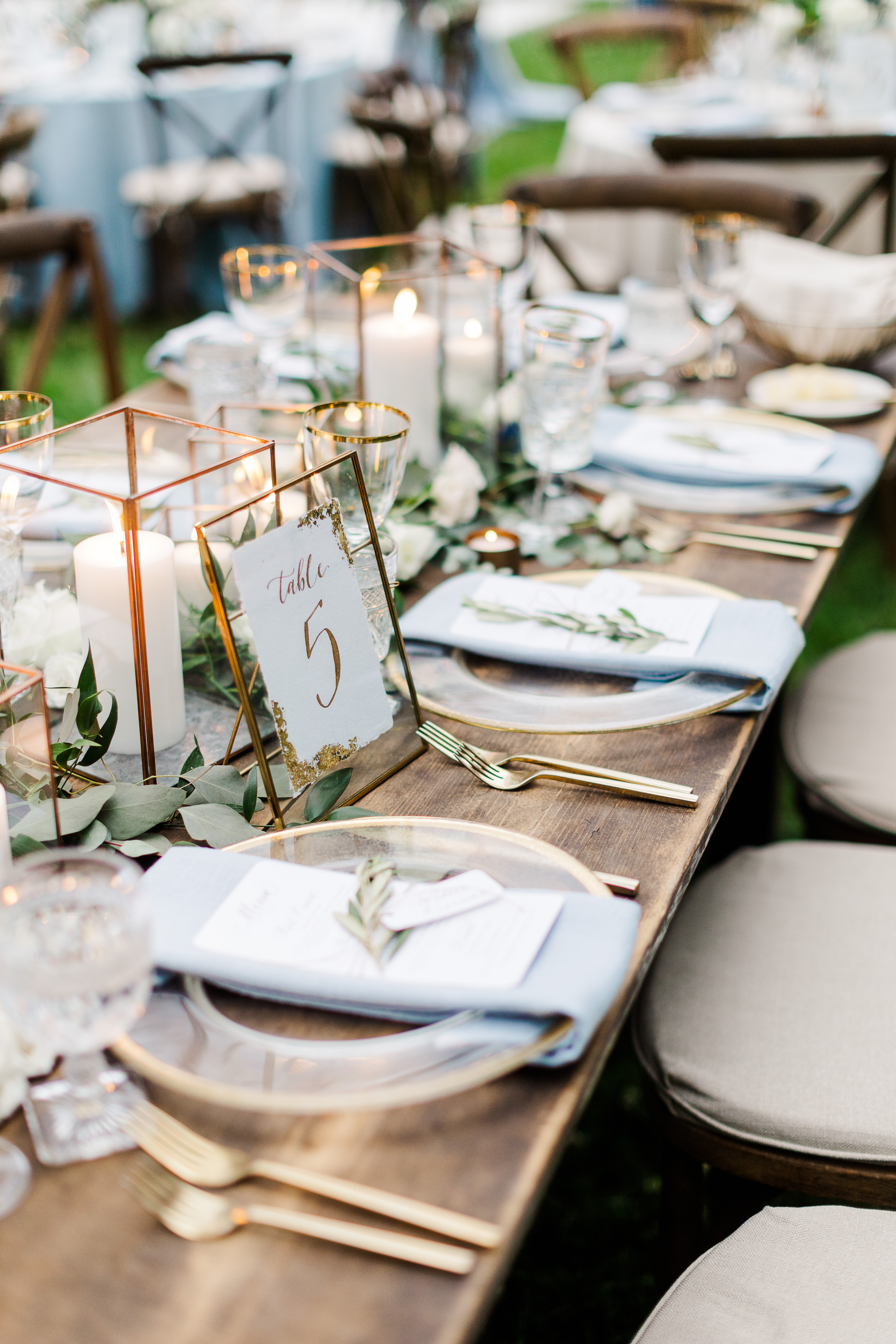
White Ink was thrilled when Mae and Casey asked us to put our own touch on this one-of-a-kind wedding. One of the best things about being a part of it all was getting to show the true beauty behind layering textures. Notice how the custom designed menu was displayed: heavy wooden table, gold rimmed glass charger, soft linen, rounded edged menu with spot calligraphy, and an olive branch all tied together with a single piece of twine. Whew! Now that is how you impress your guests using texture! This display at Mae and Casey’s reception embodied the perfect mixture of bold and gentle to make the dreamiest styled tablescape we have seen in a long time.
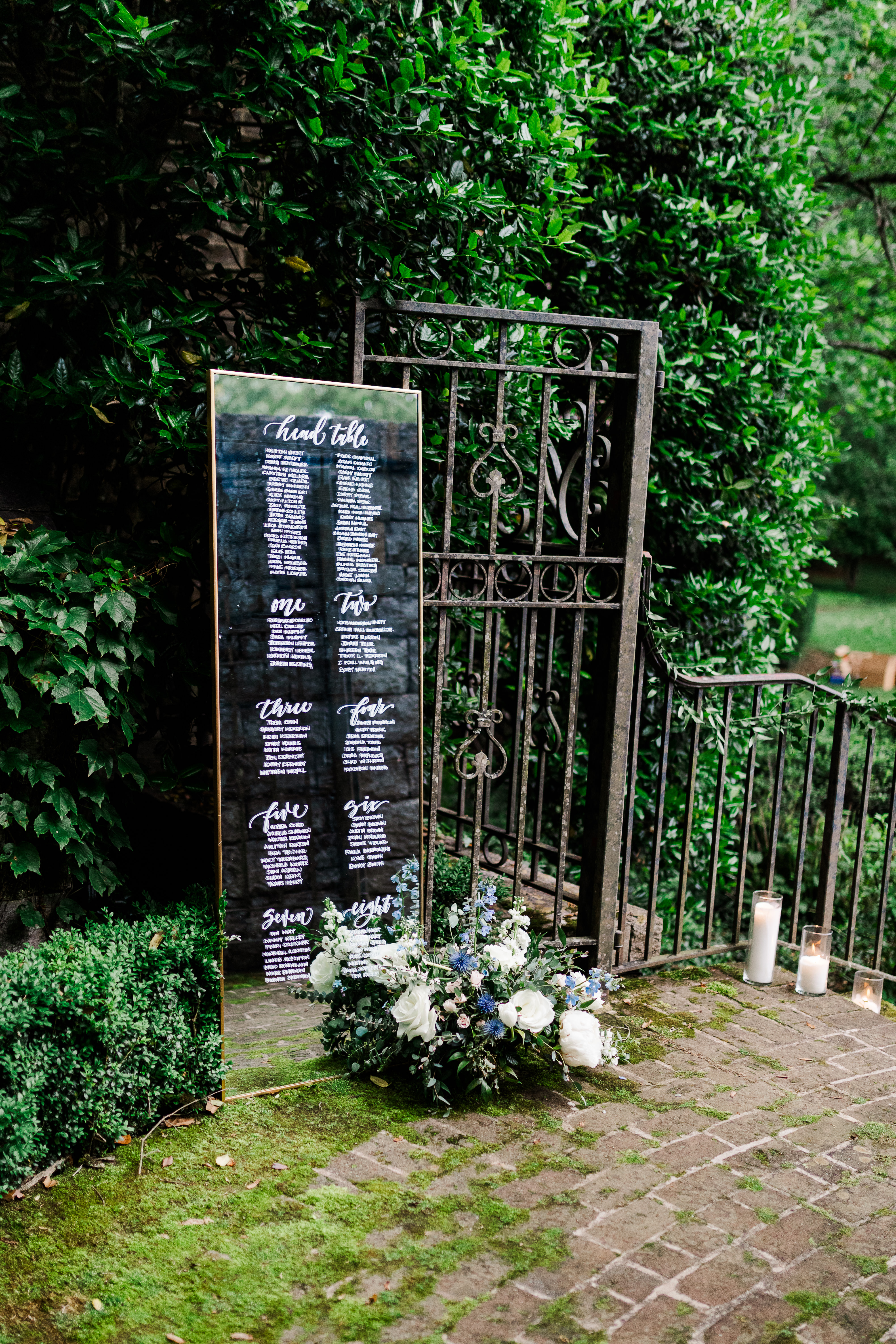
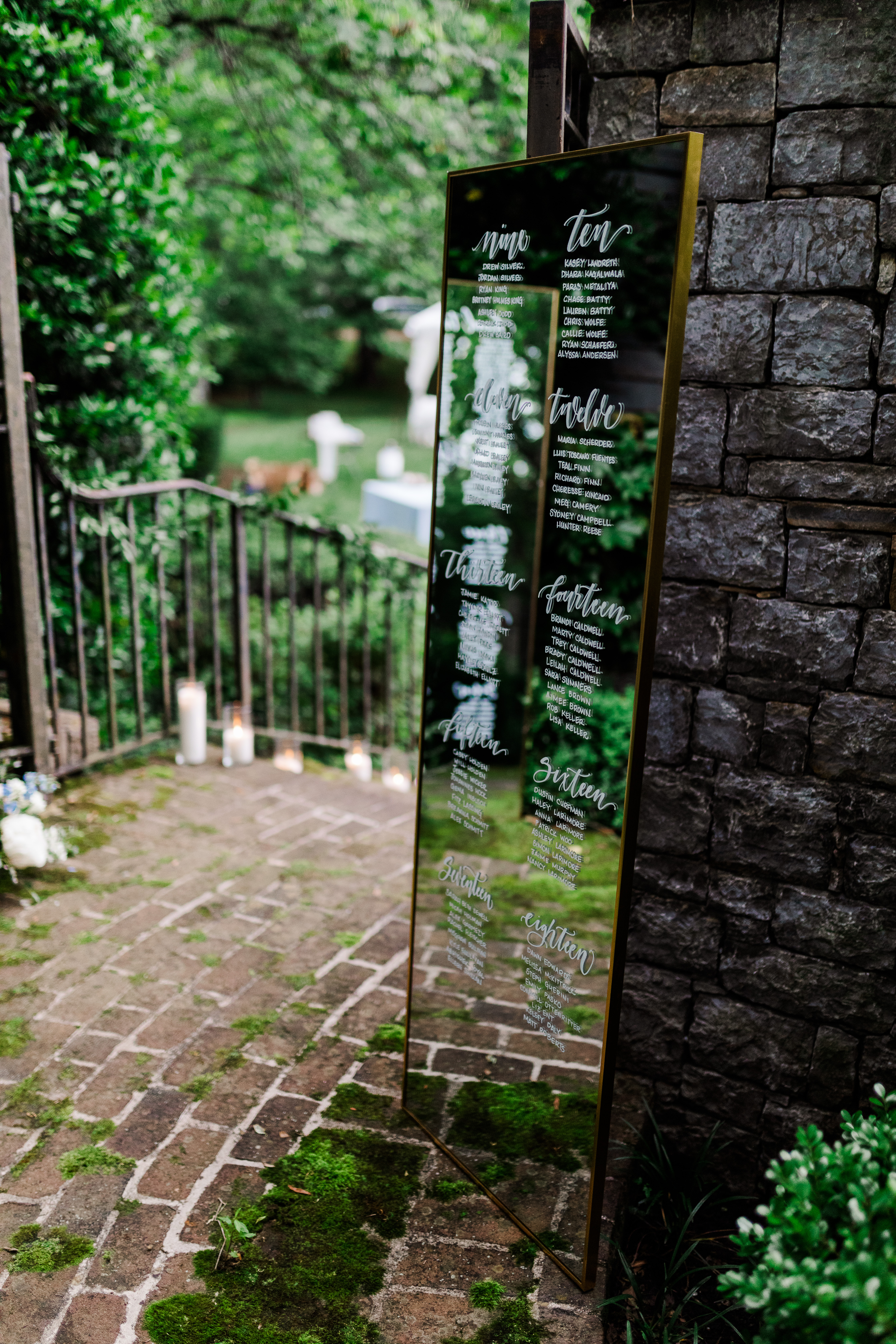
Check out this seating chart! Have you ever seen glass so perfectly placed? I mean this looks like it’s straight out of a fairytale! These gorgeous, gold-trimmed standing mirrors rested softly against iron gates and sat on a cushy bed of moss that was growing atop the stone floors and walls. (I mean, I love that I even get to say that sentence.) Again, layered texture for the win! I love seeing White Ink’s work used like this. It’s just so satisfying.
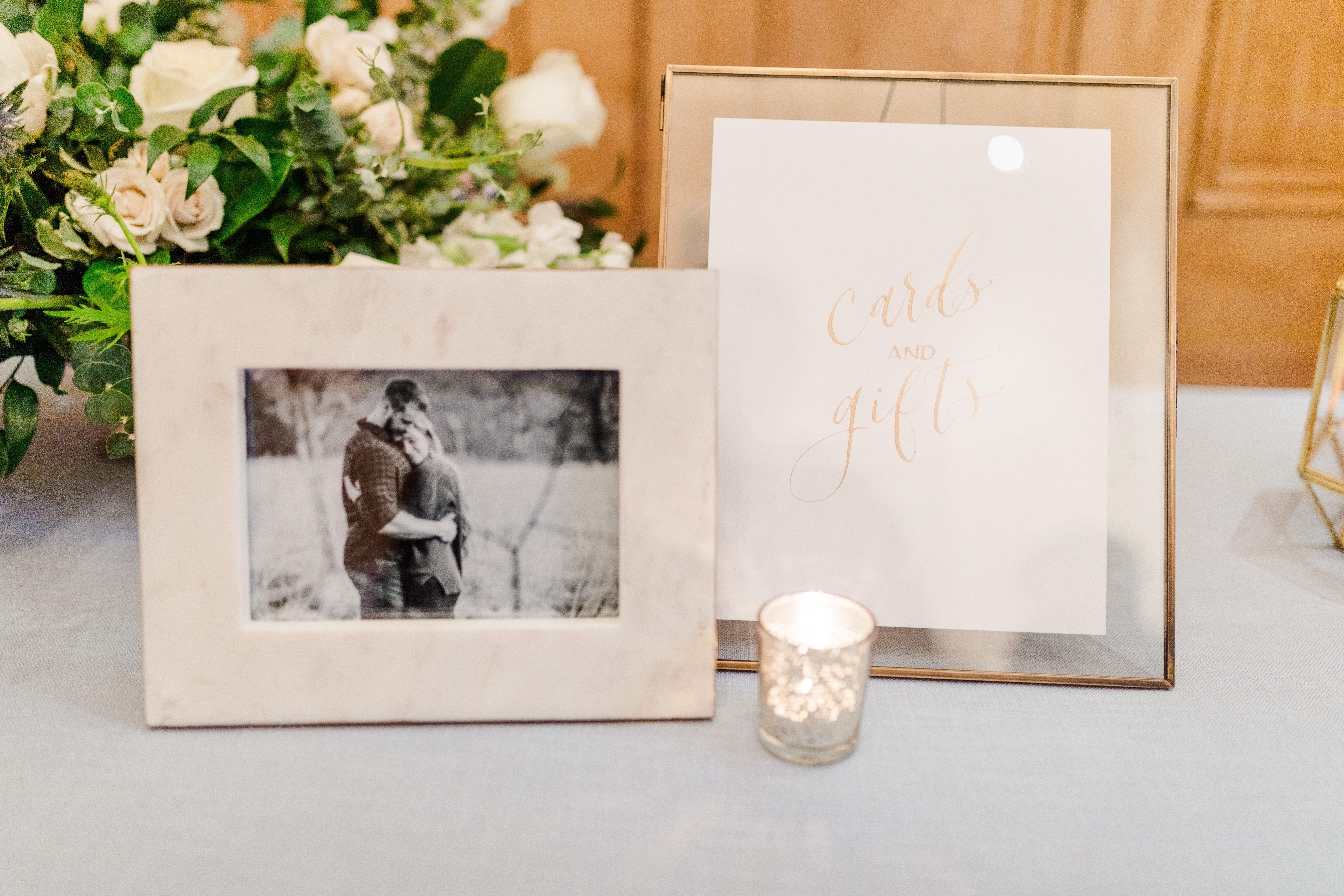
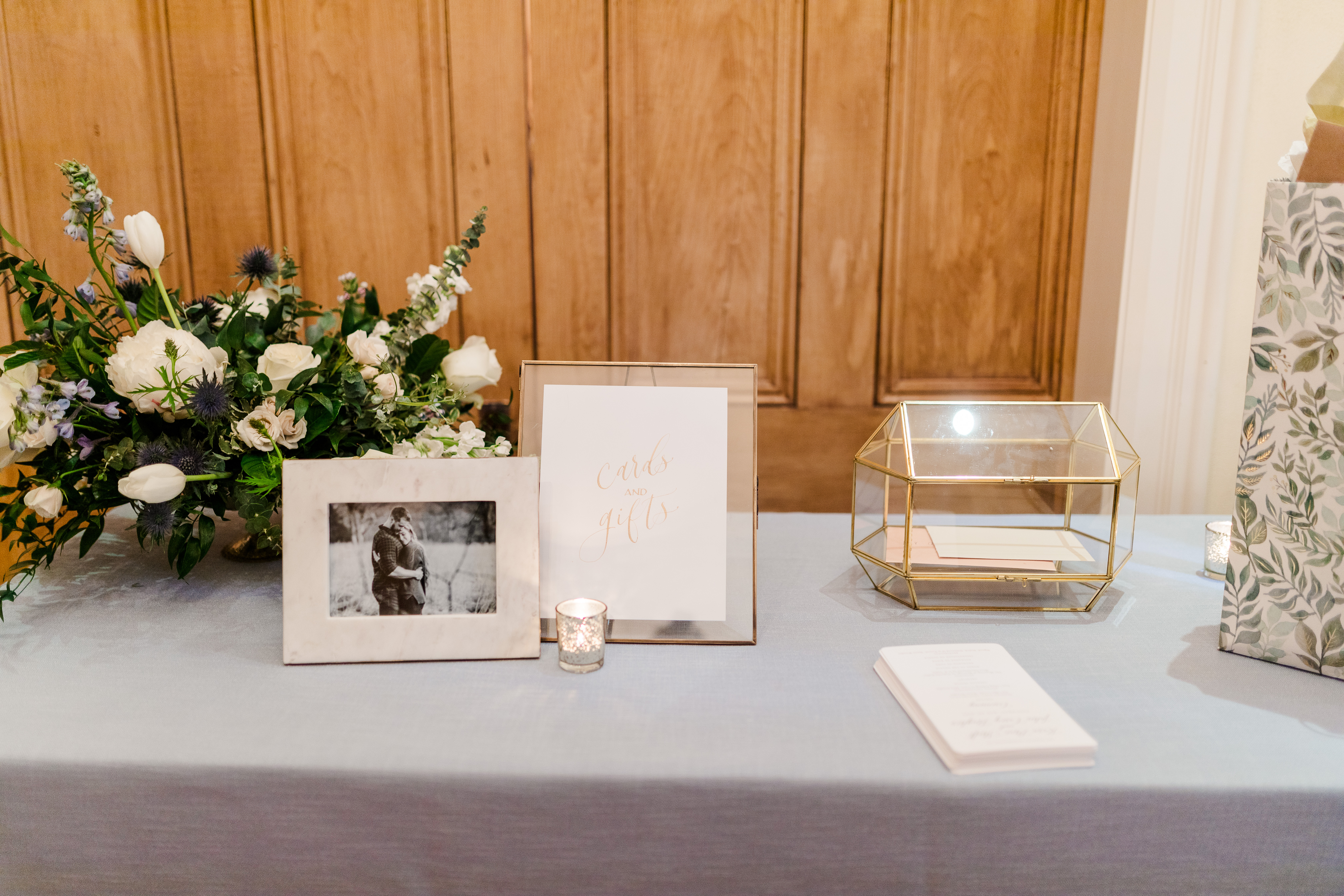
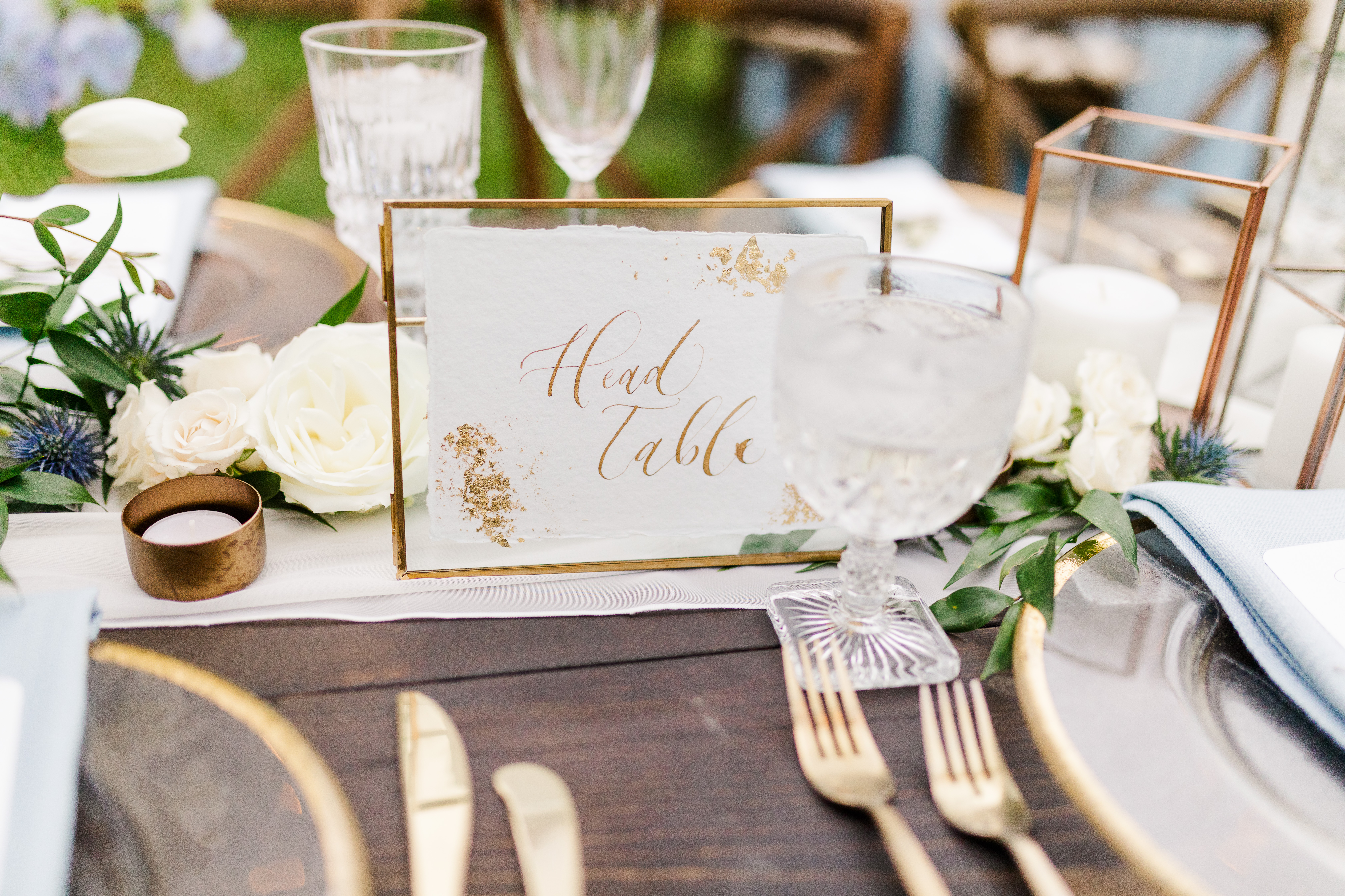
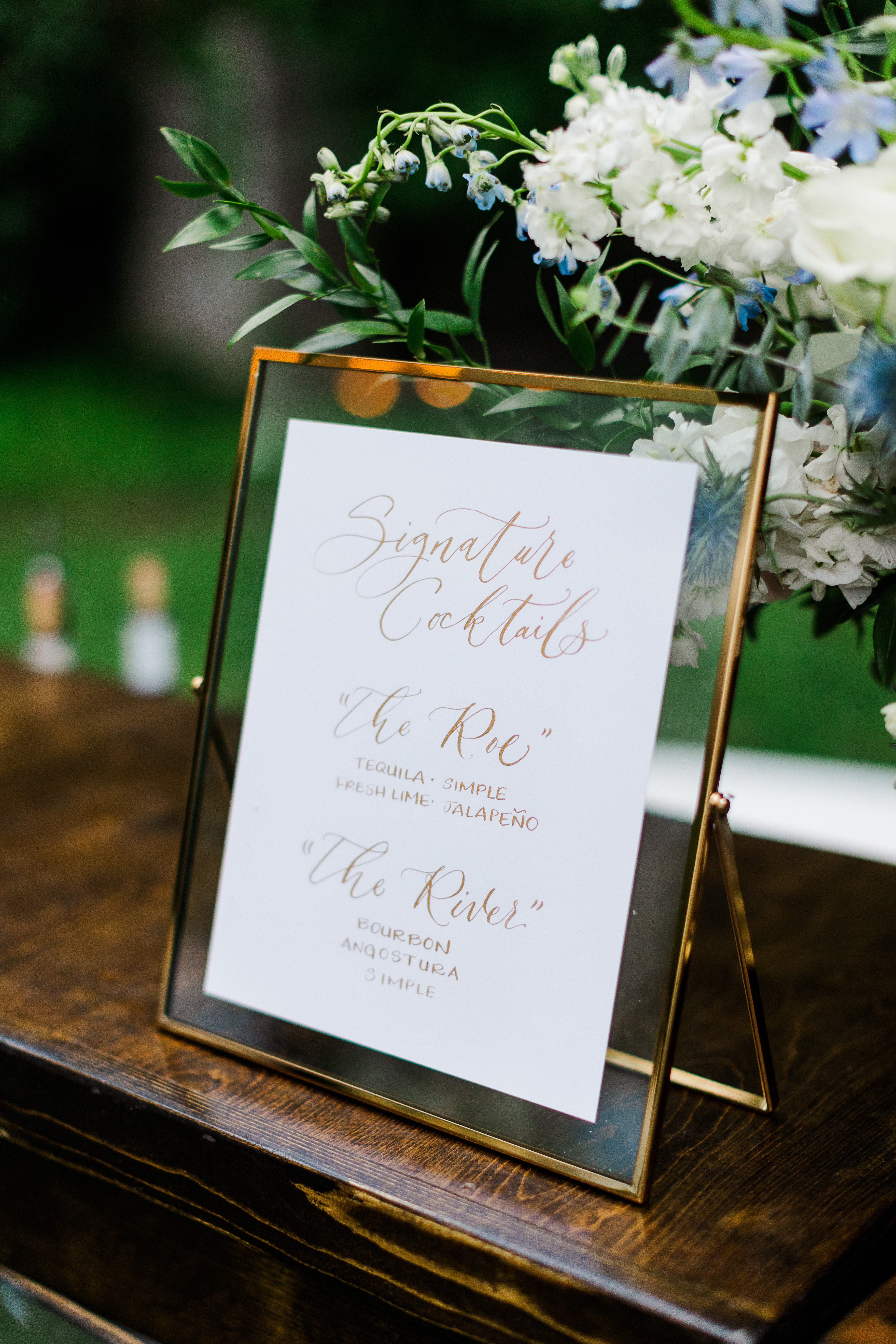
I was excited that Mae and Casey chose one of our card boxes from our extensive rental collection. This particular card box is gold trimmed and went flawlessly together with all of the gold accented décor throughout the ceremony and reception. The table numbers we provided for them were complete with gold flake corners and lettering, as well as the beautiful cocktail signage all done in gold ink calligraphy.
We love watching our couples piece their wedding day together and we love even more that we get to be such a big part of that. And when it comes to using lots of texture, don’t be afraid of it. It might be exactly what you’re looking for!
Photographer: Amanda May Photos
Planner: Kristen Sheft
Calligraphy: White Ink Calligraphy
Florist: Gradient and Hue
Rentals: Music City Tents and Events| Southern Events Party Rentals