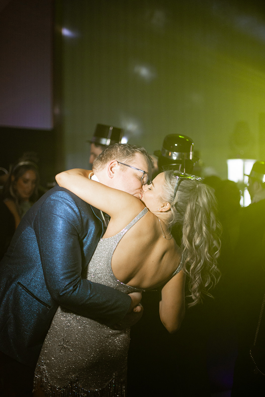
When we first met with this bride, we knew this New Year’s Eve wedding would be anything but ordinary. From the start, she gave us complete creative freedom—a dream for any designer! While many NYE weddings stick to classic black, white, and gold, she wanted something unexpected. To bring to life this bold and chic NYE wedding, we embraced bold patterns, a maximalist style, and a color palette that felt fresh, unique, and celebratory. The end result was amazing!
Setting the Stage with a Statement Invitation Suite
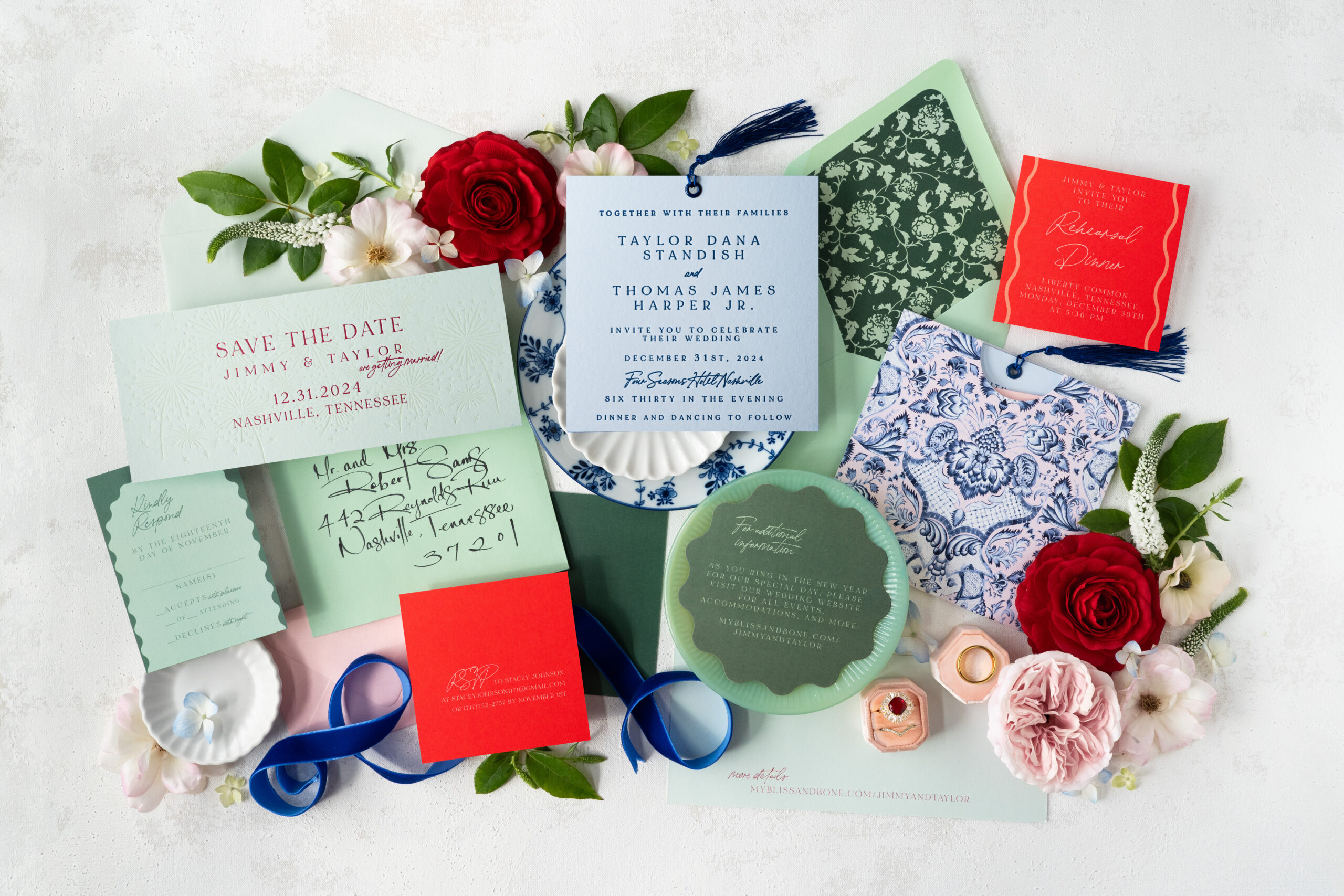
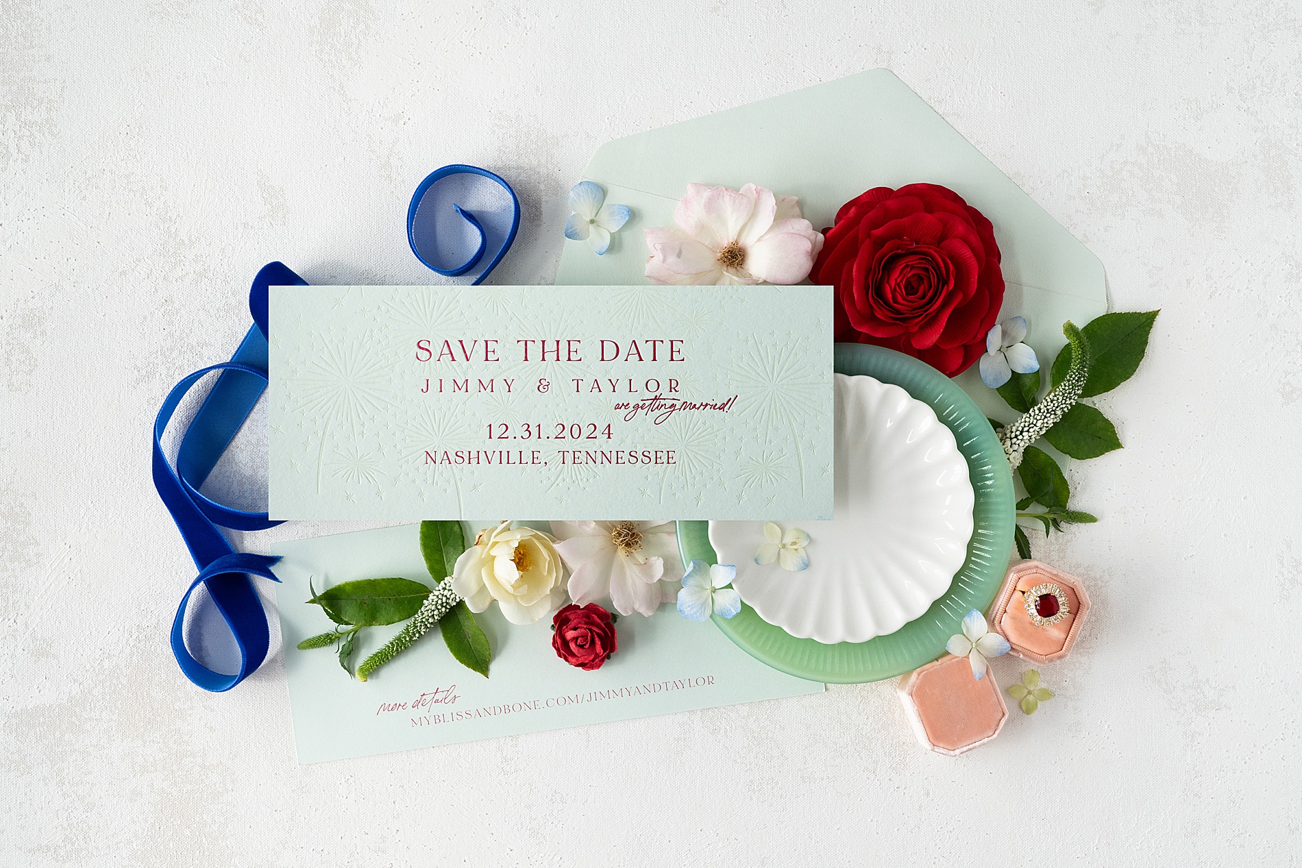
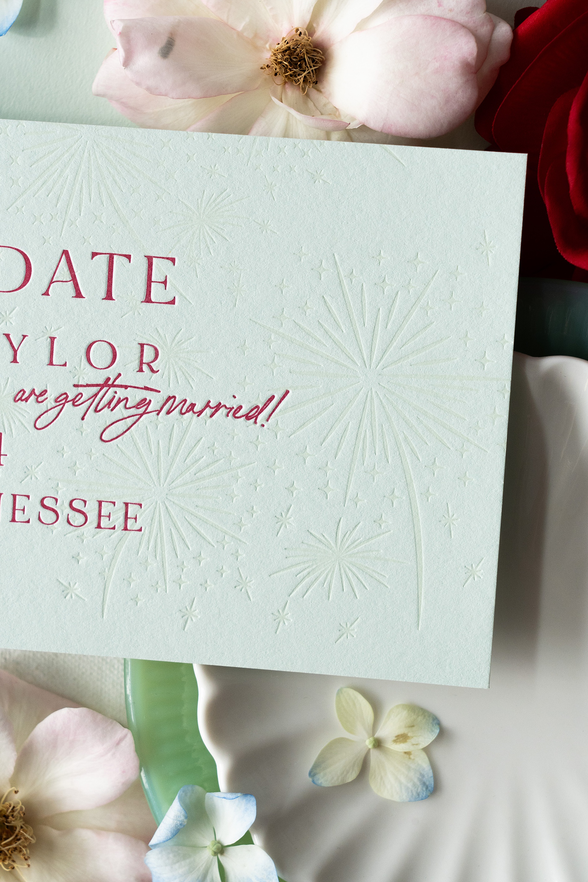
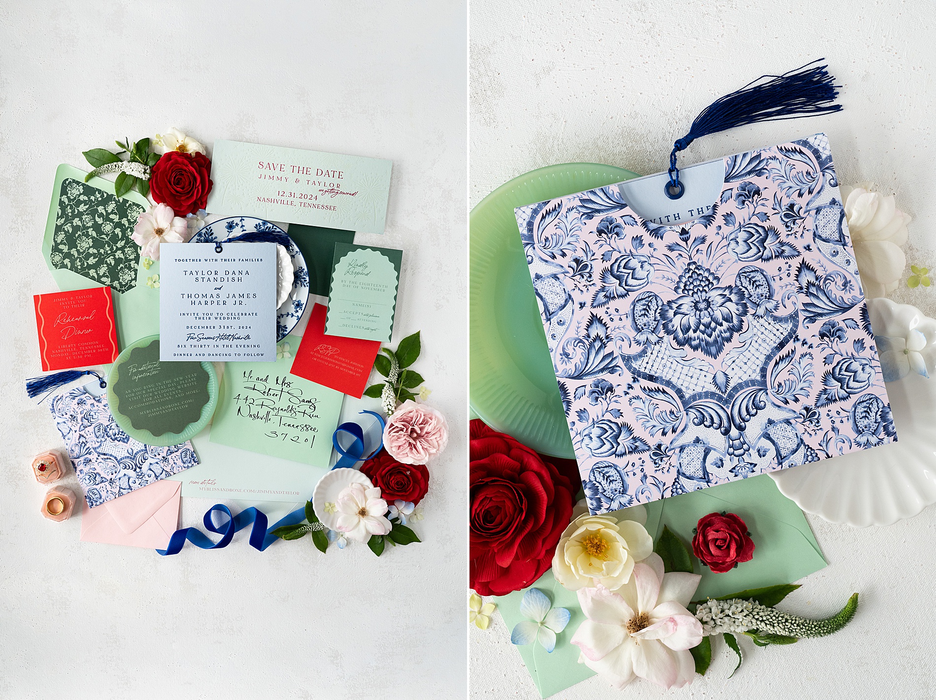
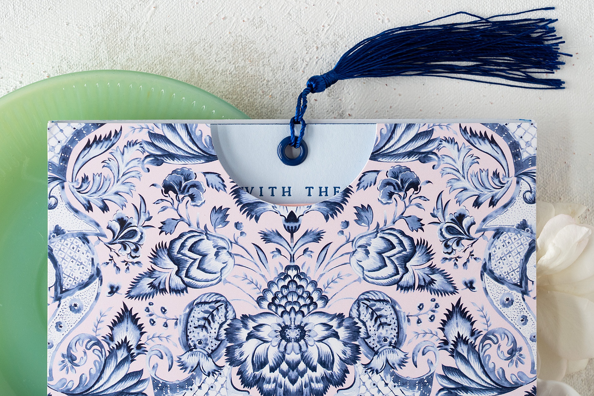
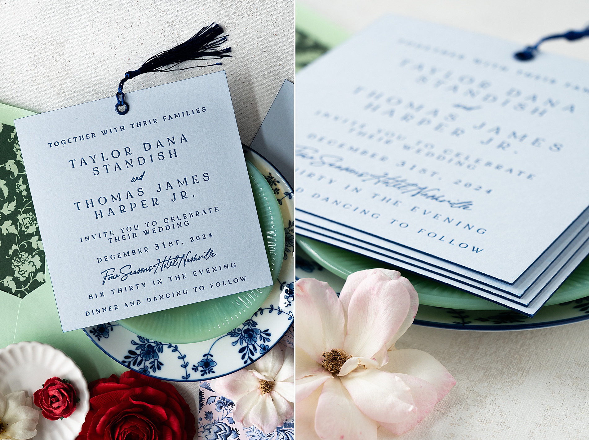
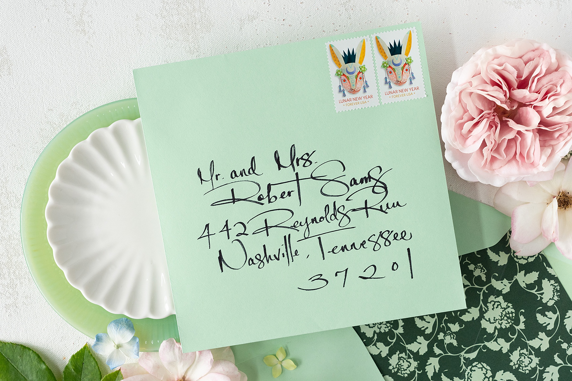
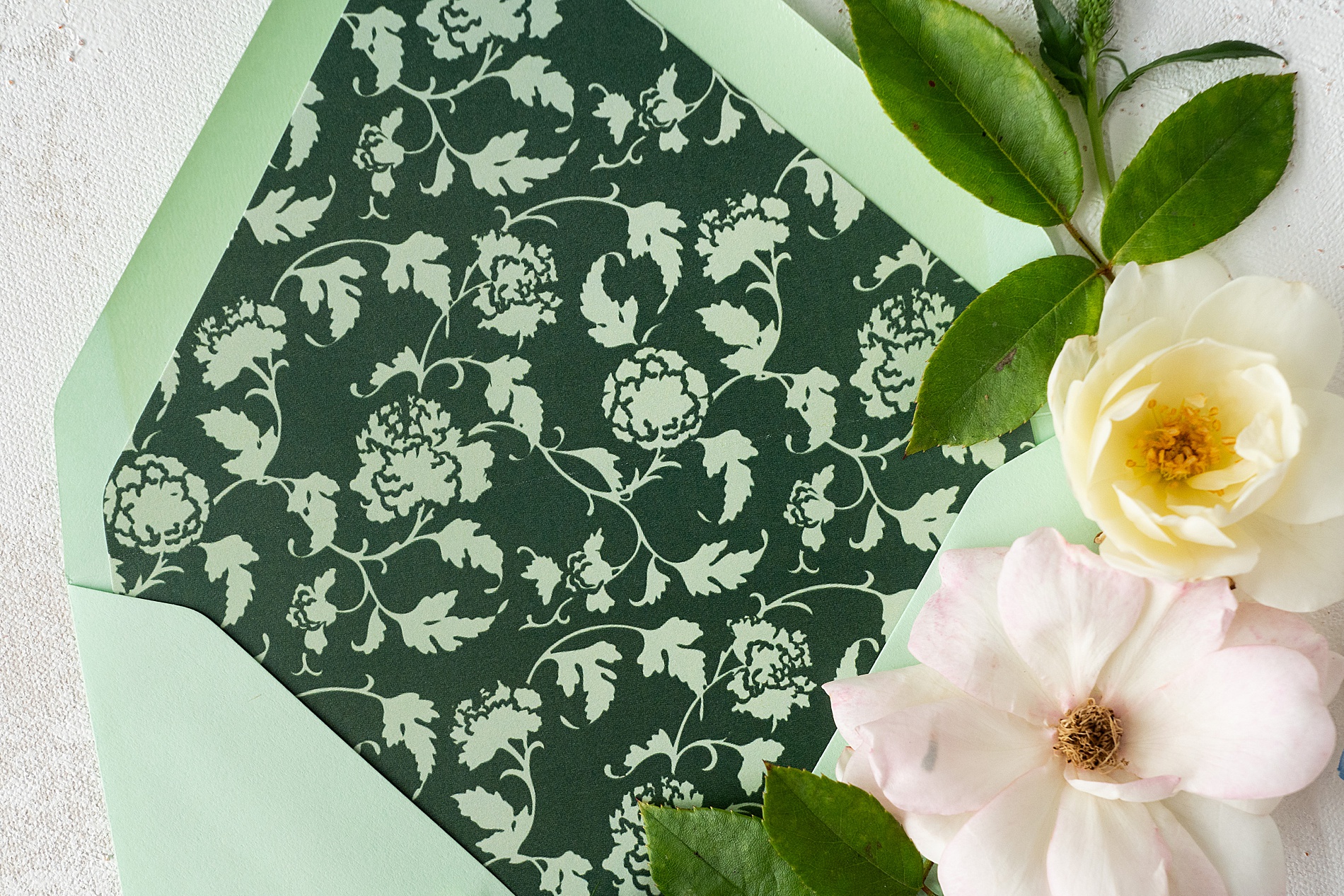
The invitation suite was the first glimpse into the playful yet sophisticated vision for this wedding. First, save the dates in mint green cardstock with fireworks impressed into the paper provided that subtle nod to NYE and what was to come. For the invitation suite, we mixed patterns and colors in ways that are rarely seen in winter weddings. The envelopes were a striking combination of light green and dark green, while the invitation sleeve featured a bold blue and light pink floral pattern. A fun blue tassel completed the suite, giving it an elevated, textural element.
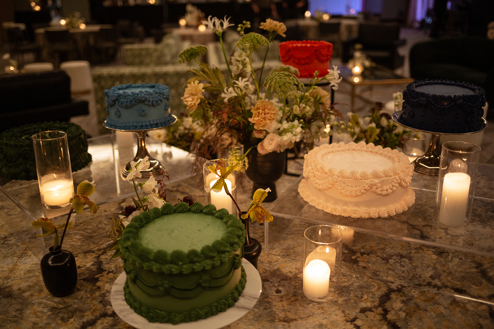
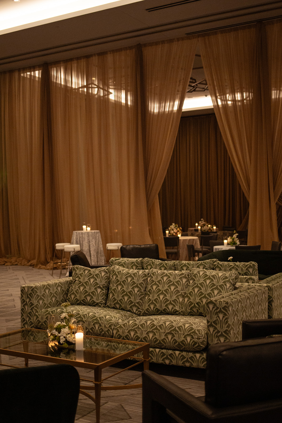
These design choices weren’t just beautiful on their own—they set the stage for the patterns and color combinations guests would see throughout the celebration, from the colorful wedding cakes to the lounge furniture at the reception.
Elevating the Guest Experience with Custom Details
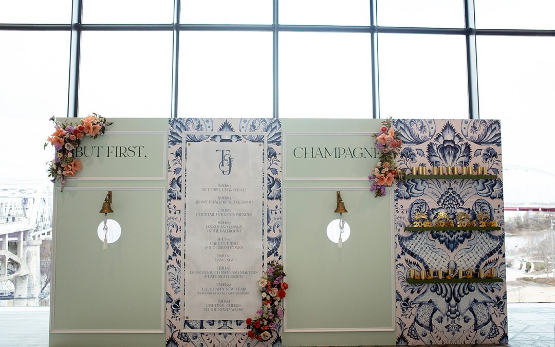
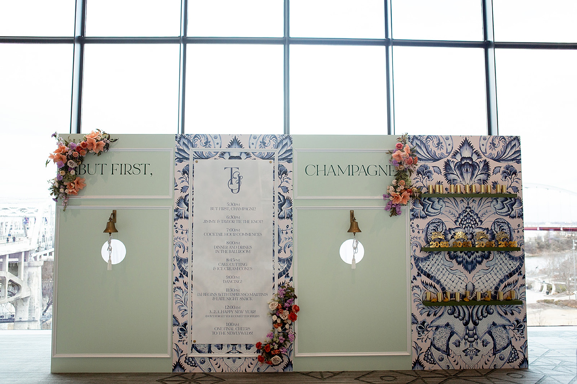
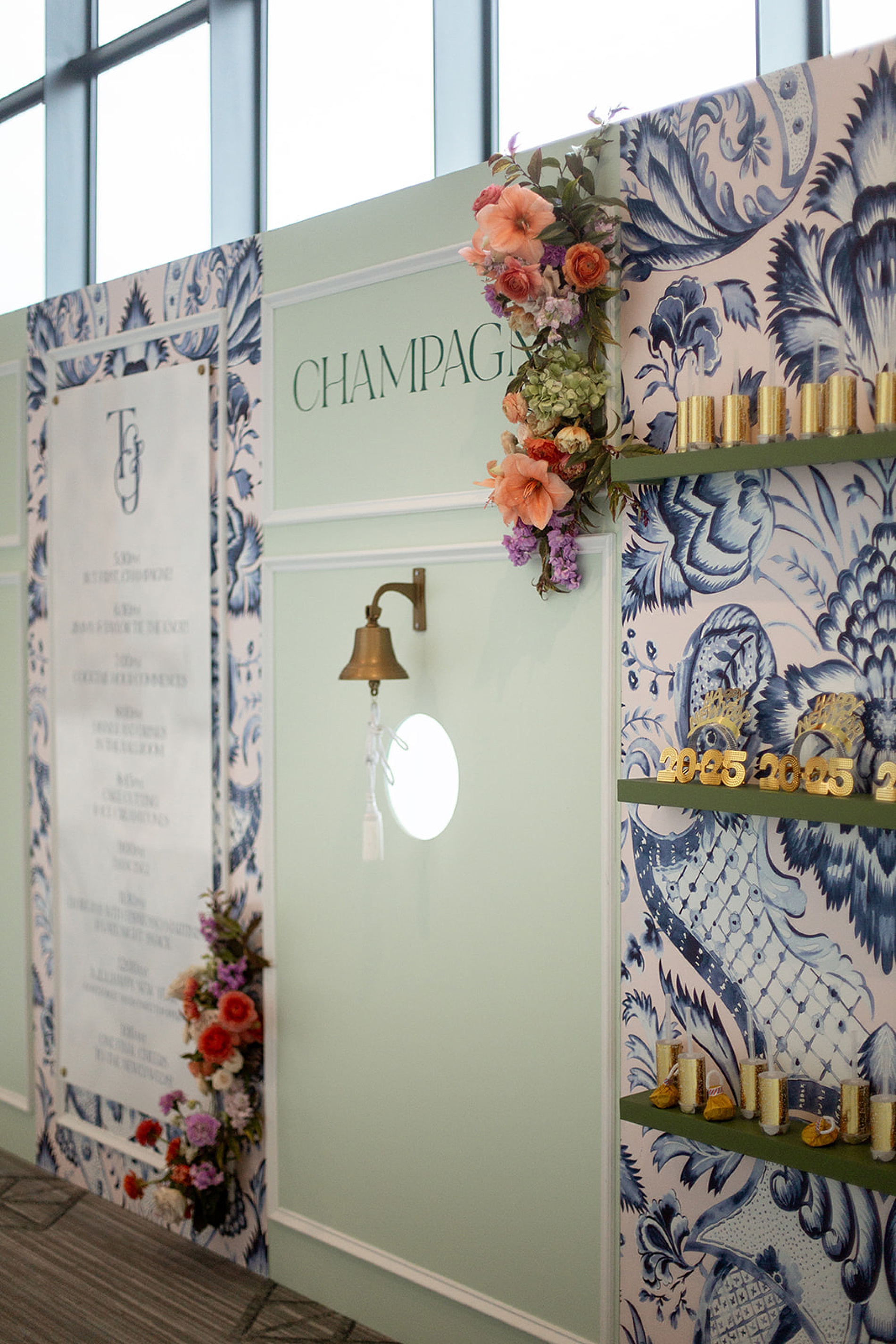
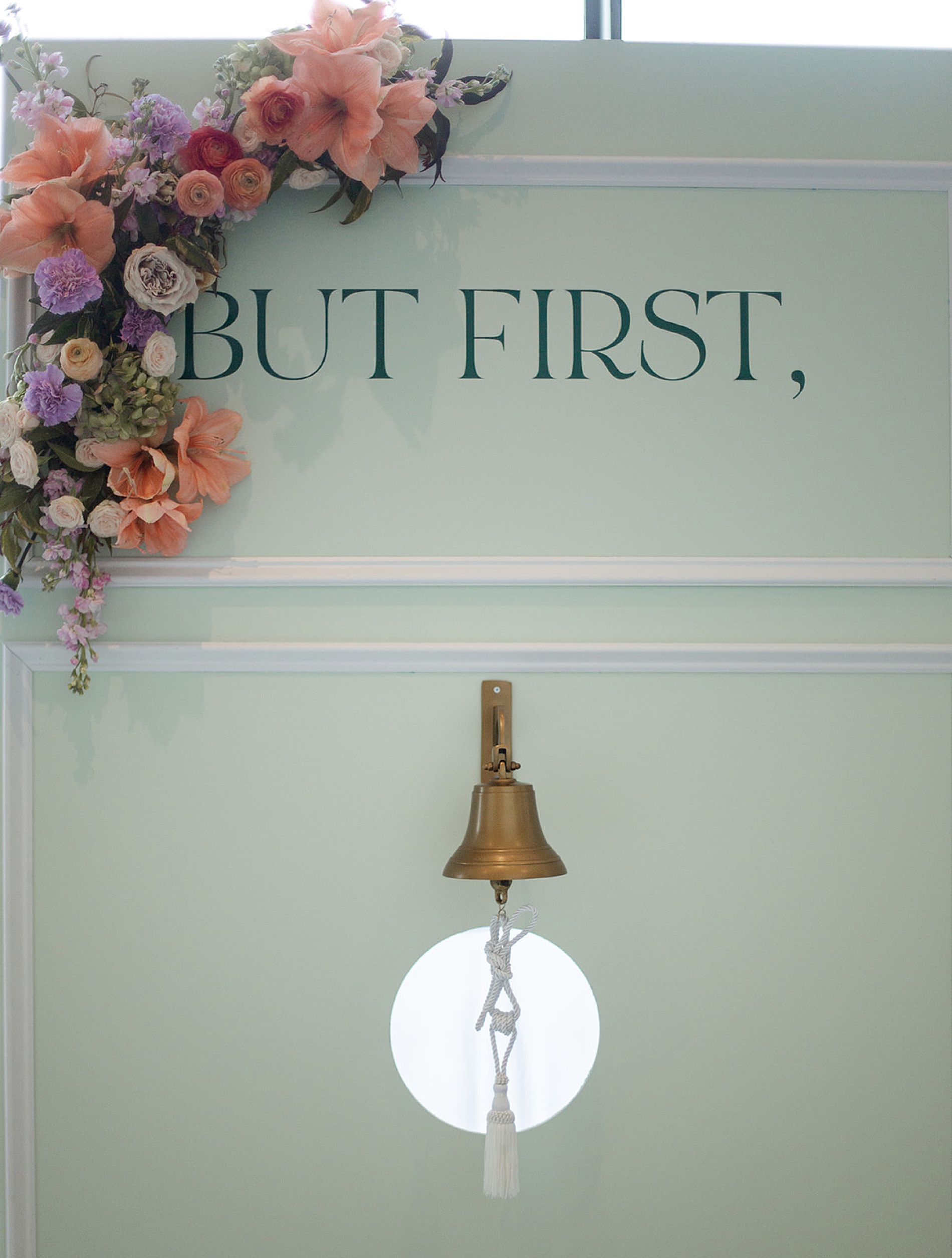
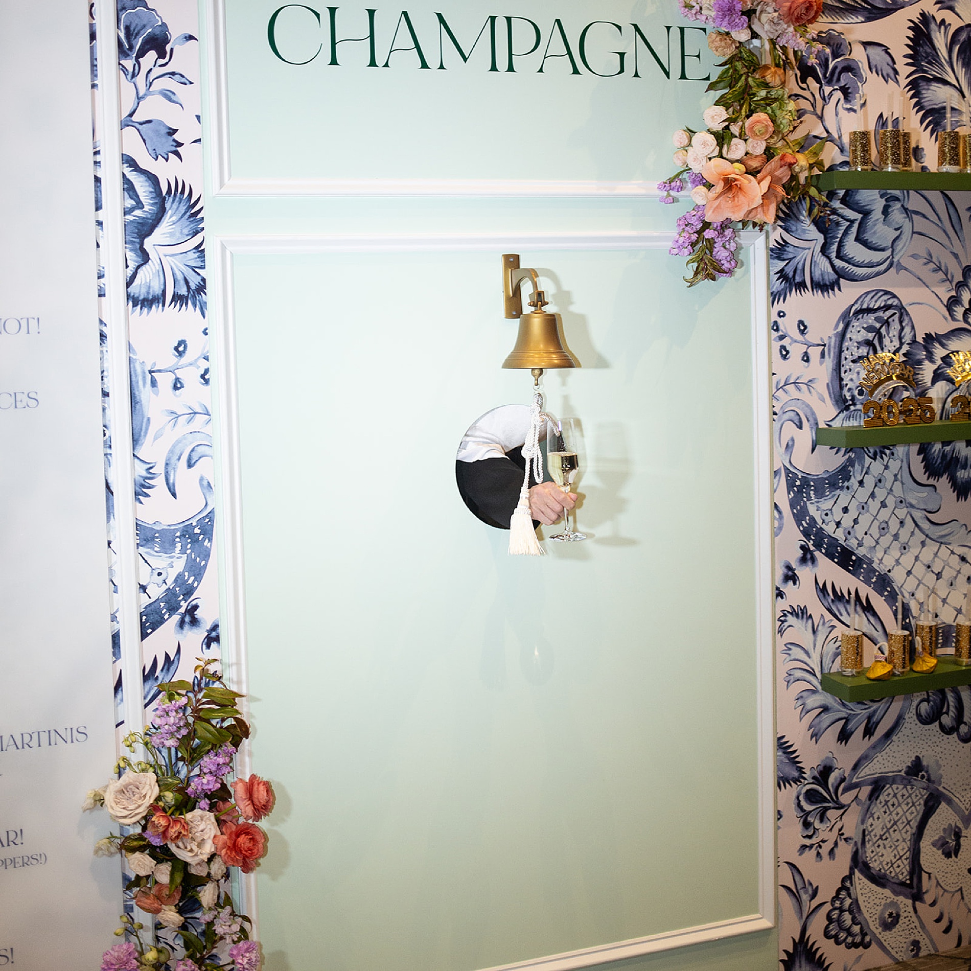
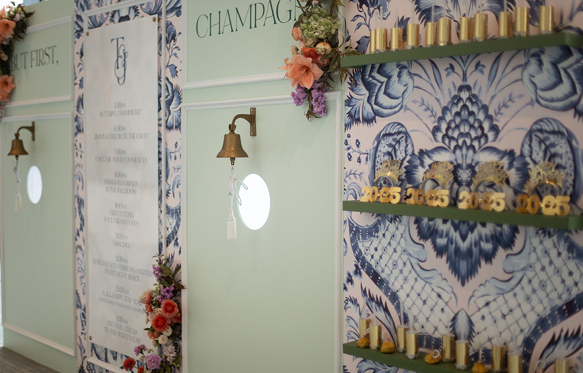
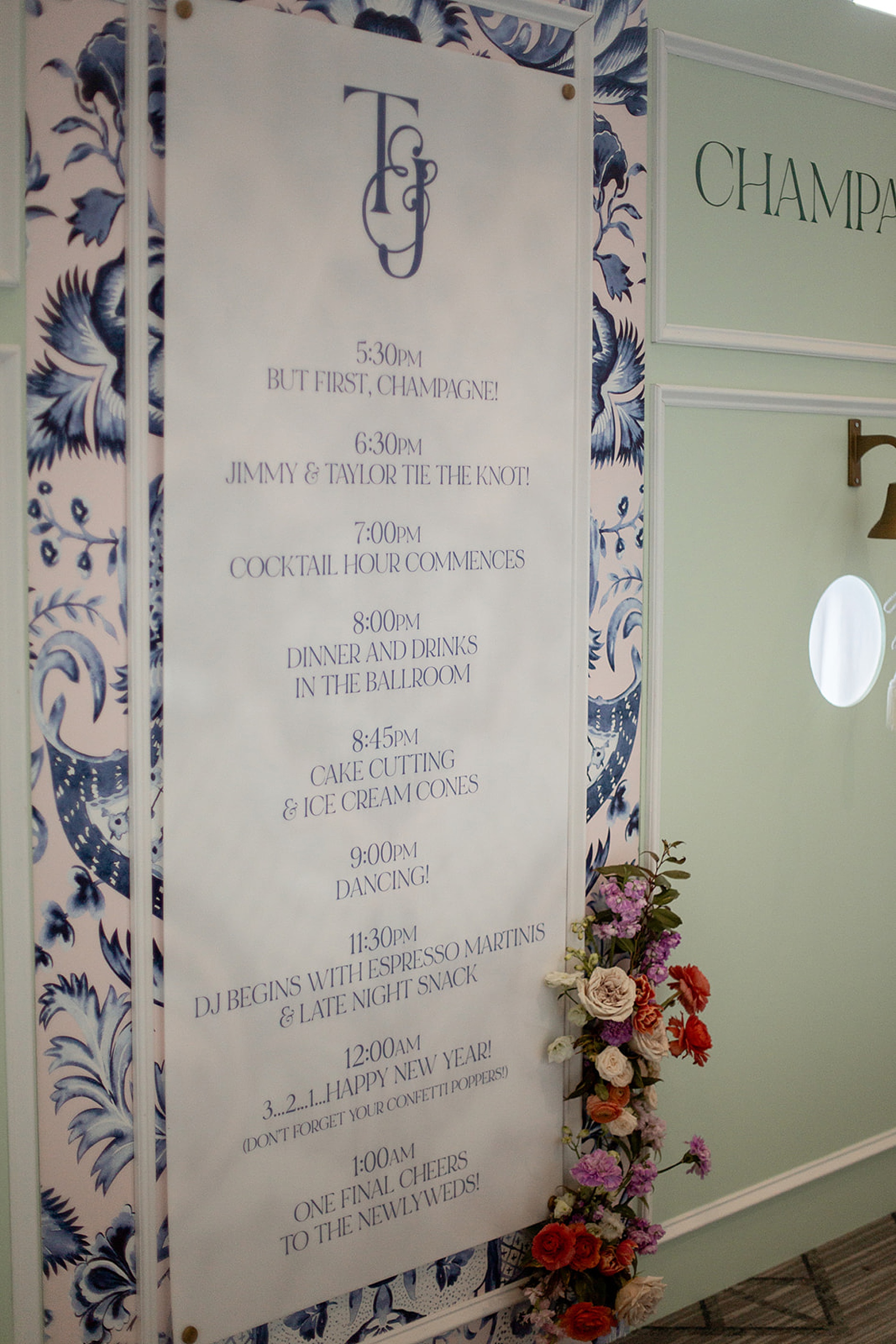
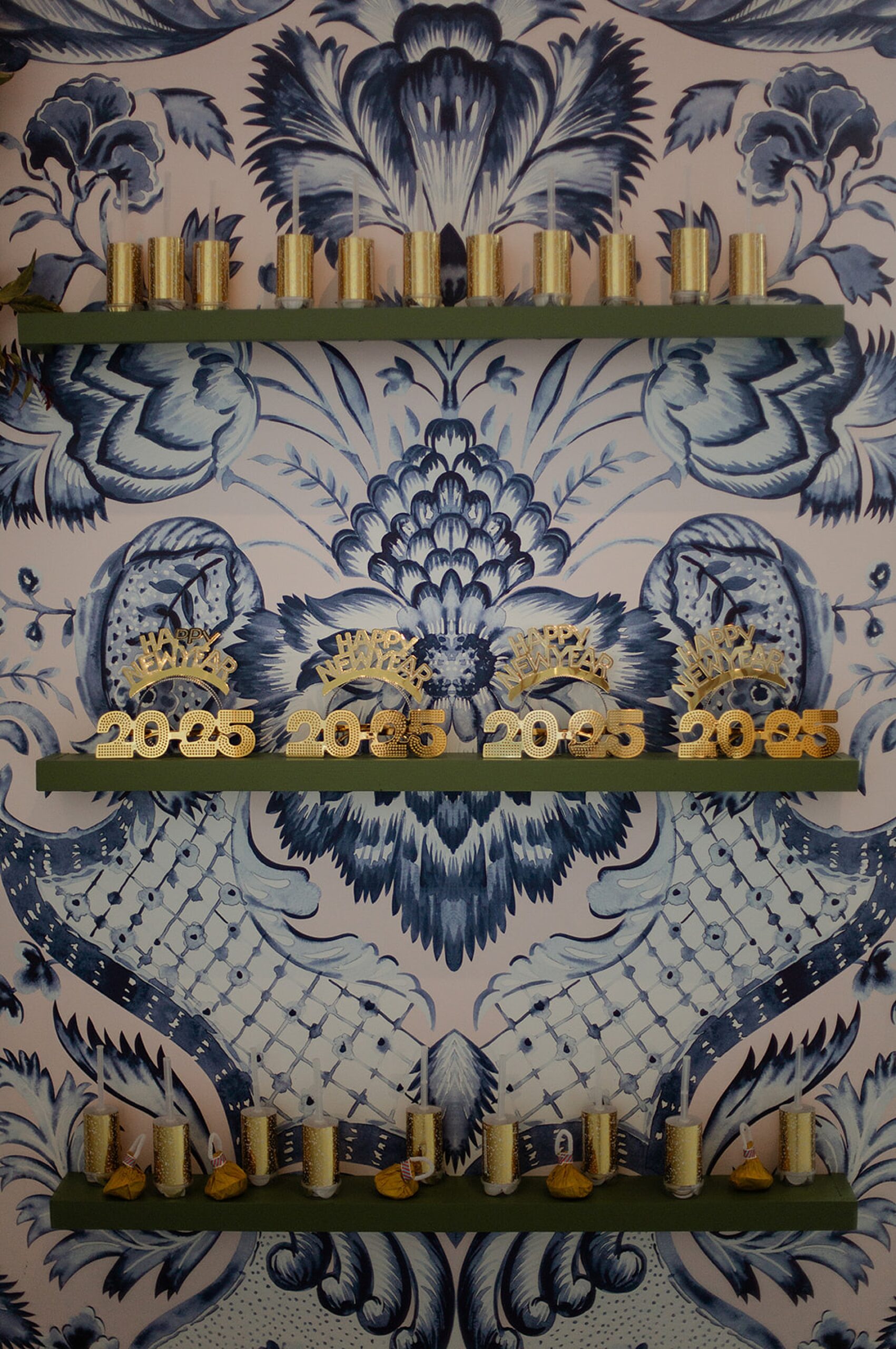
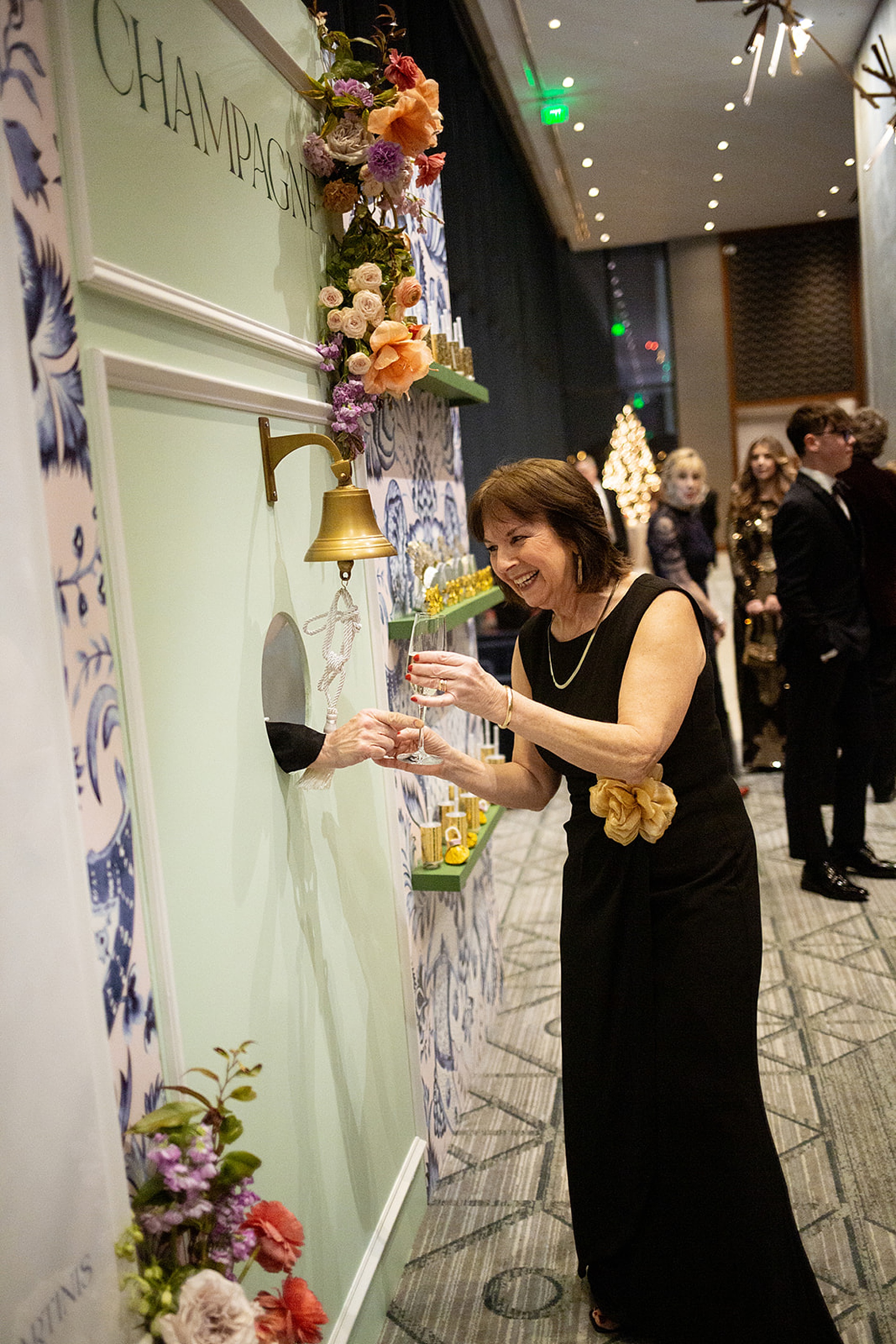
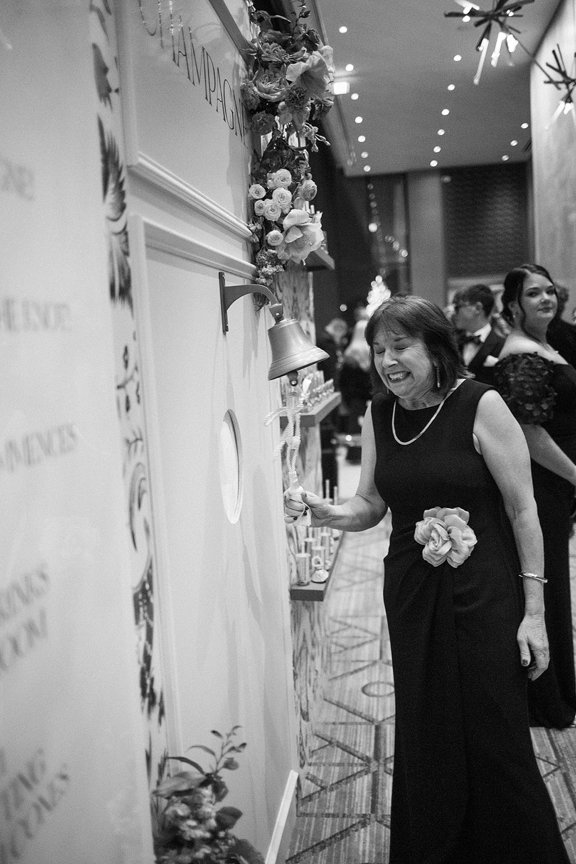
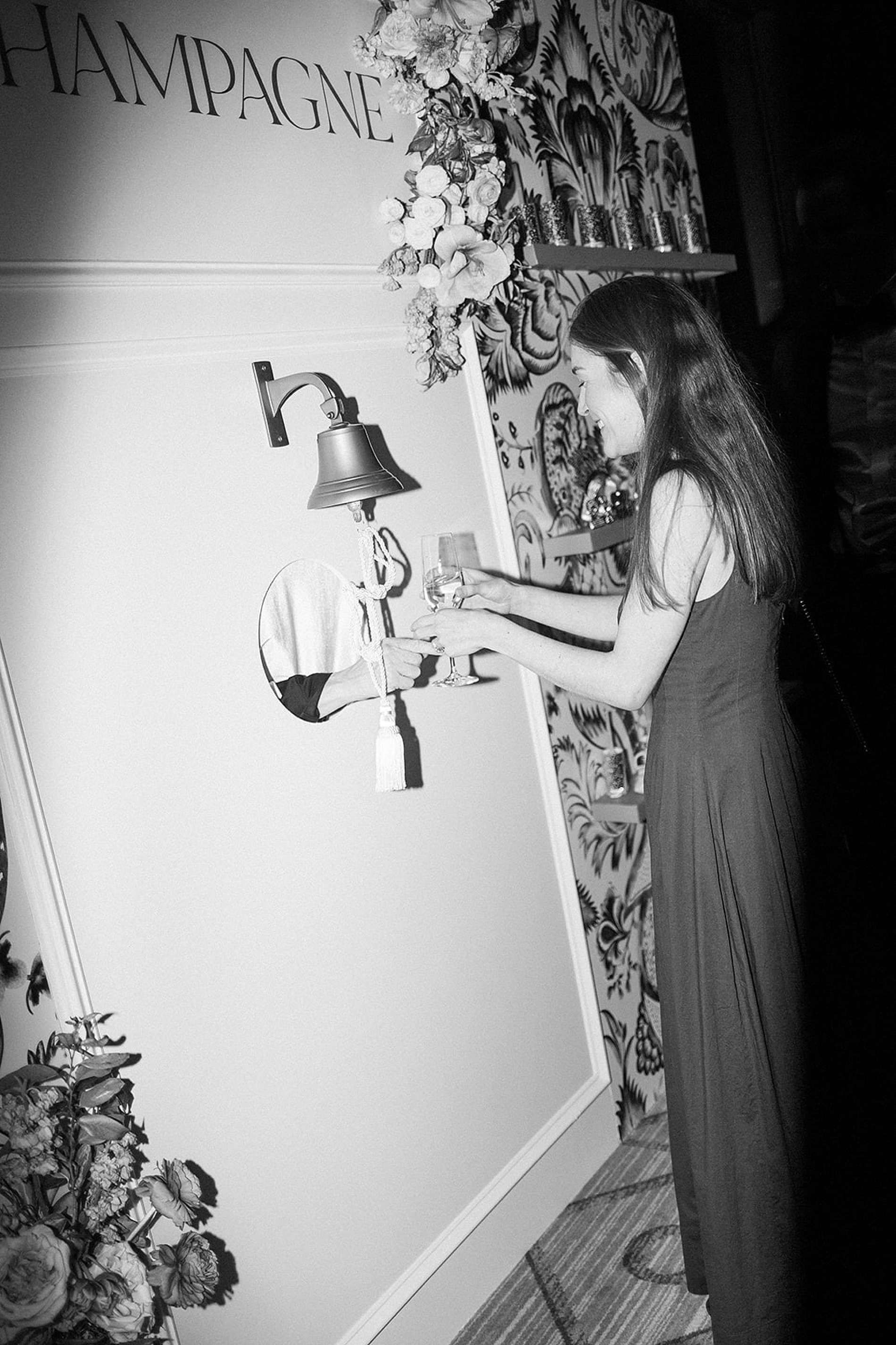
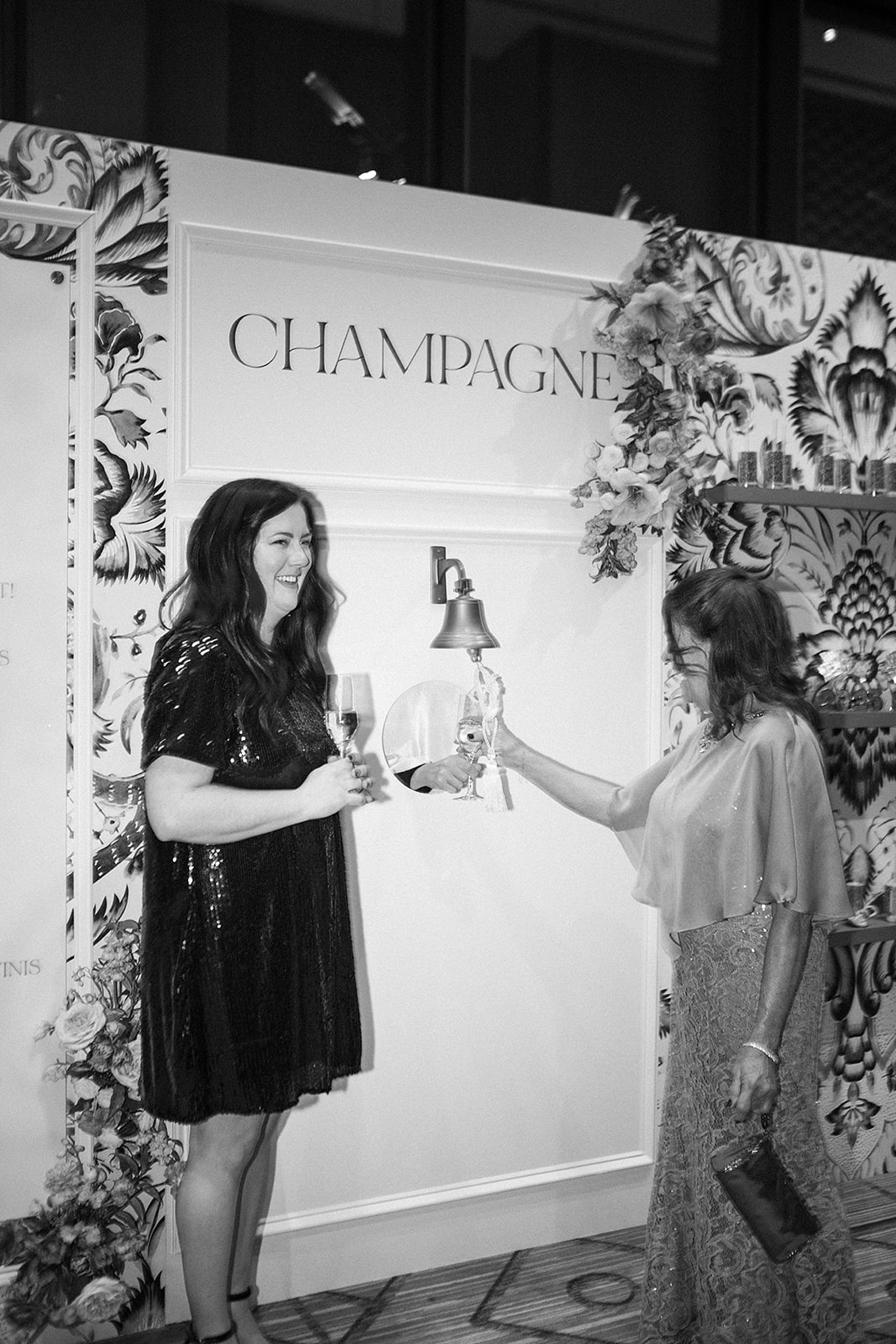
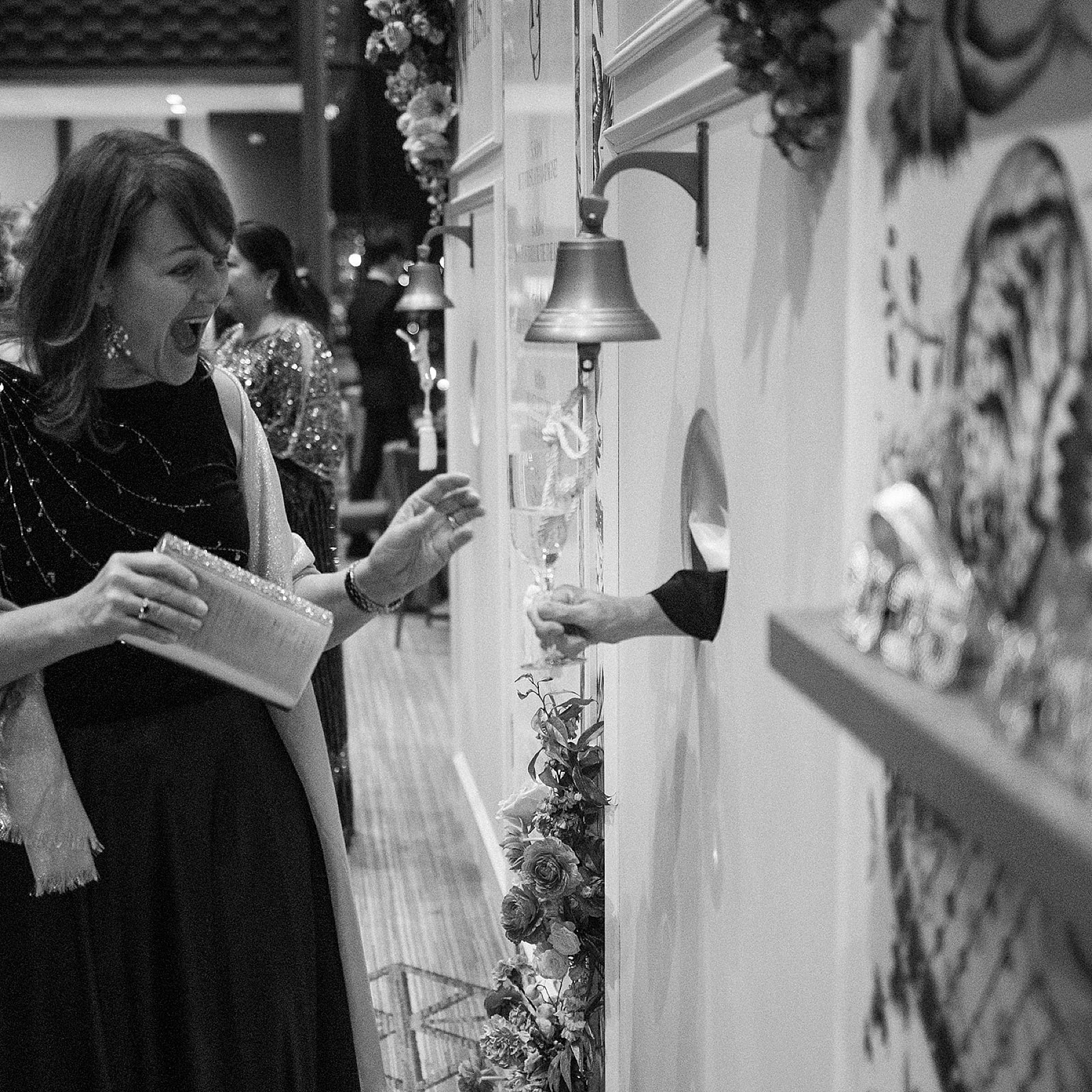
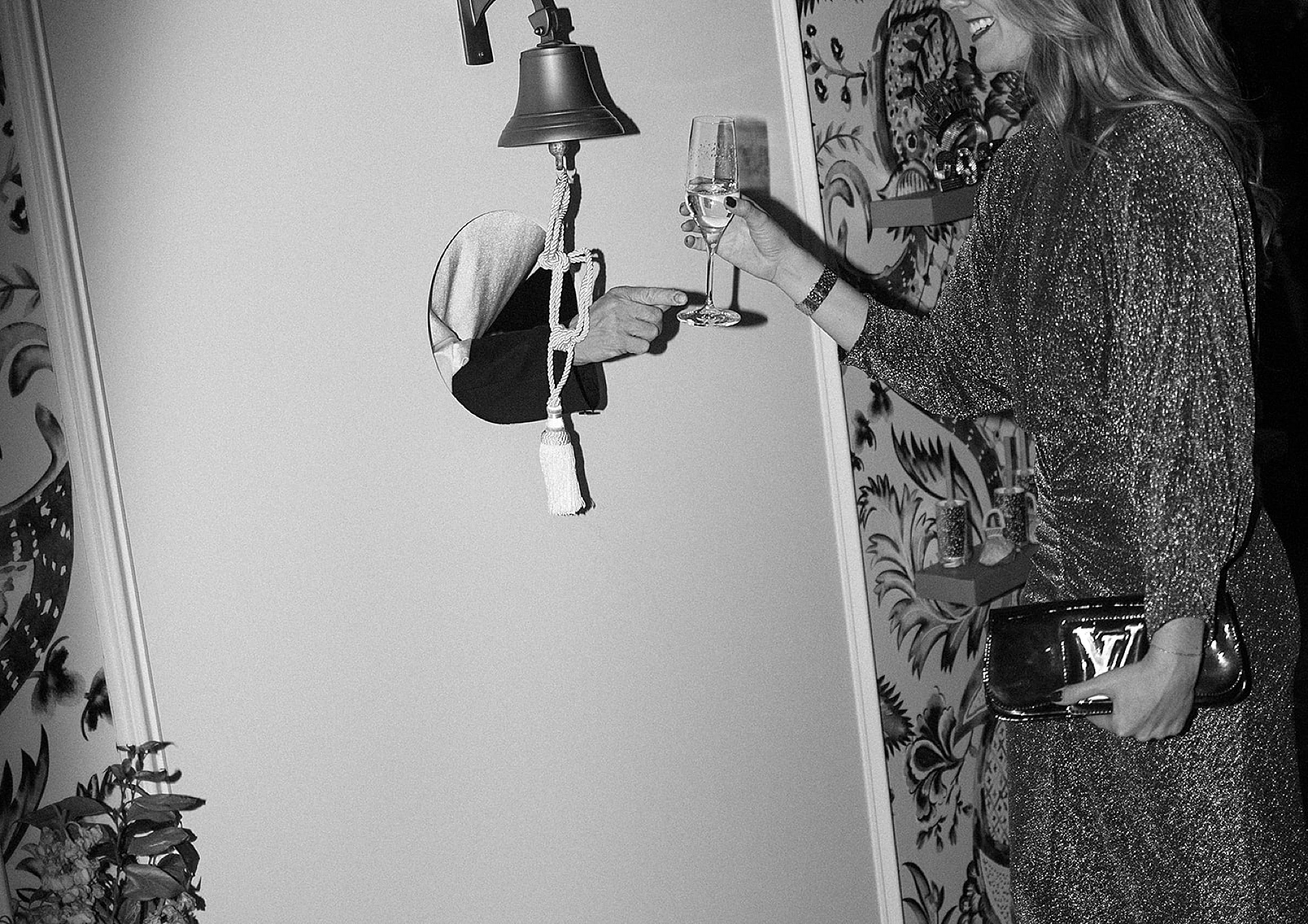
Every wedding we work on is an opportunity to craft experiences, and this NYE celebration was no exception. The bride wanted fun, unique moments that guests would remember, and we designed details that delivered just that. One of our favorite elements was the Champagne pass-through and wall display—an elegant and interactive way to kick off the festivities. Guests loved this stylish touch, and it fit seamlessly into the chic, upscale atmosphere of the night.
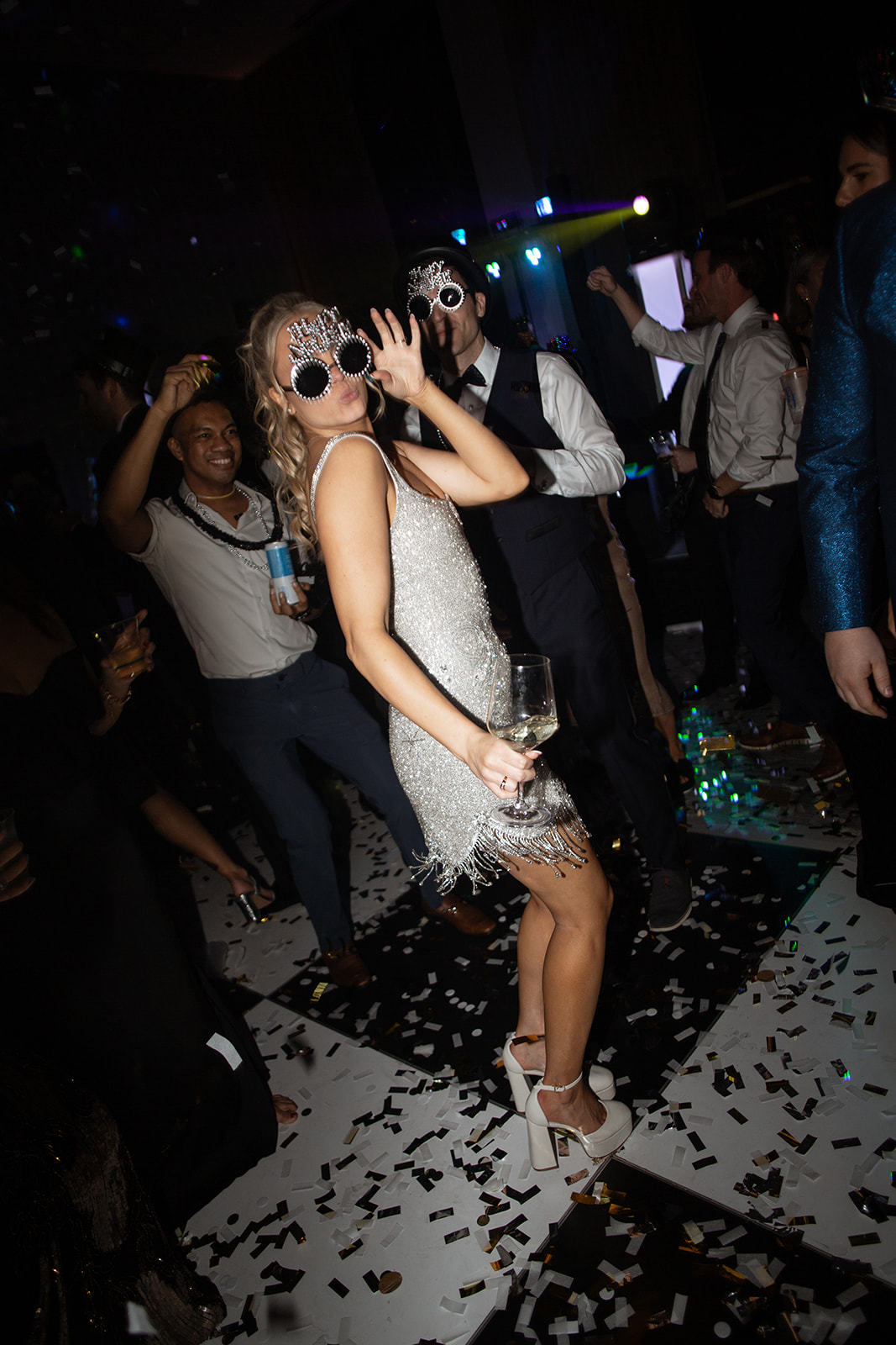
The Champagne wall we designed showcased the same pattern from the invitation sleeve, tying the event’s visual theme together beautifully. A timeline display on one side and a shelf stocked with NYE swag on the other added an extra dose of fun, making sure guests were ready to ring in the new year in style with confetti poppers and 2025 glasses!
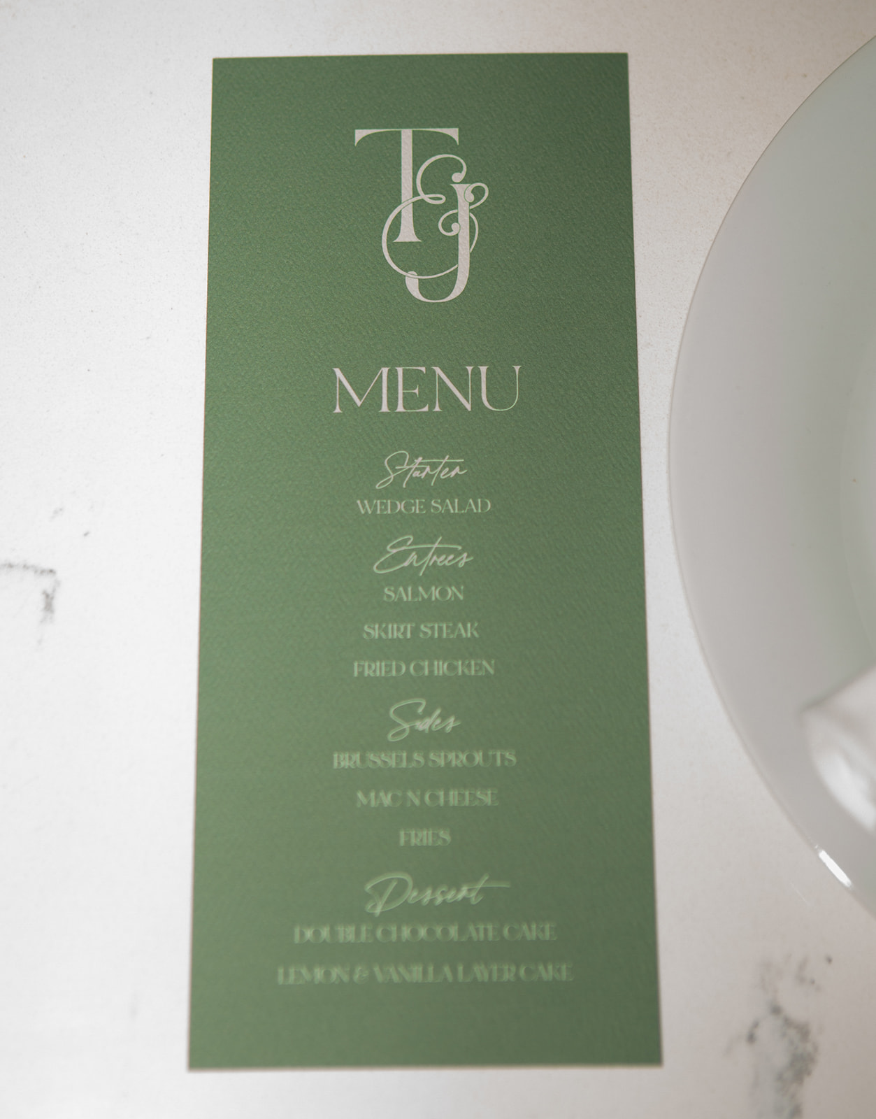
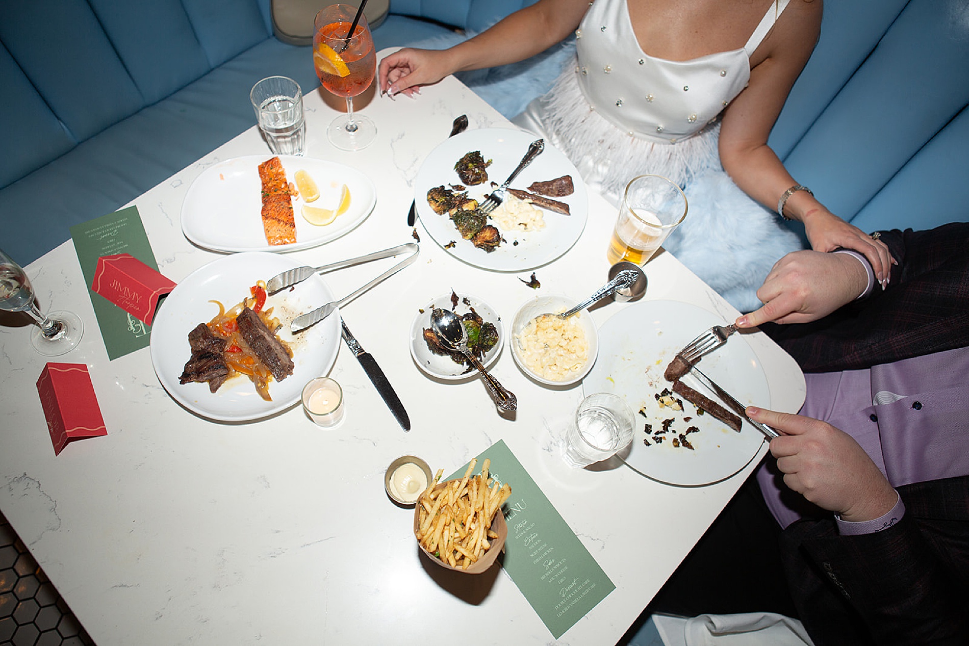
The details didn’t stop at the invitation suite and wall display. We carried the custom design elements through various pieces, including:
The Rehearsal Dinner welcome sign and menus for a stylish pre-wedding celebration at Liberty Common, just across the street.
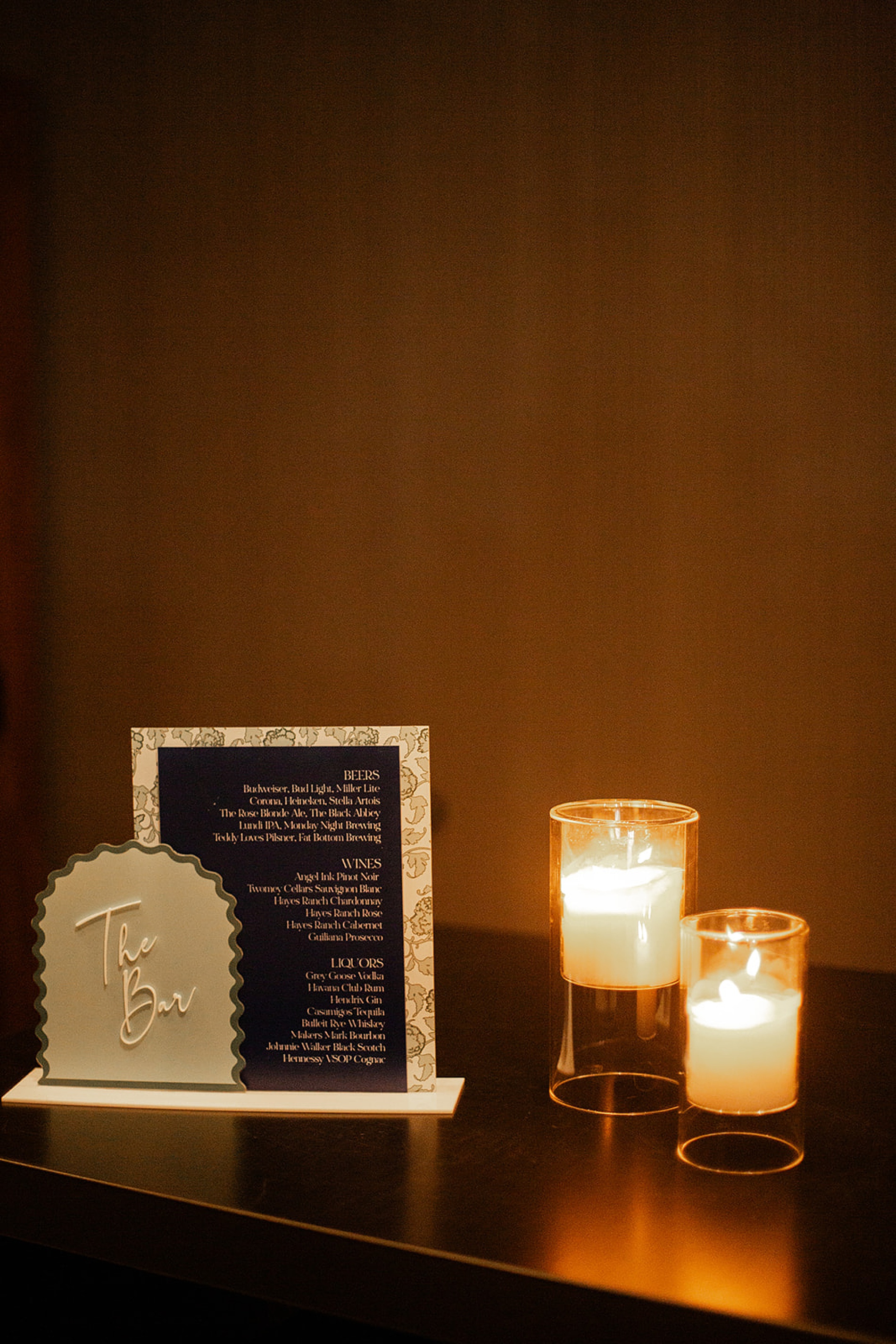
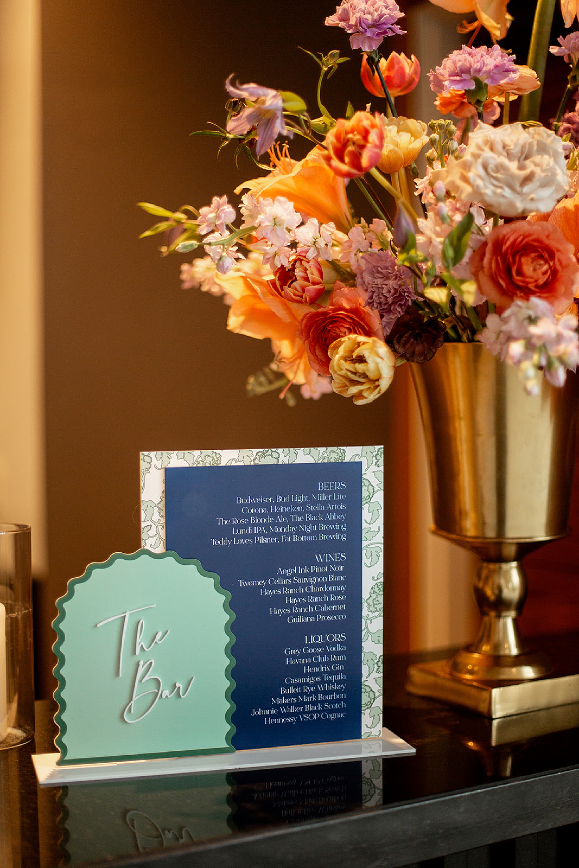
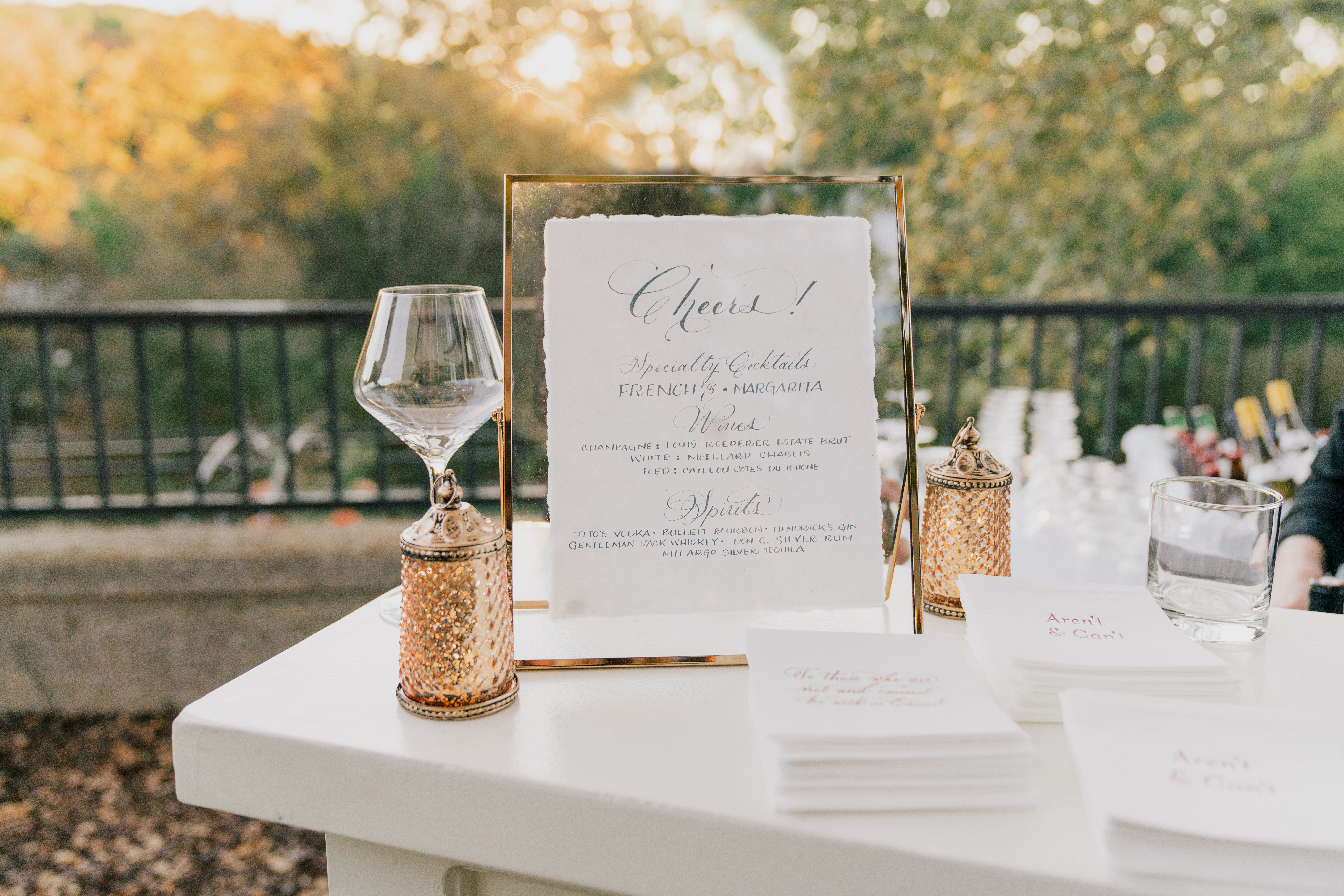
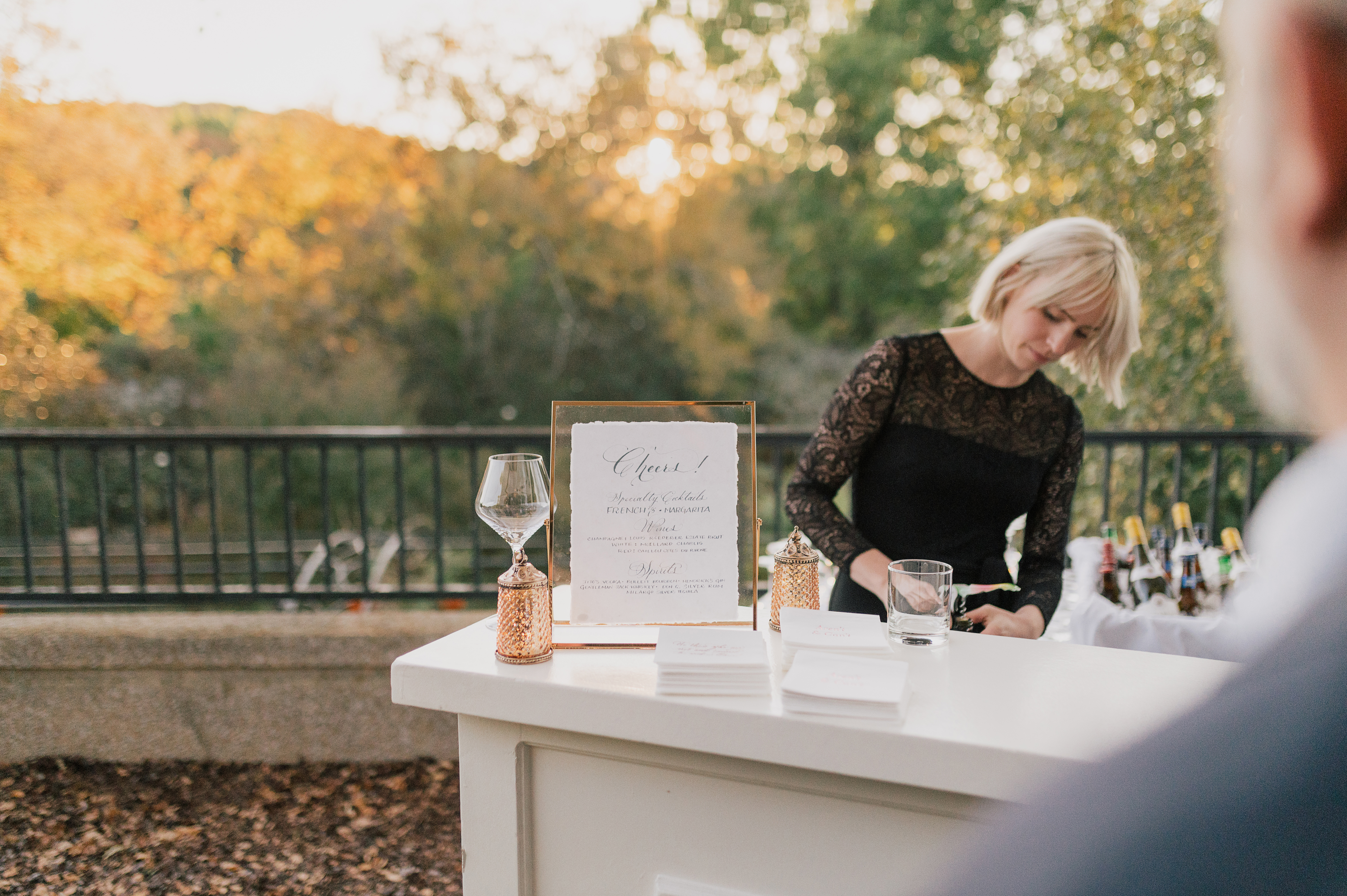
Bar Signage at the reception that brought personality and cohesion to the cocktail hour and reception space.
Wedding Programs that guided guests through the evening while complementing the wedding’s aesthetic.
A Night to Remember
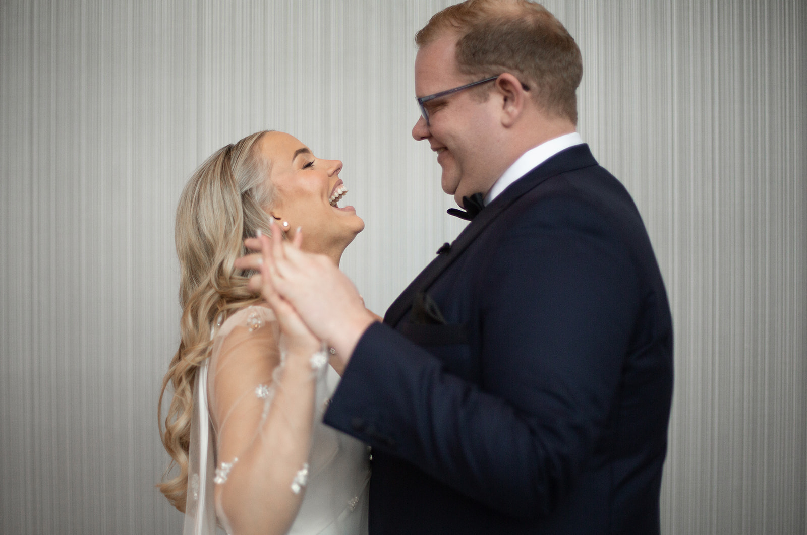
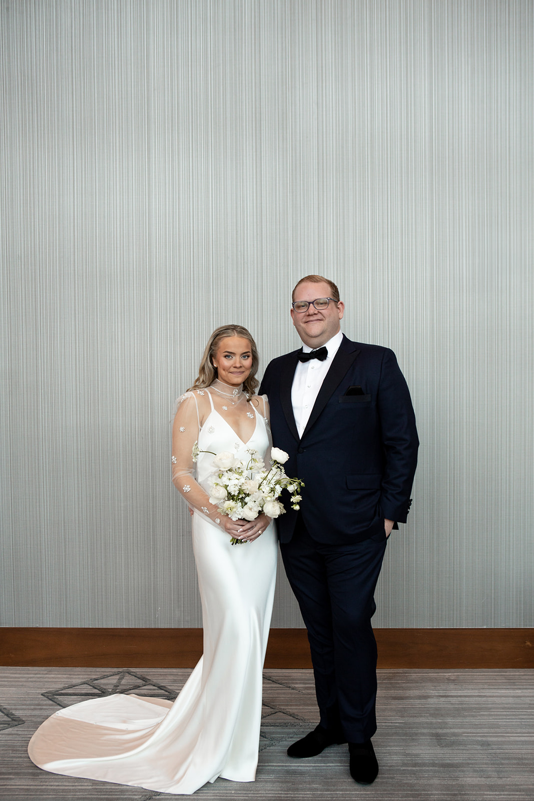
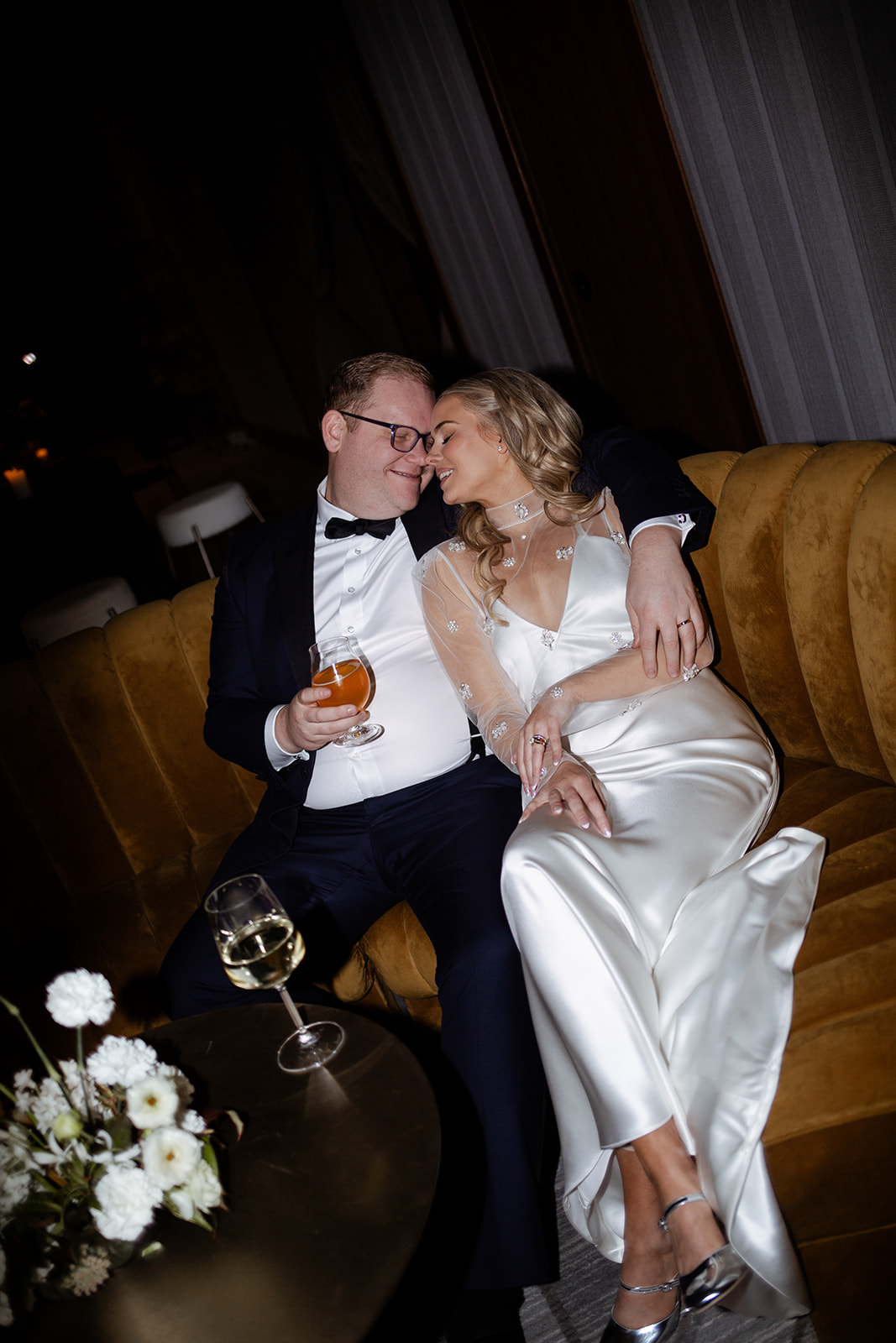
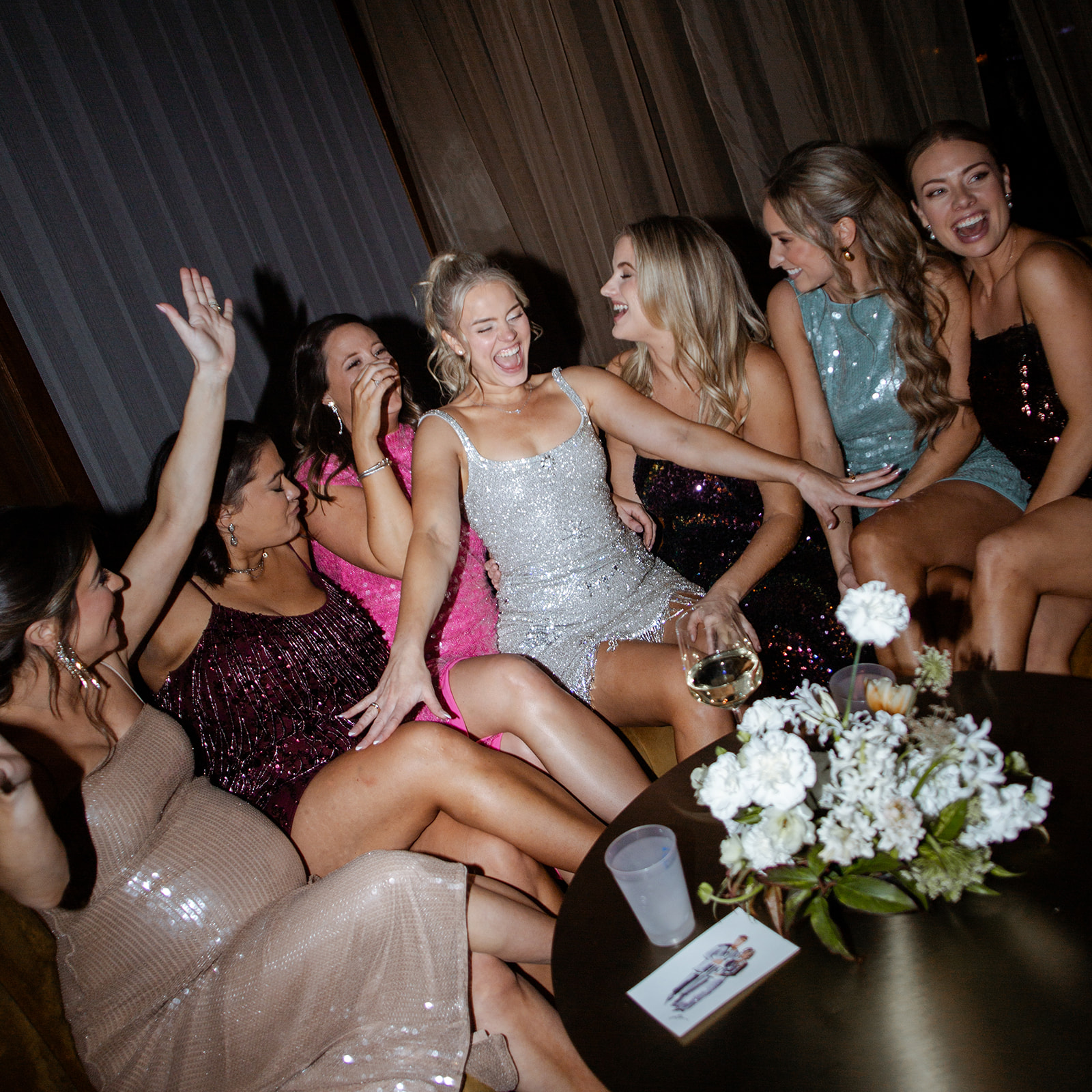
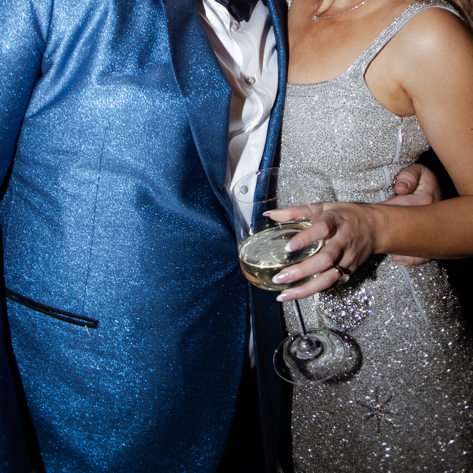
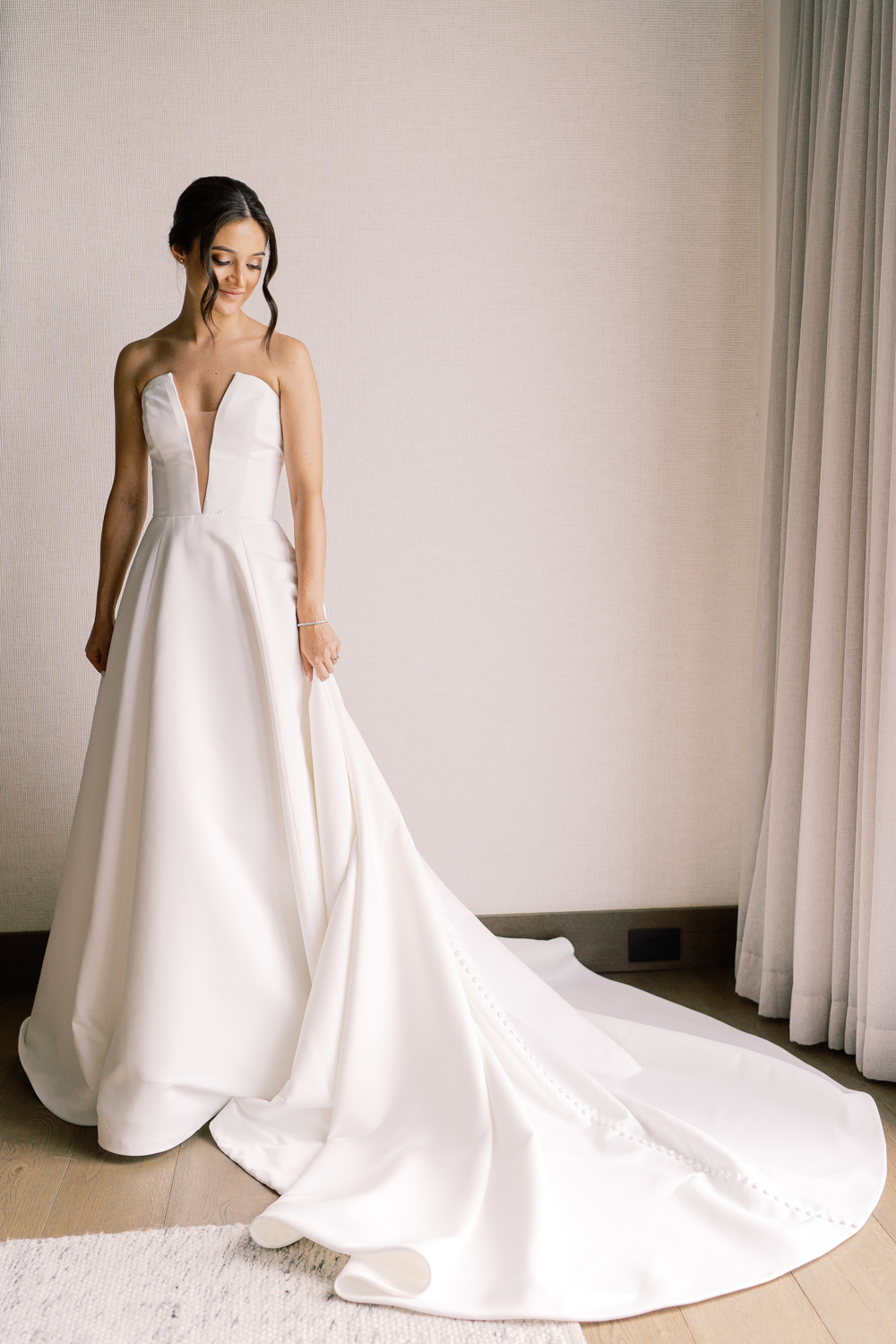
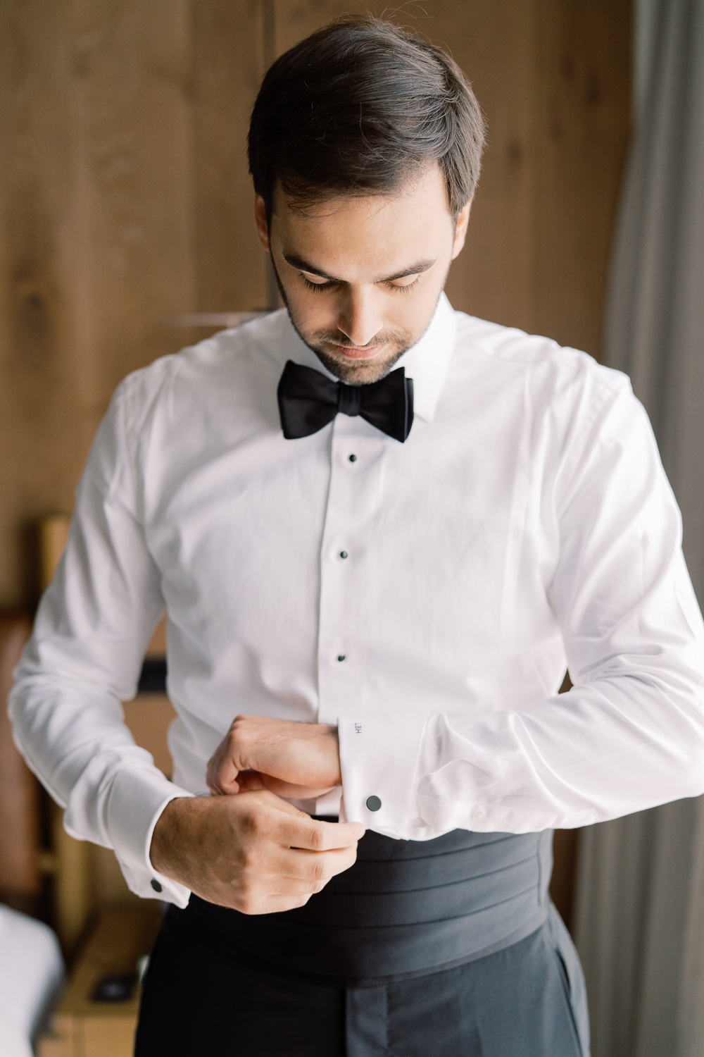
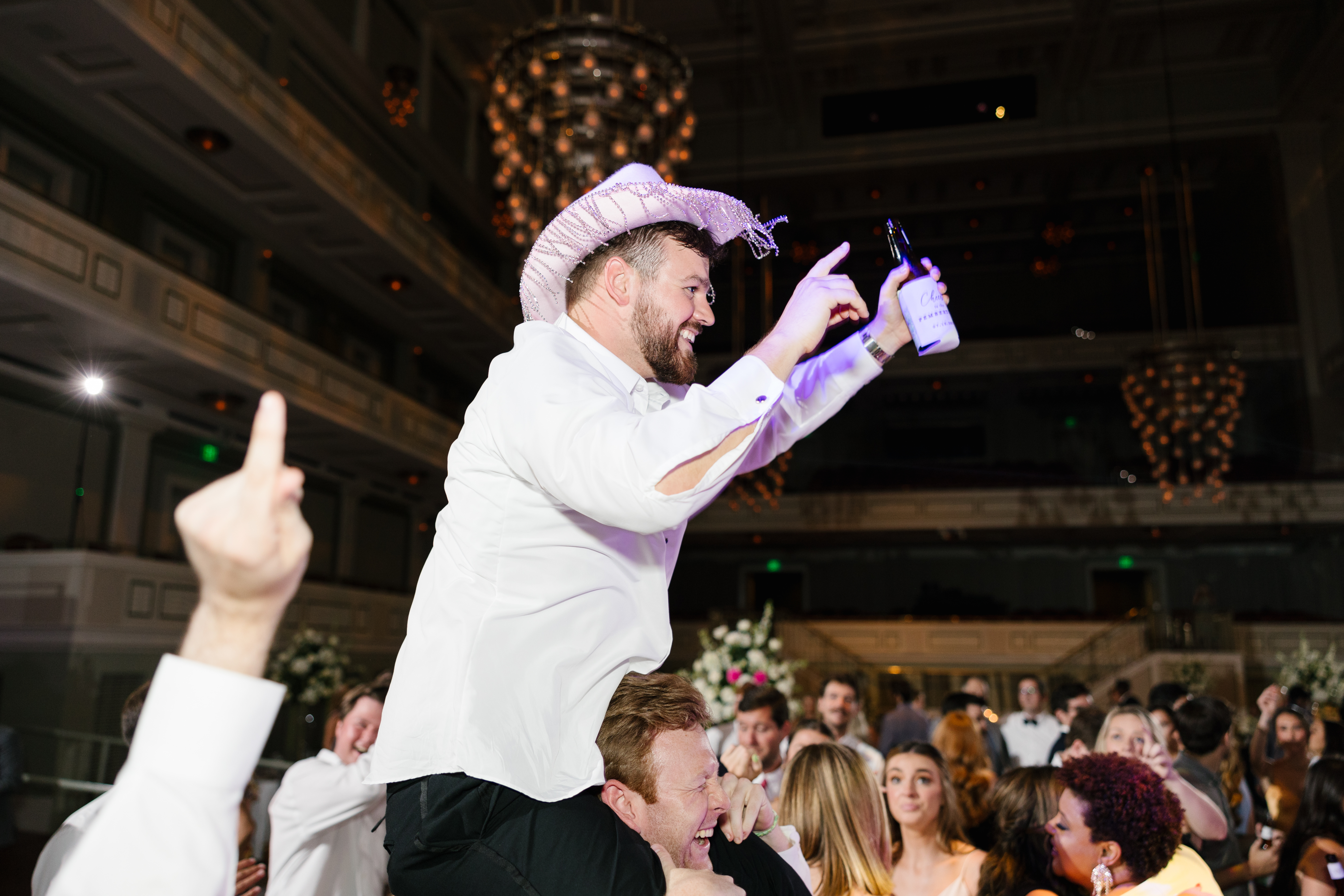
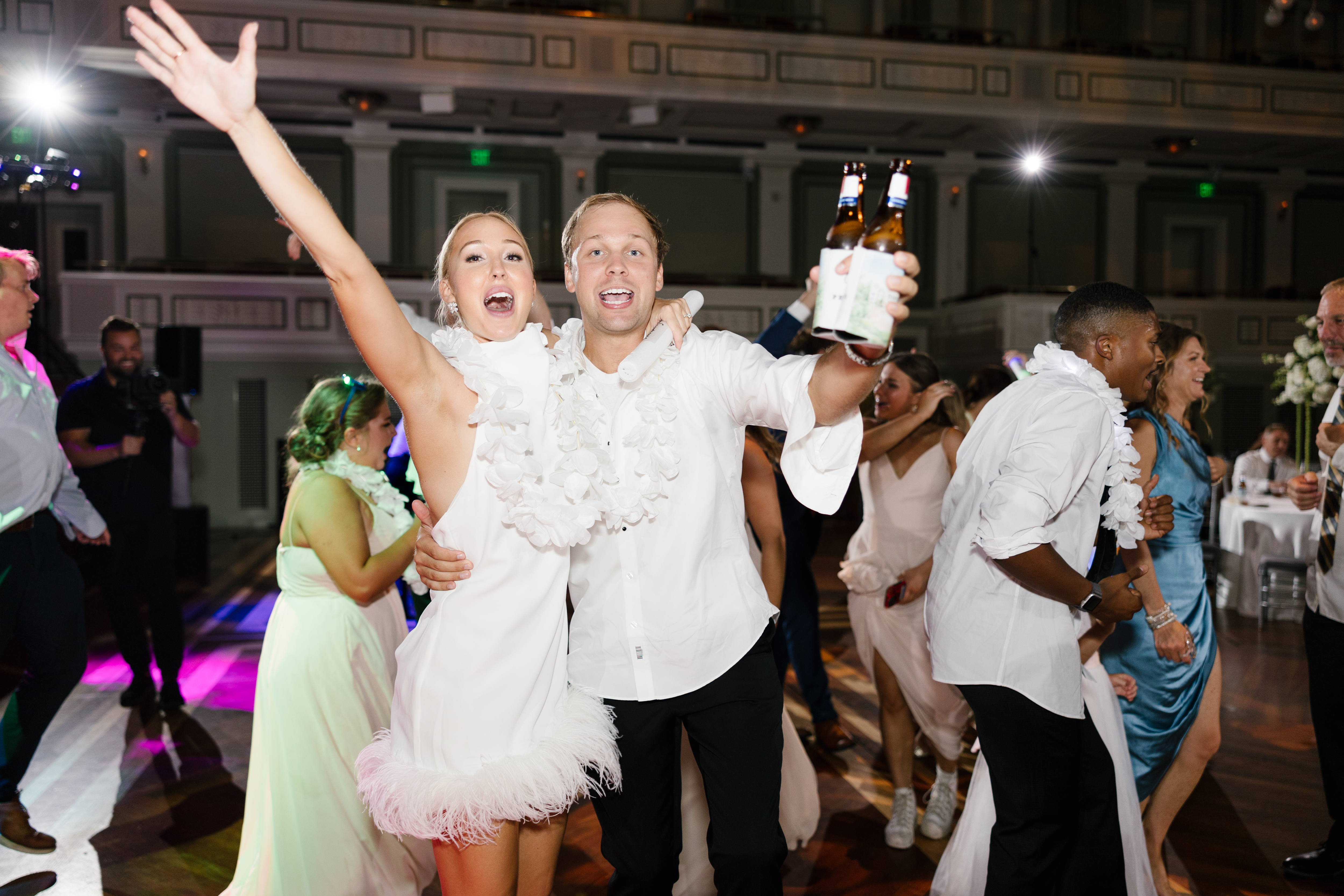
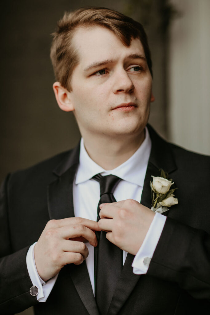
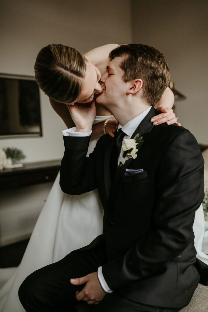
The bride and groom set the tone for a stylish night with not one but two outfits. For the ceremony, they both kept it classic with the bride in a sleek, white satin gown and the groom in a black tux. When it came time to party, the bride and her bridesmaids changed into fun, sparkly dresses that were perfect for a New Year’s Eve bash, while the groom changed into a blue suit jacket that shimmered in the lights. Their wardrobe change mirrored the entire event’s transformation—from a beautiful wedding ceremony to an all-out NYE celebration complete with confetti!
From the bold, unexpected color palette to the immersive guest experiences, every detail of this NYE wedding came together to create an unforgettable night. Designing the details for this celebration was such an incredible experience, and we loved seeing everything come to life in such a stunning and joyful way.
If you’re looking to add custom, thoughtful touches to your wedding or event, we would love to help make your vision a reality. Reach out today to learn more about our full-service design offerings—we can’t wait to create something unforgettable for you!
If you enjoyed this post, you’ll love these other blogs!
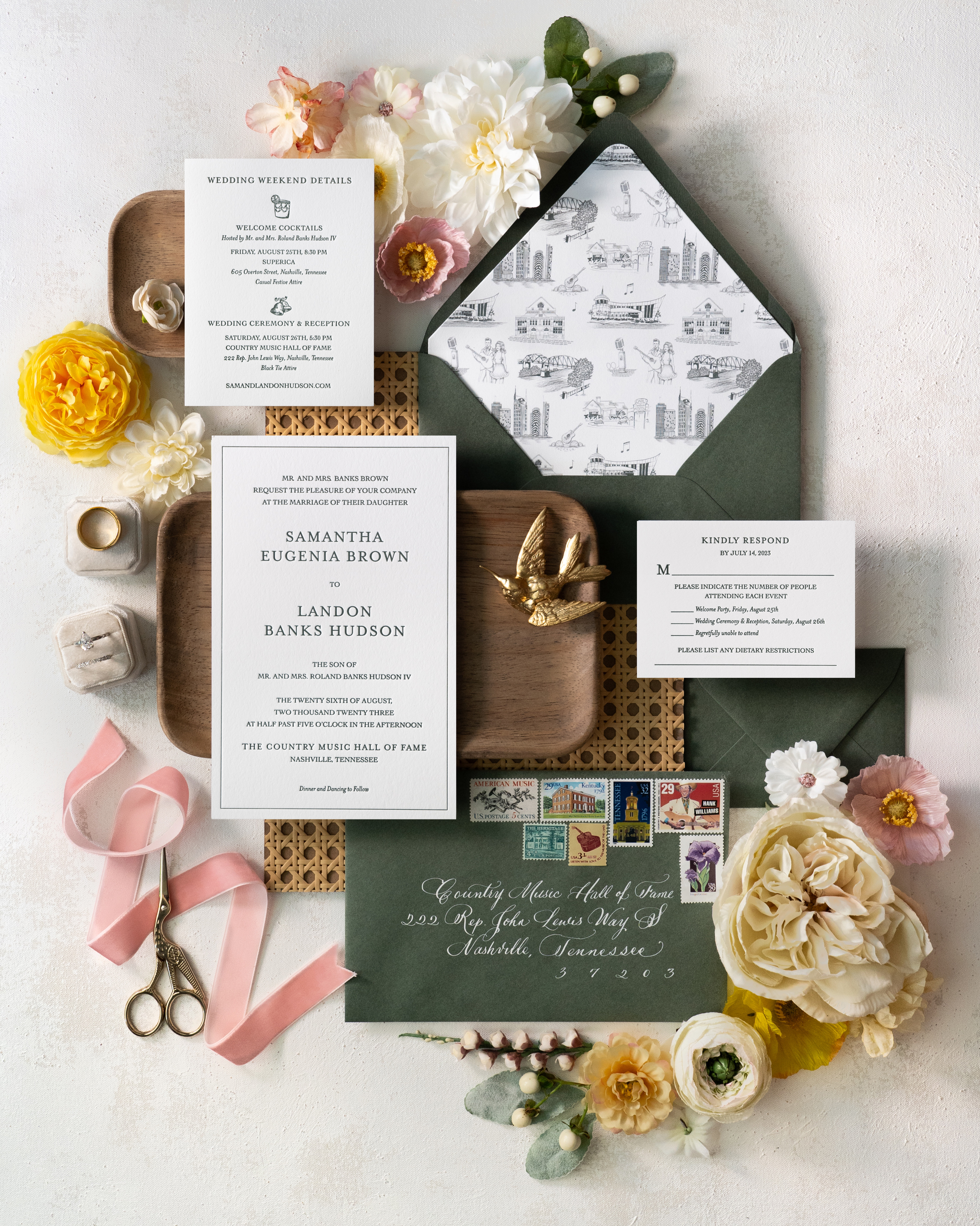
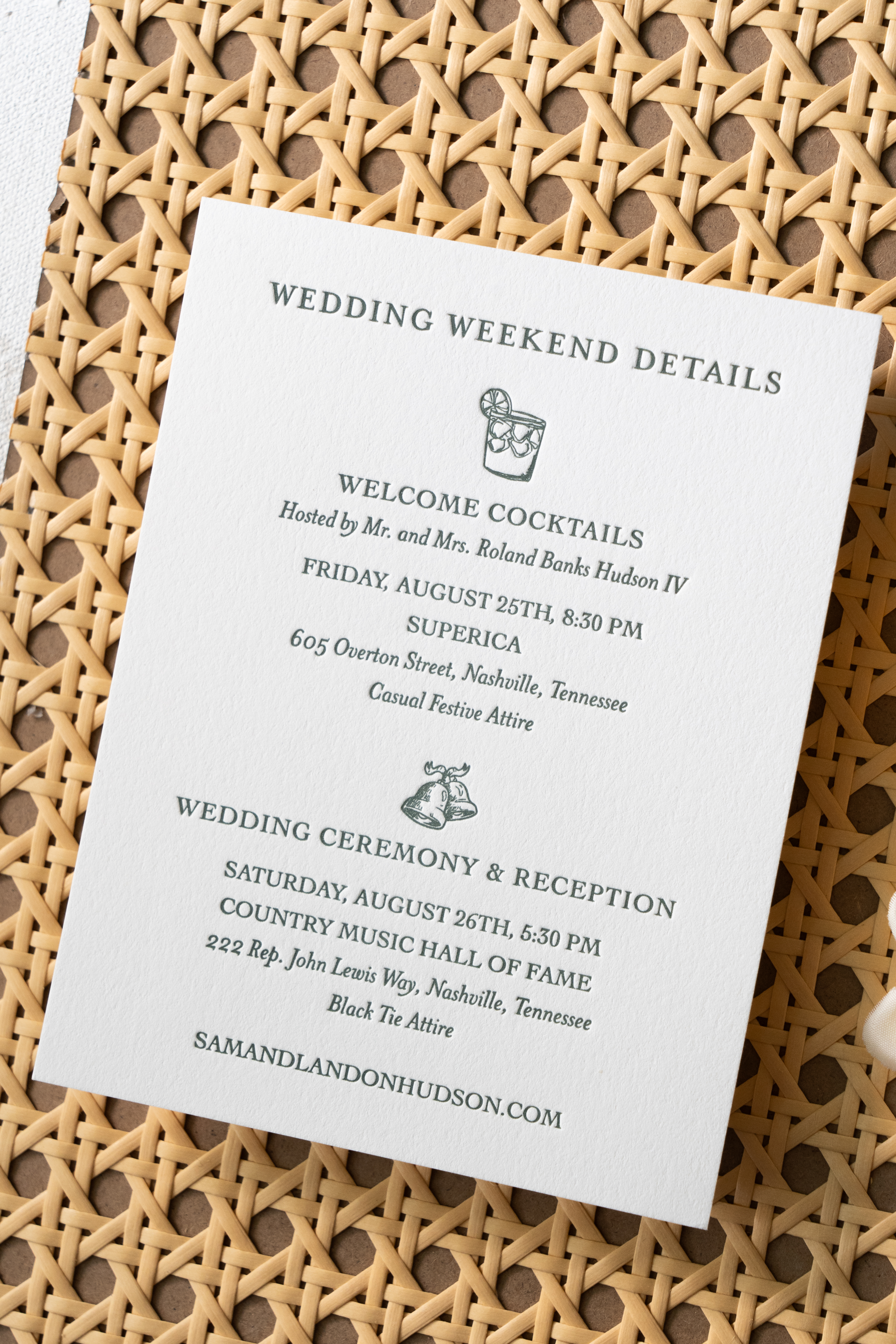
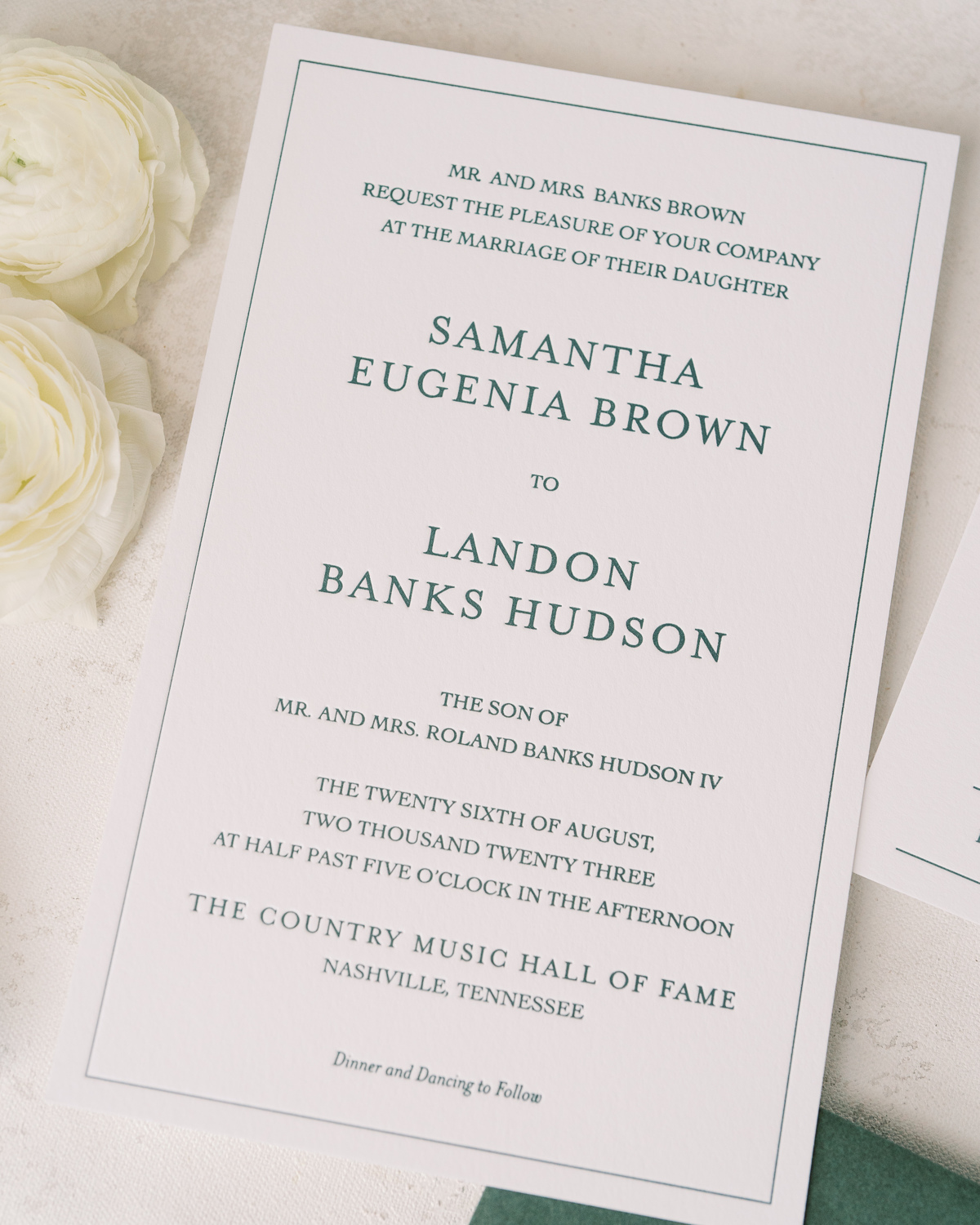
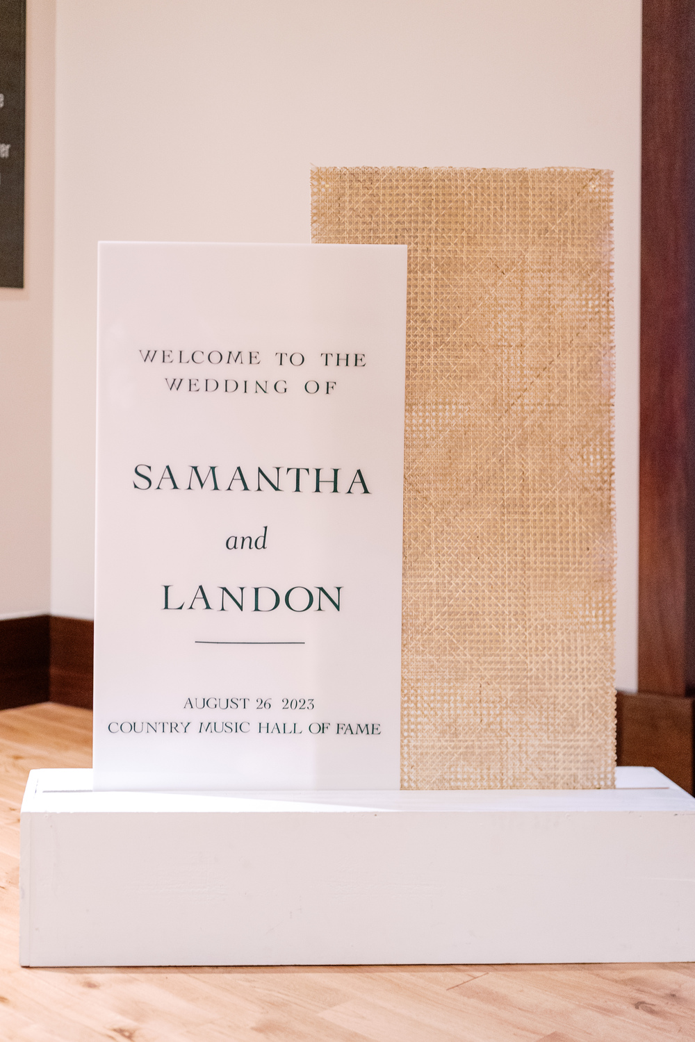
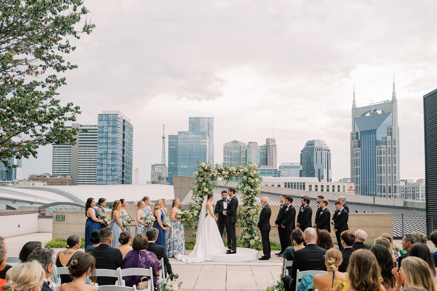
Sometimes, a client’s dream wedding turns into our dream wedding! The moment our sweet couple, Sam and Landon, asked White Ink to take part in elevating their Country Music Hall of Fame wedding details, I realized that this wedding was going to be incredibly memorable for our team. And indeed, it was! We had the honor of helping to showcase Sam and Landon’s style with purpose and authenticity by creating their custom Nashville wedding details.
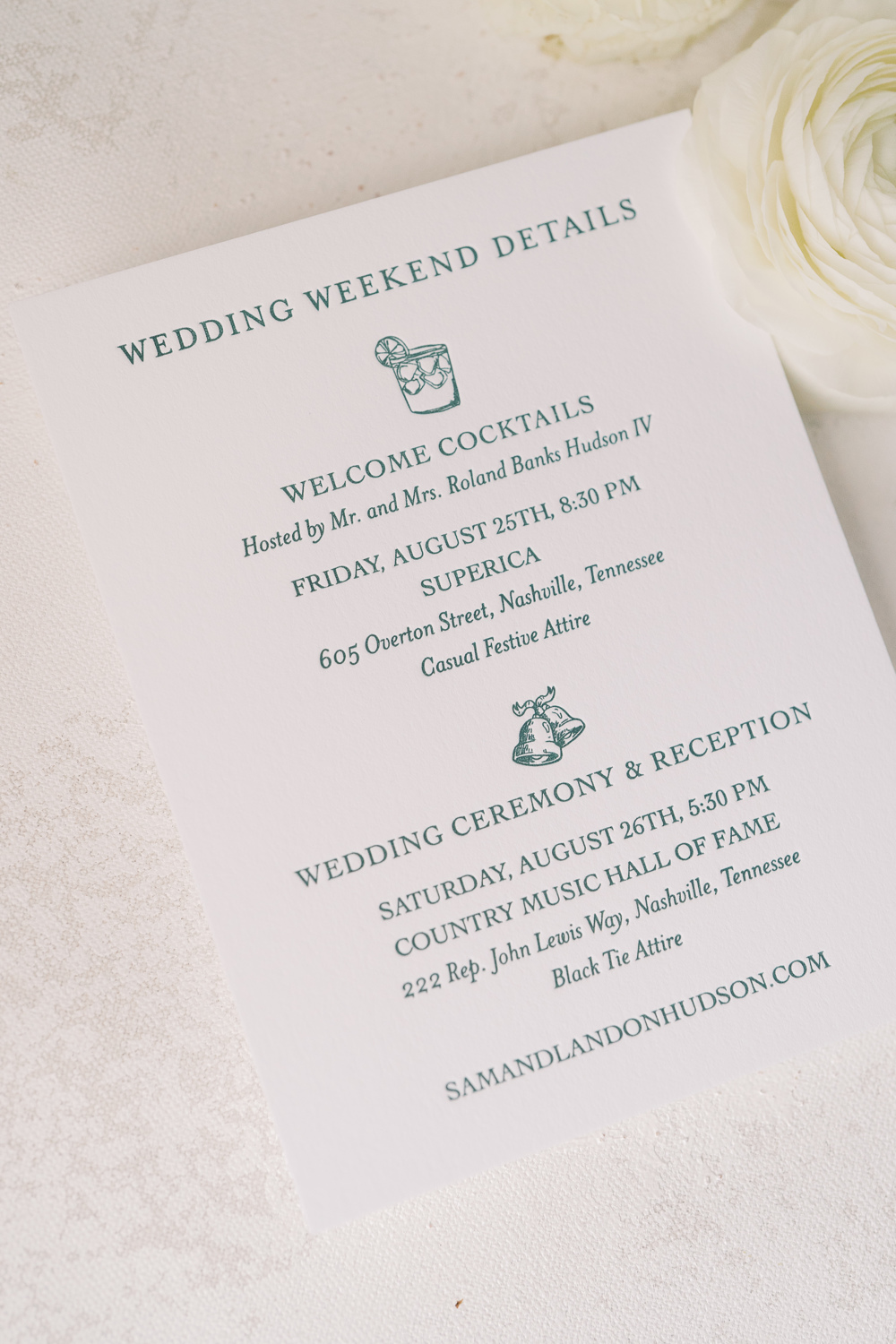
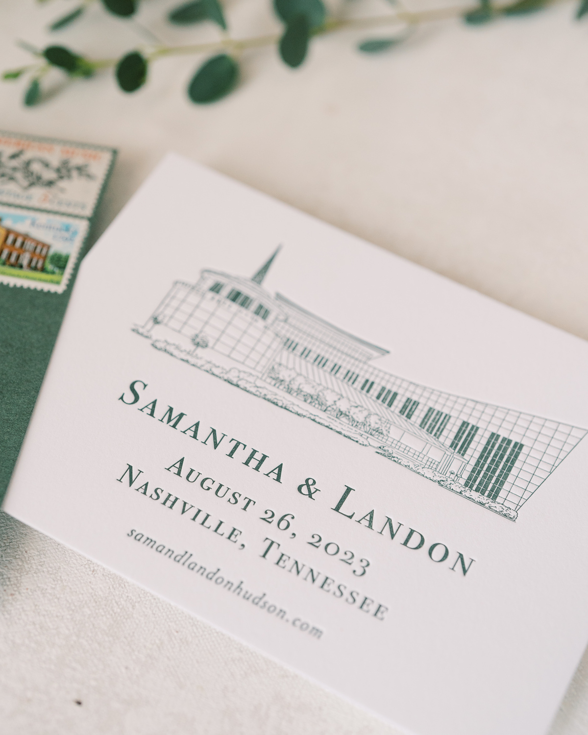
For starters, our couple’s wedding suite embraced a style that was bold and uniquely “Nashville.” I love the sharpness of the invite, complete with a heavy stock, wedding paper and letter pressed font.
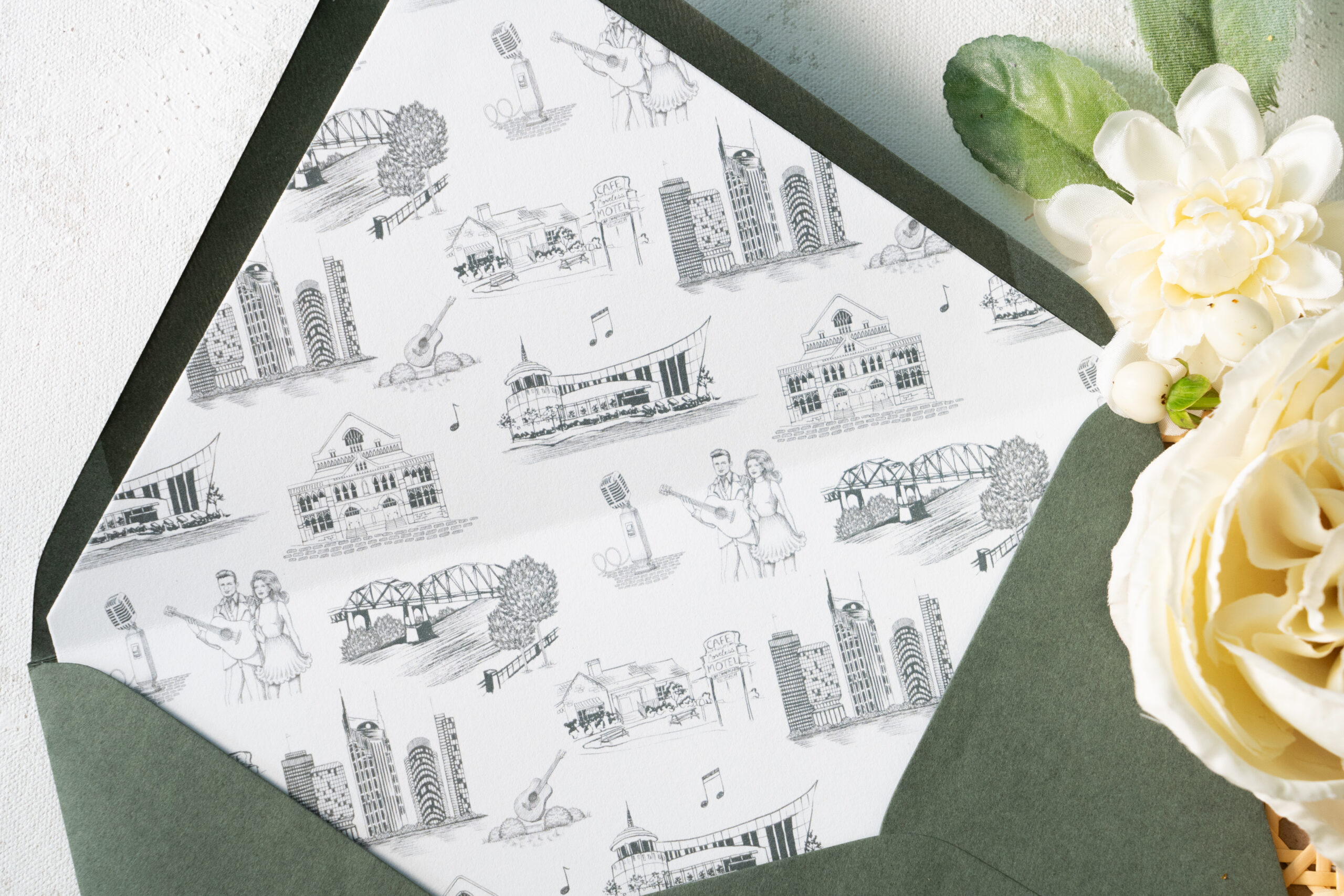
Take a moment to soak in the amazing work of the talented Katie Kime! She provided the custom artwork on the envelope liners which depict iconic Nashville favorites like Jonny and June, The Loveless Cafe, The Country Music Hall of Fame, and even the “Batman Building.” Details like this truly set the tone for your wedding guests and create a memorable experience. I just love this details!
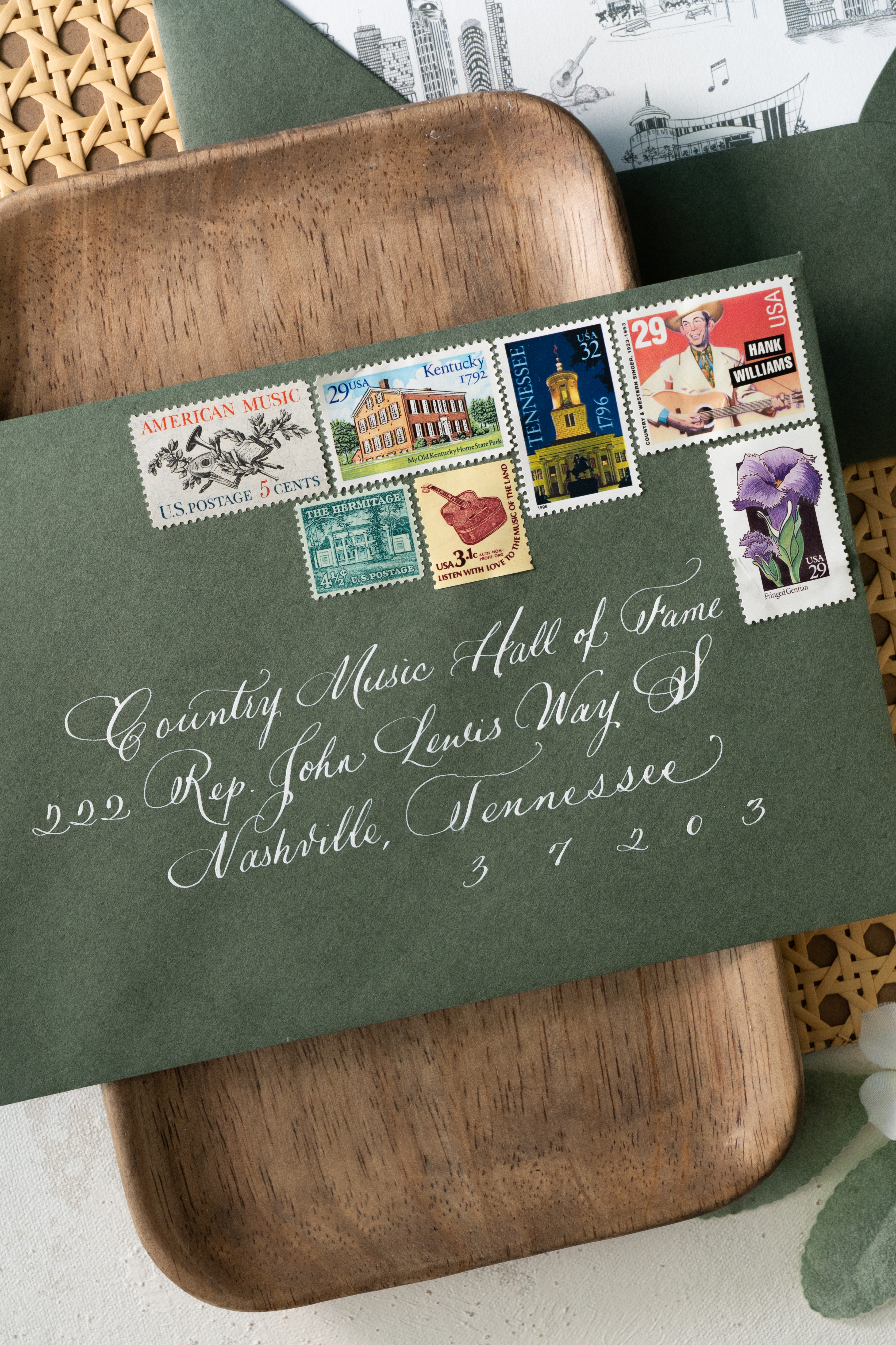
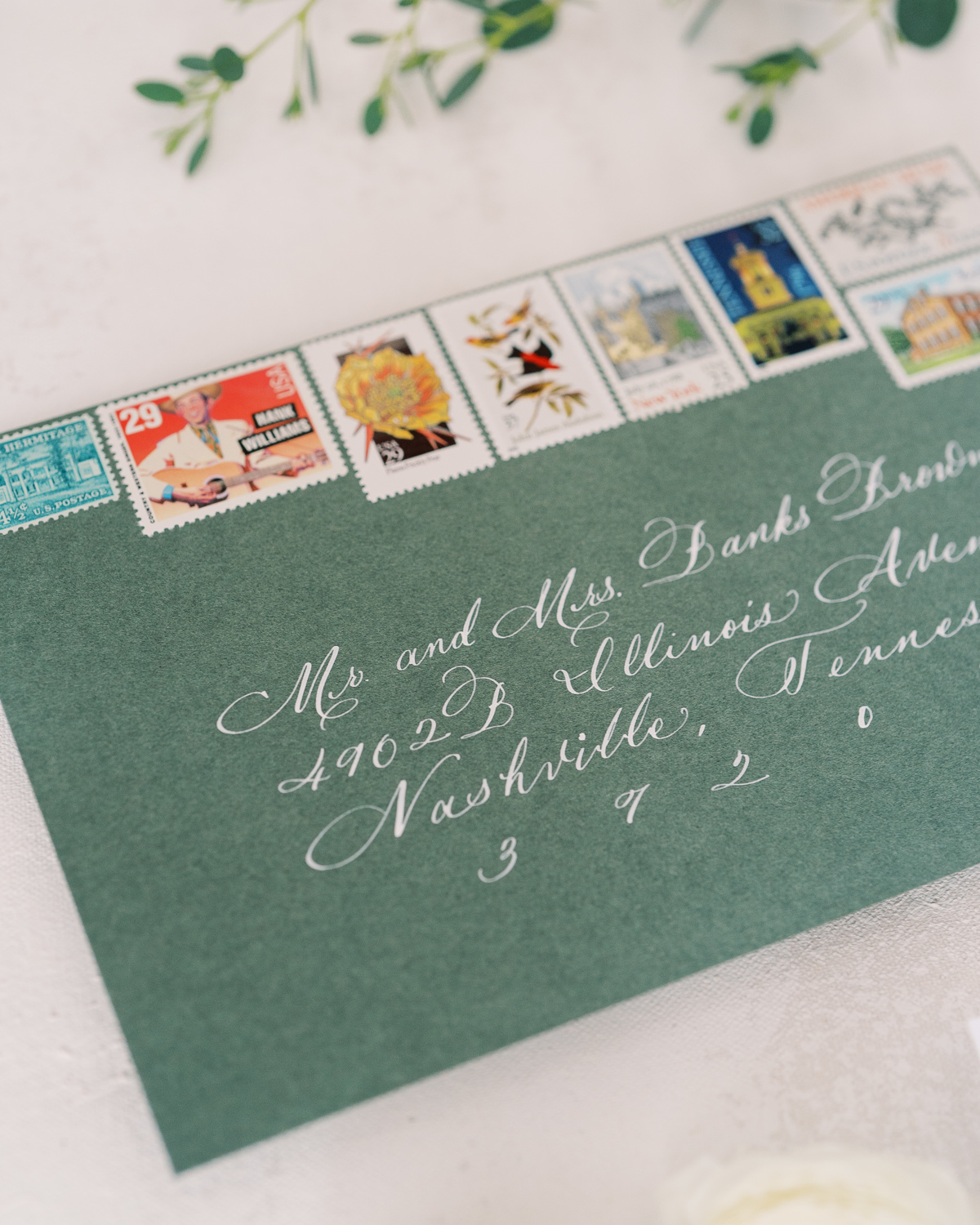
Sam and Landon’s save-the-date boasted the same polished look as the invitation suite including the letter pressed font and print of the Country Music Hall of Fame. (Side note: I can never get enough of how beautiful the vintage postage is!)
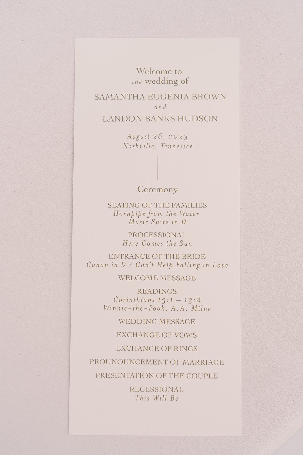
Wedding Welcome Sign and Program Details
This wedding welcome sign spoke volumes and was a complete showstopper. From the texture to the font to the overall framing of the display, this piece was impressive to say the least.
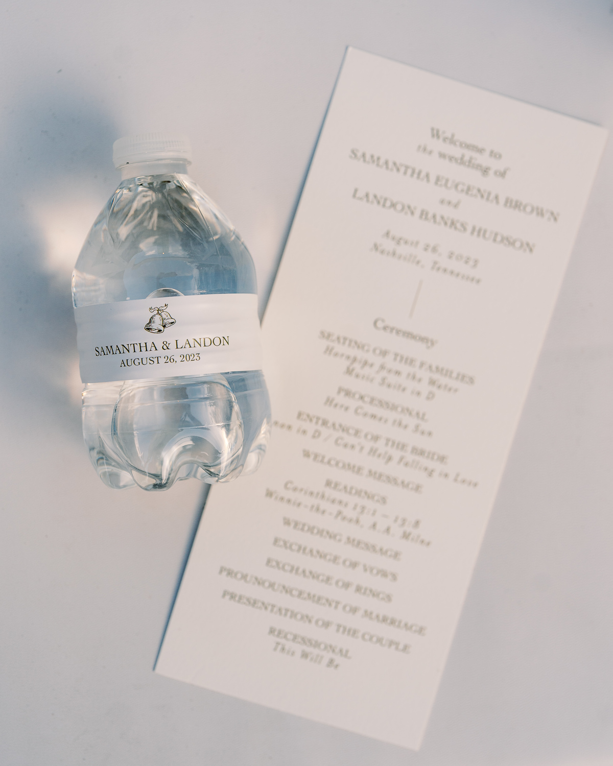
Simplicity goes a long way with these program details. A gentle font and color against a soft white paper was perfectly inviting for Sam and Landon’s guests. I love getting a peep of little details that are laced throughout the day like the cute little wedding bells on this custom water bottle. The same wedding bell print that we used for the wedding details card in the invitation suite.
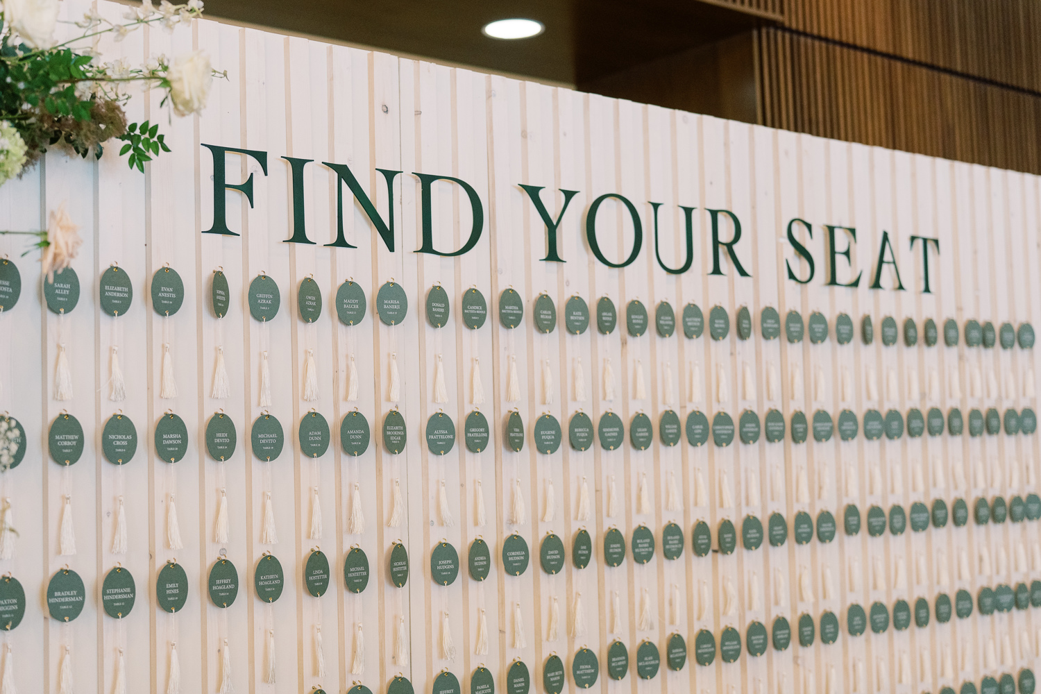
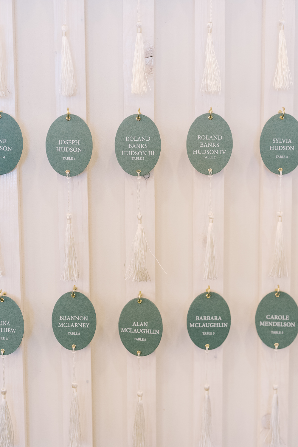
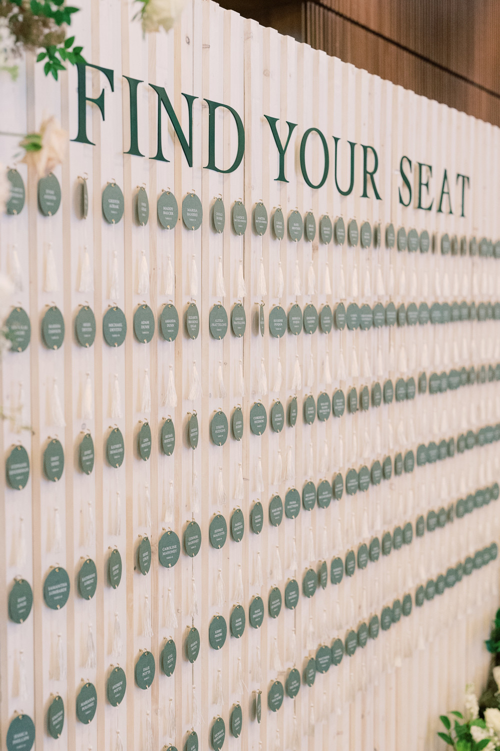
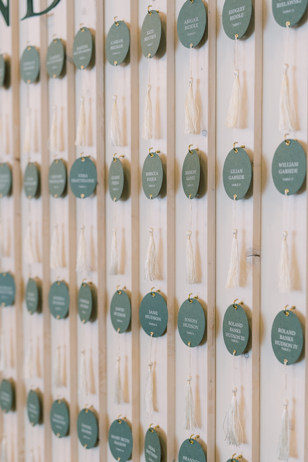
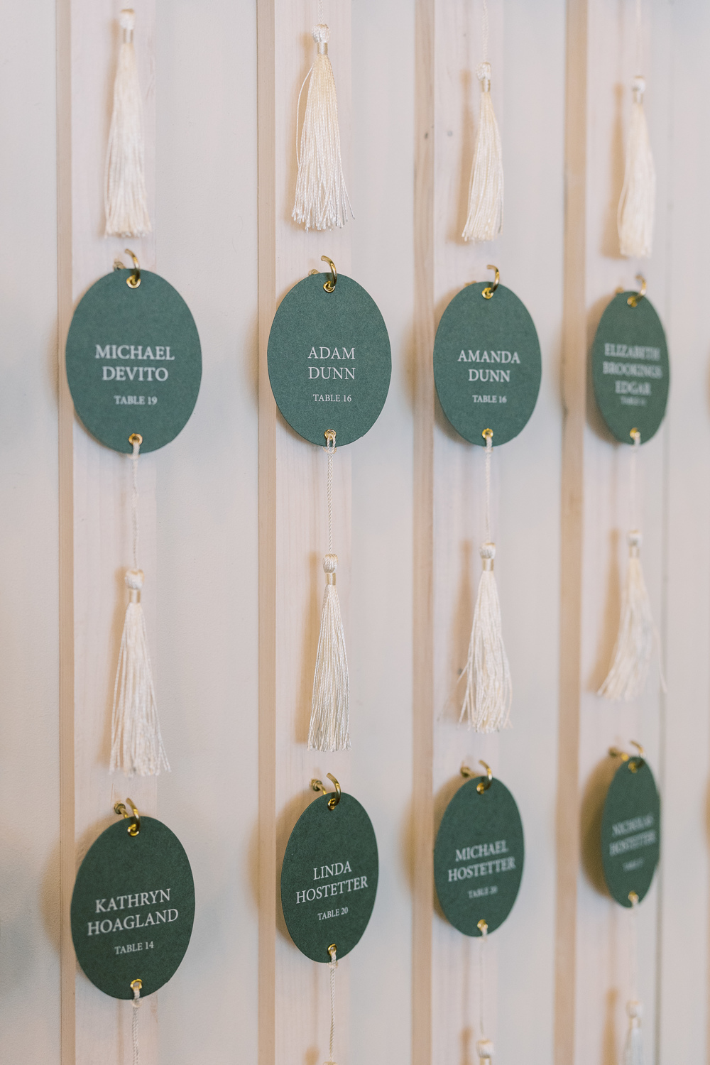
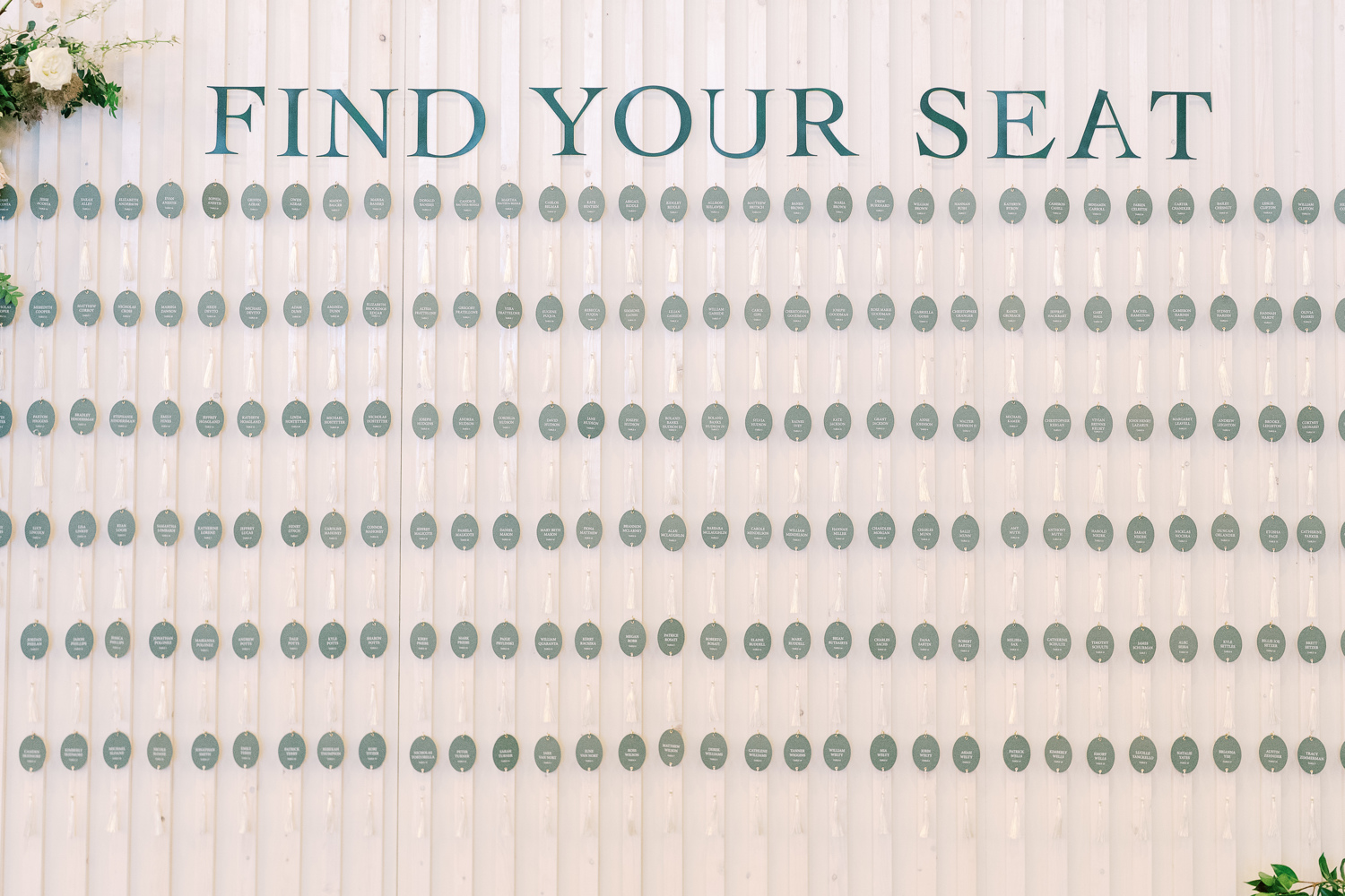
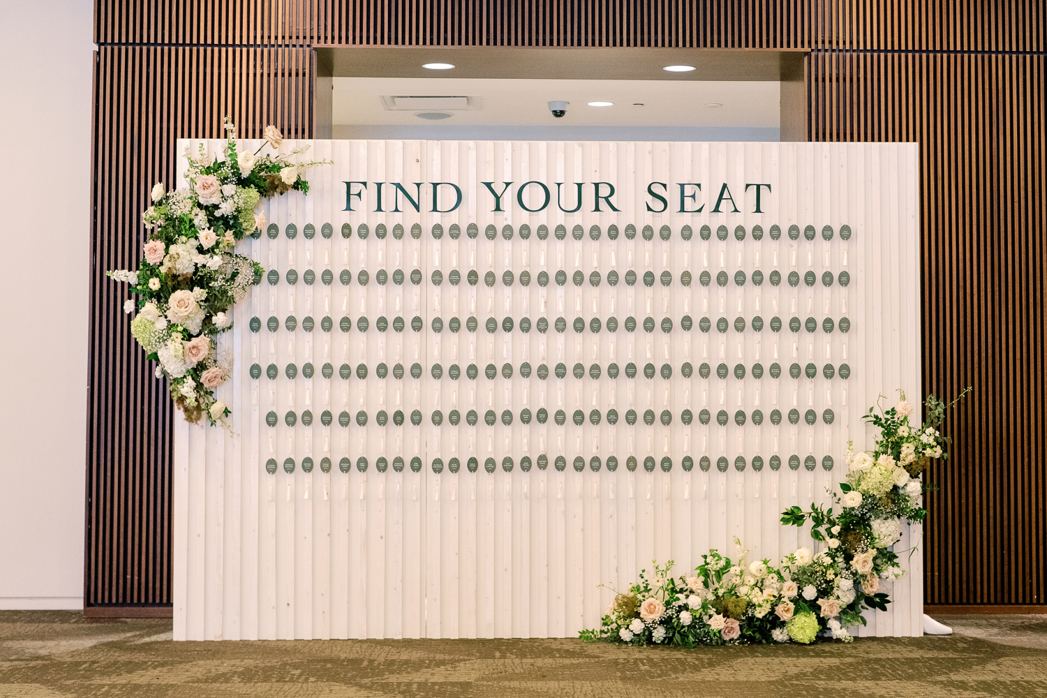
Elegant Seating Chart Display
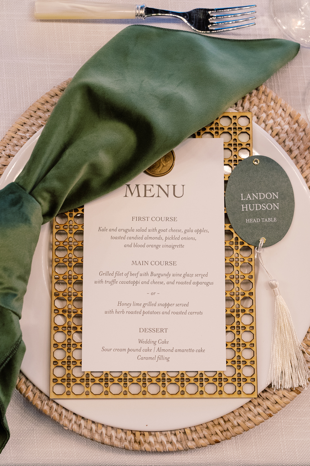
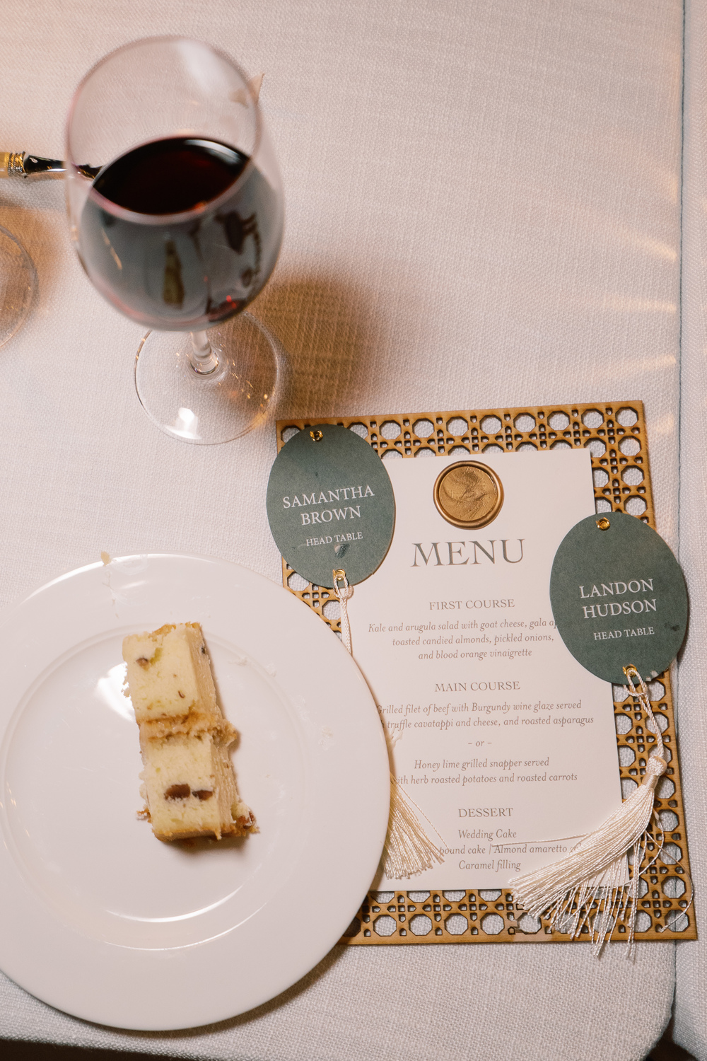
I am so happy to show off what my team created for Sam and Landon’s seating chart! Putting this seating chart wall together on site was an accomplishment. One that I adore! The sleek oval escort cards with hanging tassels were just so beautiful to see. This display wowed the guests and was yet another reflection of Sam and Landon’s elegant style.
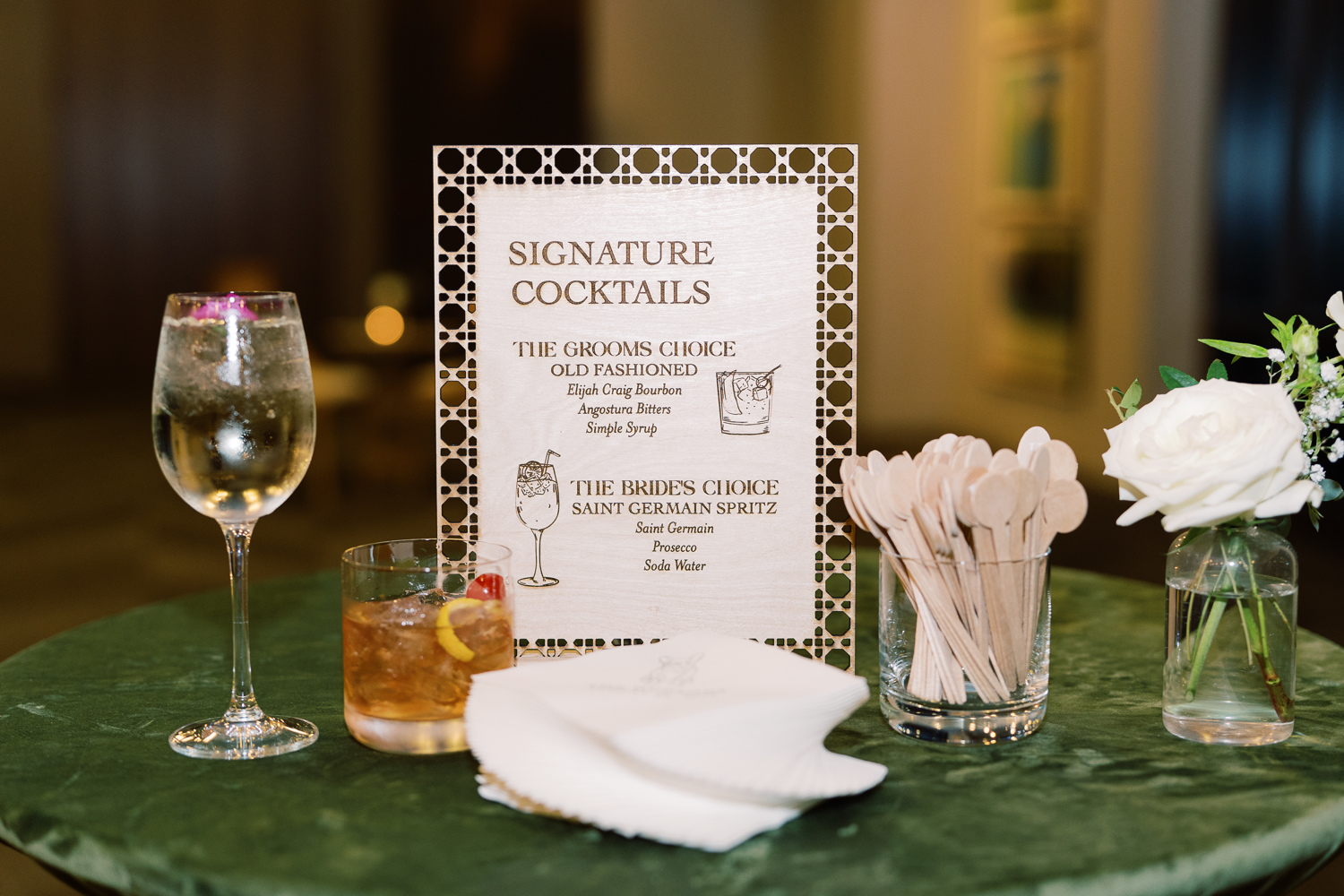
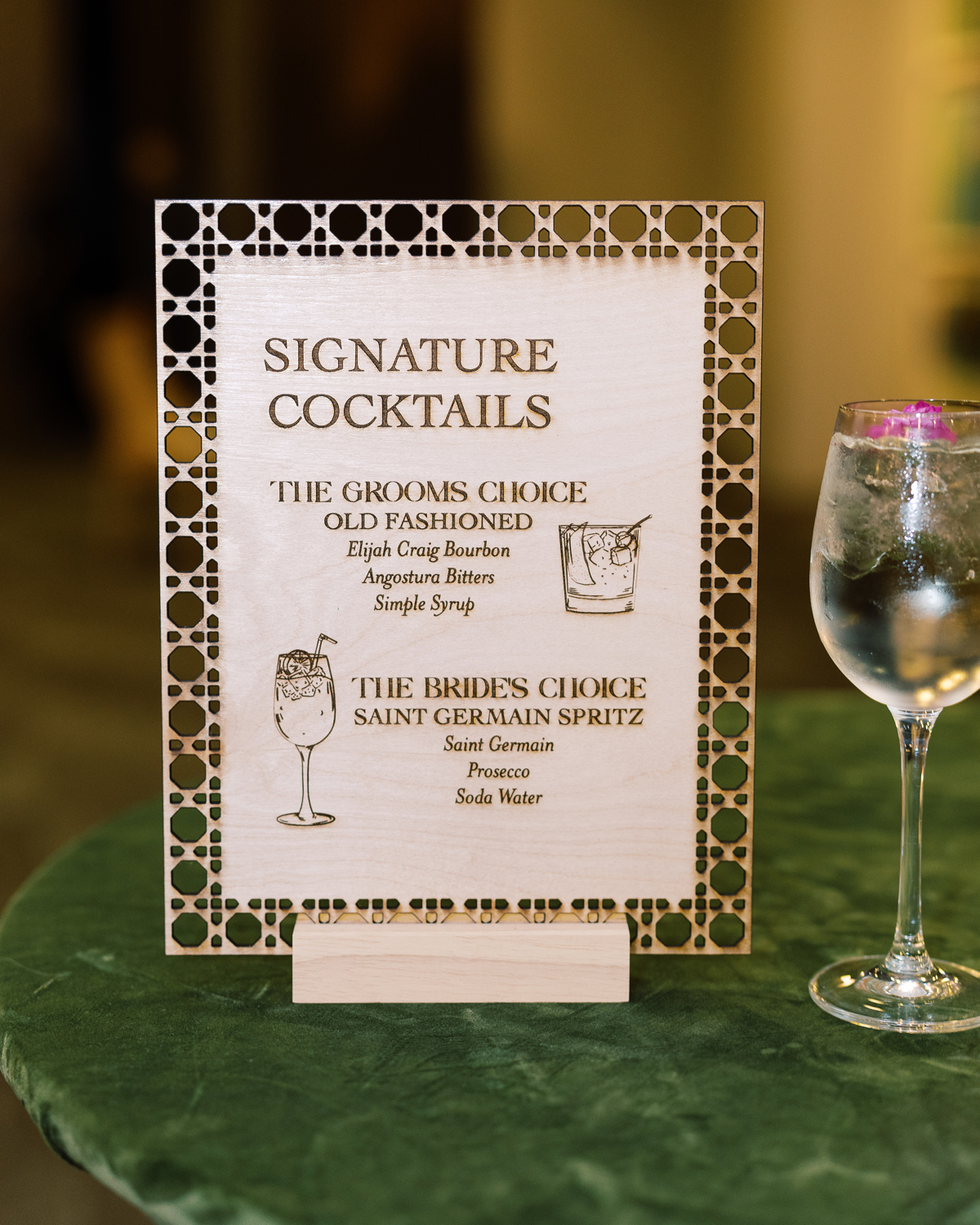
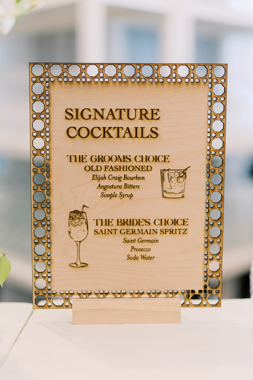
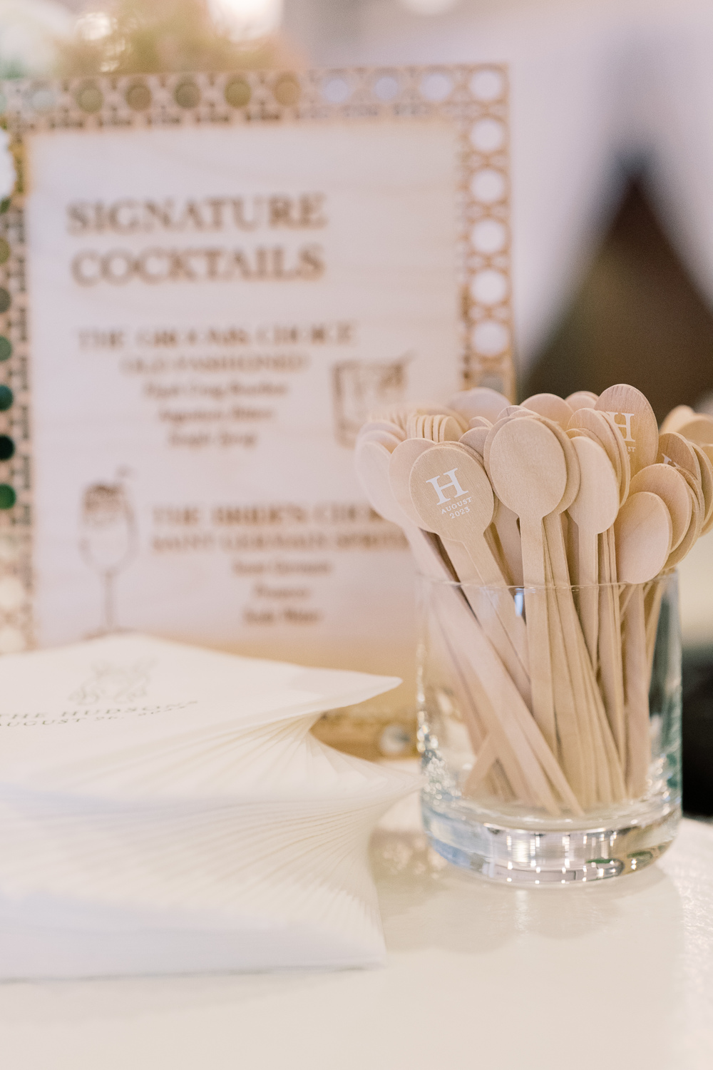
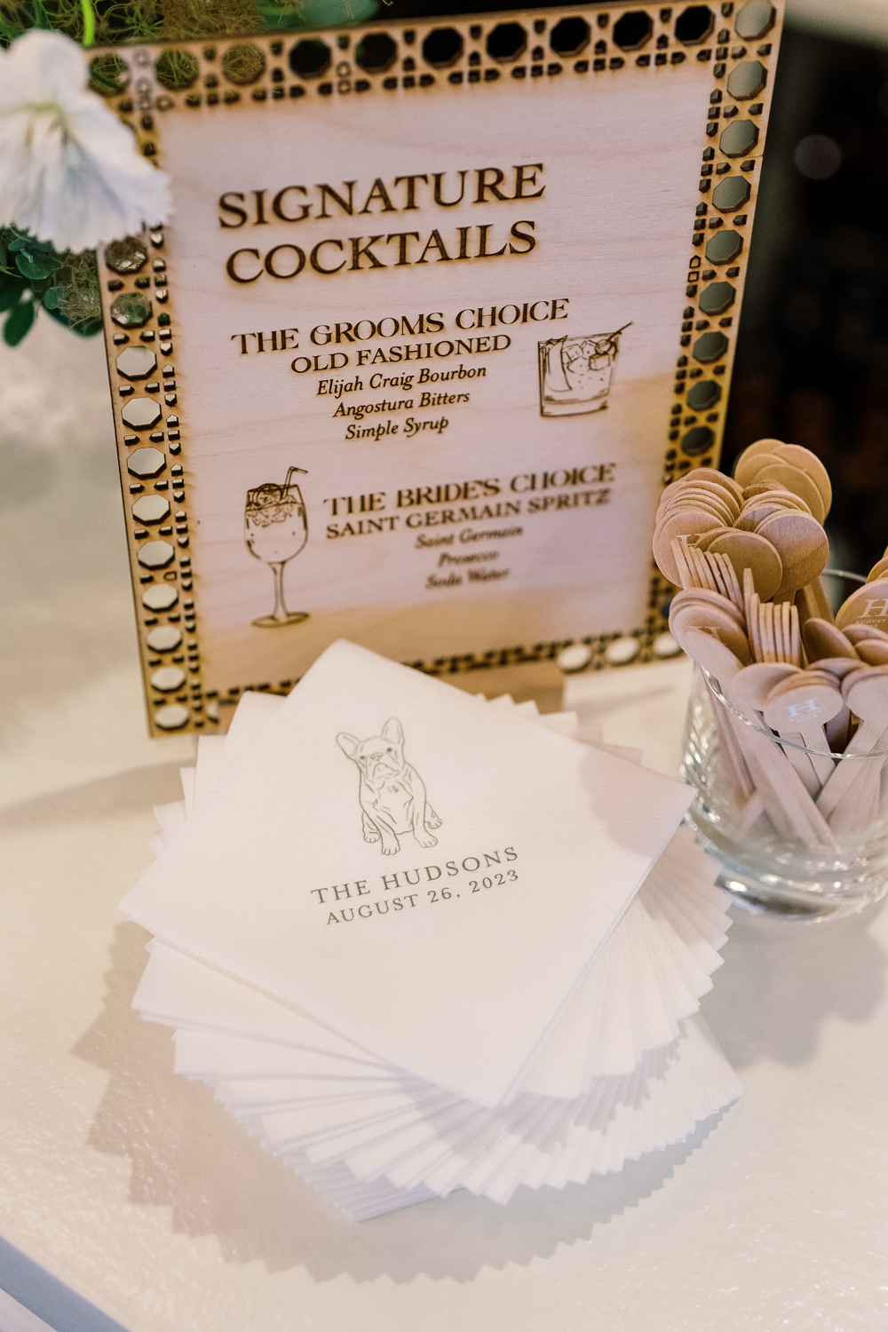
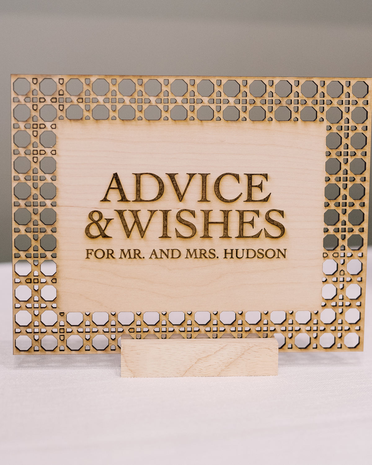
Custom Laser-Cut Signature Cocktail Signs
For cocktail hour, we rolled up our sleeves to do one of our favorite things: custom laser-cuts! We designed several table signs to add to the uniqueness of our couple’s unforgettable day. I love how this turned out and how well it fit into the style of the entire event.
However, it’s the custom cocktail stirrers for me! These little guys were so fun to make. The “H” initial stands out so perfectly along with the date. This is a great example of a small detail that packs a huge punch. It’s things like this that your guests never forget!
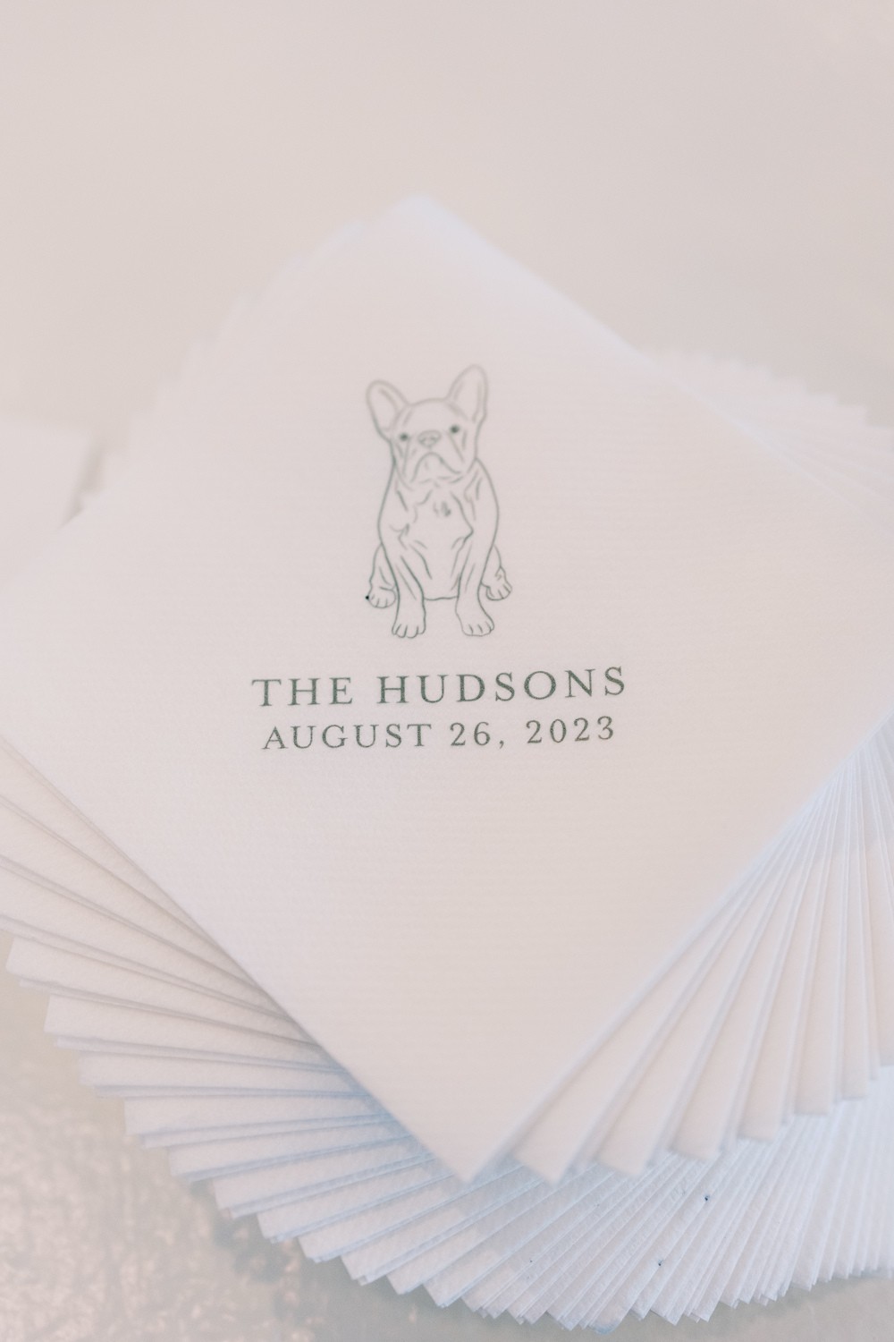
Can we all take a moment to appreciate how adorable Sam and Landon’s pup looks printed on these custom cocktail napkins? Cocktail hour is a great opportunity to pull in really special details of our lives- like pets! I could look at this face all day!
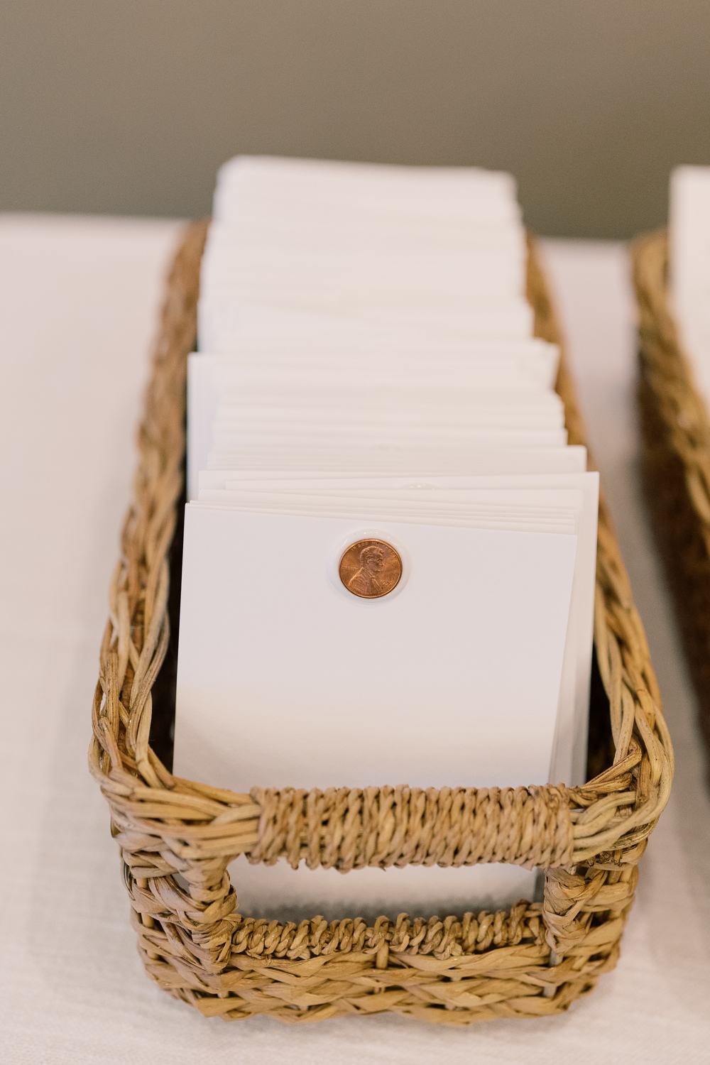
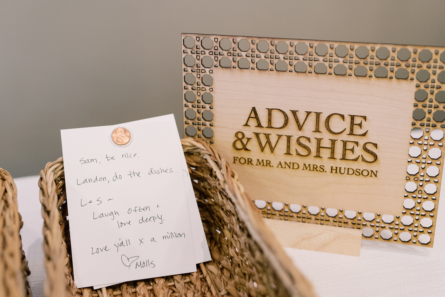
A Penny For Your Thoughts
Guests took the time to share their best advice on marriage and give well wishes as Sam and Landon created a space for “A penny for your thoughts.” This was a fun and clever way to include each guest as well as receive some welcomed advice from their closest friends and family! We were happy to be included by creating yet another one-of-a-kind laser-cut custom table sign.
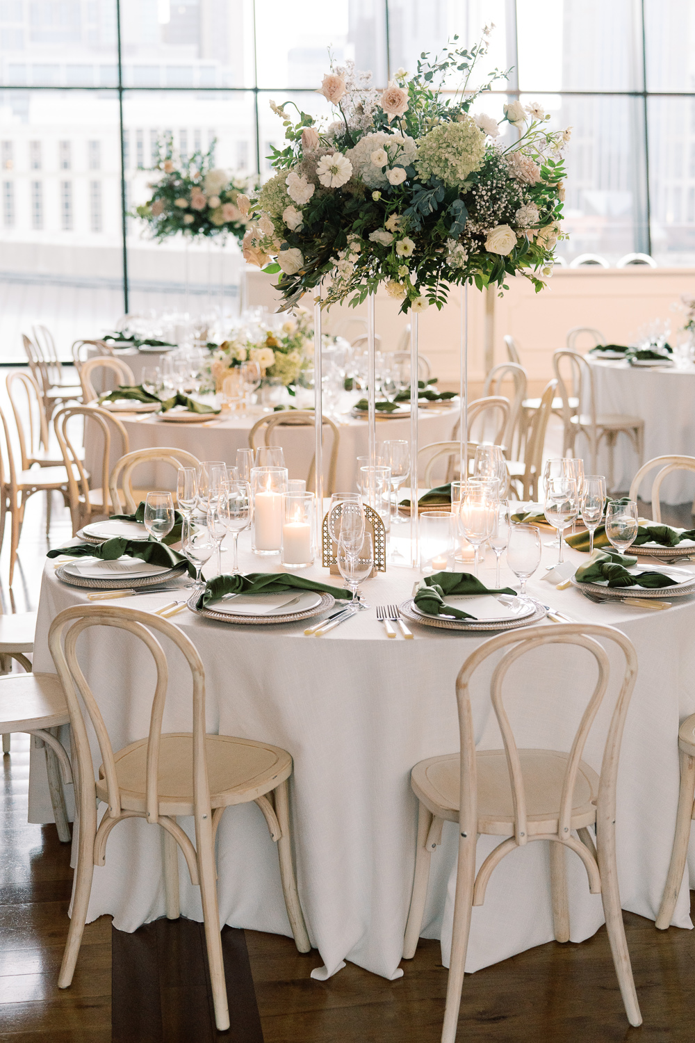
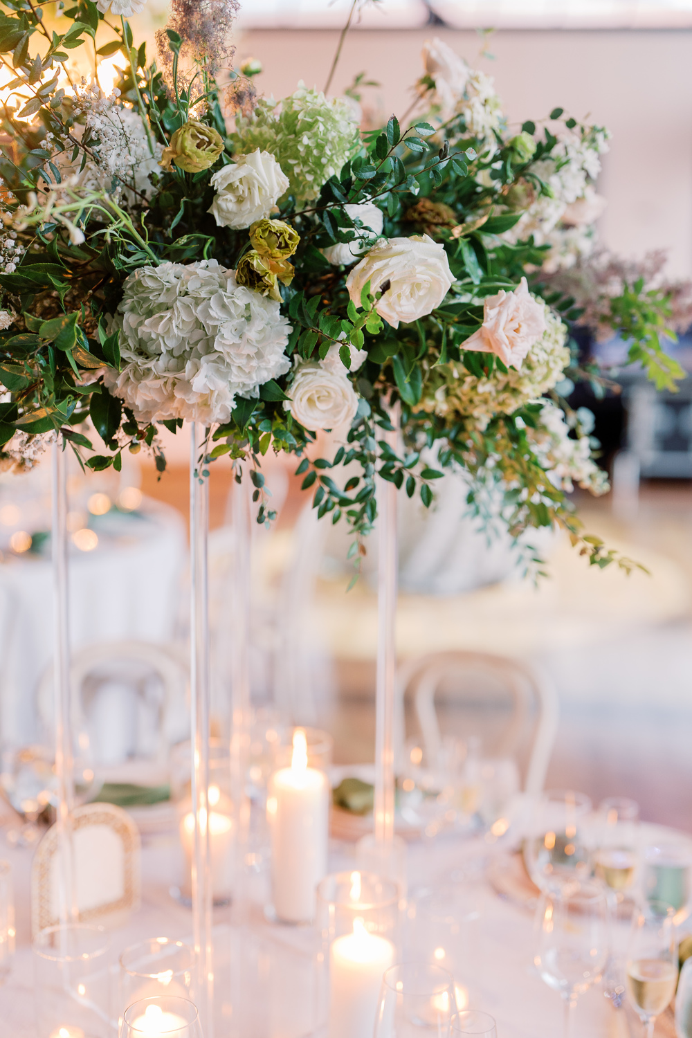
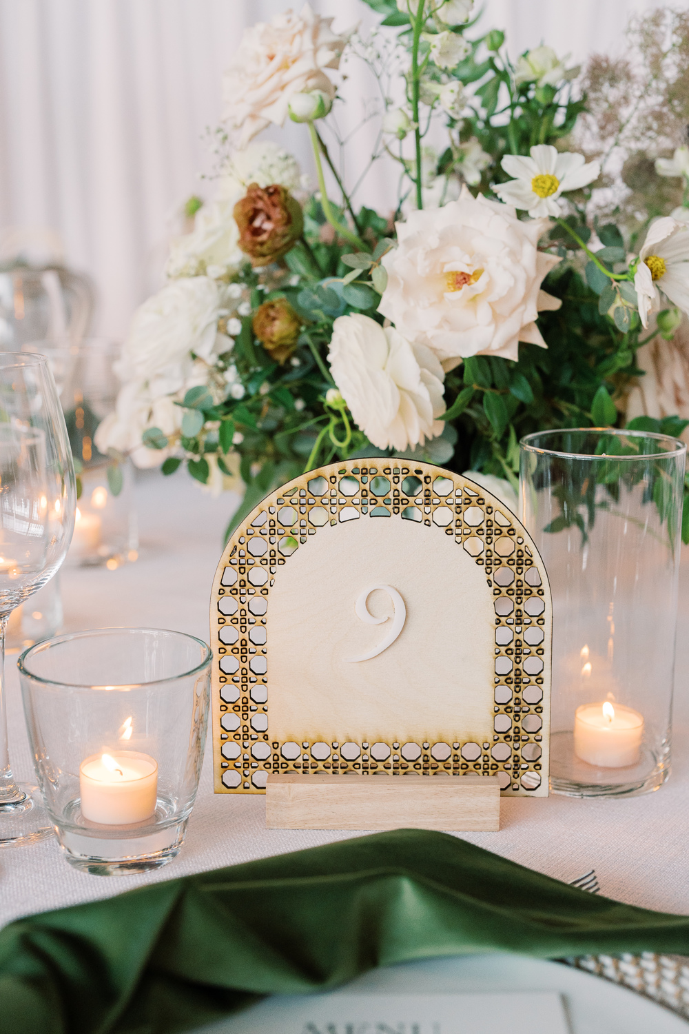
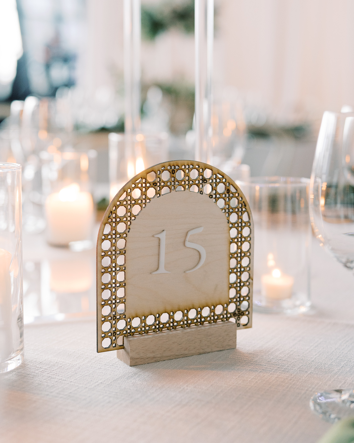
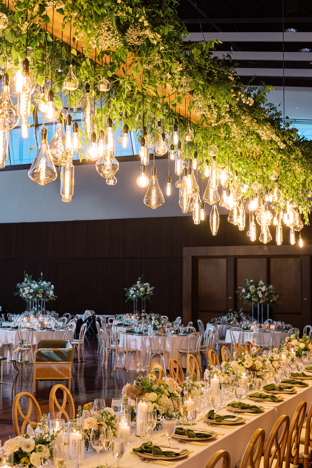
The custom signage was carried throughout the reception. Doing this can truly elevate the theme and help carry the tone of a room. The arched table numbers worked perfectly with the delicate tablescapes, and their texture offered a wonderful balance to the vibrant florals all around. Such an incredibly impressive look!
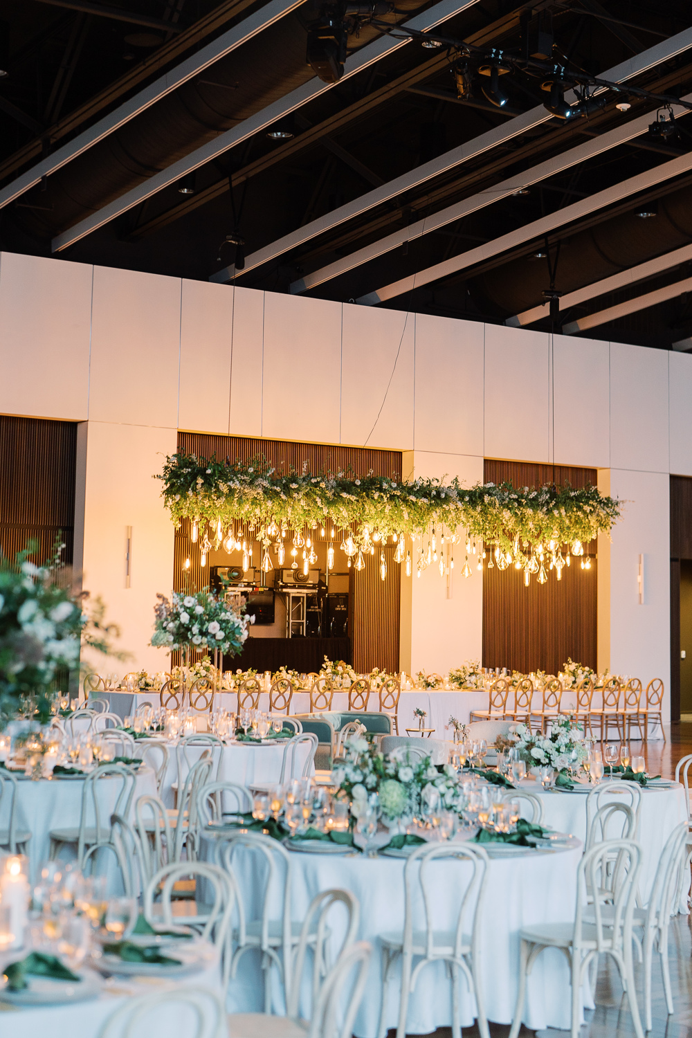
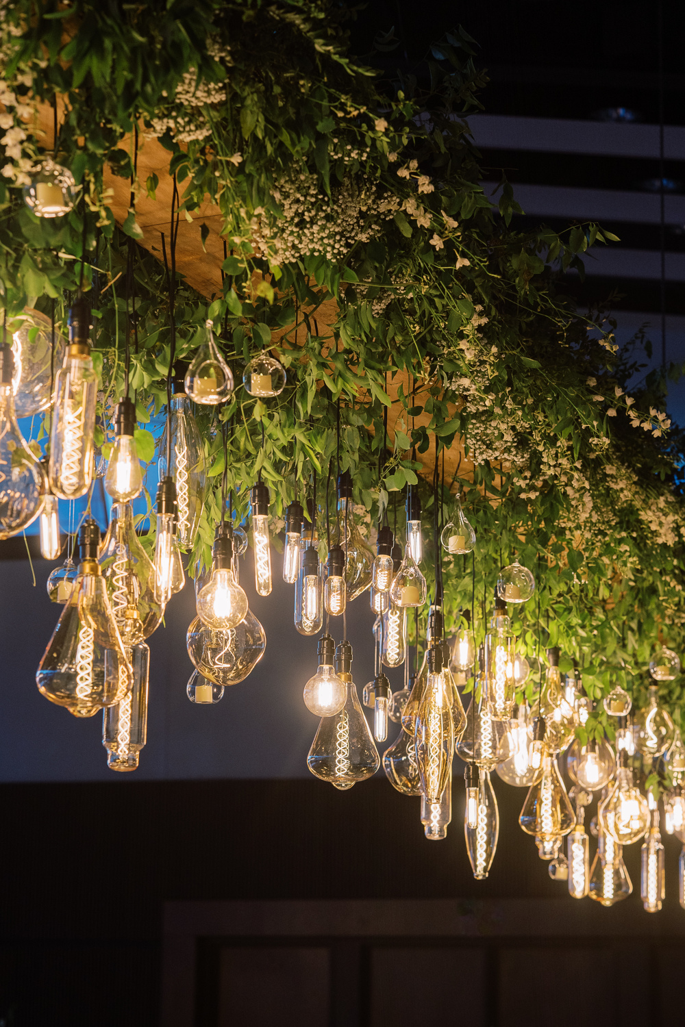
Sidenote: I still think about this floral chandelier more often than I care to admit. I mean, wow! This was such a stunning wedding in so many ways and this chandelier was a showstopper!
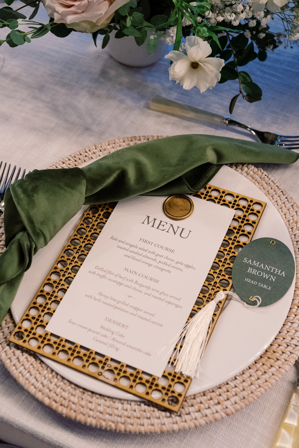
Custom Nashville Wedding Details
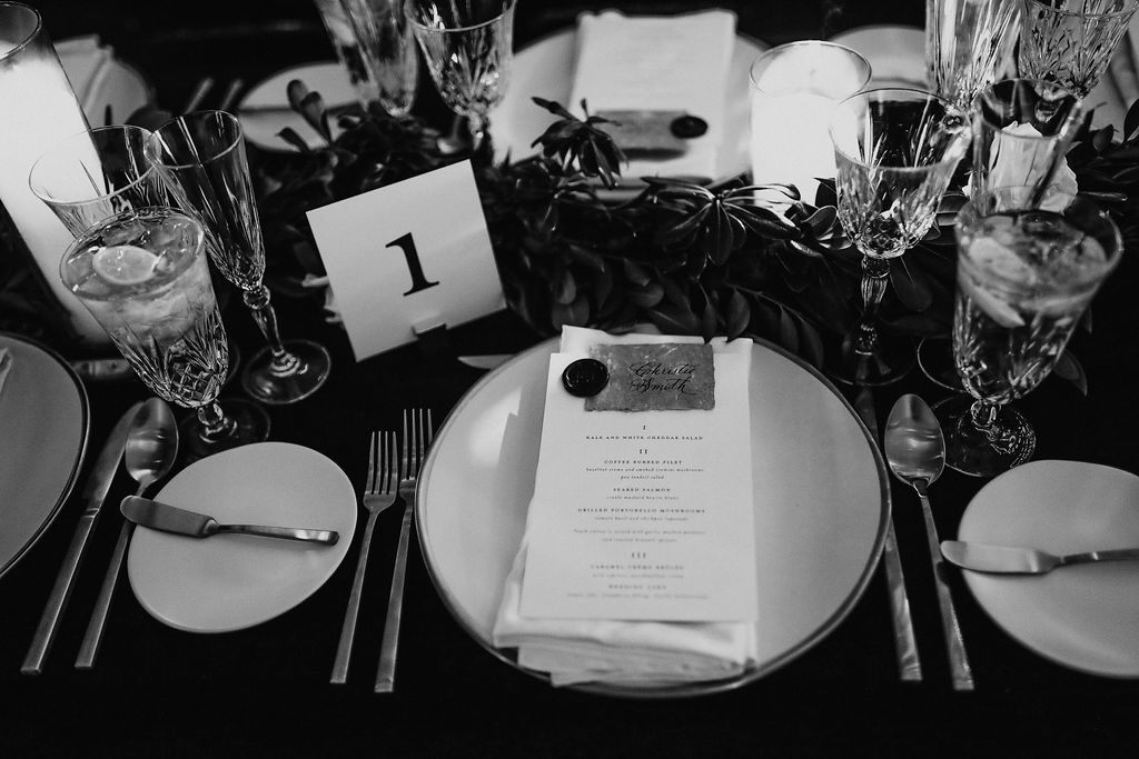
White Ink designed Sam and Landon’s reception menus that fit perfectly on top of the custom laser-cut settings we created as well! The gold wax seal to top the menu pulled this entire place setting together with the added bonus of the matching table numbers and table signage throughout. When it comes to lacing details throughout an event, THIS is how it’s done.
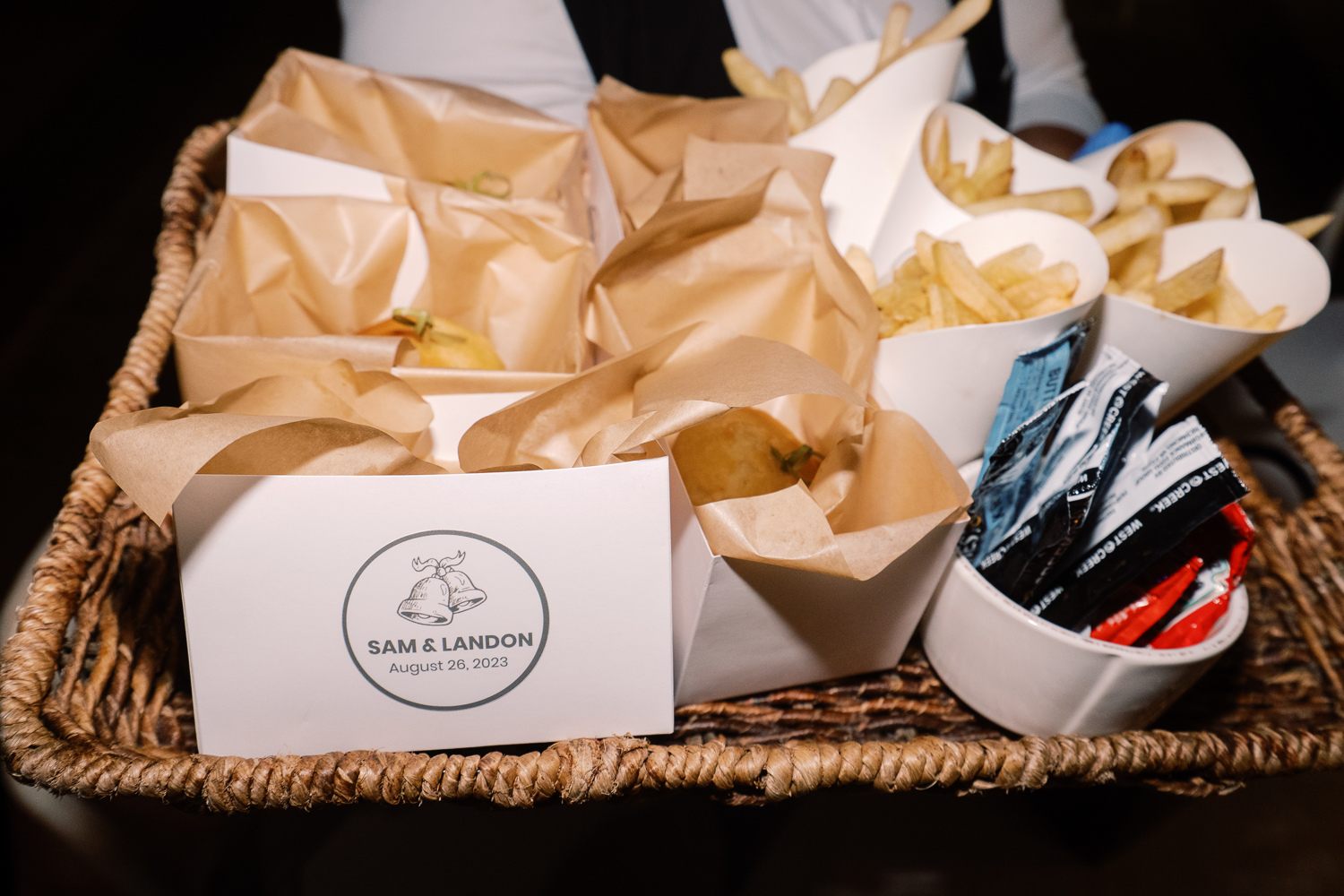
Peep the cute wedding bell prints making another appearance! This time, at the end of the night when guests were offered a yummy snack of burgers and fries. From invitation suite to burger box, this wedding bell print fit right in!
Wedding Welcome Party Details
I don’t want to wrap up without showing you guys a couple of the day-before details that White Ink did for Sam and Landon’s Wedding Welcome Party. Wedding parties and wedding rehearsal dinners are the perfect time to have fun with details and create a more intimate tone.
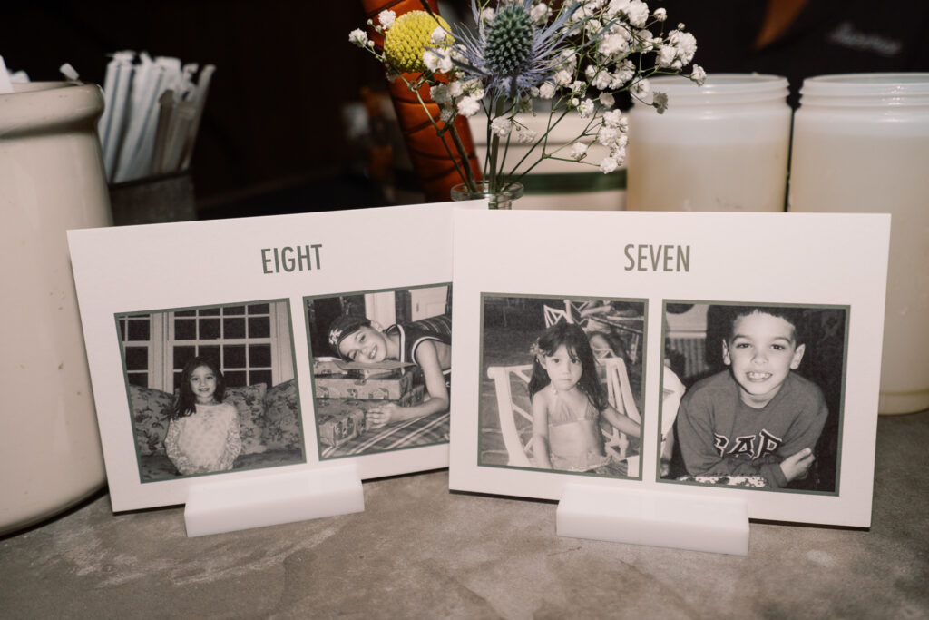
Sam and Landon wanted us to create table numbers for the welcome party that included pictures of them being the same age as the number on the sign. As you can see above, here are Sam and Landon at ages 7 and 8. Is this not the sweetest thing ever? It meant a lot to be able to provide these special table numbers for them!
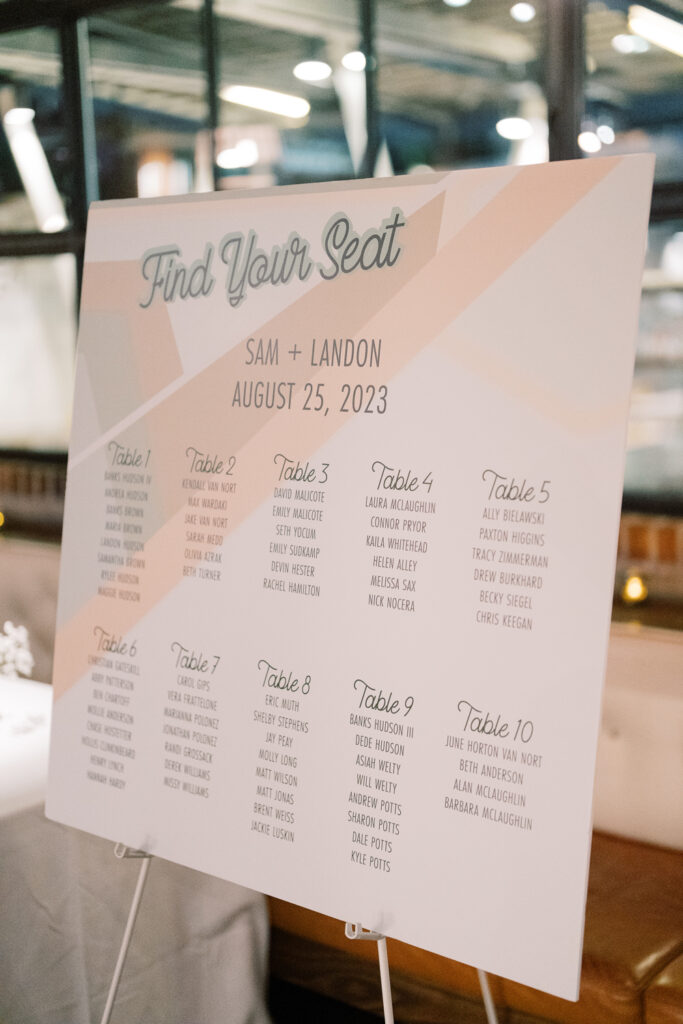
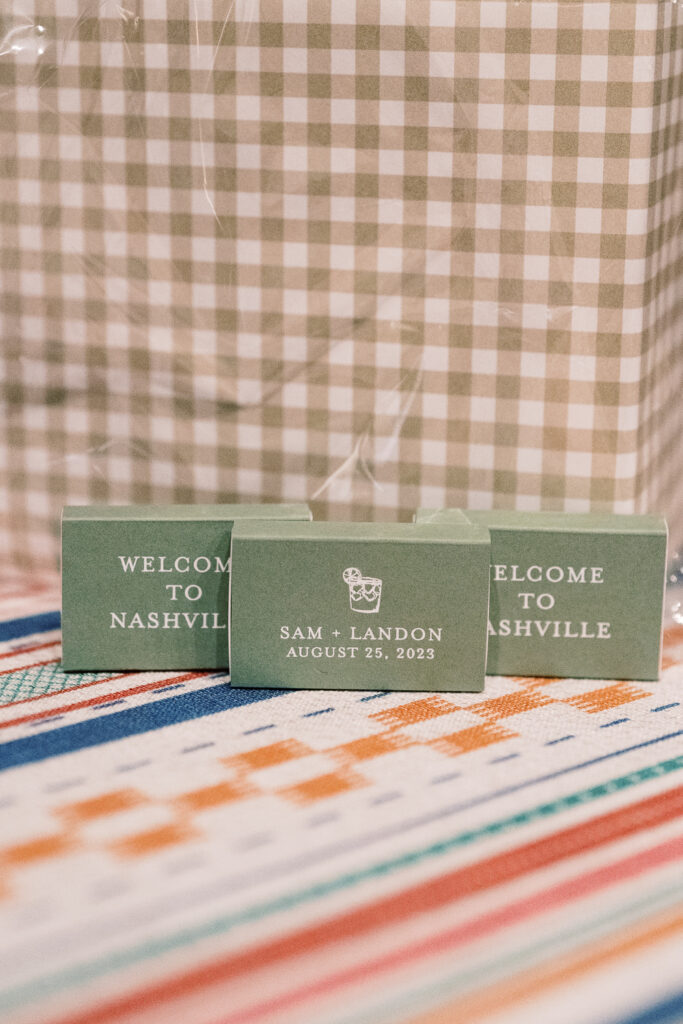
We also created a few more day-before details for Sam and Landon’s wedding welcome party. It was an honor to create items like their seating chart and the most adorable little matchboxes for the guests to take along with them. Putting in the extra effort in these more intimate settings really shows those closest to you, that they are appreciated and that you were thinking of them, which is really special!
To the happy couple, we hope you enjoy lots of love and adventure, and continue soaking in all the finer details around you! Cheers to you both!
If you’re looking to add custom, thoughtful touches to your wedding or event, we would love to help make your vision a reality. Reach out today to learn more about our full-service design offerings—we can’t wait to create something unforgettable for you!
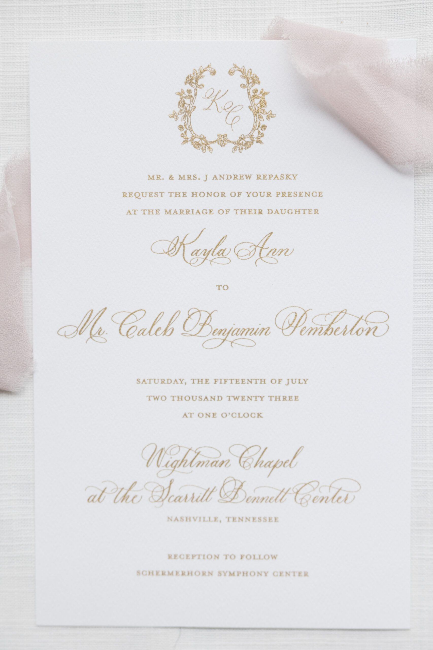
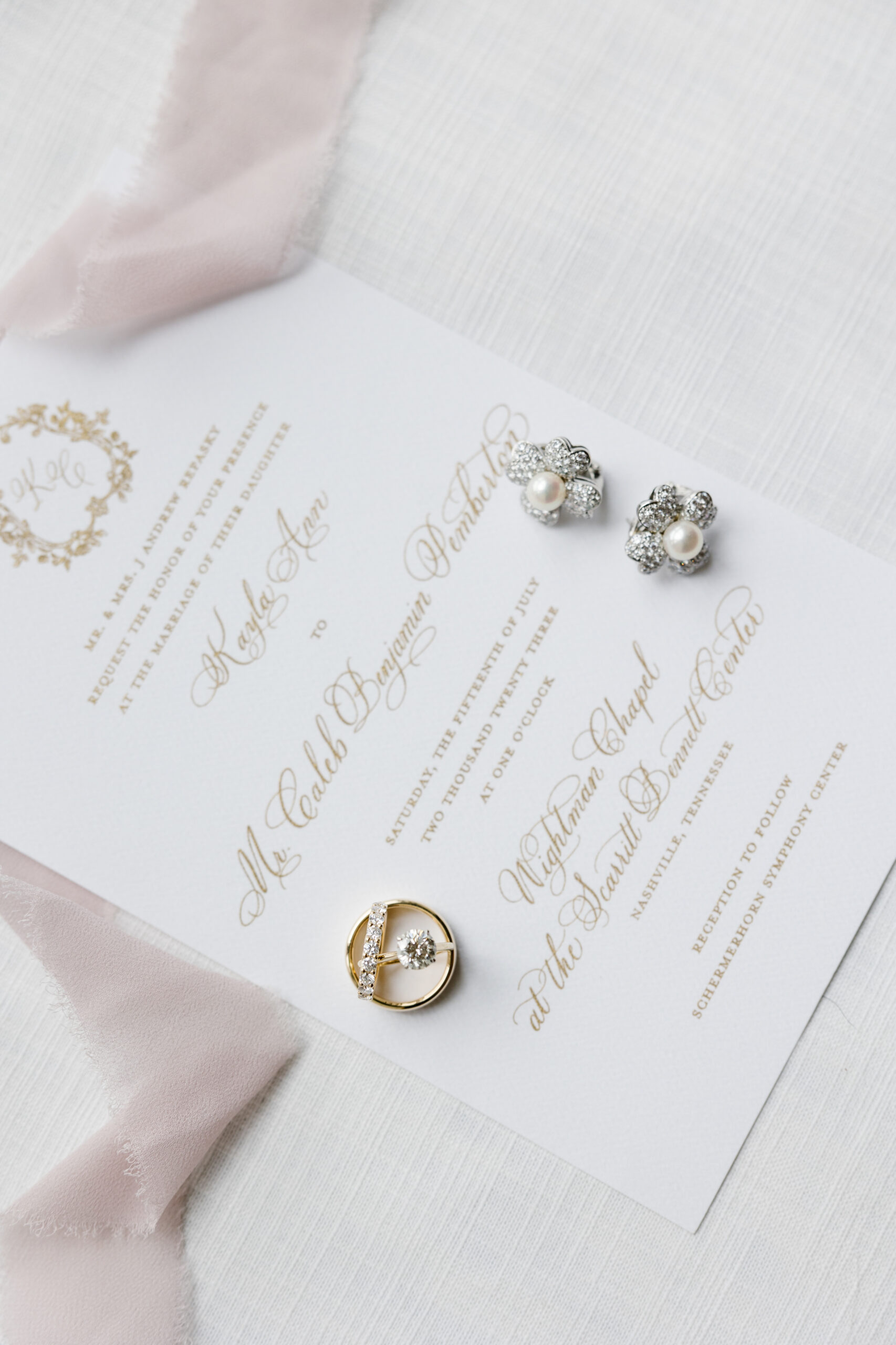
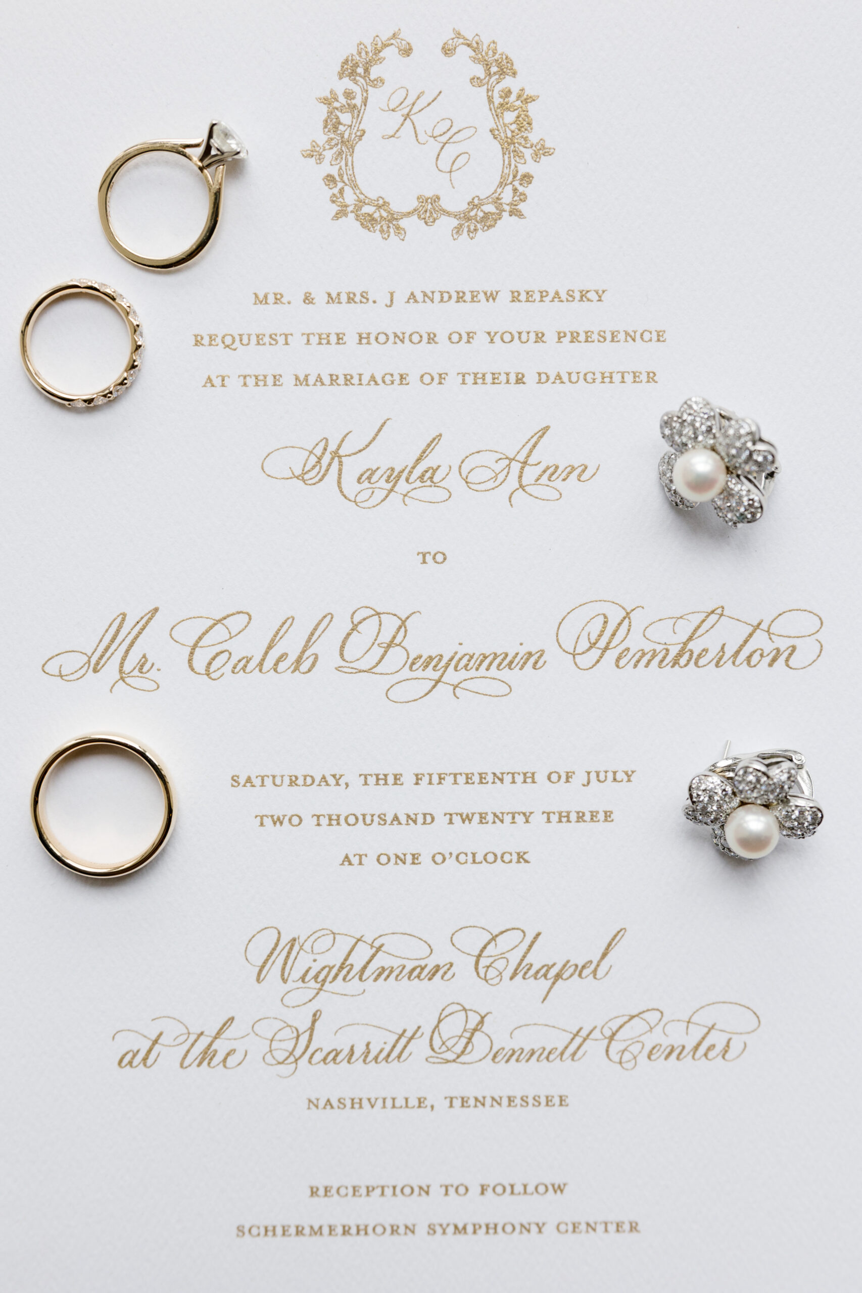
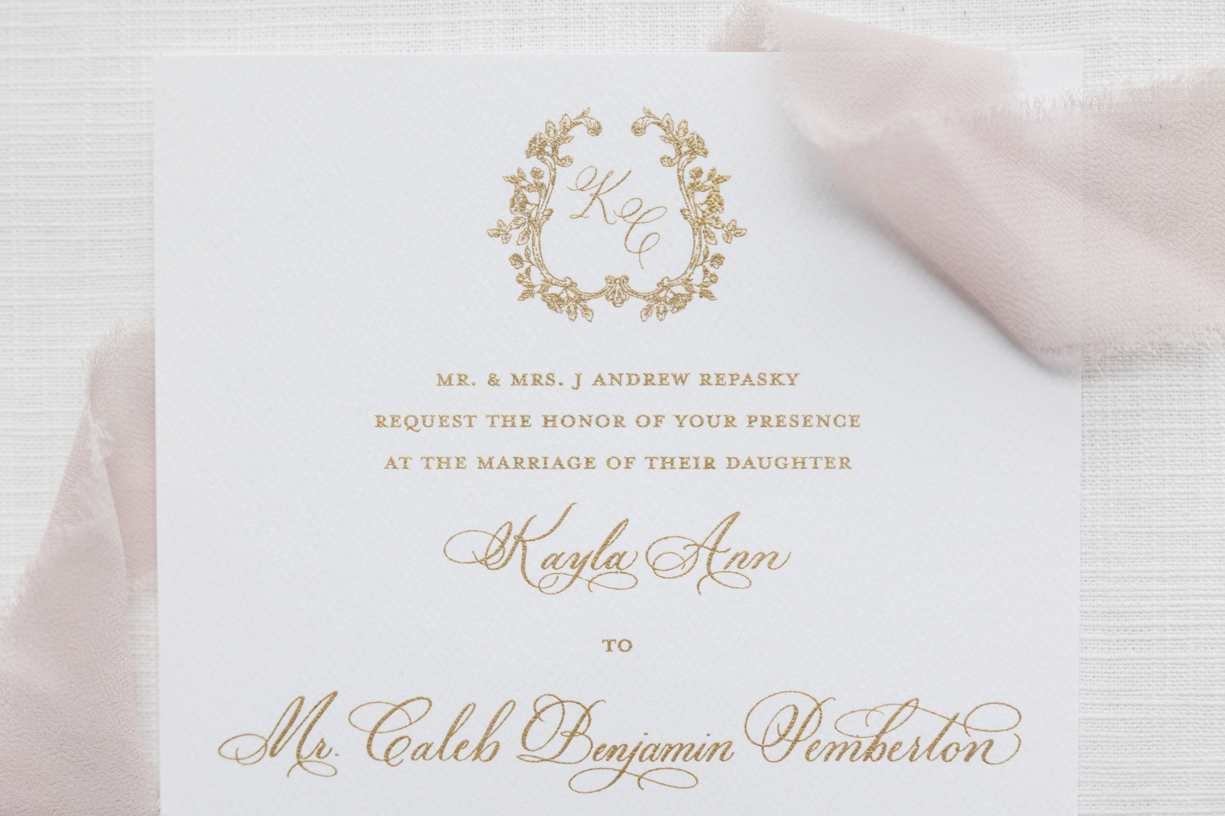
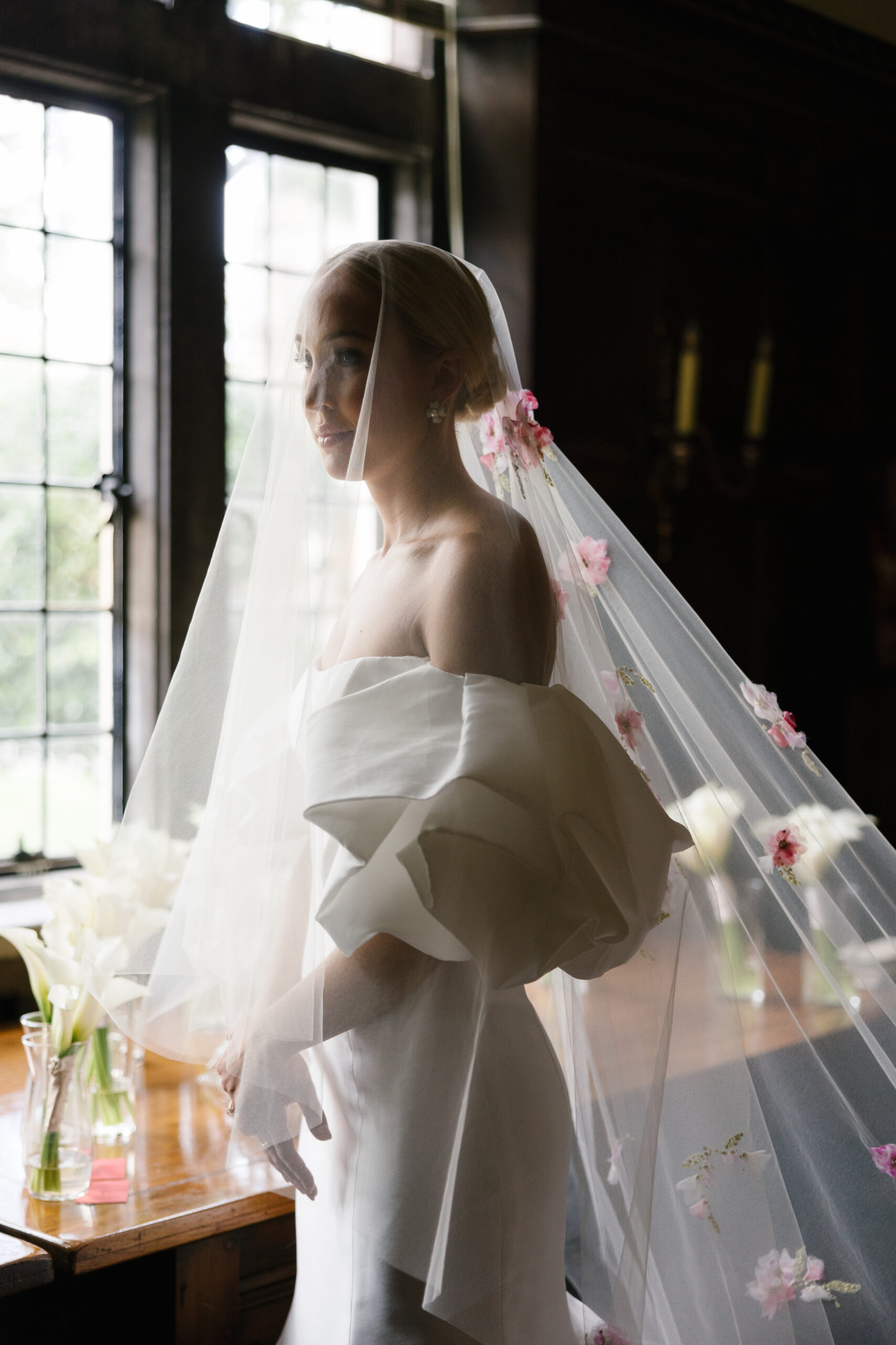
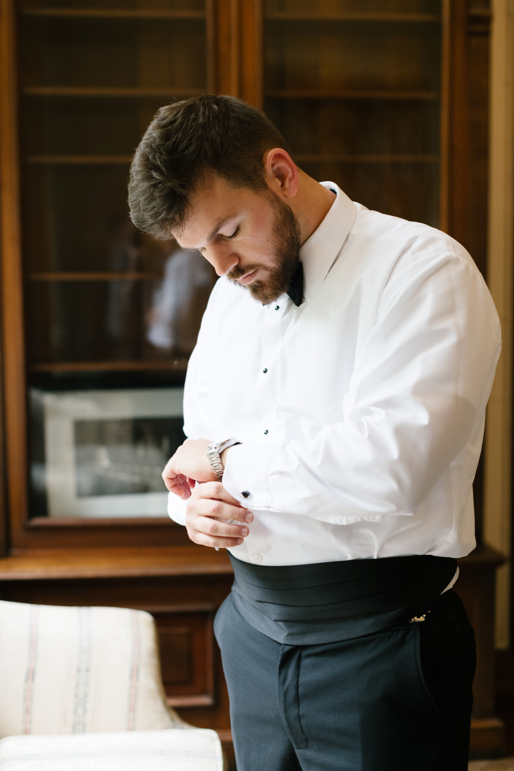
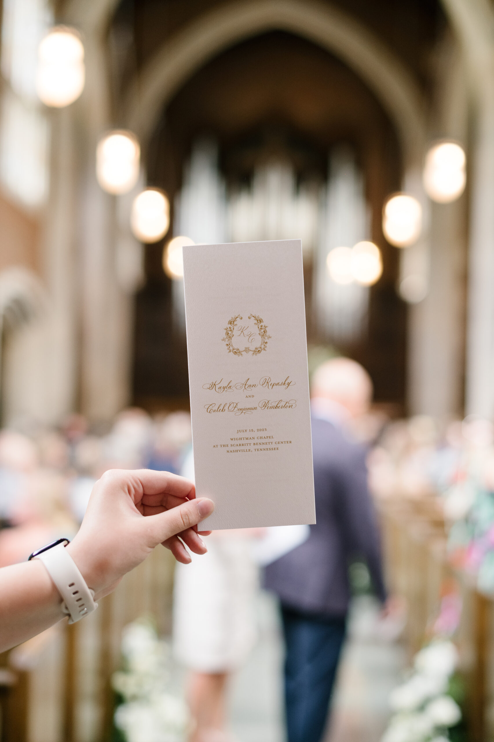
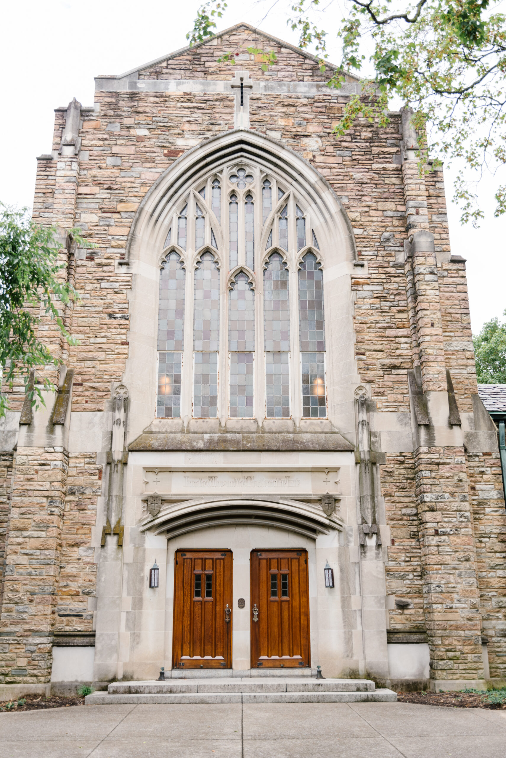
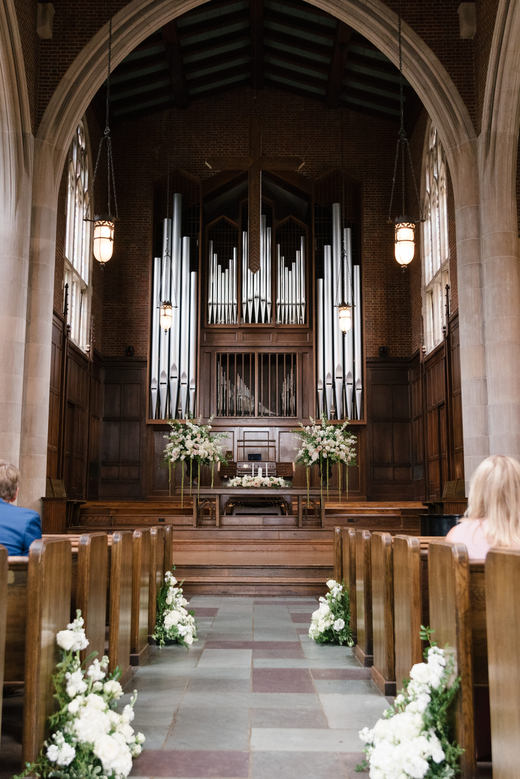
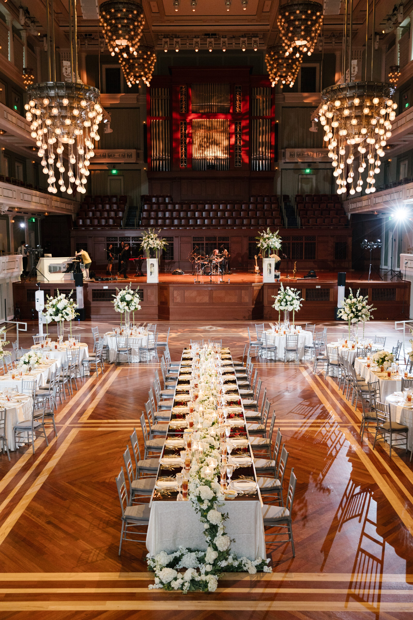
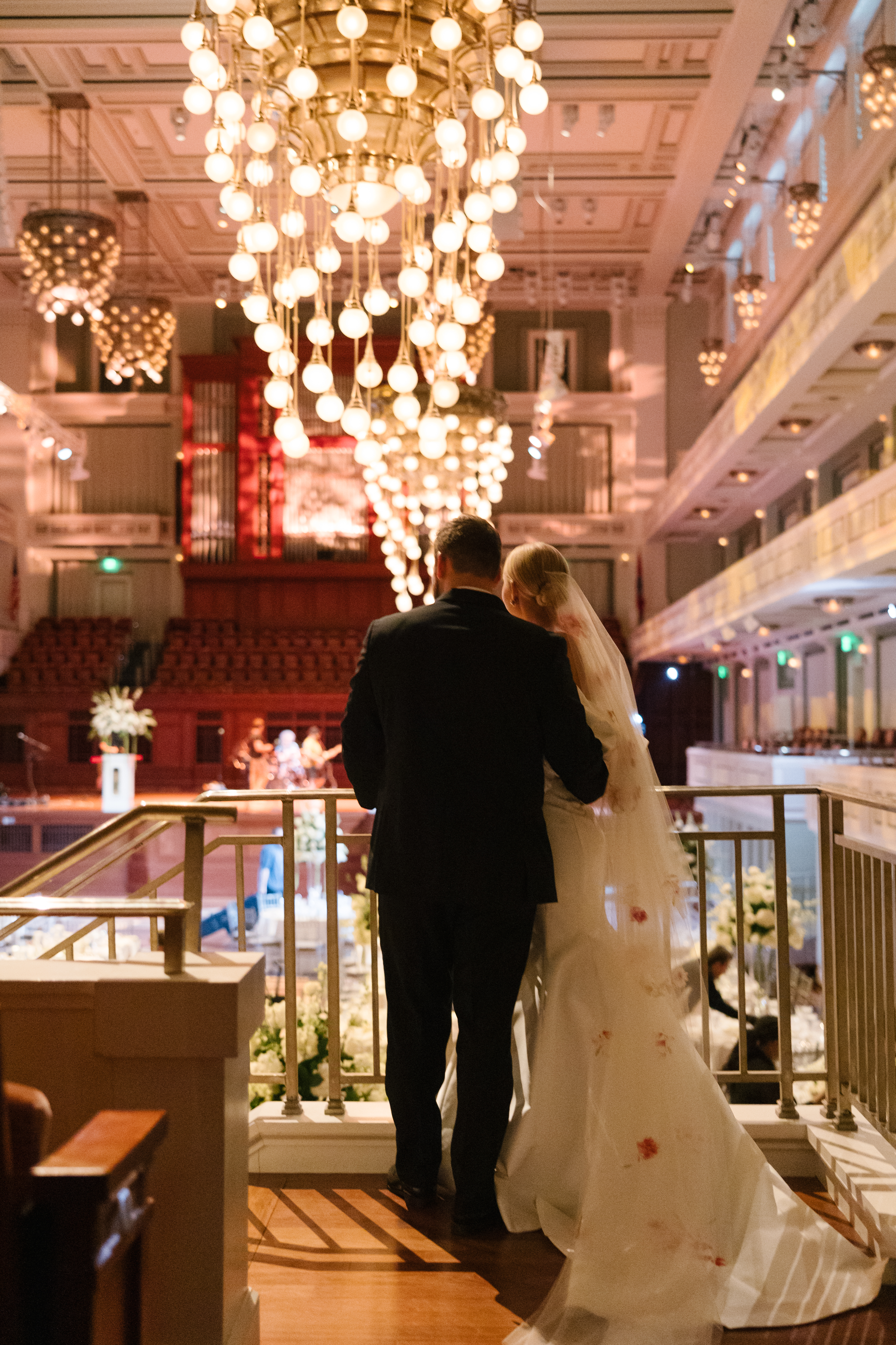
Kayla and Caleb’s elevated Nashville Symphony wedding was an absolute dream! This picturesque event of classic and timeless details was something you just couldn’t take your eyes off of. From the gothic style architecture of Scarritt Bennett’s Wightman Chapel to the grandeur of Nashville’s Schermerhorn Symphony Center, there wasn’t a stone left unturned as Kayla and Caleb carefully placed together one of the best Nashville weddings White Ink has seen. Contributing these stunning details and being a part of such a memorable wedding was an absolute honor. Hopefully you can take away some serious wedding inspo from this gorgeous day!
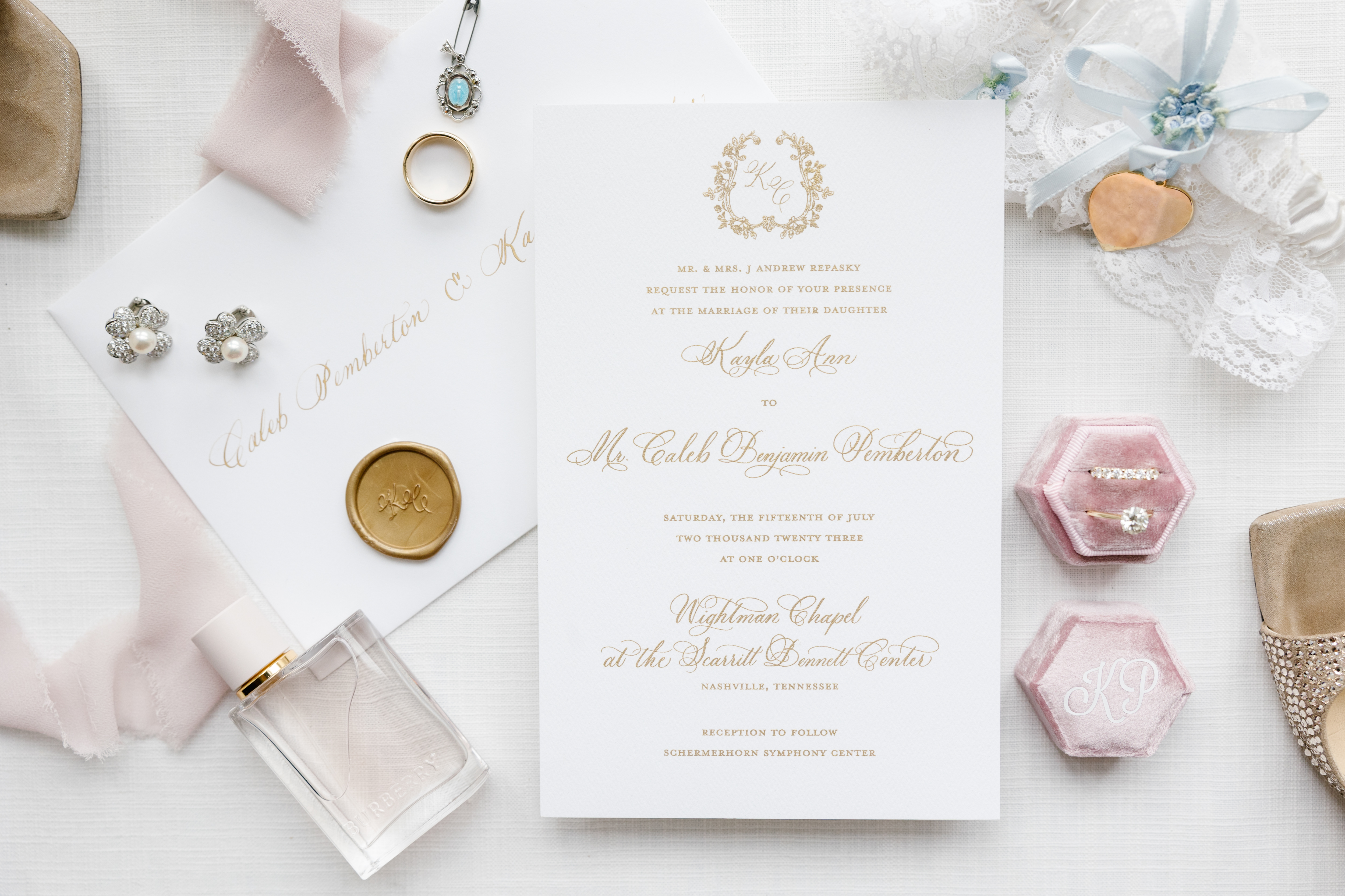
We designed our couple’s wedding invitation suite to embody the elegance of their big day. A custom monogram delicately stood out on the beautiful card stock. I loved adding the extra touch of using a custom, monogram, gold, wax seal for the envelopes. These are small details that pack a big impression!
Wedding Programs
What sets White Ink apart from big box paper retailers is our personalized, hands-on approach. Taking out the guesswork is part of what we do best. From knowing exactly what to include in your programs to advising on quantity, size, and where to “splurge”, we guide you every step of the way. We even help incorporate meaningful elements from your invitation suite to tie everything together. With years of experience and a deep understanding of event-day details, we ensure you get exactly what you need!
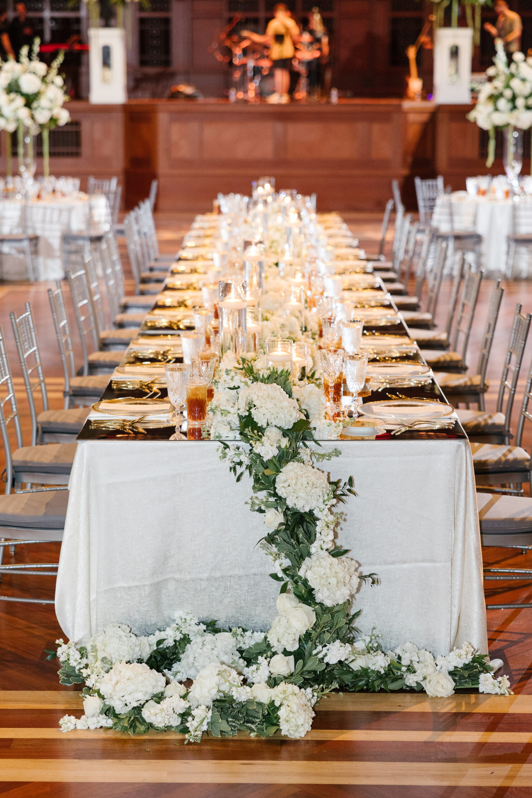
Elevated Nashville Symphony Wedding Reception
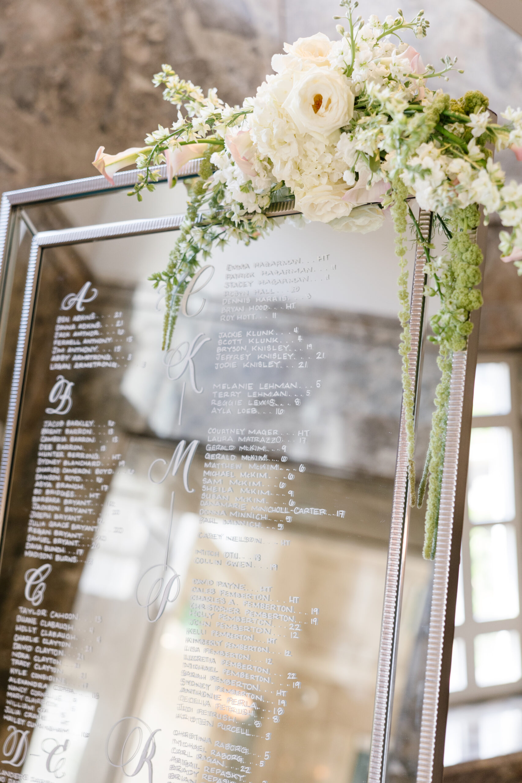
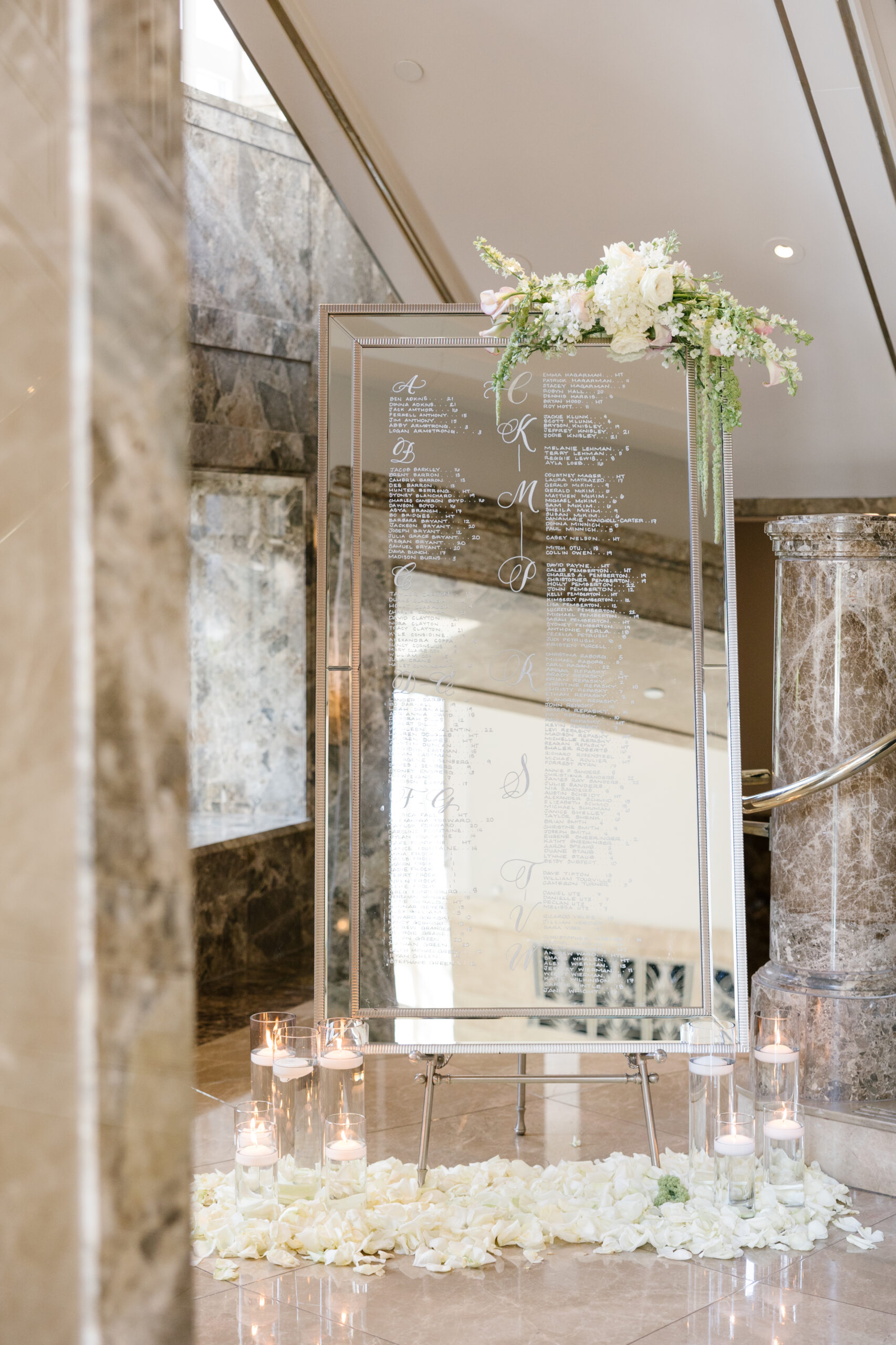
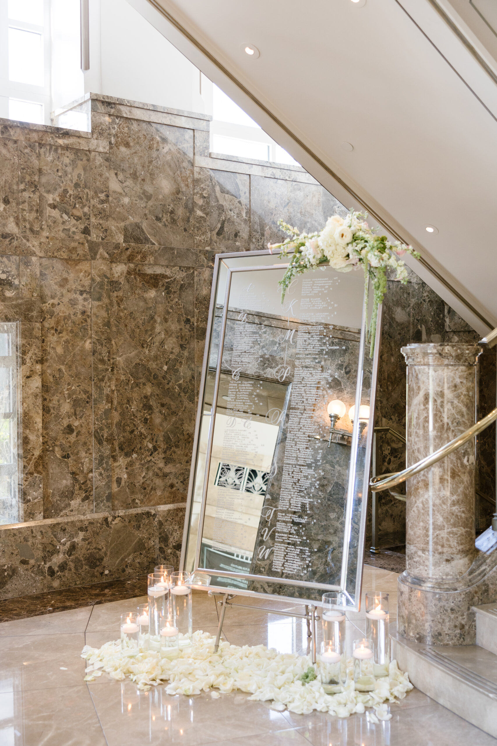
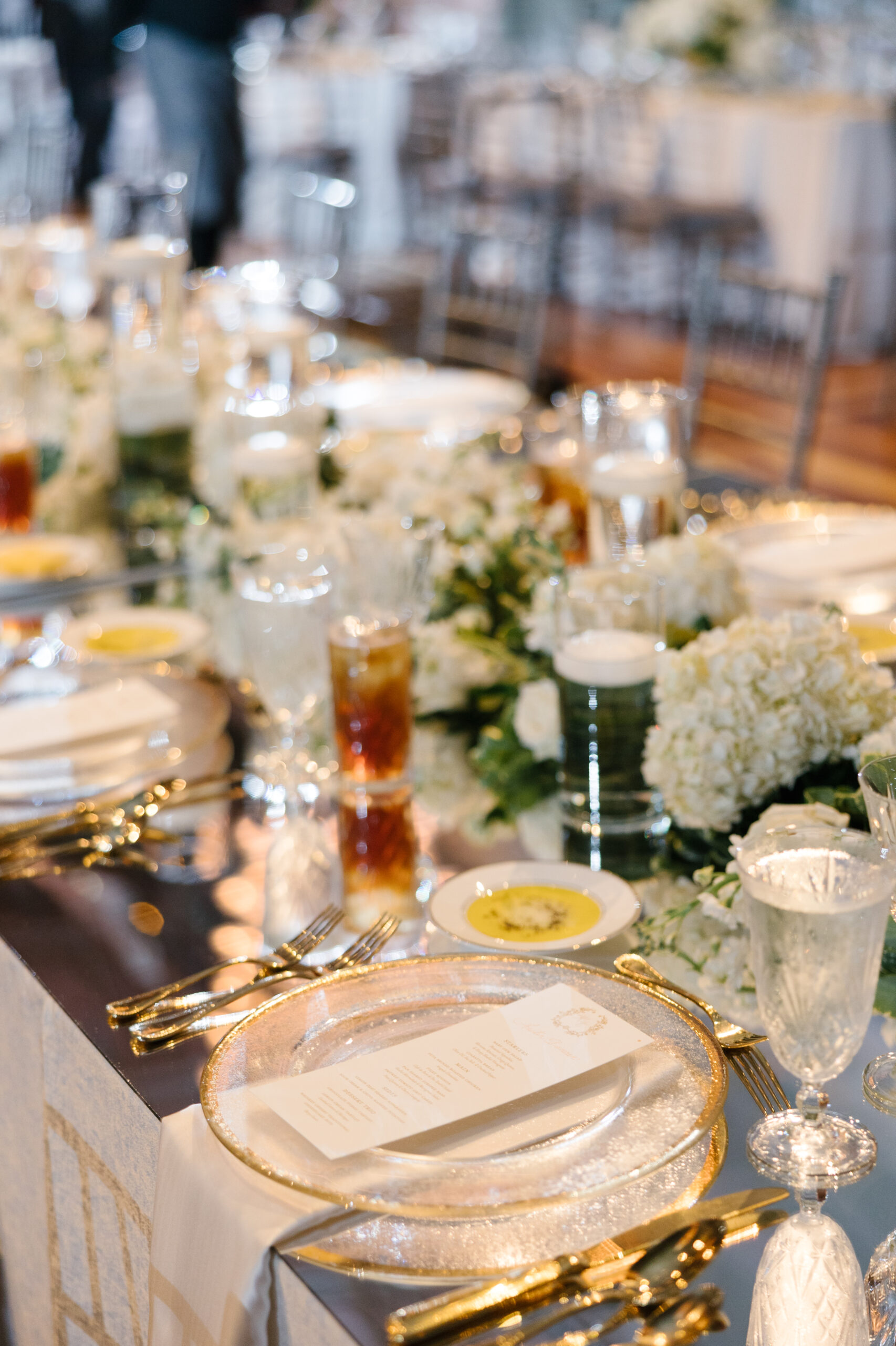
It’s hard to top the simple elegance a mirrored seating chart. I have always loved how the white lettering on the glass instantly elevates the beauty of this double-rib framed mirror. Kayla and Caleb styled this gorgeous seating chart with florals (always a good idea!) and surrounded it with glass vases holding floating candles. I can’t think of a better way to be invited to take my seat at a table in the opulent Schermerhorn. Divine!
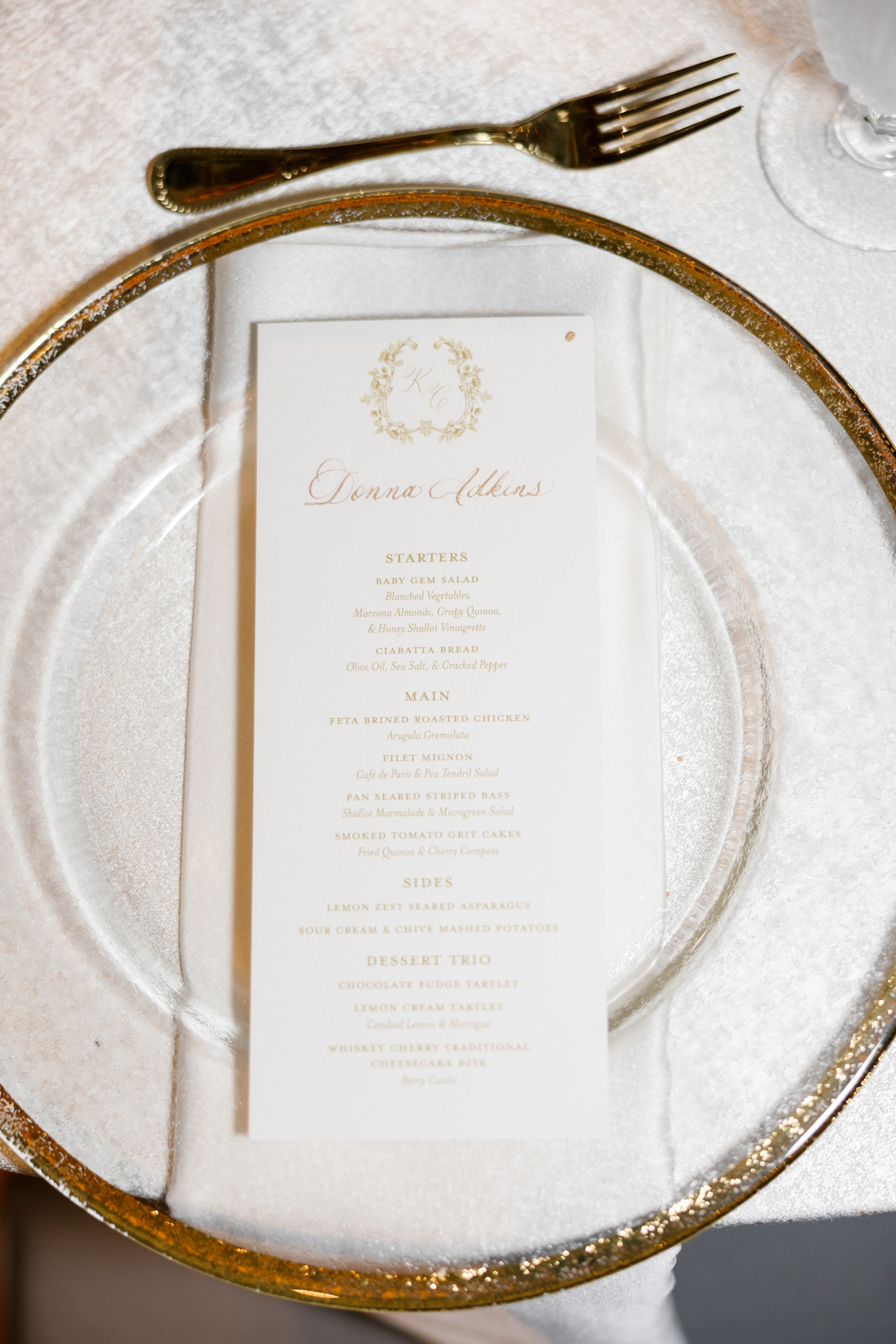
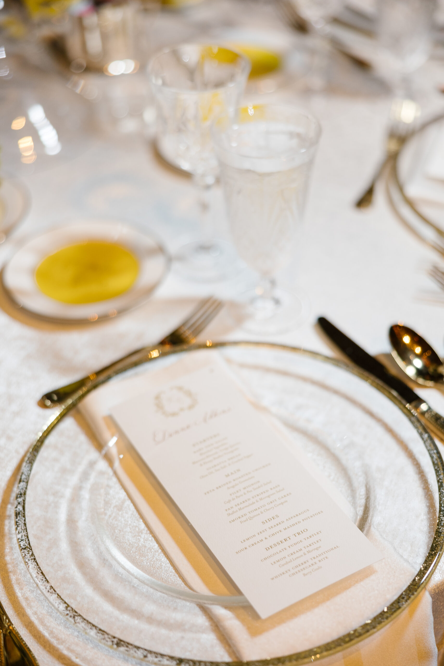
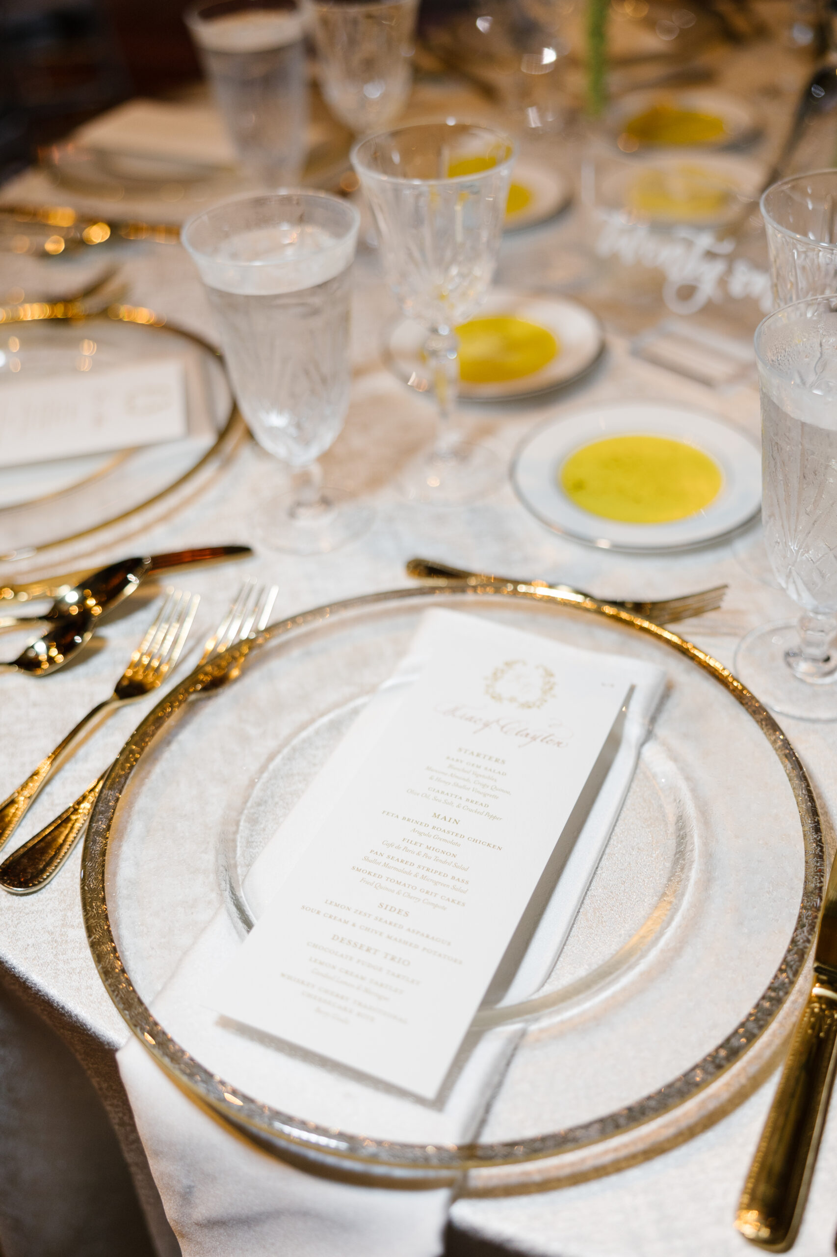
The most elegant part to these custom designed reception menus is that each menu had the guests’ names calligraphed directly on to them. This is why I love what I do! I love when my couples give me the chance to really elevate the finer details of their reception. And yes, guests DO notice little things just like this and often appreciate the level of attention.
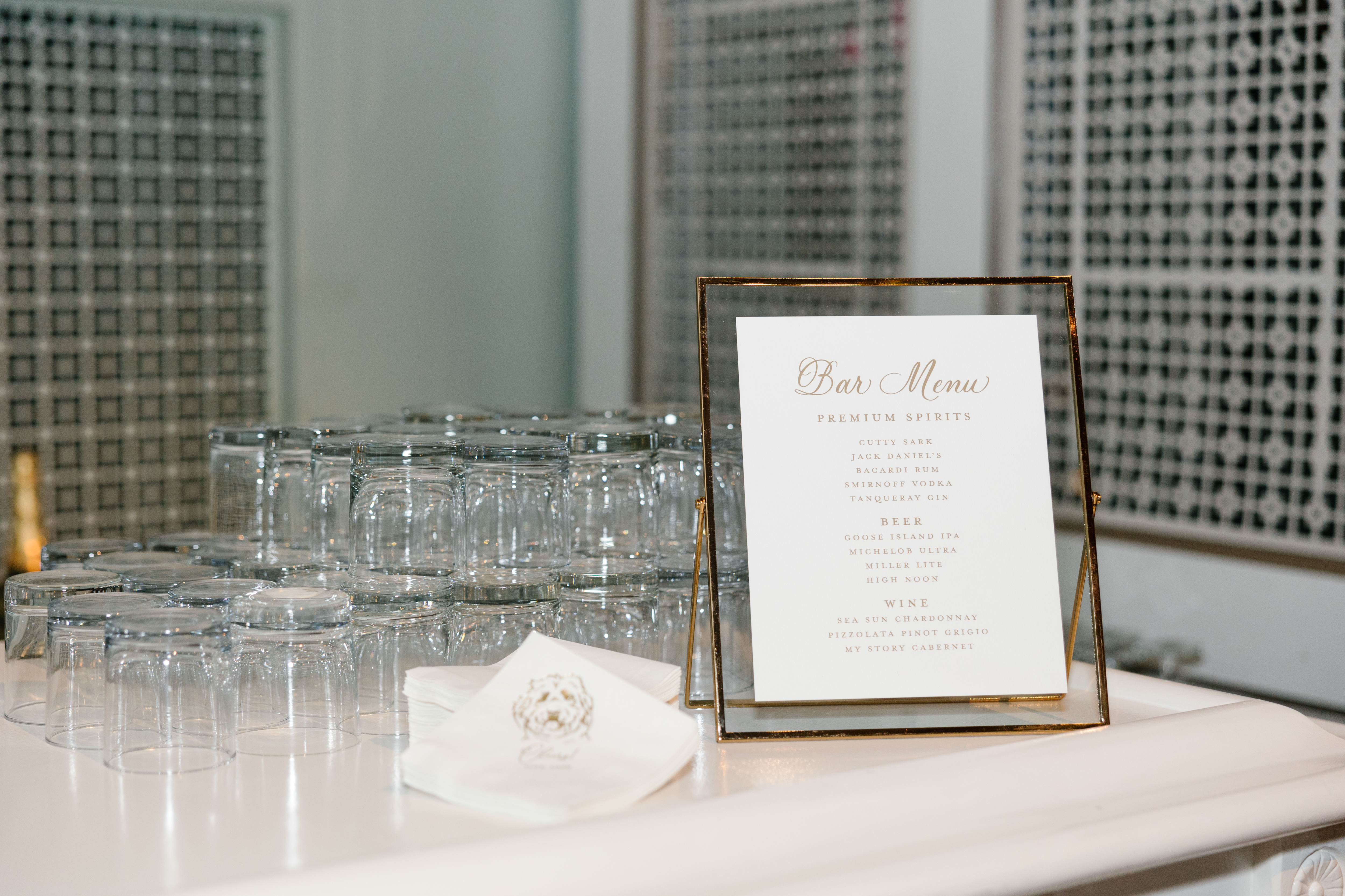
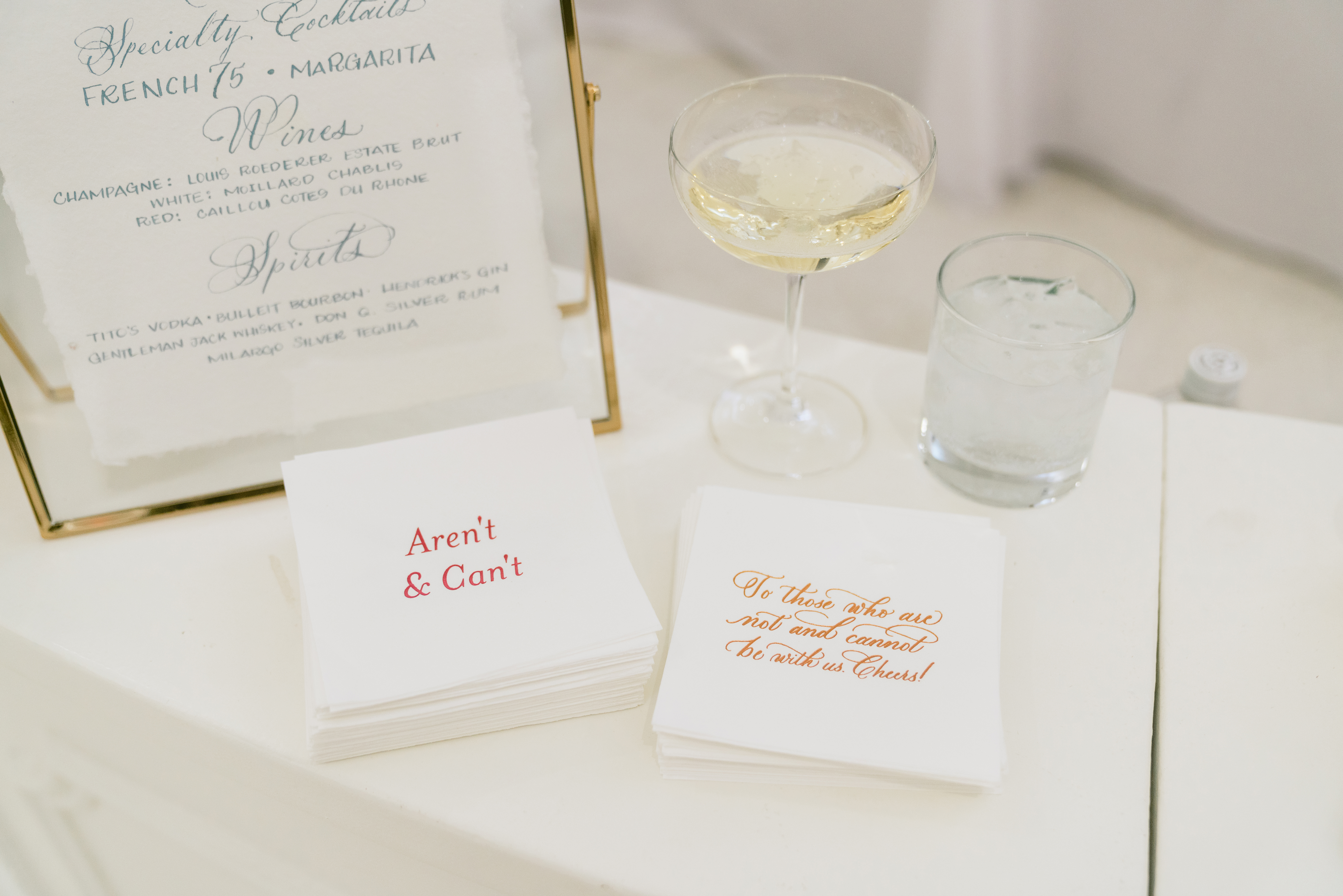
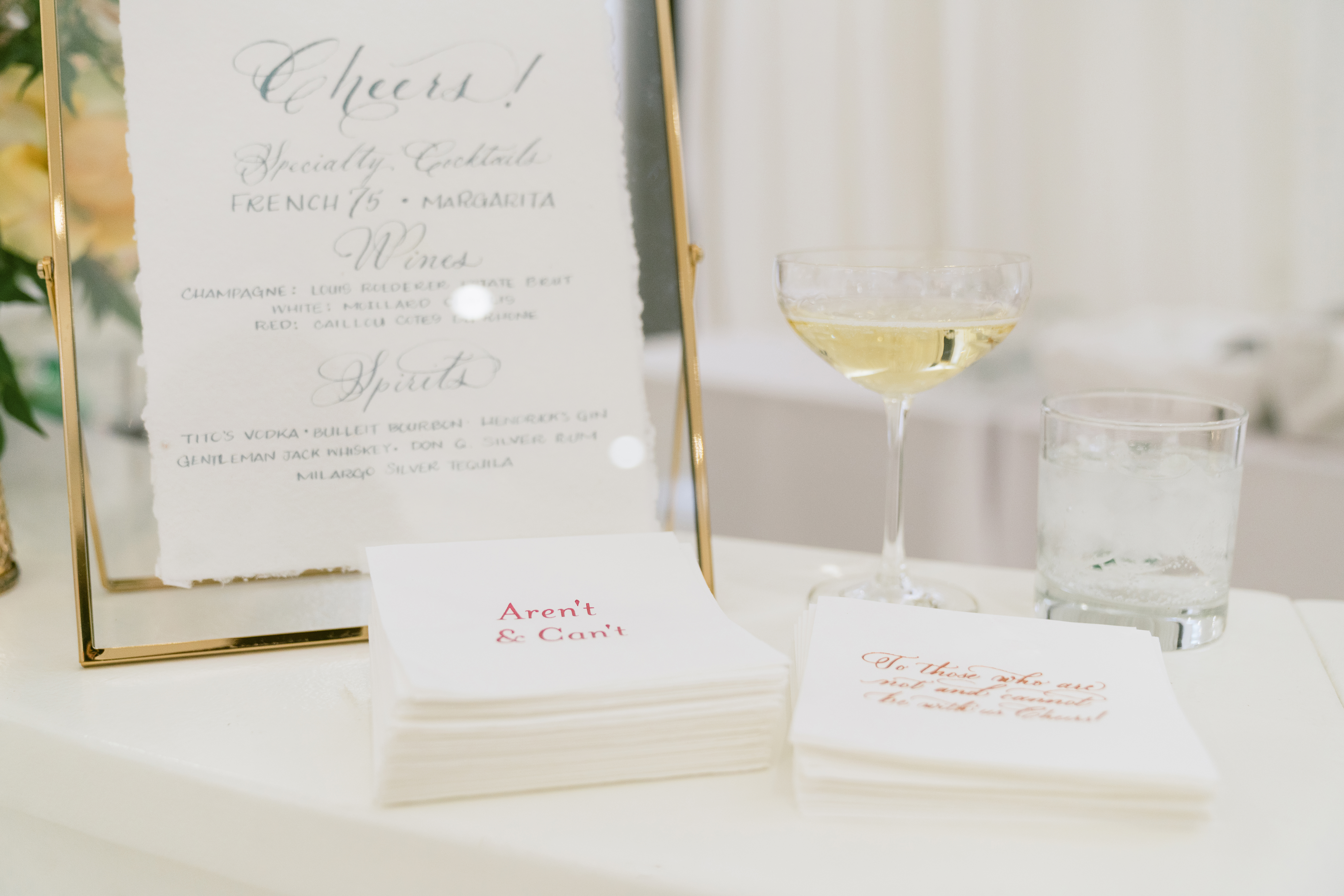
Custom Bar Signs and Cocktail Napkins
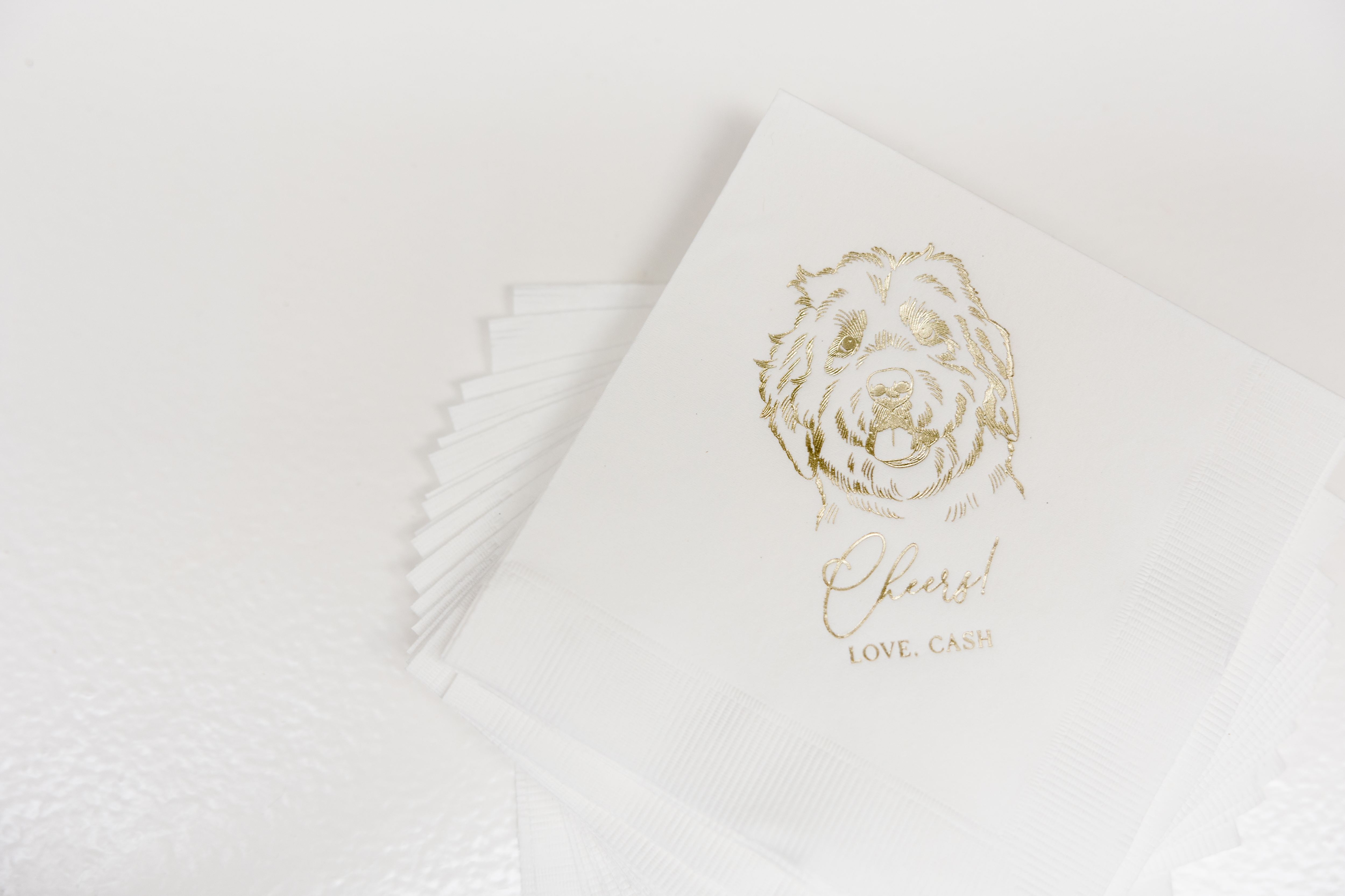
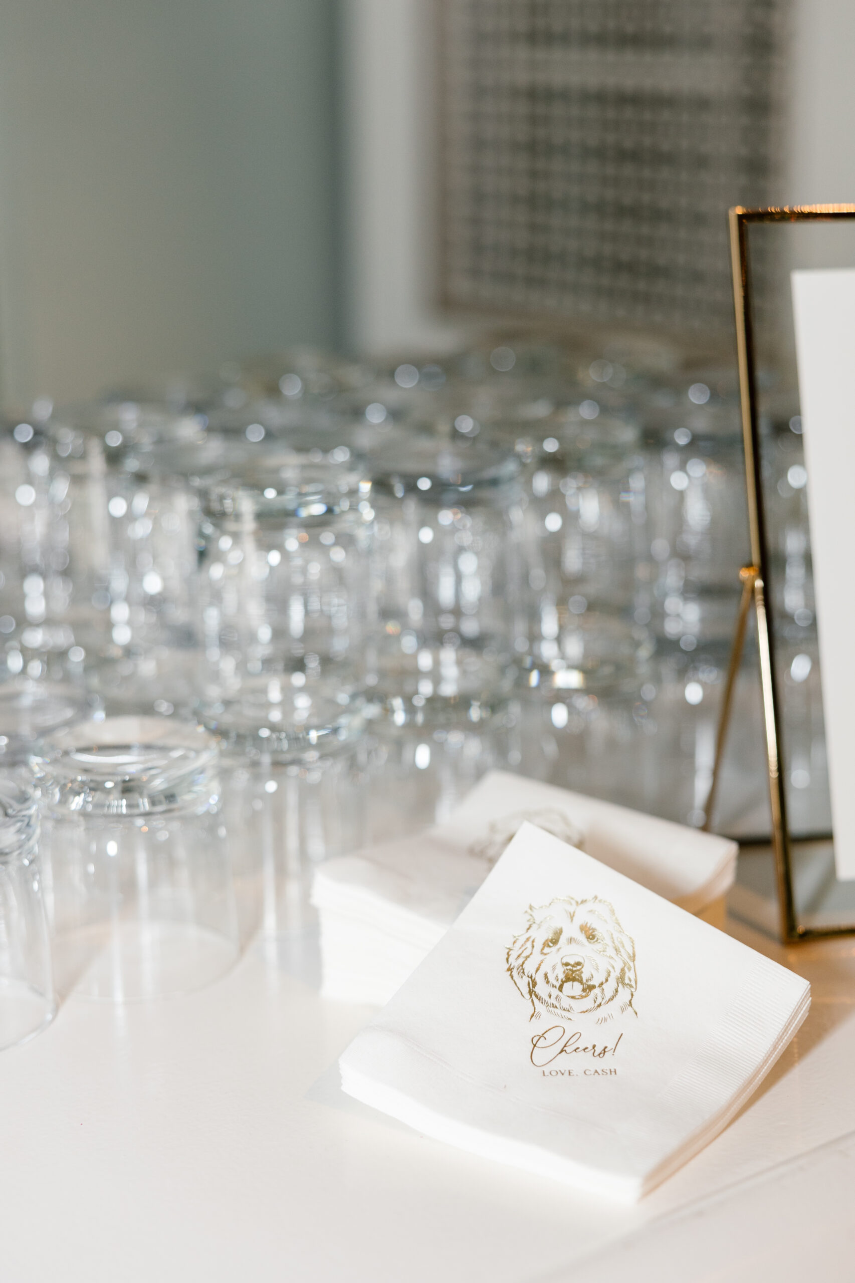
Kayla and Caleb went with one of my favorite bar signs from our rental collection. We customized the drink menu to fit with the style of all other day-of paper goods as well as the invitation suite. Also, please take a moment to gush over the print of their sweet pup, Cash, on the cocktail napkins! Cocktail napkins are the perfect moment to bring in something special or personal to your big day. And it’s a detail that will be cherished forever.
I think one of the most appreciated details of the evening were these adorable koozies that we customized for Kayla and Caleb! They once again took time to personalize an item that guests were able to use and enjoy. It was the perfect little koozie for guests to use with their drinks while they let loose on the Schermerhorn dance floor! I couldn’t love this more.
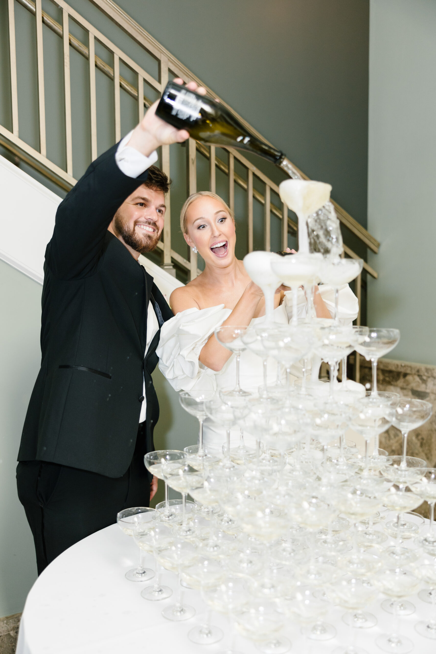
For the White Ink team, this was a night to remember. Nights like this make us proud to do what we do. We love making our couples happy! Kayla and Caleb were an amazing couple to work with. They knew exactly what they wanted and trusted us to pull their vision together. And we are honored to do just that. Cheers to the happy couple!
If you’re looking to add custom, thoughtful touches to your wedding or event, we would love to help make your vision a reality. Reach out today to learn more about our full-service design offerings—we can’t wait to create something unforgettable for you!
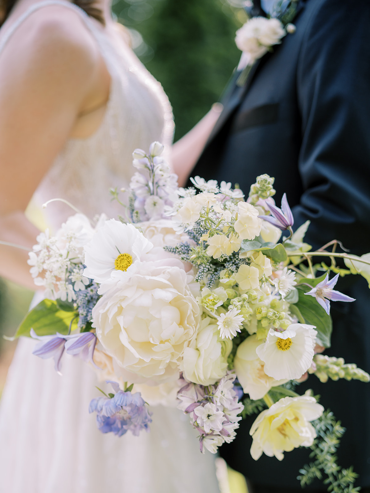
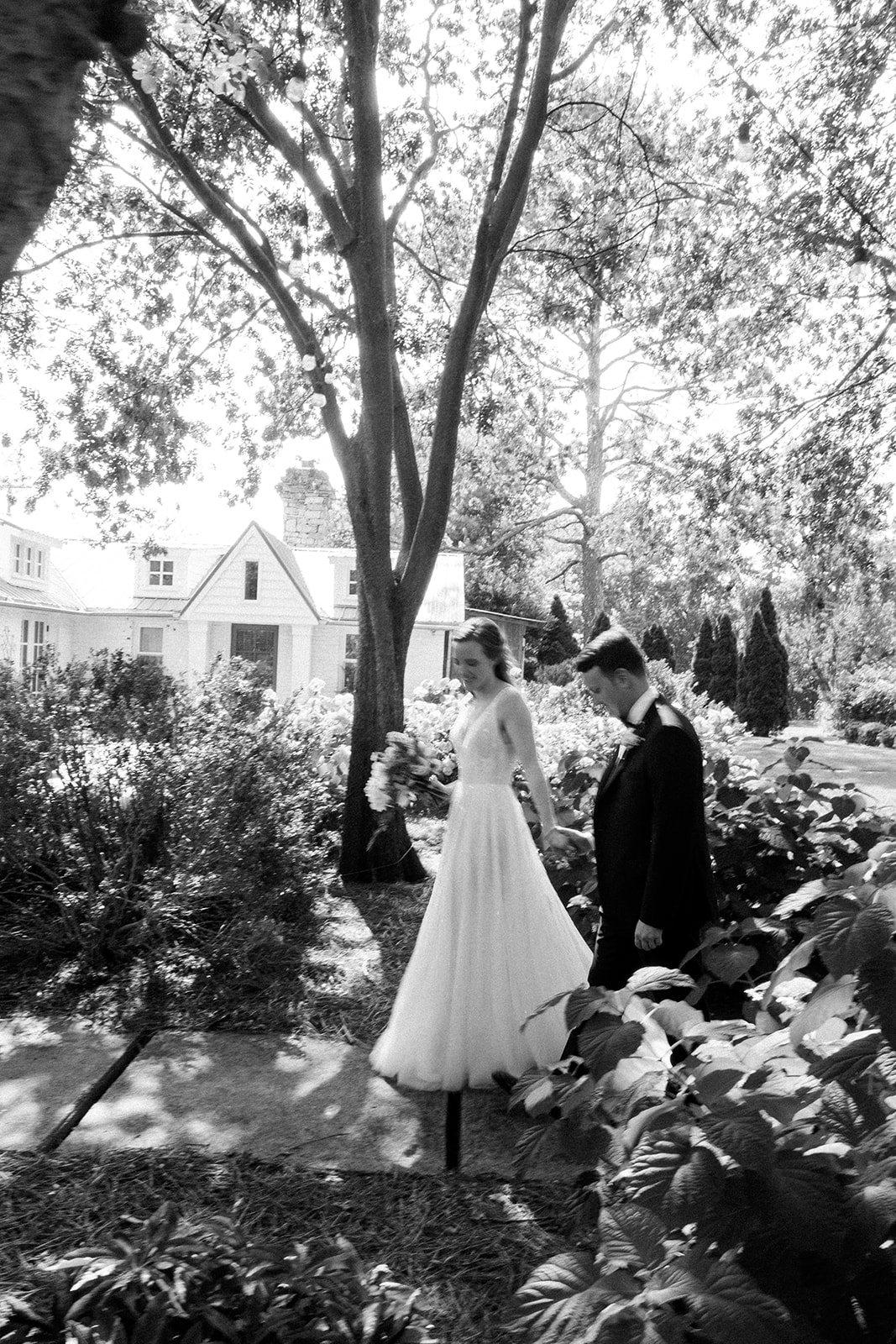
Every moment of planning with this sweet couple was a true joy for all of us at White Ink. Morgan and Tommy chose an incredible balance of boldness and gentleness throughout their wedding details making this dreamy garden-inspired summer wedding unforgettable for all in attendance. Truly, it was stunning-a dream day from start to finish.
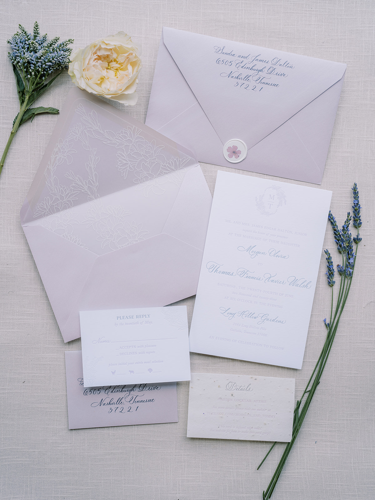
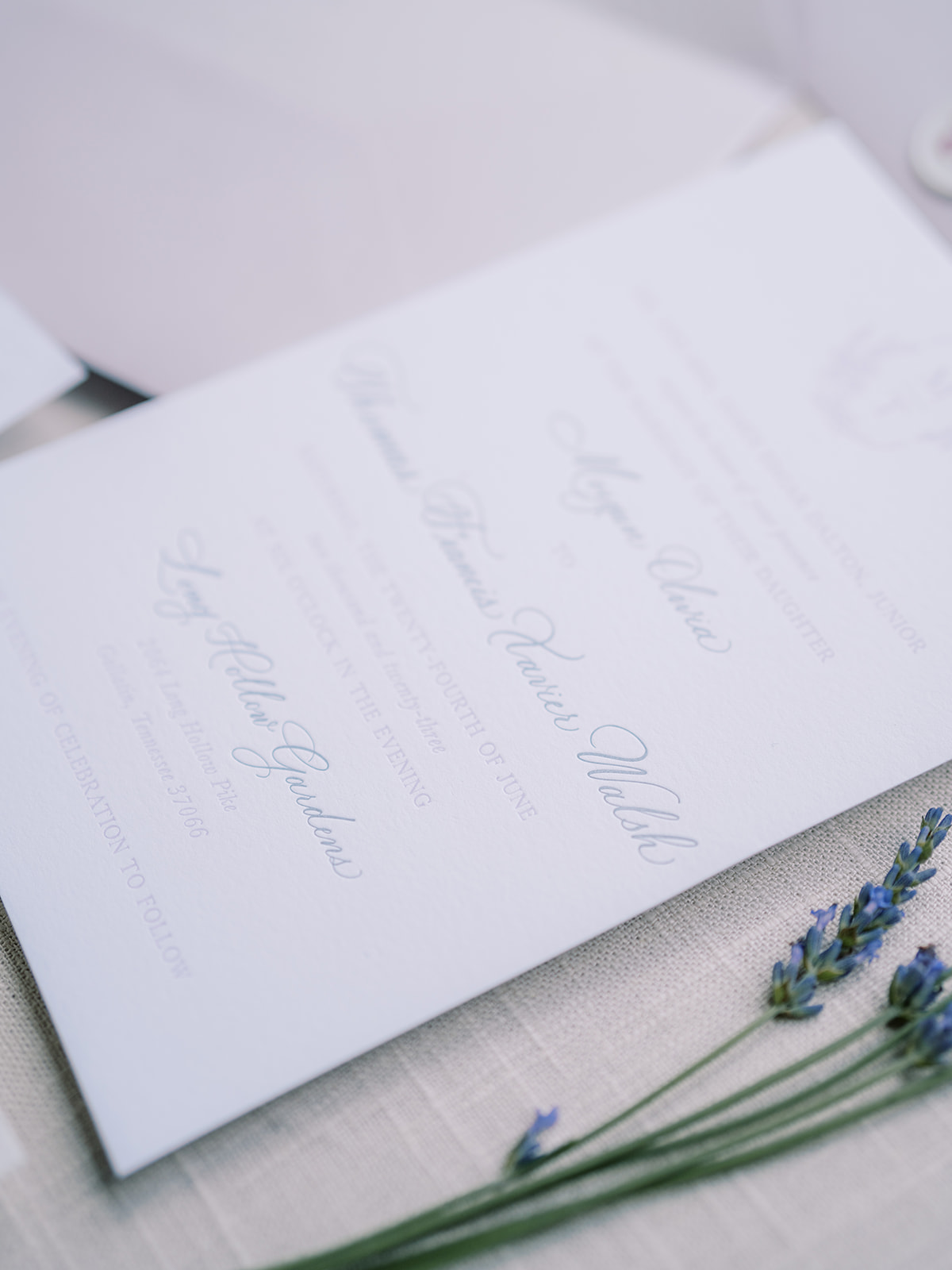
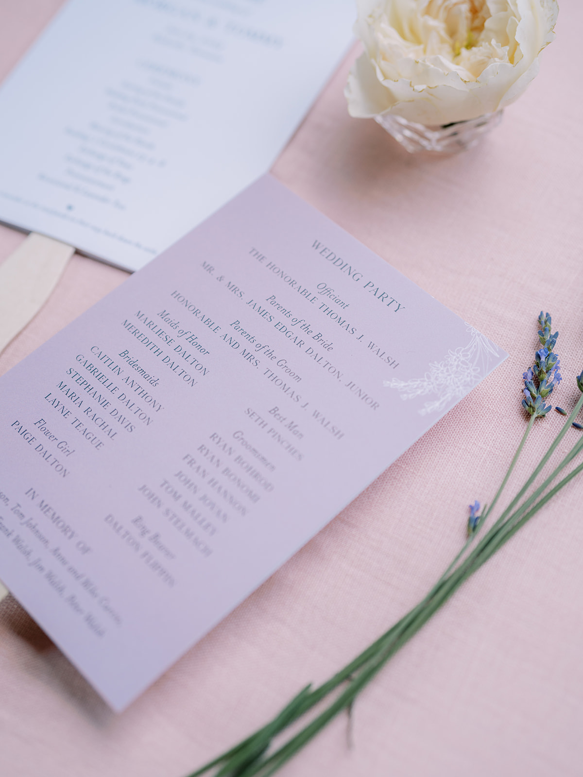
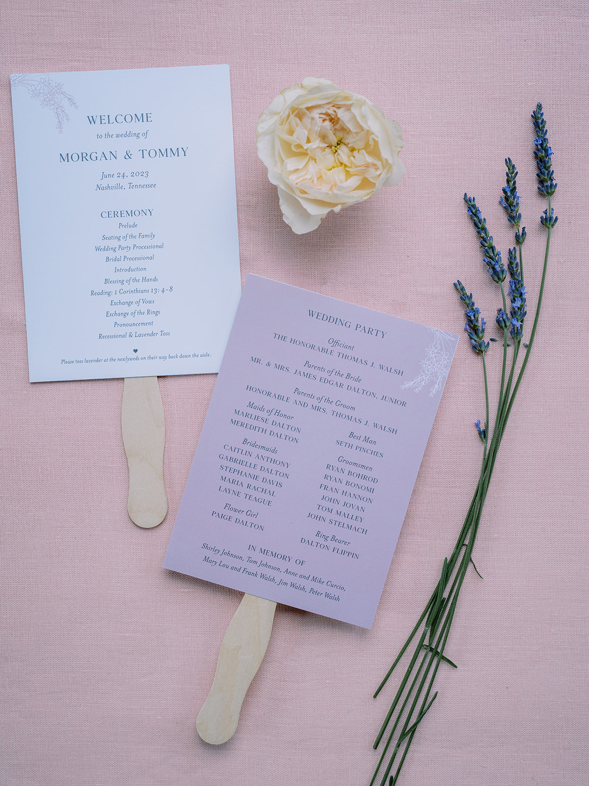
Dreamy Lavender Invitation Suite
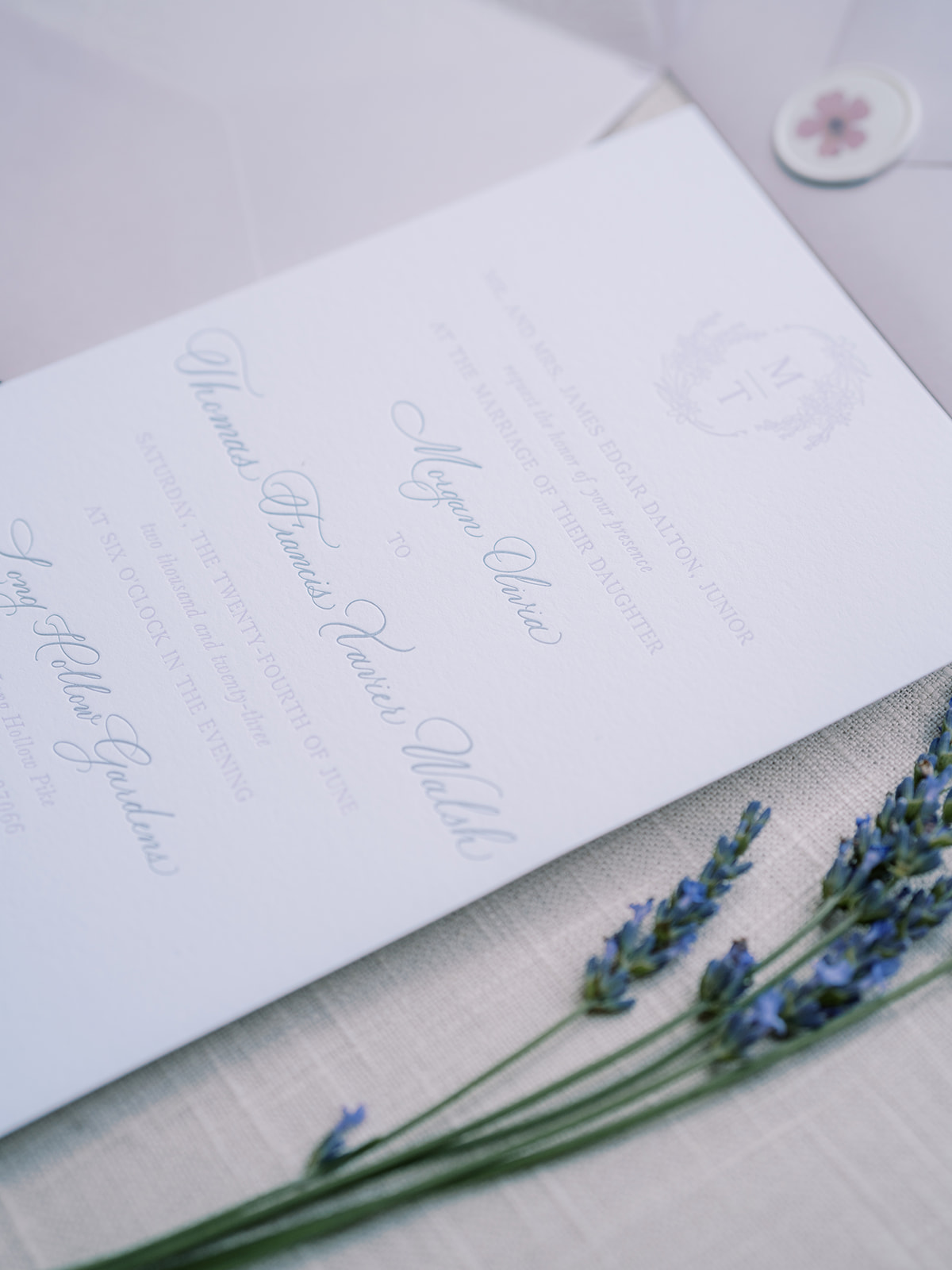
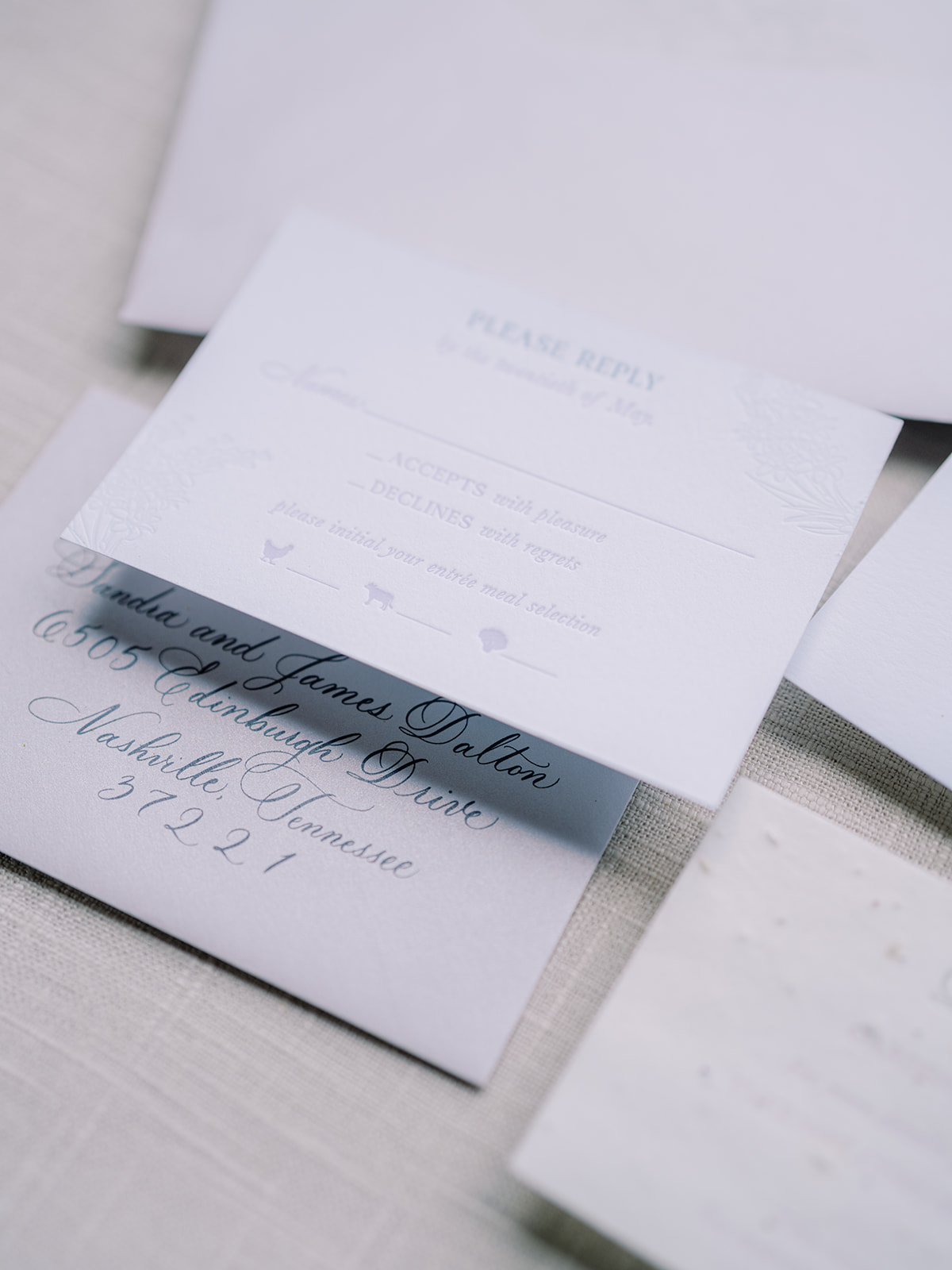
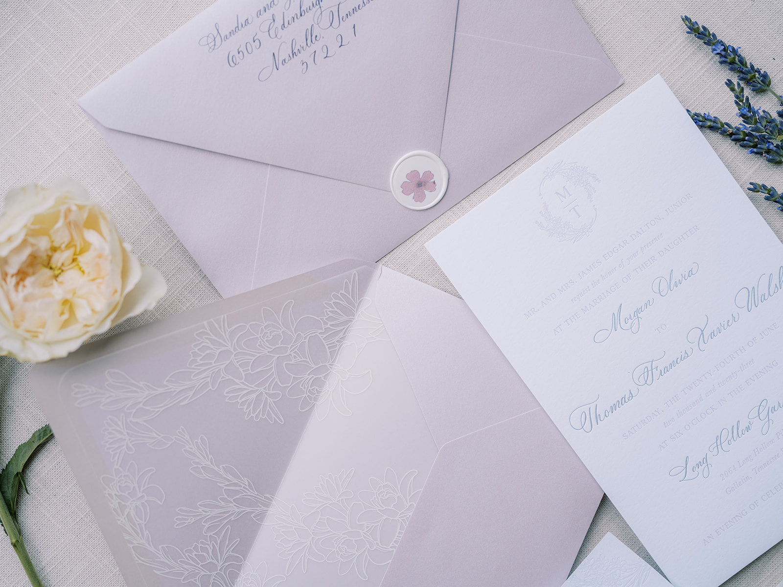
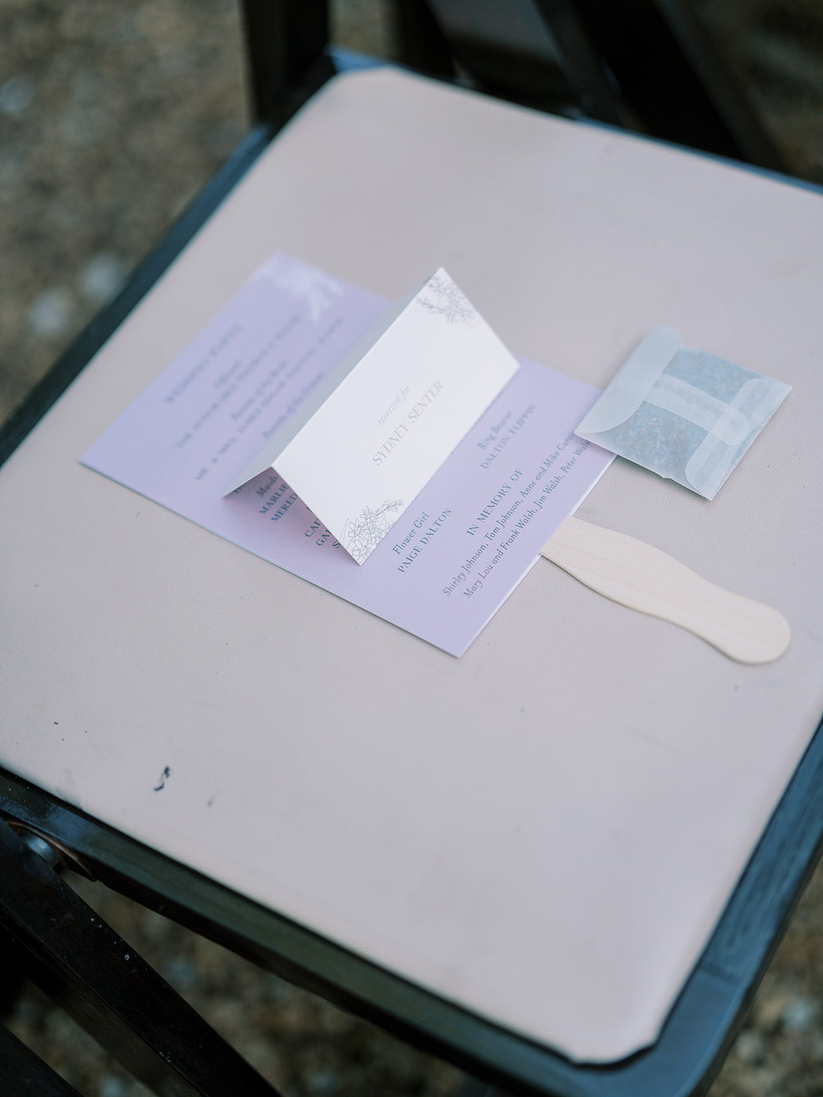
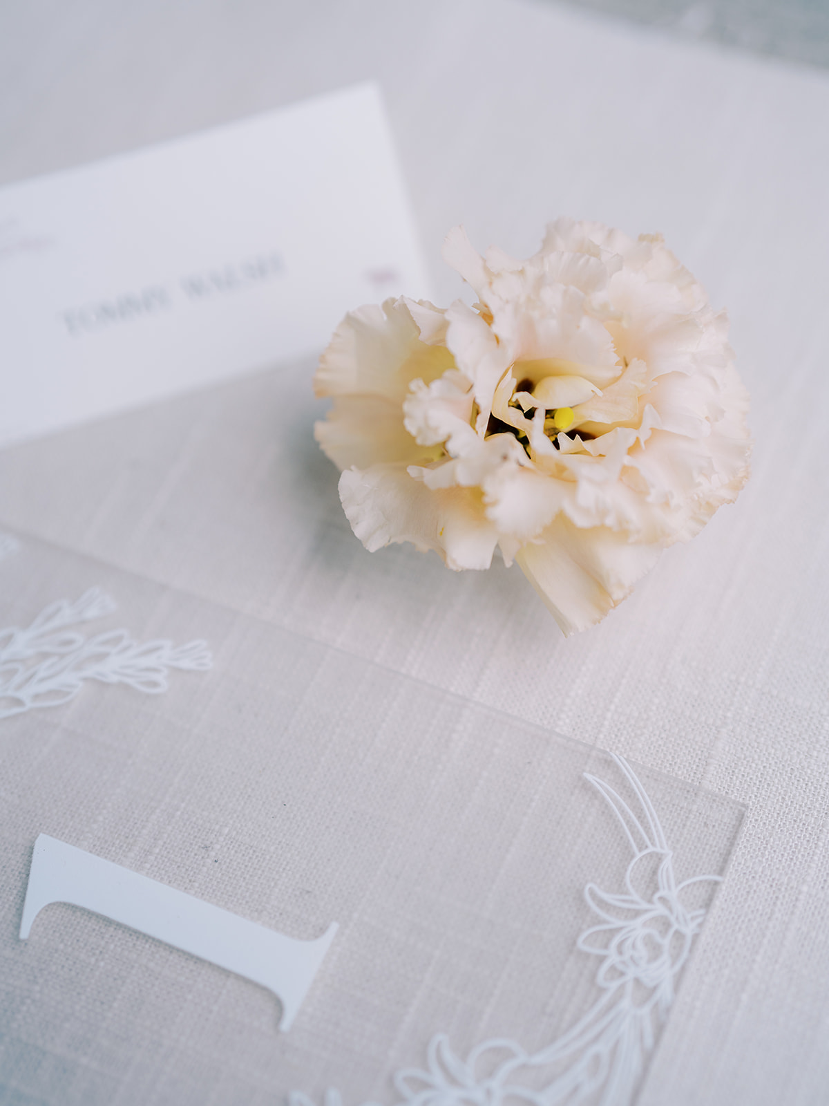
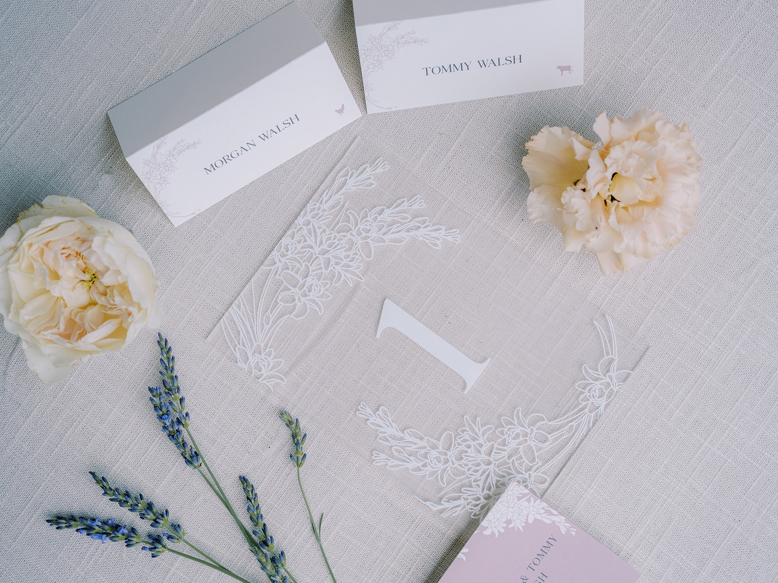
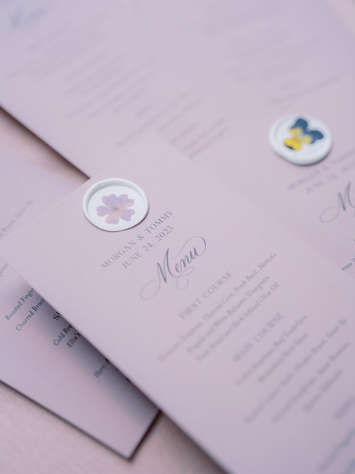
Morgan and Tommy’s invitation suites delicately showcased a beautiful lavender color and theme, a detail that was laced throughout the entire ceremony and reception! Our friends at Clover Calligraphy Co. did the beautiful letterpress work on the card stock paper, which comes at no surprise as they always do impressive work! A soft lavender hue was chosen for the envelopes in addition to the vellum envelope liners with a dainty tuber rose print. I also want to draw attention to the pressed flowers in the custom wax seals! Is this not the dreamiest invitation suite?
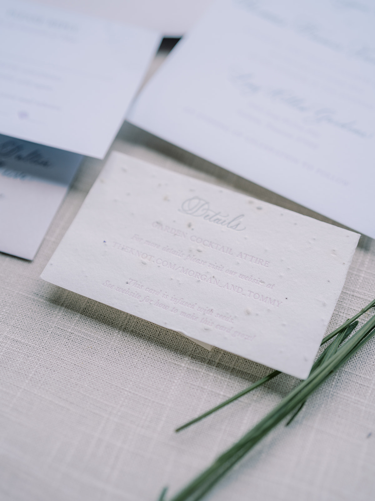
If you look closely at the details card from our bride and groom’s invitation suite, you can see that this textured card is actually seed paper! The cards were infused with wildflower seeds so that wherever guests planted their cards, wildflowers would grow! Talk about a memorable detail!
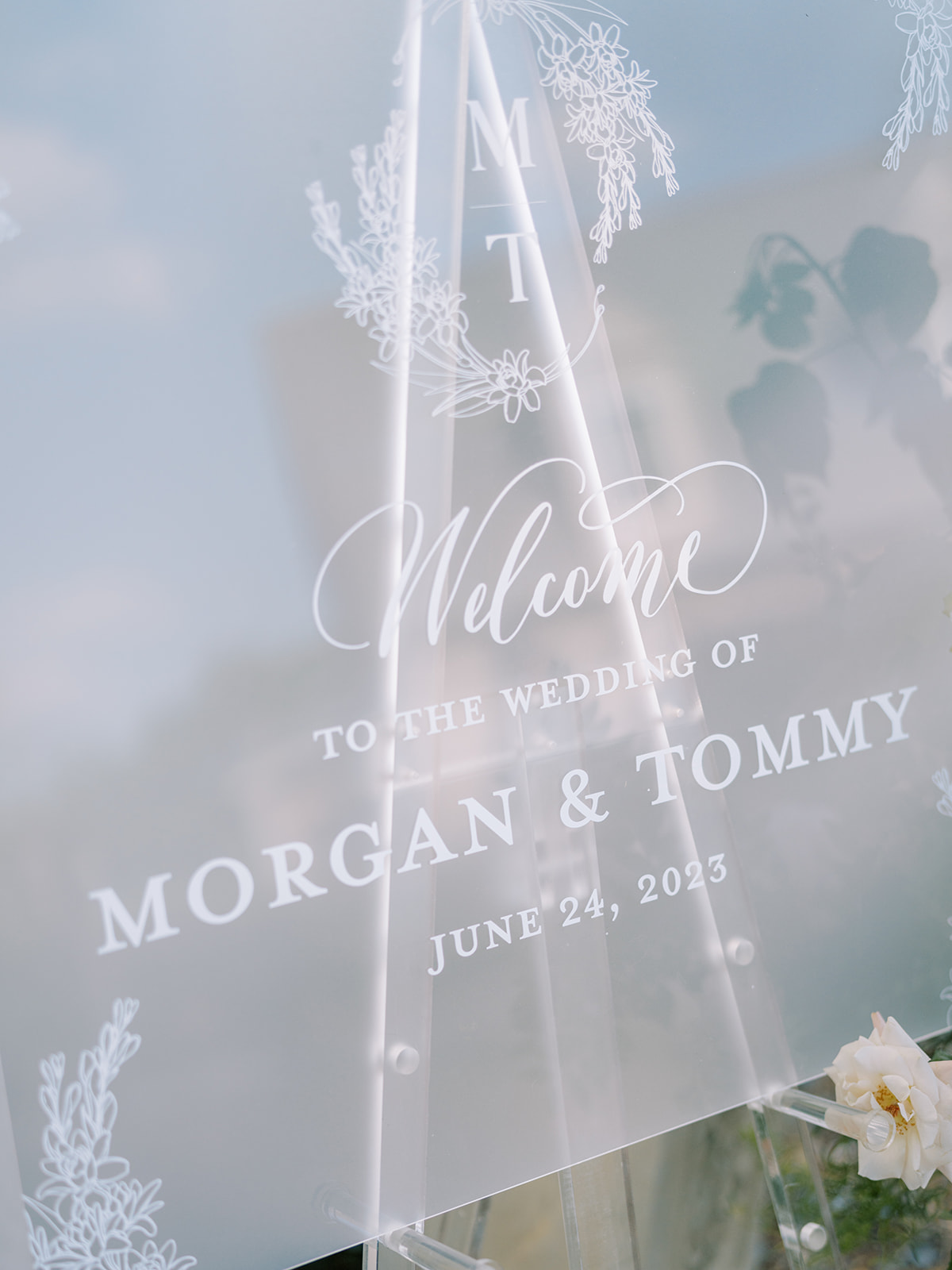
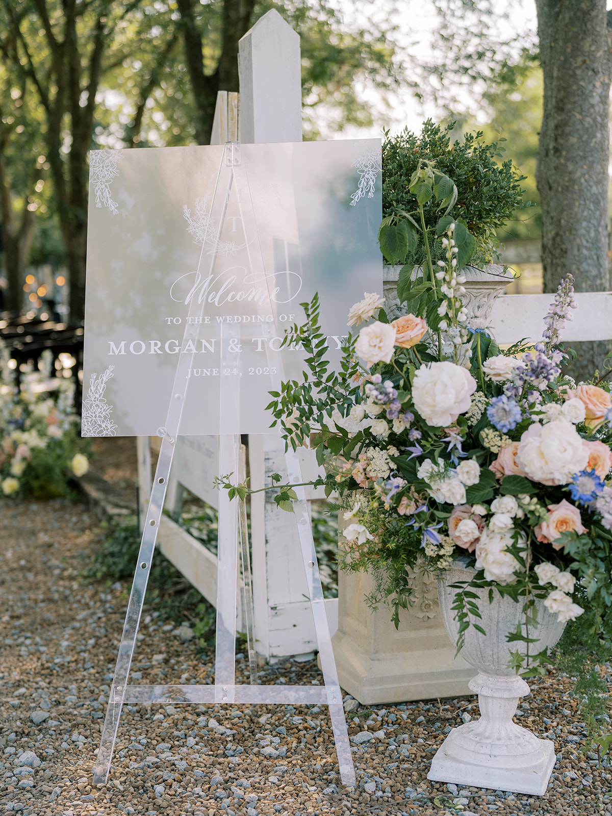
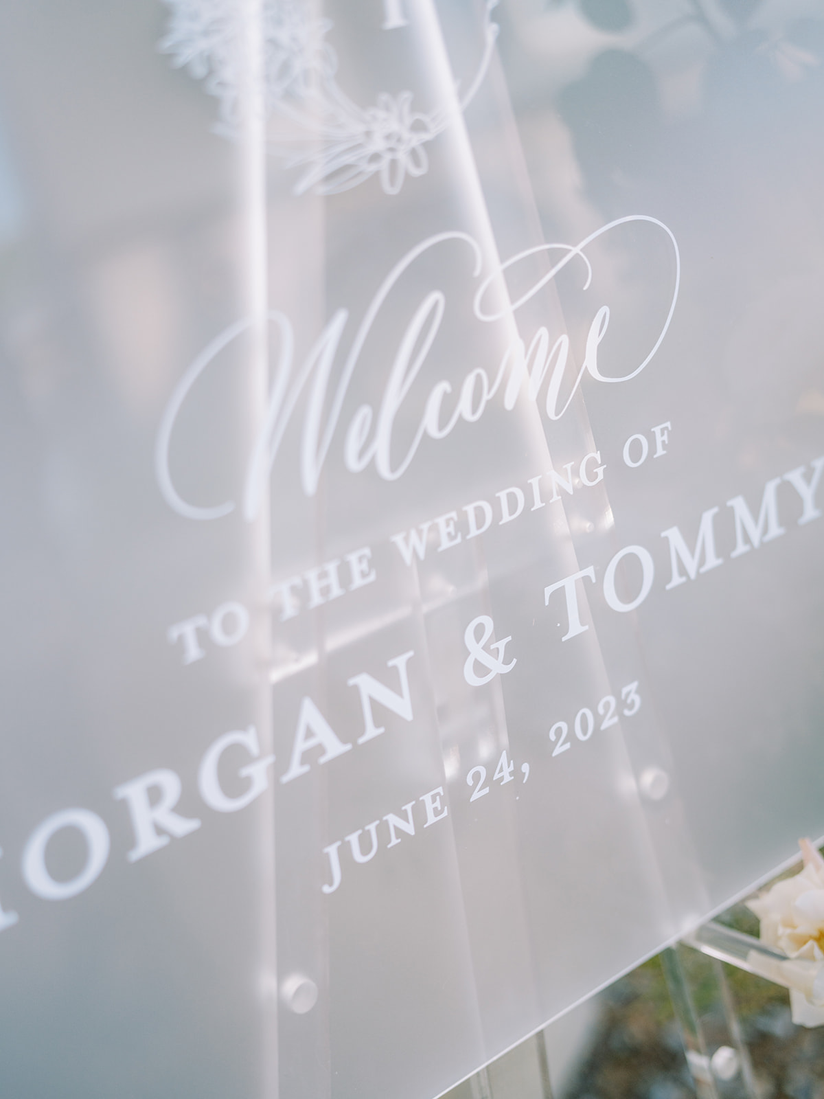
Frosted Acrylic Welcome Sign
The elegant frosted acrylic wedding welcome sign brought me back to the invitation suite details, as guests could see the same custom monogram from the invite, as well as the beautiful tuber rose print on the vellum envelope liner. Connecting details throughout an event, especially a wedding, can easily elevate your special day.
Thoughtful Summer Wedding Details
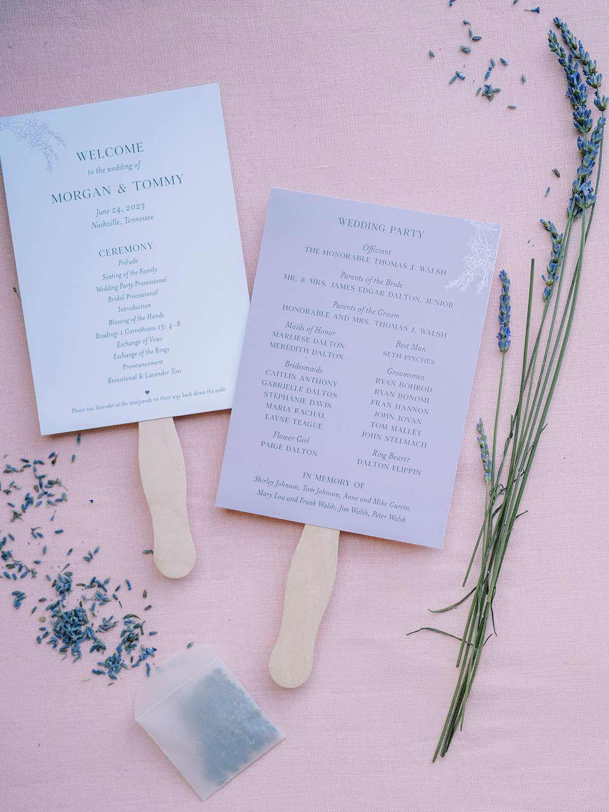
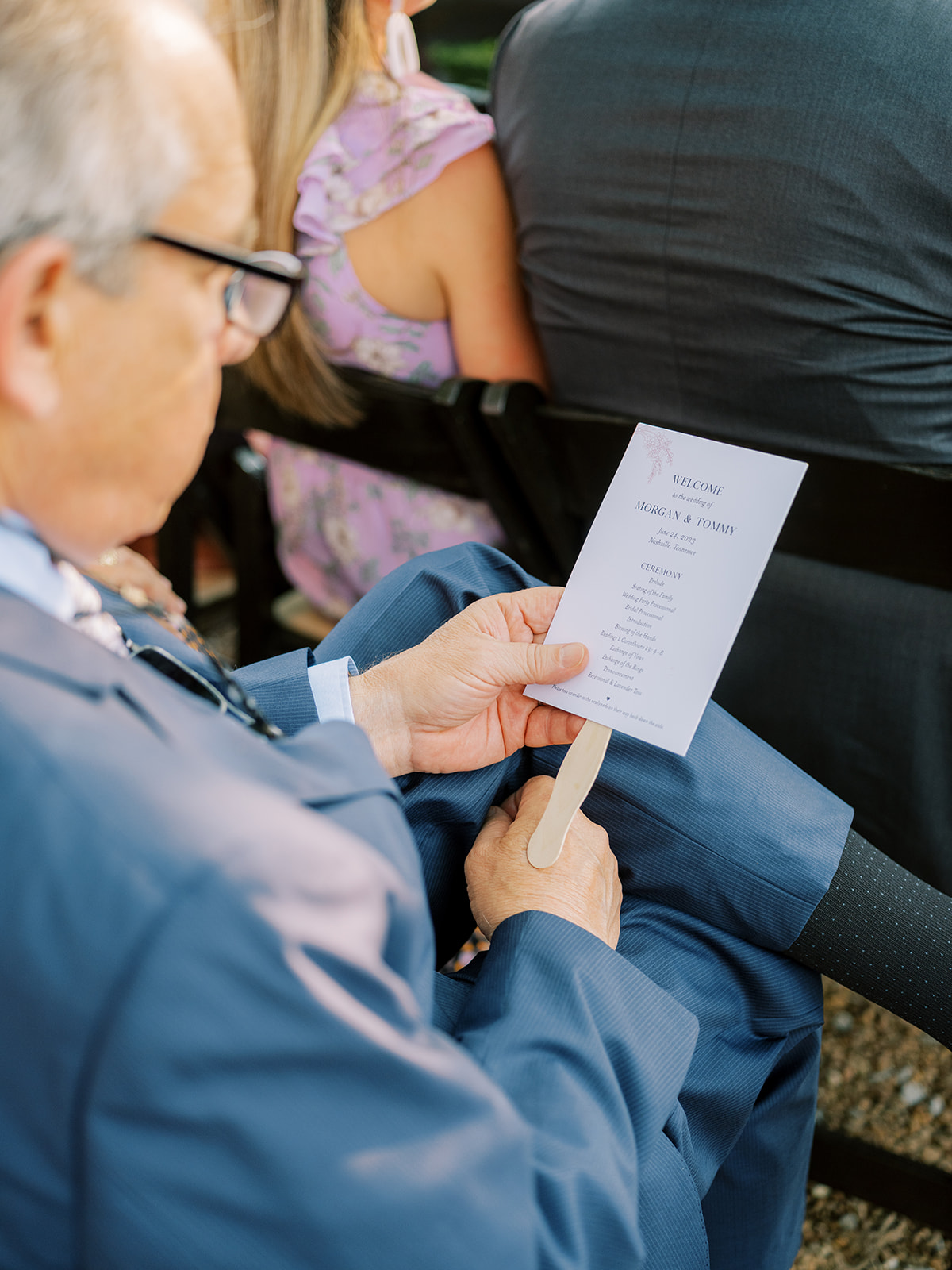
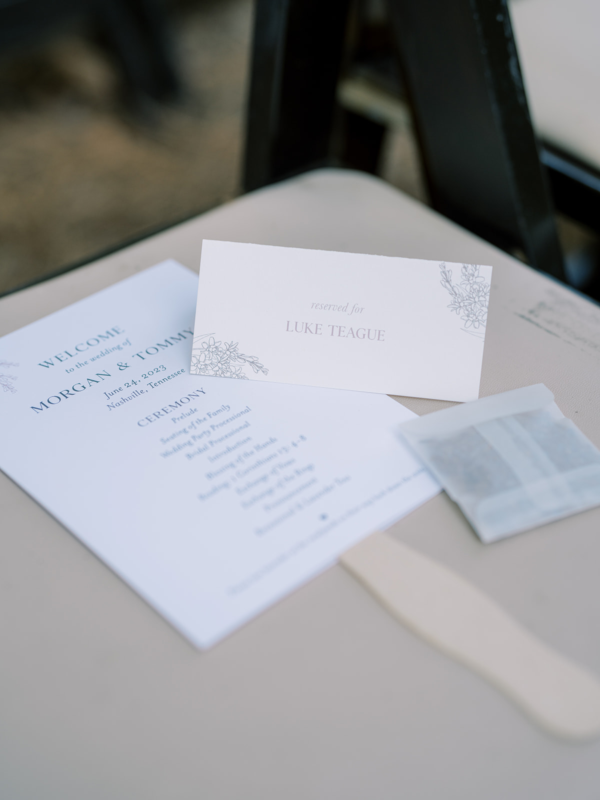
A very thoughtful detail that Morgan and Tommy added to their June wedding was letting us create these adorable fan programs which, of course, included the stunning lavender color theme and floral prints that blanketed the details of their wedding. This is a perfect example of making parts of your ceremony details functional for your guests while maintaining a delicate theme.
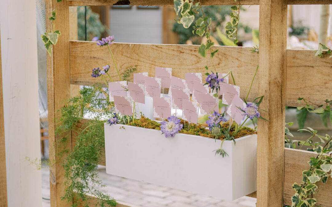
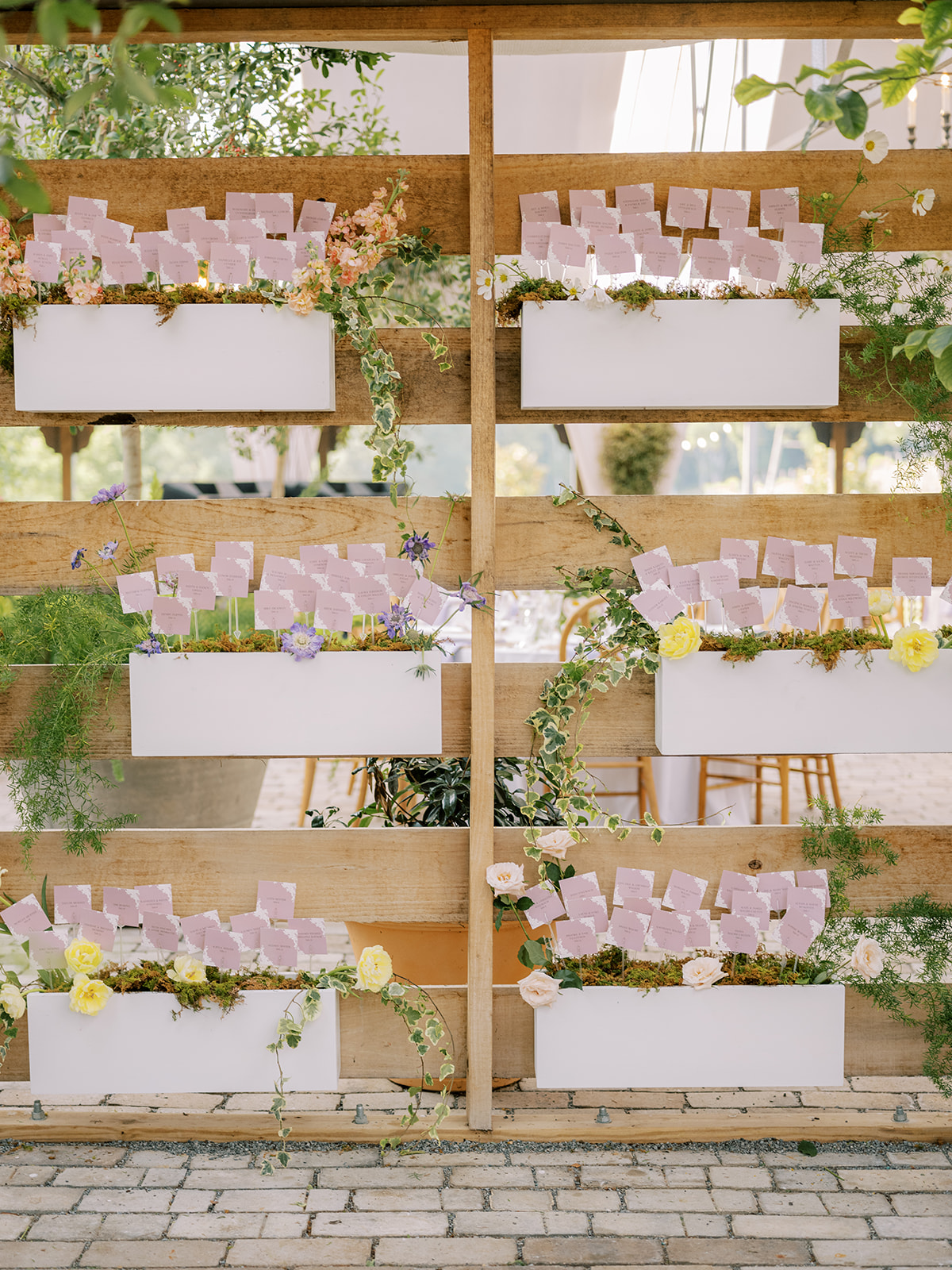
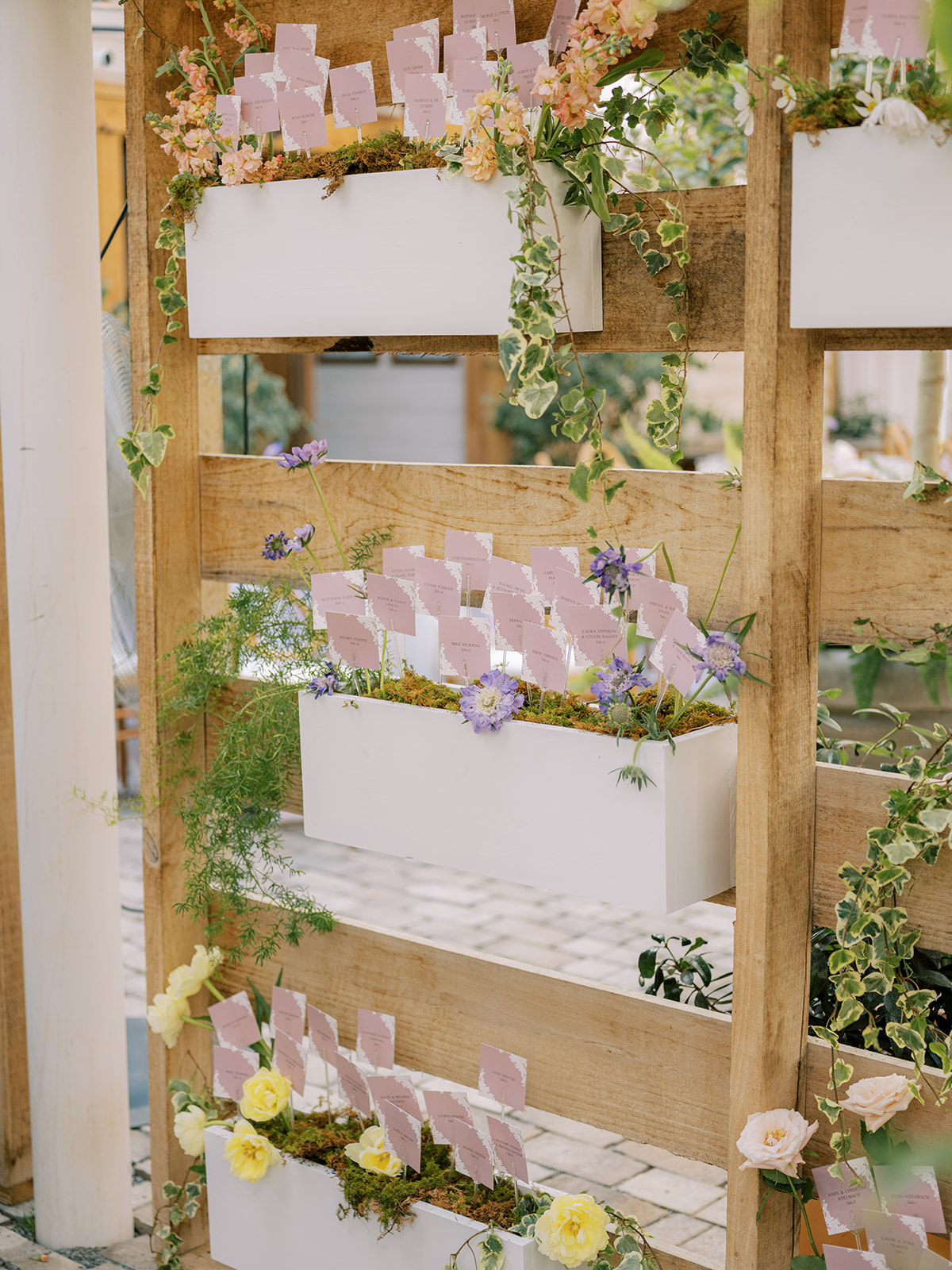
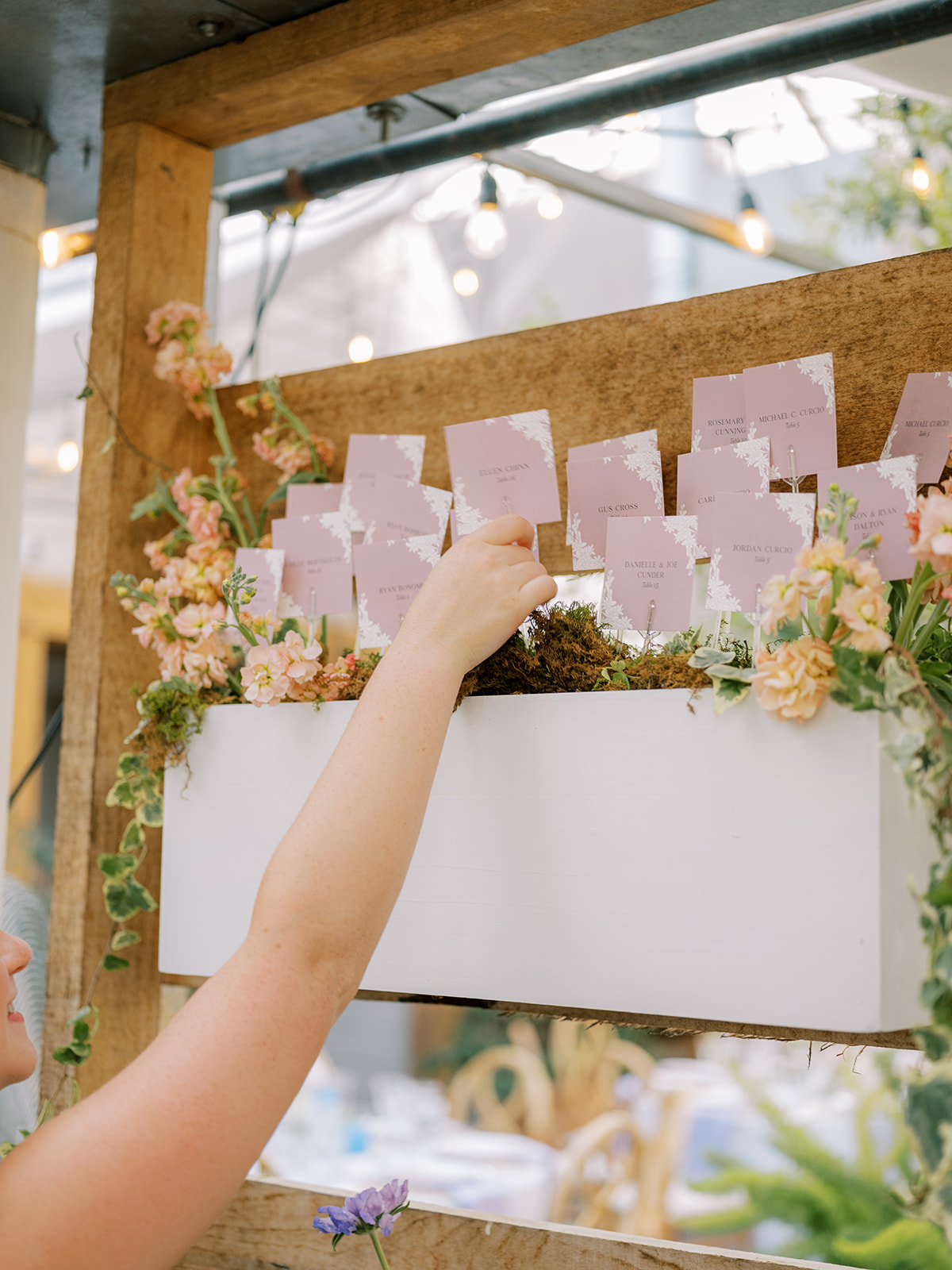
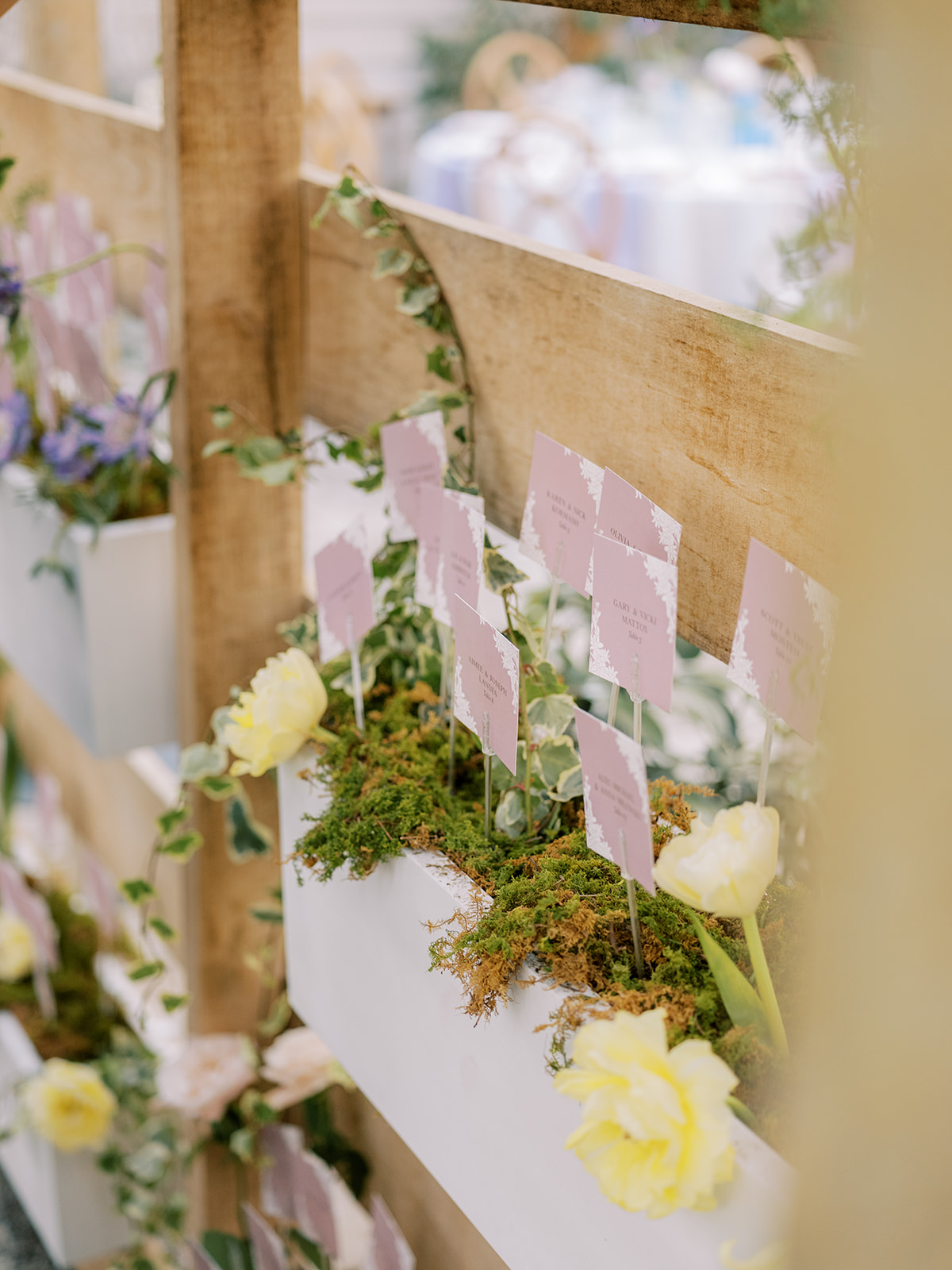
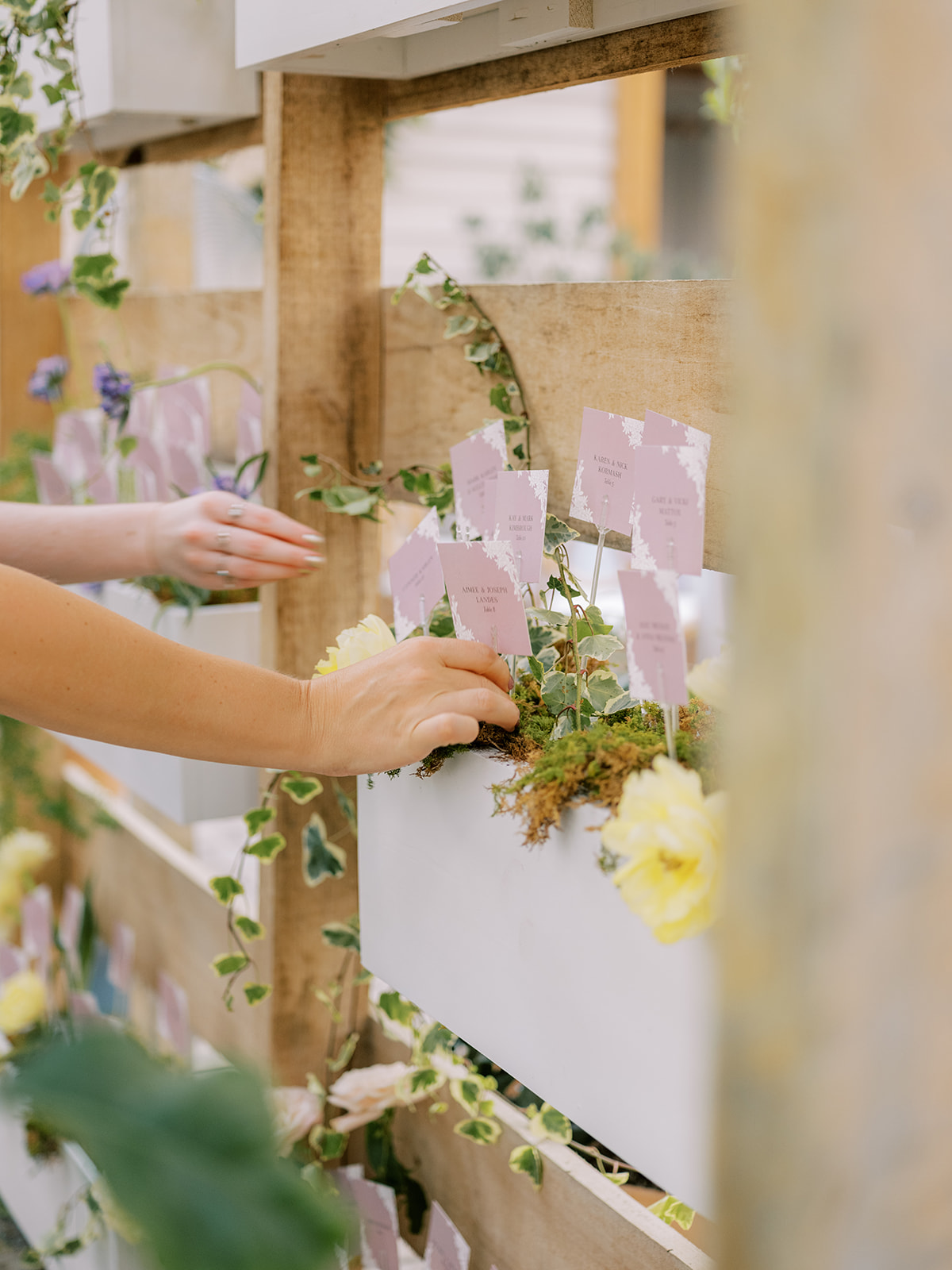
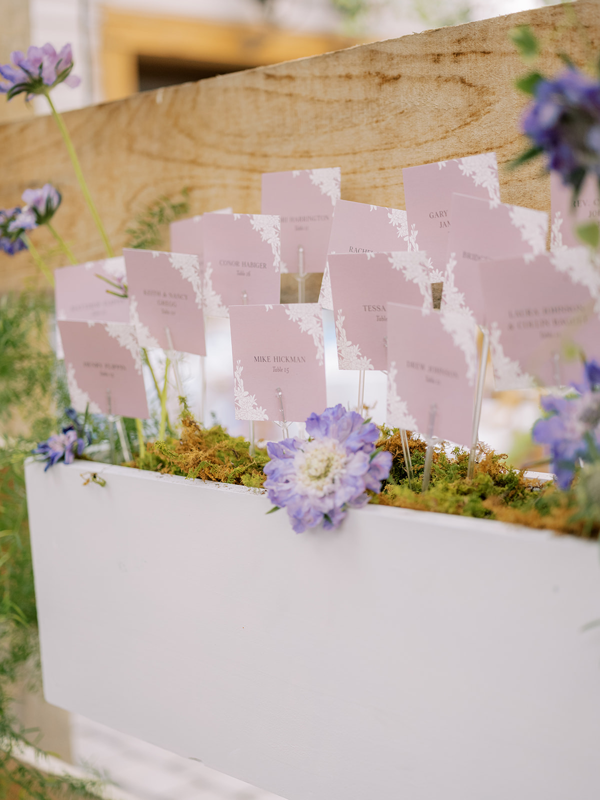
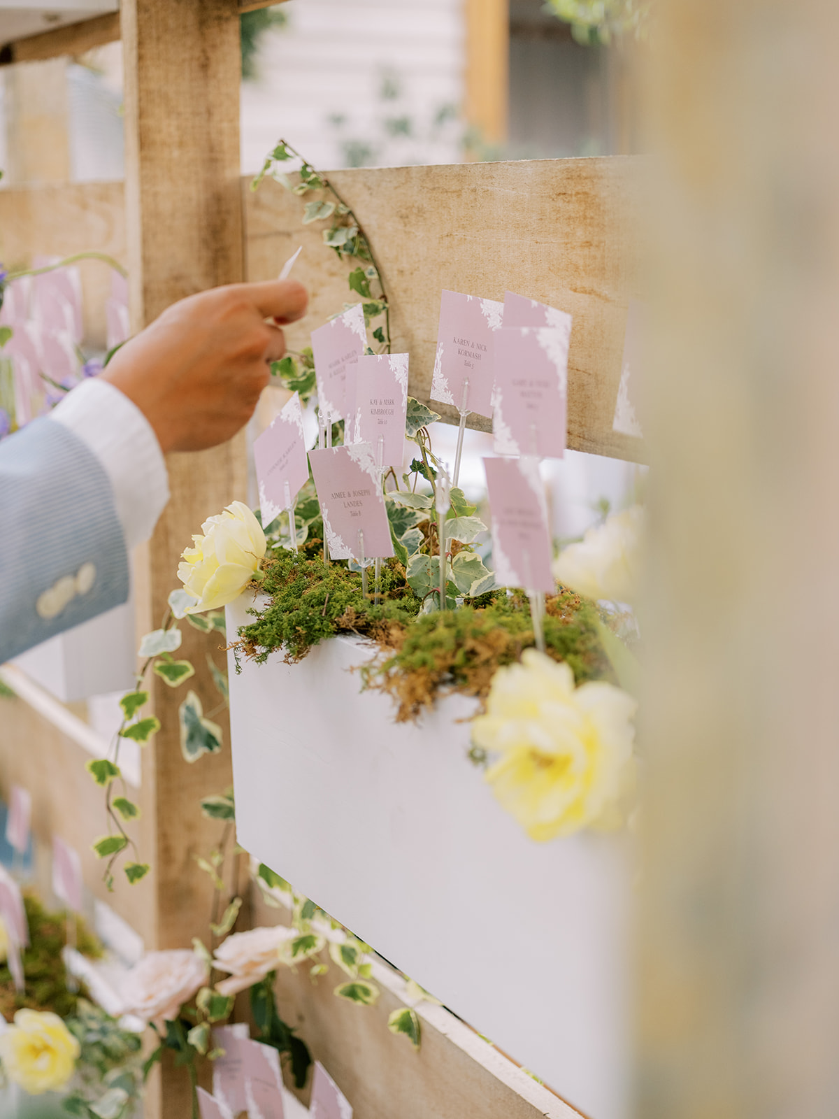
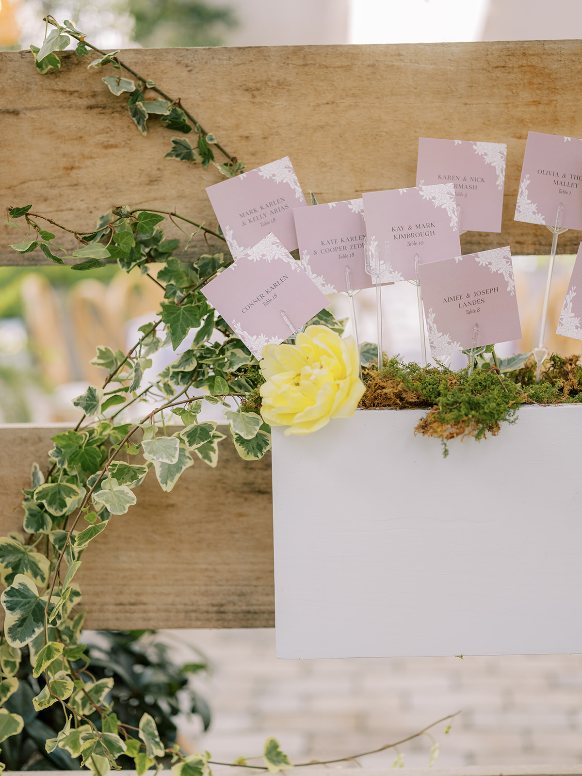
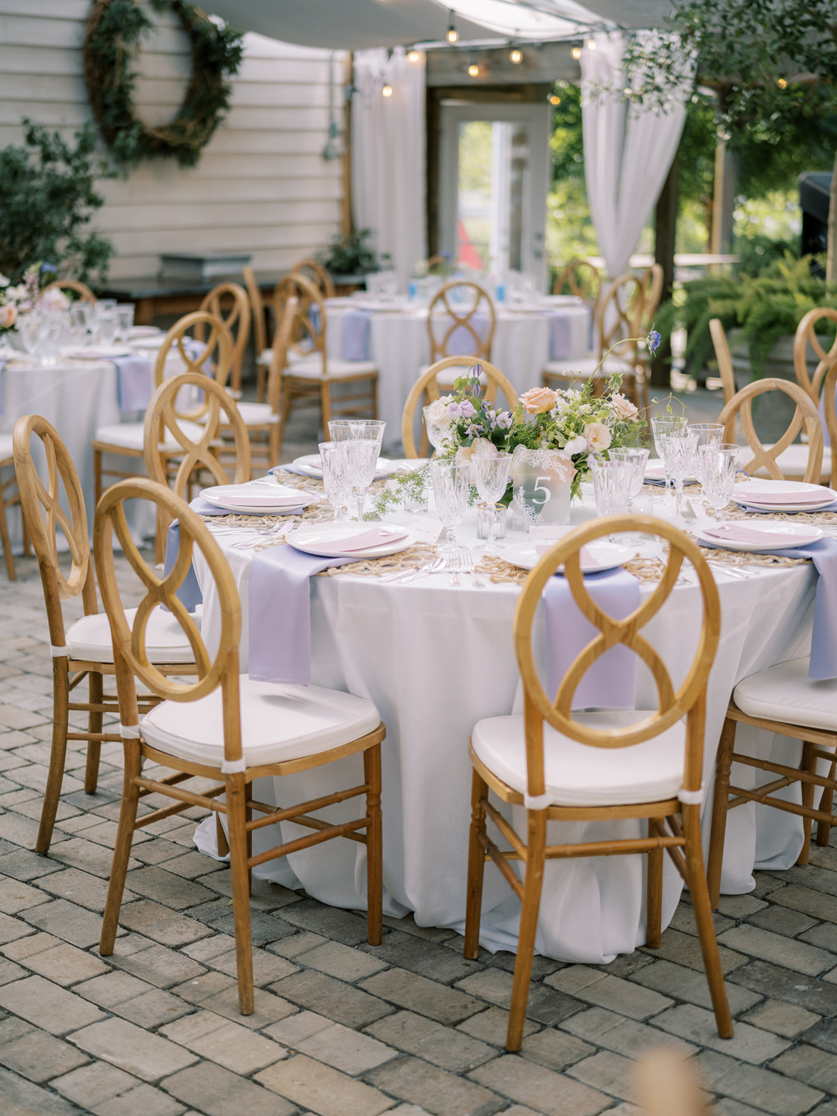
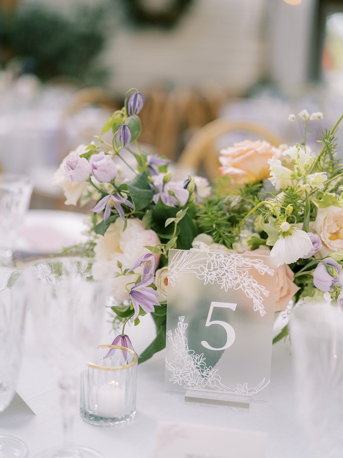
Garden Party Inspired Seating Chart
Alright, now it’s time to talk about this stunning, garden-party inspired seating chart! Guests could find their escort cards in these adorable little wooden garden boxes that were appropriately filled with gorgeous florals and greenery. This is one of the sweetest seating charts I’ve ever taken part in. It was a true showstopper!
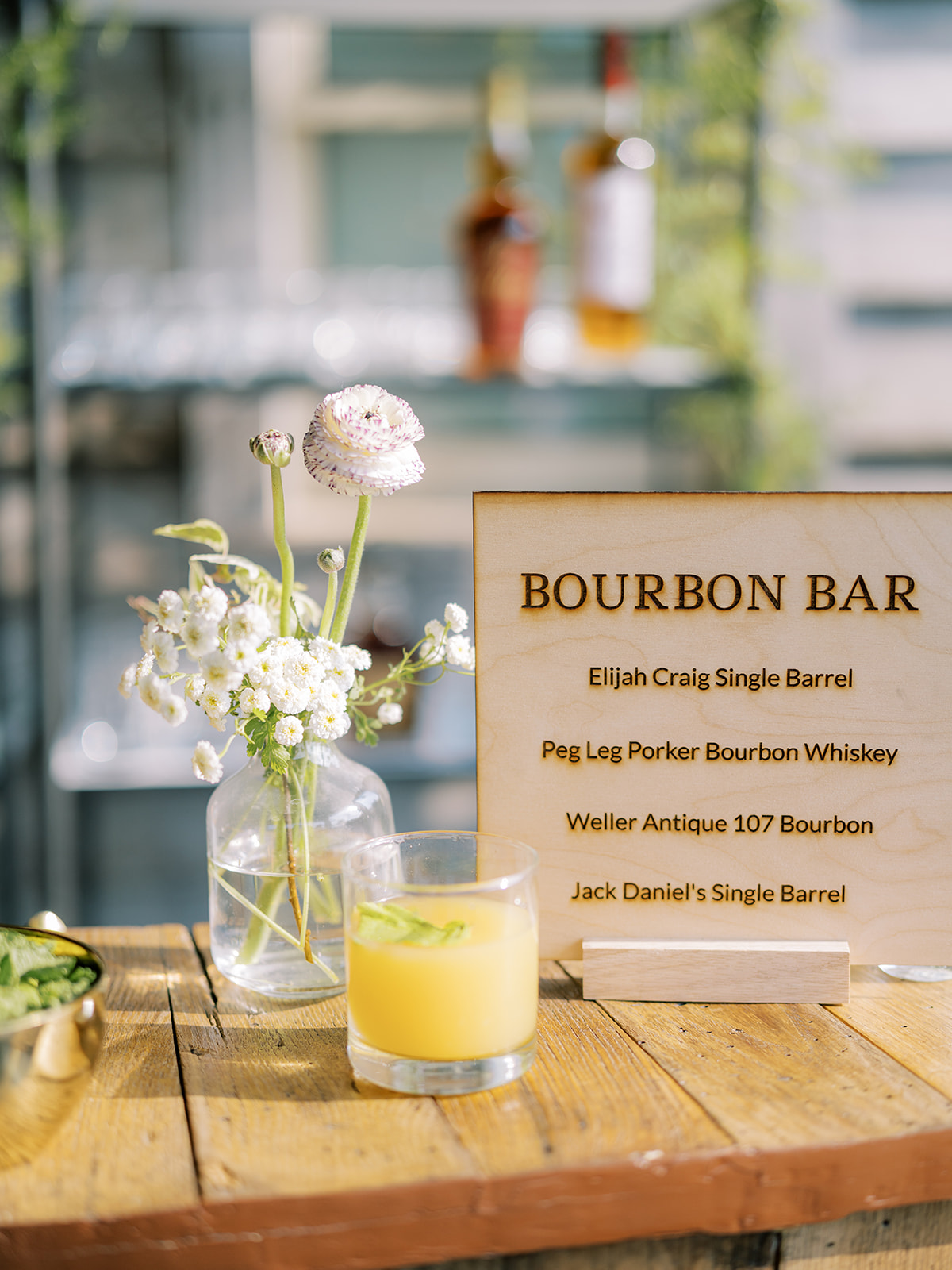
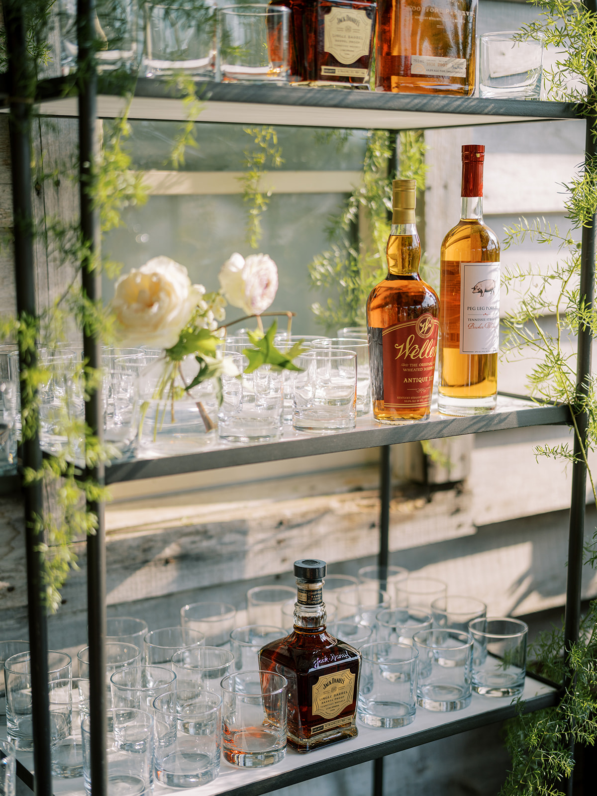
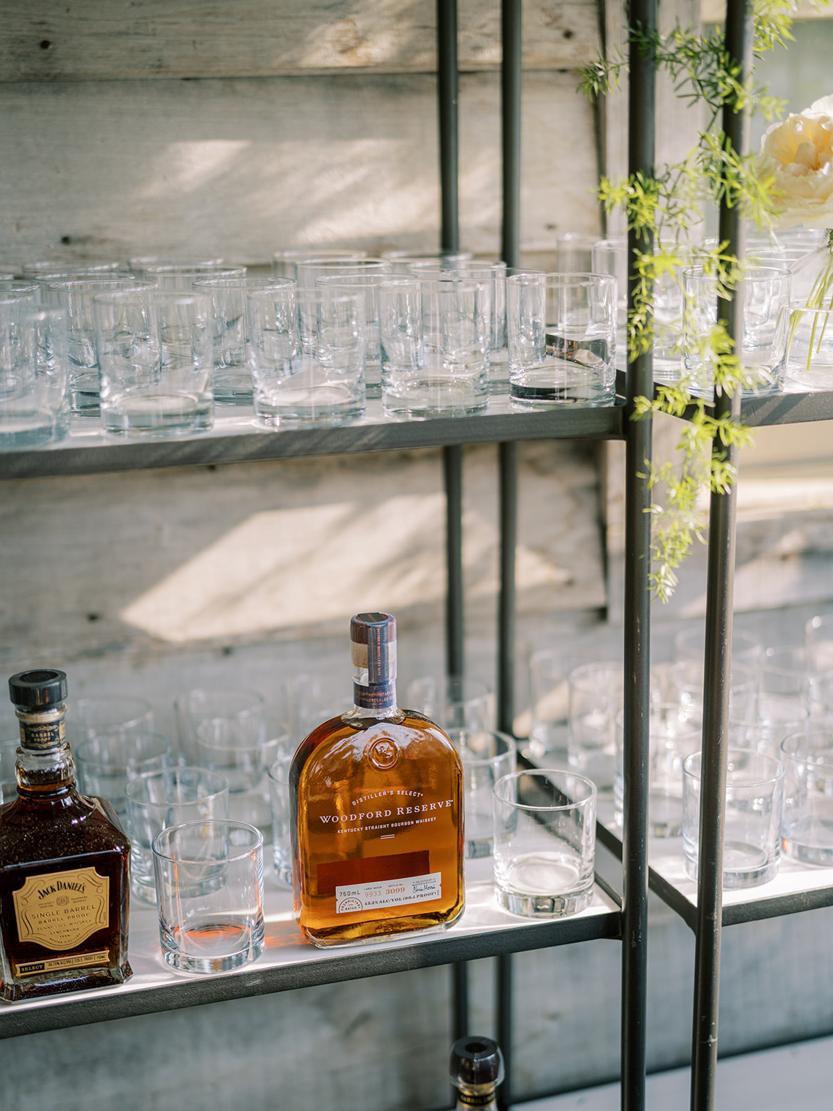
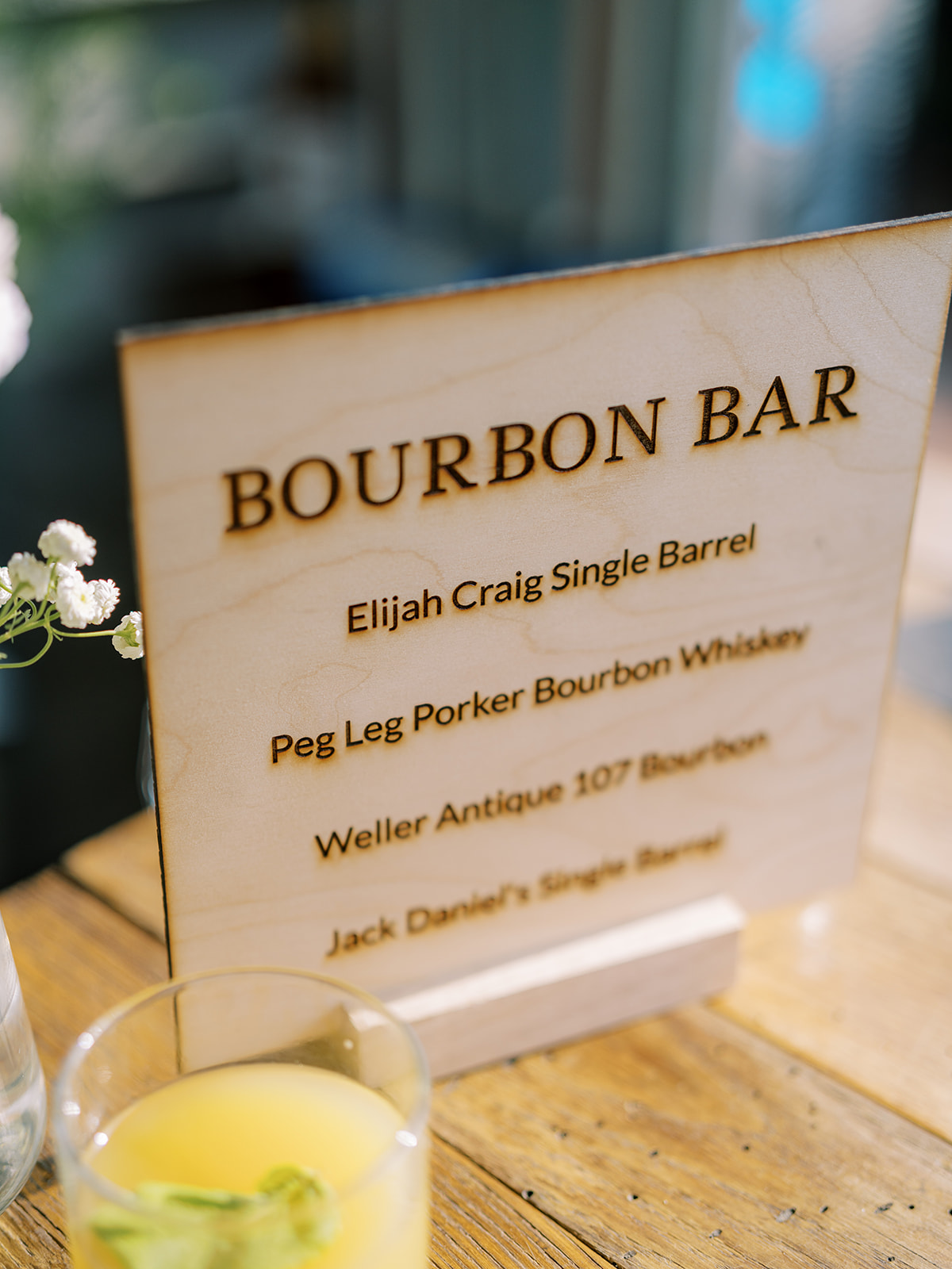
Custom Laser-Engraved Bar Sign
Among all of the delicate designs of the day, Morgan and Tommy still maintained a wonderful balance of boldness, like this one-of-a-kind bourbon bar. We got to create this awesome, laser-engraved, wooden bourbon bar sign, which matched incredibly well with the rustic look they wanted for this setting. I’m really proud of how great this sign turned out. It made for a great conversation piece among guests too!
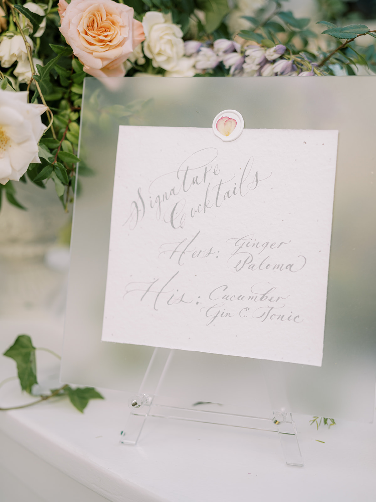
White Ink also created the custom cocktail sign using the same frosted acrylic as the wedding welcome sign. YES to matching signage!
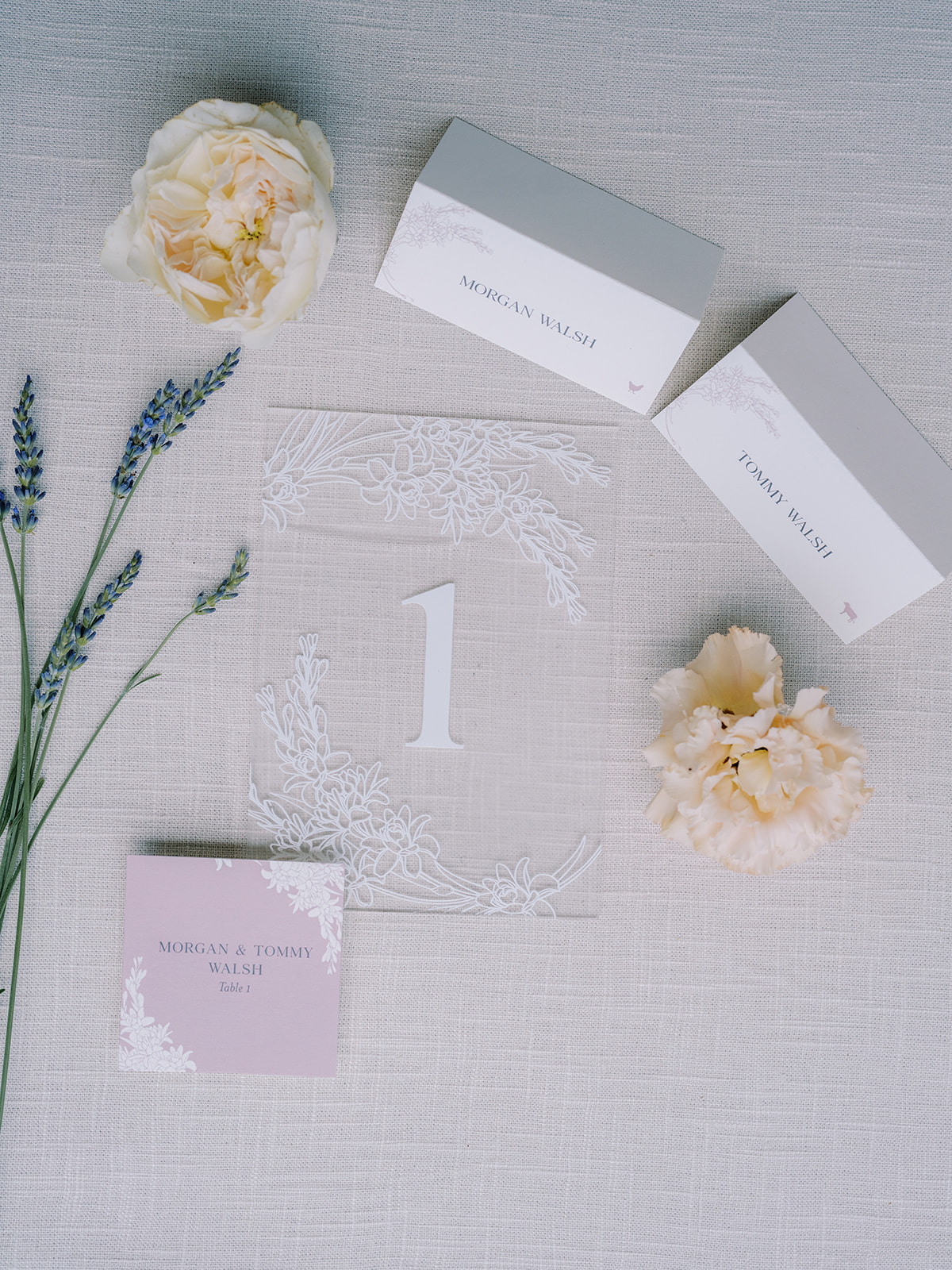
The table signage, place cards, and escort cards were not left out of this lavender garden-inspired theme. Look at how well all of the finer details fit together! Also, notice more of the tuber rose print throughout. I’m obsessed.
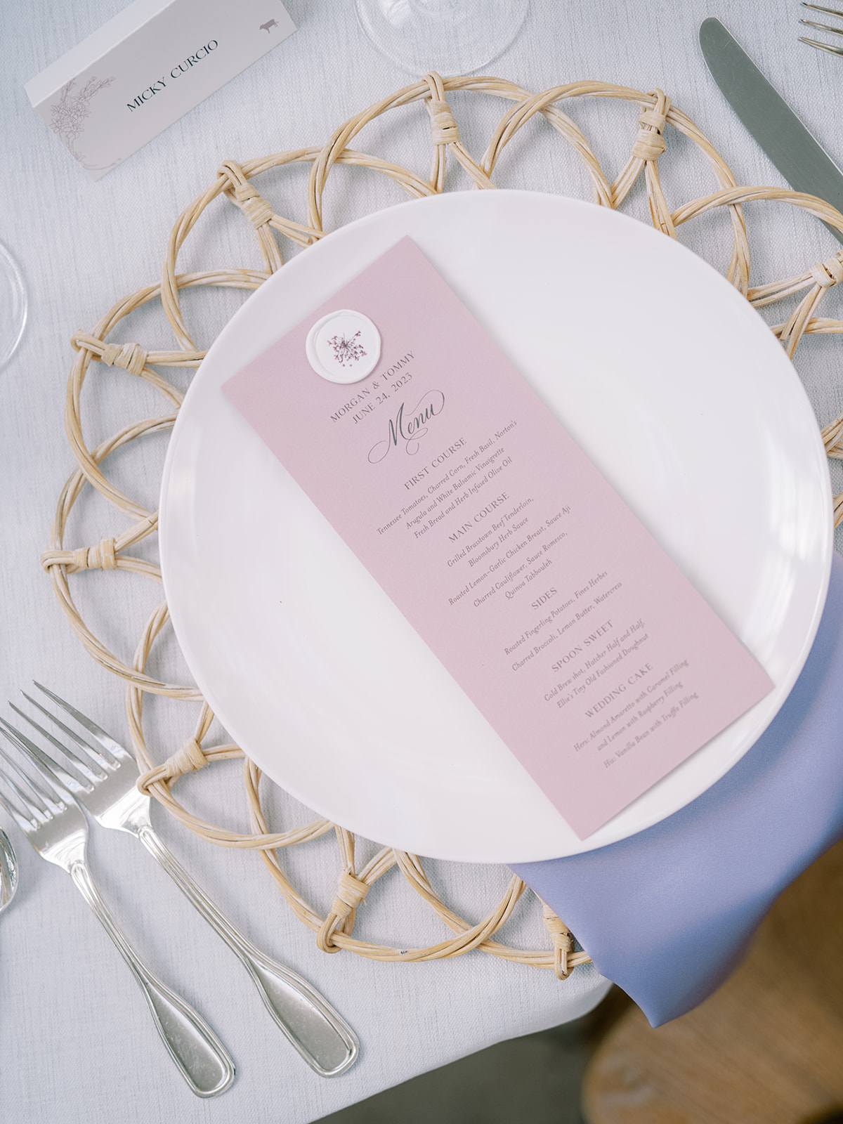
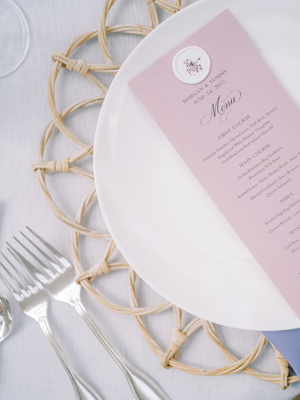
Summer Lavender-Inspired Menus
I loved getting to create these summer-perfect, lavender menus for Morgan and Tommy’s reception. Does the wax seal look familiar? It’s the same custom wax seal with pressed flowers that sealed the guests’ invitation suites! These looked so amazing among the beautiful tablescapes.
I am so proud of the work we were able to accomplish for Morgan and Tommy! This dreamy garden-inspired summer wedding was one for the books and certainly one I will remember for years to come. When it comes to summer wedding inspiration, I guess you could say, this couple has planted the seed! Cheers!
If you’re looking to add custom, thoughtful touches to your wedding or event, we would love to help make your vision a reality. Reach out today to learn more about our full-service design offerings—we can’t wait to create something unforgettable for you!
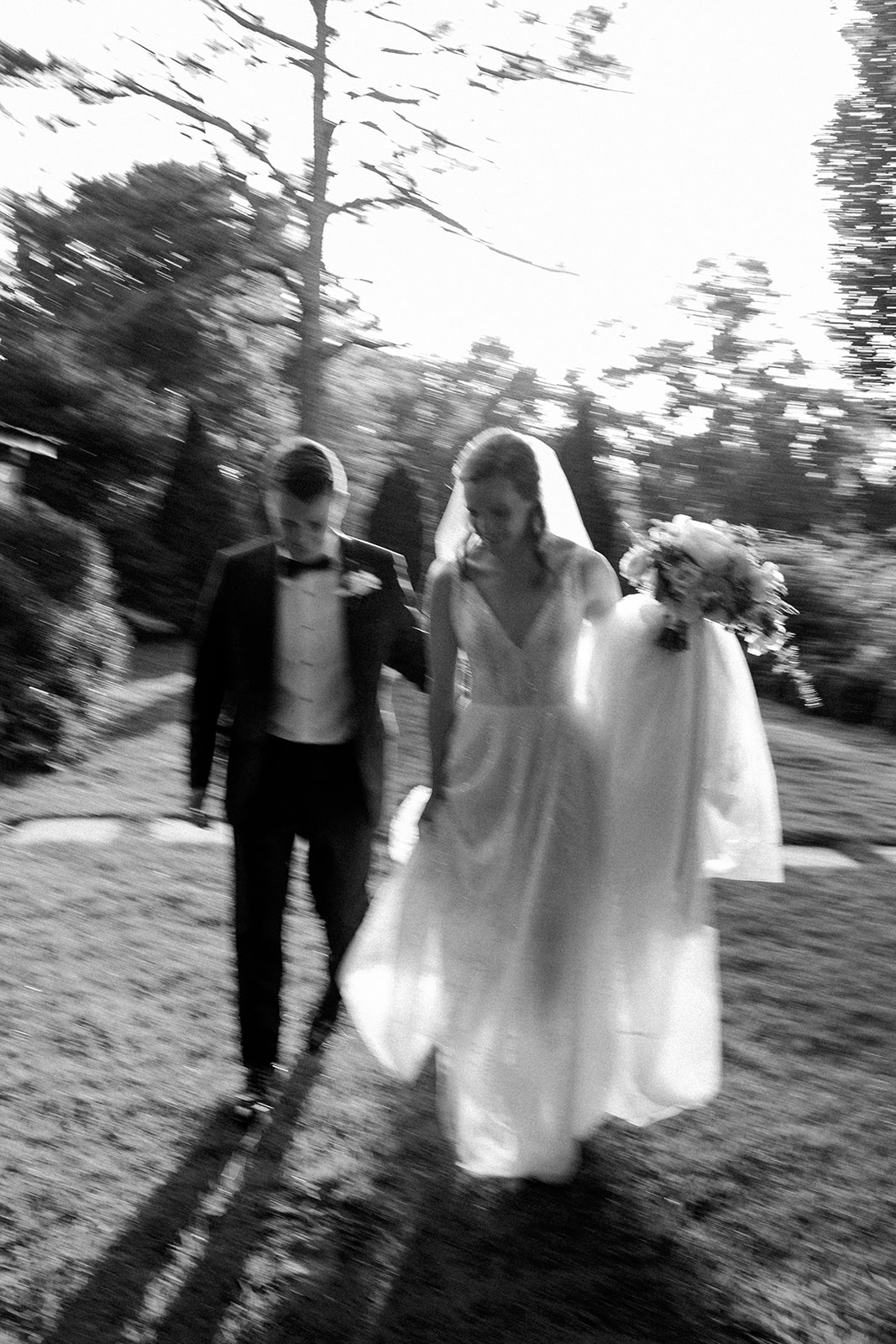
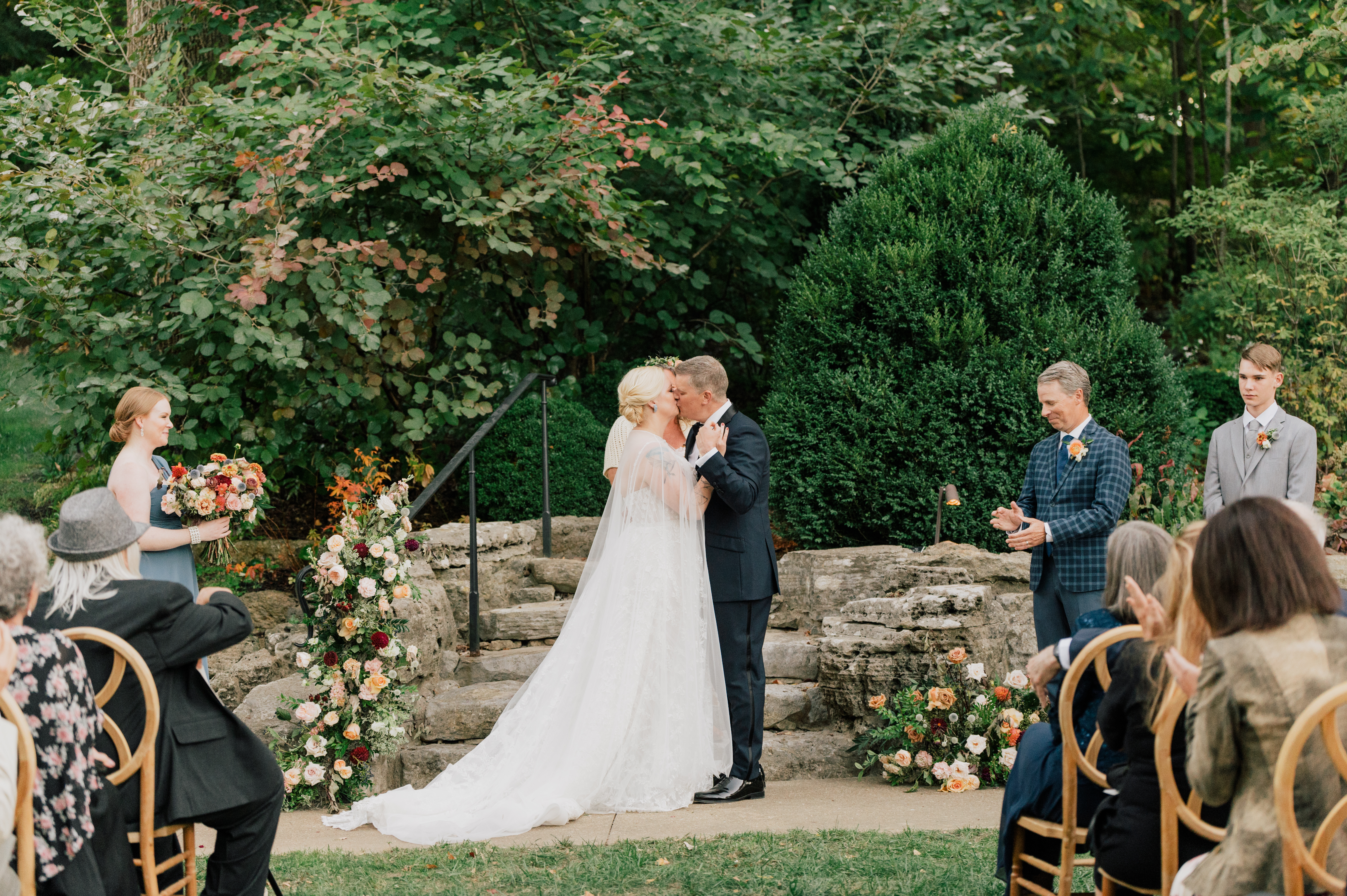
I am honored beyond words that I get to work alongside so many amazing vendors for weddings and other major events. It is a community that I never knew I needed. We all may have different jobs, but in the end, we are working towards one goal- giving our clients the wedding/event of their dreams! Taking part in the beautiful nuptials of our couple, Emma and John, last October gave us a front-row seat to one of the dreamiest weddings we had the pleasure of being a part of. I’ve been excited to show you all of the personalized details that made this wedding exceptional. In truth, there is a lot of hard work that goes into a wedding day, but the effects of that dedication last far longer than just a single day; we help create the details that are put into memories that last forever.
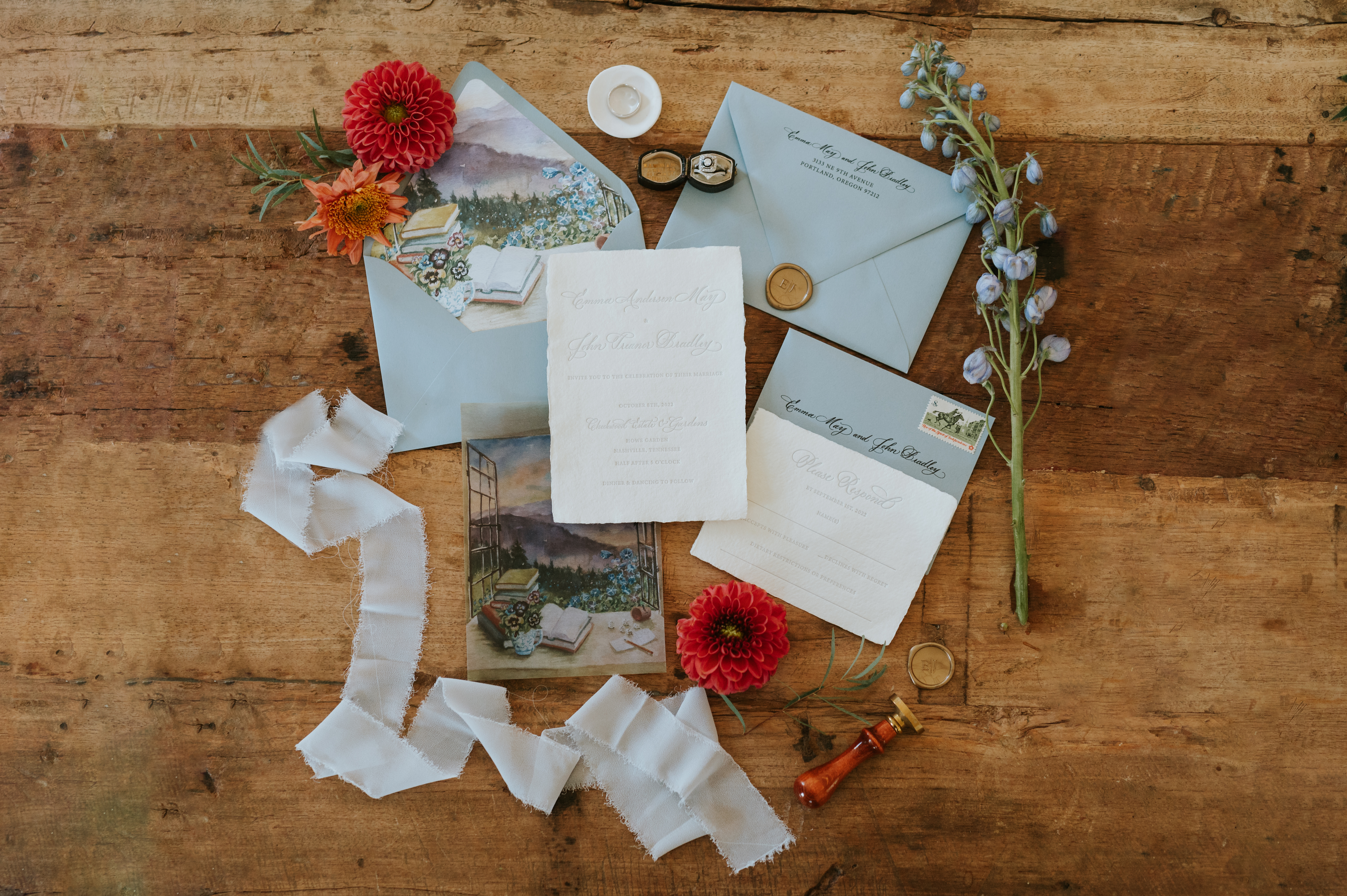
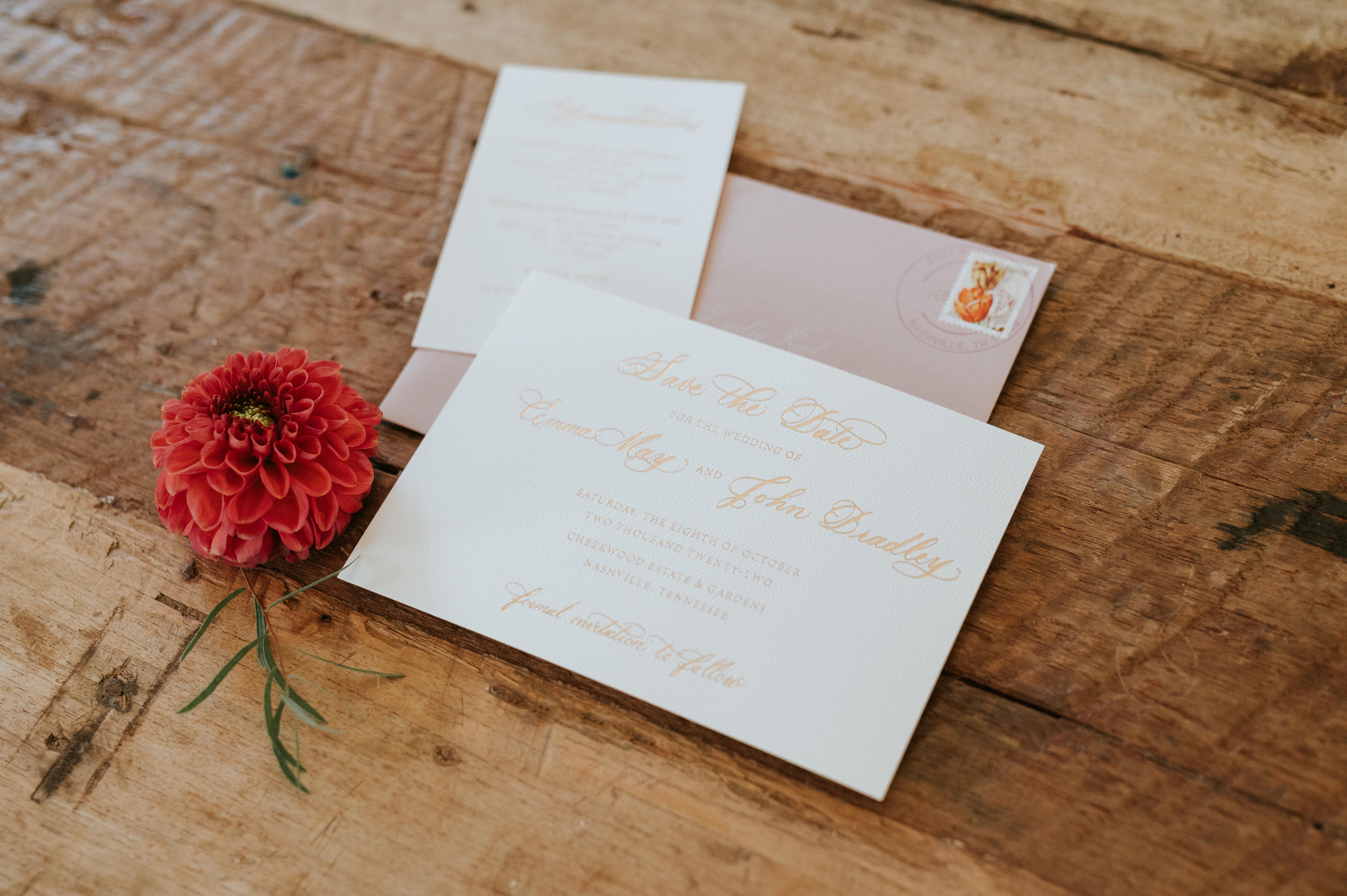
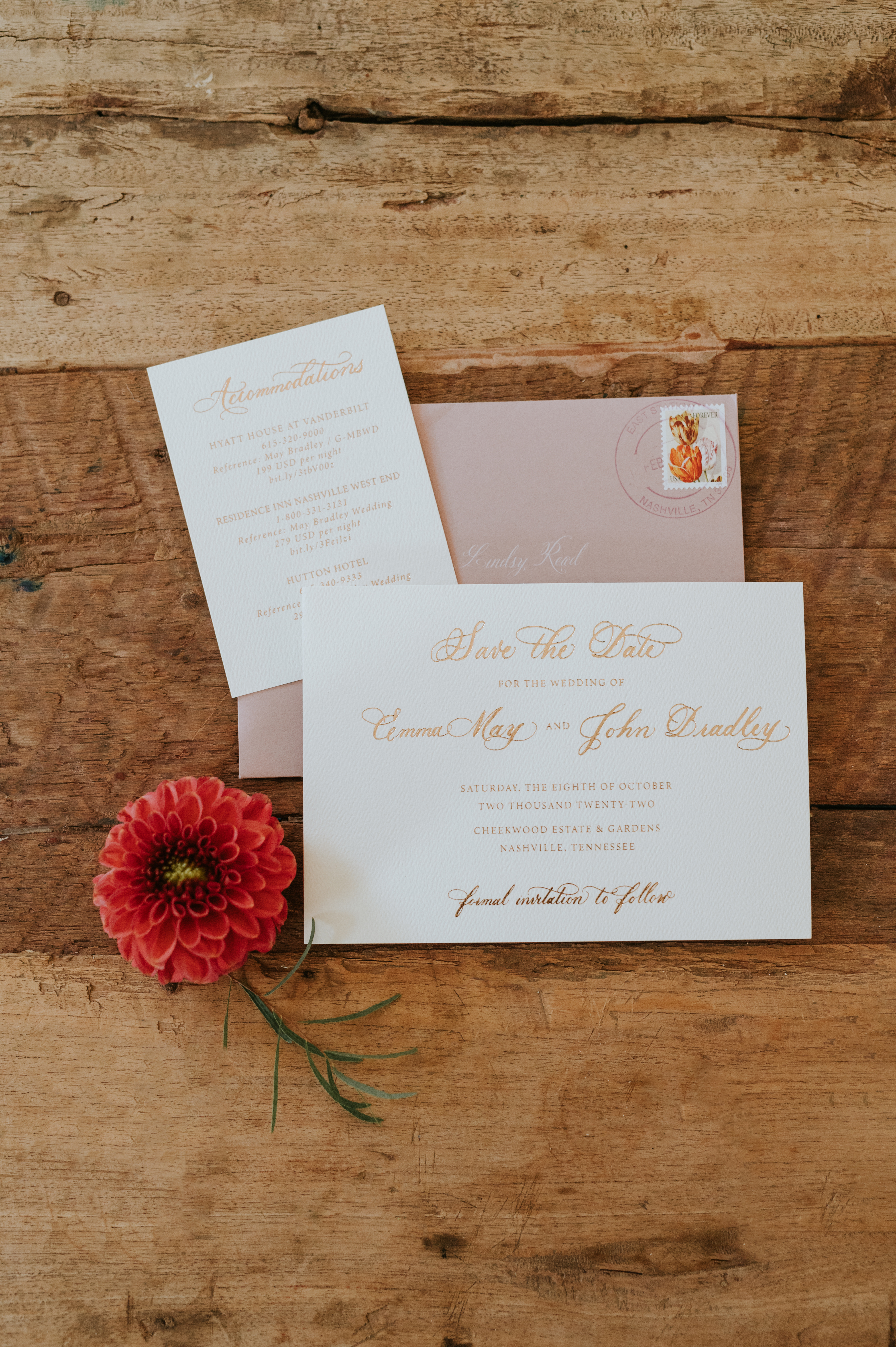
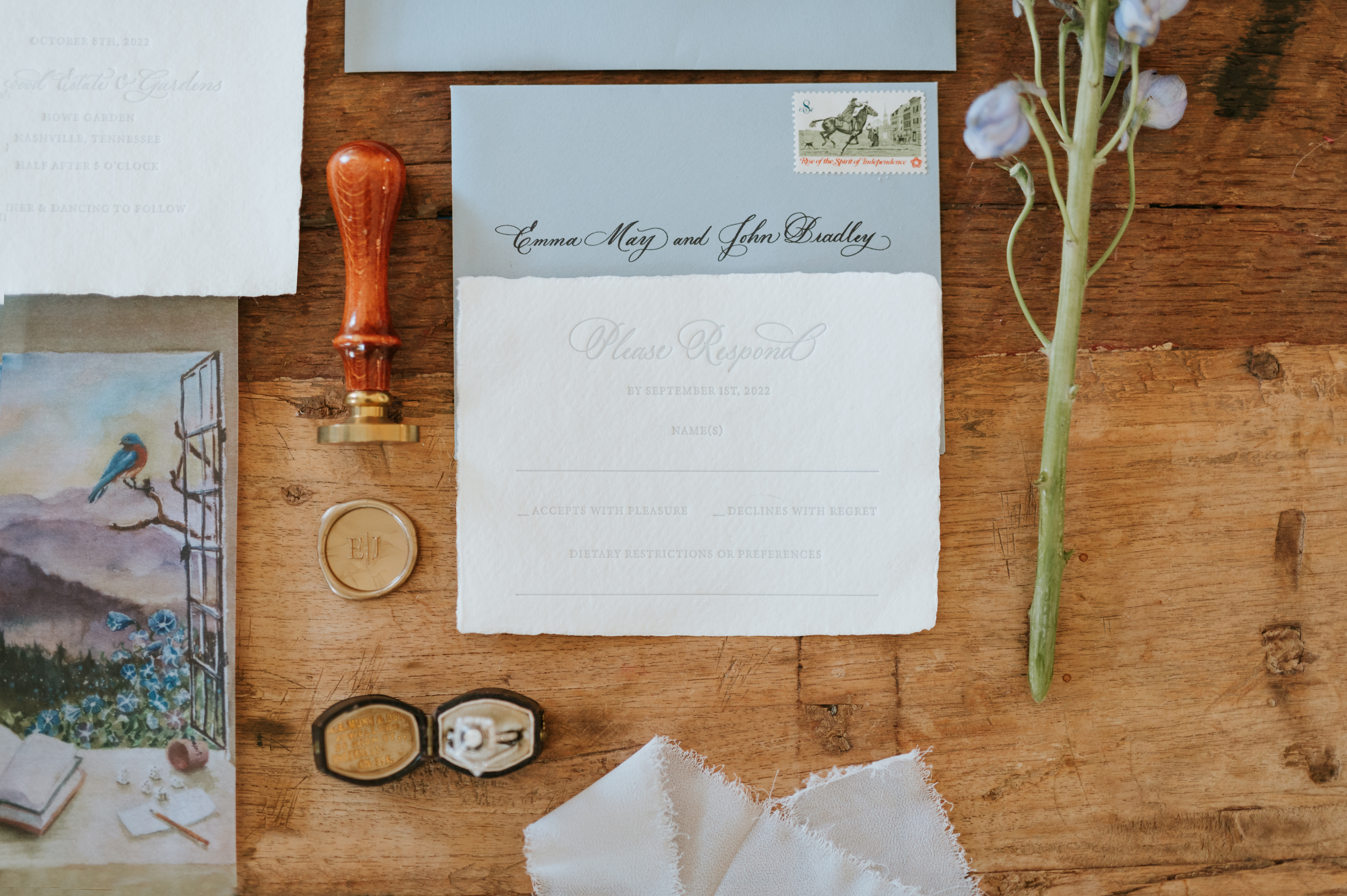
Emma and John’s save-the-date was done using card stock topped with gold calligraphy and tucked into a warm, dusty rose envelope giving it a most delicate and inviting feel. I like to imagine the smiles people give when opening up these happy color combos.
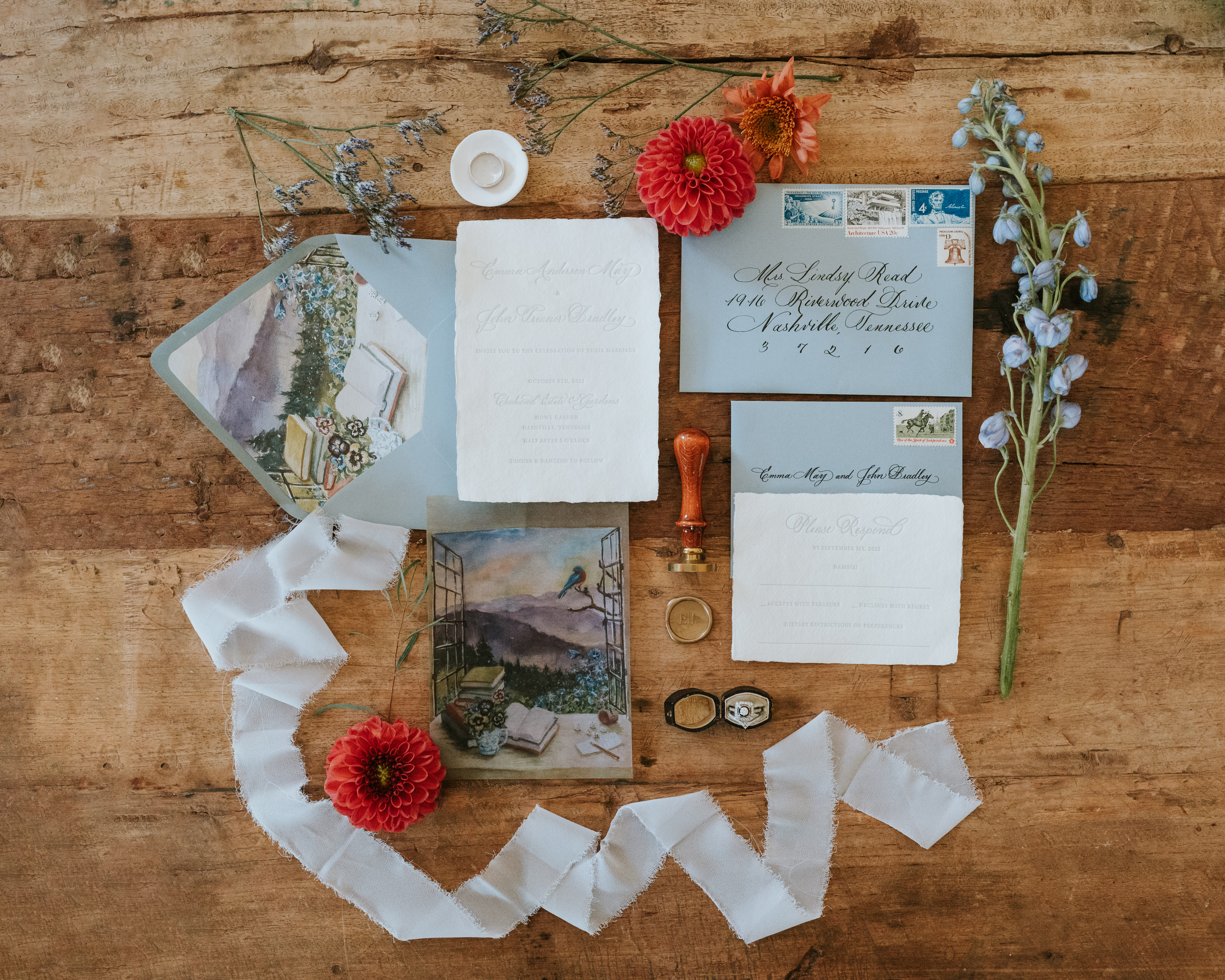
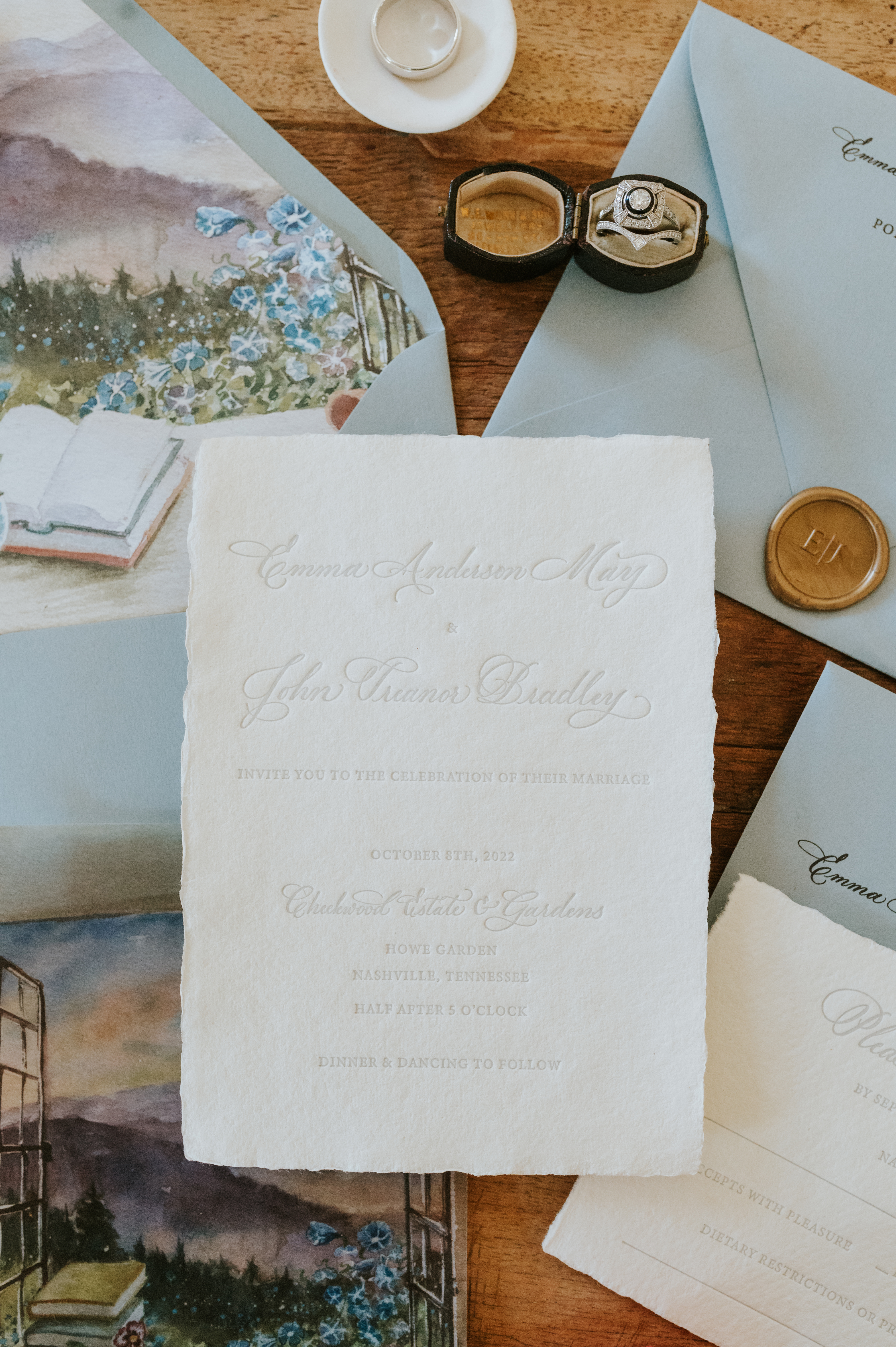
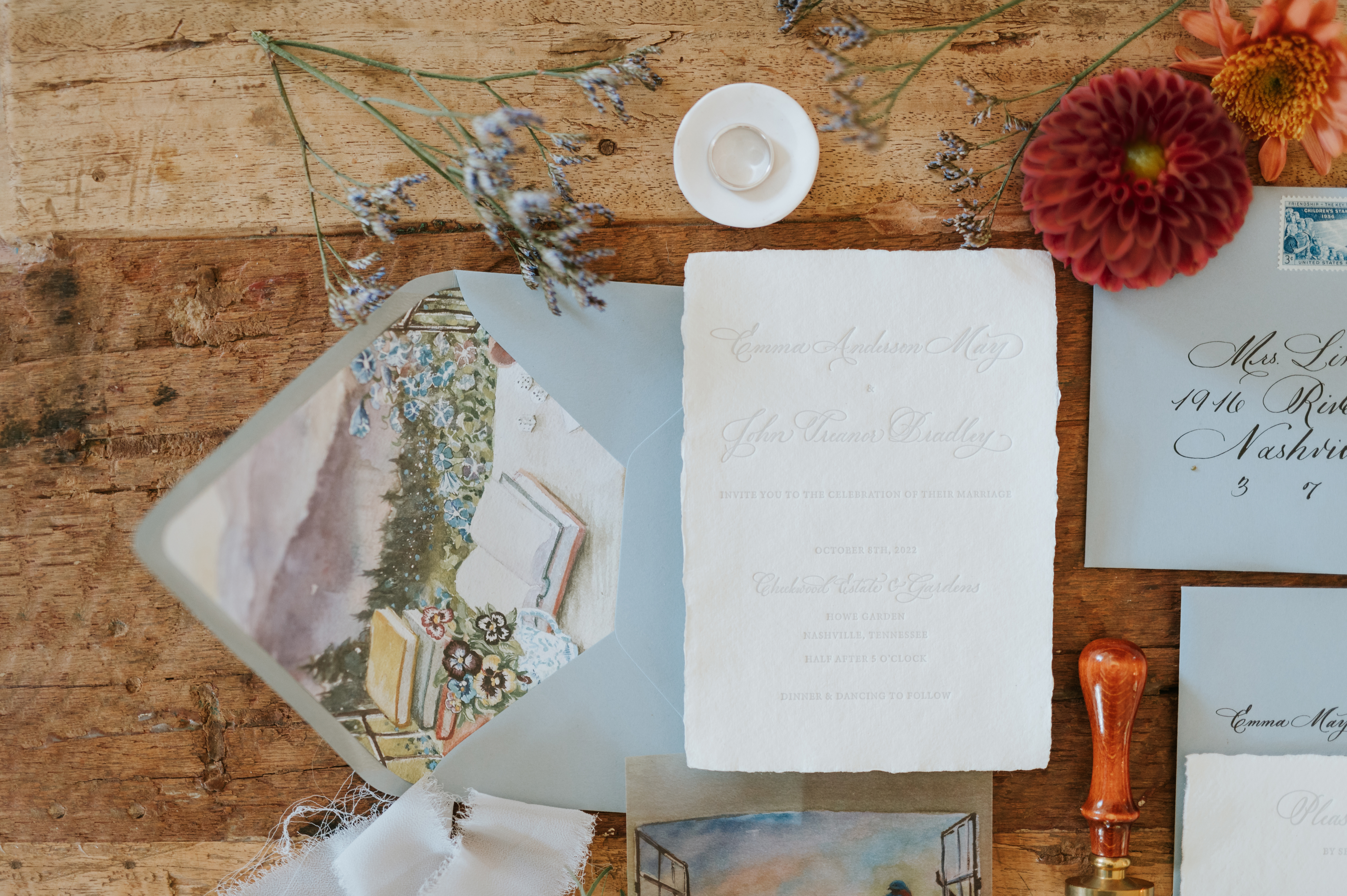
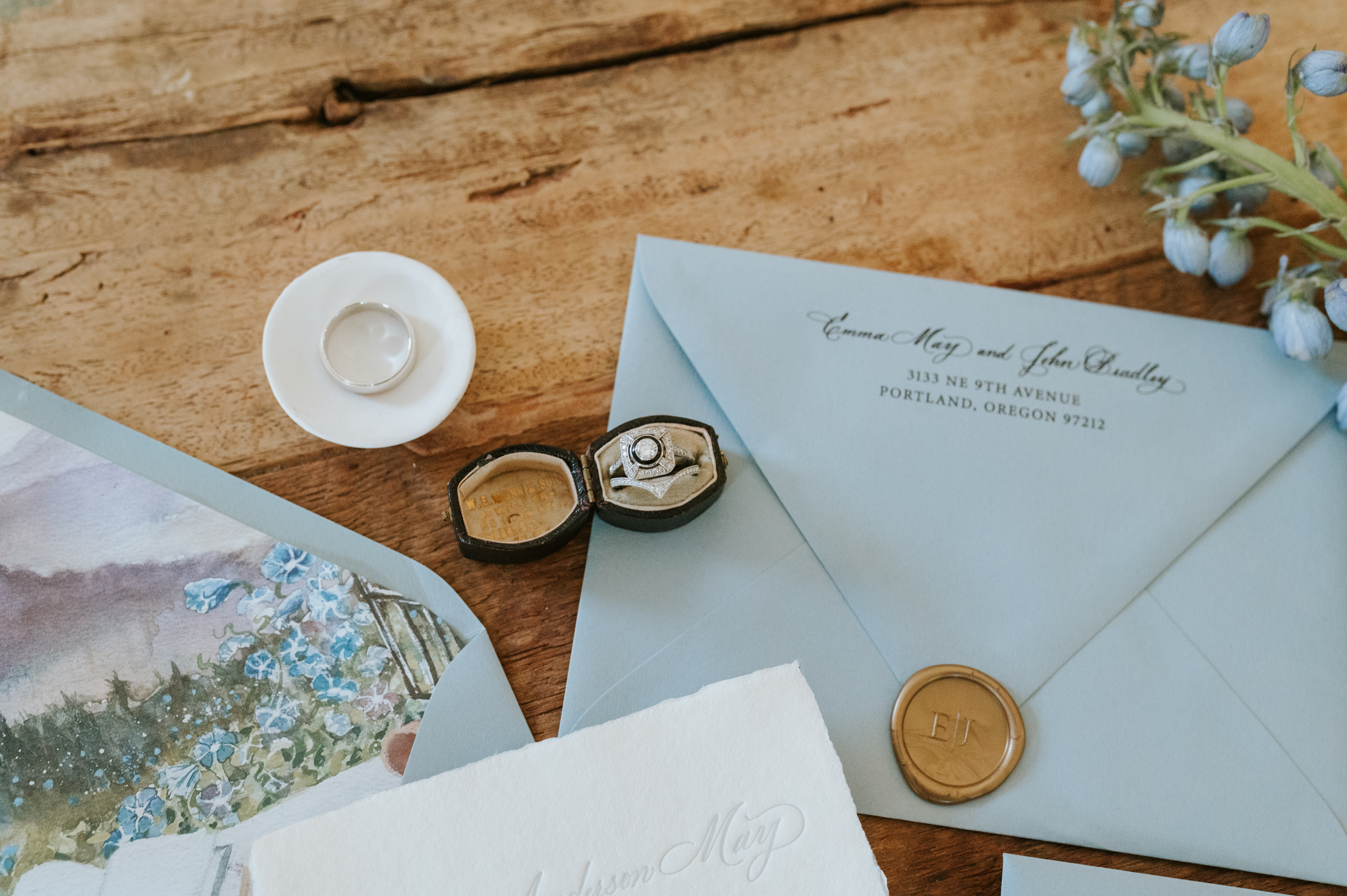
This invitation suite steals the show. For me, this is about as good as it gets. The invitation was done in letterpress on handmade paper (yes, handmade paper). I especially love how Emma and John went from a dusty rose save-the-date envelope to dusty blue invitation suite envelopes. The envelopes were closed with a gold, custom, monogrammed wax seal. (Icing on the cake!)
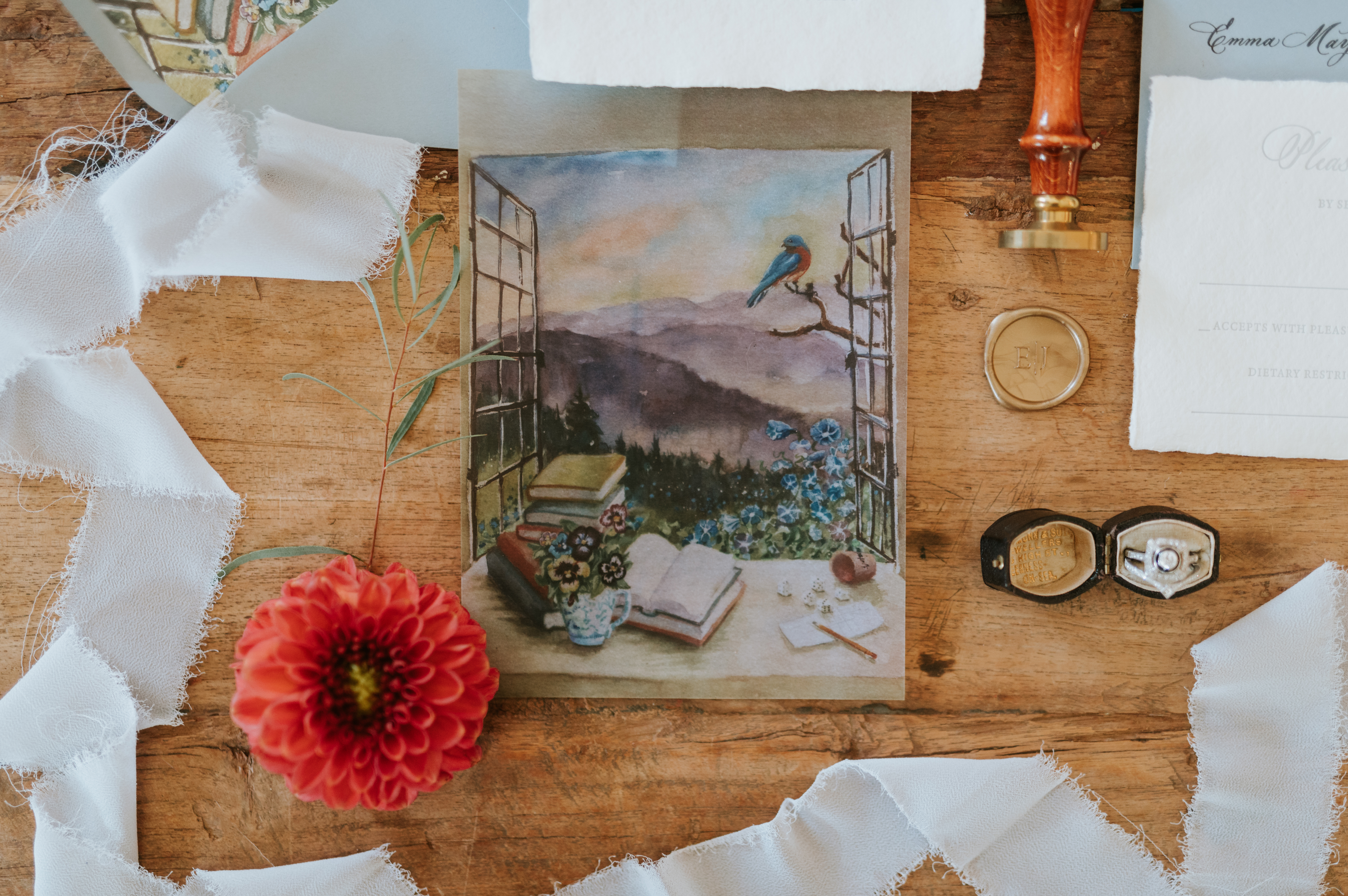
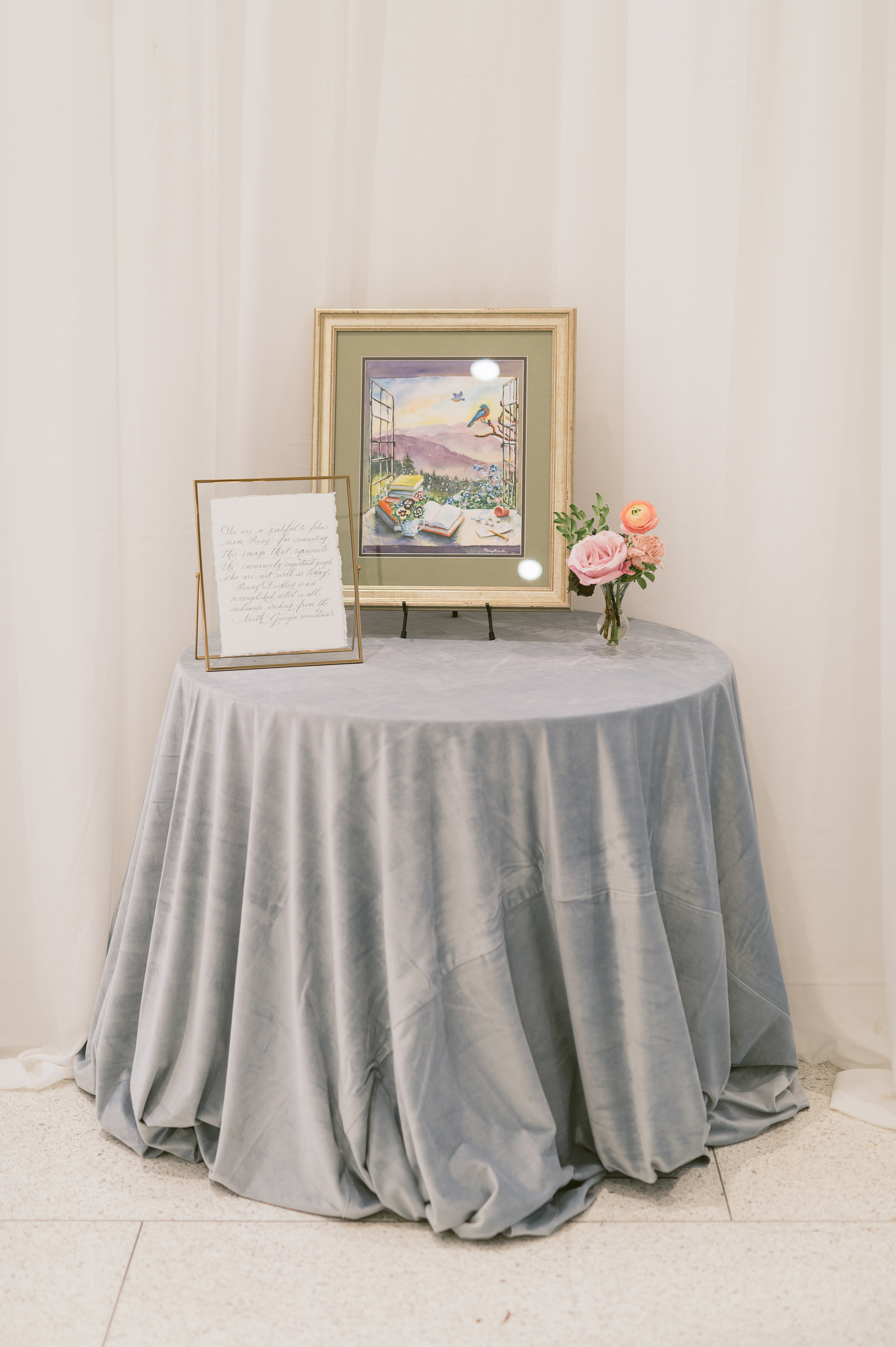
Emma and John personalized their invitation suite to include a liner that had a print which was actually hand-painted by John’s mother. The same print was also used on the suite’s vellum overlay. THIS is what I mean when I say we help create memories that last forever. How special is this gorgeous detail?
John’s mother, Penny, is an artist who took on the role of creating this piece for her son and daughter-in-law as a way to include those who were with them in spirit. She used very special and specific details in this image to represent those loved ones. We were honored to pen the letter that went along with the beautiful picture display.
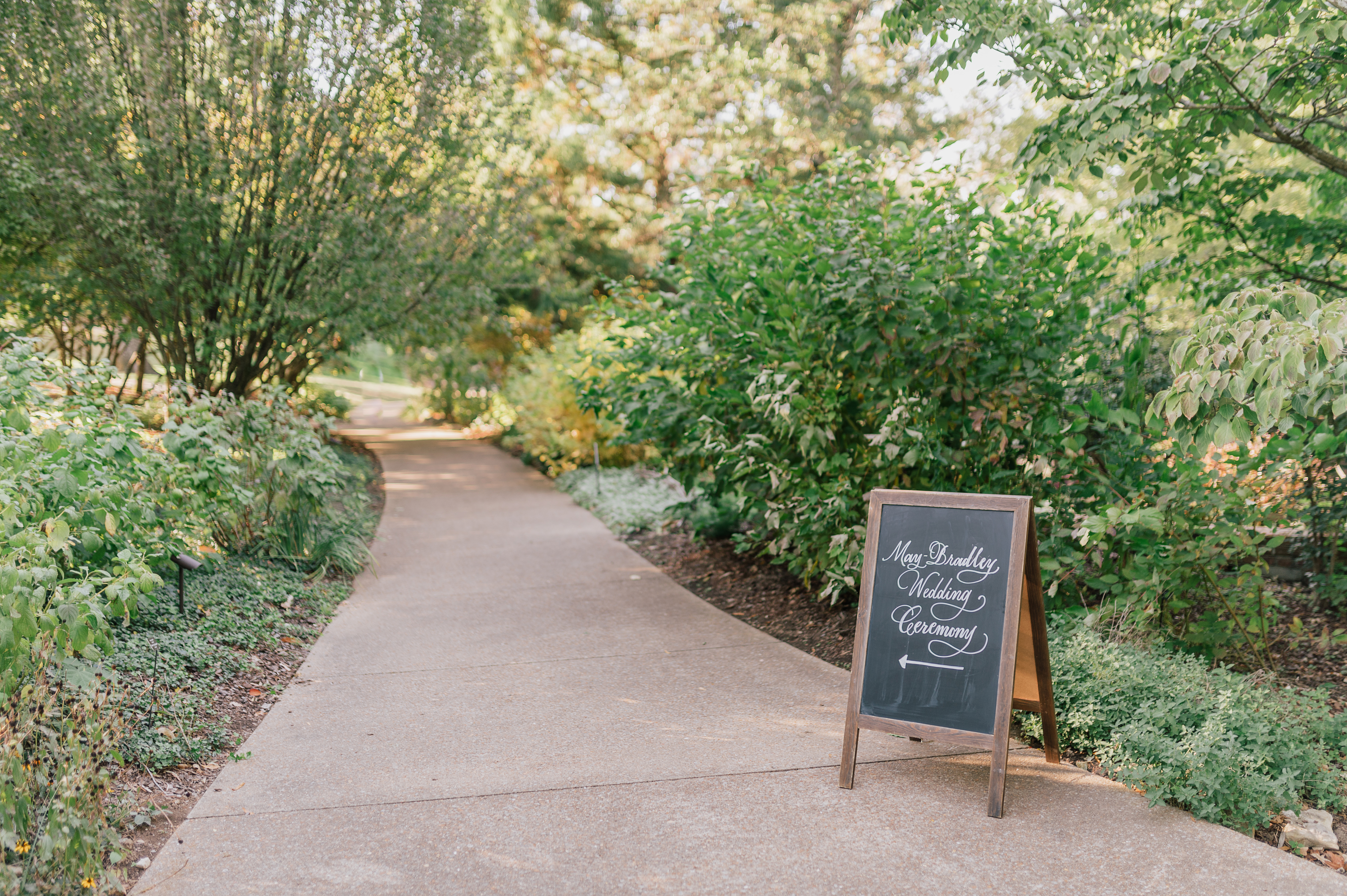
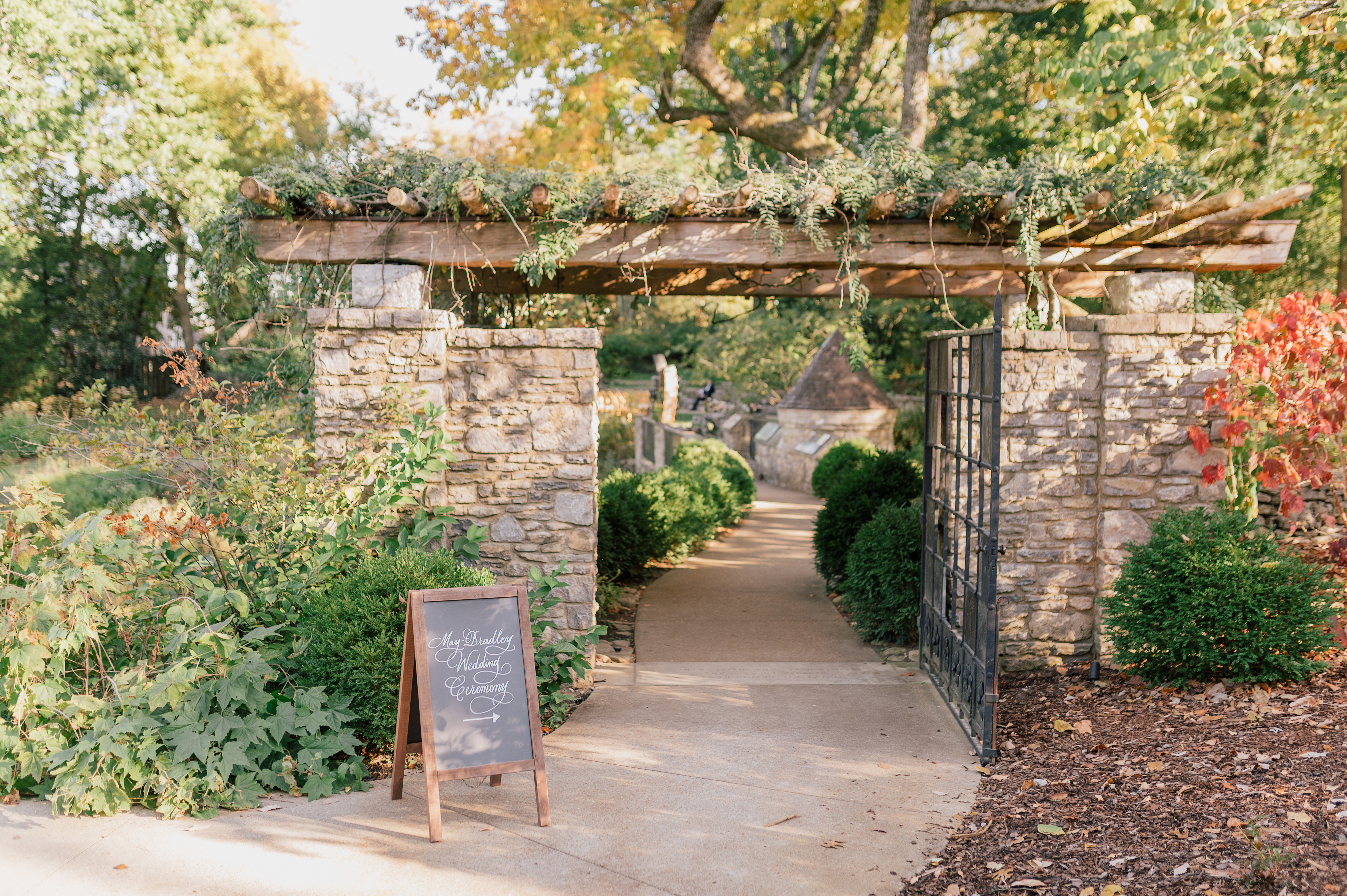
The chalkboard directional signs fit perfectly within the woodsy scenery of this Cheekwood venue. They stand out just enough to guide guests to their seats.
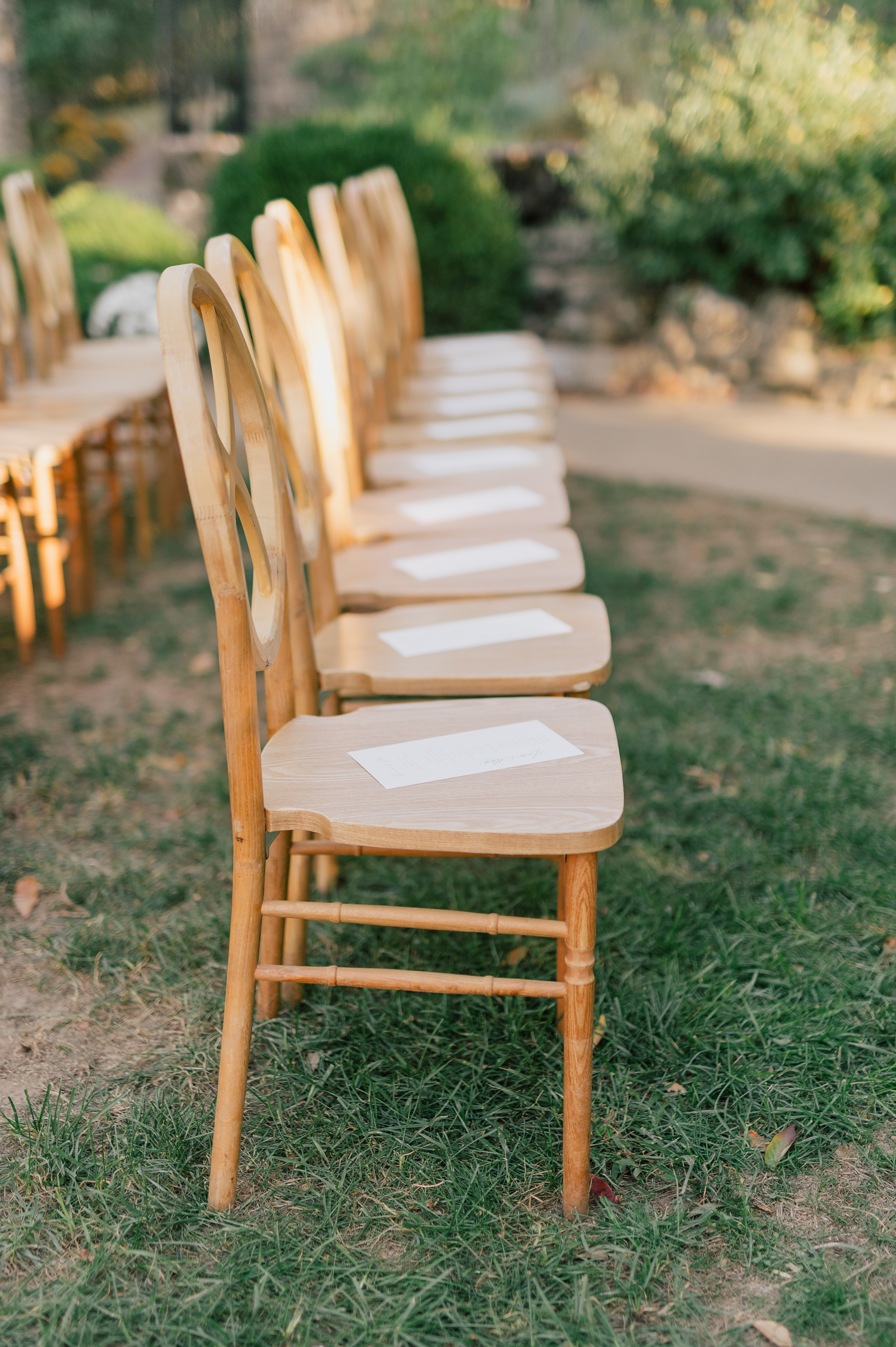
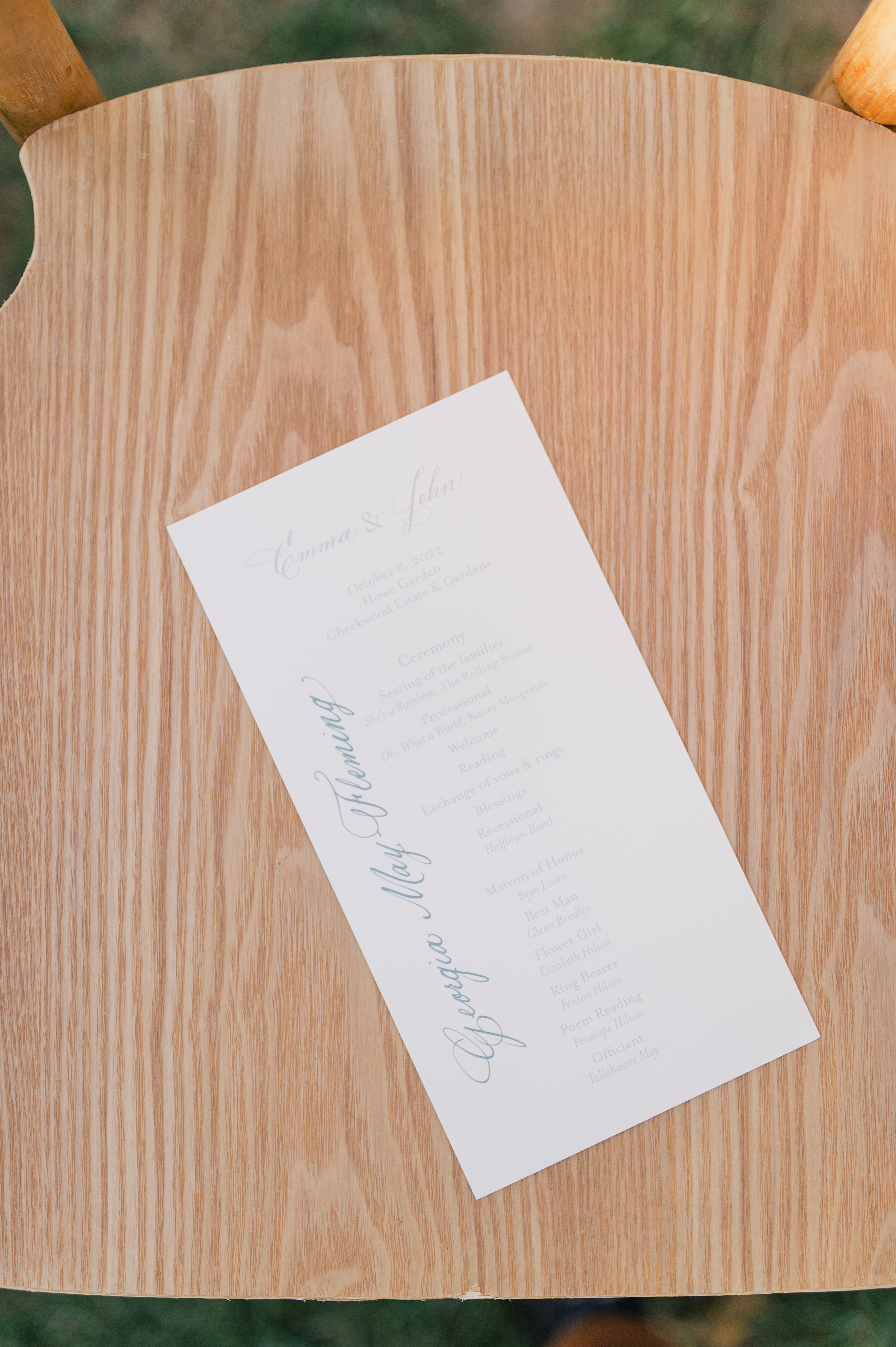
Here is a refreshing new detail that we don’t see very often. The couple wanted to have special seating for the ceremony portion of the wedding. We did that by taking the printed programs and writing the names of each guest so they knew where to find their seat. This was a beautiful example of how much thought went into each moment of Emma and John’s big day.
You can never go wrong with a classically beautiful, mirrored seating chart. Although this is a very popular seating chart display, there was something especially whimsical about seeing the textural differences of the glass mirror against the beautiful trees in the garden.
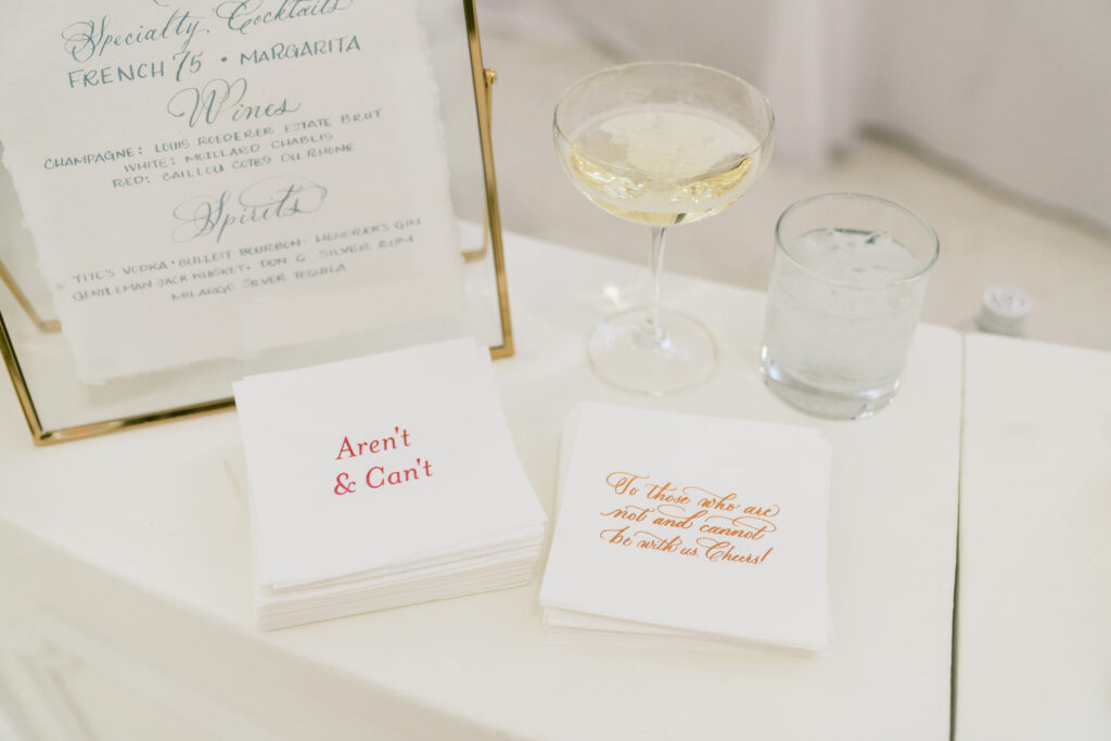
White Ink is always happy to put our touch on table signage like we did for Emma and John’s bar sign. But what we loved most was getting to make the super awesome cocktail napkins that displayed several of the couple’s favorite sayings. Taking it to the next level and making it your own, is what’s it’s all about. I hope you enjoy these!
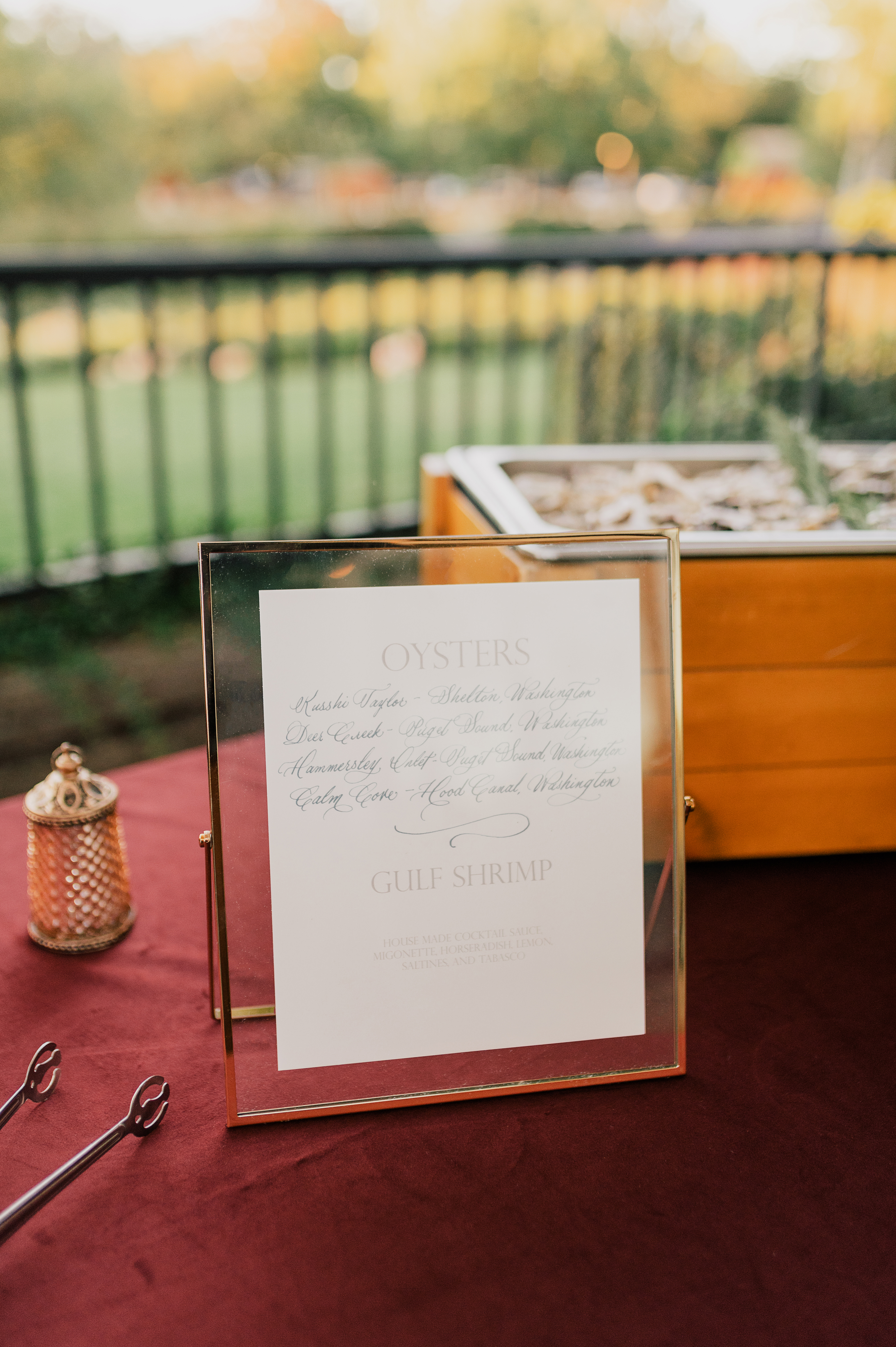
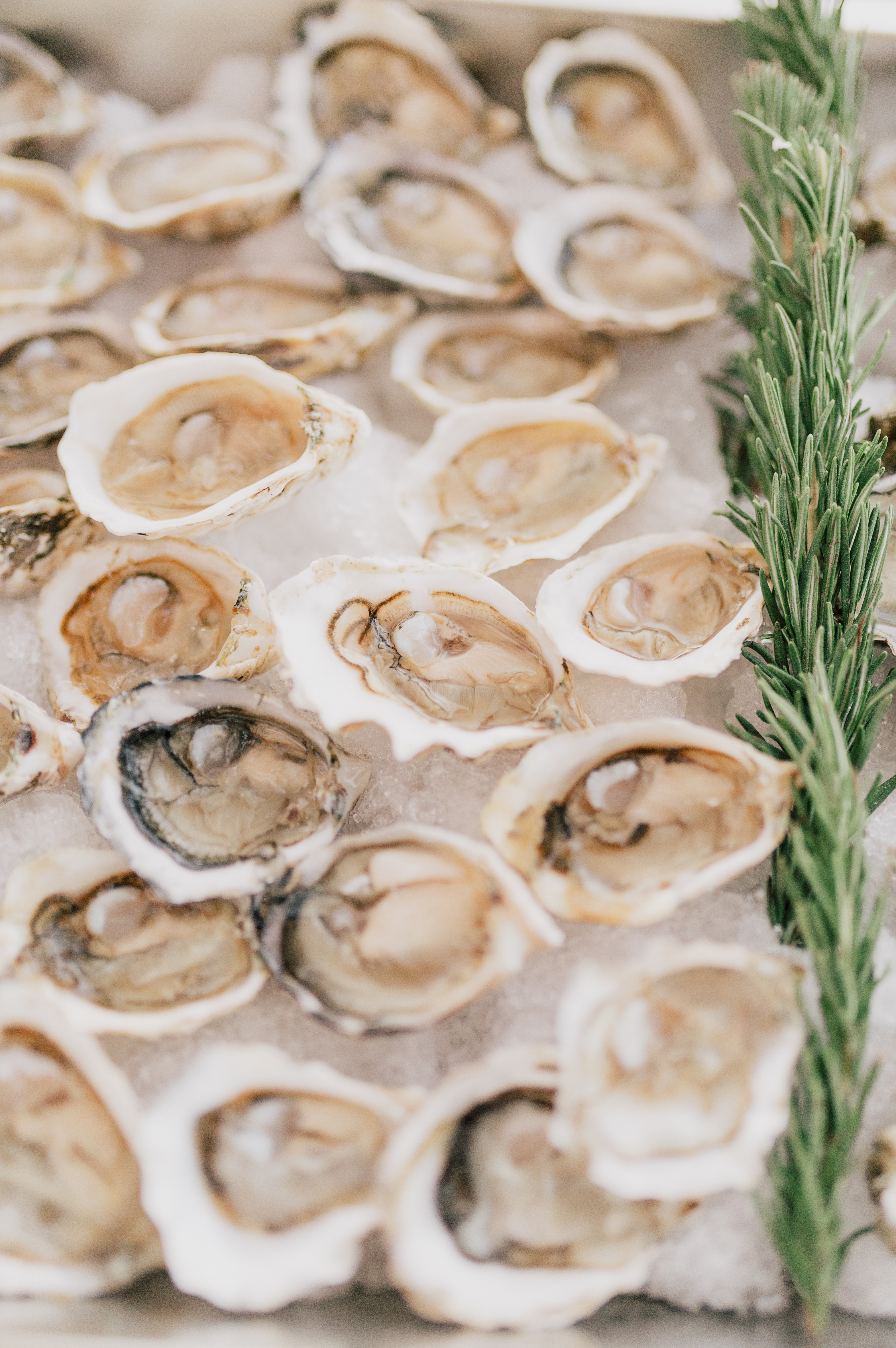
Another table-top sign was for the deliciously showstopping oyster and shrimp bar! Yum!
Every single wedding White Ink gets to be a part of is always so special to us. We loved the deeply personal touches that Emma and John made room for on their big day. A gem of a wedding, indeed! Cheers to the happy couple! Check out some of the amazing vendors who took part in this event.
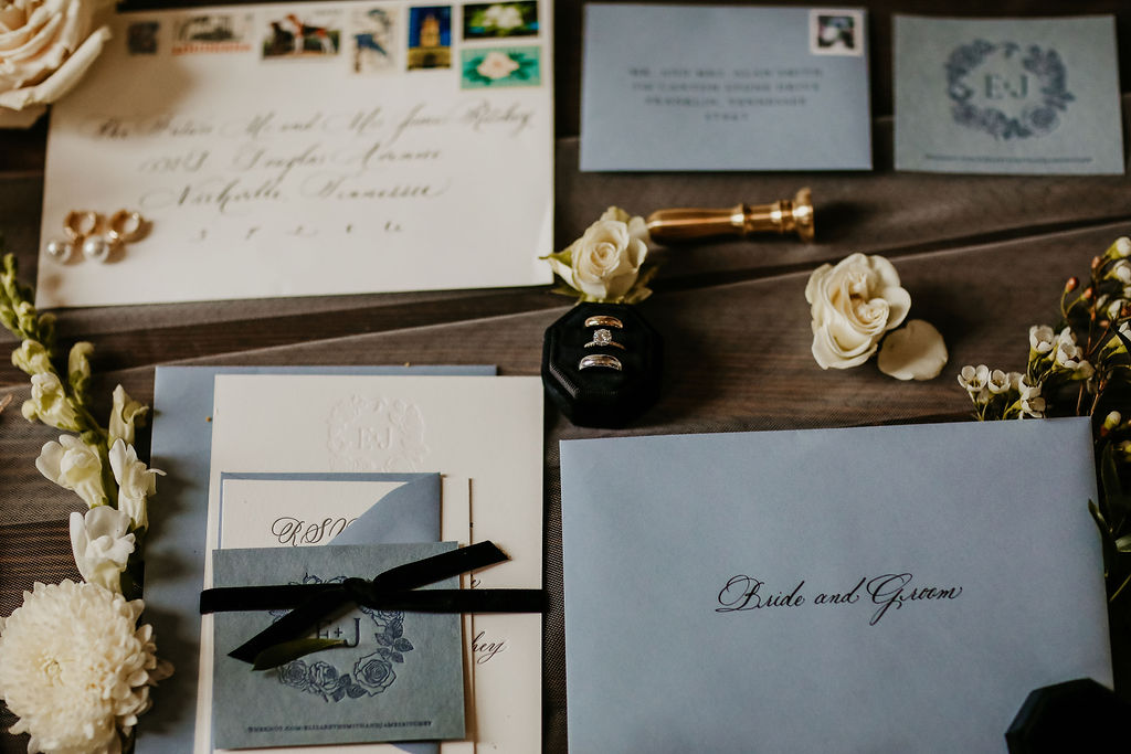
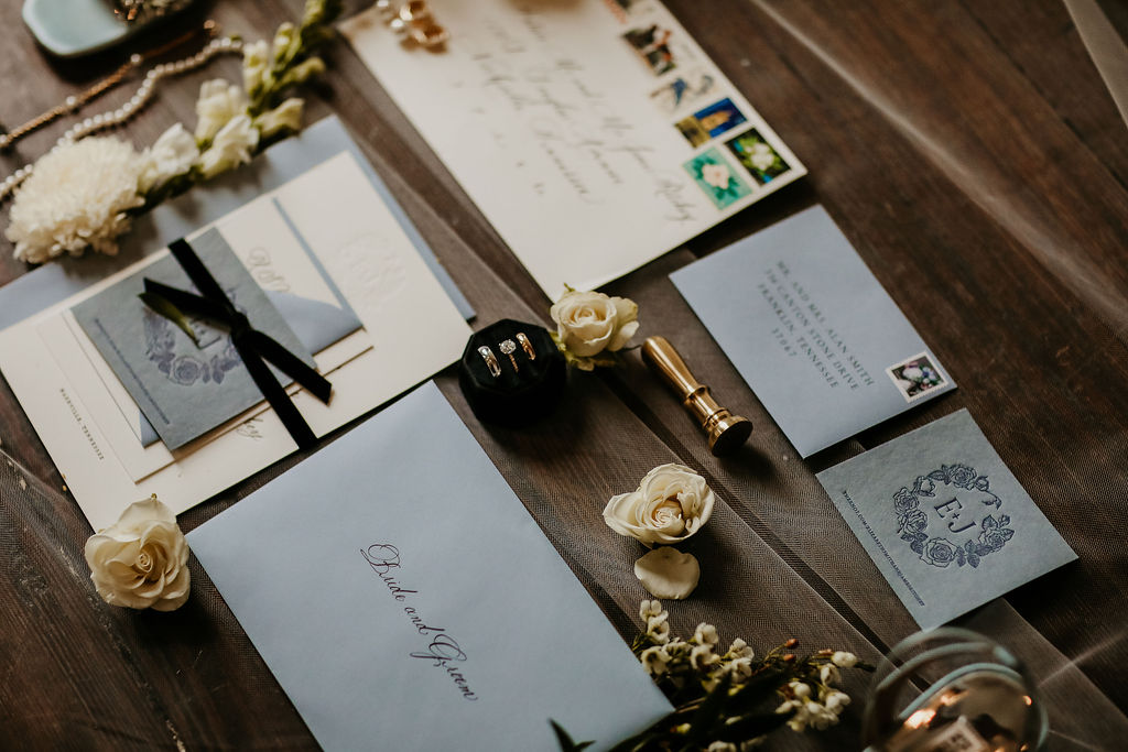
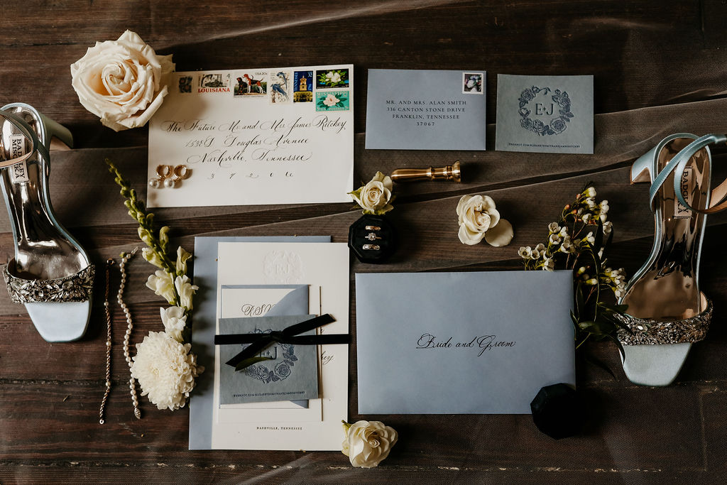
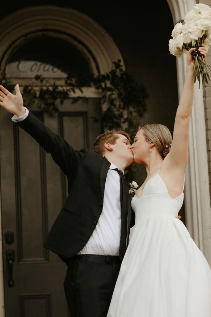
There is something really special about getting to be a part of an entire wedding process all the way from the invitation suites down to the monogrammed wax seals on the menu cards. It means so much to us at White Ink when our brides and grooms trust us to help bring their big day to life! It’s why we’re here, and it’s why we’re never leaving. I hope you enjoy the beautiful recap of Elizabeth and James’s wedding day as much as we enjoyed being a part of it.
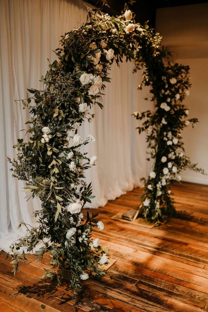
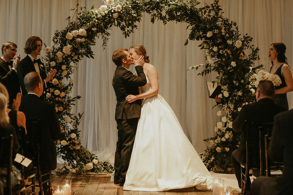
We made our way to the stunning Cordelle in downtown Nashville to help bring together the finer details of Elizabeth and James unforgettable wedding day. The energy from this couple was genuine and light. They were such a delight to work with the entire way.
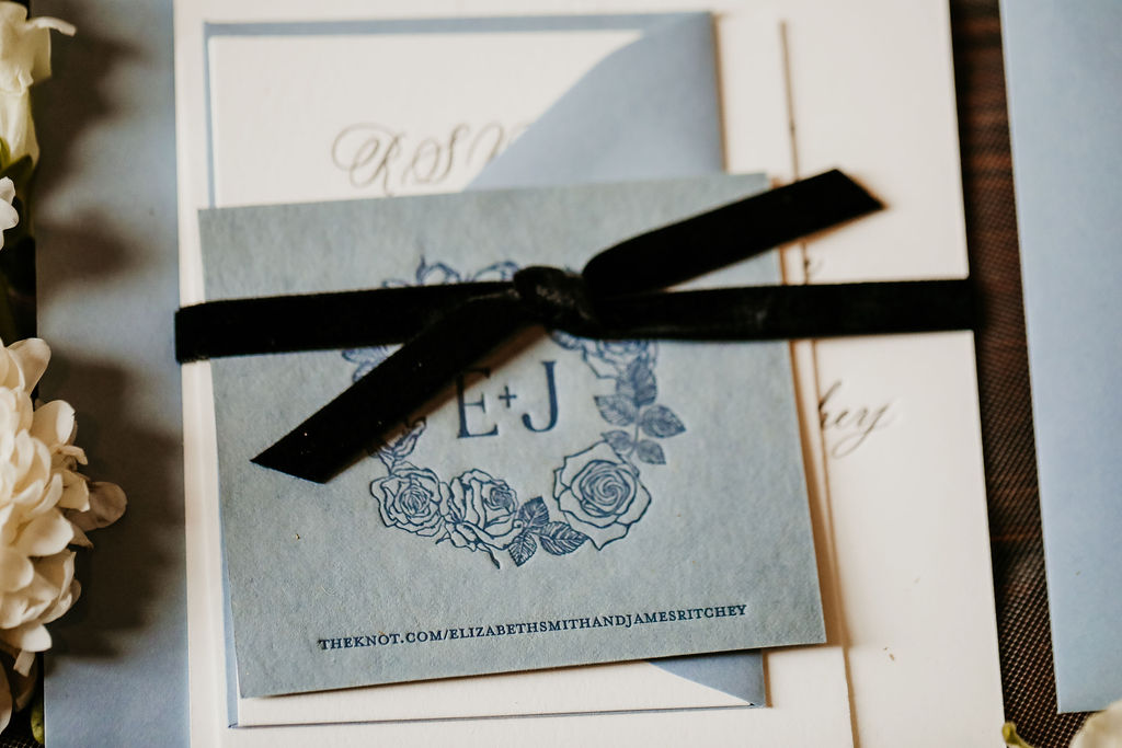
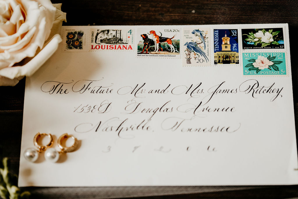
We’ll start with the invitation suite. Each detail was carefully selected. Spot Calligraphy, vintage postage, hand-made paper with custom monogram (my personal favorite), envelope calligraphy, all wrapped in a delicate black velvet ribbon and tucked into the always classy dusty-blue hue envelopes. I am on cloud nine every time I look at these beauties. Simply stunning! Fun fact: dusty blue has been one of our most popular colors this year by far.
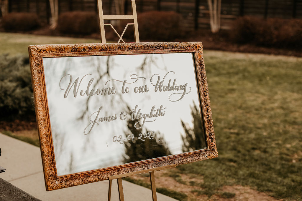
“Welcome to our Wedding,” simply put and warmly welcoming, the welcome sign we did for Elizabeth and James was elegant and perfectly placed inside this timeless, ornamented frame. Fun tip: mirrors will work with absolutely ANY event style- I promise.
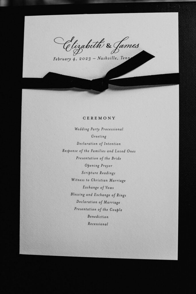
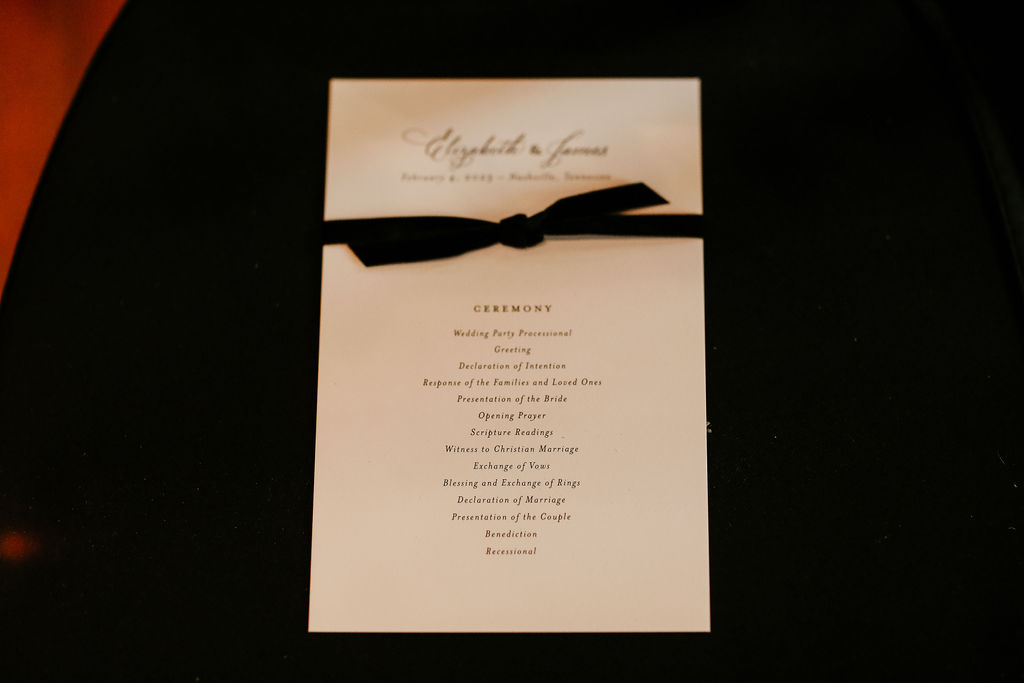
White Ink created the chic program for our couple’s nuptials. You can see the same black velvet ribbon that bound the gorgeous invitation suites was also used around Elizabeth and James’s ceremony programs. Raise your hand if you love details that can carry over!
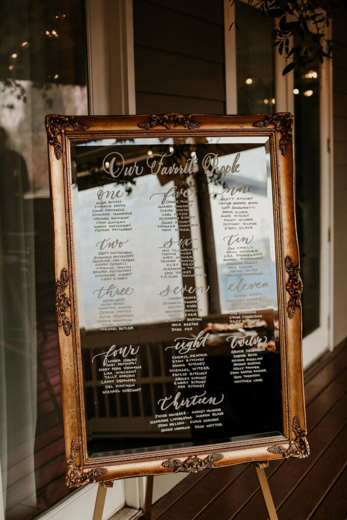
Another beautifully mirrored sign in a thick, distressed, gold ornamented frame that we used for the couple’s seating chart. “Our Favorite People” is quickly becoming one of my favorite titles for seating charts. So warm and inviting!
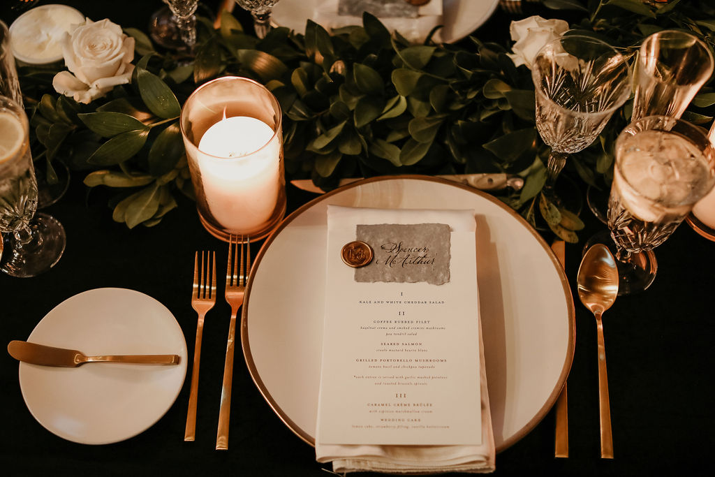
White Ink menus are always top-notch menus. The best part about working with Elizabeth and James is how they really wanted to tie together so many delicate details. They chose to use the same hand-made paper for their menus that was also used to create their invitation suites. A solid decision for a bold and timeless wedding. The wax seal used to combine the place cards and menus boasts a custom monogram as well. Fun tip: Elevate your place cards with custom spot calligraphy.
We also supplied Elizabeth and James with our super sleek table numbers that fit effortlessly into the dreamy tablescape.
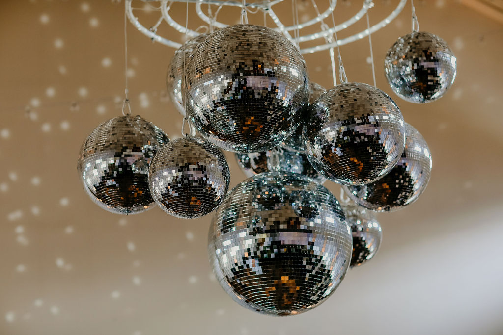
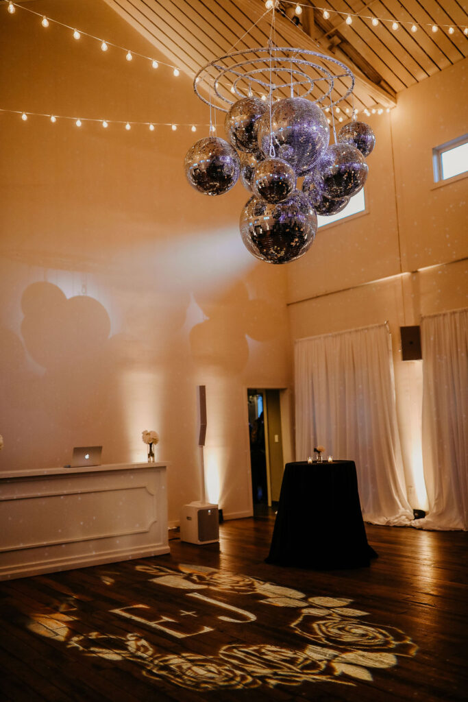
If you don’t think disco balls and custom monograms belong together, I’m here to tell you- Oh yes, they do! The monogram we used with the handmade invite paper was carried over to the dance floor, illuminated by a chandelier of disco balls. I can’t stop looking. This is just the best thing ever and really gives you a peek into the fun energetic style of our beautiful couple.
I am so happy we finally got a chance to bring you into one of the most fun nights we’ve had in a long time. Elizabeth and James allowed us to show off our creativity and interlace this entire journey with distinctive details and style. They made my job easy, and I love my job! Cheers!