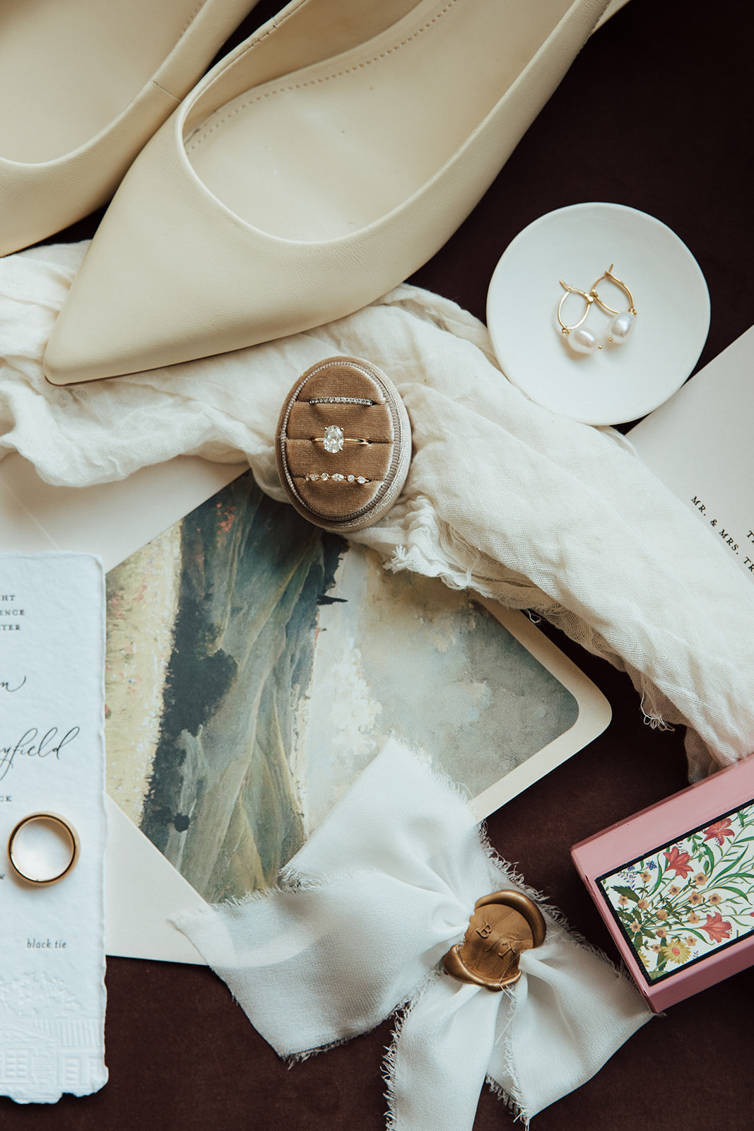
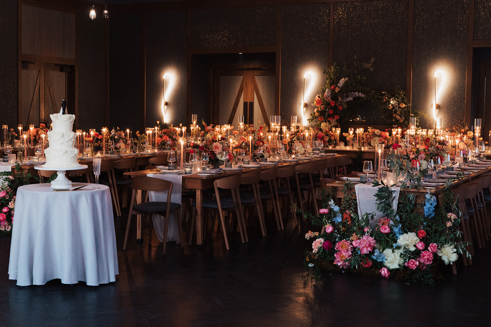
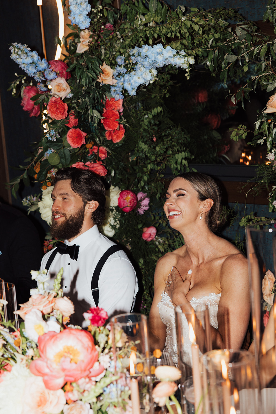
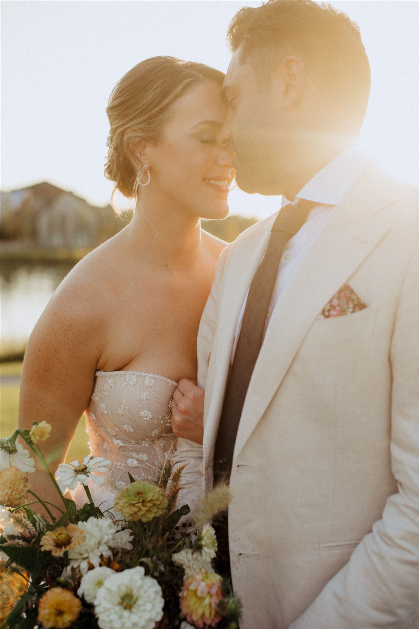
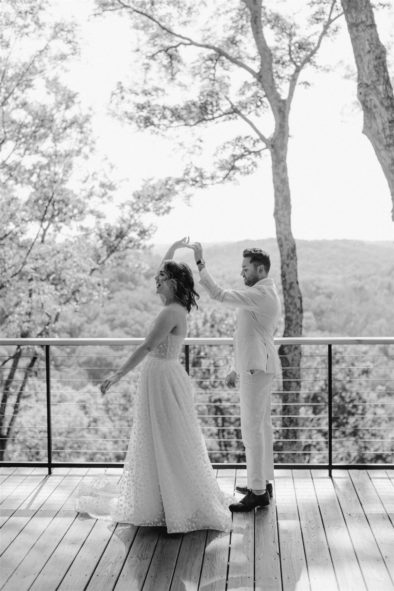
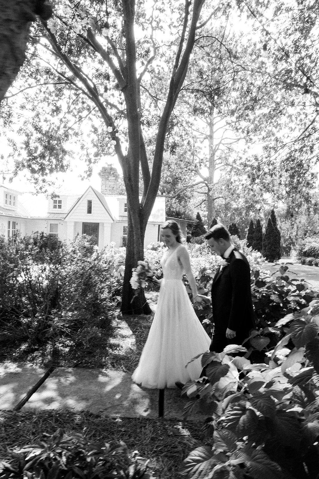
We are back at the enchanting Southall Farm and Inn as we take part in elevating the gorgeous wedding of White Ink couple, Brittanie and Tristen. This wedding touches all the senses, as textures and colors burst throughout the Franklin, TN venue.For this elegant, black tie wedding, we created several fun and unique textured details. From fabric signs to stone table numbers, we loved putting all our creative energy to use to make their vision come alive.
Elegant Wedding Invitation Suite
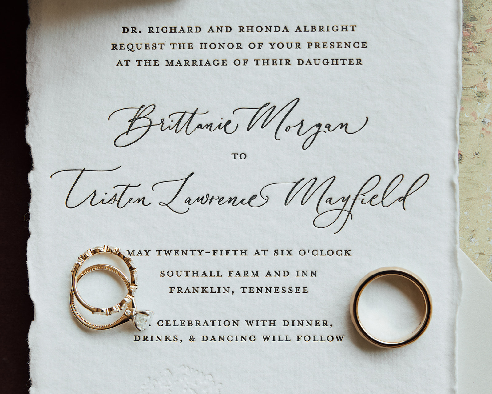
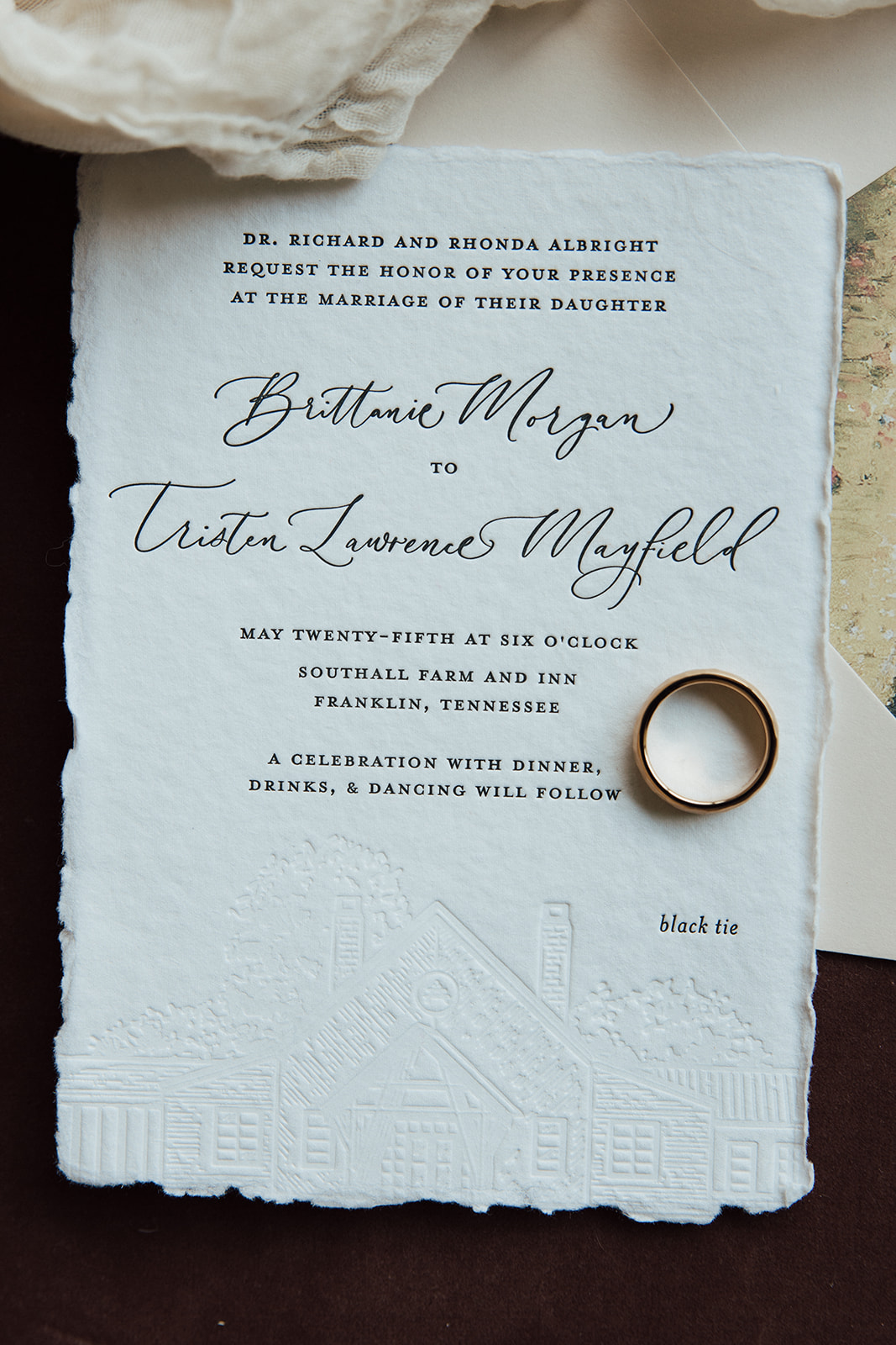
Brittanie and Tristen’s invitation complete with letterpress on hand-torn stock card created an incredibly elegant feel and look for their big day. Wedding invites have the power to truly set the tone for the entire event. I love when our couples understand how important it is to not skip the delicate details that give their guests the very first impression of what’s to come.
Note the pressed image of the Southall venue gently placed over the invite. It’s a small yet mighty detail that makes this invite one-of-a-kind.
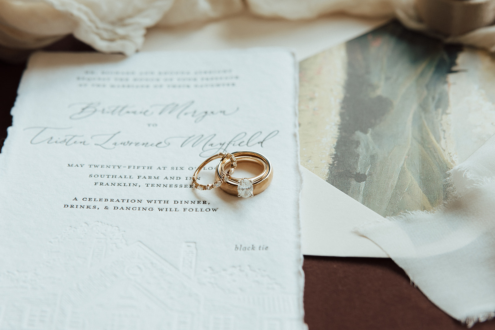
Another detail that we must highlight in this suite is the beautiful envelope liner. In my opinion, envelope liners are simply a must, especially when finding ways to customize your wedding invitation suite. I like to think of it as the lining of a fancy jacket; it’s a place to pull in color and even have some fun and make it yours!
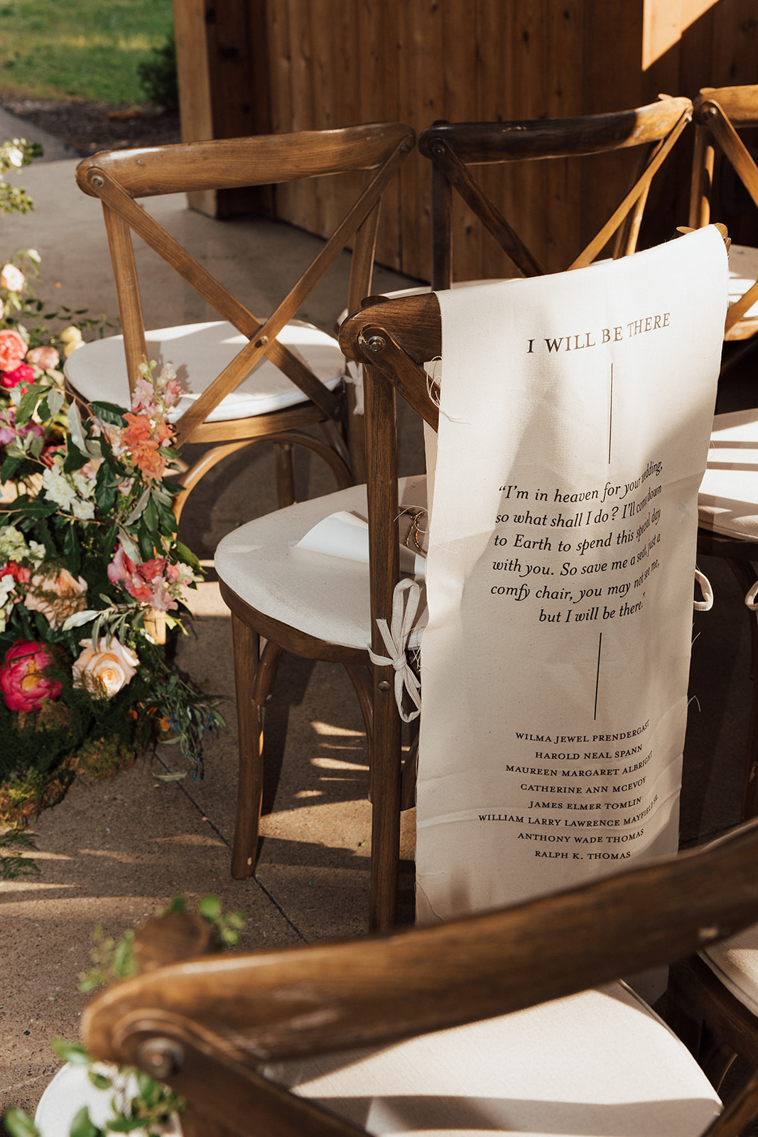
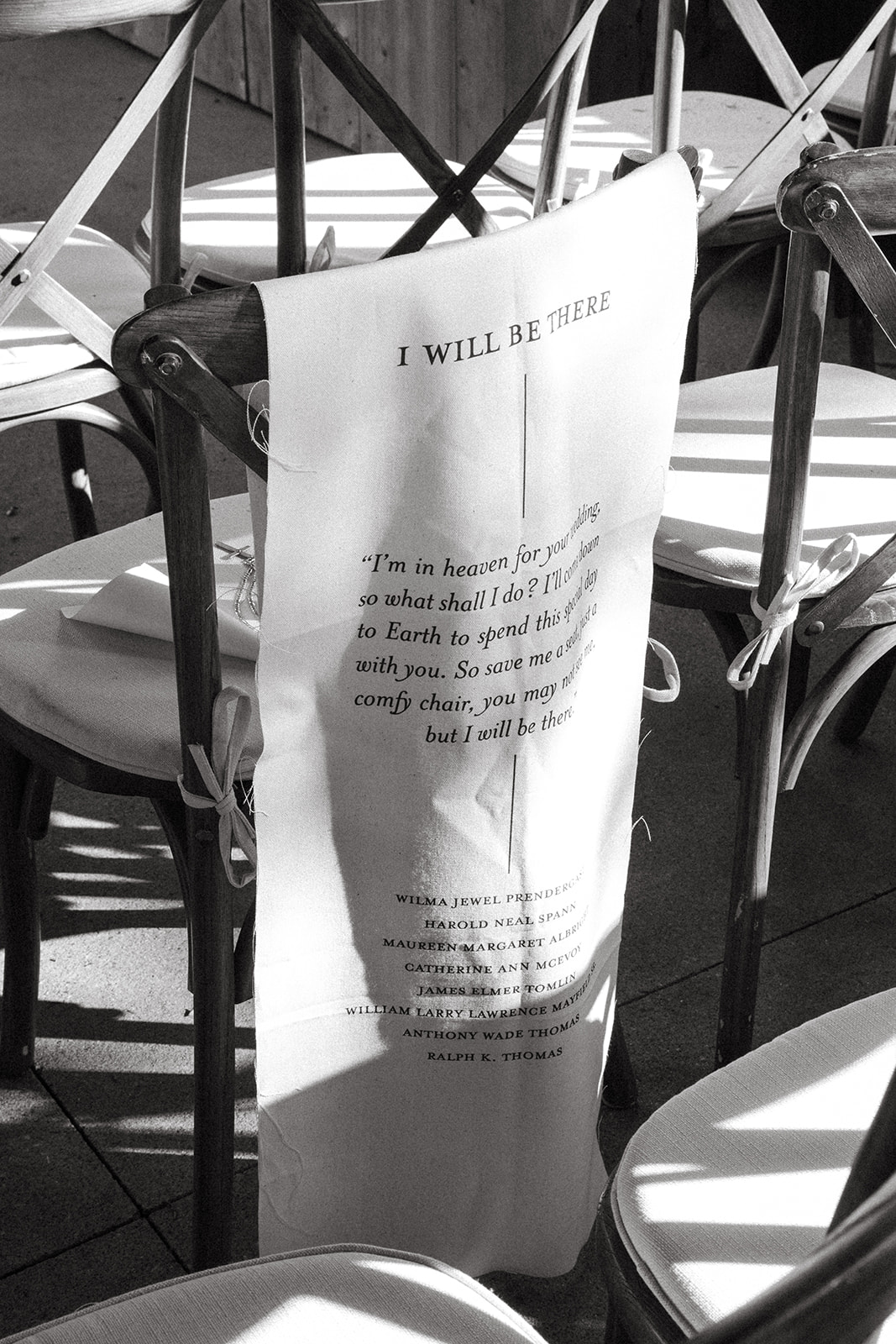
“I’m in heaven for your wedding, so what shall I do? I’ll come back to earth to spend it with you. So save me a seat, just a comfy chair, you may not see me, but I will be there.” This touching poem was placed on a fabric banner along with the names of those from Brittanie and Tristen’s life who have passed on. It was an honor for us at White Ink to be involved in such a sentimental part of the ceremony and create this loving gesture for our couple.
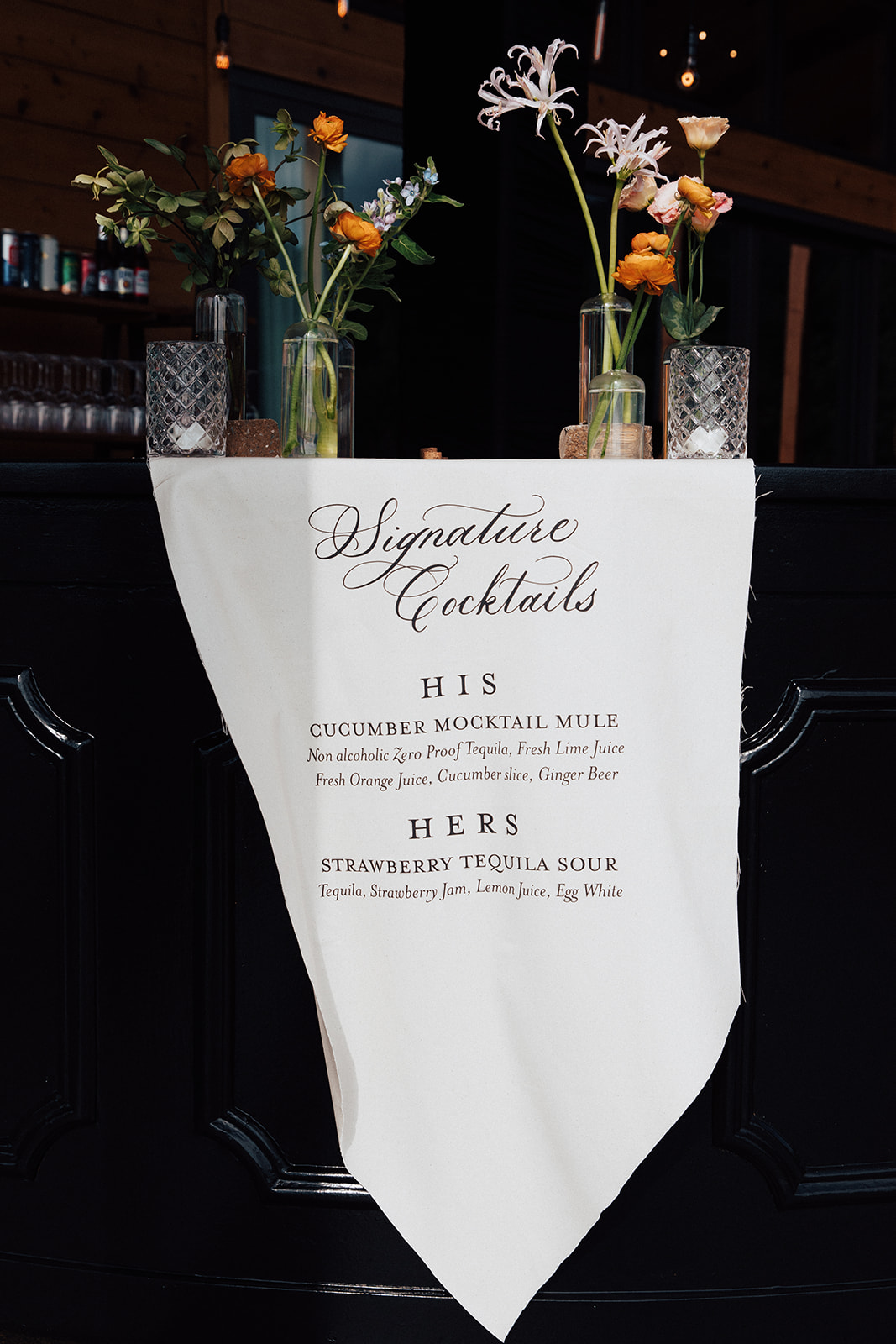
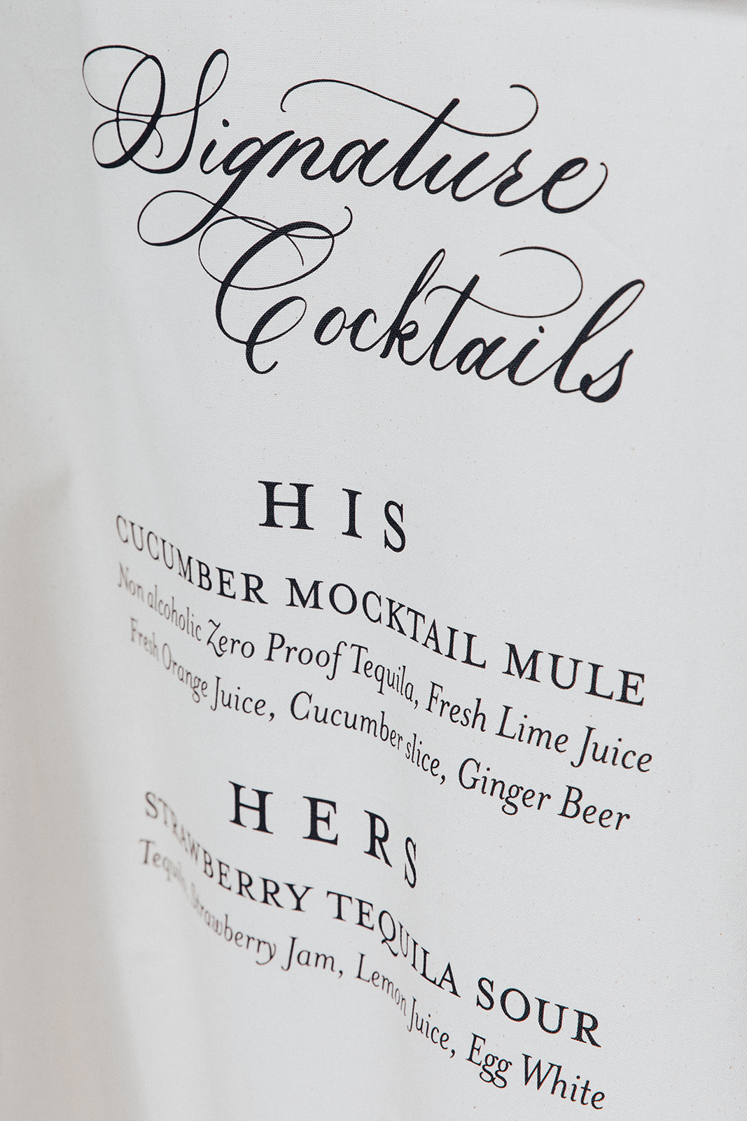
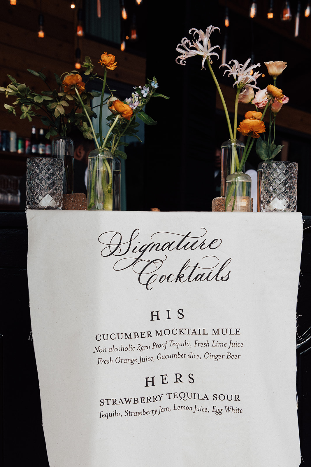
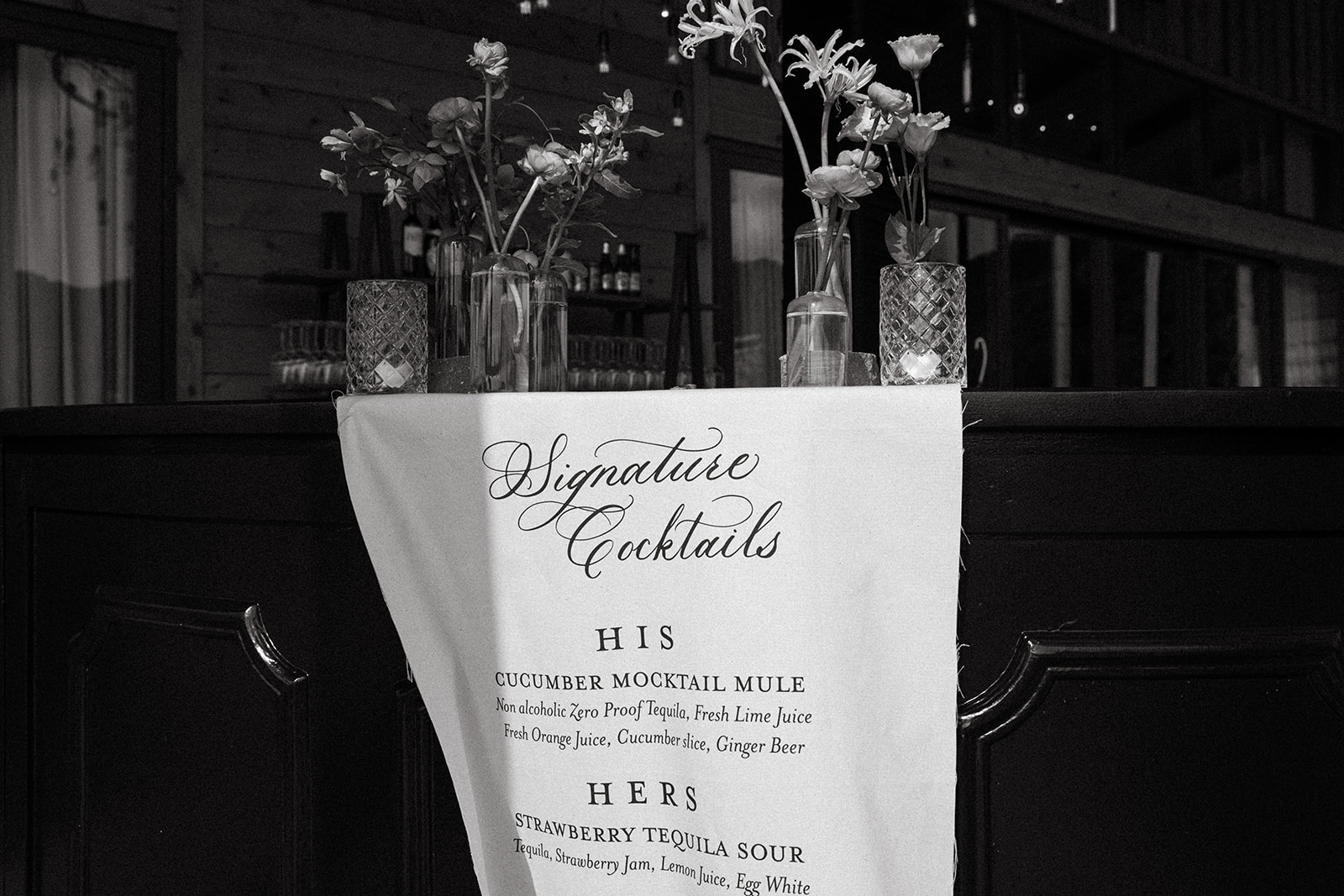
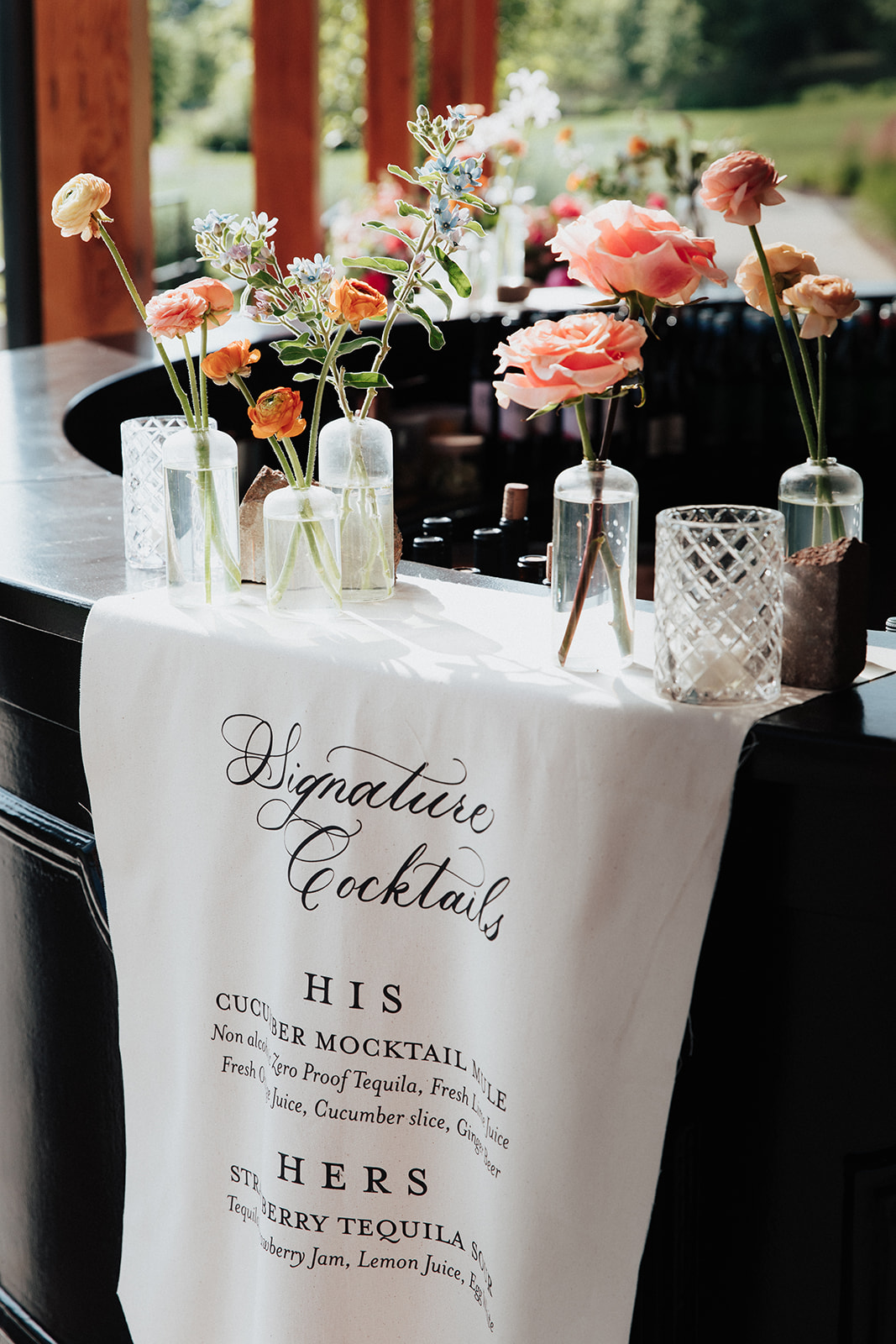
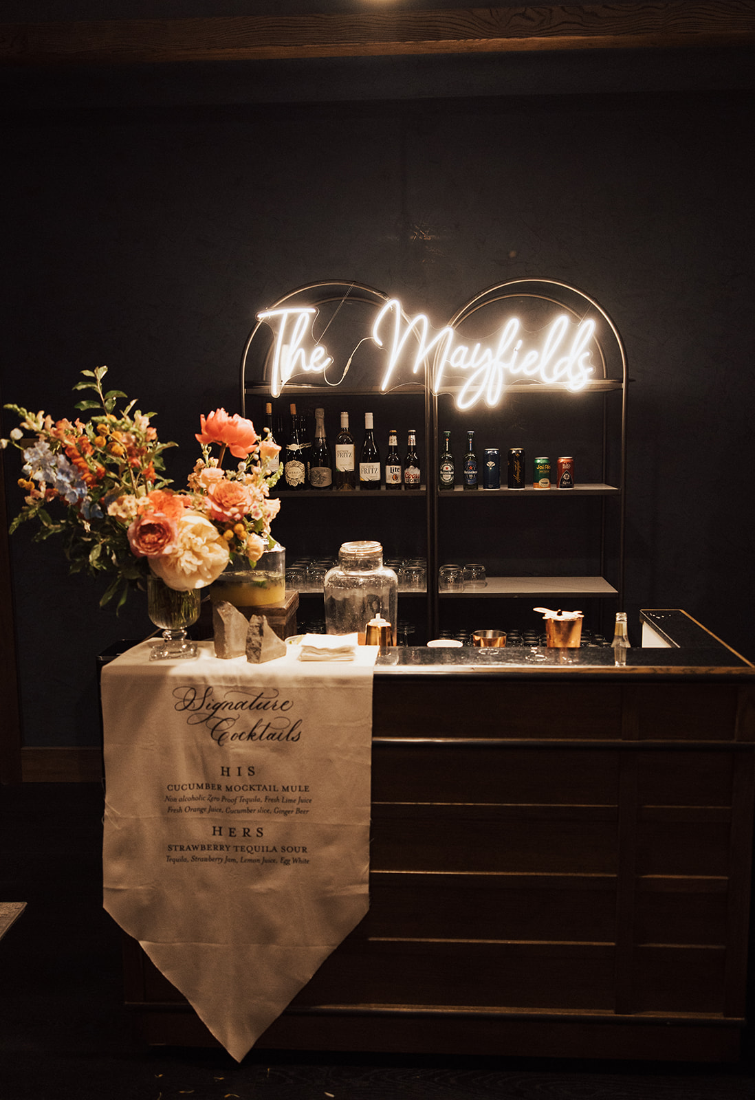
Custom Fabric Bar Sign
For cocktail hour, Brittanie and Tristen chose to utilize fabric for the custom bar sign. I like getting the chance to showcase our work as we step off the paper and onto other textures! The look of the fabric bar sign, on the thick wooden bar decorated with soft florals is perfectly inviting as guests make the transition from ceremony to reception. Also, I can guarantee guests will not forget a sign like this!
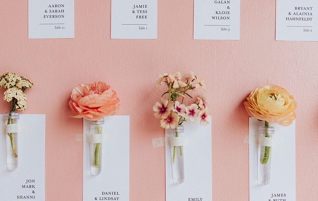
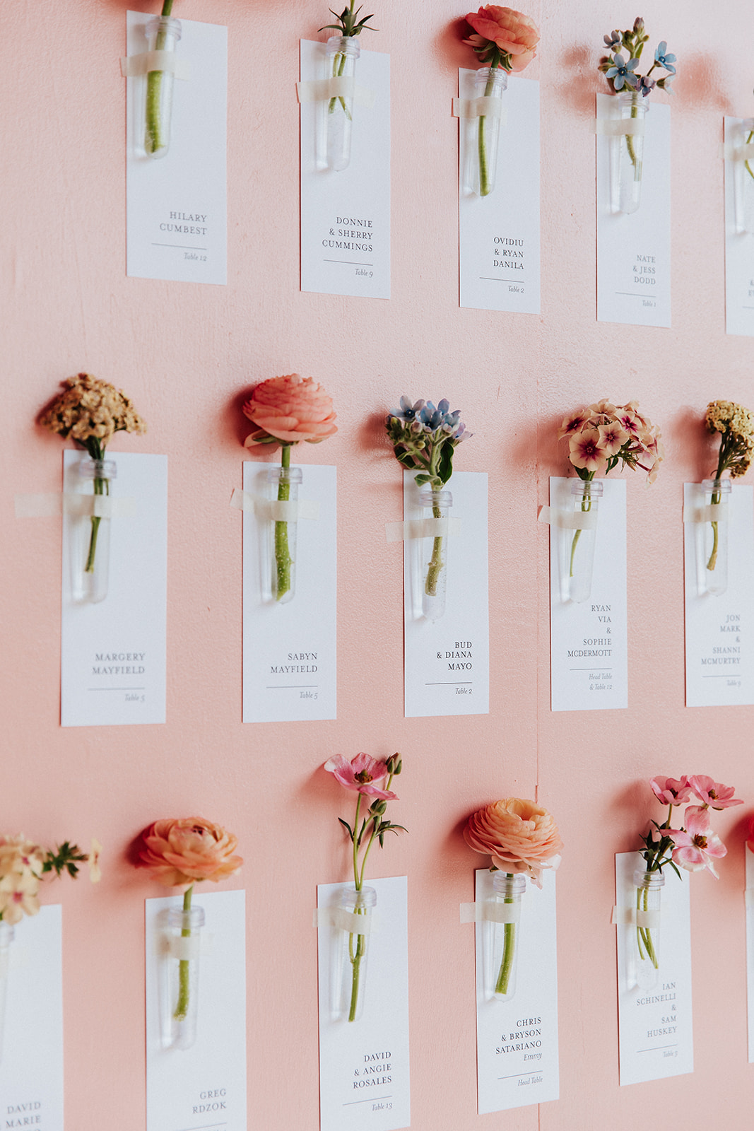
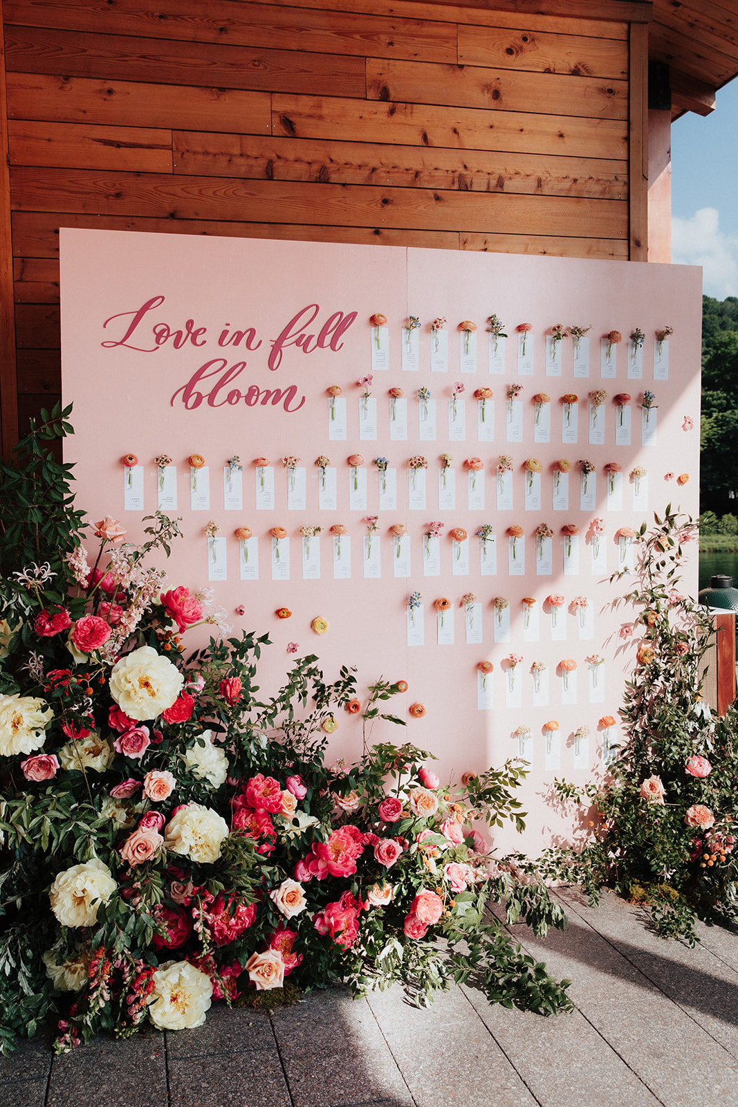
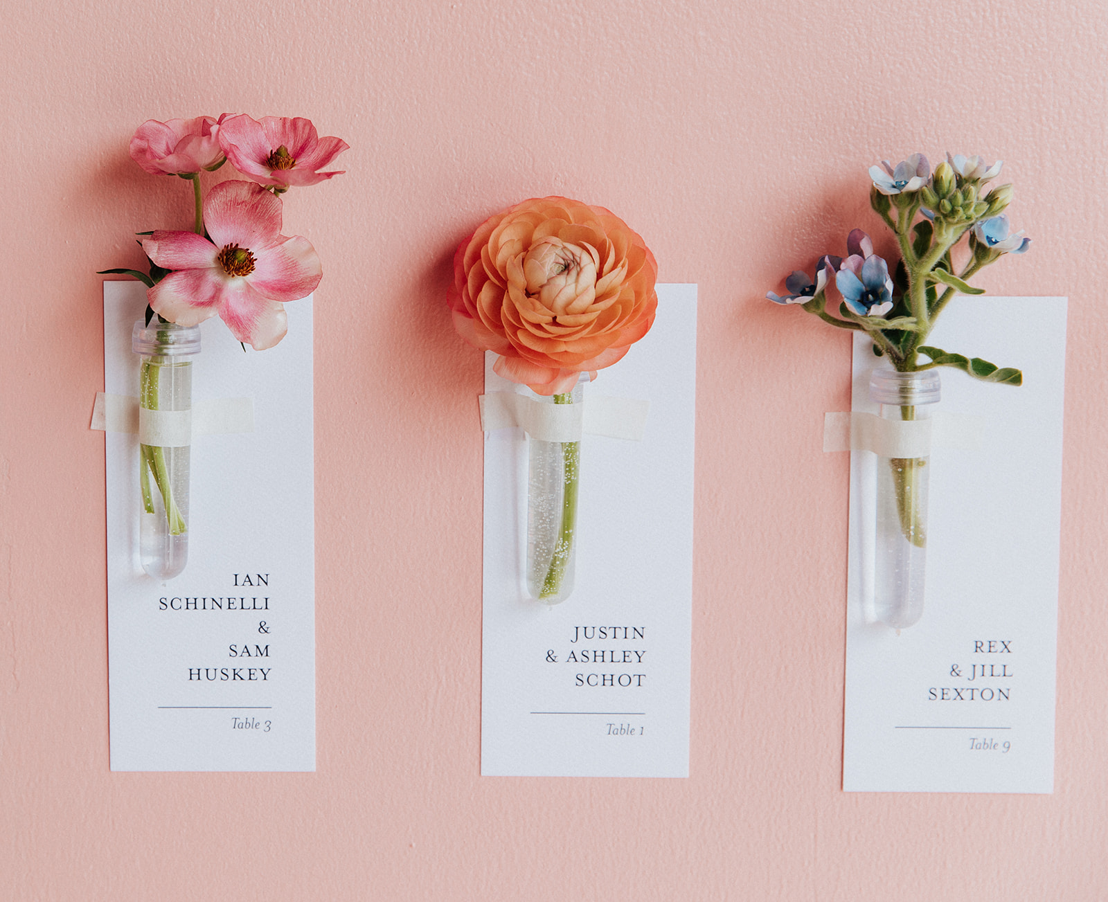
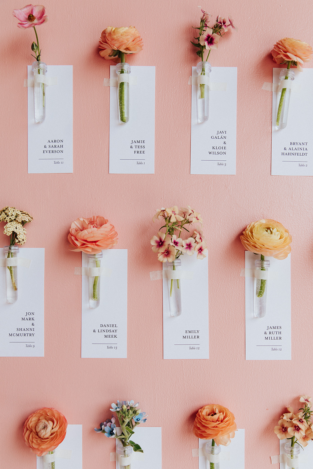
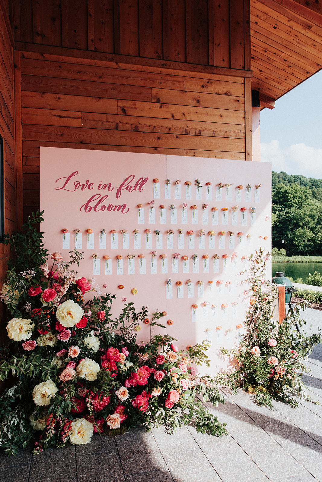
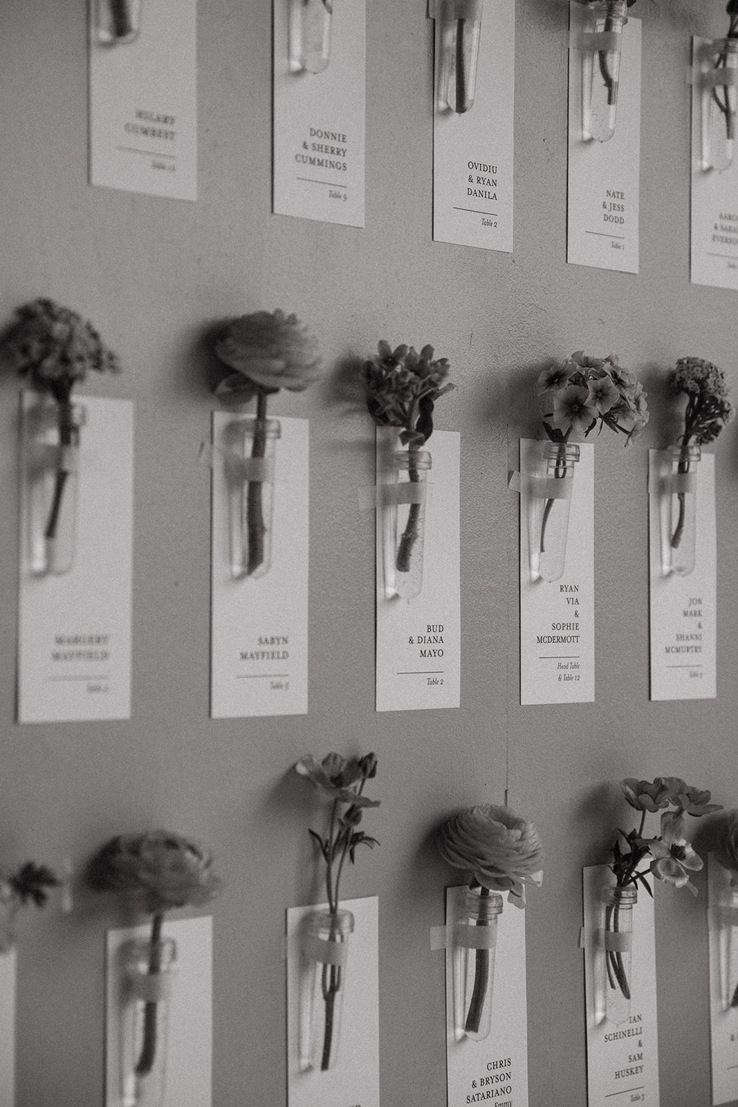
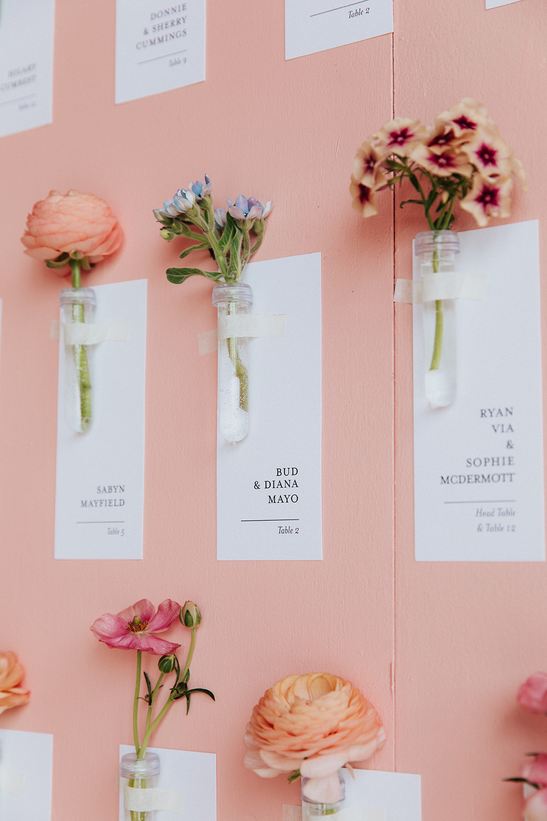
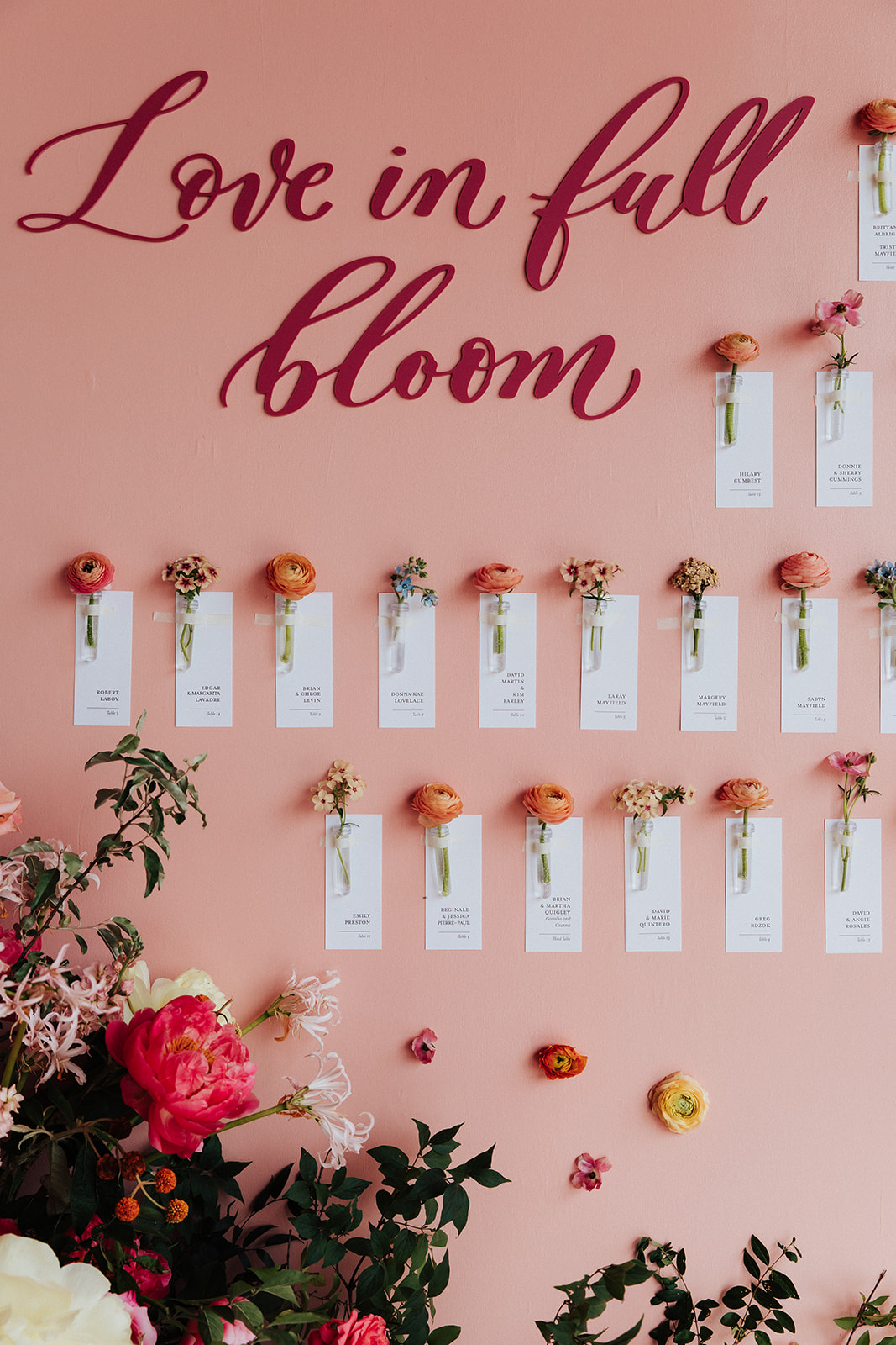
The title of this custom escort wall says it all: “Love in Full Bloom”. Brittanie and Tristen’s seating chart was so much fun to help create. As if the cascading florals all around aren’t enough to brighten this display, we kept it coming with custom escort cards attached to individual flowers. I like to think of them as small tokens to carry on the mood and energy of this fantastic day.
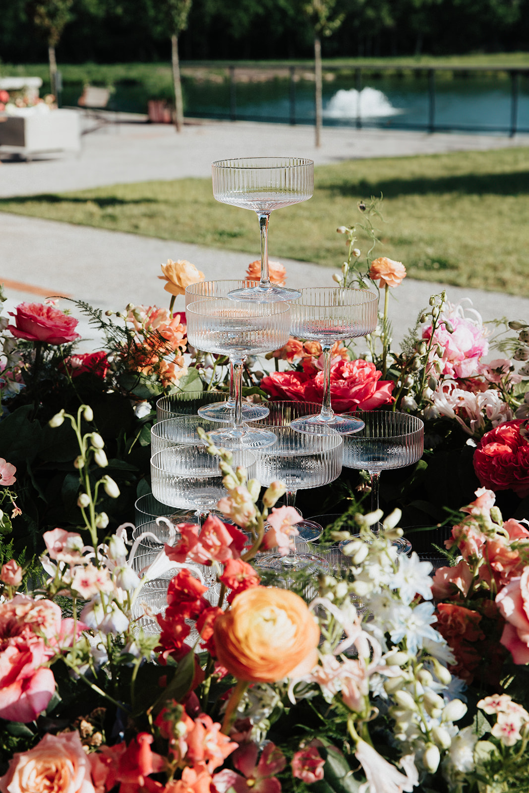
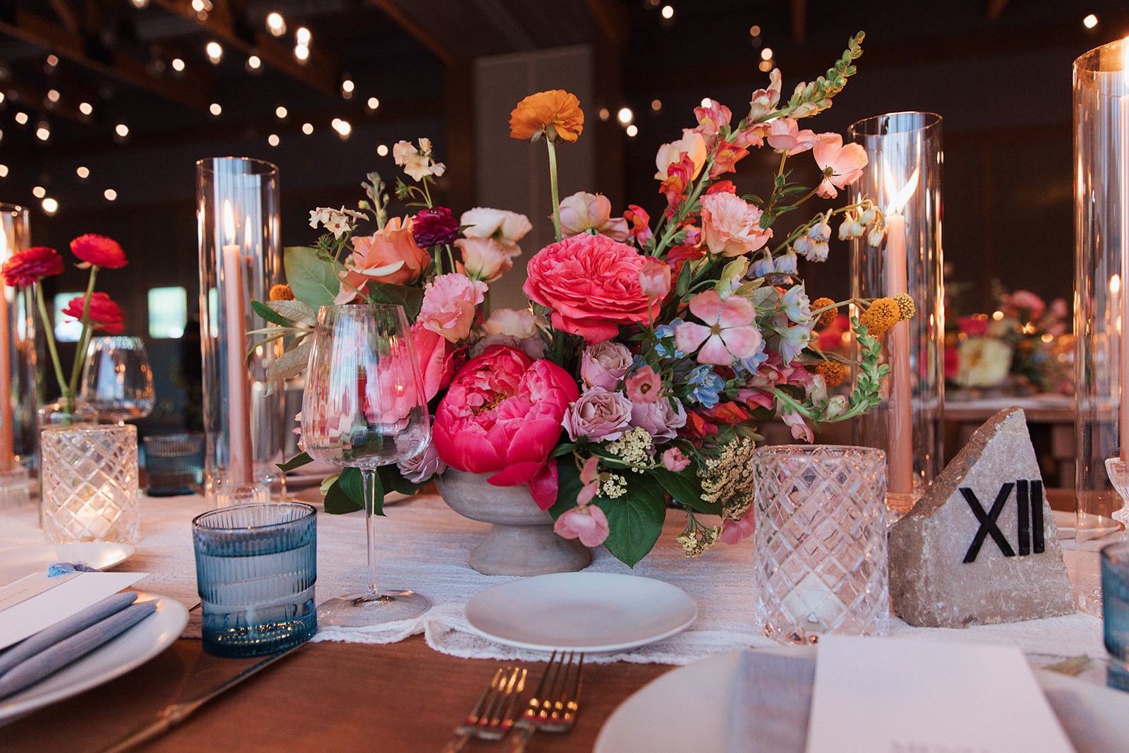
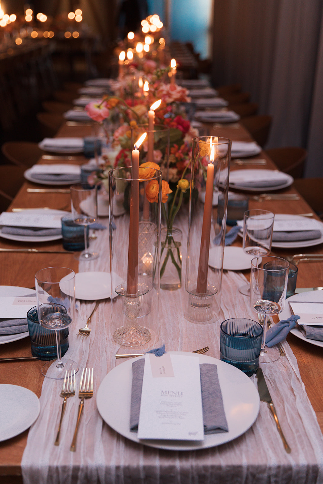
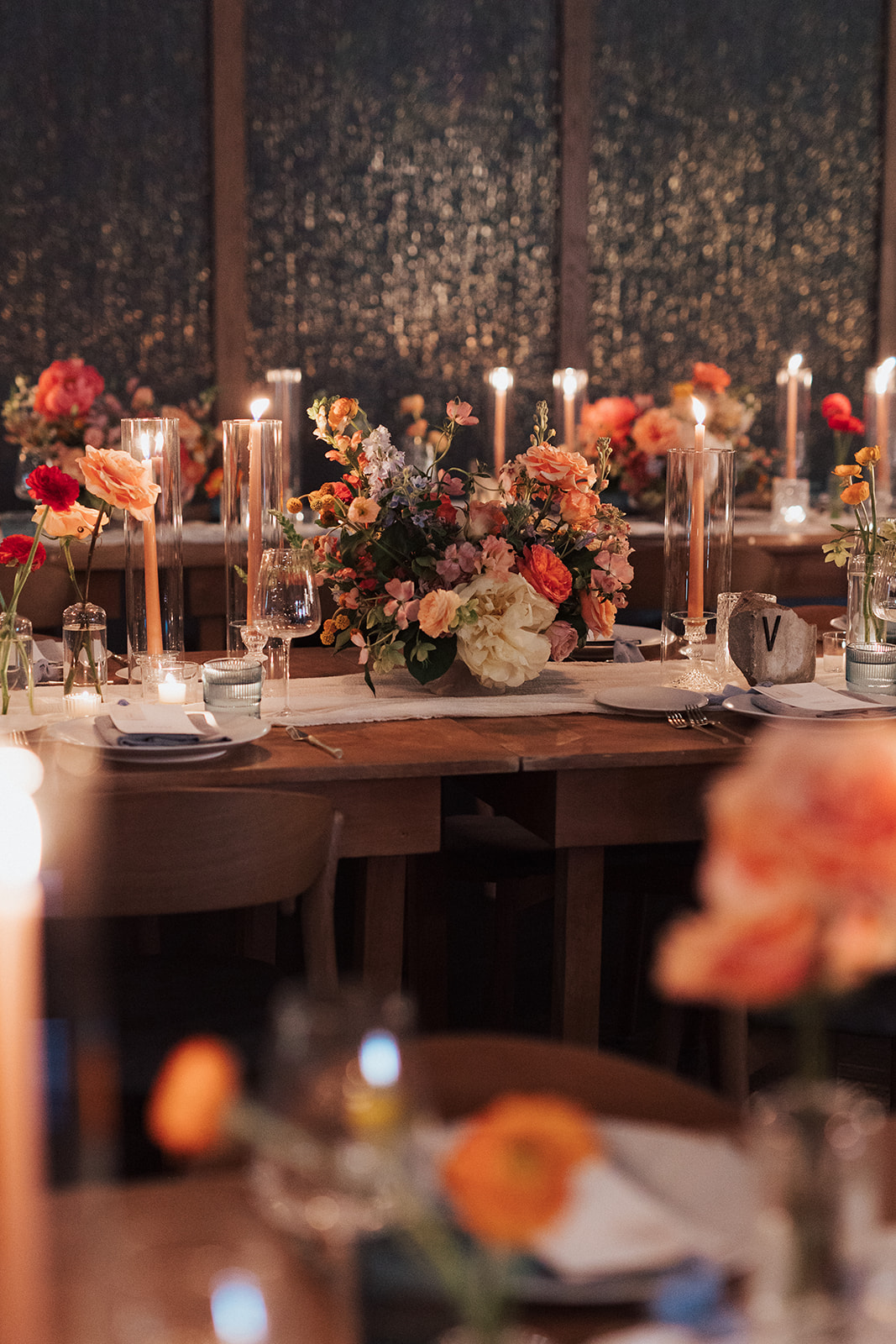
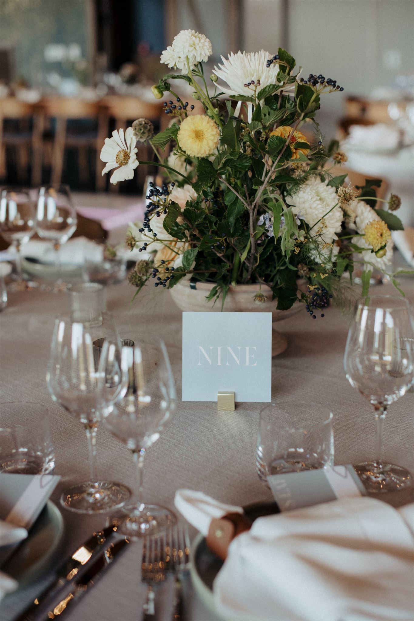
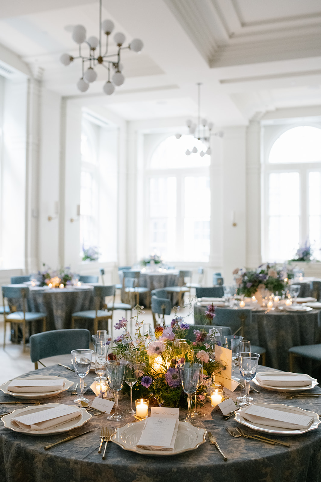
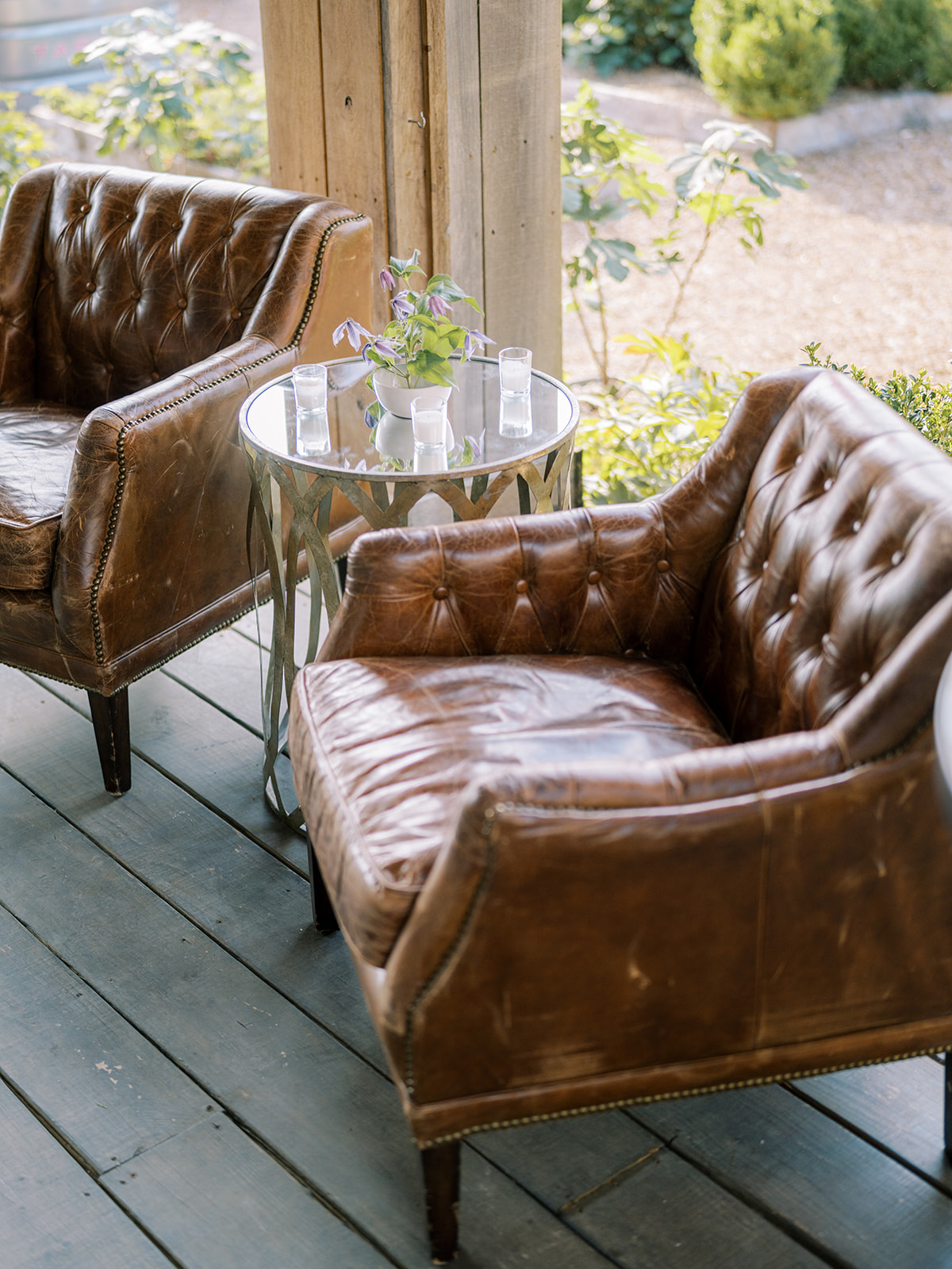
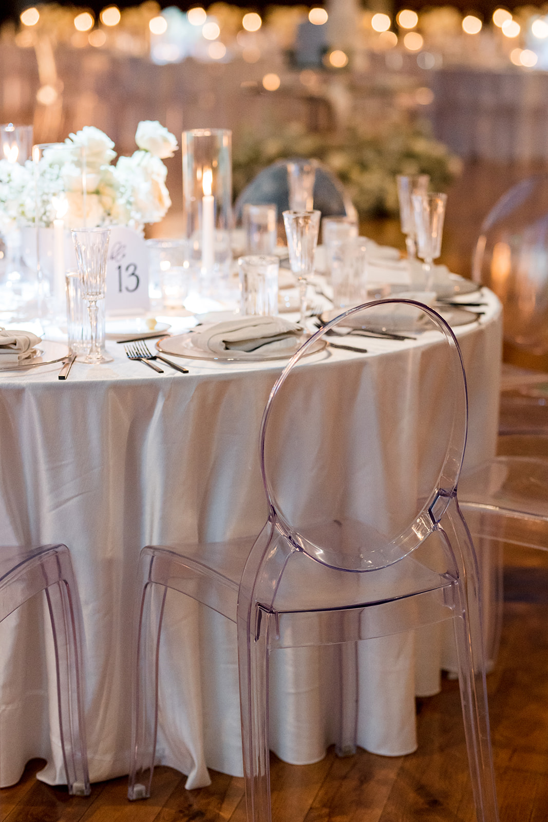
Textured Reception Details
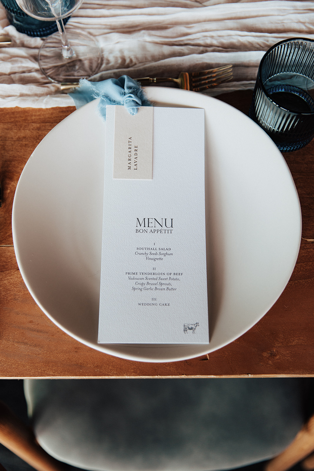
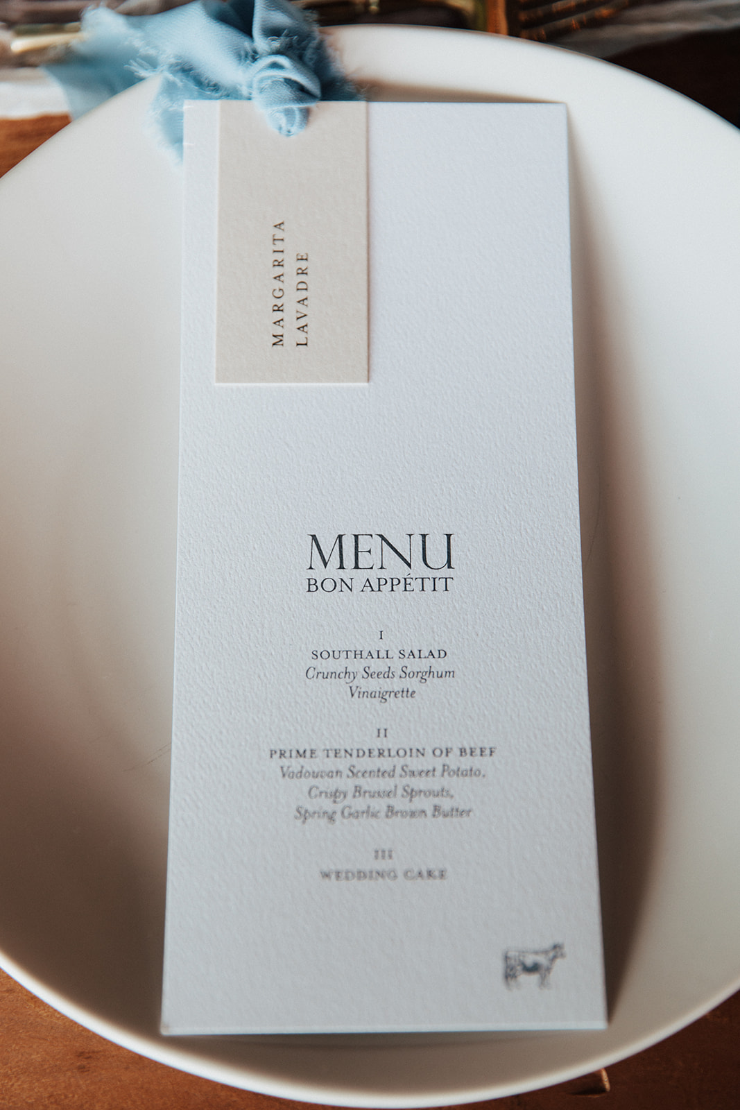
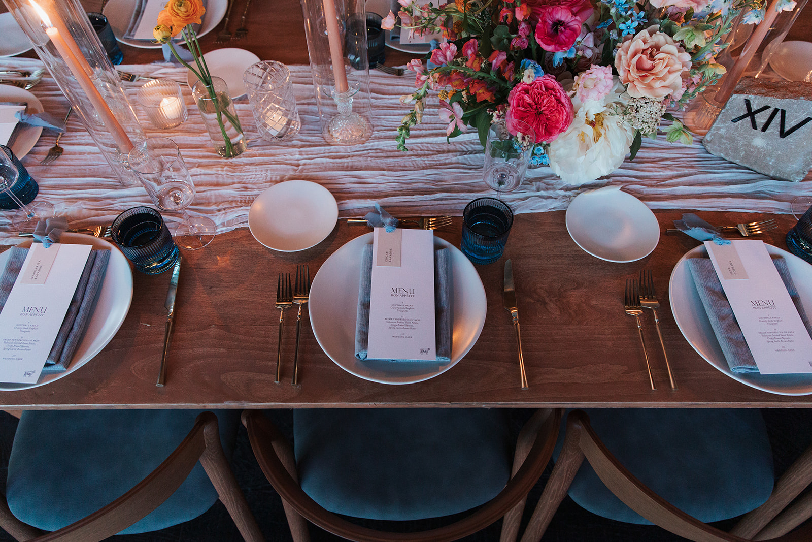
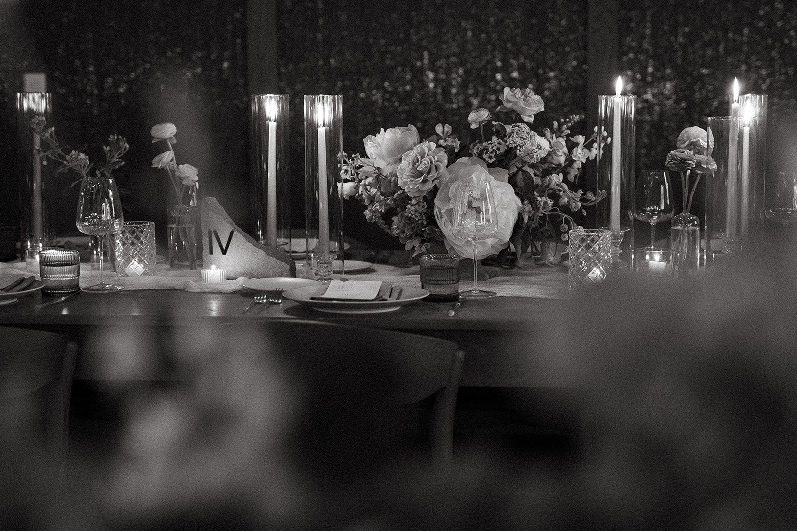
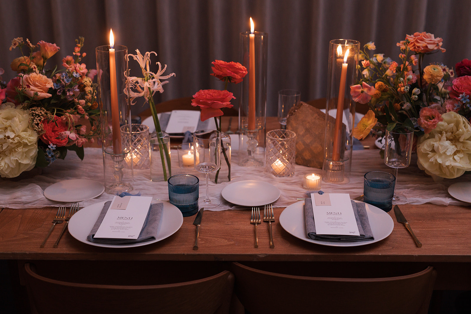
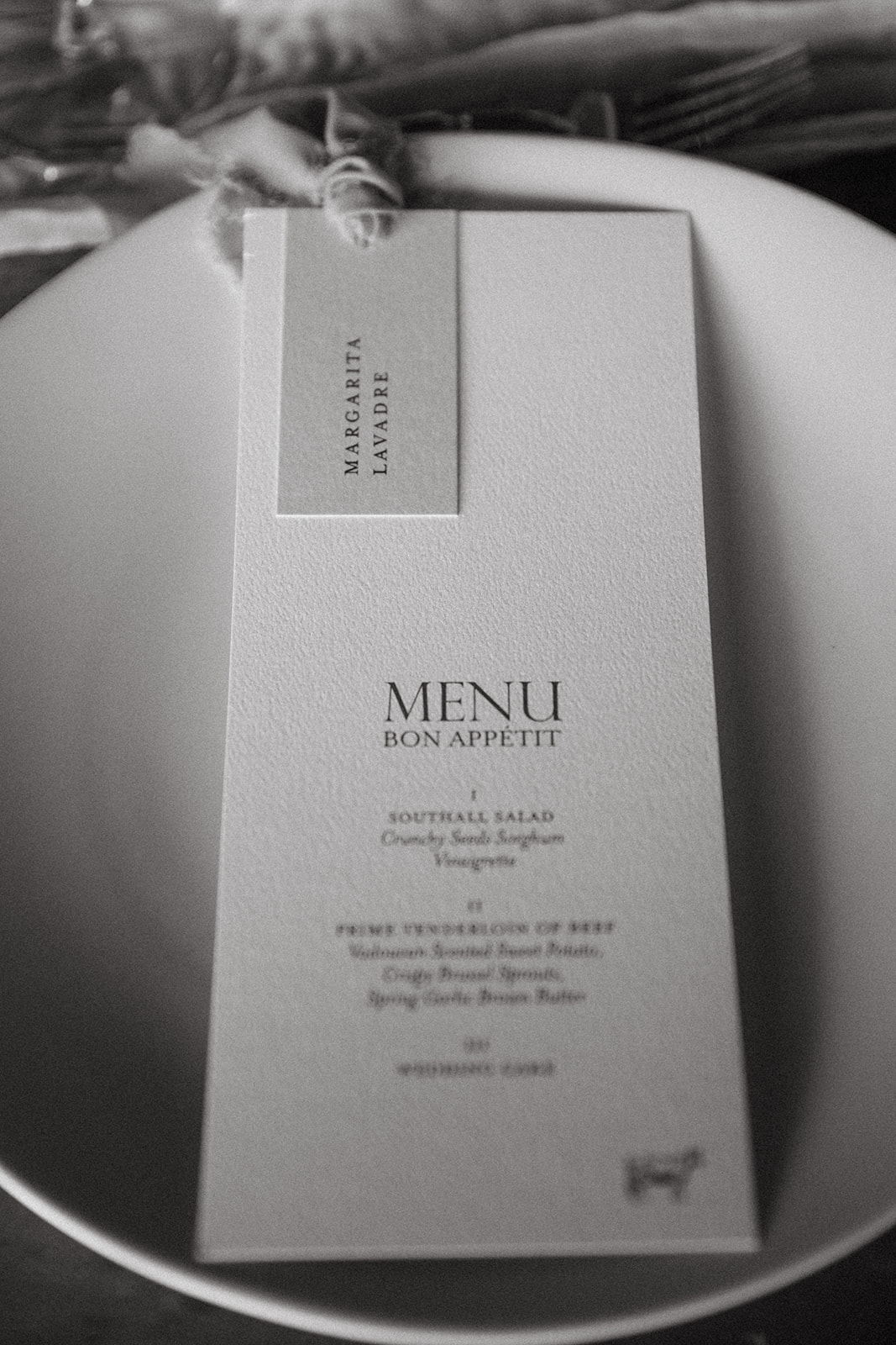
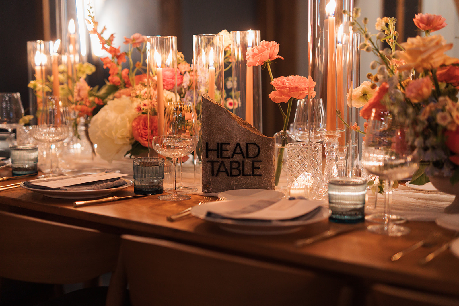
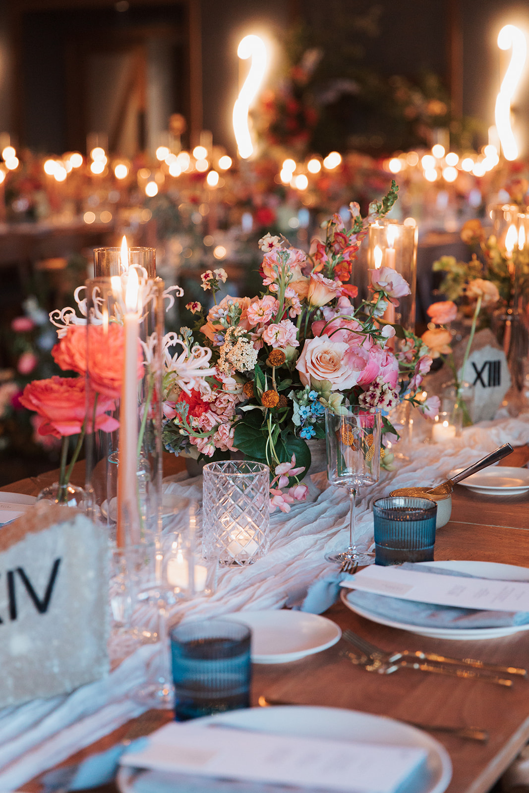
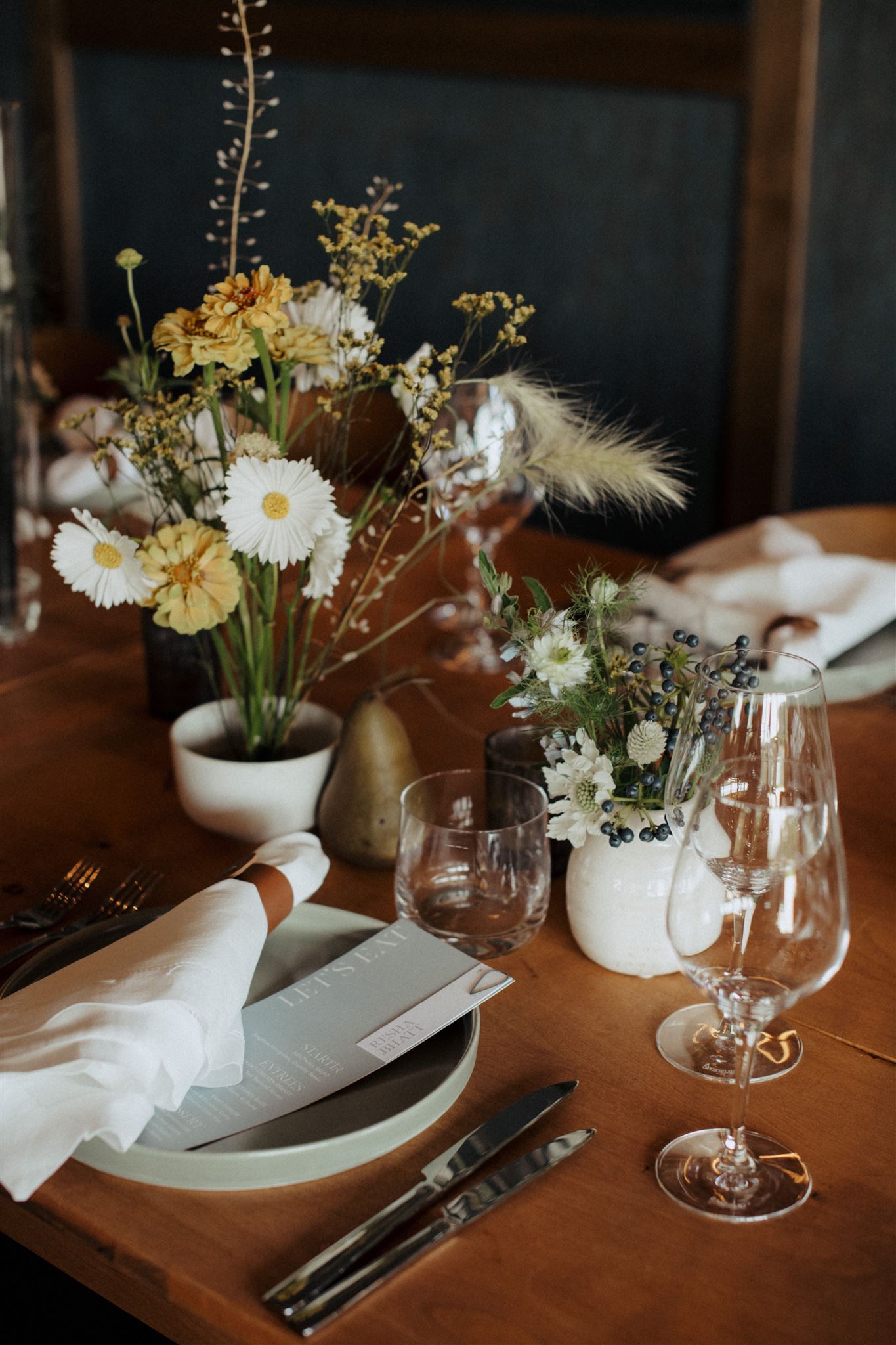
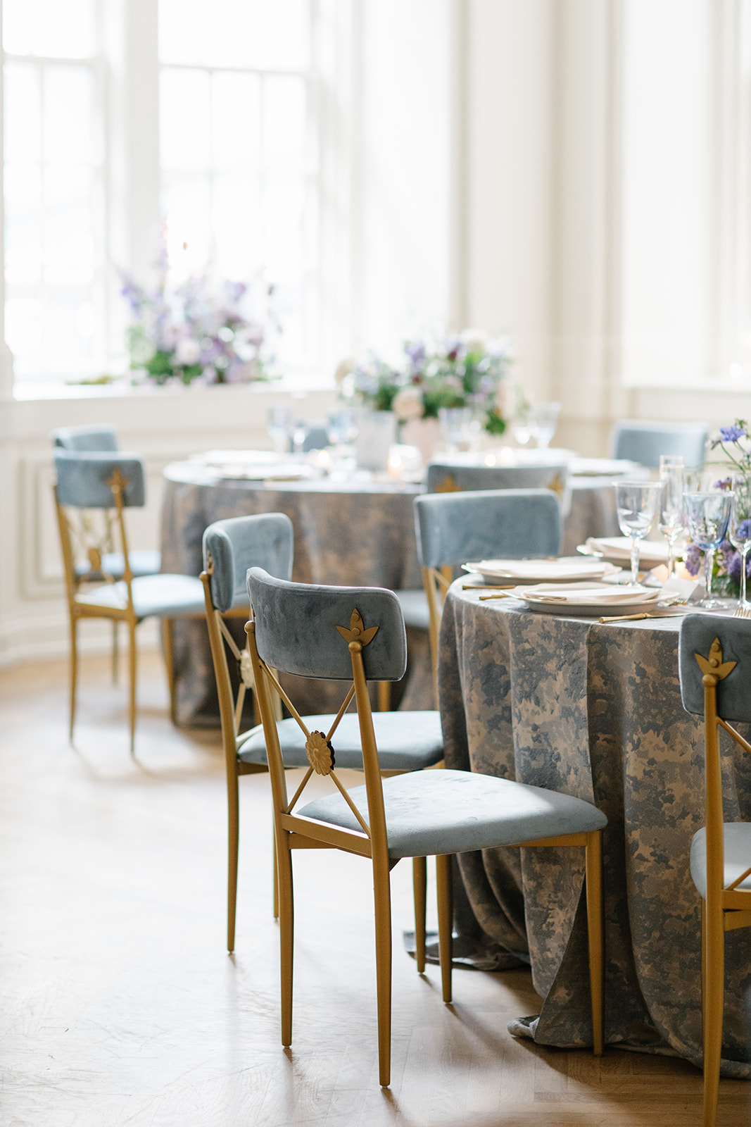
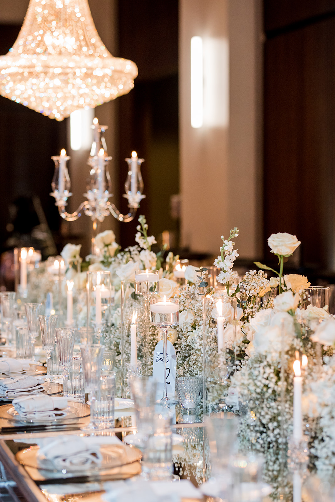
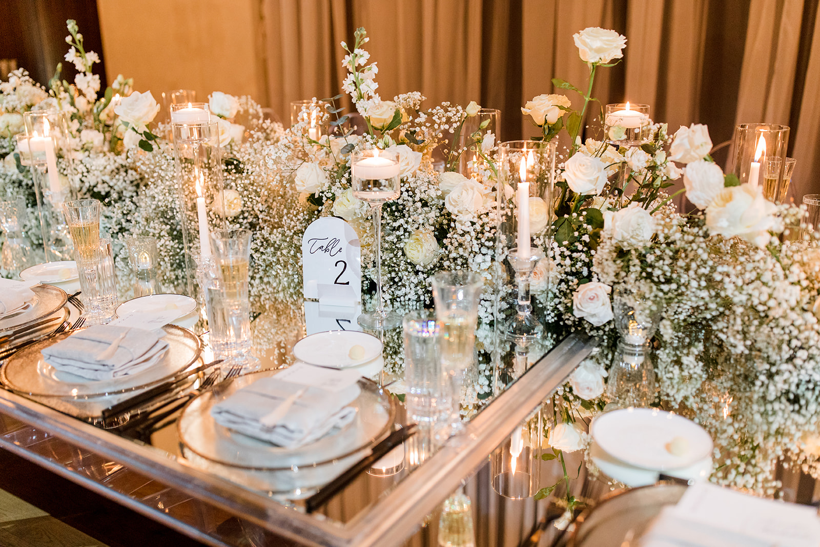
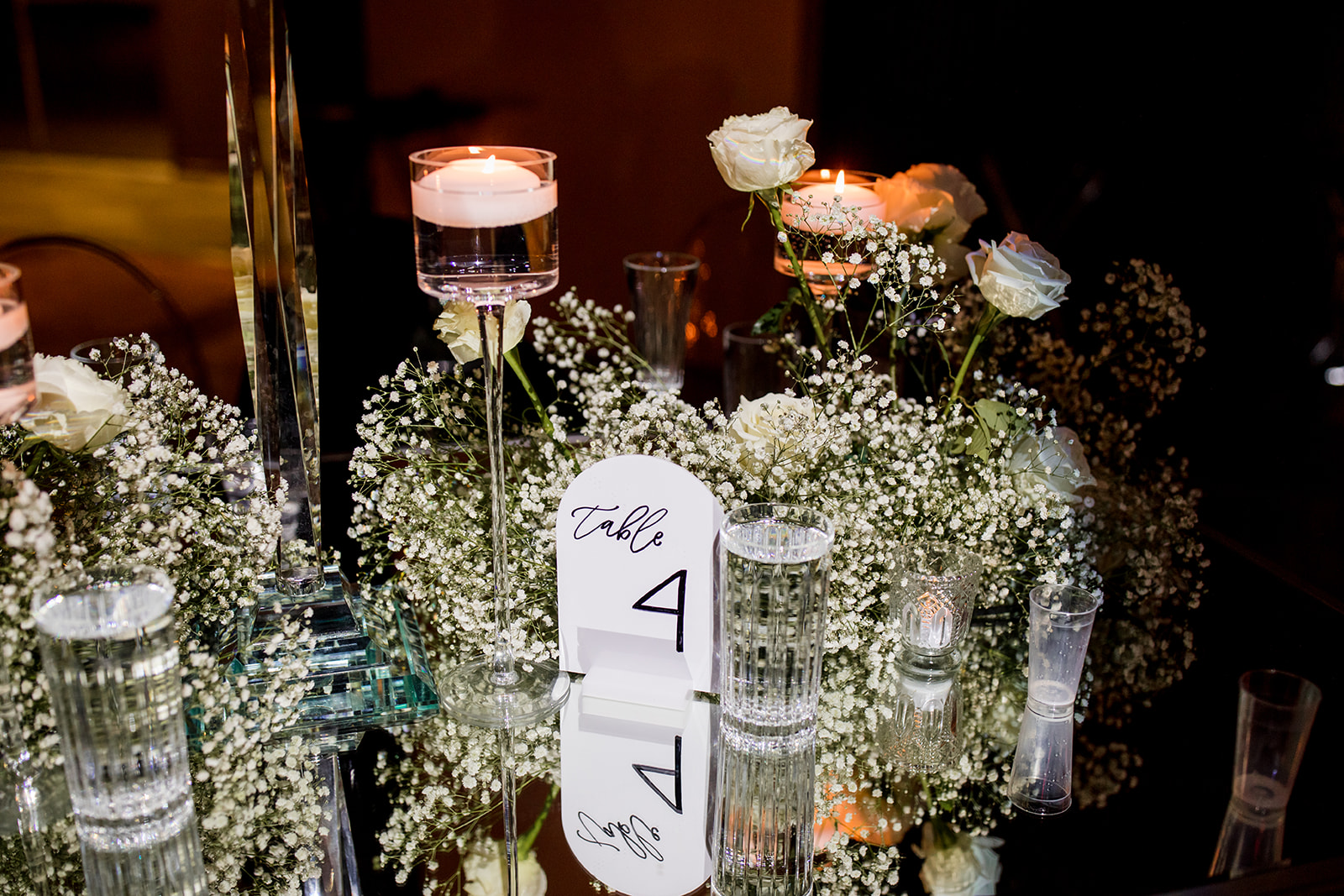
The delicious menu selection was printed on a beautiful stock card and placed underneath a delicate place card with baby blue ribbons. I think it’s important to point out the spectacular usage of texture from Brittanie and Tristen’s reception. Guests soaked in the beauty of soft linens, traditional and modern glassware, abundant florals, and warm candlelight. THIS is how you create the mood and keep the guests engaged in every sense. I could have stayed here forever.
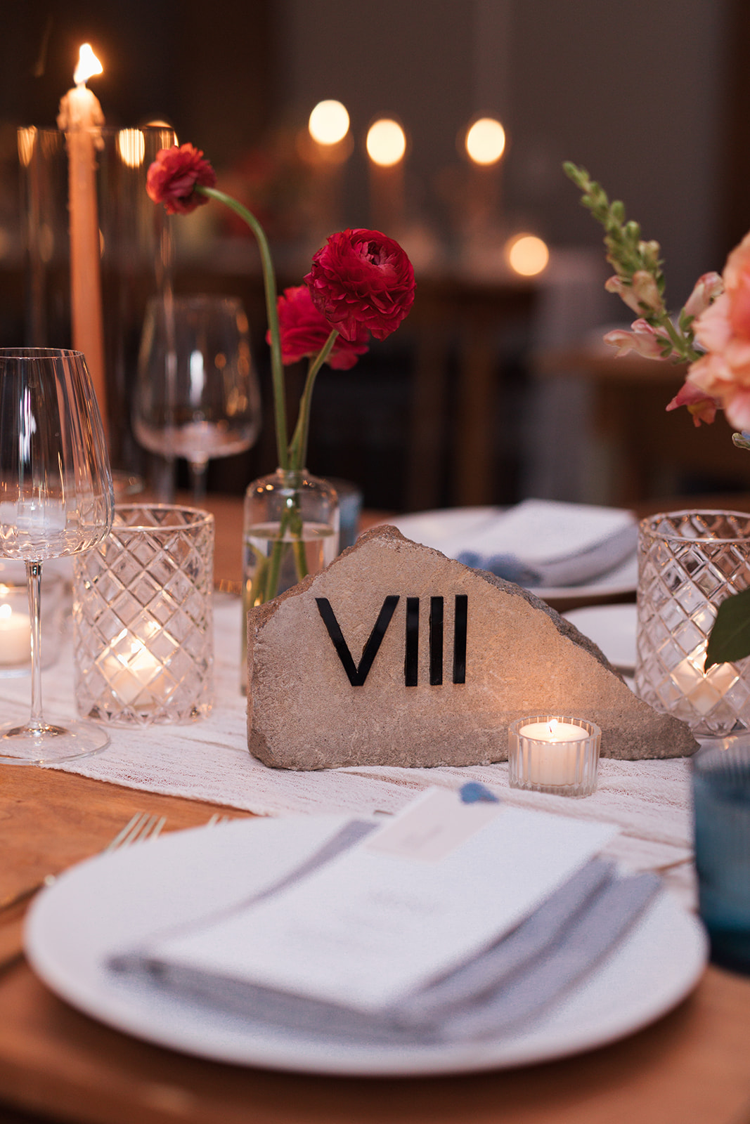
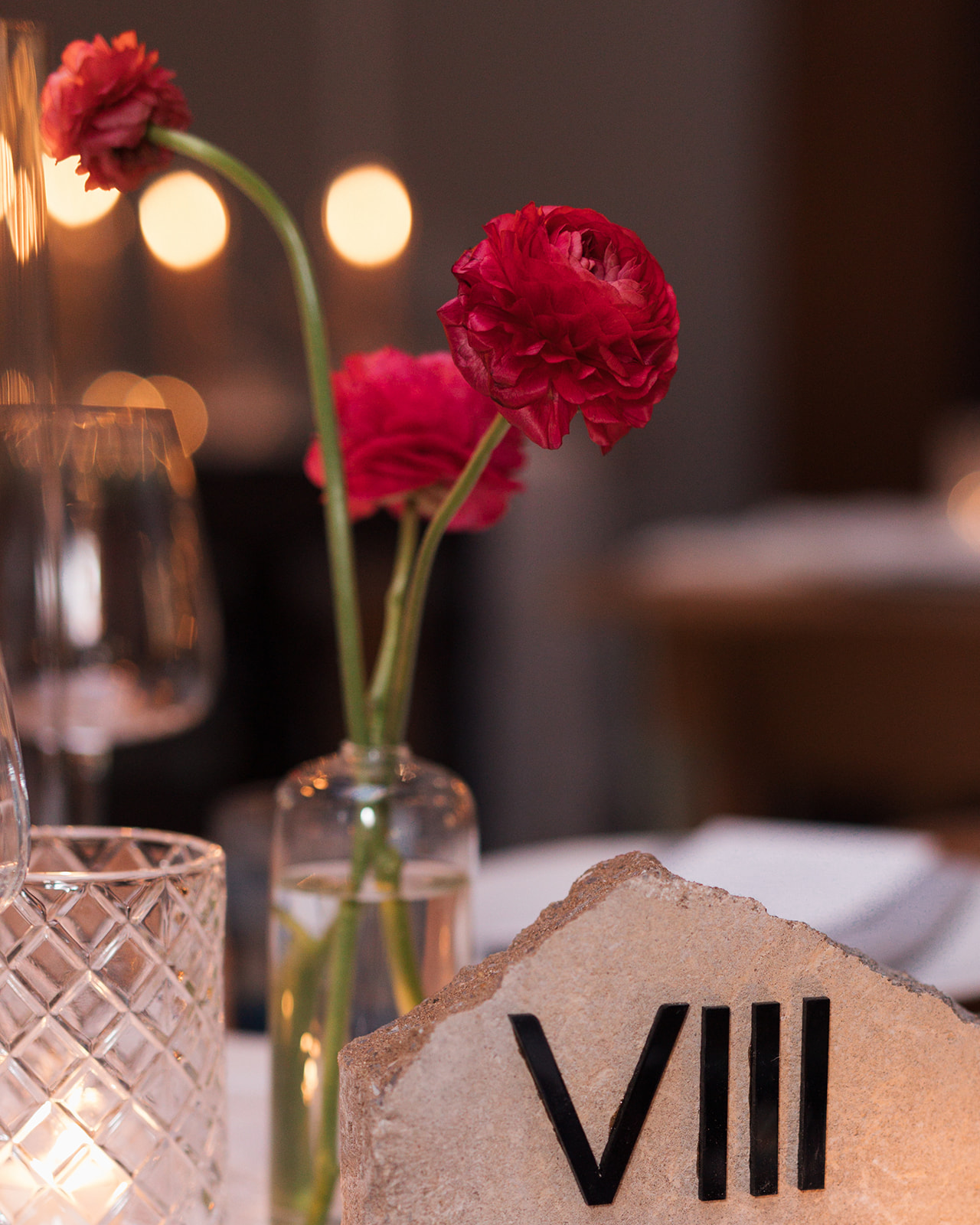
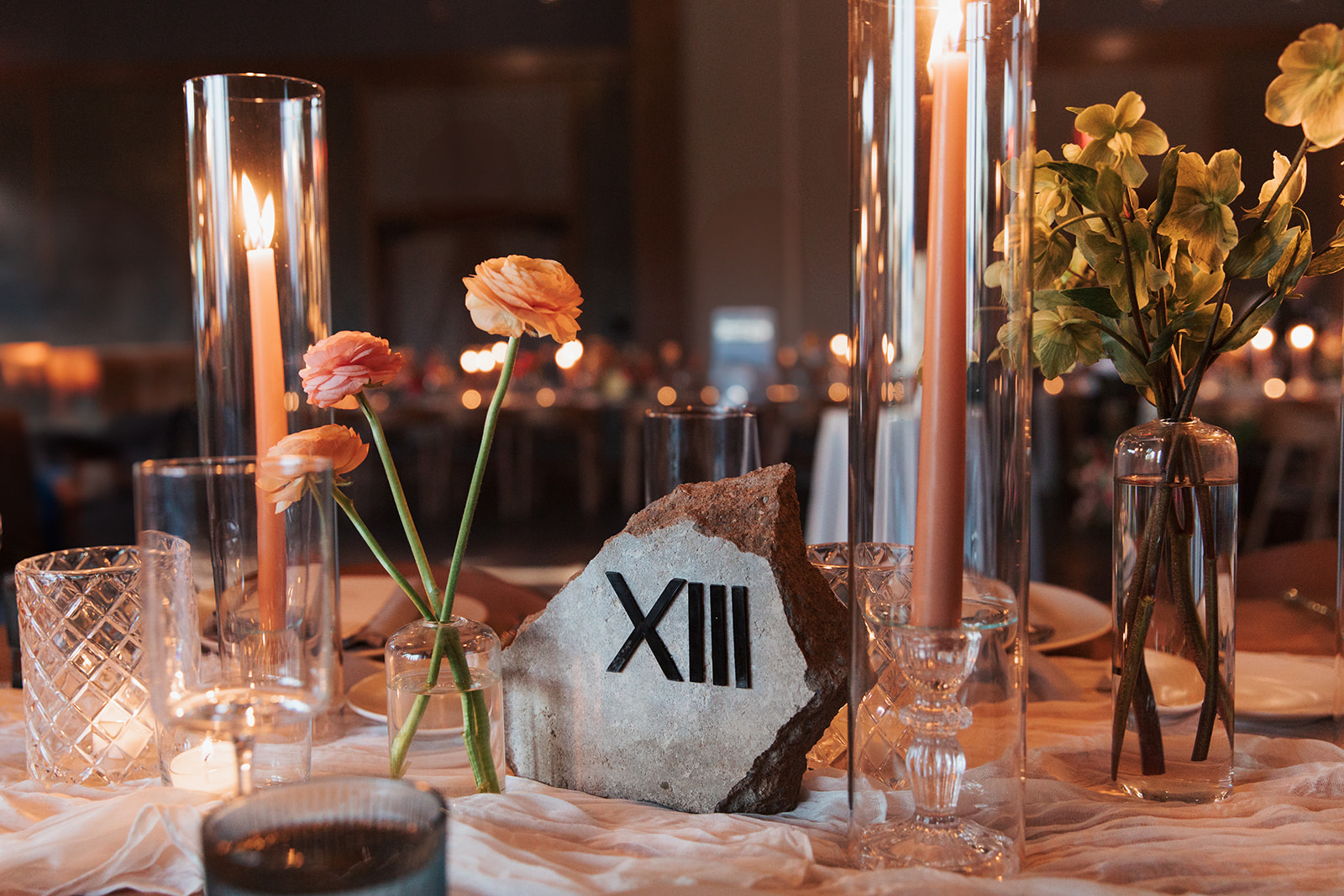
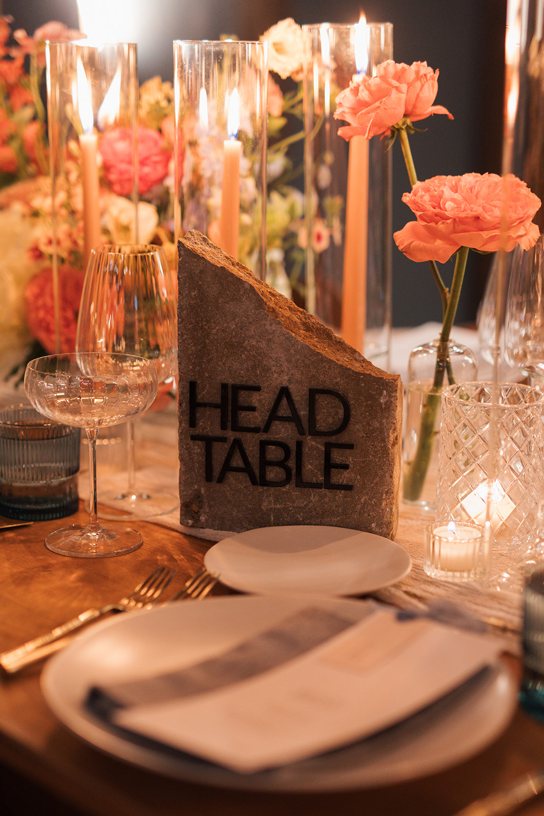
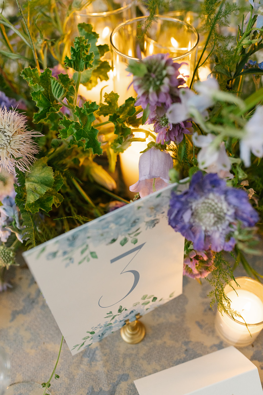
I have been so excited to showcase these table numbers! Talk about texture! These custom stone table numbers from our extensive rental collection are a favorite of ours at White Ink. We were thrilled to provide these at the reception for Brittanie and Tristen. They created the perfect balance of the texture-filled tablescapes and were undoubtedly a main conversation piece. Reception decor is a wonderful time to show your style and personality just as Brittanie and Tristen did. The Roman numerals were an excellent touch.
Here’s to Brittanie and Tristen. For trusting White Ink with the finer details of this fine day. The love, the people, the creativity is something that will stay with us for many years to come. Cheers!
If you’re looking to add custom, thoughtful touches to your wedding or event, we would love to help make your vision a reality. Reach out today to learn more about our full-service design offerings—we can’t wait to create something unforgettable for you!
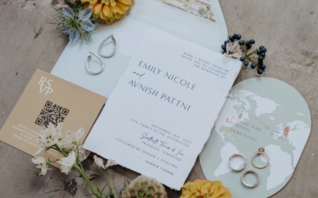
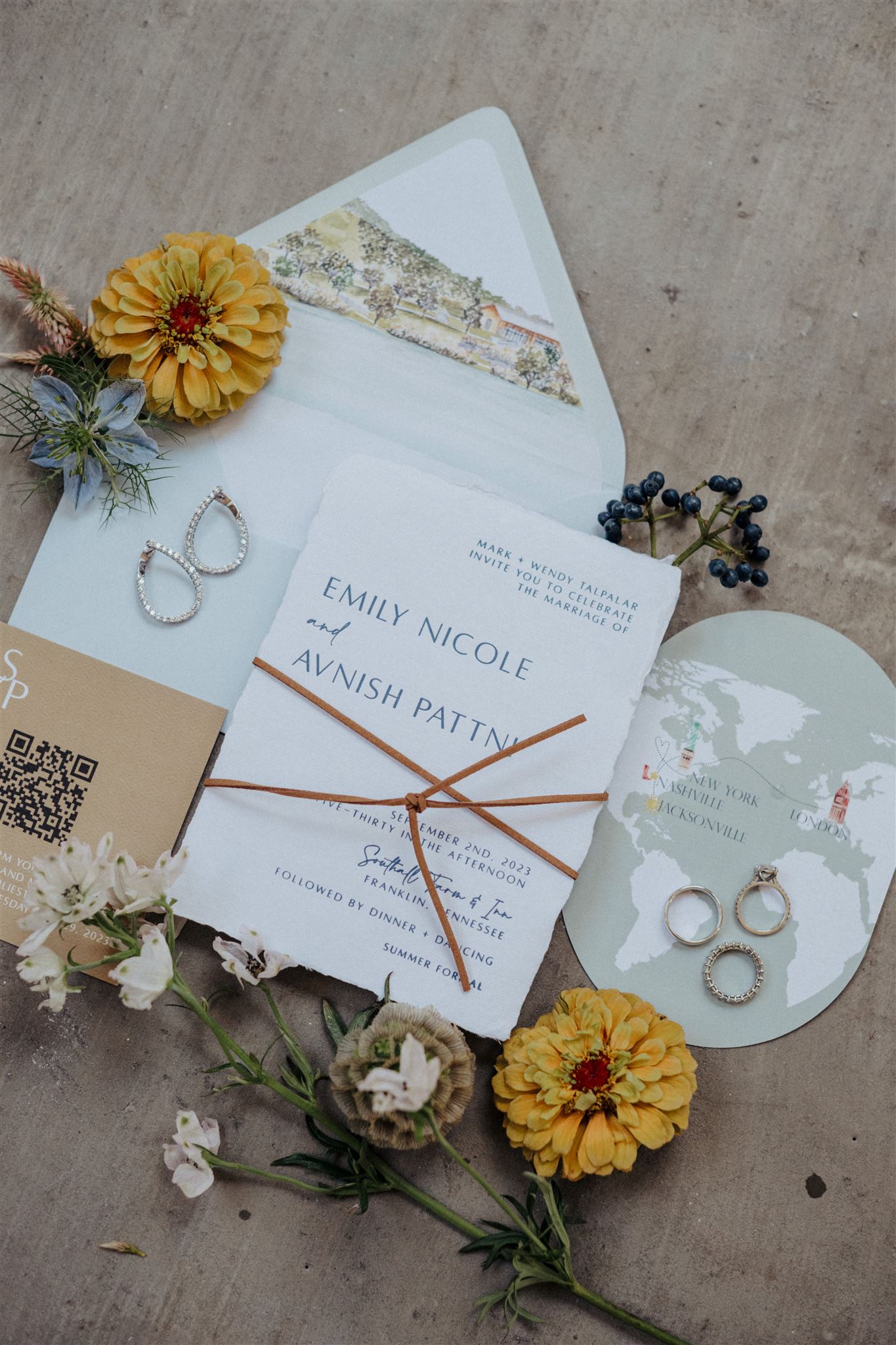
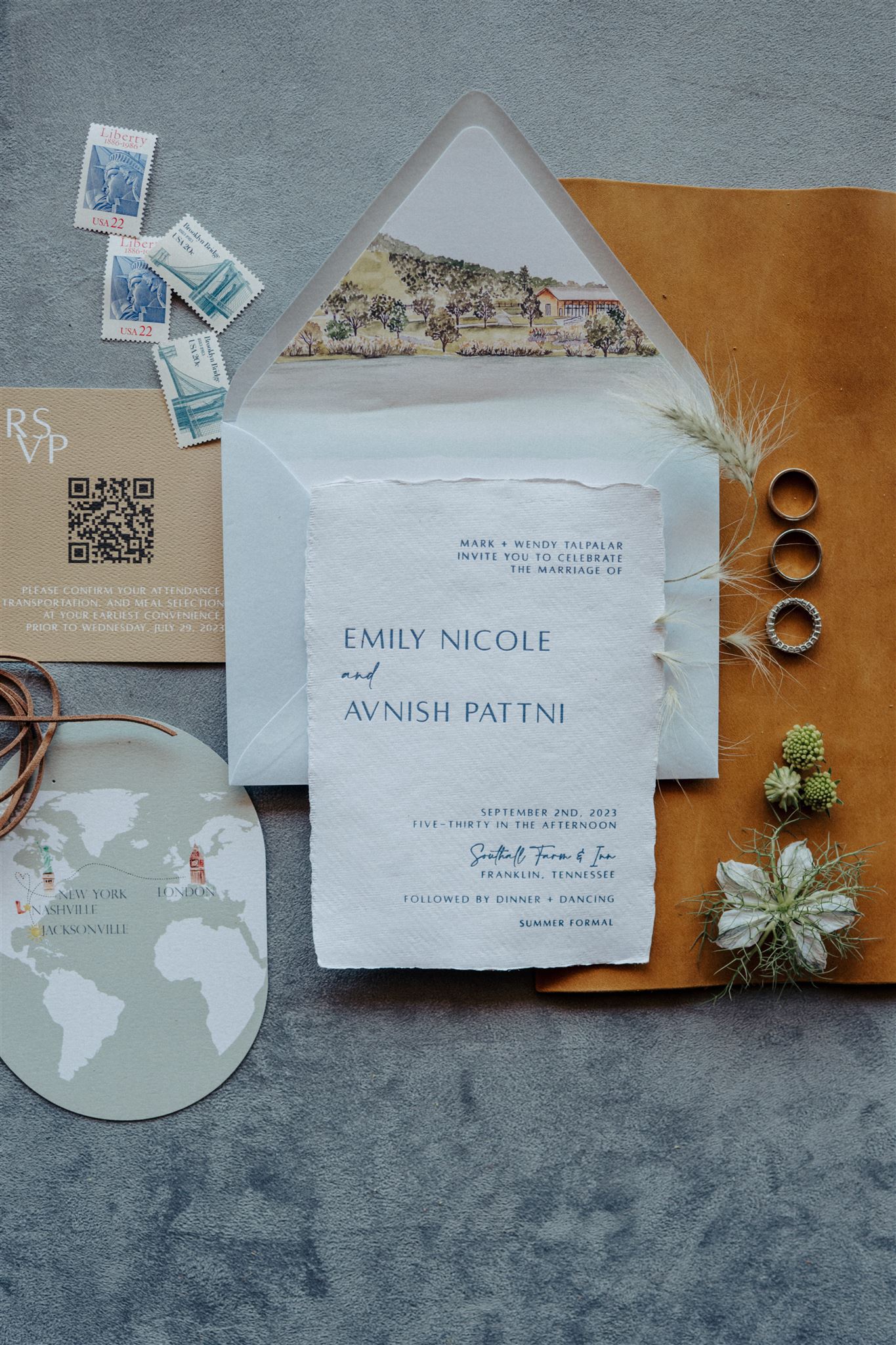
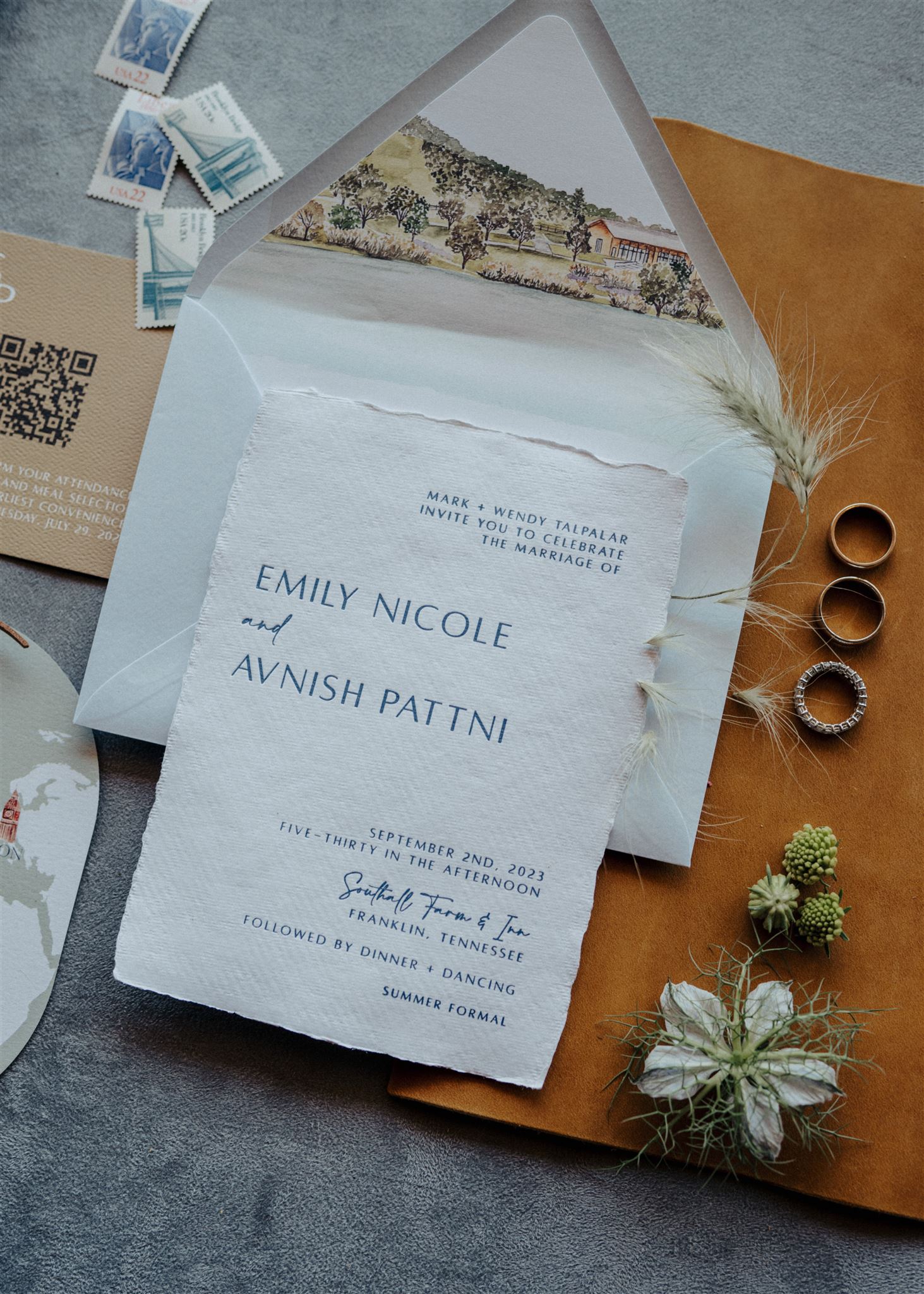
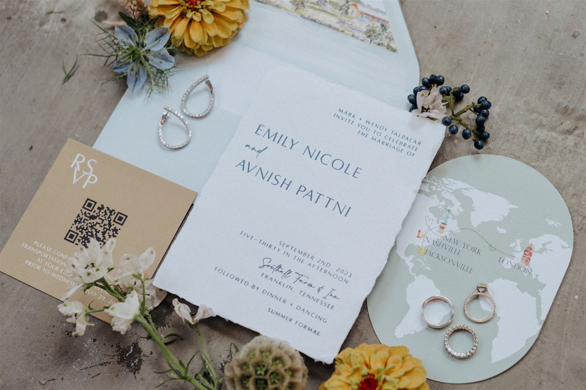
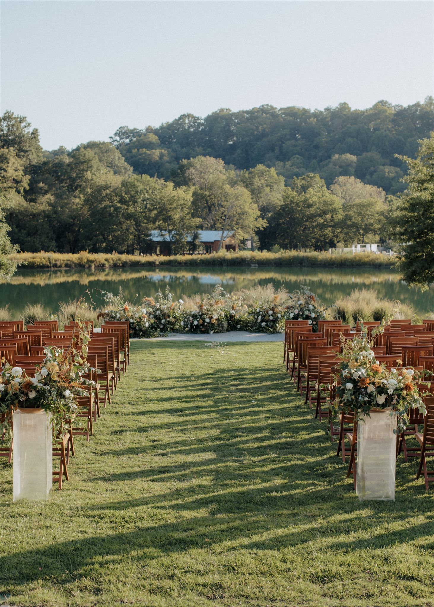
This picture-perfect fairytale wedding which took place at the breathtaking Southall Farm & Inn in historic Franklin, TN was one I will never forget. For starters, Emily and Avnish were the first clients that we worked with from the new White Ink Studio! That alone was a very special and meaningful moment for me and my team. It also didn’t hurt that this couple was an absolute delight to work with! They trusted us in creating some amazing multi-textured wedding details that I am so excited to share!
Bold + Textured Invitation Suite
Texture, Texture, Texture. It never fails. Emily and Avnish’s guest received this bold invitation suite that boasted hand-made paper, a custom map created for the details card, and a leather cord used to wrap up this suite into one, bright bundle of celebration.
White Ink also included a custom envelope liner which depicted the Southall property. Such a chic way of showing guests a little sneak peek of the venue!
One of my favorite parts of this invitation suite was the RSVP card that included a QR code with all of the info at the guests’ fingertips. It’s no secret that not everyone remembers to RSVP to events. This is a clever way to prompt and encourage guests to confirm their attendance. It’s a win, win.
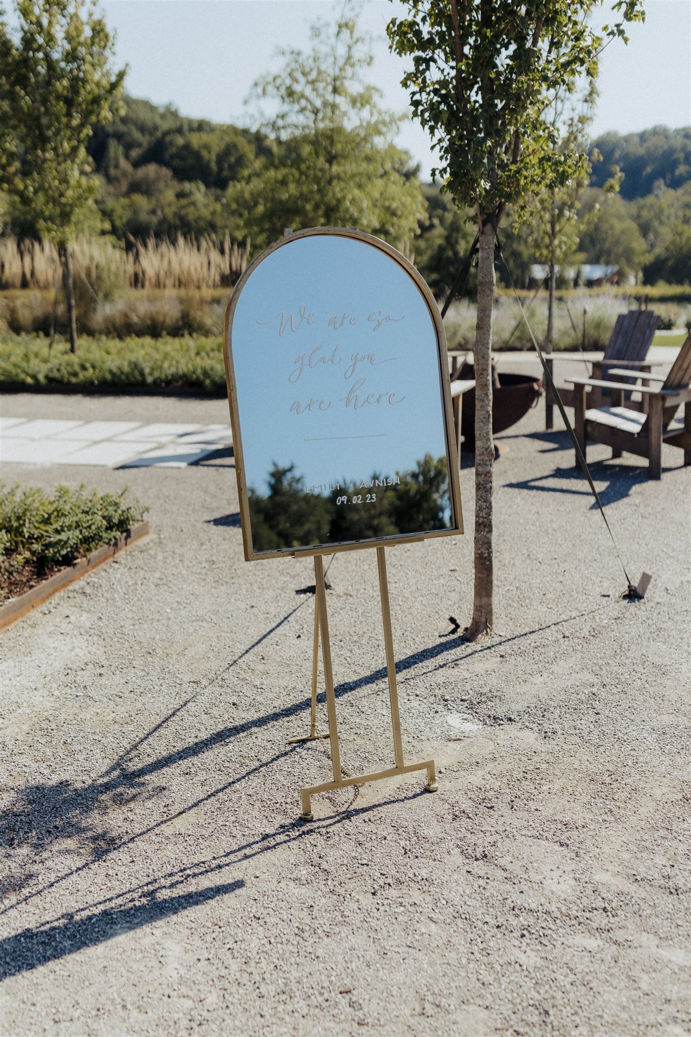
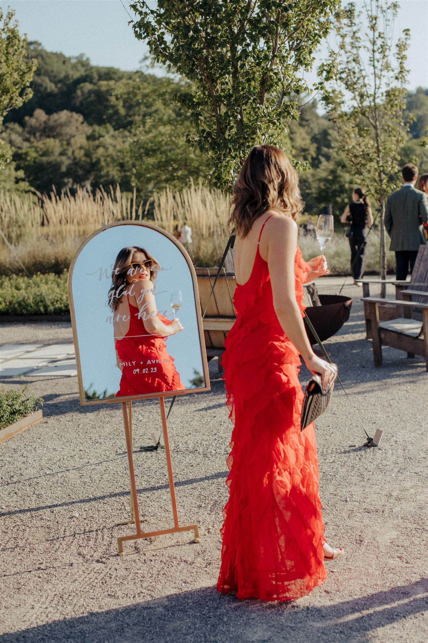
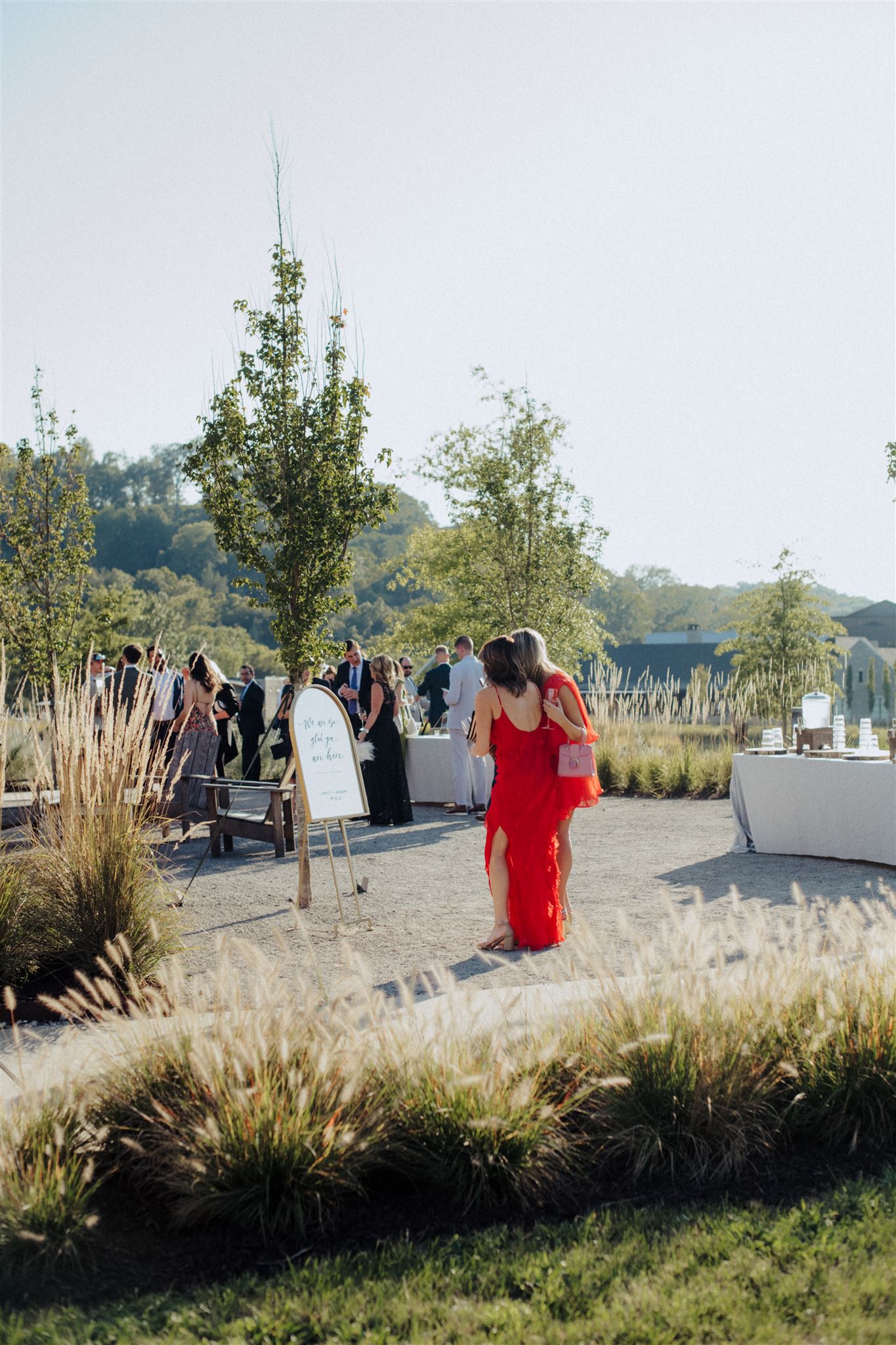
Modern Mirror Welcome Sign
With an abundance of mirrors to choose from in the White Ink Collection, I was excited that Emily and Avnish went with this arched, gold framed mirror for their wedding welcome sign. The modern touch complimented the natural serenity that Southall possesses. It stood out just enough for guests to take notice!
Multi-Textured Wedding Details
Tile seating chart, florals arrangements, wooden backdrop – are we starting to see a theme here? Yep, it’s texture. Using texture works so well because it is a feast for the eyes. The different feel, looks, and colors offer a compelling and exciting contrast that people can’t help but indulge in! Multi-textured design like this lends itself to a particularly beautiful and often unforgettable balance that is enjoyed by all!
Fun Fact: I hand painted this seating chart sign while onsite at Southall! A one-of-a-kind experience for a one-of-a-kind wedding!
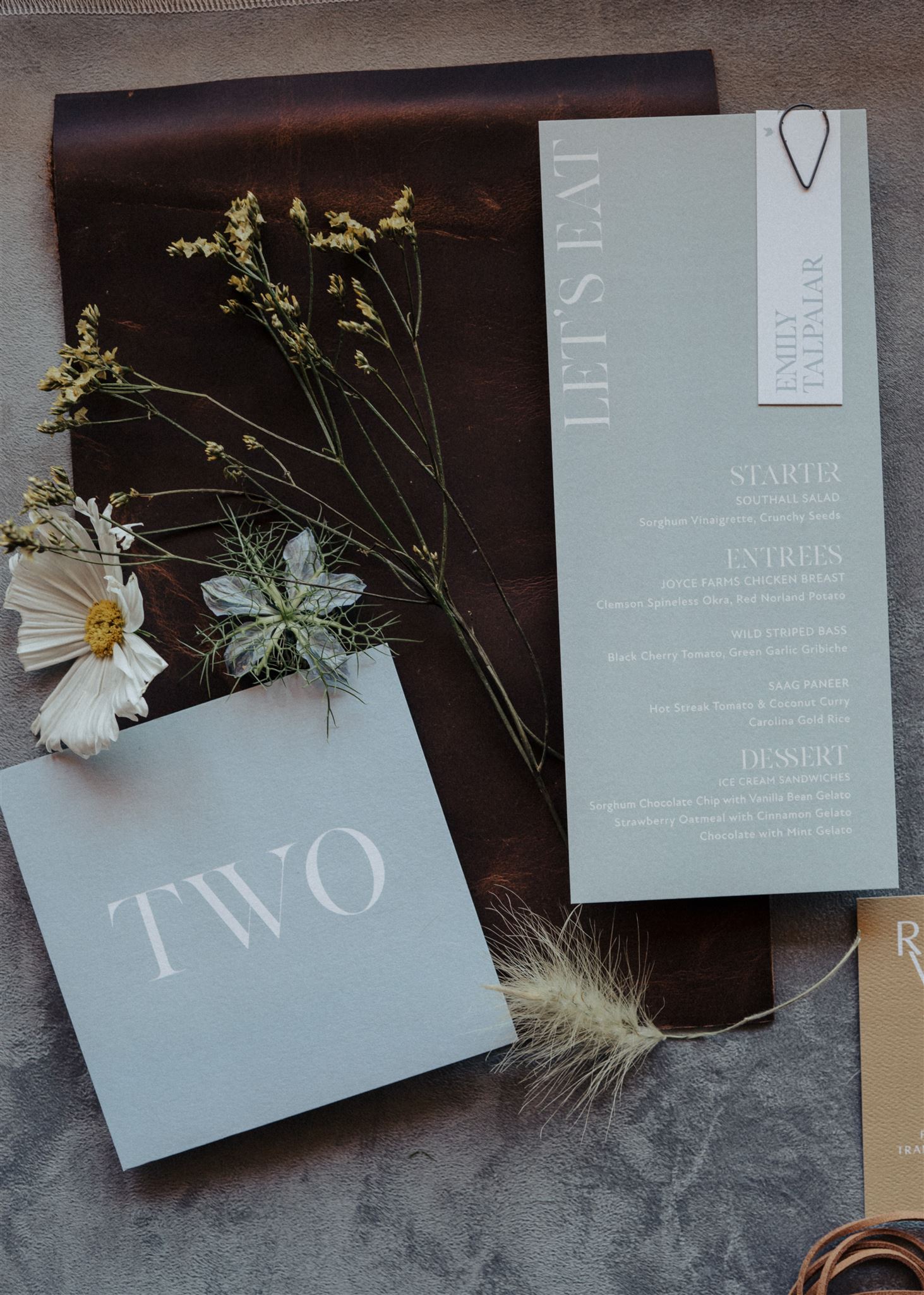
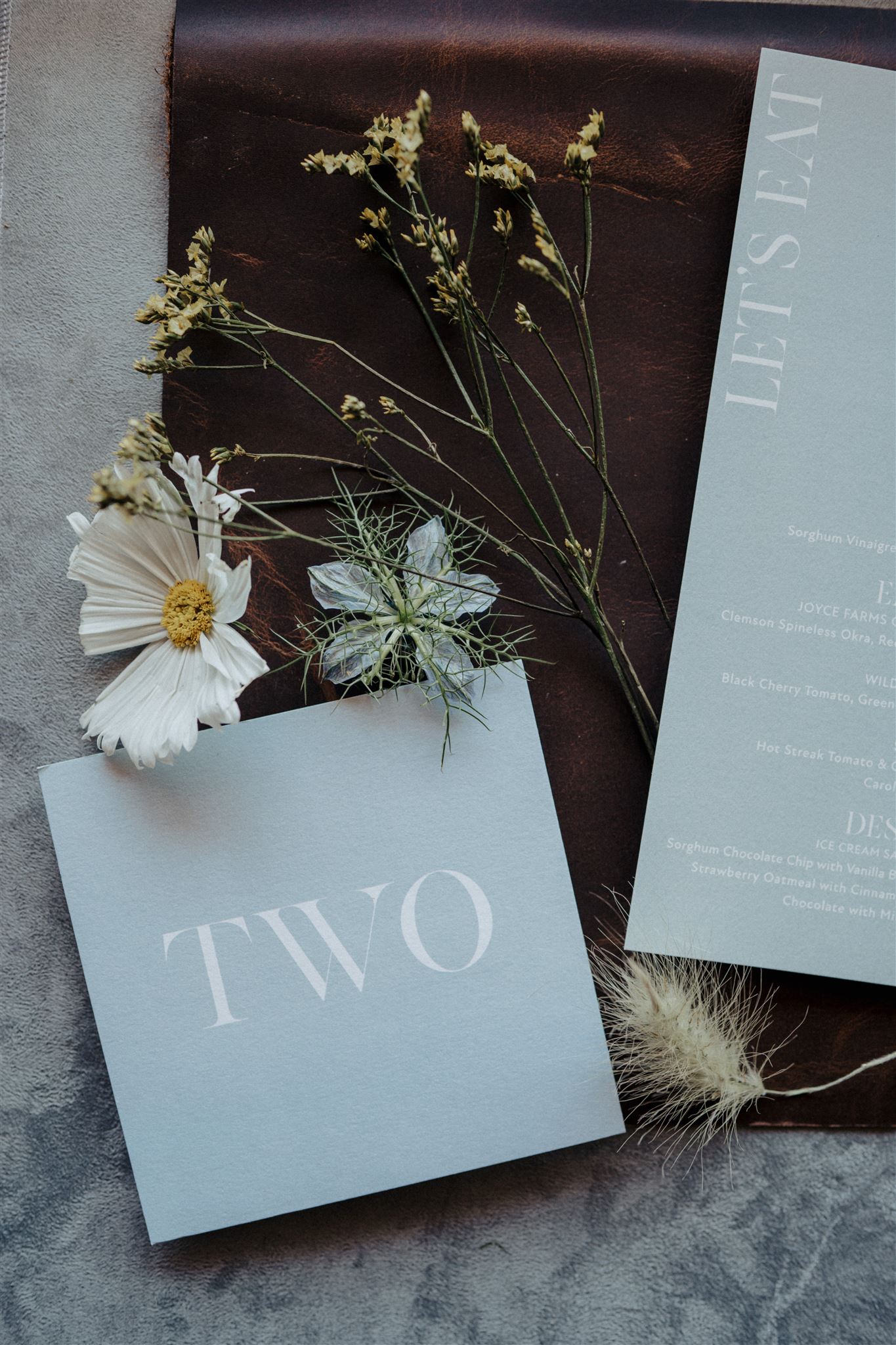
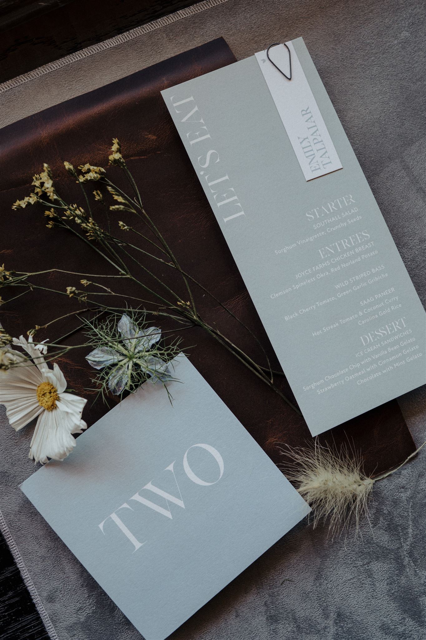
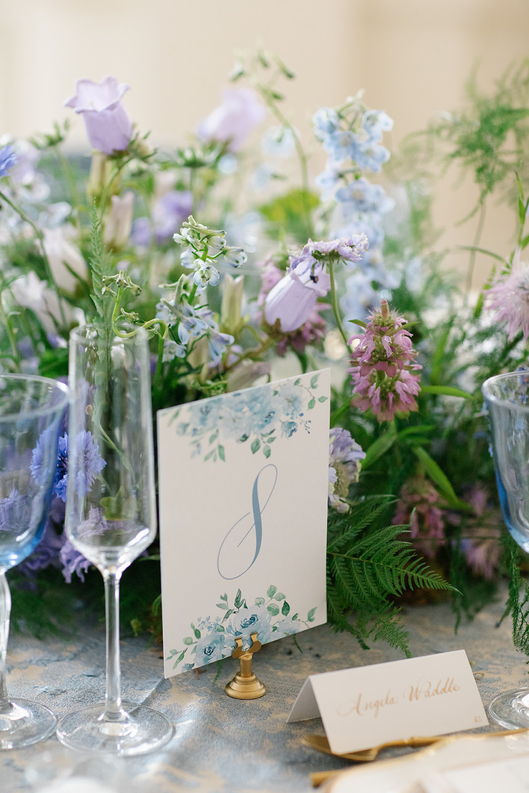
This sweet, dusty blue hue, which can be seen throughout the wedding details (including the invitation), looked gorgeous used with the menus and table numbers. Our stationary team did a fantastic job getting all the details that Emily and Avnish wanted for these. The place cards fastened to the menus are my favorite.
The table numbers were displayed using these super cute gold square bases, that are a part of our extensive collection. These versatile pieces can fit into nearly any style or theme. This little detail tied together our couple’s picturesque tablescape.
Getting to be onsite for Emily and Avnish’s wedding was truly a gift. One that I will always cherish. This couple will always hold a special place in our hearts as the first couple we hosted in our studio! Their trust in the work that we do here at White Ink was unmatched. Cheers to the happy couple and to their Franklin Fairytale!
If you’re looking to add custom, thoughtful touches to your wedding or event, we would love to help make your vision a reality. Reach out today to learn more about our full-service design offerings—we can’t wait to create something unforgettable for you!
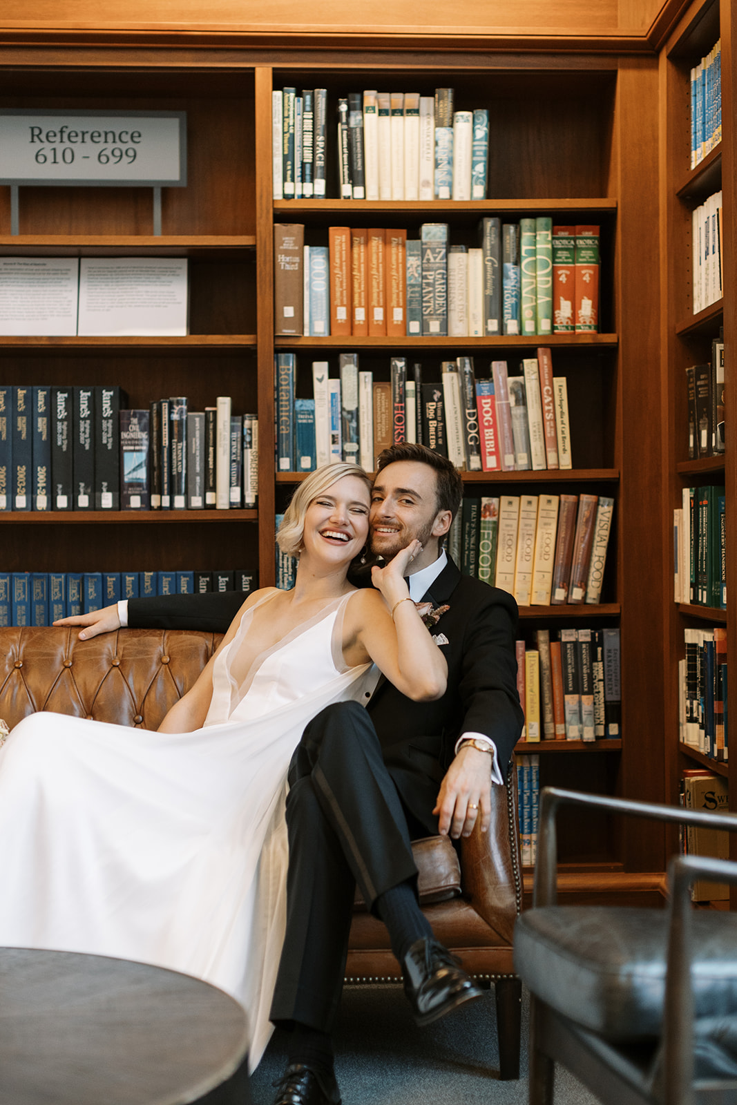
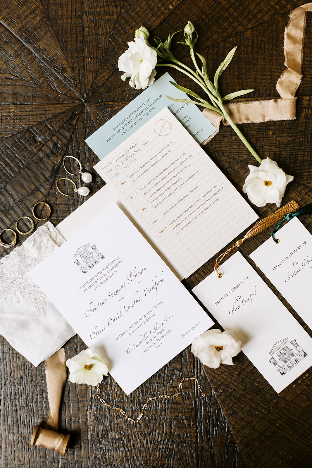
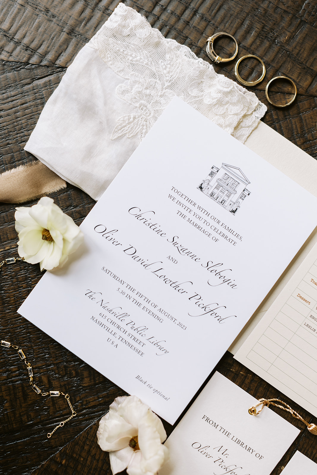
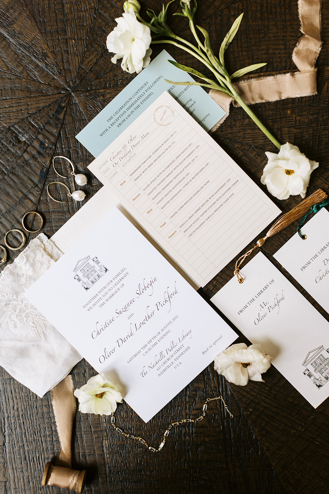
There is an old proverb that says, “A book is like a garden carried in the pocket.” Within the pages of a book one can find beauty, power, and adventure that is universally understood. This is something that book lovers far and wide keep close to their hearts. For our wedding couple, Christy and Oliver, nothing was more fitting than being surrounded by an array of literature on their big day. It was an absolute honor to create stunning and meaningful details for our bride and groom for their Nashville Public Library wedding, helping them turn the page as they stepped into a new chapter of their lives!
Library-Inspired Wedding Details
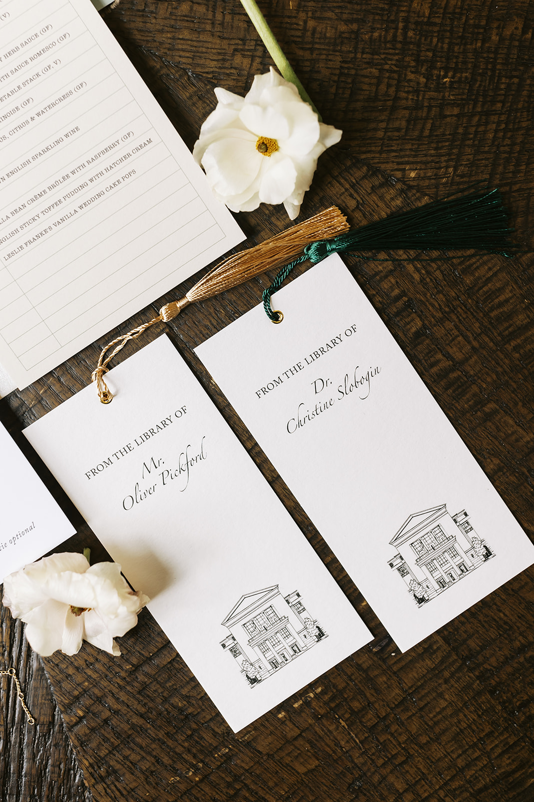
For starters, their invitation suite was . . . everything! The clean and crisp design packed a punch as it flawlessly incorporated details like a custom sketch of the Nashville Public Library. They even included a tassled bookmark keepsake for guests.
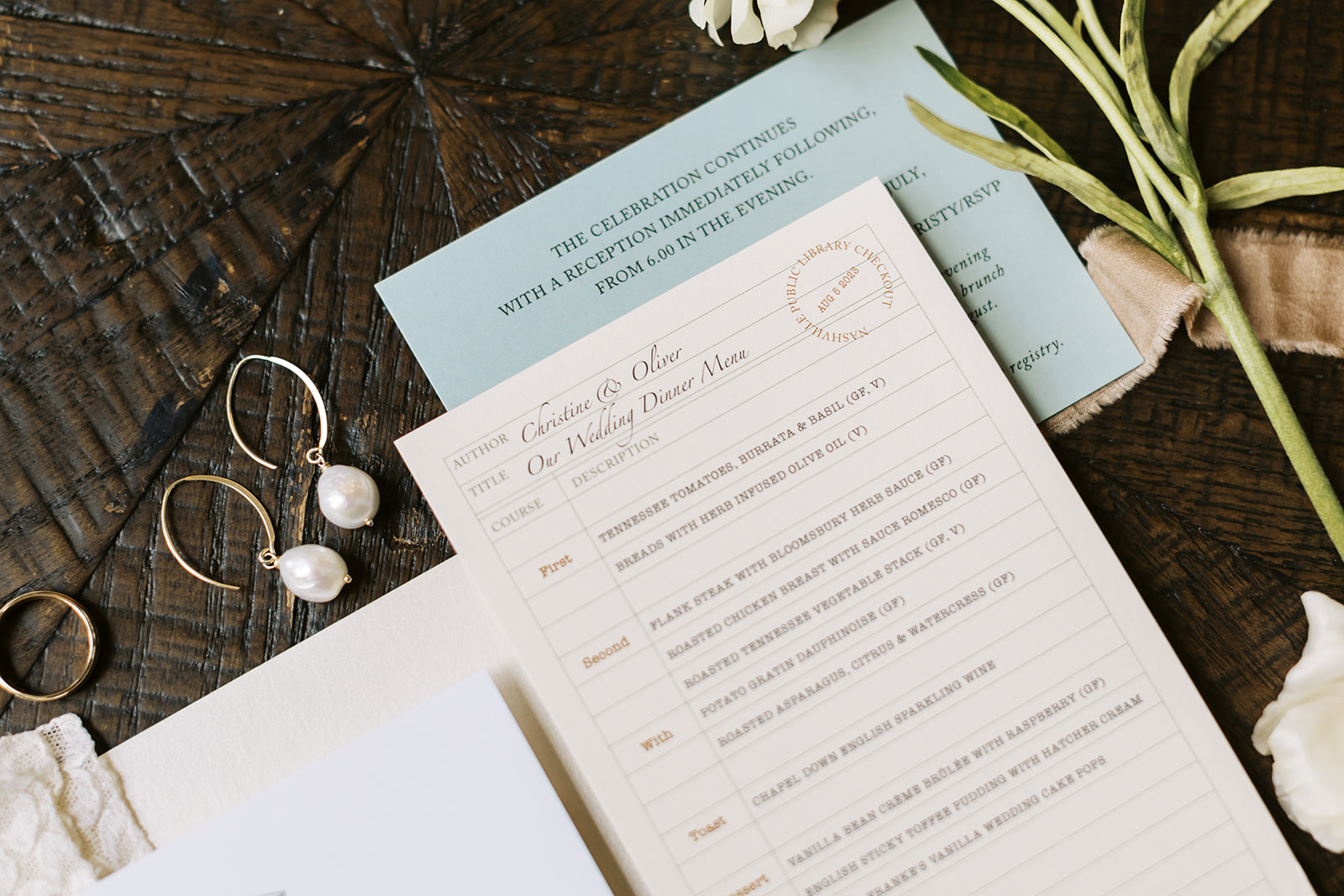
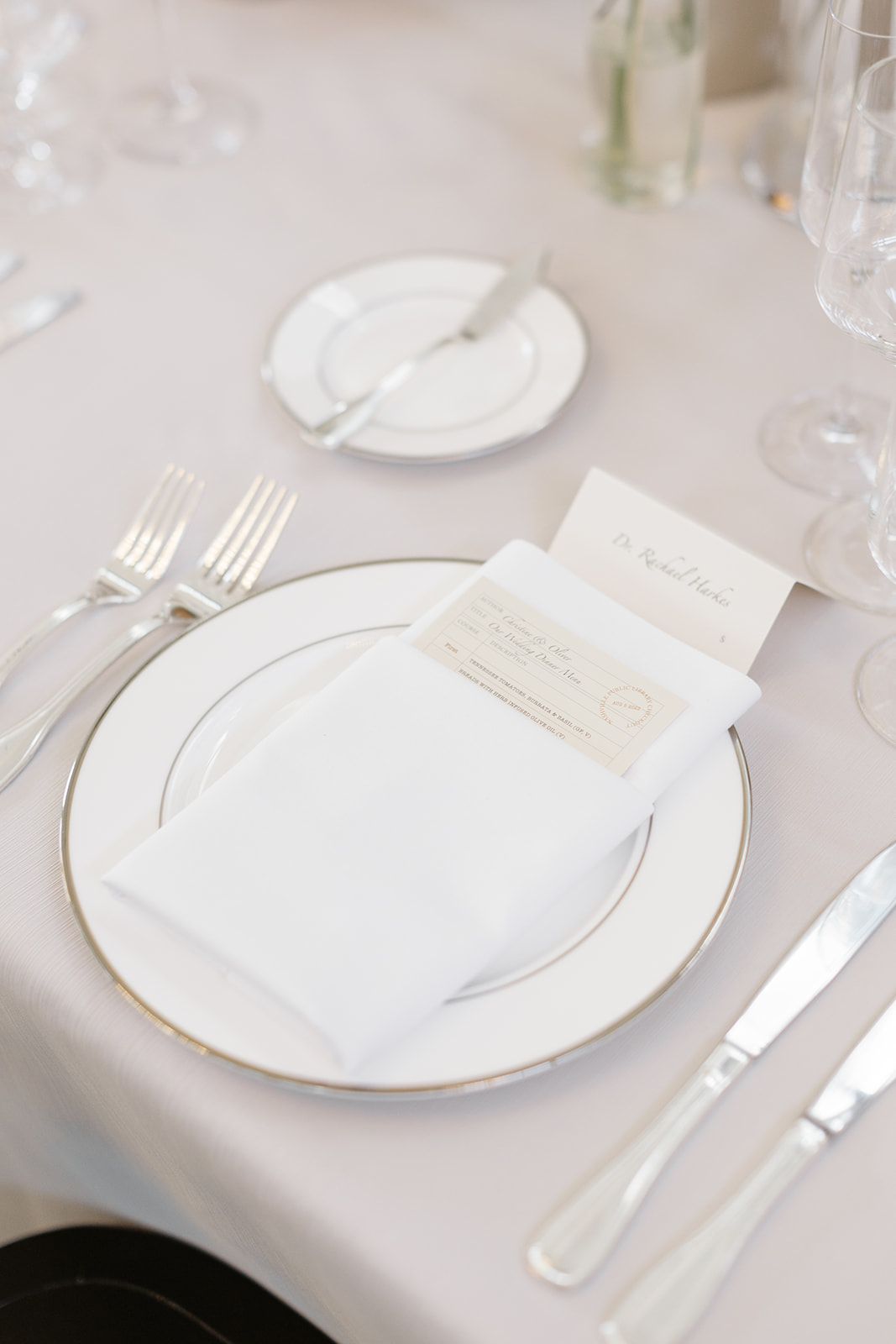
Going with the bookish theme, White Ink designed Christy and Oliver’s reception menus to look like vintage library book check-out cards! Is this not THE most perfect thing for a wedding at a library?! I love when our couples invite us to have fun in creating these parts of their wedding details. This is one that our team will always remember!
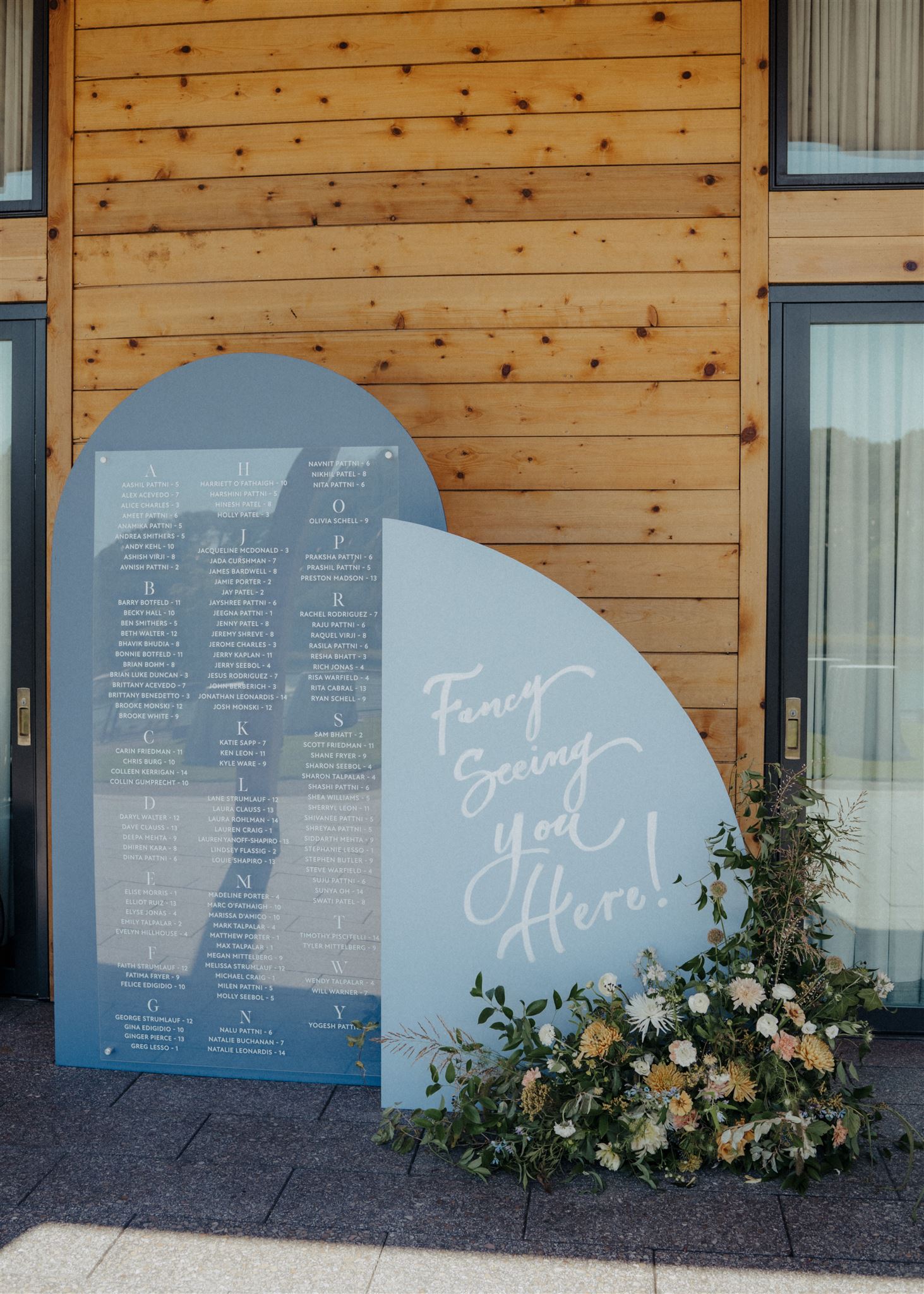
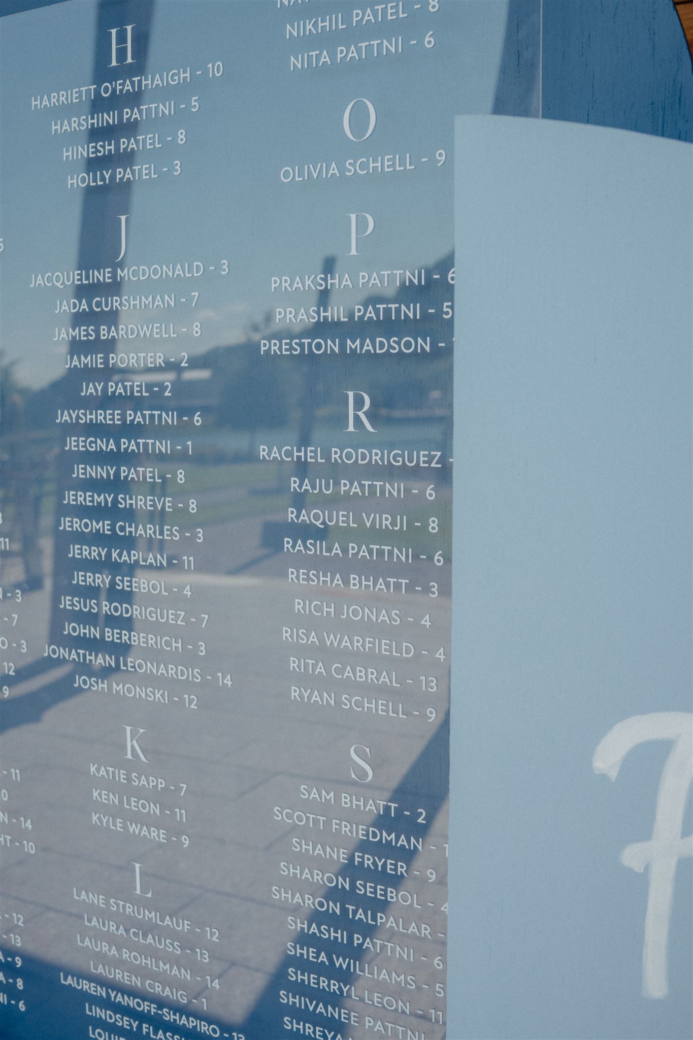
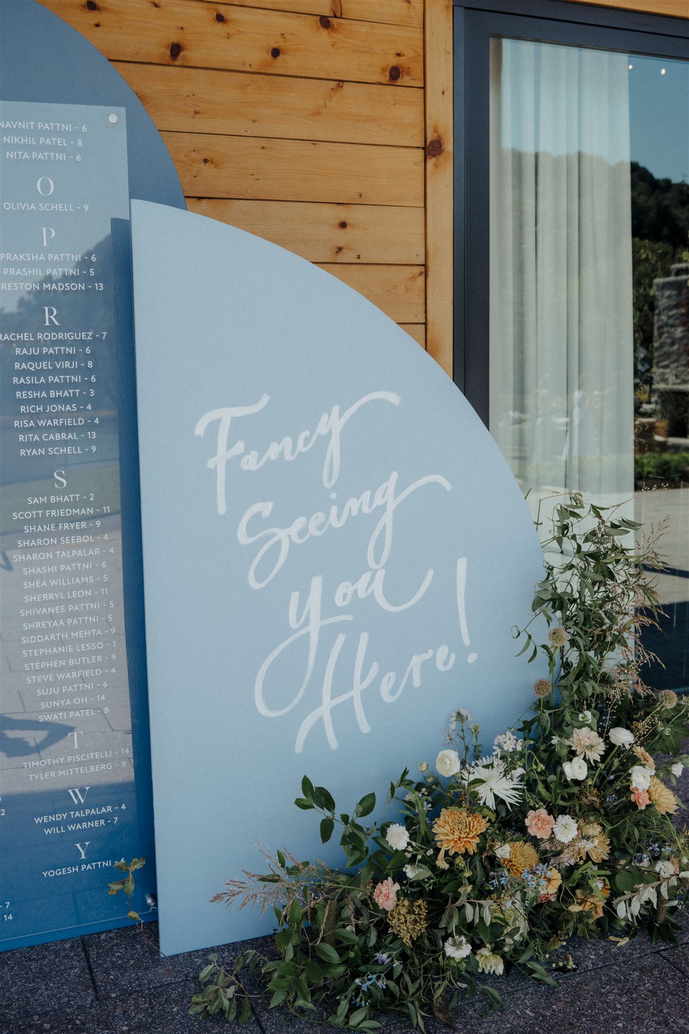
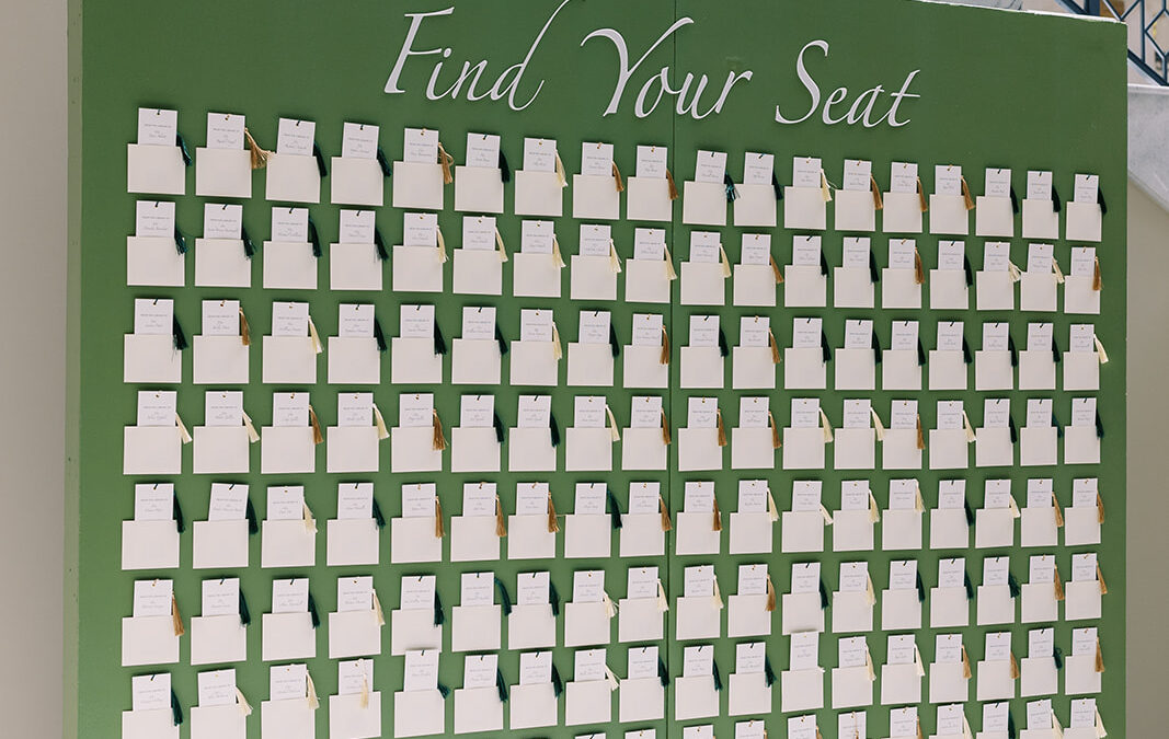
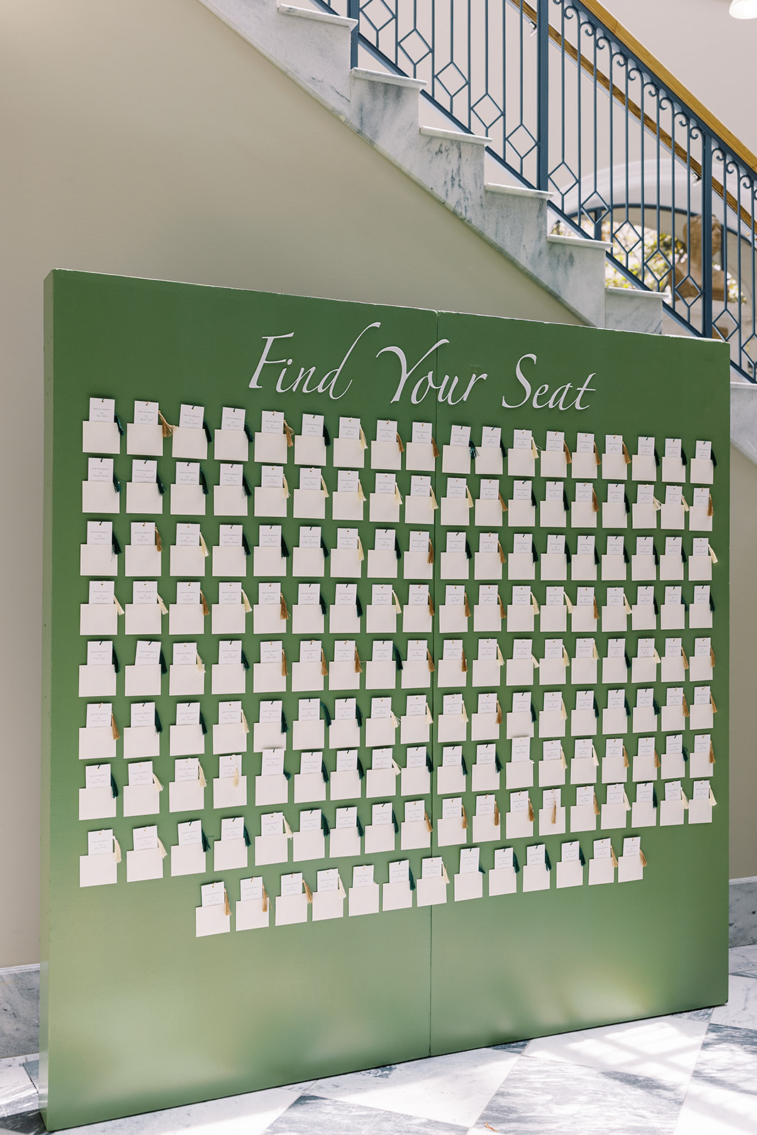
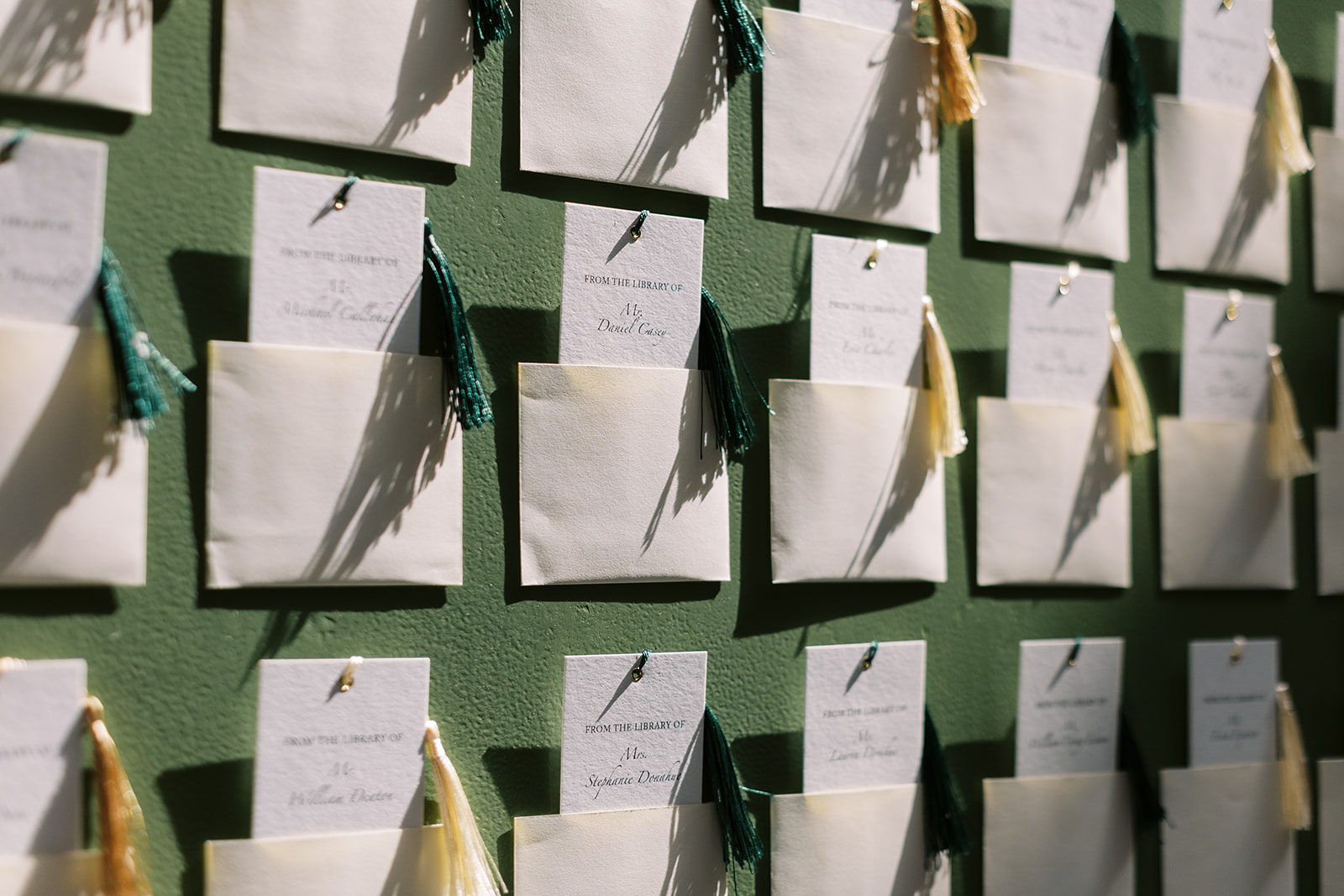
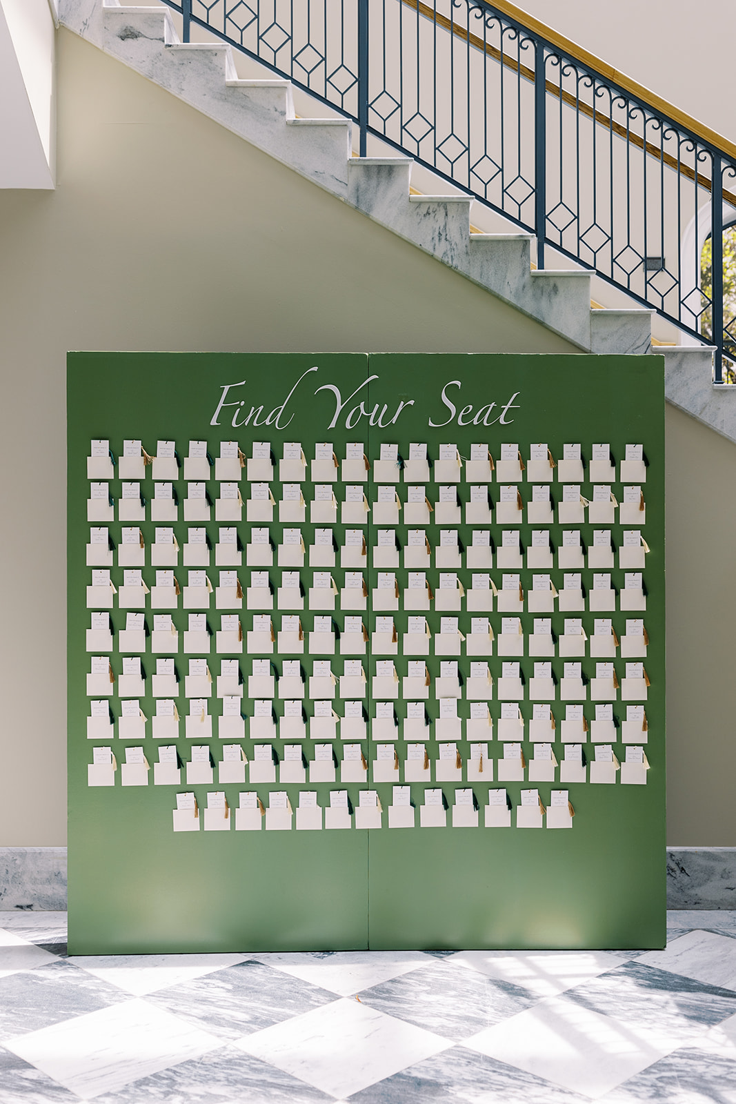
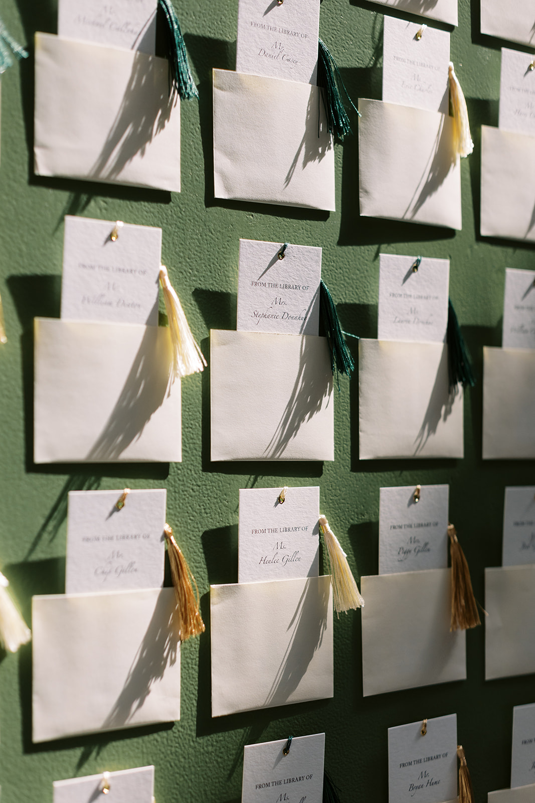
Custom Seating Chart + Keepsake Escort Cards
The Seating Chart we helped create for our bride and groom completely wowed the guests. The escort cards doubled as keepsake bookmarks, because you can never have too many! This event cleverly included details like this throughout the day from start to finish. These are things that guests ALWAYS notice and remember for a long time.
I can’t get enough of this black and white checkered flooring and how well it makes this green seating chart pop!
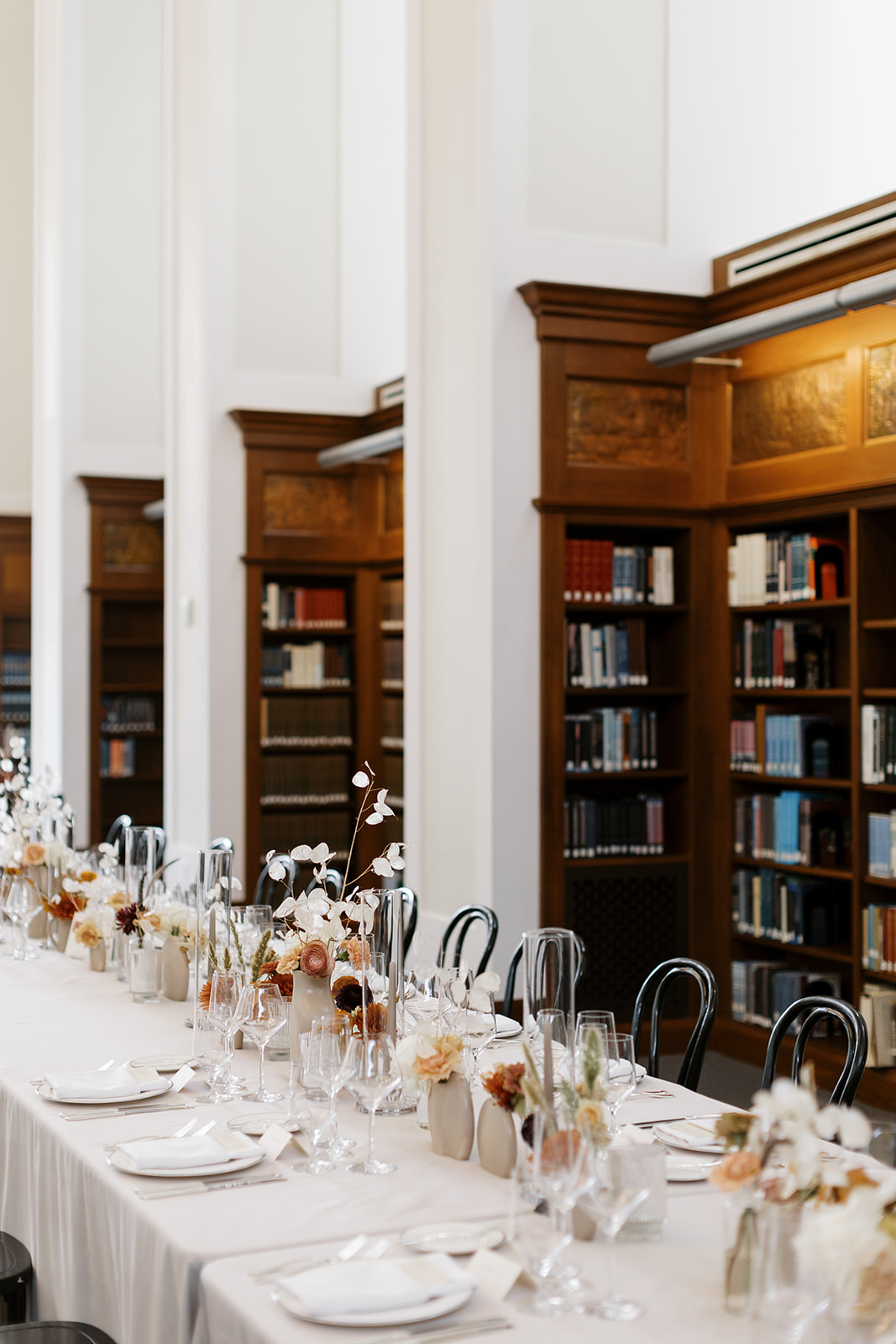
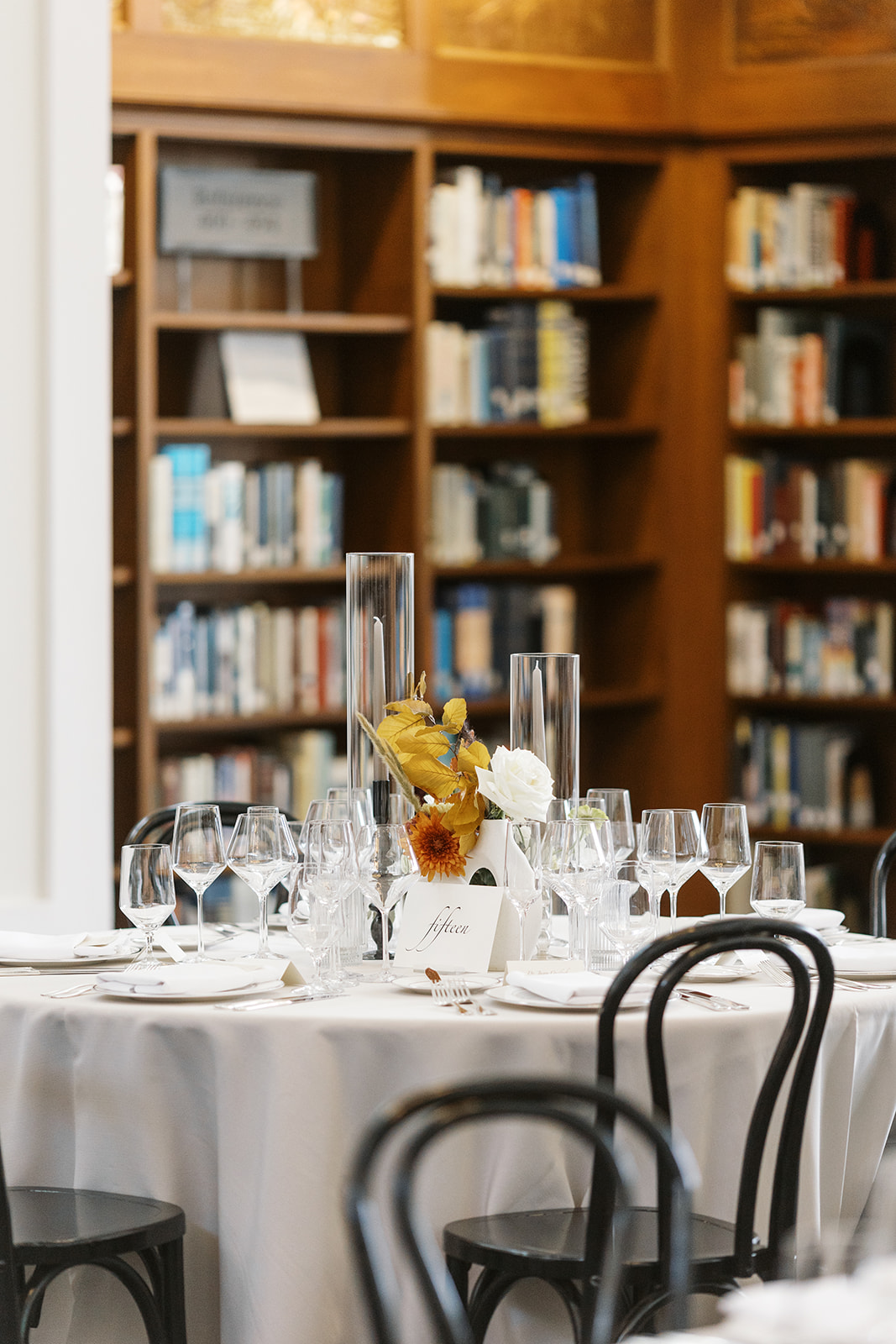
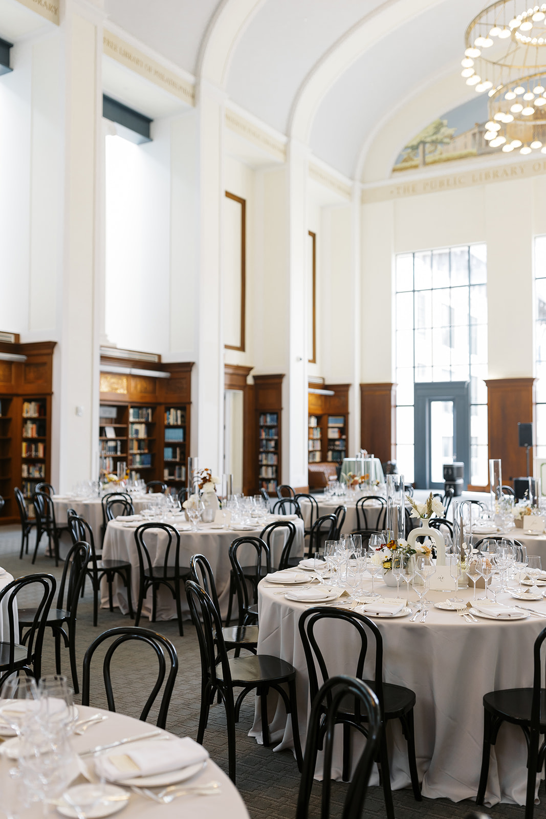
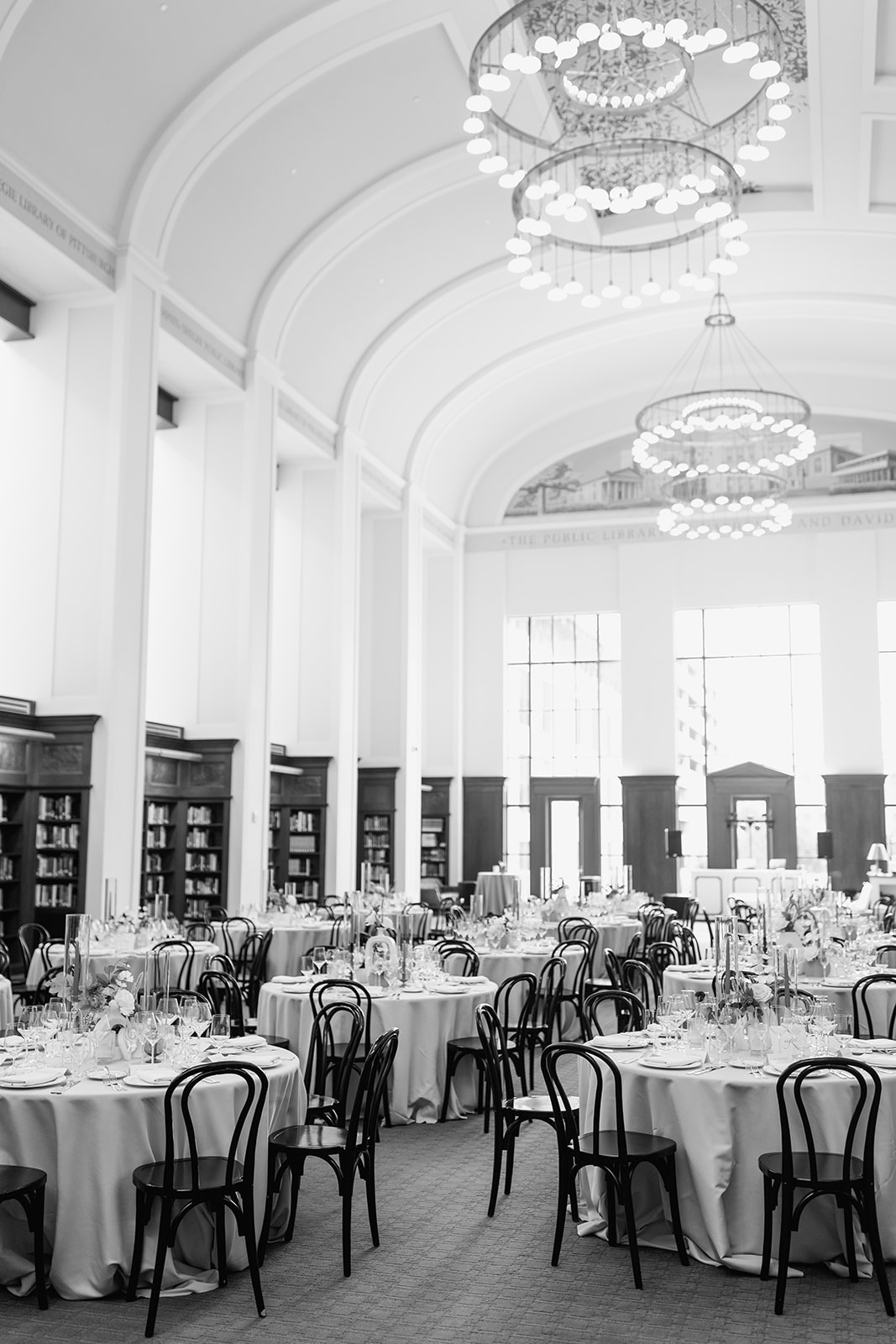
Nashville Public Library Wedding Reception
When your reception is in the middle of a gorgeous library, a simple touch of elegance is enough to seriously elevate the look and decor of the room. Classic black, calligraphy table numbers nestled on top of the bright white table linen was the chef’s kiss to this tablescape. Dreamy, classy, smart.
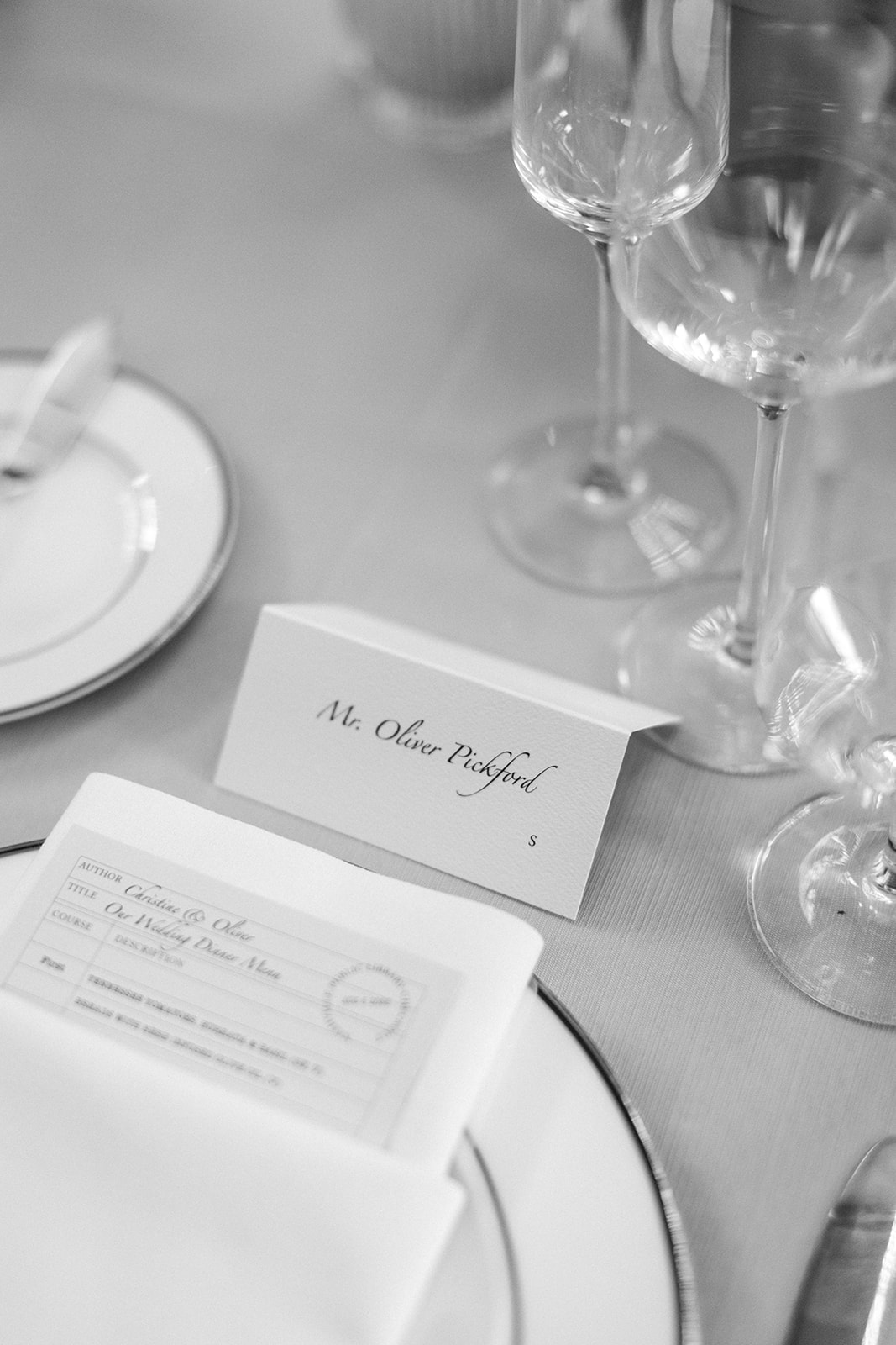
Custom place cards sat at the head of each place setting for Christy and Oliver’s reception. When it comes to impressing your guests and making them feel like they were a big part of your event planning, place cards truly take the cake! It is a very personal and intentional detail that has a big impact on the person sitting in front of it. I love it when a couple appreciates details like these. Peep those adorable check-out card menus!
Christy and Oliver were an absolute delight to work with! We are forever grateful for the opportunity to help elevate some of the most meaningful details of the day. Just like the guests, I know I will be talking about this wedding for a long time to come. For the White Ink team, this wedding was one… for the books.
If you’re looking to add custom, thoughtful touches to your wedding or event, we would love to help make your vision a reality. Reach out today to learn more about our full-service design offerings—we can’t wait to create something unforgettable for you!
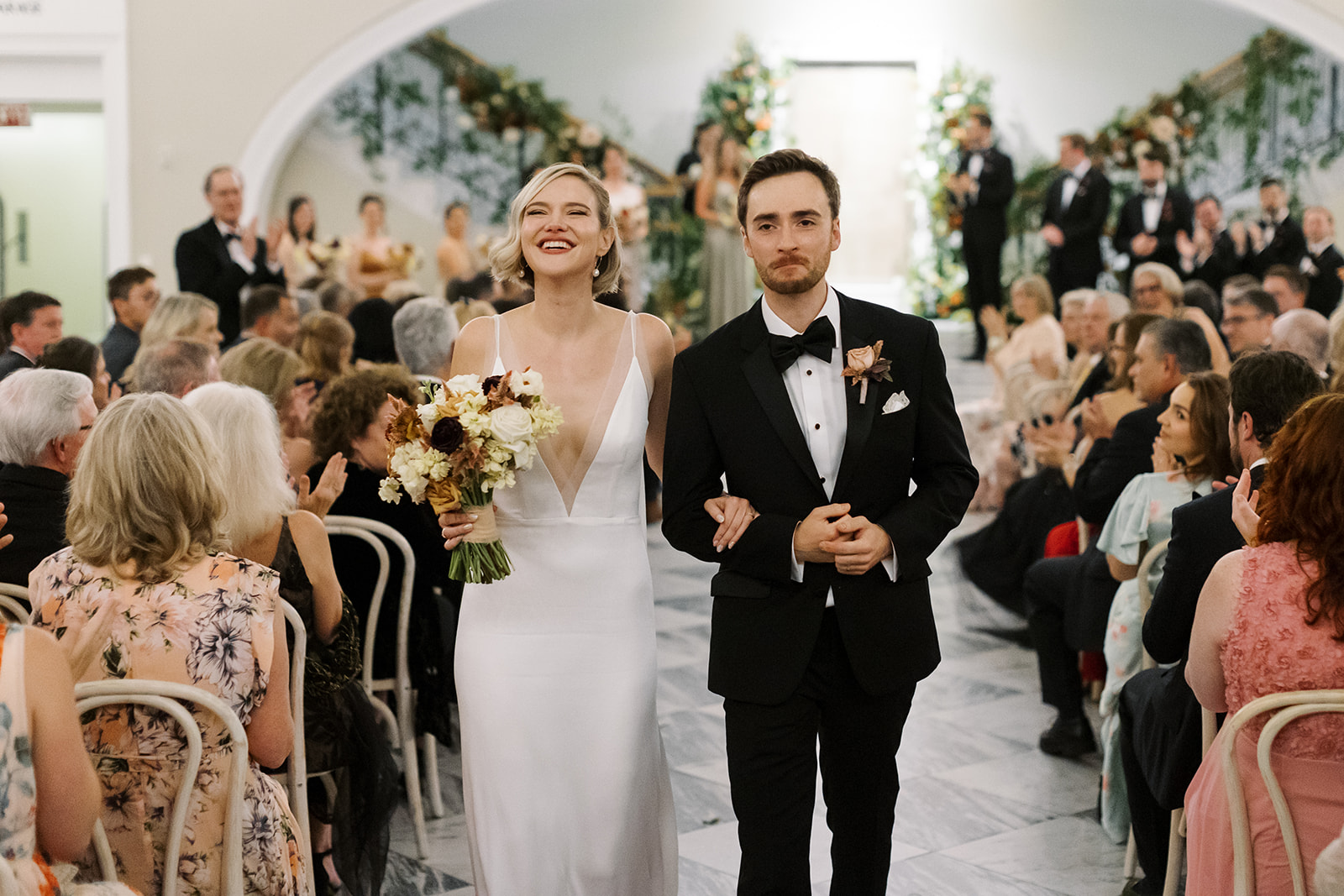
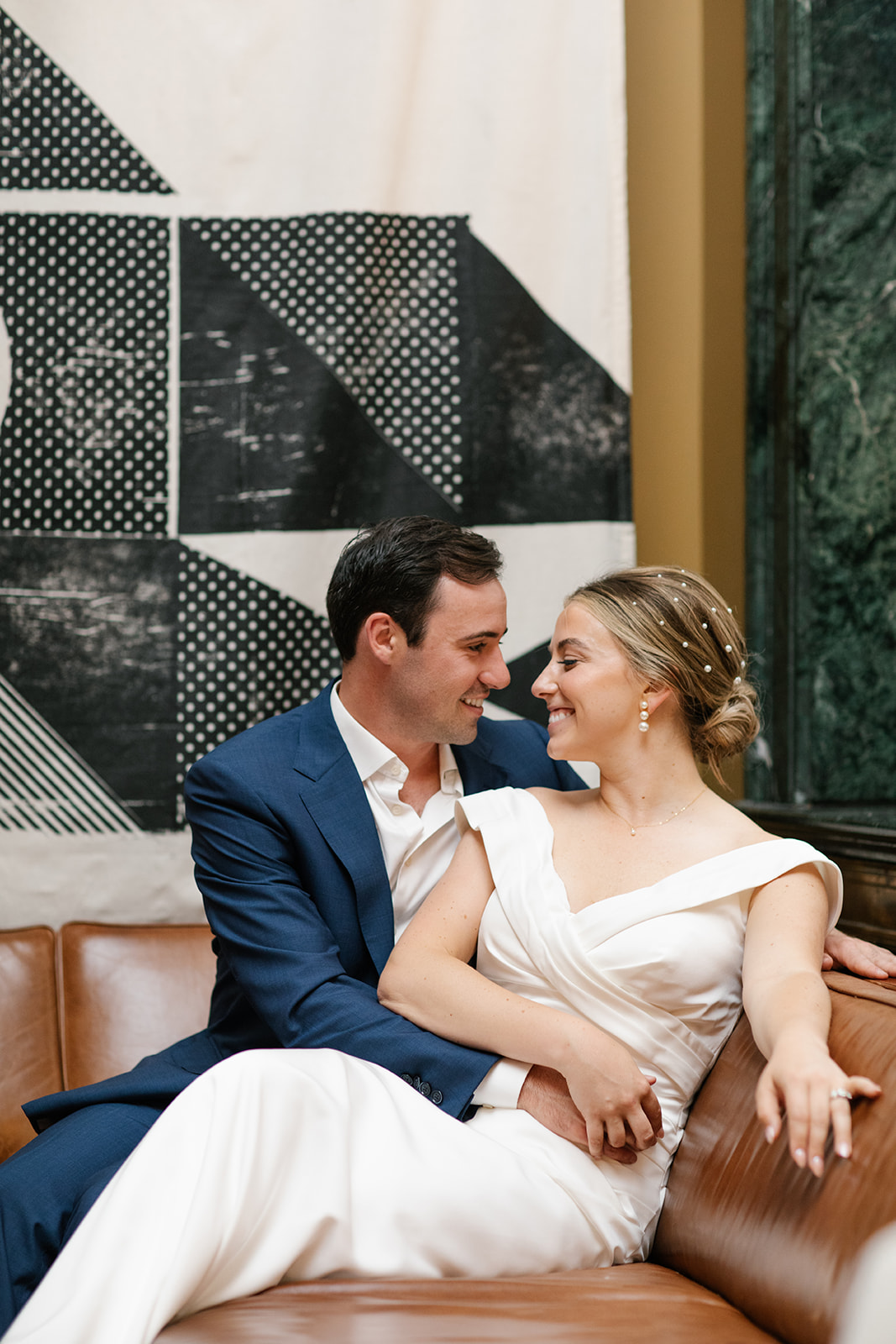
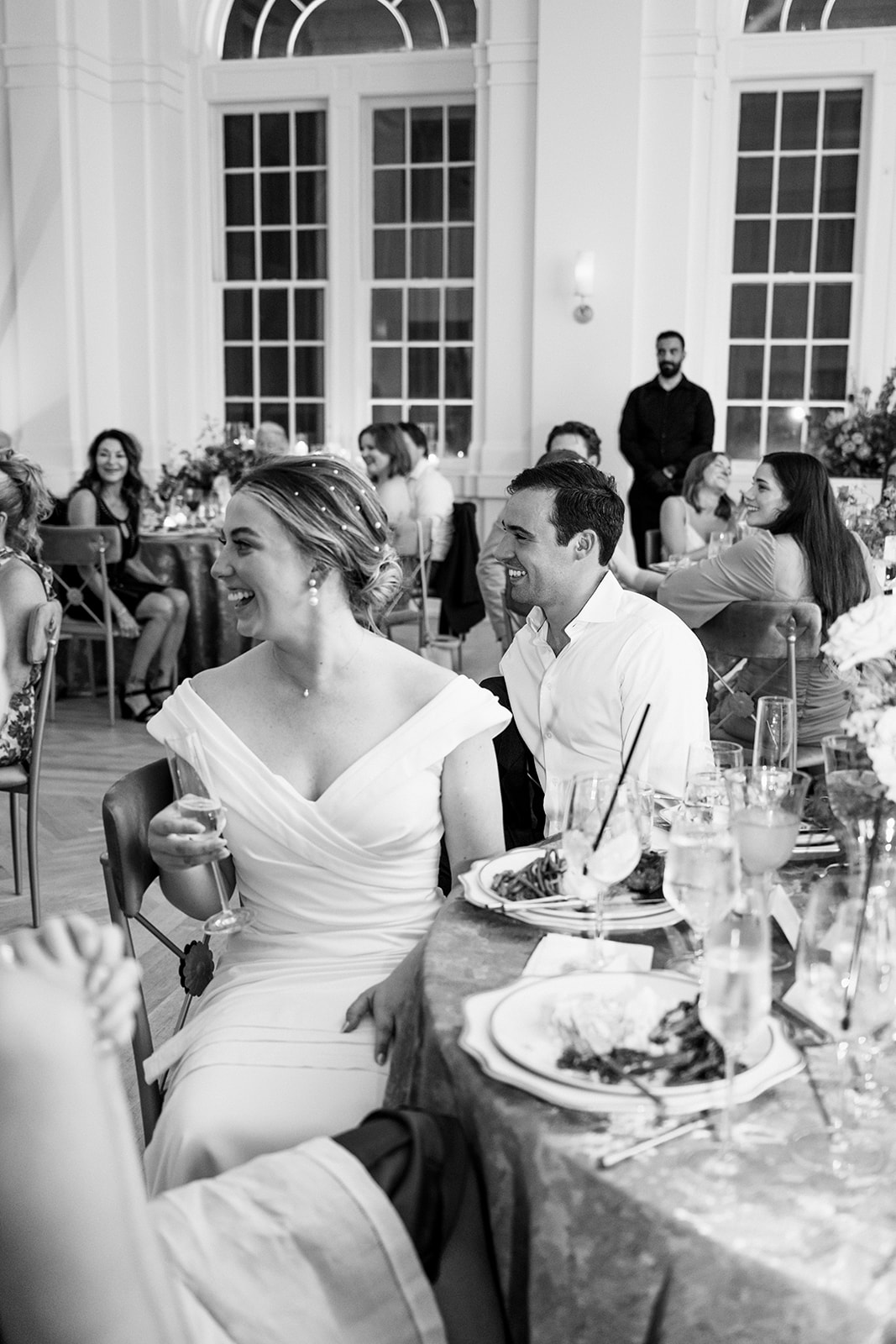
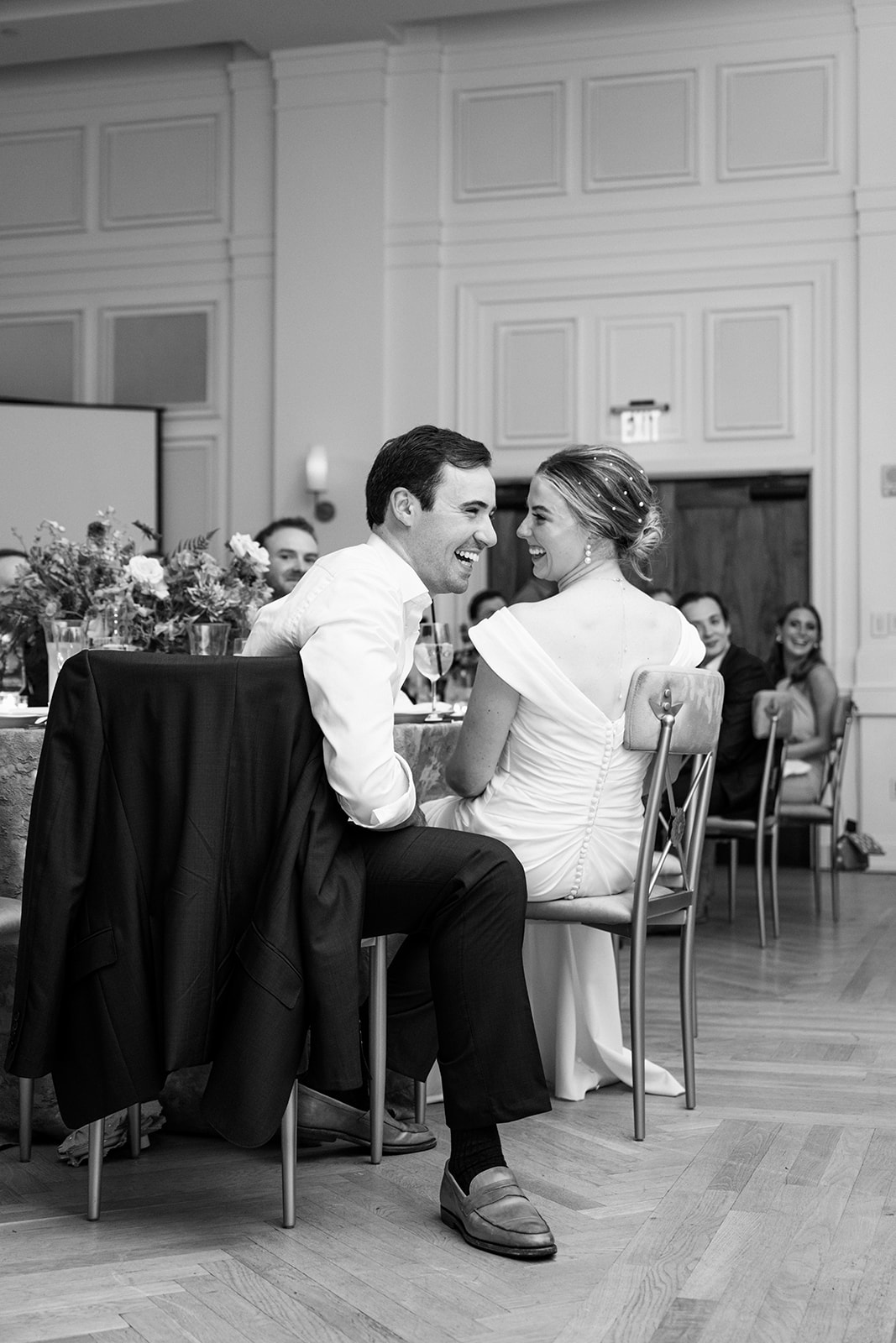
A bride and groom’s time to shine isn’t narrowed down to just one day. Sometimes, the most meaningful moments happen in the days surrounding a wedding day. One of the biggest roles of a rehearsal dinner is to allow the bride and group an opportunity to properly welcome family and the wedding party. Cason and Eddie set the bar for what a rehearsal dinner should look like and feel like! White Ink was honored to take part in delivering this rehearsal dinner to remember!
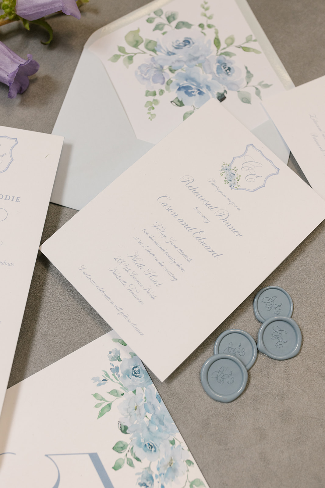
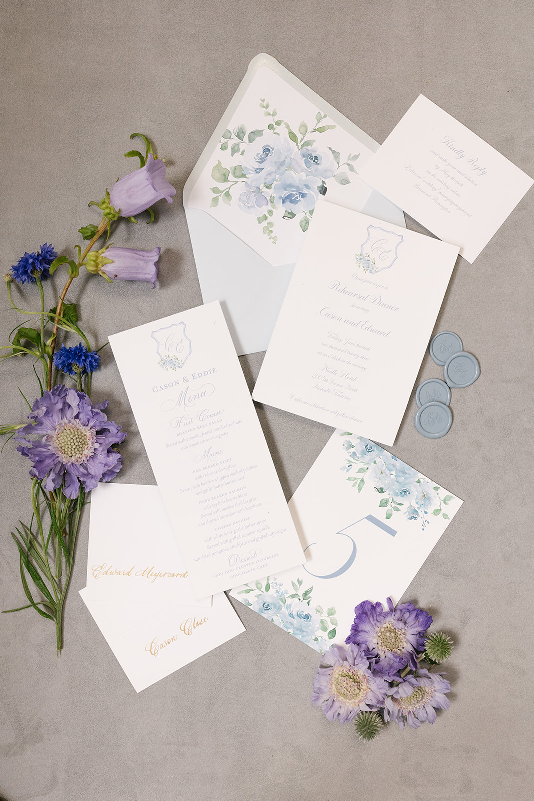
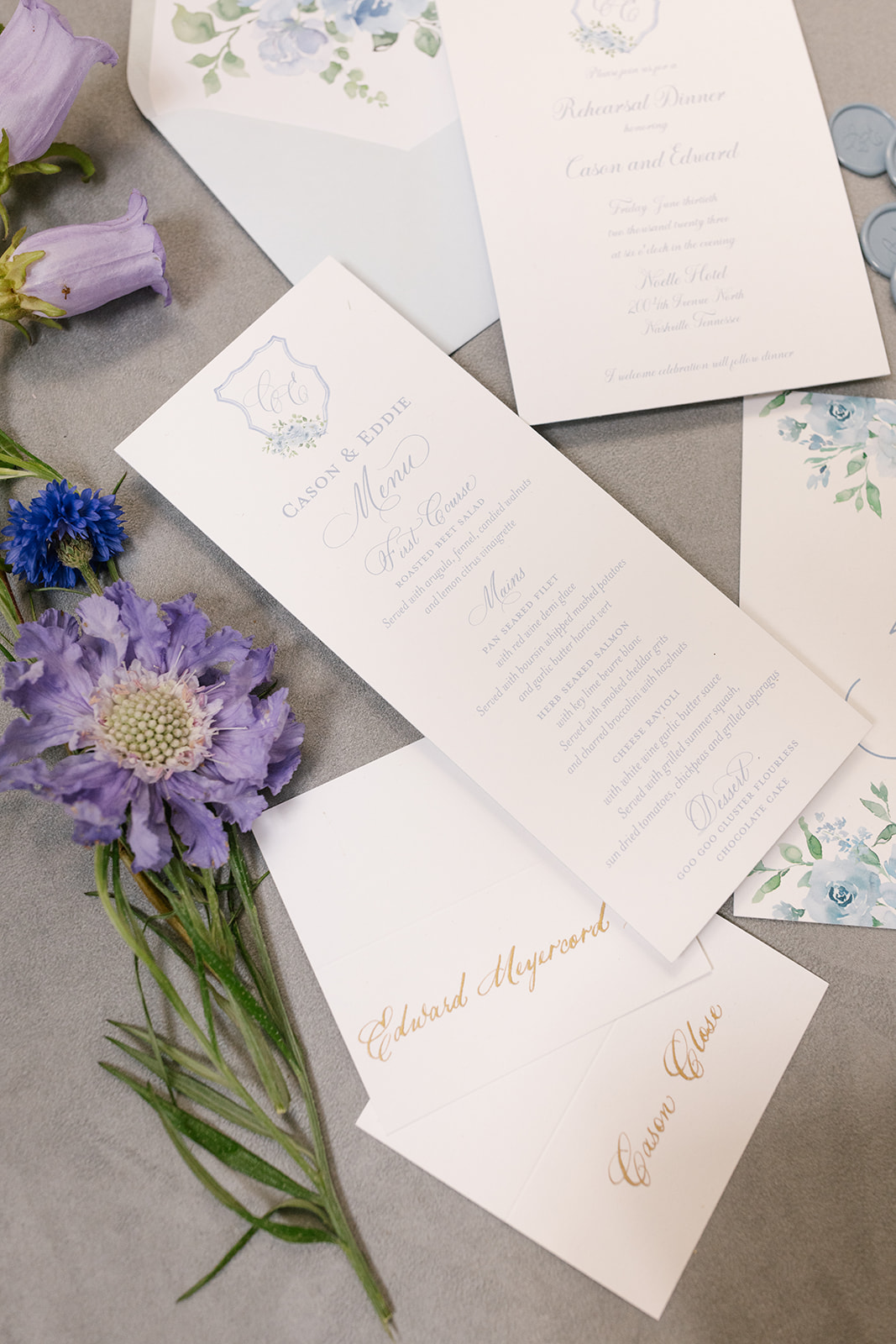
Rehearsal Dinner Invite + Paper Goods
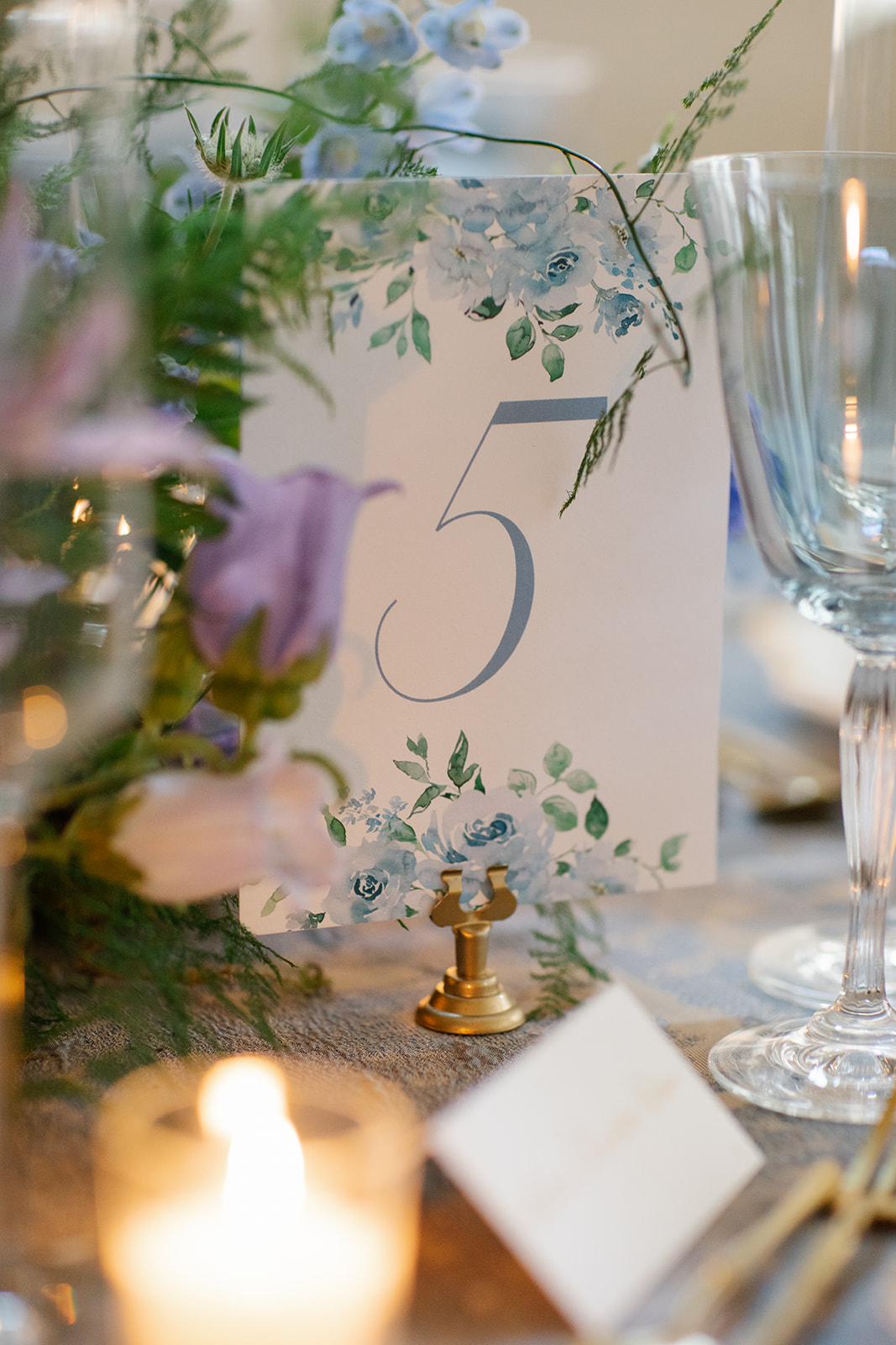
White Ink knows how to deliver the goods…. paper goods! Cason and Eddie’s June nuptials offered the perfect chance for them to use the beauty of summer floral prints. The rehearsal invite liner featured a beautiful floral print also found on the custom table number signs at the reception.
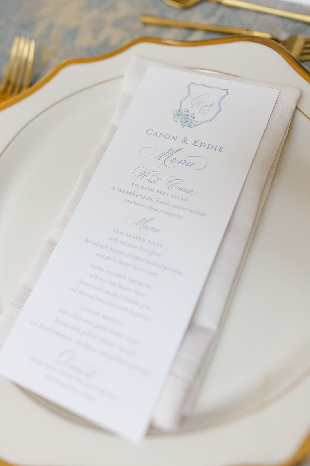
I always love to see that gorgeous dusty blue hue. Our couple incorporated this color throughout the entire evening, and I simply couldn’t get enough of it.
Notice the “C.E.” monogram sporting more gorgeous blue summer floral prints on both the custom Rehearsal Dinner menu and invite.
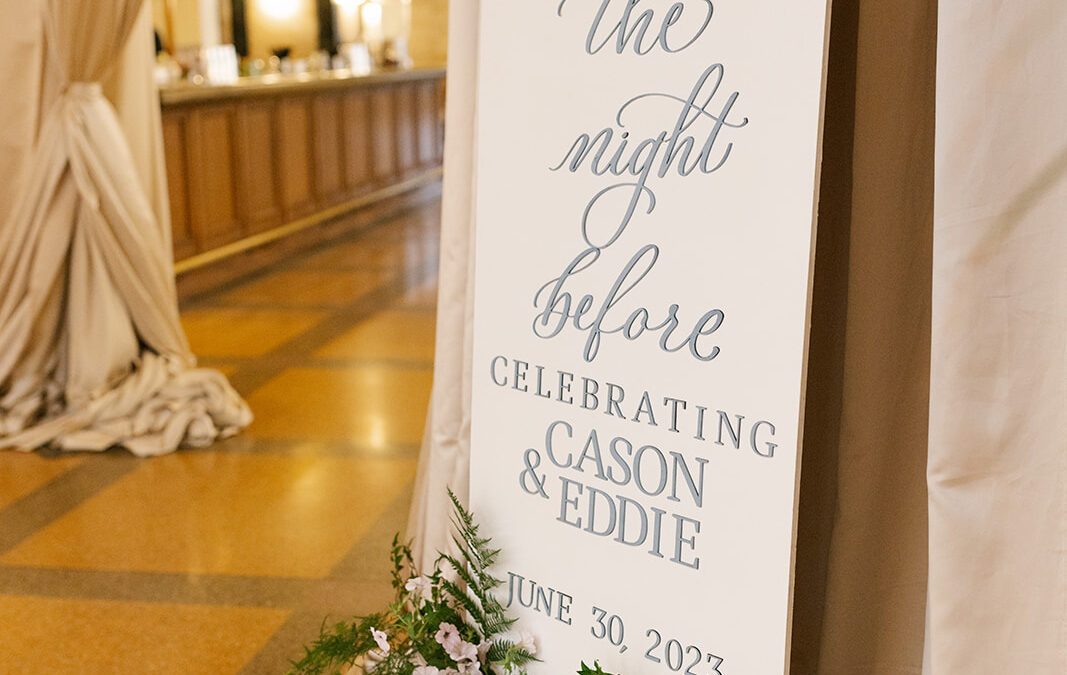
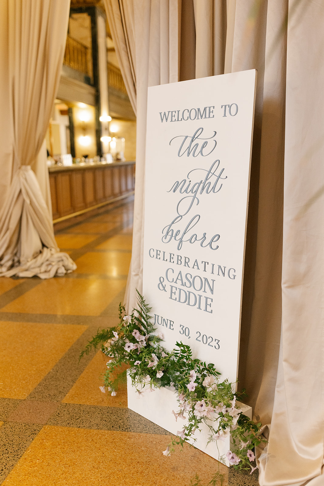
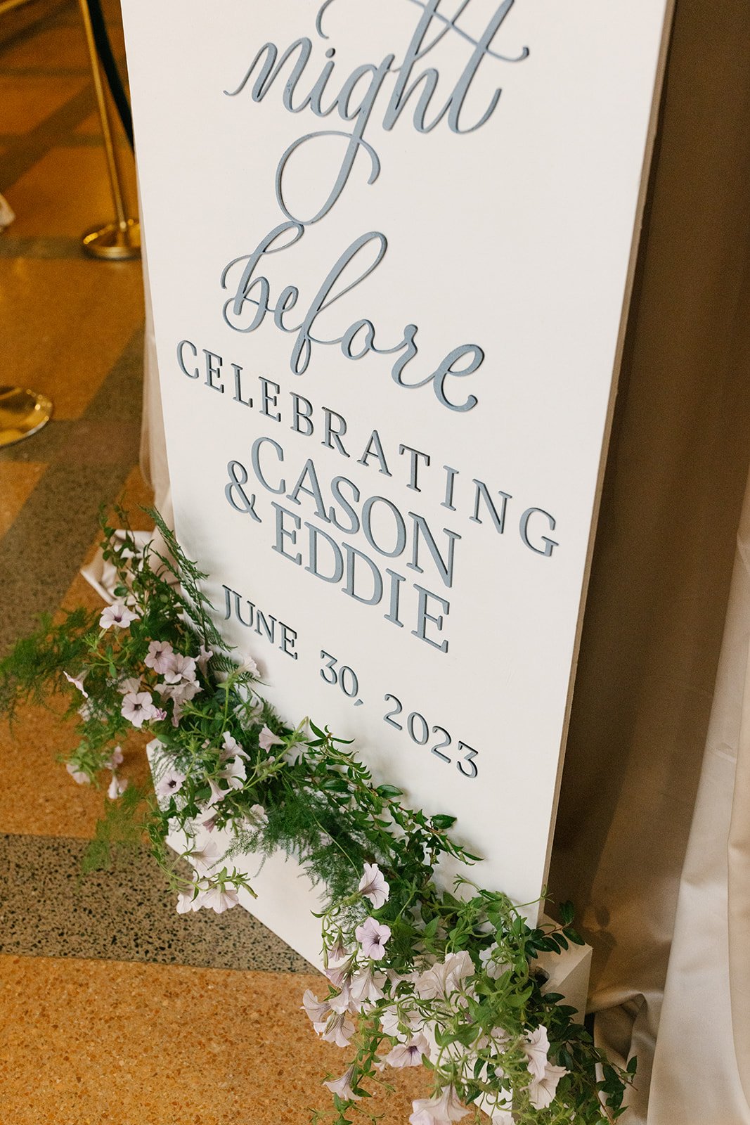
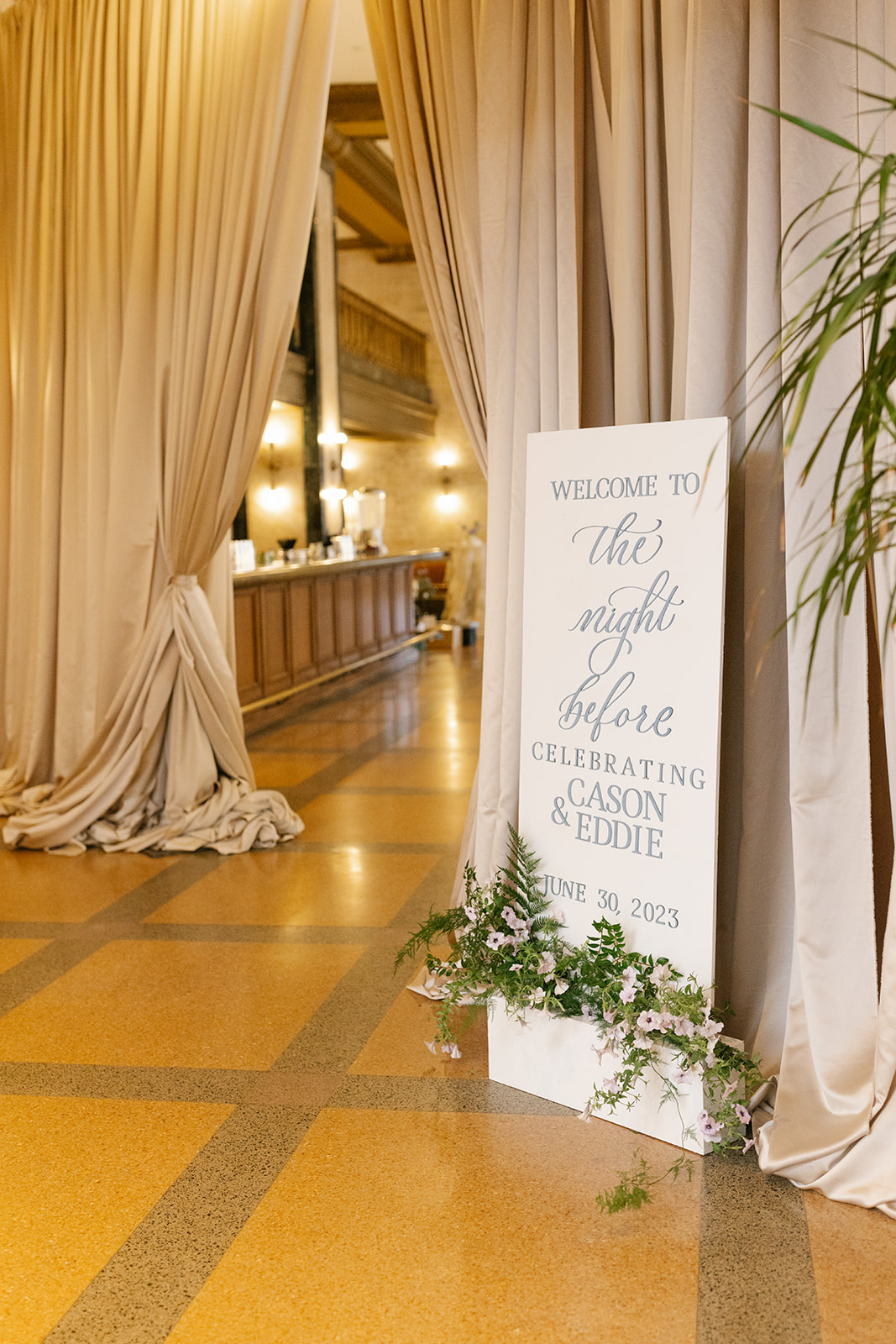
The Night Before Welcome Sign
Cason and Eddie chose the ever-stunning Noelle in Nashville to welcome their close friends and family to their wedding celebrations. We collaborated with Hill Event Rentals to put together this amazing welcome sign that was tucked perfectly against a draped entryway. The florals that lined the bottom of the sign was the cherry on top that made this welcome sign the delicate focal point that it was. Teamwork!
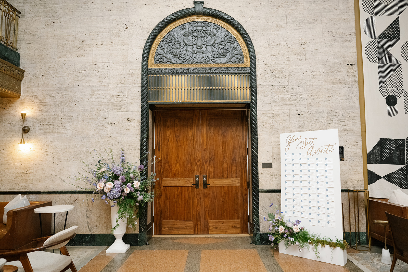
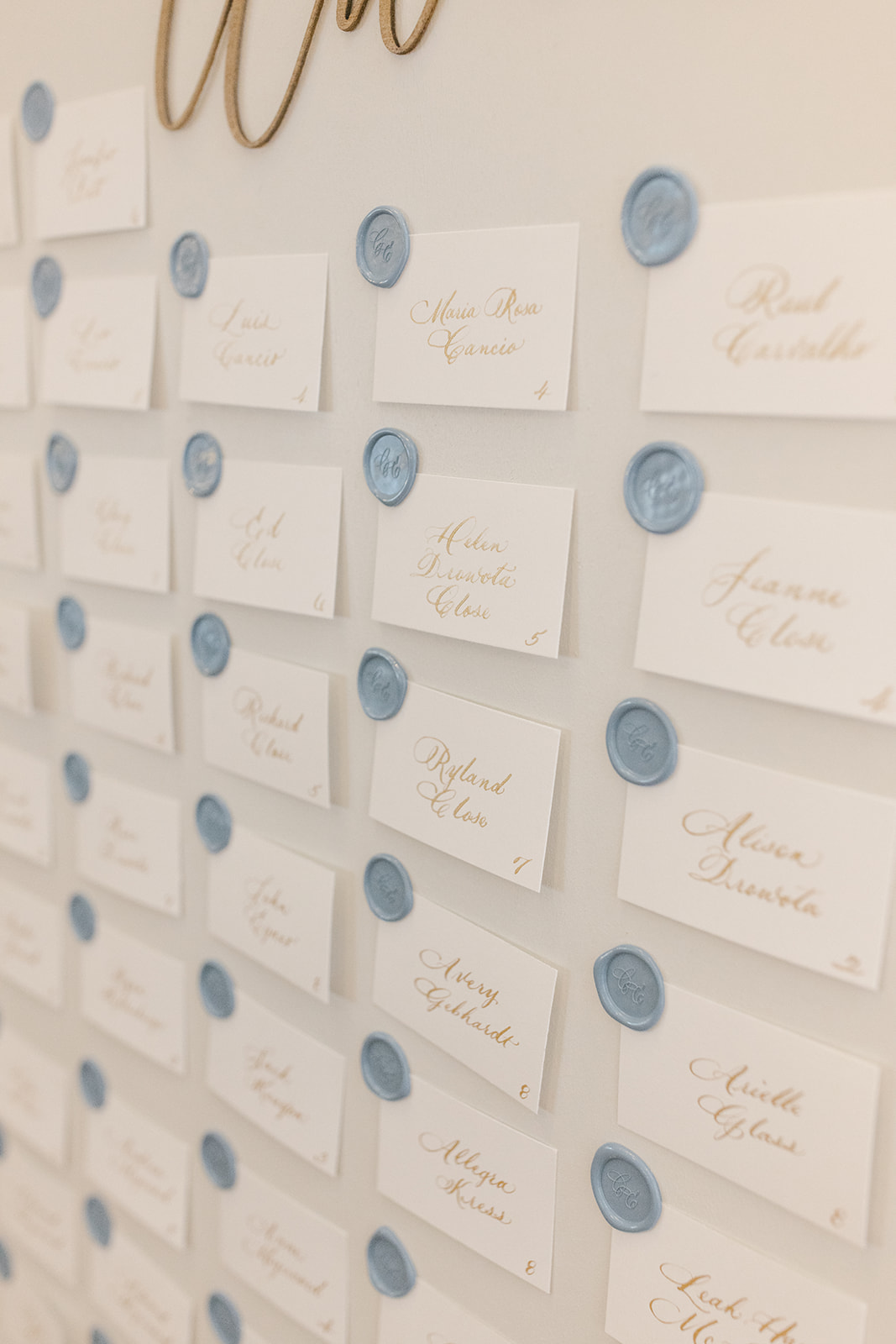
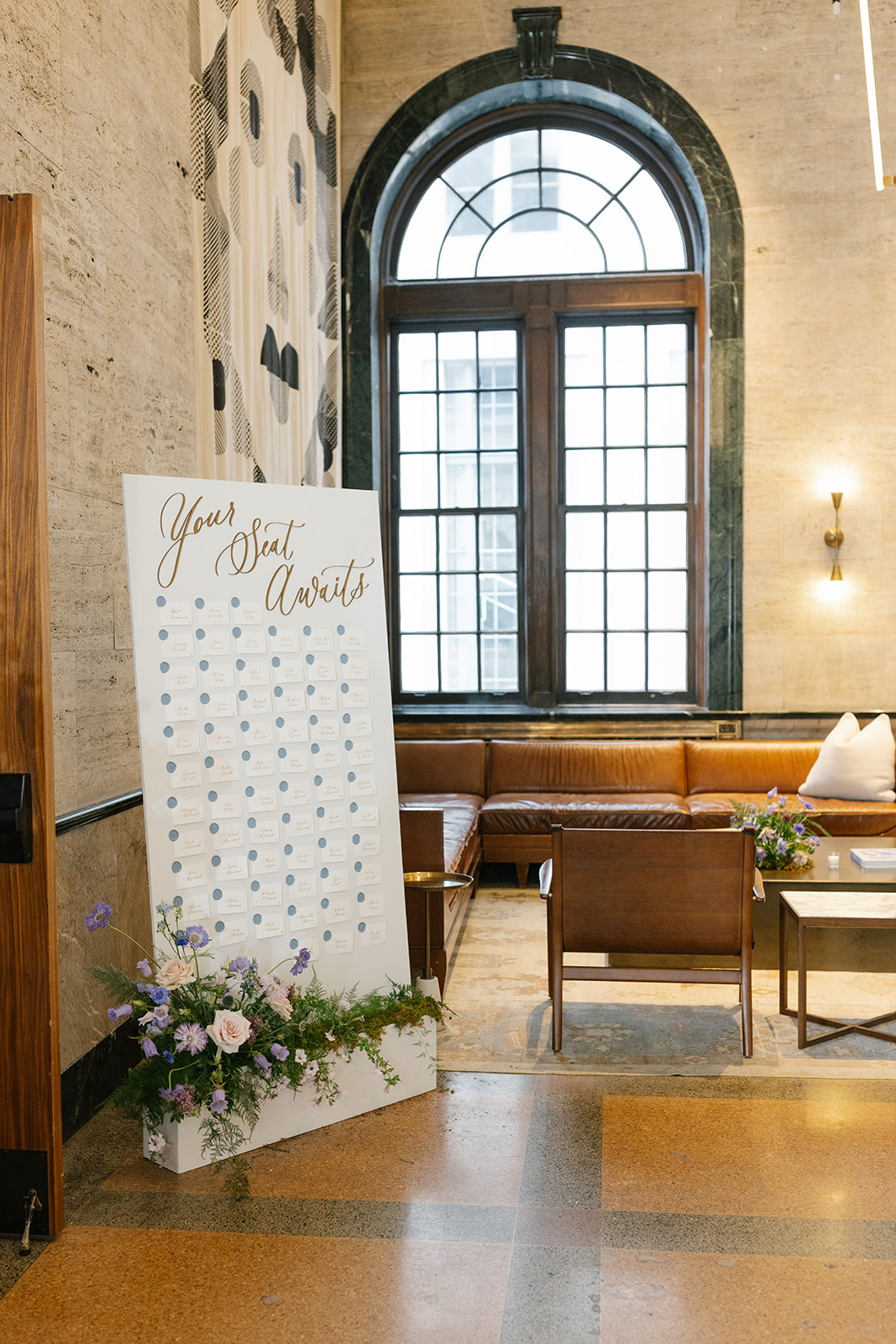
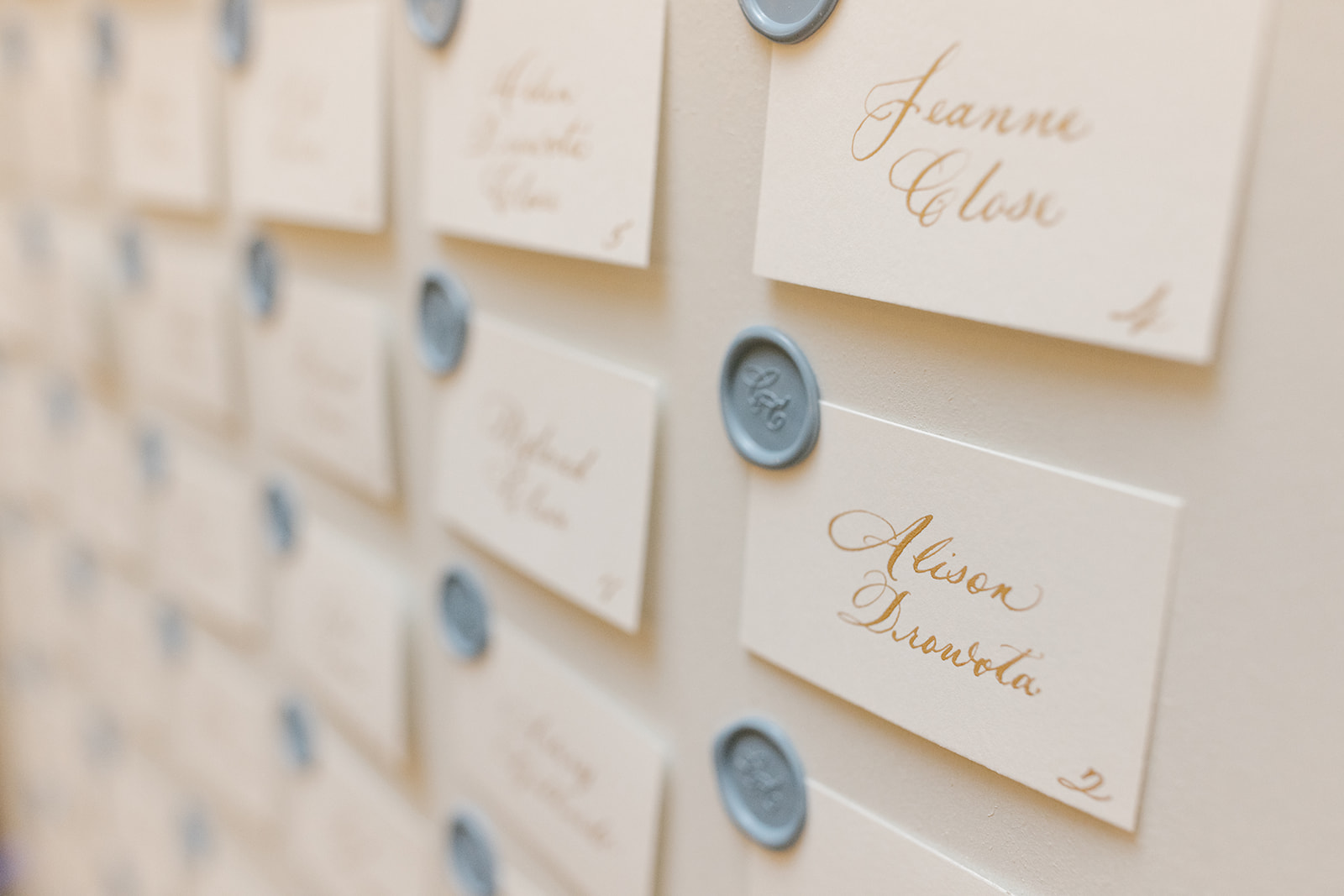
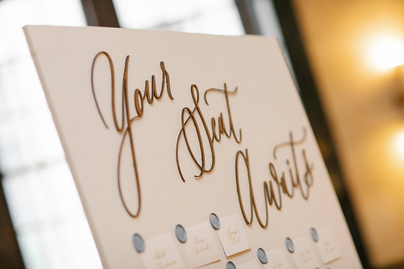
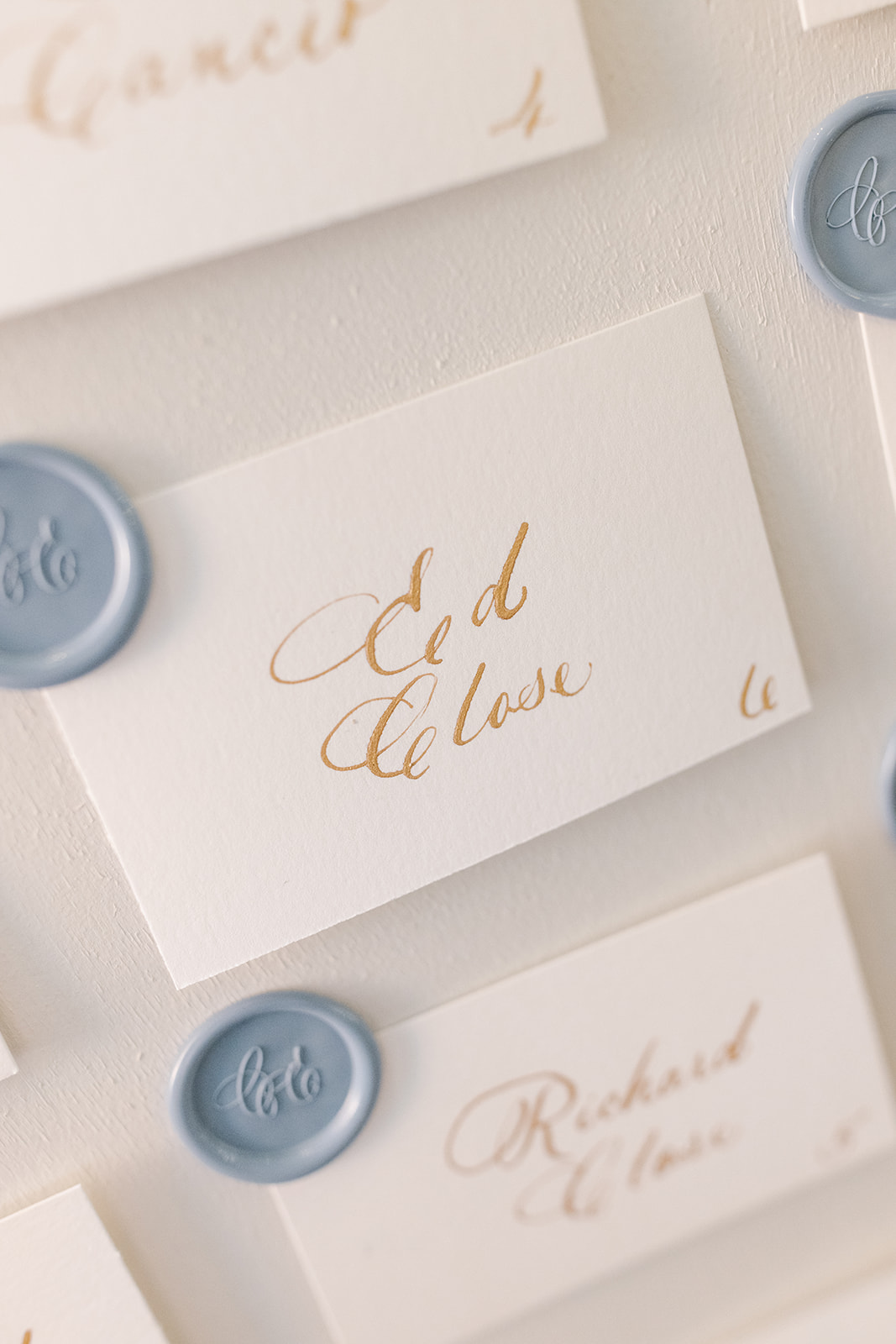
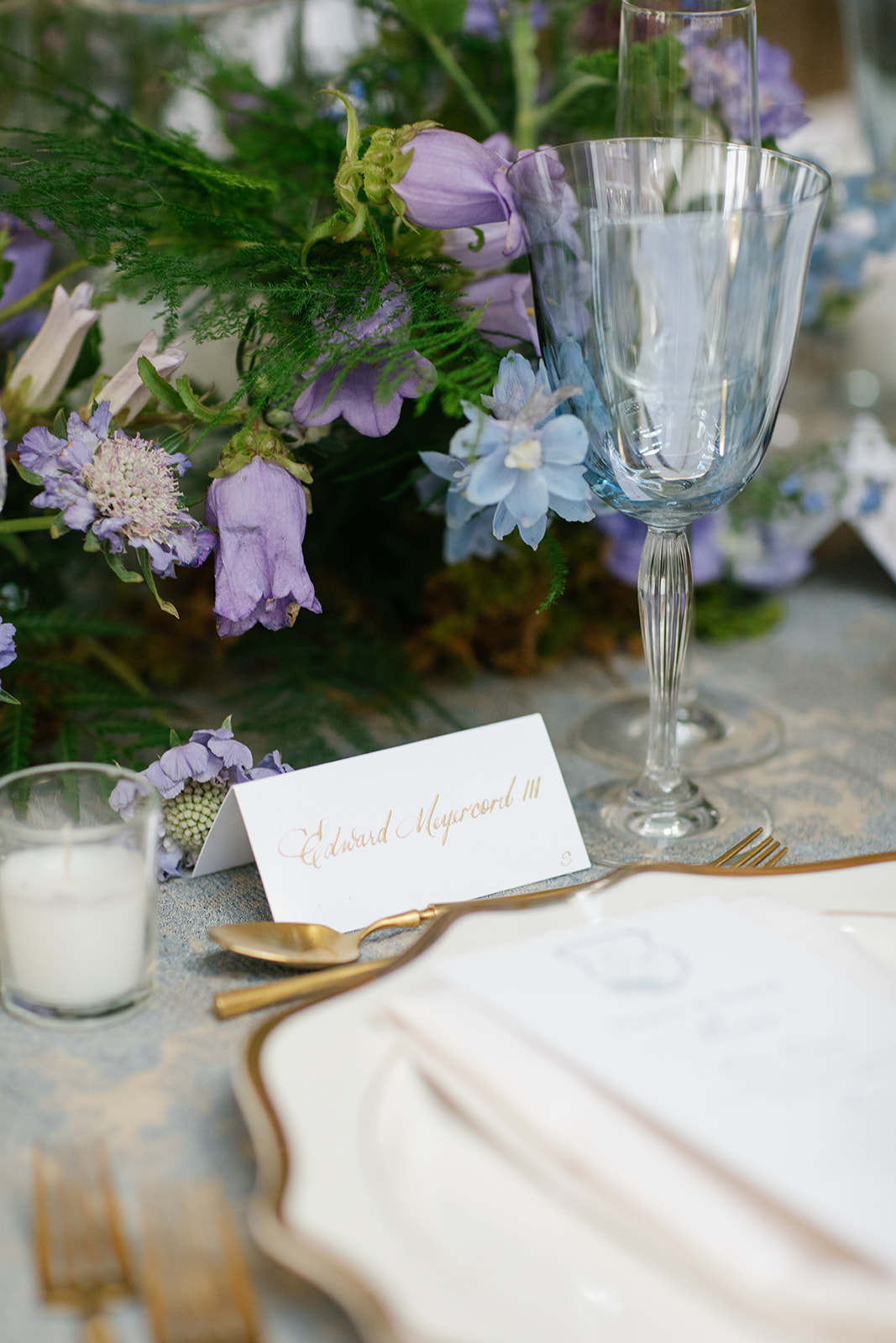
“Your Seat Awaits”
“Your Seat Awaits,” topped the escort card display. Hill Event Rentals once again showcased some of their best work with building this display to match the Welcome Sign display. White Ink did what we do best and added the laser-cut text along with individually calligraphed place cards, complete with a custom monogram wax seal.
Remember, event signage doesn’t have to be cold or bossy. Direct your guests in a warm and beautiful way! Feel free to make it unique and even playful! We love helping our clients with these ideas.
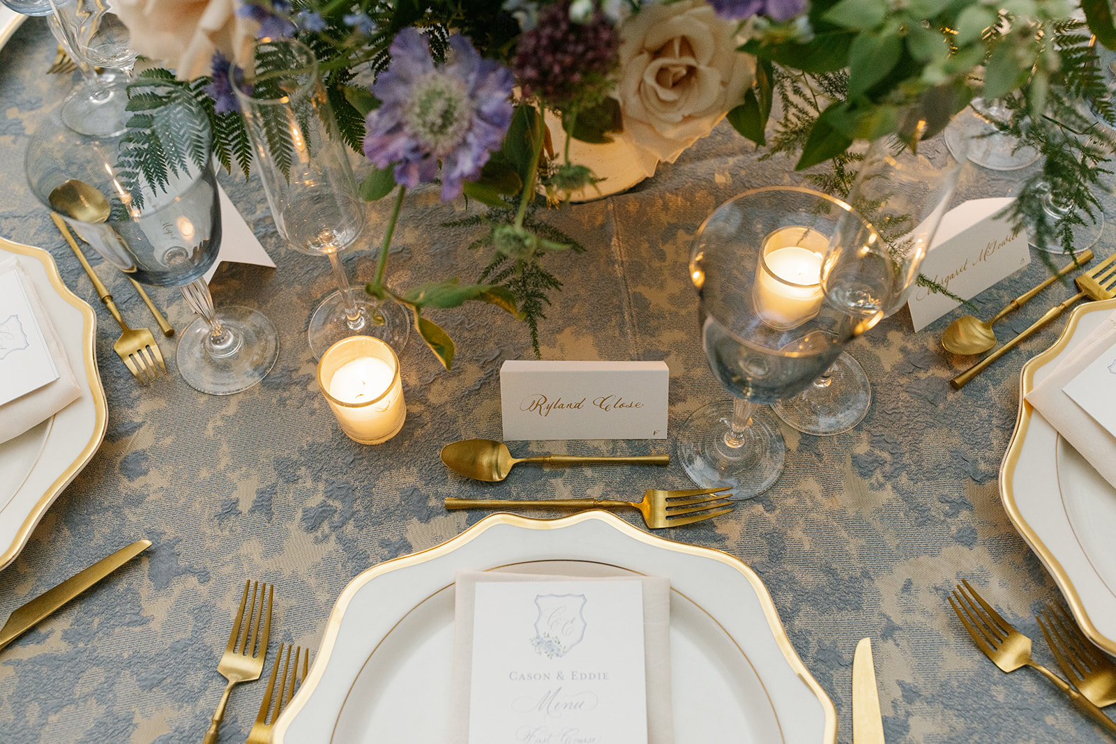
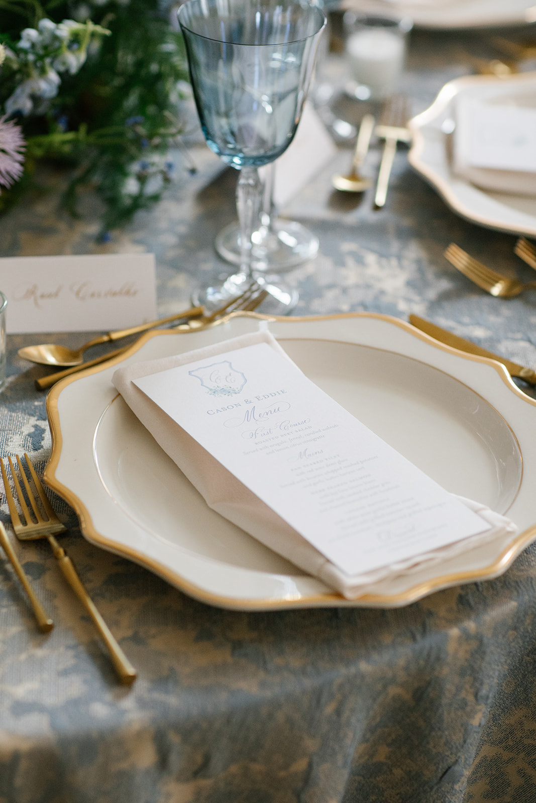
The table numbers fit perfectly into the stunning formal tablescapes in the Noelle’s Sadiee Gallery Grand Ballroom. They simple belonged in this room!
The place cards elevated the show-stopping tablescape and fit effortlessly alongside the goldware at each place setting. This is a perfect example of how one seemingly small detail can really pack a big decor punch!
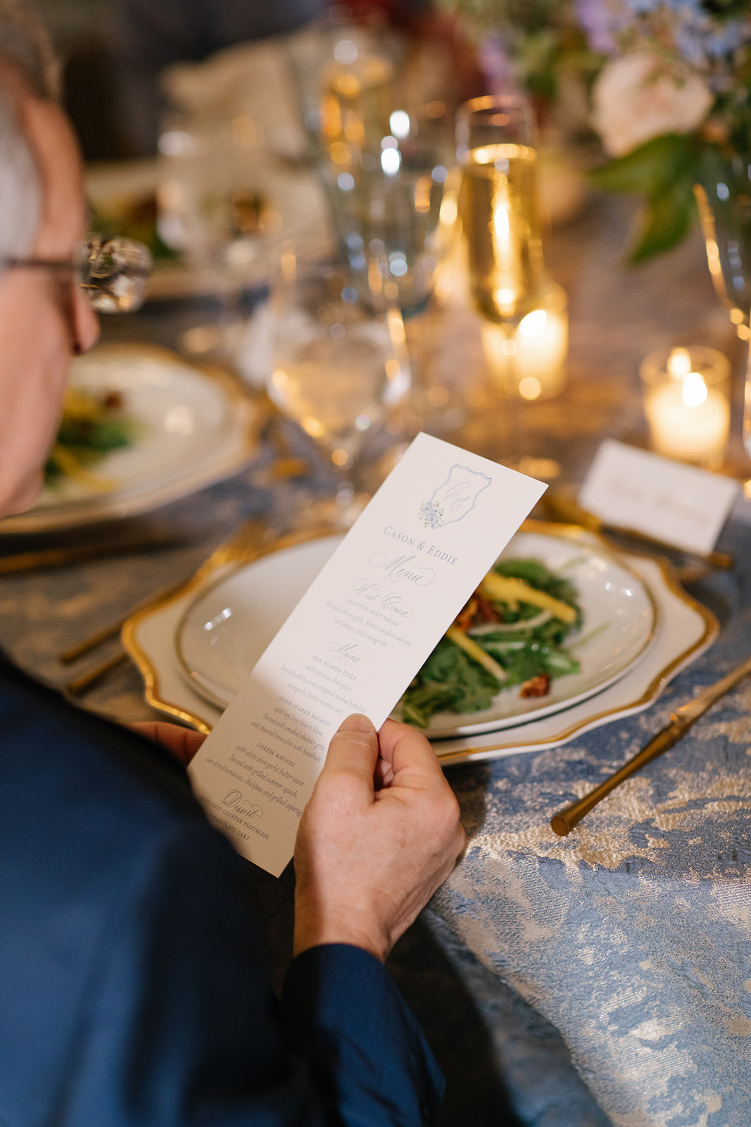
Custom Event Menus
We designed a classic, custom menu for Cason and Eddie. Carrying details like color and prints throughout the whole of an event sends a message of intention and thoughtfulness and can show guests that their enjoyment is a really big part of the planning process!
Cason and Eddie made sure that their family and wedding party received a proper welcome. It meant so much to be a part of this rehearsal dinner to remember! We cannot wait to share more details about their wedding day too! For now, we will hold onto memories that were made “The Night Before.”
If you’re looking to add custom, thoughtful touches to your wedding or event, we would love to help make your vision a reality. Reach out today to learn more about our full-service design offerings—we can’t wait to create something unforgettable for you!
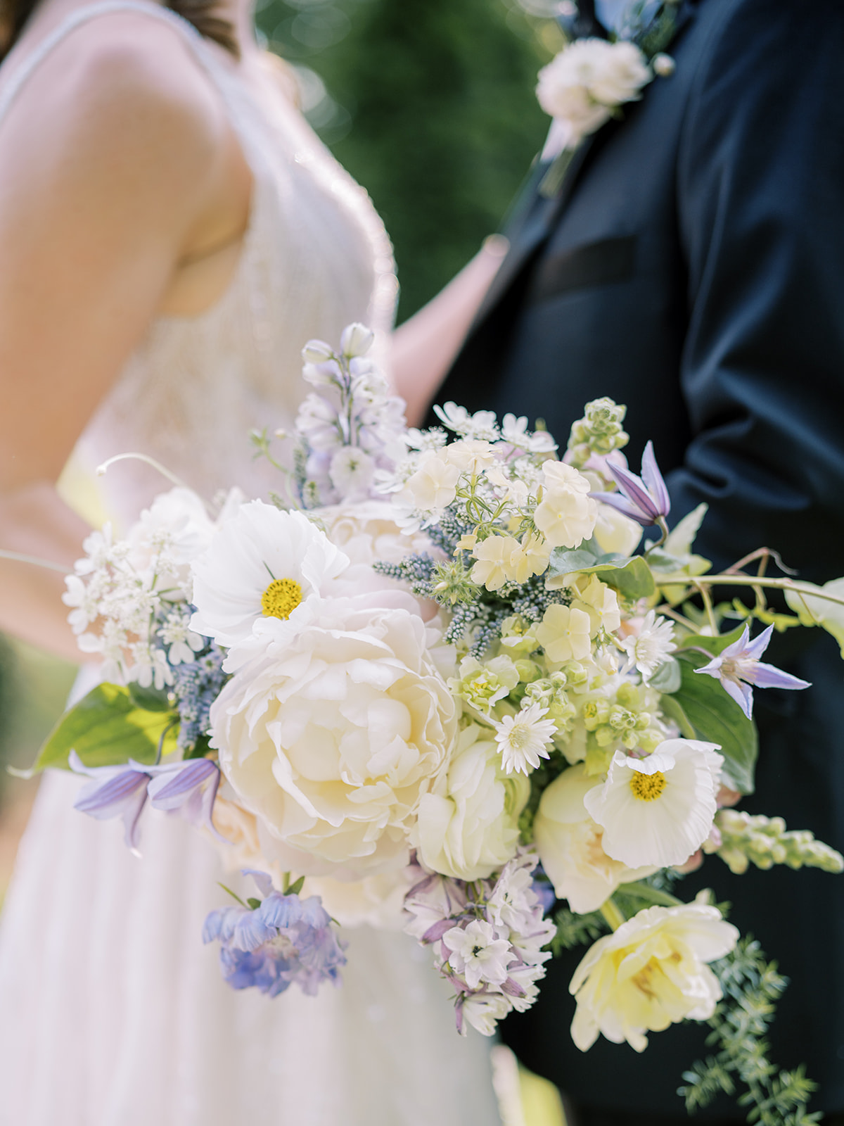
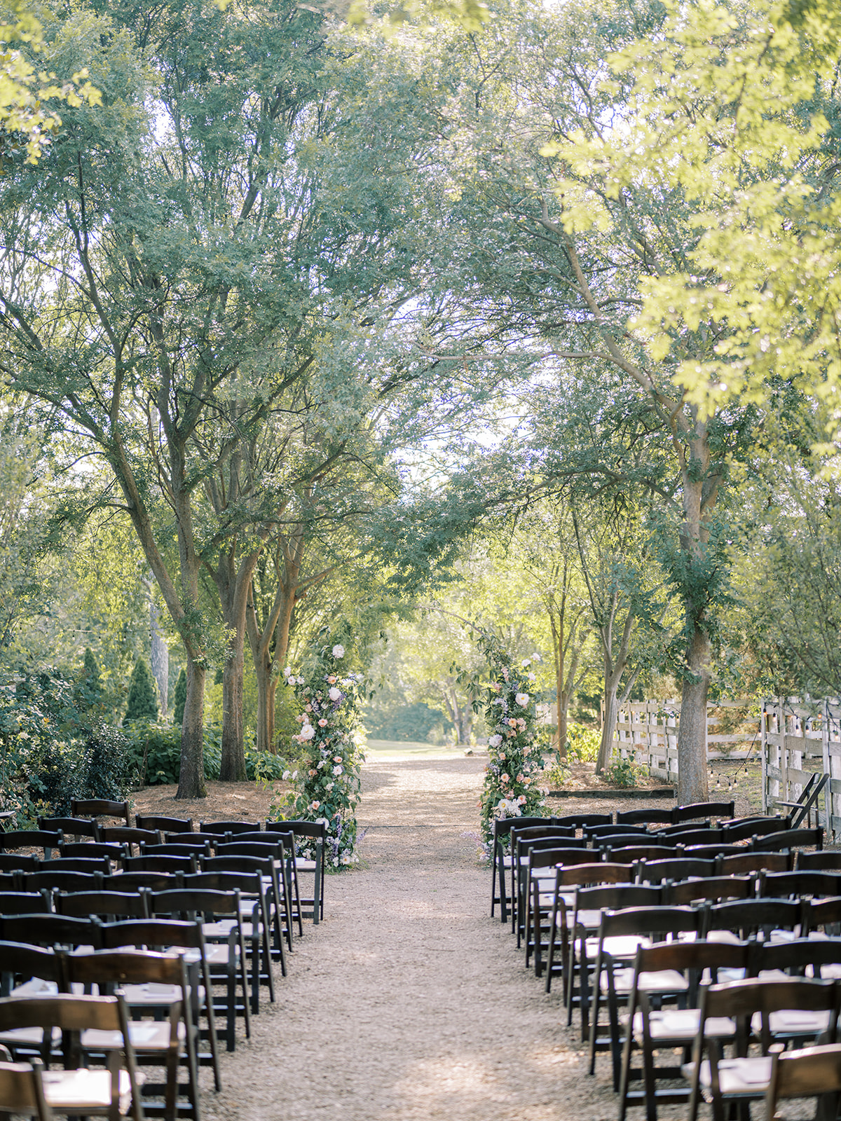
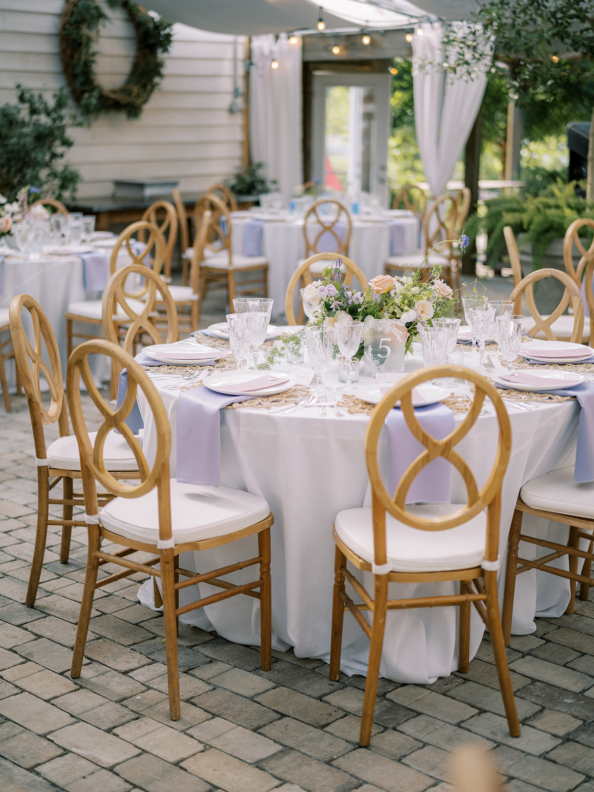
Every moment of planning with this sweet couple was a true joy for all of us at White Ink. Morgan and Tommy chose an incredible balance of boldness and gentleness throughout their wedding details making this dreamy garden-inspired summer wedding unforgettable for all in attendance. Truly, it was stunning-a dream day from start to finish.
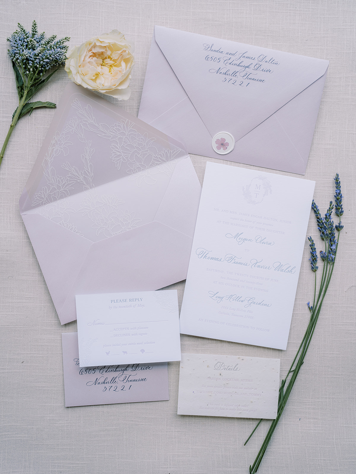
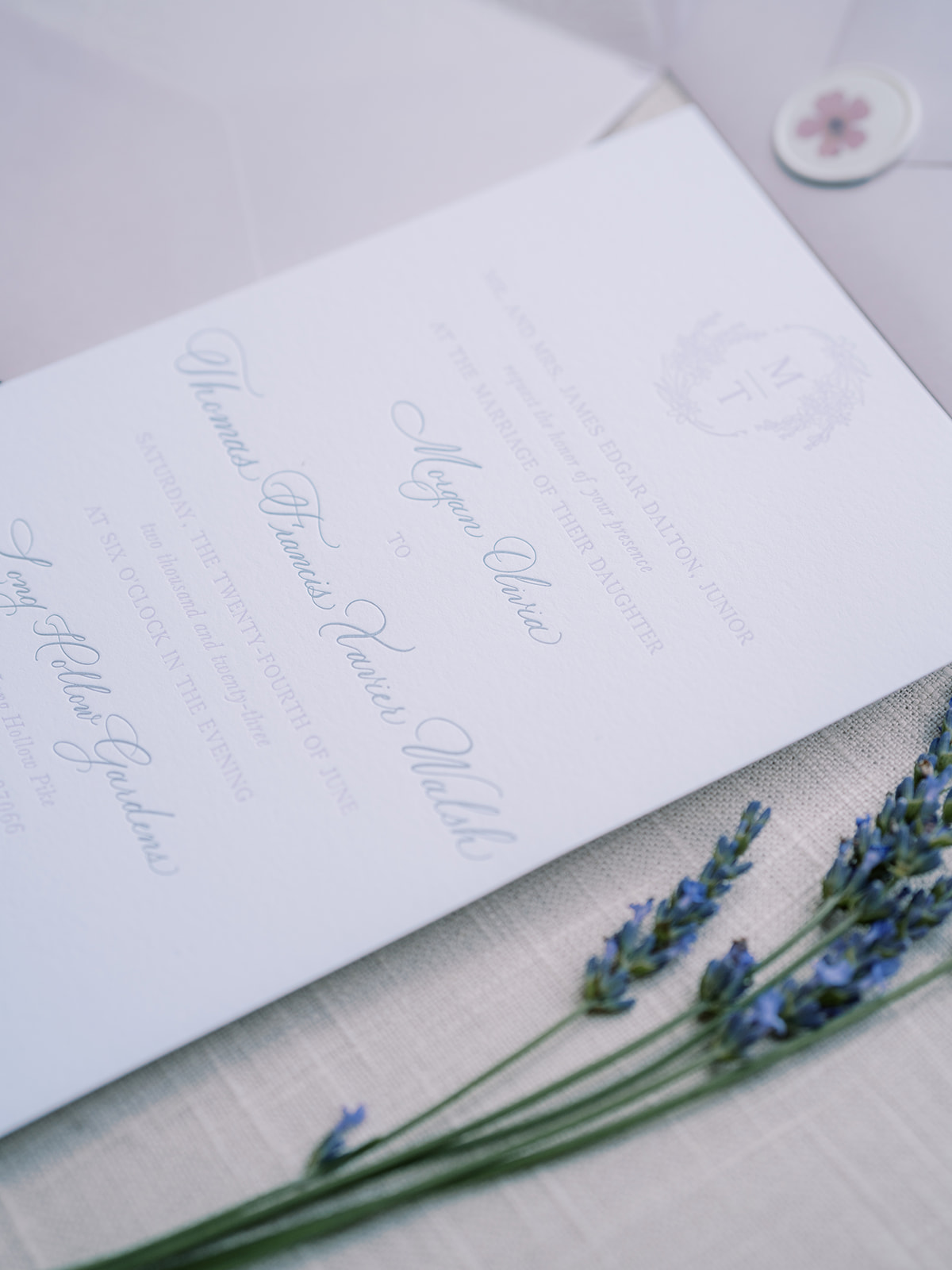
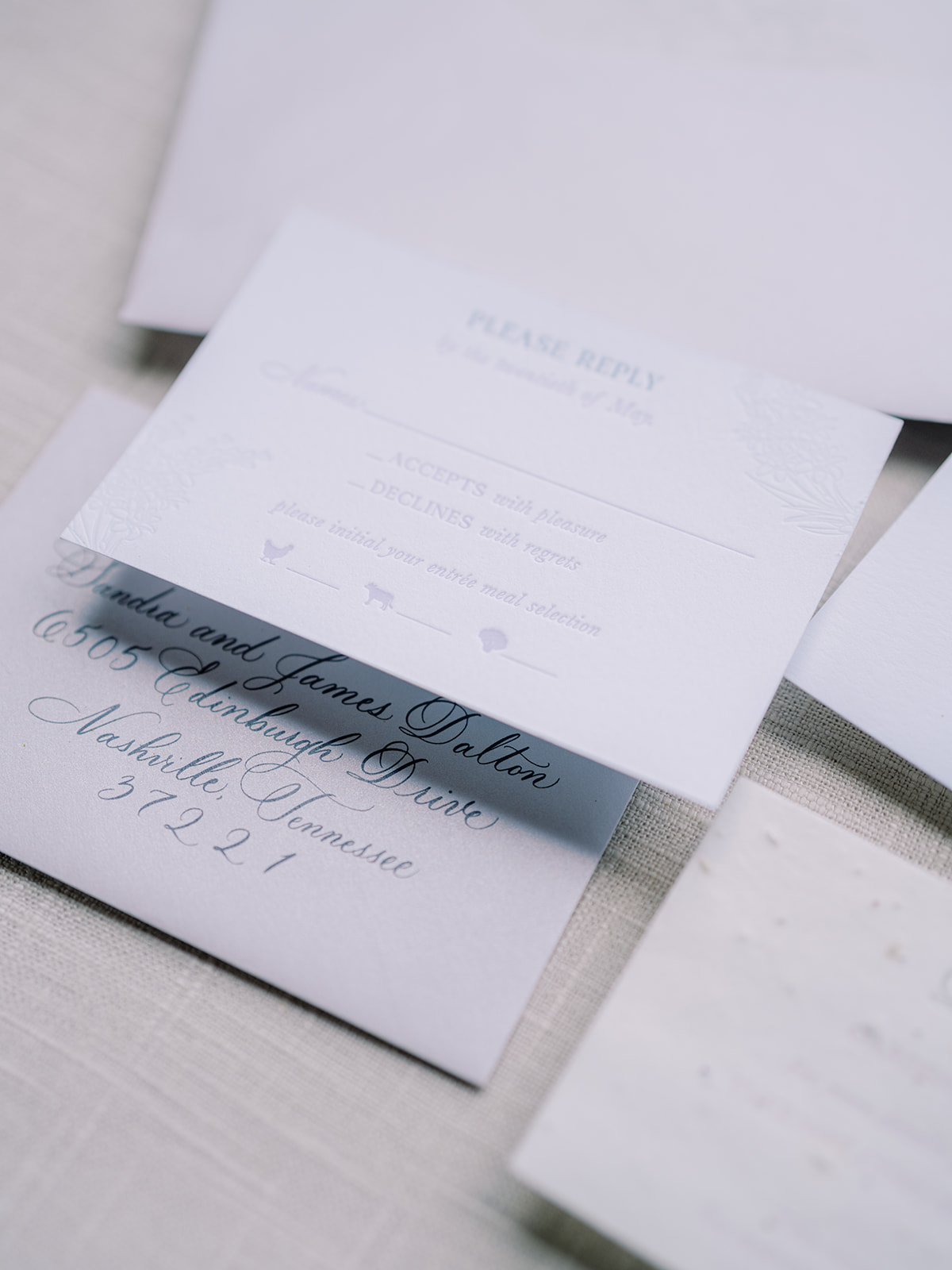
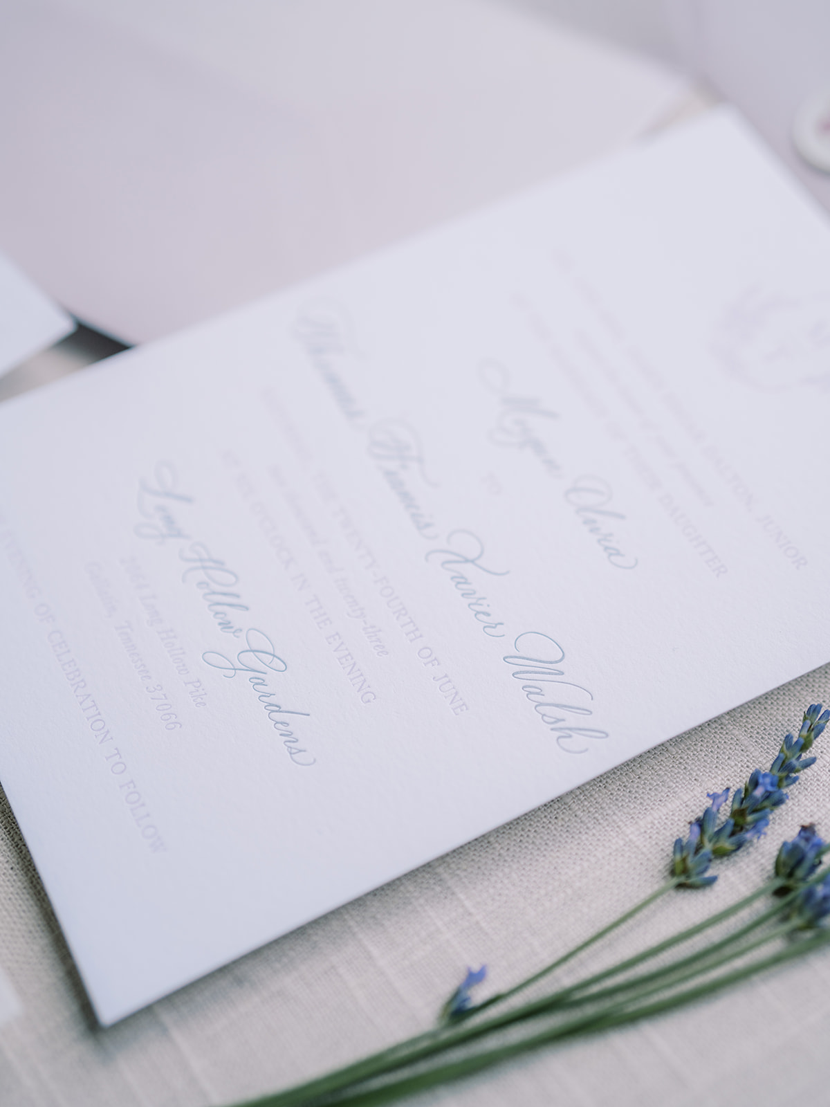
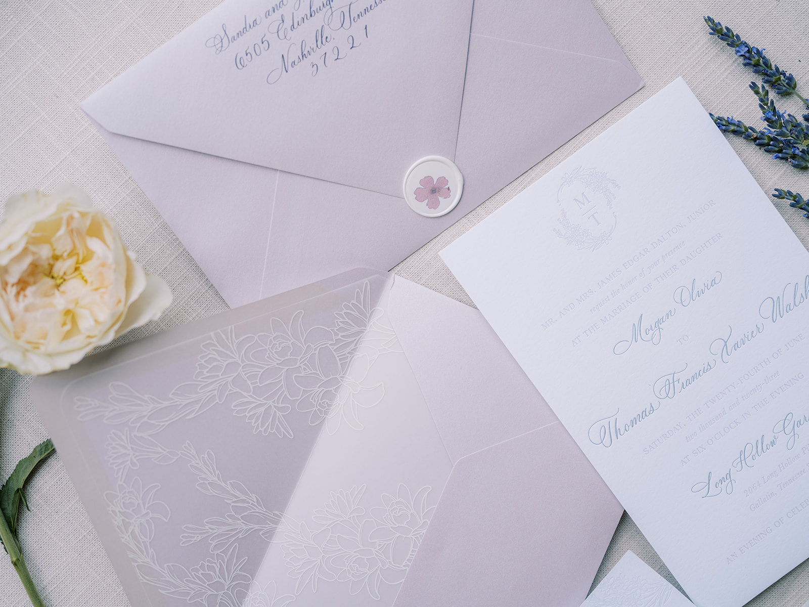
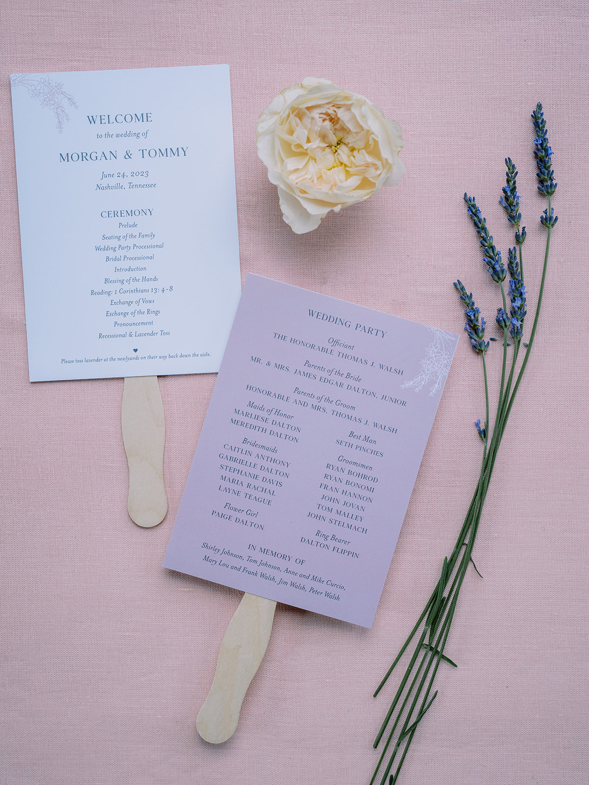
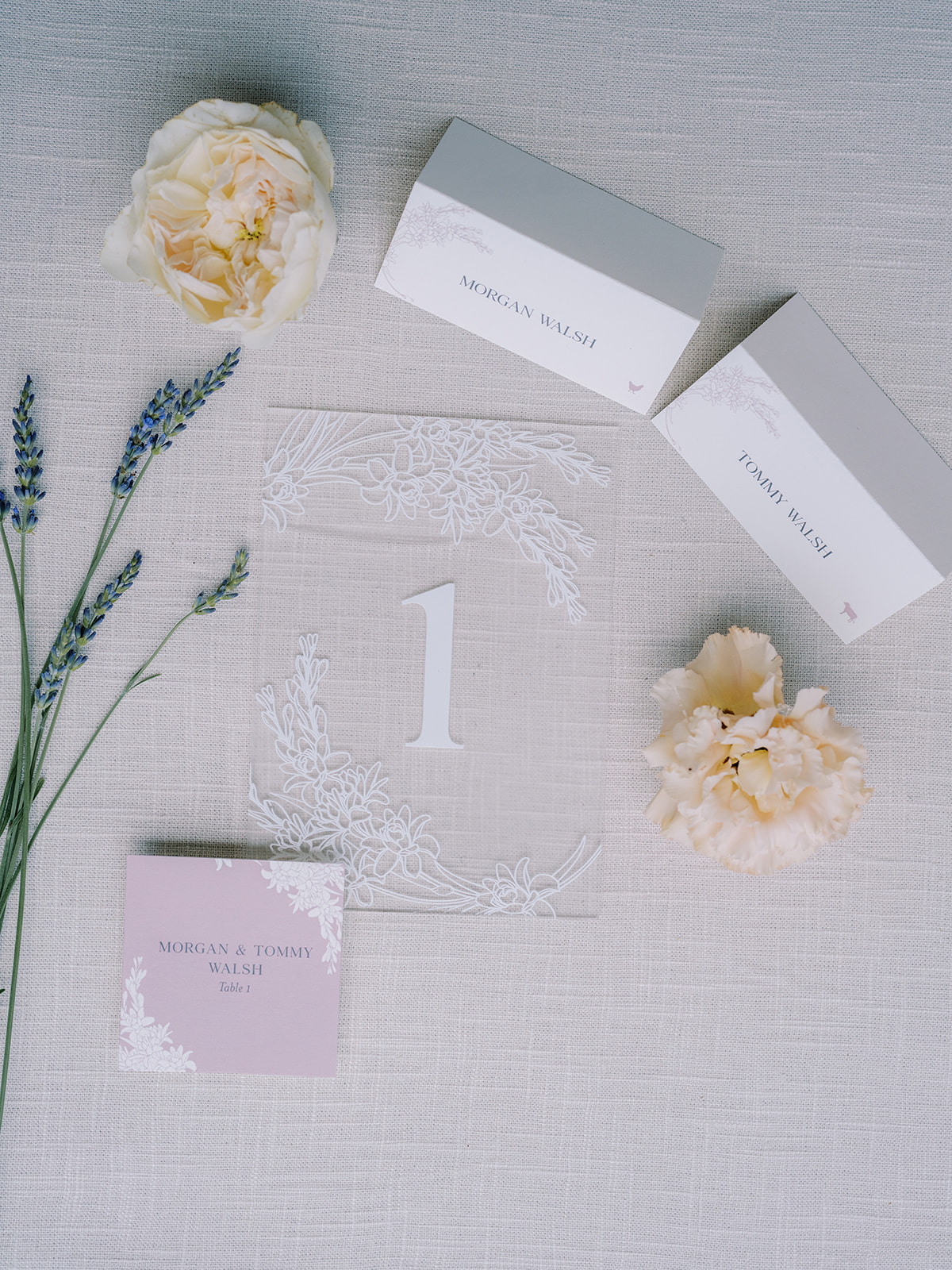
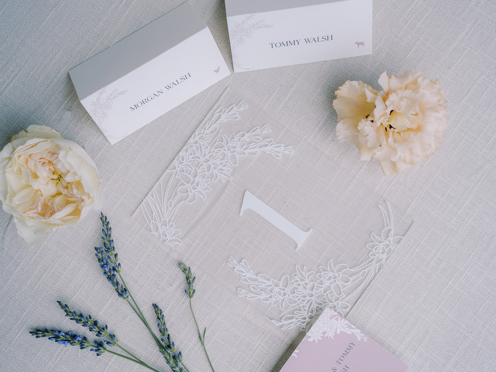
Dreamy Lavender Invitation Suite
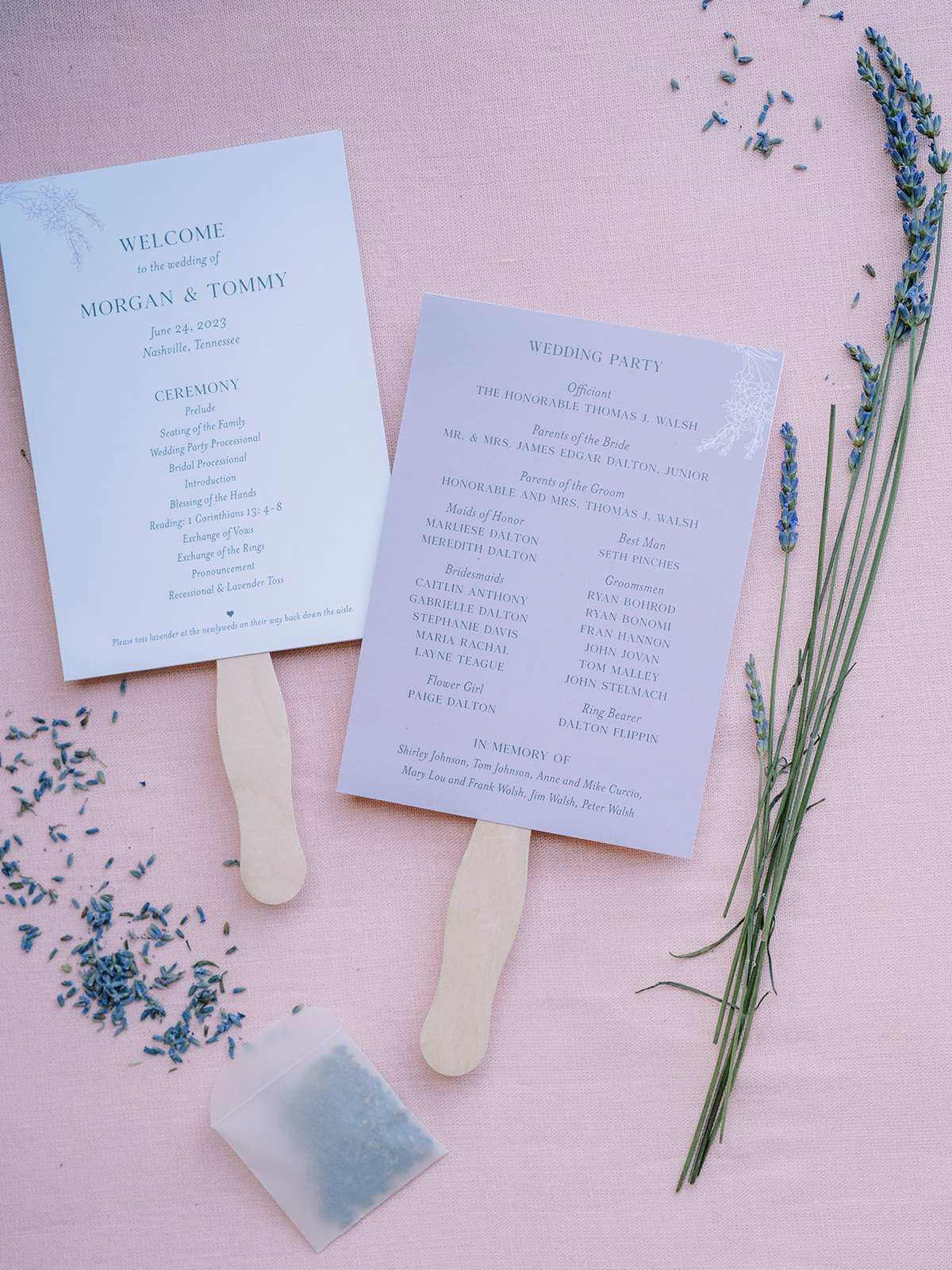
Morgan and Tommy’s invitation suites delicately showcased a beautiful lavender color and theme, a detail that was laced throughout the entire ceremony and reception! Our friends at Clover Calligraphy Co. did the beautiful letterpress work on the card stock paper, which comes at no surprise as they always do impressive work! A soft lavender hue was chosen for the envelopes in addition to the vellum envelope liners with a dainty tuber rose print. I also want to draw attention to the pressed flowers in the custom wax seals! Is this not the dreamiest invitation suite?
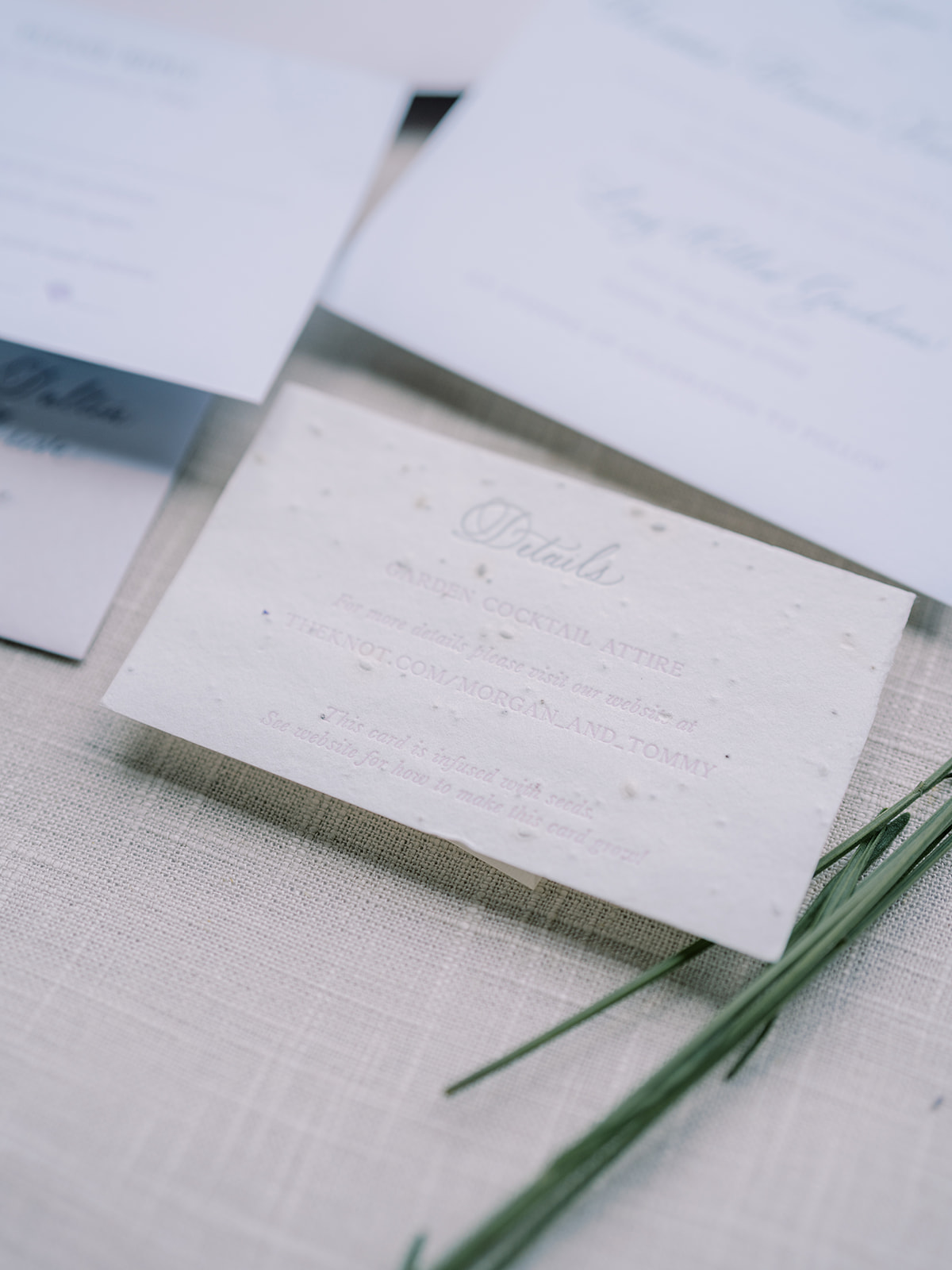
If you look closely at the details card from our bride and groom’s invitation suite, you can see that this textured card is actually seed paper! The cards were infused with wildflower seeds so that wherever guests planted their cards, wildflowers would grow! Talk about a memorable detail!
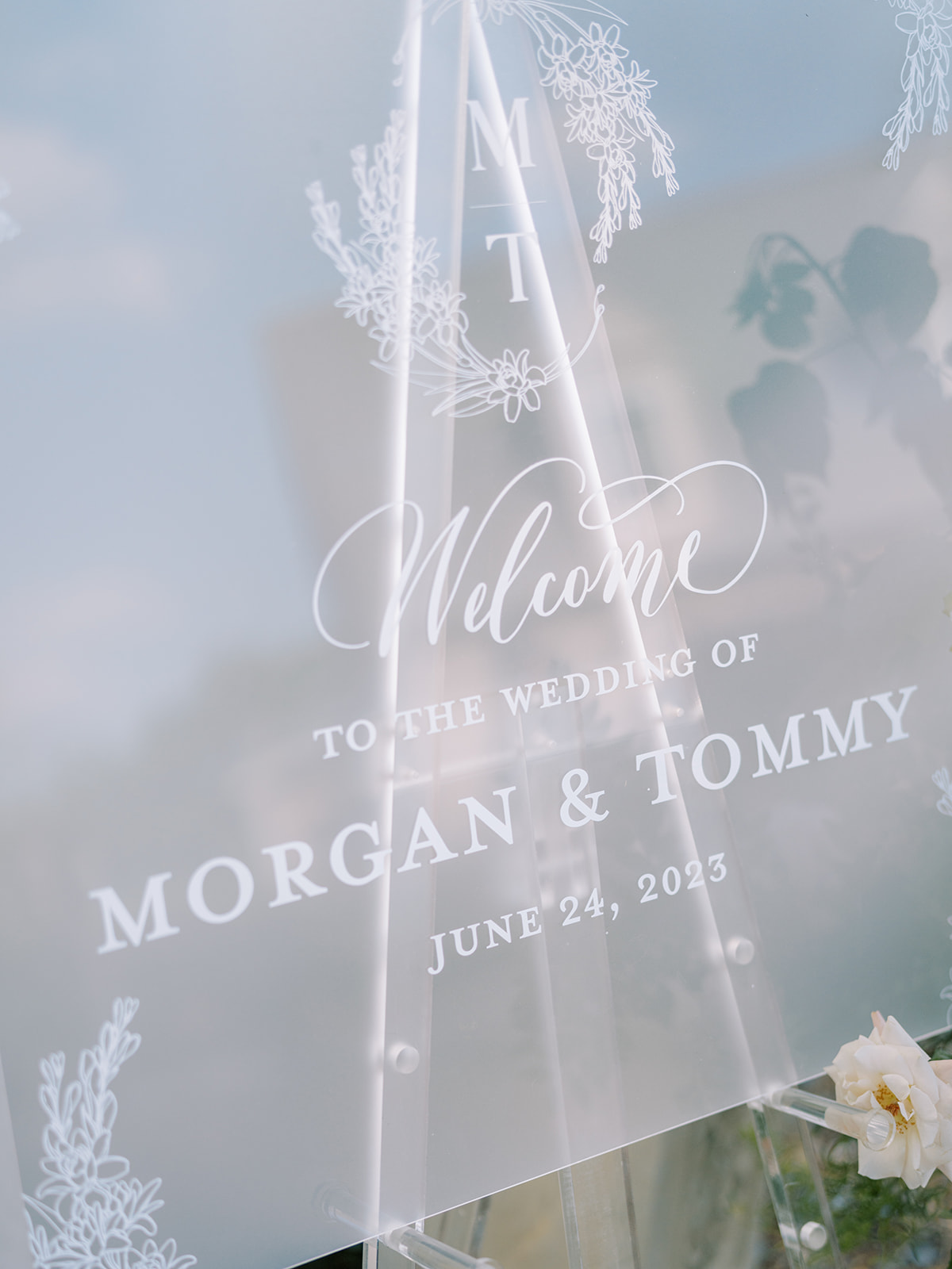
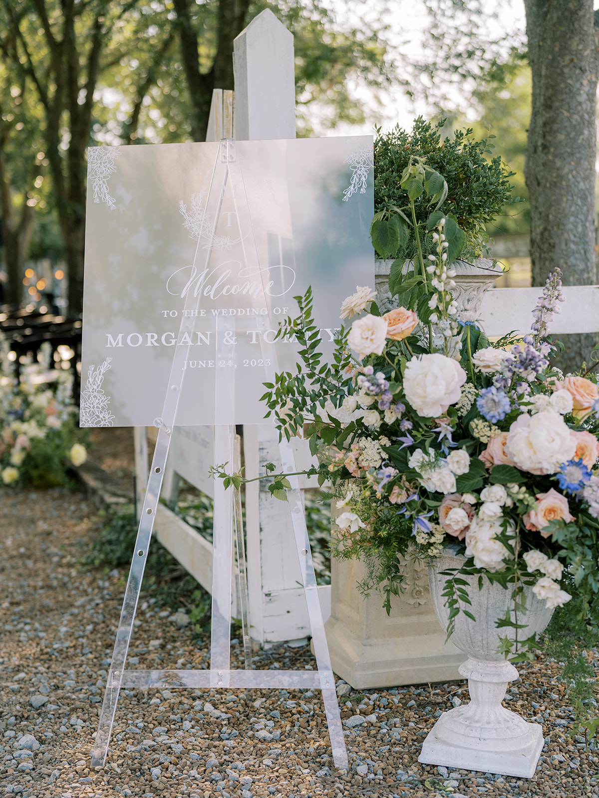
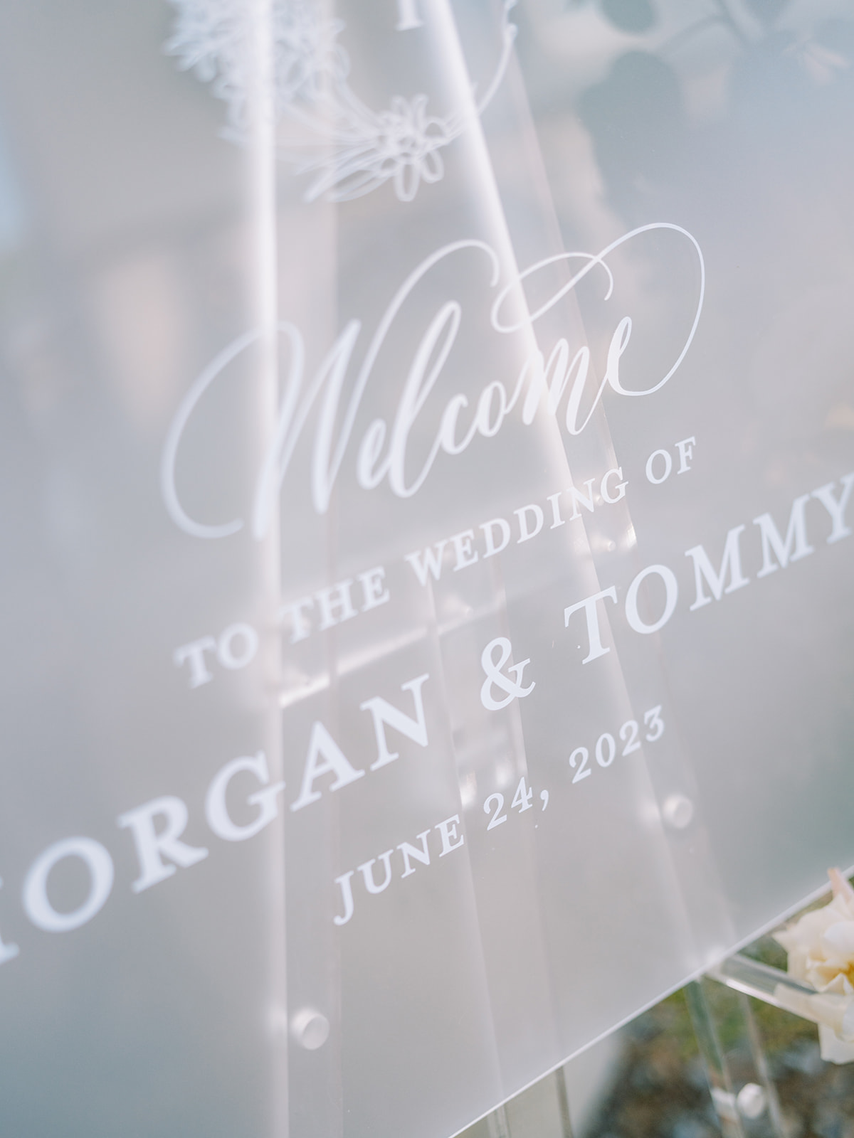
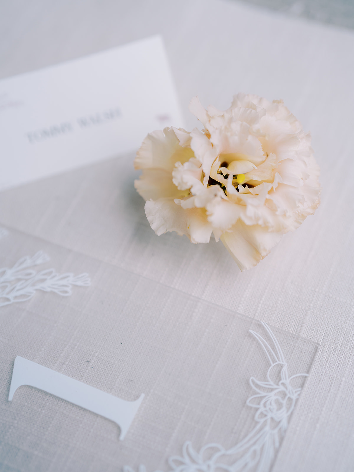
Frosted Acrylic Welcome Sign
The elegant frosted acrylic wedding welcome sign brought me back to the invitation suite details, as guests could see the same custom monogram from the invite, as well as the beautiful tuber rose print on the vellum envelope liner. Connecting details throughout an event, especially a wedding, can easily elevate your special day.
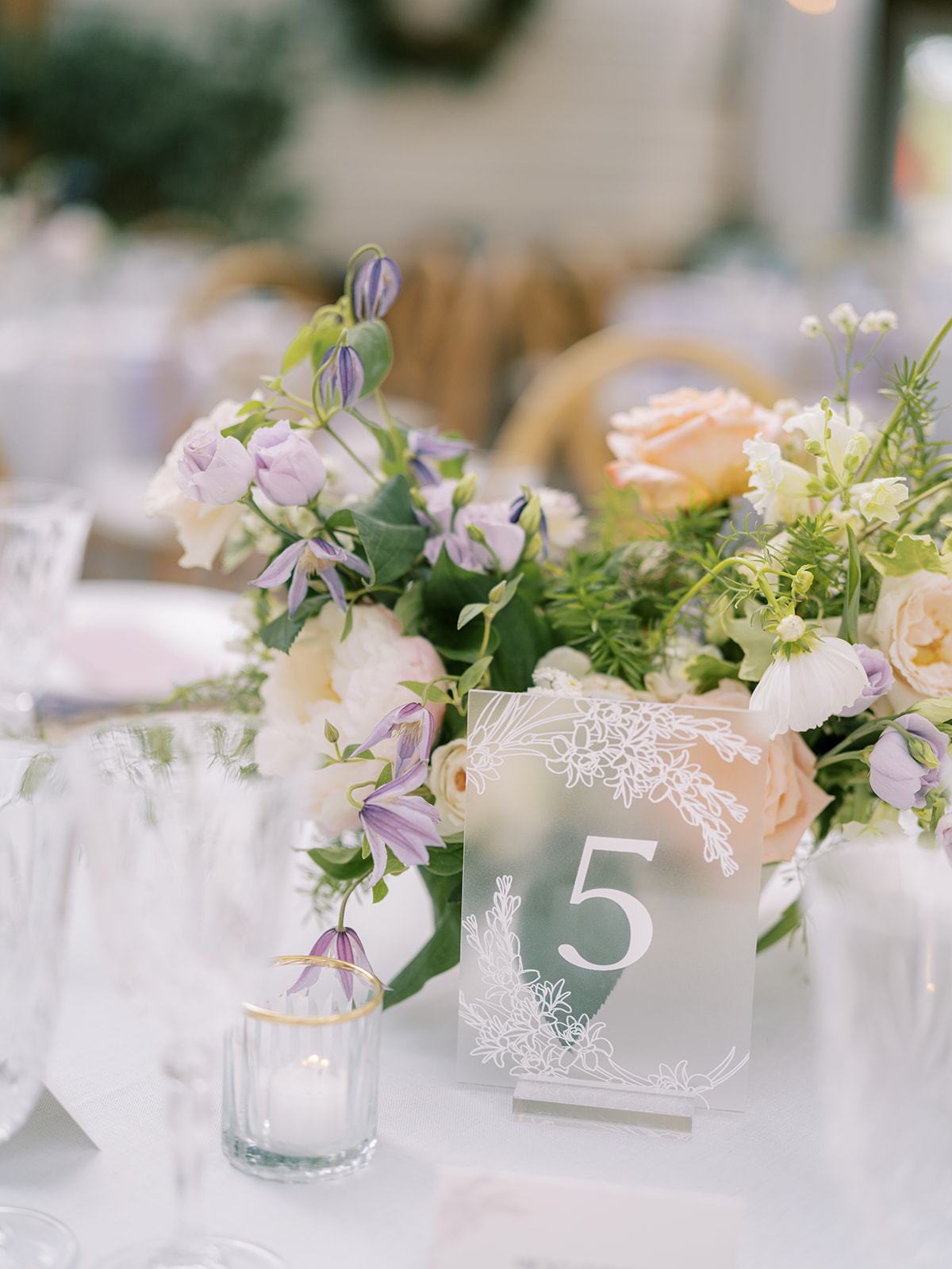
Thoughtful Summer Wedding Details
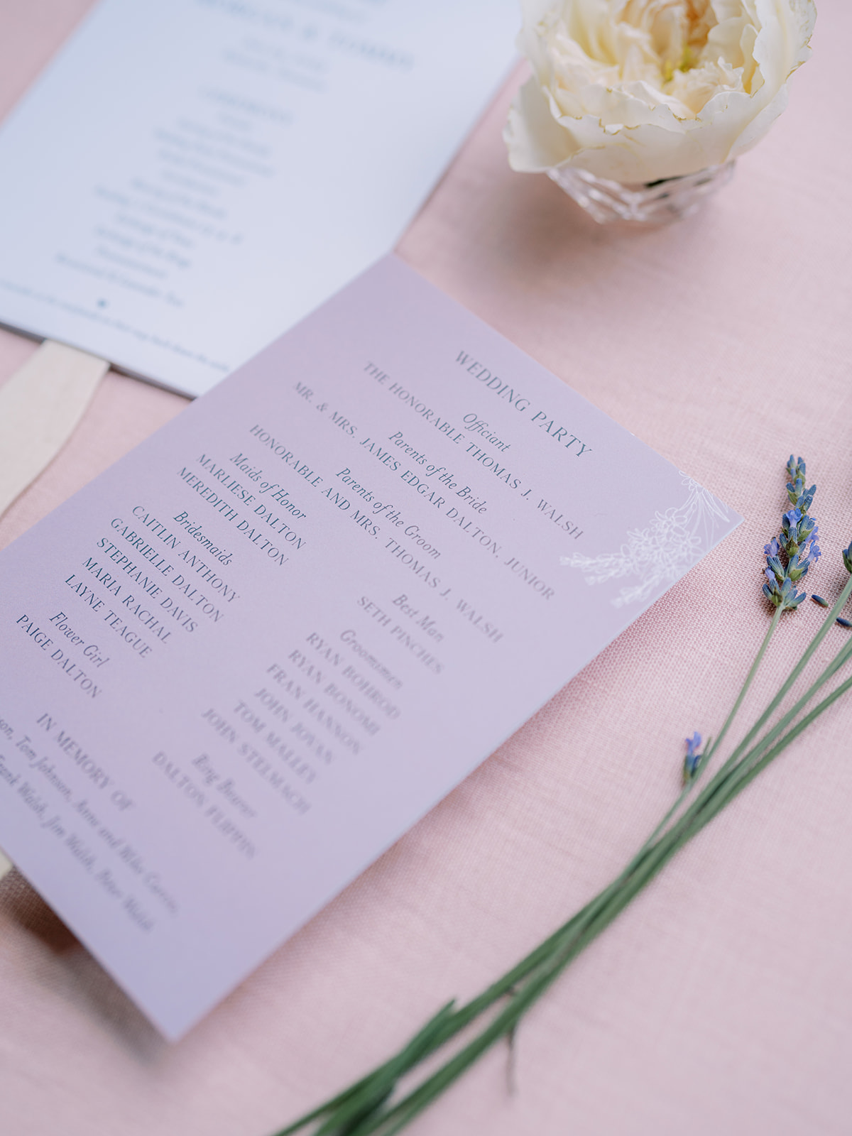
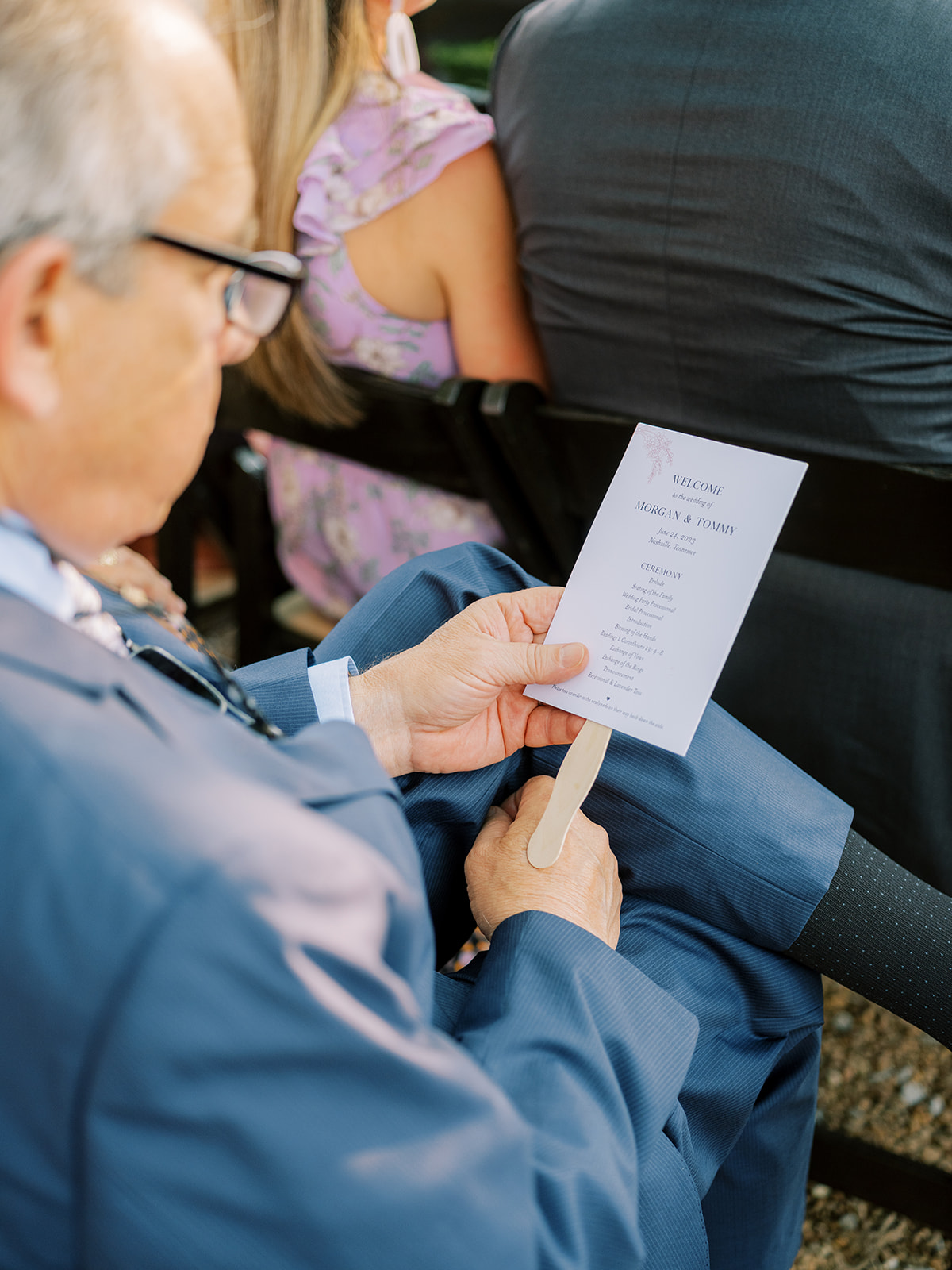
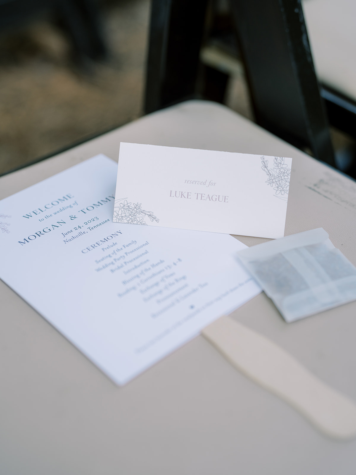
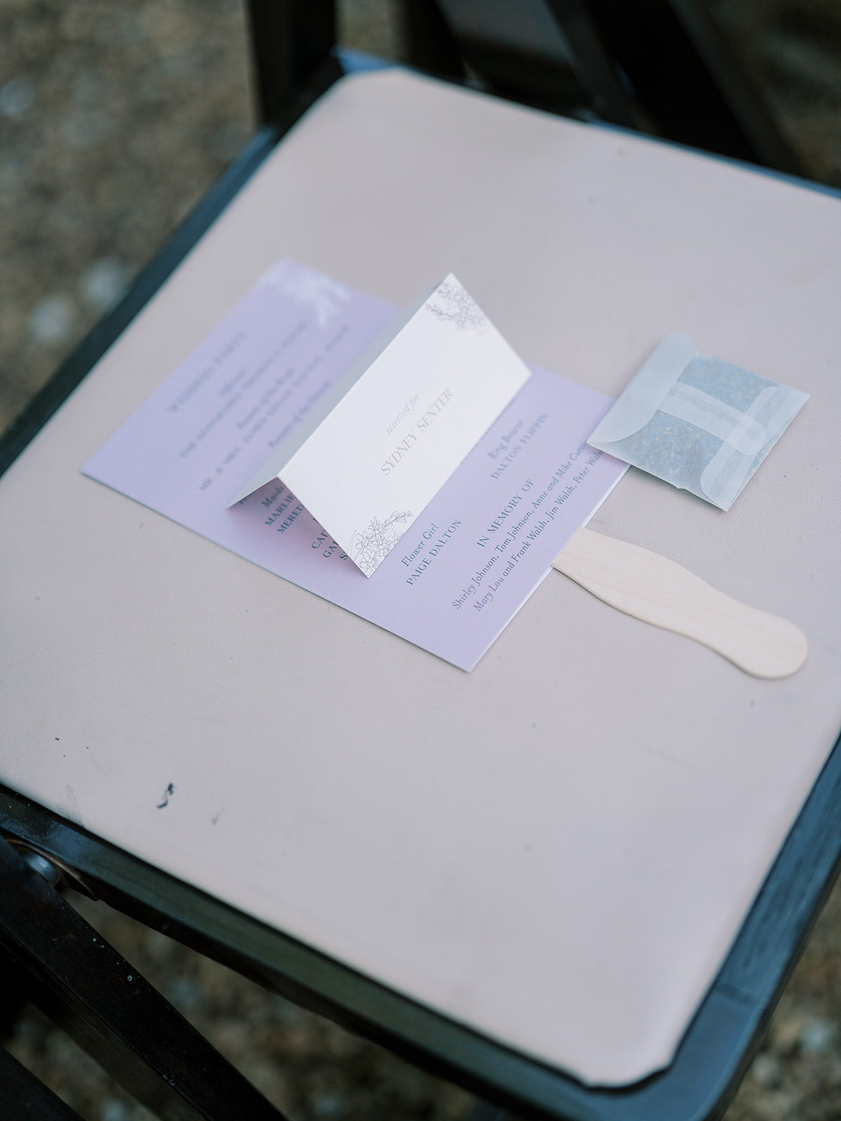
A very thoughtful detail that Morgan and Tommy added to their June wedding was letting us create these adorable fan programs which, of course, included the stunning lavender color theme and floral prints that blanketed the details of their wedding. This is a perfect example of making parts of your ceremony details functional for your guests while maintaining a delicate theme.
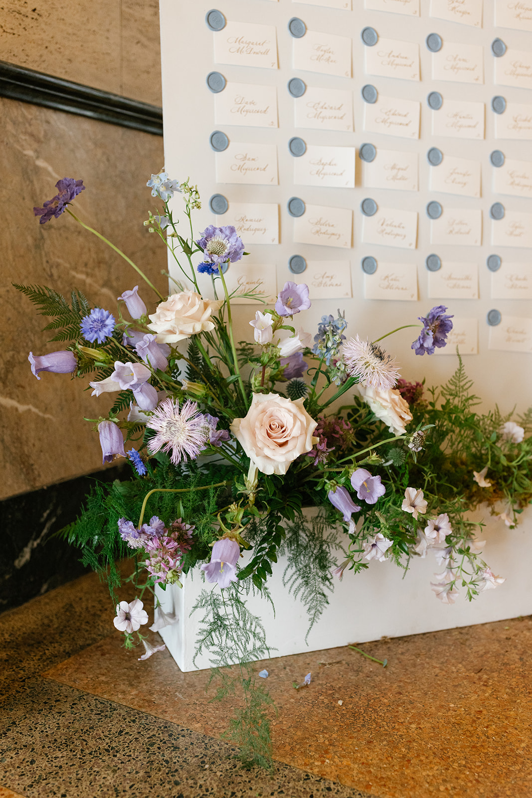
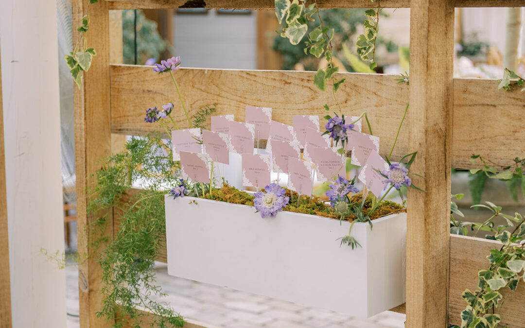
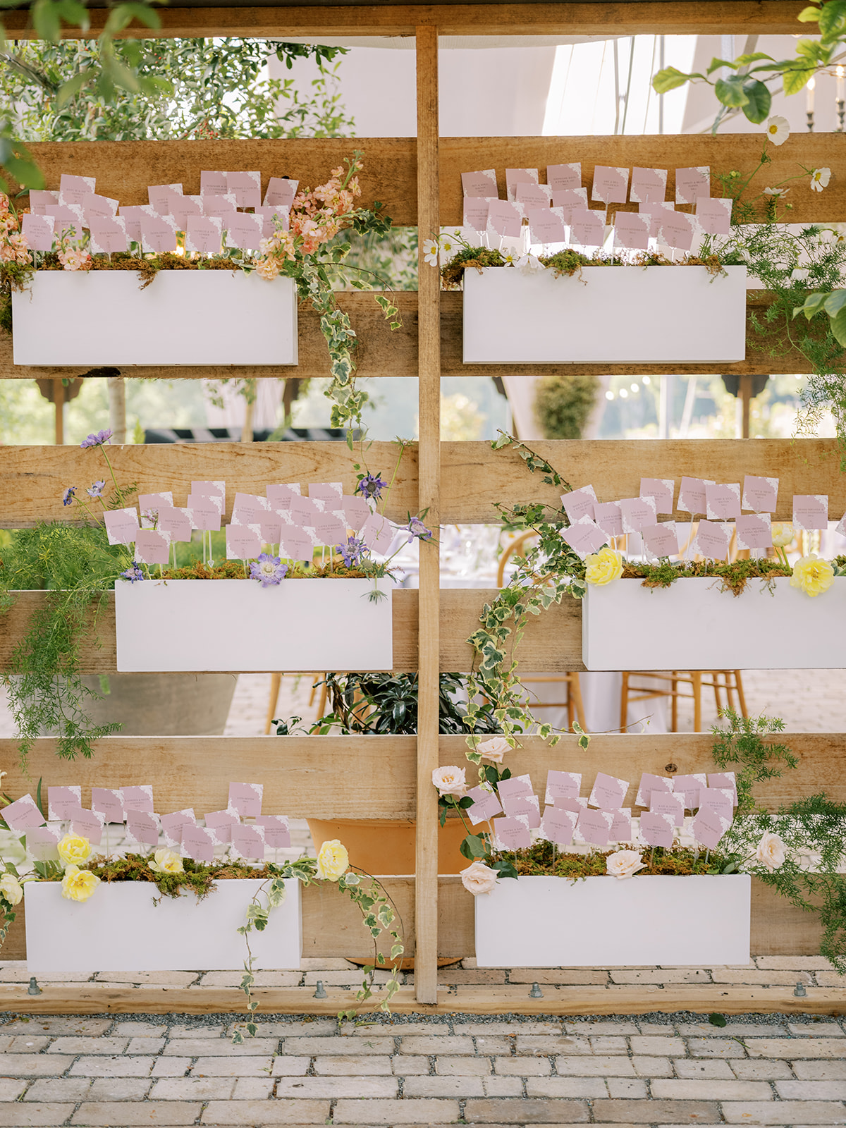
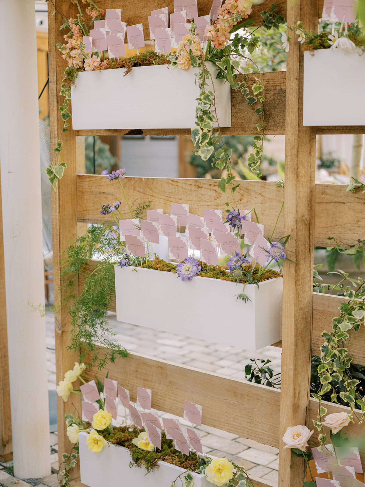
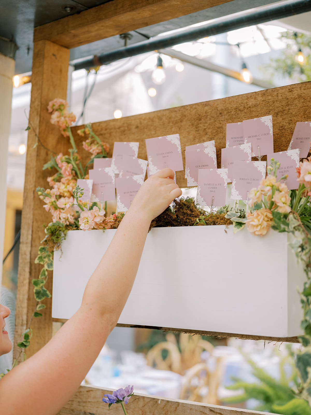
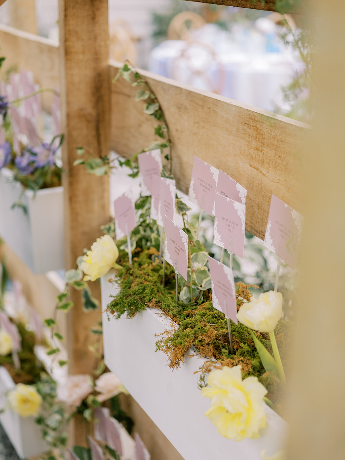
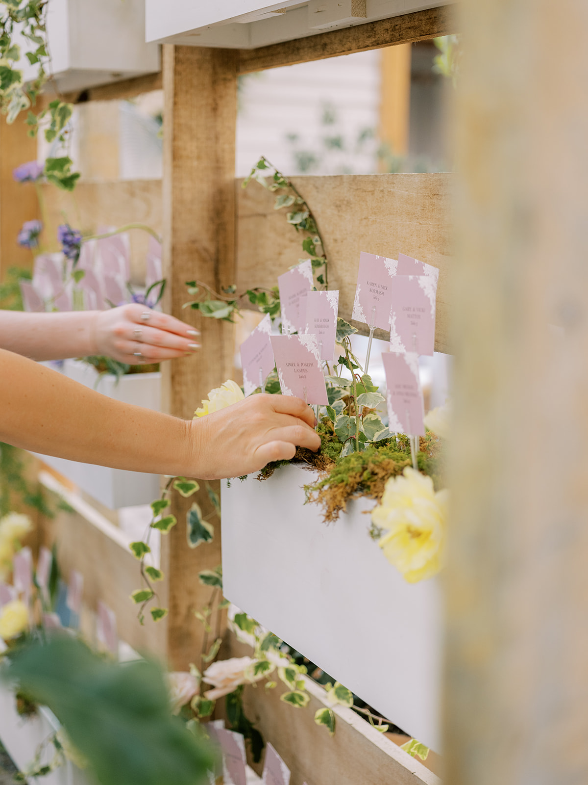
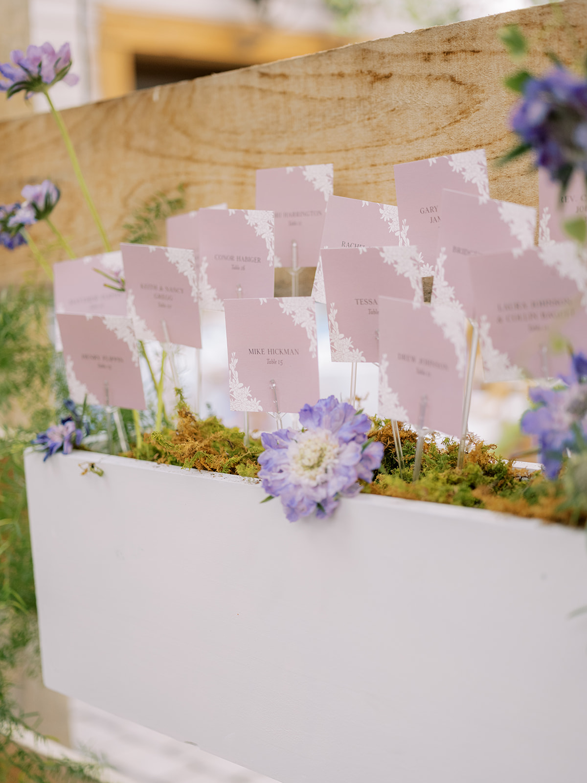
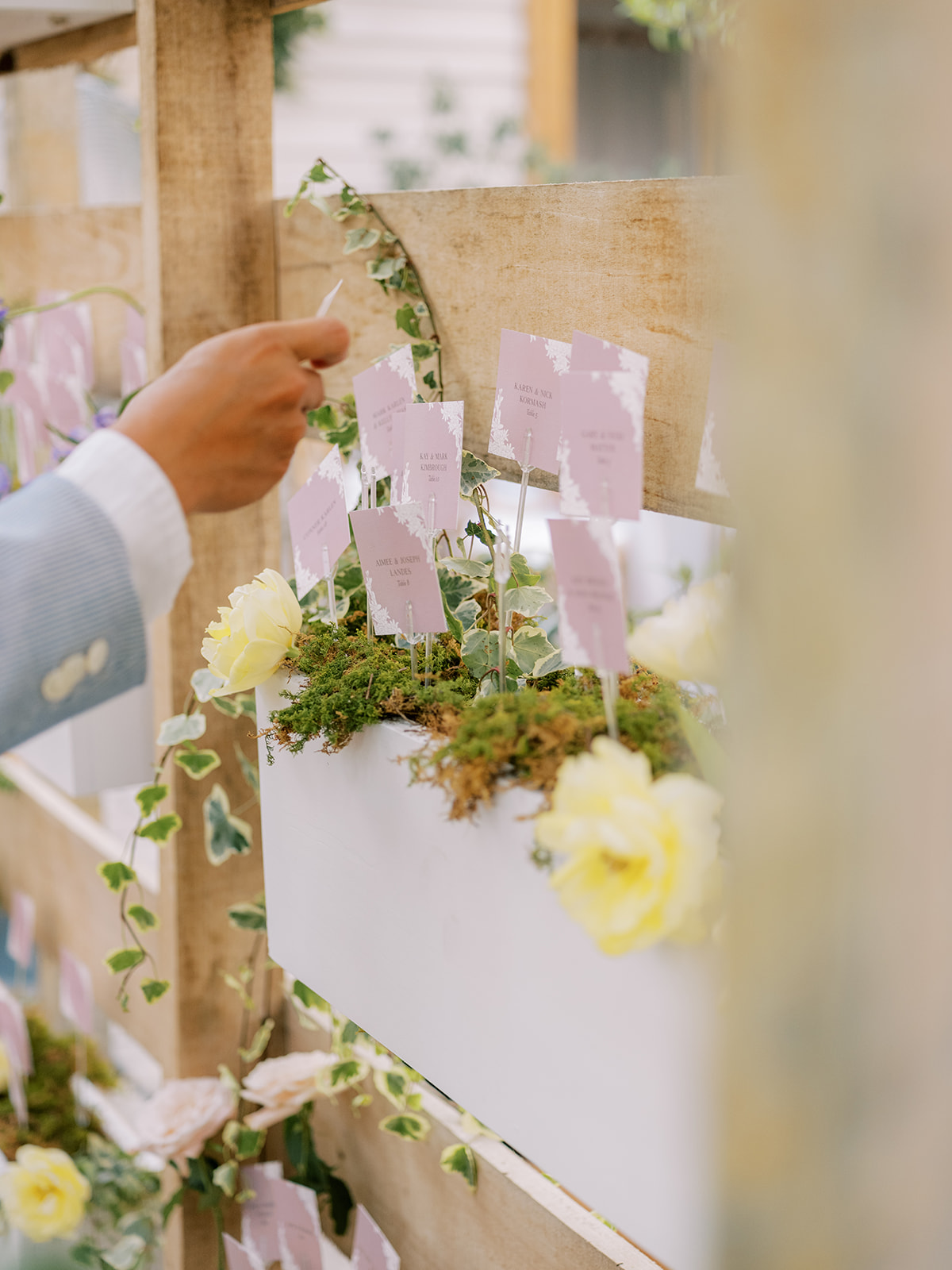
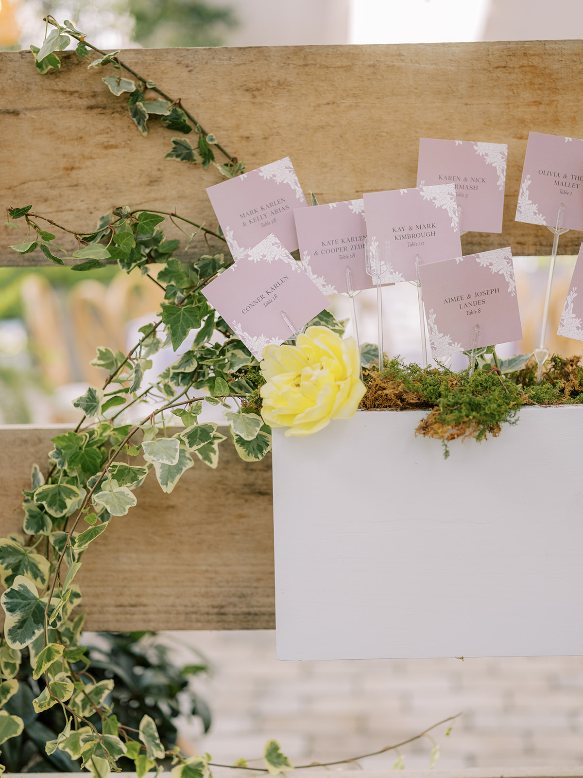
Garden Party Inspired Seating Chart
Alright, now it’s time to talk about this stunning, garden-party inspired seating chart! Guests could find their escort cards in these adorable little wooden garden boxes that were appropriately filled with gorgeous florals and greenery. This is one of the sweetest seating charts I’ve ever taken part in. It was a true showstopper!
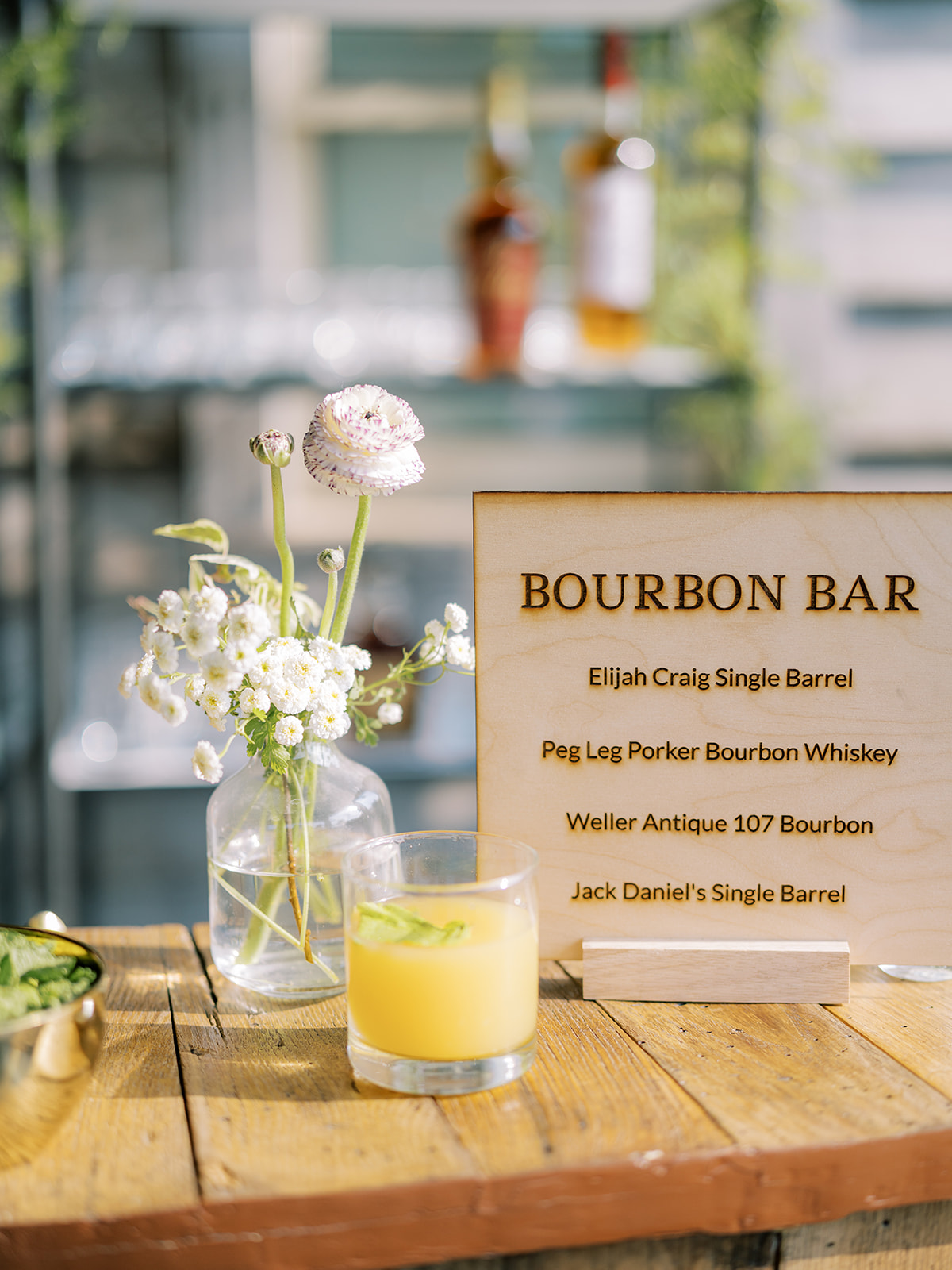
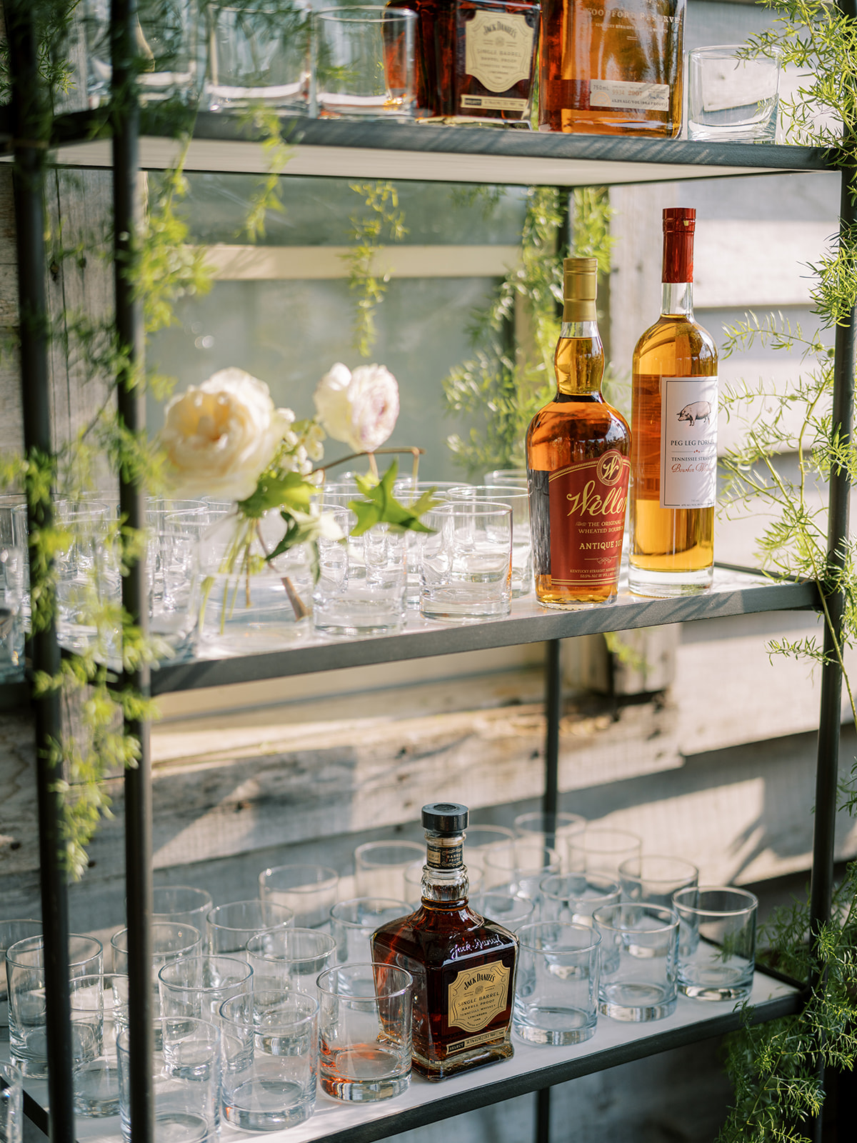
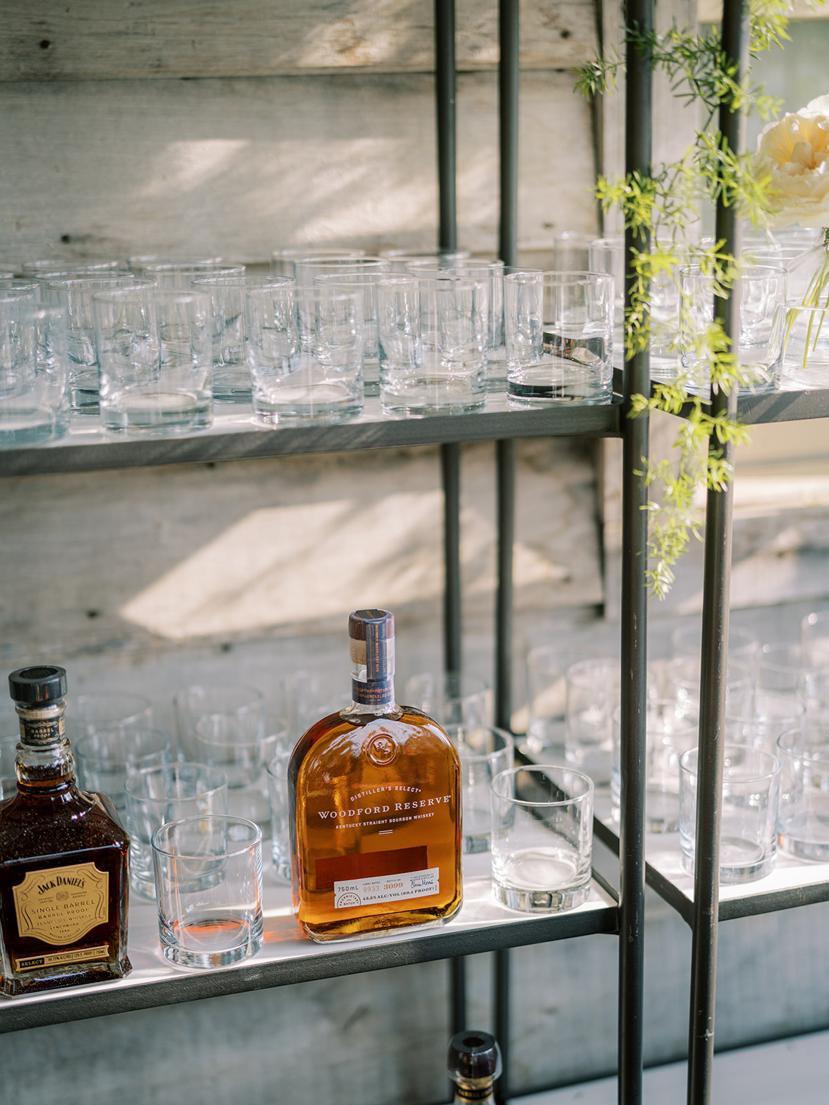
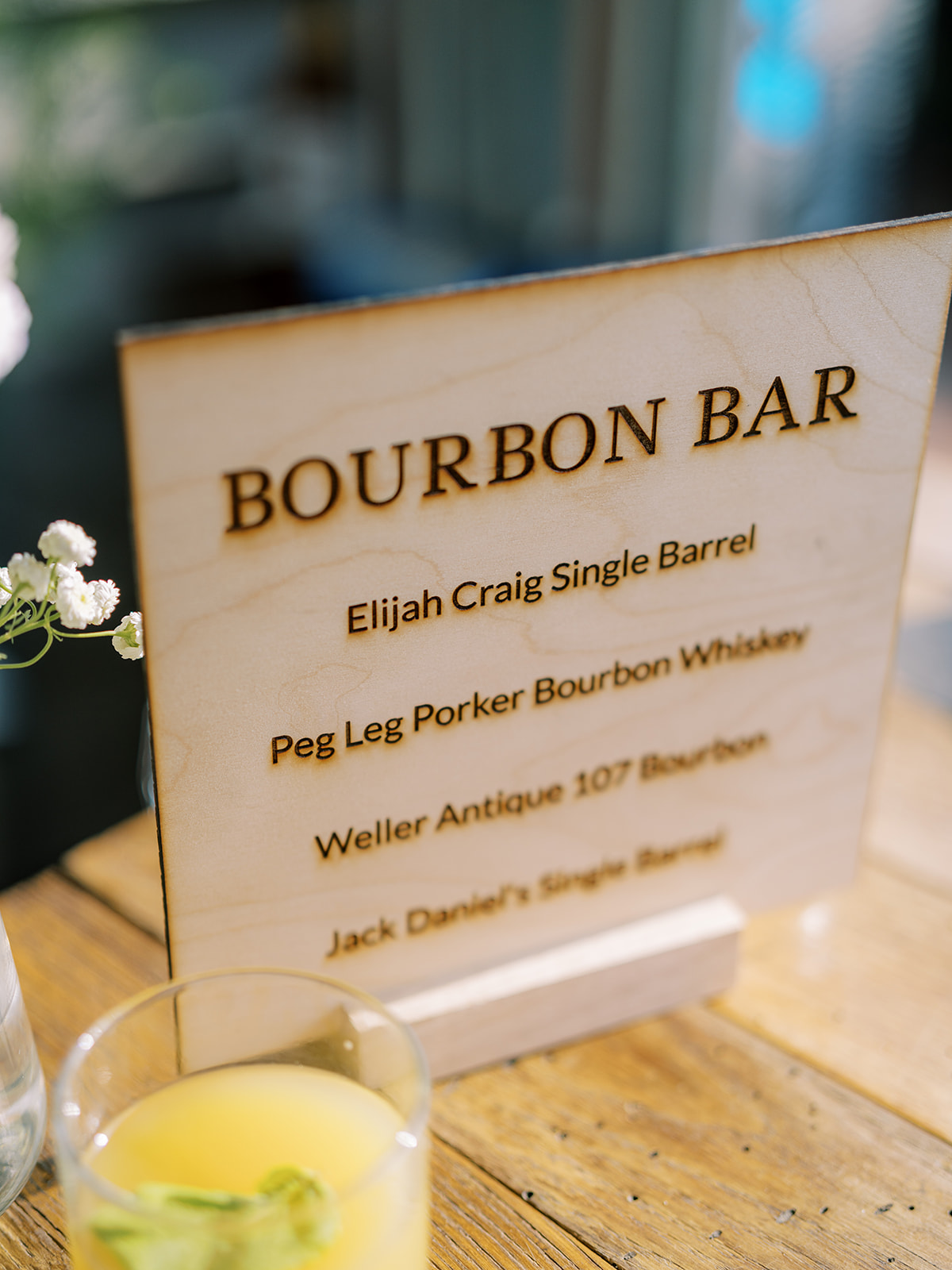
Custom Laser-Engraved Bar Sign
Among all of the delicate designs of the day, Morgan and Tommy still maintained a wonderful balance of boldness, like this one-of-a-kind bourbon bar. We got to create this awesome, laser-engraved, wooden bourbon bar sign, which matched incredibly well with the rustic look they wanted for this setting. I’m really proud of how great this sign turned out. It made for a great conversation piece among guests too!
White Ink also created the custom cocktail sign using the same frosted acrylic as the wedding welcome sign. YES to matching signage!
The table signage, place cards, and escort cards were not left out of this lavender garden-inspired theme. Look at how well all of the finer details fit together! Also, notice more of the tuber rose print throughout. I’m obsessed.
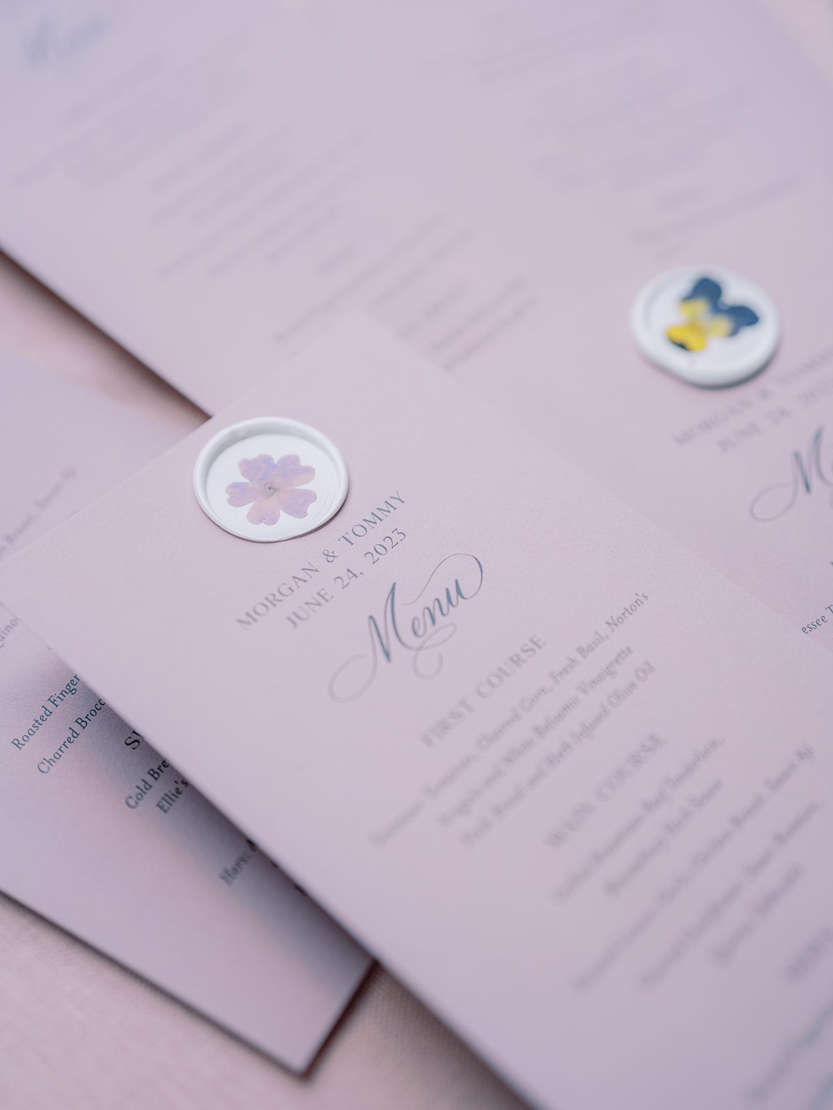
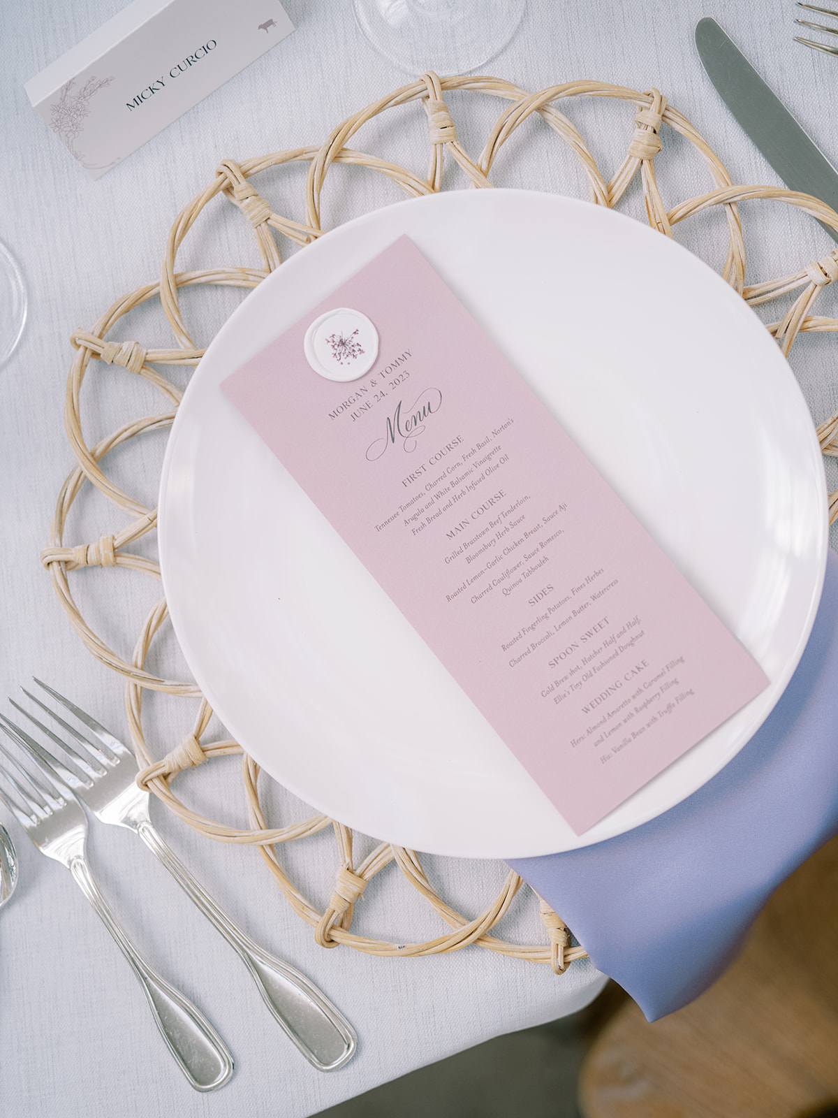
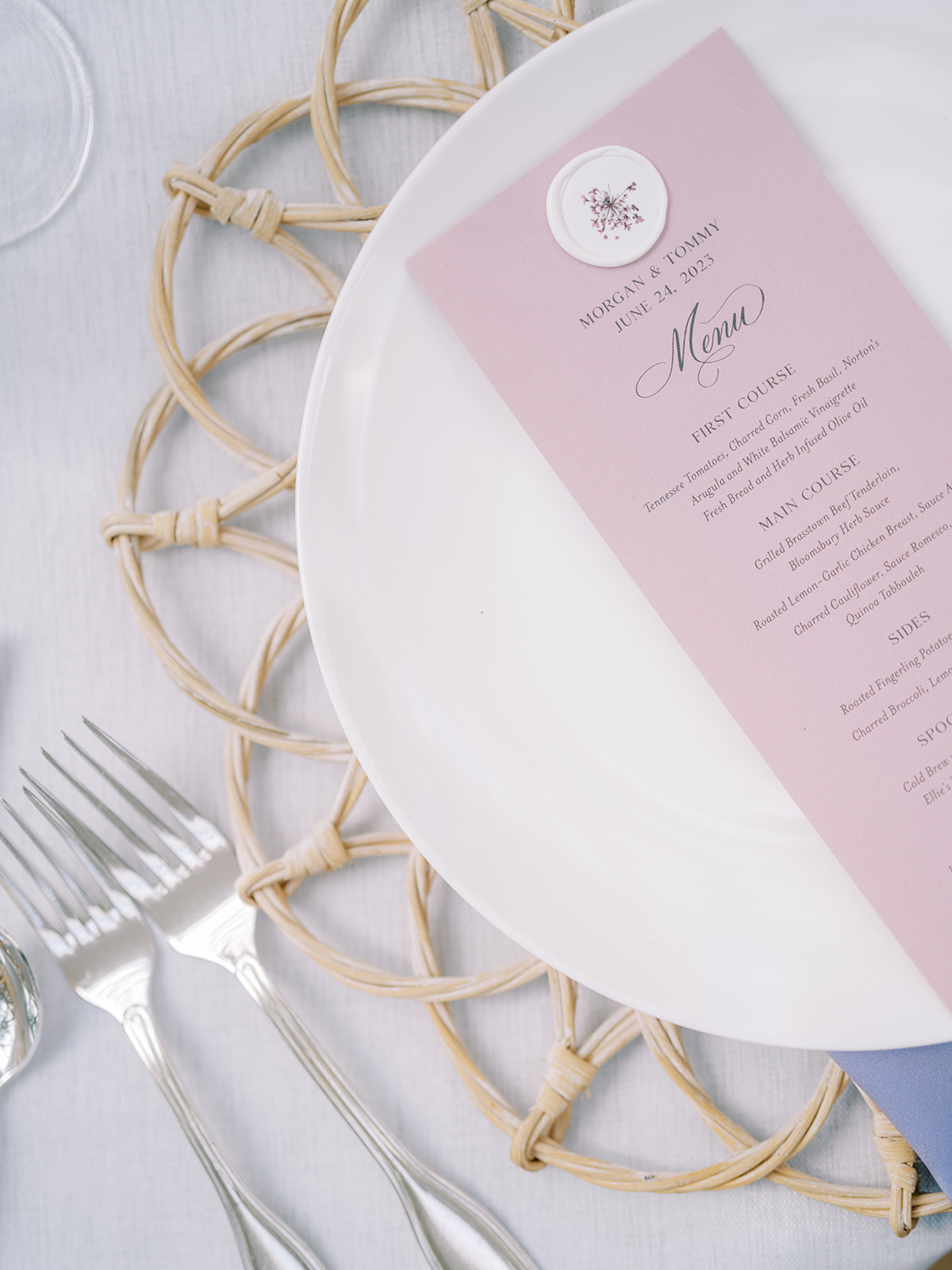
Summer Lavender-Inspired Menus
I loved getting to create these summer-perfect, lavender menus for Morgan and Tommy’s reception. Does the wax seal look familiar? It’s the same custom wax seal with pressed flowers that sealed the guests’ invitation suites! These looked so amazing among the beautiful tablescapes.
I am so proud of the work we were able to accomplish for Morgan and Tommy! This dreamy garden-inspired summer wedding was one for the books and certainly one I will remember for years to come. When it comes to summer wedding inspiration, I guess you could say, this couple has planted the seed! Cheers!
If you’re looking to add custom, thoughtful touches to your wedding or event, we would love to help make your vision a reality. Reach out today to learn more about our full-service design offerings—we can’t wait to create something unforgettable for you!
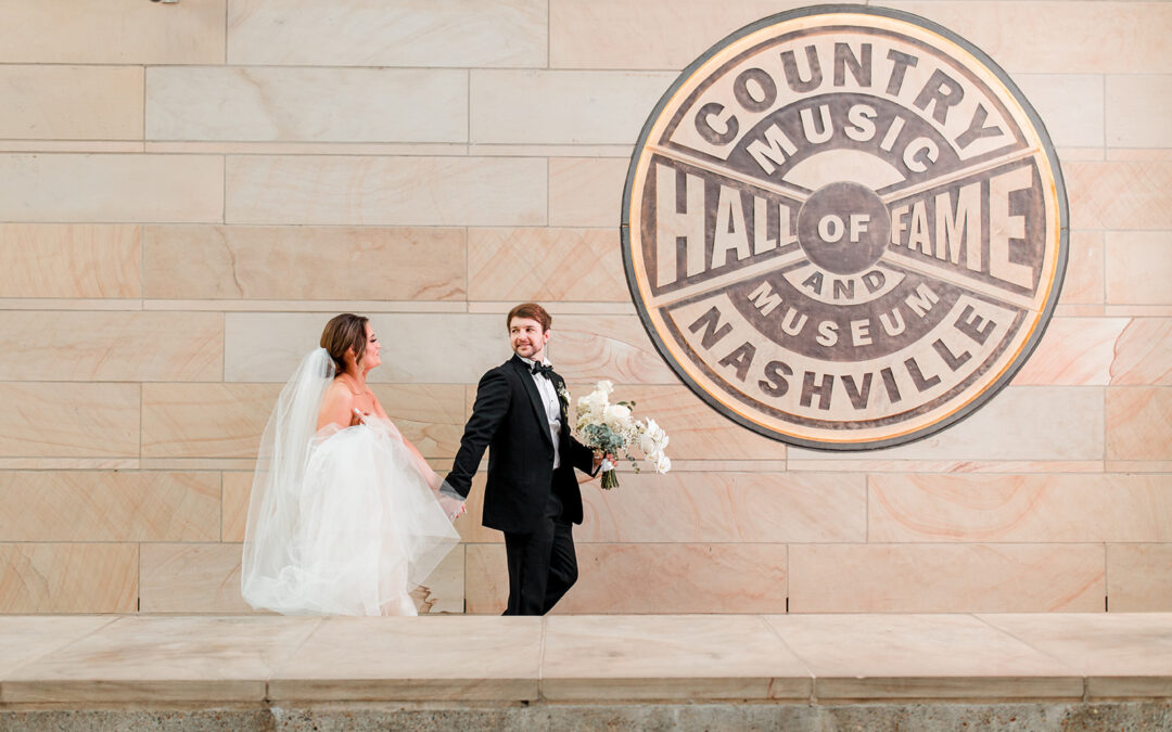
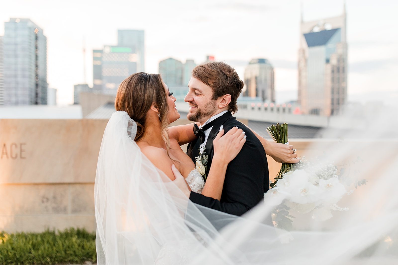
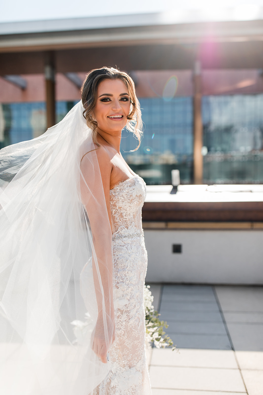
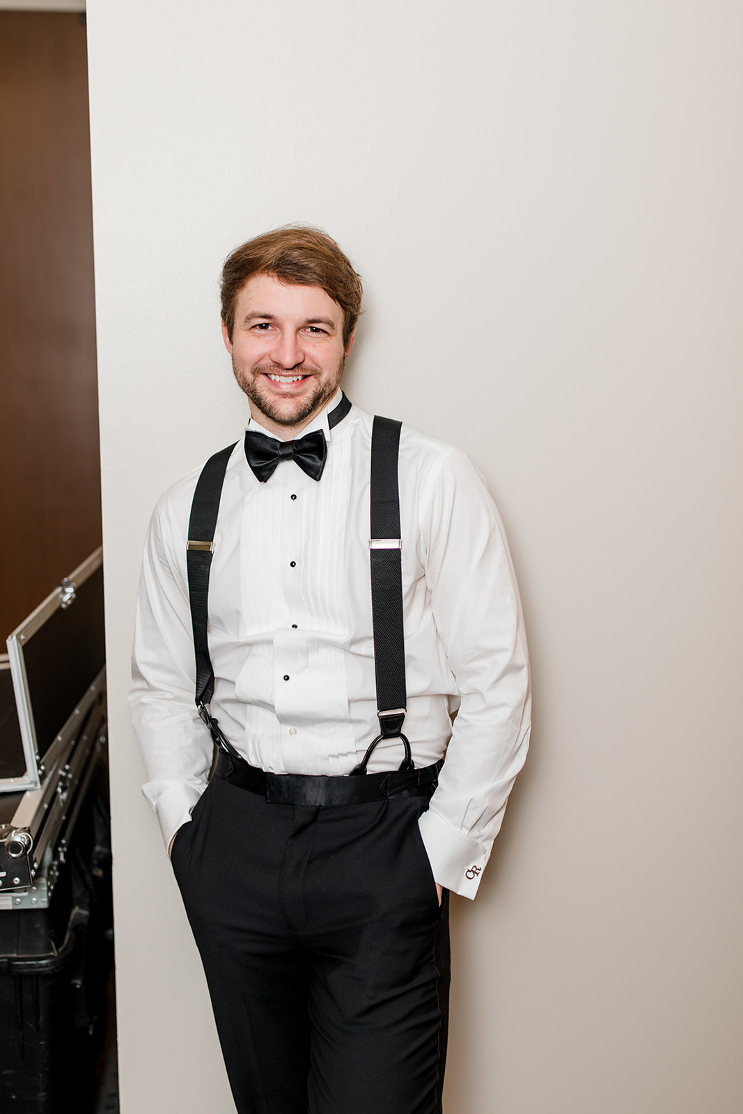
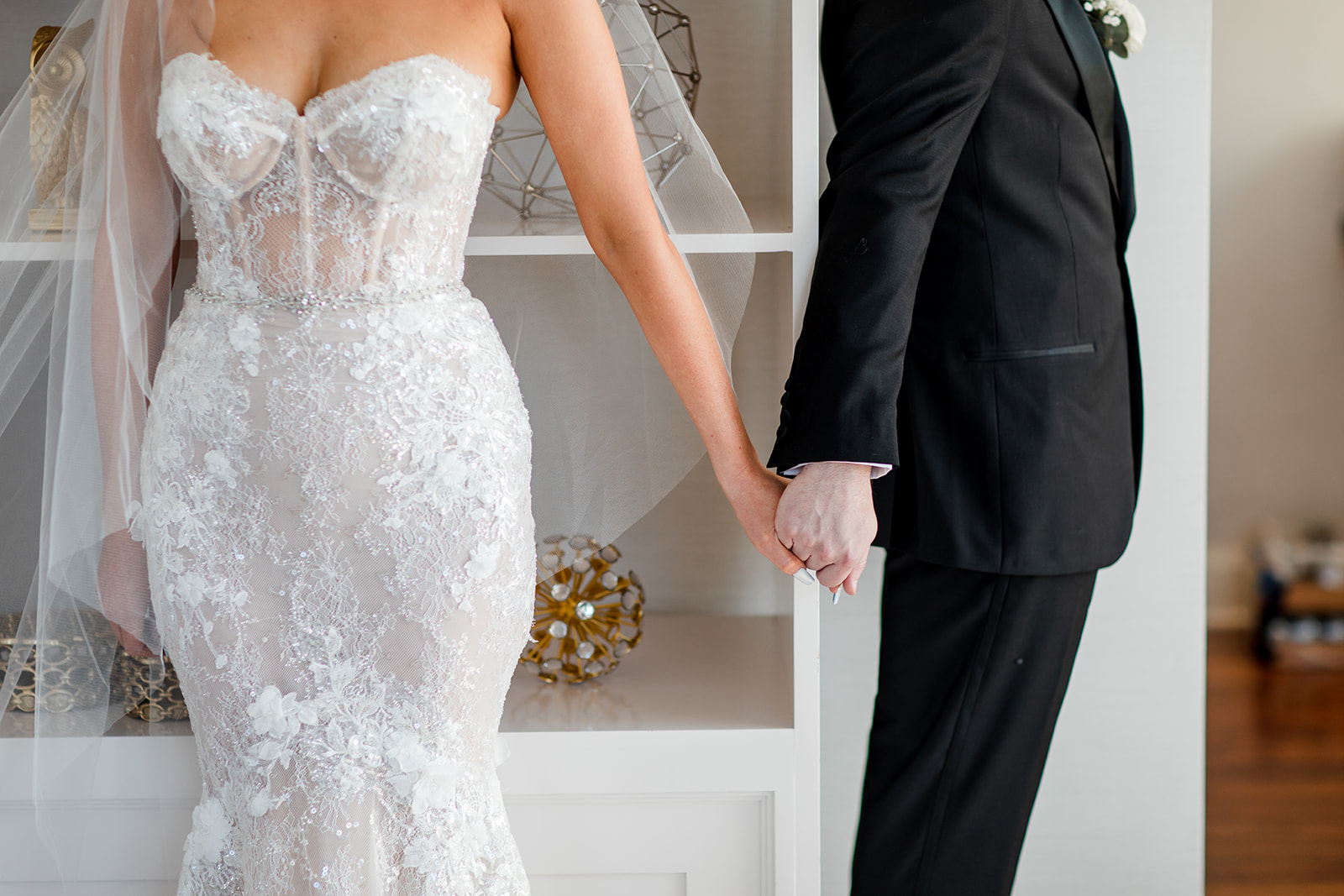
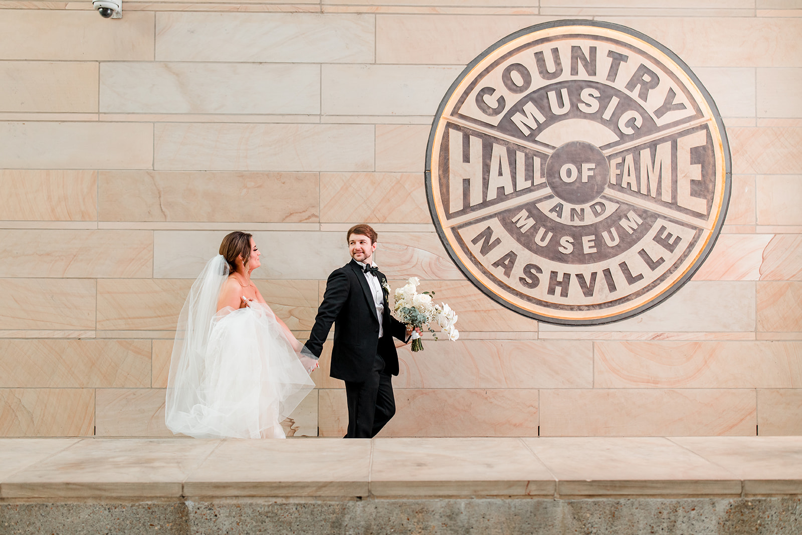
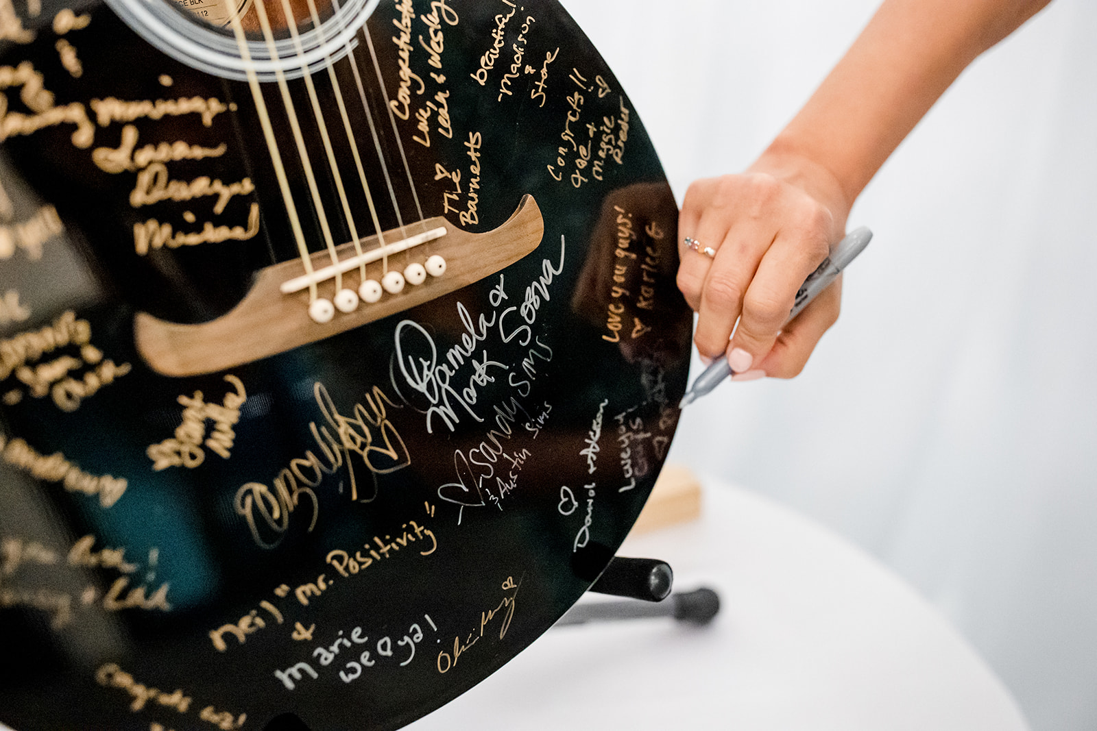
Nashville is widely celebrated as the birthplace of country music. When you’re here, you don’t have to go very far before you start to hear sounds of strumming and people bearing their hearts and souls through the words and the meanings of this thing they call country. If this is your jam, we are excited to bring you downtown with us to see how White Ink couple, Lindsey and Carson, created their downtown Nashville dream wedding surrounded by the iconic collections that live inside of Nashville’s very own Country Music Hall of Fame and Museum. Check out how we played a part in creating details that helped tie this beautiful Nashville wedding together.
It’s easy to tell when a couple takes time and care in selecting the finer details of their wedding. Lindsey and Carson are an exceptional team and were so fun to work with because they took care in choosing what they wanted for their big day.
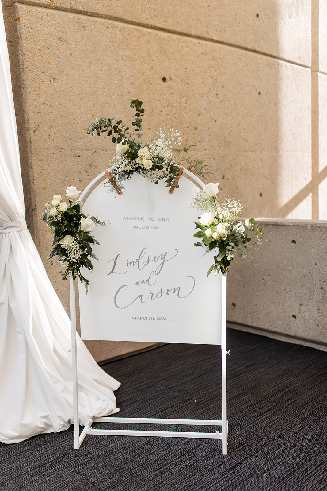
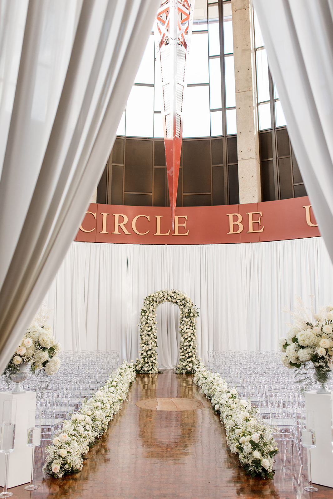
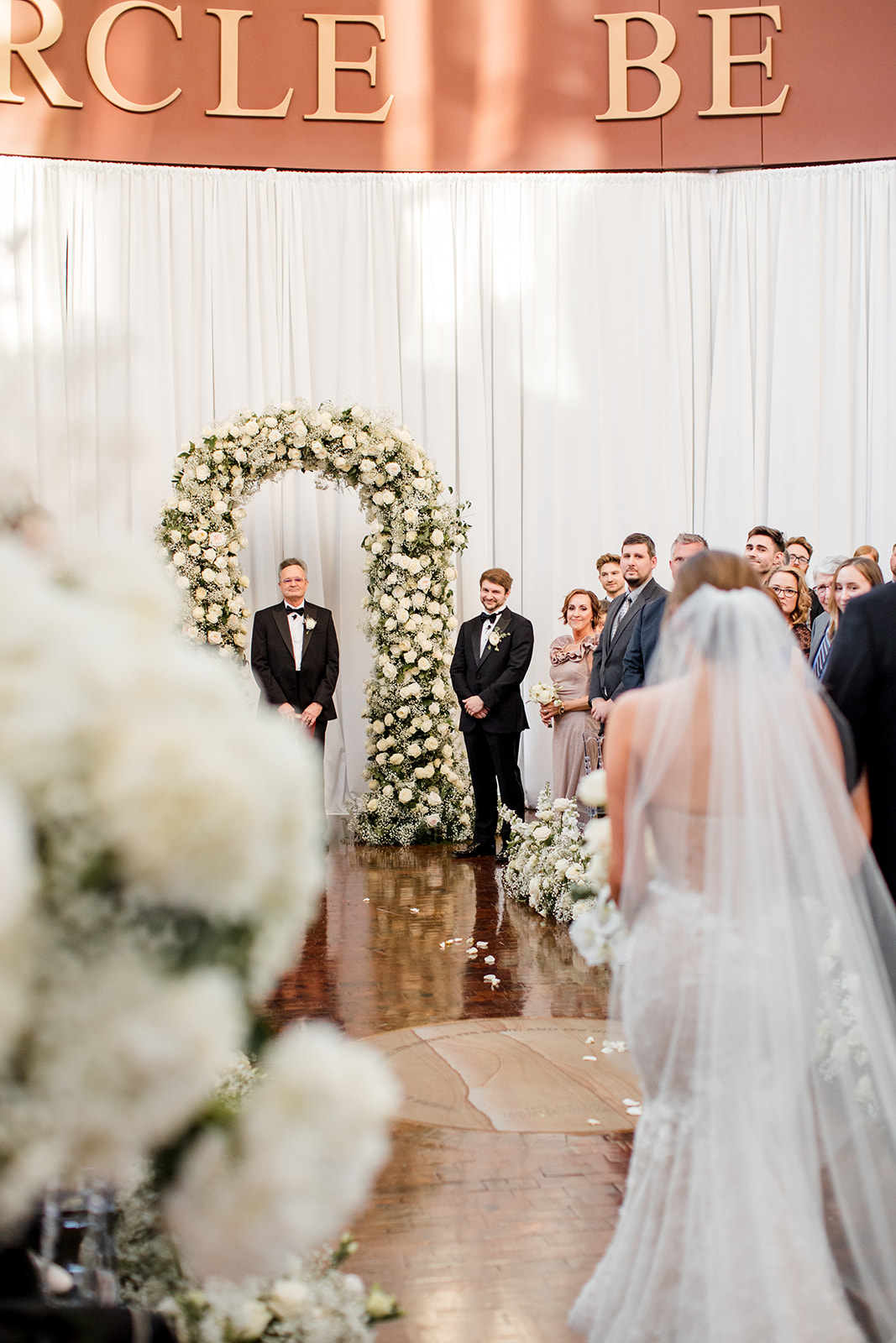
Downtown Nashville Dream Wedding
This arched wedding welcome sign is definitely one of my favorites from our collection. I love the all-white look; it fits into nearly any style and makes the perfect canvas for displaying florals or really any other designing element that you would want to tie together throughout the day.
The beautiful floral designs that Lindsey and Carson chose were laced throughout the ceremony and reception, including the wedding welcome sign.
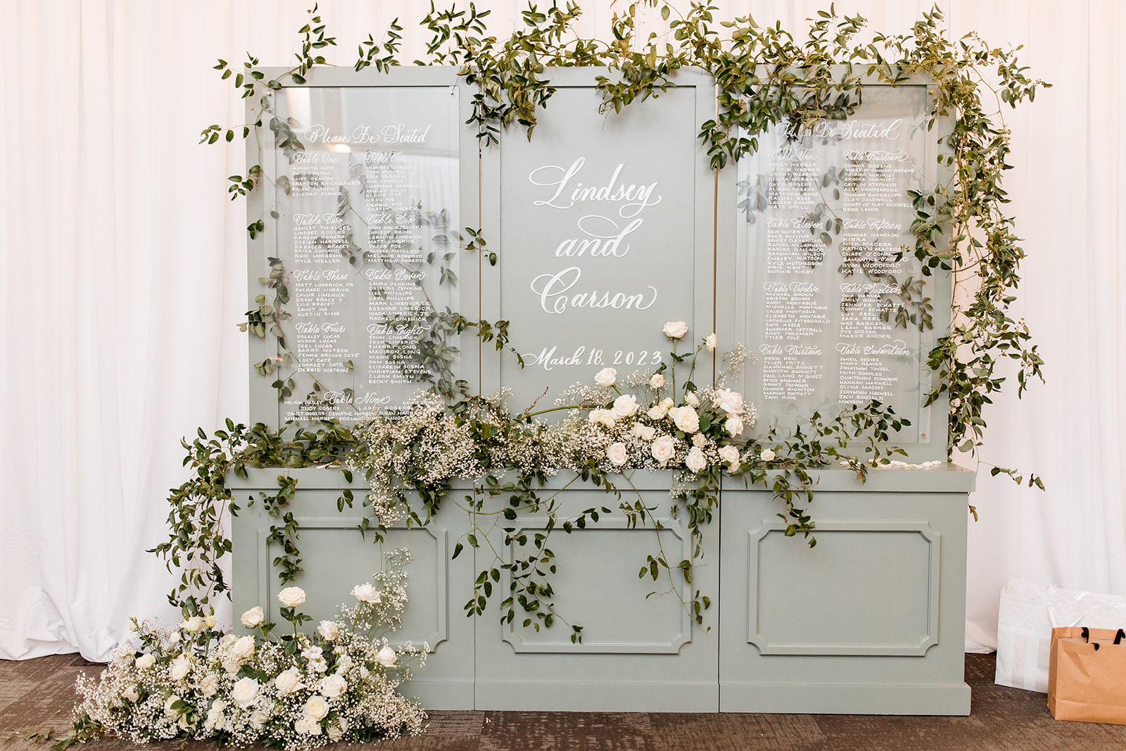
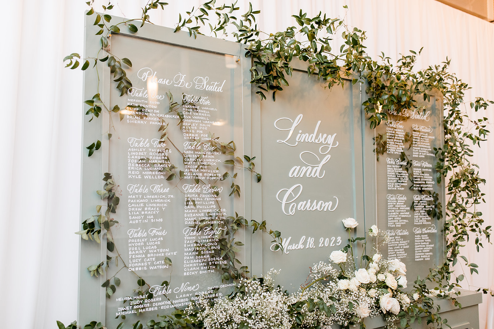
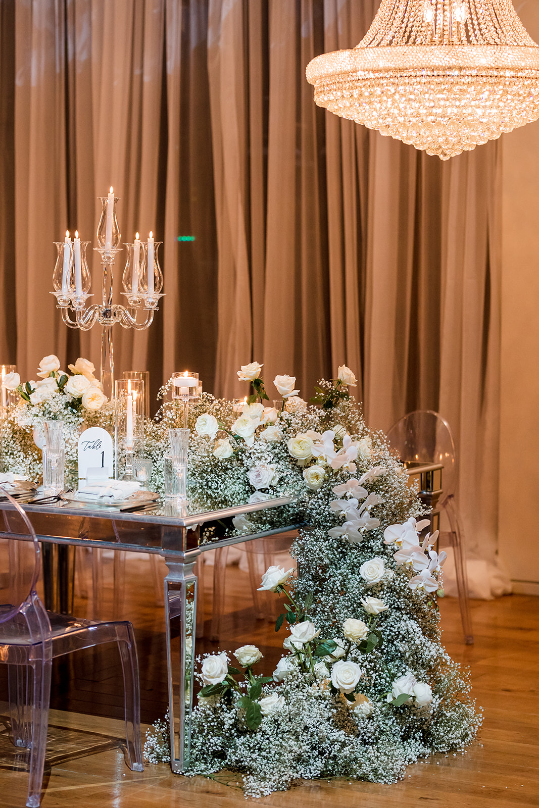
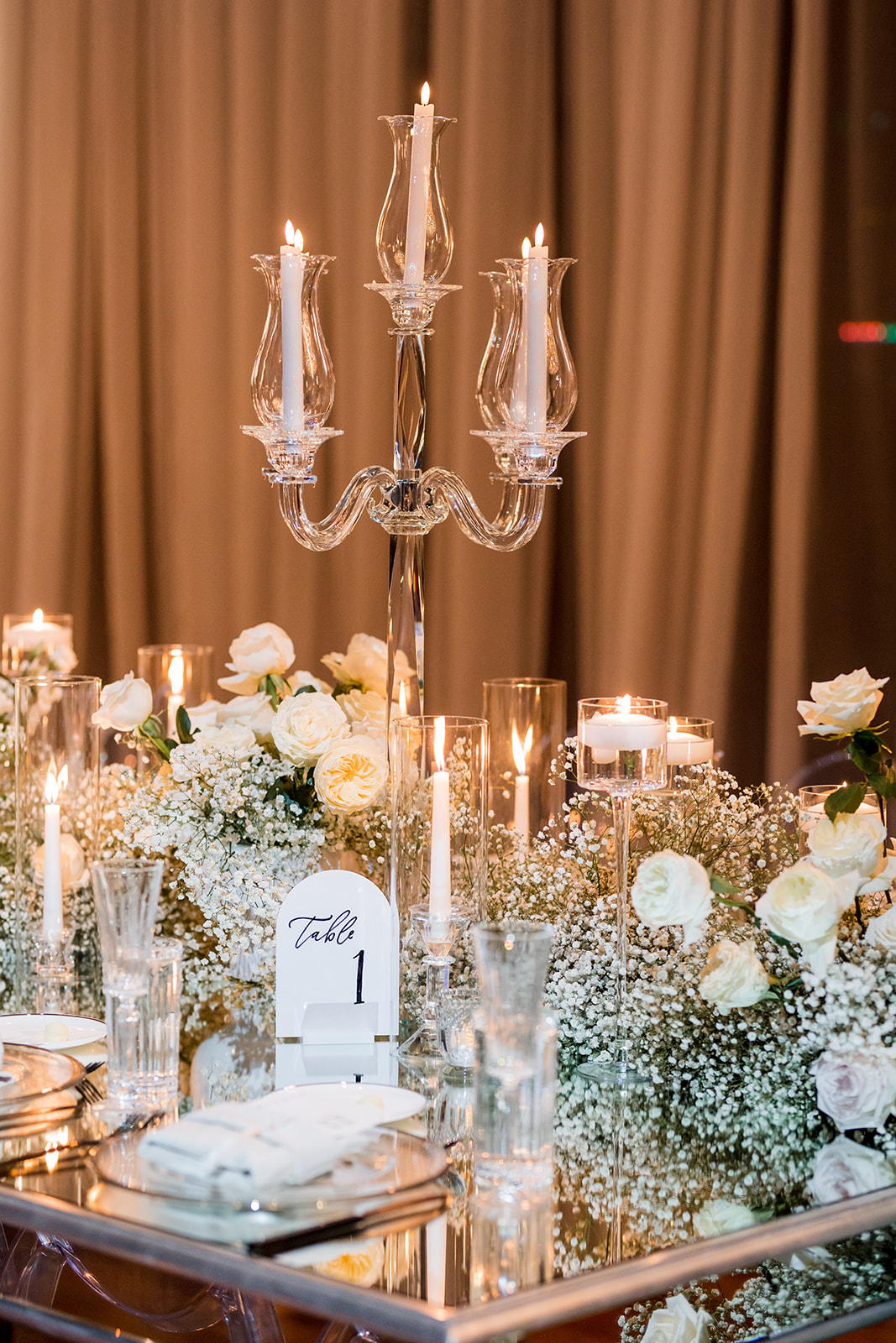
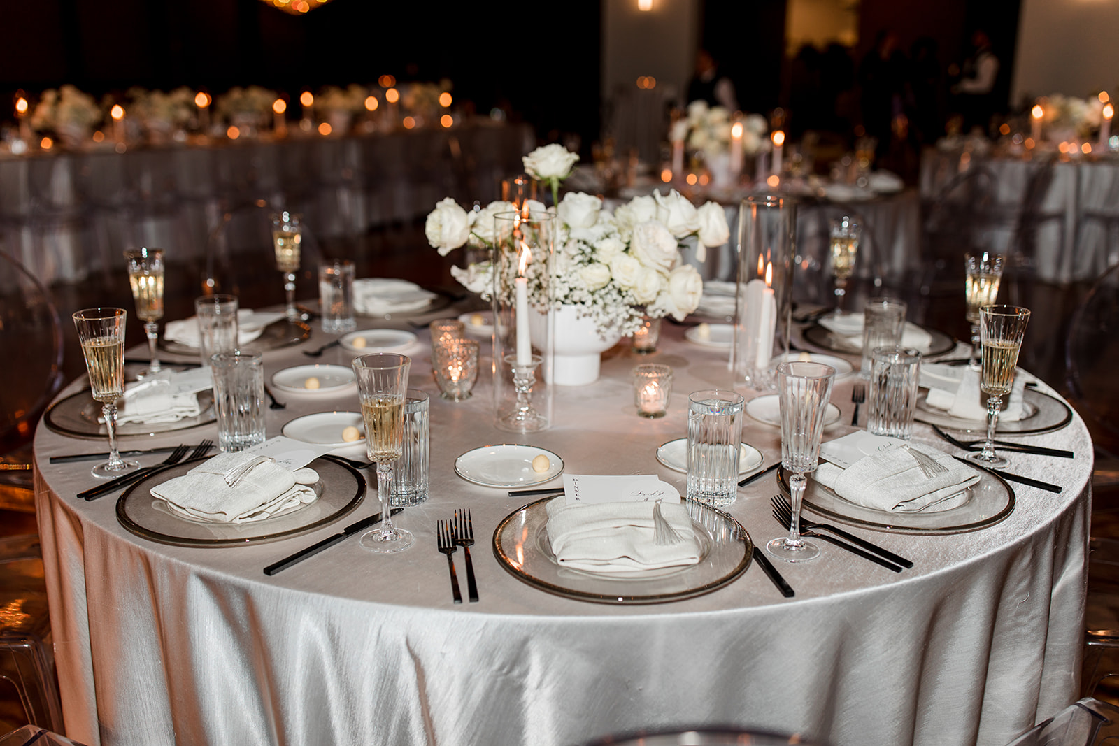
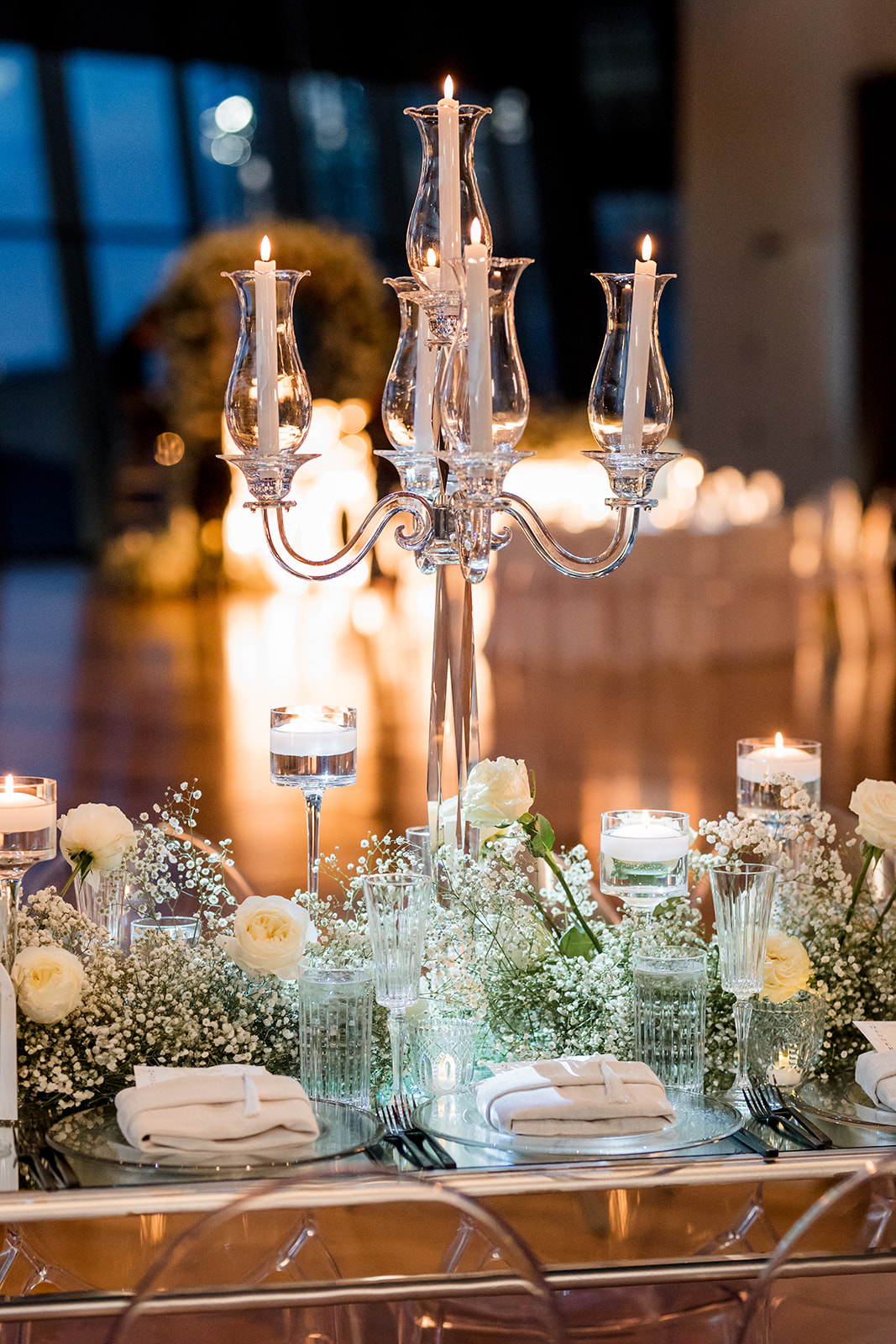
Reception Details
It’s fun when we get to focus our attention on the reception too! I can’t begin to tell you guys how cool it is to be a part of so many amazing seating chart designs and ideas.
This seating chart just makes me smile – I don’t know how else to put it. I mean, the muted, soft gray with florals cascading all around. I really love how delicate the white ink looks against this color and how the greenery pops from behind the acrylic of the seating signage. Perfectly magical.
Our couple chose our white arched table number signs in black ink. Not only did these little beauties match the shape and color of the arched wedding welcome sign, but they also blended perfectly into the stunning tablescapes!
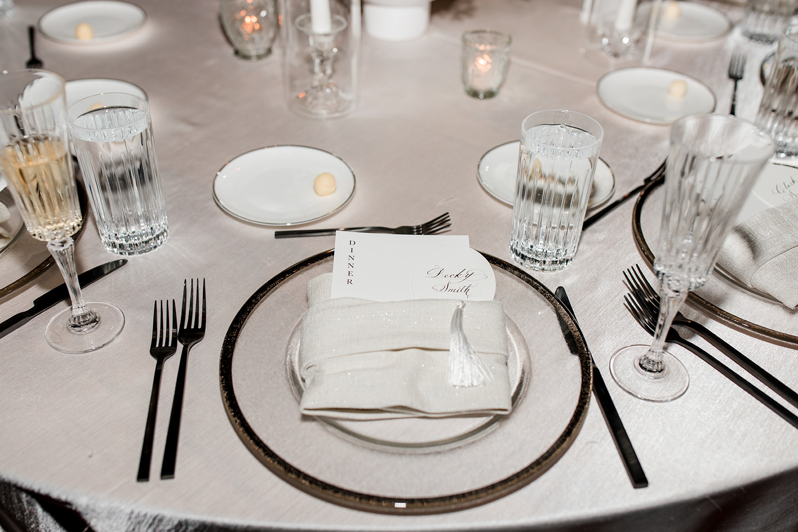
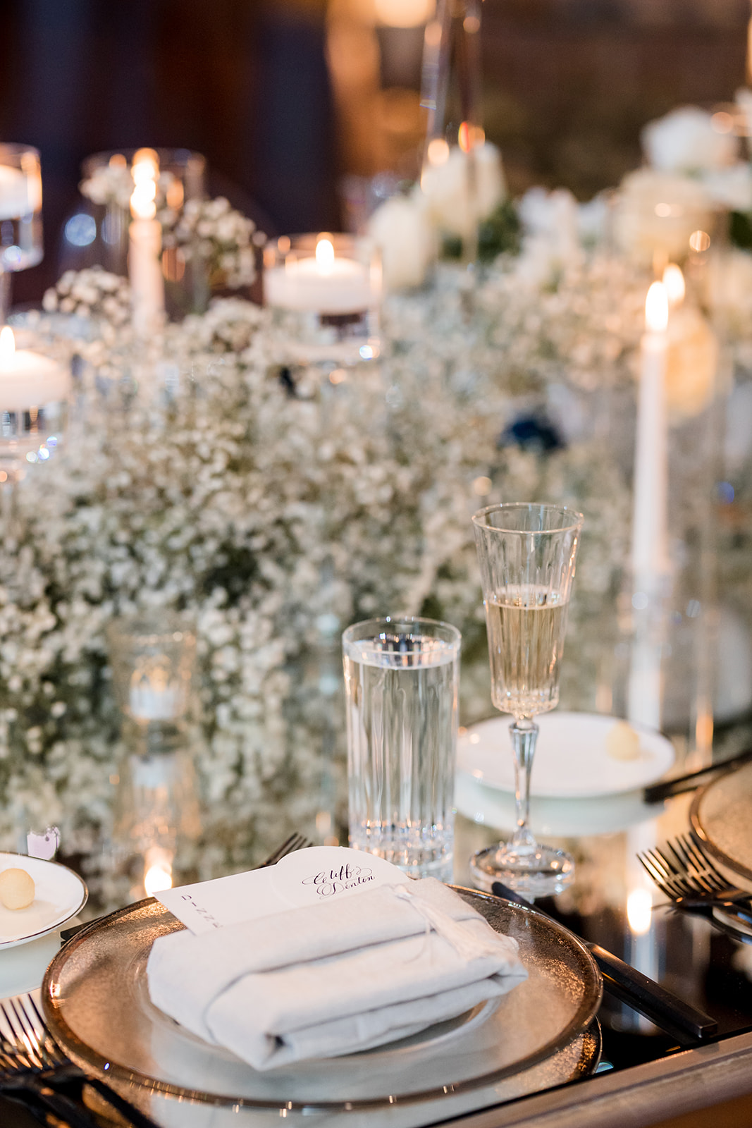
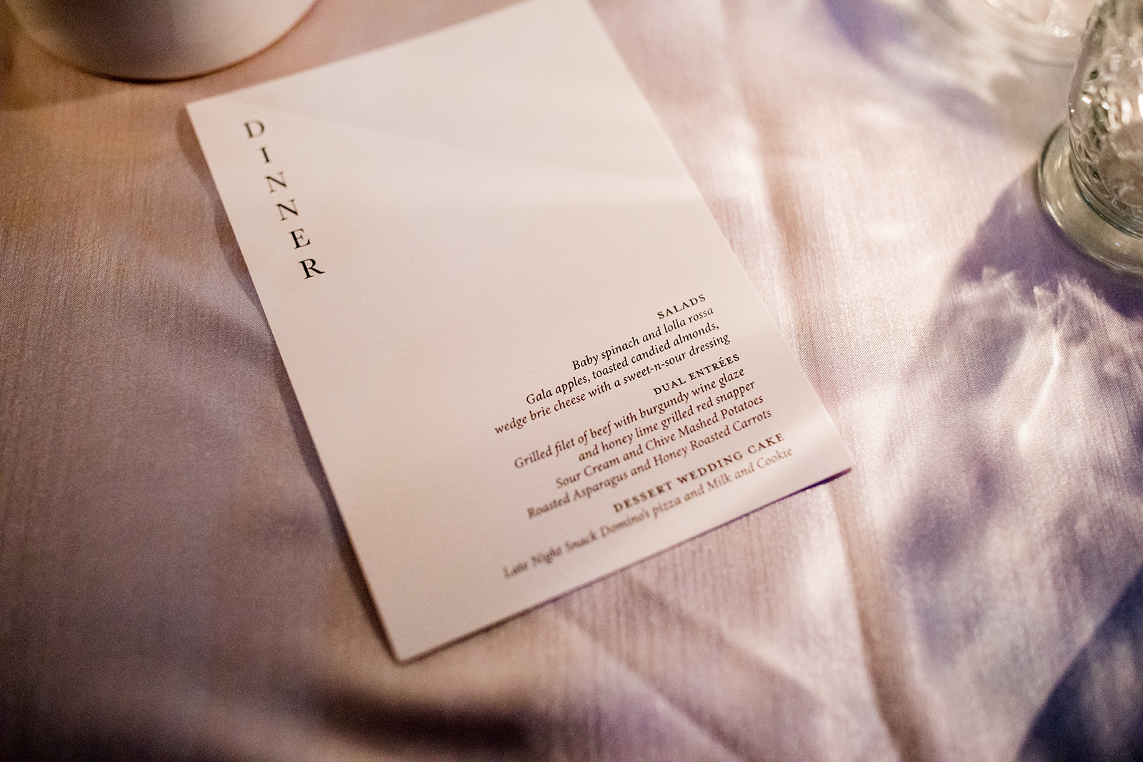
Custom Menu + Place Cards
White Ink also designed Lindsey and Carson’s custom menus for the reception that were perfectly tucked into the napkins at the formal place settings. We also created the most adorable little oval place cards with tassels that went alongside the custom menus. I love when details are both adorable and functional!
The word “Dinner” peeks out from the napkin leaving this custom menu sleek and inviting.
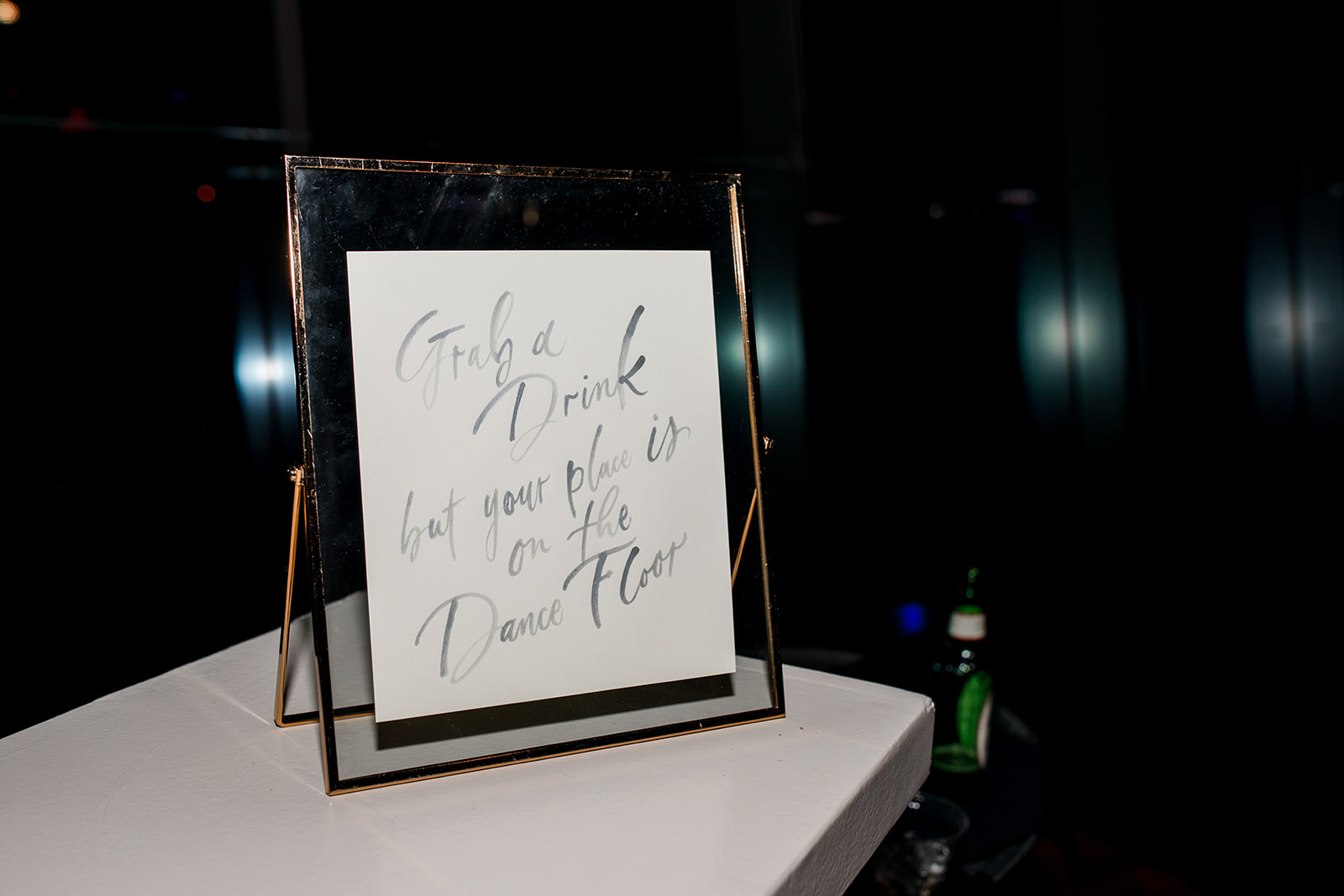
“Grab a Drink but your place is on the Dance Floor,” is the kind of guidance I need to encourage me to let my hair down and hit the dance floor. I love added humor into signage like this, very fun and highly appropriate.
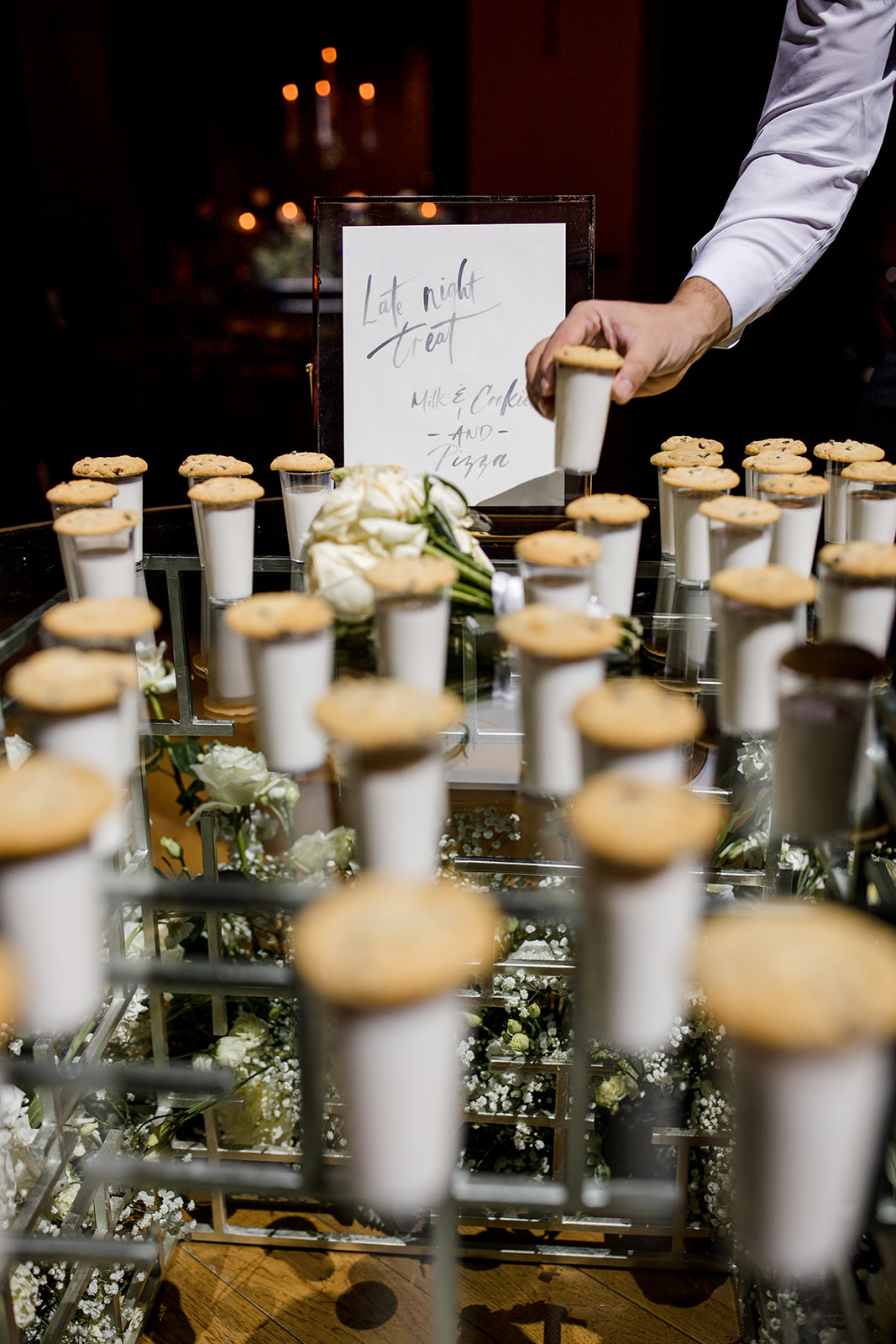
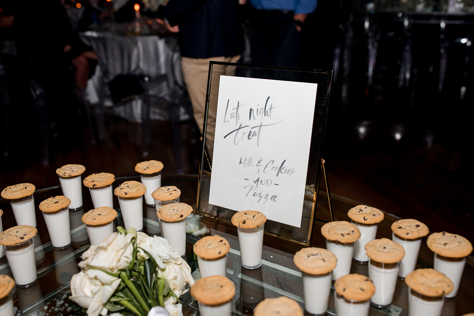
Let’s be honest, late night snacks are the real MVPs of wedding receptions and we all know it! I’m so happy we were able to make a sign for these little lifesavers.
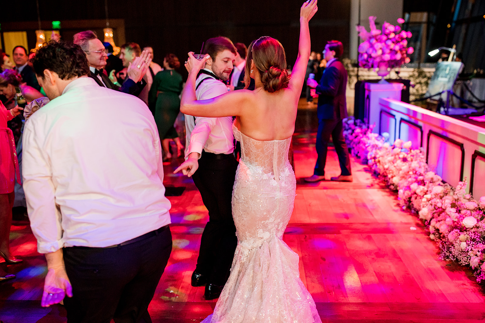
When it comes to Nashville, you may be here for the country, or you may be here for a good time. Lindsey and Carson made sure to have both and that’s what keeps us always coming back for more. To this amazing couple, may there be more just like you with nights just like this. Cheers, ya’ll!
If you’re looking to add custom, thoughtful touches to your wedding or event, we would love to help make your vision a reality. Reach out today to learn more about our full-service design offerings—we can’t wait to create something unforgettable for you!