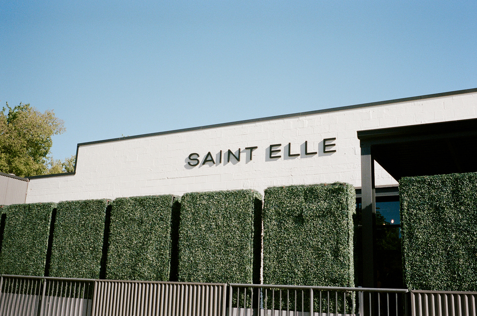
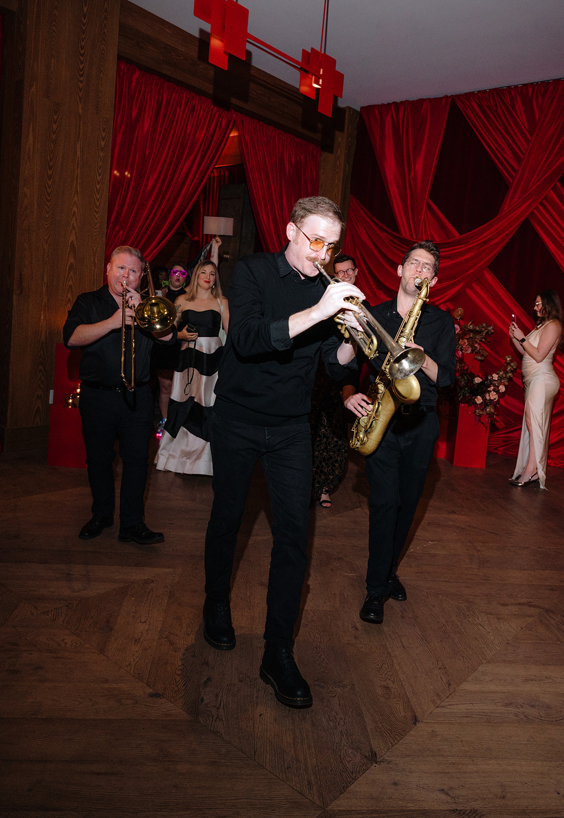
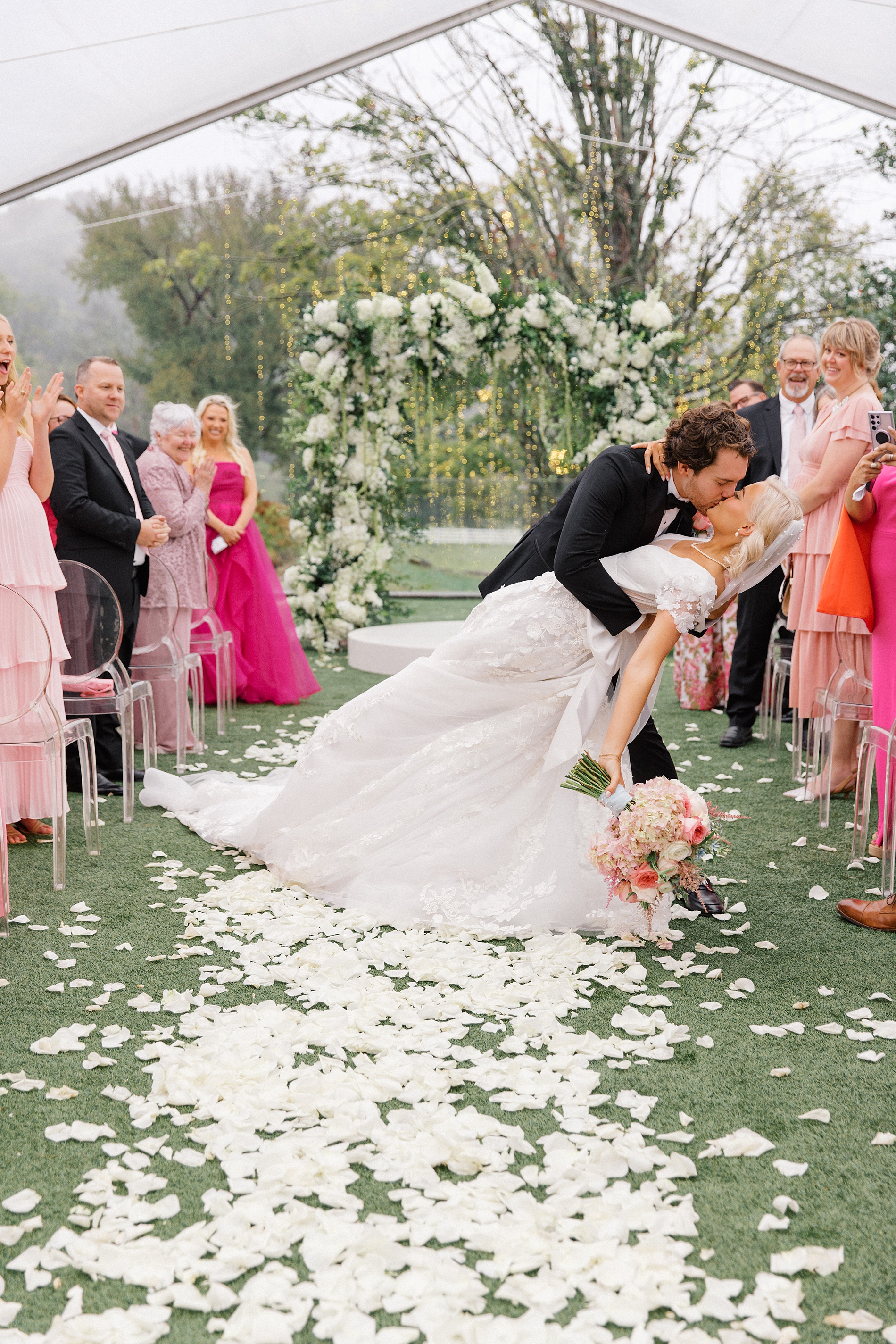
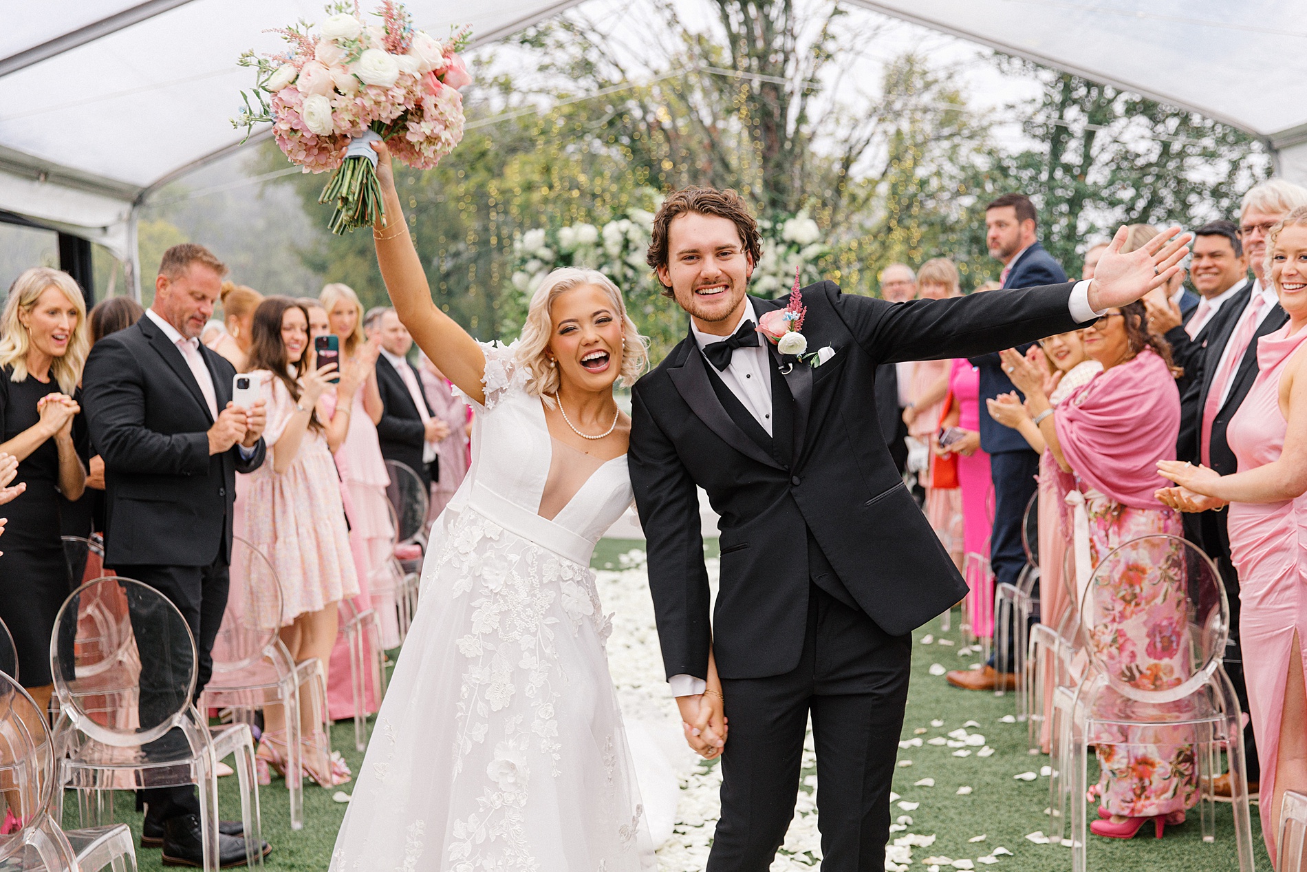
At White Ink Calligraphy, we love when couples and planners trust us to have fun with design! This Saint Elle wedding in Nashville was no exception! The incredible Sarah Oakland worked her magic, and gave us the creative freedom to incorporate fun, bold colors. In addition to the bright colors, the personal touches and mix of trendy and traditional wedding details made this wedding truly one-of-a-kind.
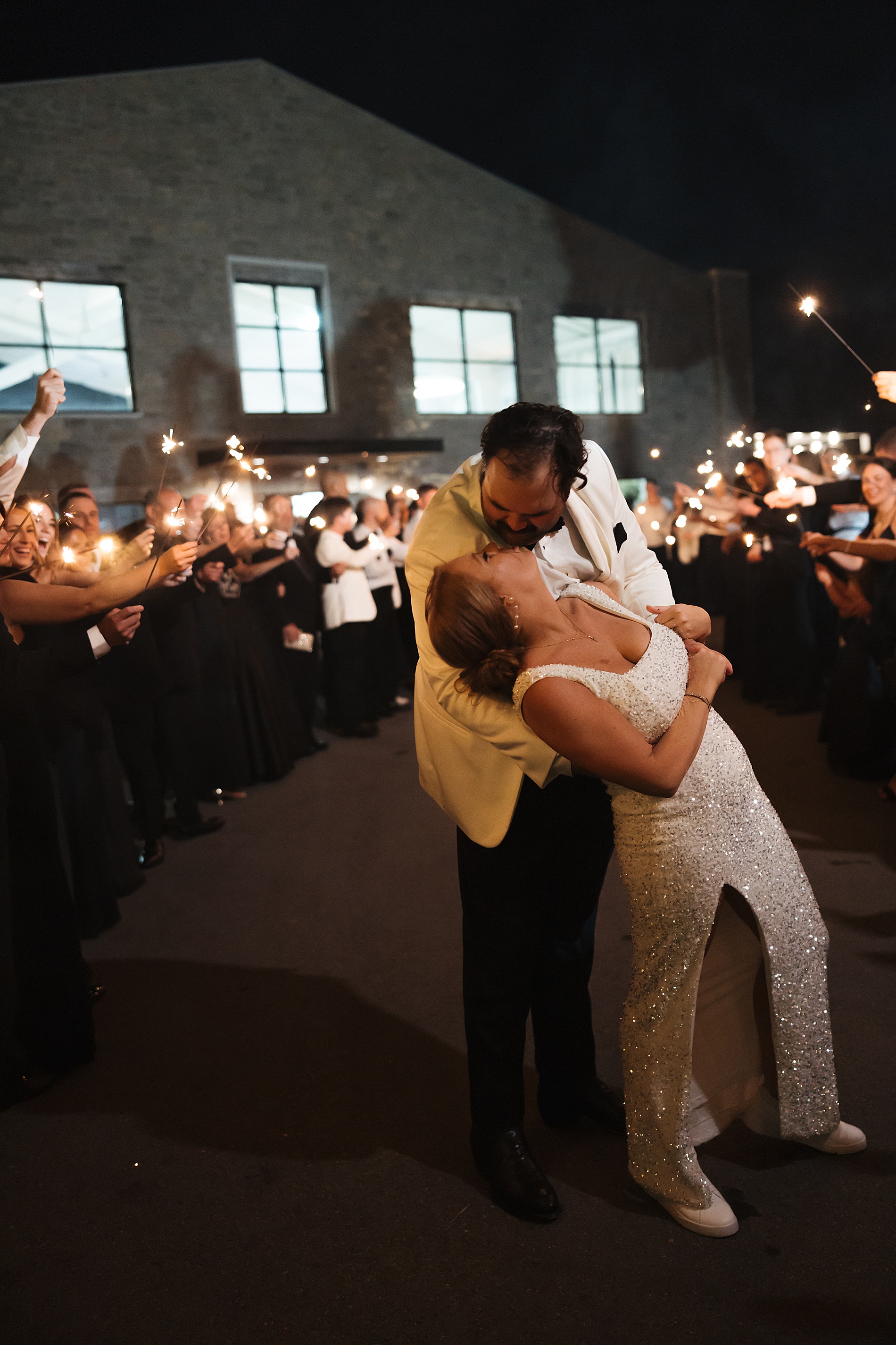
As we were setting up in the morning, we overheard the father of the bride introduce himself to a vendor by saying, “I’m the father of the bride—last name Swift, like Taylor Swift, but not related.” It was such a cute and memorable moment that perfectly captured the joy and excitement of the day. The bride and groom were brimming with happiness, as were all the guests who shared this special day with them.
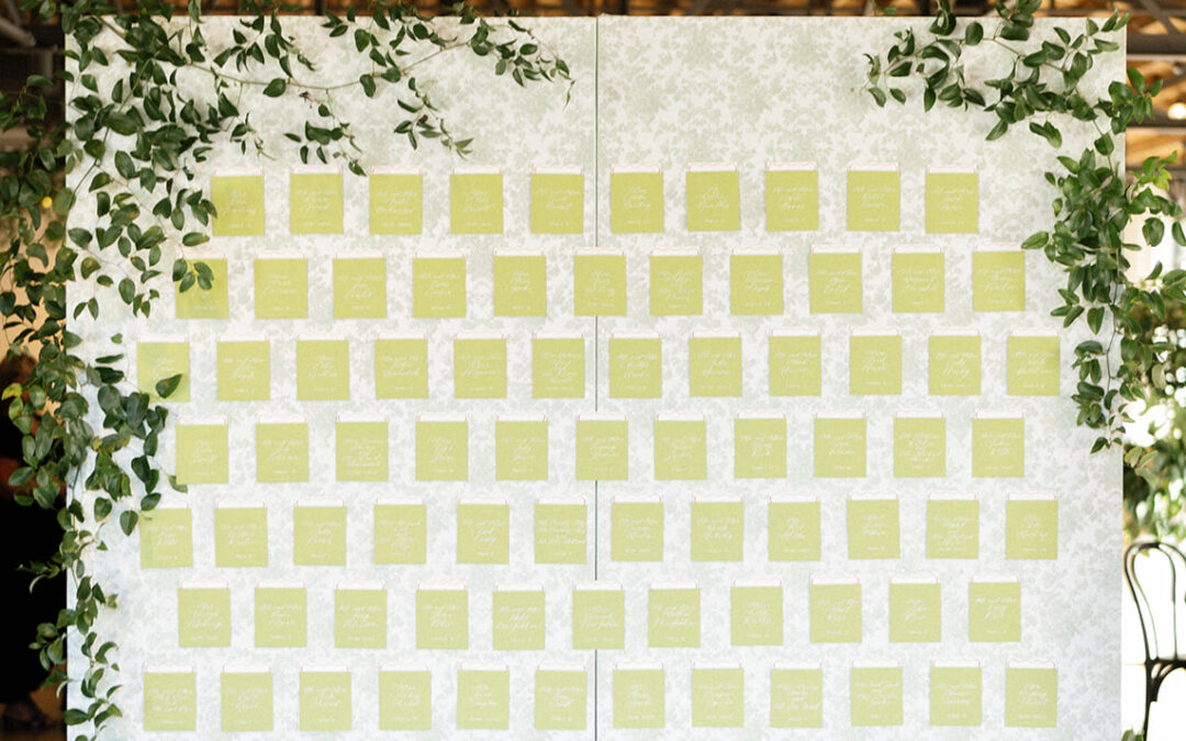
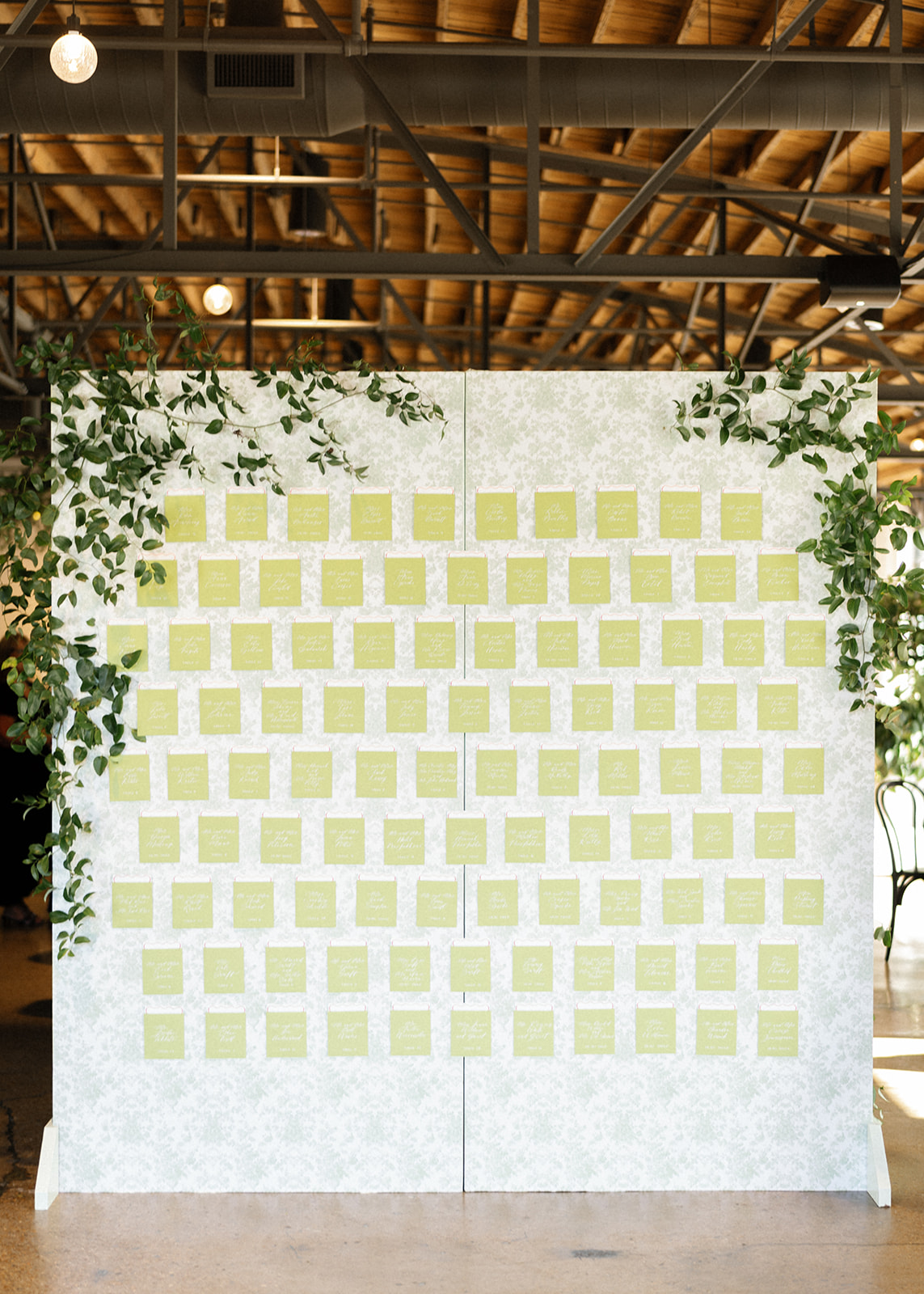
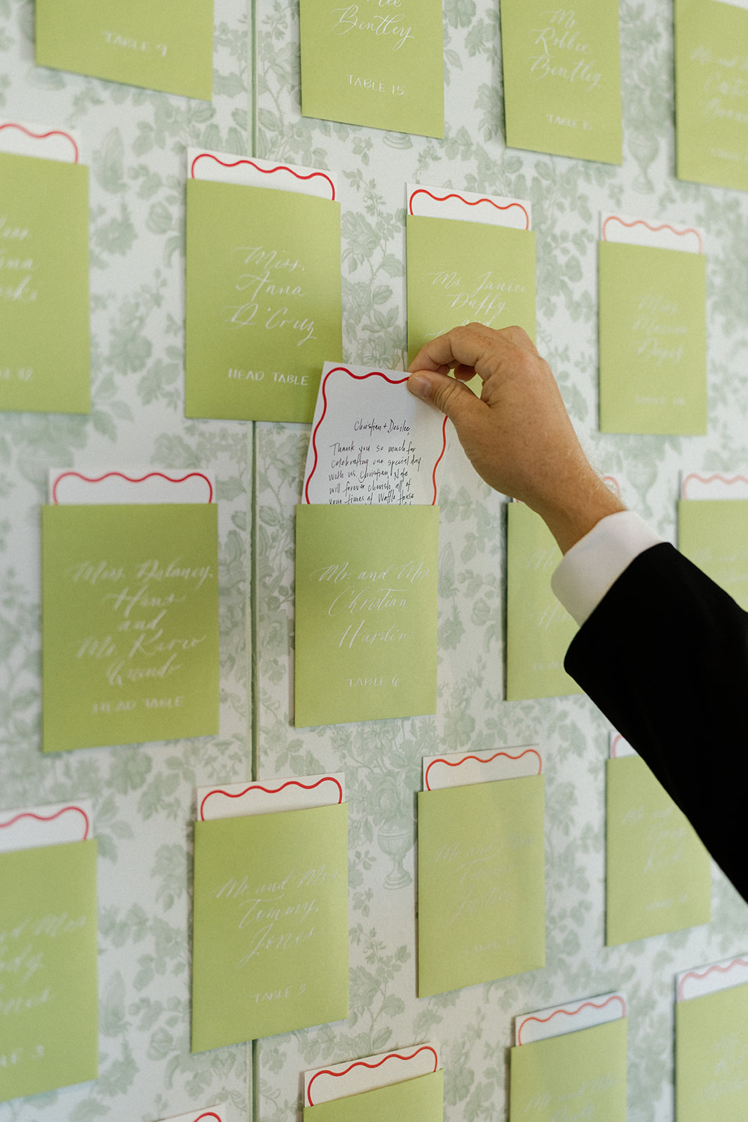
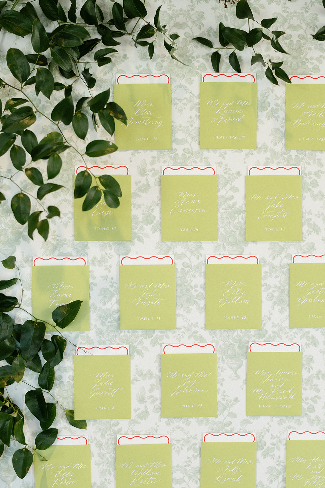
A Vibrant Seating Chart with a Personal Touch
One of our favorite elements of this wedding was the seating chart wall, which featured envelopes in a striking “Sour Apple” green shade. The bright pop of color added energy to the event and drew people in as they walked by. It was also the perfect complement to the varying shades of green woven throughout the wedding design.
However, there was one personal touch that made this seating chart extra special. Inside each green envelope, where guests could find their table number, there was also a handwritten note from the bride and groom. This incredibly thoughtful detail left a lasting impression and made every attendee feel extra appreciated. These are the details that make a huge impact on your day, and when they are seamlessly incorporated with your overall design like this, it is pure perfection.
Mixing Modern Trends with Timeless Elegance
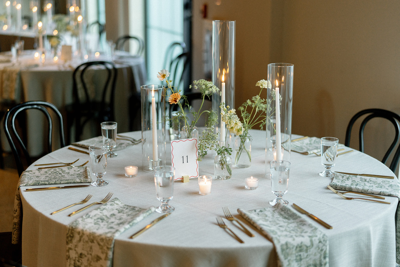
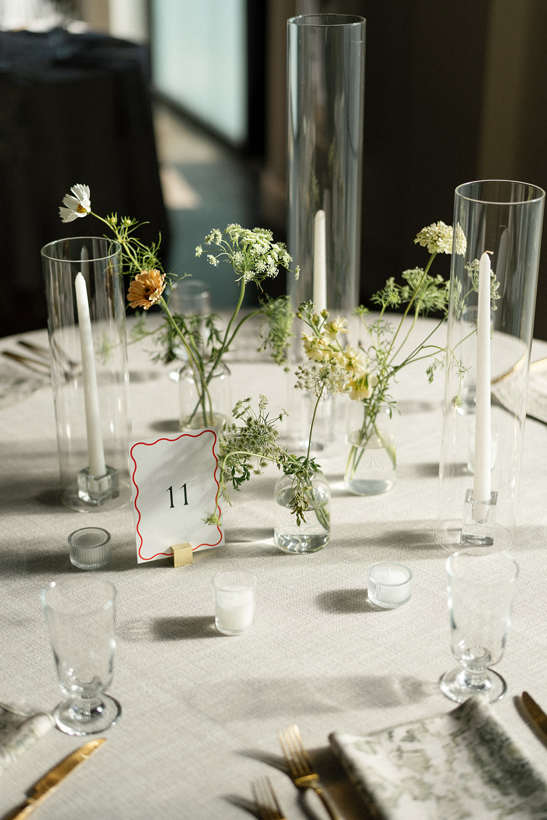
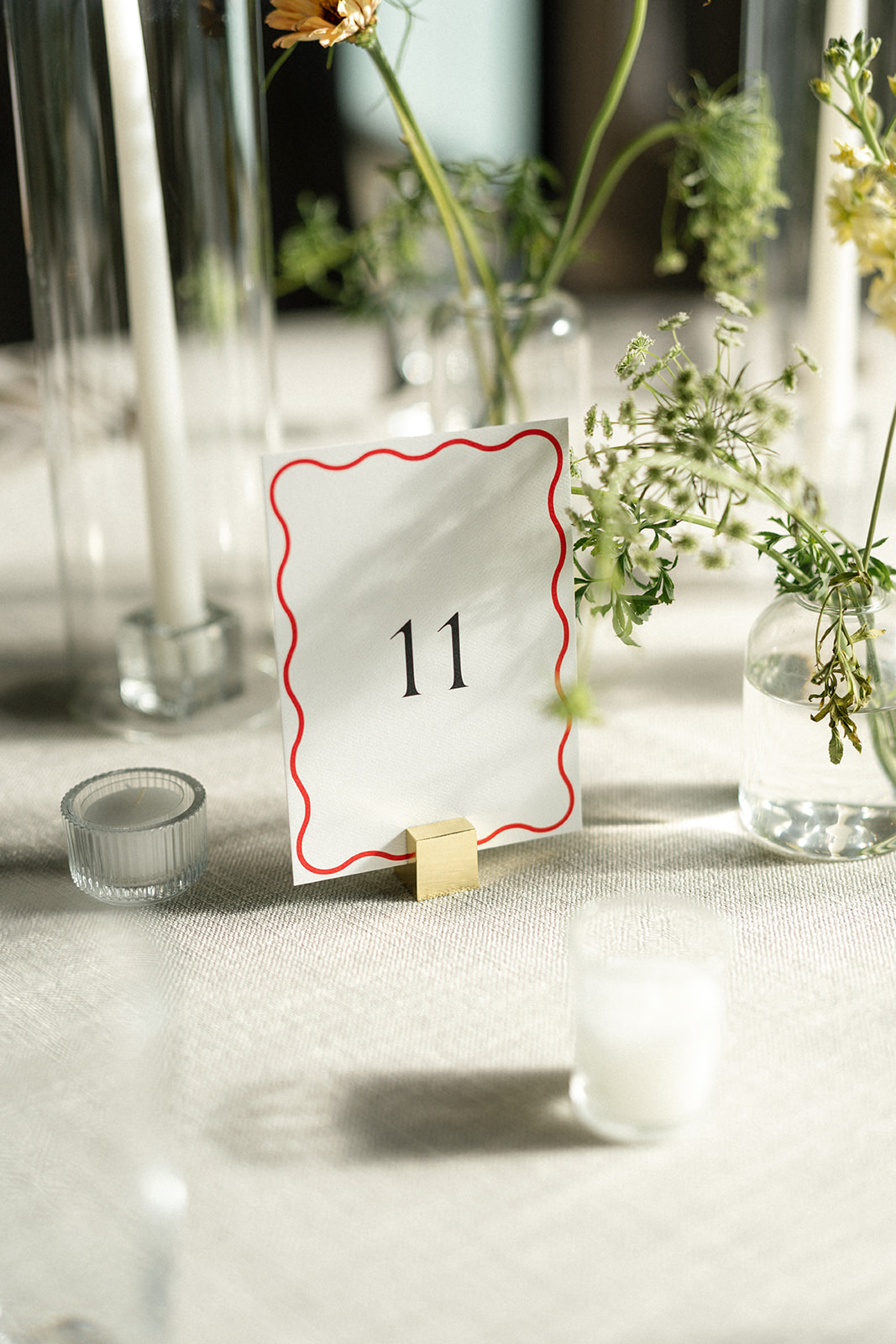
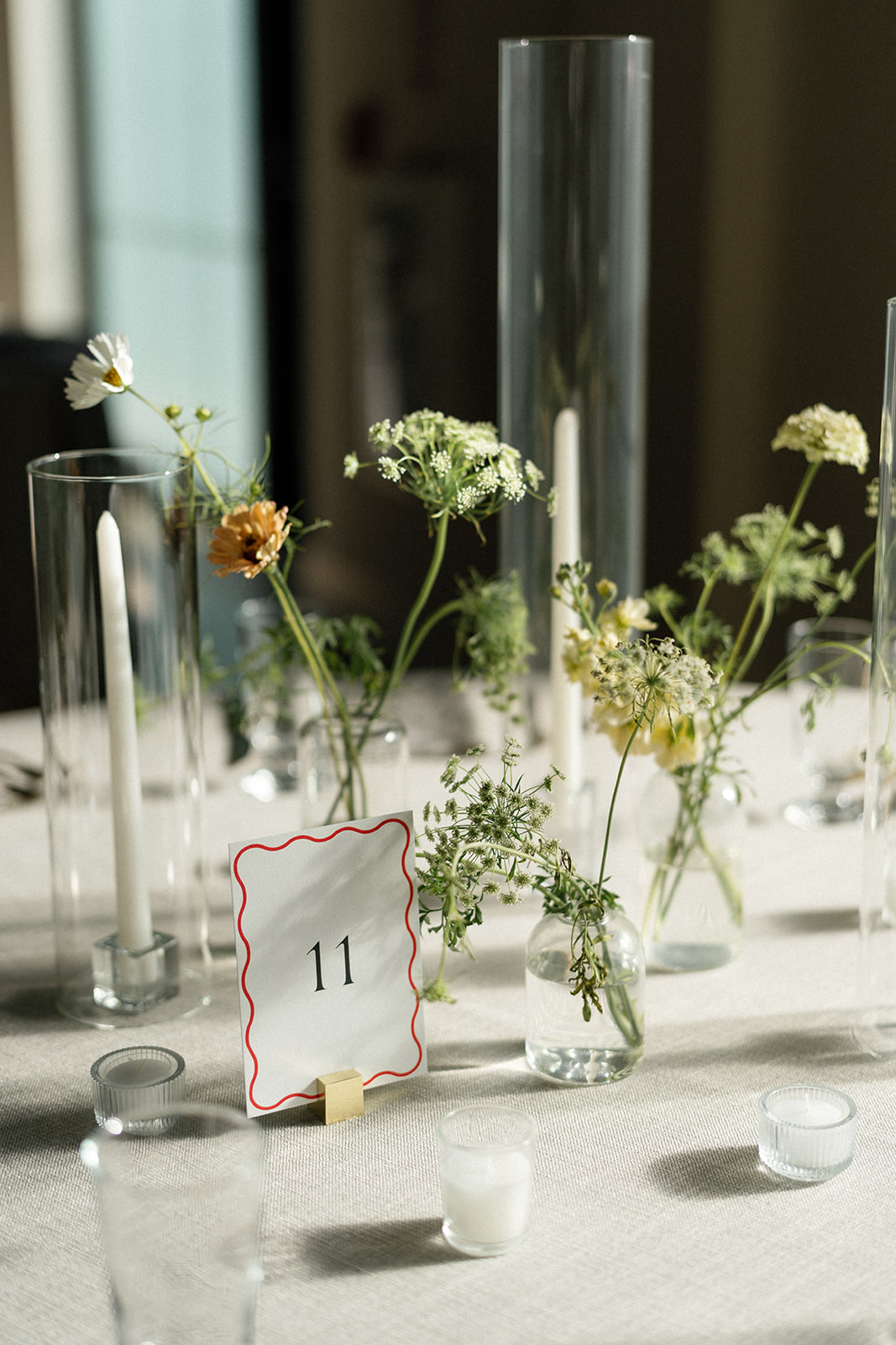
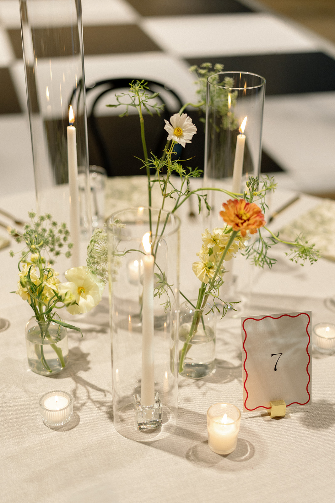
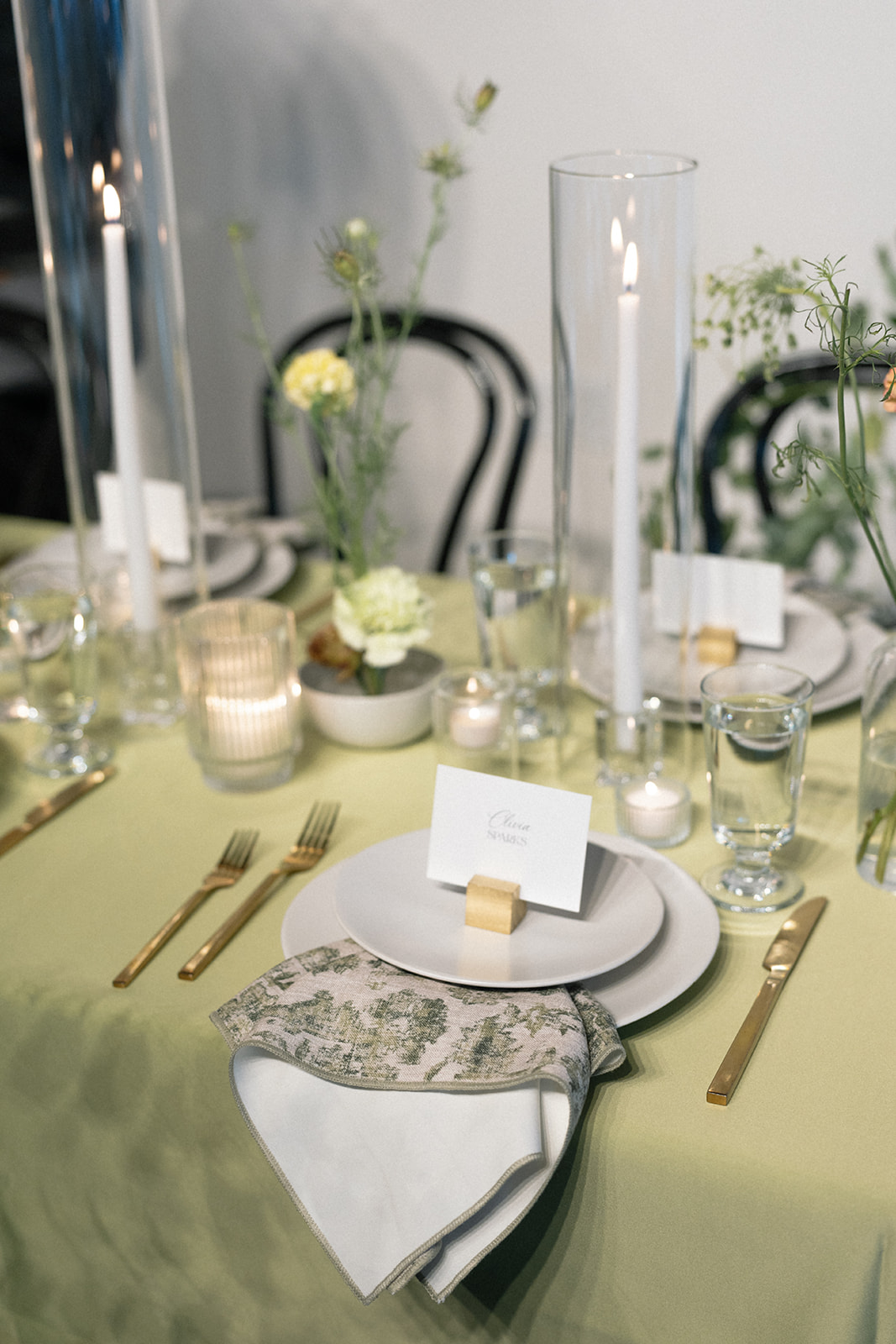
We always love finding ways to balance current trends with classic design, and this wedding was the perfect opportunity to do just that. The seating chart wall featured a sophisticated custom wallpaper, bringing in a timeless element, while the guest cards and table numbers had a modern, red squiggle border design that felt fresh and playful. The contrast of these styles created a look that was both elegant and fun.
Wedding Signage and Details
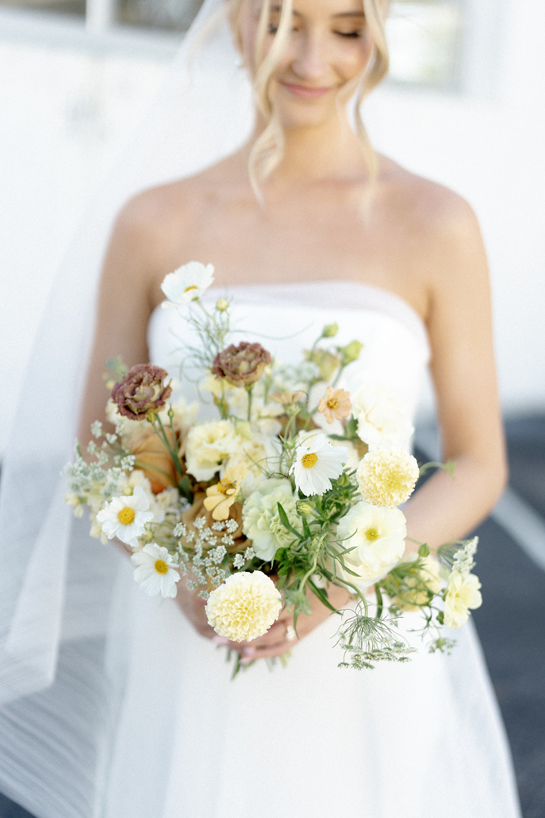
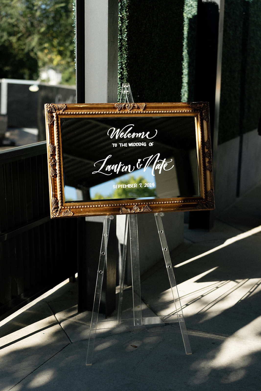
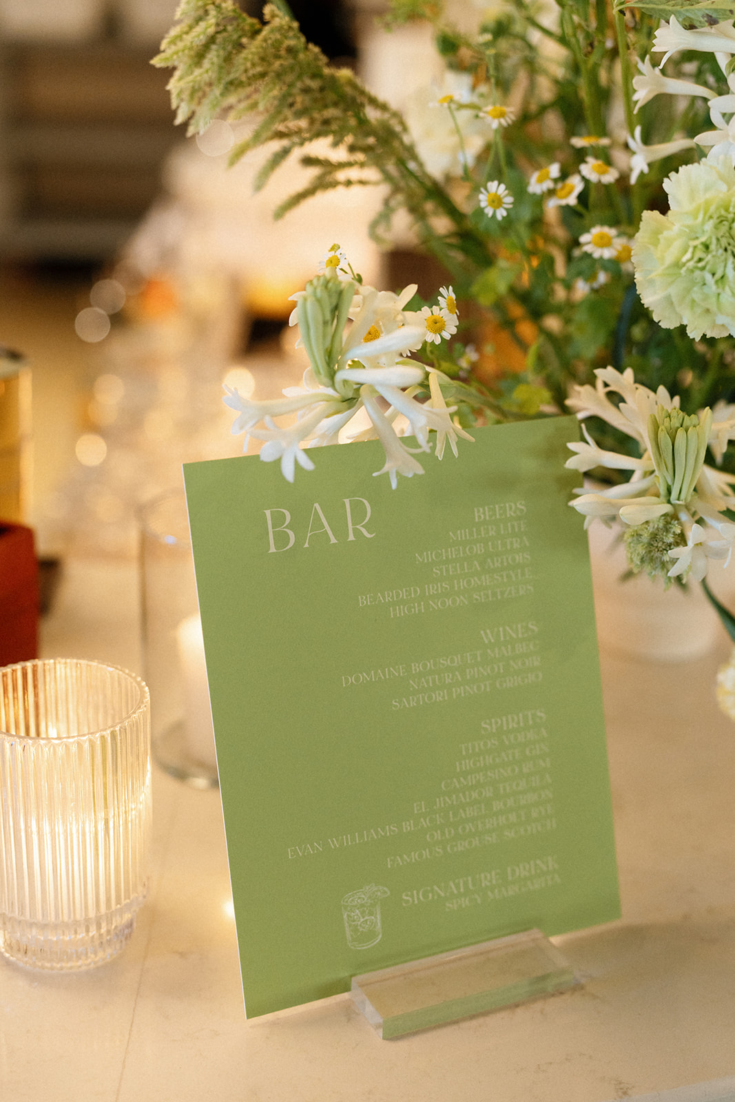
As guests arrived at Saint Elle, they were greeted by a beautiful mirror welcome sign with white calligraphy, setting the tone for the celebration to come. White Ink Calligraphy also created the green bar sign with white lettering, similar to that of the envelopes on the seating chart. The soft, muted florals found in the wedding party bouquets and arrangements at the reception balanced the brighter green wedding details and the pop of red on the table numbers and guest cards.
We were honored to be a part of this gorgeous Saint Elle wedding. From the vibrant green seating chart to the personal touches and stylish design elements, this wedding was a great example of how to mix modern and classic elements to create a beautifully designed event.
If you’re looking to add custom, thoughtful touches to your wedding or event, we would love to help make your vision a reality. Reach out today to learn more about our full-service design offerings—we can’t wait to create something unforgettable for you!
If you enjoyed this post, you’ll love these other blogs!
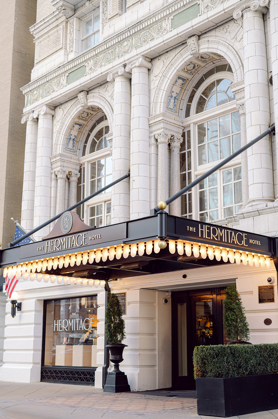
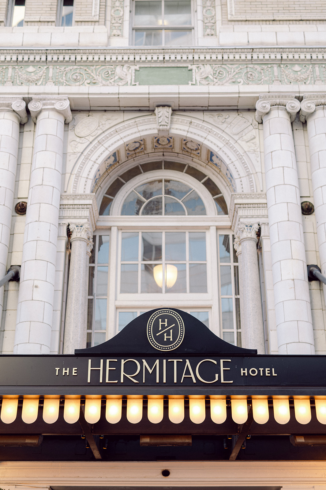
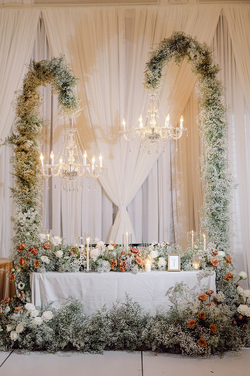
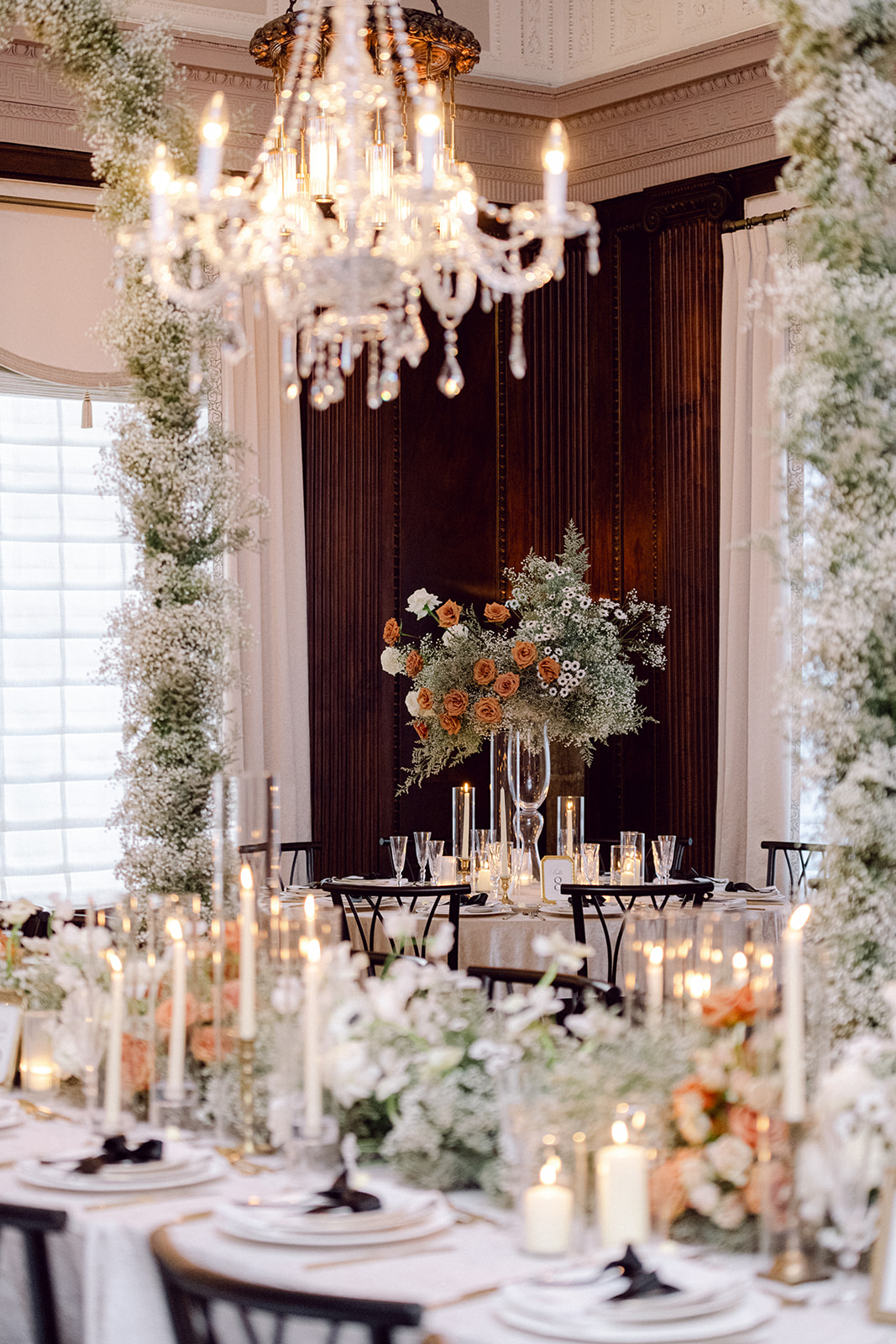
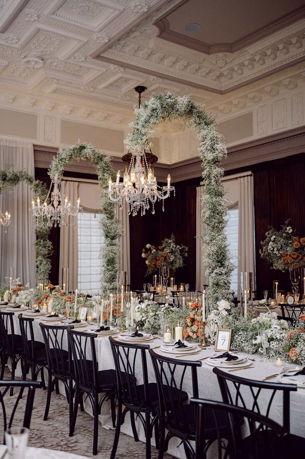
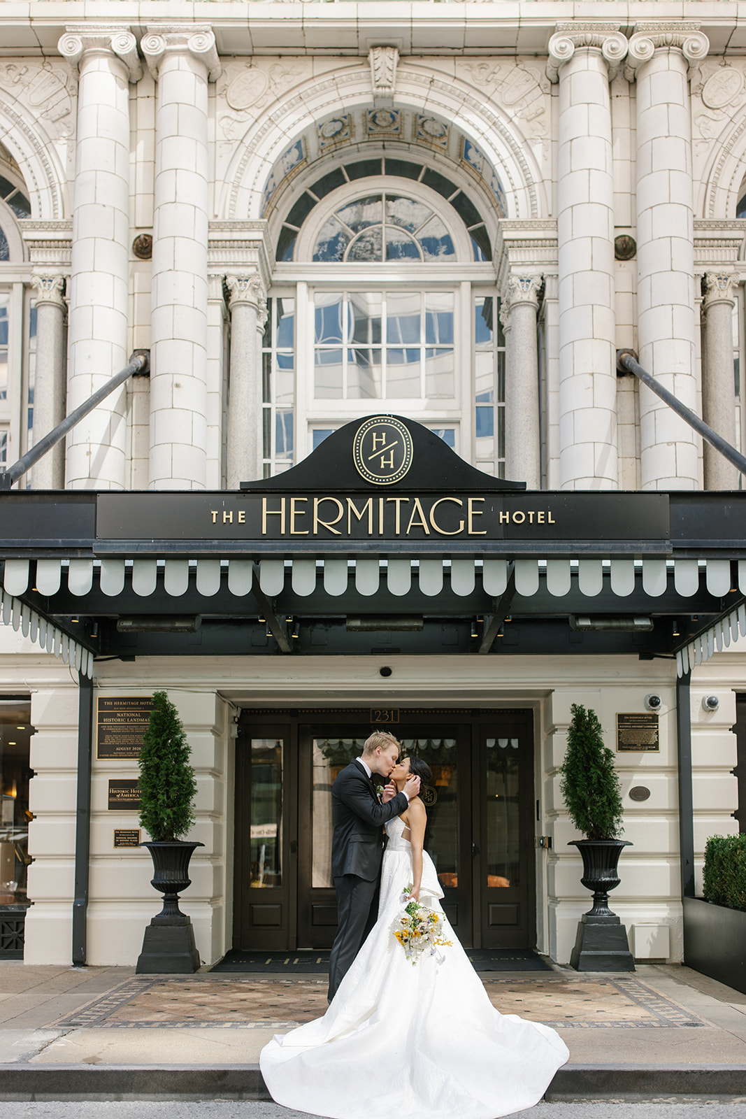
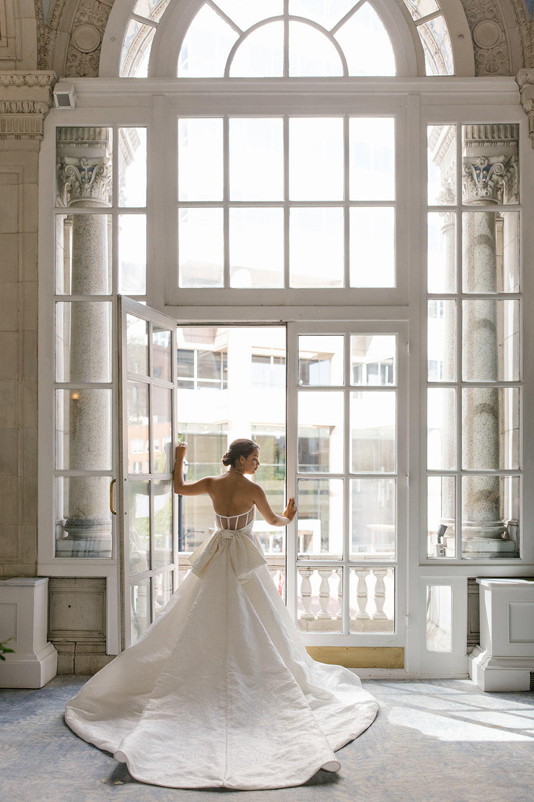
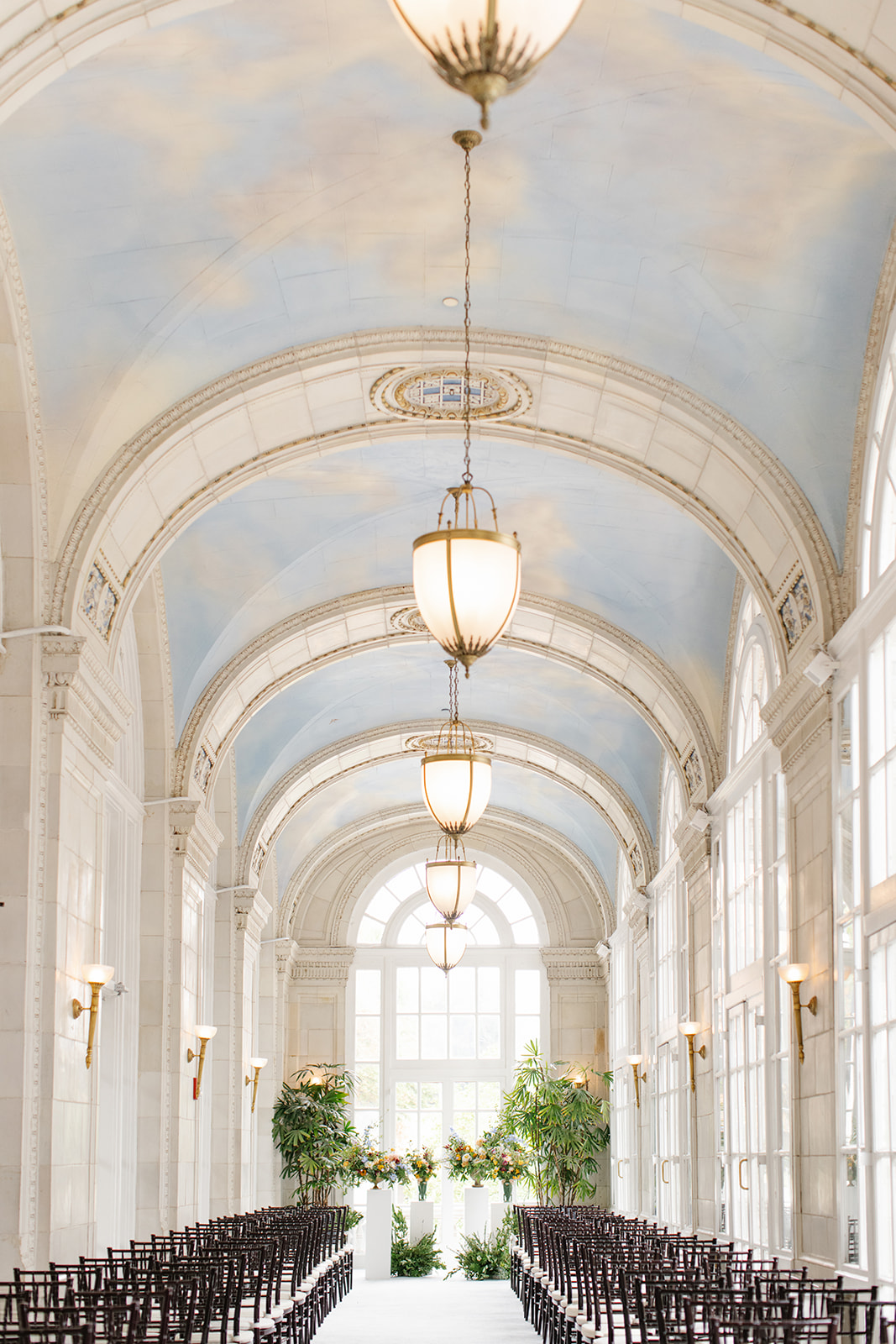
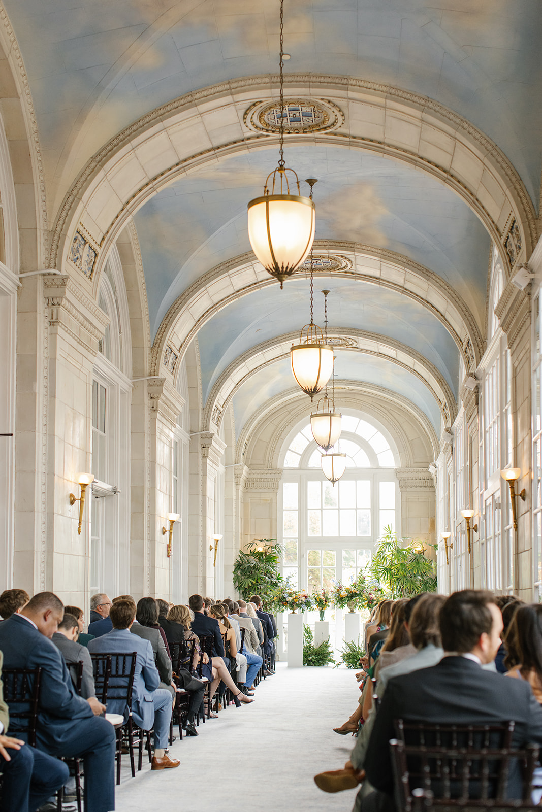
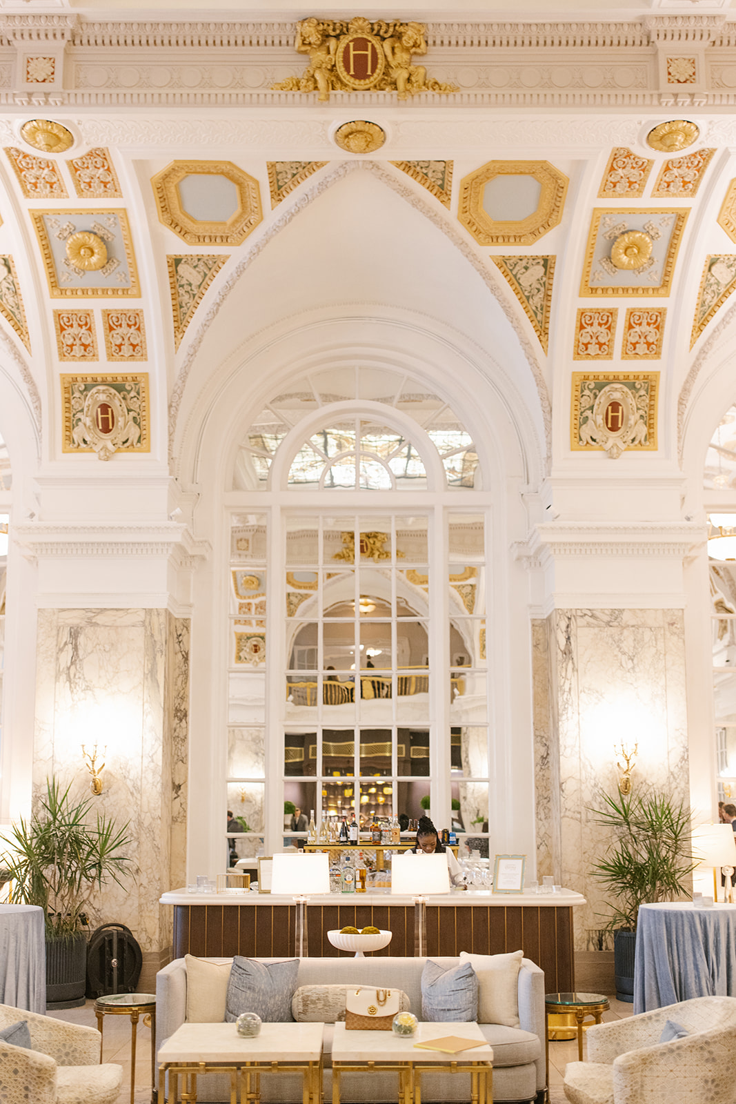
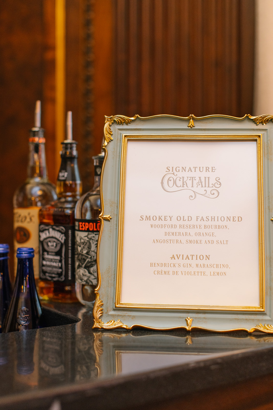
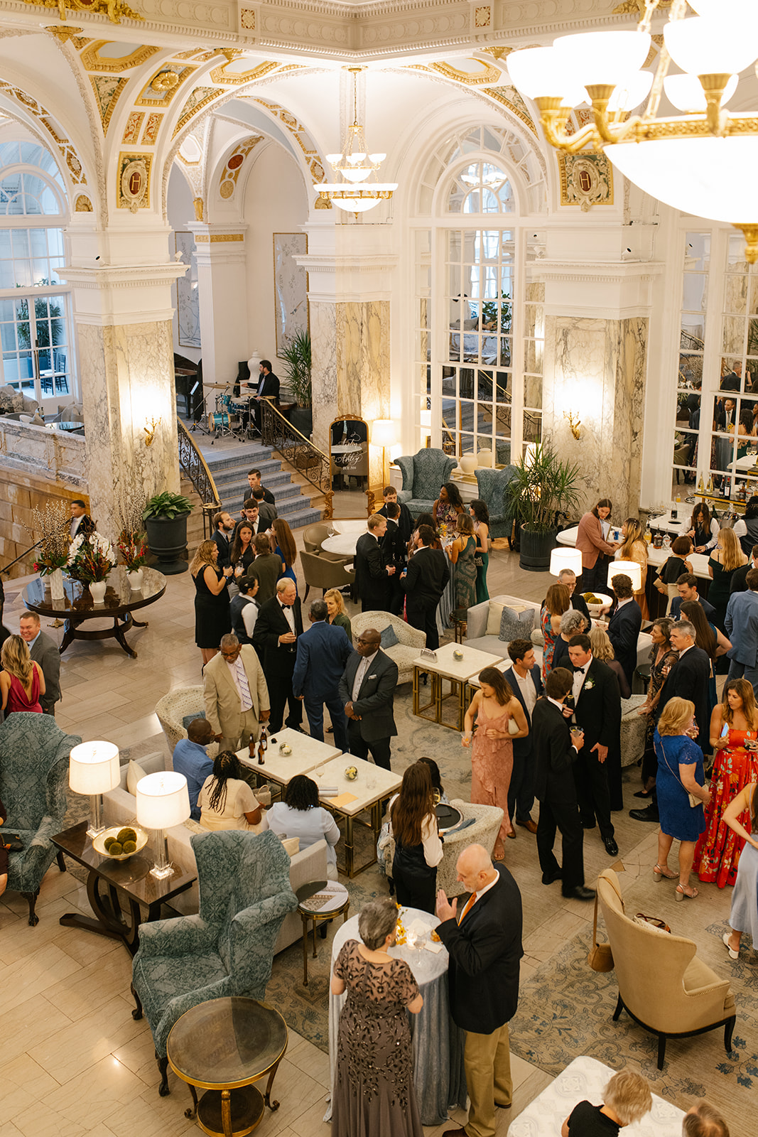
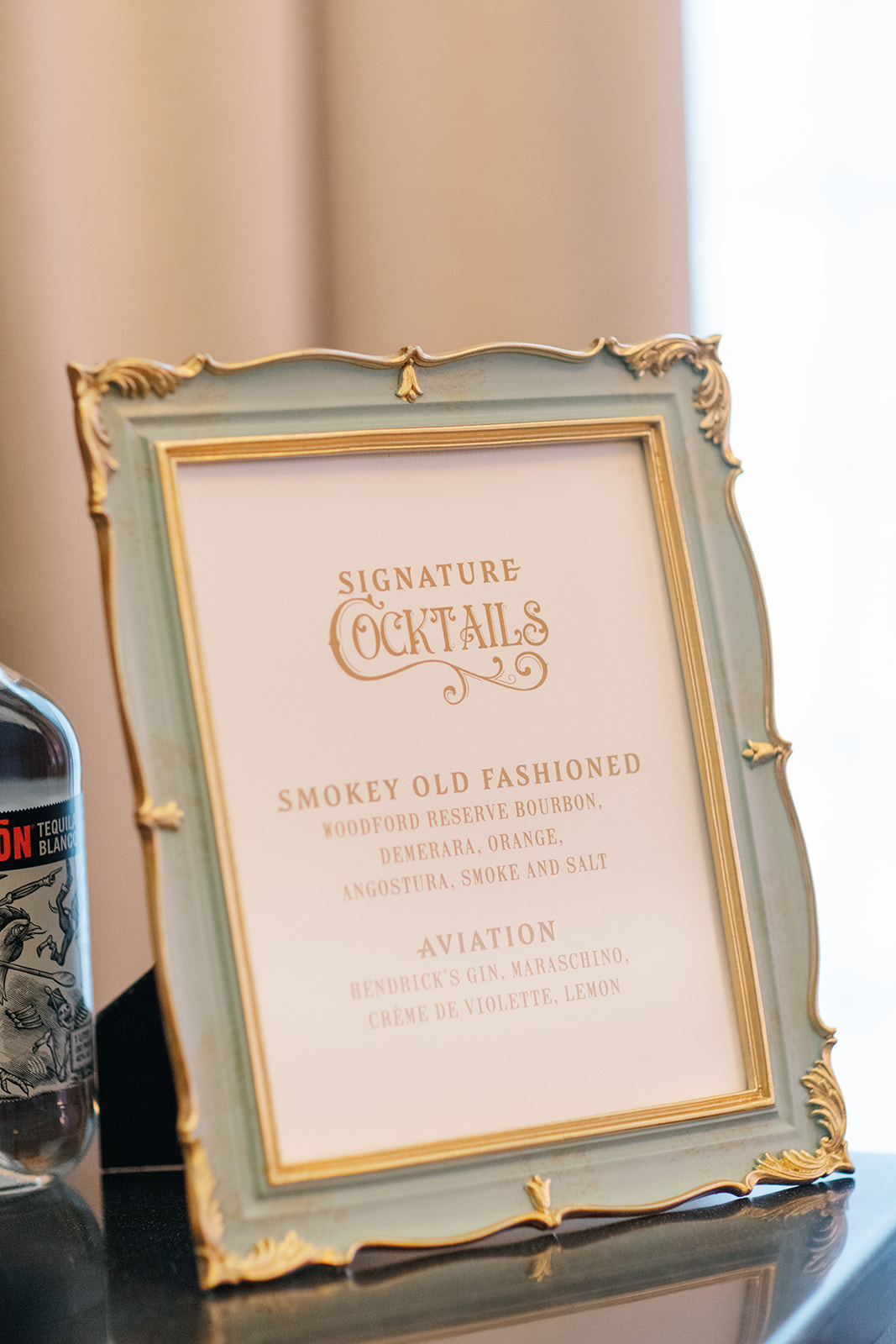
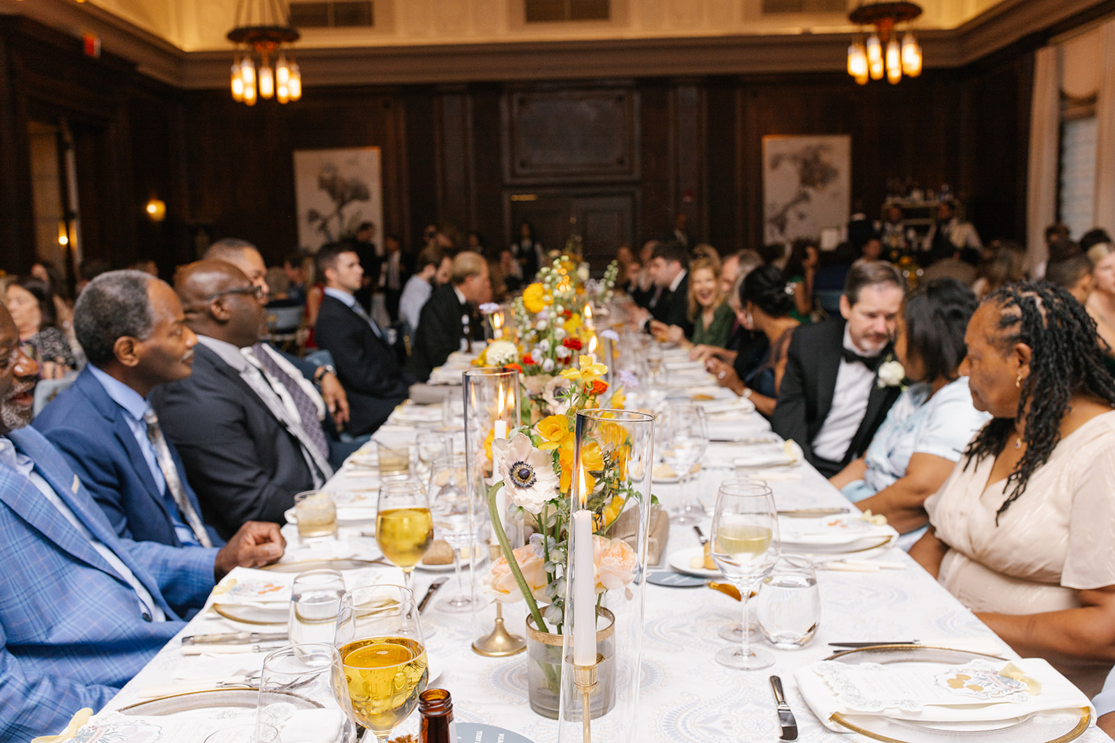
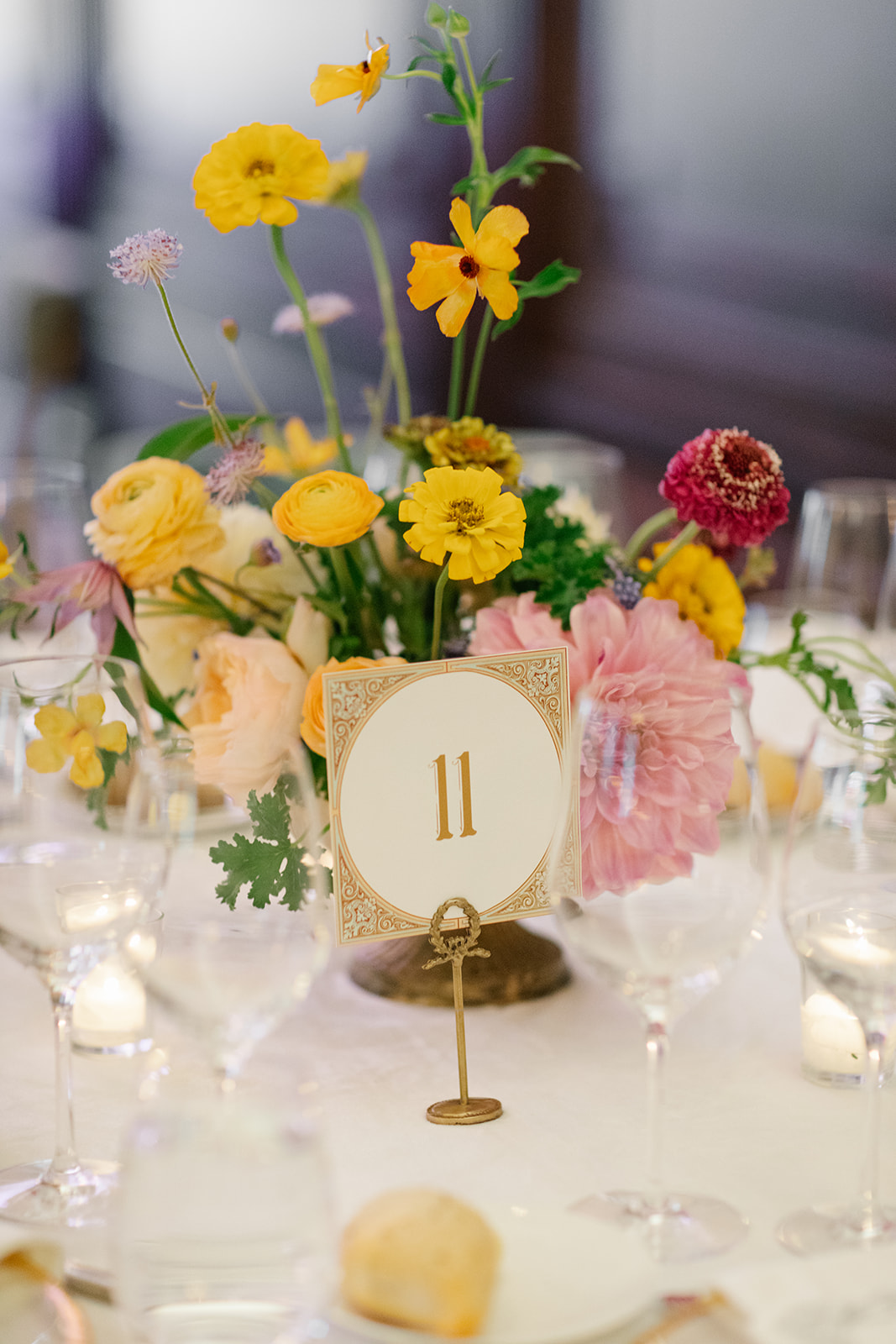
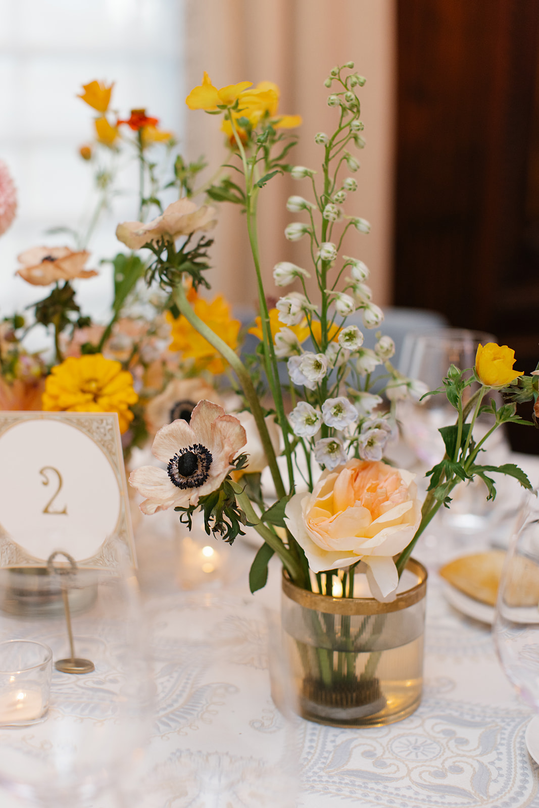
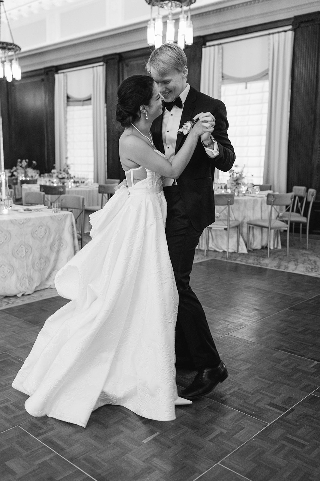
This stunning, elegant Hermitage Hotel wedding was our first wedding to kickstart 2025, and this was definitely one for the books. What a great way to start our year off. Every detail was elegant, classic, and just overall perfection, especially when paired with the amazing venue and the florals of the day. The fabulous vendor team we had the privilege of working with also elevated this entire wedding experience. The talented Joanna Lewis of Siena & Co. planned this beautiful wedding, executing everything to perfection. Kéra Photography did the honor of capturing all our detail shots. They are stunning and I’m so excited to showcase all the different details that went into this wedding!
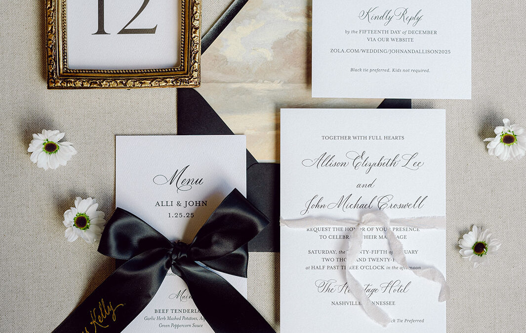
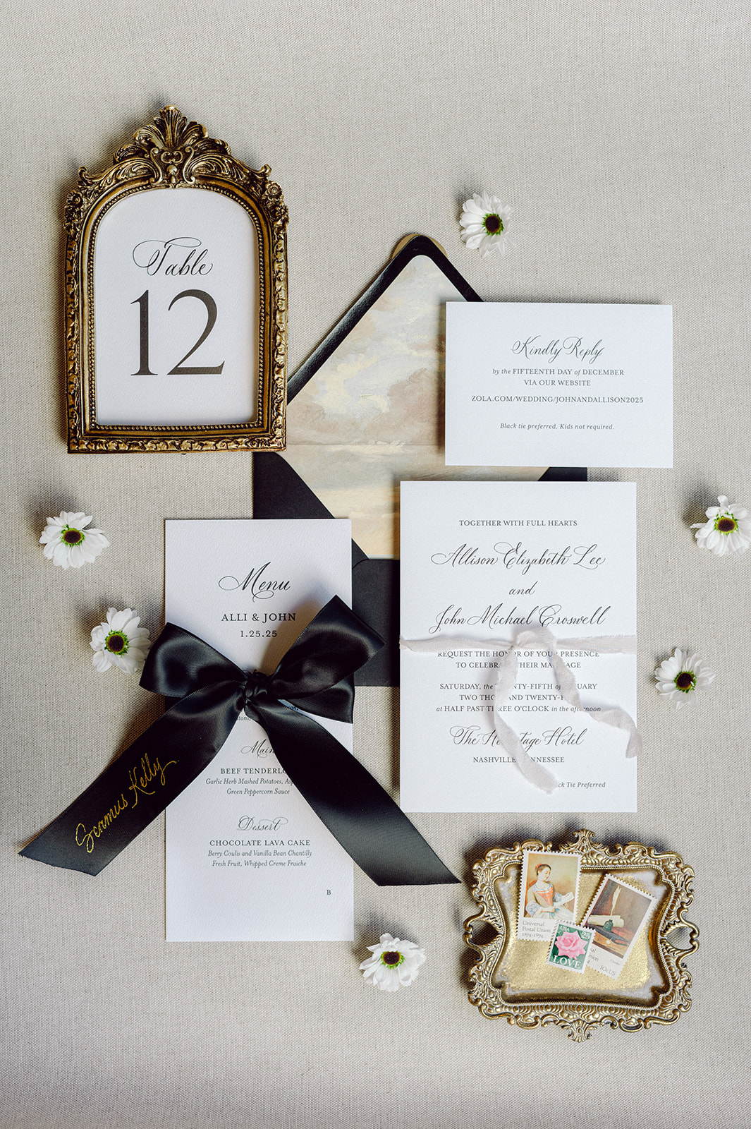
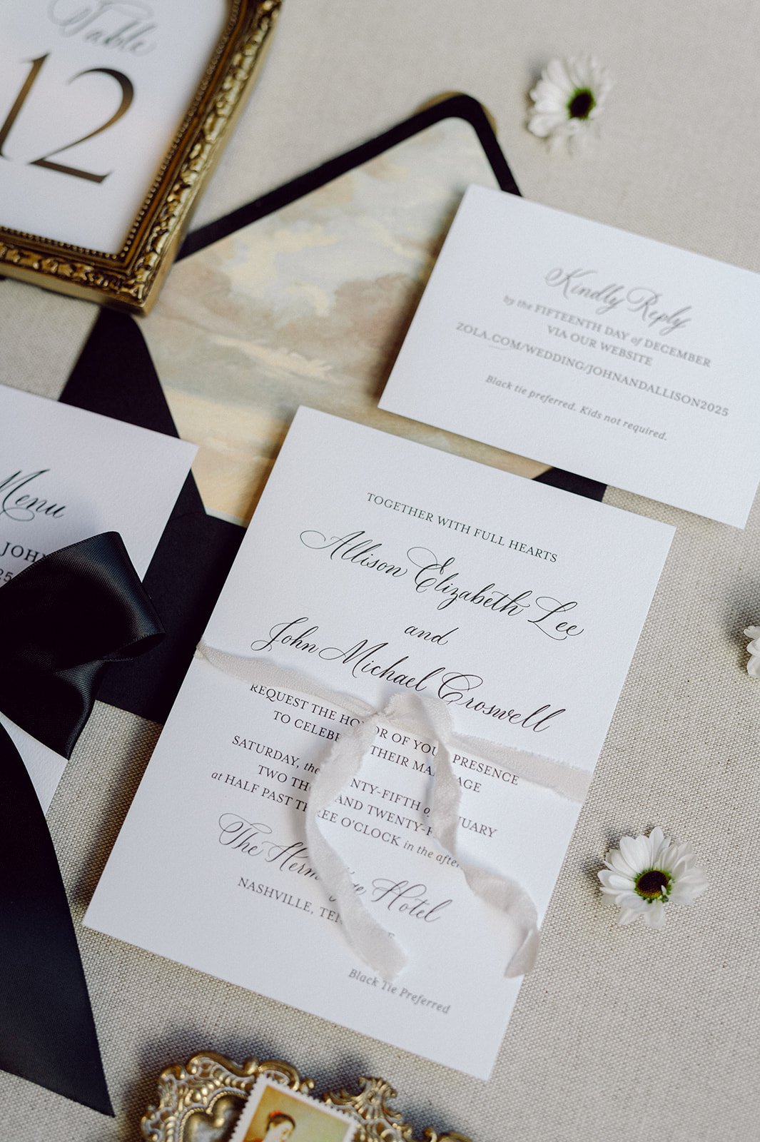
Elegant Wedding Details: The Invitation Suite
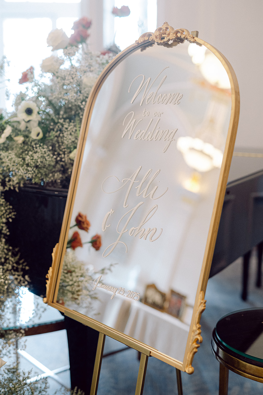
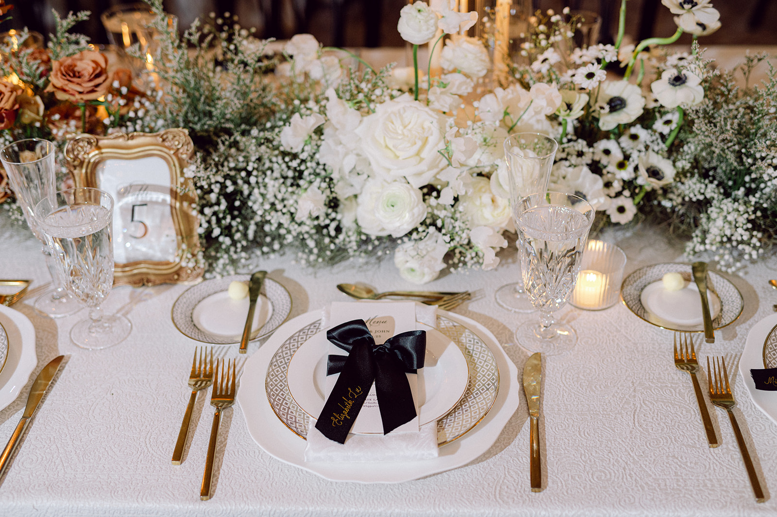
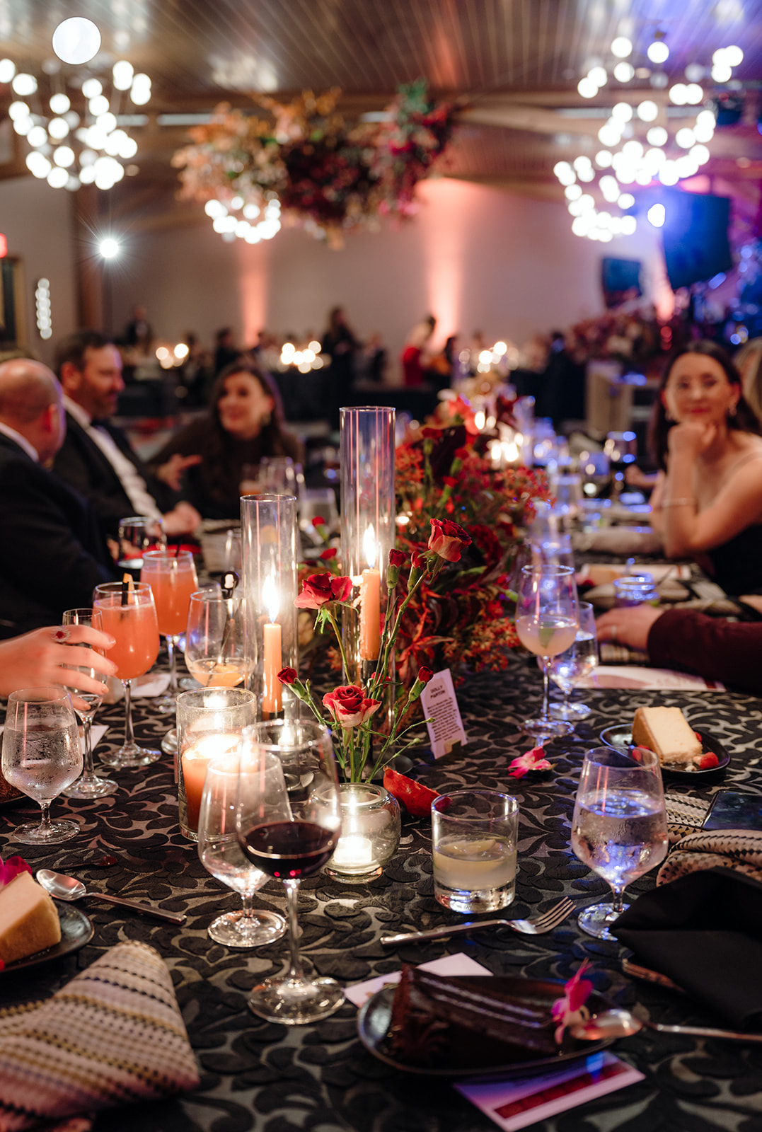
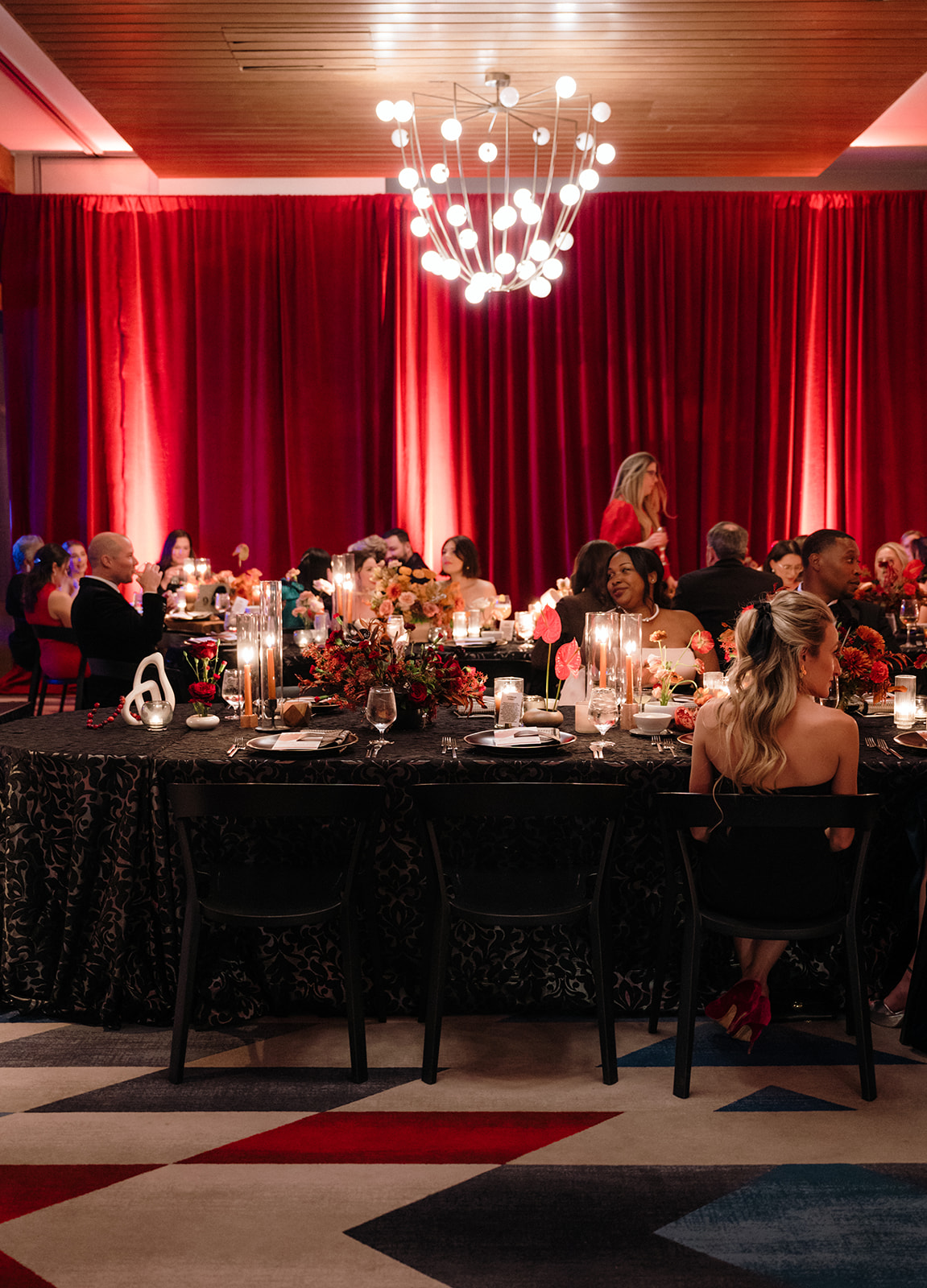
We produced all of the stationer items for this day-everything from wedding invitations to the day of details. The wedding invitation suite was a masterclass in effortless elegance. We kept it classic and in line with the vision of the wedding using black letterpress calligraphy. The custom envelope liner included a nod to The Hermitage Hotel’s stunning ceiling, which was such a fun and unique detail that tied everything together. The bold black envelope added just the right amount of drama and was a preview to the timeless black accents that were to come. Of course, we made a beautiful, thread-it-all-together moment when the spot calligraphy carried through to the wedding day signage.
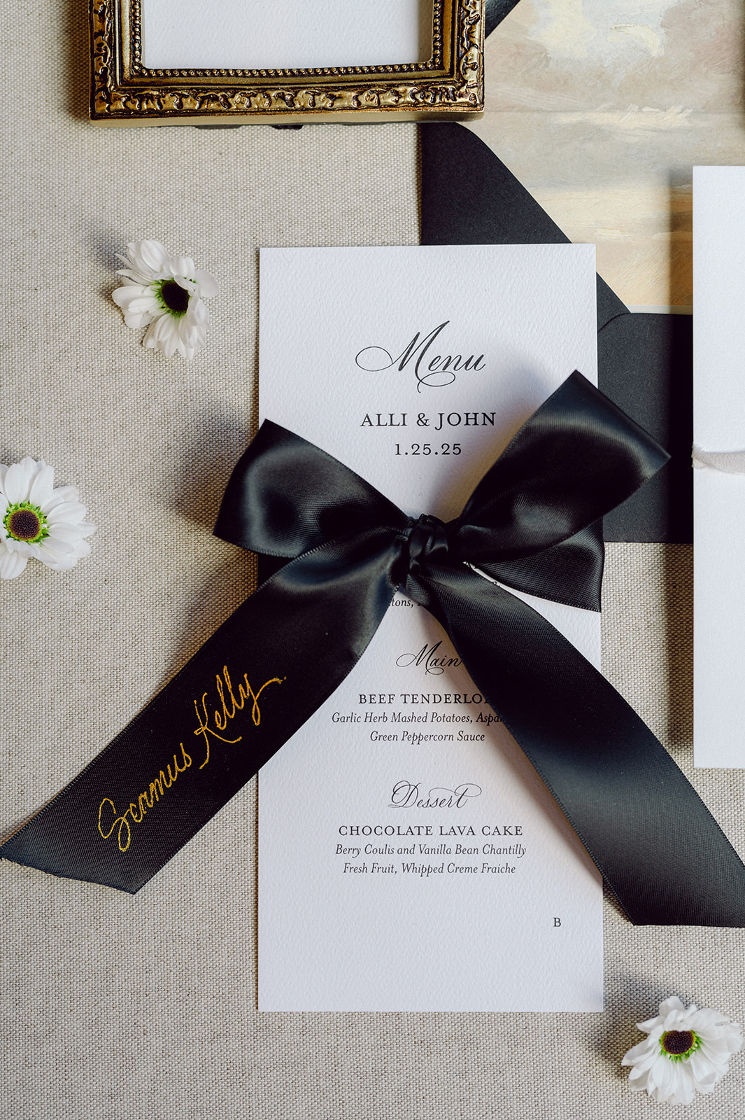
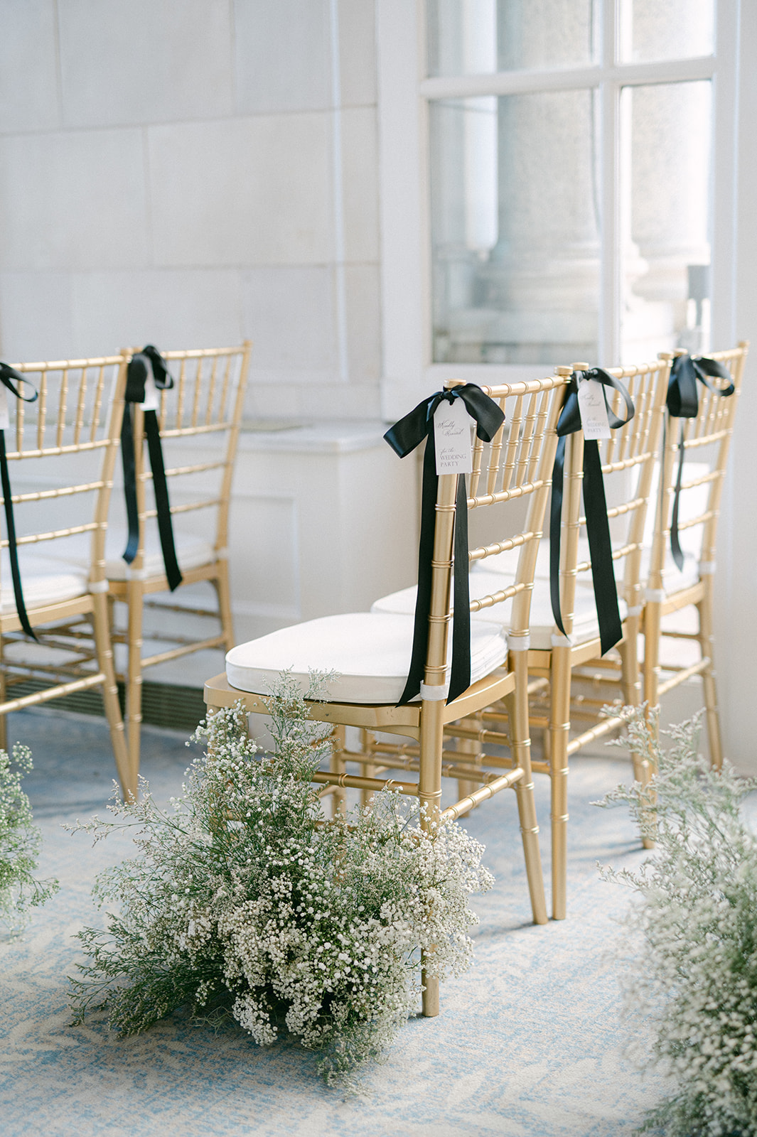
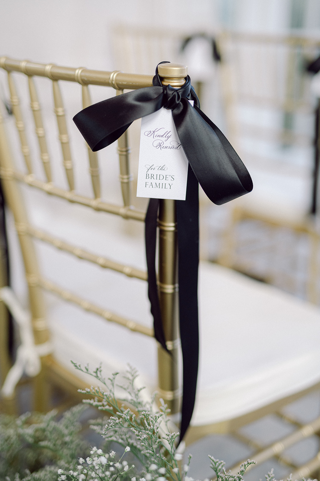
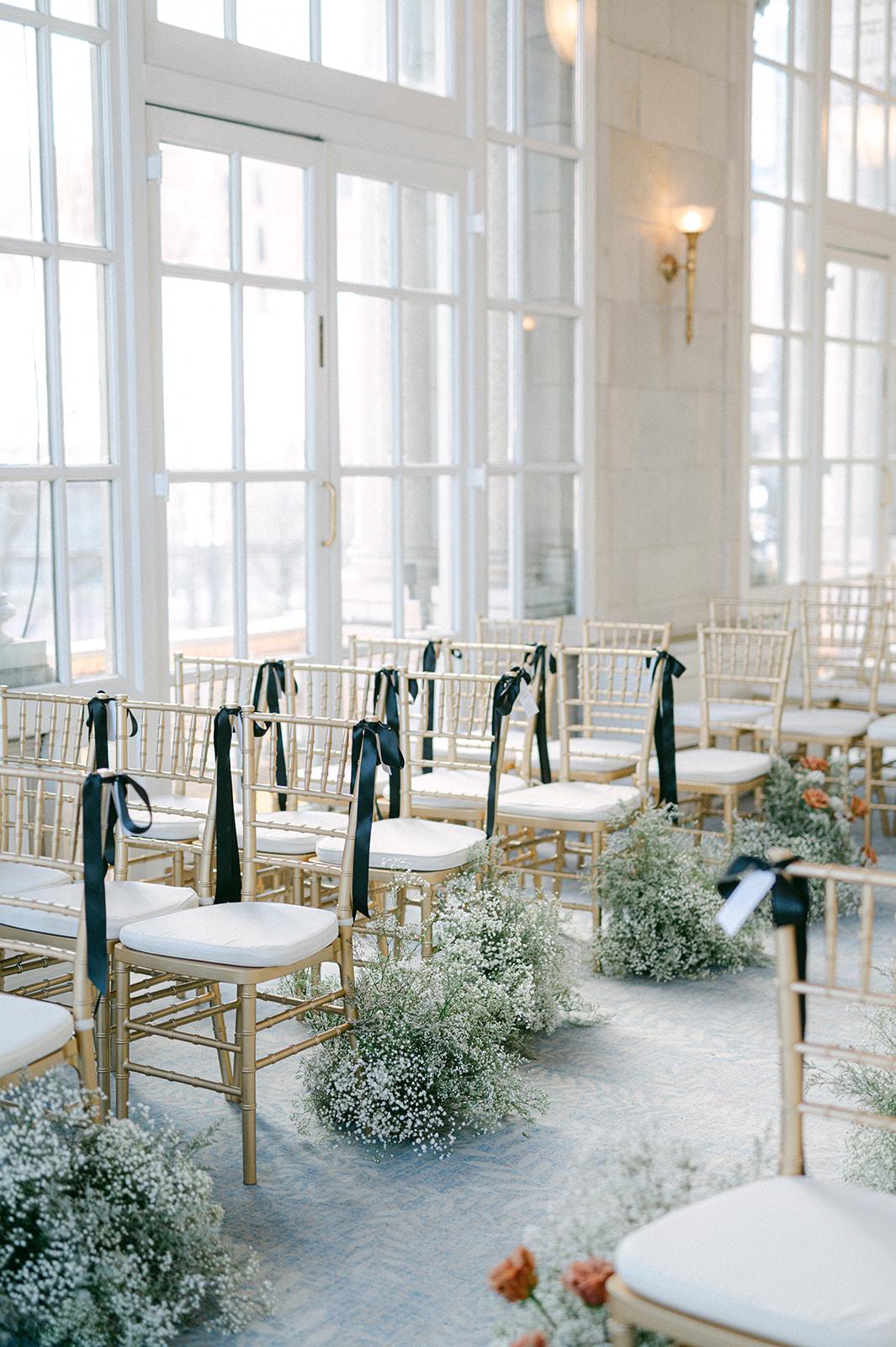
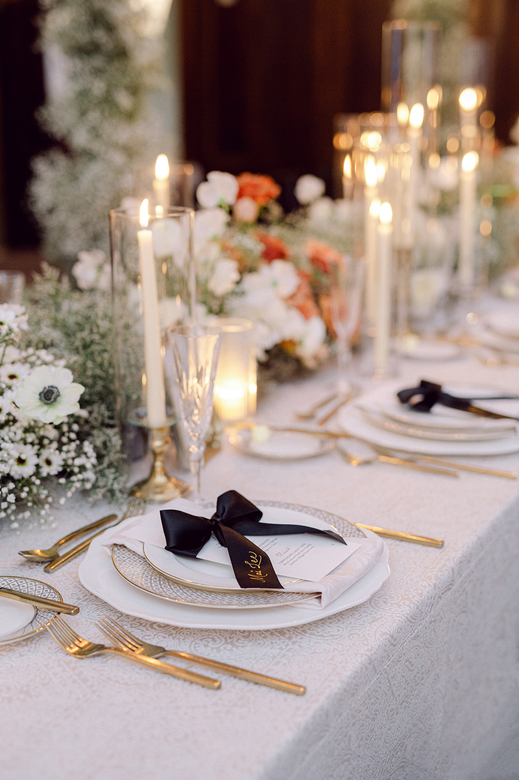
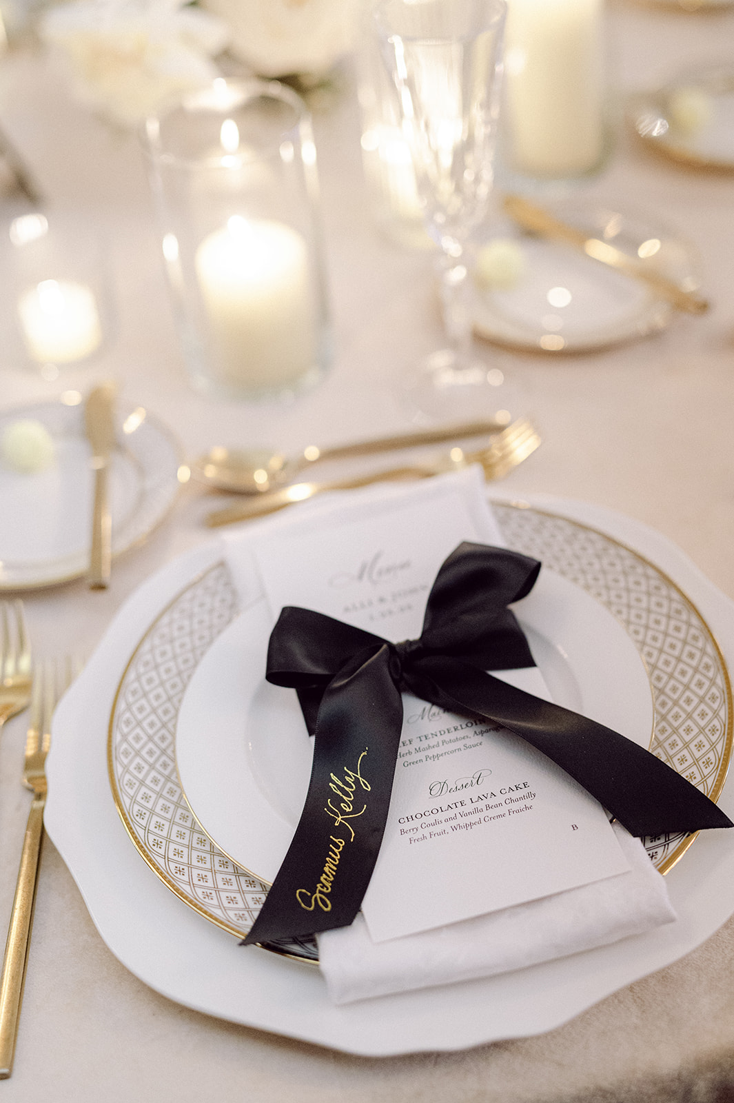
Bold, Black Ribbon Details
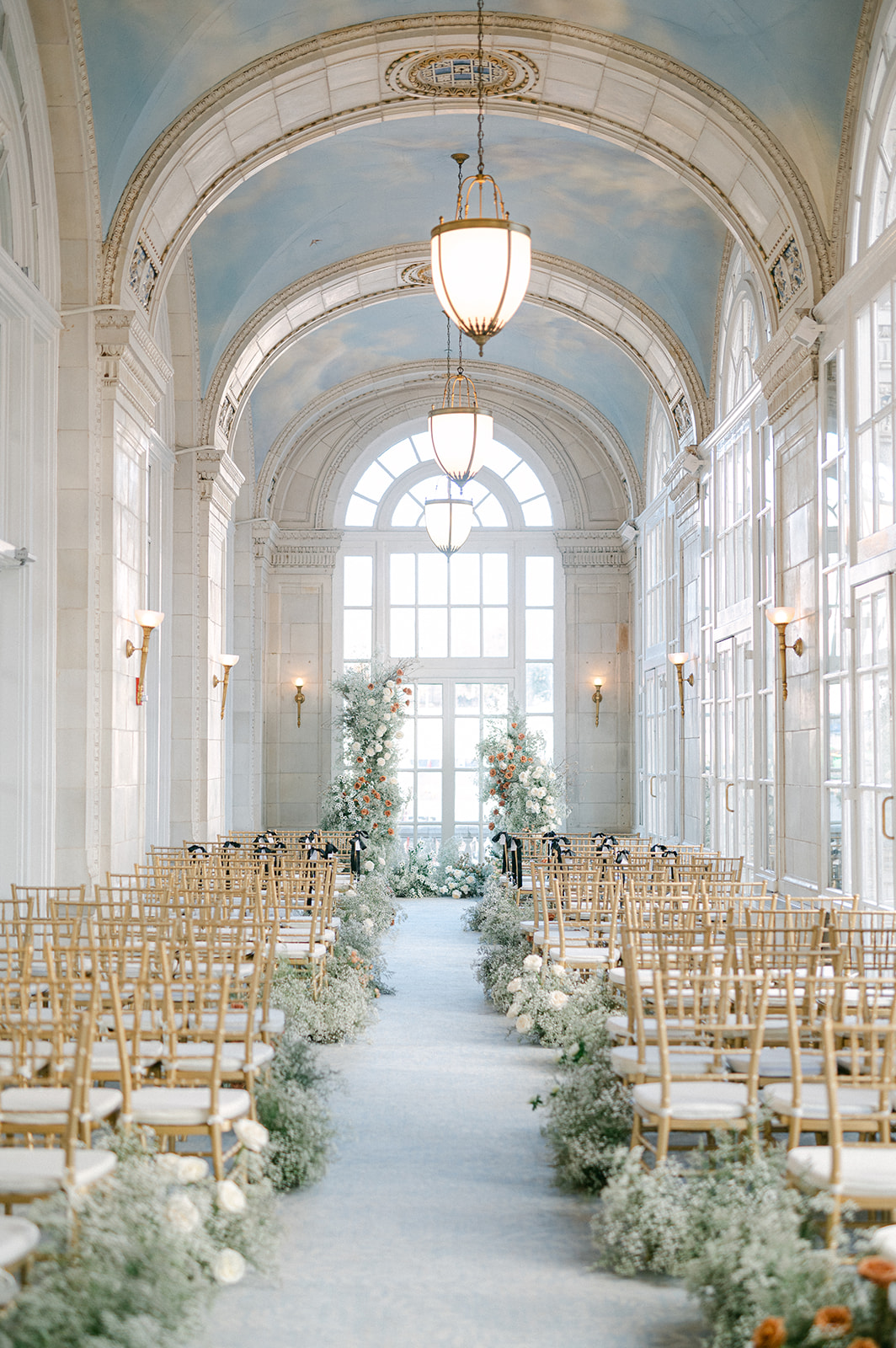
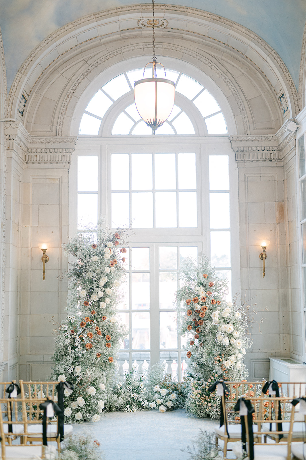
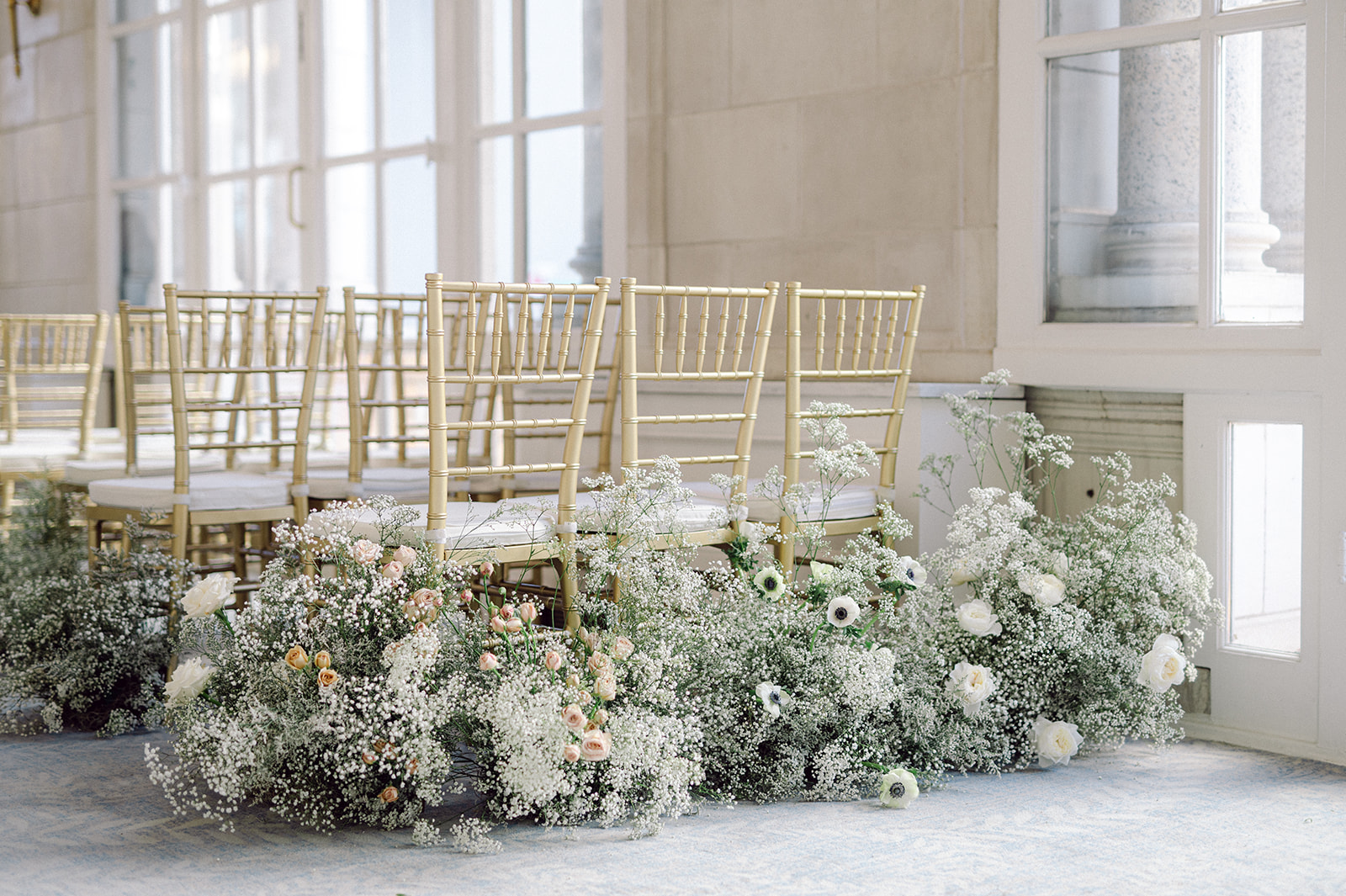
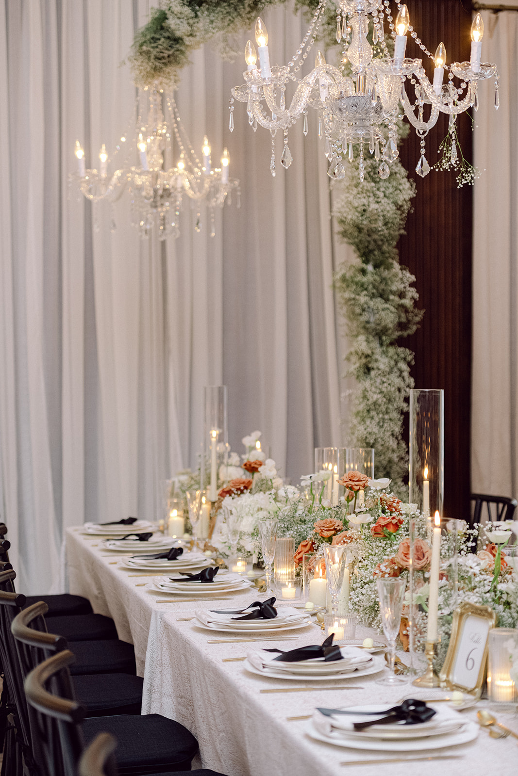
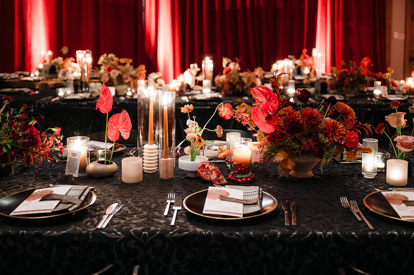
I was onsite working this wedding from the start of the day until ceremony start time. I wanted to ensure the seating chart was flawless and the bows on each table place setting were perfect. The black ribbon bows were incorporated into various moments throughout the day. At the ceremony under the beautiful ceiling that served as inspiration for the envelope liners, reserved chairs for the bride and groom’s family and bridal party were identified by black ribbons with a white tag that had each guest name in calligraphy.
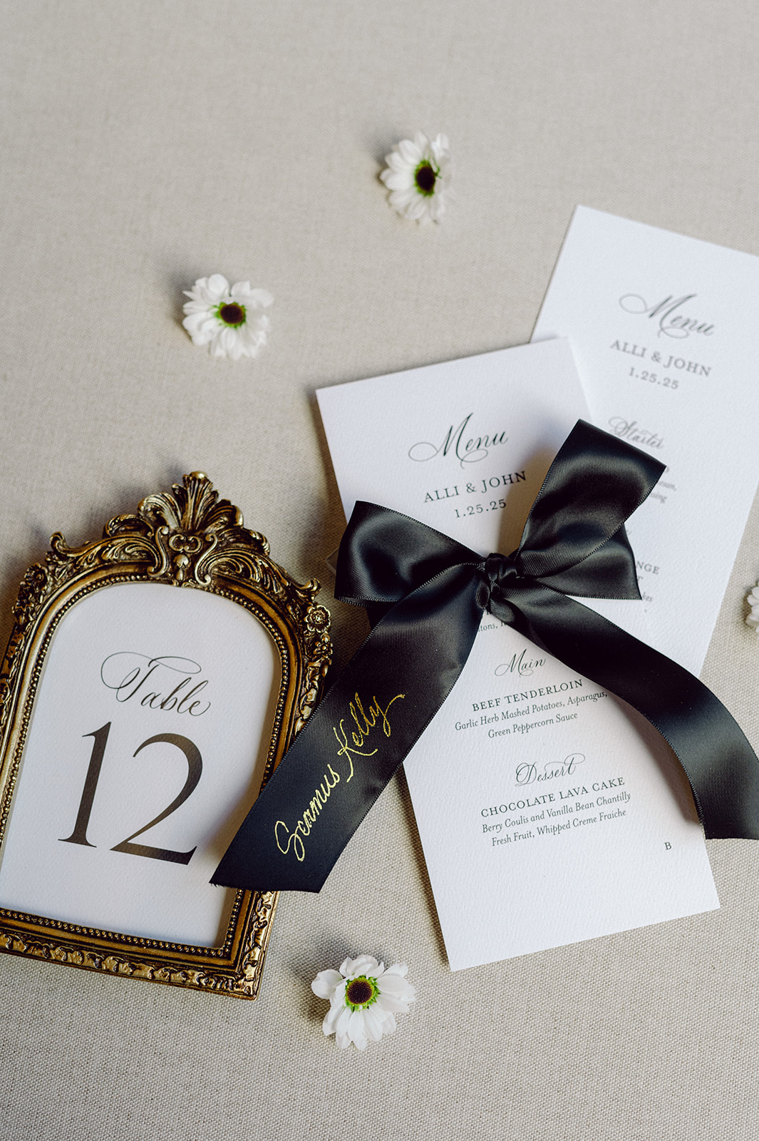
More classic, black ribbons were used as place cards and tied to the custom menus at each place setting. Hand lettered hot foiled calligraphy in gold stood out on each bow with each guests’ name, which coordinated with the custom seating chart. I absolutely love the end result! Let’s make this a trend for 2025!
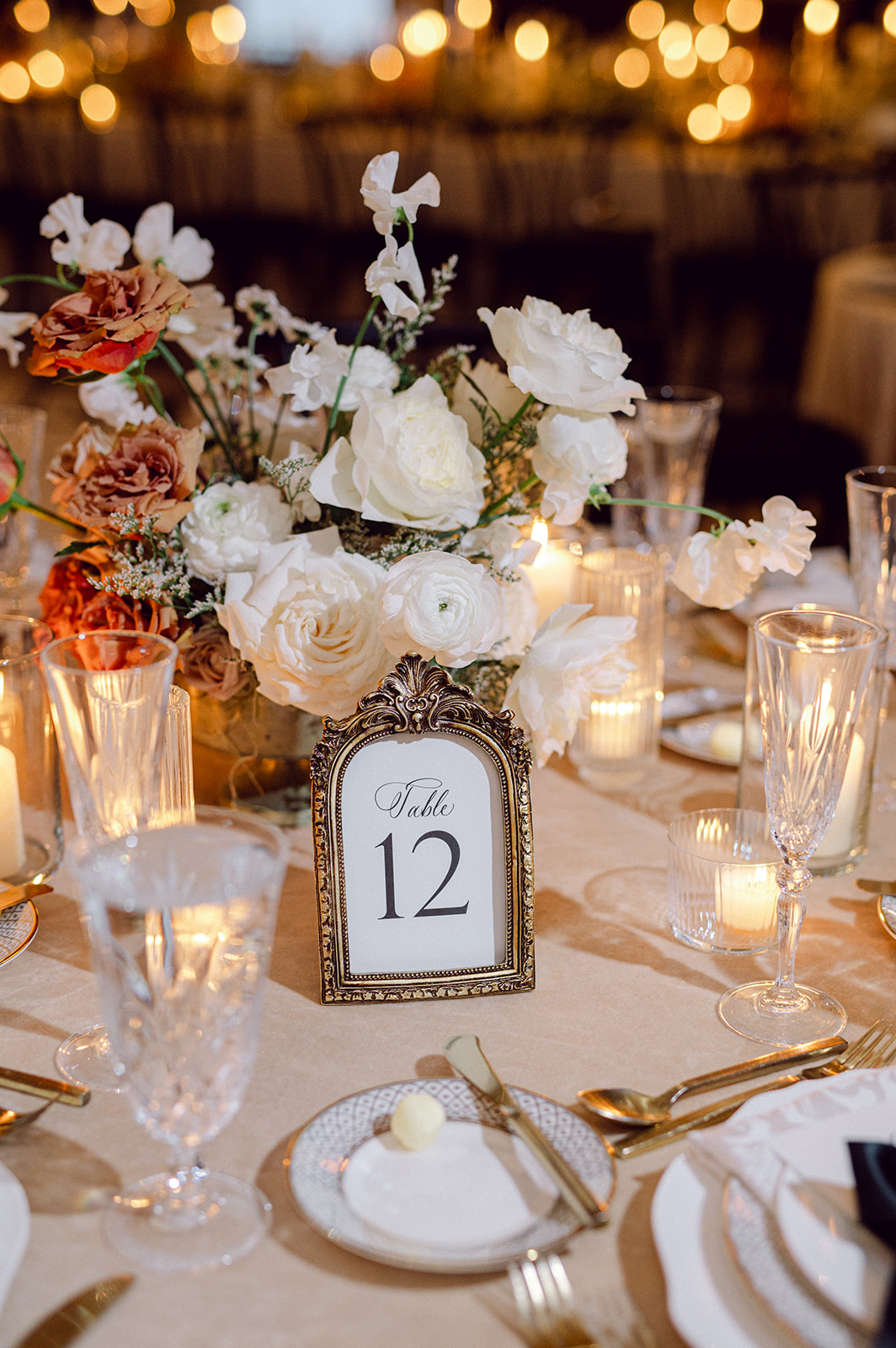
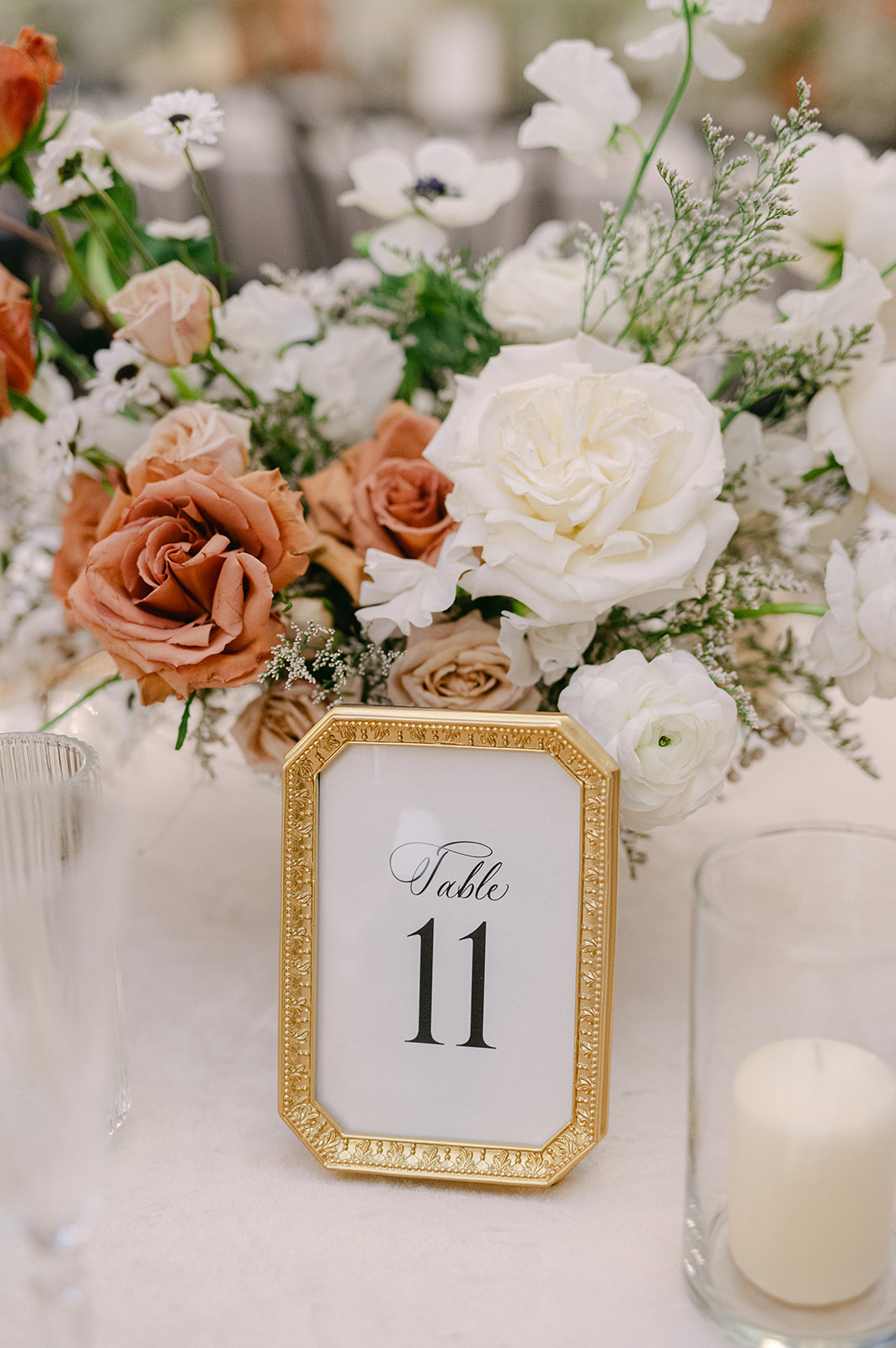
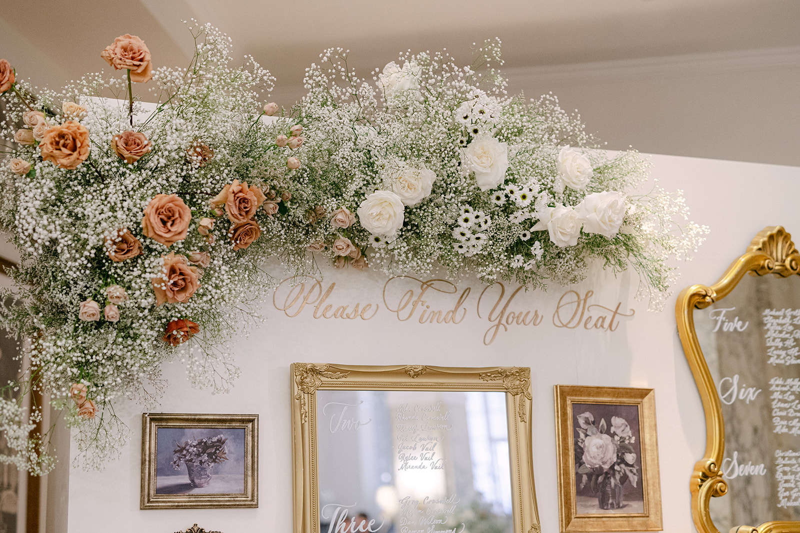
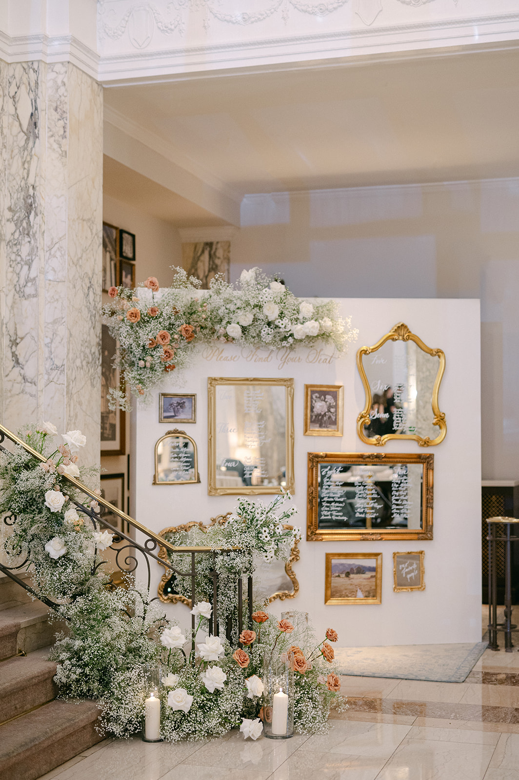
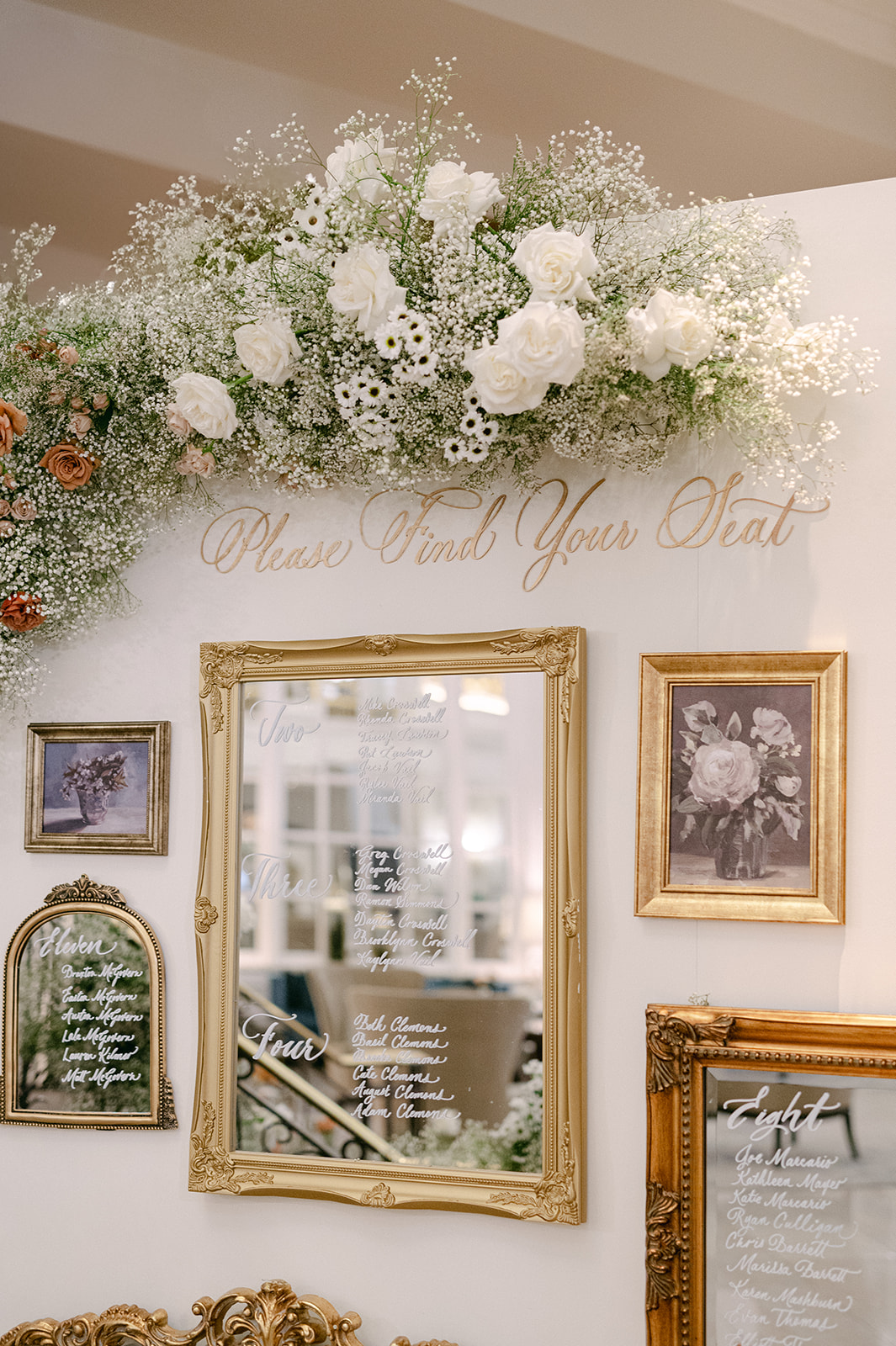
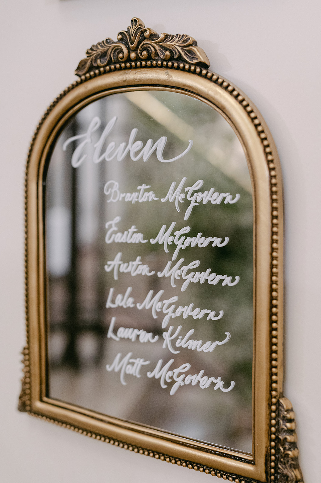
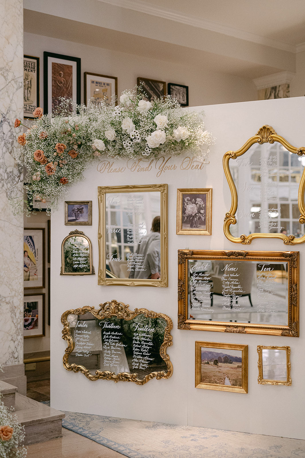
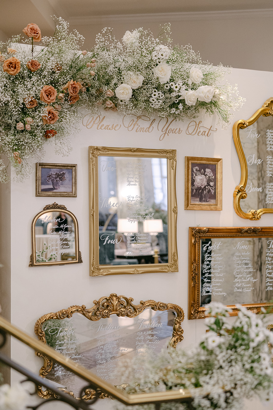
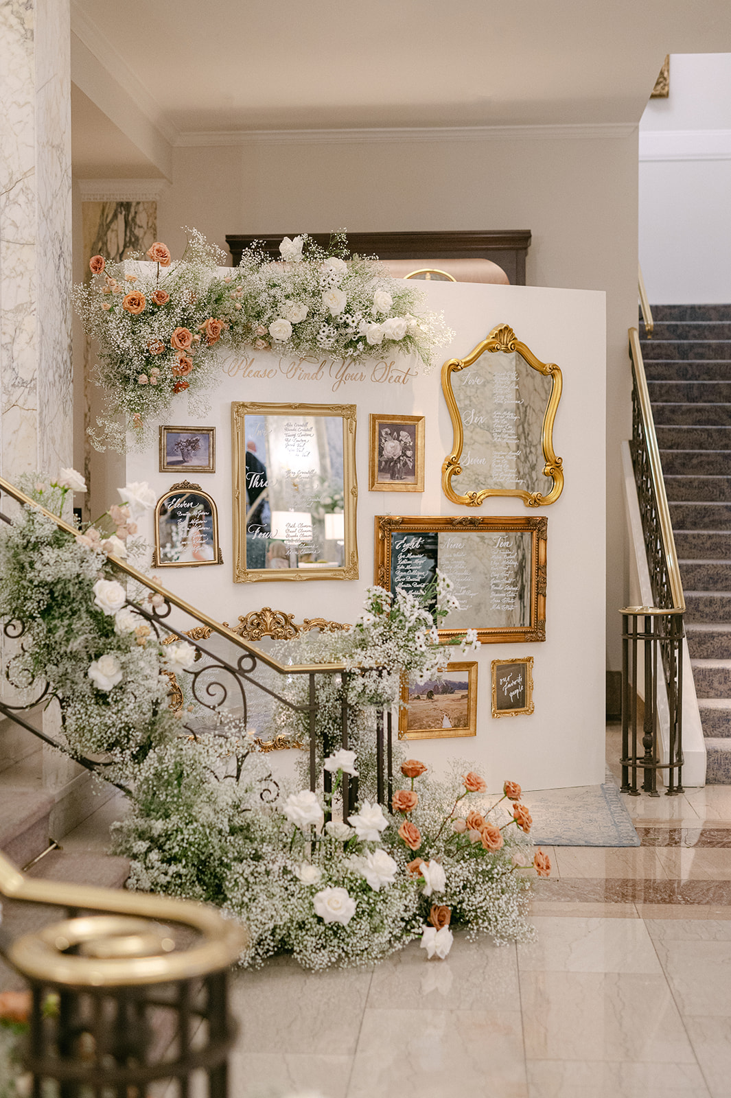
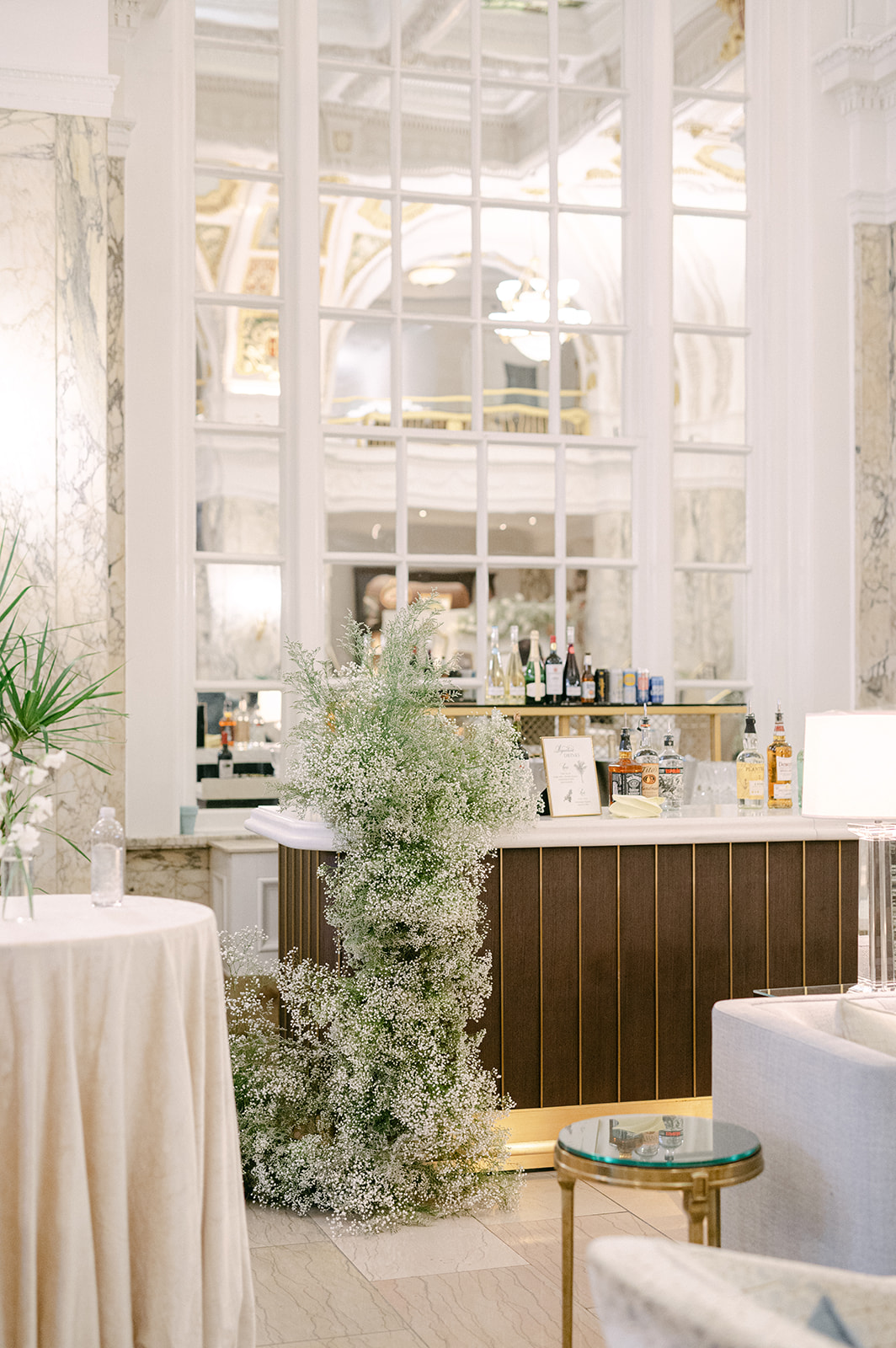
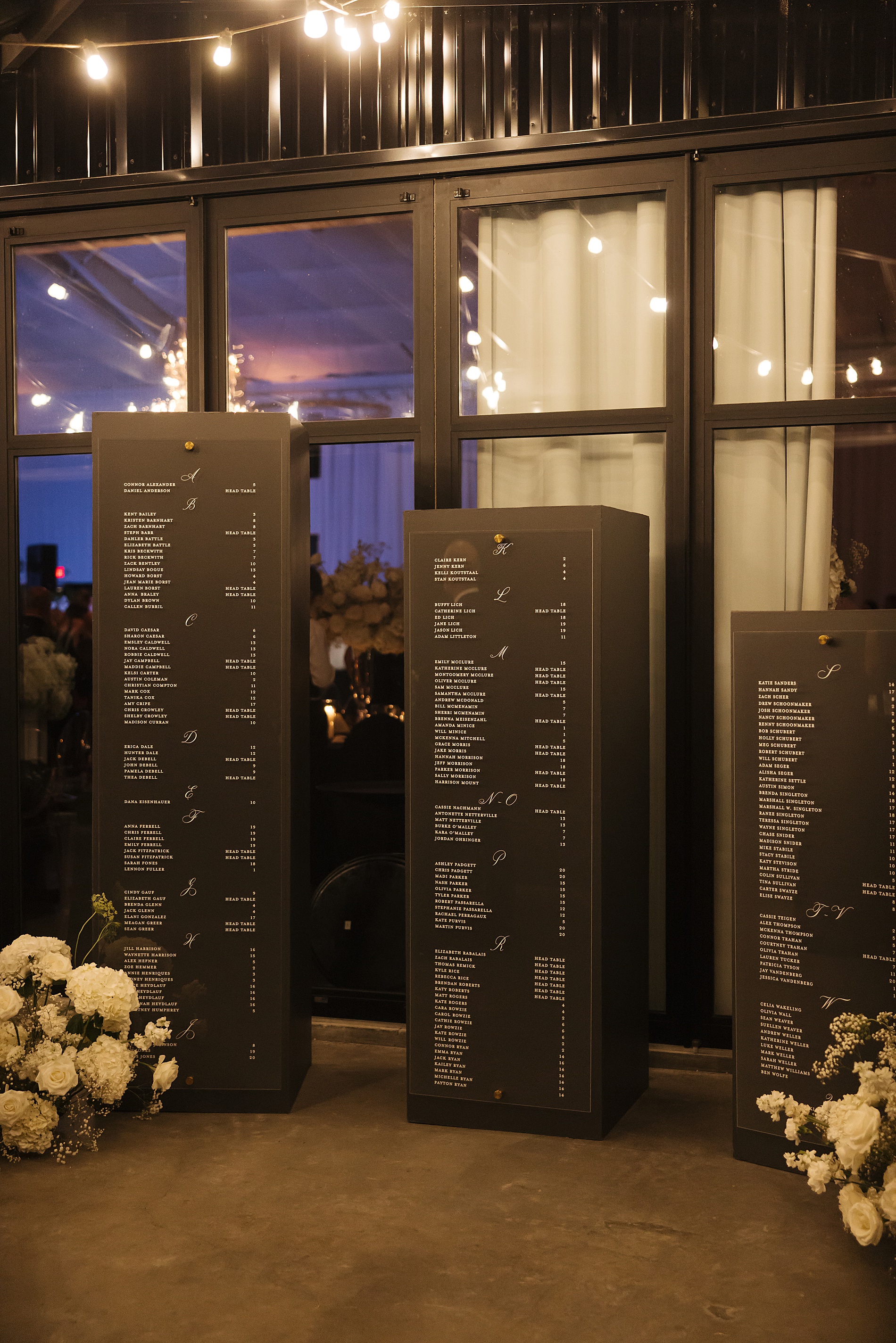
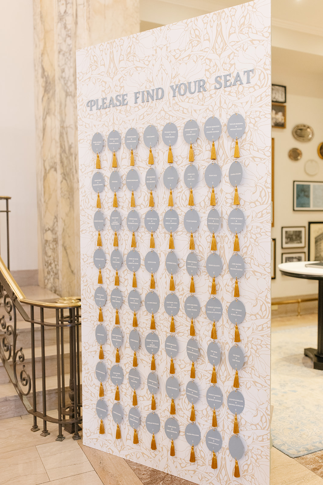
An Elegant Seating Chart
The seating chart was a masterpiece! The gold vintage framed mirrors in different styles and sizes hung on a display wall. This served as a functional focal point for guests to locate their table number and seat. Each guest’s name was written on the mirrors in white calligraphy and the entire display was accented with gorgeous florals that carried on throughout the reception.
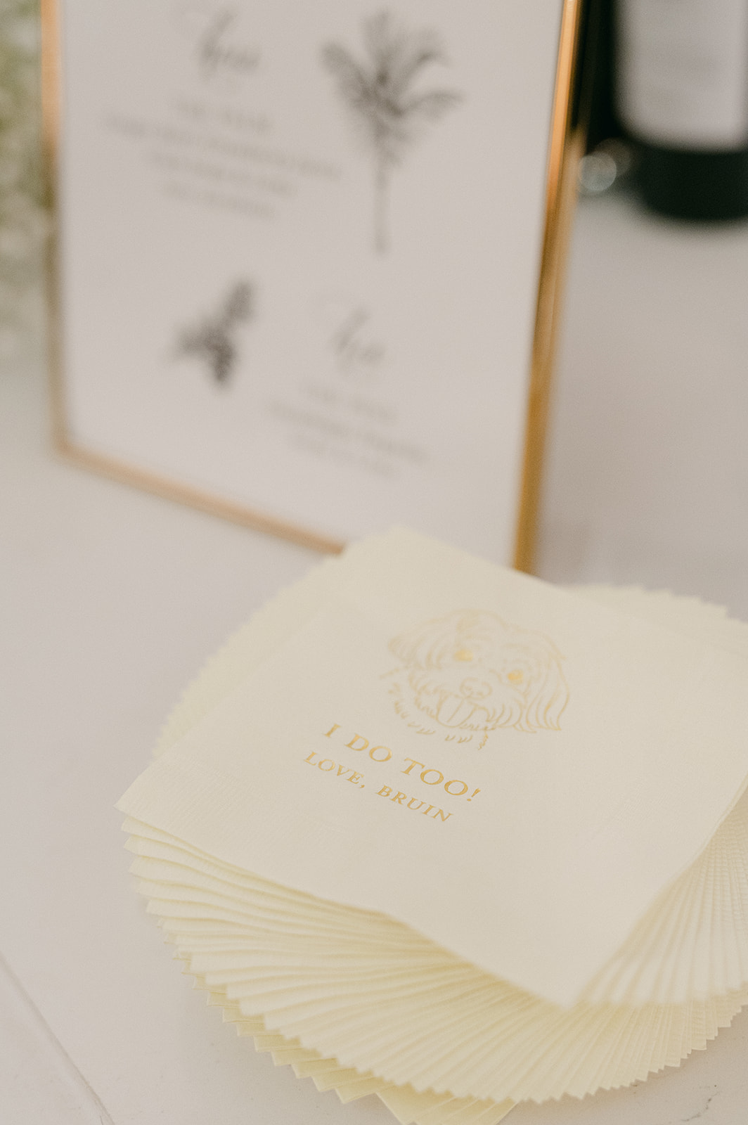
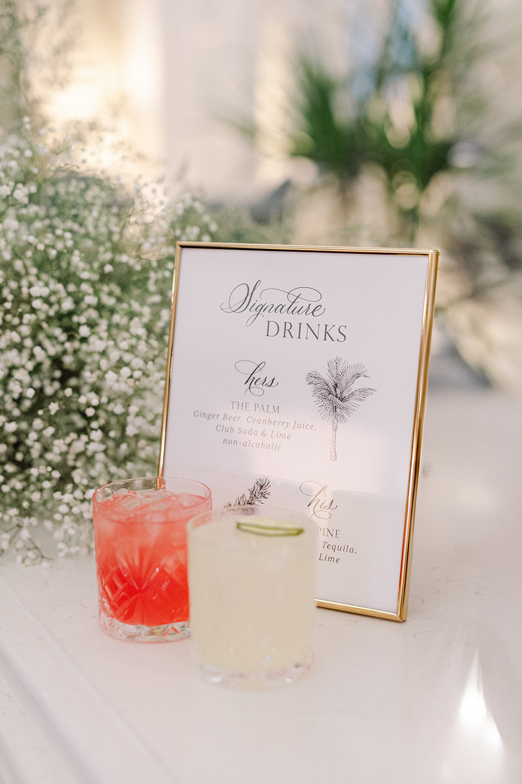
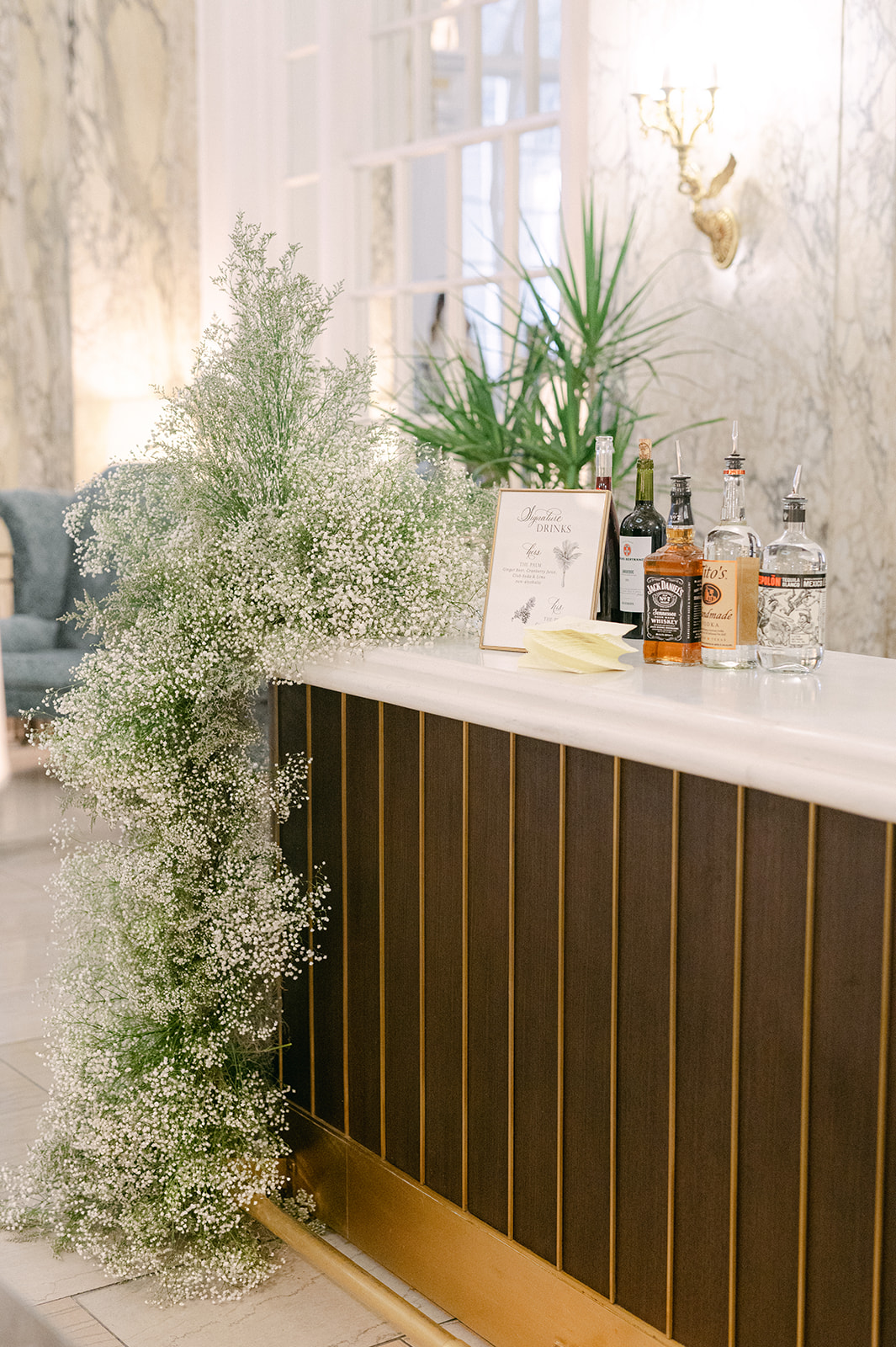
From the custom bar sign, a welcome sign that cohesively tied in the seating chart, custom napkins, table number signs and all the stationery in between, this wedding was so much fun to work on. I love the classic, elegant aesthetic of this wedding, as well as the talented Nashville vendors I had the joy of working alongside! If this is how 2025 started, I can’t wait to see what is to come!
If you’re looking to add custom, thoughtful touches to your wedding or event, we would love to help make your vision a reality. Reach out today to learn more about our full-service design offerings—we can’t wait to create something unforgettable for you!
If you enjoyed this post, you’ll love these other blogs!
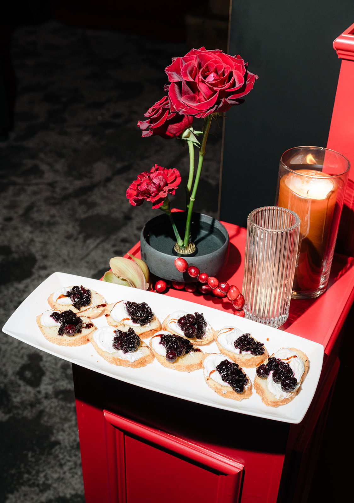
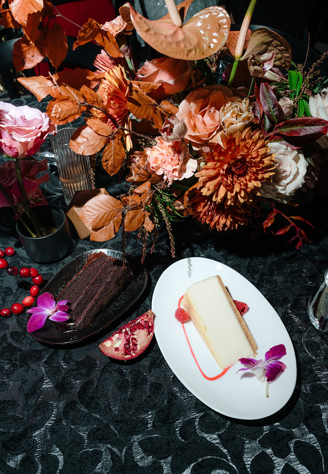
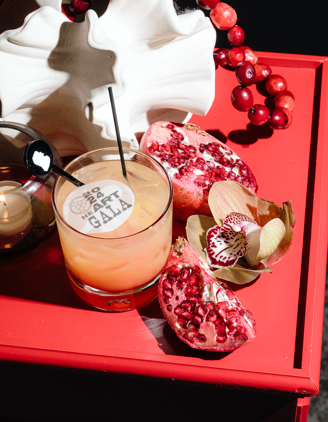
To close out an incredible year, White Ink Calligraphy + Co. attended the Wedding International Professionals Association (WIPA) Gala in Nashville. This exciting annual event brings together local wedding professionals to celebrate, connect, and reflect on another successful season. WIPA hosts events throughout the year that encourage learning, networking, and growth. However, the gala is all about celebrating—and we were thrilled to be part of it!
Nashville WIPA Gala: A Night to Remember
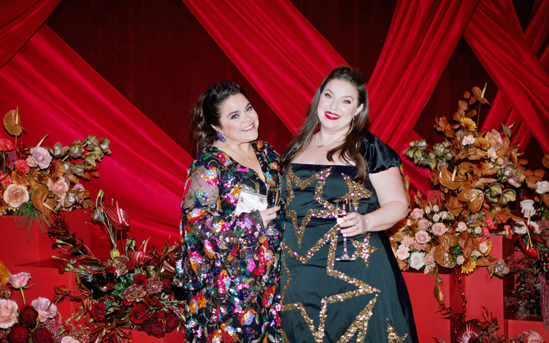
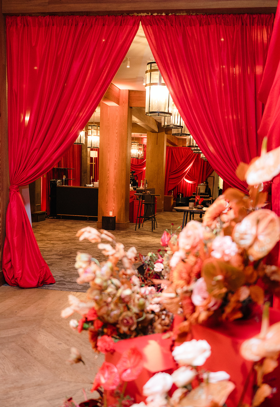
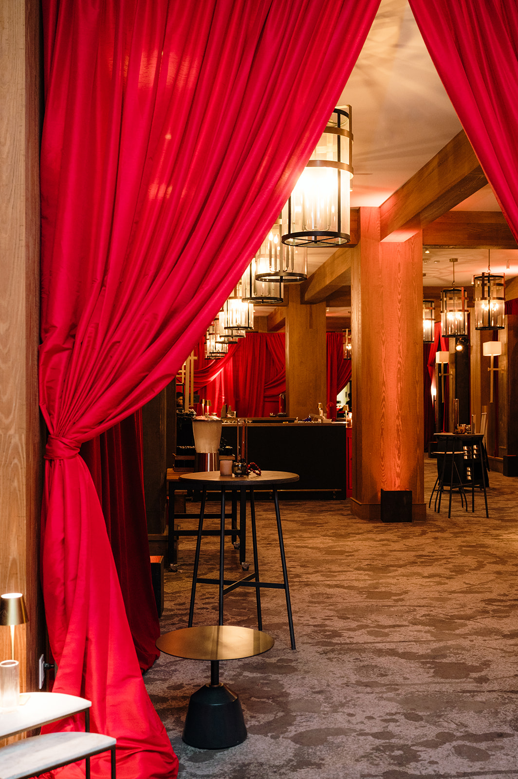
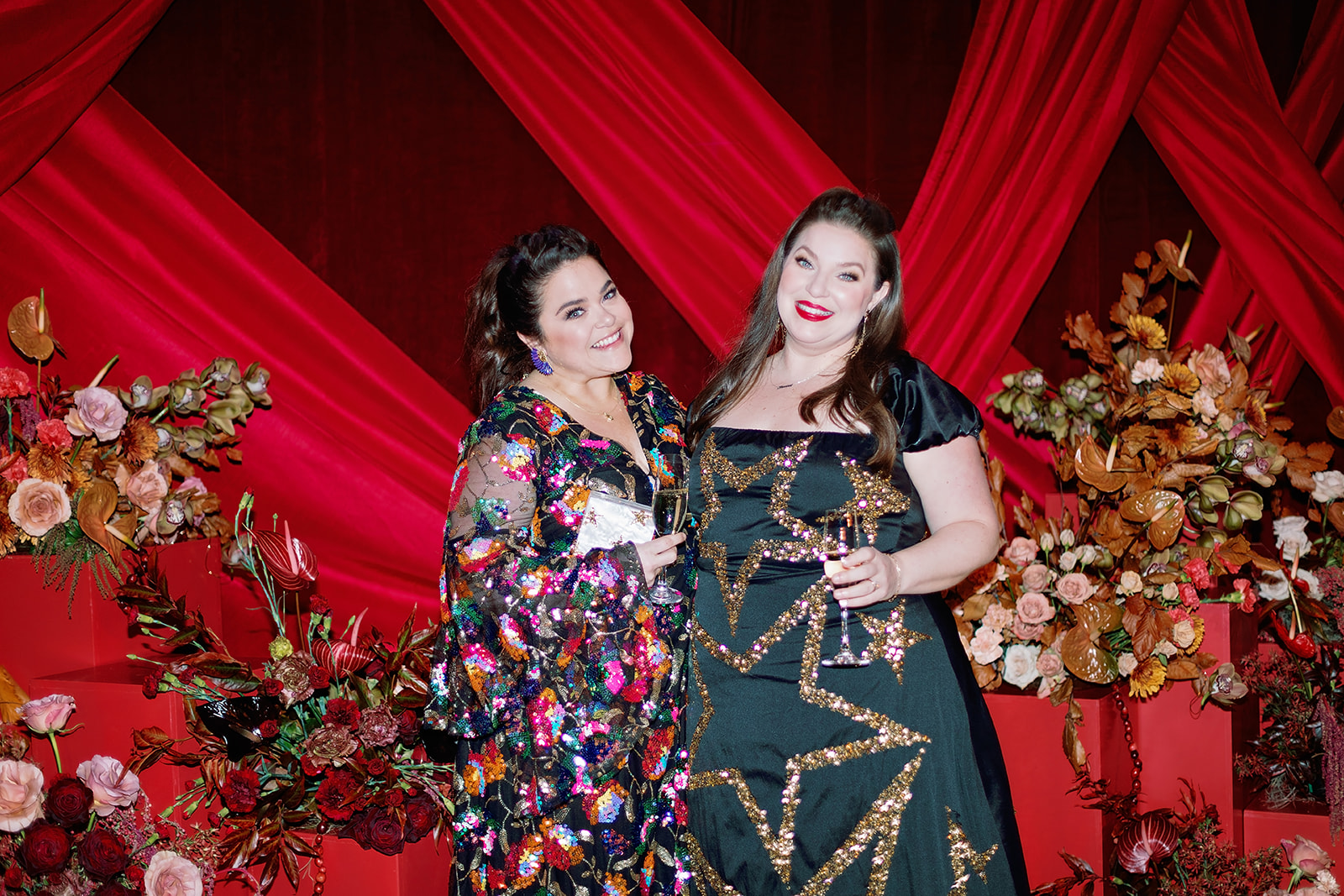
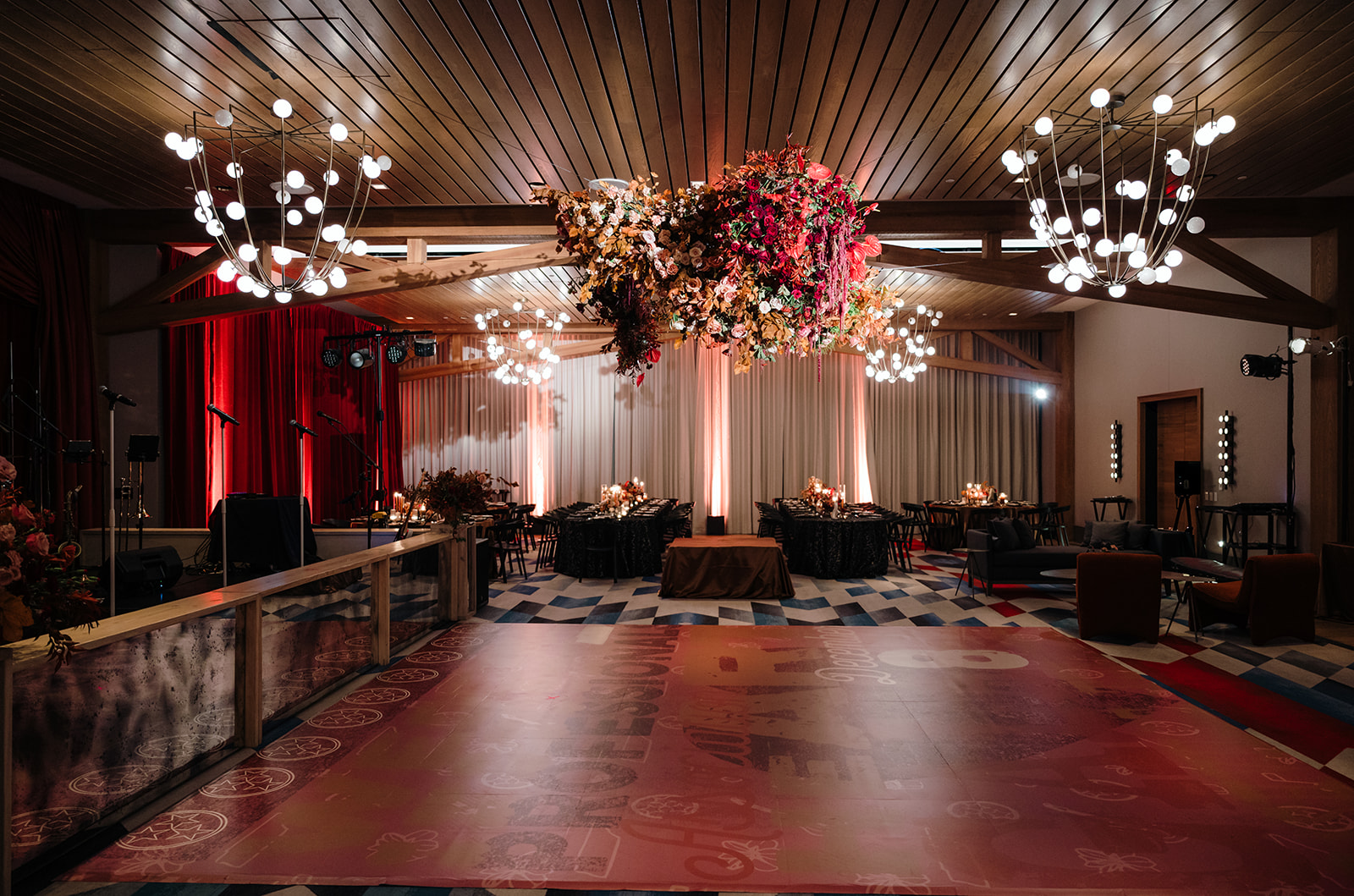
The gala took place at the stunning Virgin Hotel Nashville on December 8th, right after our last event for the year, which meant we were excited to celebrate the end of the year! As active members of WIPA, it was an honor for my team and I to attend the gala as guests but also to contribute to the event’s details. Townley, White Ink’s stationer, and I enjoyed a well-deserved night out, surrounded by familiar faces and fellow wedding industry creatives.
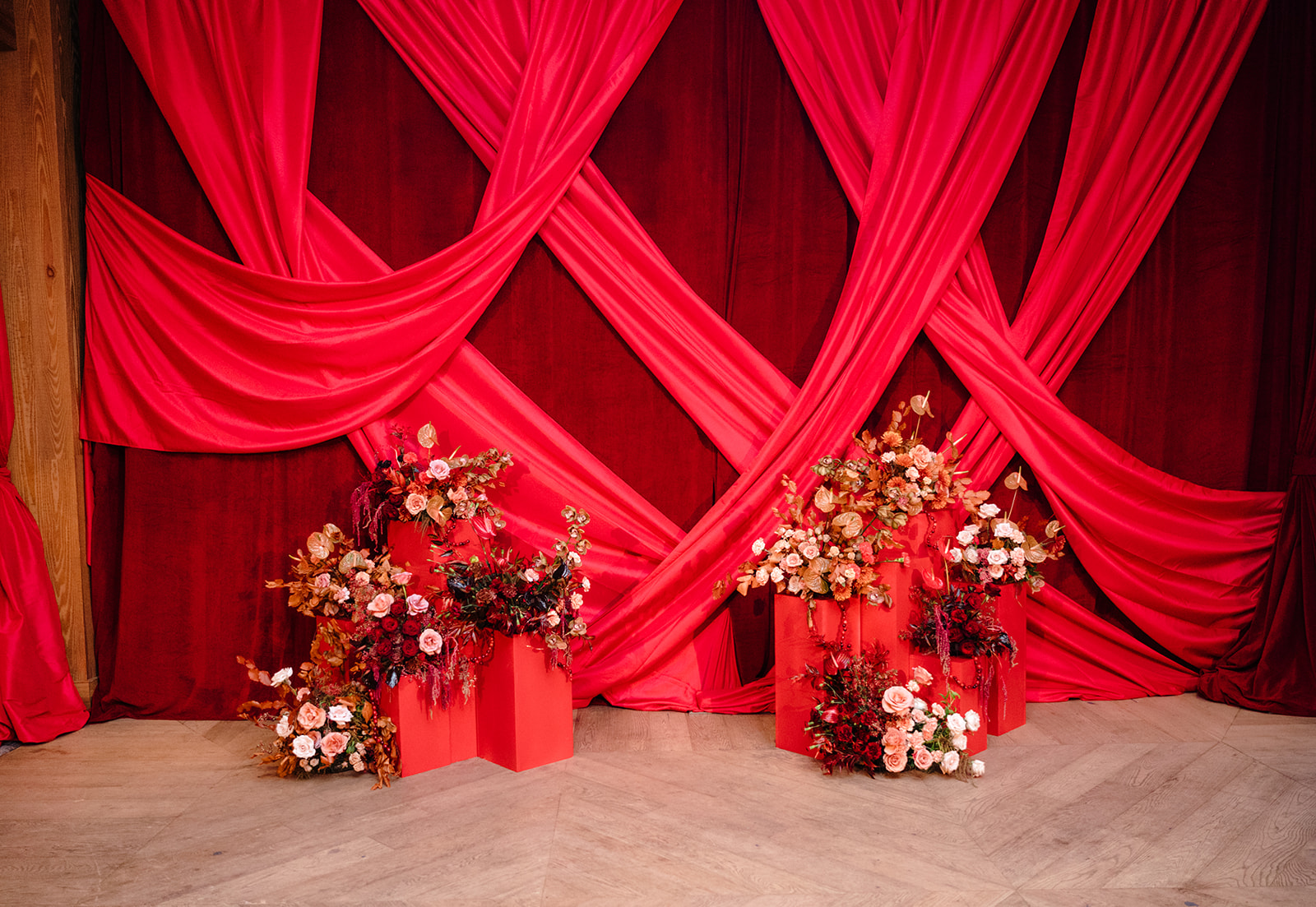
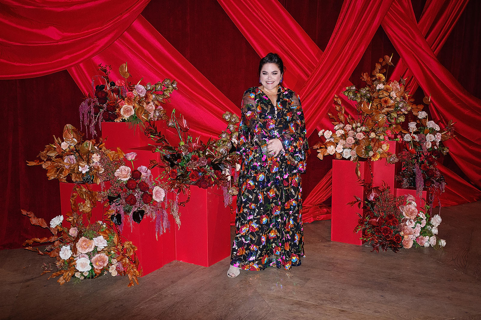
Everyone arrived dressed to impress, and the red carpet entrance set the tone for a glamorous evening. Photographers captured guests as they arrived, framed by a striking red draping and exquisite florals designed by the incredibly talented Rosemary & Finch—a perfect backdrop for portraits.
Our Red Carpet Looks
Townley and I made sure to embrace the occasion with stylish outfits from The Showroom Nashville, owned by one of our past brides, Kristen Geyser. Townley’s dress, adorned with golden stars, was a nod to the Tennessee flag, while I chose a sparkling ensemble. We even treated ourselves to hair and makeup by the amazing Katie-Laine Thornton, making the night feel extra special!
The heART of Nashville: A Celebration of Artistry
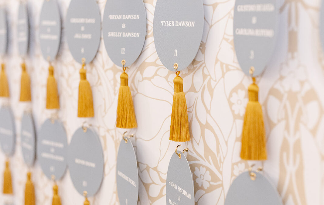
The theme of this year’s gala, “The heART of Nashville,” with an emphasis on Nashville ART, to celebrate the city’s rich artistic culture. We had the honor of crafting custom stationery pieces that reflected this theme in a creative and meaningful way.
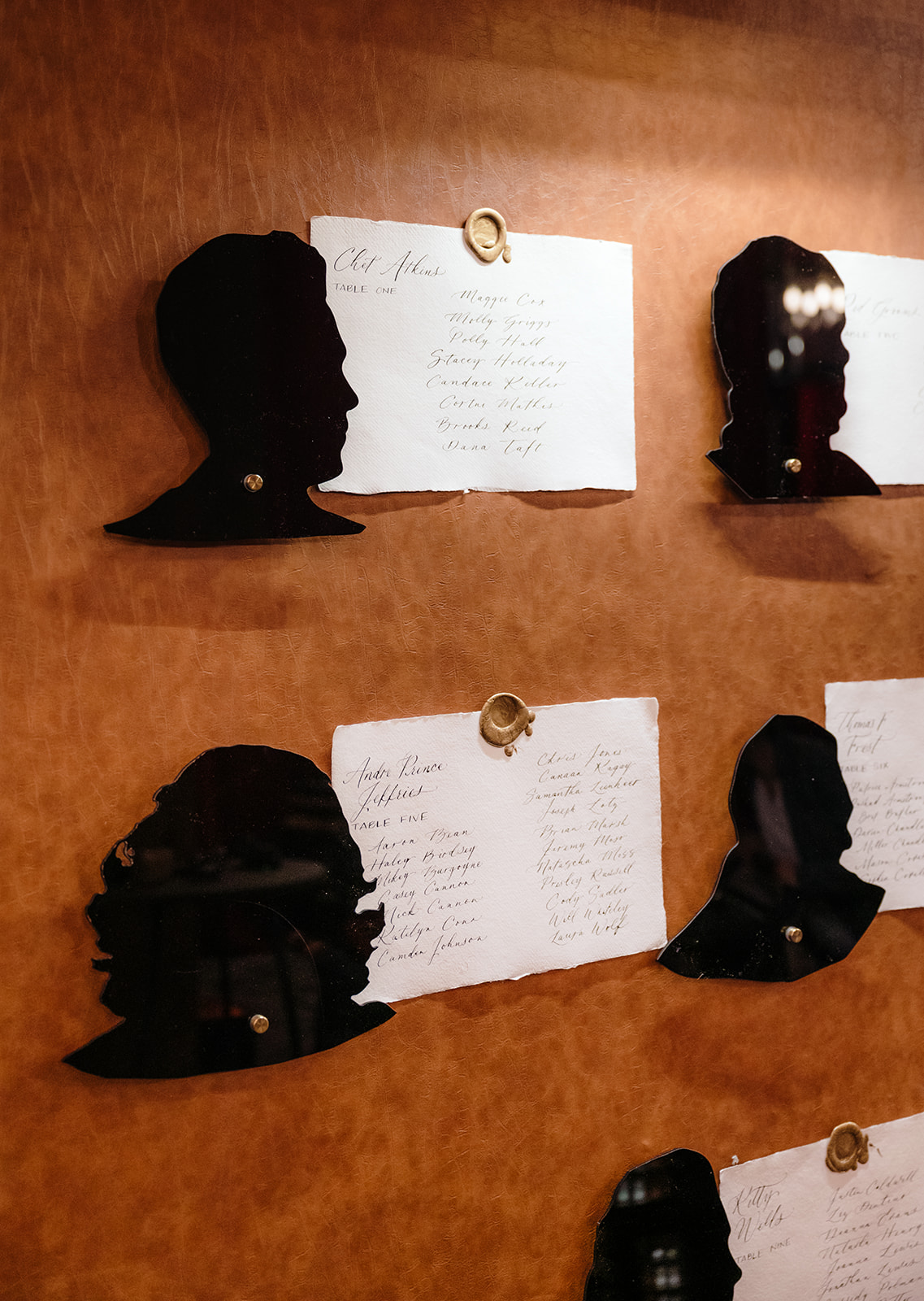
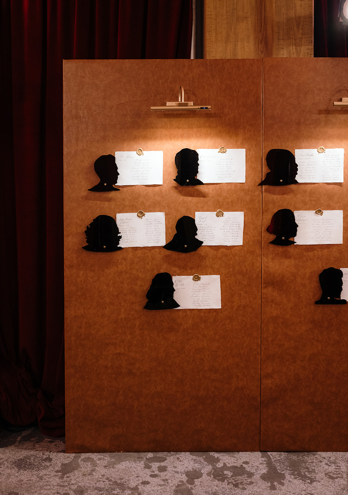
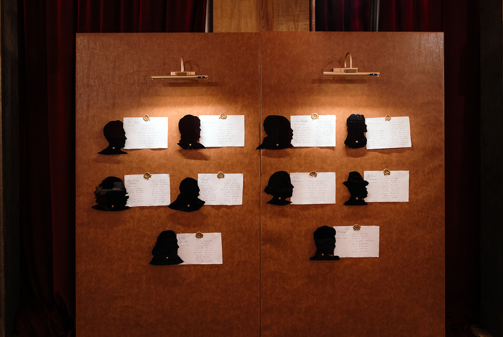
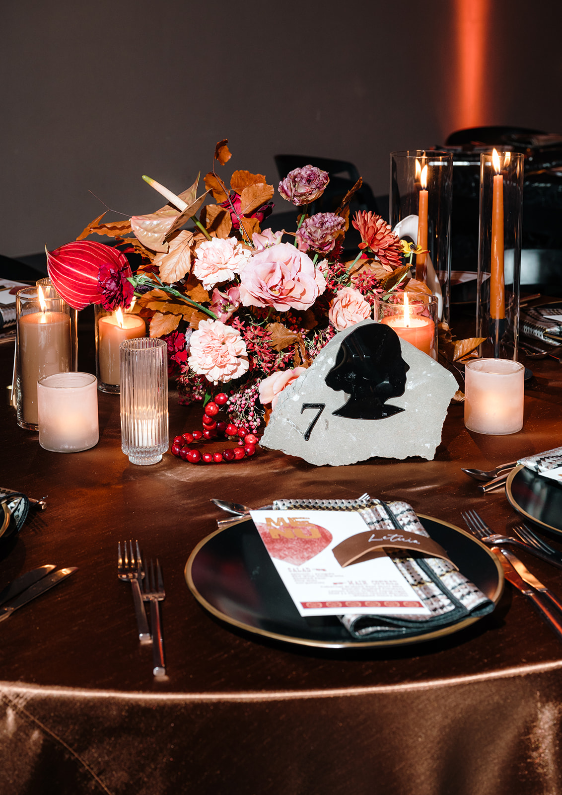
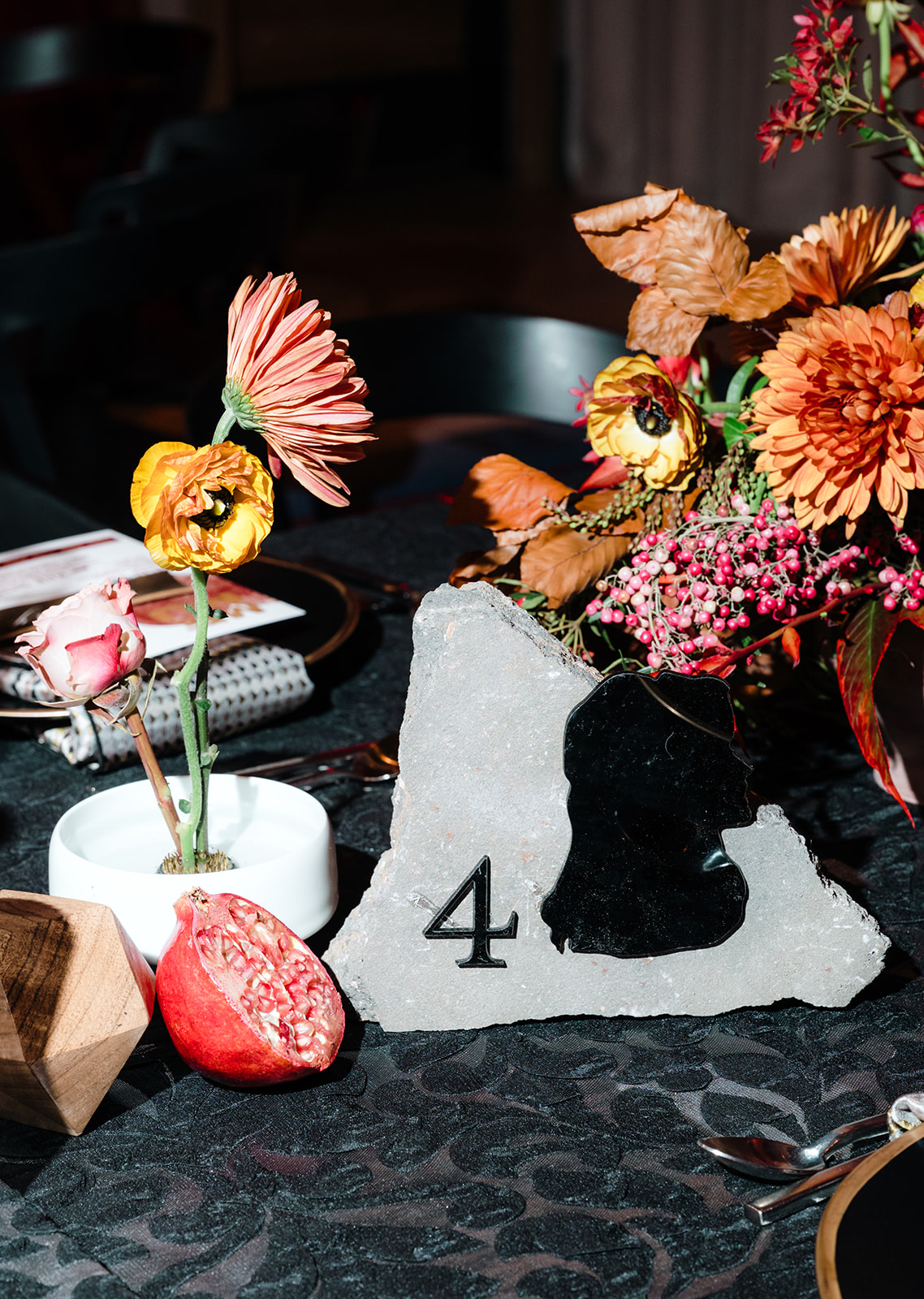
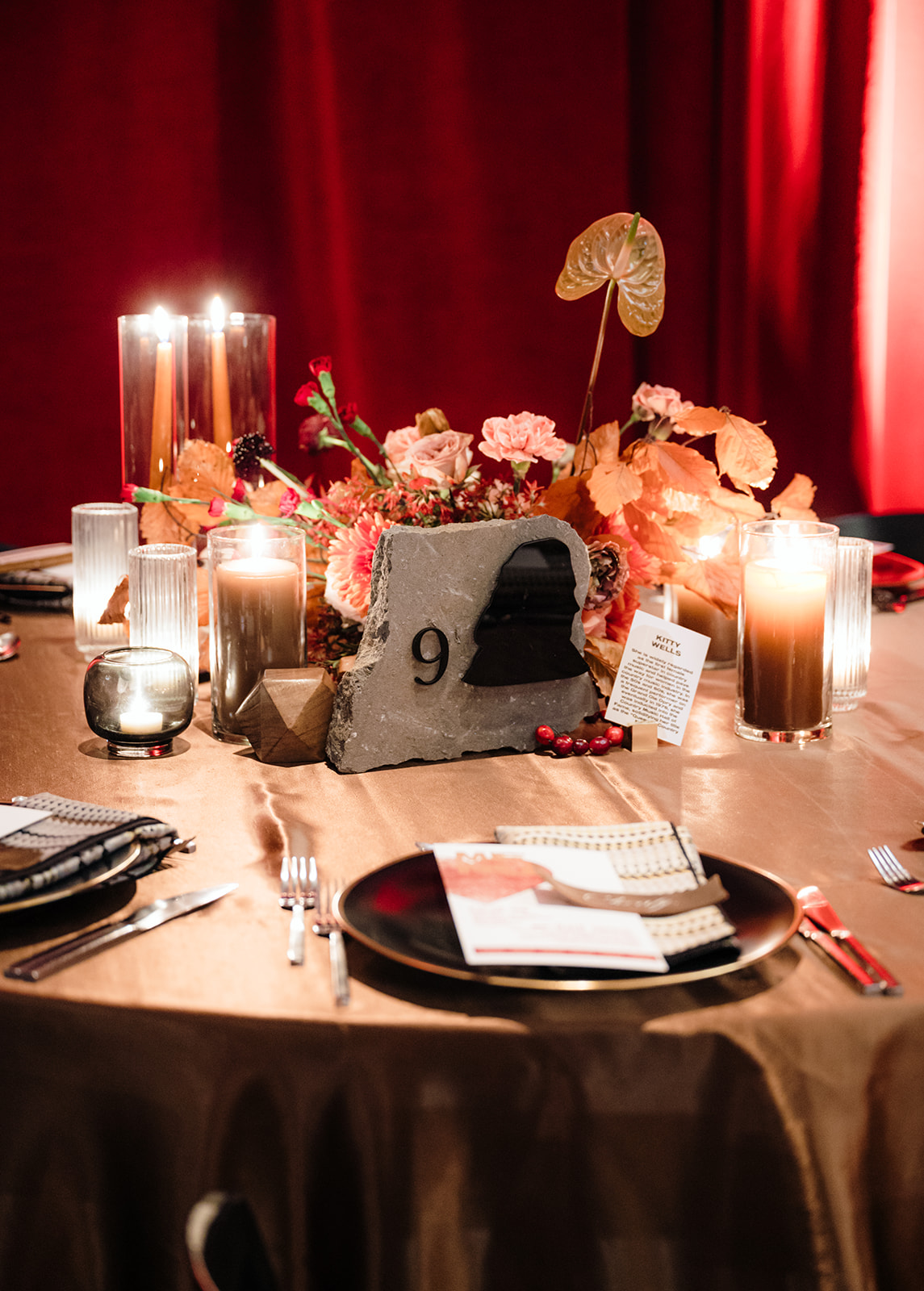
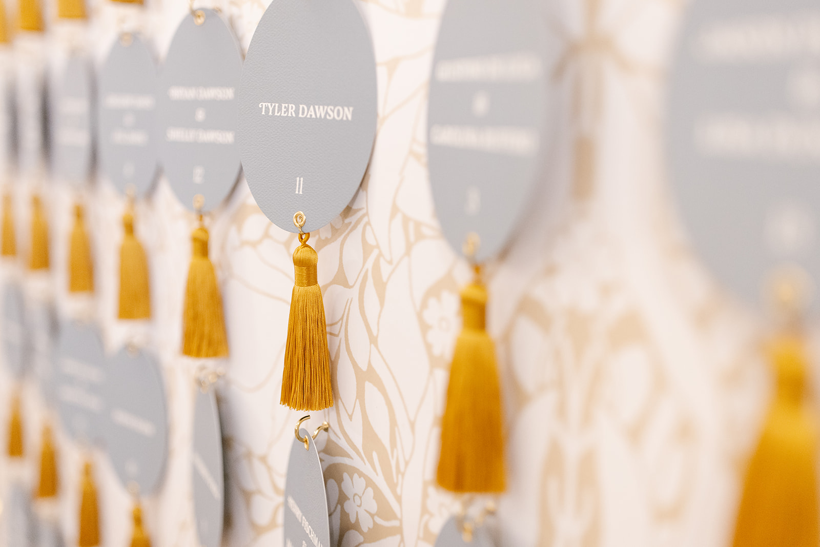
The Seating Chart
We elevated the seating chart design by incorporating handmade paper for calligraphed guest names, all mounted on a backdrop lined with leather, creating a sophisticated and tactile experience. Next to each piece of paper were Silhouettes of different Nashville artists that served as another table identifier.
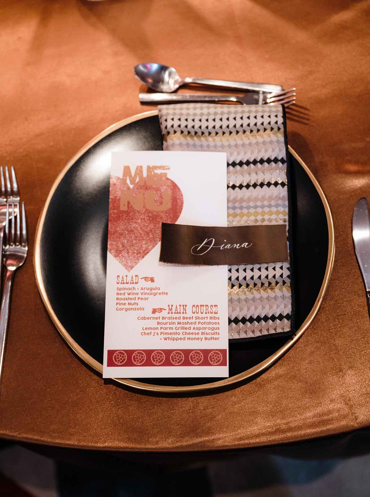
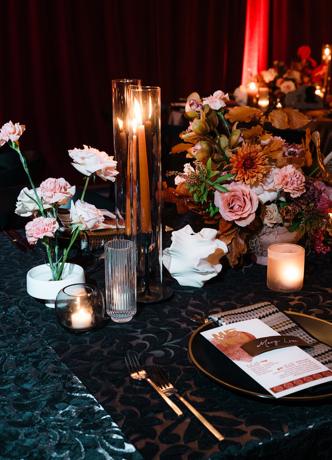
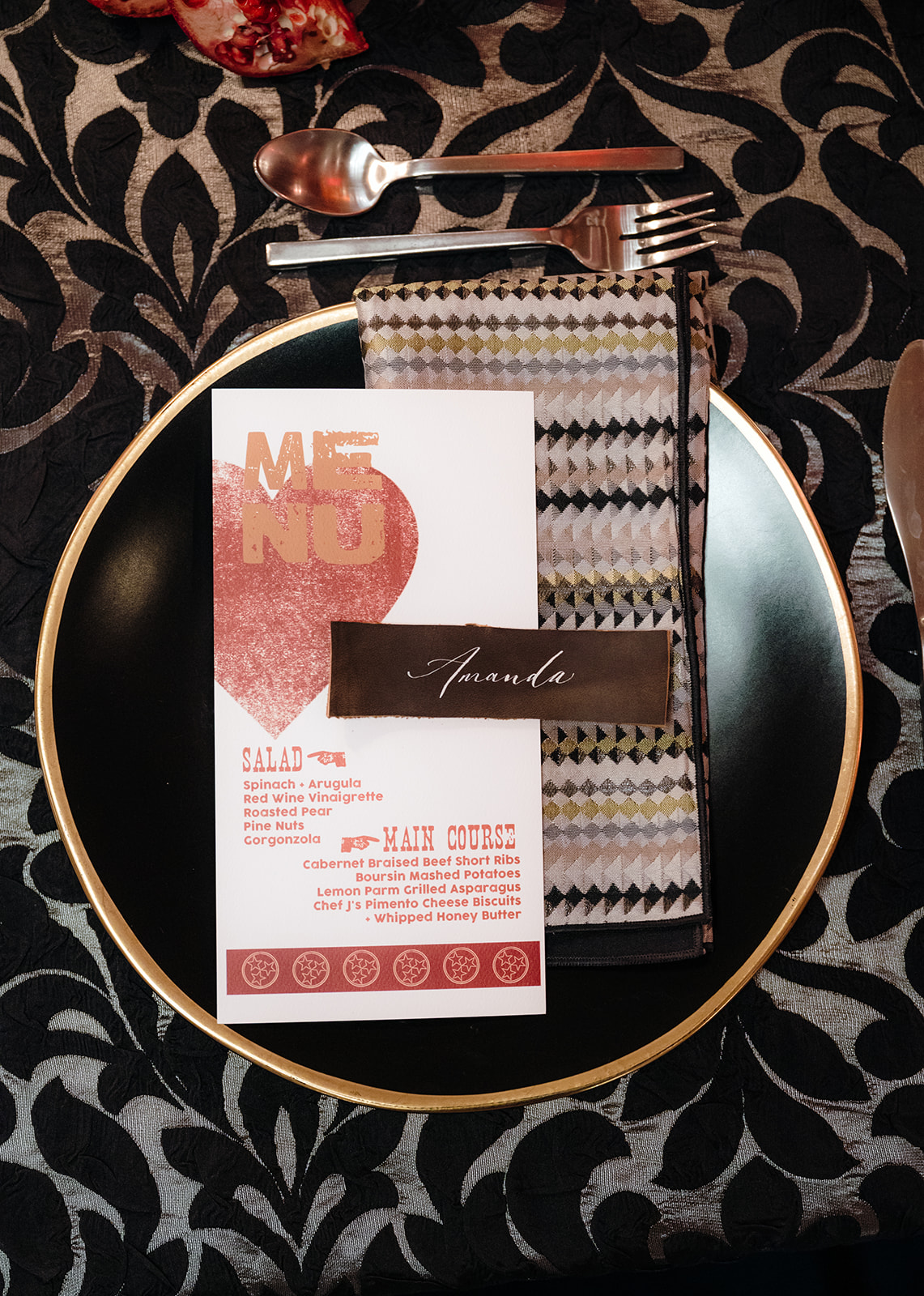
Place Cards + Menus
Leather was also used for the place cards. Our signature white ink calligraphy was elegantly displayed on leather place cards resting atop each menu. Inspired by the classic Hatch Print style, our menus added a touch of vintage Nashville charm to each place setting.
Unique Table Numbers
Lastly, the table numbers came from Tennessee limestone and featured silhouettes of Nashville artists, tying in beautifully with the seating chart design, where coordinating silhouettes were placed next to the handmade paper list.
A Perfect End to 2024
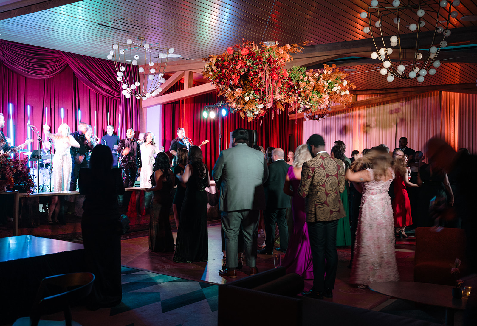
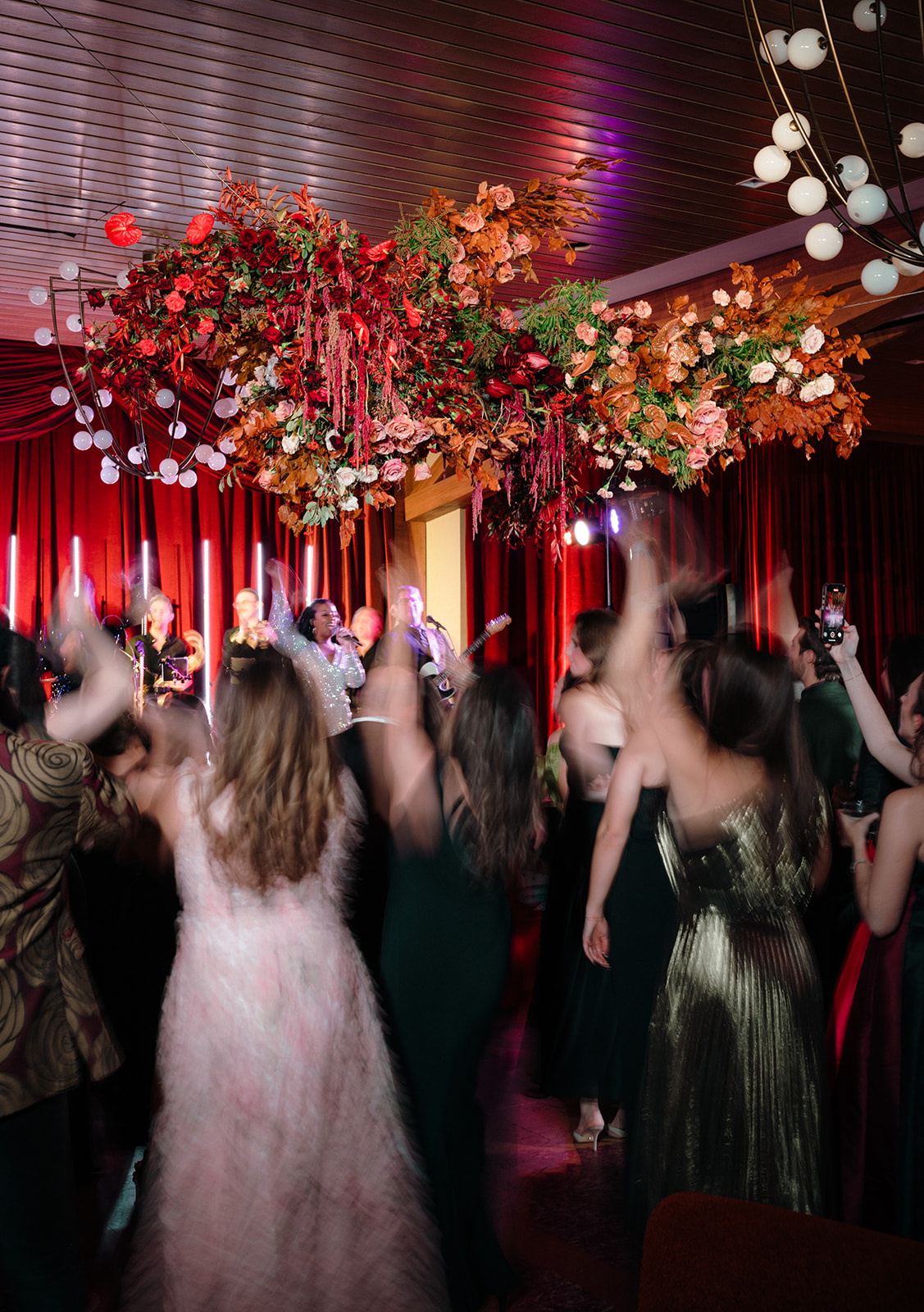
From the delicious food and cocktails to the lively dancing and wonderful company, the WIPA Gala was truly a night to remember. It was the perfect way to reflect on another successful year. We are so grateful for the wedding community in Nashville and beyond, and we can’t wait to see what the rest of 2025 brings!
If you’re looking for custom, one-of-a-kind stationery and calligraphy details for your wedding or special event, we’d love to bring your vision to life. Reach out today to learn more about our full-service design offerings—we can’t wait to create something unforgettable for you!
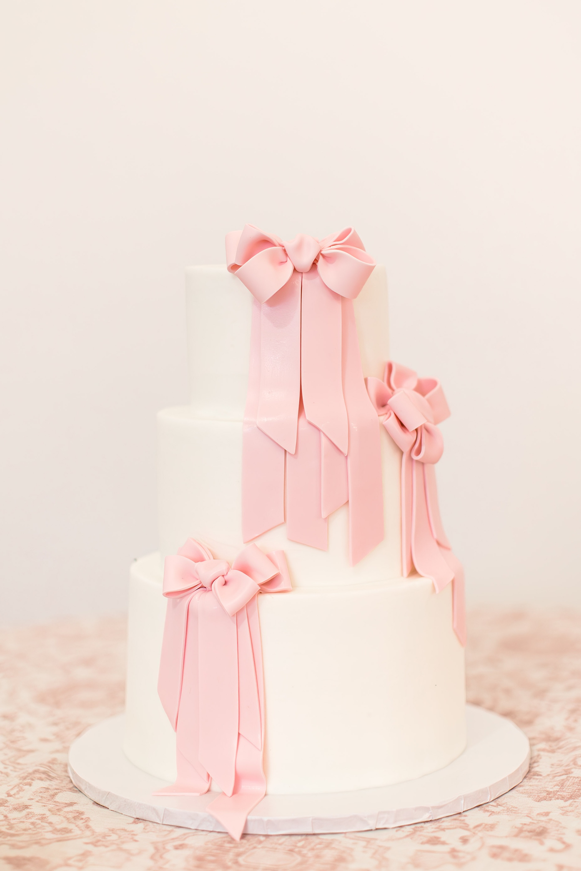
This elevated pink-inspired wedding at Diamond Creek Farms was a dream come true – especially for a bride who adores all things pink. Designed with sophistication and charm, this celebration was nothing short of spectacular. It was an honor to contribute our custom stationery and signage to such a spectacular event.
The incredible planner, Annie Weir of Elizabeth Events who helped bring the bride’s fun vision to life is one that we’ve had the privilege of working with since White Ink Calligraphy + Co, started eight years ago. She has an unmatched ability to make wedding dreams a reality, and this wedding was no exception. The execution of all the details was flawless.
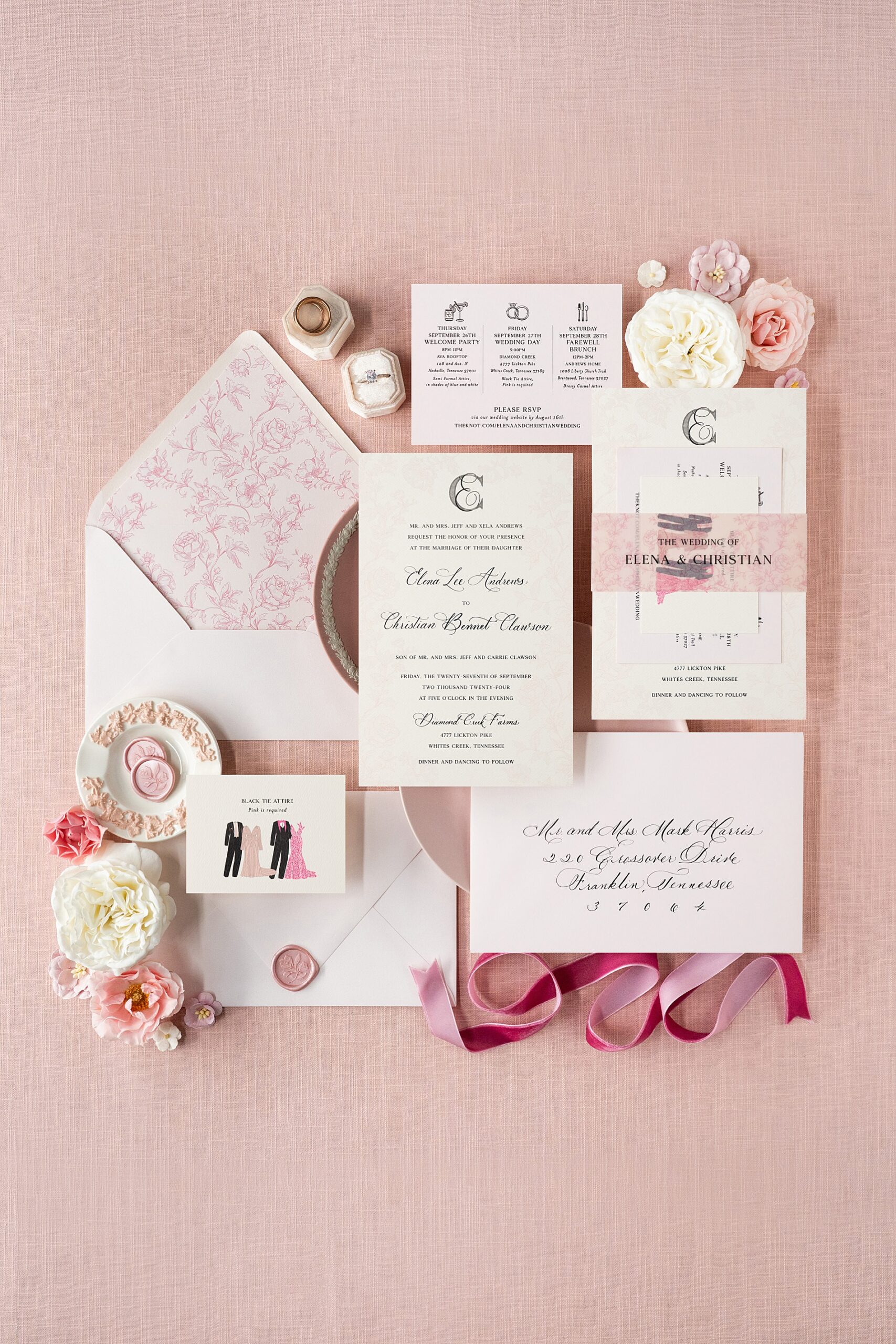
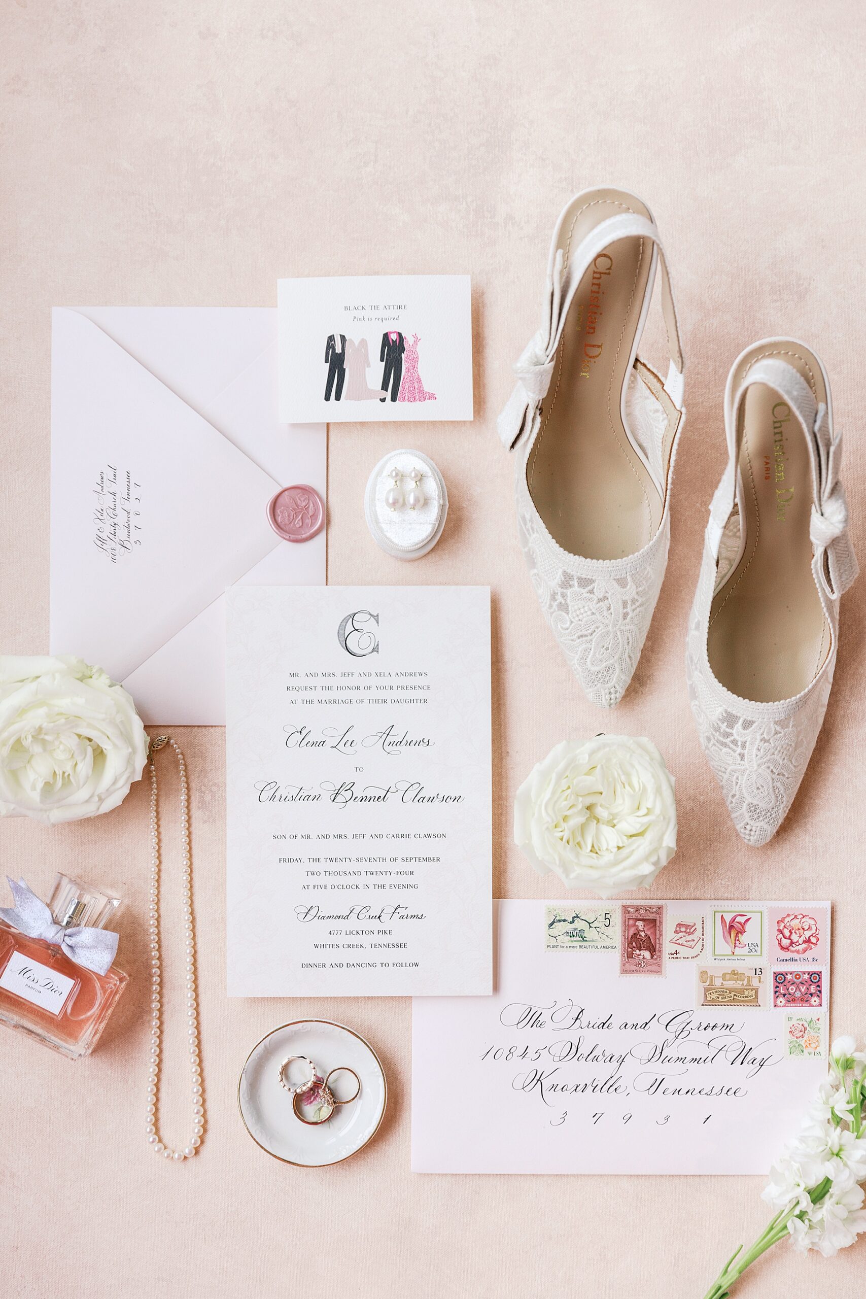
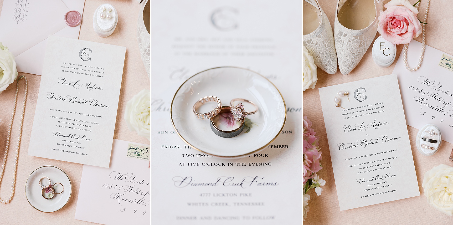
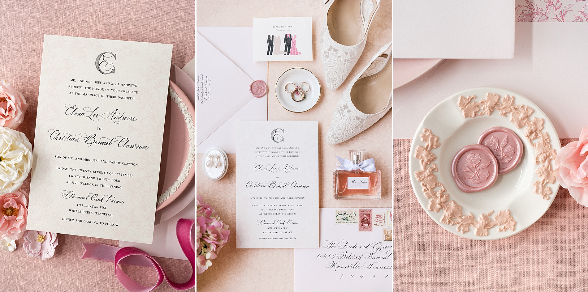
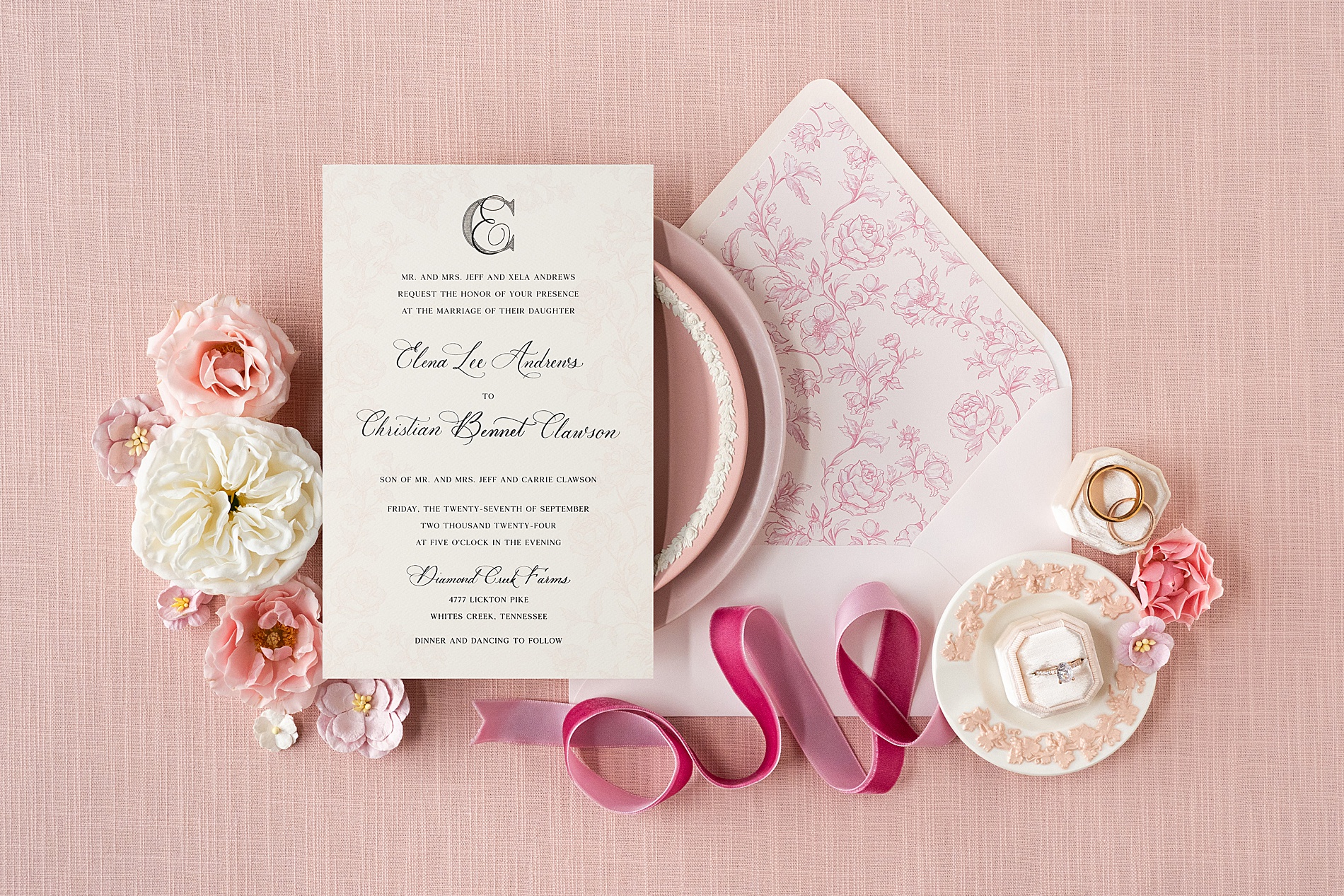
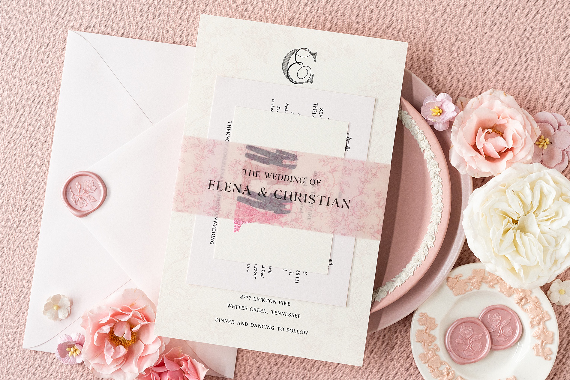
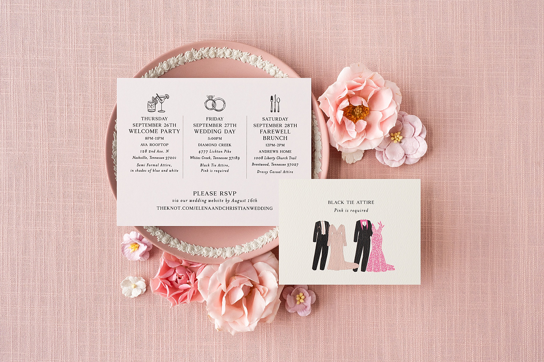
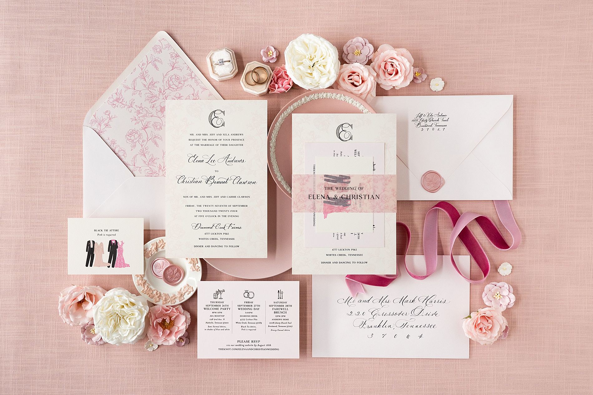
The Stunning Invitation Suite
To set the tone for this unforgettable wedding, we designed an elegant invitation suite that was equal parts timeless and trendy. The suite featured:
A main invitation with spot calligraphy
Envelope calligraphy
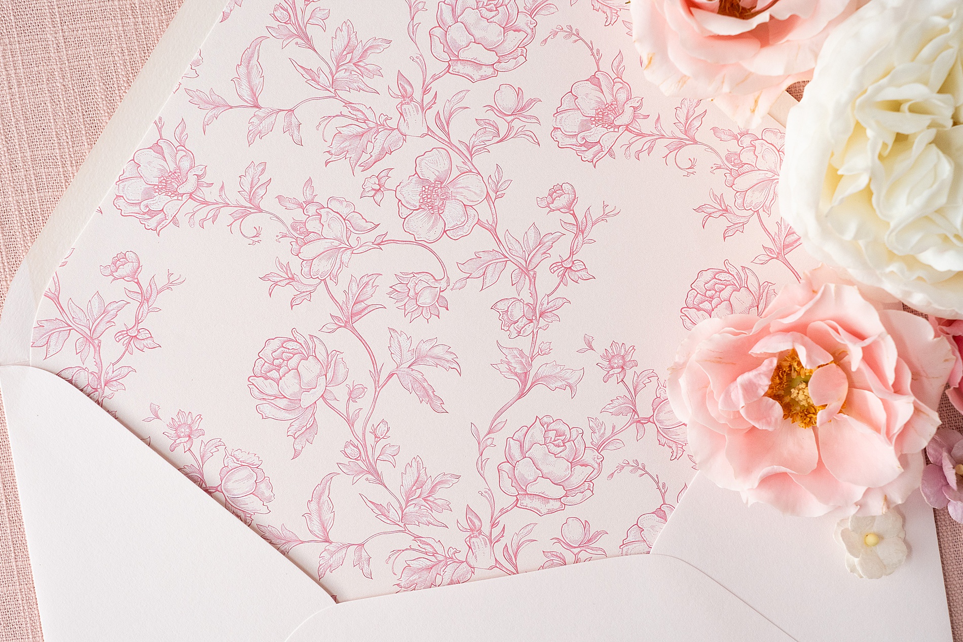
A custom envelope liner that featured soft pink floral designs
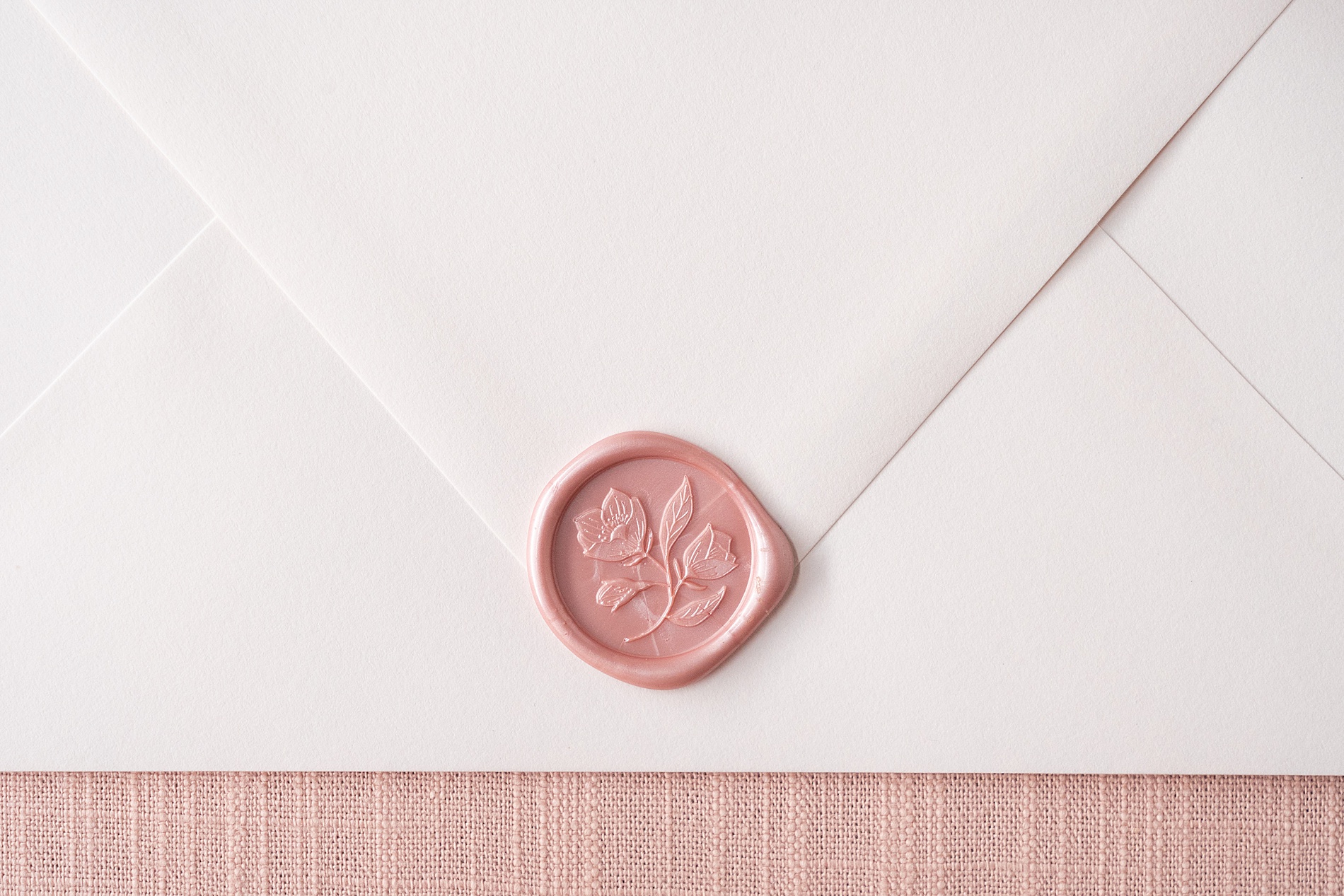
A pearlized pink wax seal
A vellum bellyband
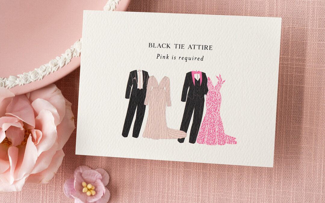
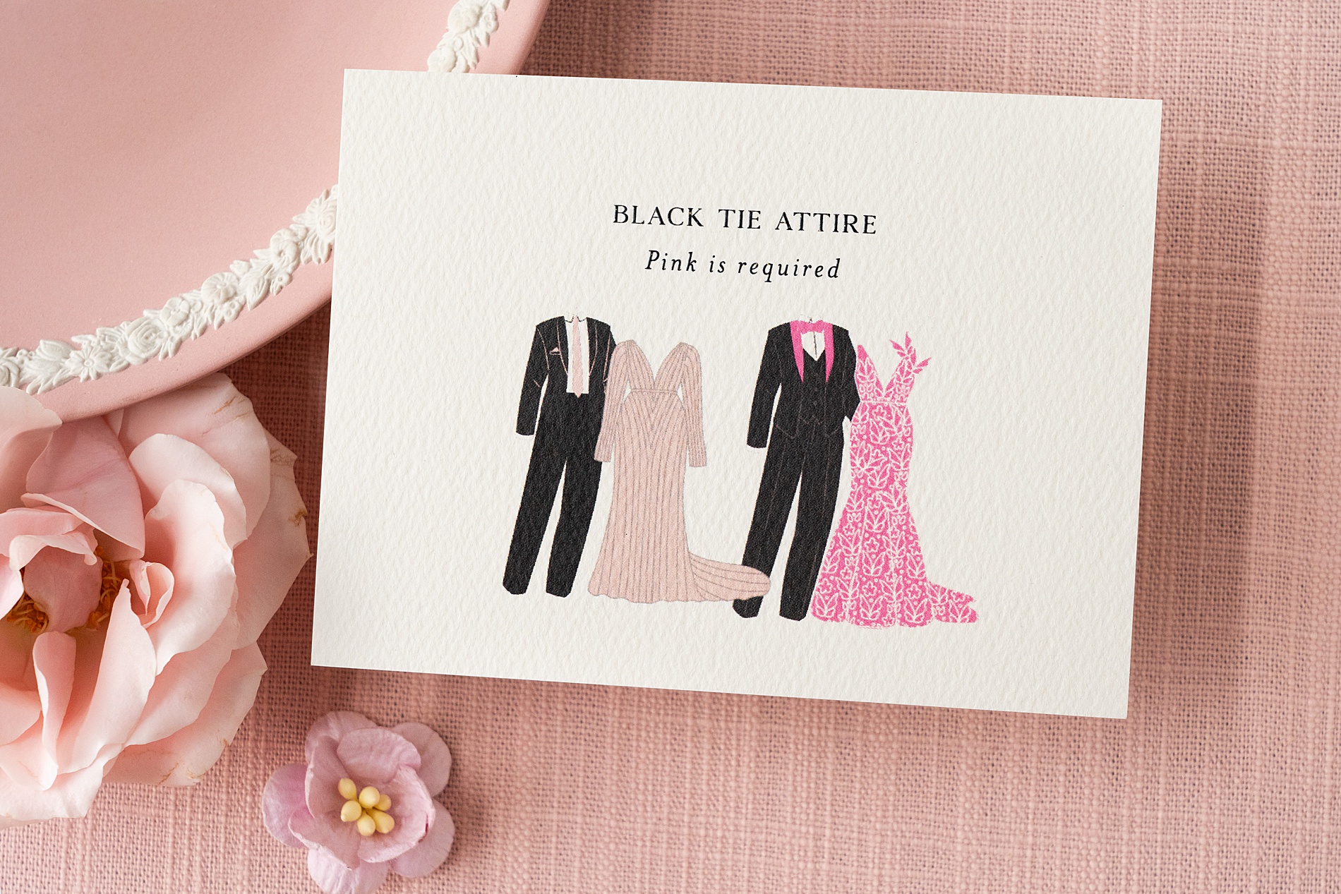
An attire card with the bold pink dress code request – more on that below!
A details card featuring fun icons and a note about a digital RSVP
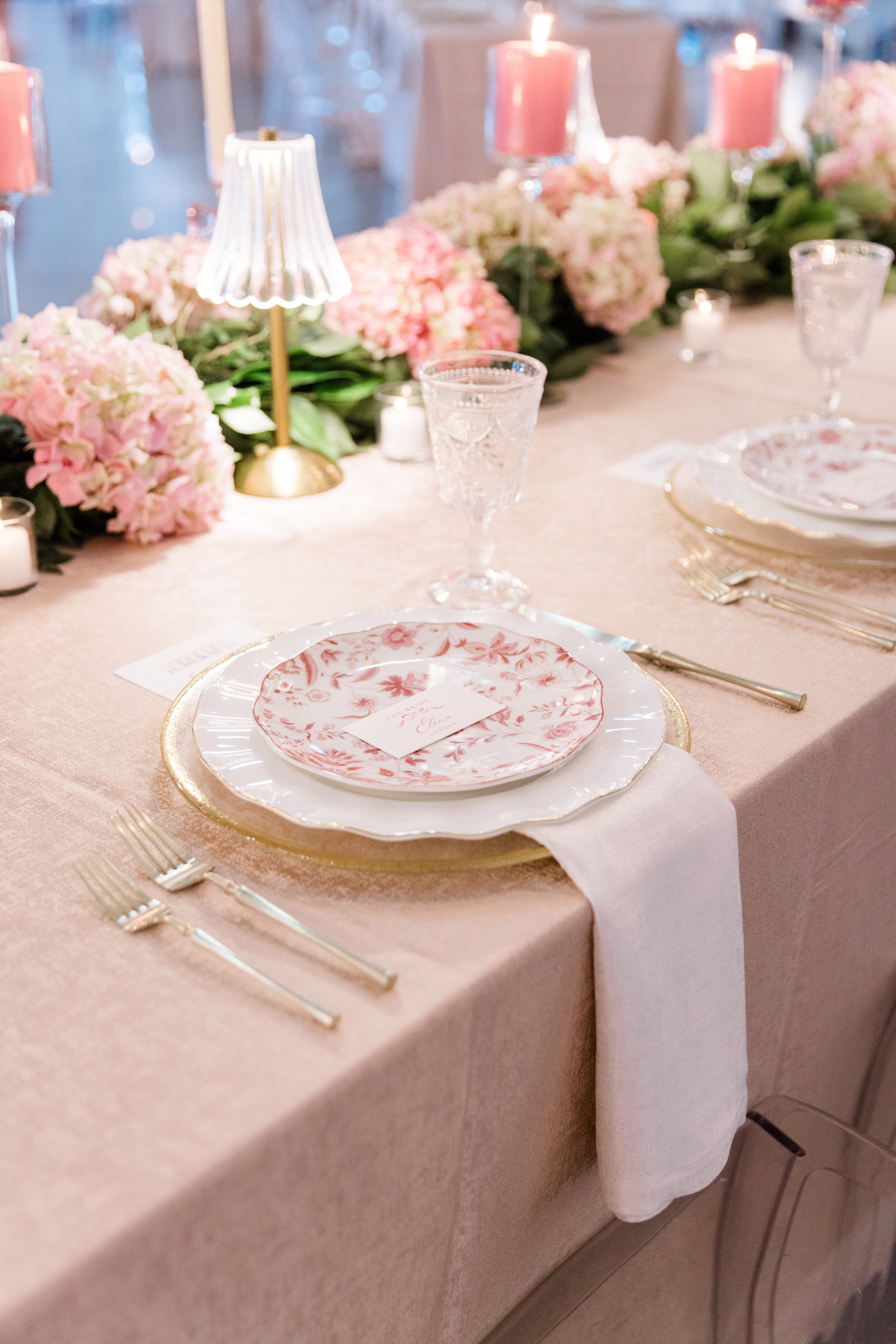
We designed every element of the suite to reflect the bride’s personality and vision for the wedding. Cream and blush tones came together to create this elegant suite along with our custom touches!
Pink Attire Request Worthy of Its Own Card
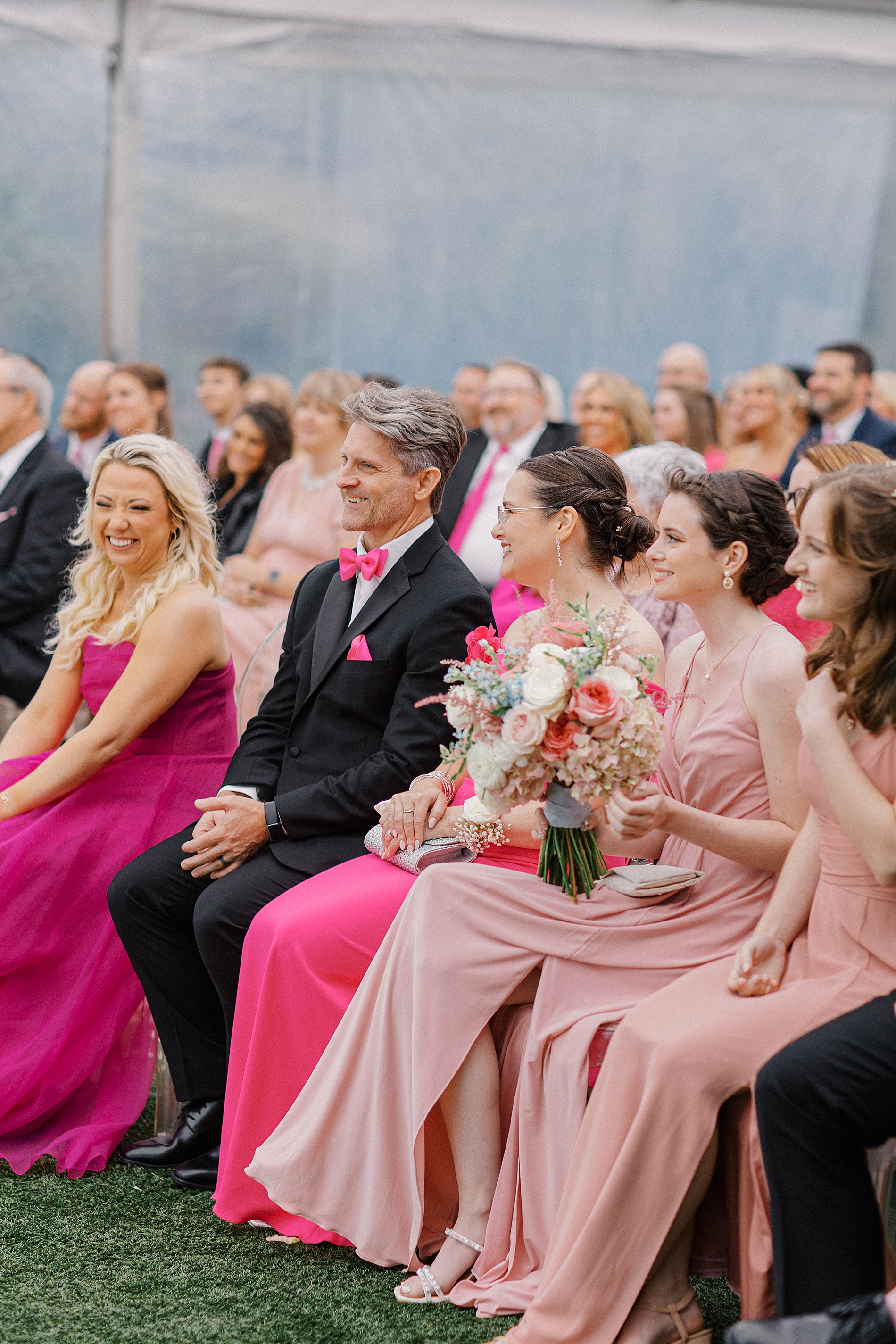
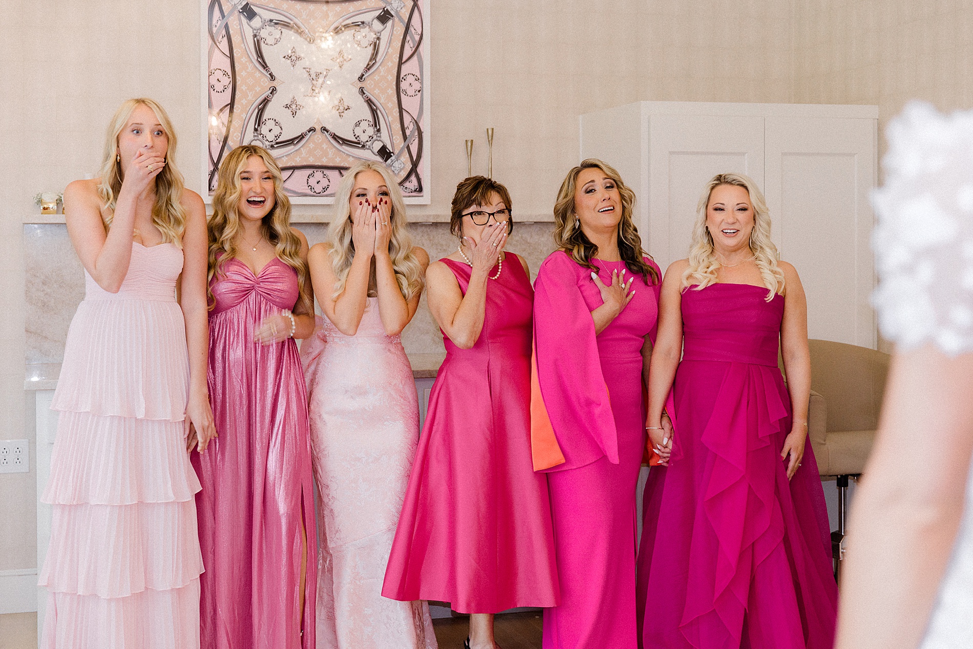
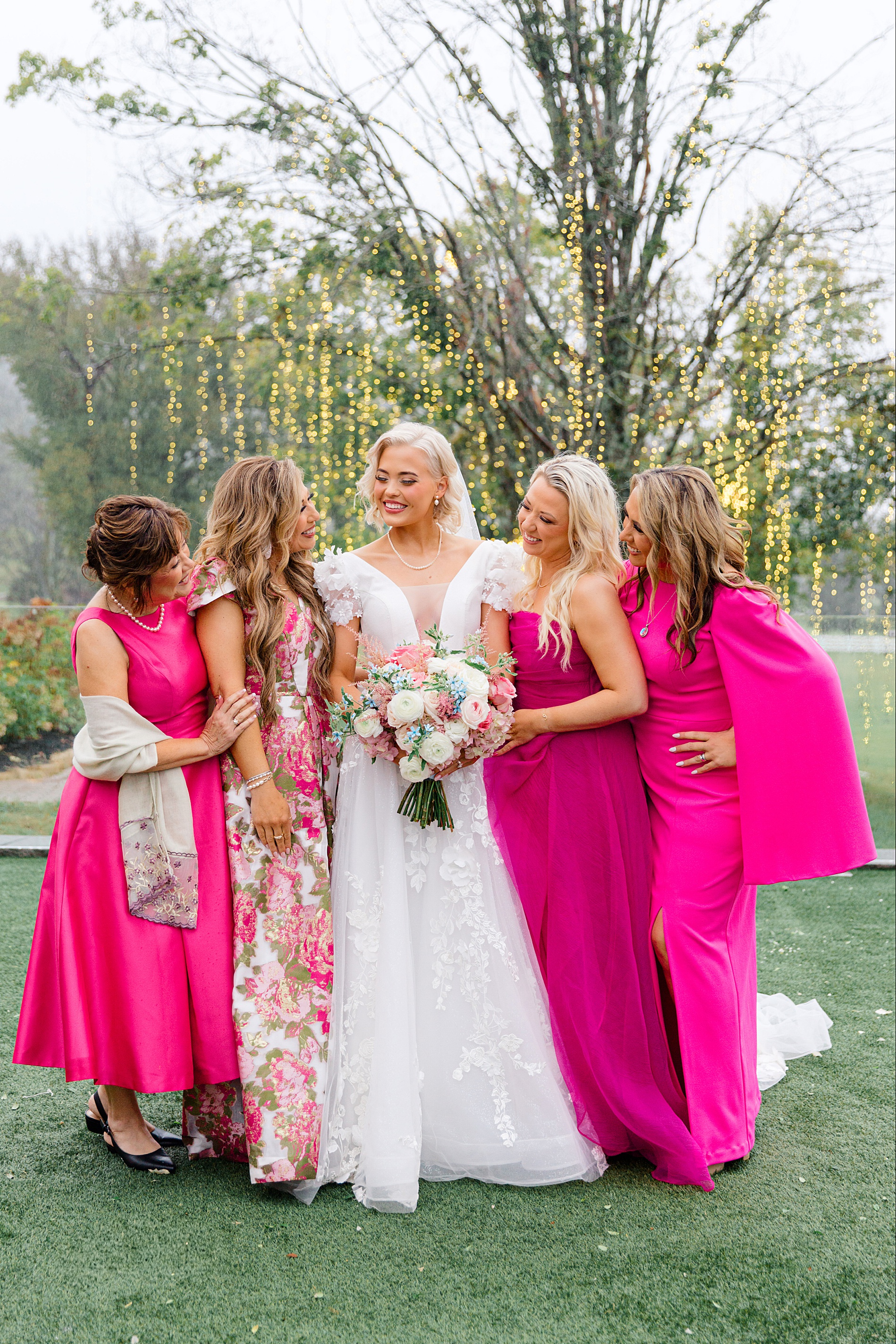
While most weddings include an attire note on the main invitation, this wedding called for something extra special. The fun and girly bride’s love for pink wasn’t just reflected in the details—it was a core theme of the entire event. To highlight this theme, she wanted all the guests to wear pink. To emphasize this fun request, we designed separate attire cards that read: Black Tie Attire, Pink is Required. Let me just say, the guests absolutely delivered! From soft blush tones to bold pink hues, the guest attire was nothing short of fabulous.
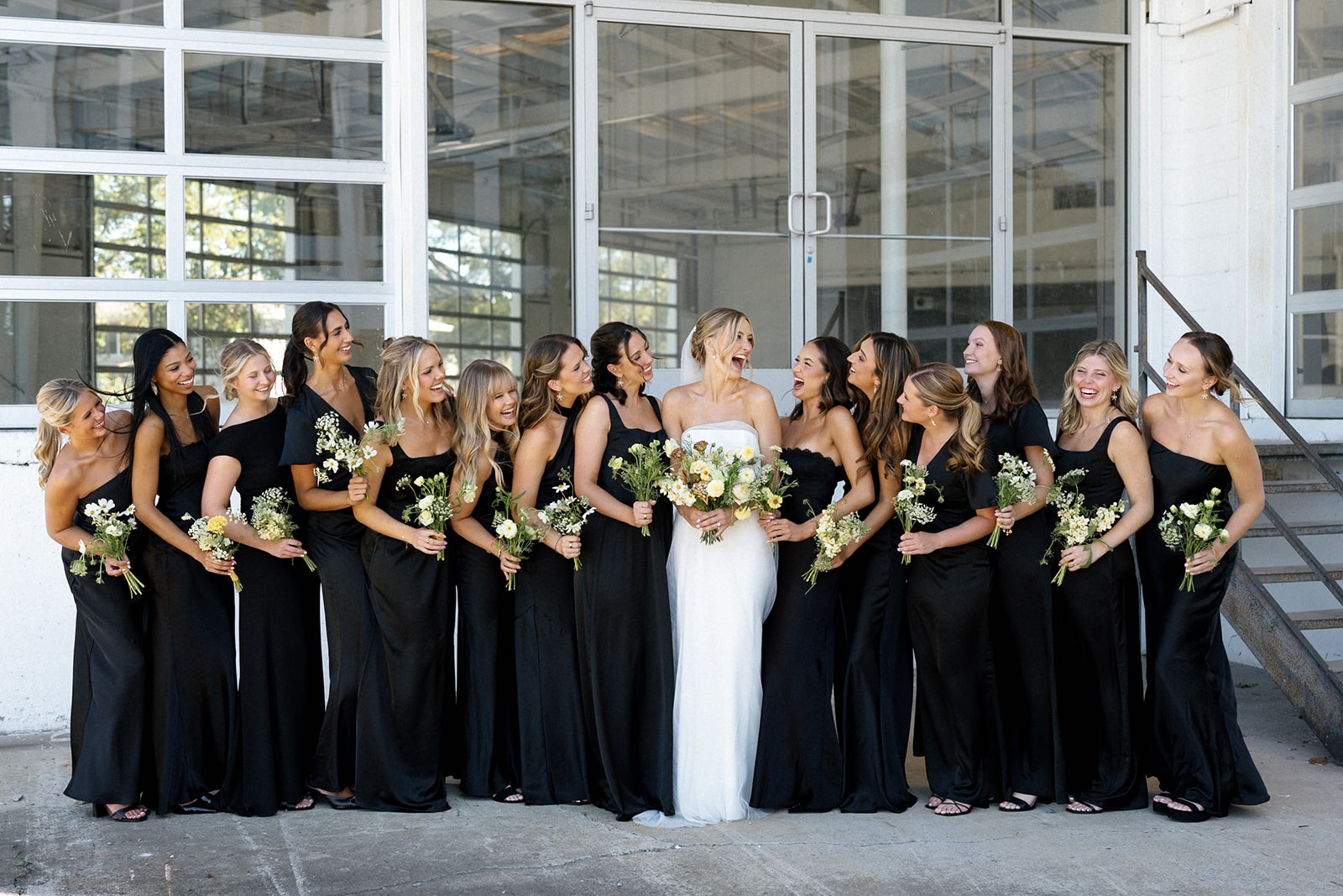
The bridesmaids looked stunning in dresses of varying styles and shades of pink, creating a cohesive yet dynamic bridal party aesthetic. Meanwhile, the bride stood out in her gorgeous white gown with sheer details in the front, holding a bouquet of soft pinks and whites.
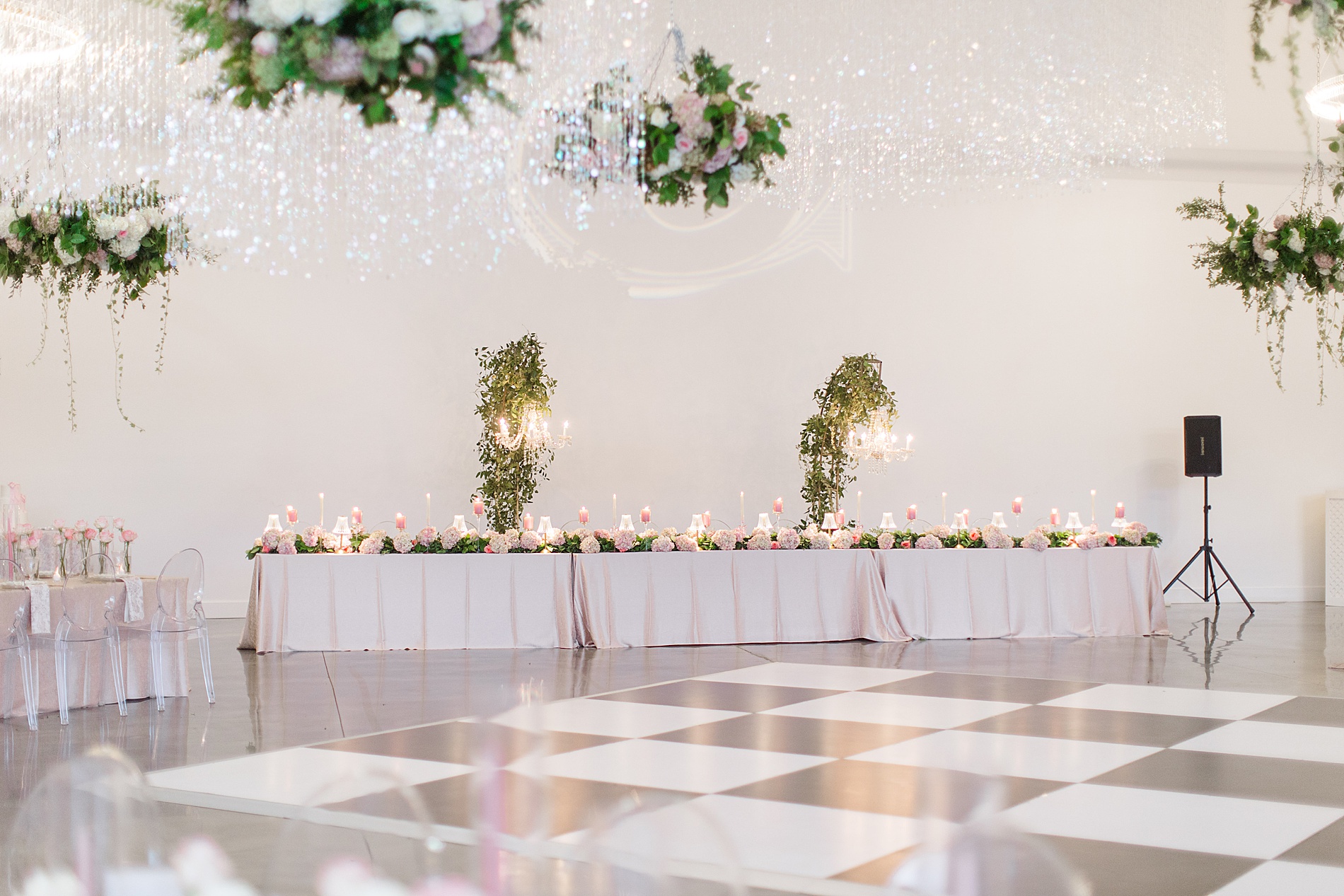
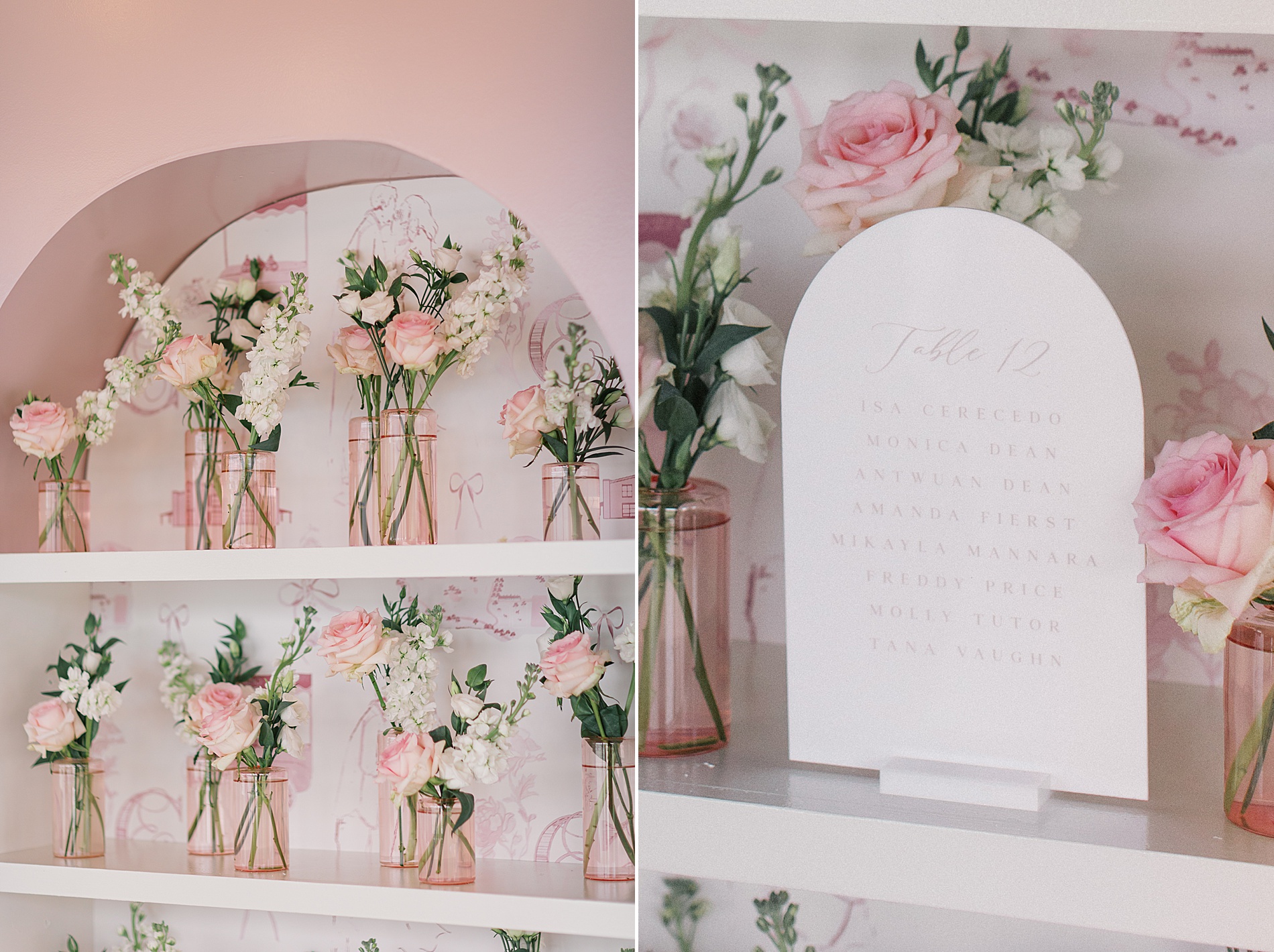
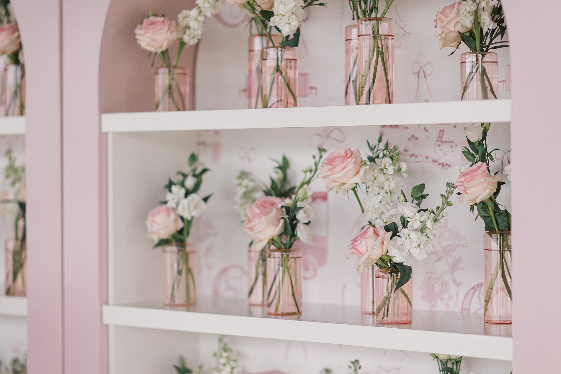
Welcome Sign + Seating Chart
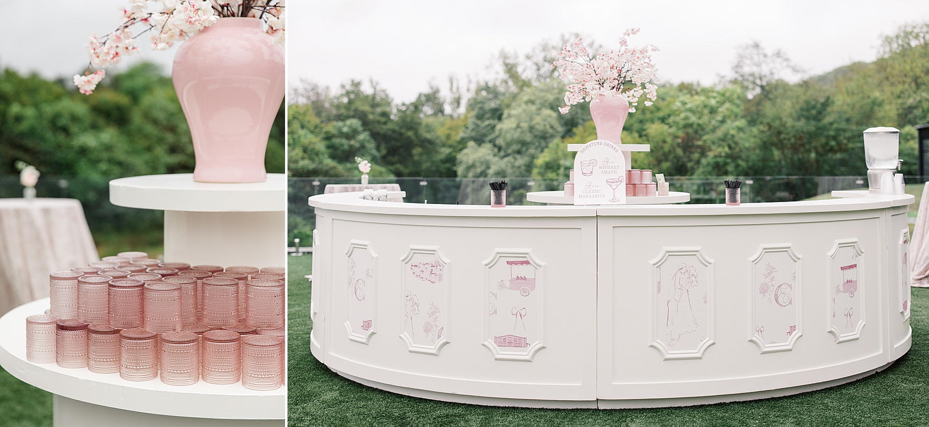
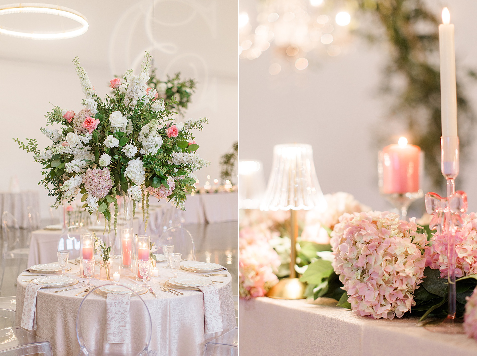
The reception space was STUNNING. Floral centerpieces, flickering candles, and white and pink plates that made the place setting pop decorated dusty pink tablecloths. White Ink Calligraphy created the large white welcome sign to greet guests as they arrived. The sign sat against a wall of greenery accented with pink and white flowers.
For the seating chart, we took a creative approach! We created a shelving building that held tombstone-cut acrylic pieces and small pink vases with white and pink flowers. It was such a beautiful display that added to the overall elevated pink theme.
A Celebration to Remember
As the night came to a close, the bride made a final, show-stopping outfit change—slipping into a chic hot pink dress for the grand send-off. It was the perfect ending to a wedding filled with love, personality, and of course, all things pink! This incredible wedding even made the cover of Nashville Lifestyles Wedding Magazine’s most recent issue—a true testament to its beauty and uniqueness.
Designing these custom pieces for this elevated pink-inspired wedding was an absolute joy.
If you’re looking to add custom, thoughtful touches to your wedding or event, we would love to help make your vision a reality. Reach out today to learn more about our full-service design offerings—we can’t wait to create something unforgettable for you!
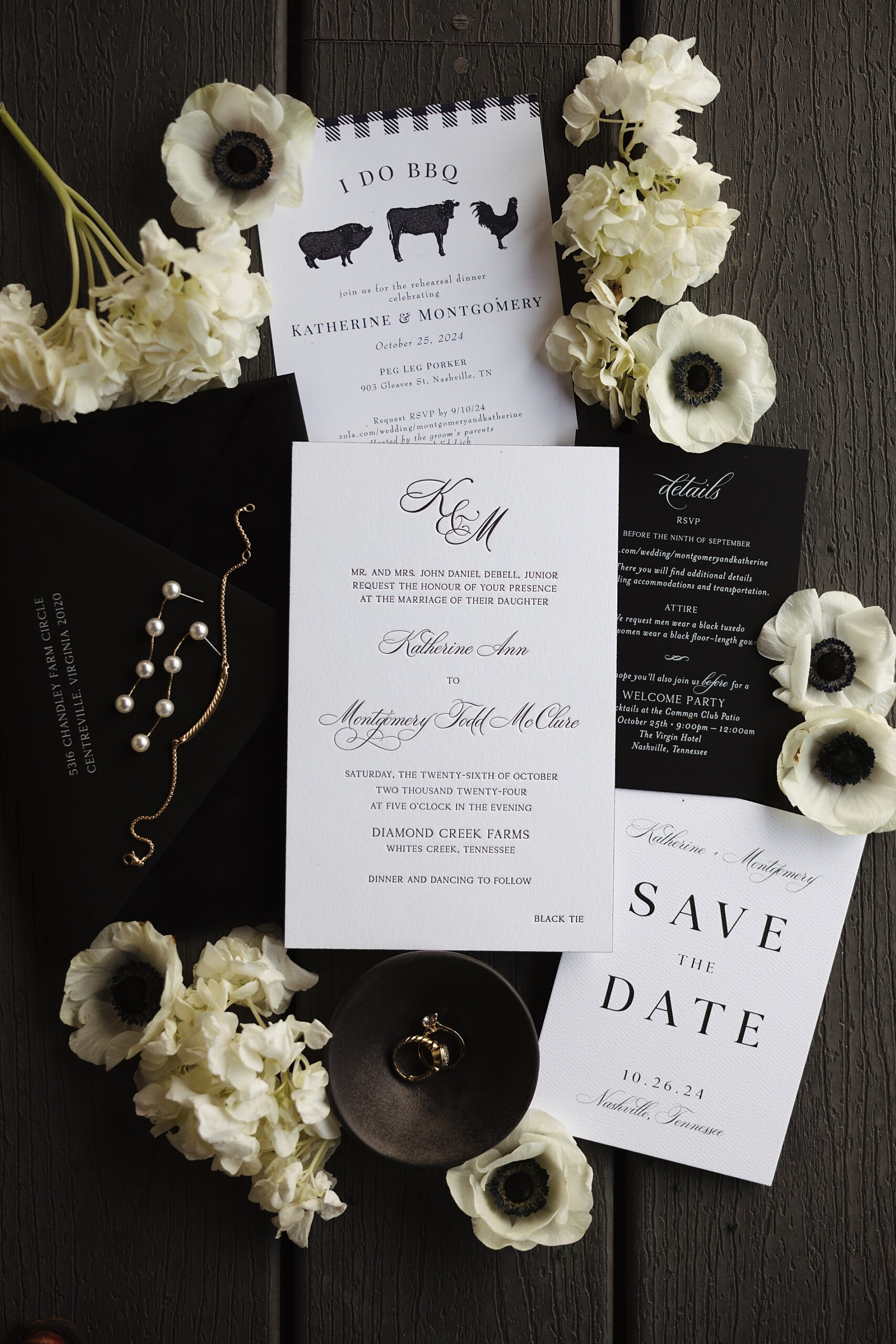
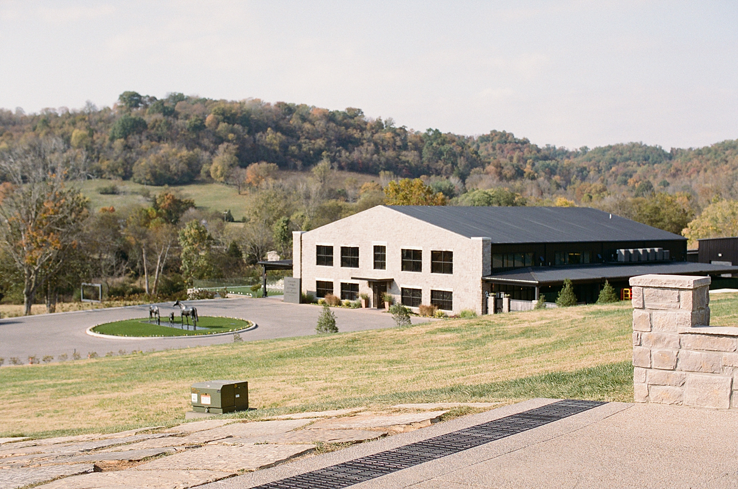
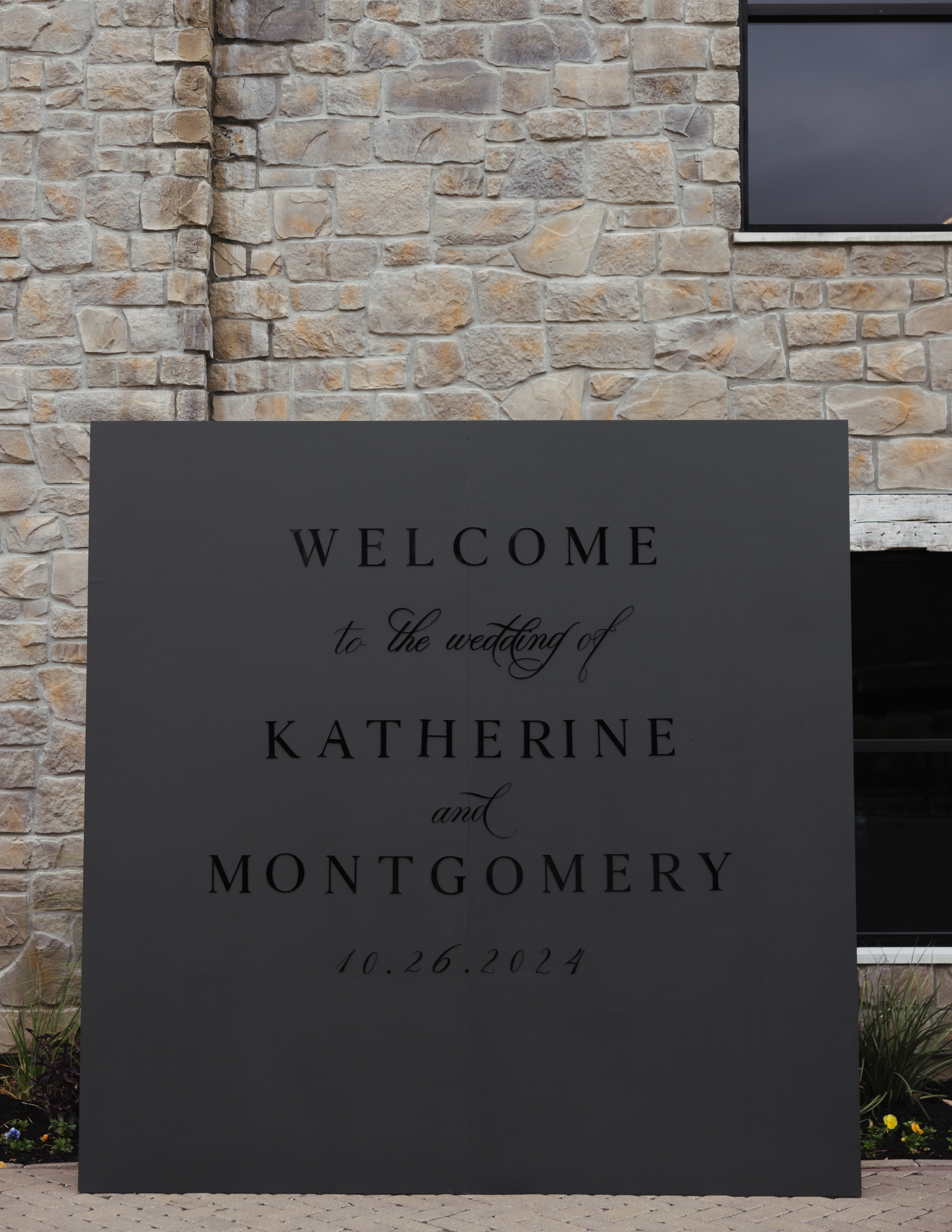
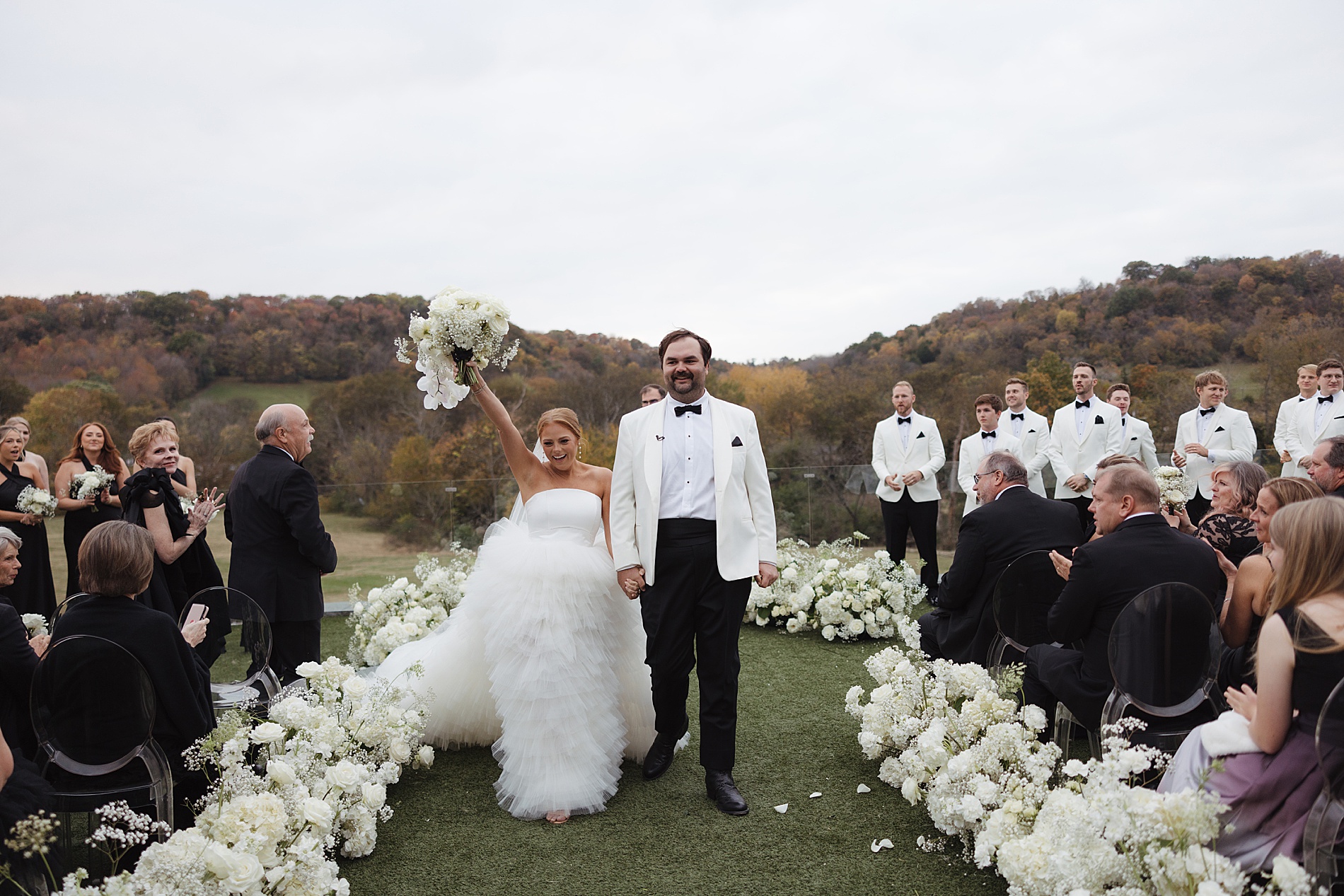
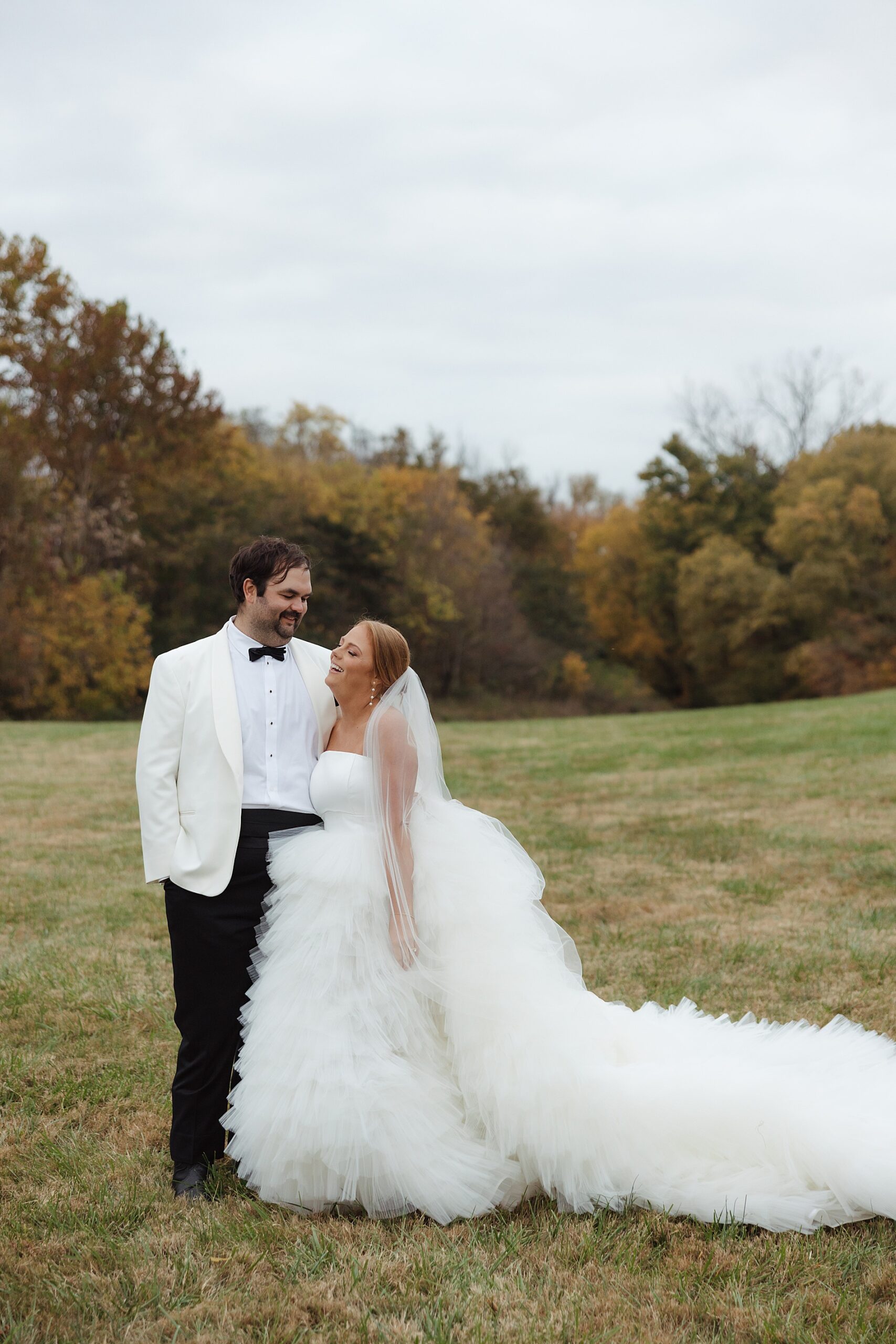
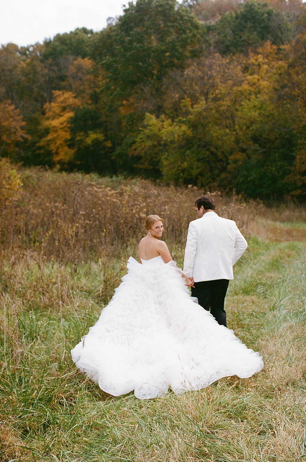
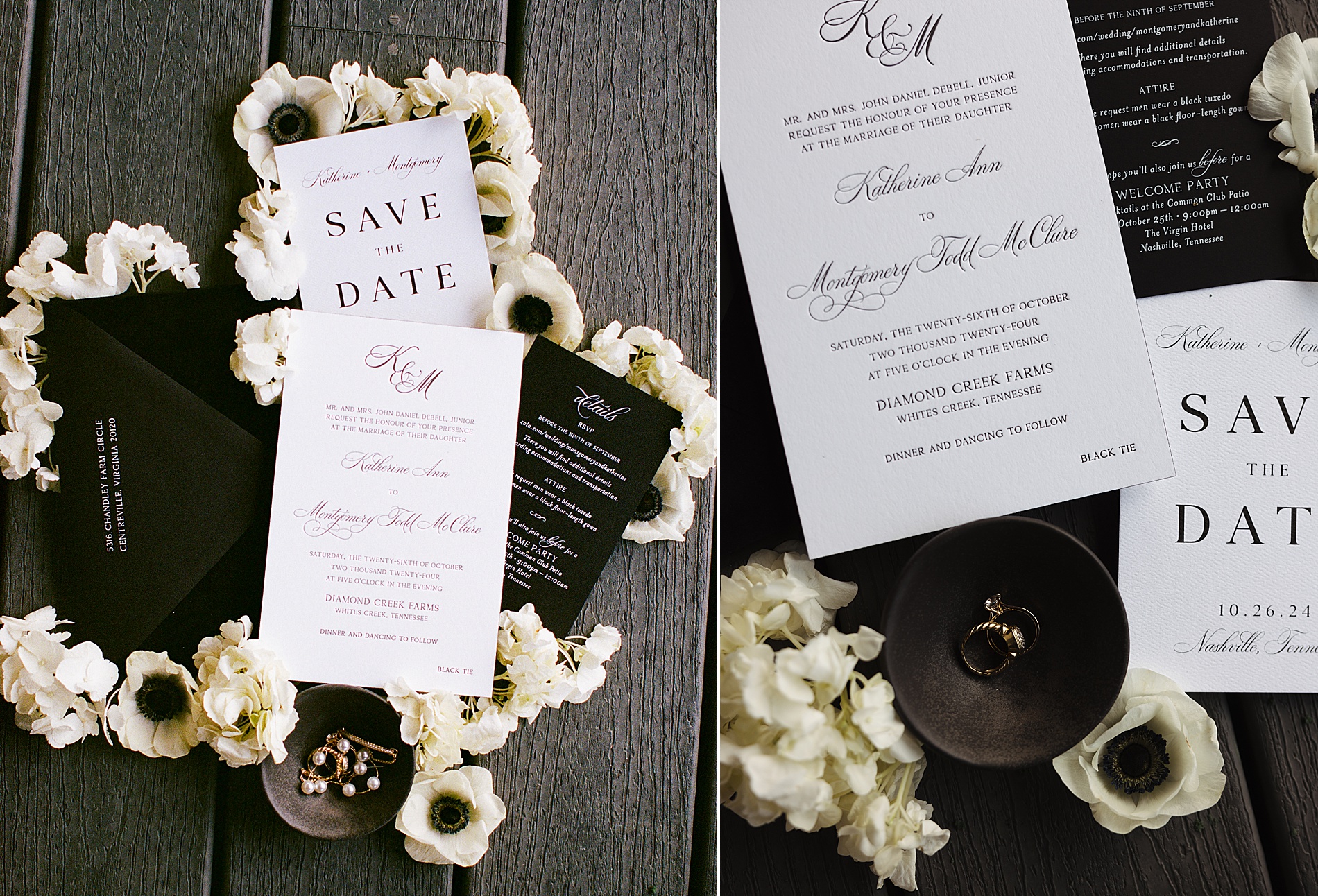
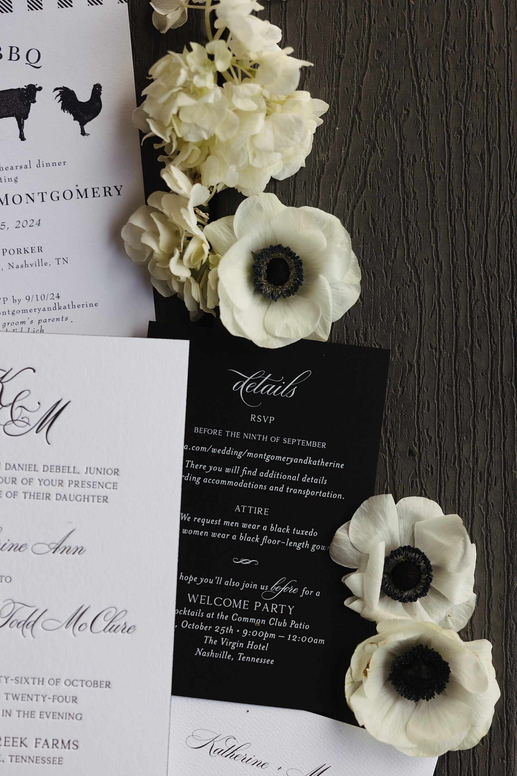
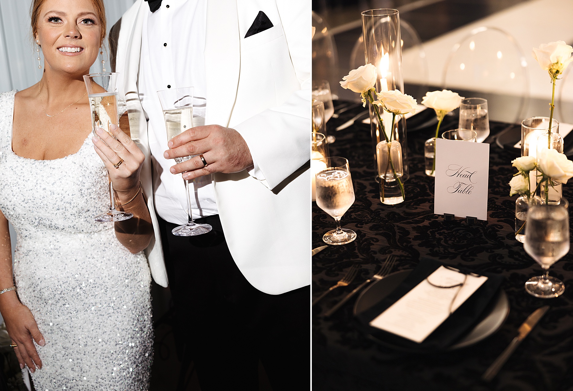
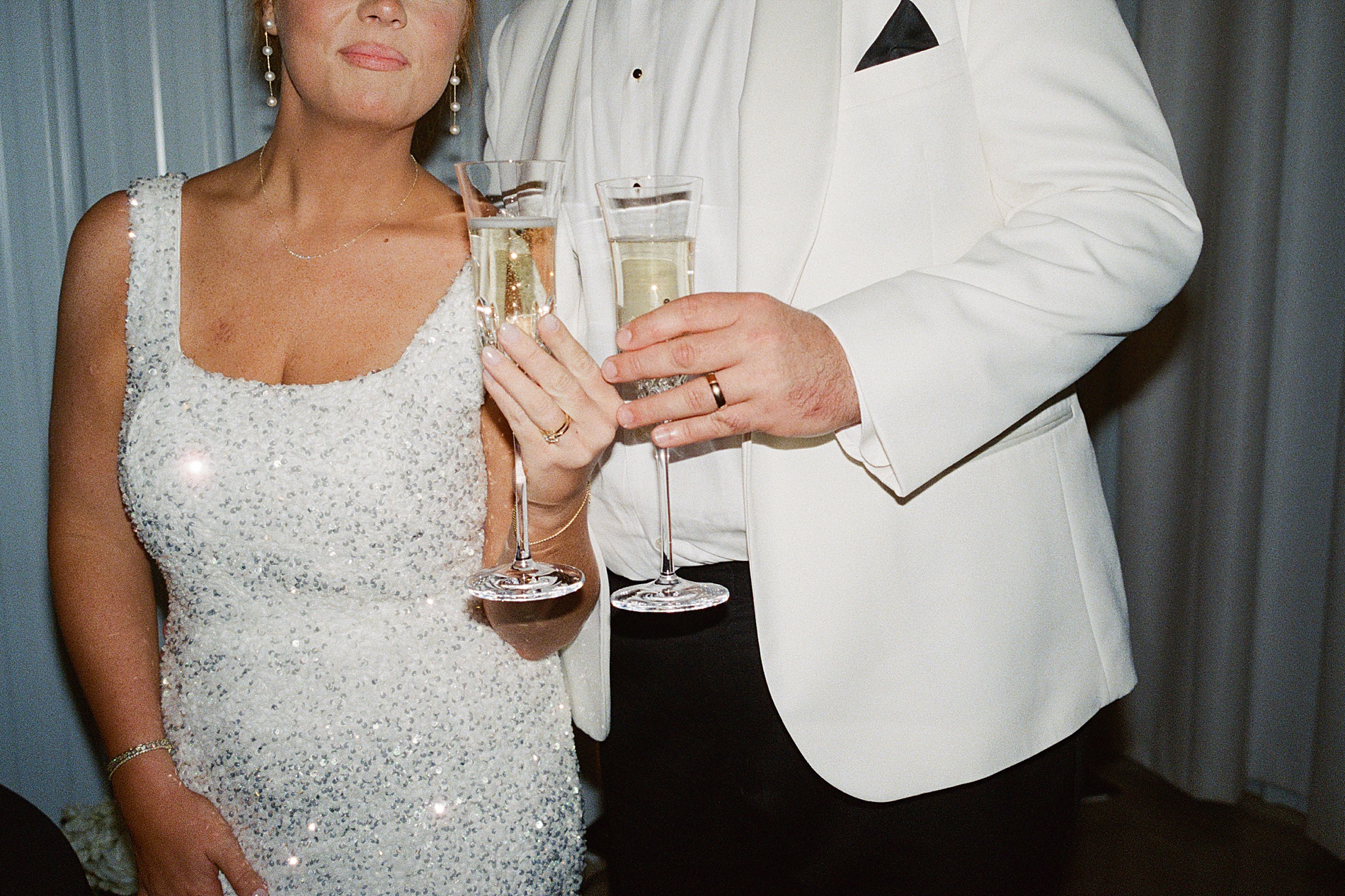
Nestled in the heart of Nashville, Diamond Creek Farm set the scene for a timeless wedding. At White Ink Calligraphy + Co. we had the incredible honor of designing bespoke details for this unforgettable day. What made prepping for this wedding even more special was the opportunity to meet the bride and her mother for an in-person consultation at our East Nashville studio. This was a lovely treat since most of our consultations are done virtually. It was a joy to work closely with them to bring this timeless and elegant black and white wedding vision to life!
A Grand Welcome
A show-stopping 8’x8’ welcome wall greeted guests as they arrived at Diamond Creek Farm. This design element became an instant topic of conversation! Positioned perfectly at the driveway’s entrance, this large-scale installation set the tone for the day while also adding a grand, personal touch that wowed attendees. Both the guests and the wedding planner, Sarah Oakland, raved about this unique feature.
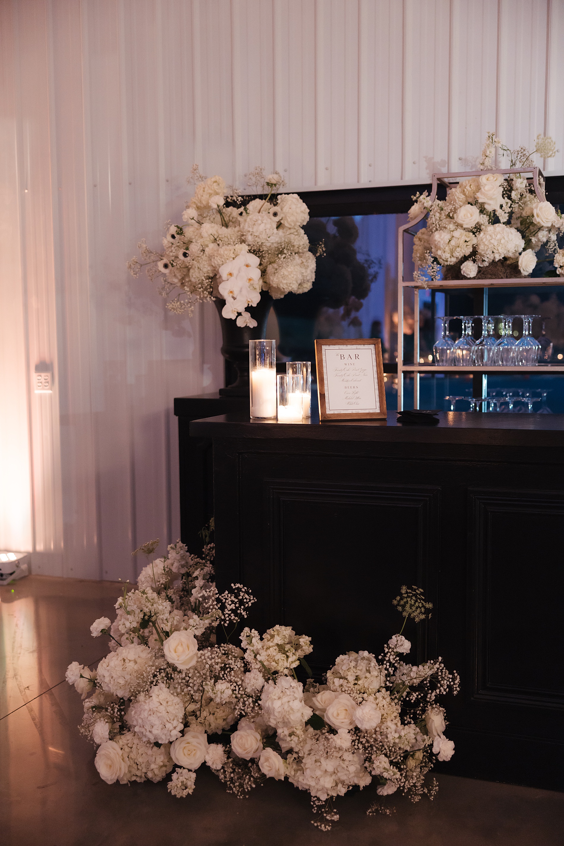
Luxurious Touches and Thoughtful Details
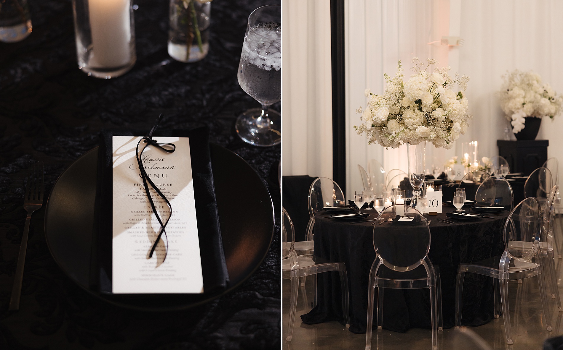
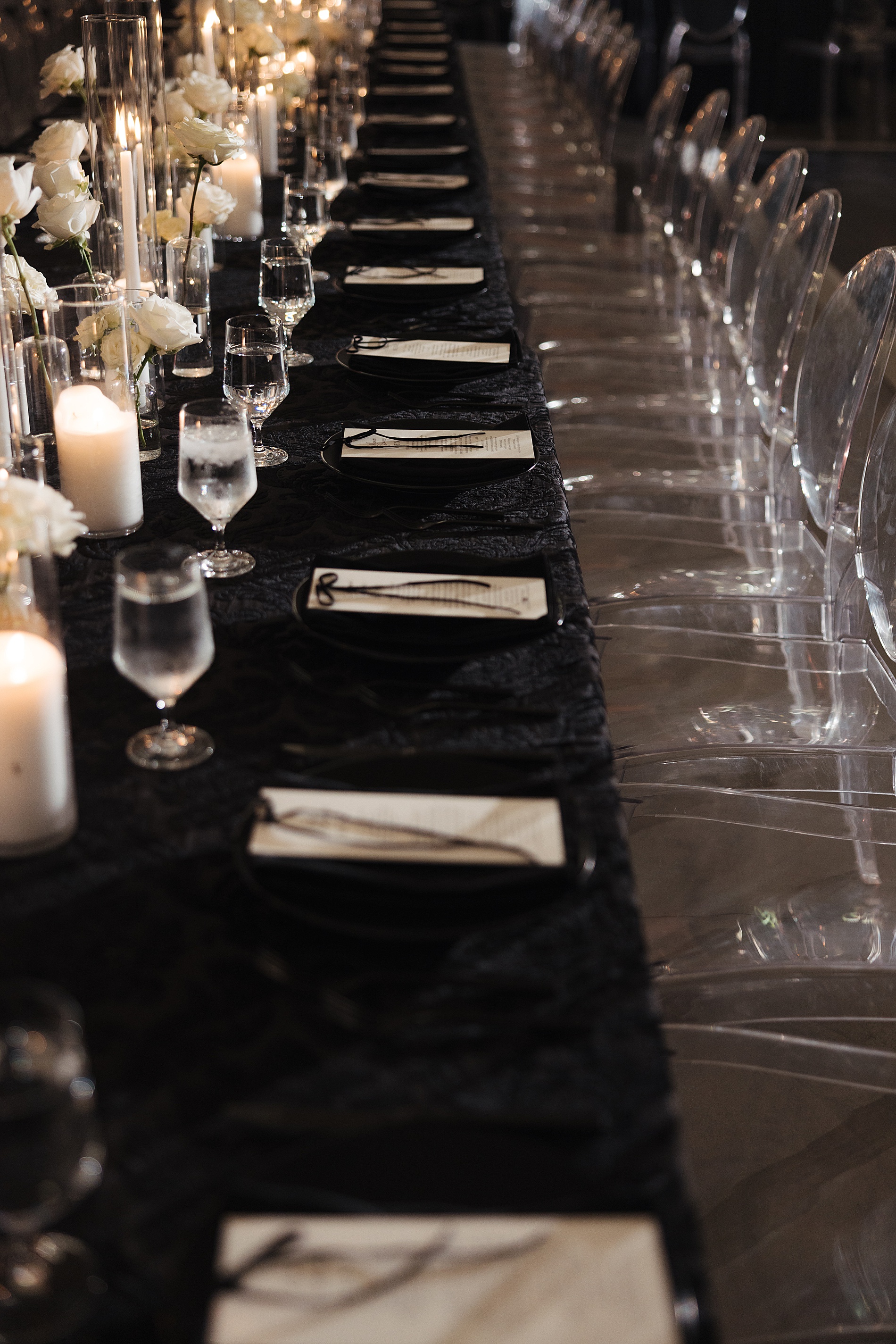
The bride’s sophisticated taste was evident in every detail we designed. For the wedding invitations, we lined the envelopes with black velvet, adding a sense of luxury and texture to the suite. Then, to tie this element into the wedding day, we used a dainty velvet ribbon to elegantly wrap the menus, which were placed at each guest’s seat.
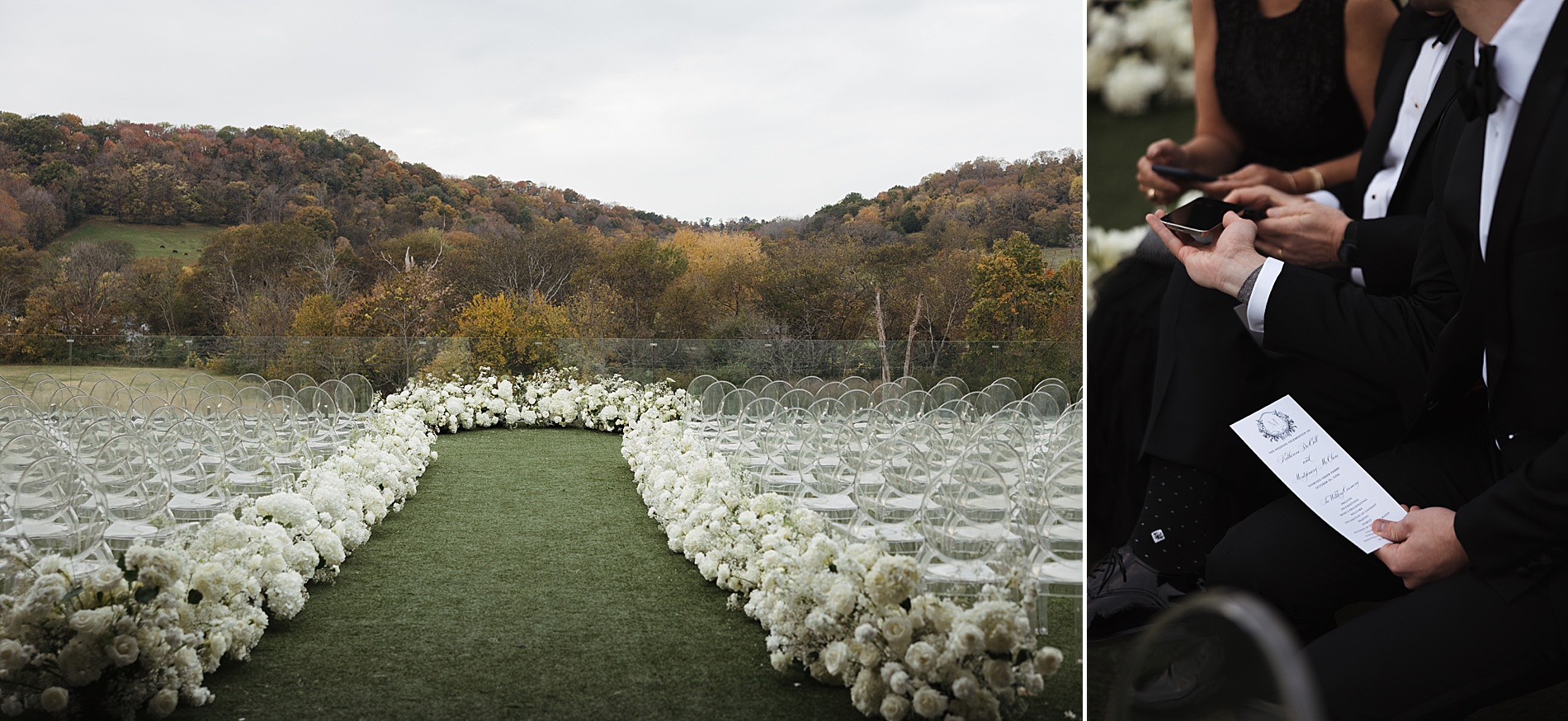
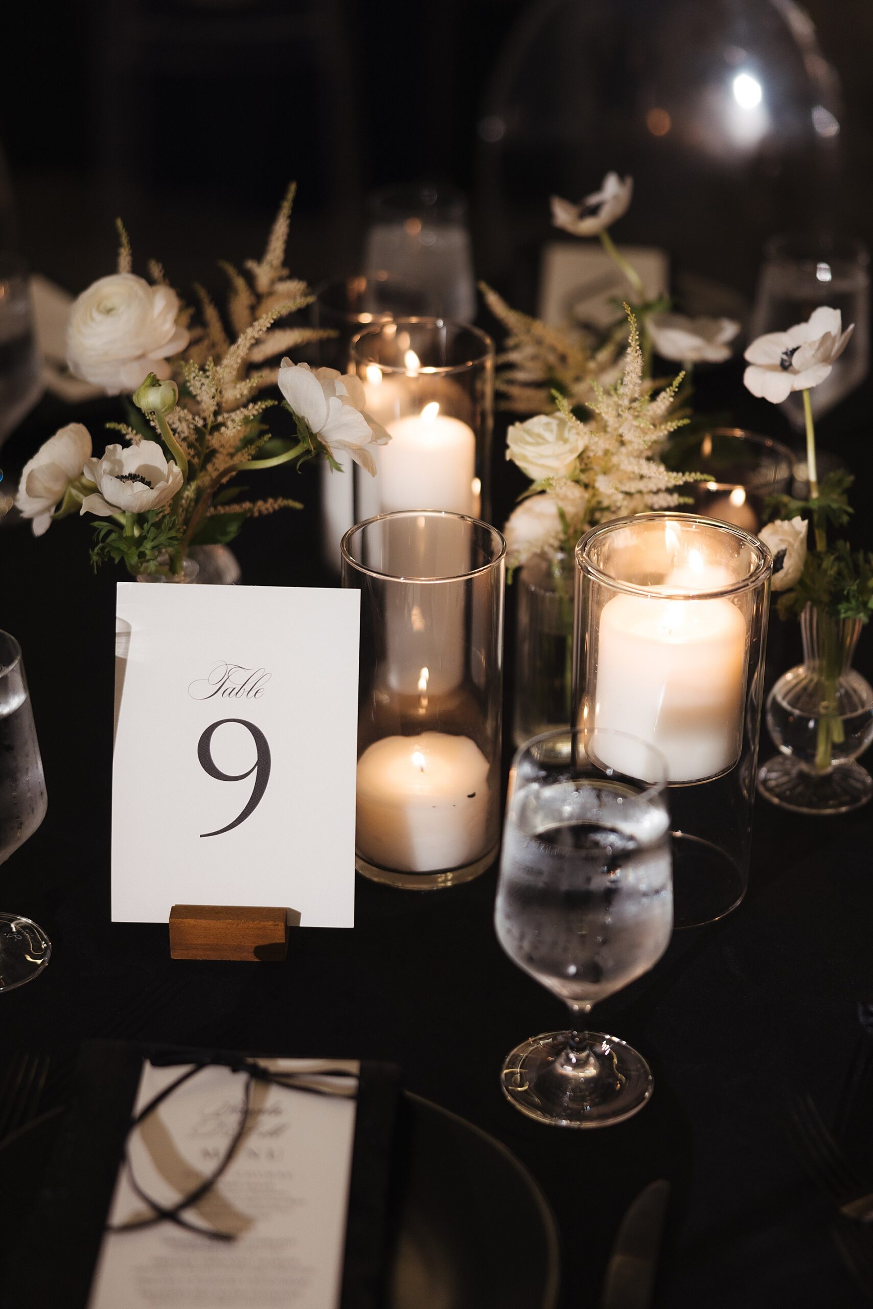
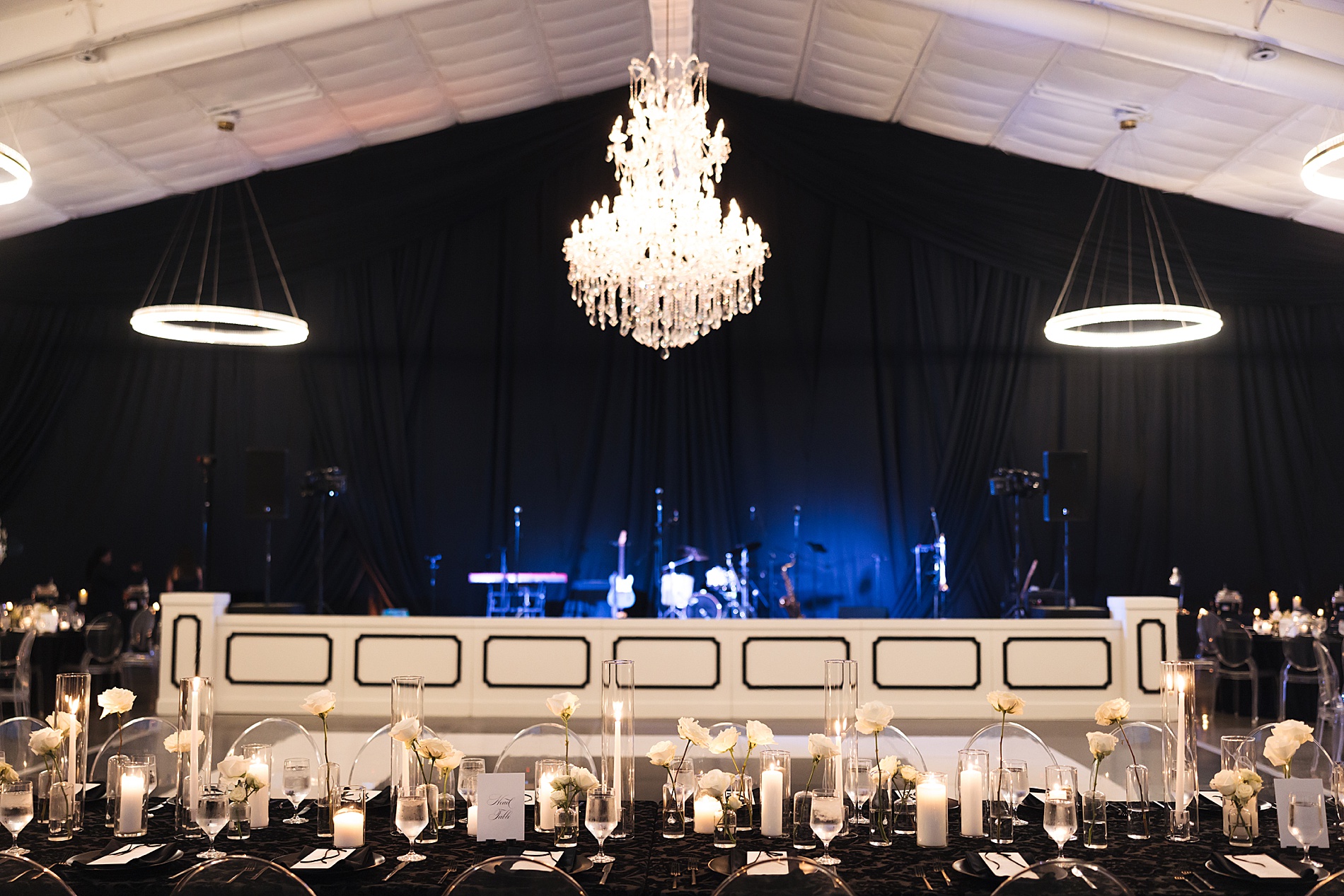
The sleek black seating chart display was another focal point. White flowers arrangements surrounded the seating chart adding a beautiful contrast. Upon locating their table, guests would find a custom calligraphy table number sign held up with a wood place card holder from our rental collection.
We created custom toile, featuring Diamond Creek Farm venue and other iconic Nashville images. This was a unique element that appeared on the back of the save the dates and menus. The toile was also subtly incorporated into the border of the bar signs, tying the entire aesthetic together.
Personalized Calligraphy
Personalization was a major focus of this wedding, and it was most evident in the calligraphy we provided. Each menu featured the guest’s name in beautiful hand-drawn calligraphy at the top. This served as both a seating assignment and a keepsake. We love dual purpose details!
Our team provided a cohesive suite of design elements that seamlessly wove the classic black and white wedding theme together. Every detail was carefully considered and crafted, from save the dates and invitations to bar signs, programs, and even custom cocktail napkins and cups. Each piece reflected the couple’s style and the timeless elegance of their black tie affair. At White Ink Calligraphy + Co., we take pride in creating event details that become lasting memories, and this wedding was no exception.
If you’re looking to add custom details to your wedding or event, we would love to make your vision a reality. Reach out today to learn more about our full-service design offerings—we can’t wait to create something unforgettable for you!
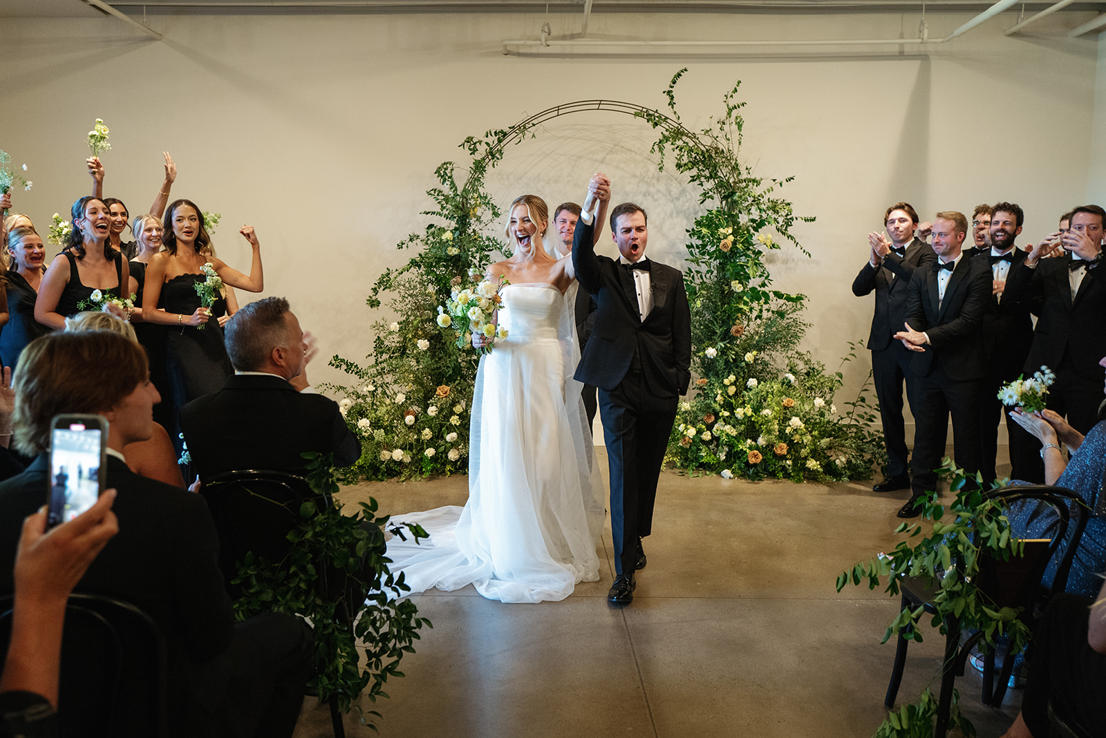
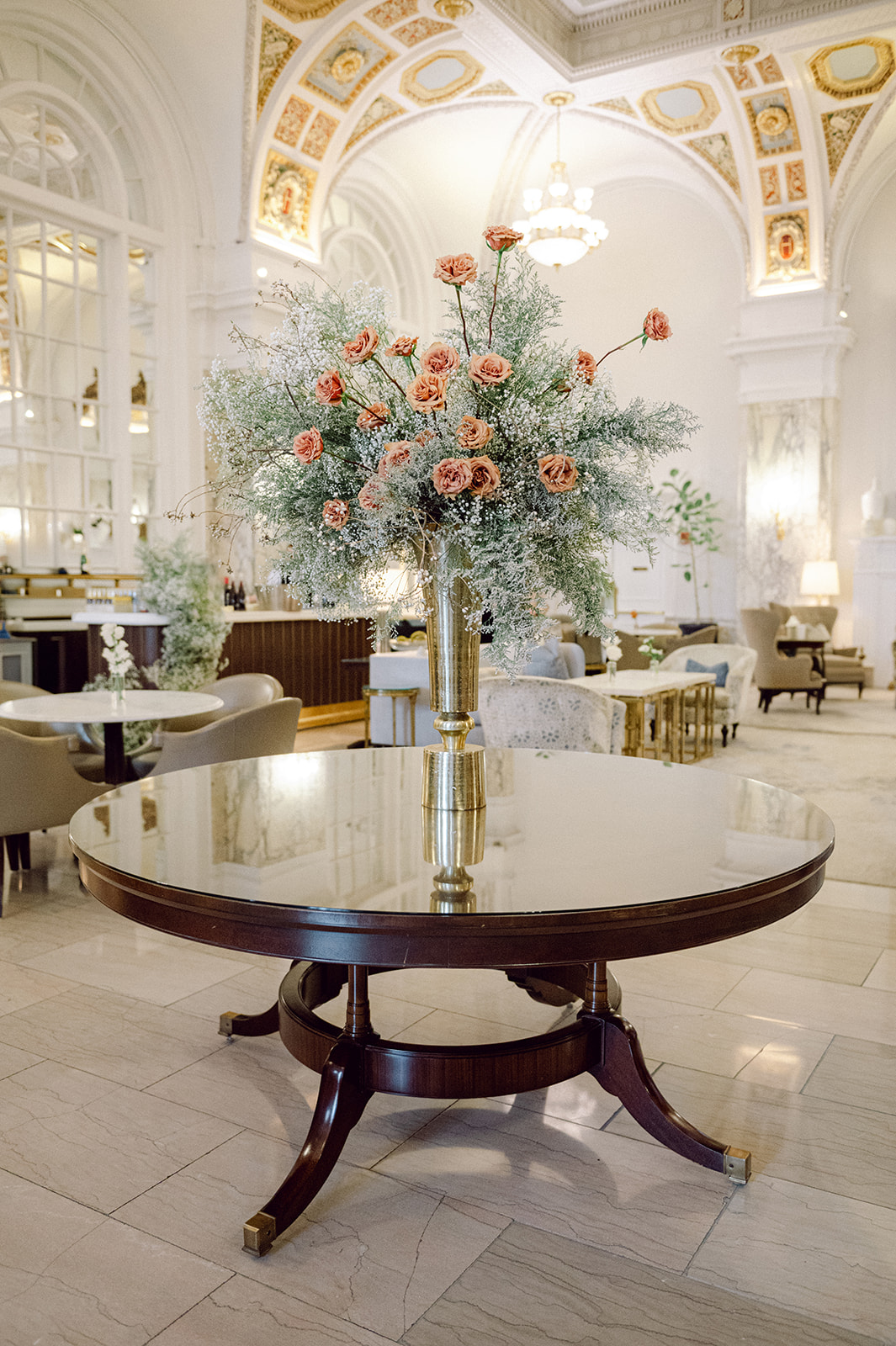
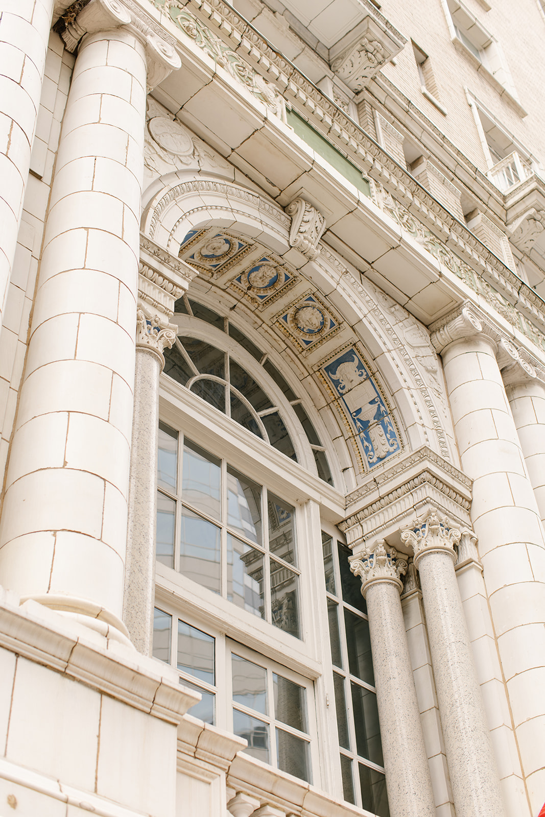
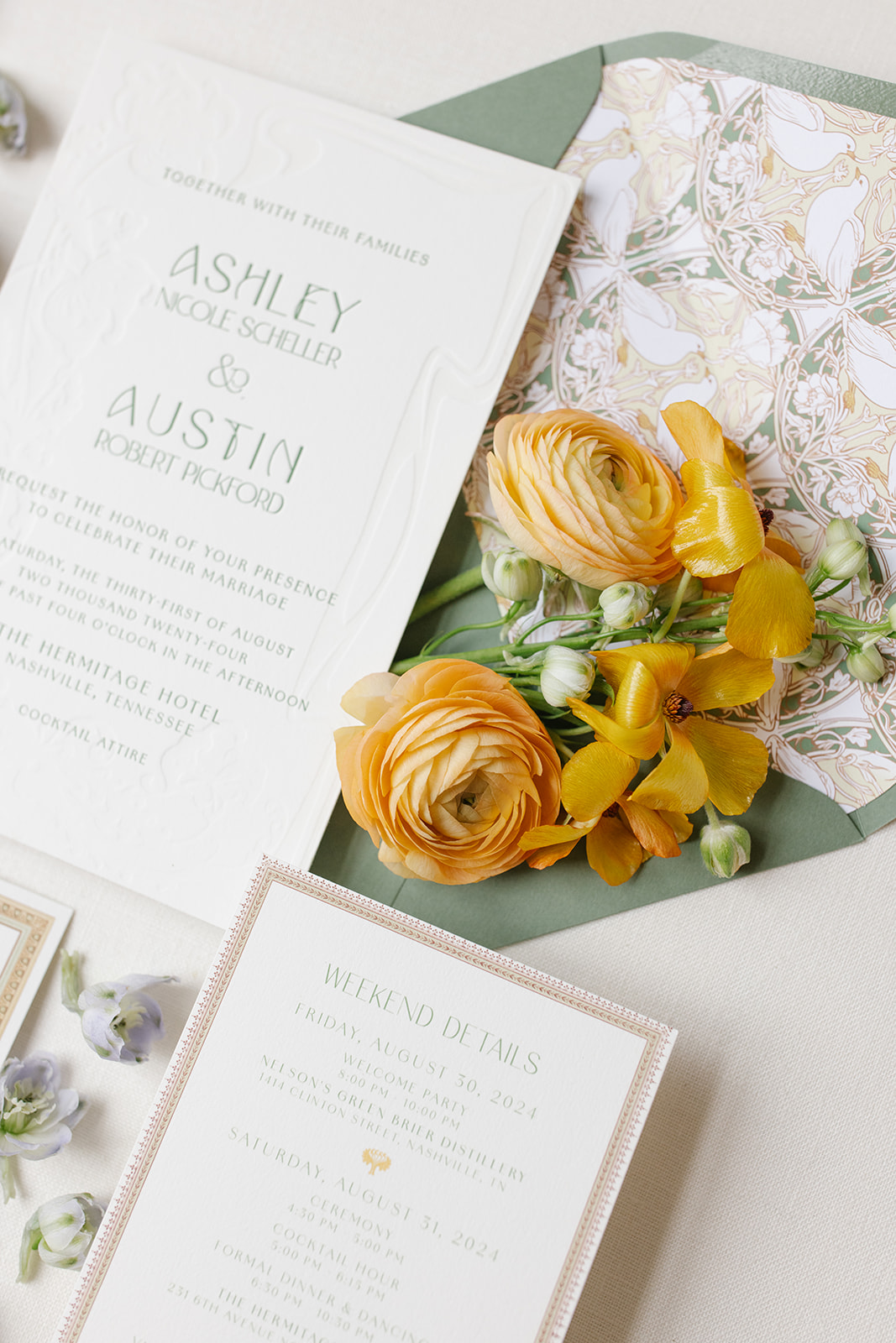
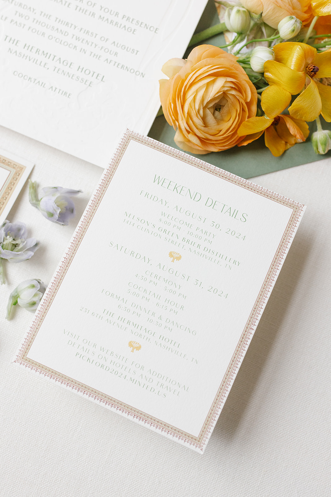
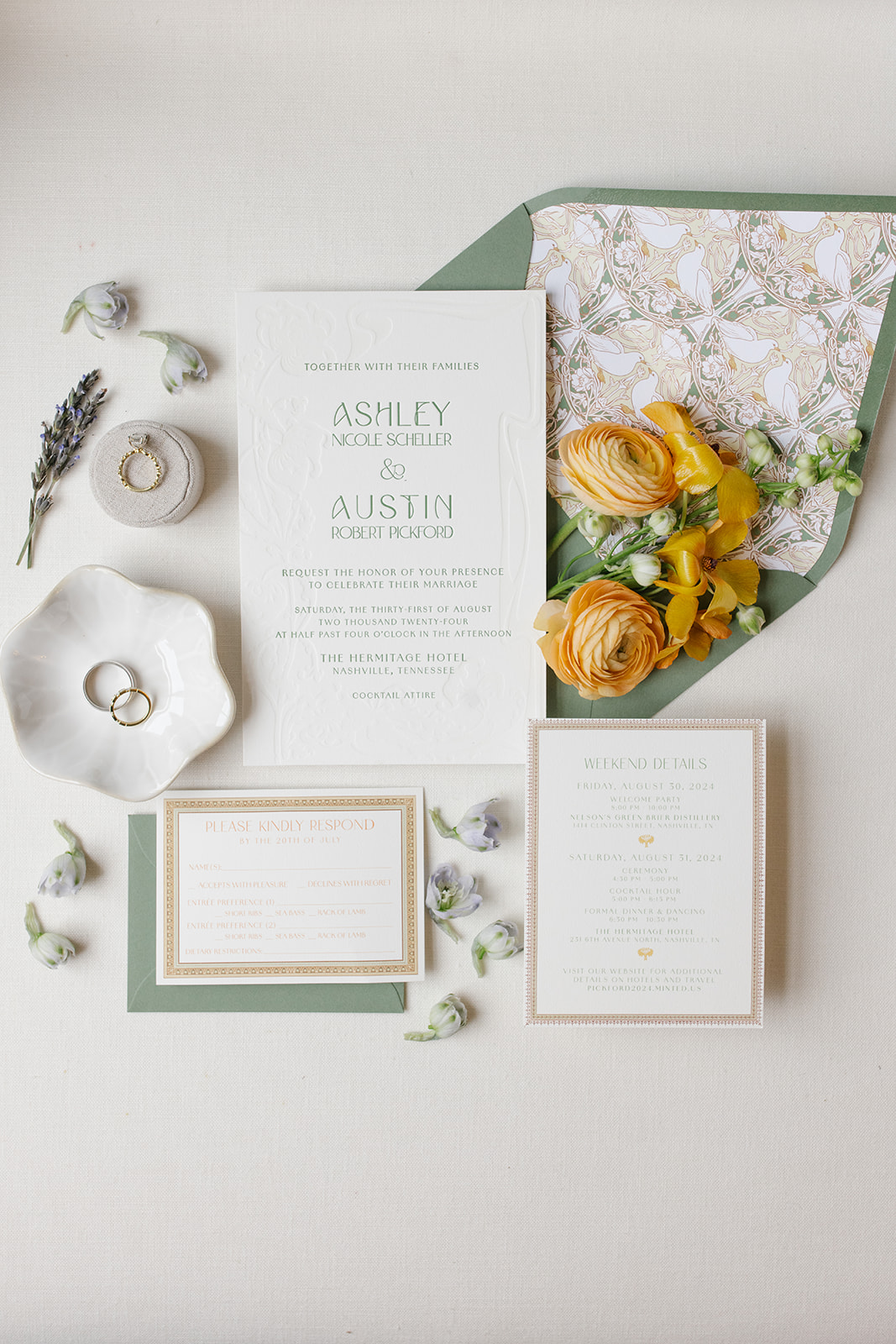
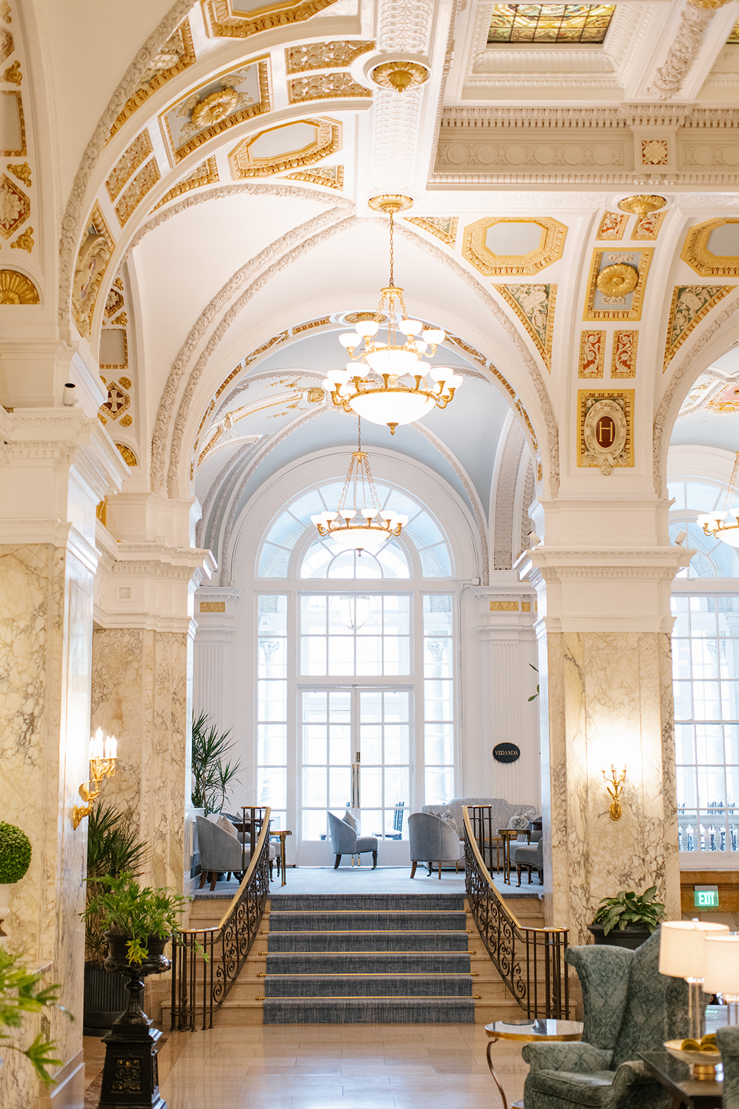
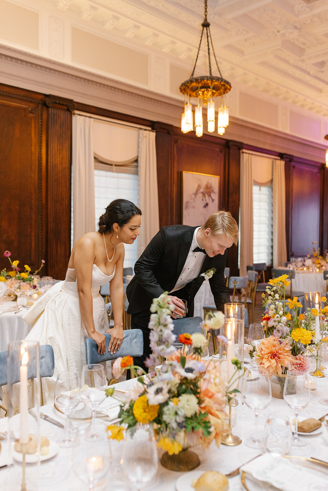
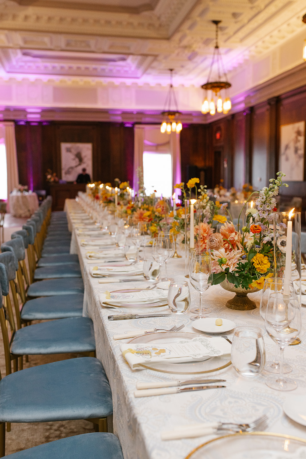
This year we started off a busy fall wedding season with White Ink Couple, Ashley and Austin, at the iconic Hermitage Hotel in downtown Nashville. This unforgettable, art nouveau-inspired wedding did not hold back when utilizing details, pulling in colors, and interlacing style and texture throughout the entire event. White Ink was there for ALL of it!
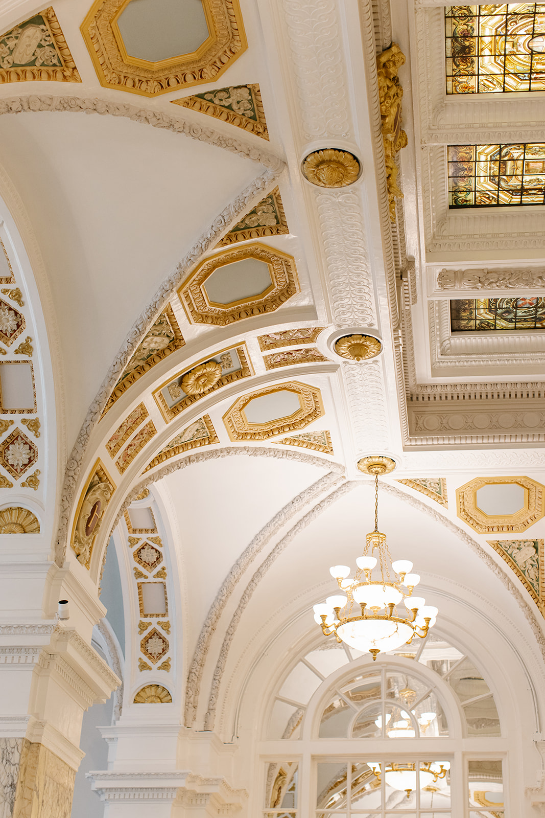
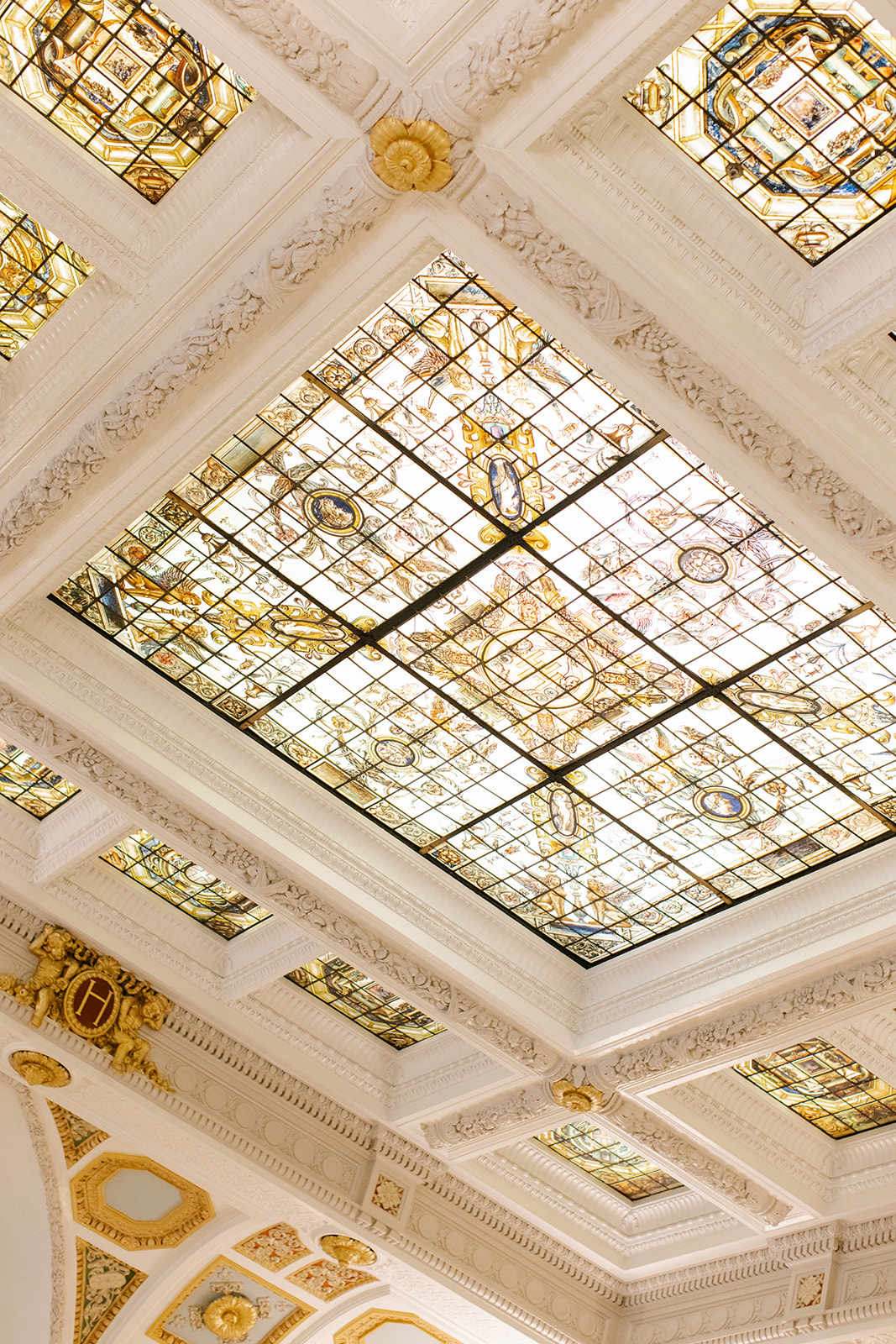
We rolled up our creative sleeves and worked to help bring Ashley and Austin’s elegant vision into focus. We wove together poignant characteristics from The Hermitage Hotel’s architecture along with the flowing geometric styles and muted colors of the booming art nouveau movement were incorporated into all the important details of the day.
This was an unforgettable experience for the our team and we are delighted to finally get to share this day with you!
Art Nouveau- Did you know?
Art Nouveau or “new art” was a movement that gained popularity from the late 1800’s to the early 1900’s. According to the The Art Story’s website, “Art Nouveau was aimed at modernizing design, seeking to escape the eclectic historical styles that had previously been popular. Artists drew inspiration from both organic and geometric forms, evolving elegant designs that united flowing, natural forms resembling the stems and blossoms of plants. The emphasis on linear contours took precedence over color, which was usually represented with hues such as muted greens, browns, yellows, and blues.” www.theartstory.org
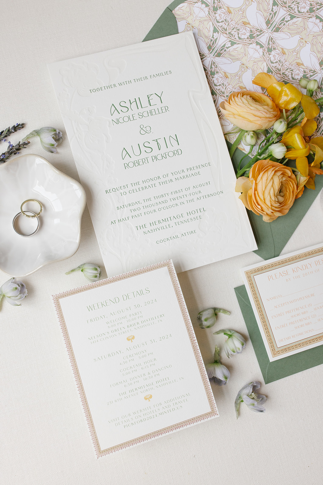
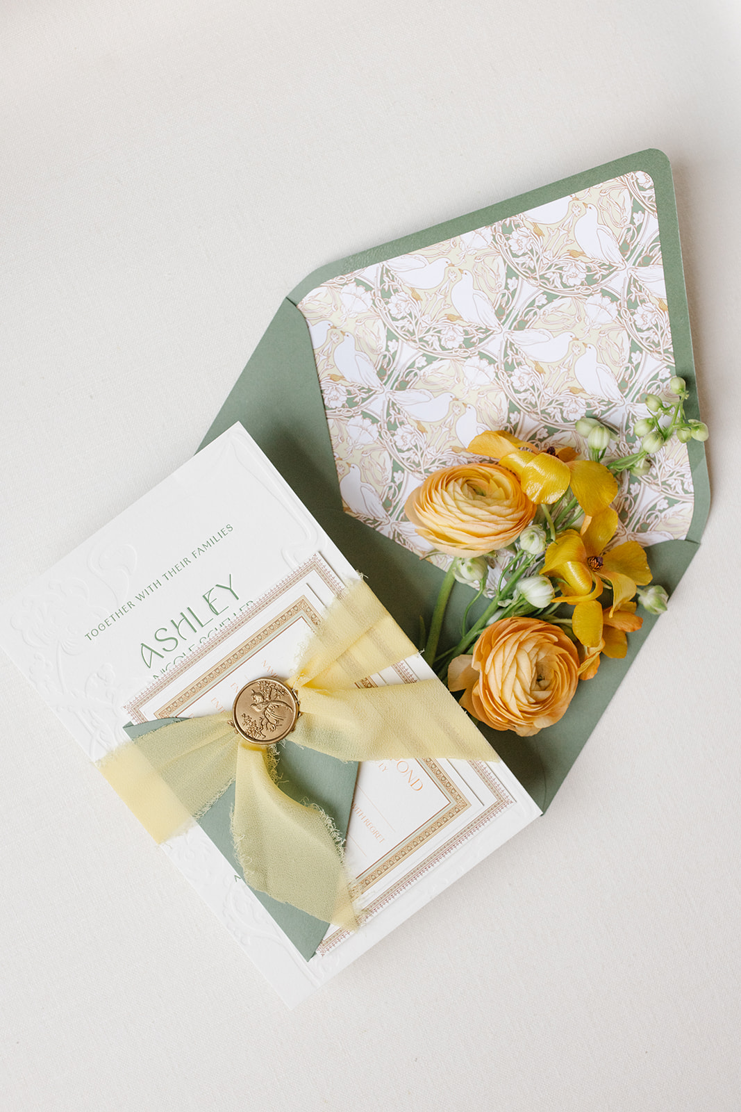
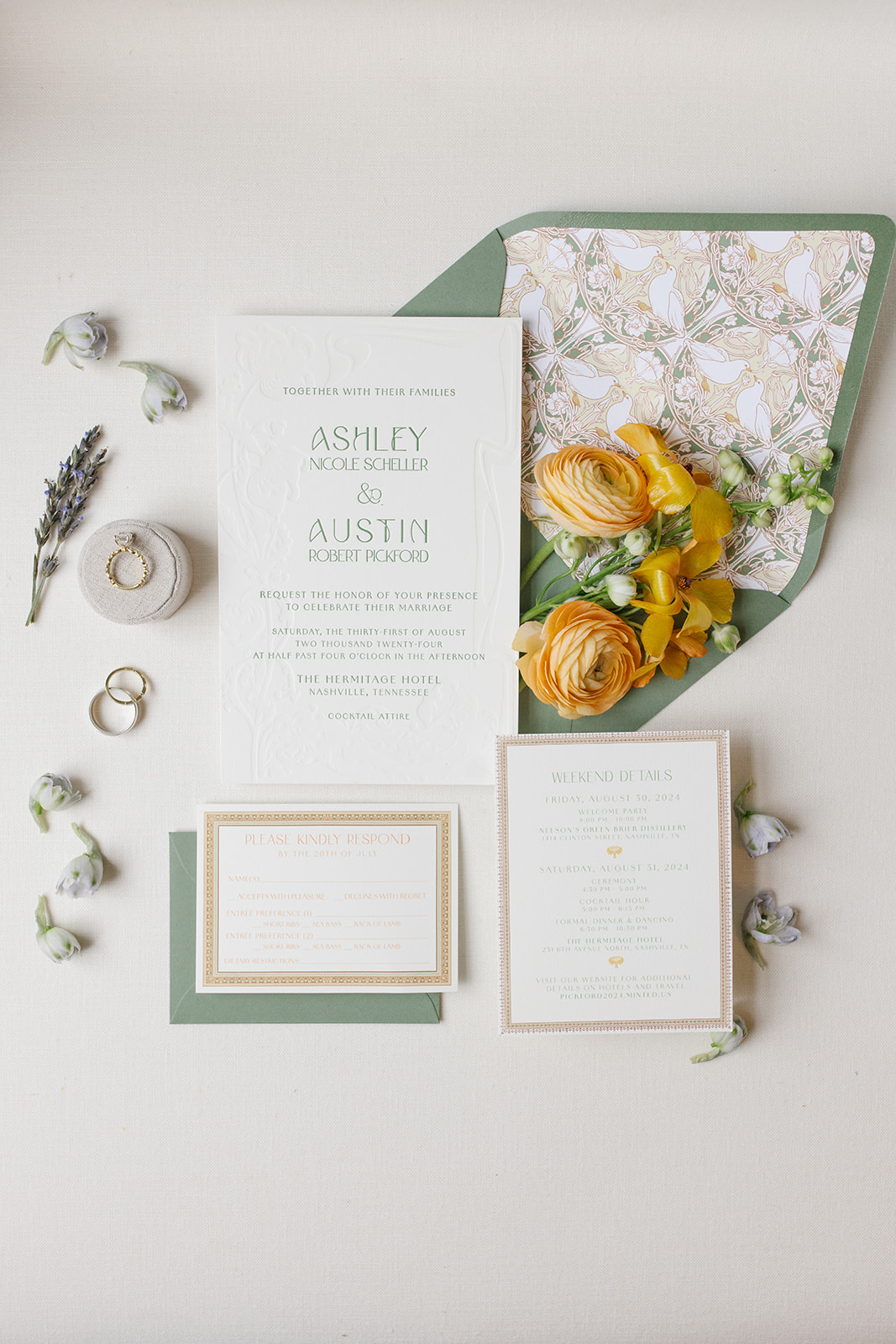
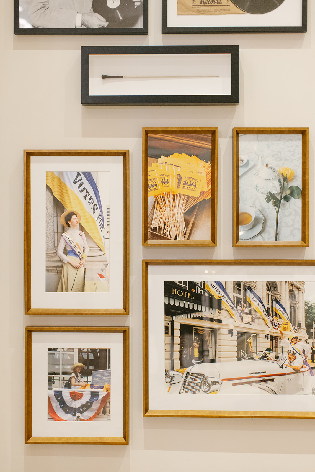
This invitation suite was designed to reflect the timeless details of the wedding venue. We custom-designed the envelope liner to include that classic, art nouveau look. Muted greens and yellows rested perfectly together with a focus on the natural beauty of white birds and the liners’ harmonious shapes and lines.
One notable detail within The Hermitage Hotel is a hand-painted bird theme throughout the guestrooms and suites. The idea to include birds in the custom envelope liner was a purposeful and beautiful way to connect the invites to the venue.
The ornament framing around the rsvp and details cards was meant to mimic the ornate frames and trim work throughout the hotel. This invitation suite was truly the ultimate ‘sneak peek’ for Ashley and Austin’s guests of what was to come!
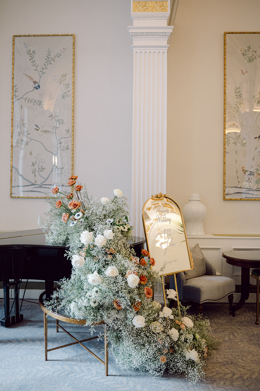
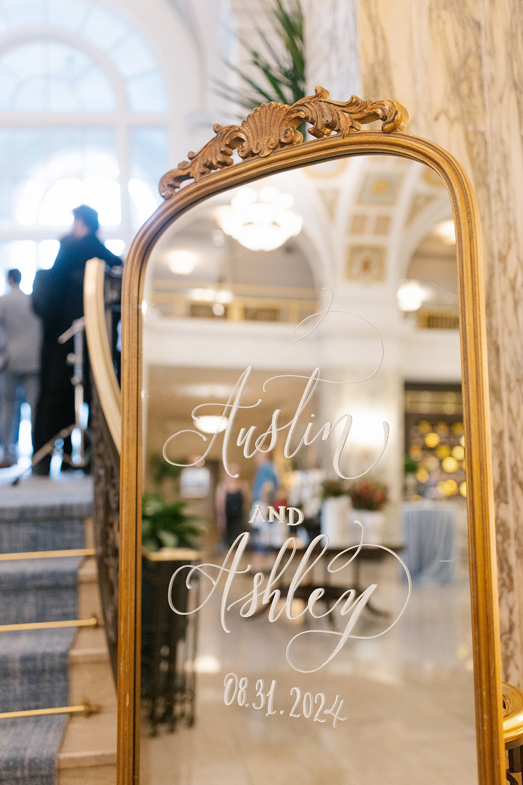
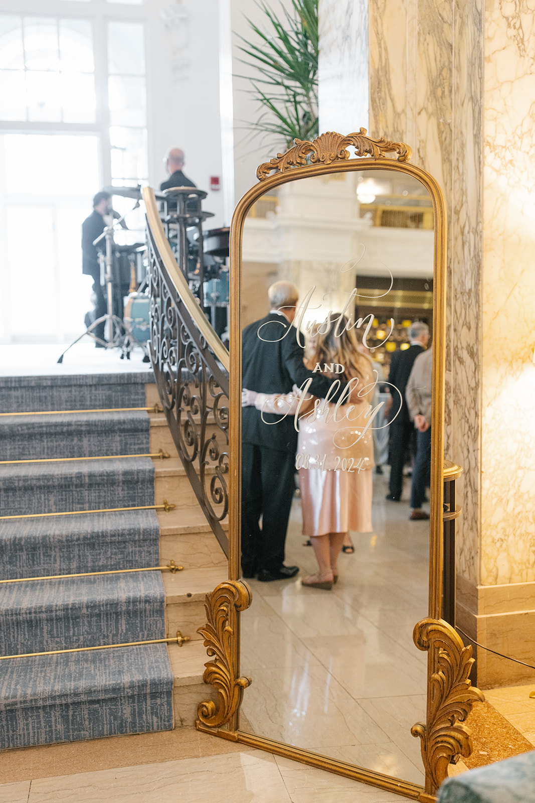
A wedding welcome sign is multifunctional, especially if it is mirrored. Event signage, in general, is a seamless way to provide guidance for your guests as they enter the venue space. It adds to the tone of the space without stealing the show. It’s also a fantastic way to showcase the theme of your big day.
Ashley and Austin chose to use our floor-length, Bourdeaux, gold-framed mirror with minimal ornamentation. It was the perfect sign to bring just enough attention. Even in a vintage, art nouveau-themed wedding, small details can go a long way. Giving guests a quick opportunity to check their reflection is a welcomed added bonus!
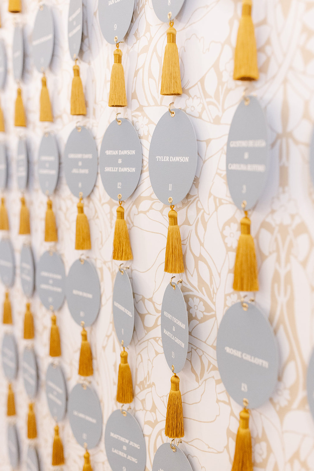
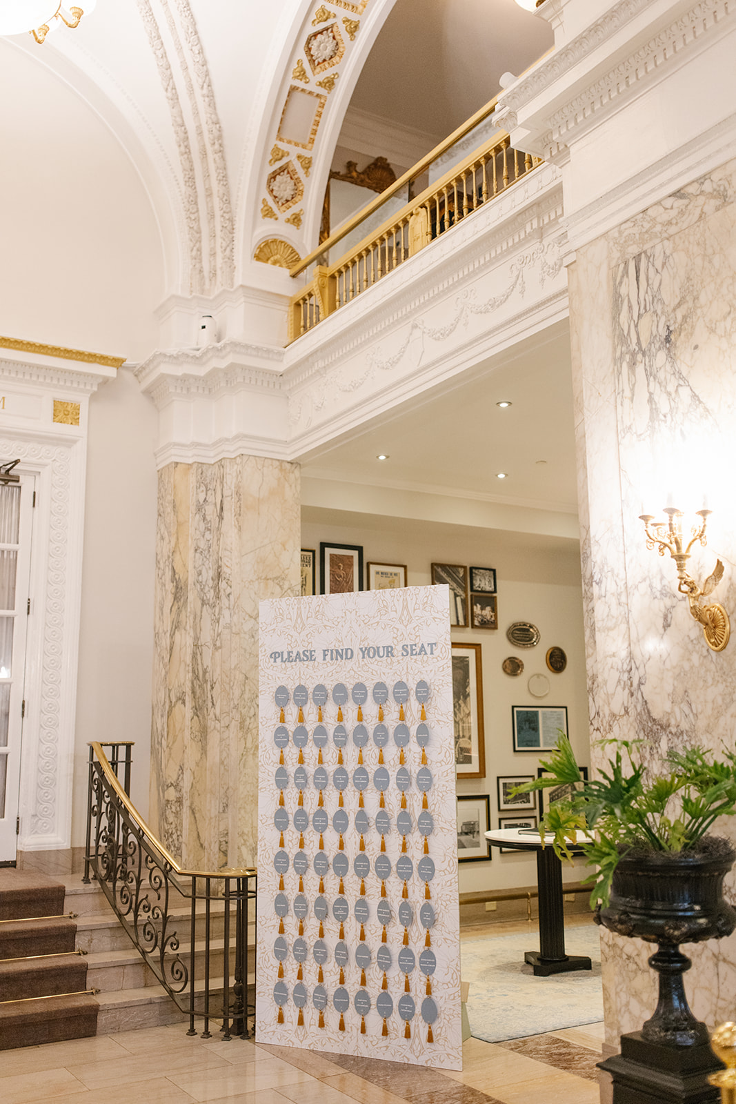
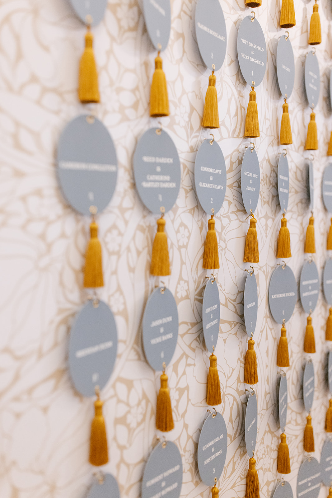
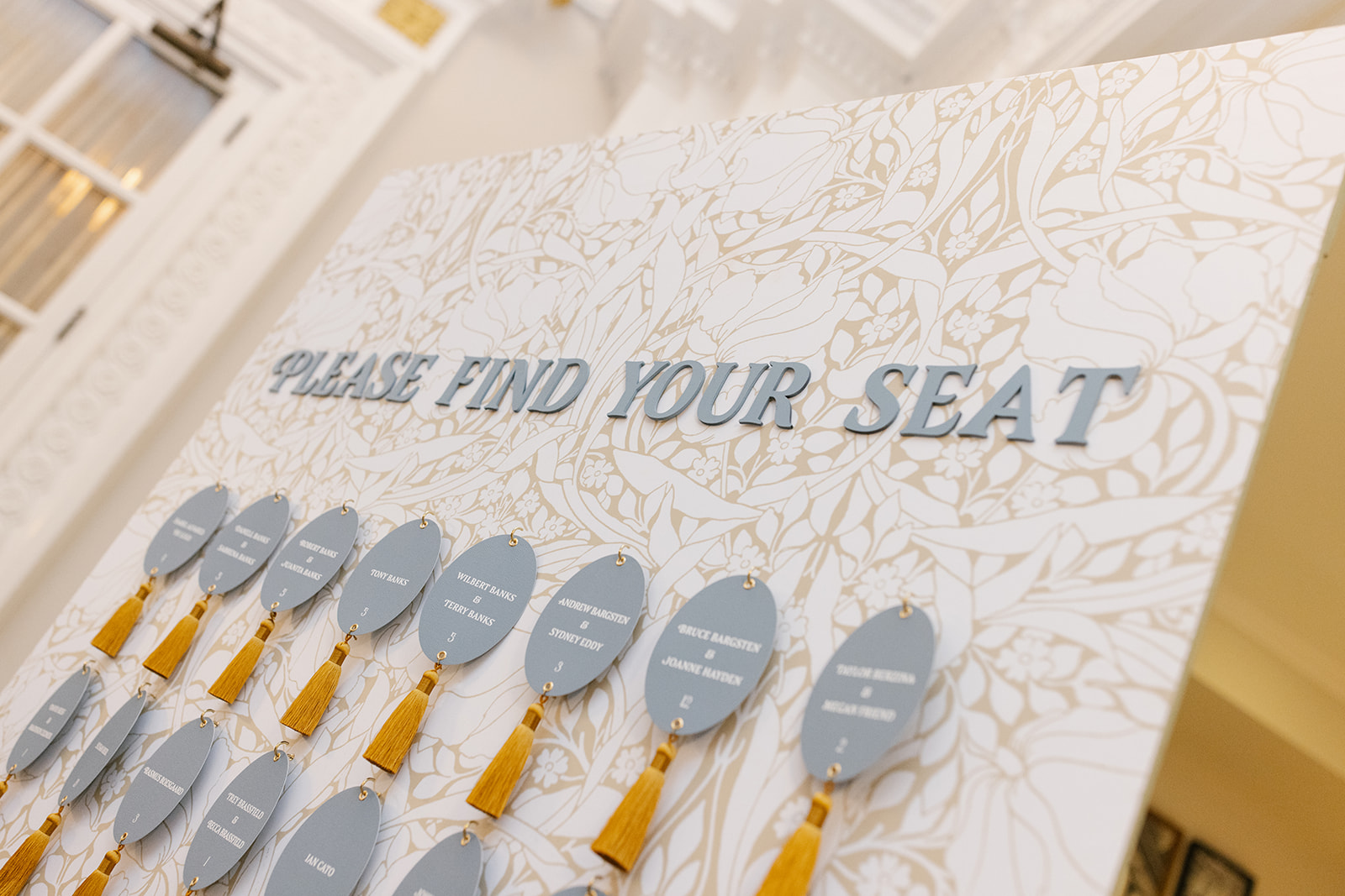
Our couples often use seating charts and escort wall displays as an opportunity to showcase their wedding day theme in a big way, and I am HERE for it!
Ashley and Austin trusted White Ink to create a custom wallpaper to serve as the backdrop for this one-of-a-kind escort wall display. We kept with the art nouveau theme by focusing on natural elements, like leaves and flowers with a soft brown and white. The oval escort cards were individually hooked to the display and boasted a thick yellow tassel to replicate a vintage hotel key. How cute are these?
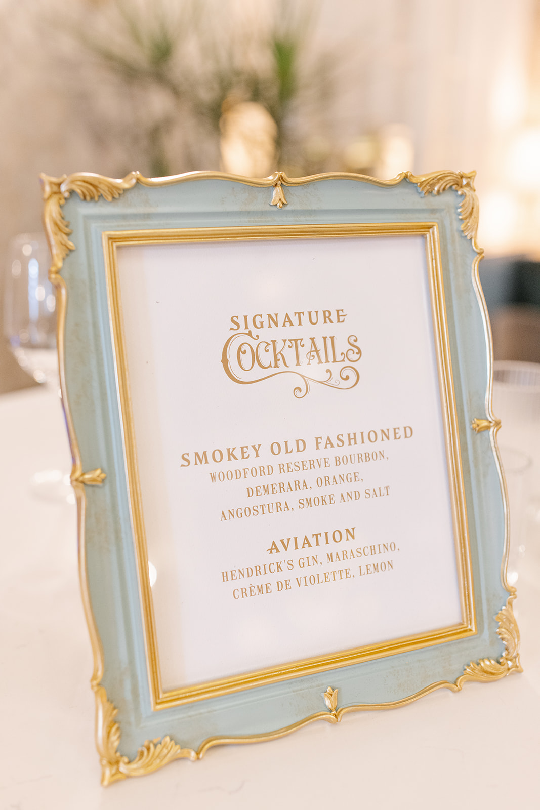
This stunning muted blue frame with gold ornamented trim was the perfect addition to our custom bar sign. It fit in with theme so seamlessly. The cocktail hour bar sign was a beautifully subtle addition to help carry the art nouveau theme by pulling in those soft hues and bold fonts.
Details like these are so much more than signs and menus, they provide a pivotal role in a carefully designed event. These little details leave a lasting impression and are something guests appreciate.
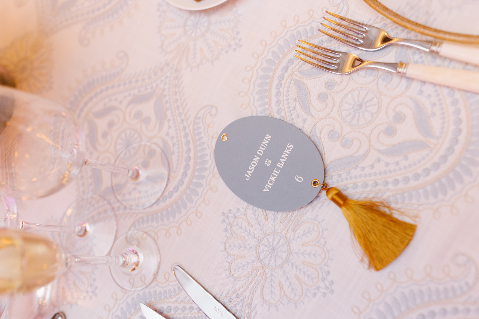
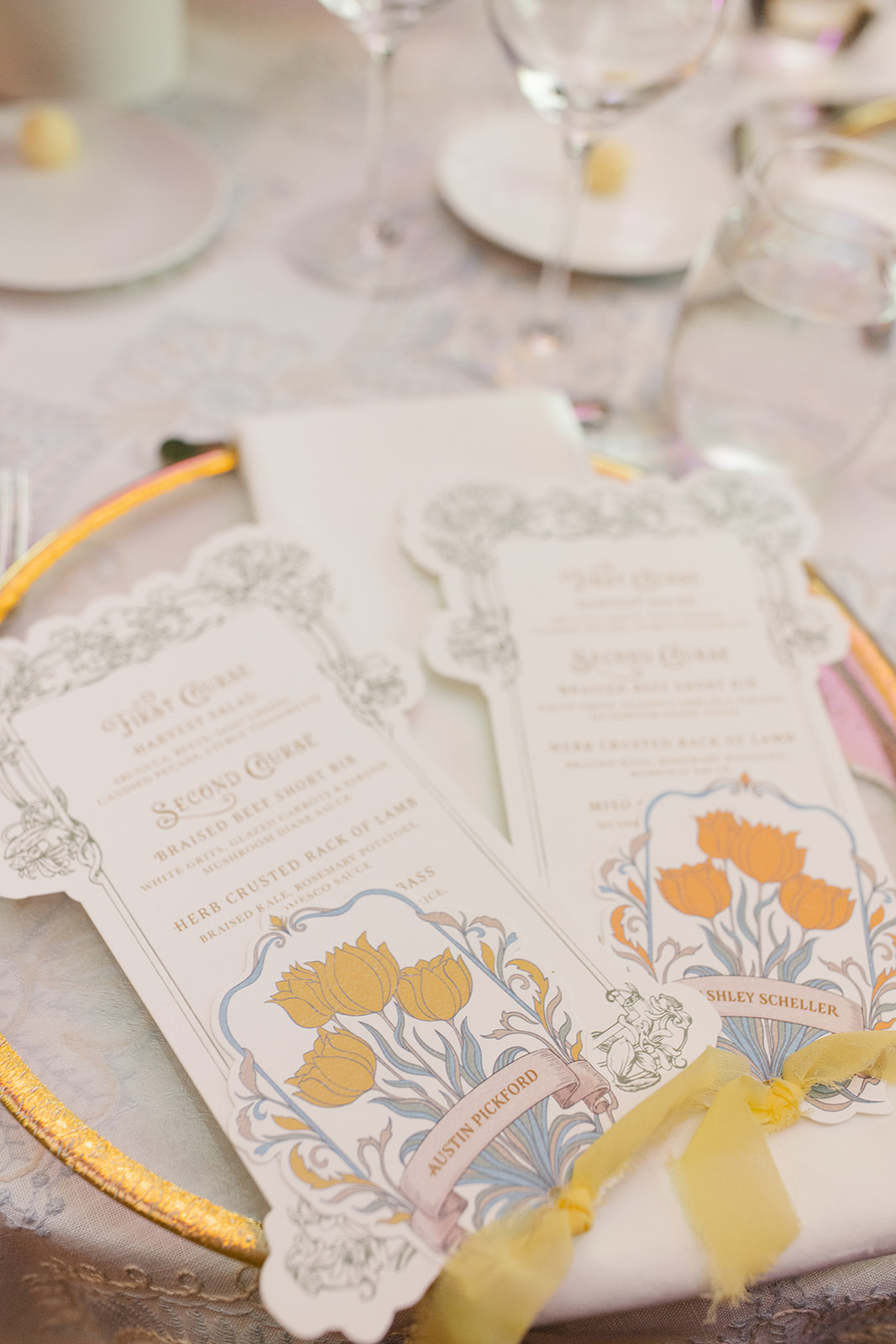
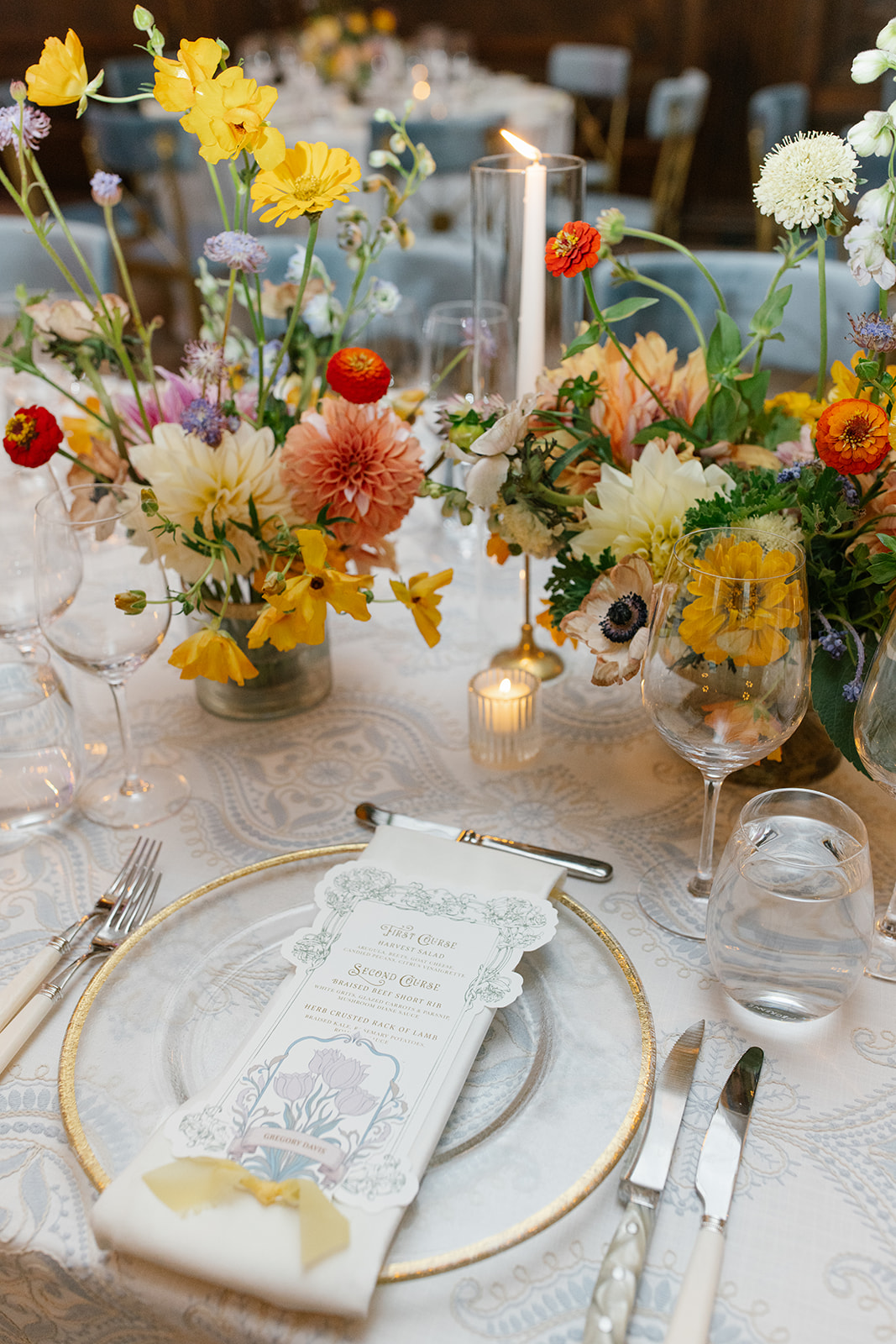
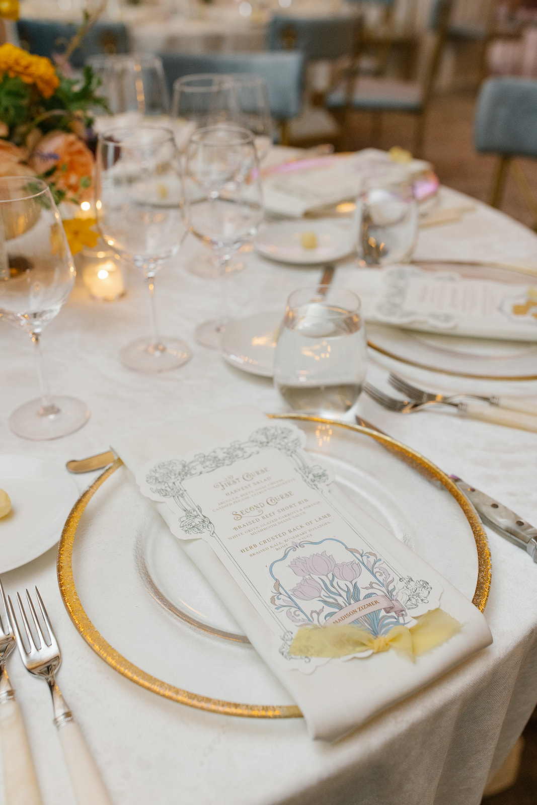
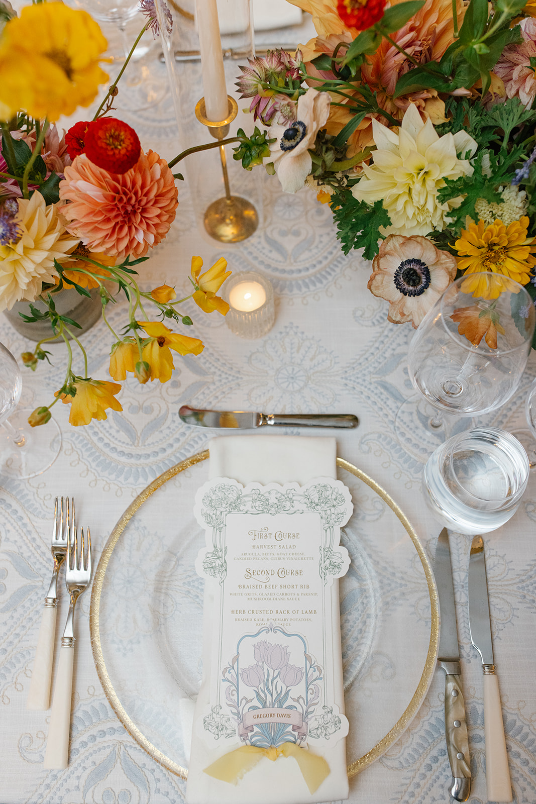
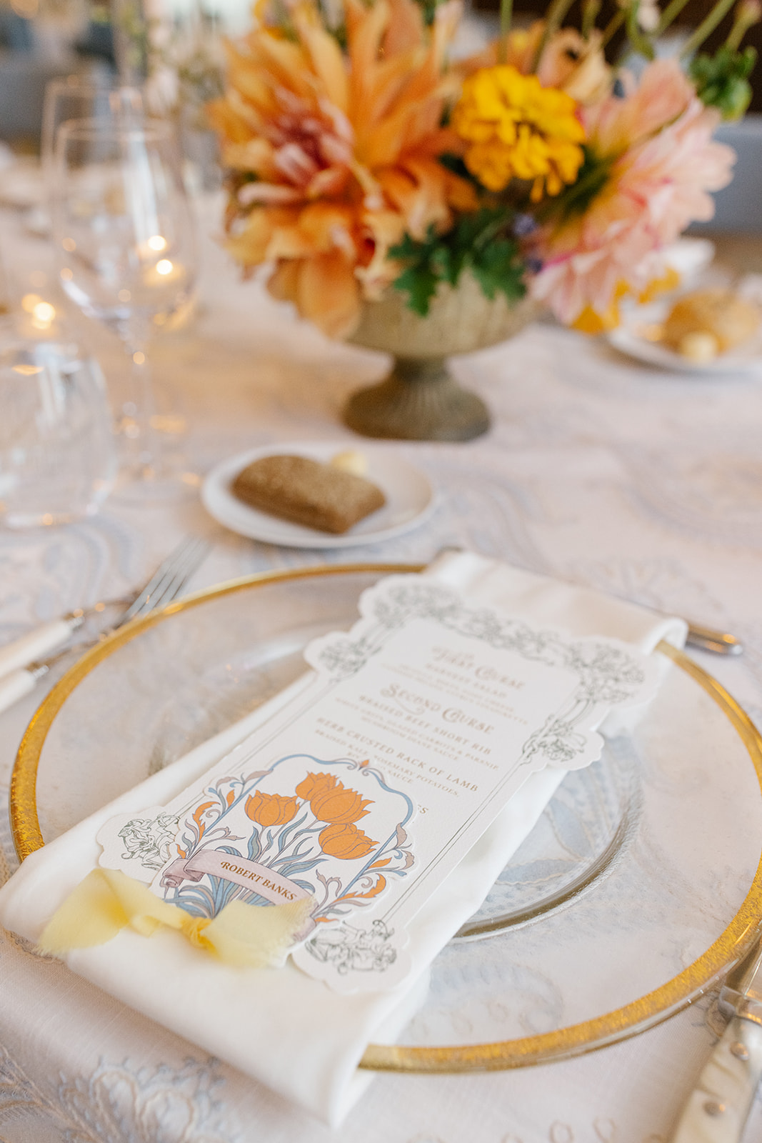
I could stare at these custom die-cut menus and place cards for hours. Guests enjoyed many day-of details that these little guys boasted. Much of the day’s style, colors, florals, and designs can be found right here in the artfully designed paper details.
A place card sat atop each menu, connected together with a soft, vintage, yellow chiffon ribbon. The same yellow ribbon could also be found on their invitation suite. I especially appreciated the functionality of the color-coded blooms on the place cards, which served as the meal indicator. Absolute perfection.
White Ink carried the vintage frame design from the invitation suite, rsvp, and detail cards to create Ashley and Austin’s table numbers. Table numbers don’t have to steal the spotlight in order to be a memorable part of a stunning tablescape.
The best way to tie in wedding theme details throughout the day is by pulling in designs just like this. Our couple also decided to use the vintage, wreath table number base from our extensive wedding rental collection. As you can see, it was the perfect choice!
Ashley and Austin came to White Ink with an elegant, vintage, art nouveau-inspired wedding vision. It was an honor to take on the task of bringing their vision to life. Taking in the approving whispers and smiles of the bridal party and guests is an unforgettable feeling. It is at the heart of why we do what we do. We love seeing the faces of our couples and their loved ones light up when they see their wedding dreams become a reality. We can’t wait to do it for you!
If you’re looking to add custom, thoughtful touches to your wedding or event, we would love to help make your vision a reality. Reach out today to learn more about our full-service design offerings—we can’t wait to create something unforgettable for you!