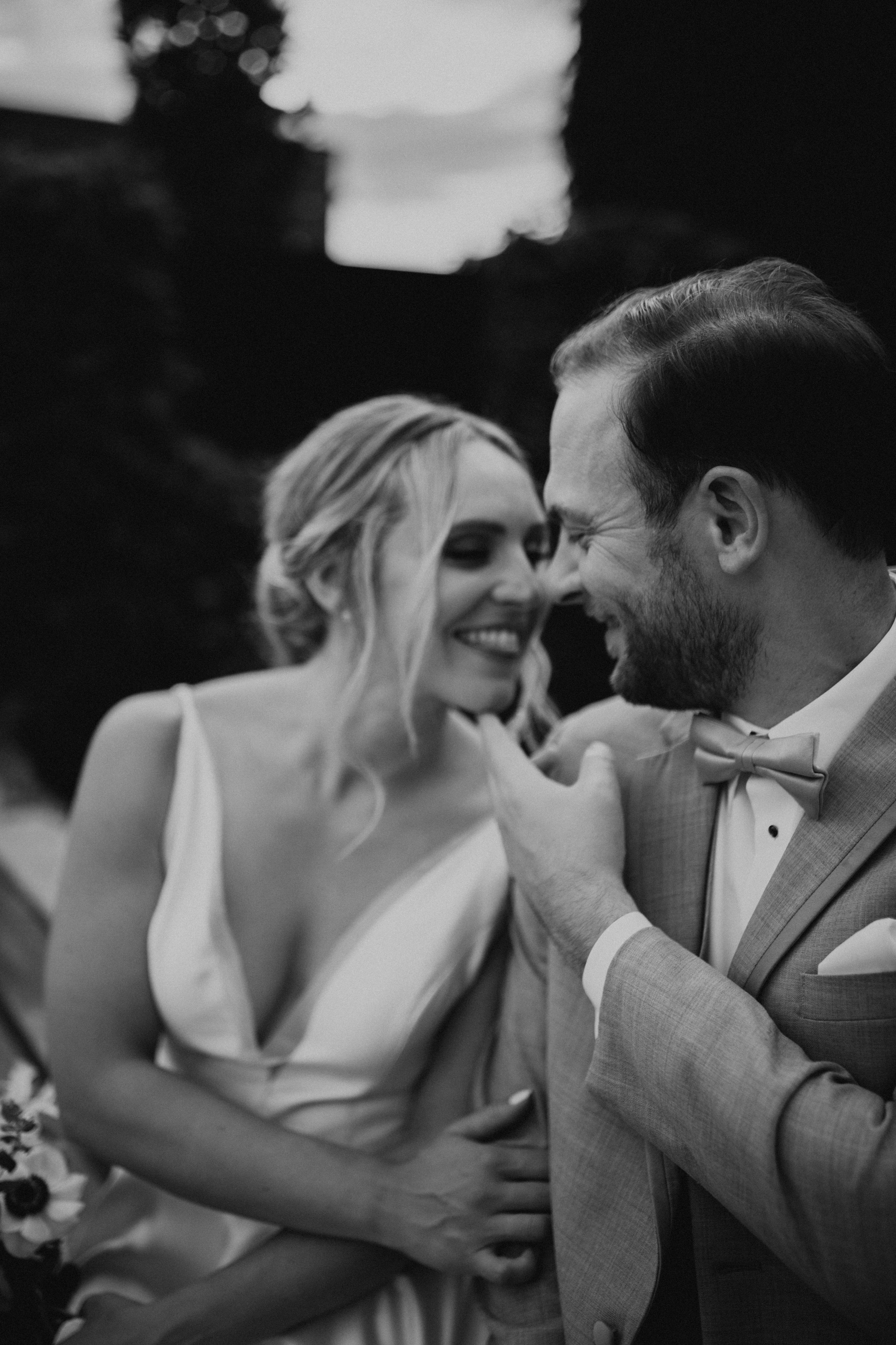
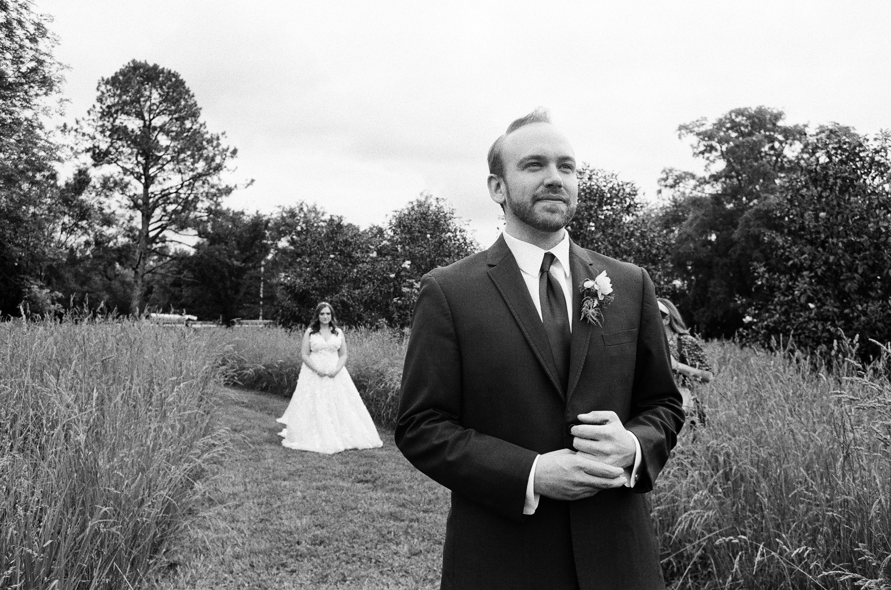
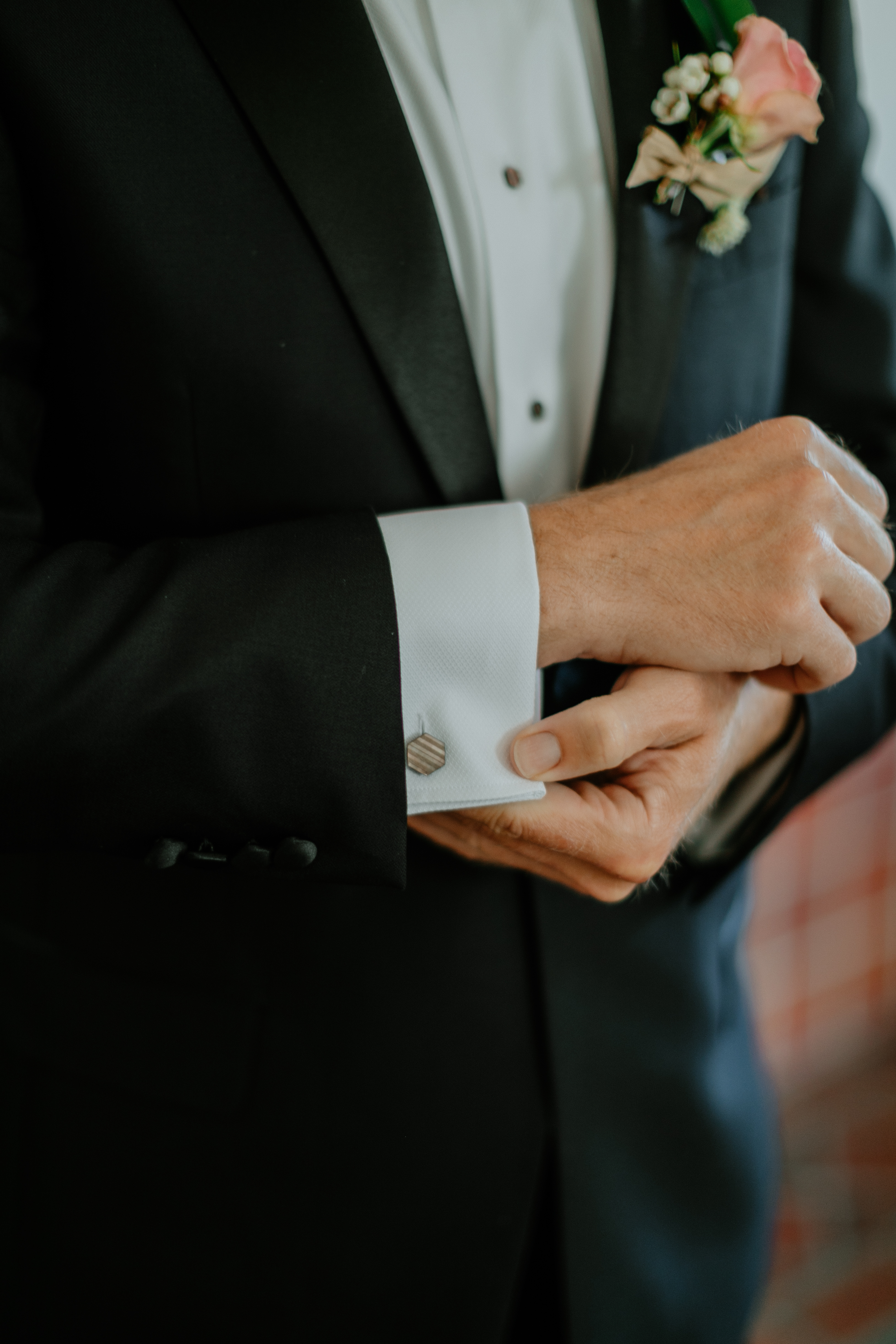
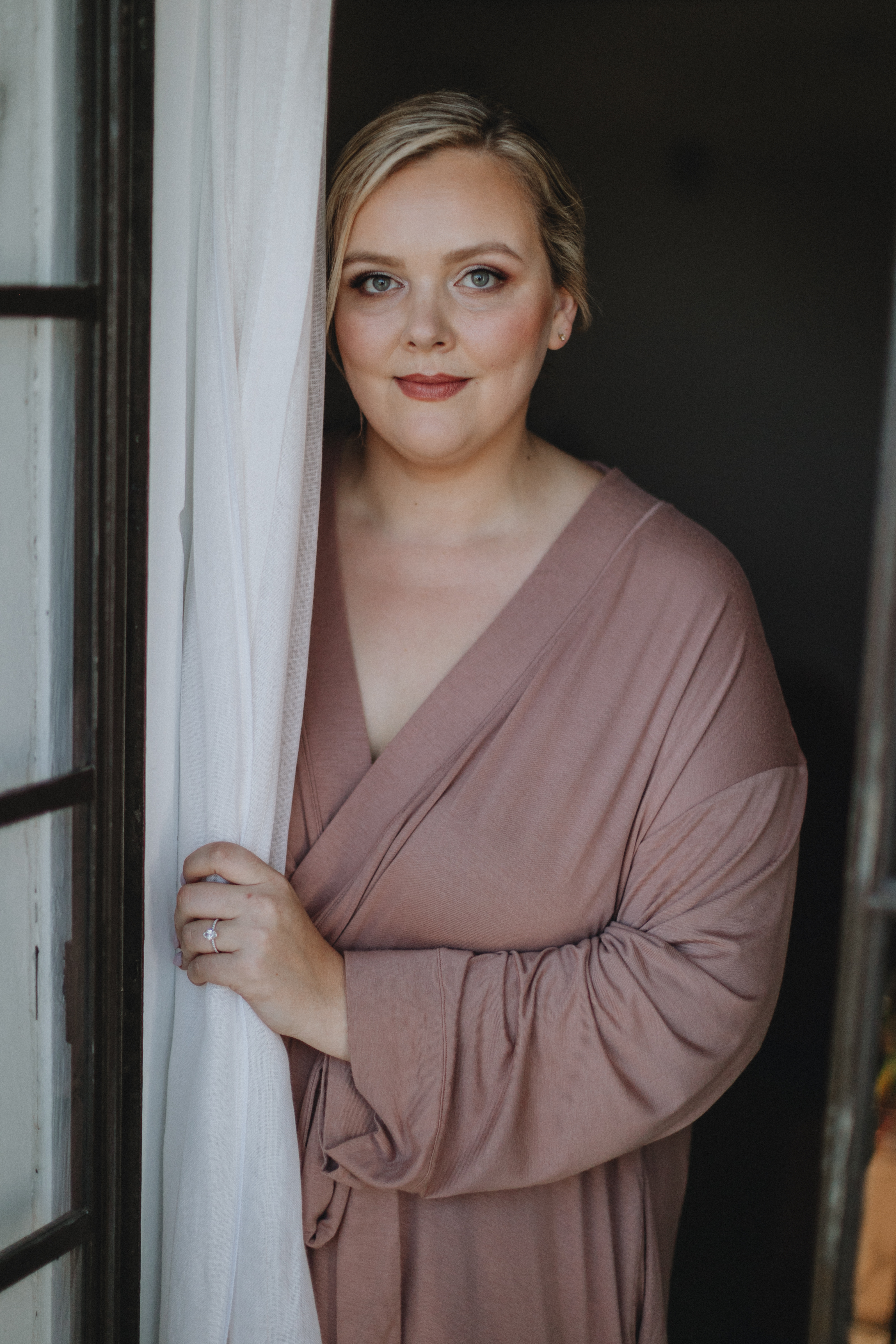
One of the things that I love about White Ink Calligraphy is that we aren’t just limited to paper. We have a wide range of capabilities that we apply to so many events, and we have so much fun doing it! We have the best clients in the world; they know we’ve got their back when it comes to meeting the expectations around their special day. Robin and Jeffrey are a great example. The White Ink team loved working for this amazing couple on their wedding day, and we know you’re going to love these details!
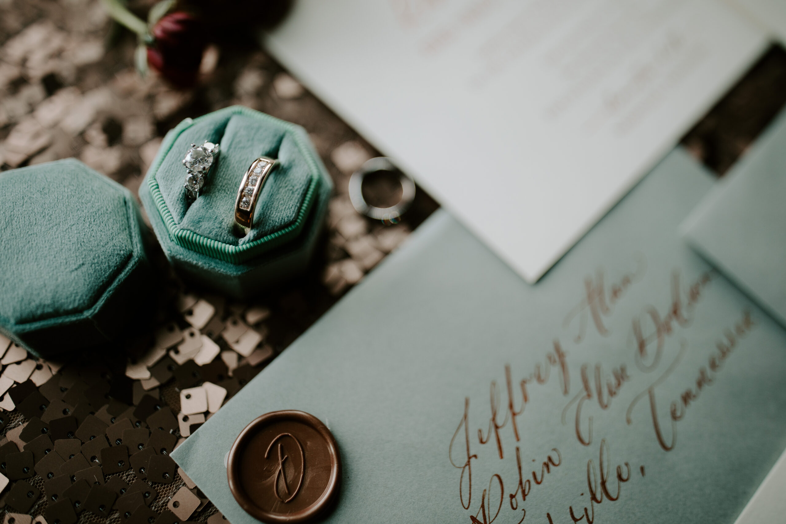
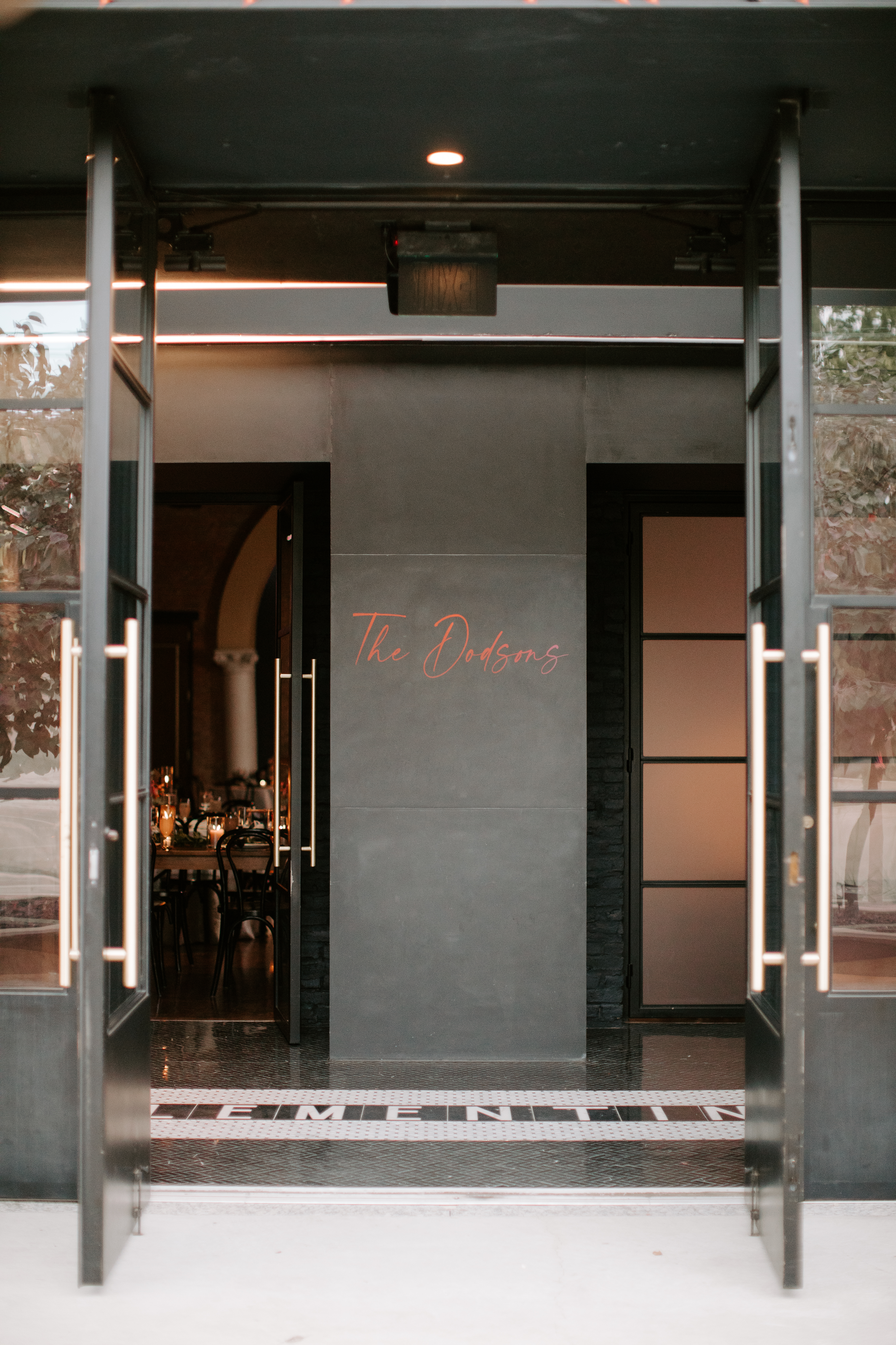
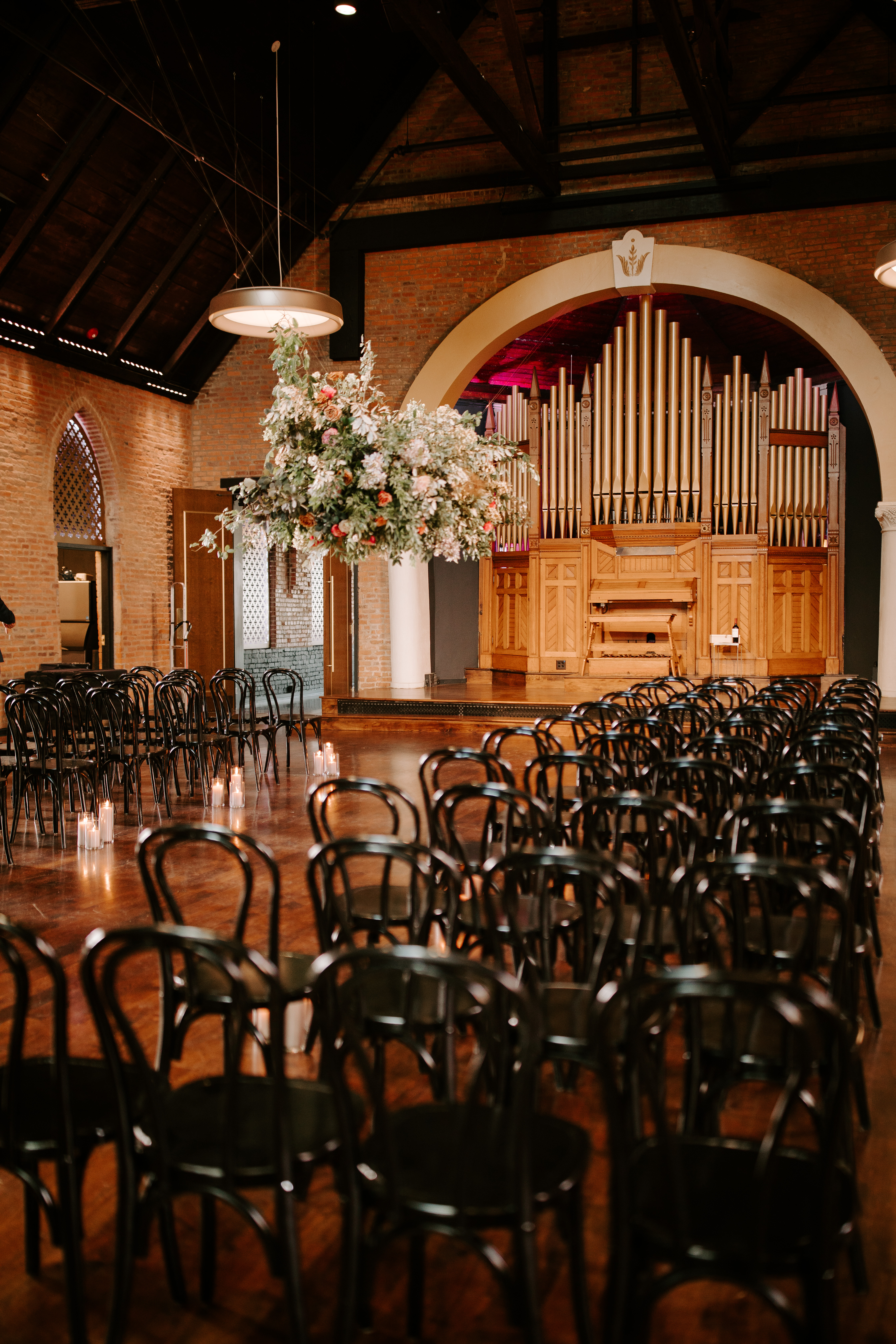
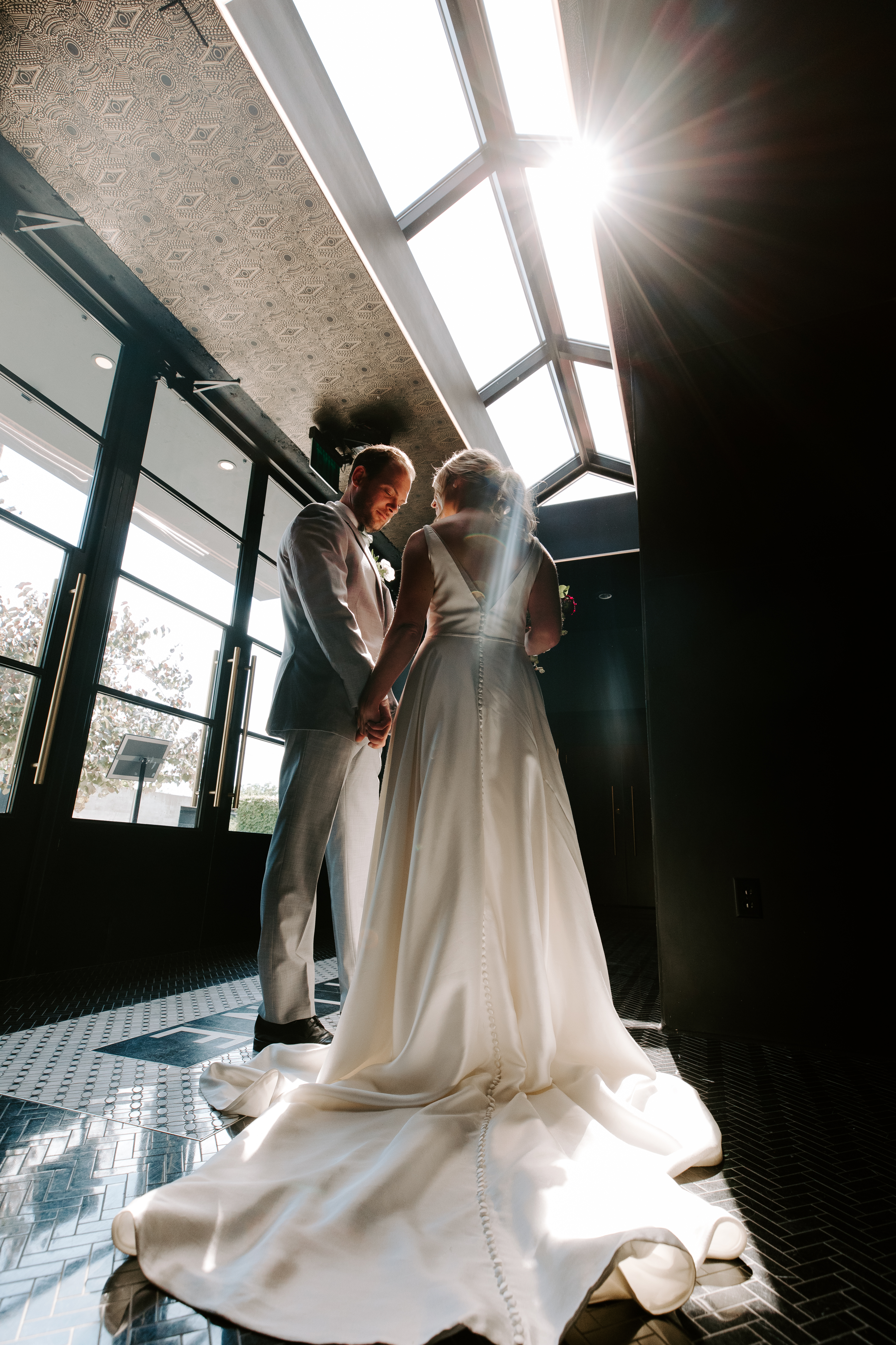
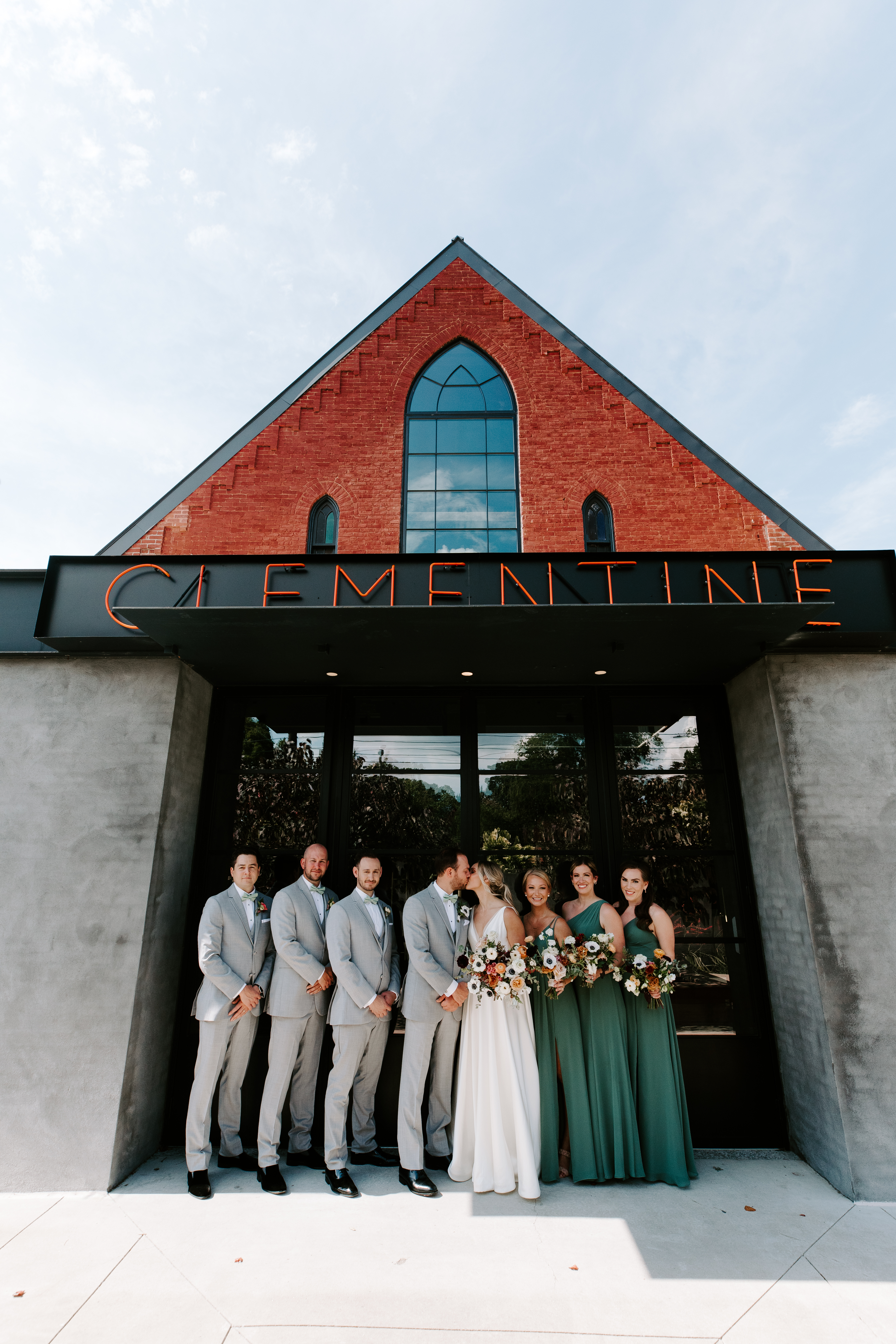
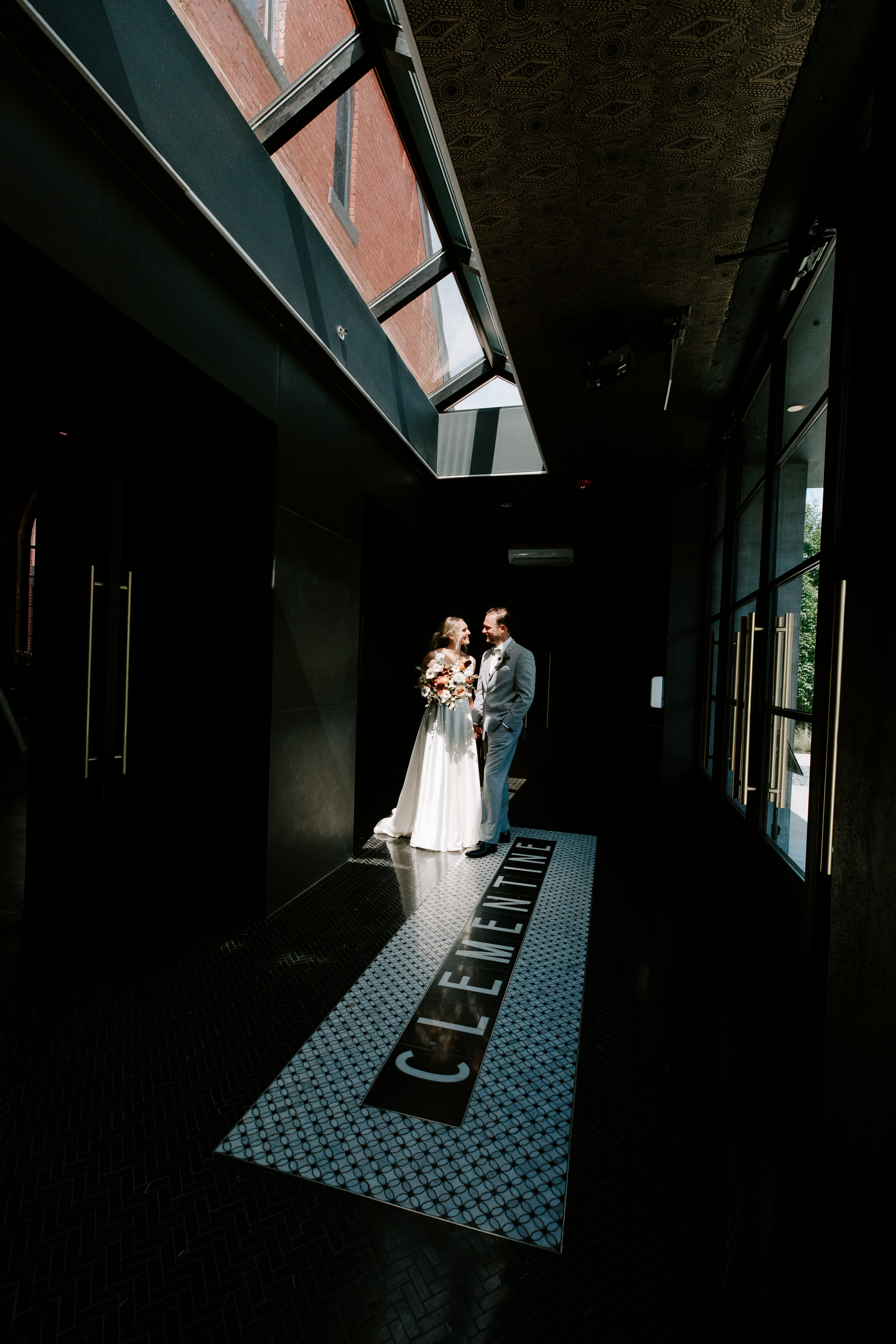
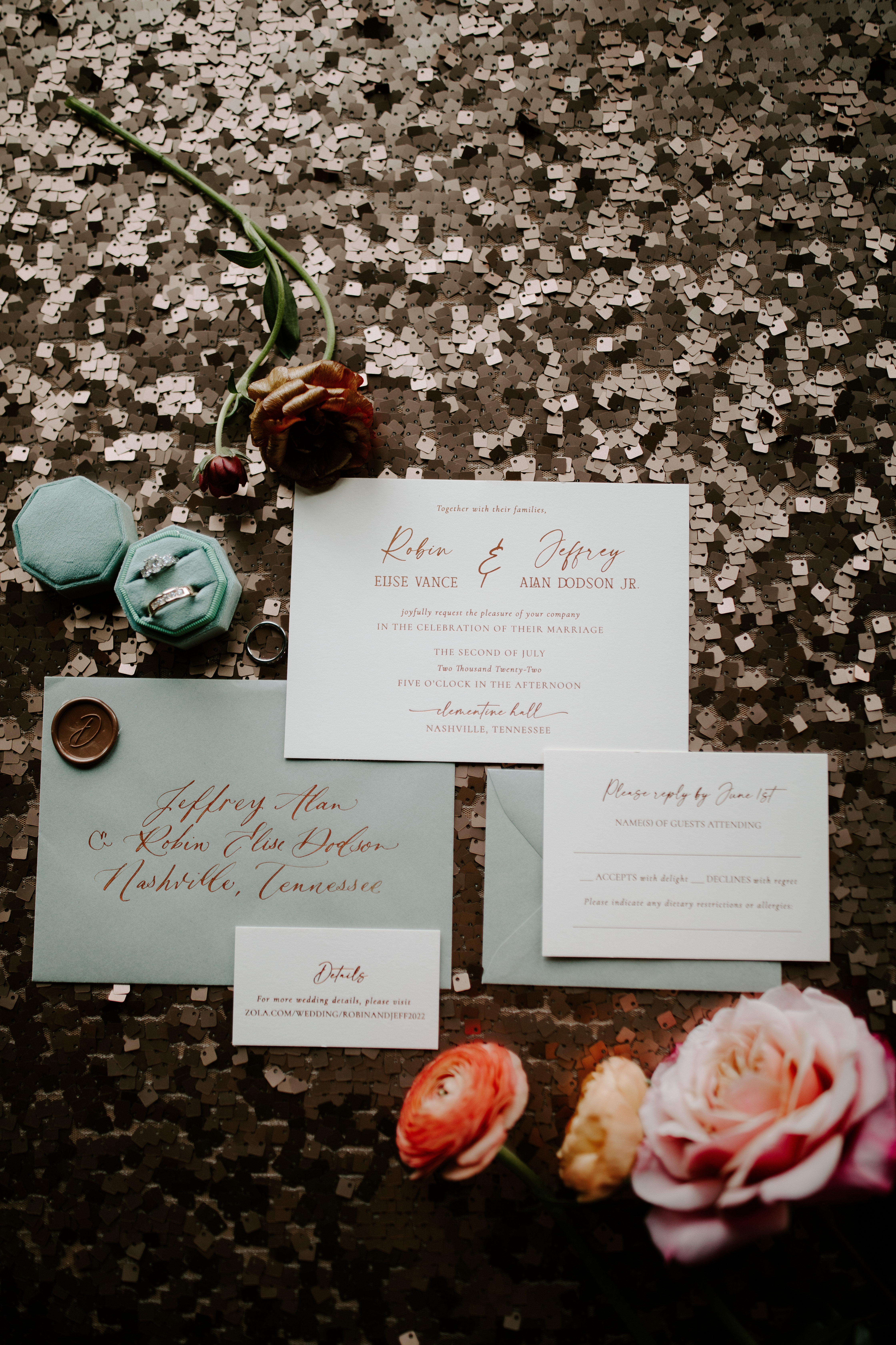
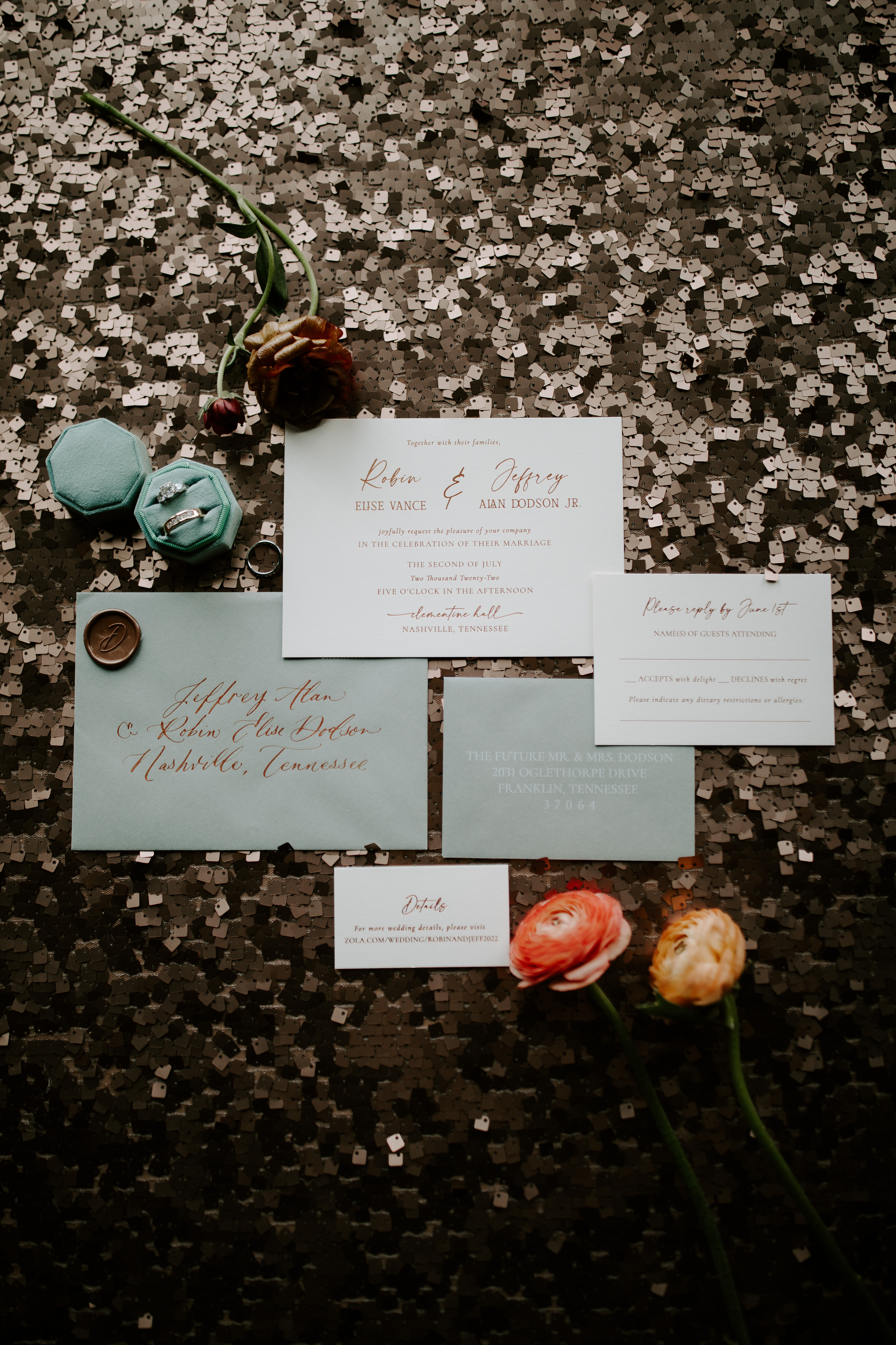
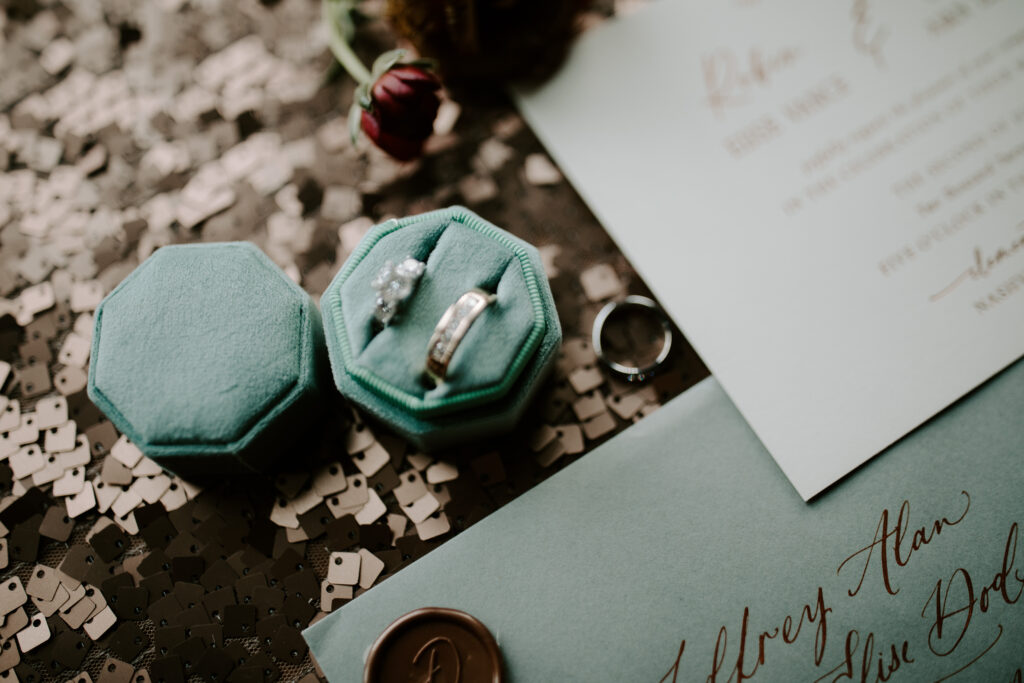
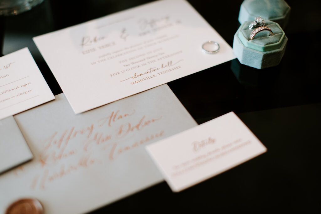
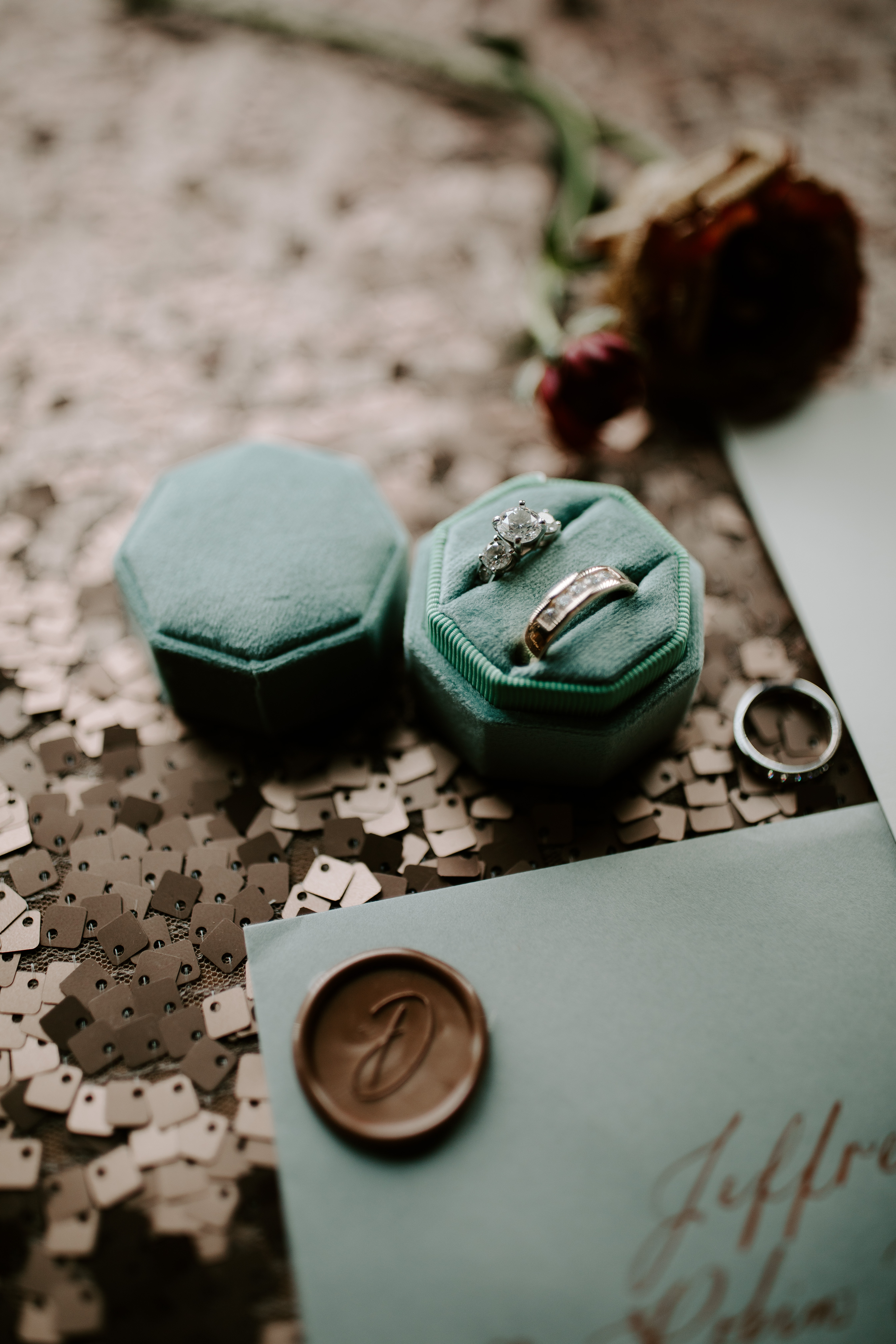
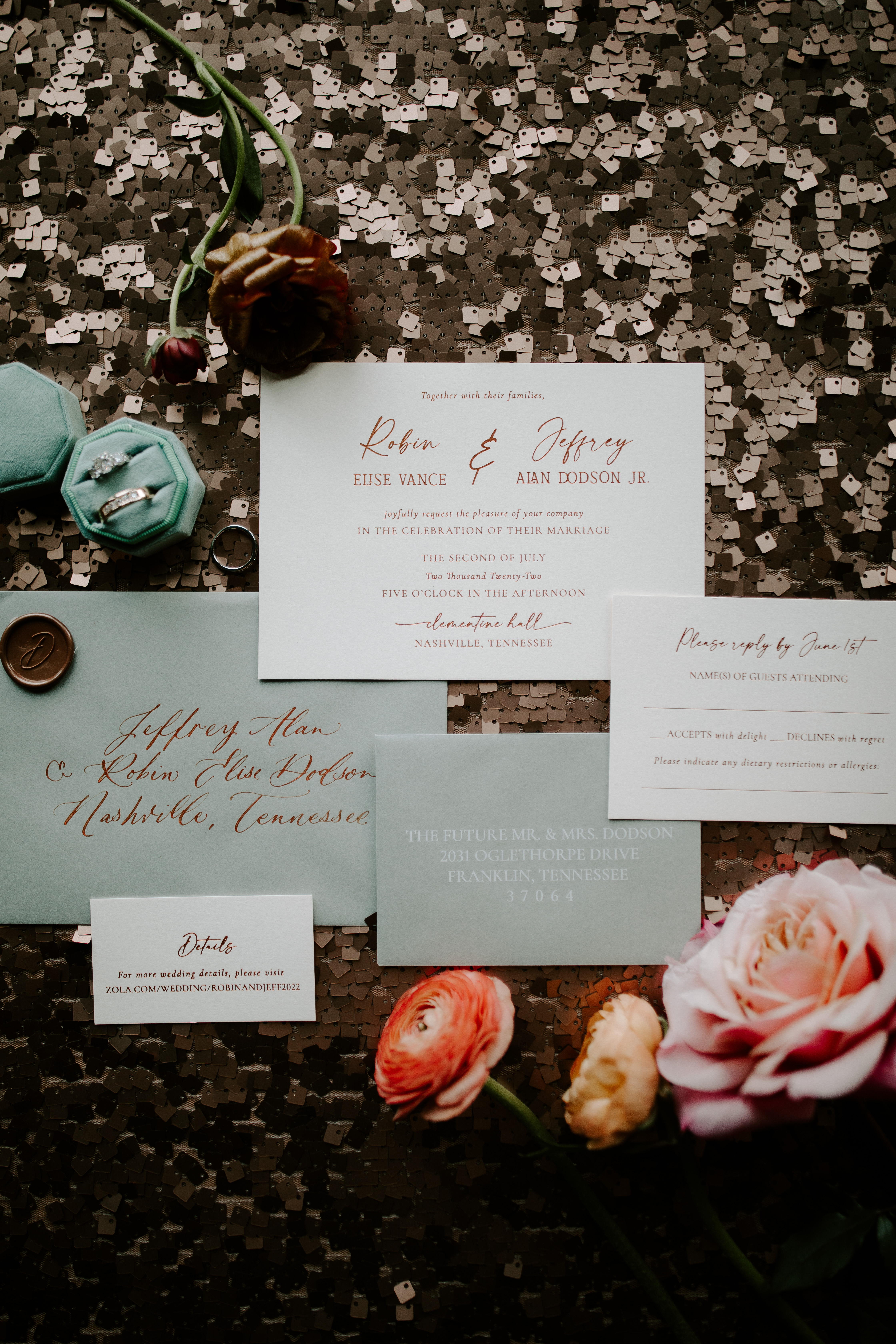
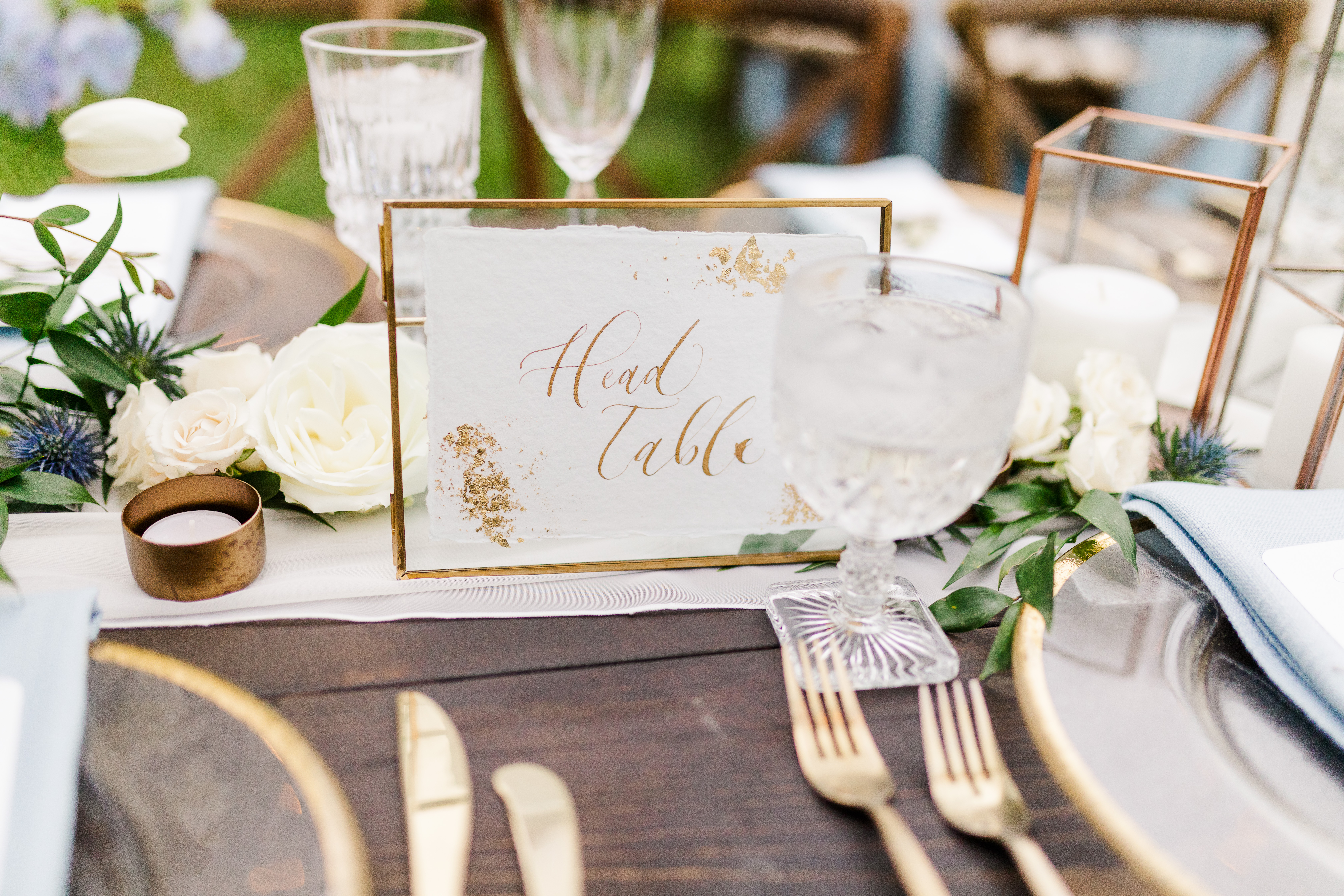
Robin and Jeffrey’s Nashville summer wedding was an absolute feast for the eyes. They chose the gorgeous Clementine Hall in downtown Nashville as their venue which added an array of modern elements to this southern wedding. Venues like the Clementine give White Ink a chance to stretch our creative muscles. Like getting to incorporate copper tones in much of Robin and Jeffrey’s day-of pieces. It all begins with the invitation suite that we created for our perfect pair. Custom envelope calligraphy is a showstopper all on its own, but when you pair that with a brilliant copper ink- whew! Just stunning. These invites were completed with a classic copper wax seal to make this suite as distinctive as our beautiful couple.
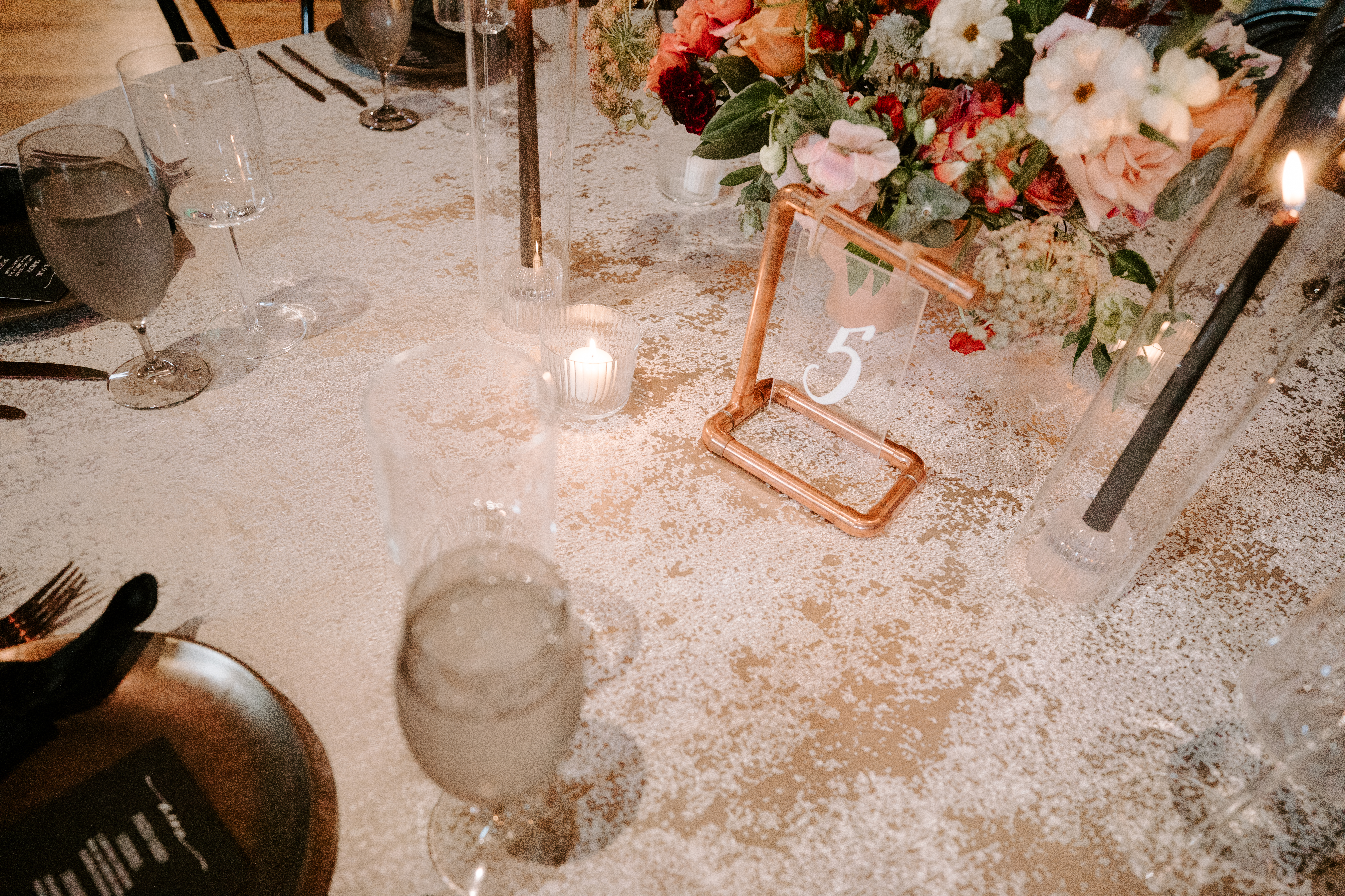
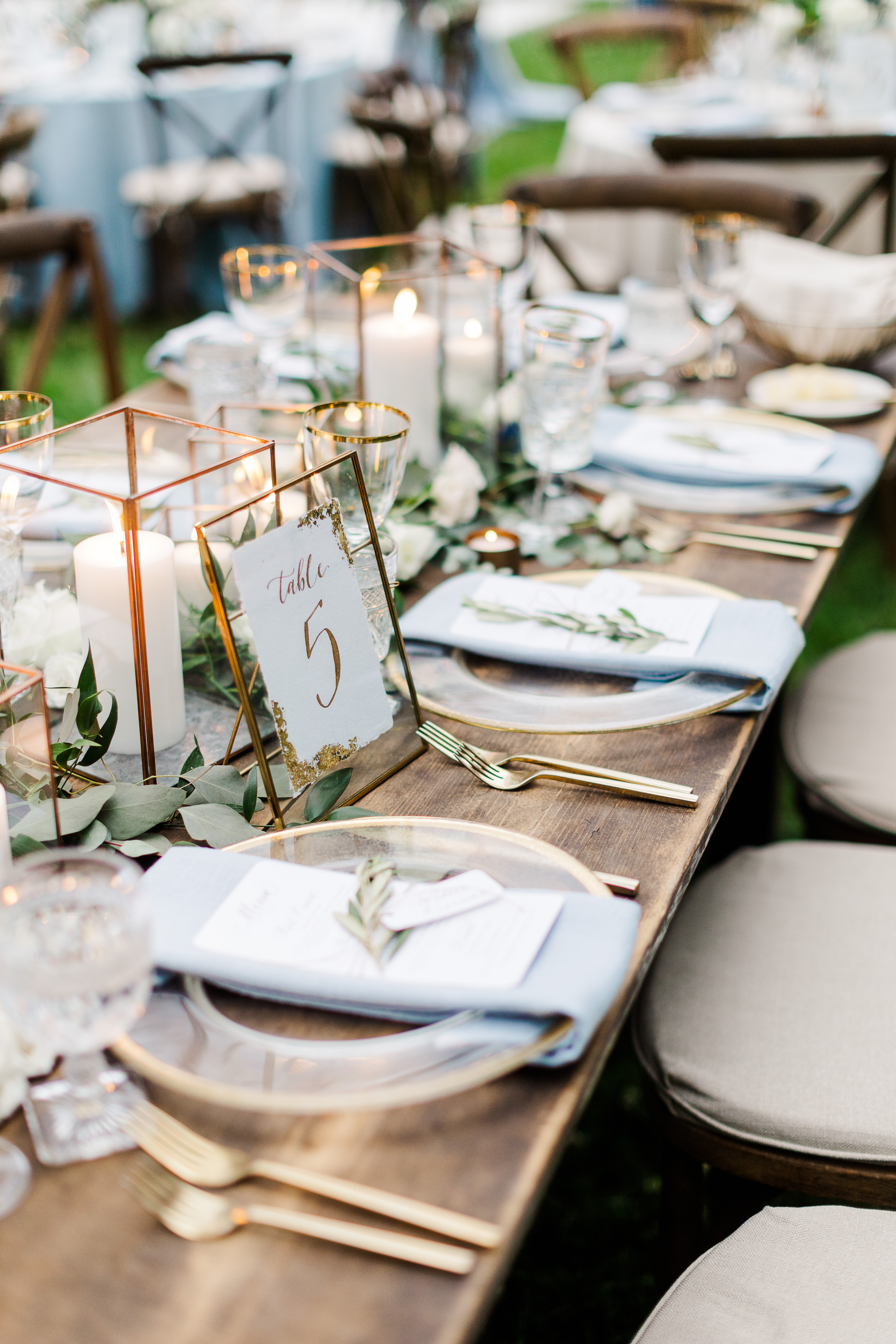
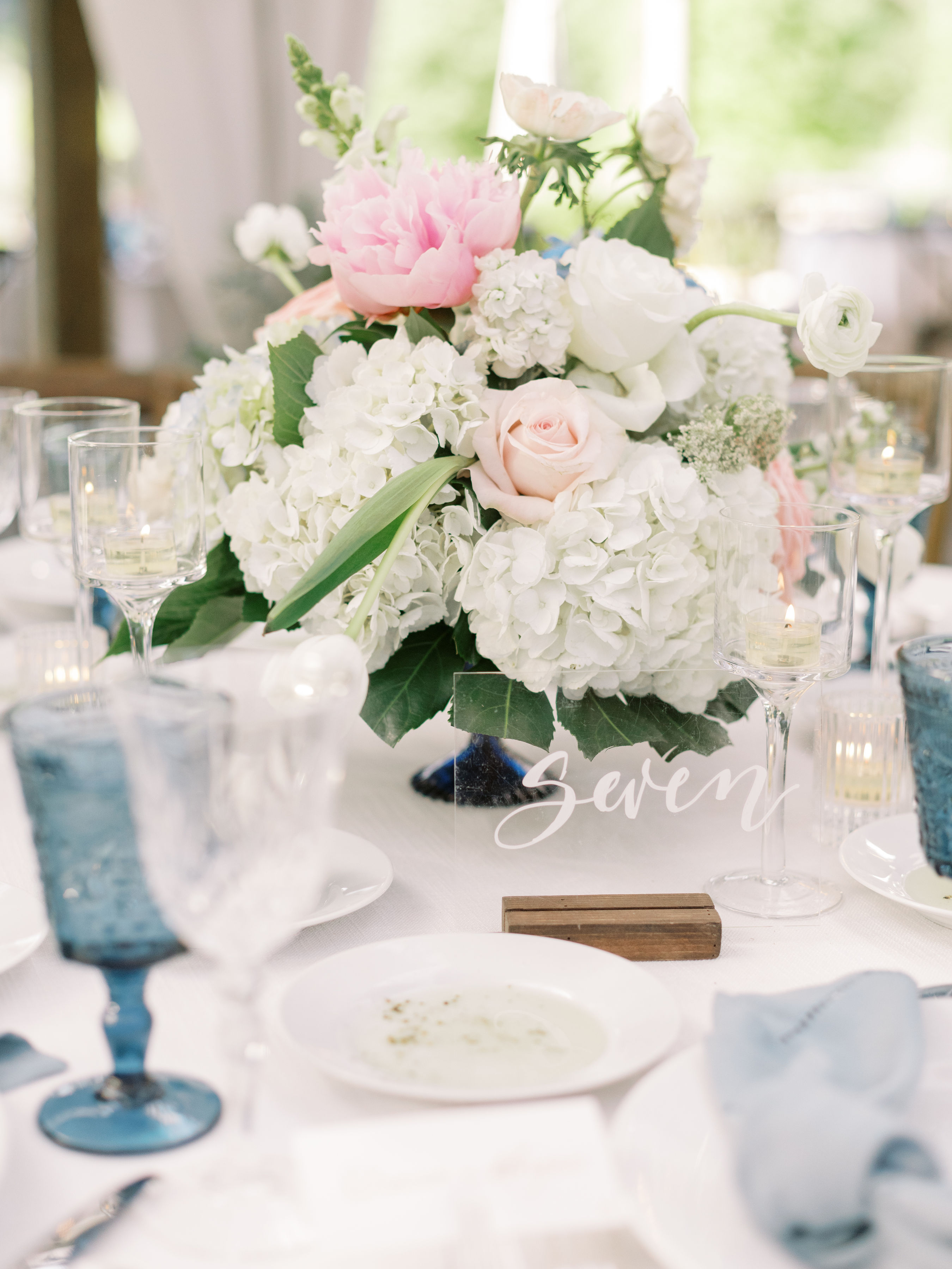
These same copper elements made their appearance again at Robin and Jeffrey’s reception. Guests were wowed by Whtie Ink’s one-of-a-kind table numbers made up of acrylic signage and copper pipe stands. How awesome are these? The way the copper pipes blend in with the florals on the tablescape is a really great example of how different textures can be used together to create an aesthetically delightful style. White Ink used this same acrylic and copper pipe for the bar signage, and we were thrilled with how well it turned out. We love a couple who aren’t afraid to think outside the box in terms of color and how to use it. Well done, Robin and Jeffrey!
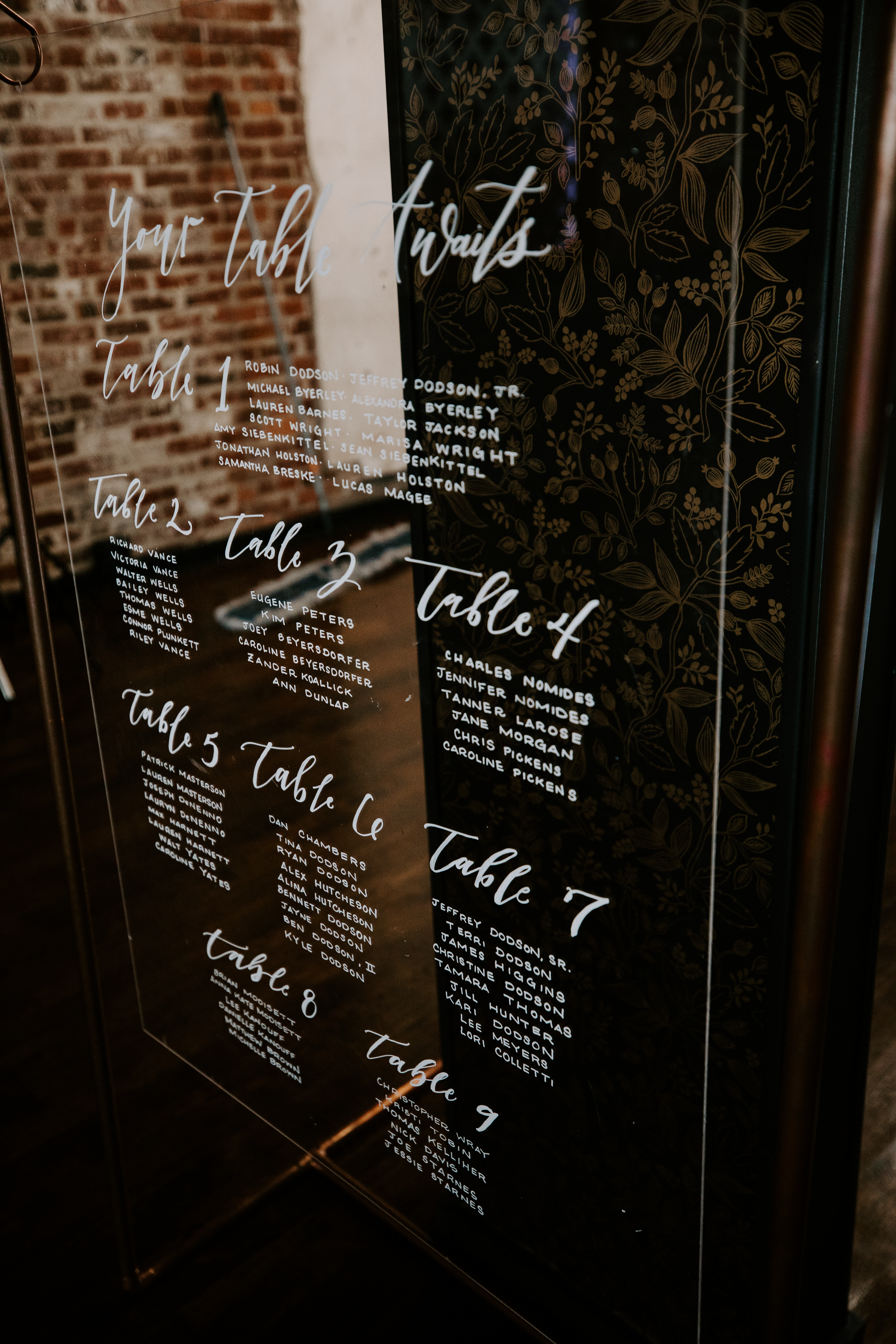
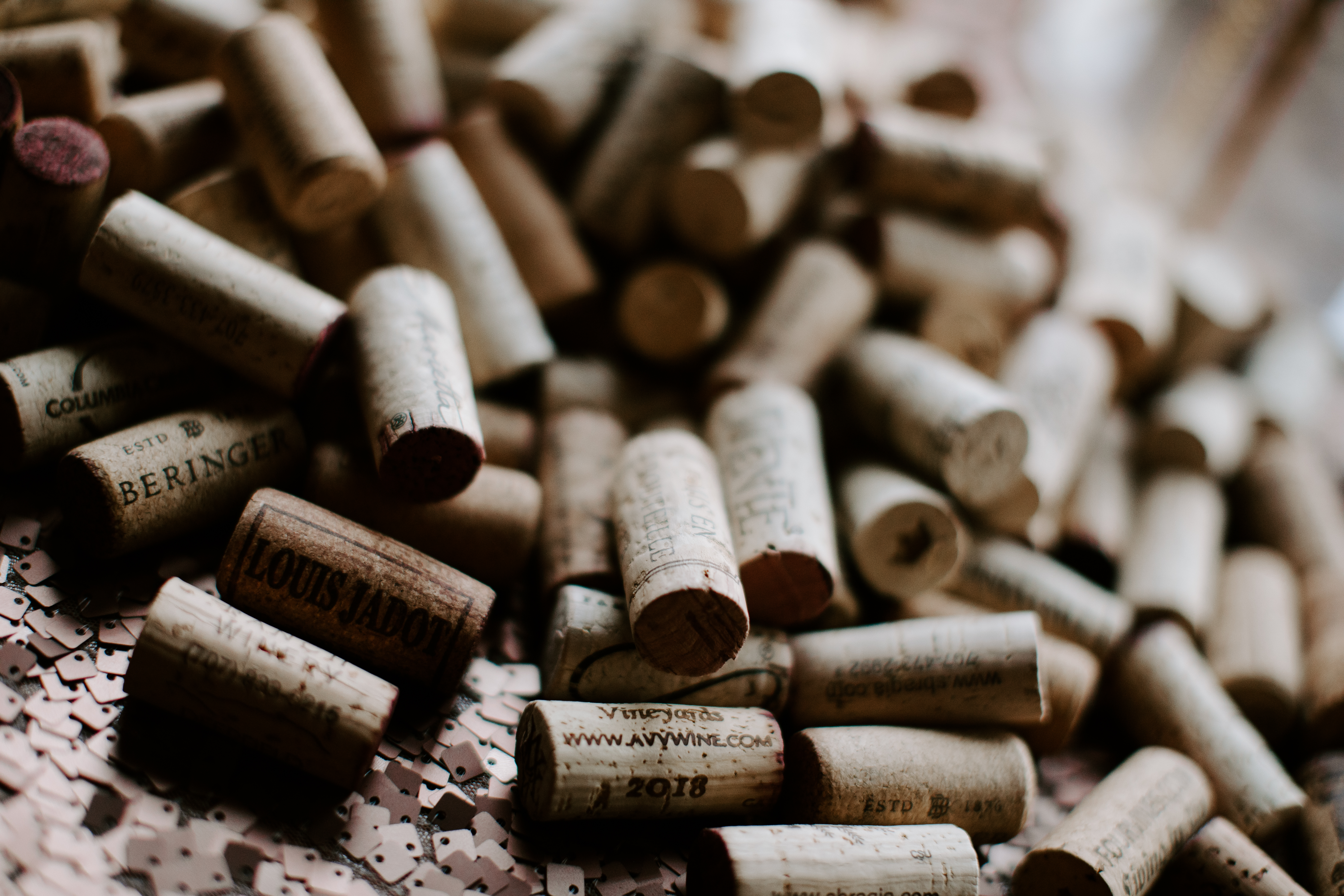
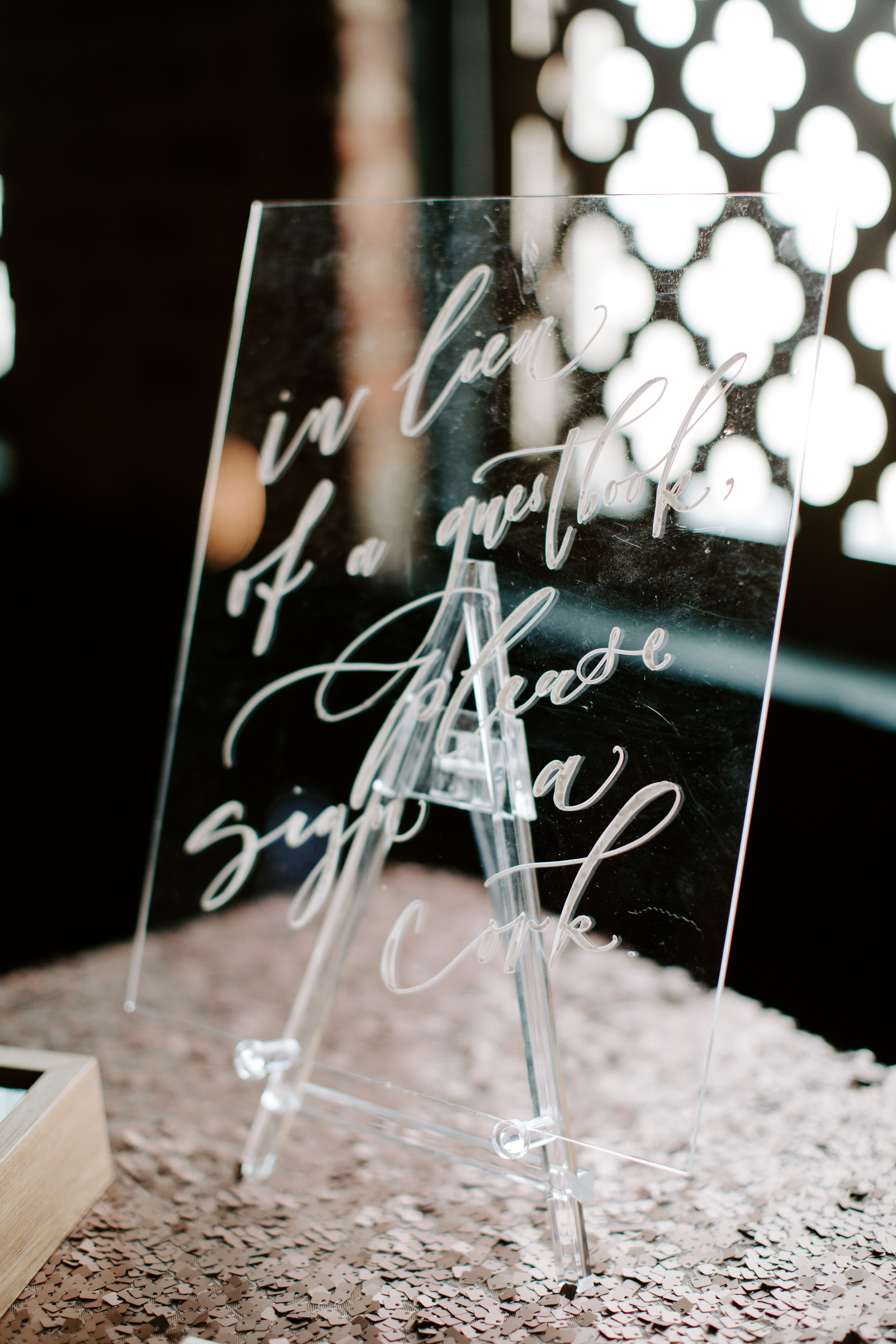
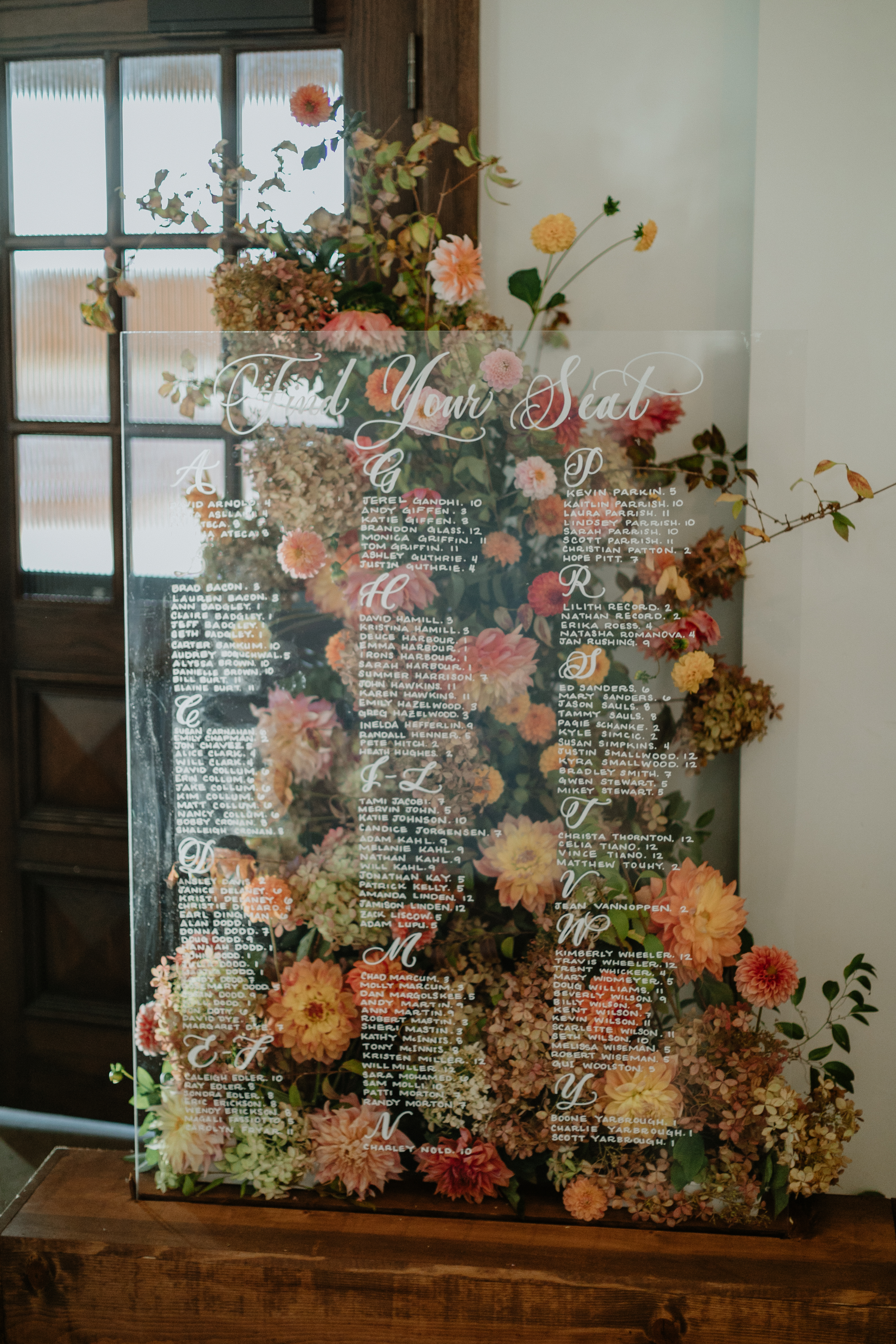
White Ink was happy to supply our bride and groom with an all-acrylic customized table seating chart. It blended perfectly with the style of the day. One of the most novel signs we customized for Robin and Jeffrey was the sign that invited guests to sign their names to a wine bottle cork in lieu of a guestbook. I thought that was such a fantastic way to turn a common wedding tradition into something that was uniquely theirs!
Working with Robin and Jeffery was a great reminder of why we do what we do. We have the skill and the supply to match our clients’ expectations and elevate each event we are asked to be a part of. White Ink is there for you, from the ink to the table- and more.
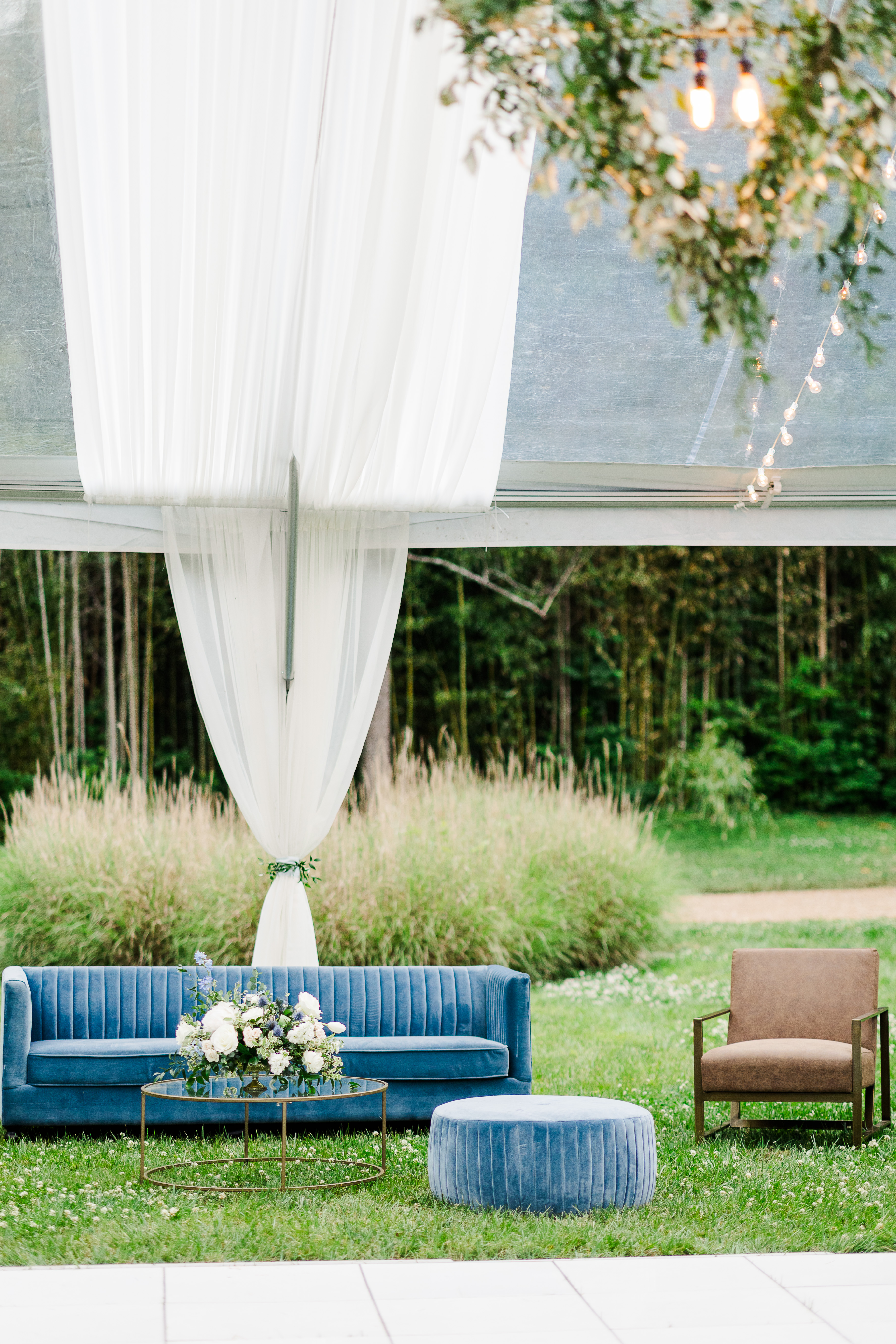
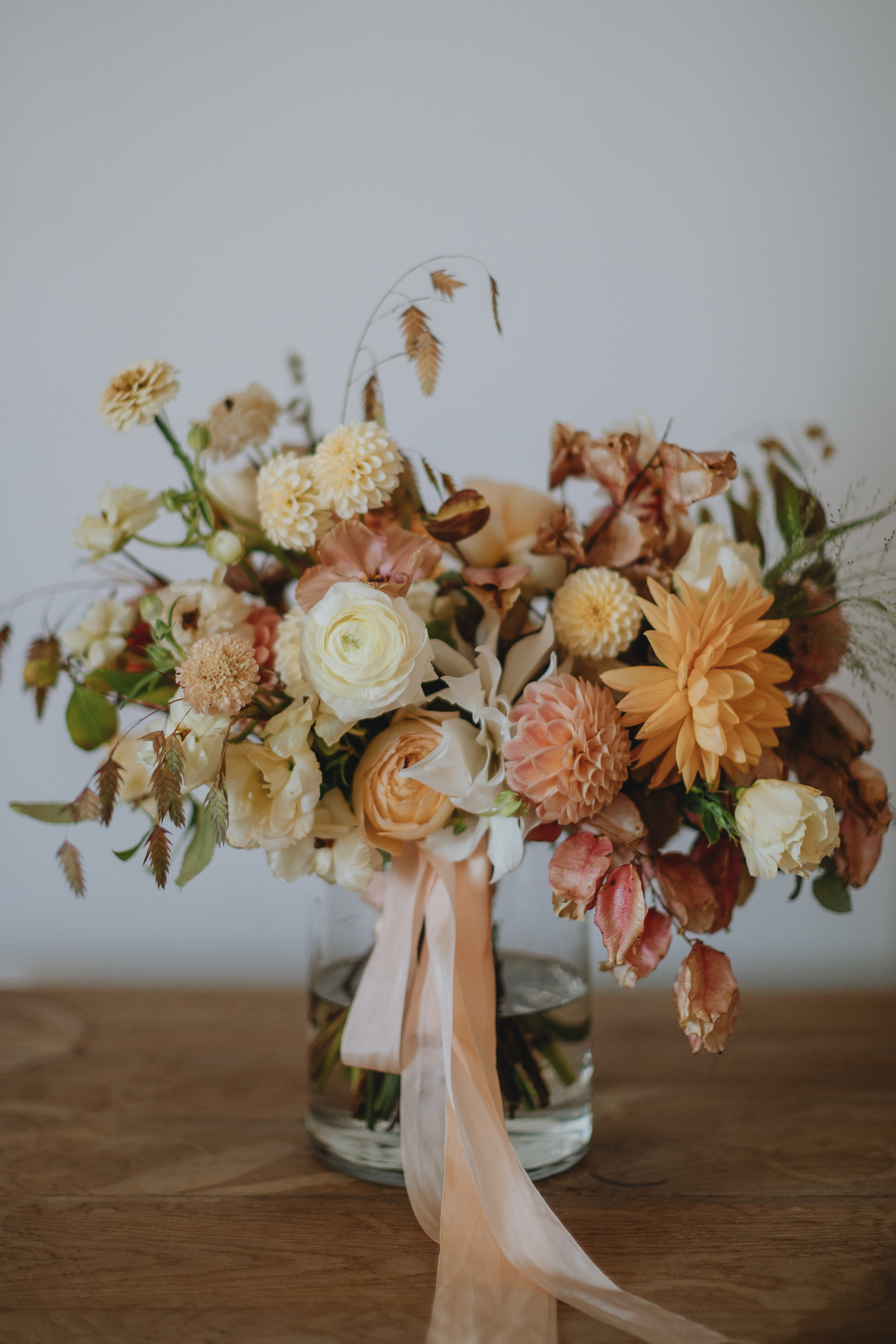
I want to say, whenever our couples take the time to include different textures in their wedding details it is ALWAYS worth the effort. Any creative knows that layered textures are sure to elevate an event. I’m excited to show you what White Ink created for Mae and Casey on their big day!
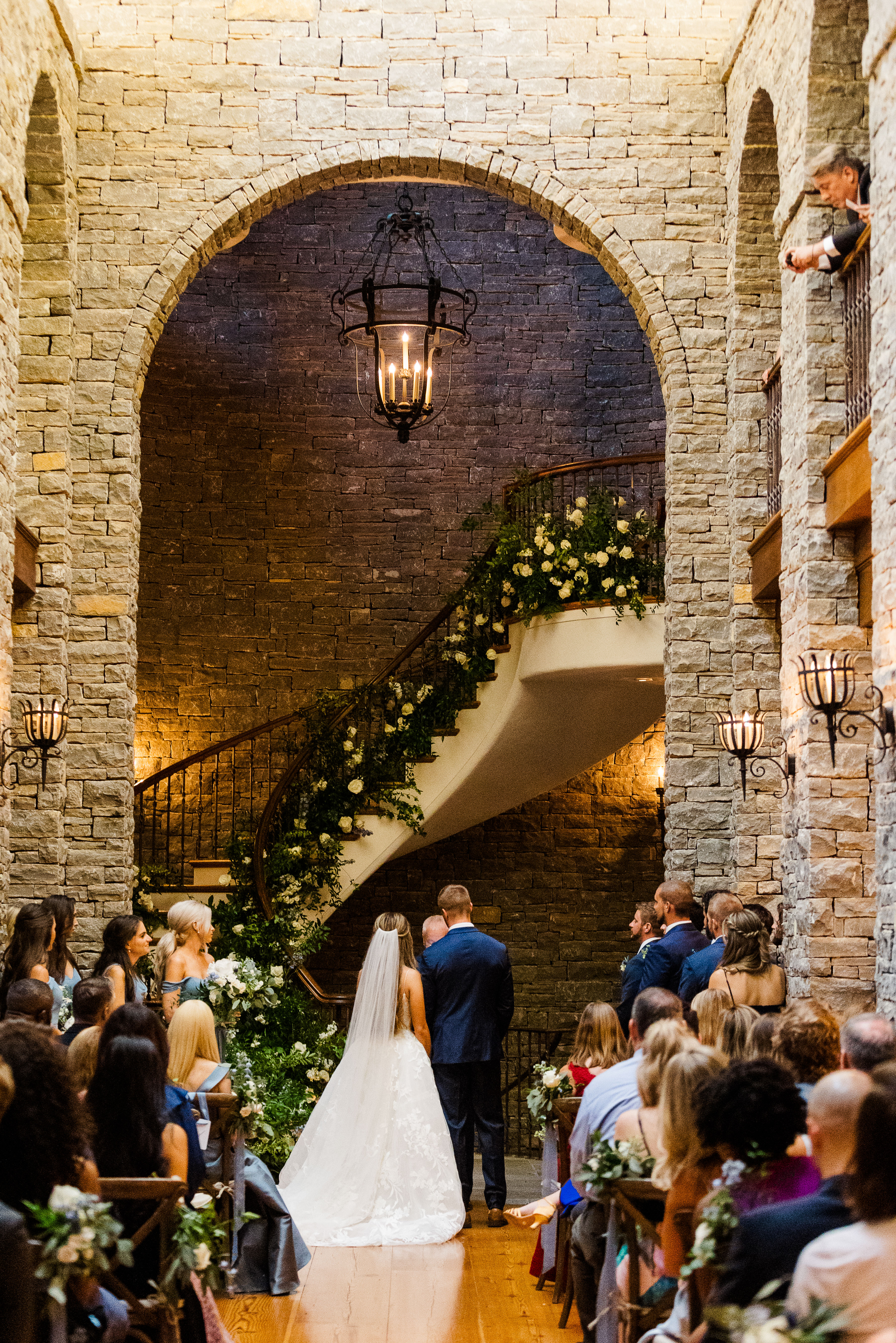
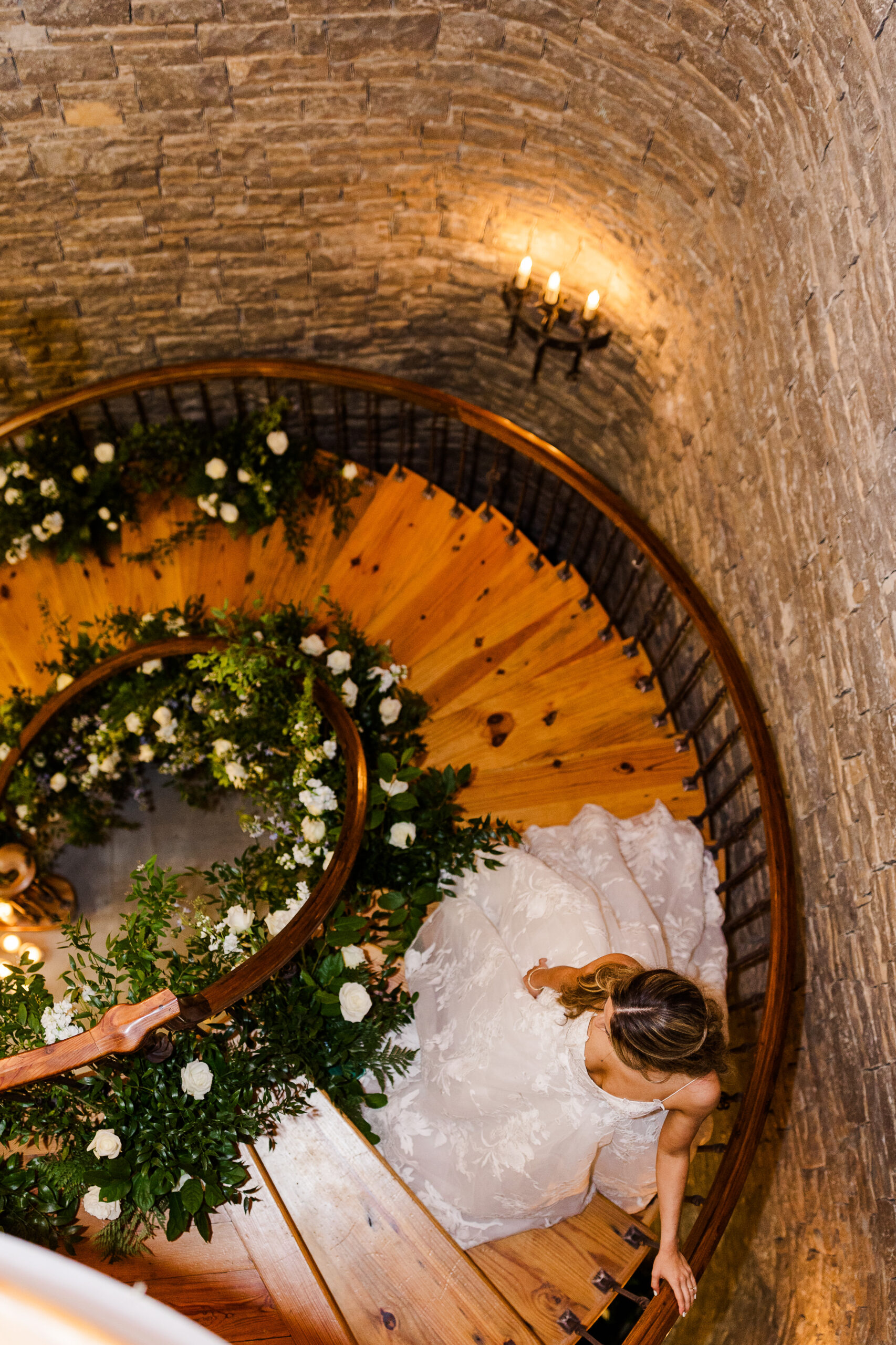
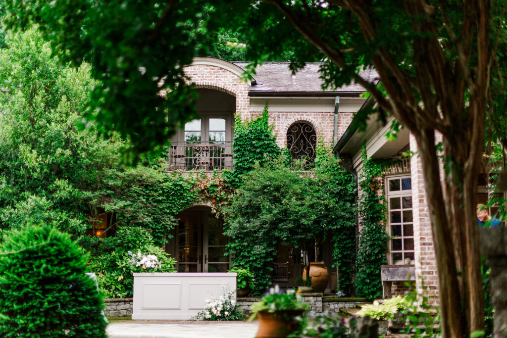
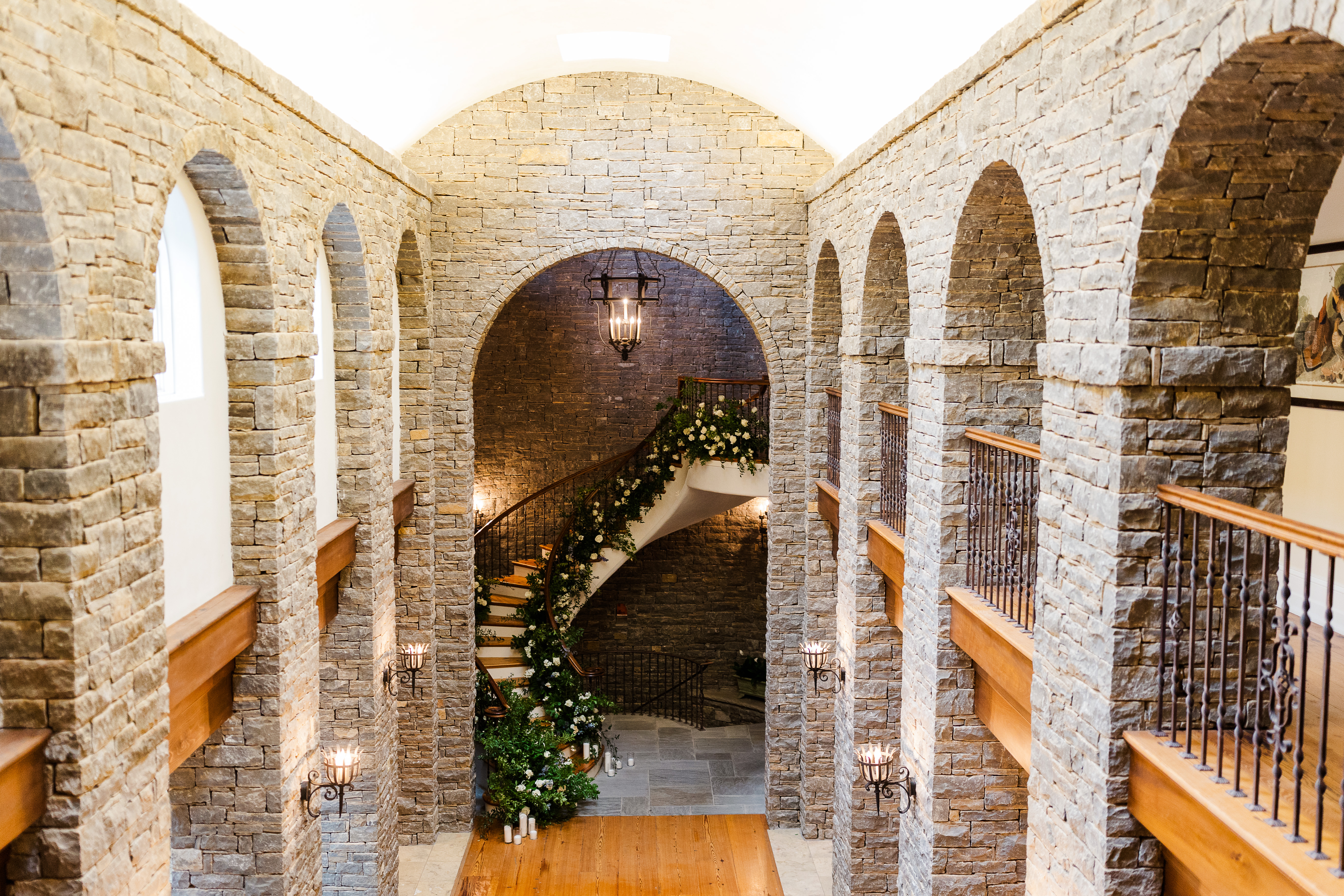
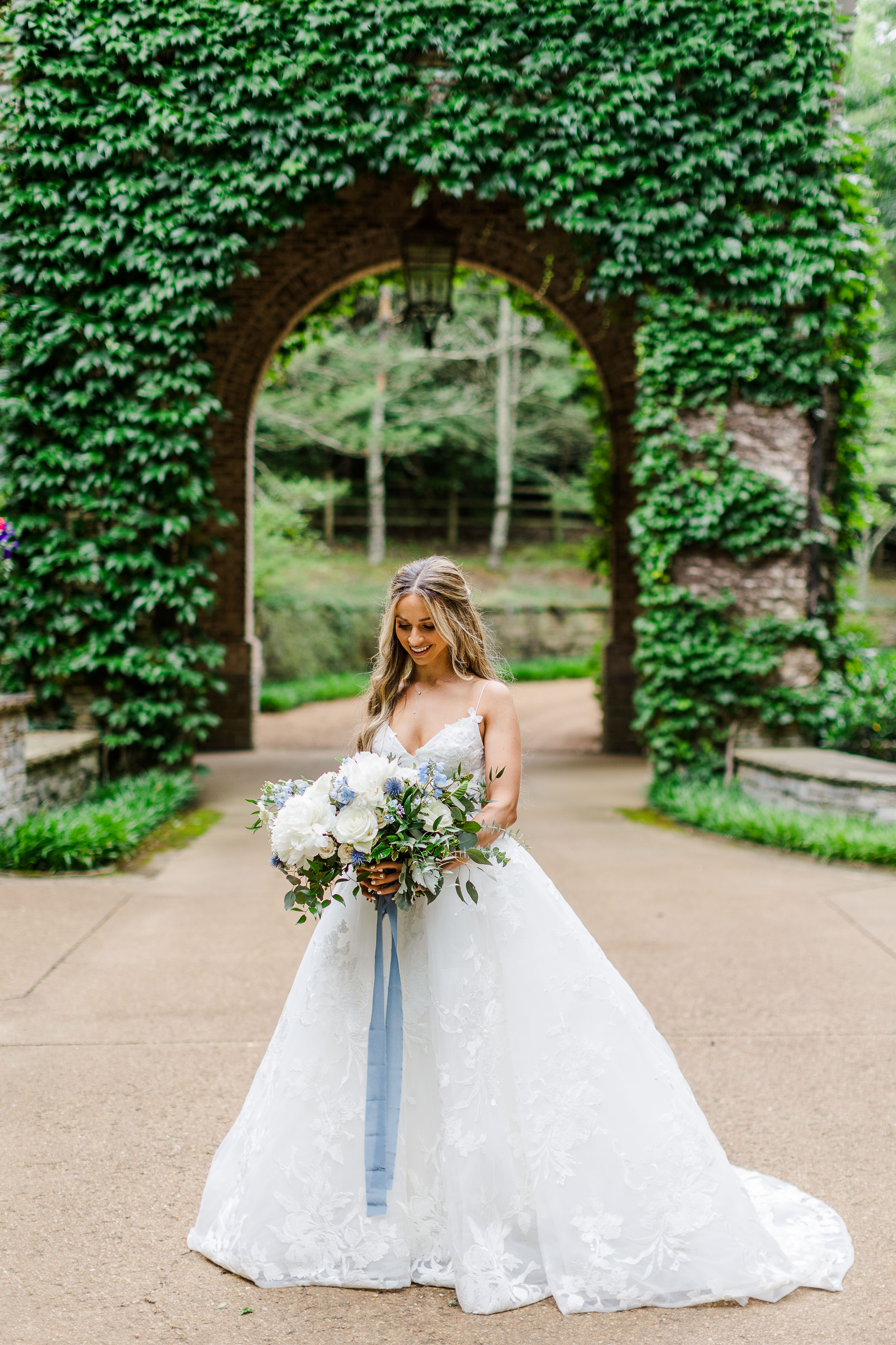
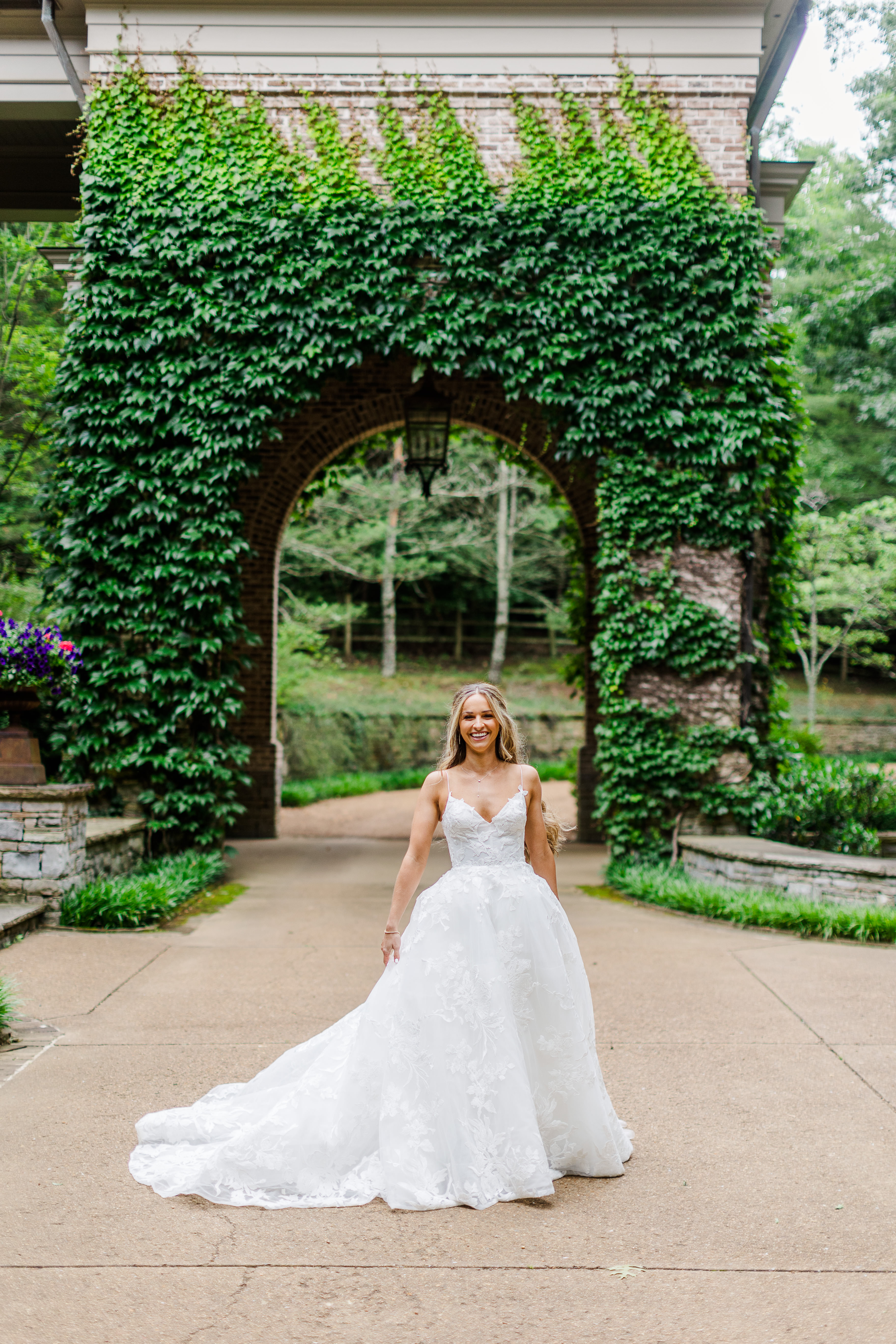
For starters, the home our couple chose as their venue was the most eye-pleasing, awe-inspiring place. There was no shortage of ivy laced brick, beautiful archways, iron gates or spiral staircases; I could go on and on. Fun fact: this home was also filmed in the show, “Nashville”, for all of you fans out there.
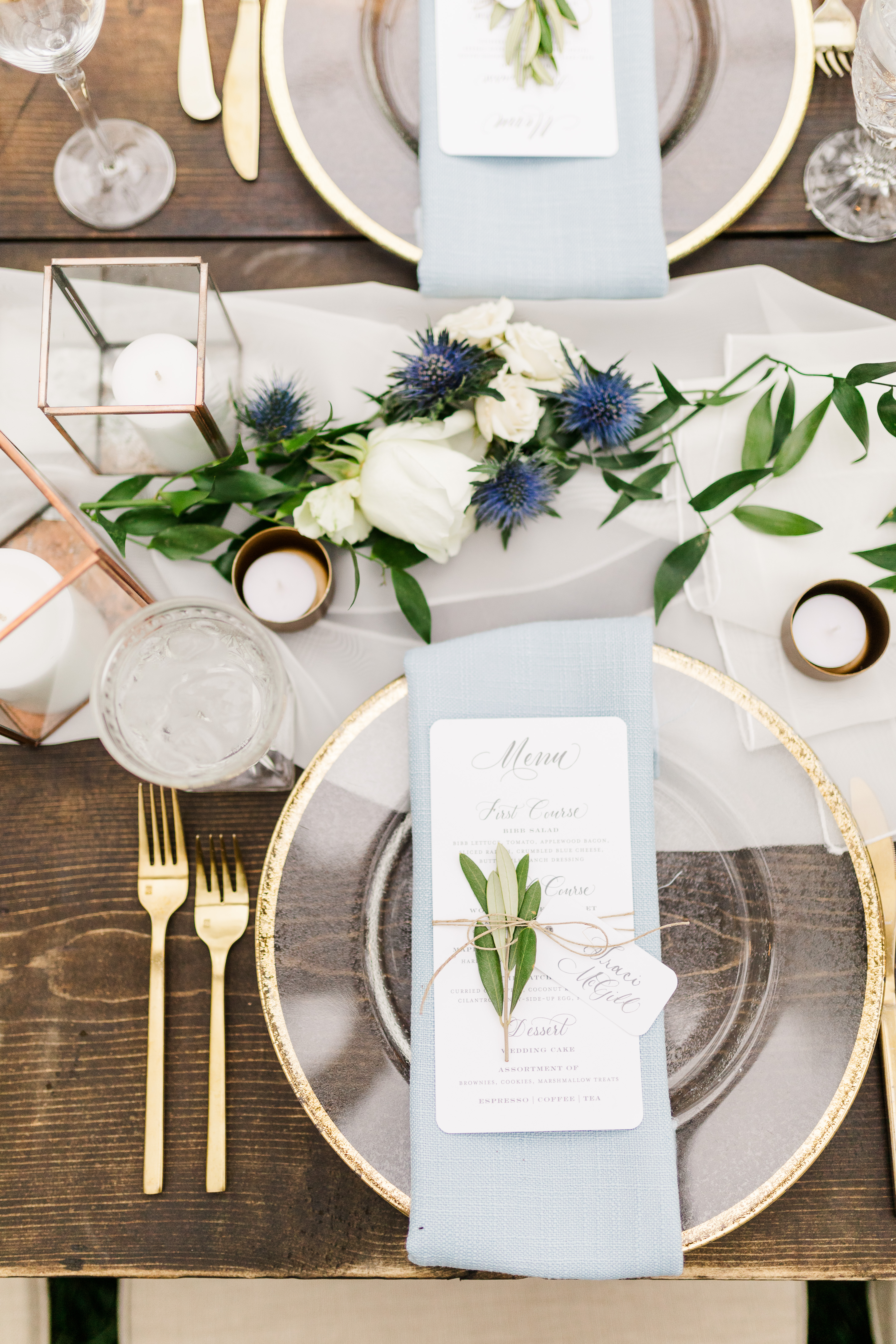
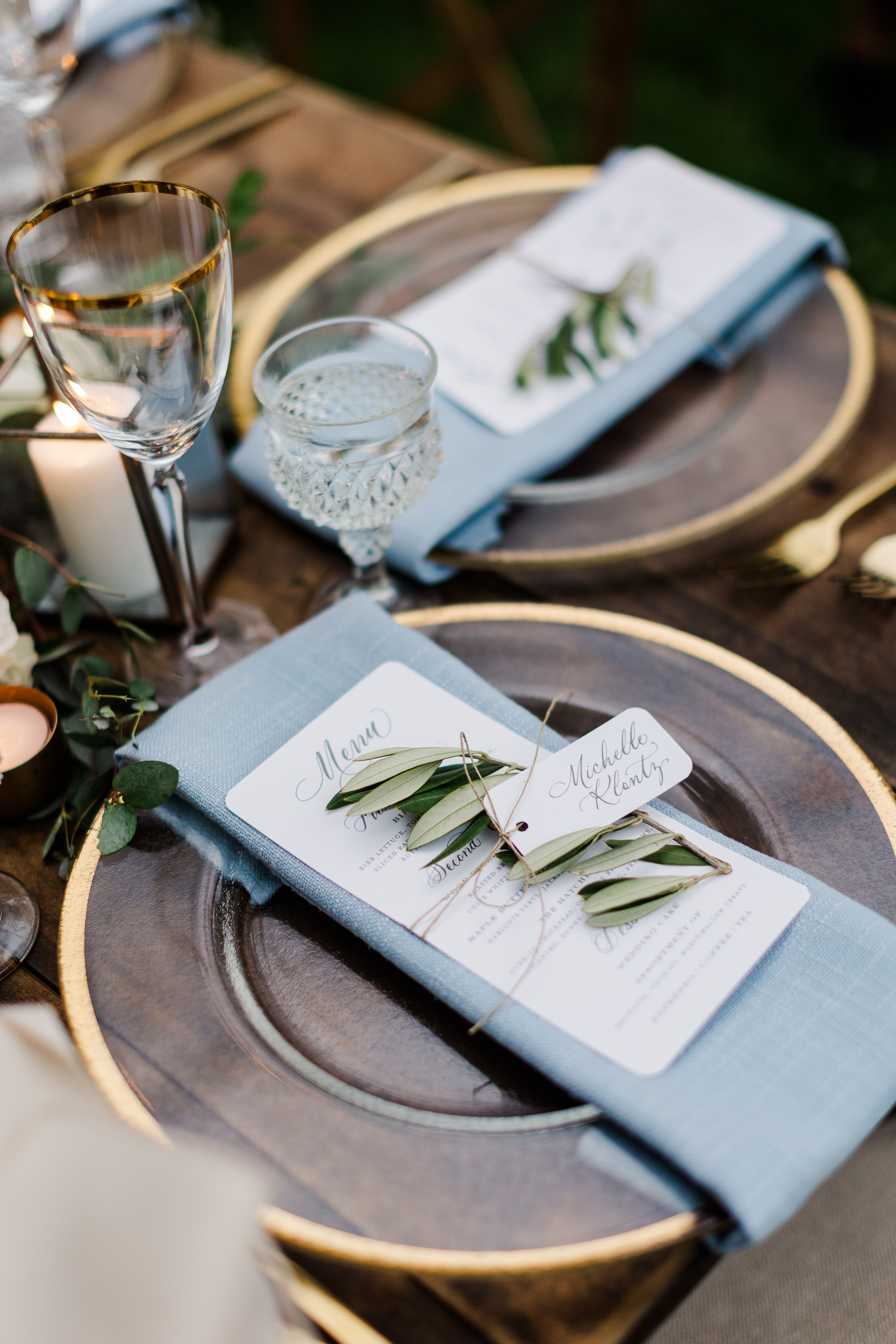
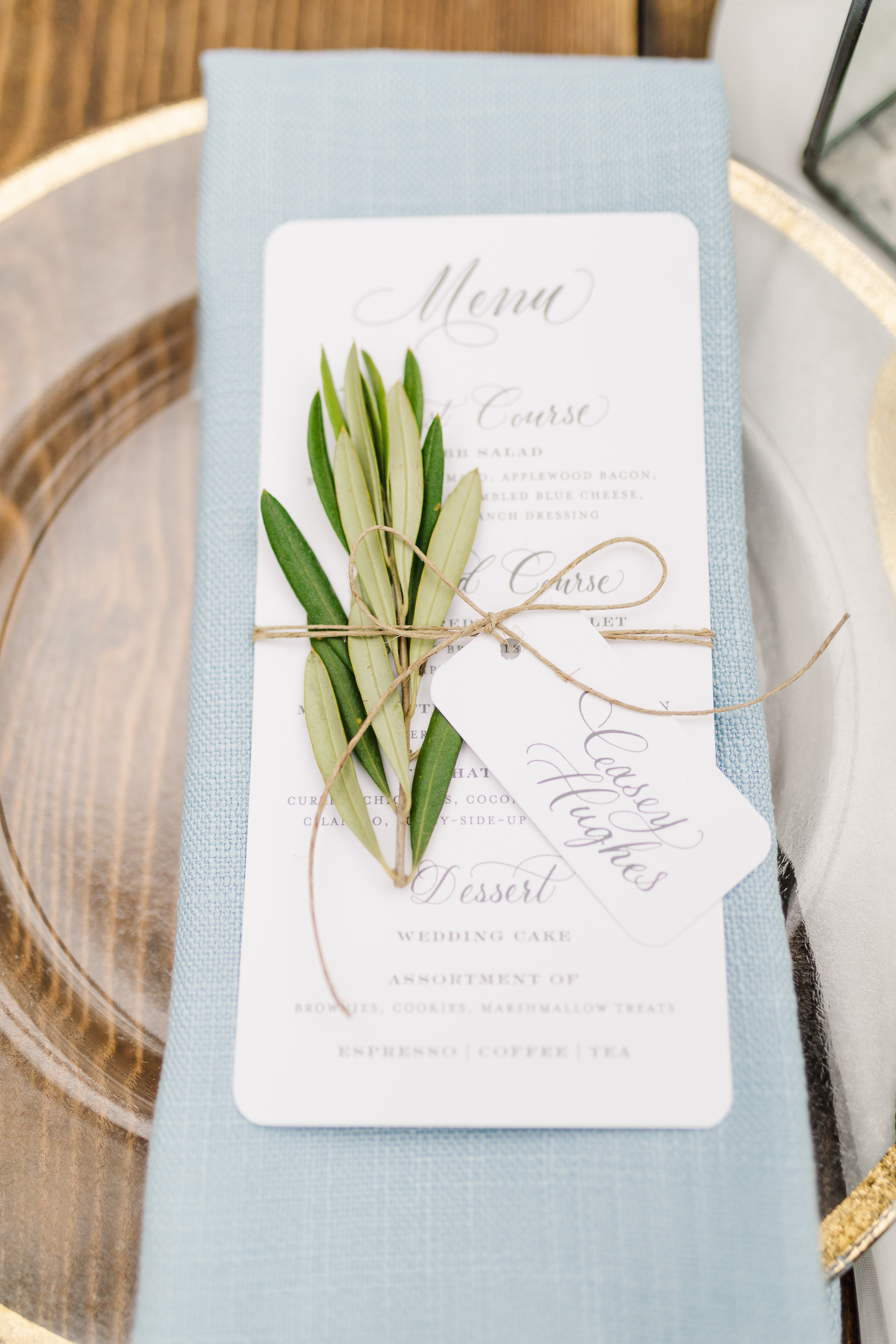
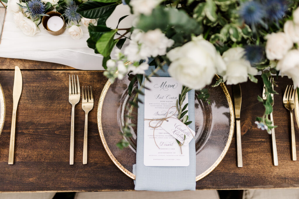
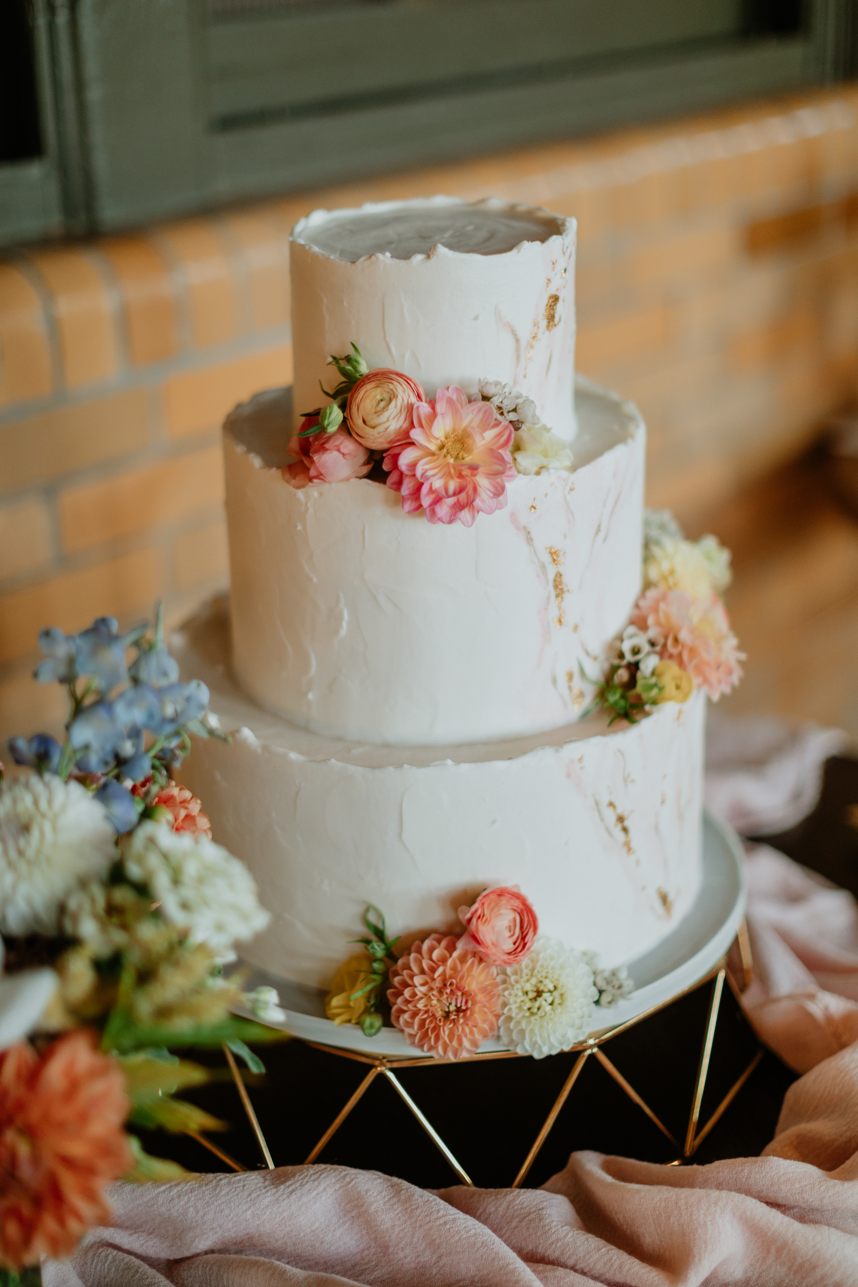
White Ink was thrilled when Mae and Casey asked us to put our own touch on this one-of-a-kind wedding. One of the best things about being a part of it all was getting to show the true beauty behind layering textures. Notice how the custom designed menu was displayed: heavy wooden table, gold rimmed glass charger, soft linen, rounded edged menu with spot calligraphy, and an olive branch all tied together with a single piece of twine. Whew! Now that is how you impress your guests using texture! This display at Mae and Casey’s reception embodied the perfect mixture of bold and gentle to make the dreamiest styled tablescape we have seen in a long time.
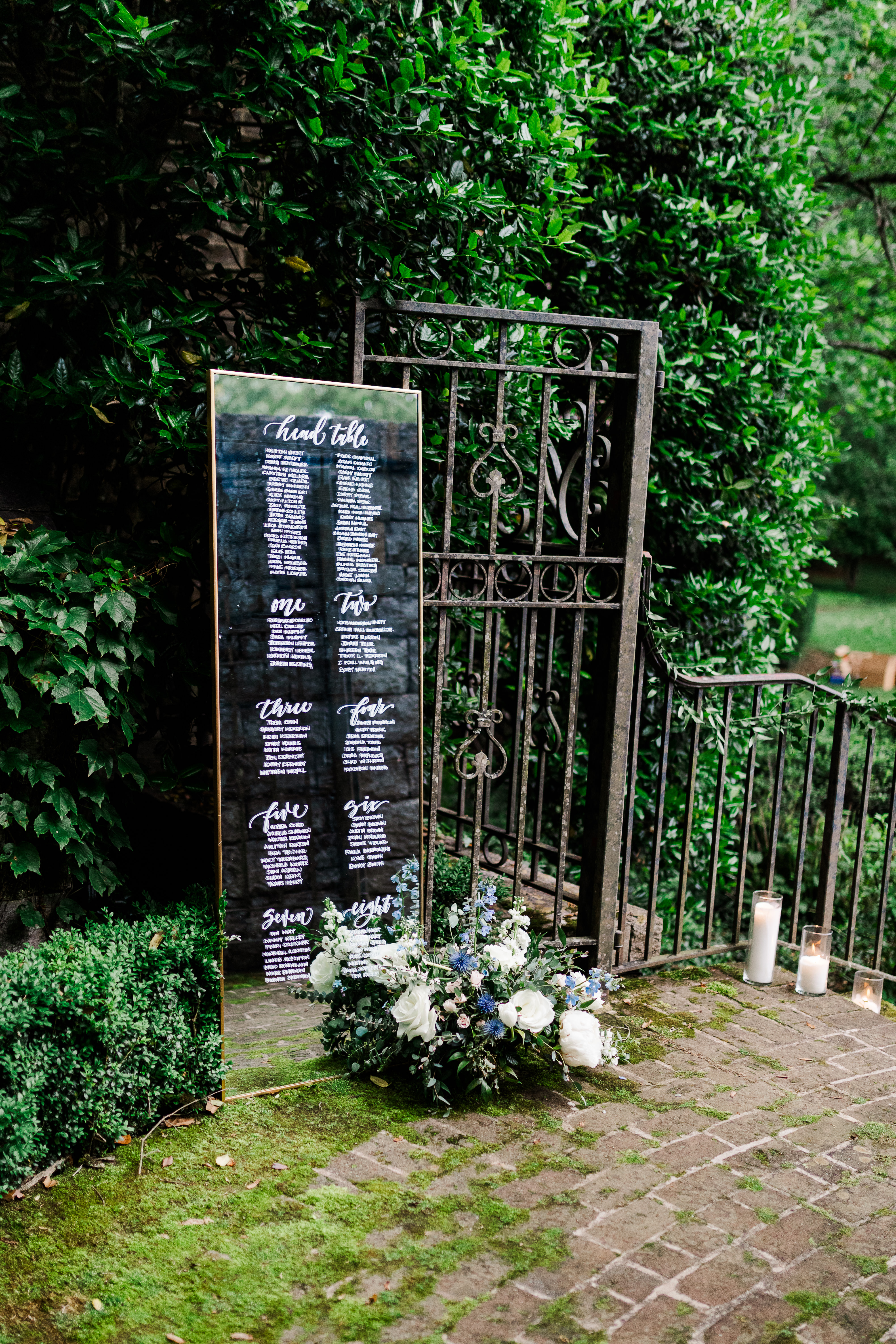
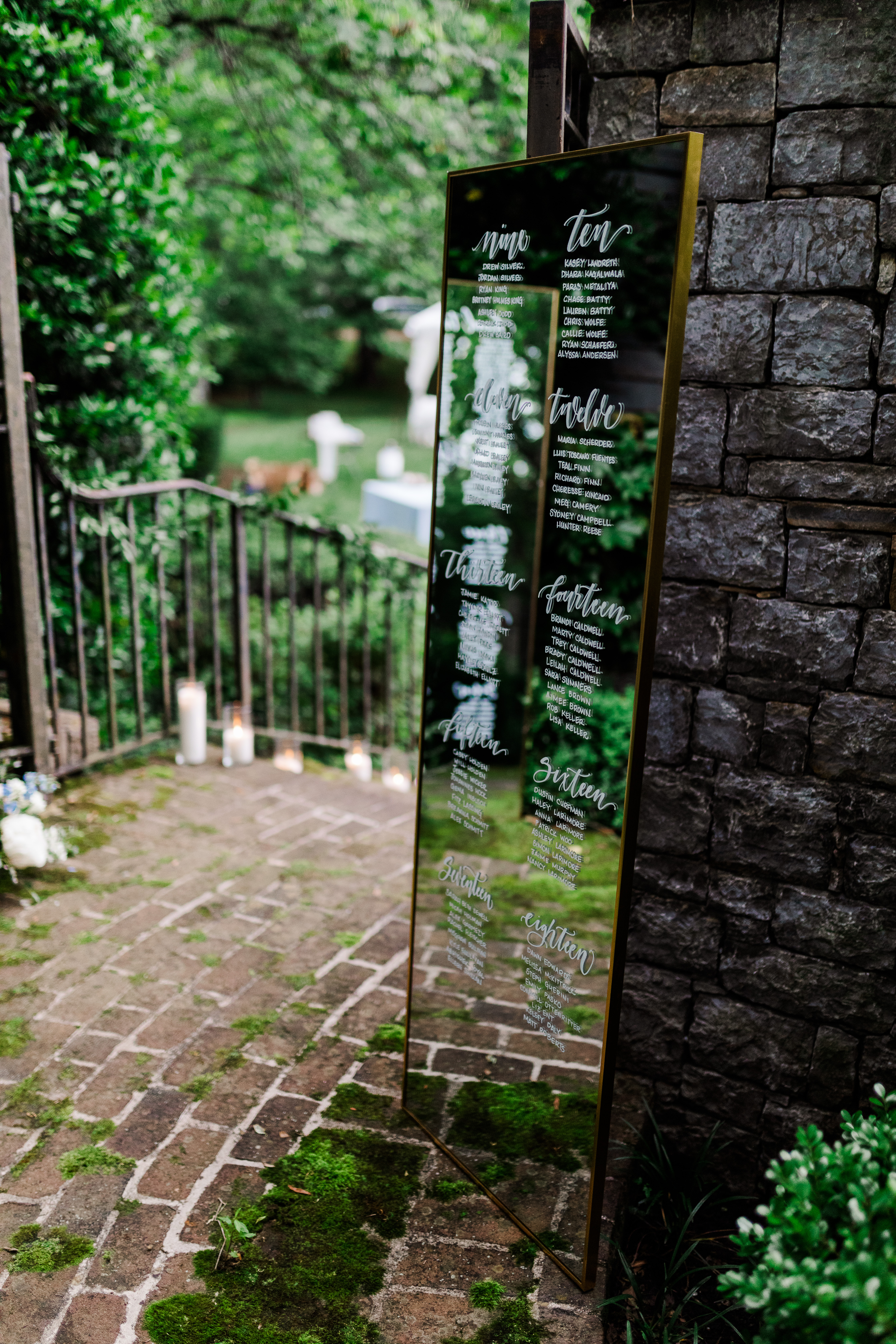
Check out this seating chart! Have you ever seen glass so perfectly placed? I mean this looks like it’s straight out of a fairytale! These gorgeous, gold-trimmed standing mirrors rested softly against iron gates and sat on a cushy bed of moss that was growing atop the stone floors and walls. (I mean, I love that I even get to say that sentence.) Again, layered texture for the win! I love seeing White Ink’s work used like this. It’s just so satisfying.
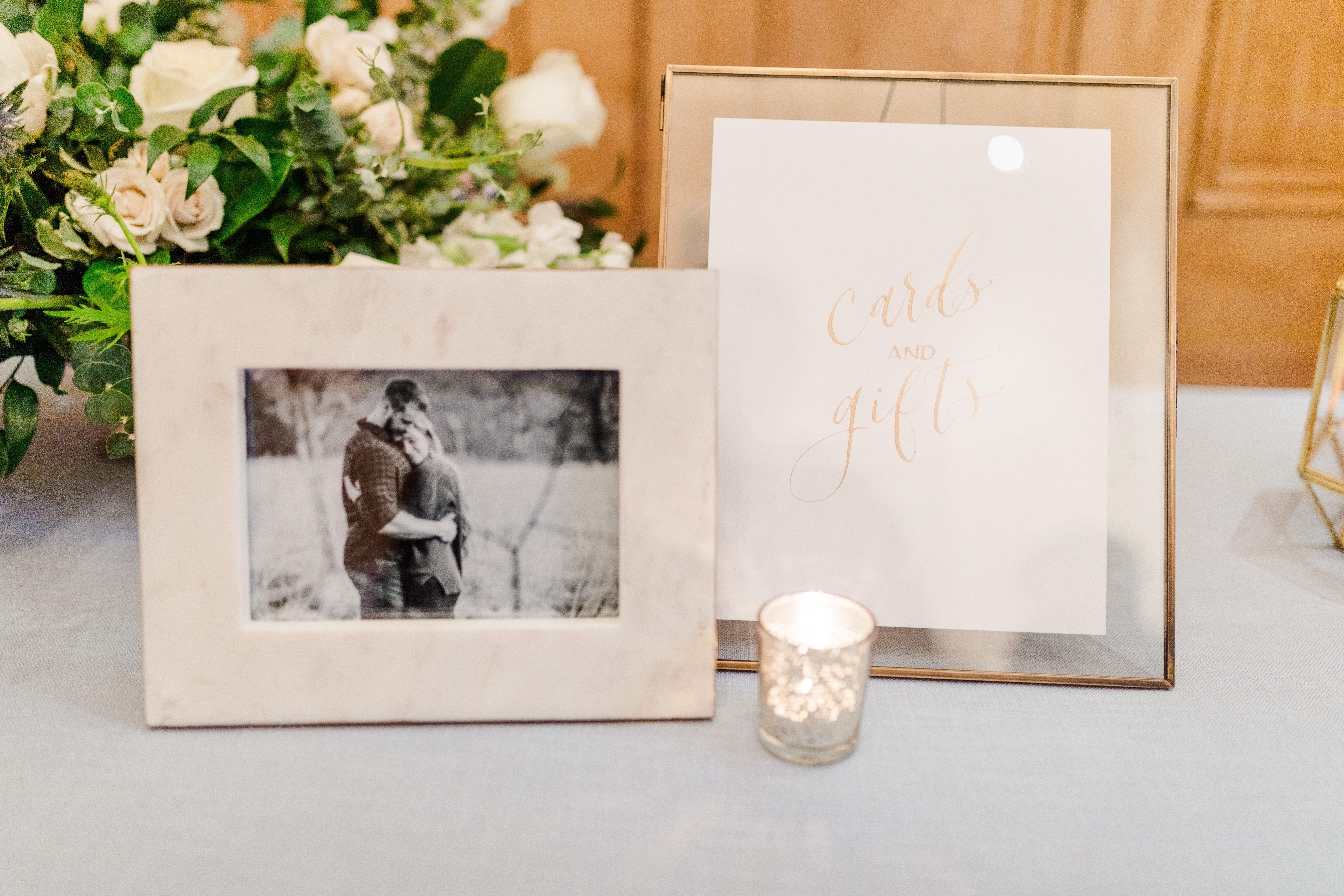
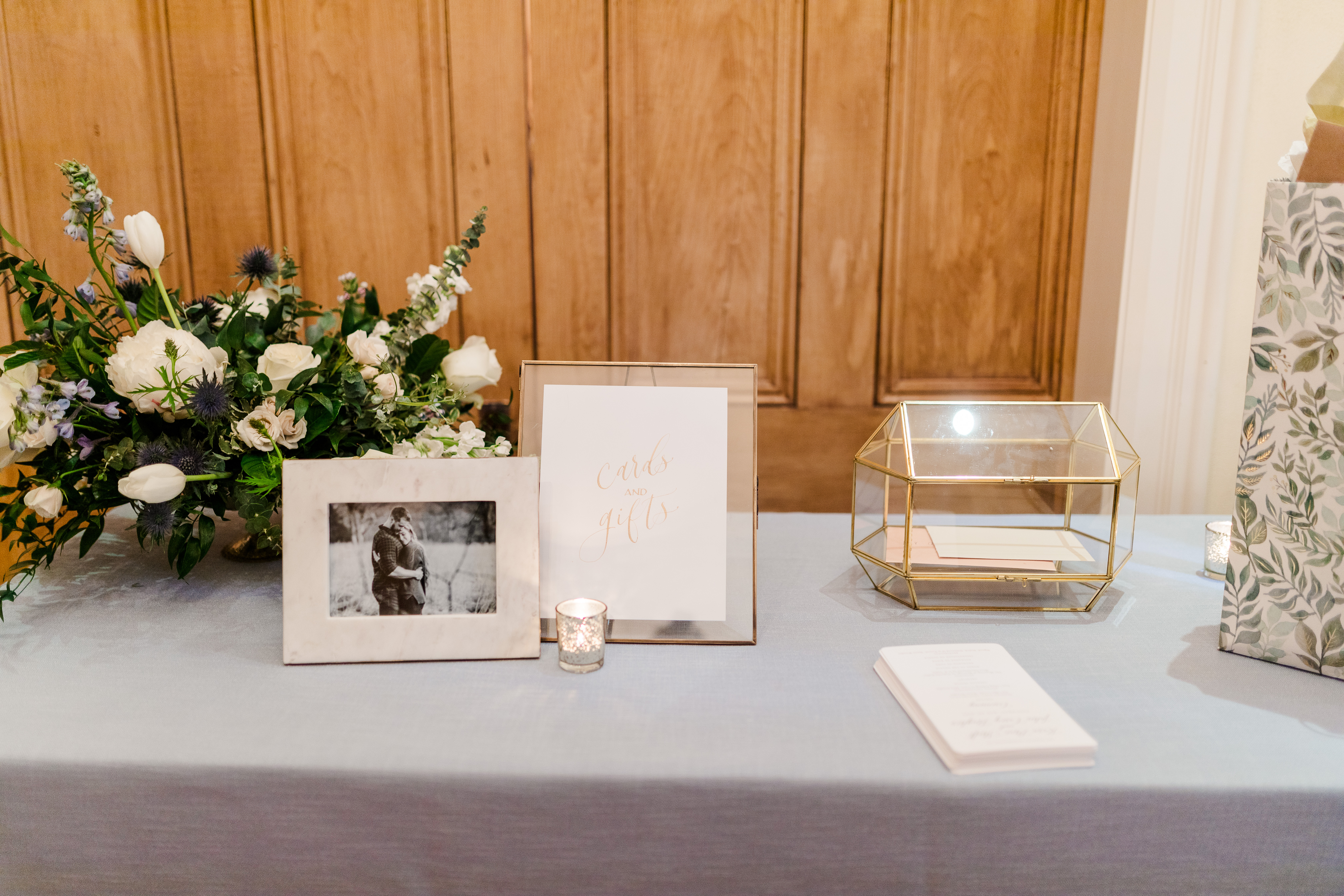
I was excited that Mae and Casey chose one of our card boxes from our extensive rental collection. This particular card box is gold trimmed and went flawlessly together with all of the gold accented décor throughout the ceremony and reception. The table numbers we provided for them were complete with gold flake corners and lettering, as well as the beautiful cocktail signage all done in gold ink calligraphy.
We love watching our couples piece their wedding day together and we love even more that we get to be such a big part of that. And when it comes to using lots of texture, don’t be afraid of it. It might be exactly what you’re looking for!
Hey guys! We want to bring you into our event signage process and show you a little bit about what creating your event sign with White Ink Calligraphy looks like. Whatever you are hosting or planning, we are well equipped and have everything on hand to tie your details together with the perfect sign.
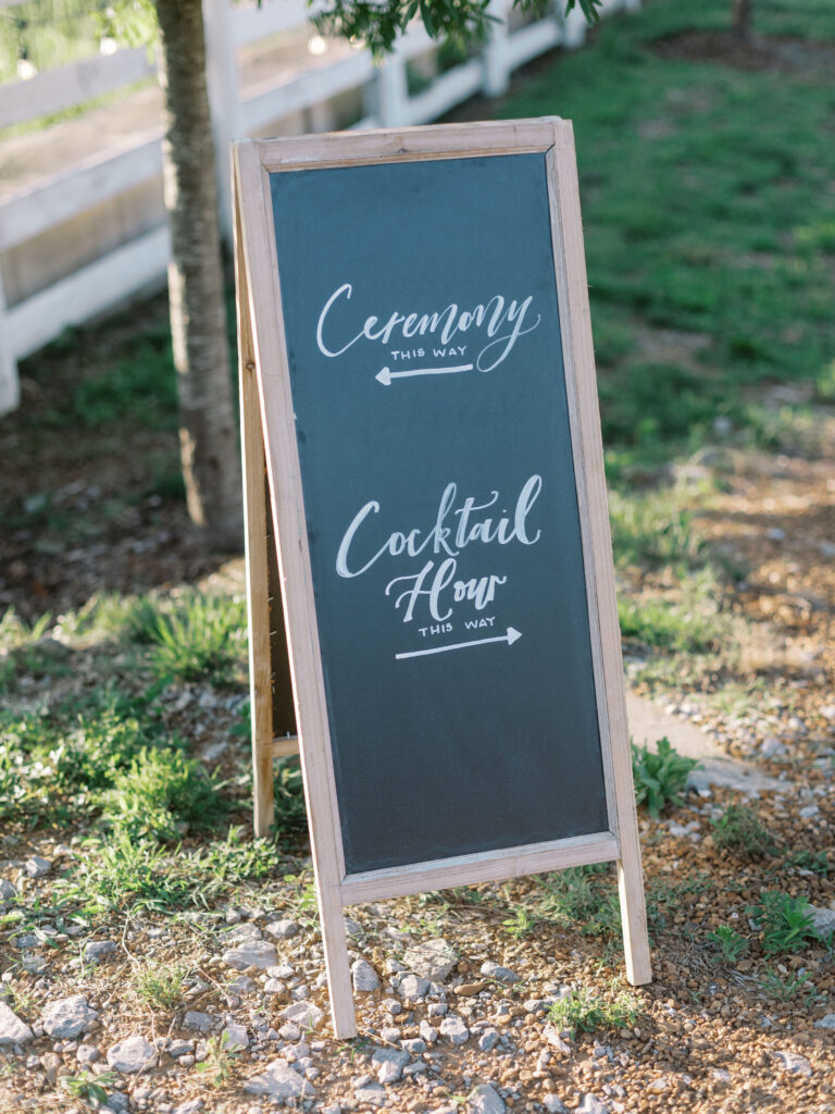
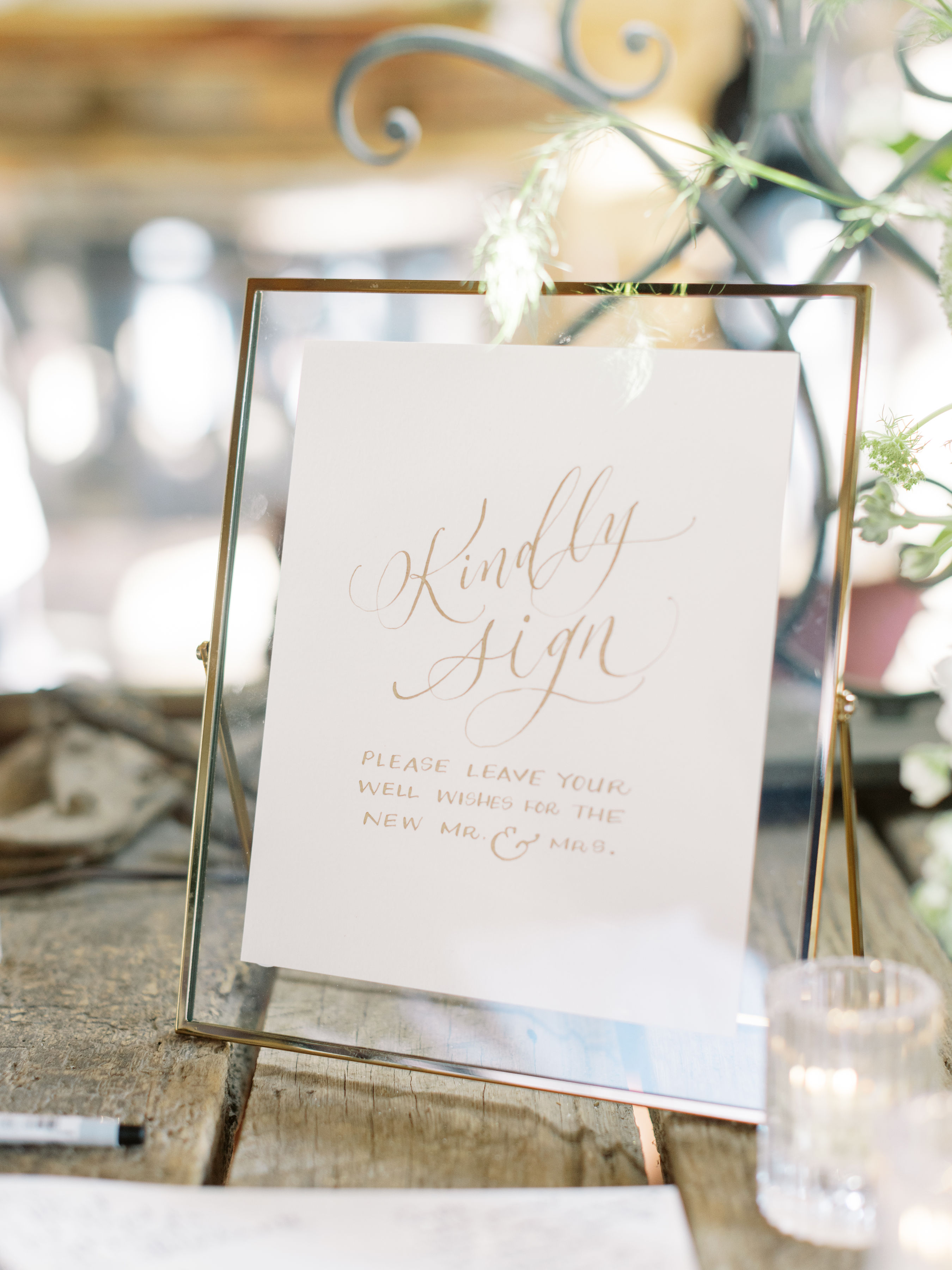
“Why is event signage important?” Because it is not only decorative, it’s functional! You wouldn’t be expected to drive on a road without signs to guide you or explain a little bit about your surroundings. So, why would we do that to our guests? From table numbers to seating charts, to bar signs, guests can be confident about the goings on of an event because of the information our custom signage subtlety provides for them.
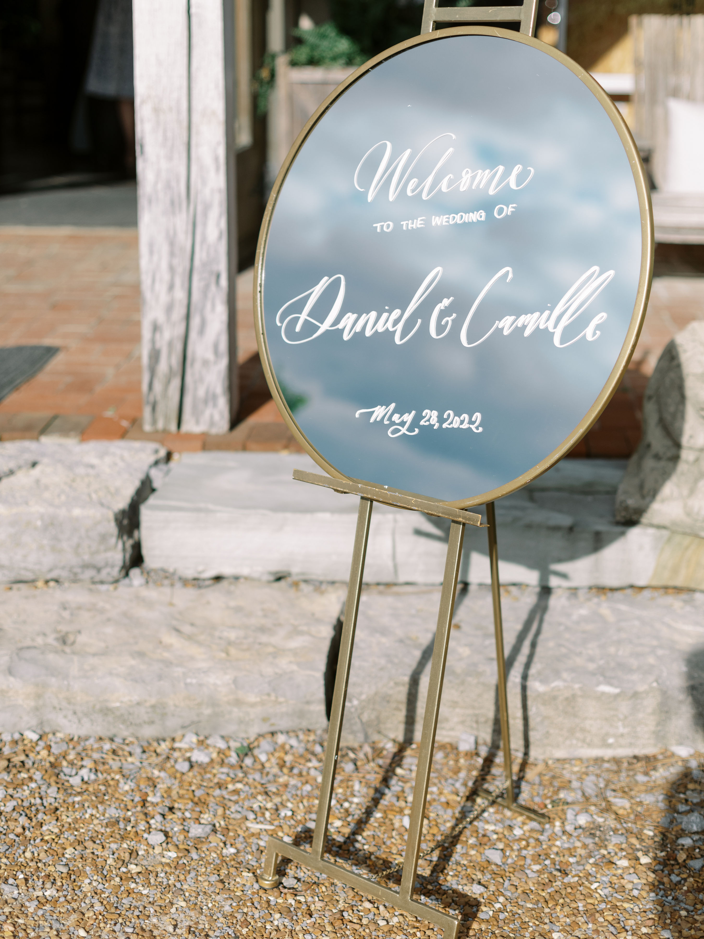
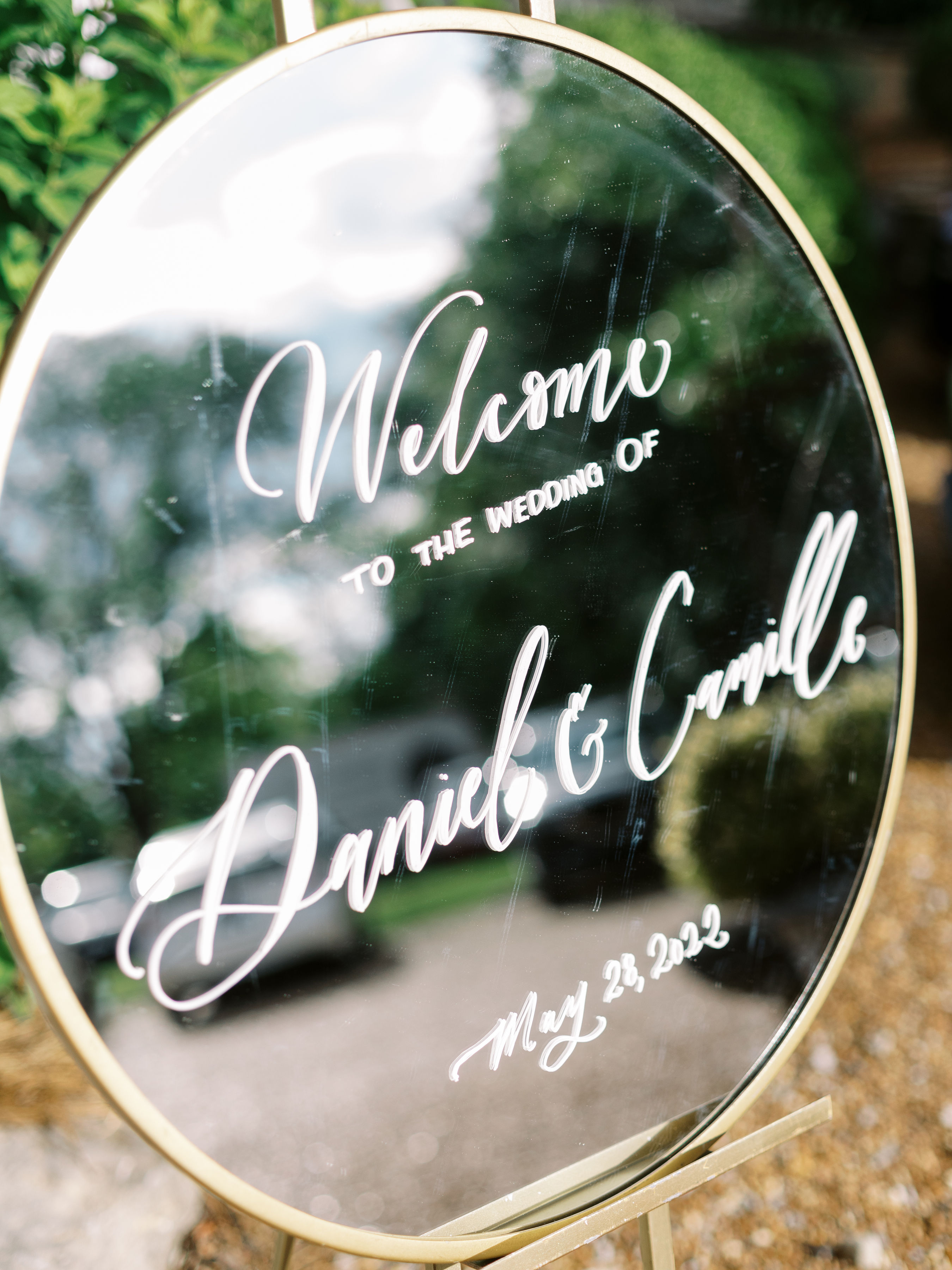
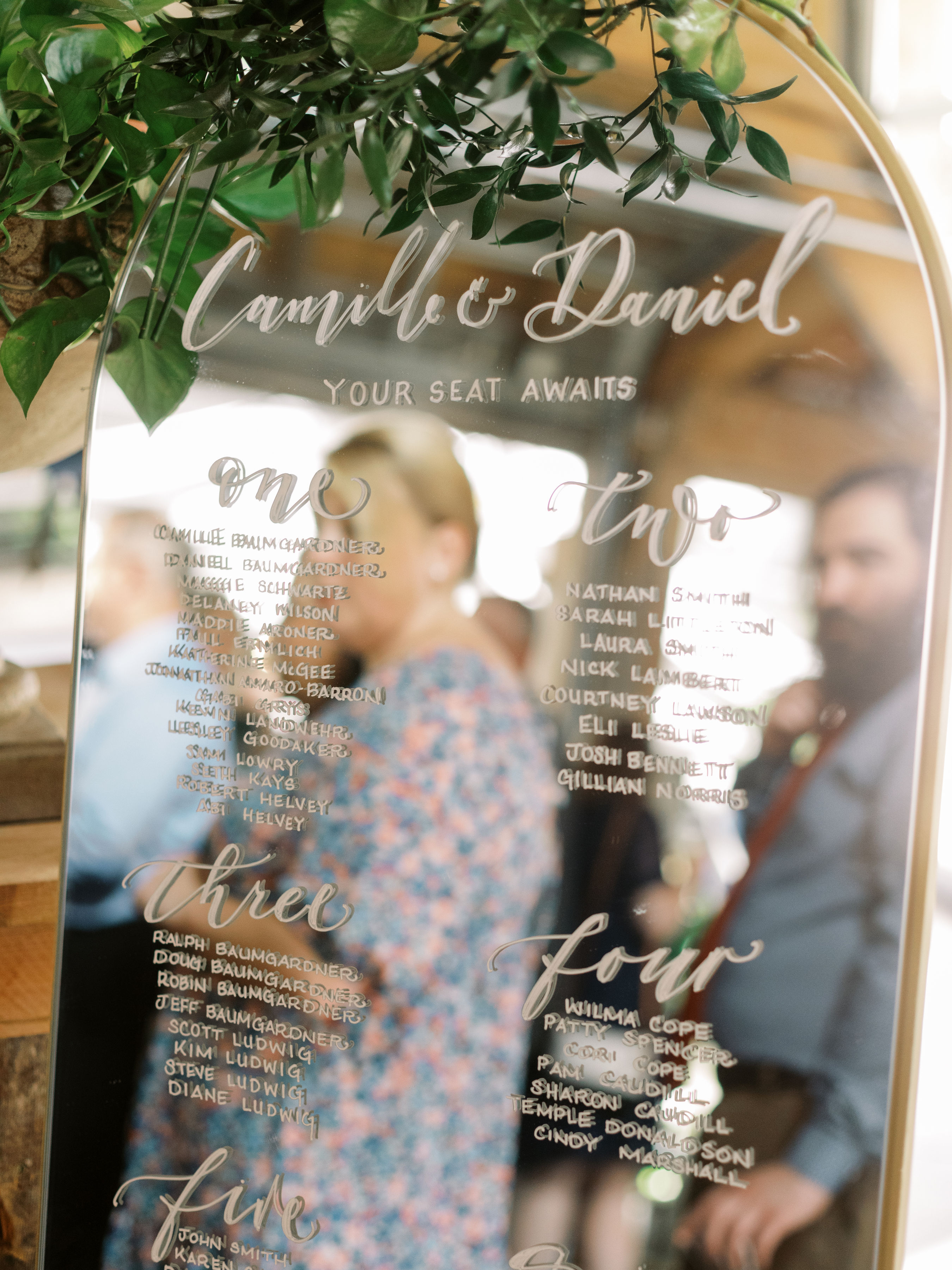
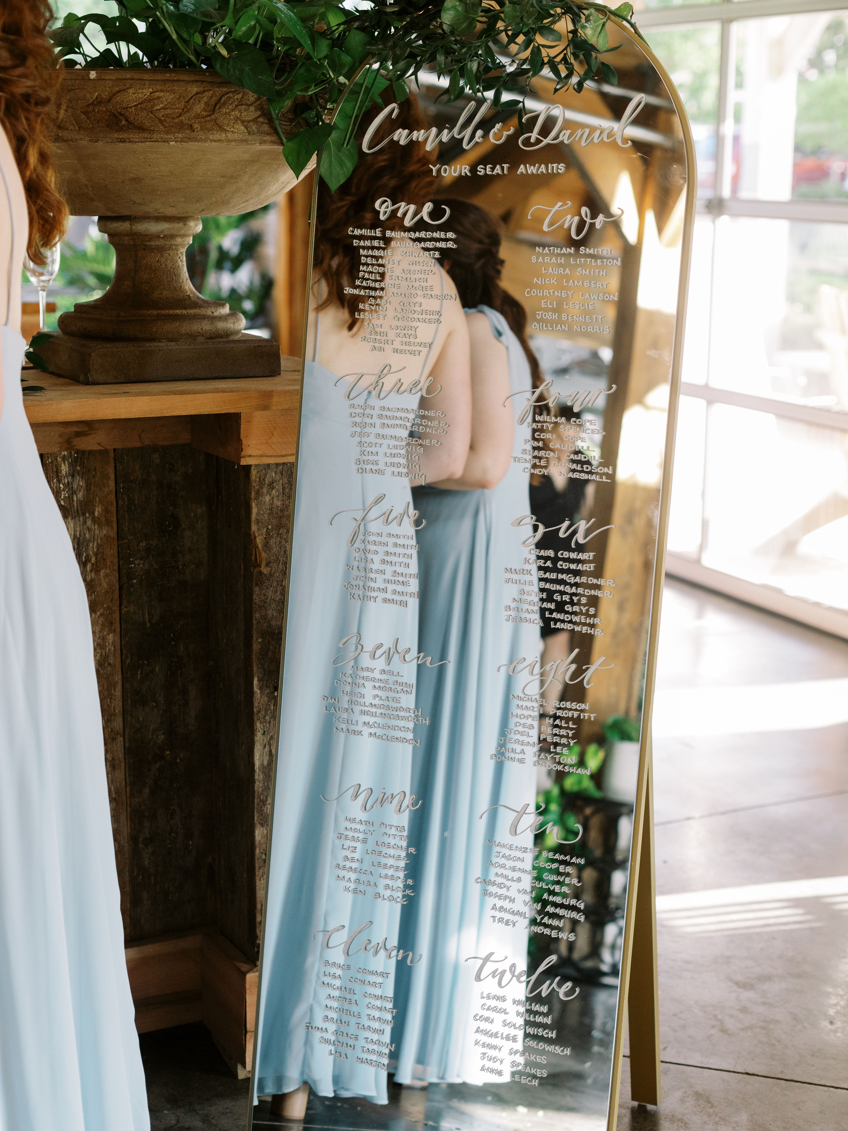
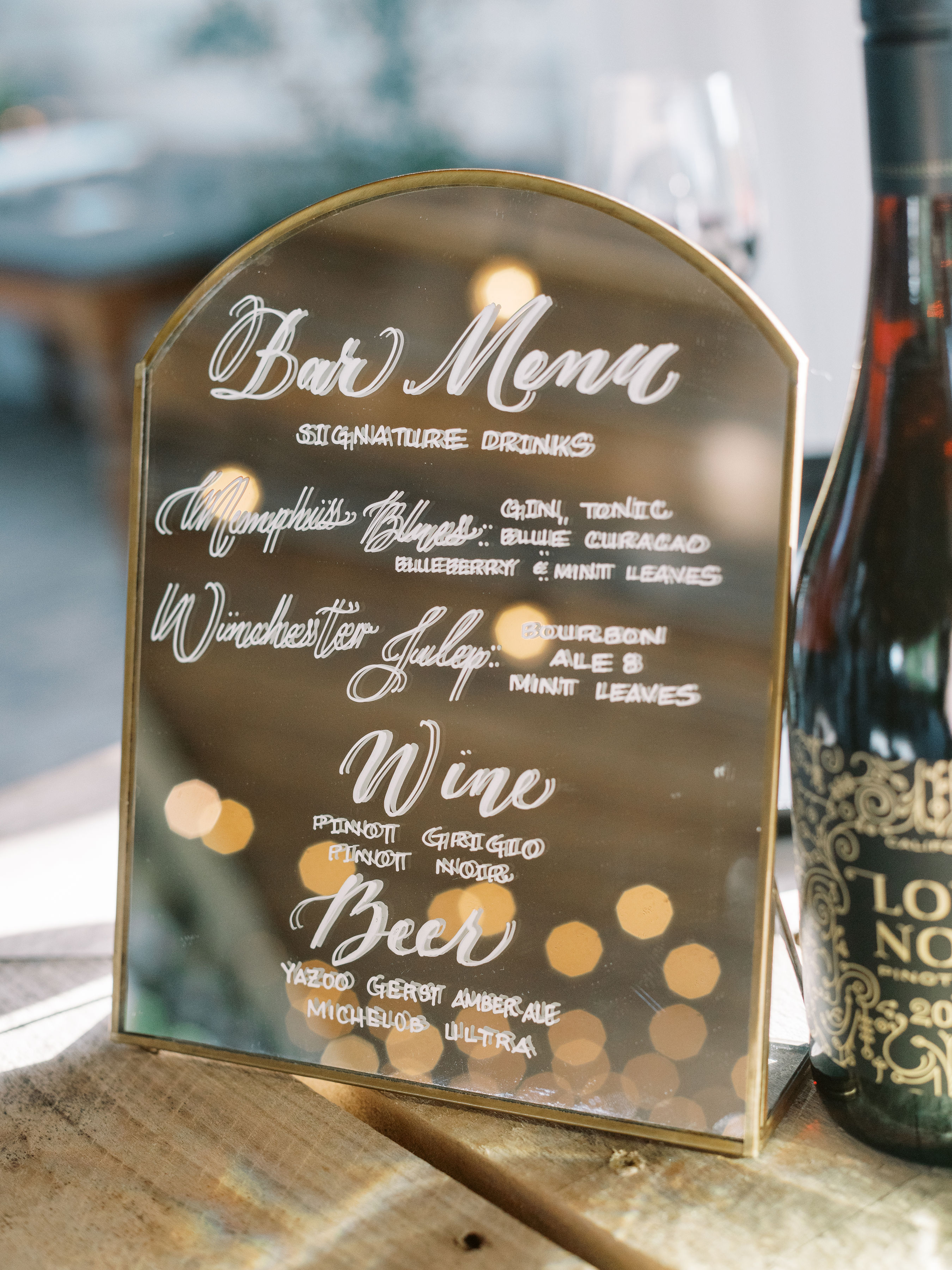
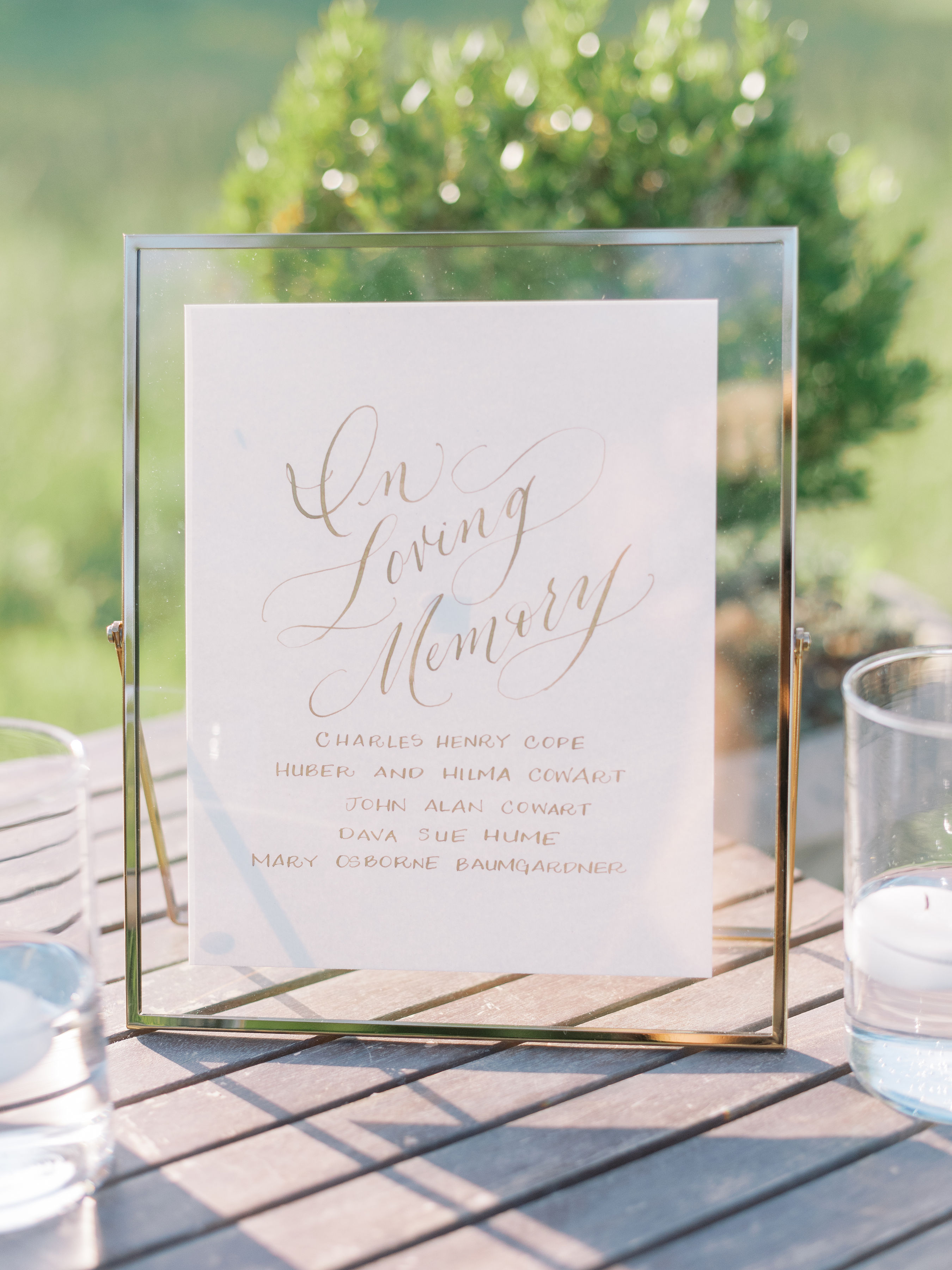
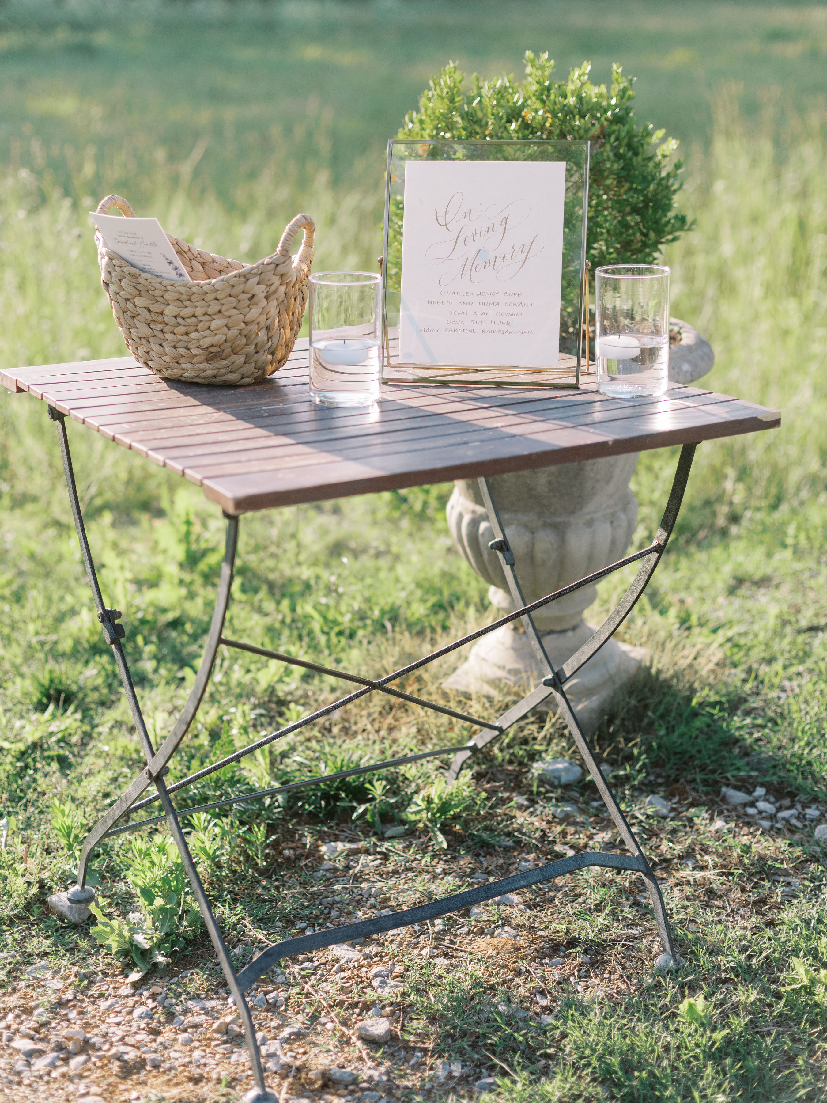
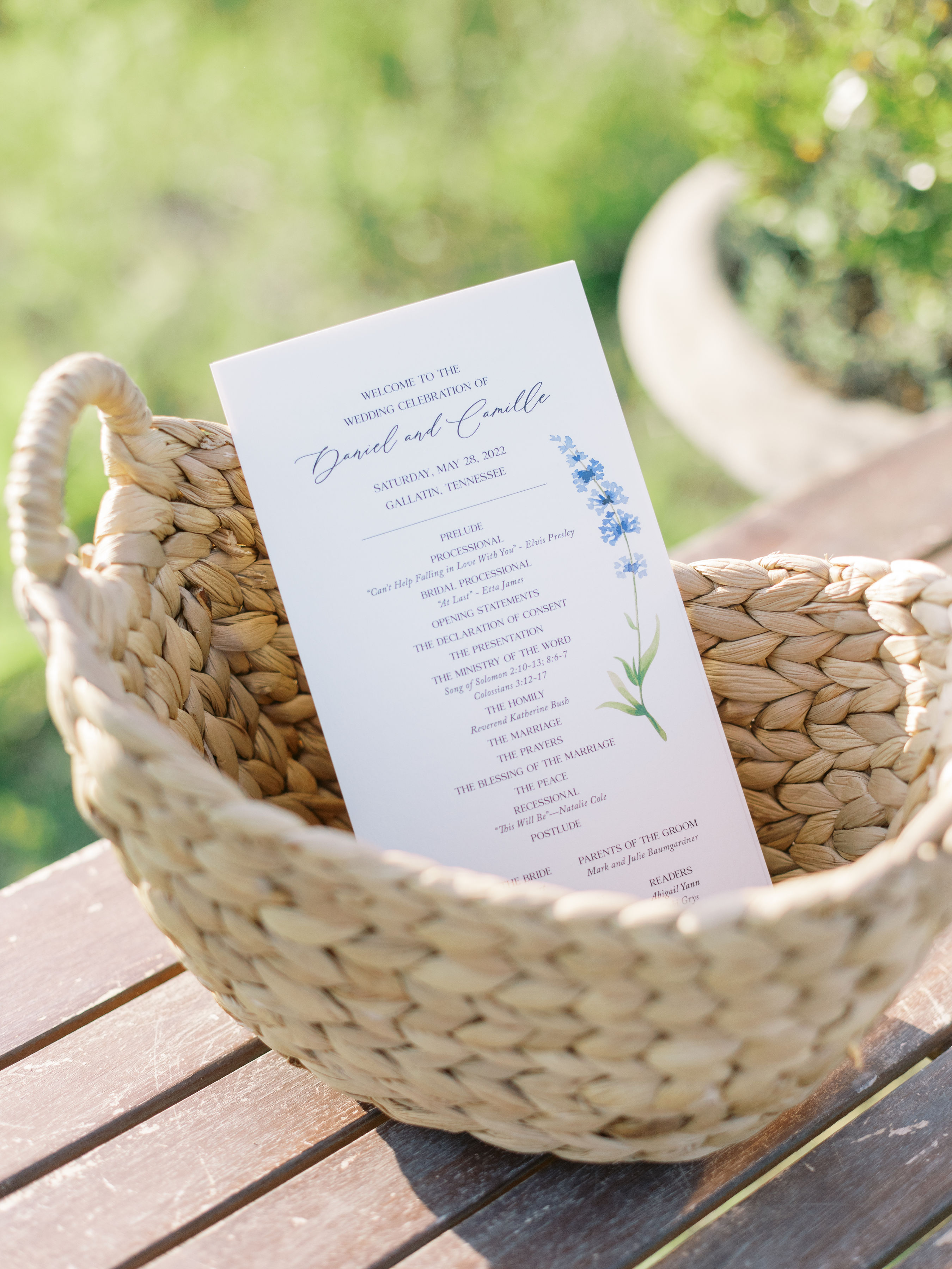
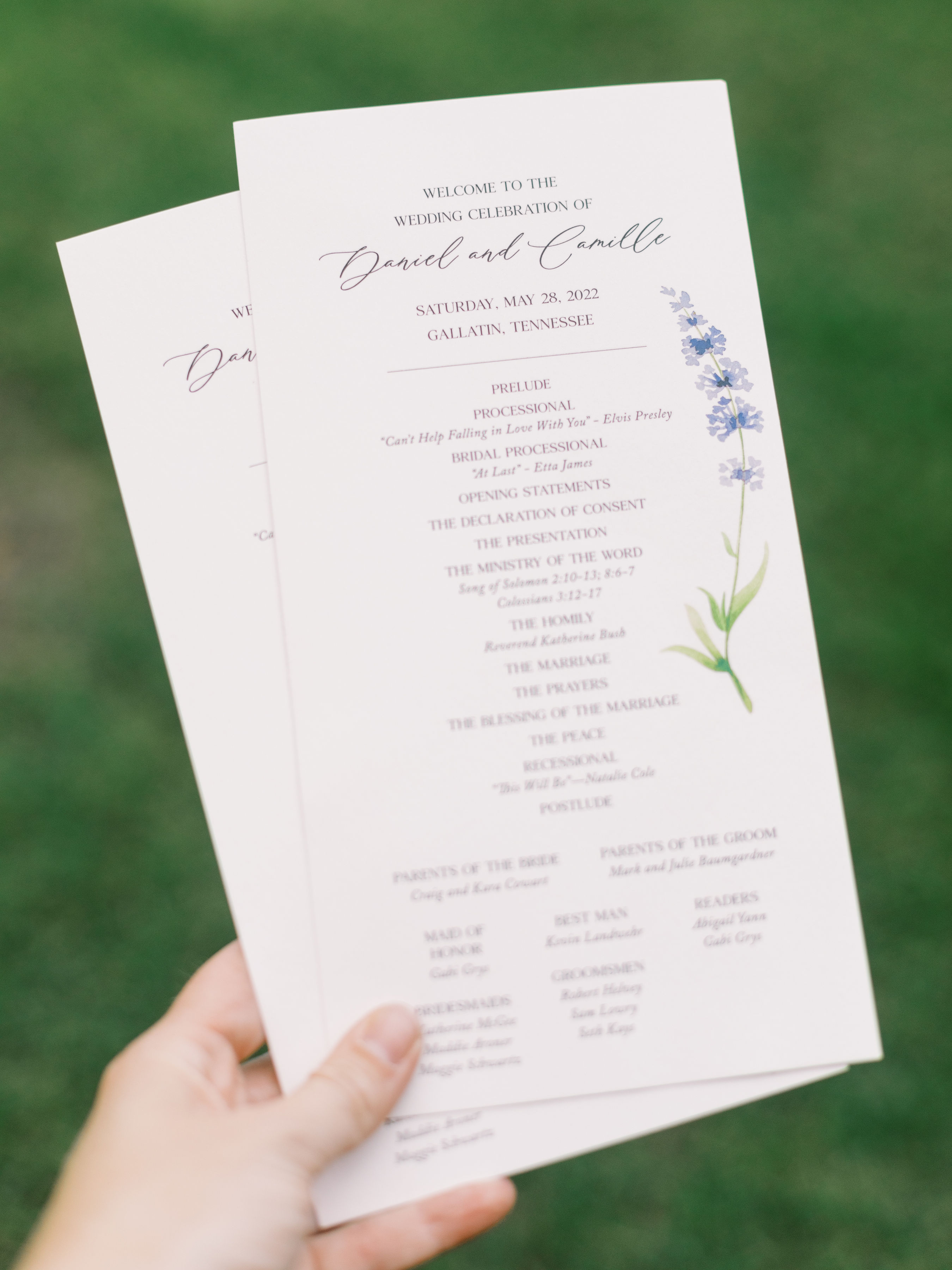
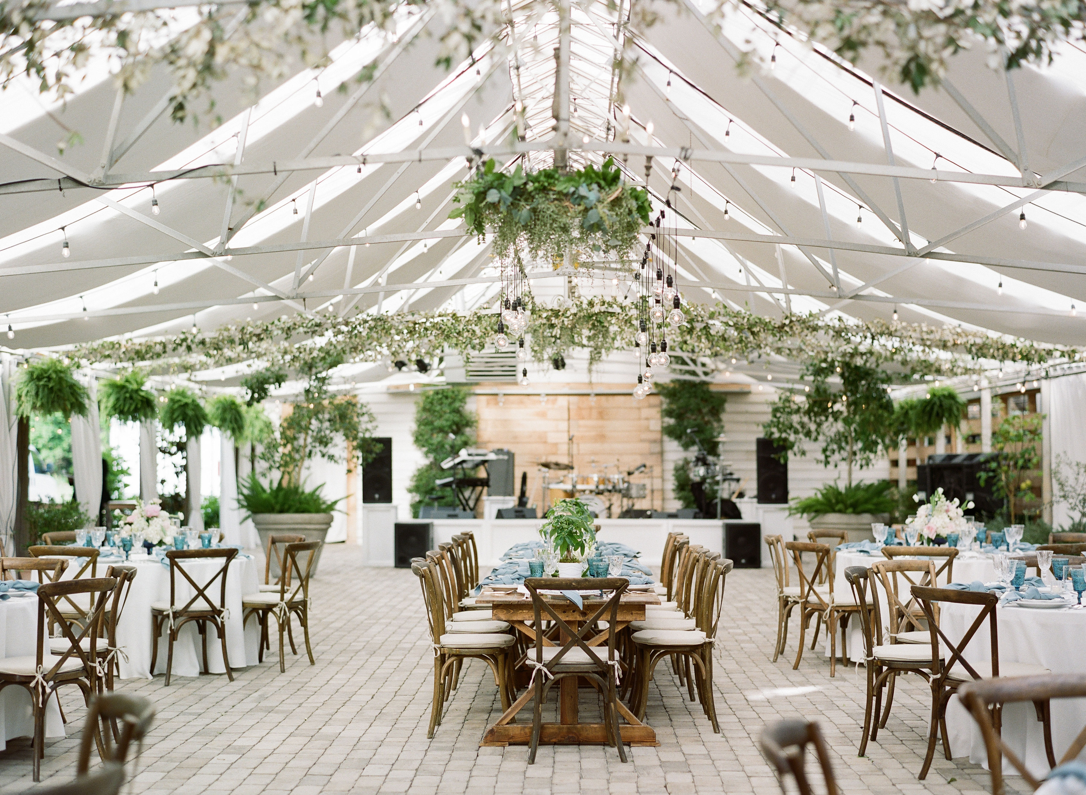
Our sweet couple, Camille and Daniel, asked White Ink to help provide their wedding guests with lots of great signage throughout their wedding day at Long Hollow Gardens. This gorgeous venue in Gallatin, Tennessee covers a lot of ground and has a lot to offer. So, bringing in signs to keep the crowd headed in the right direction and staying well-informed was a must and a very considerate addition to their big day!
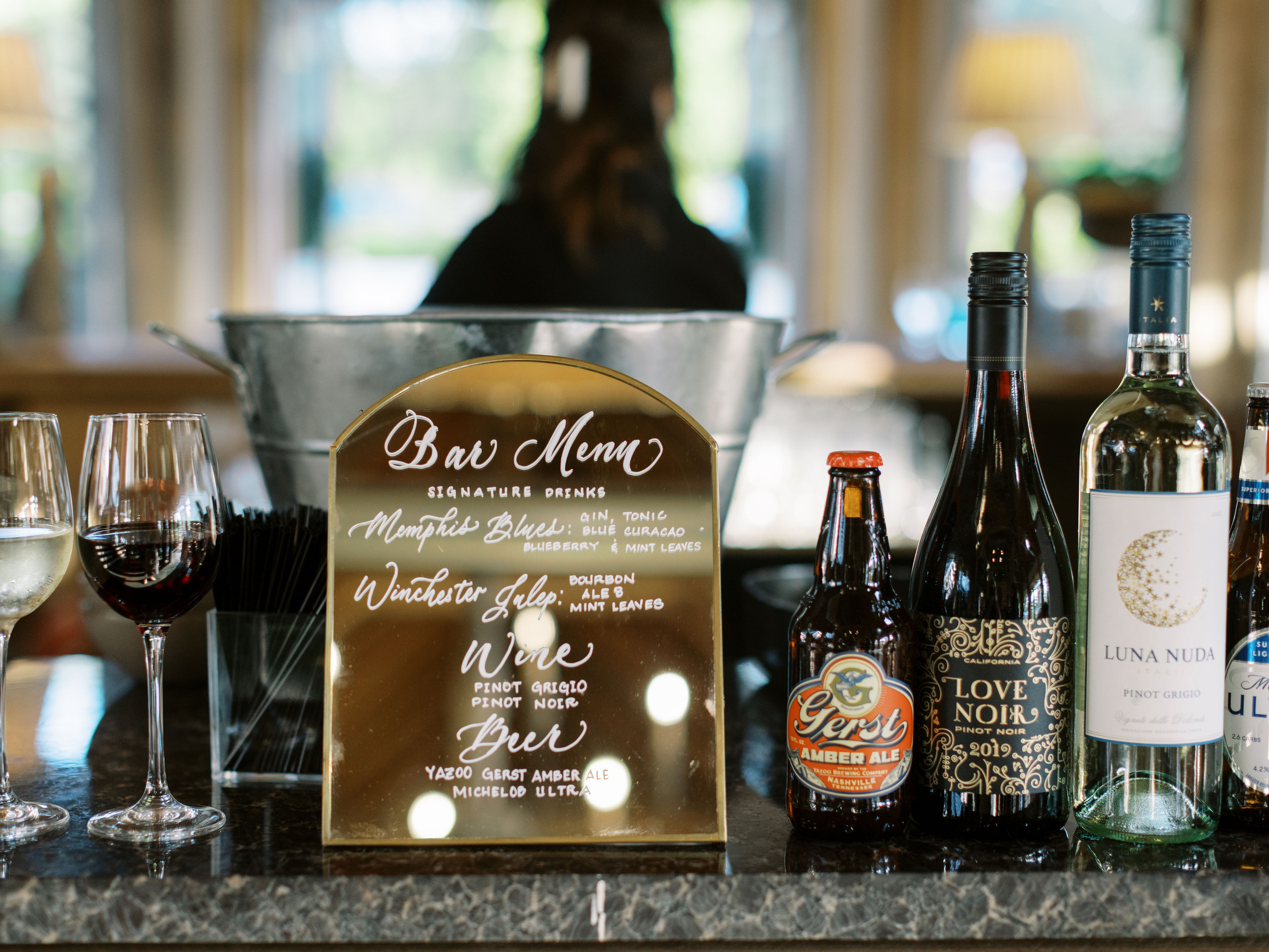
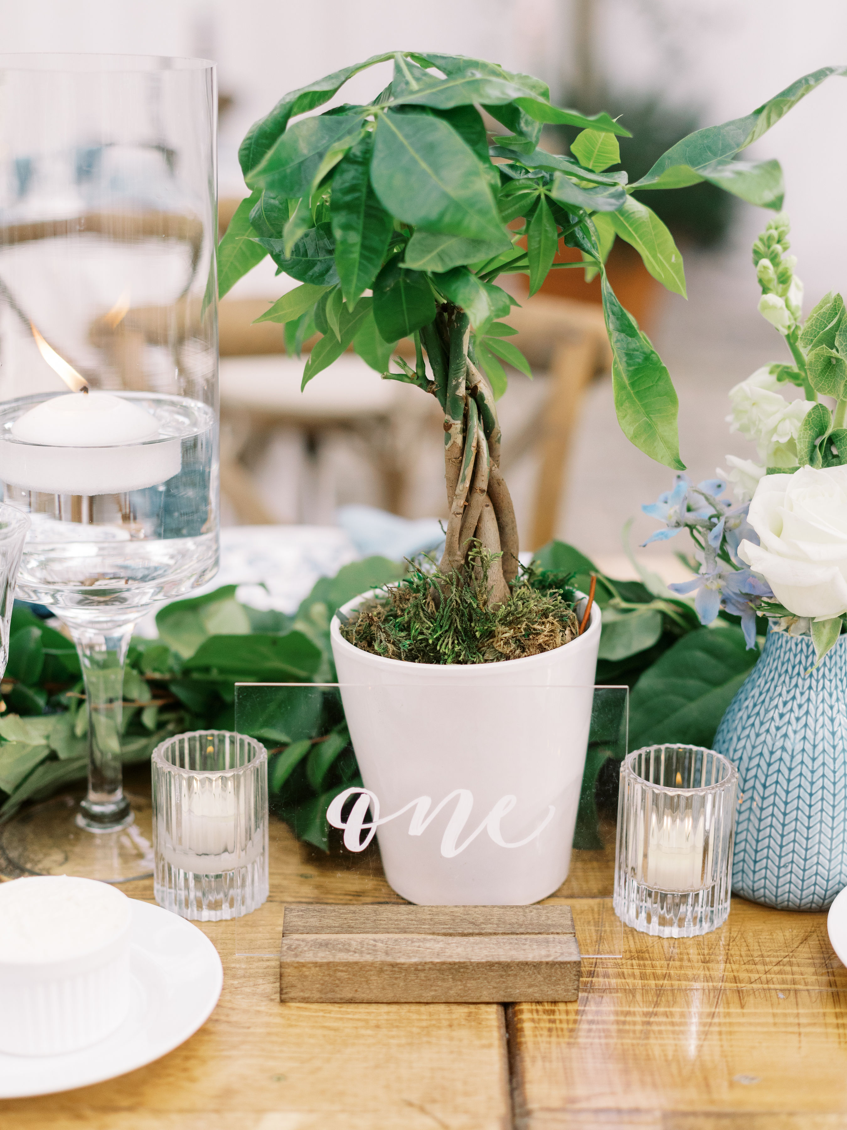
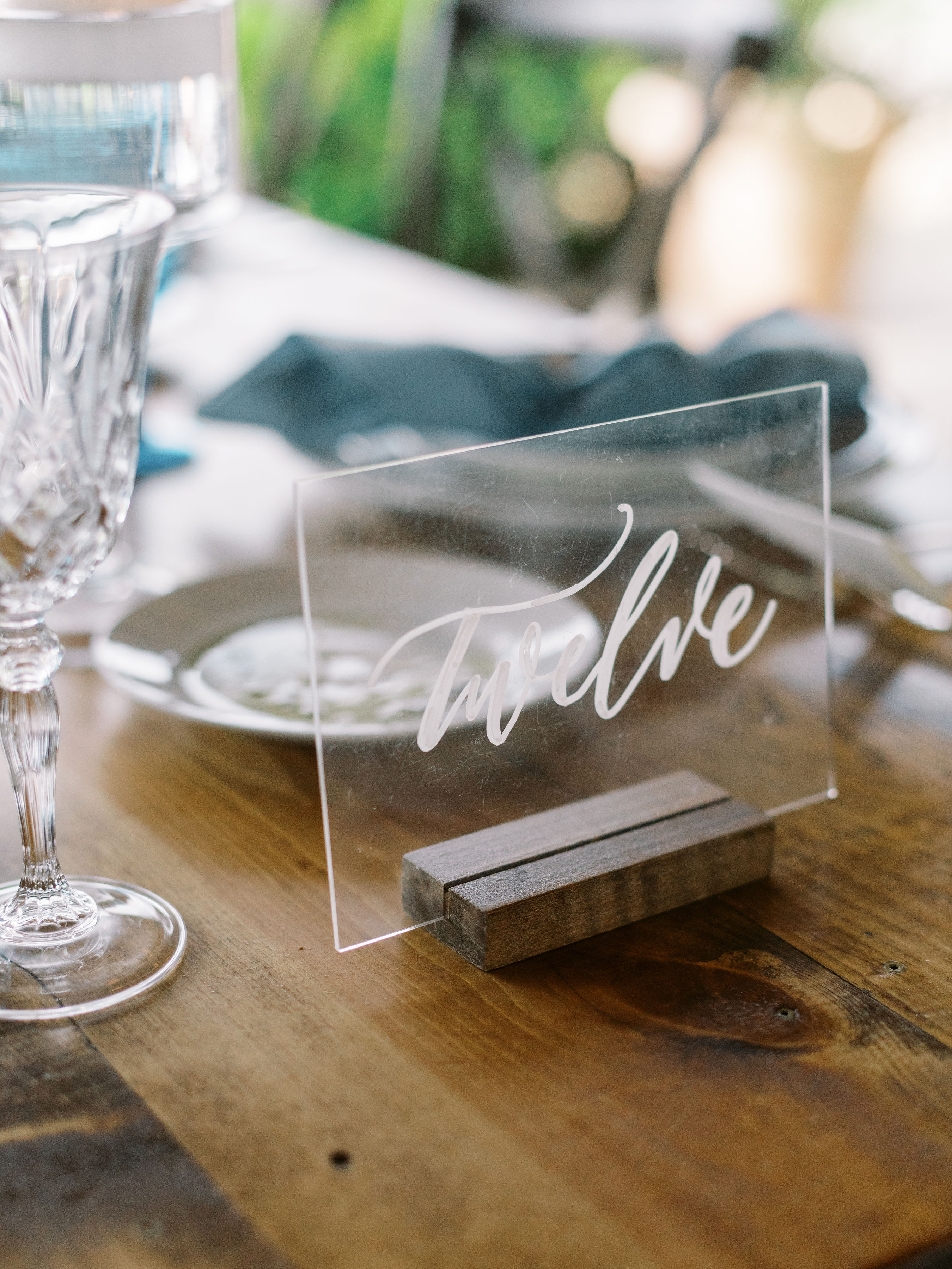
White Ink put together some gorgeous pieces for Camille and Daniel. A customized seating chart, wedding welcome sign, and bar menu were just the start. We also provided our popular acrylic table numbers as well as one of our favorite items- the signage for the couple’s memorial table.
“How do we get started?” First, our clients will look over White Ink’s Request a Quote Form where they can fill us in on the types of event signage they’re looking for and provide the day-of details. From there, folks can view our inventory of rentals in the White Ink collection that are available; or they can choose to use their own signs that we can customize! On this form, we try to get ALL of the info we can in order to give clients the most accurate quote. If they aren’t sure about what signs are best for an event, we can help with that! Clients can even upload pics of some event signage inspo for us to see!
We also ensure the perfect way to get your event signs to you. Whether it’s coordinating with your planner for pick up or arranging the right time for your signage to be delivered, we’ve got you! Our team is the best at what we do. So, what’s your sign?
We are honored to help clients like Camille and Daniel achieve the wedding of their dreams. And we love the signs they chose to use on their big day! The White Ink team was happy to get to work for them and give them exactly the signs they were looking for. Cheers to this amazing couple!
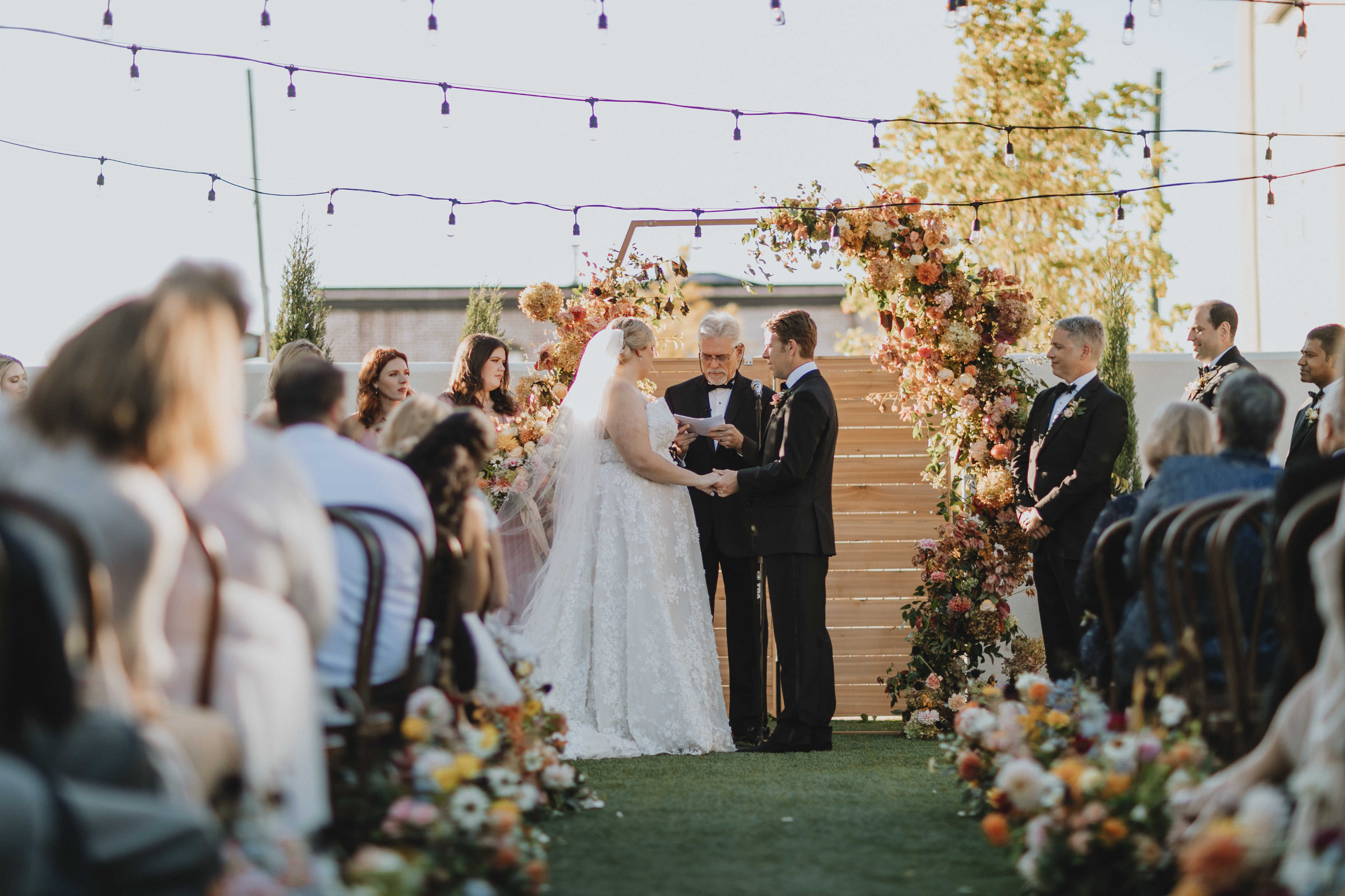
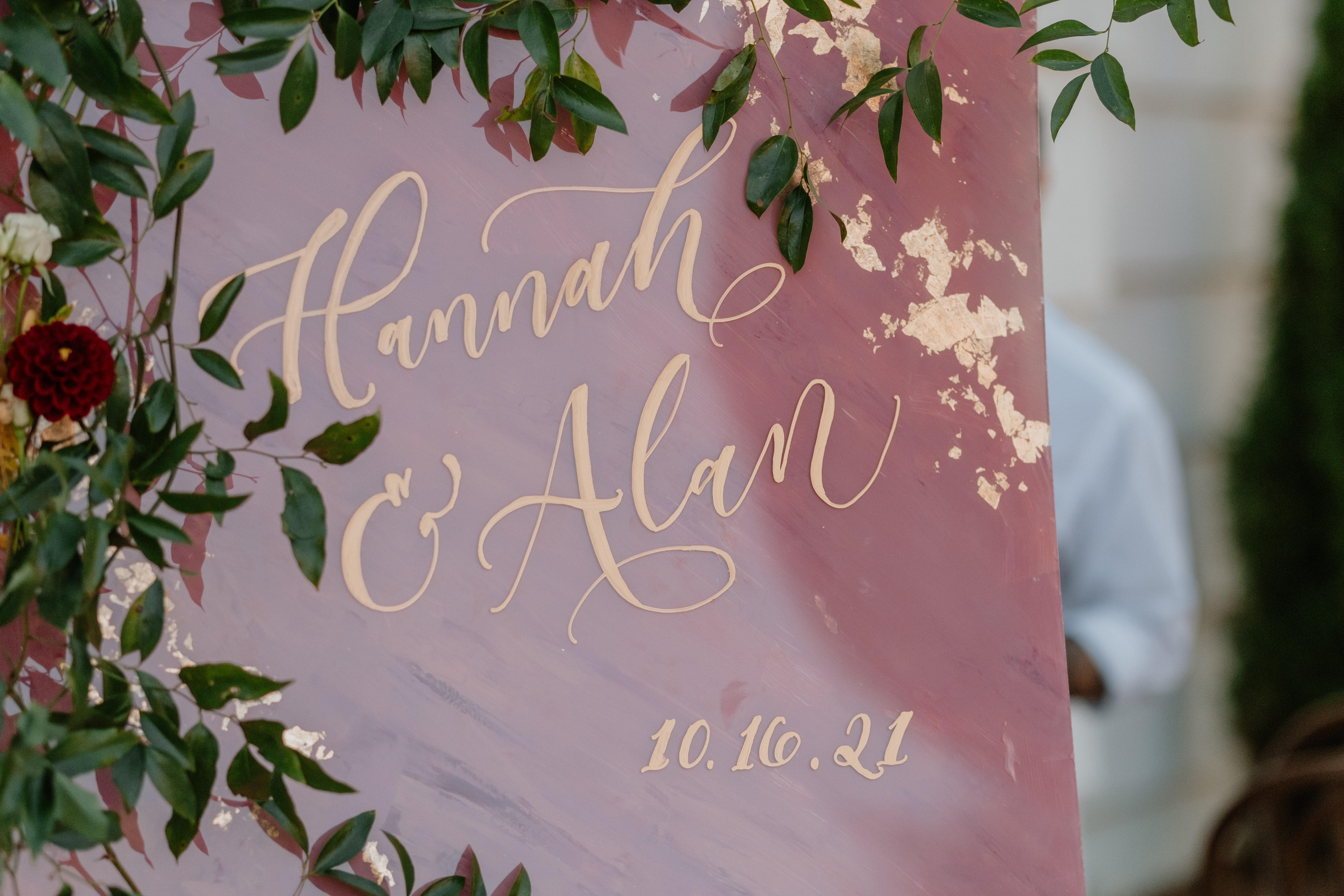
I like to think Nashville and Chattanooga are secret BFFs. They each have big city vibes, southern hospitality, Tennessee charm, and are never too far away! Hannah and Alan allowed White Ink to help elevate their Chattanooga nuptials and we were thrilled to jump on board. They were an amazing couple to work with, from creating stunning reception details all the way down to transporting all the items from Nashville. What an honor it was to be a part of such a gorgeous wedding in such a lovely town.
Hannah and Alan chose The Common House for their wedding venue which had only opened its doors in Chattanooga a few months prior to the couple’s wedding date, making their wedding one of the first ones to take place at this location.
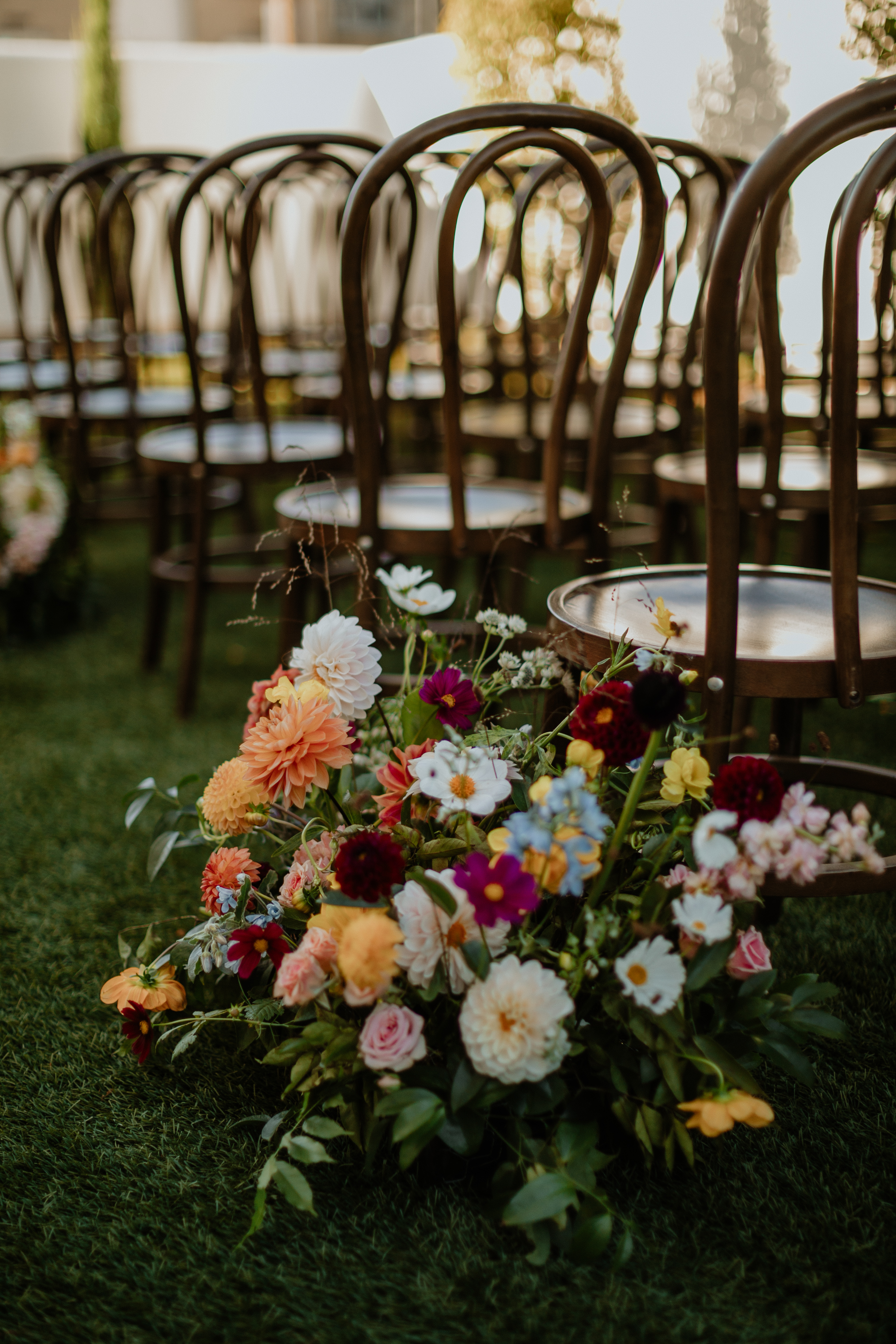
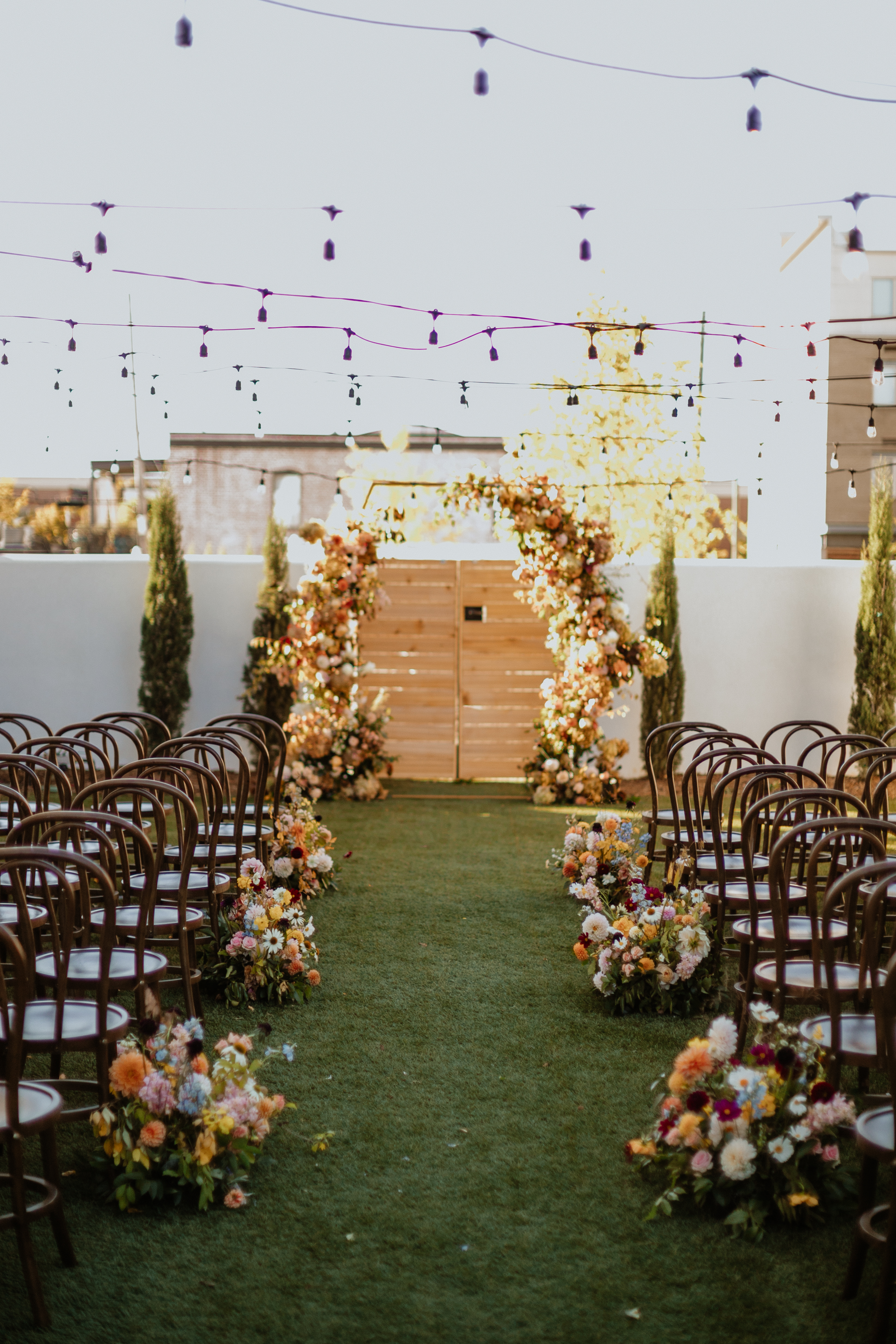
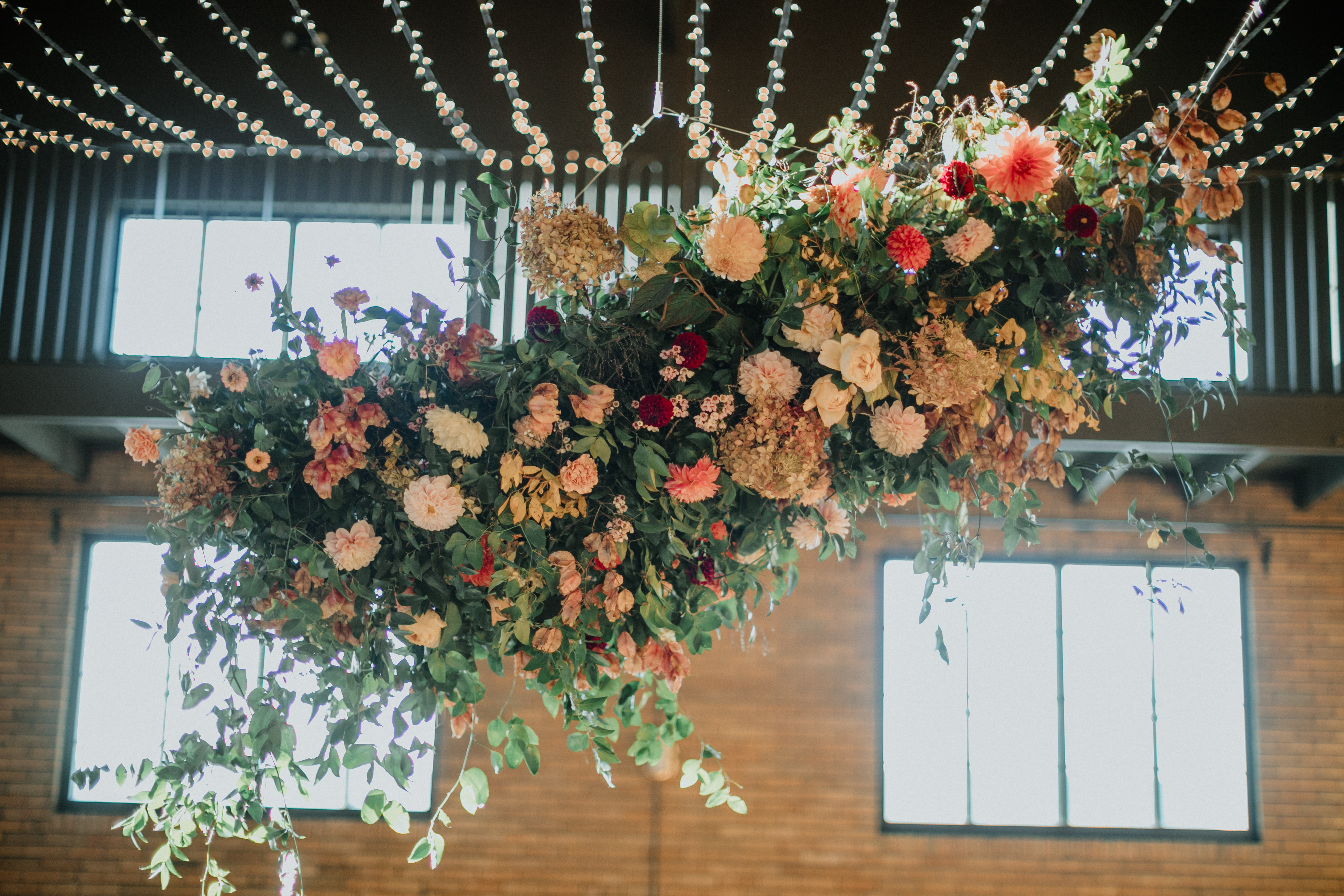
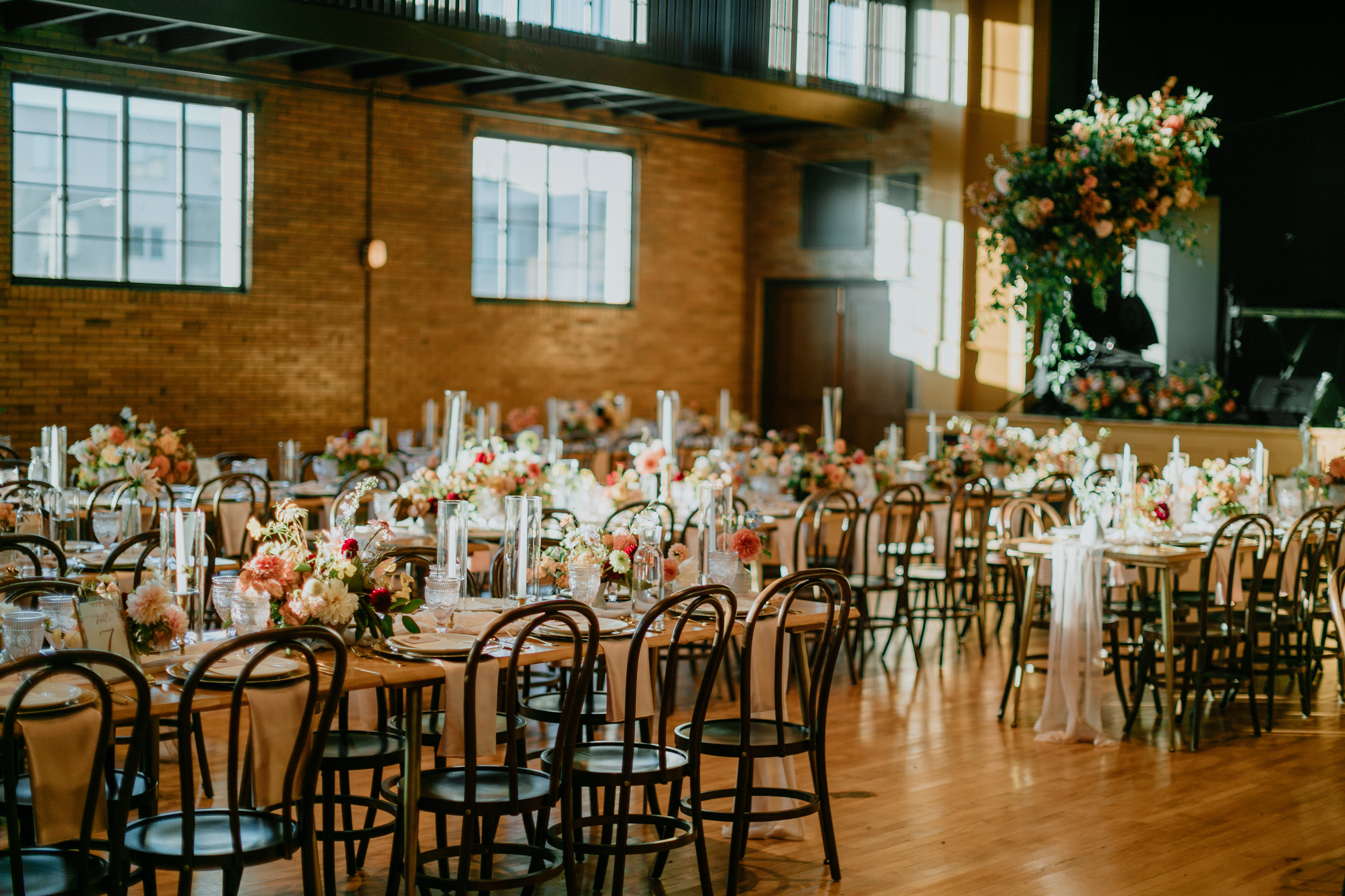
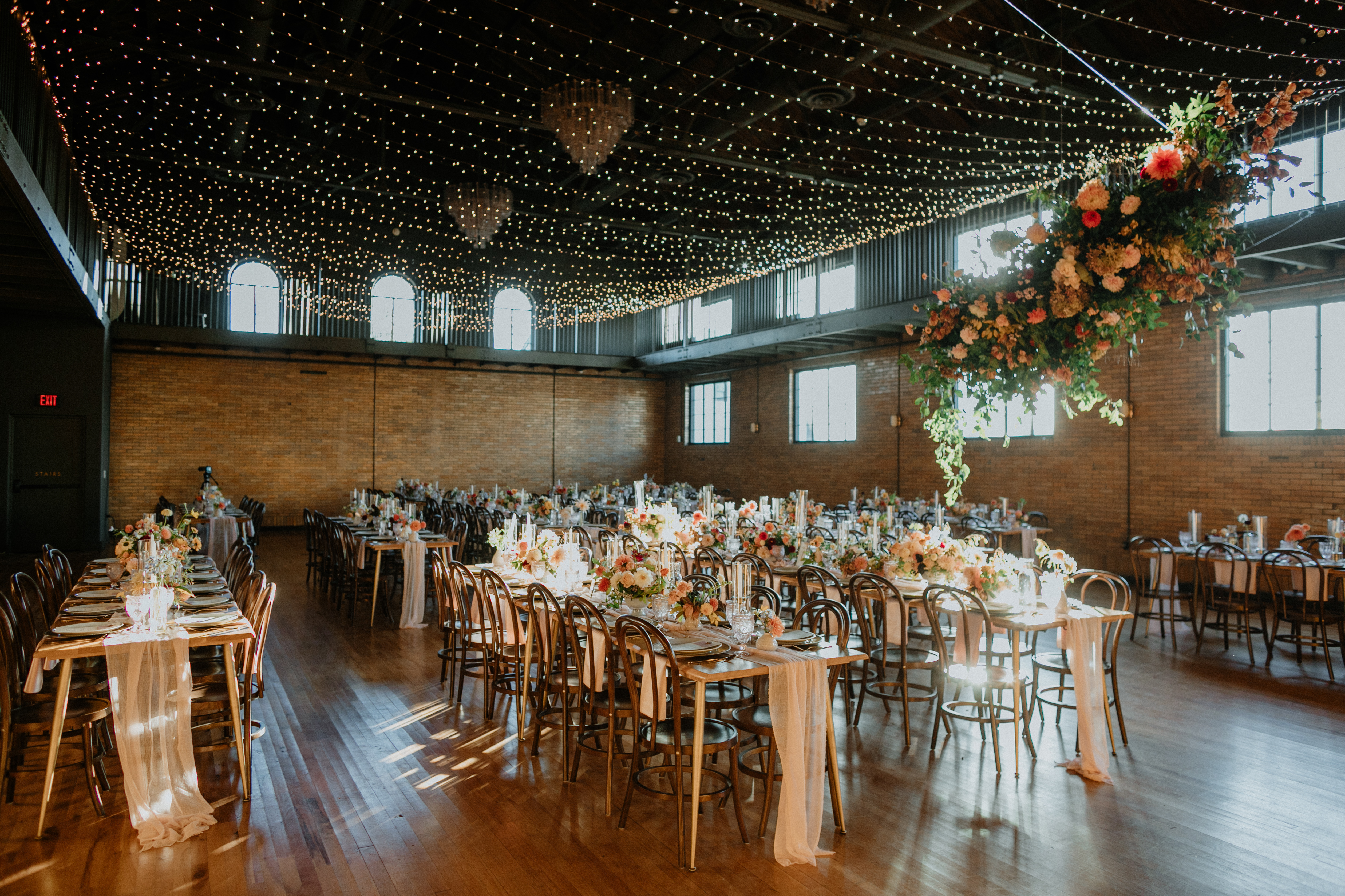
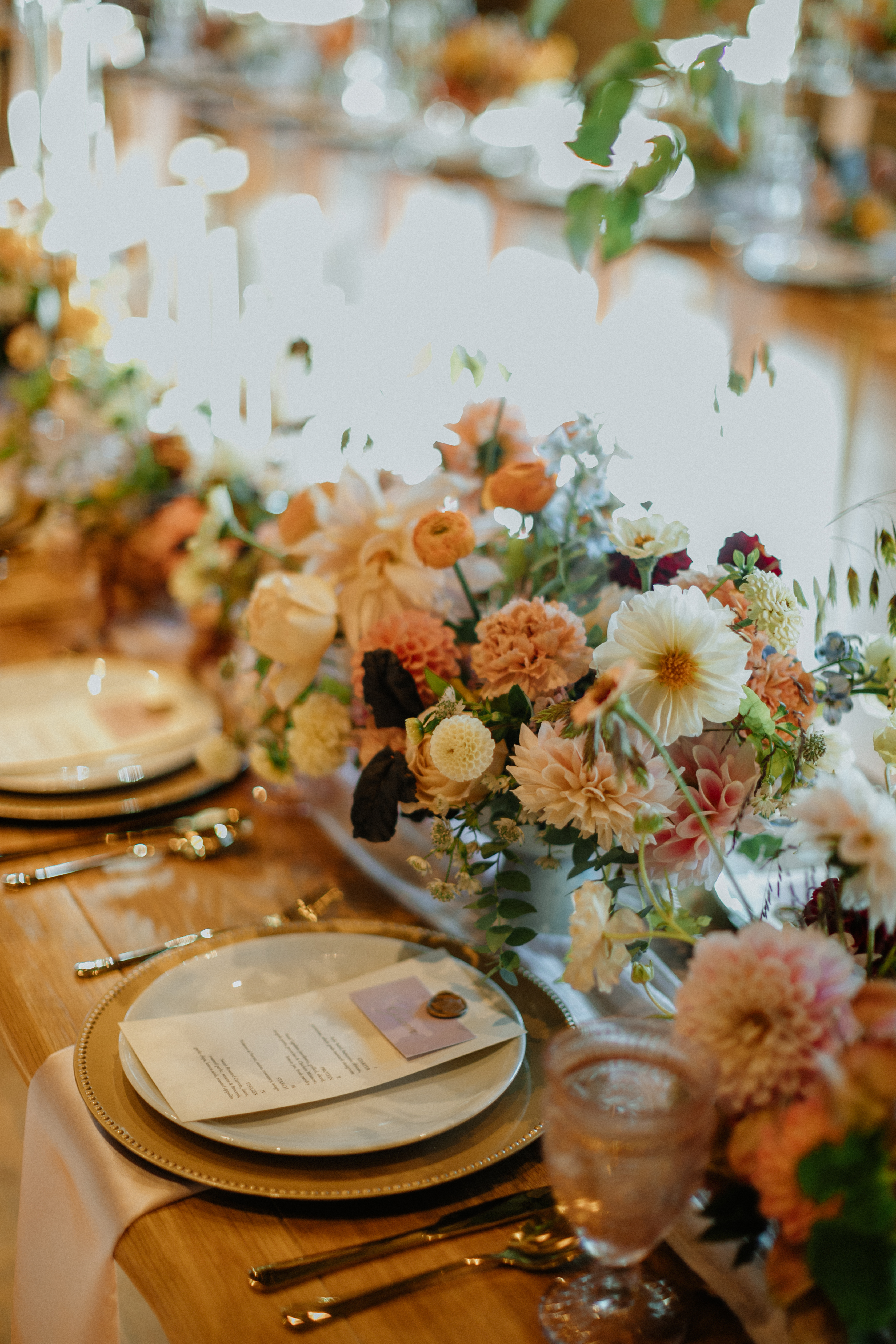
The most stunning part of this wedding, hands-down, was the endless display of floral arrangements! Flowers gushed through each carefully planned setting of Hannah and Alan’s big day, leaving us speechless.
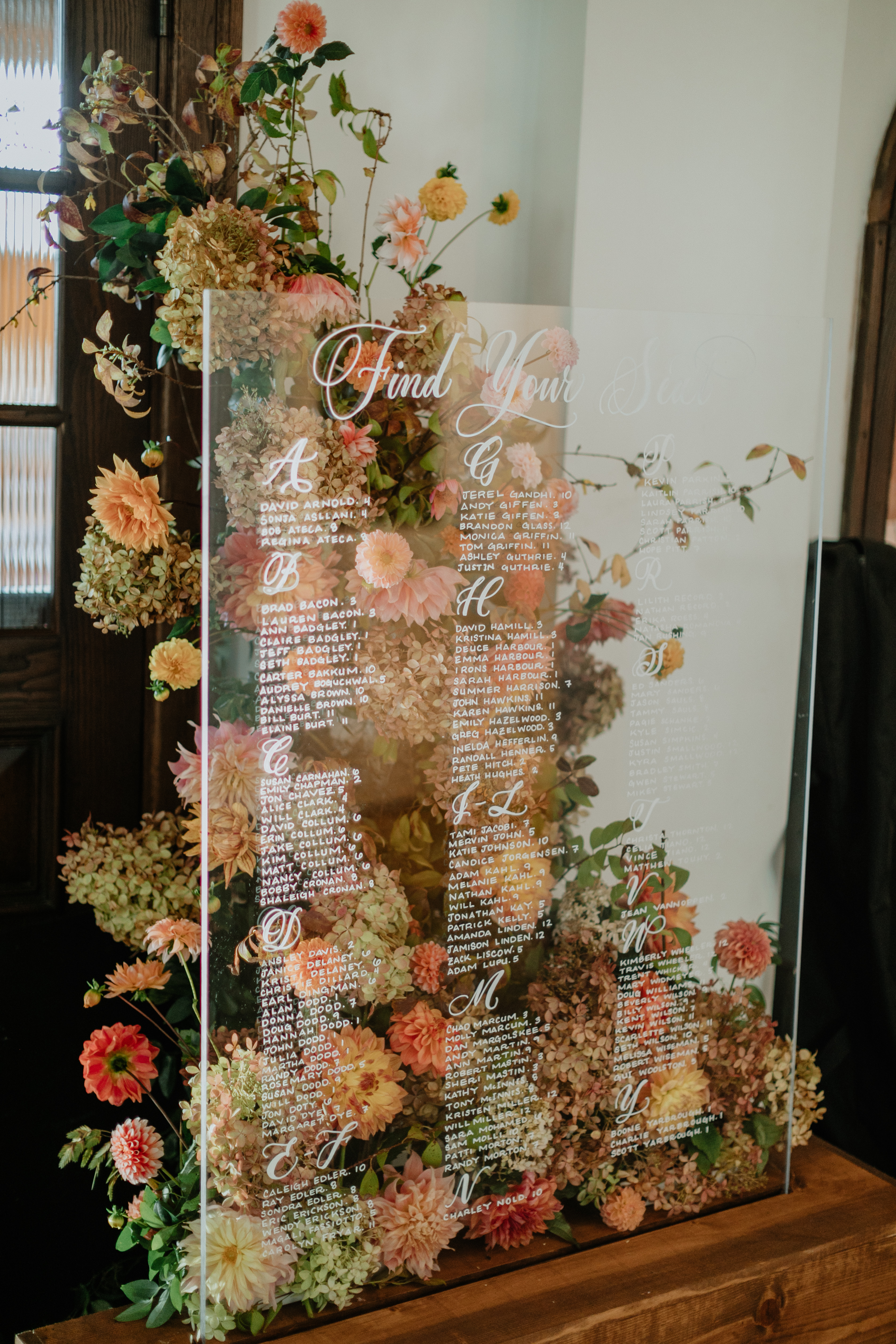
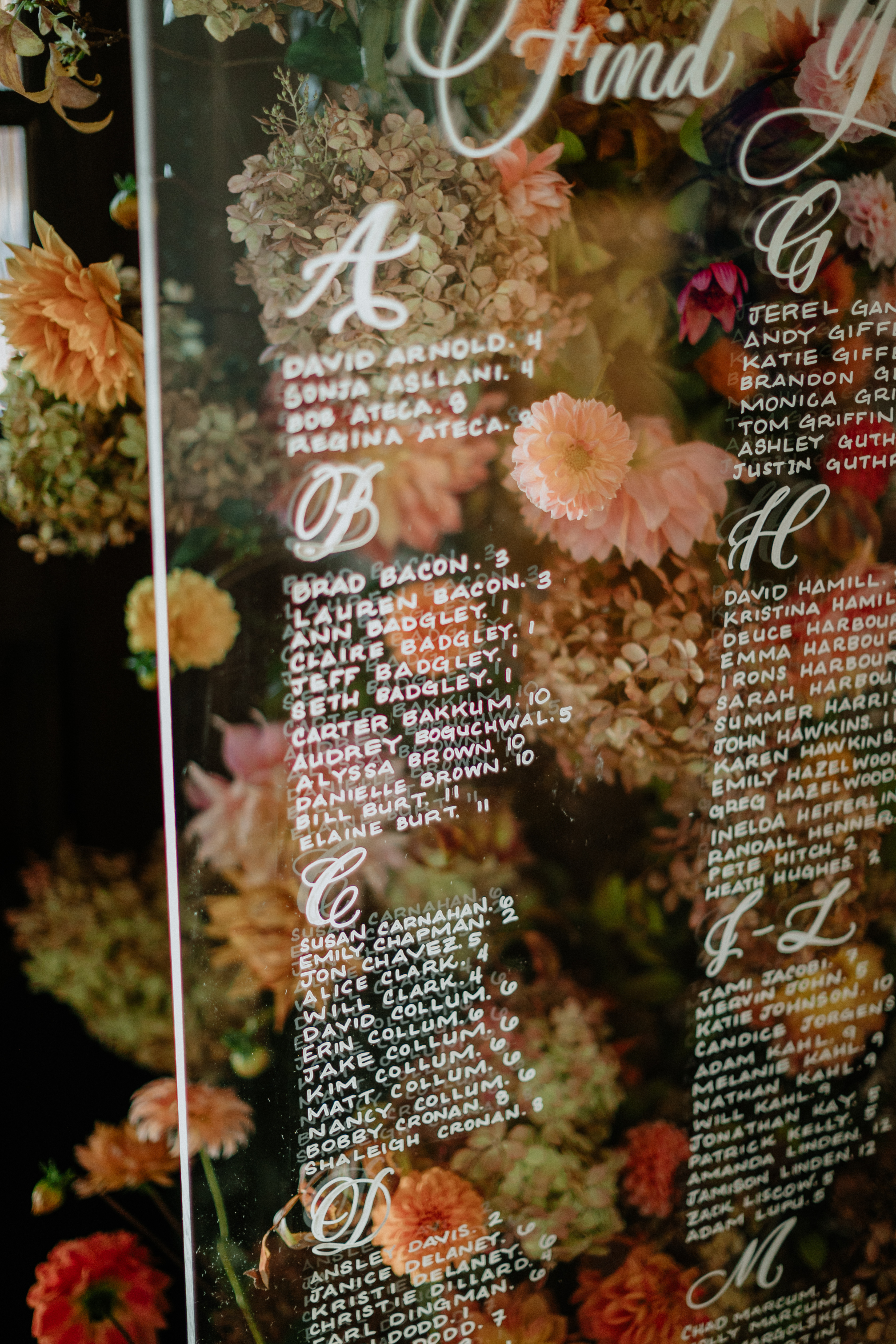
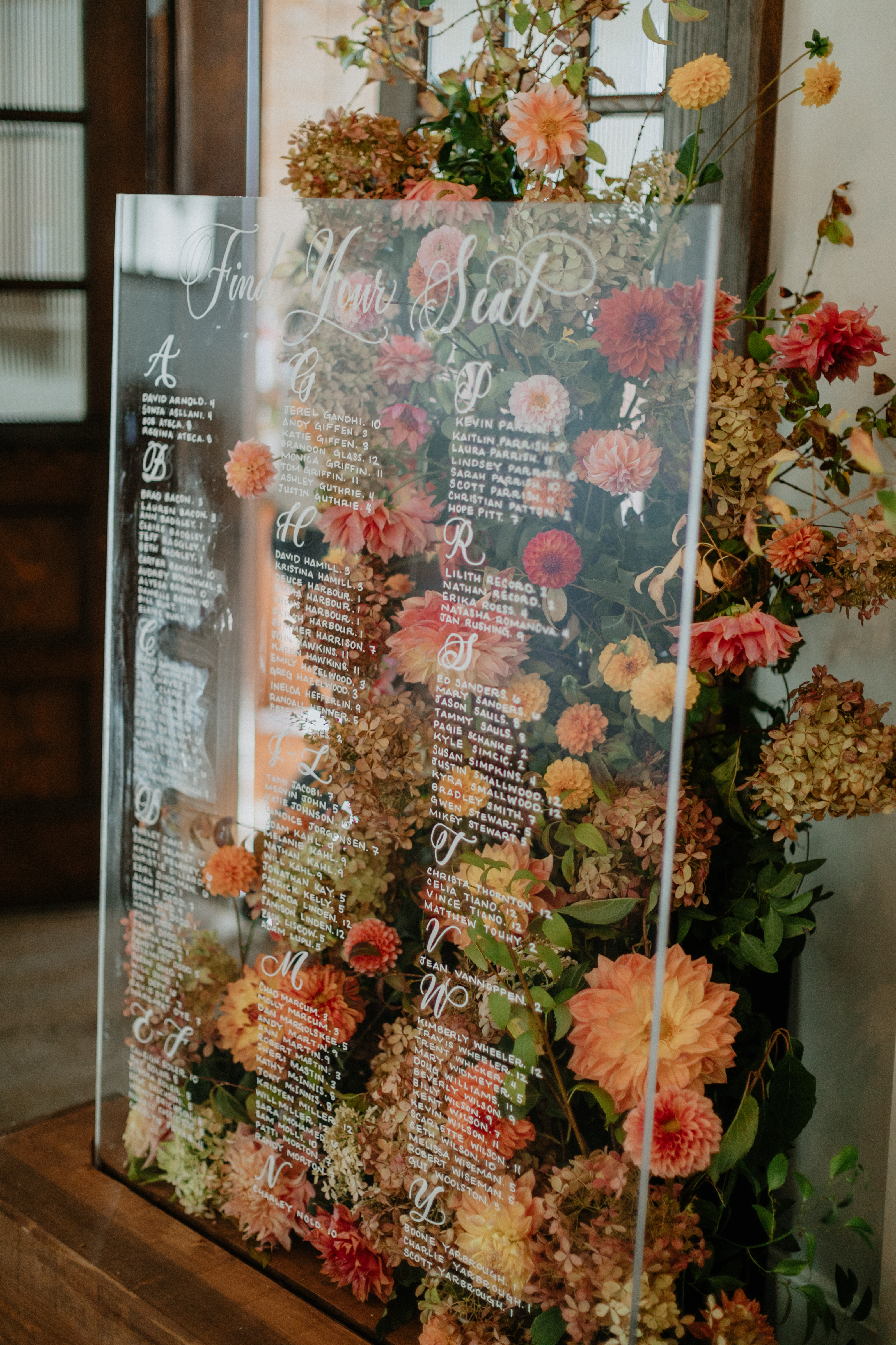
The White Ink team was blown away when we saw how our couple displayed the seating chart that we customized for them. Can you blame us though? The floral backdrop that went along with this chart set it apart in a way that I’ve never seen before. Now THIS is how you display an acrylic seating chart! Showstopper vibes!
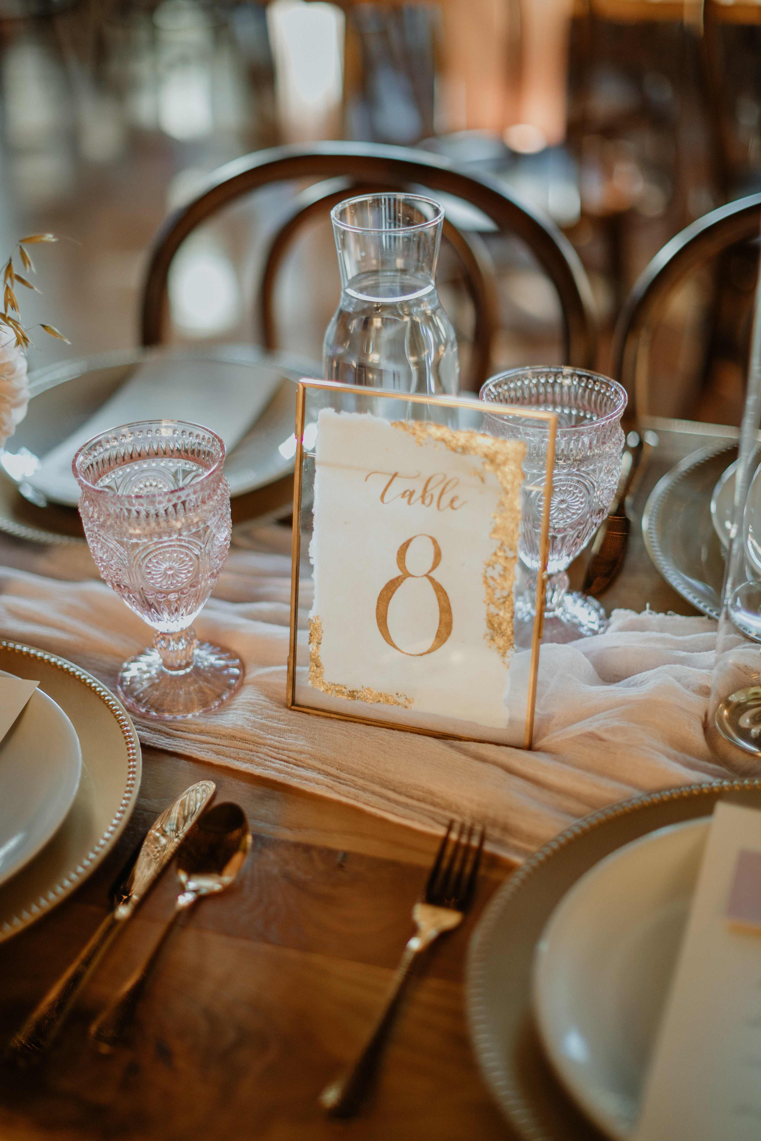
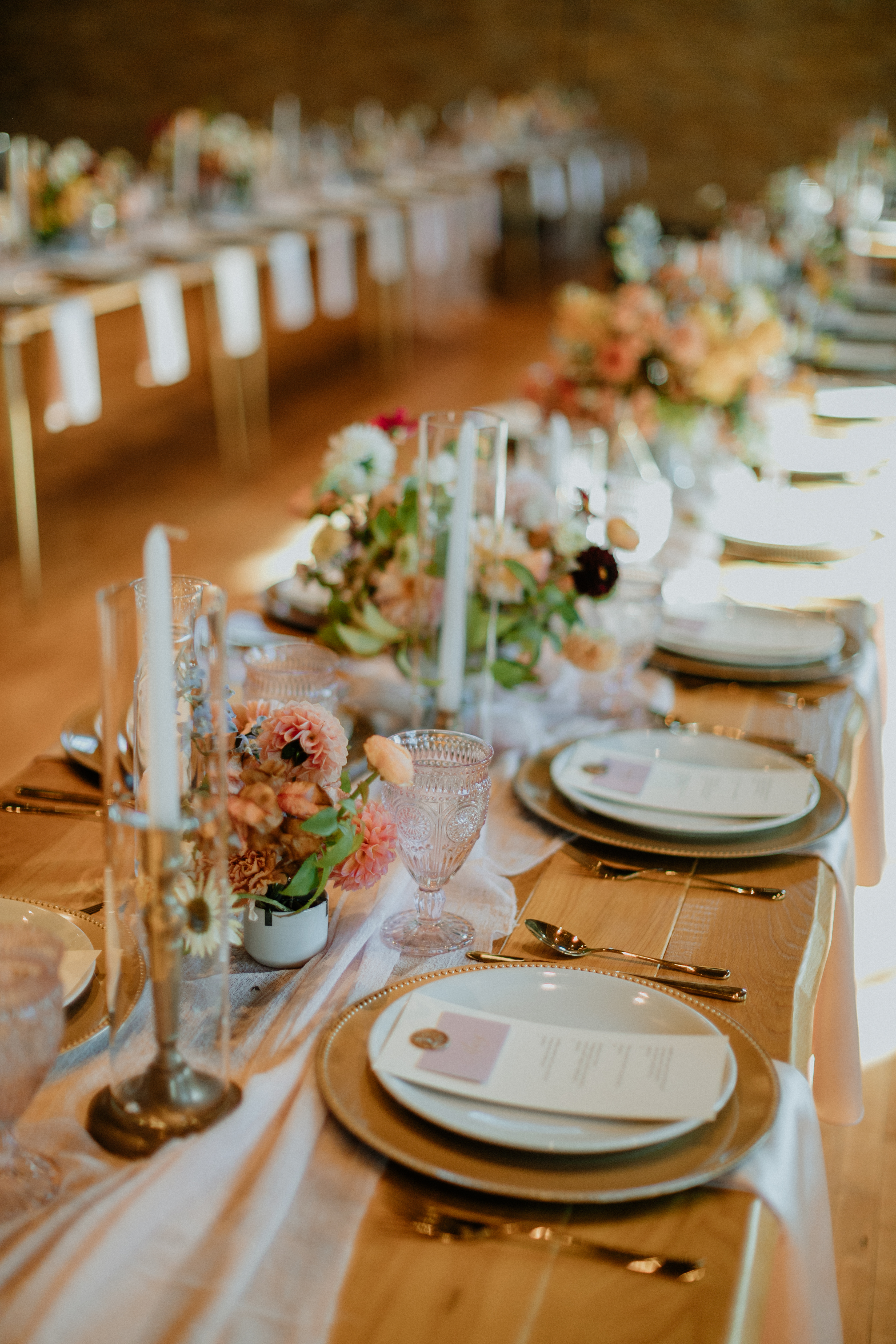
We provided Hannah and Alan with the table numbers for their reception, and we loved what they chose. The gold accents on each sign complimented the impressive tablescapes of florals and fine linen. Seeing how our work comes through for our couples on their wedding day is so very rewarding!
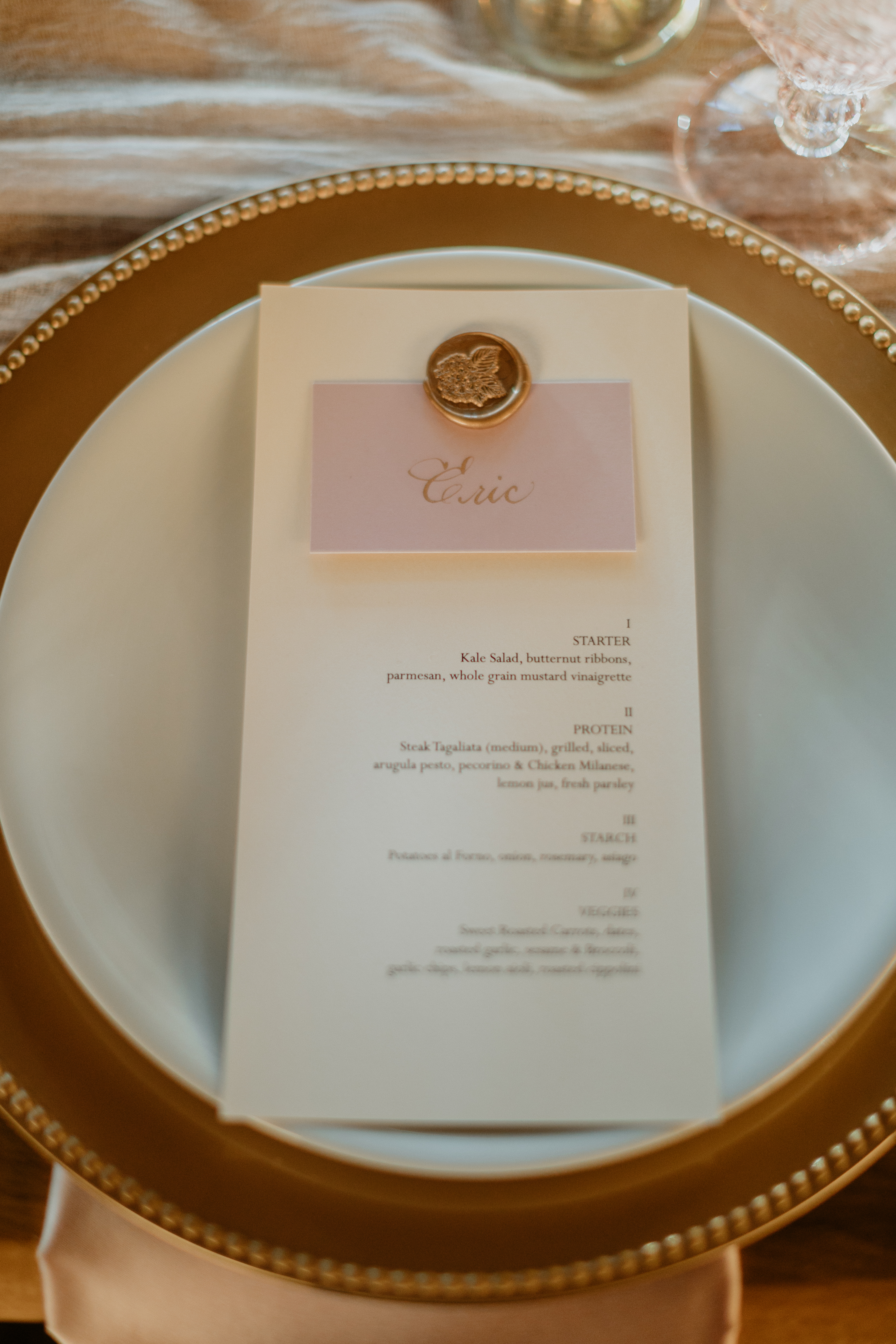
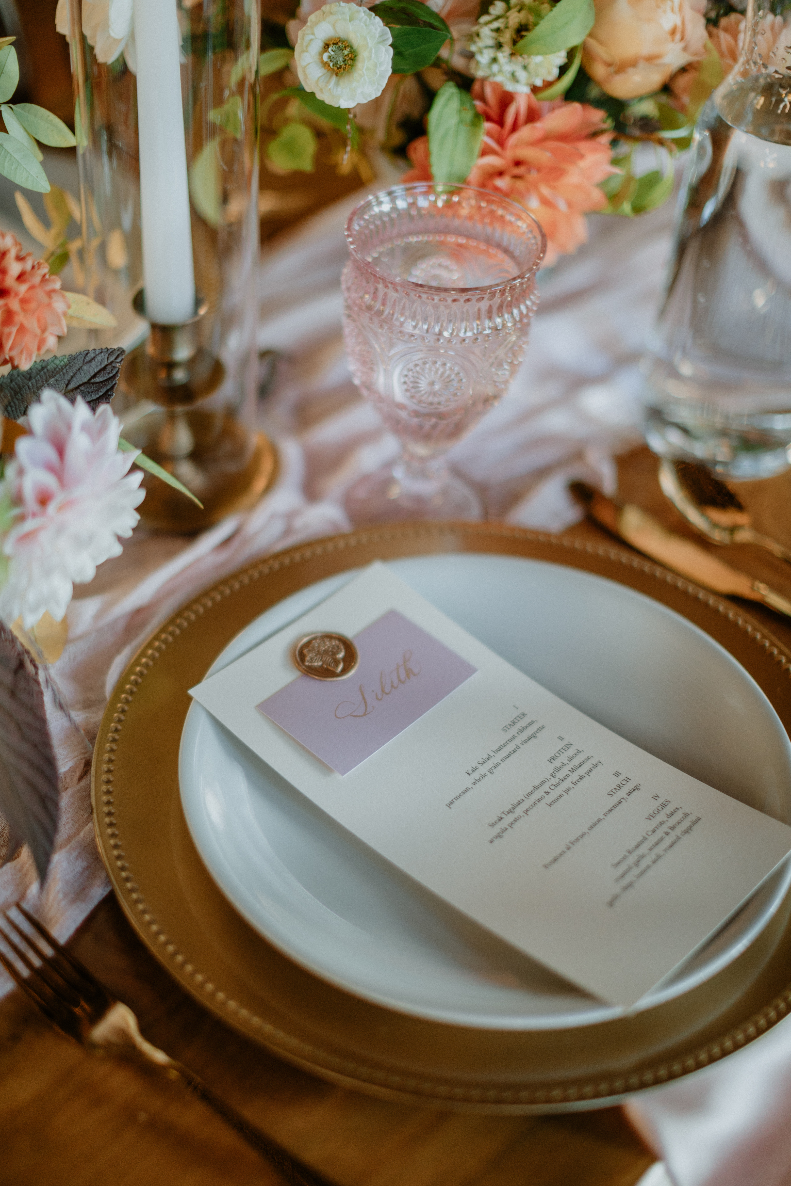
White Ink was also asked to create the menus along with the place cards which were perfectly pieced together with gold-colored wax seals. (Wax seals are kind of my favorite thing ever, just sayin’.) Details like these are an easy way to add a layer of elegance to any occasion.
This one was a magical one, guys. Flowers for days, lighting that could make the stars jealous, endless rose colors and gold accents: this is what we live for! We want to make designs and create details that go right along with the dreams that our couples have for their weddings. What can we create for your big day? What does your dream wedding look like?
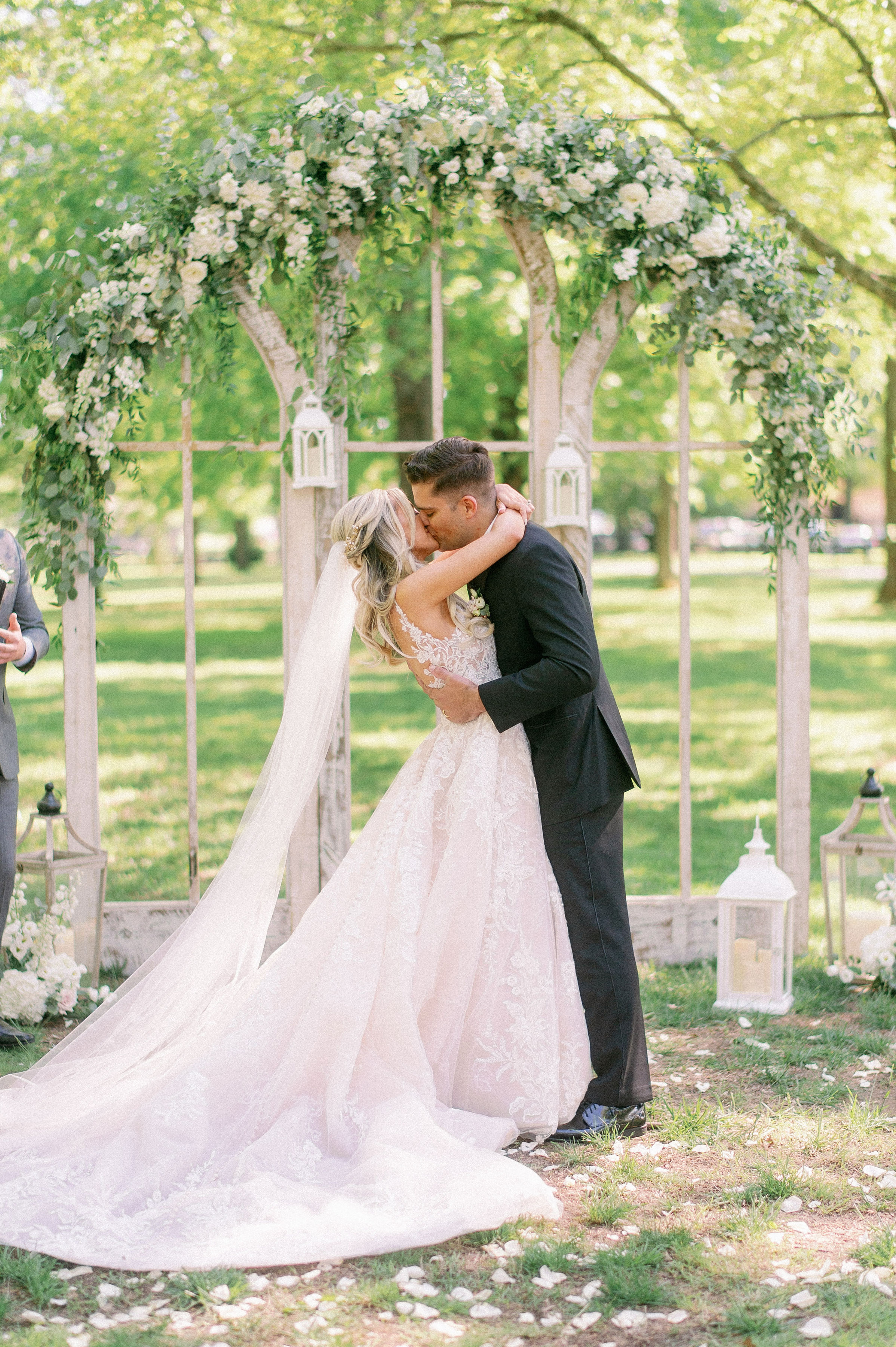
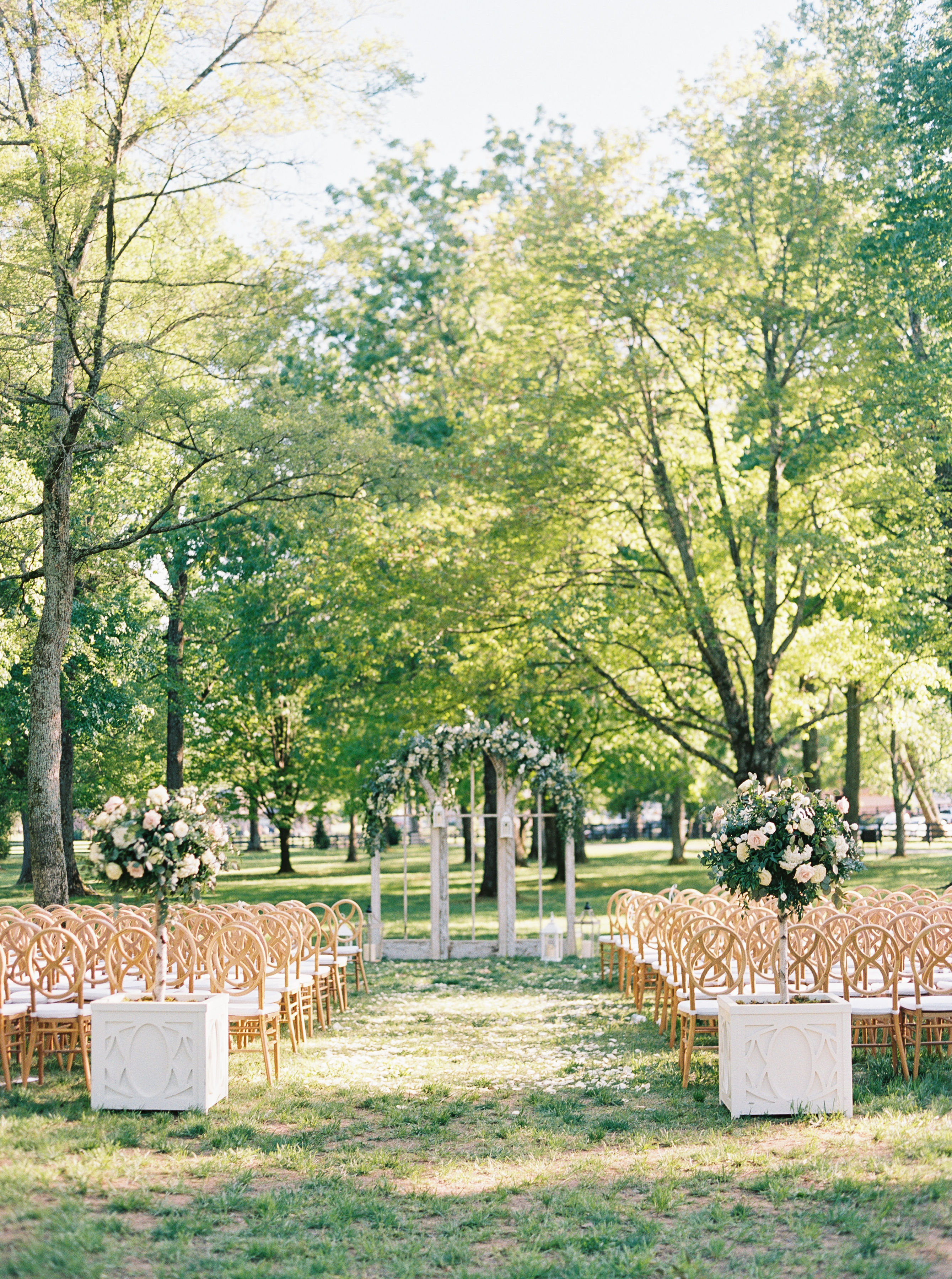
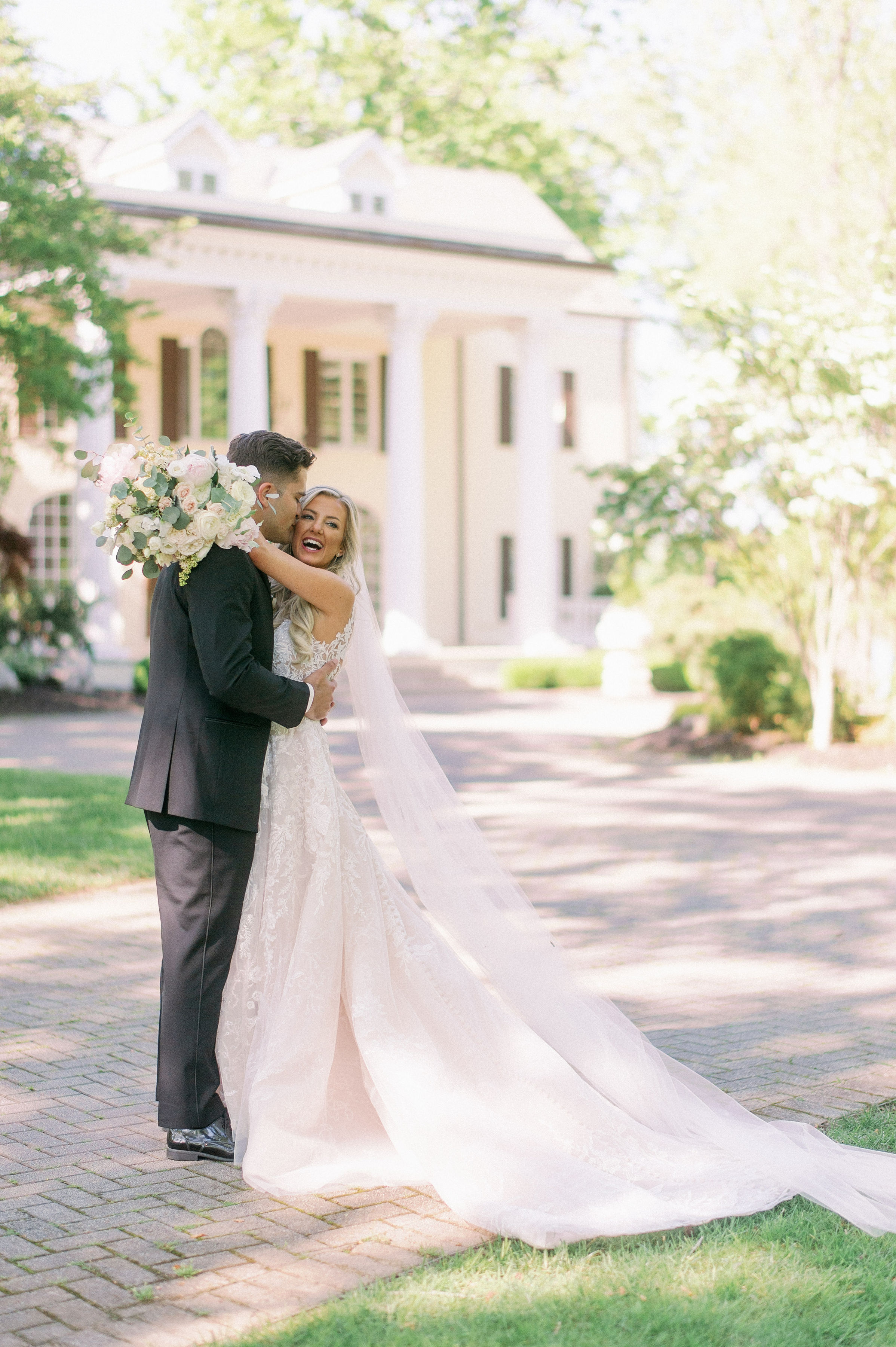
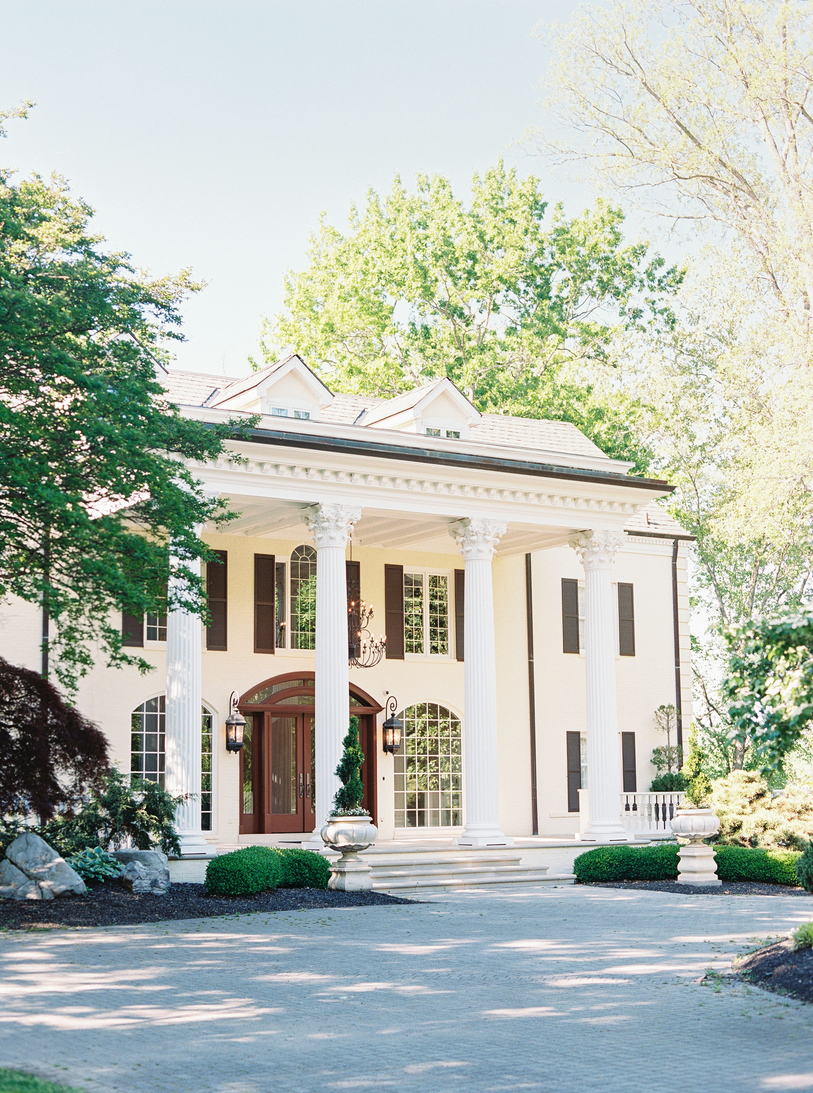
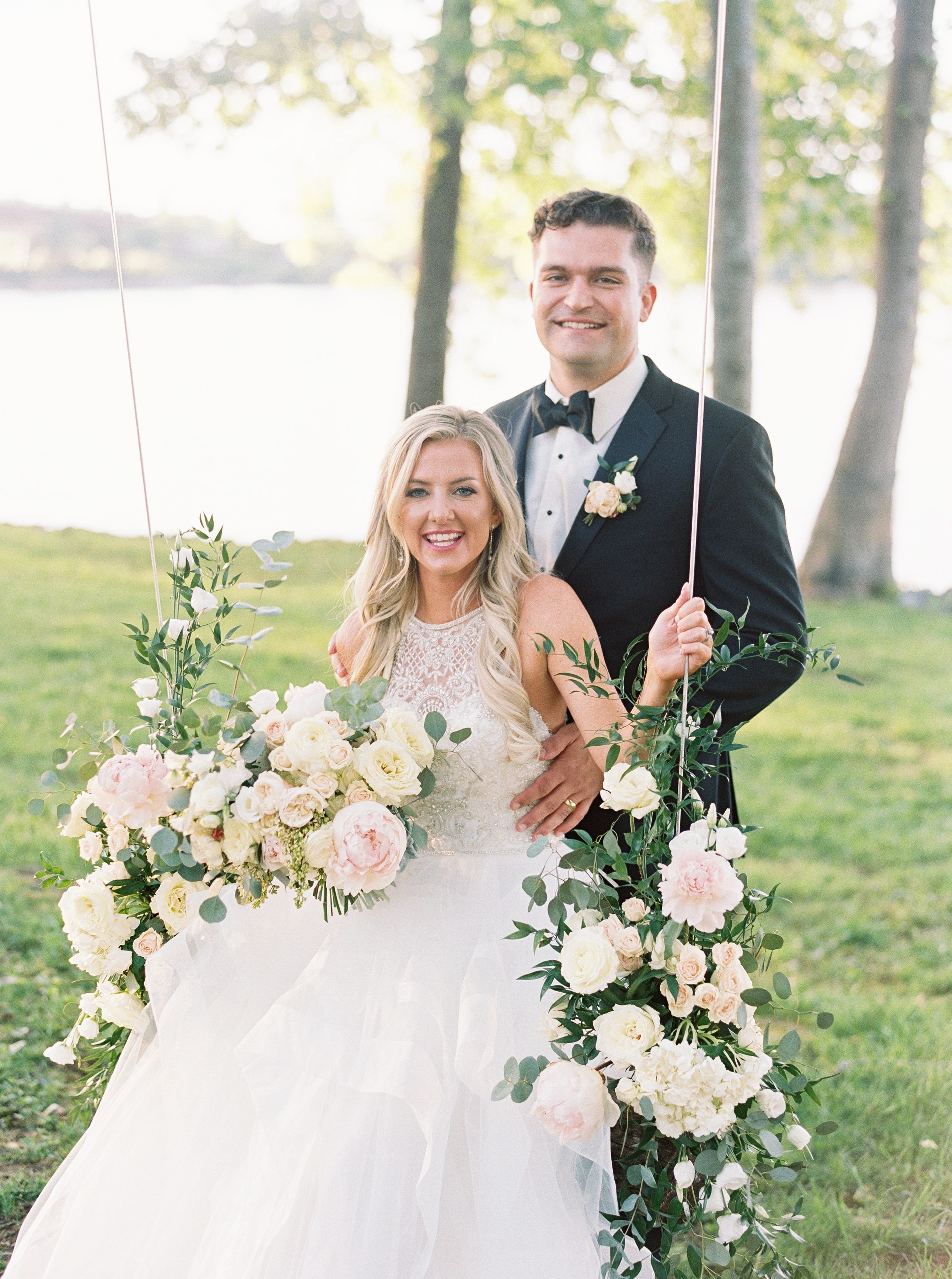
Being given the opportunity to truly tap into my creative side makes me feel as free as the bubbles floating to the top of a champagne flute. The White Ink team was invited to take part in some seriously showstopping details for the wedding of our amazing couple, Molly and Killian.
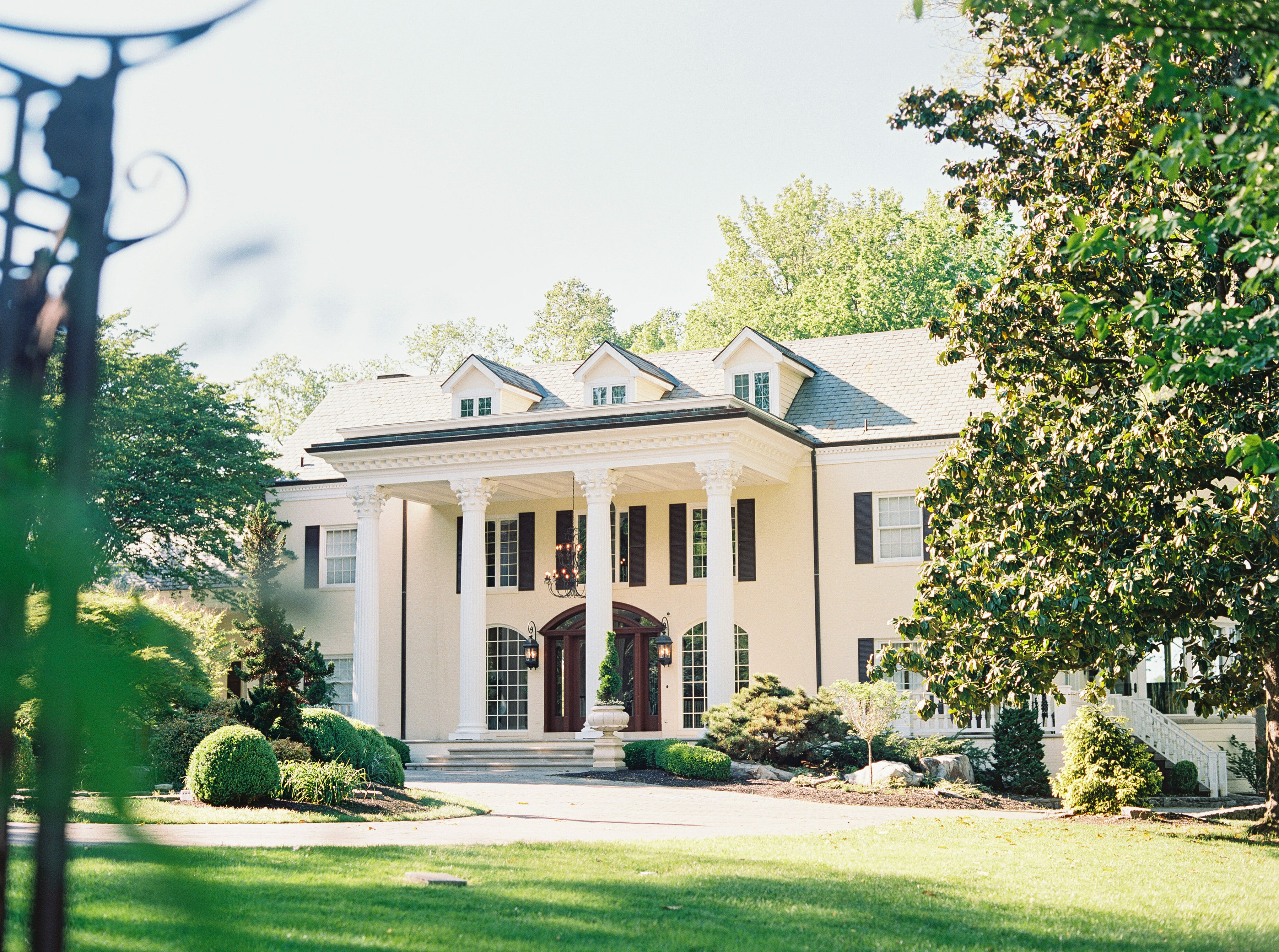
Aside from making their vows at the former home of Reba McEntire, our couple wowed their guests with custom wedding details and designs that would be the topic of conversation for a long time to come.
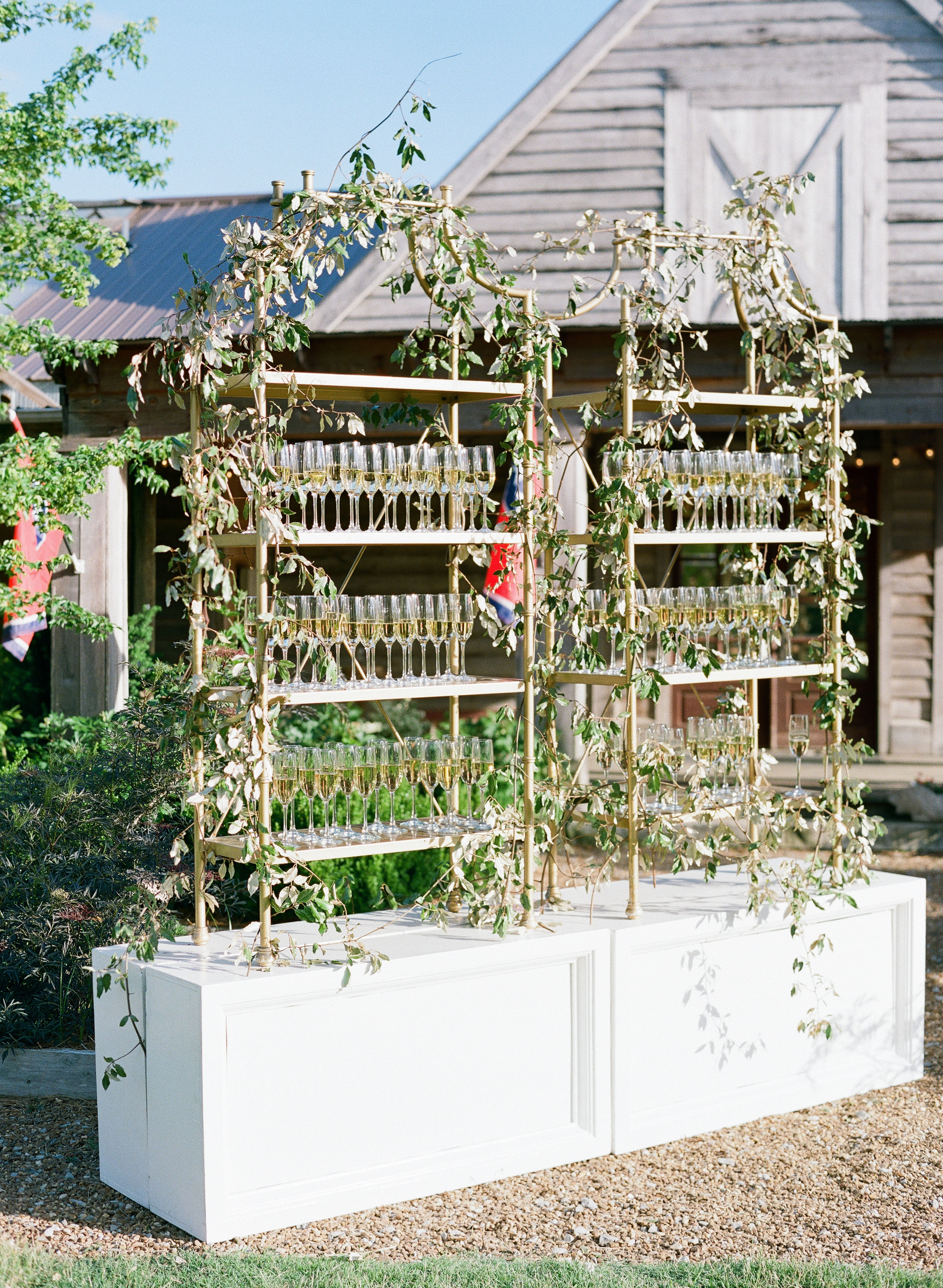
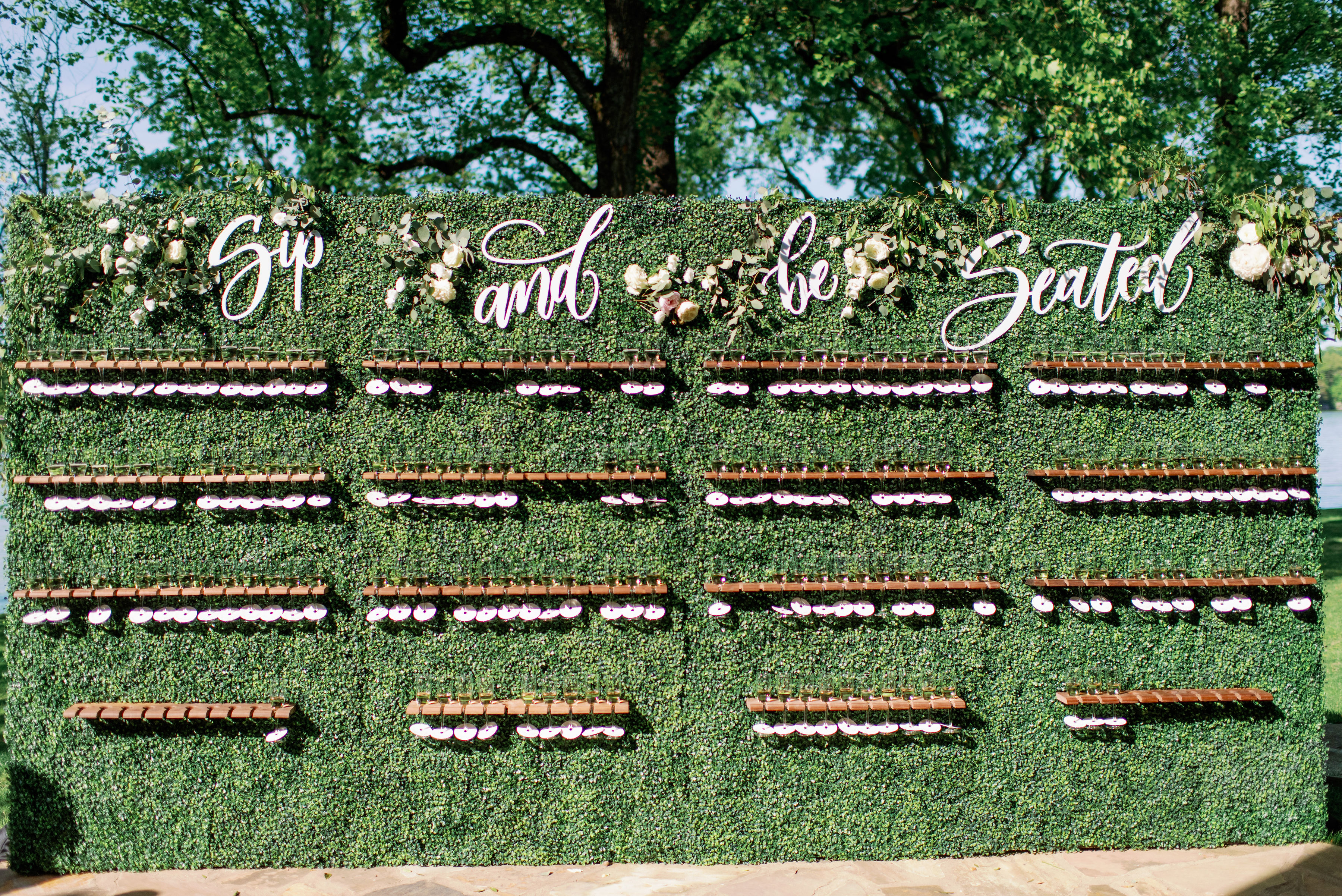
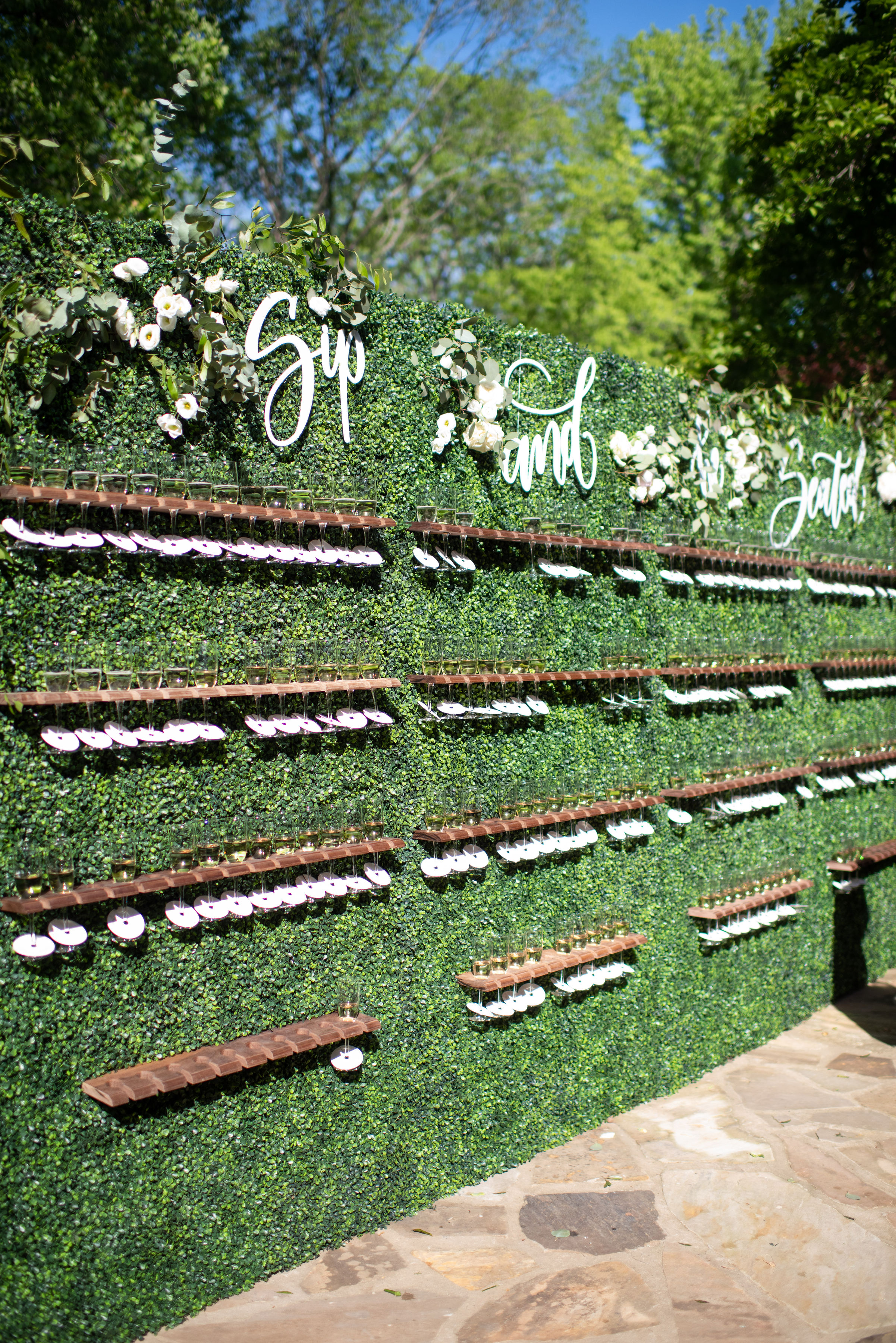
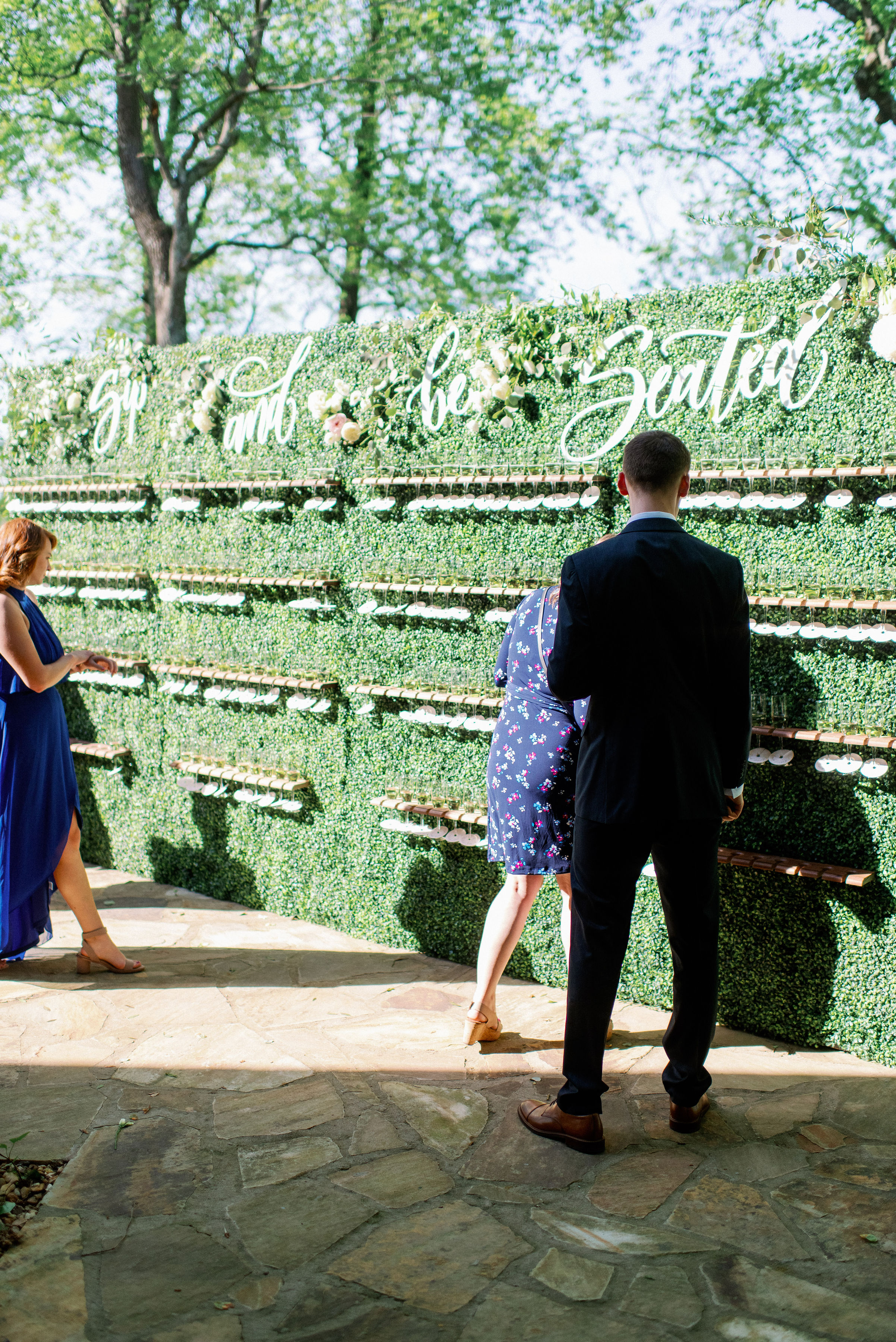
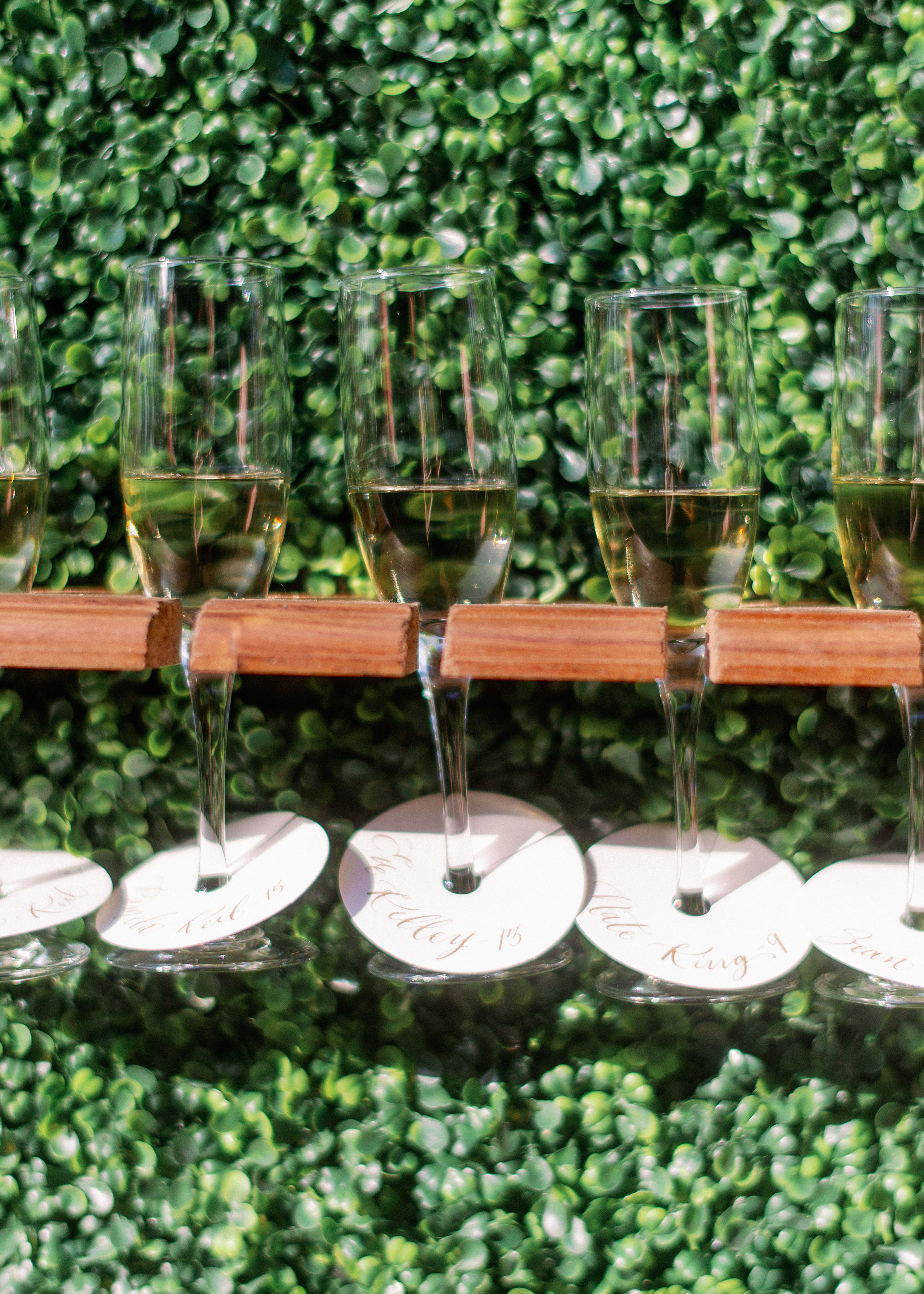
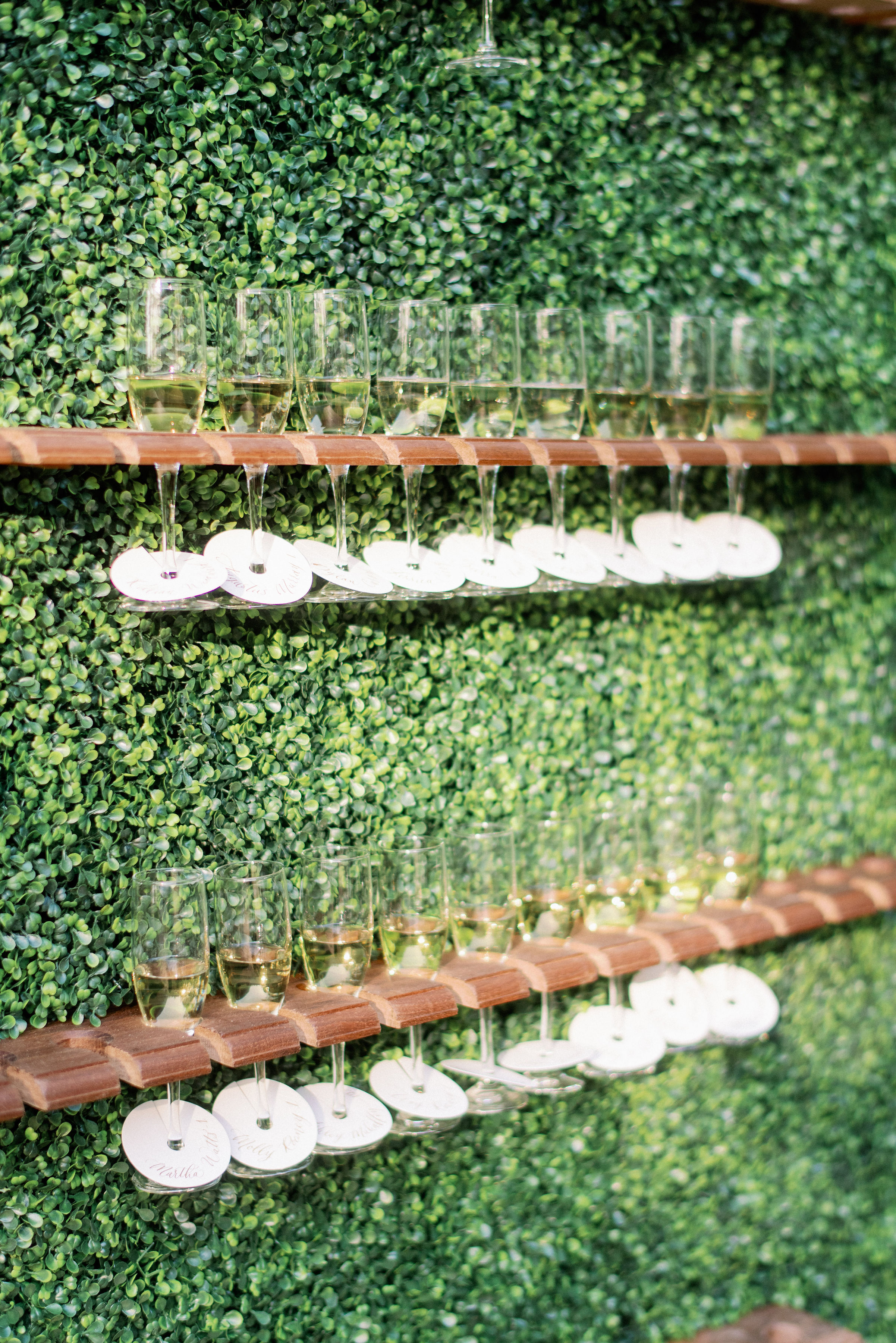
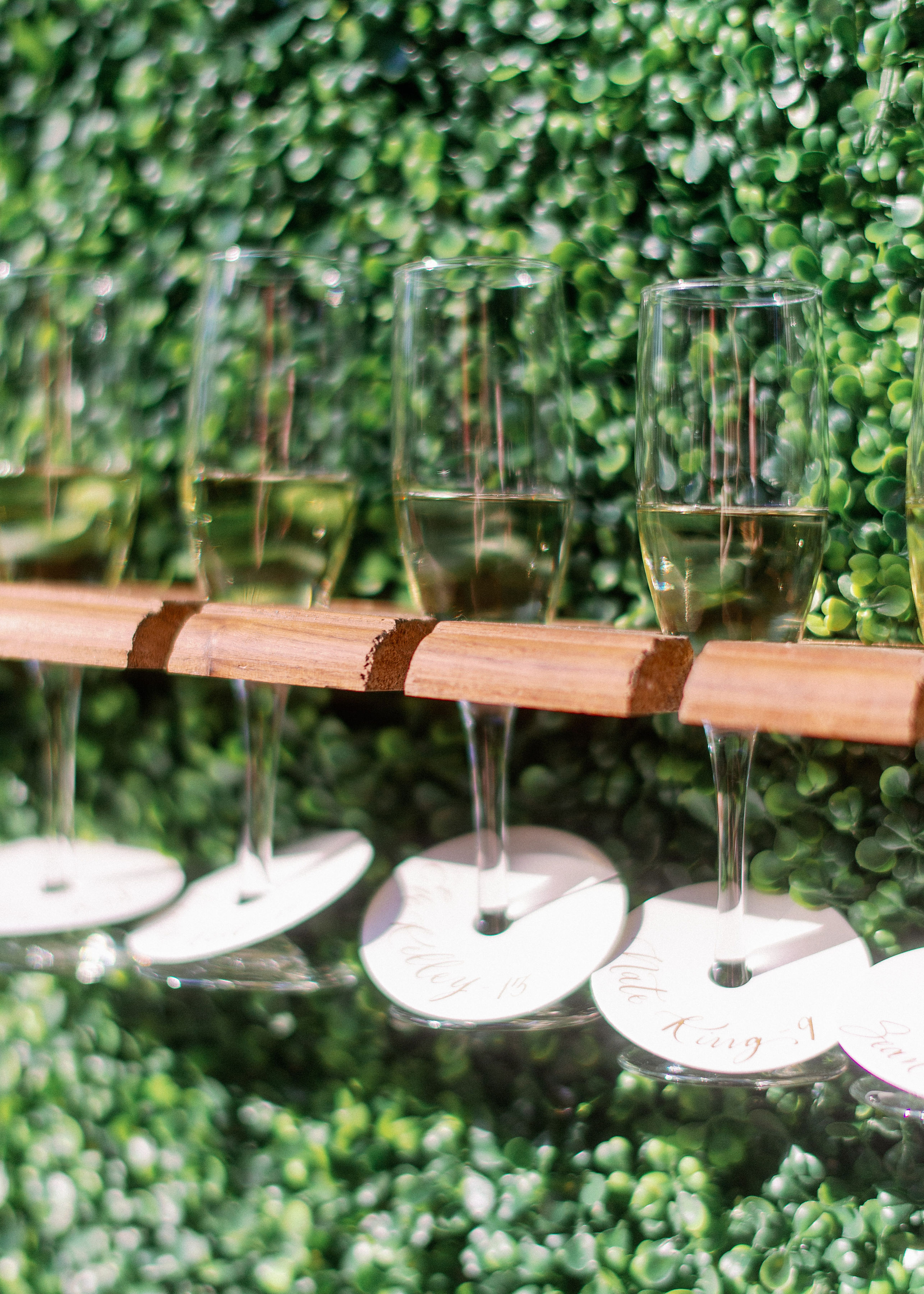
Let’s jump right in to the seating chart wall, shall we? I mean LOOK at this gorgeous wall! If you want to make an impression, seating charts are a great place to start. White Ink designed the custom, laser-cut calligraphy title “Sip and Be Seated” for this showstopper of a seating chart.
Next, we created the escort cards to slip over the champagne flutes that lined the entire wall. (I love that I get to say that sentence). I appreciate the duality of using this wall as a way to seat your guests and get the cocktail hour started. Very clever!
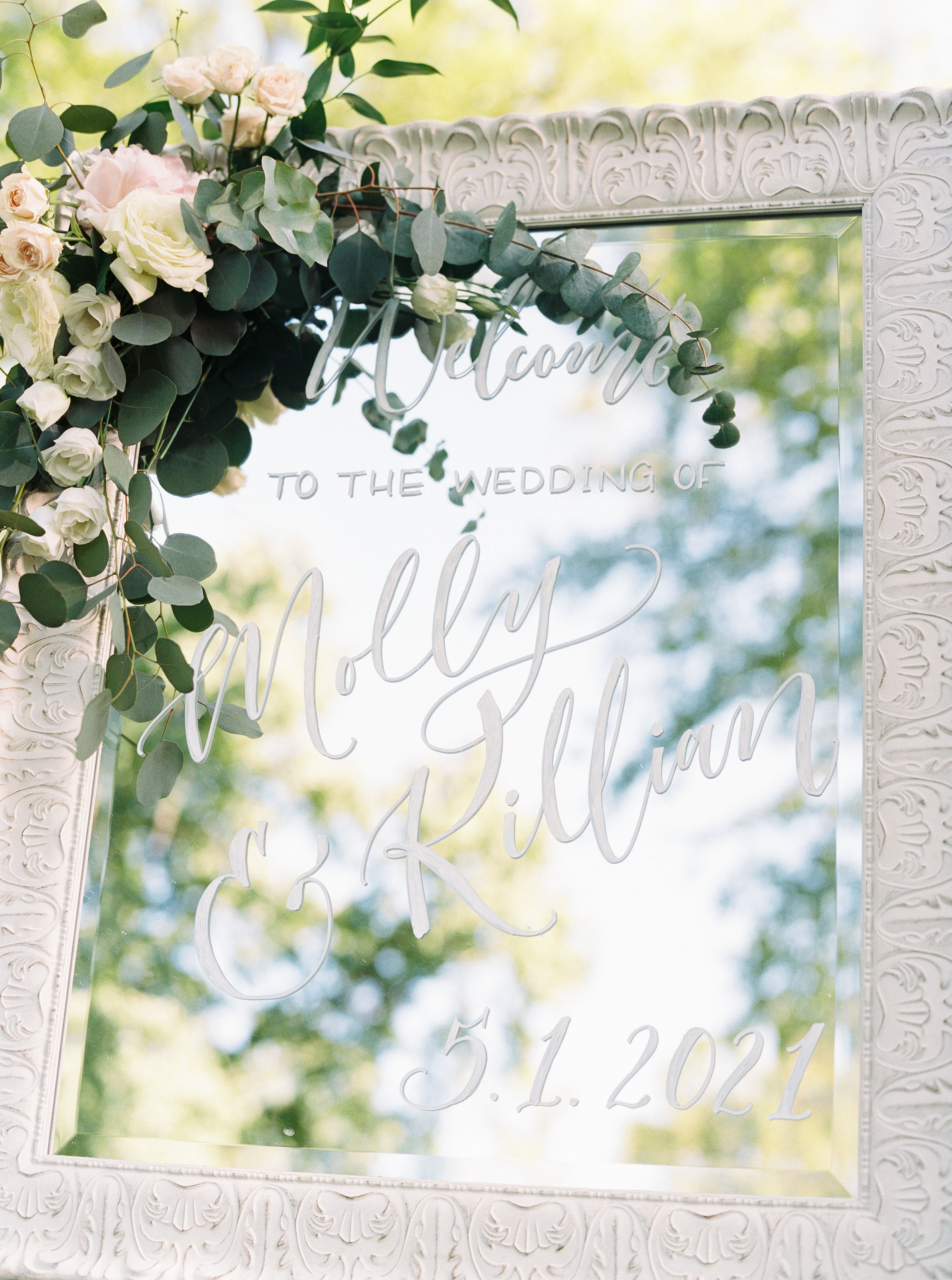
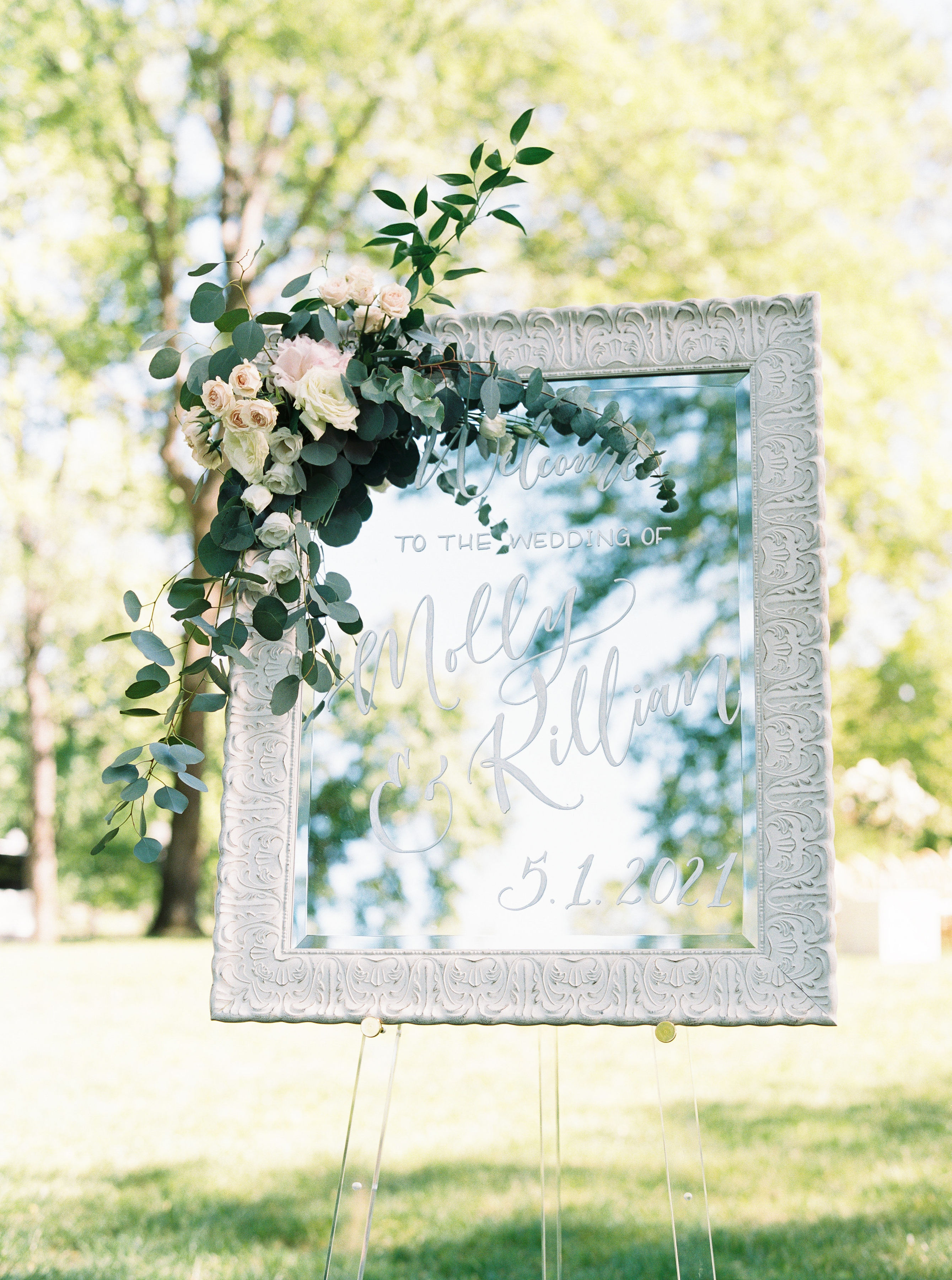
White Ink customized Molly and Killian’s mirrored wedding welcome sign which was beautifully paired with florals that spilled over the edges. I honestly love when couples use their florals with signage like this. It’s always such a fantastic balance of softness and elegance.
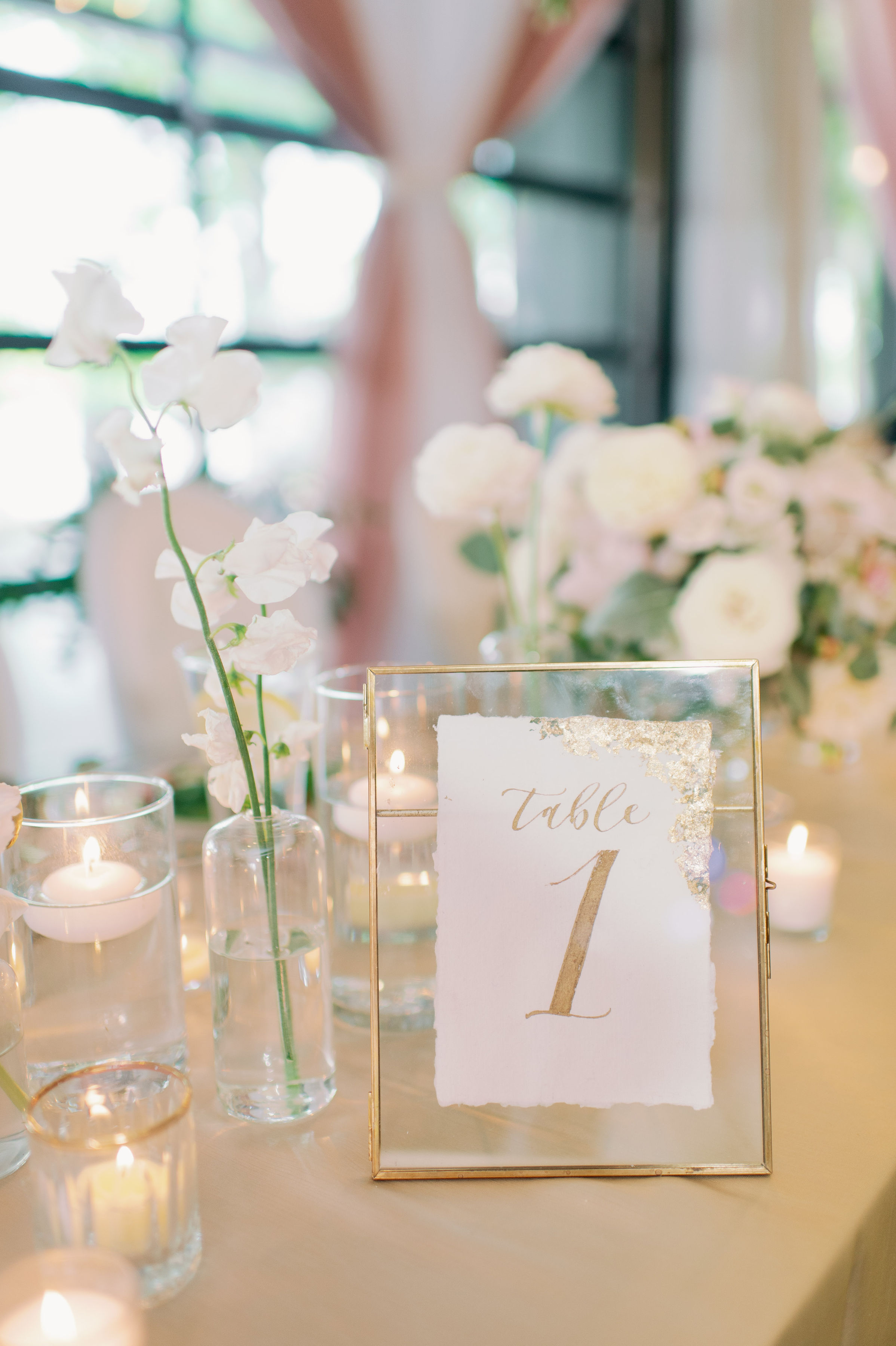
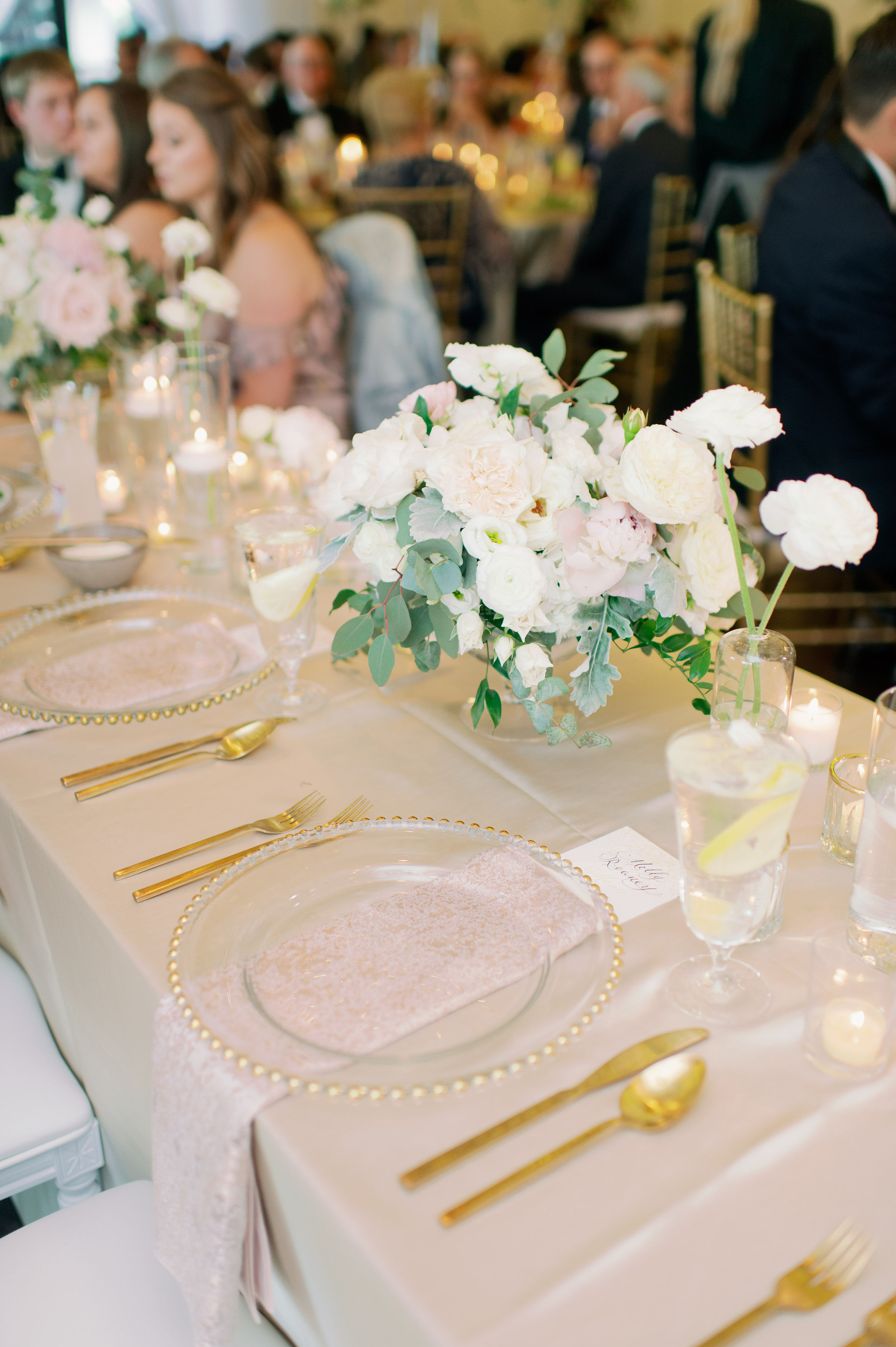
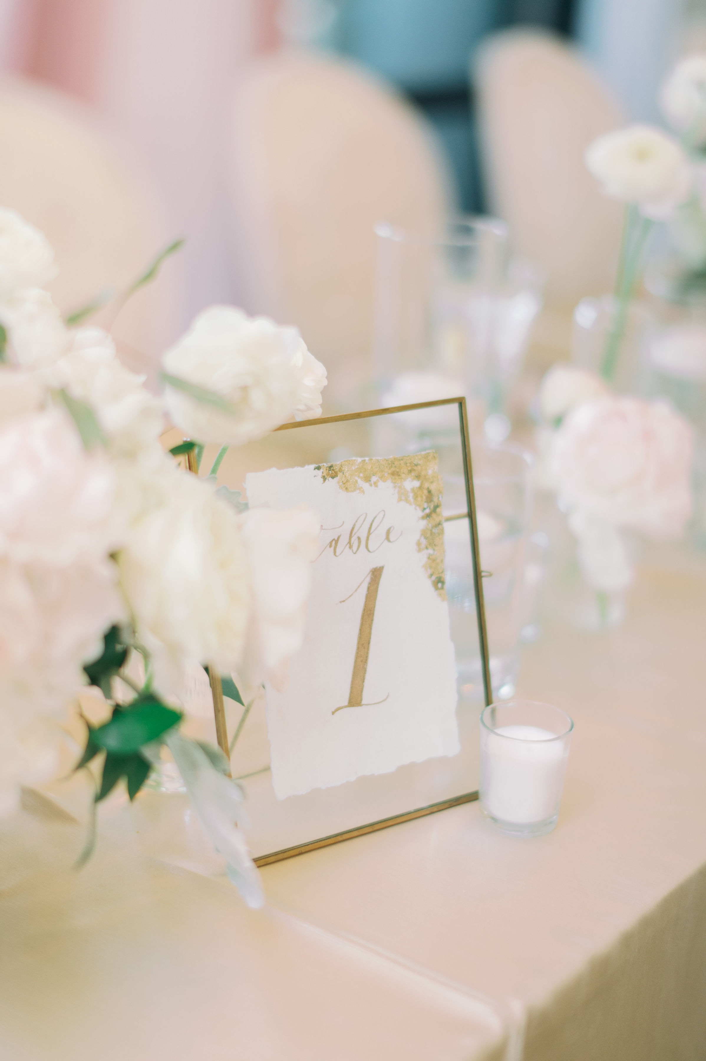
Molly and Killian chose to use our table numbers that were designed with gold ink and completed with gold foil edges. These table numbers are some of my favorites from the White Ink collection!
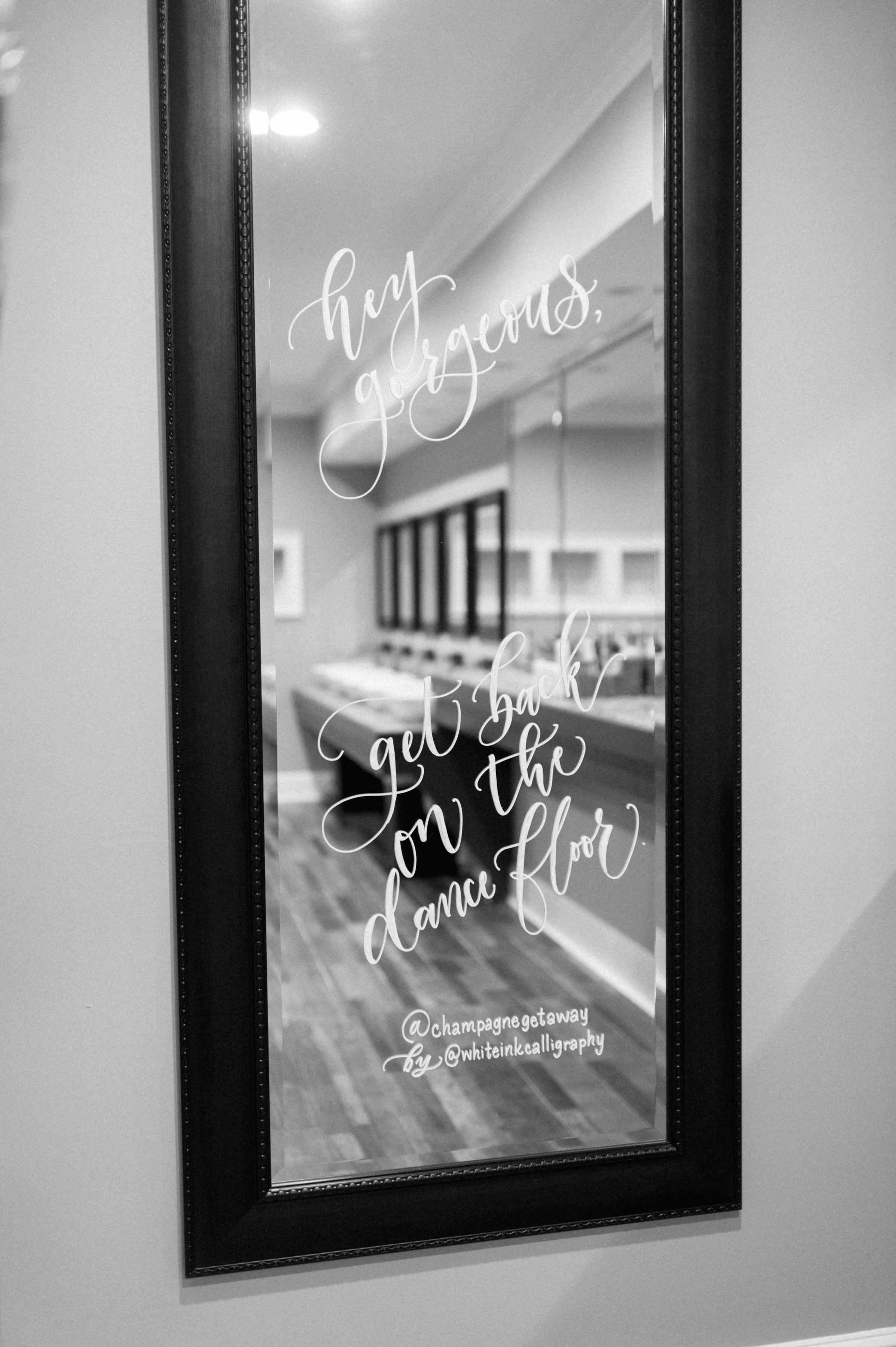
Want to know what’s kind of the cutest thing ever? Bathroom selfie lettering! Imagine taking a moment for a quick wardrobe check and being greeted with the message, “Hey gorgeous, get back on the dance floor” written on the bathroom mirror. You wouldn’t have to tell me twice! Wedding receptions need this energy.
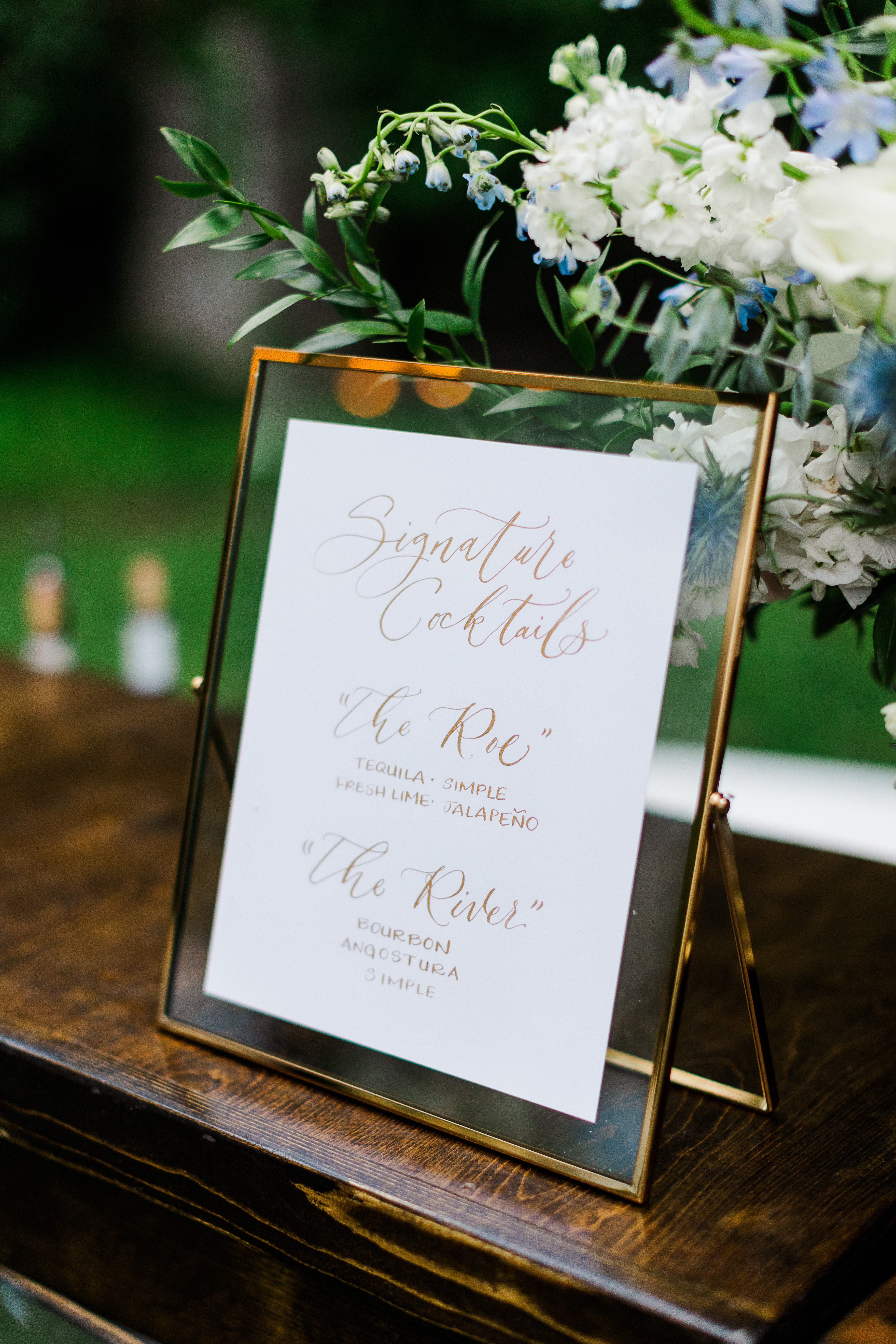
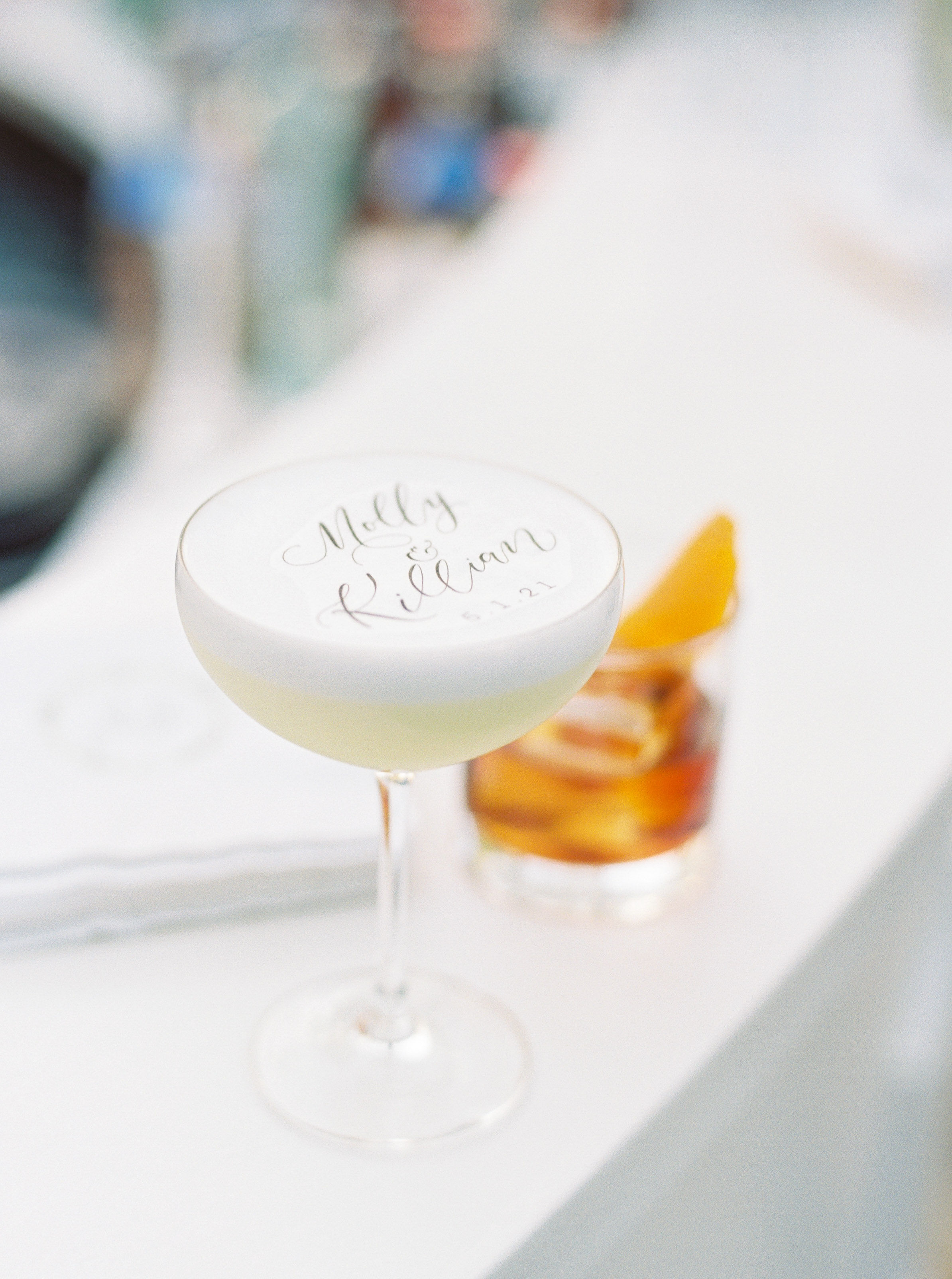
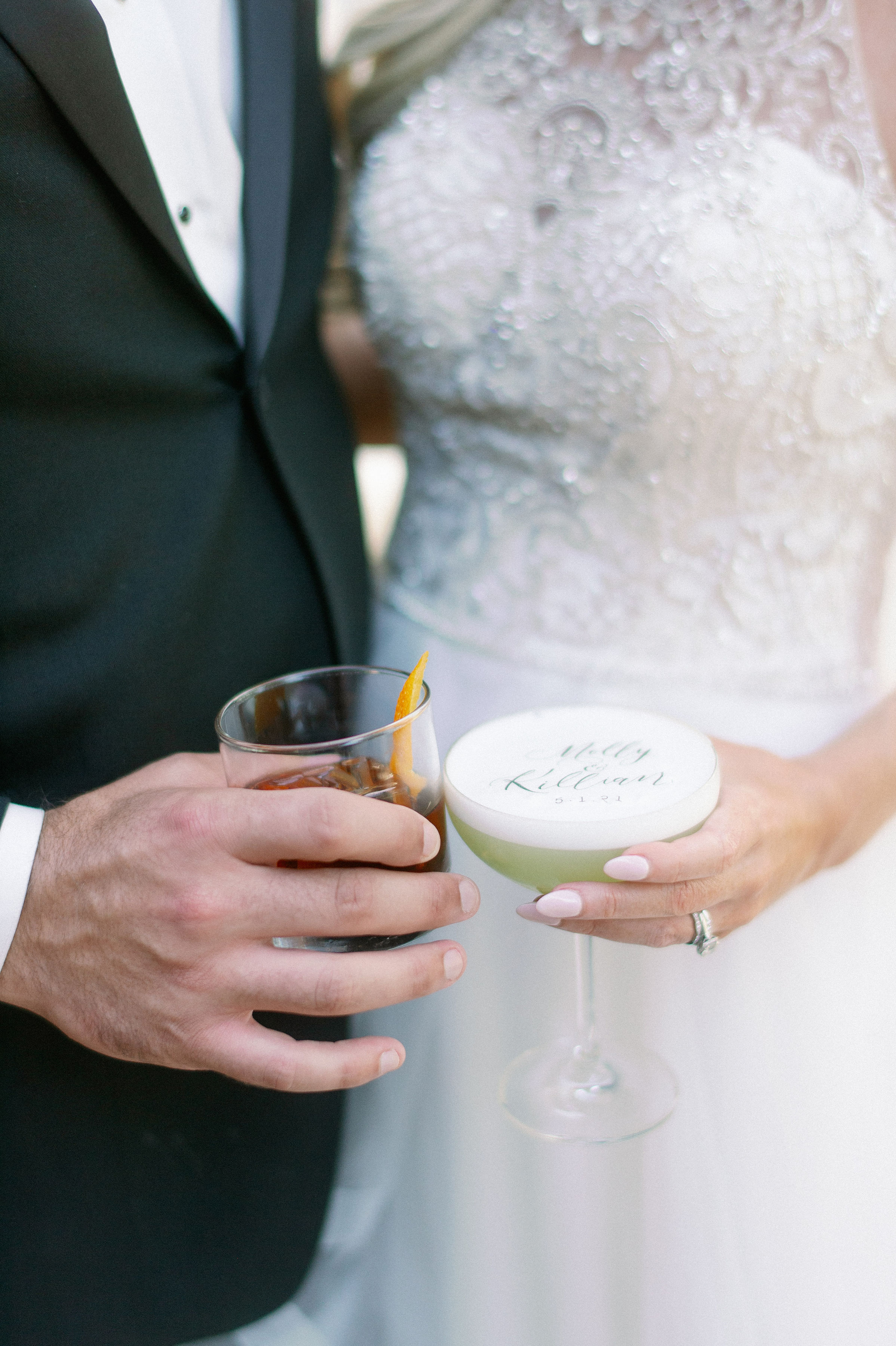
White Ink completed this dreamboat of a wedding by creating custom cocktail lettering! These are so, so fun to make. I absolutely love getting to do orders like this, partly because I know how much people are going to enjoy it. I promise you if this is ever something you choose to add to your cocktail hour, your guests will be impressed!
Cheers to the happy couple! And thank you for all the timeless wedding inspo!