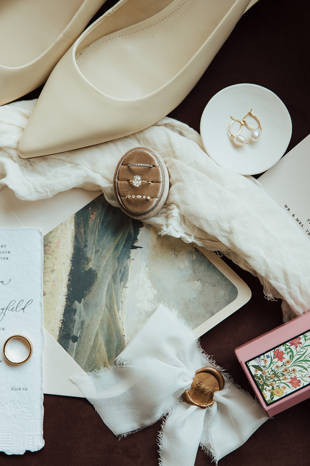
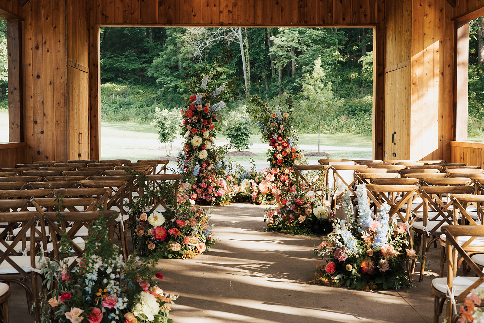
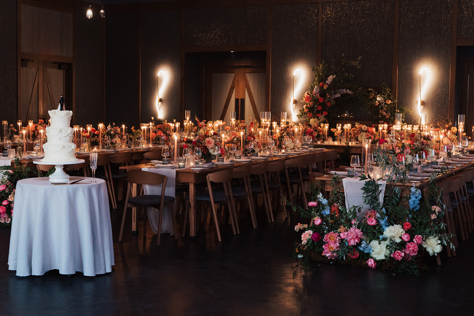
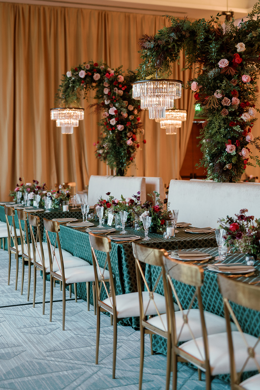
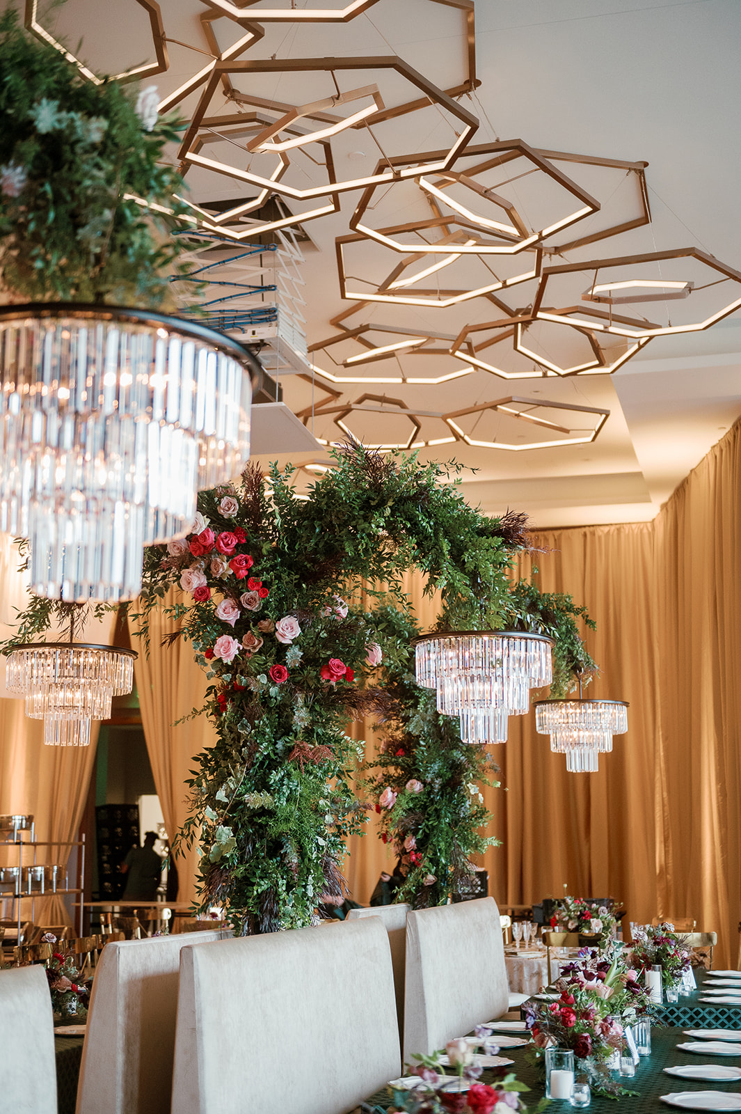
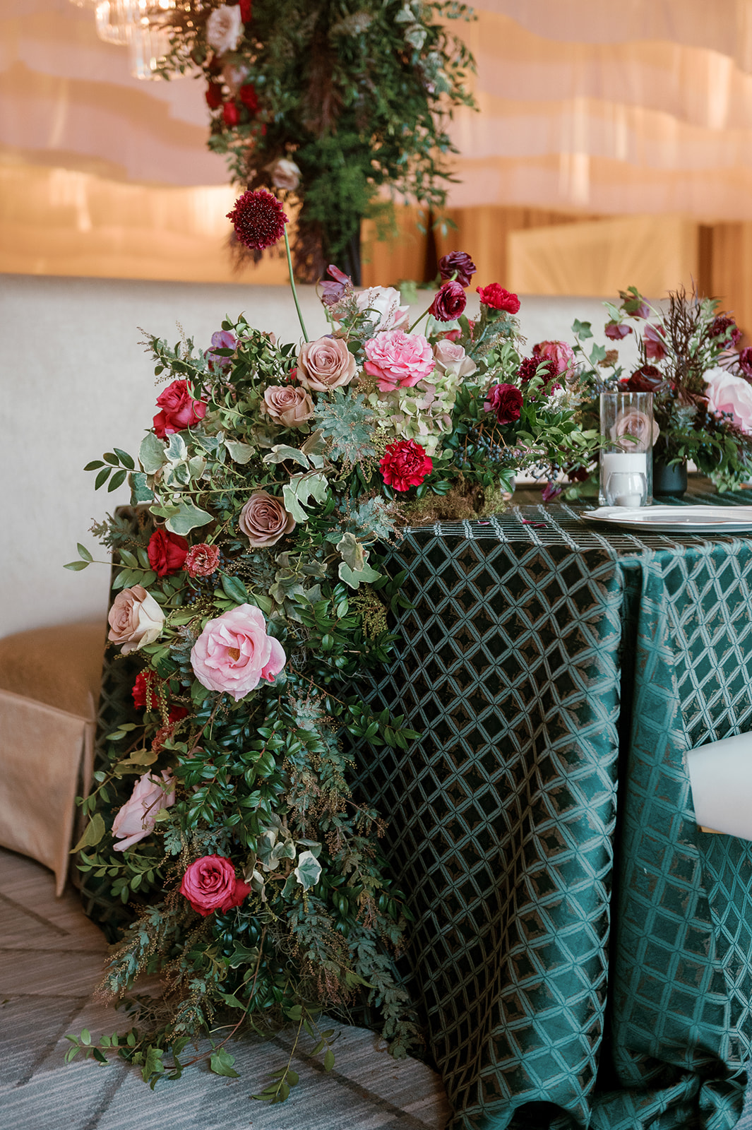
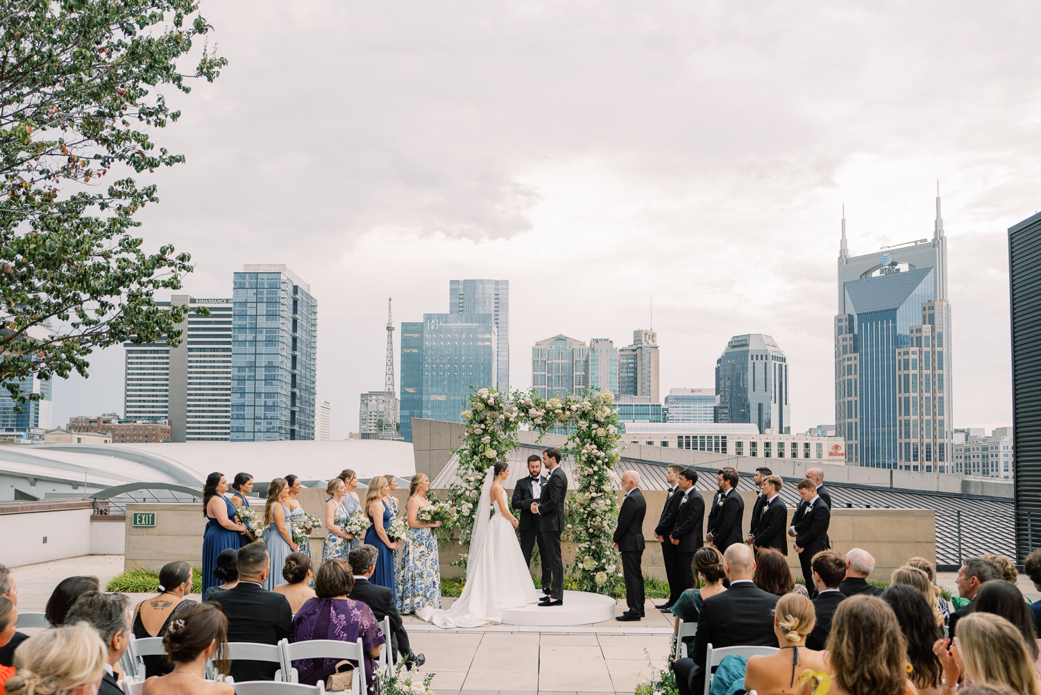
We are back at the enchanting Southall Farm and Inn as we take part in elevating the gorgeous wedding of White Ink couple, Brittanie and Tristen. This wedding touches all the senses, as textures and colors burst throughout the Franklin, TN venue.For this elegant, black tie wedding, we created several fun and unique textured details. From fabric signs to stone table numbers, we loved putting all our creative energy to use to make their vision come alive.
Elegant Wedding Invitation Suite
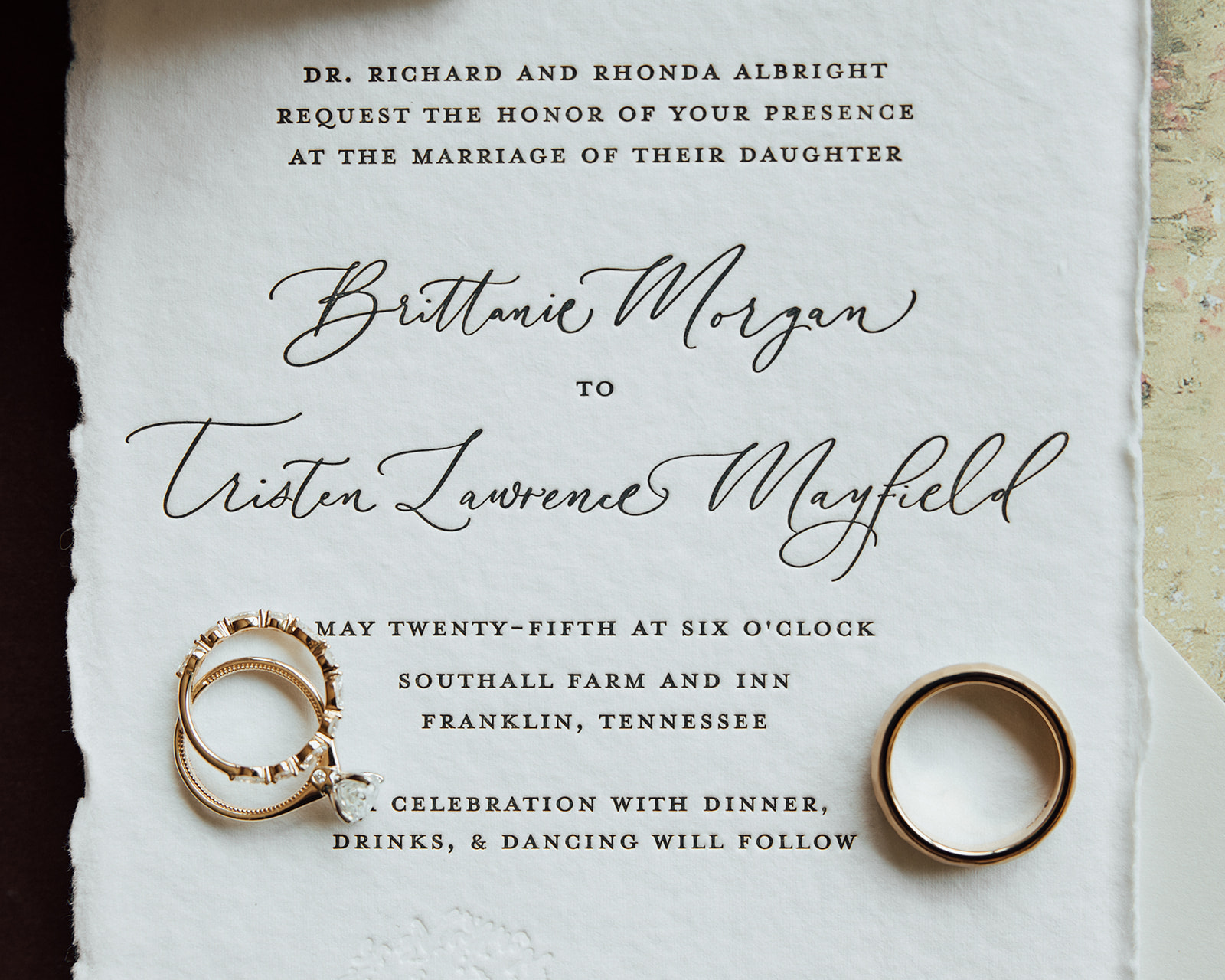
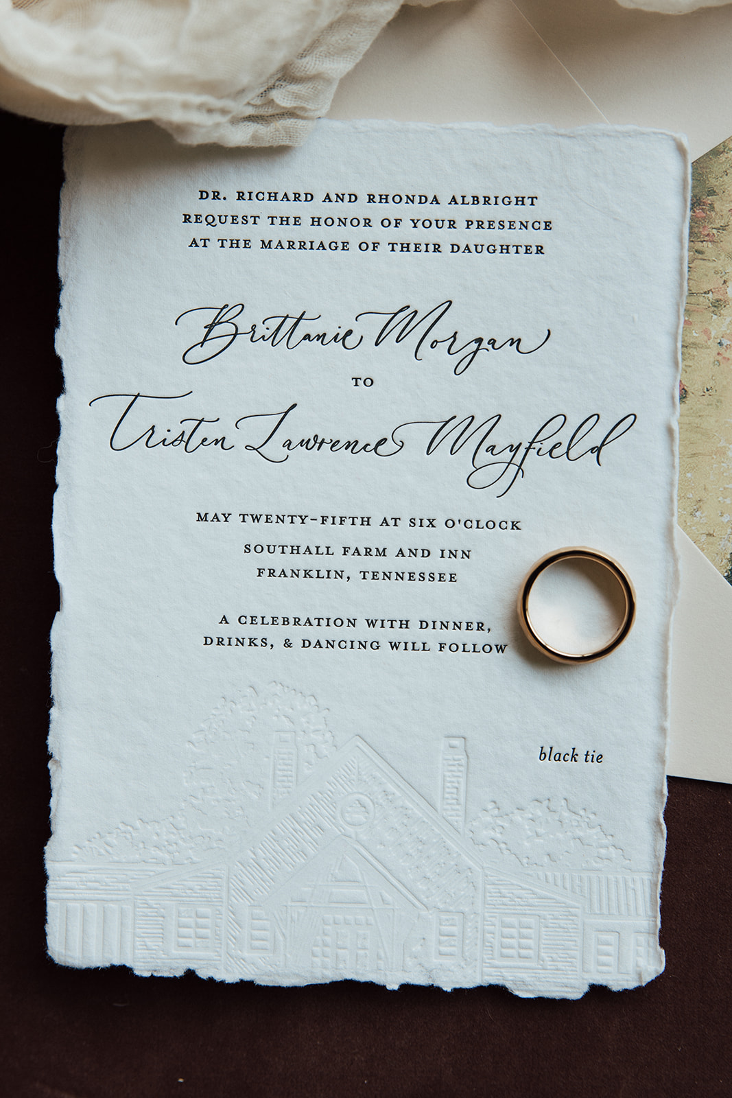
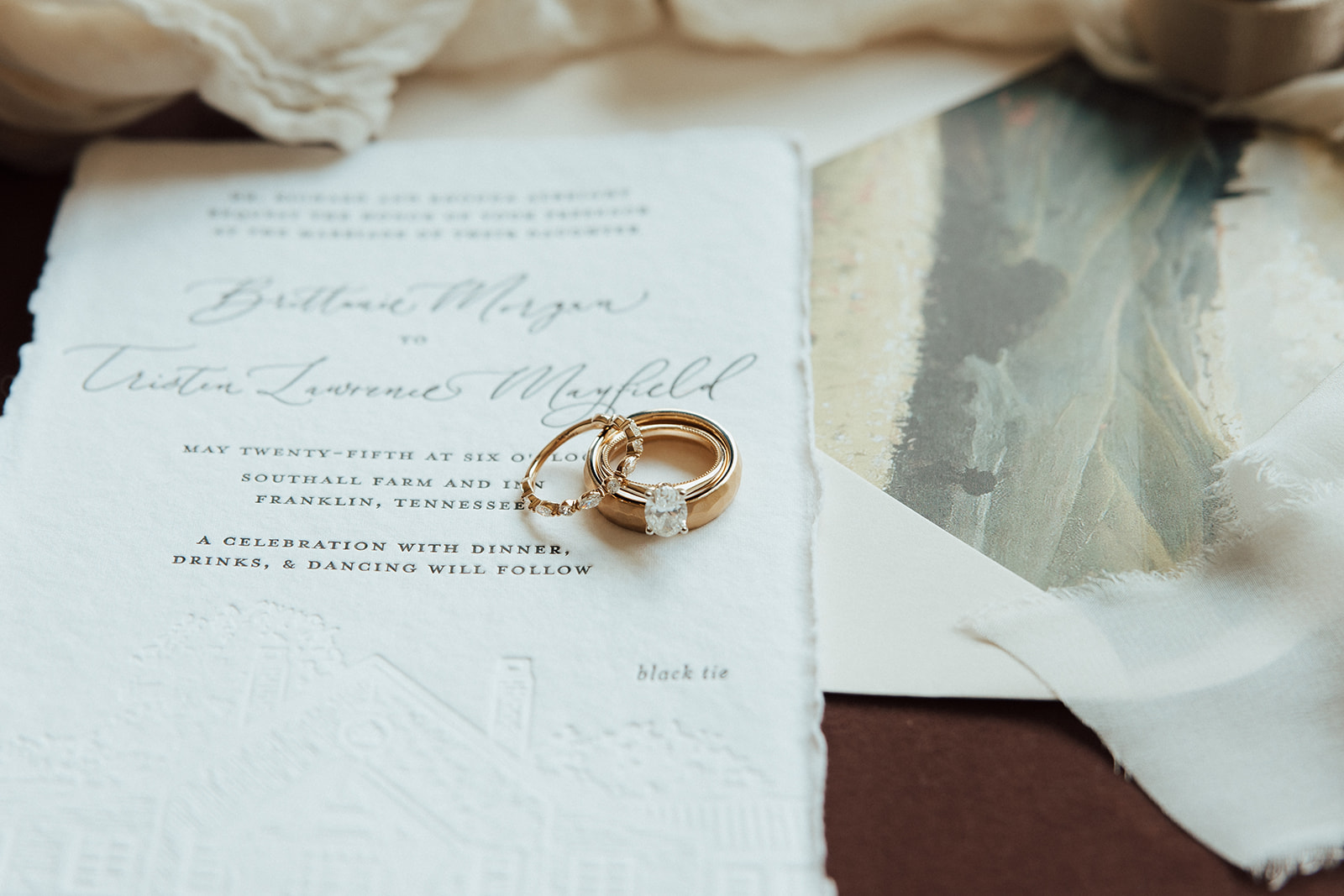
Brittanie and Tristen’s invitation complete with letterpress on hand-torn stock card created an incredibly elegant feel and look for their big day. Wedding invites have the power to truly set the tone for the entire event. I love when our couples understand how important it is to not skip the delicate details that give their guests the very first impression of what’s to come.
Note the pressed image of the Southall venue gently placed over the invite. It’s a small yet mighty detail that makes this invite one-of-a-kind.
Another detail that we must highlight in this suite is the beautiful envelope liner. In my opinion, envelope liners are simply a must, especially when finding ways to customize your wedding invitation suite. I like to think of it as the lining of a fancy jacket; it’s a place to pull in color and even have some fun and make it yours!
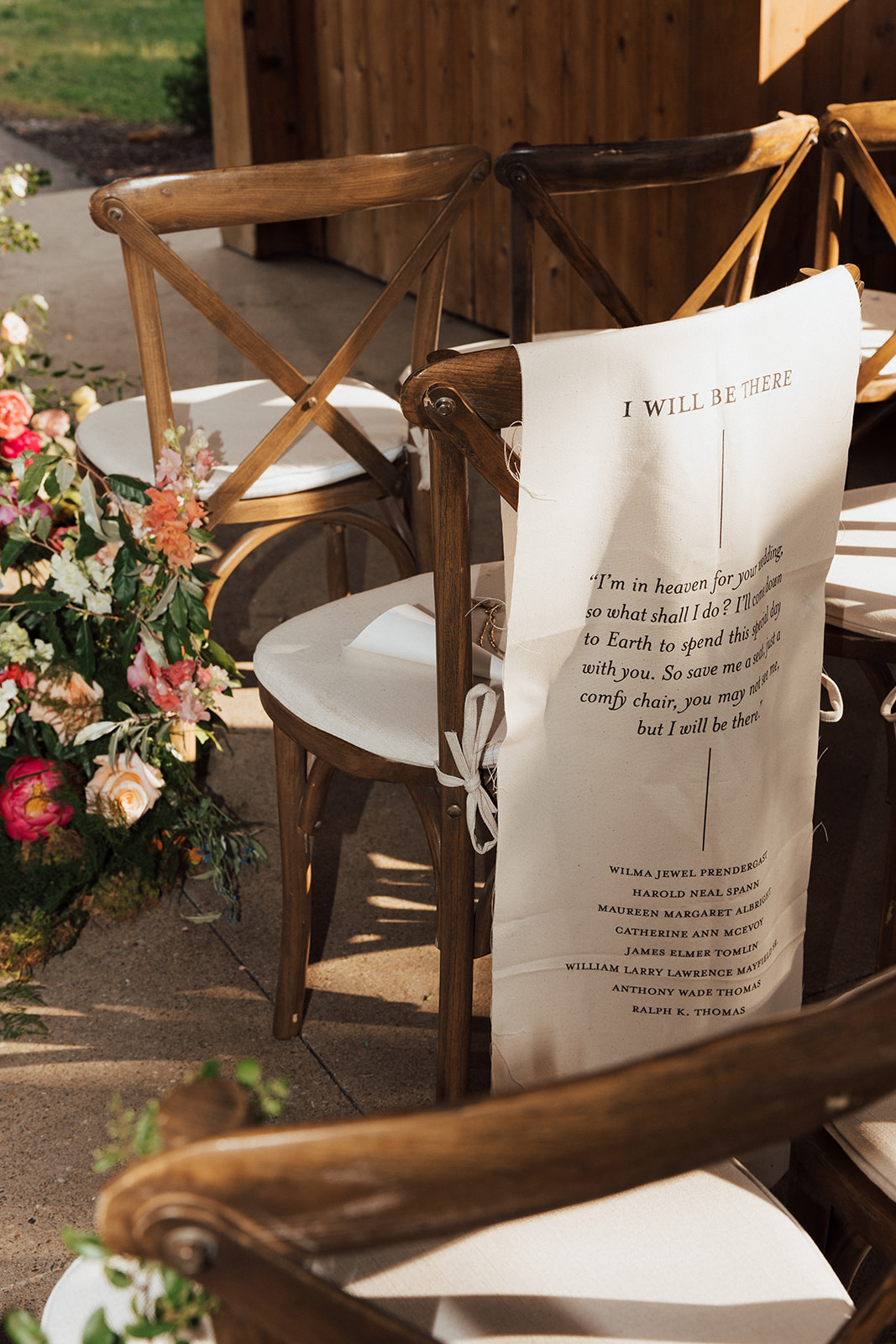
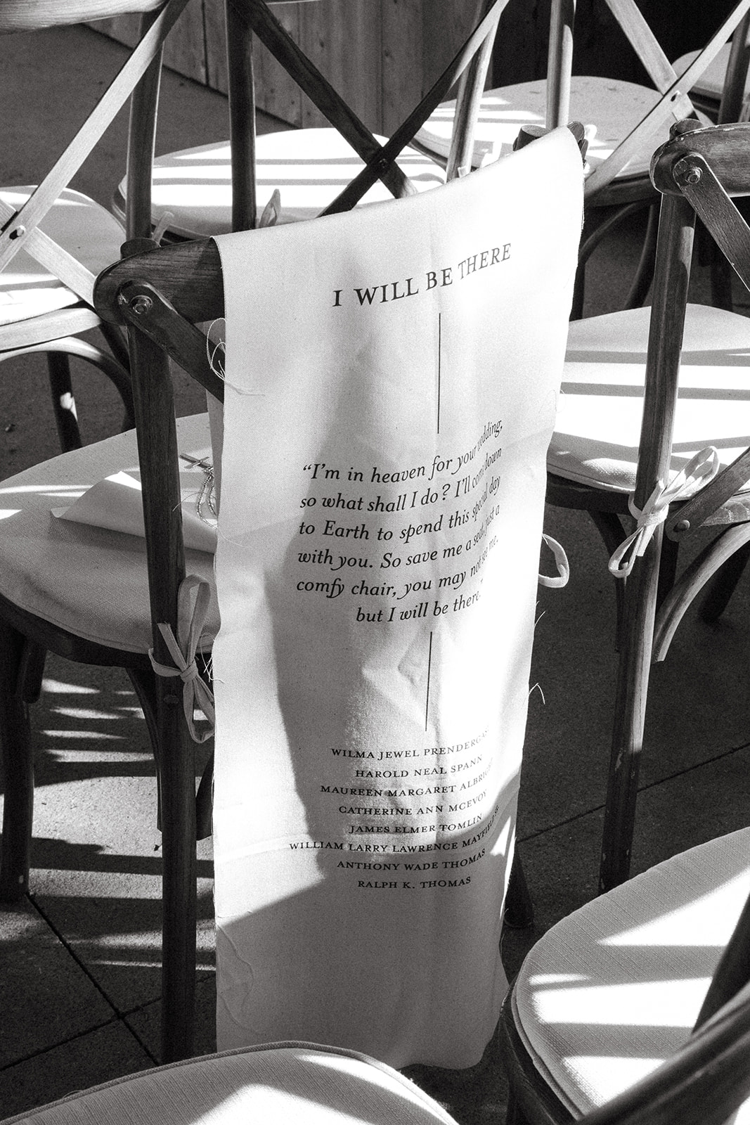
“I’m in heaven for your wedding, so what shall I do? I’ll come back to earth to spend it with you. So save me a seat, just a comfy chair, you may not see me, but I will be there.” This touching poem was placed on a fabric banner along with the names of those from Brittanie and Tristen’s life who have passed on. It was an honor for us at White Ink to be involved in such a sentimental part of the ceremony and create this loving gesture for our couple.
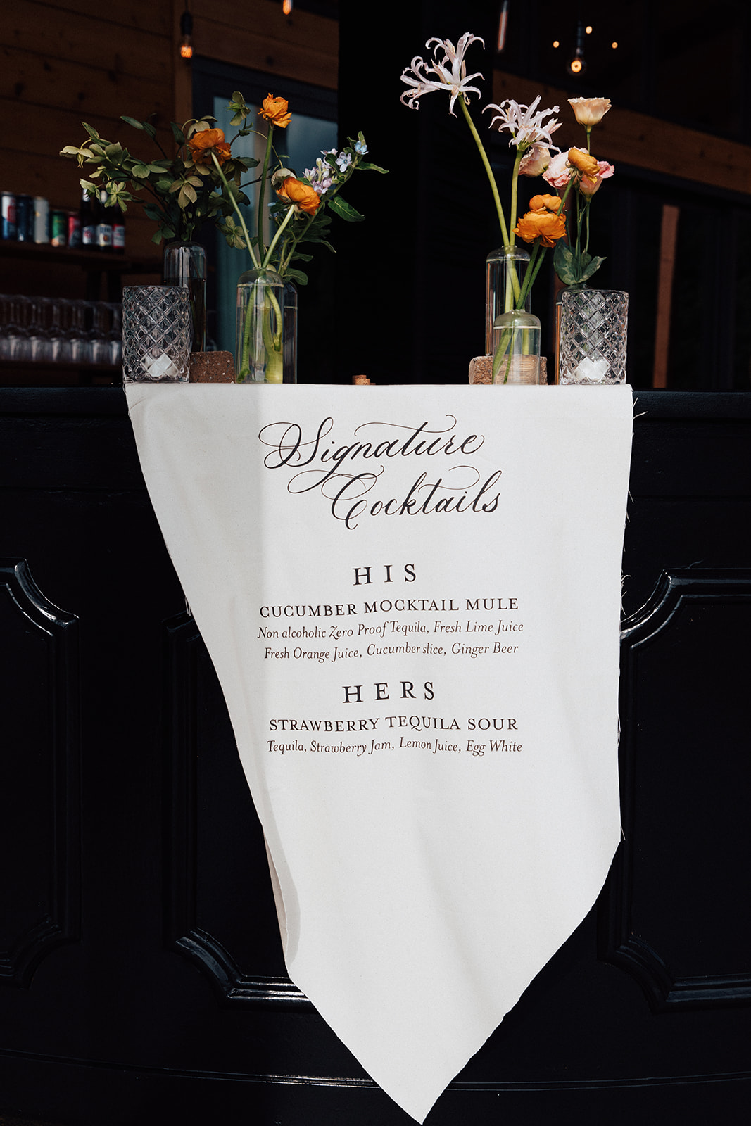
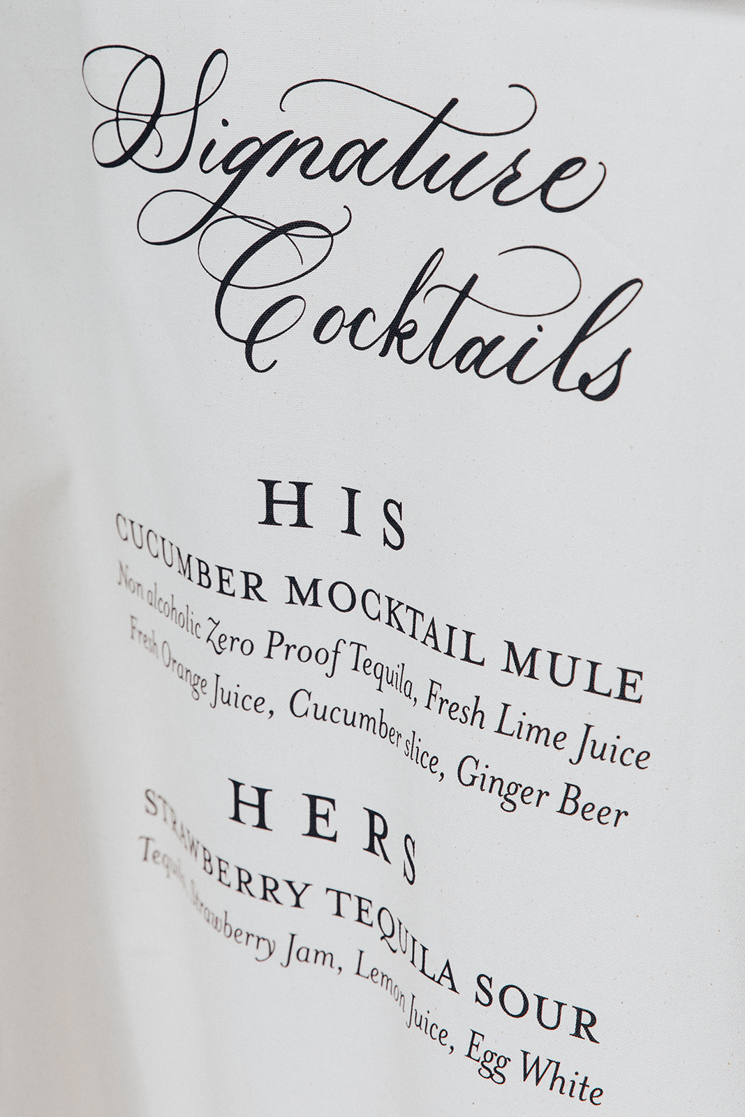
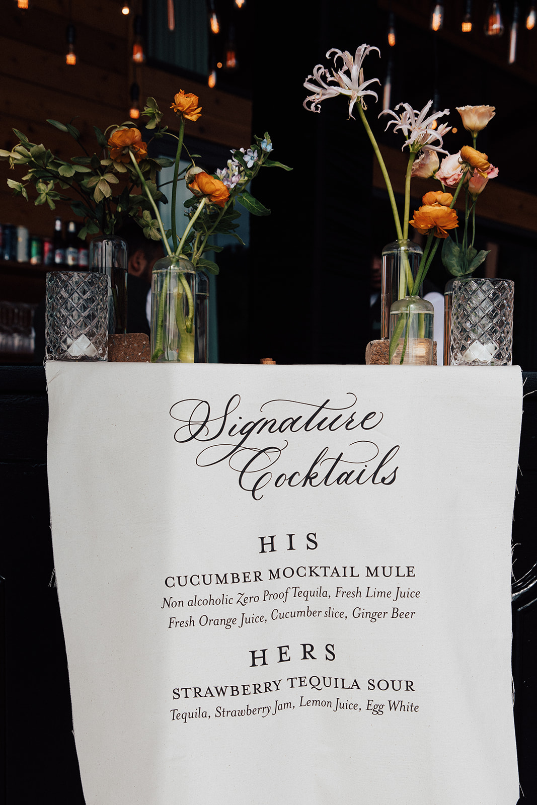
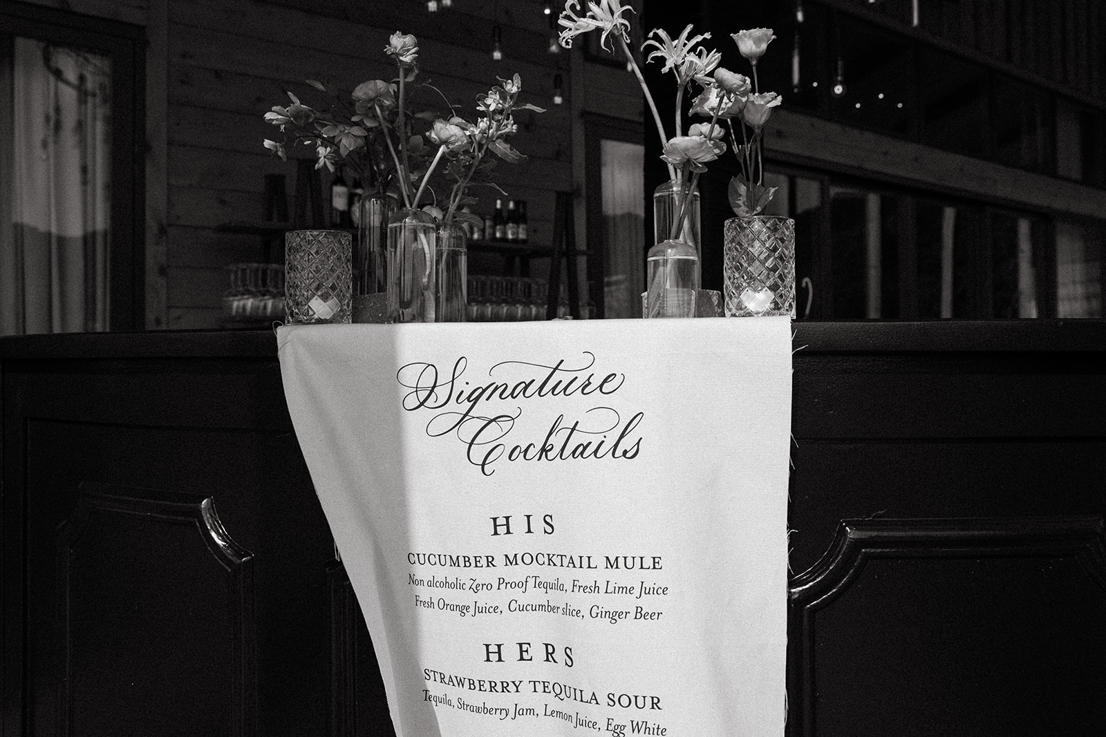
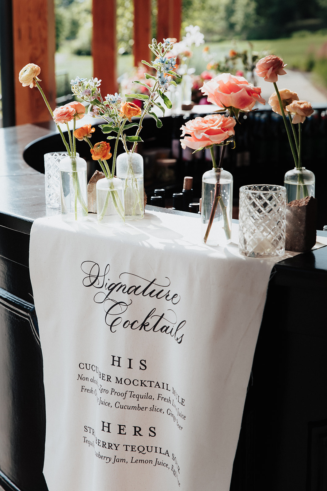
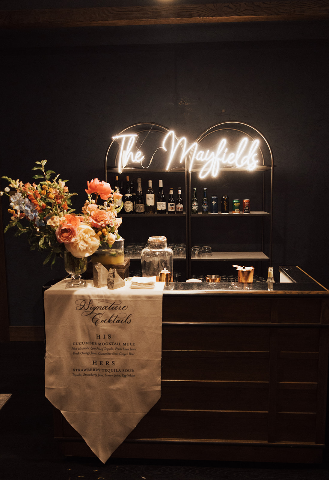
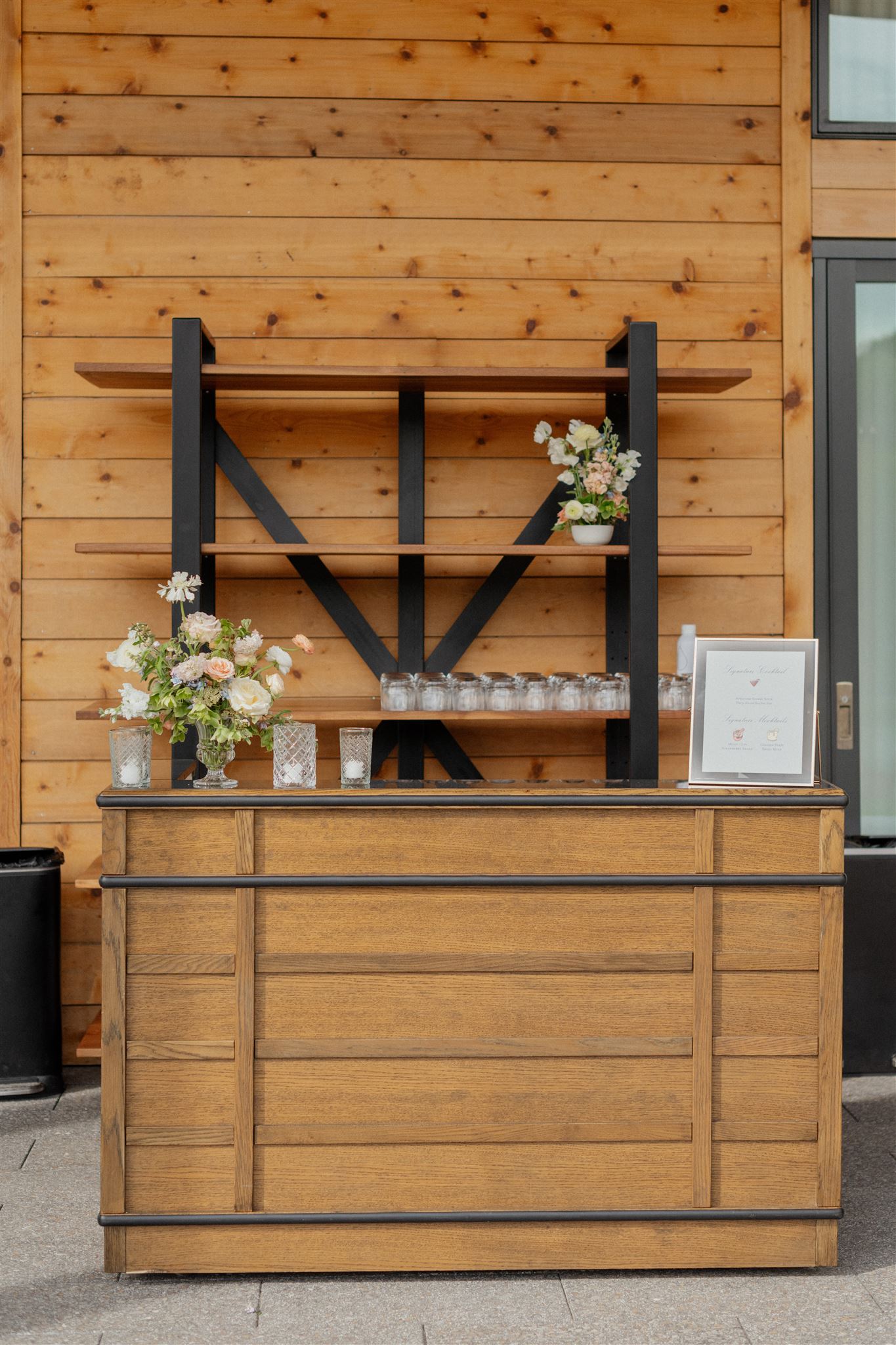
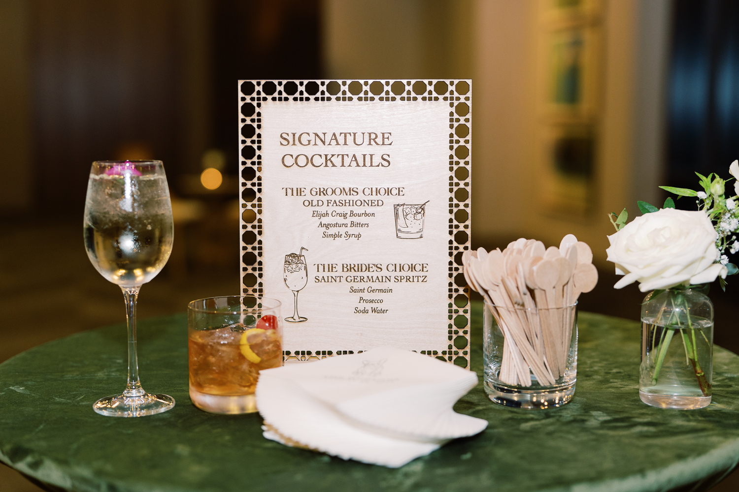
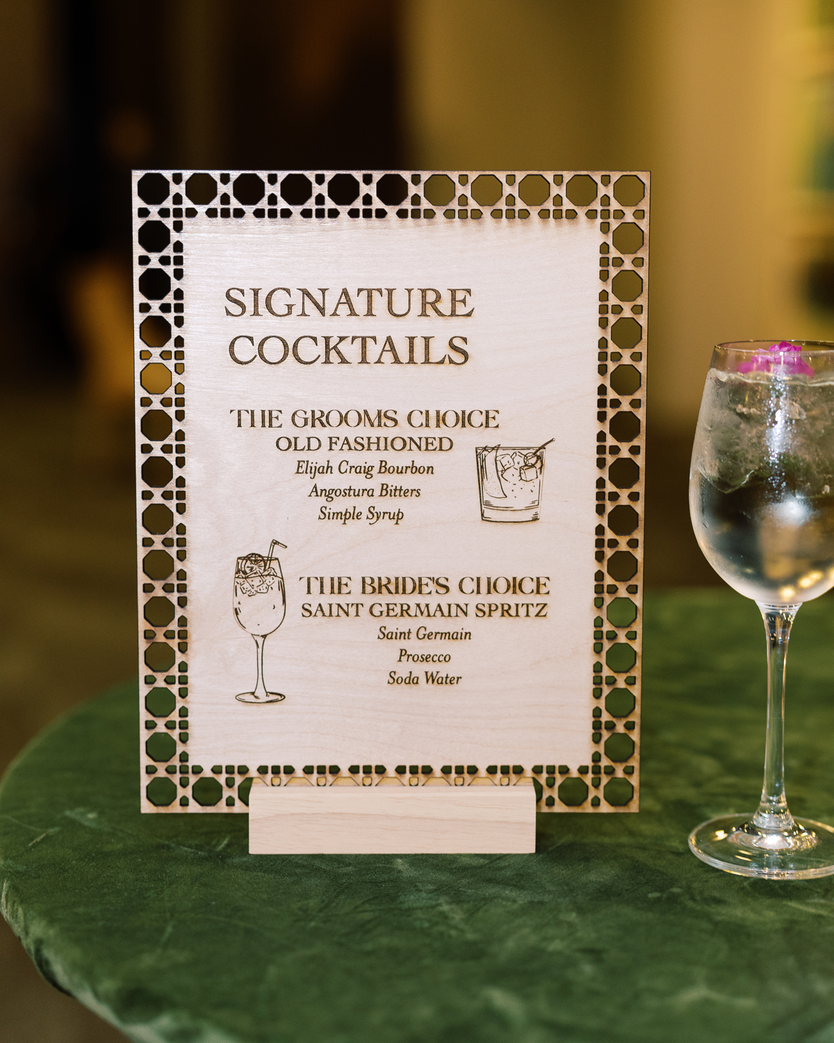
Custom Fabric Bar Sign
For cocktail hour, Brittanie and Tristen chose to utilize fabric for the custom bar sign. I like getting the chance to showcase our work as we step off the paper and onto other textures! The look of the fabric bar sign, on the thick wooden bar decorated with soft florals is perfectly inviting as guests make the transition from ceremony to reception. Also, I can guarantee guests will not forget a sign like this!
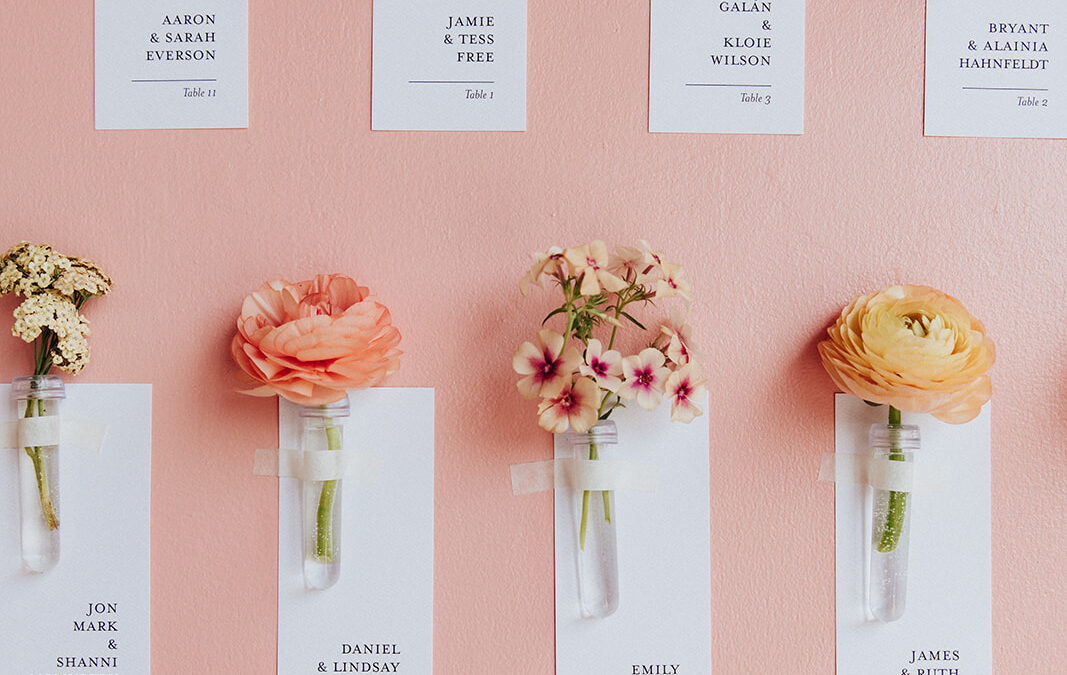
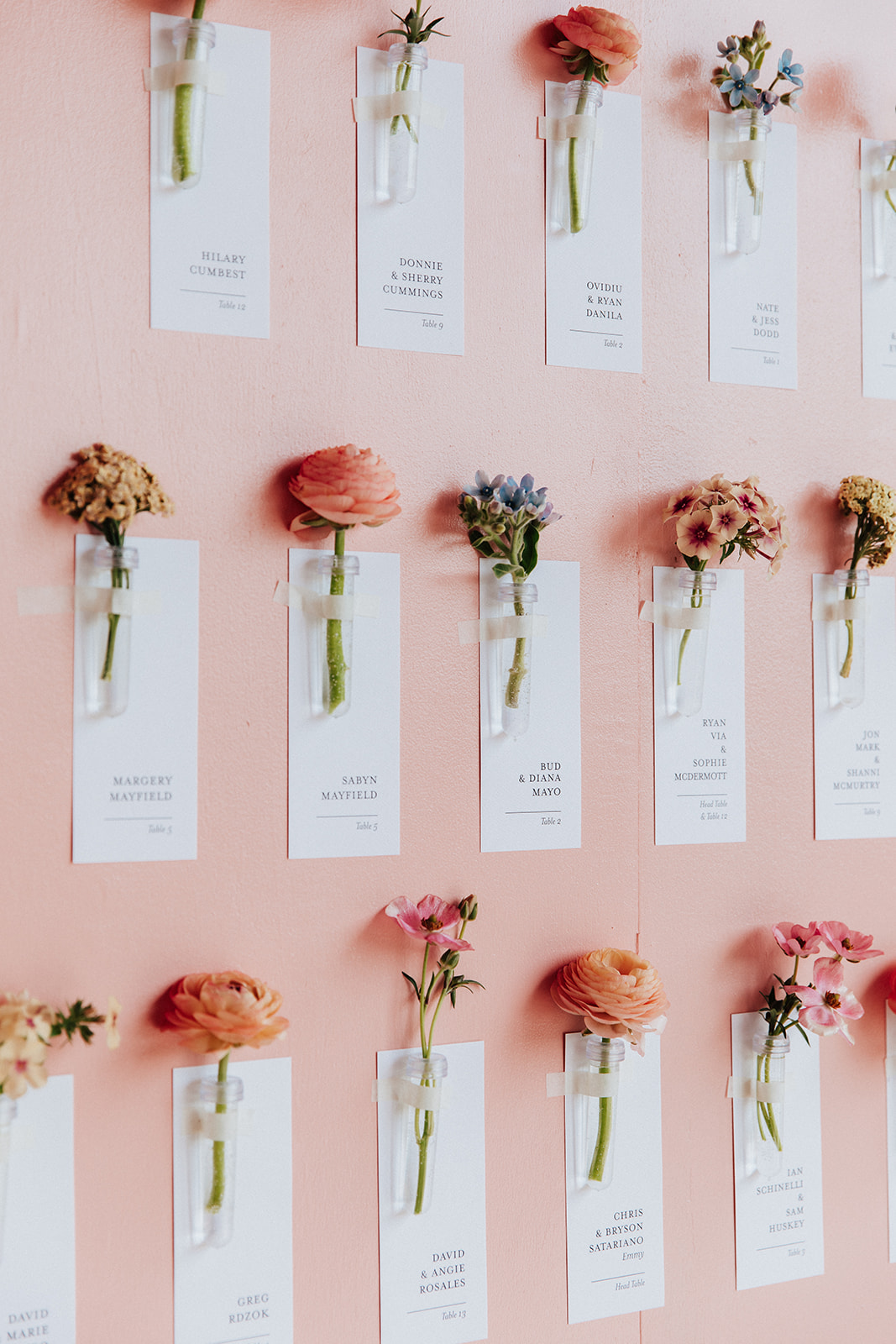
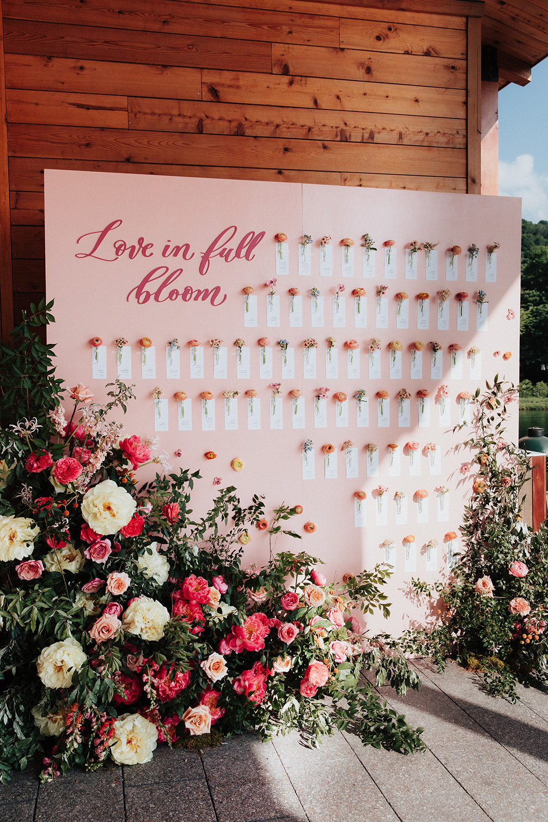
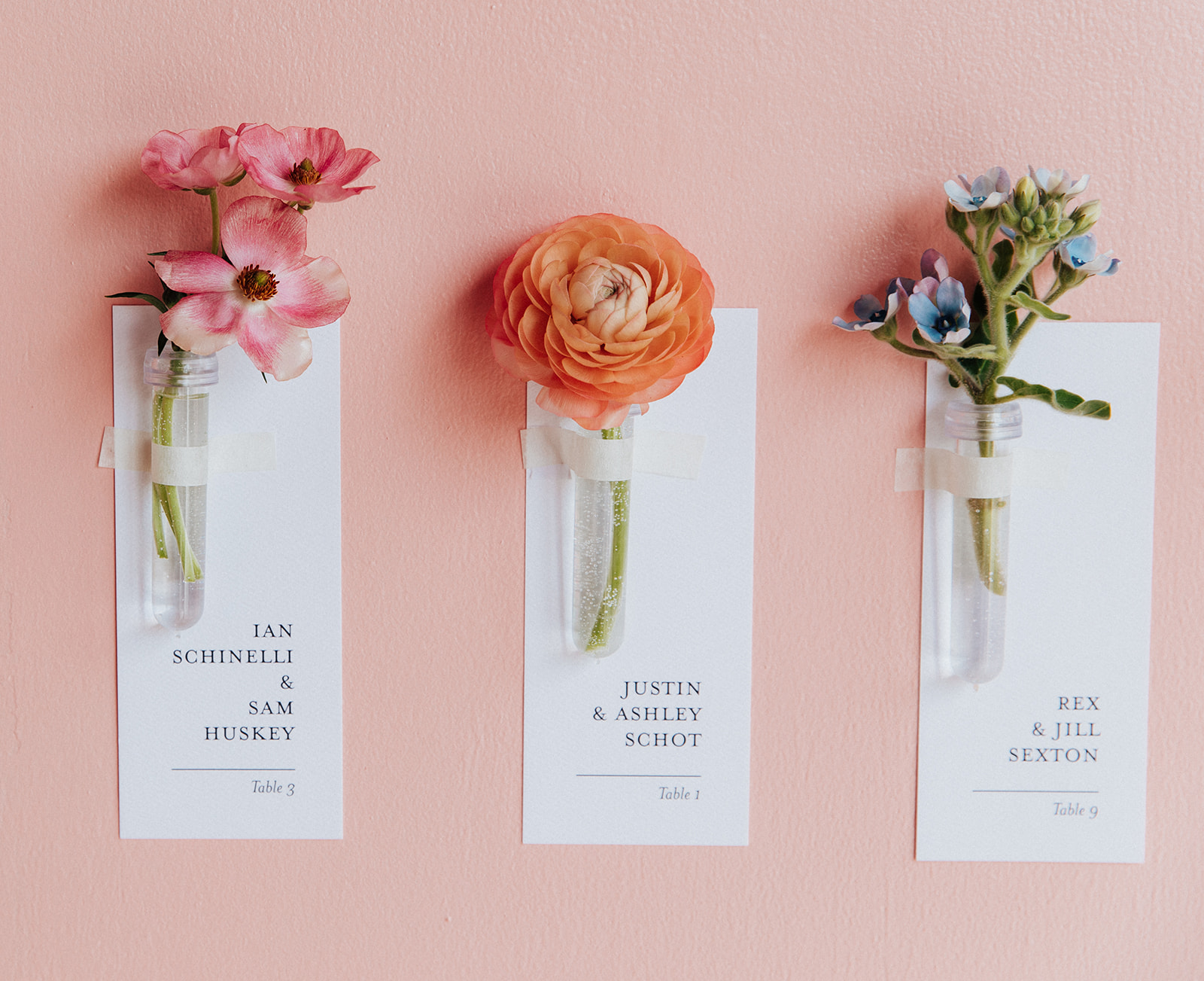
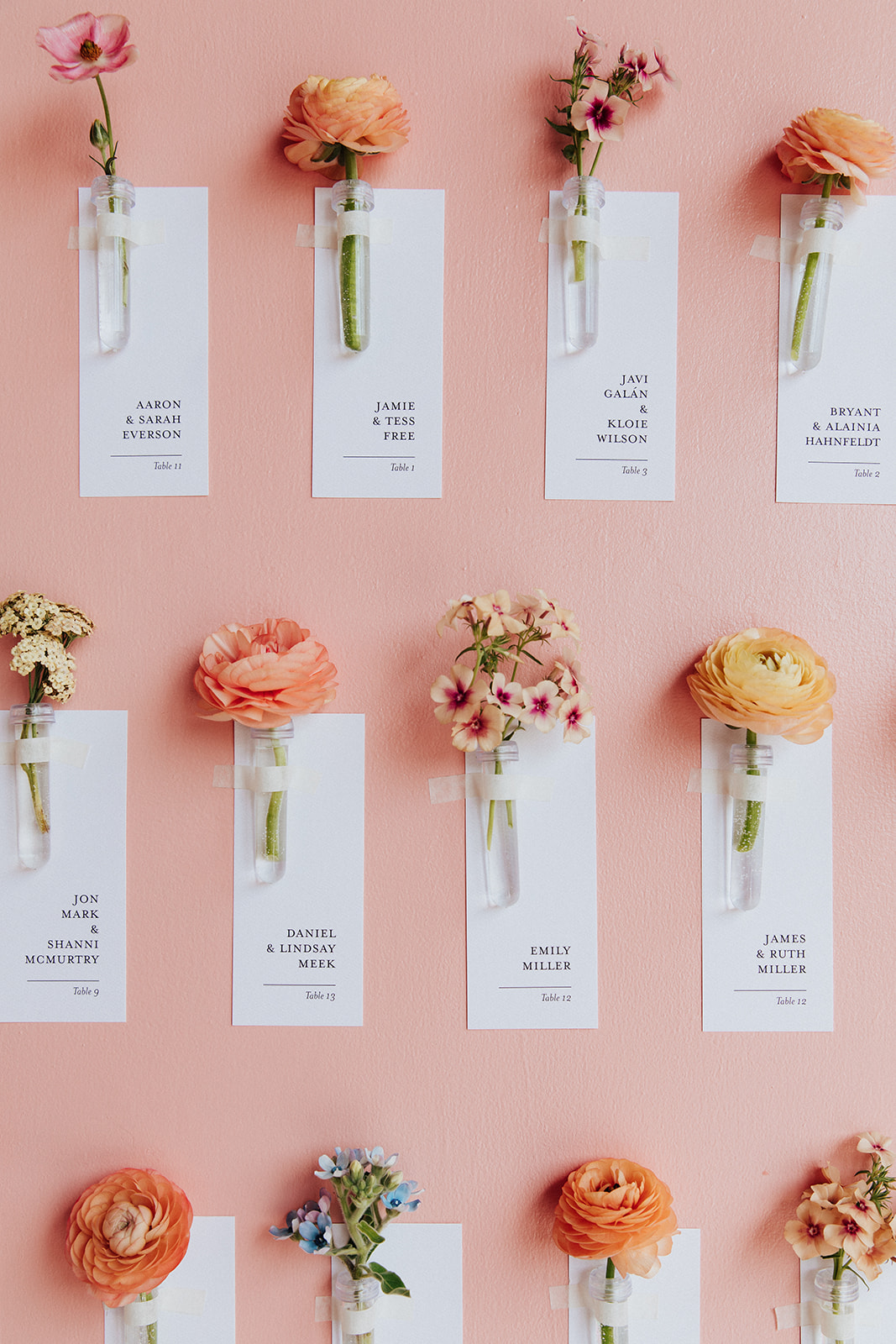
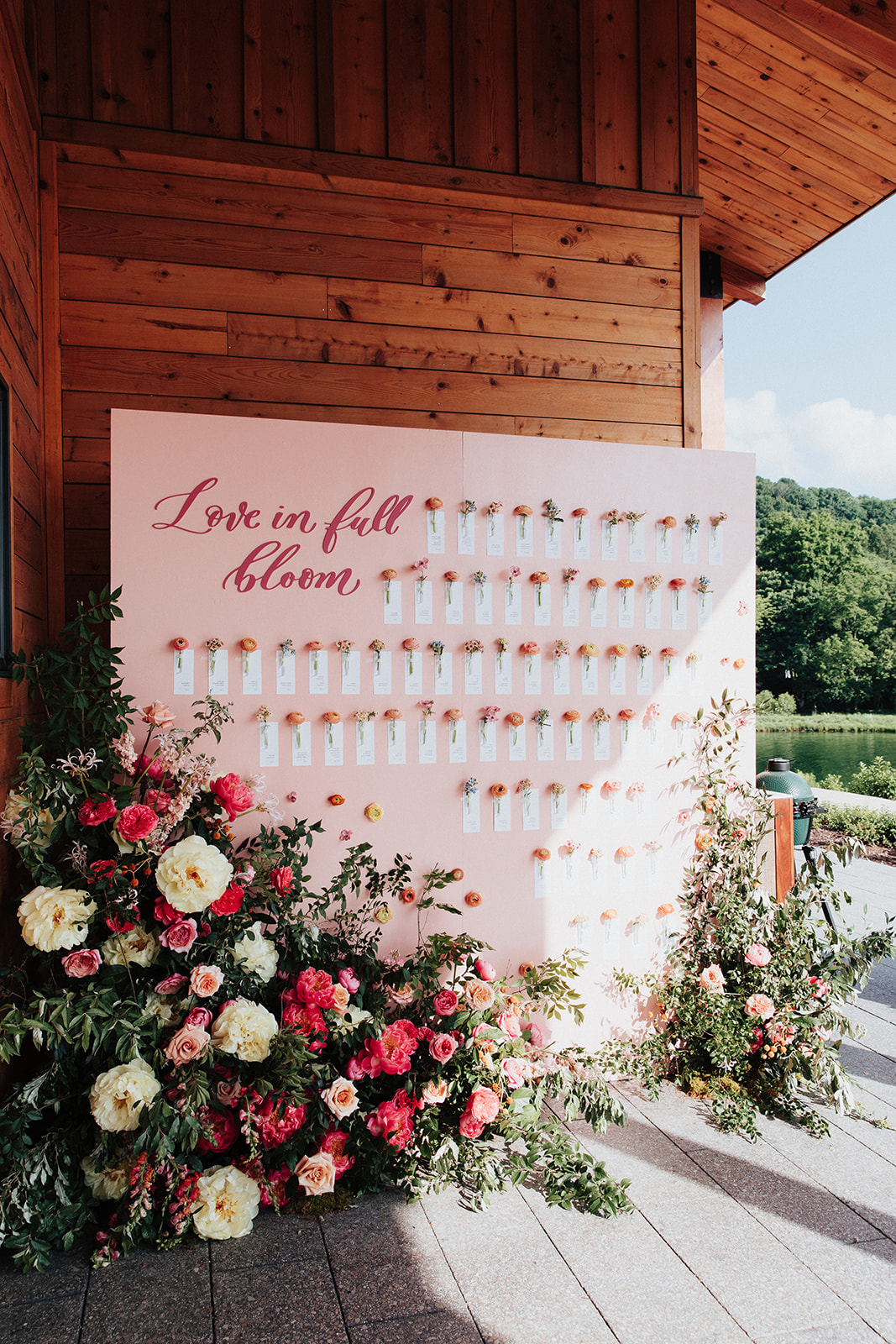
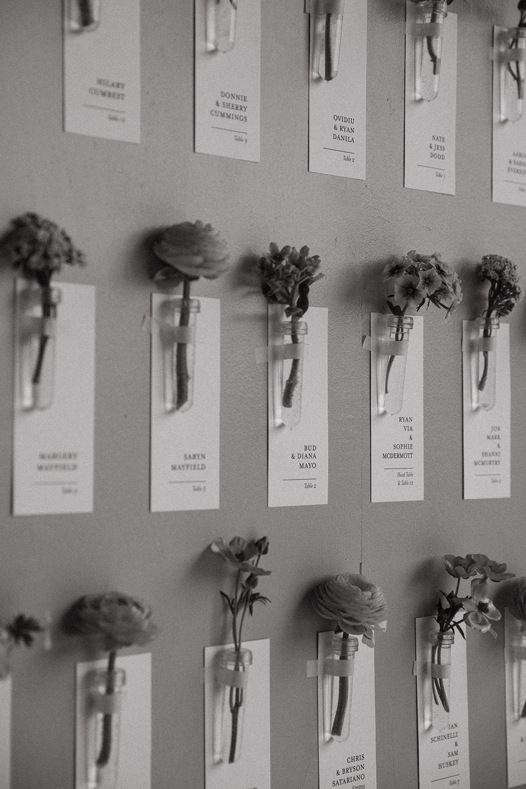
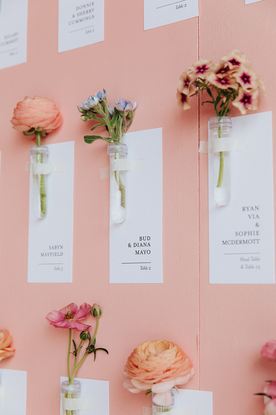
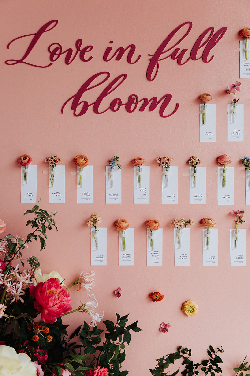
The title of this custom escort wall says it all: “Love in Full Bloom”. Brittanie and Tristen’s seating chart was so much fun to help create. As if the cascading florals all around aren’t enough to brighten this display, we kept it coming with custom escort cards attached to individual flowers. I like to think of them as small tokens to carry on the mood and energy of this fantastic day.
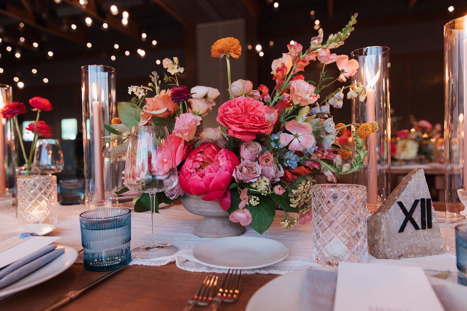
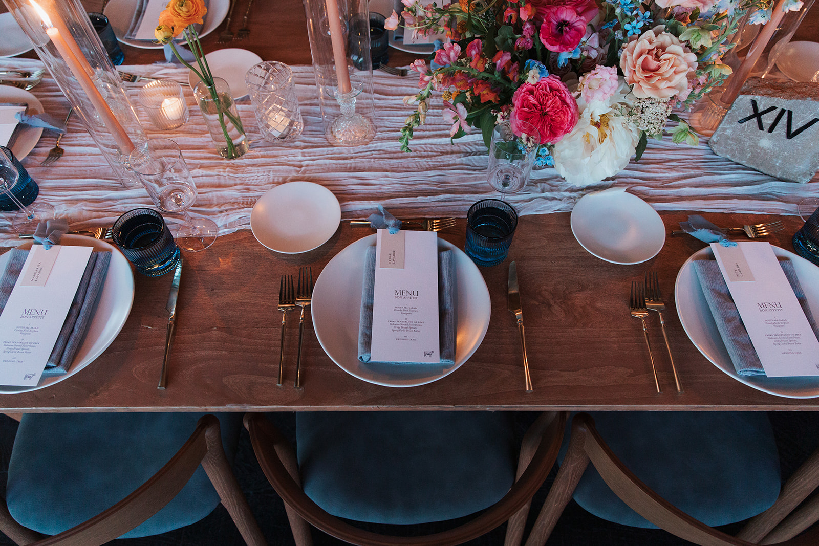
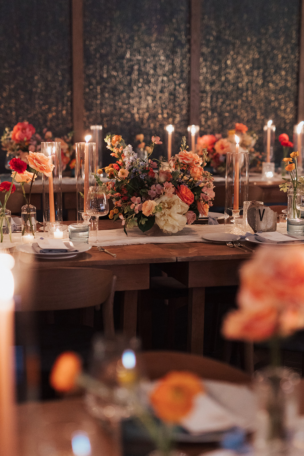
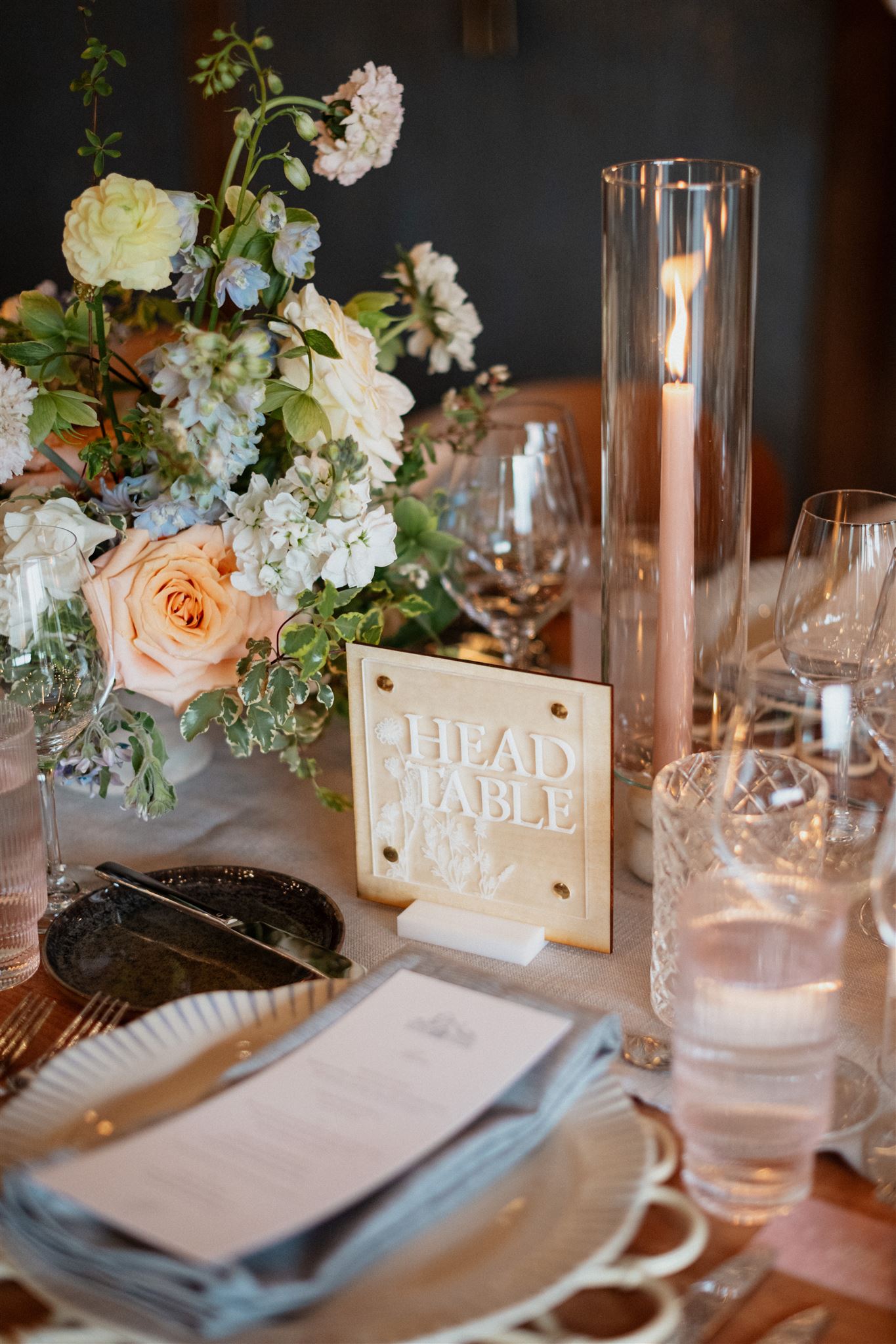
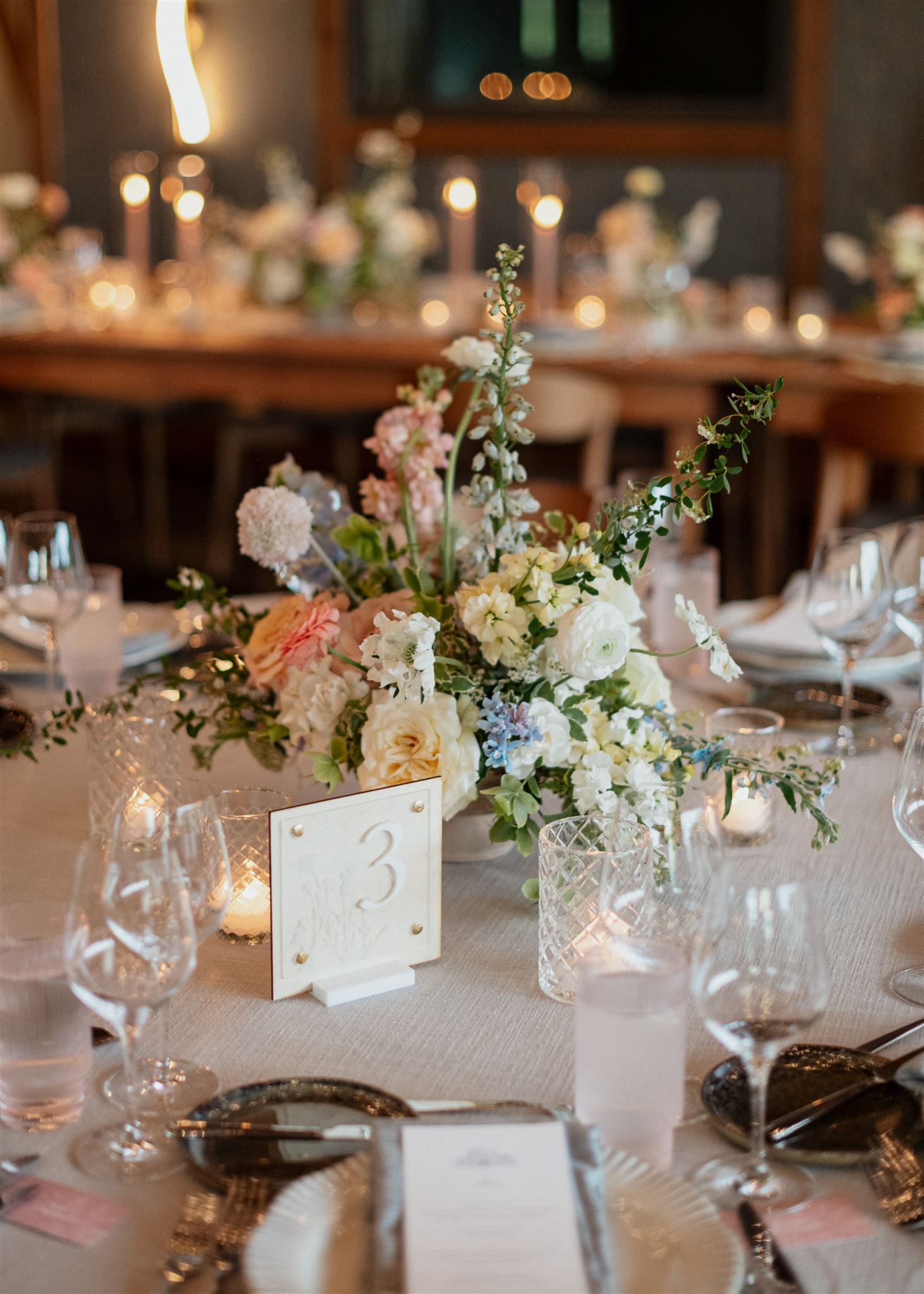
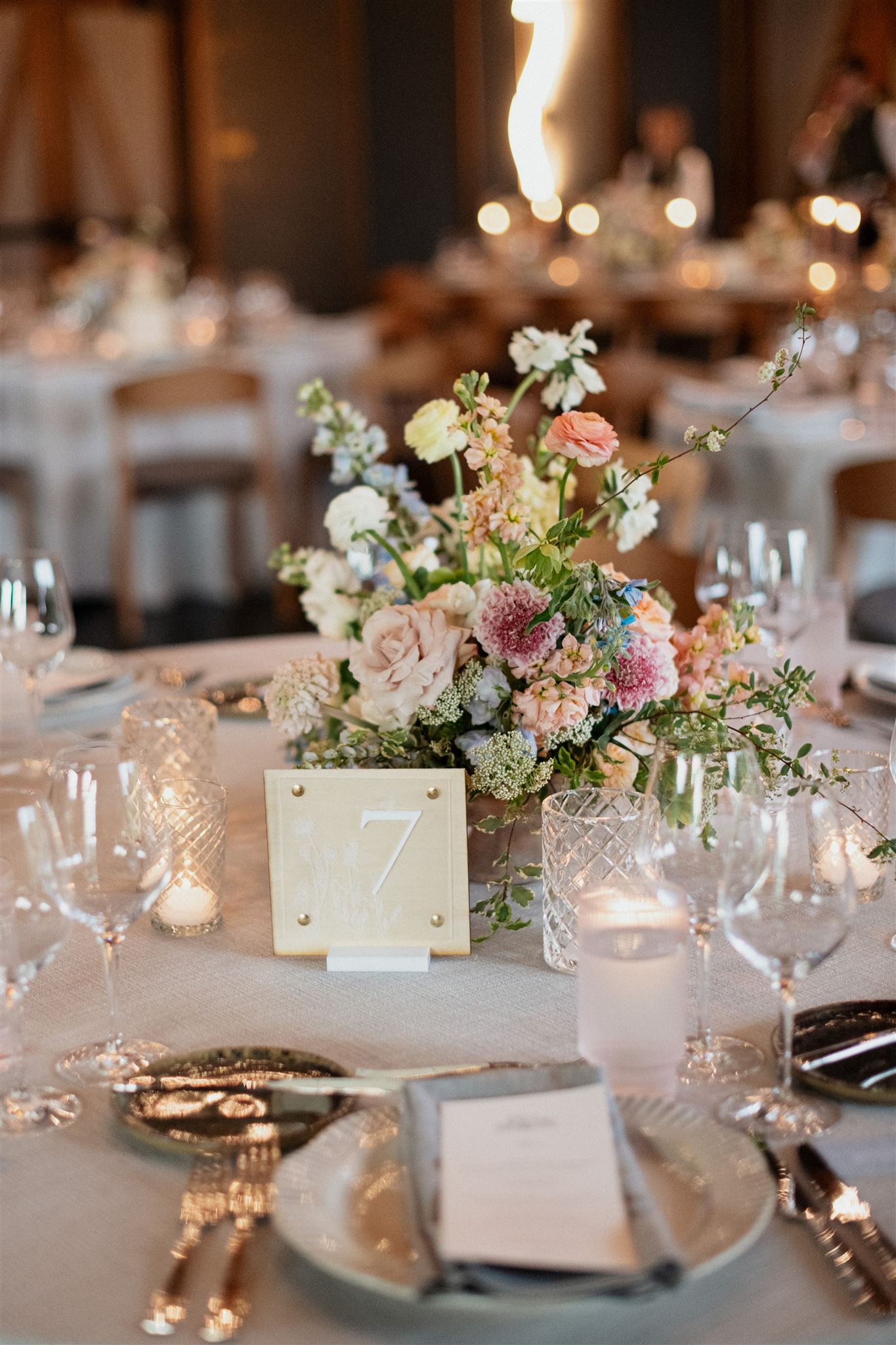
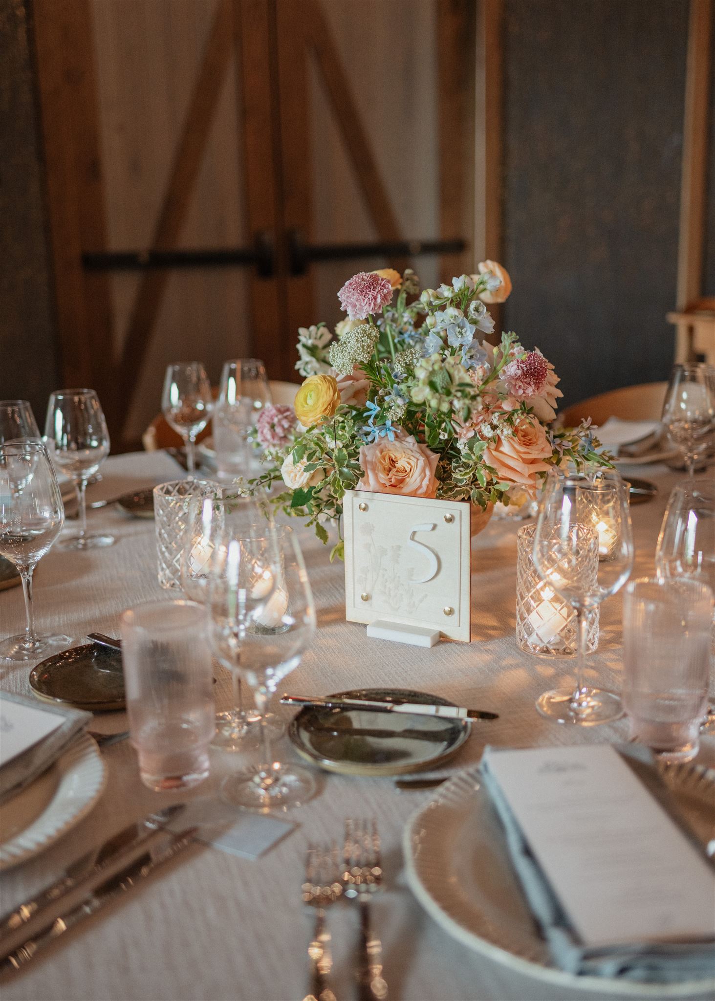
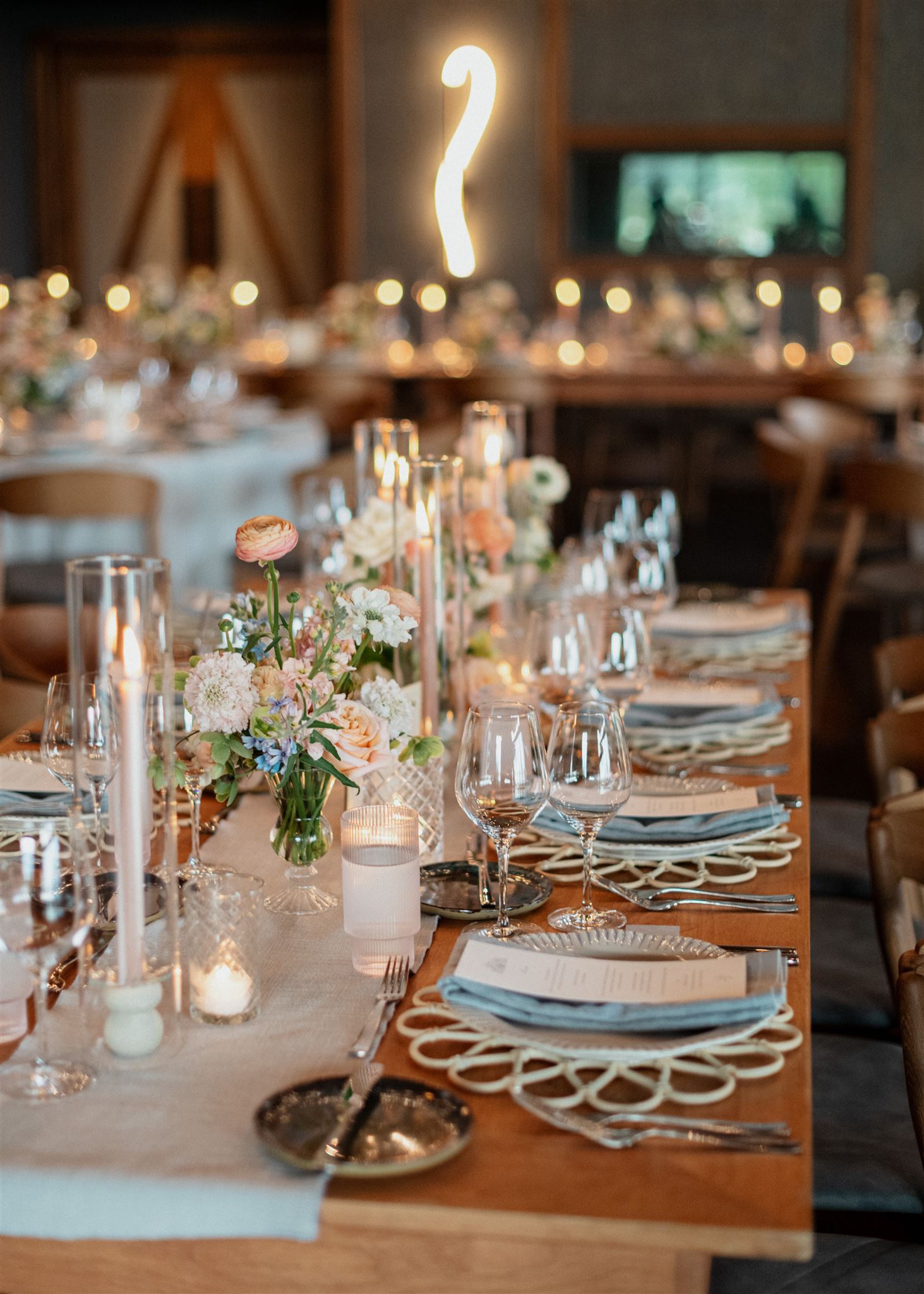
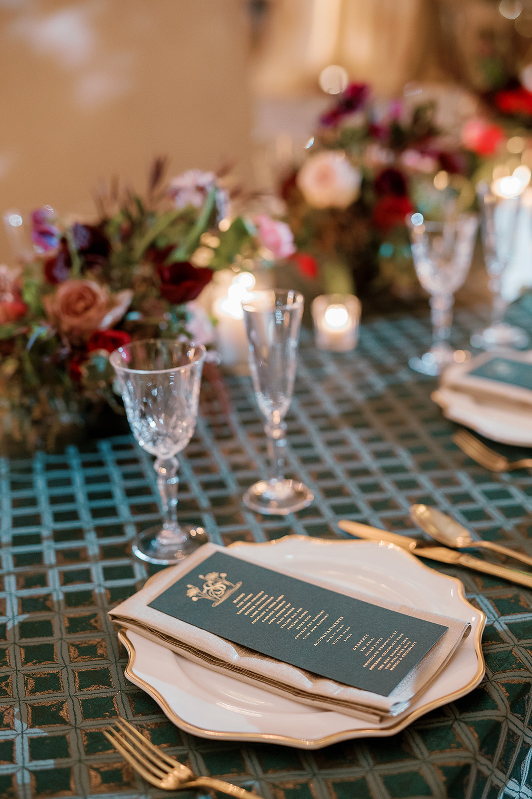
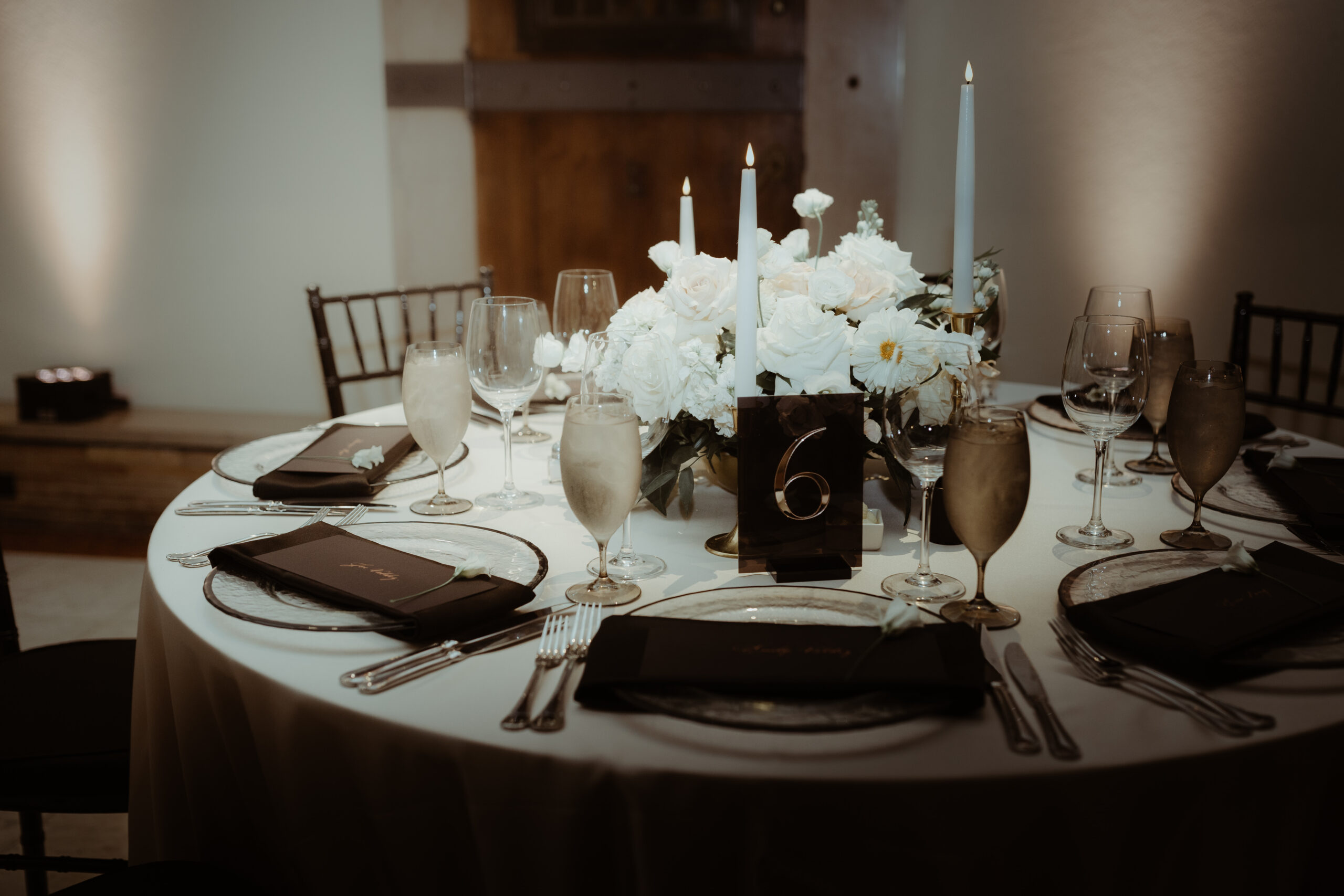
Textured Reception Details
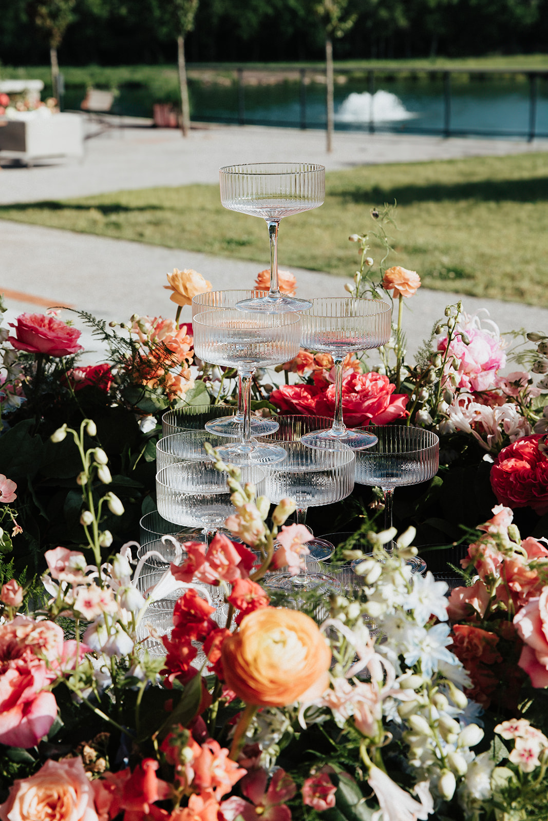
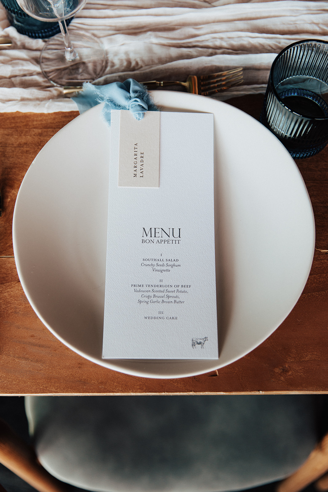
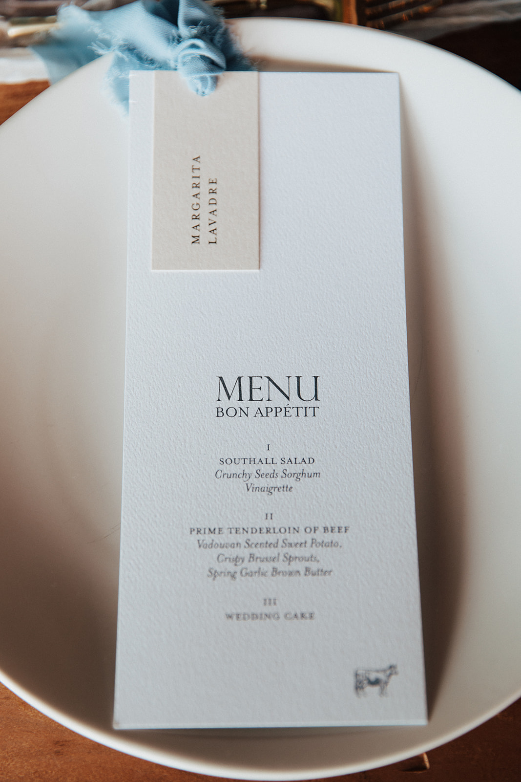
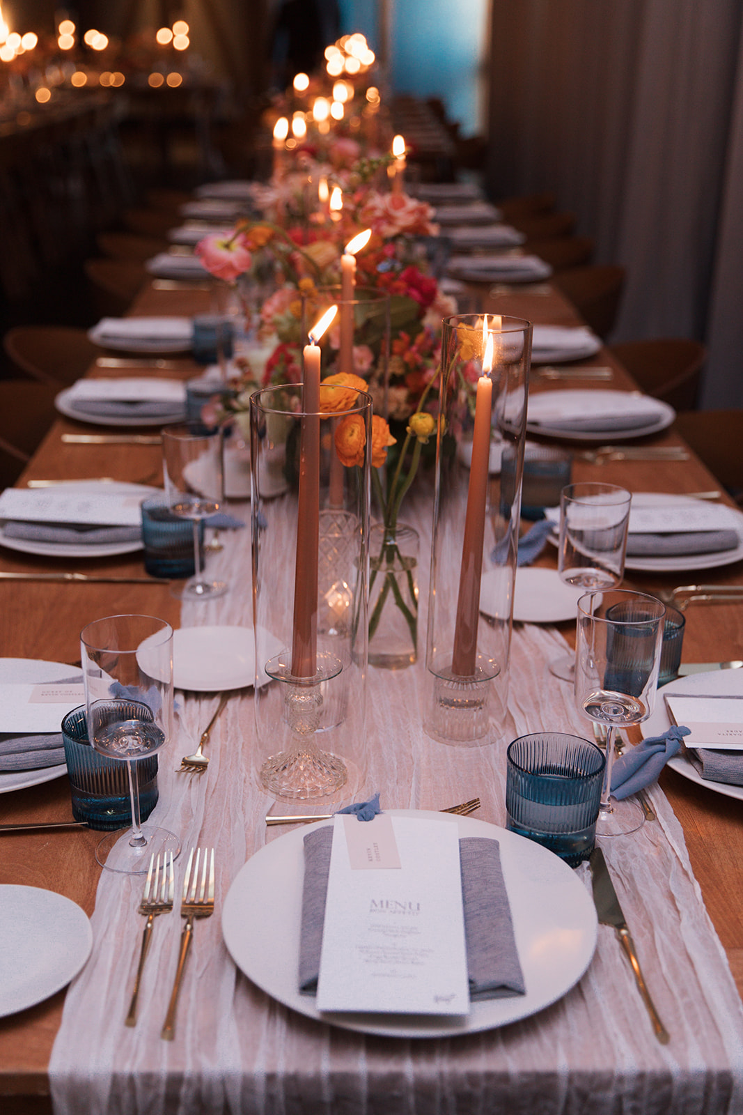
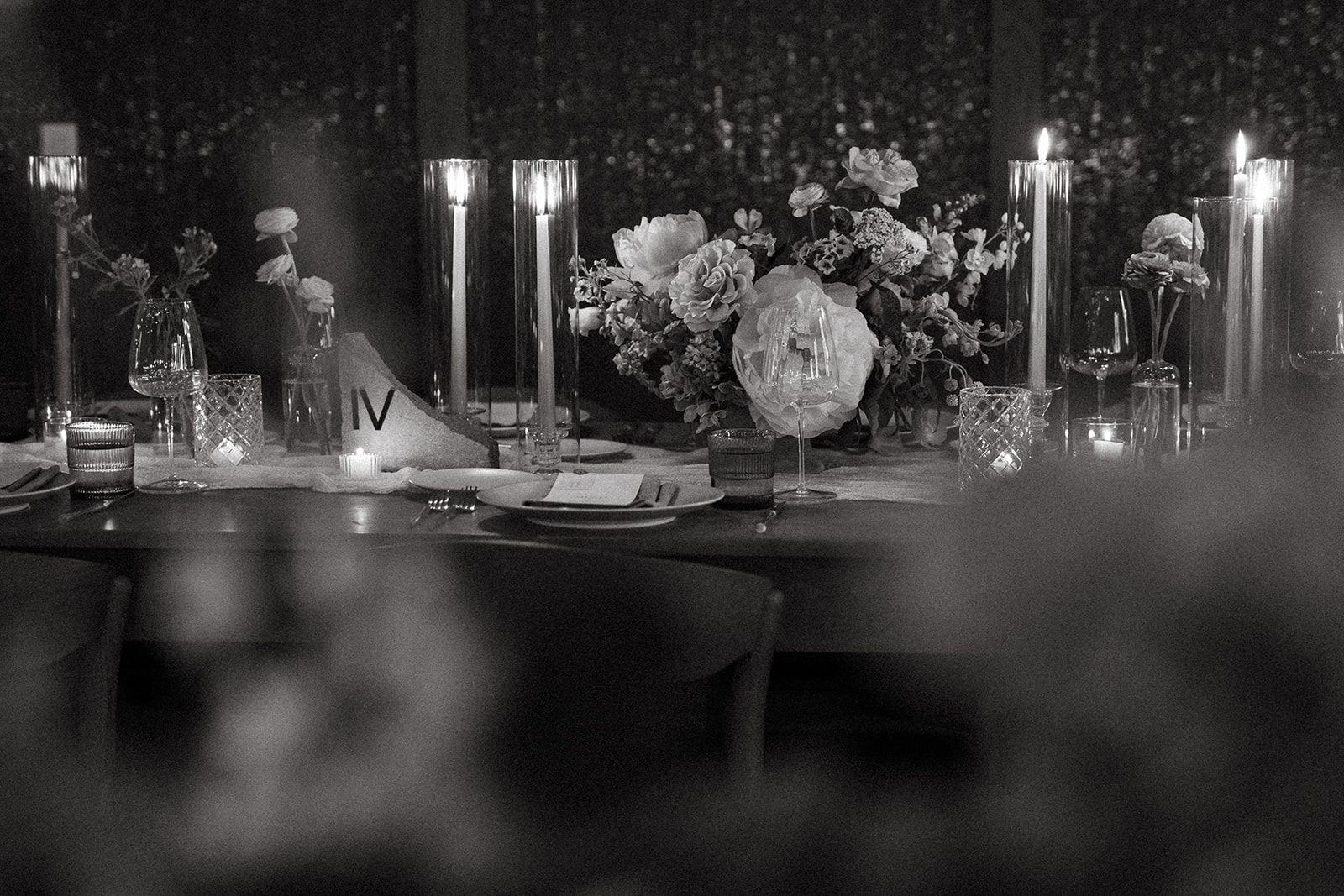
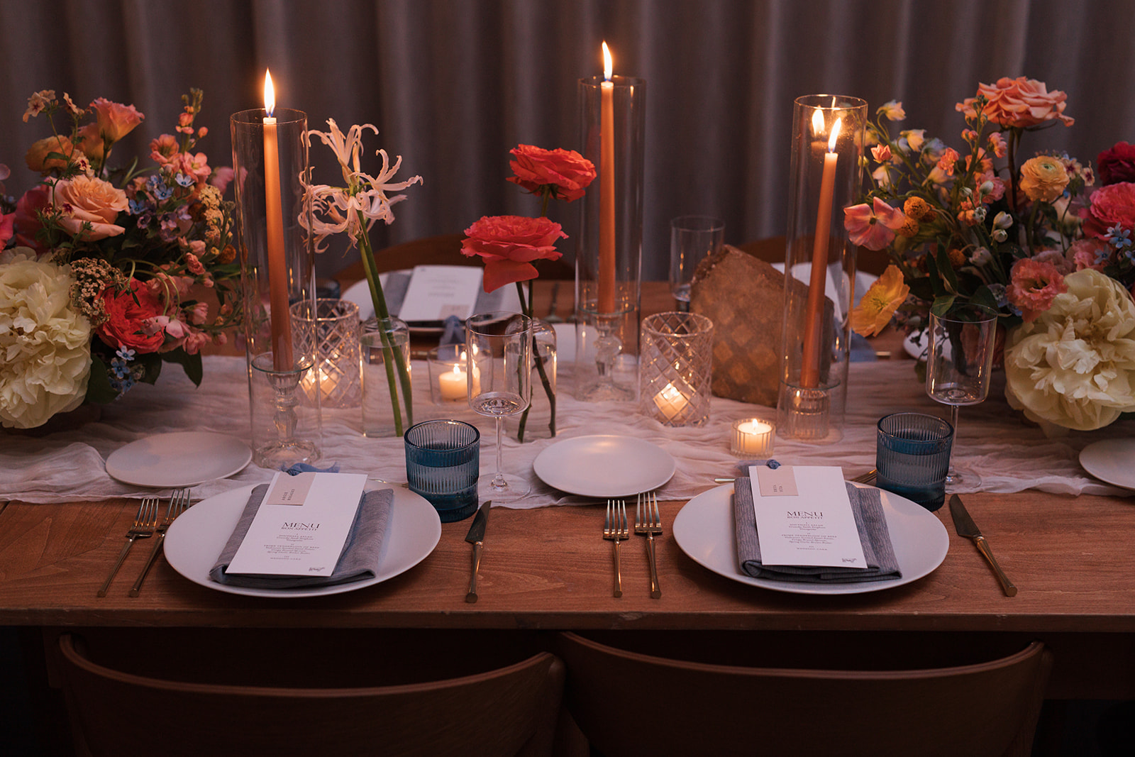
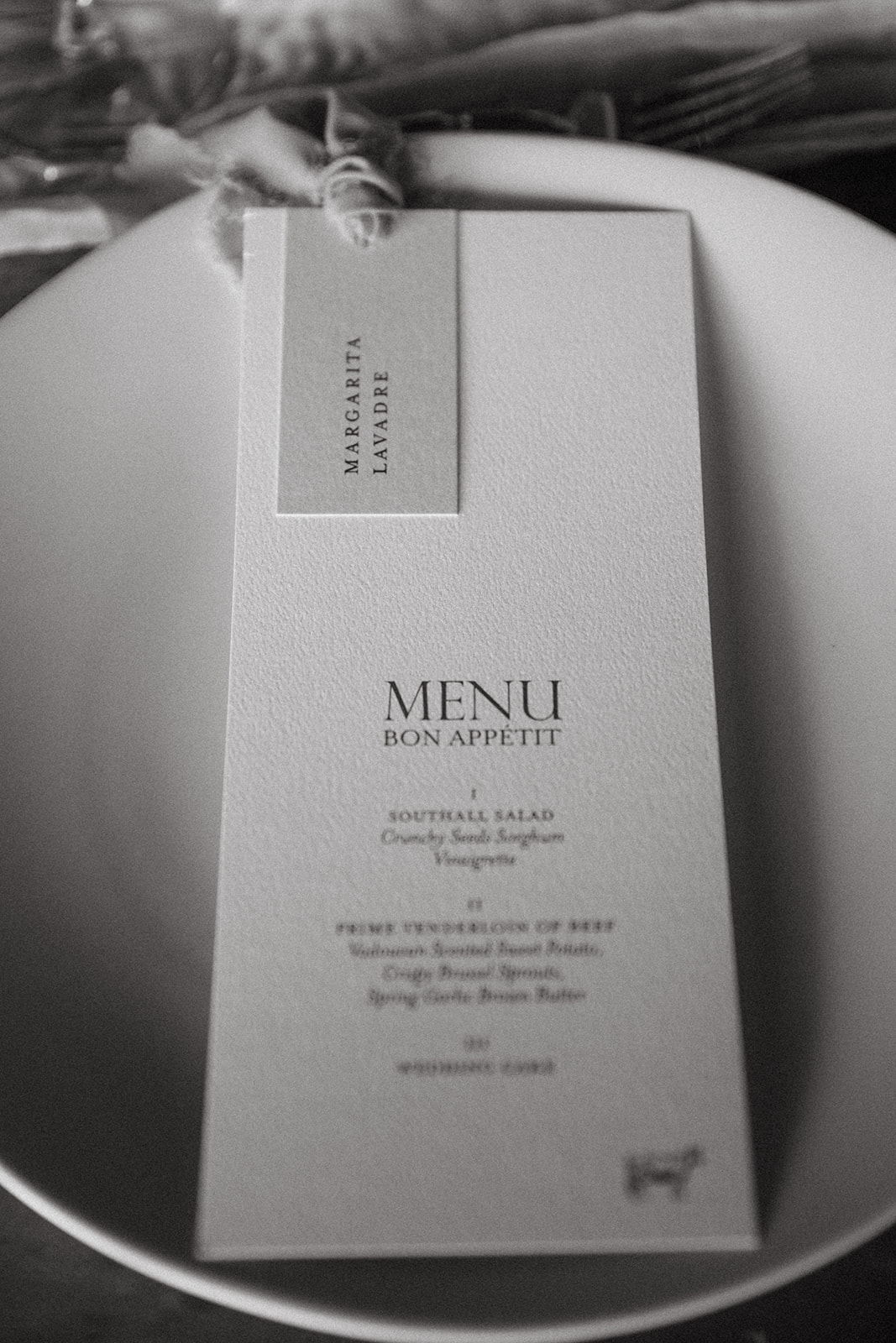
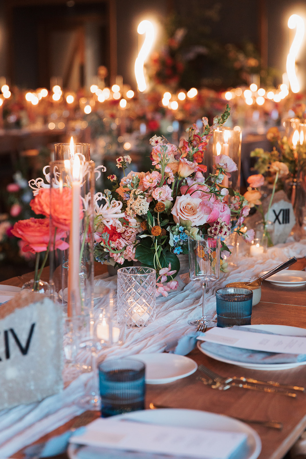
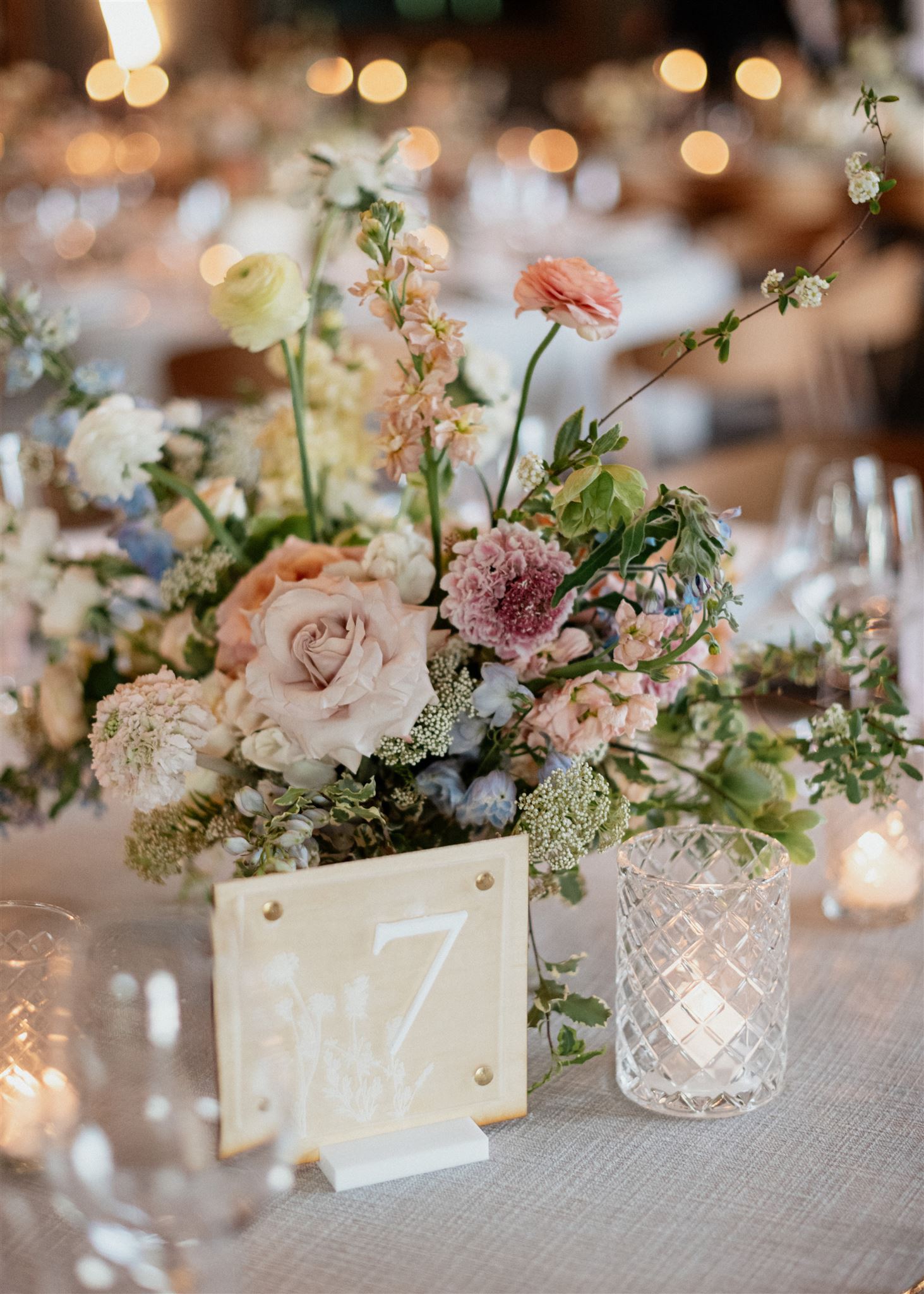
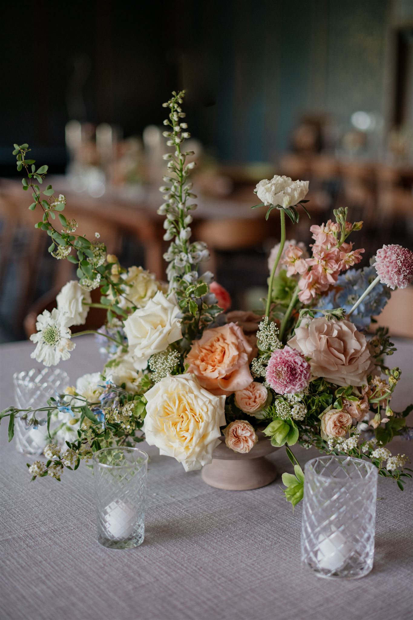
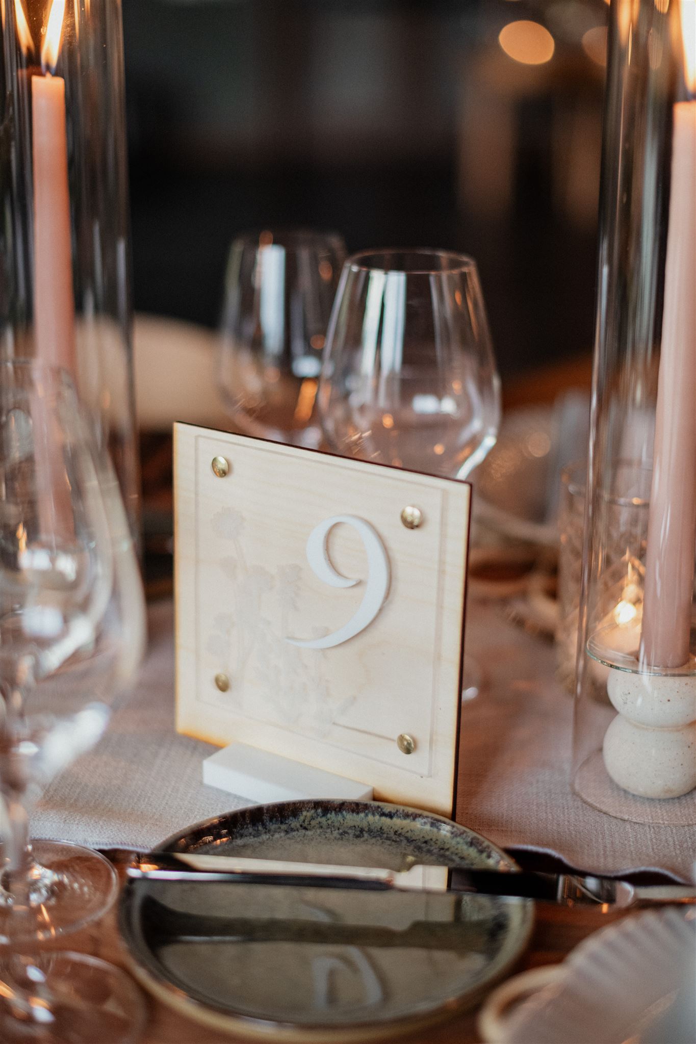
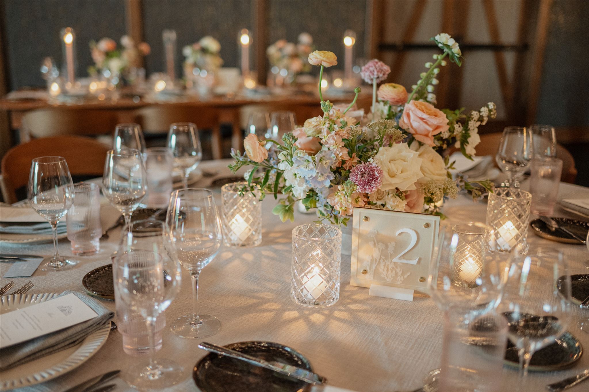
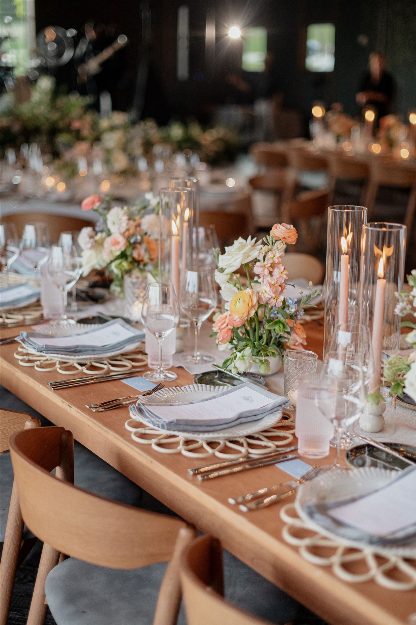
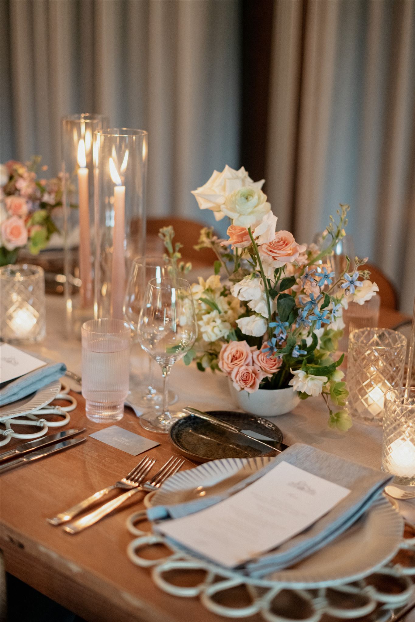
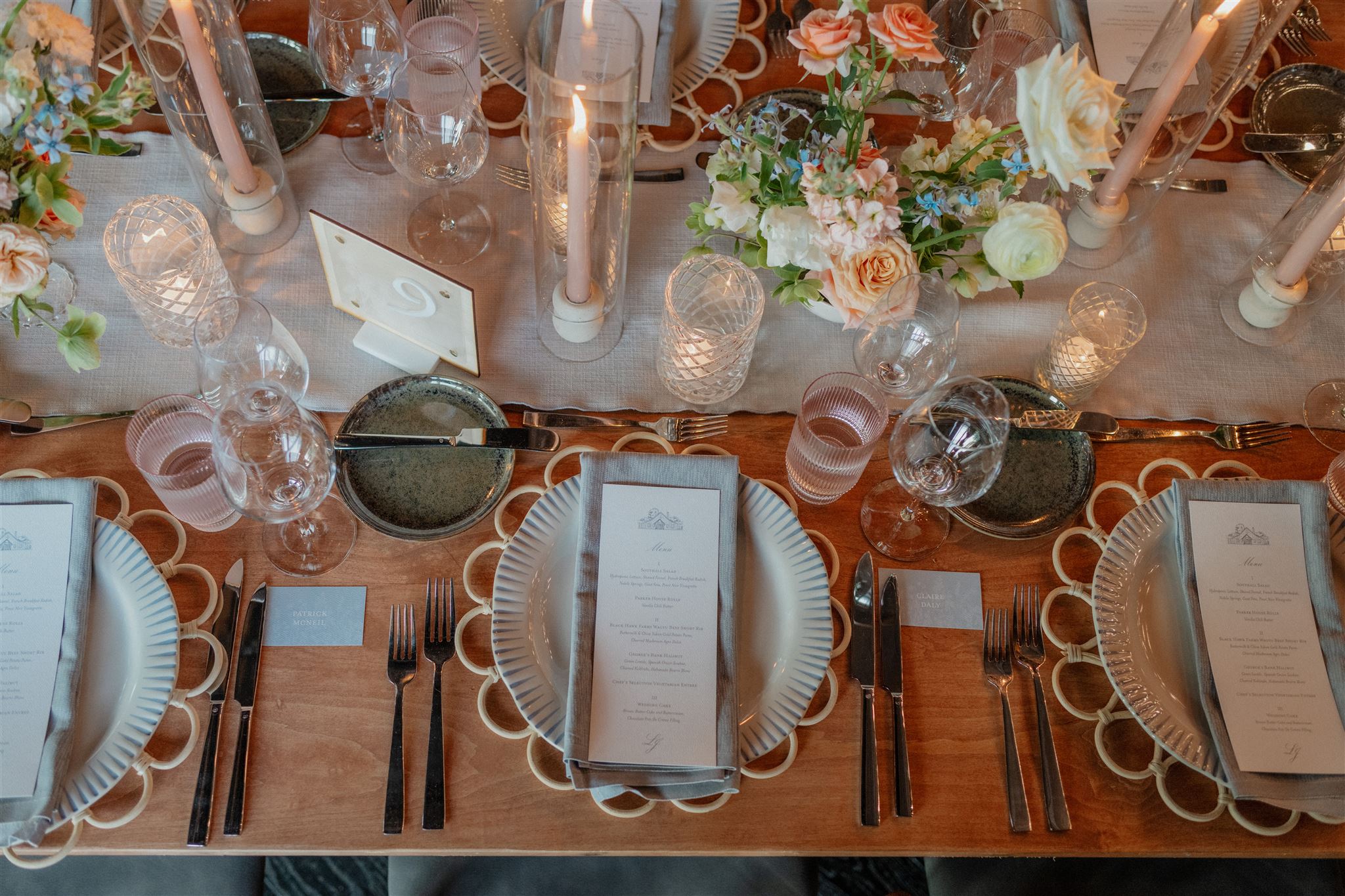
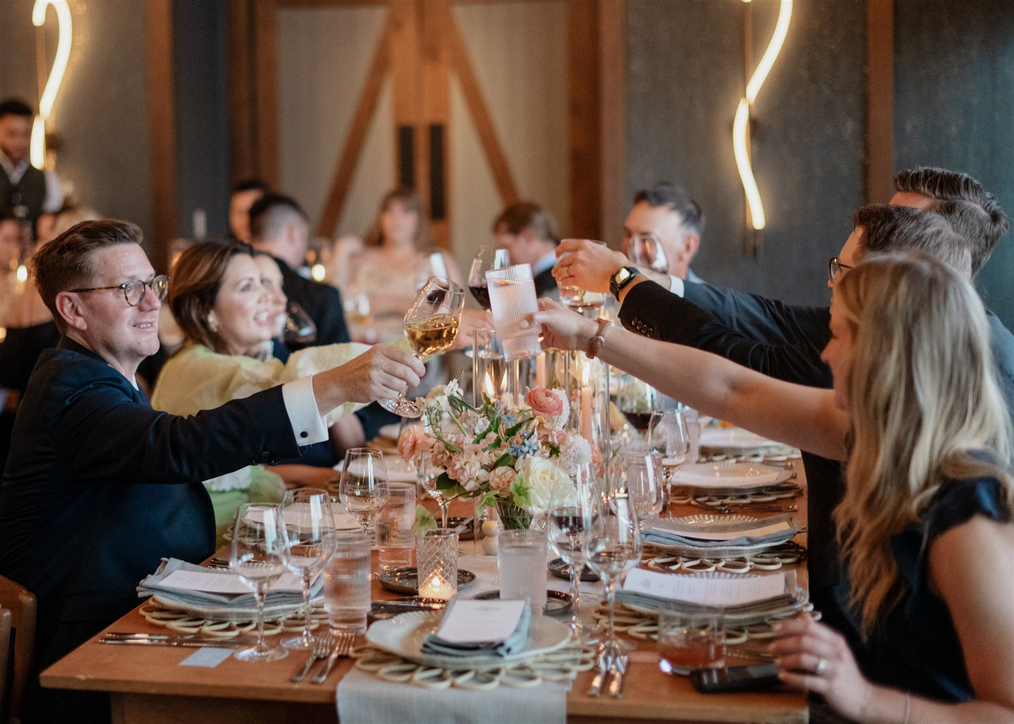
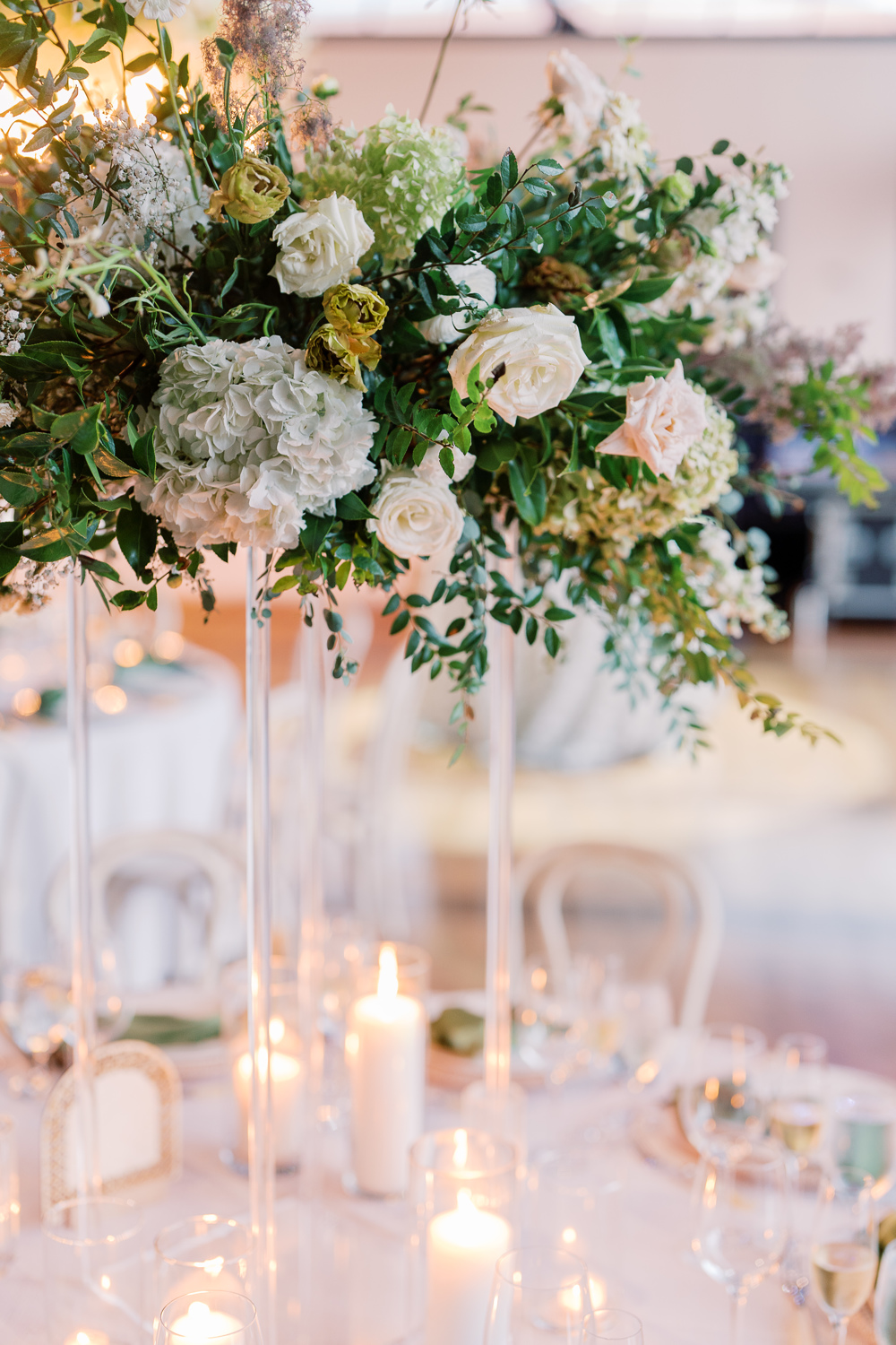
The delicious menu selection was printed on a beautiful stock card and placed underneath a delicate place card with baby blue ribbons. I think it’s important to point out the spectacular usage of texture from Brittanie and Tristen’s reception. Guests soaked in the beauty of soft linens, traditional and modern glassware, abundant florals, and warm candlelight. THIS is how you create the mood and keep the guests engaged in every sense. I could have stayed here forever.
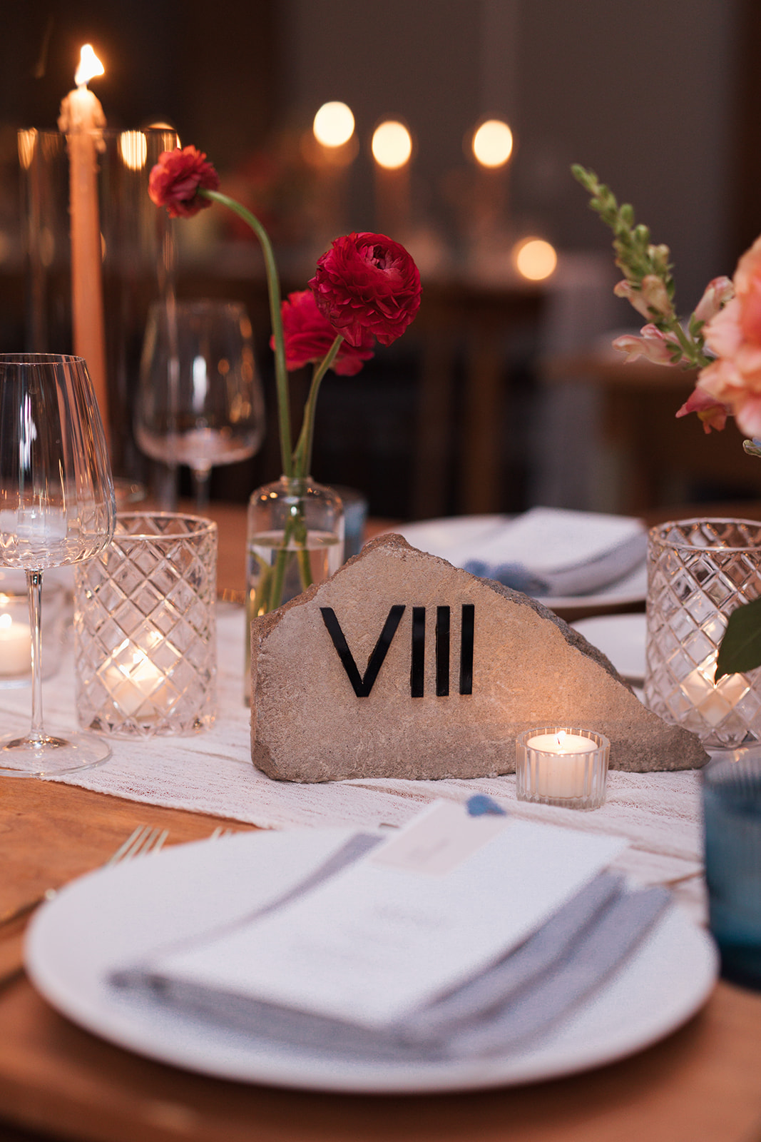
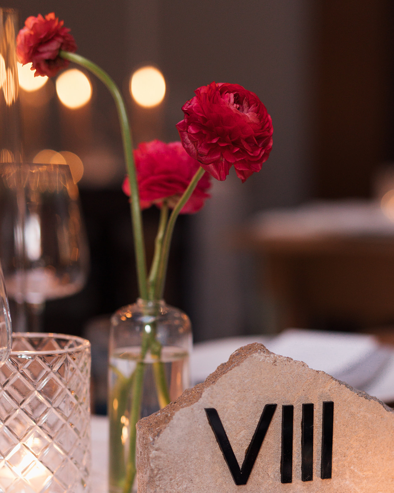
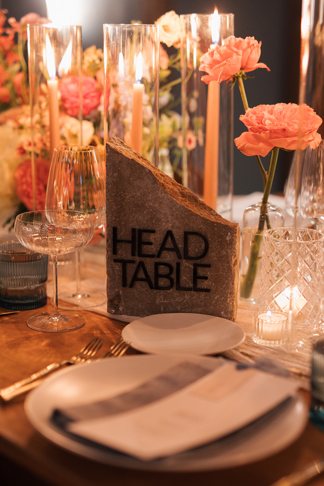
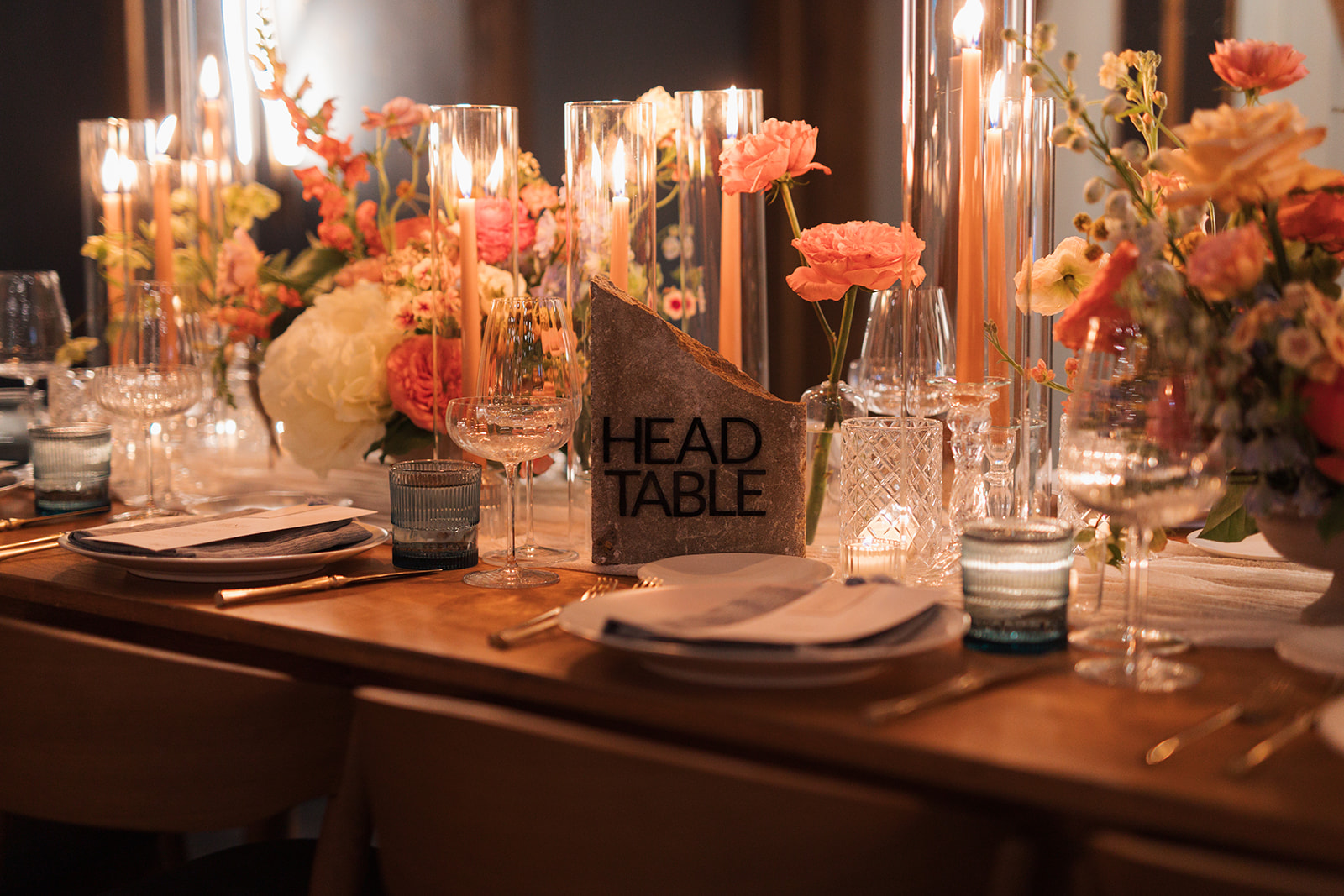
I have been so excited to showcase these table numbers! Talk about texture! These custom stone table numbers from our extensive rental collection are a favorite of ours at White Ink. We were thrilled to provide these at the reception for Brittanie and Tristen. They created the perfect balance of the texture-filled tablescapes and were undoubtedly a main conversation piece. Reception decor is a wonderful time to show your style and personality just as Brittanie and Tristen did. The Roman numerals were an excellent touch.
Here’s to Brittanie and Tristen. For trusting White Ink with the finer details of this fine day. The love, the people, the creativity is something that will stay with us for many years to come. Cheers!
If you’re looking to add custom, thoughtful touches to your wedding or event, we would love to help make your vision a reality. Reach out today to learn more about our full-service design offerings—we can’t wait to create something unforgettable for you!
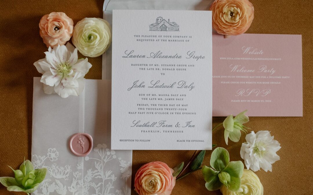
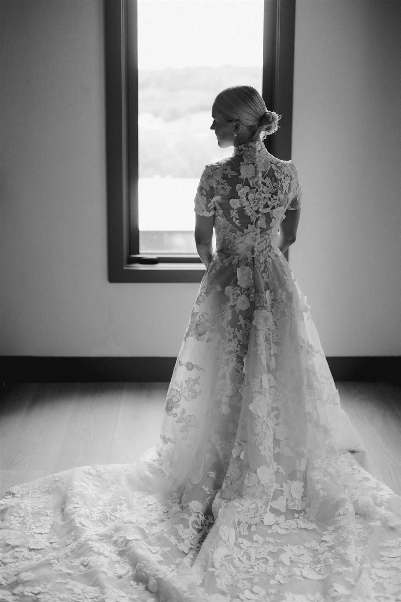
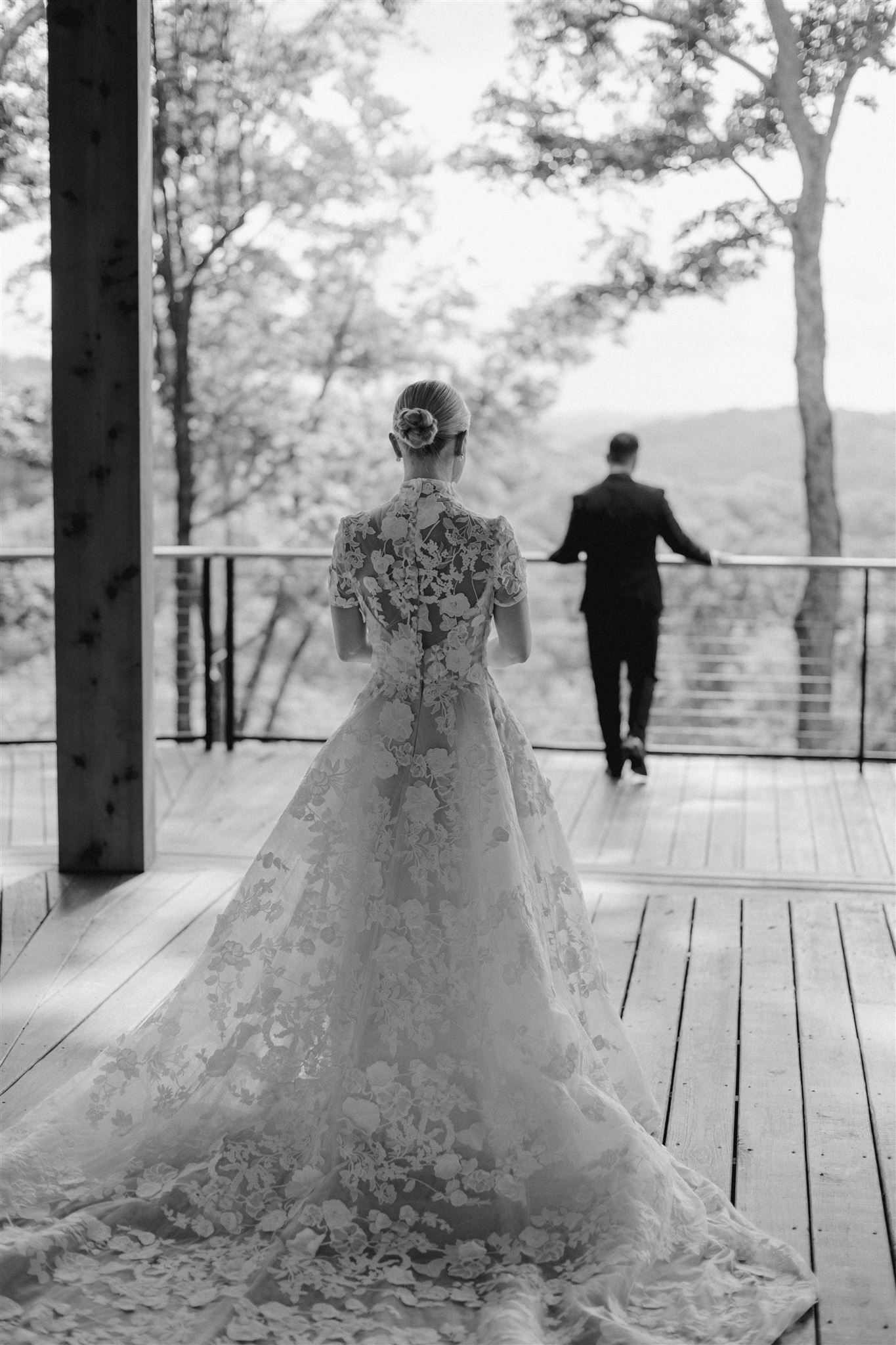
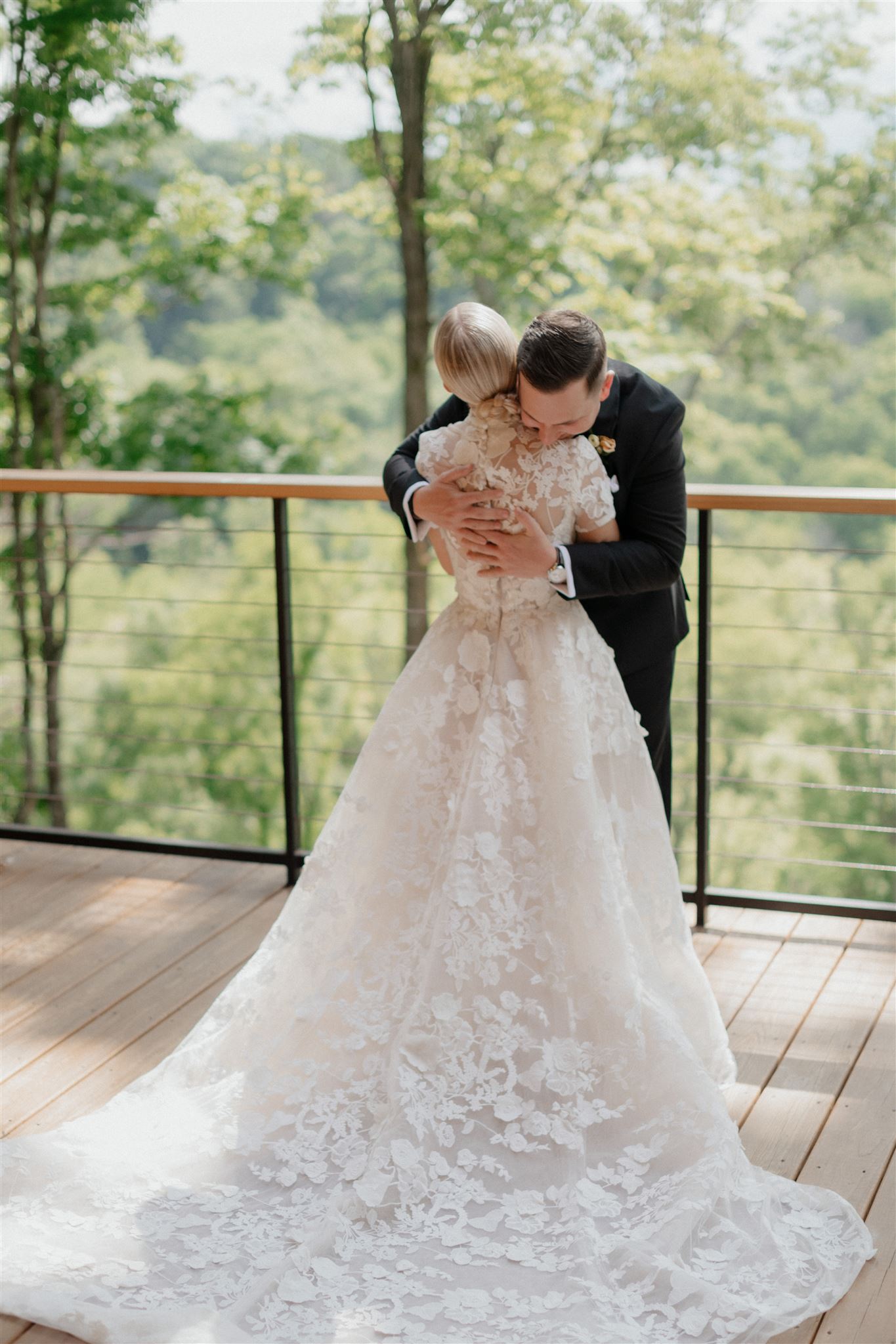
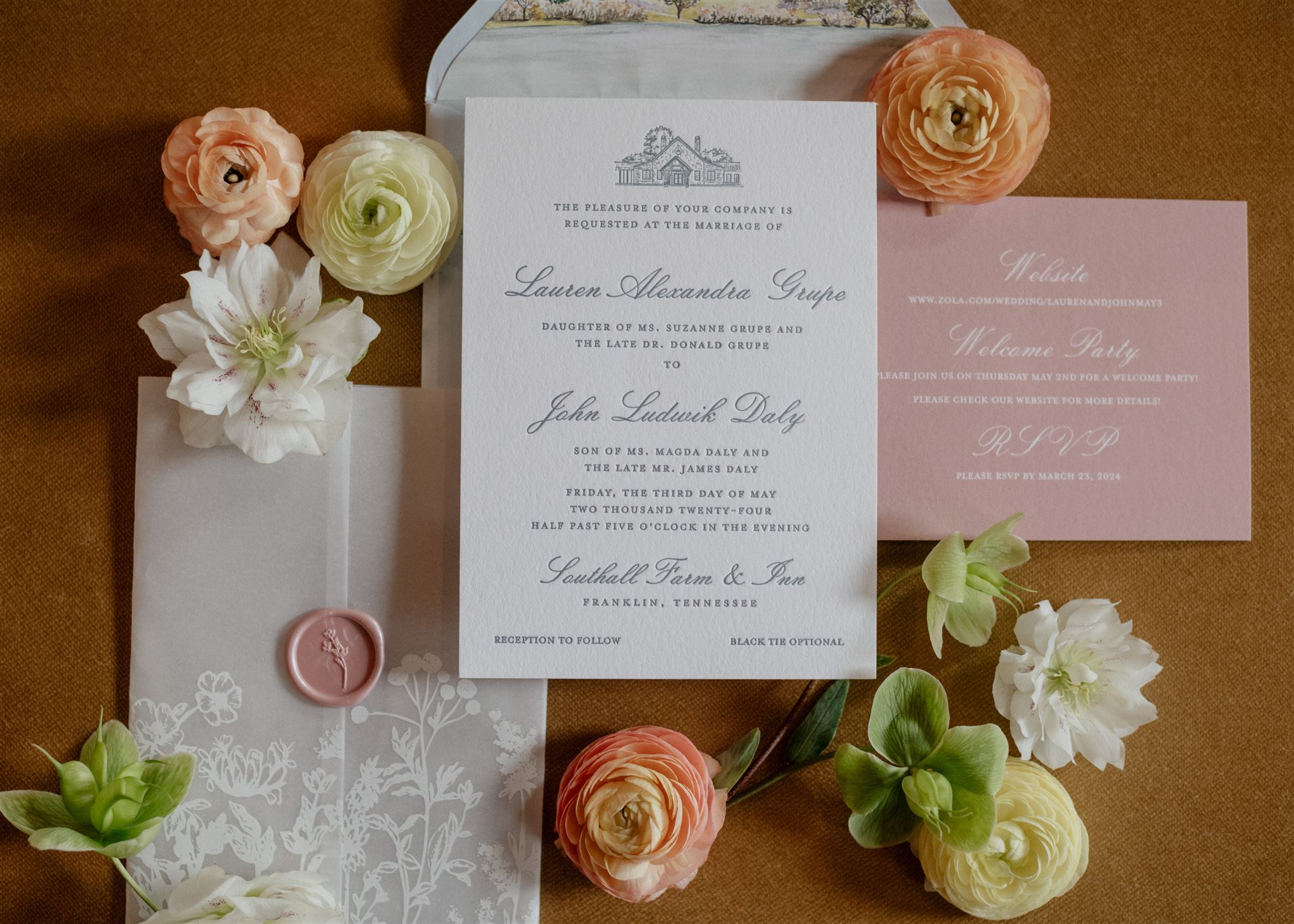
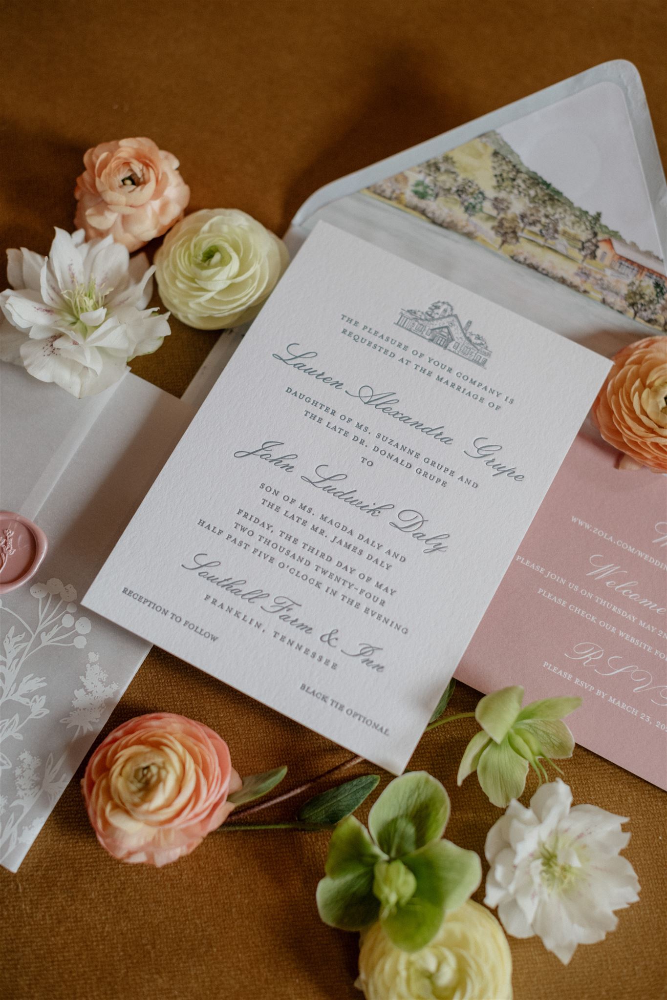
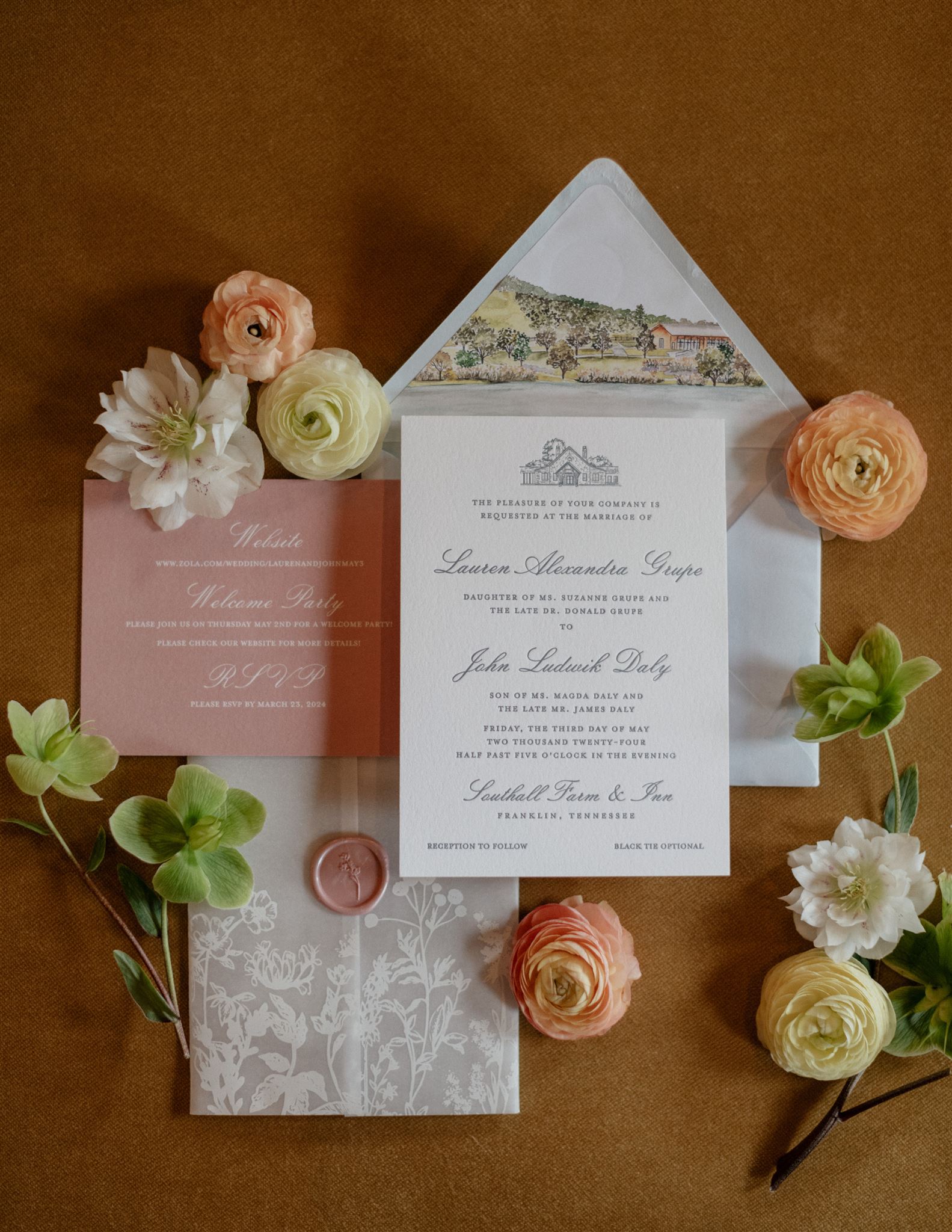
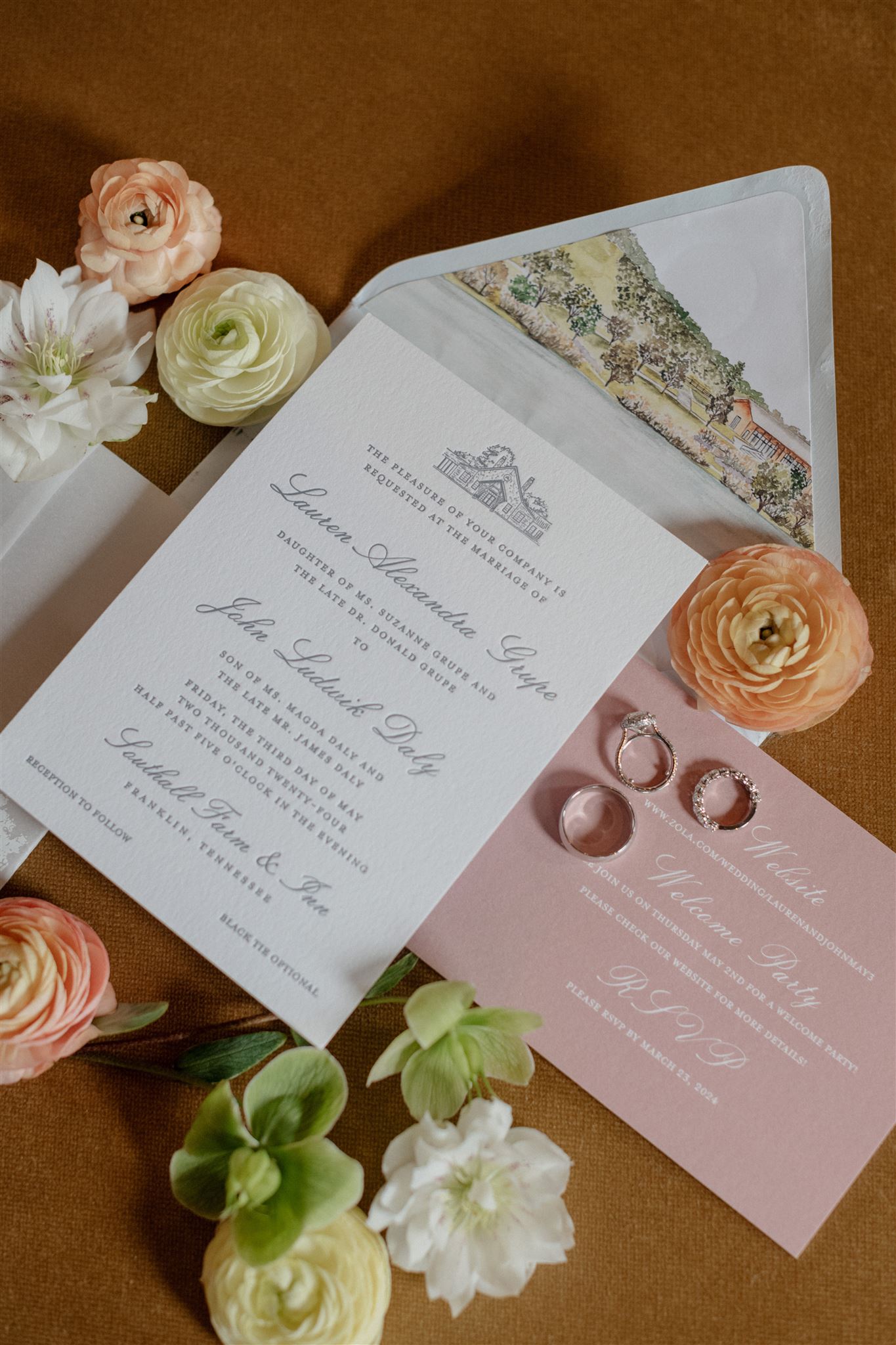
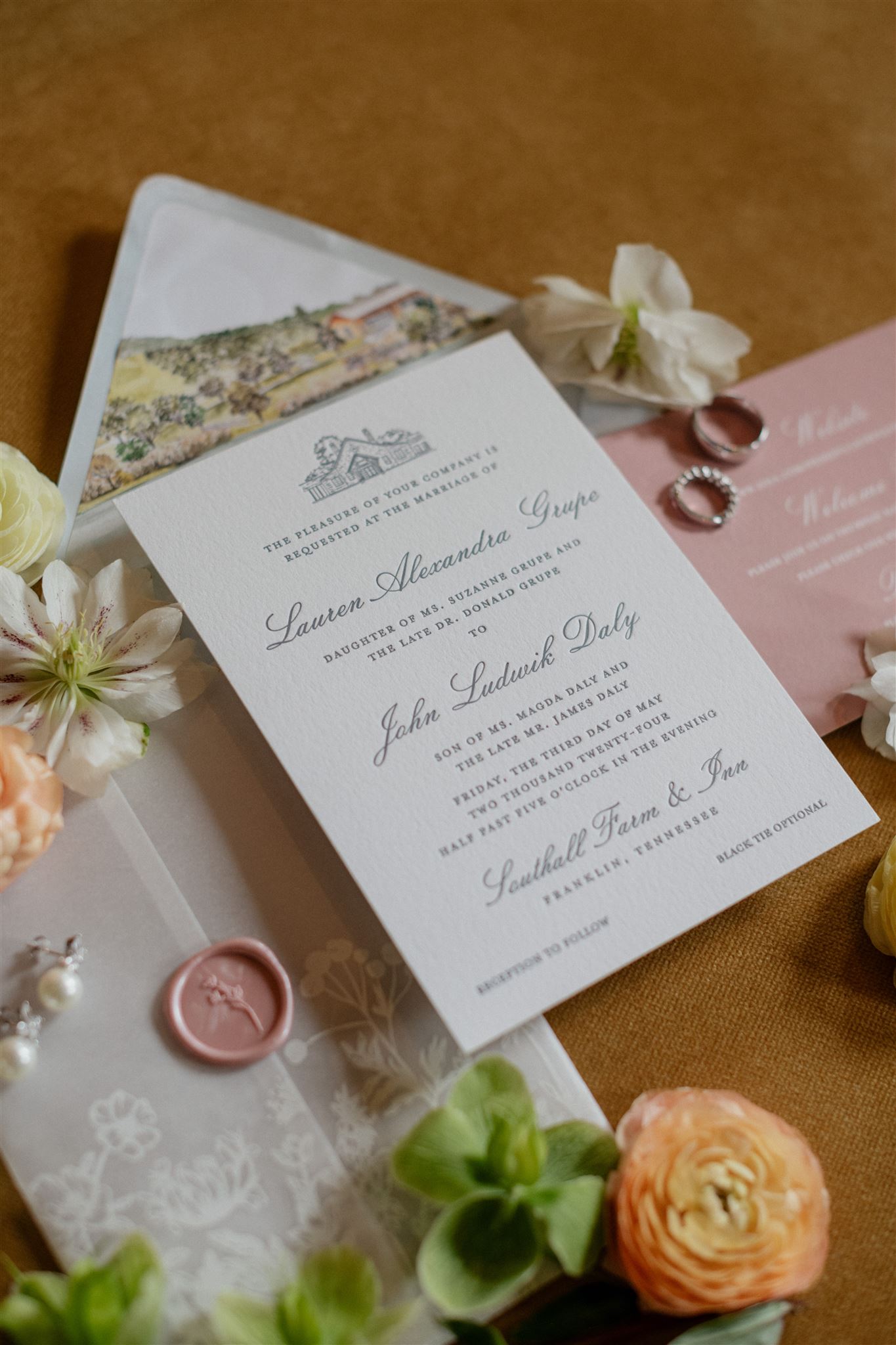
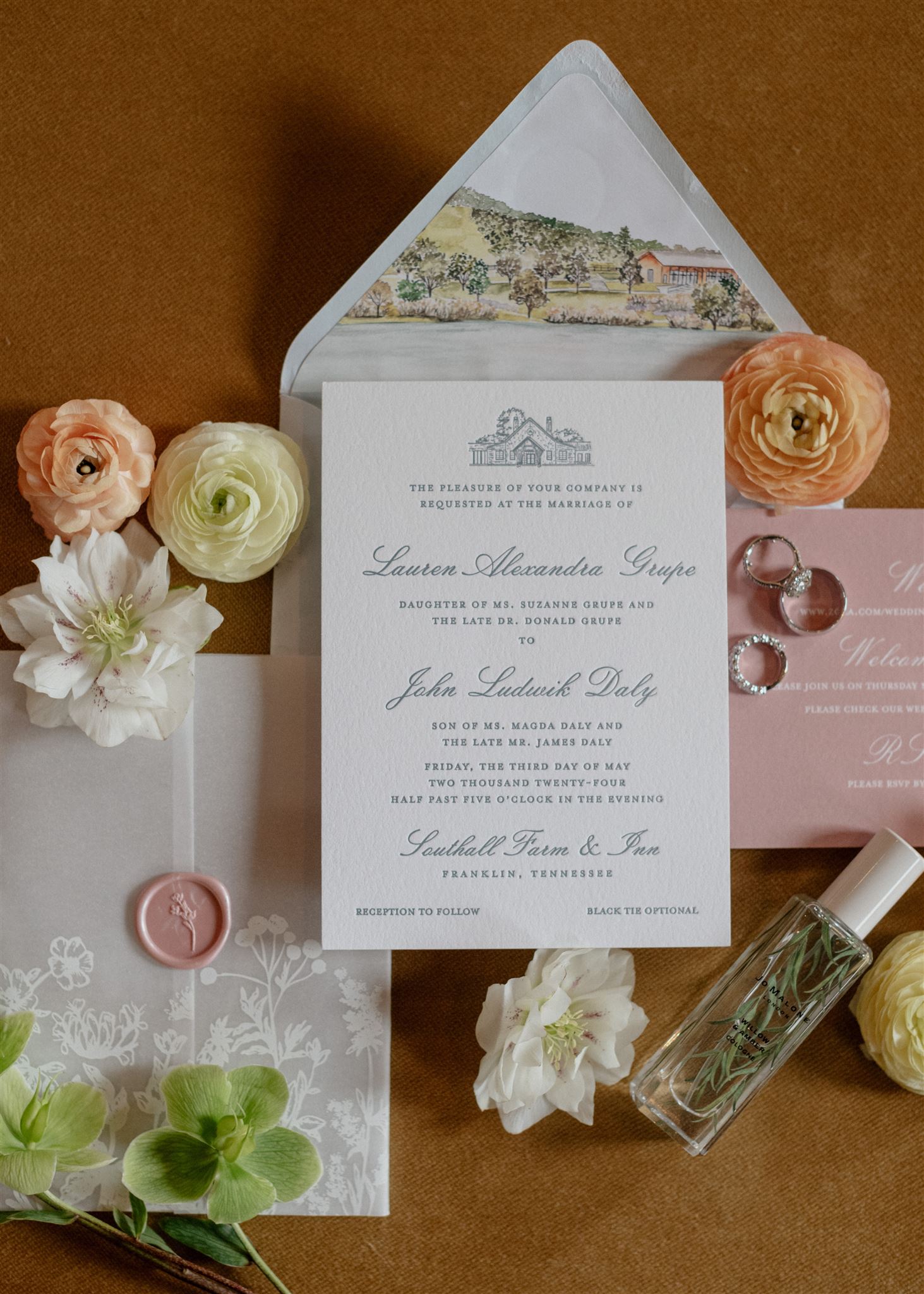
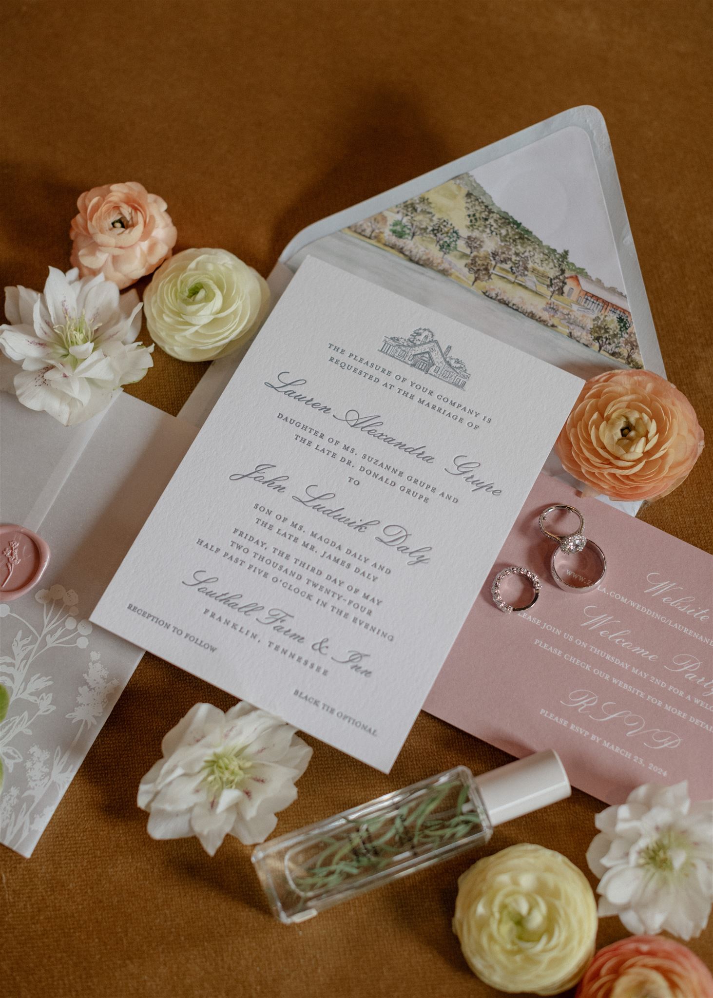
Fixed among the serene beauty of rural Franklin, TN, Southall Farm & Inn lent itself to one of the most gently breathtaking weddings we’ve been a part of. White Ink couple, Lauren and John, allowed us to create custom spring wedding details for their incredible wedding day and we were honored to do it.
Classic Invitation Suite
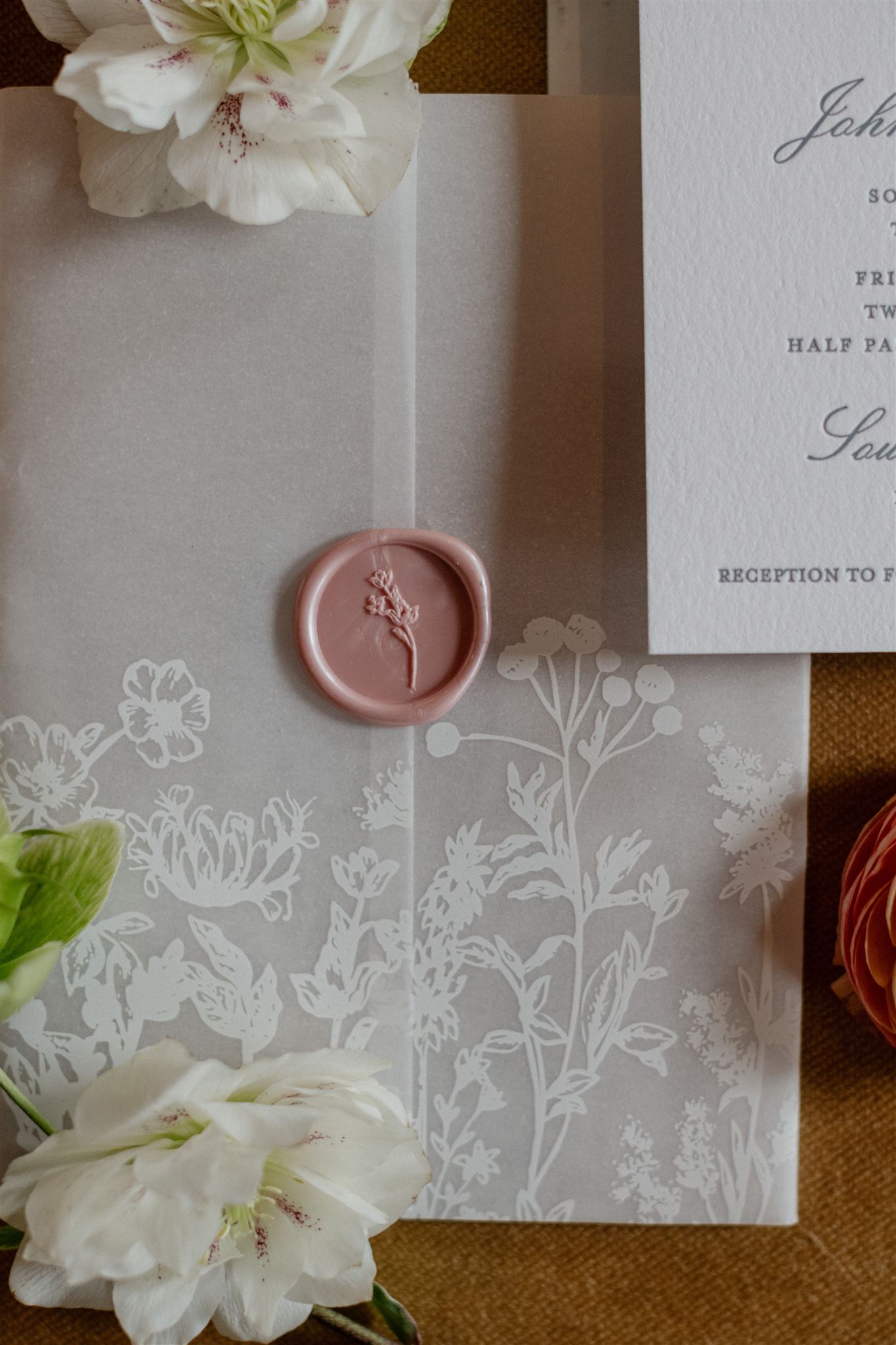
Coming in on the heels of spring, just before the summer wedding season, this special day proved to be perfect in so many ways. We began with designing Lauren and John’s impressive and quintessentially classic invitation suite. There is a notable balance of boldness and delicacy as the envelope liner with a print of the gorgeous foothills of the Southall venue jumps right off the paper while the vellum sleeve softly wraps around the classic letterpressed invitation. A perfectly placed, dusty-rose, wax seal to close the vellum wrap added an extra charm that effortlessly tied the suite together. It really was the perfect invite.
Notice that the custom wax seal not only matched the dusty rose color of the RSVP card, but it also boasts florals to match the ones found on the vellum wrap. There is nothing that elevates a wedding like tying together details throughout!
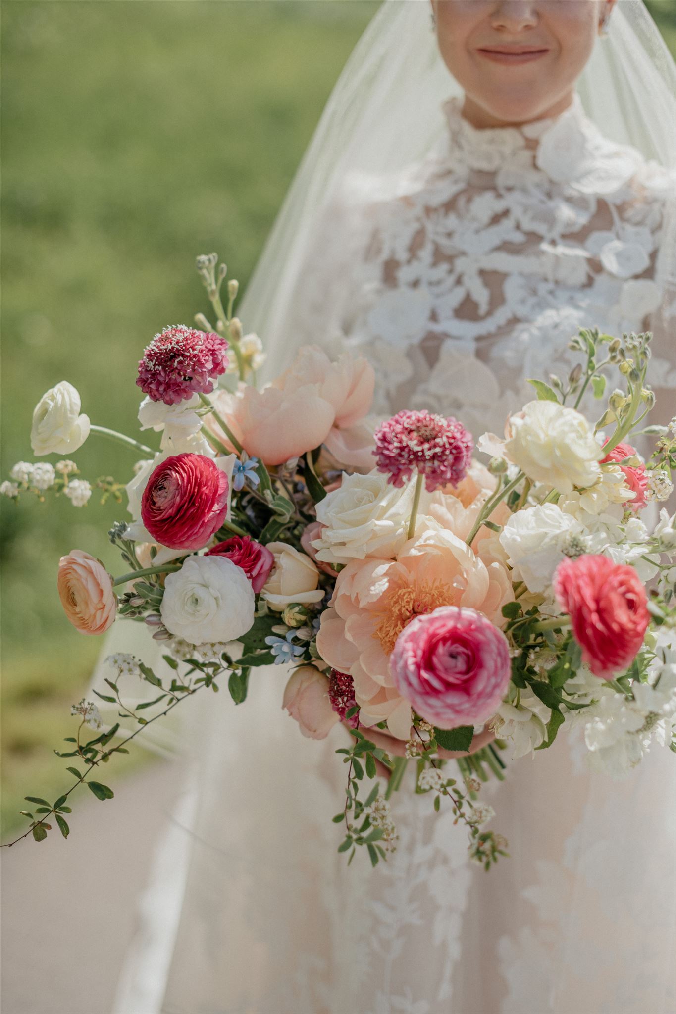
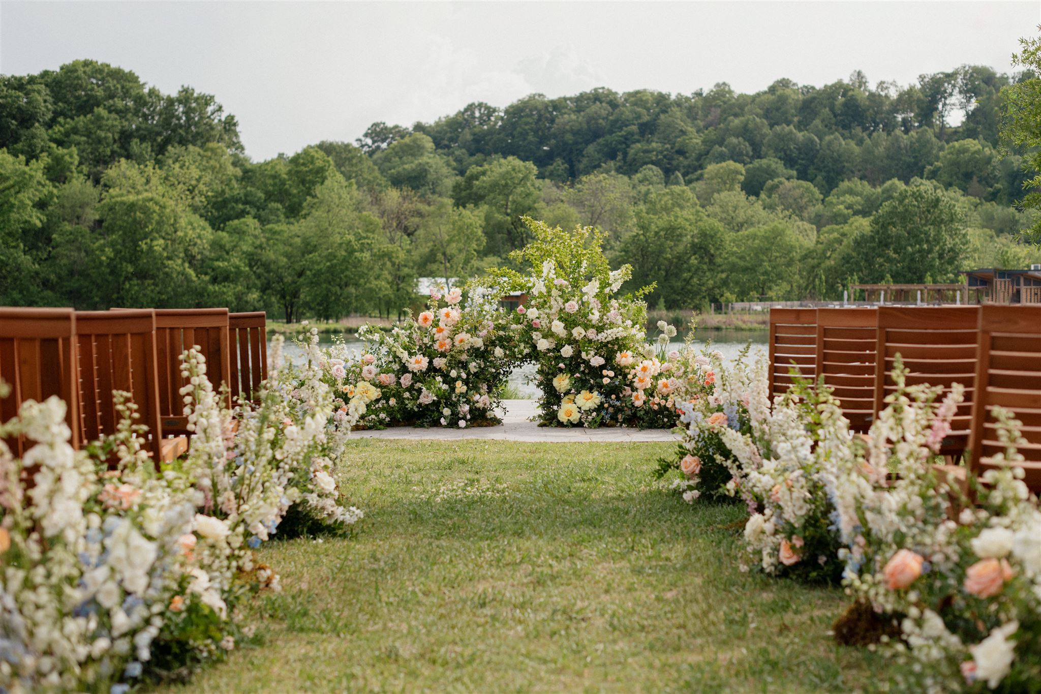
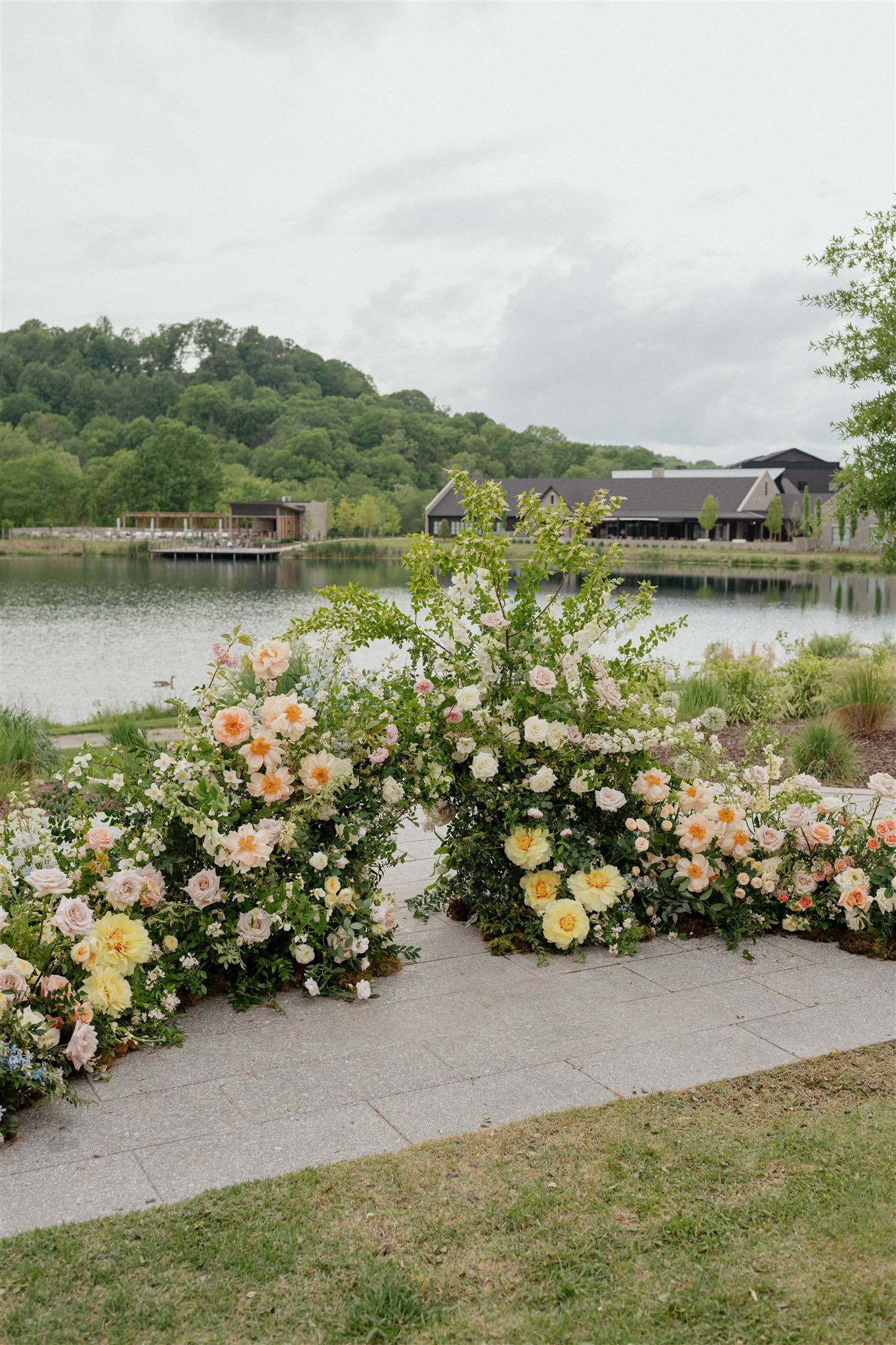
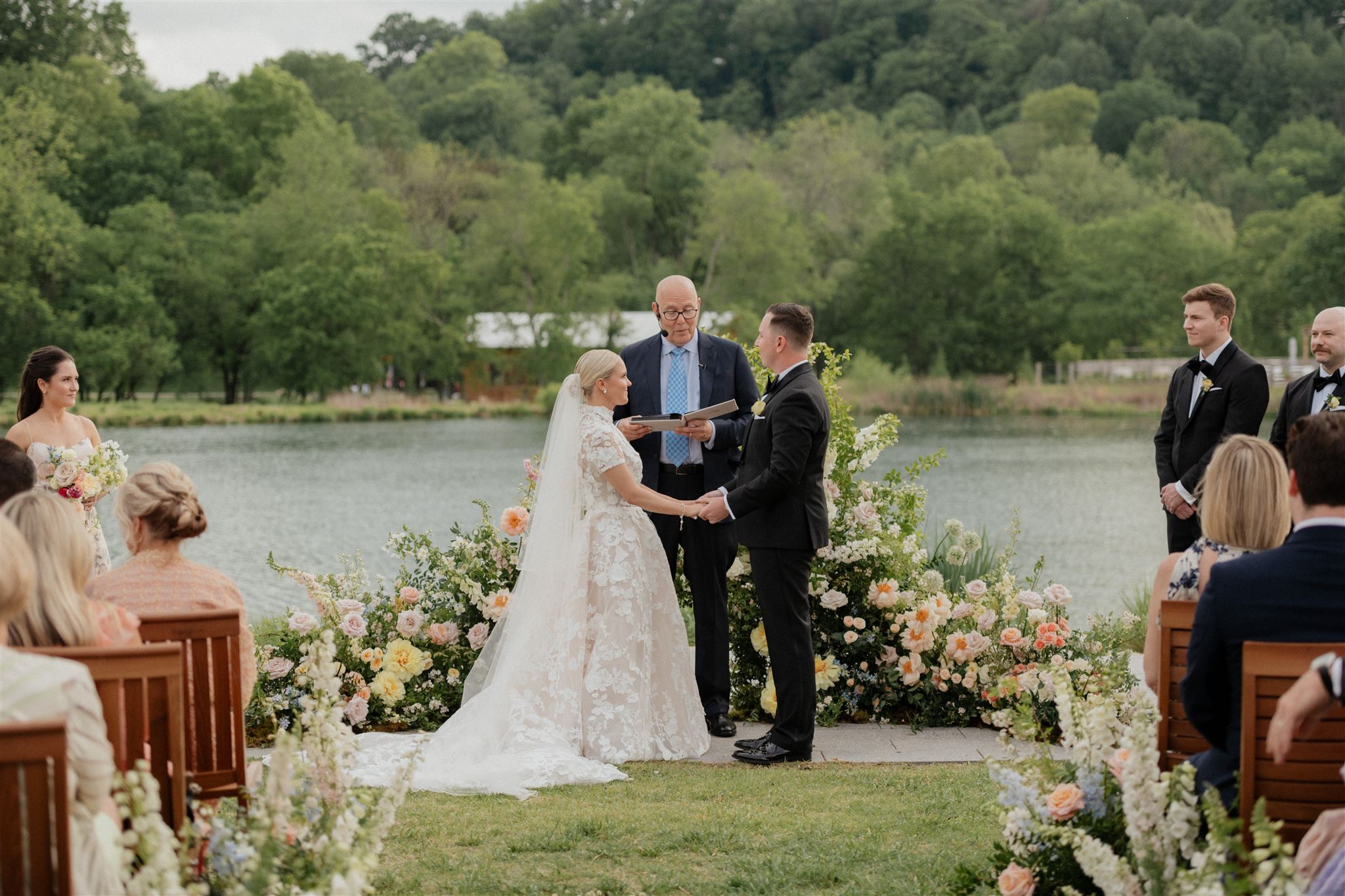
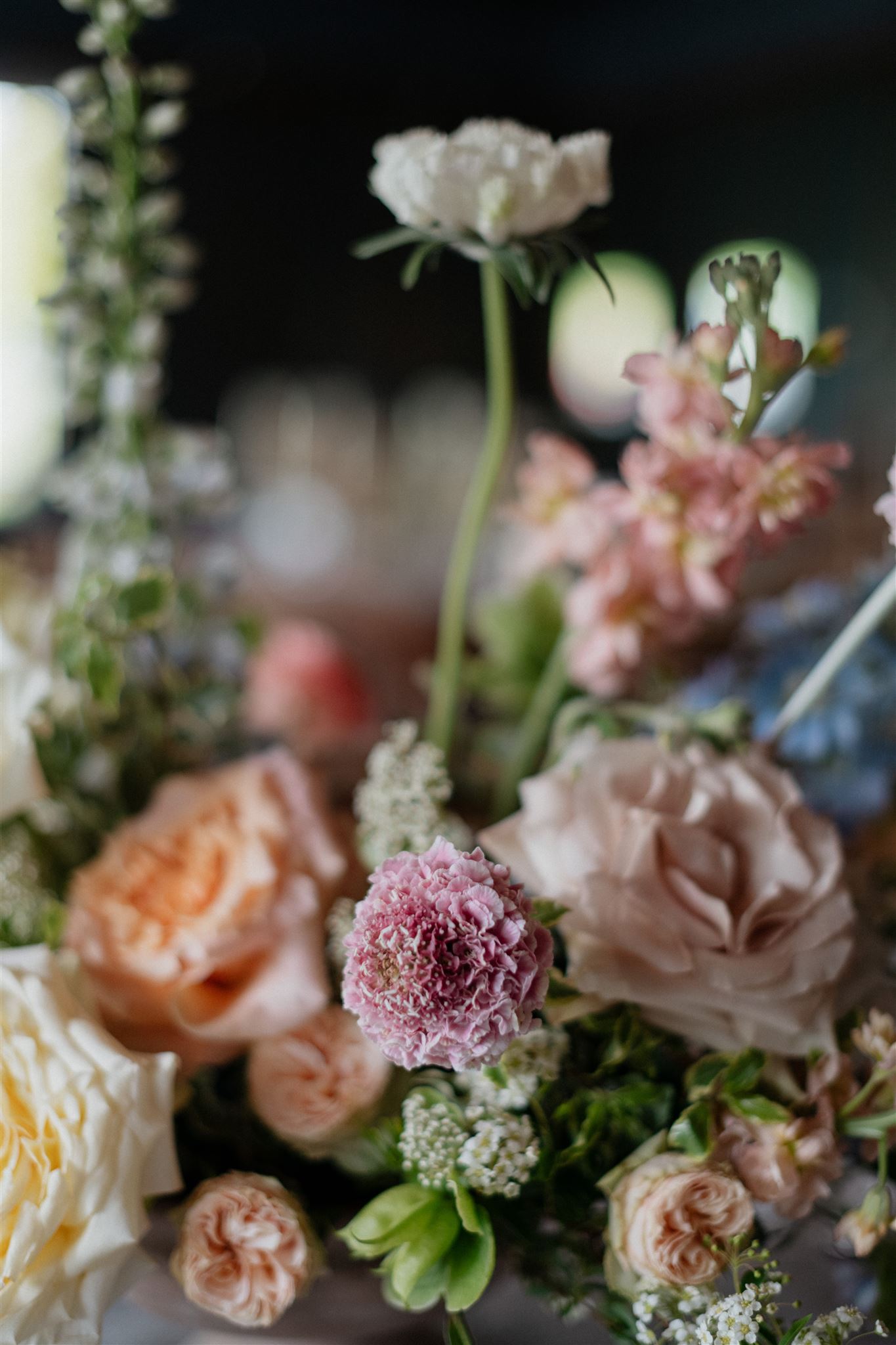
From the bride’s bouquet to a cascade of florals used for the arbor, we couldn’t get enough of the gorgeous flowers bursting through each part of this spring wedding!
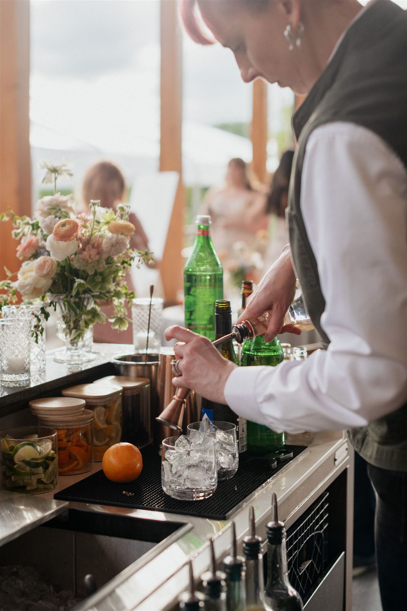
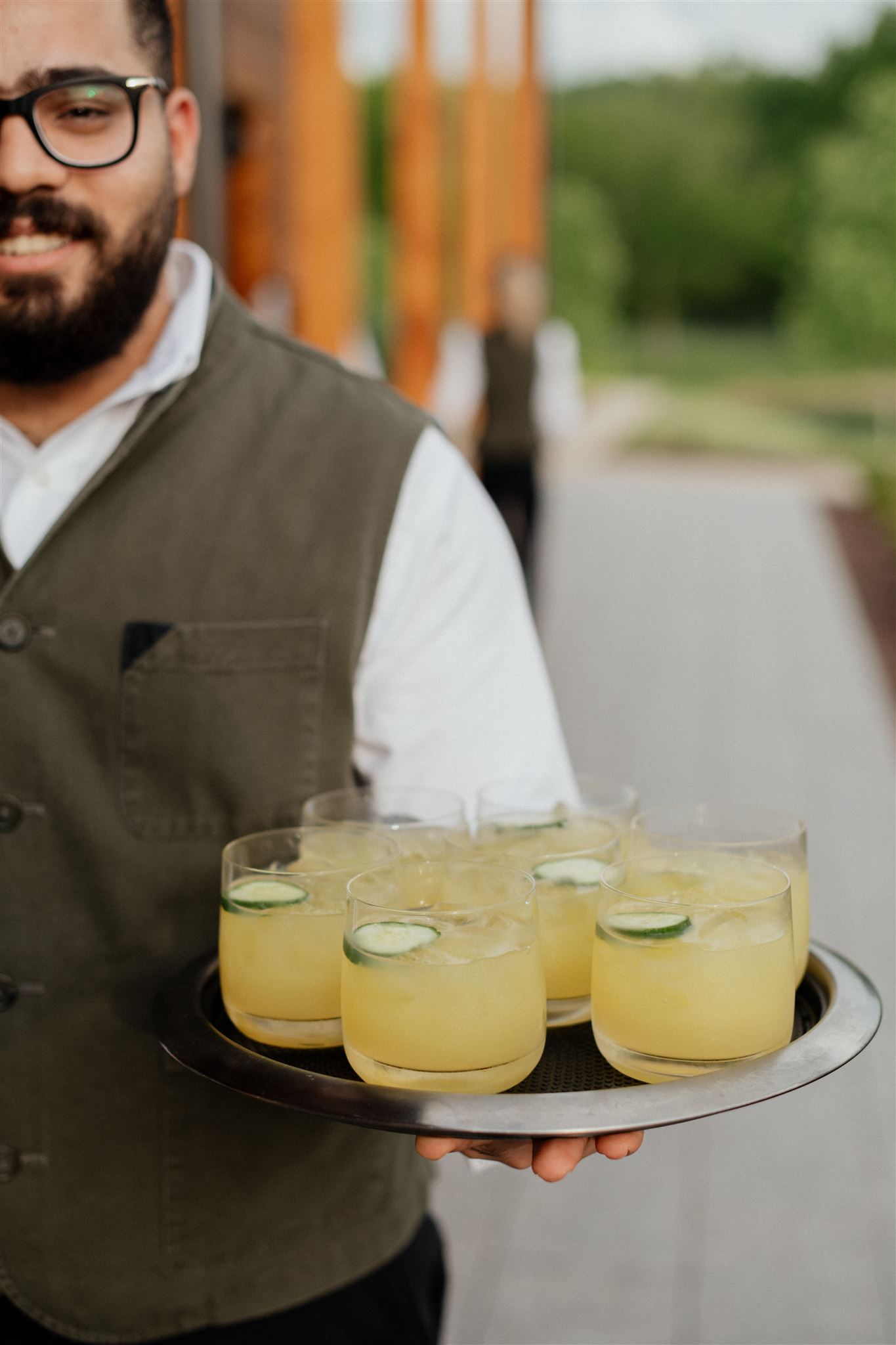
Chic, sleek, and simple – the bar menu that we prepared for Lauren and John fit perfectly into the bar’s clean look and layered textures. Guests definitely enjoyed the inviting vibe of this delicious cocktail hour. How could you not?
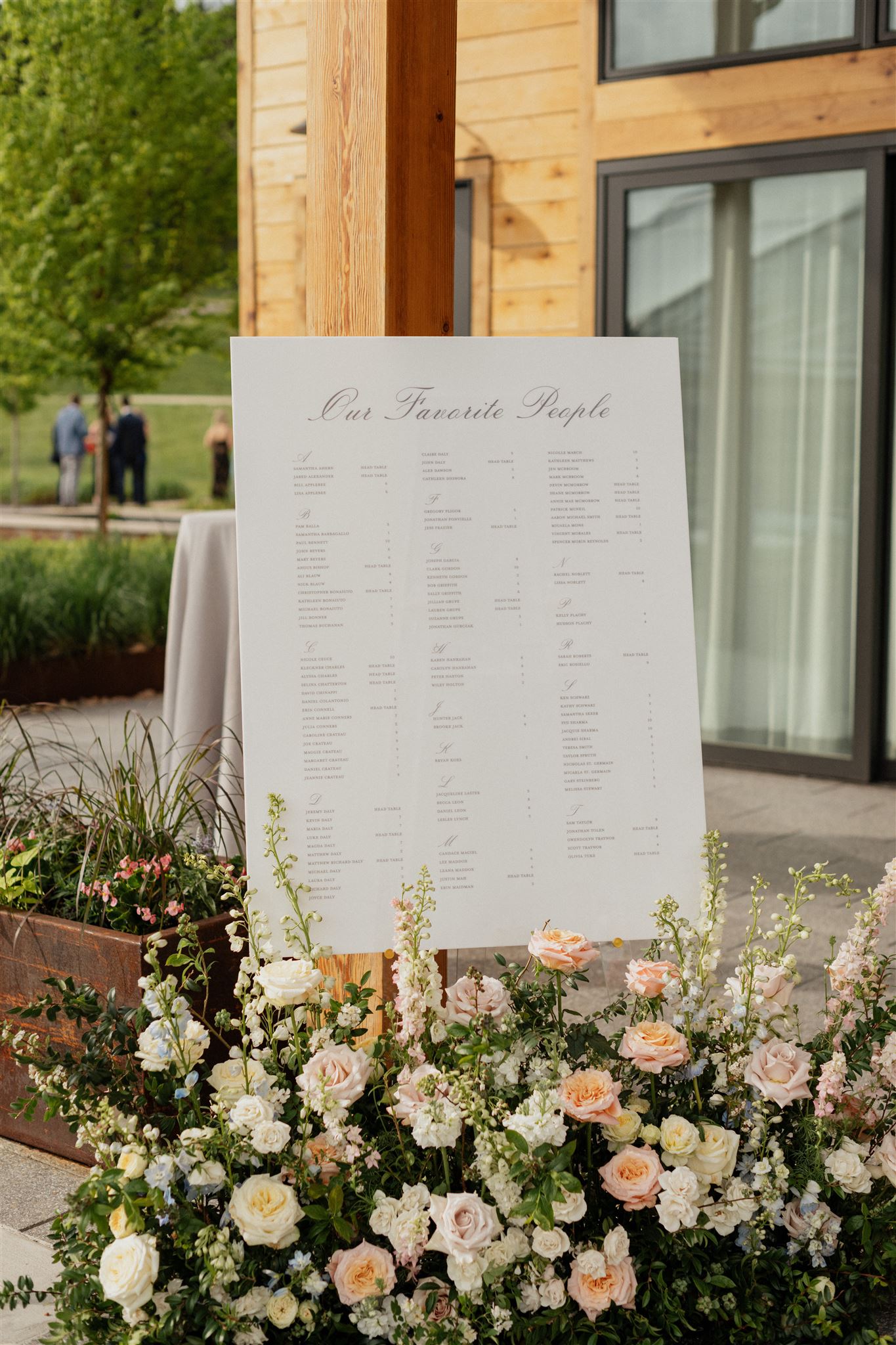
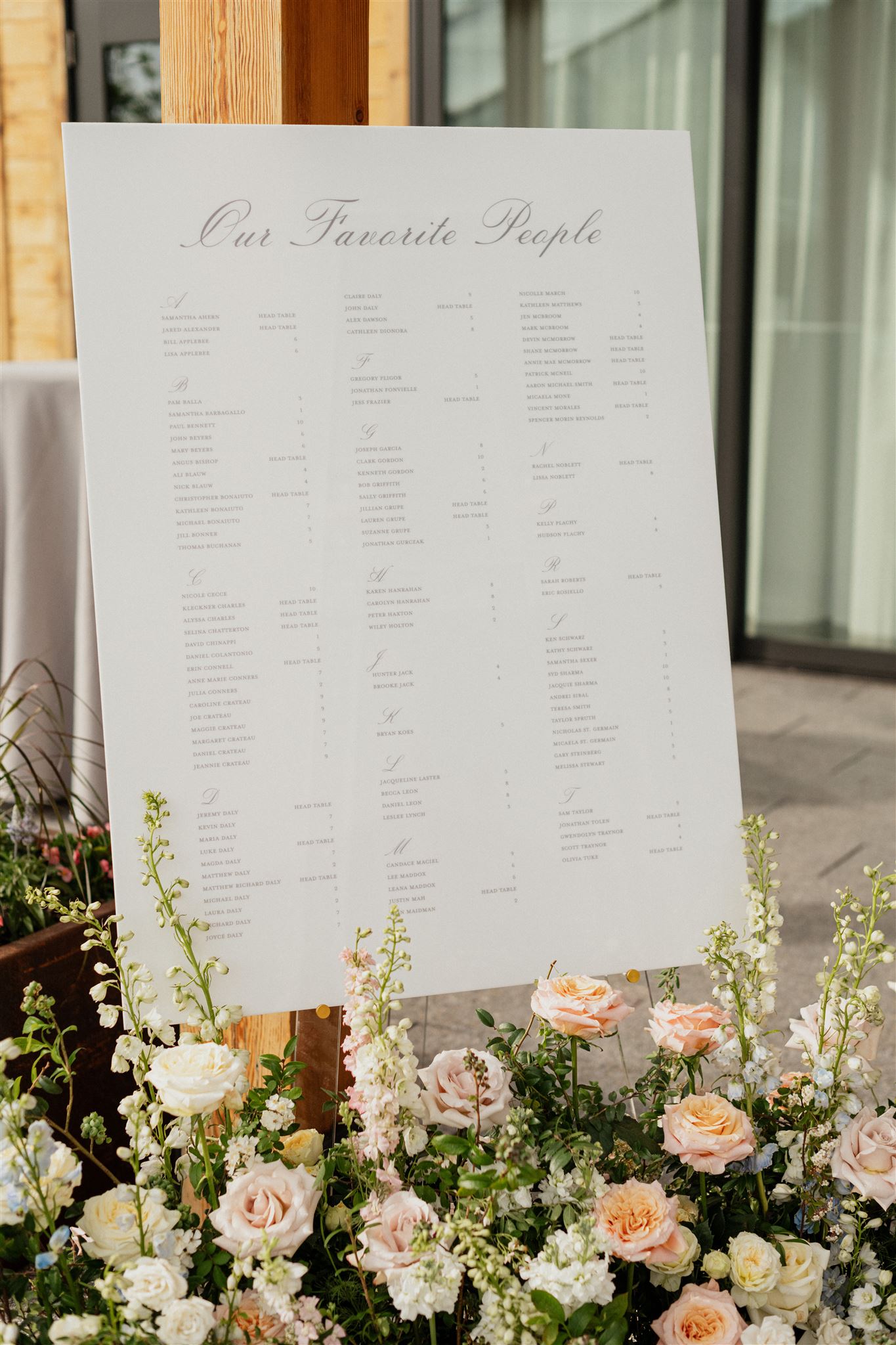
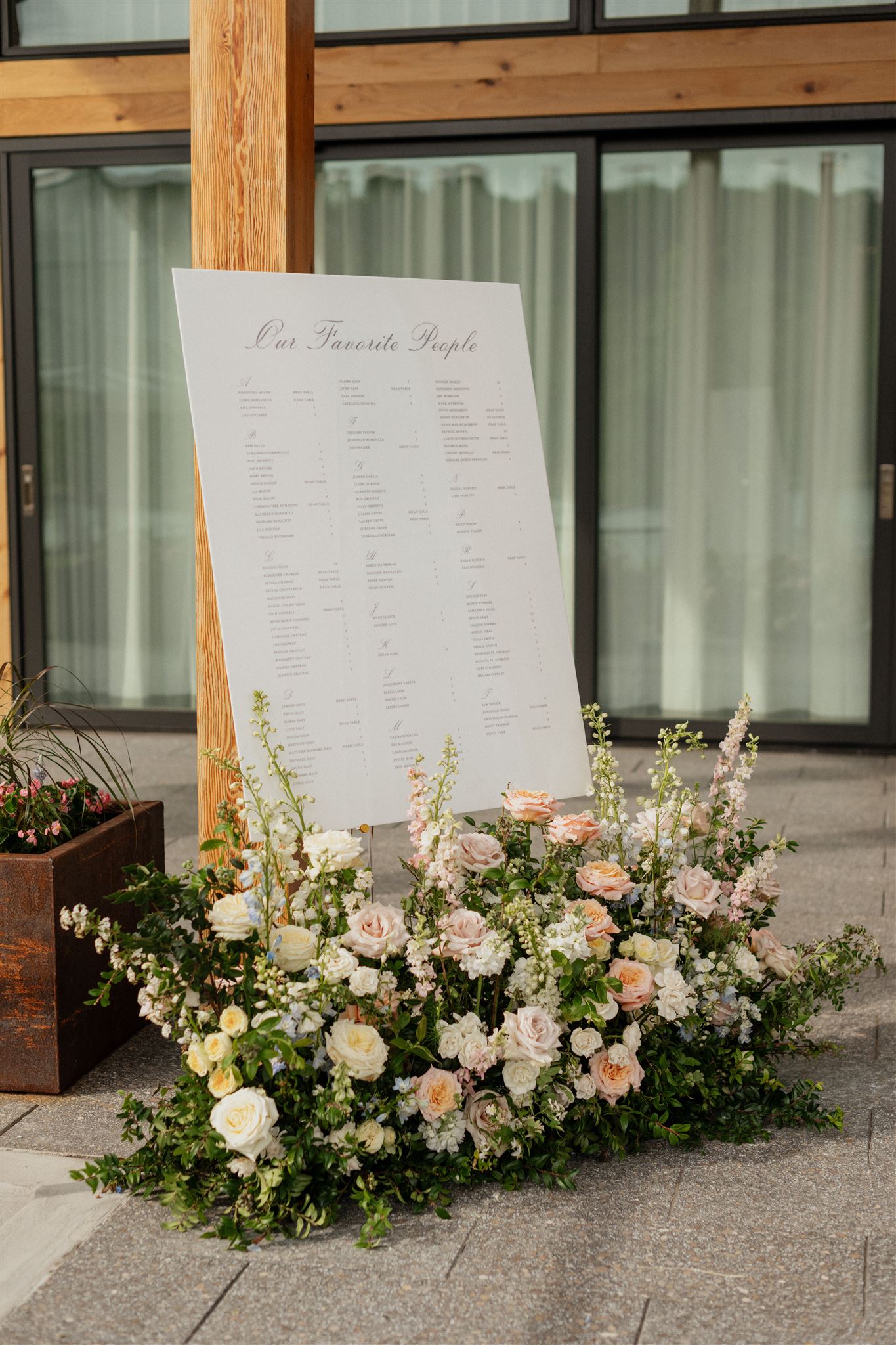
We helped guests to their seats with a tastefully designed seating chart. I adore the soft gray lettering against the white signage as flower arrangements kissed the bottom of the chart. Florals and signage just go together, there’s just nothing else like it!
Custom Spring Wedding Details
One of the most exciting things for us at White Ink is when our couples request the “designer’s choice” for some of their details and signage. Sometimes, brides and grooms know exactly what they’re looking for with these types of details and decor. However, there are others who just aren’t sure what would look best. We LIVE for these moments! Not only is this what we do, but more than that, it means that our couples completely trust us and our experience.
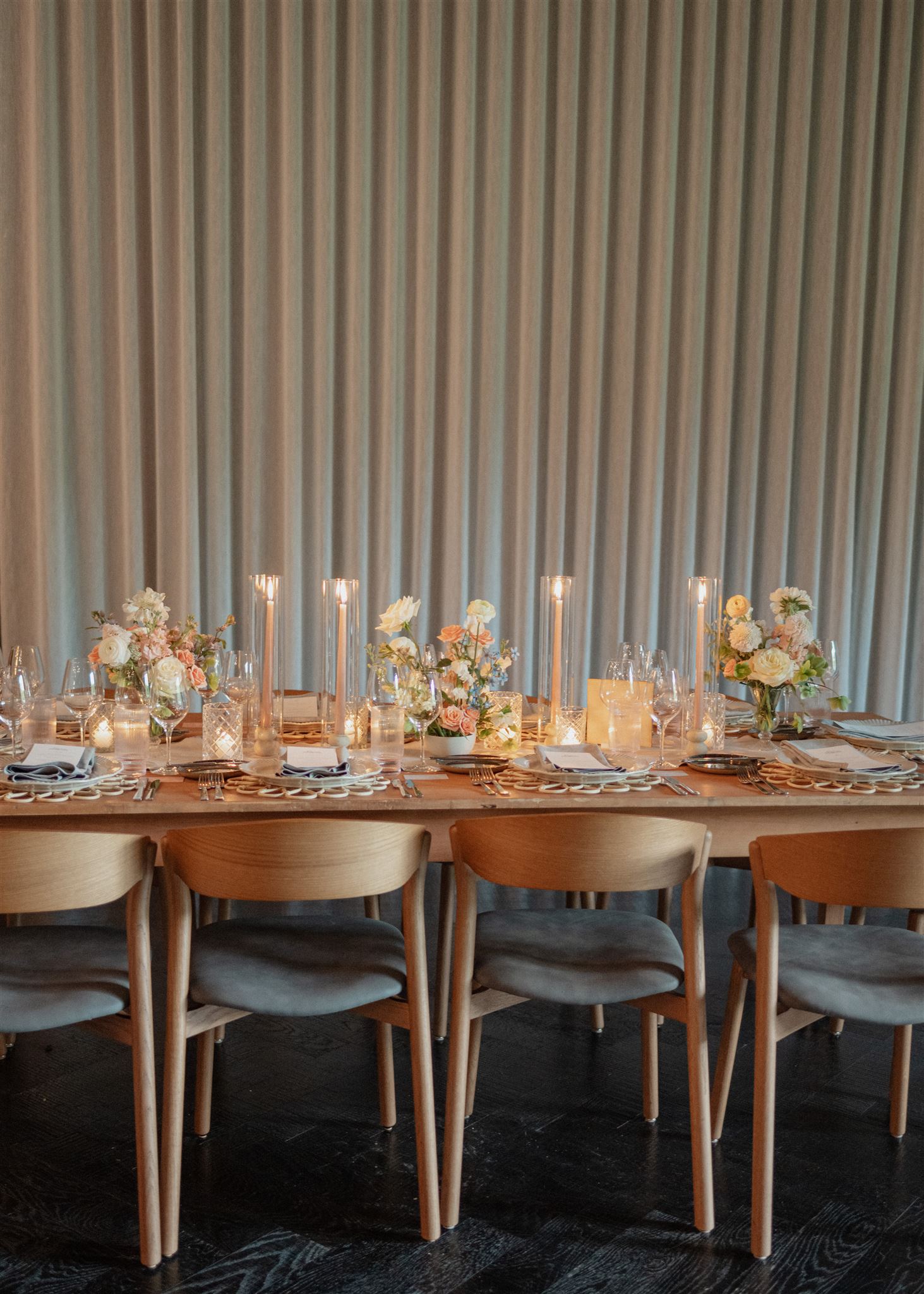
Customized Wedding Reception Details
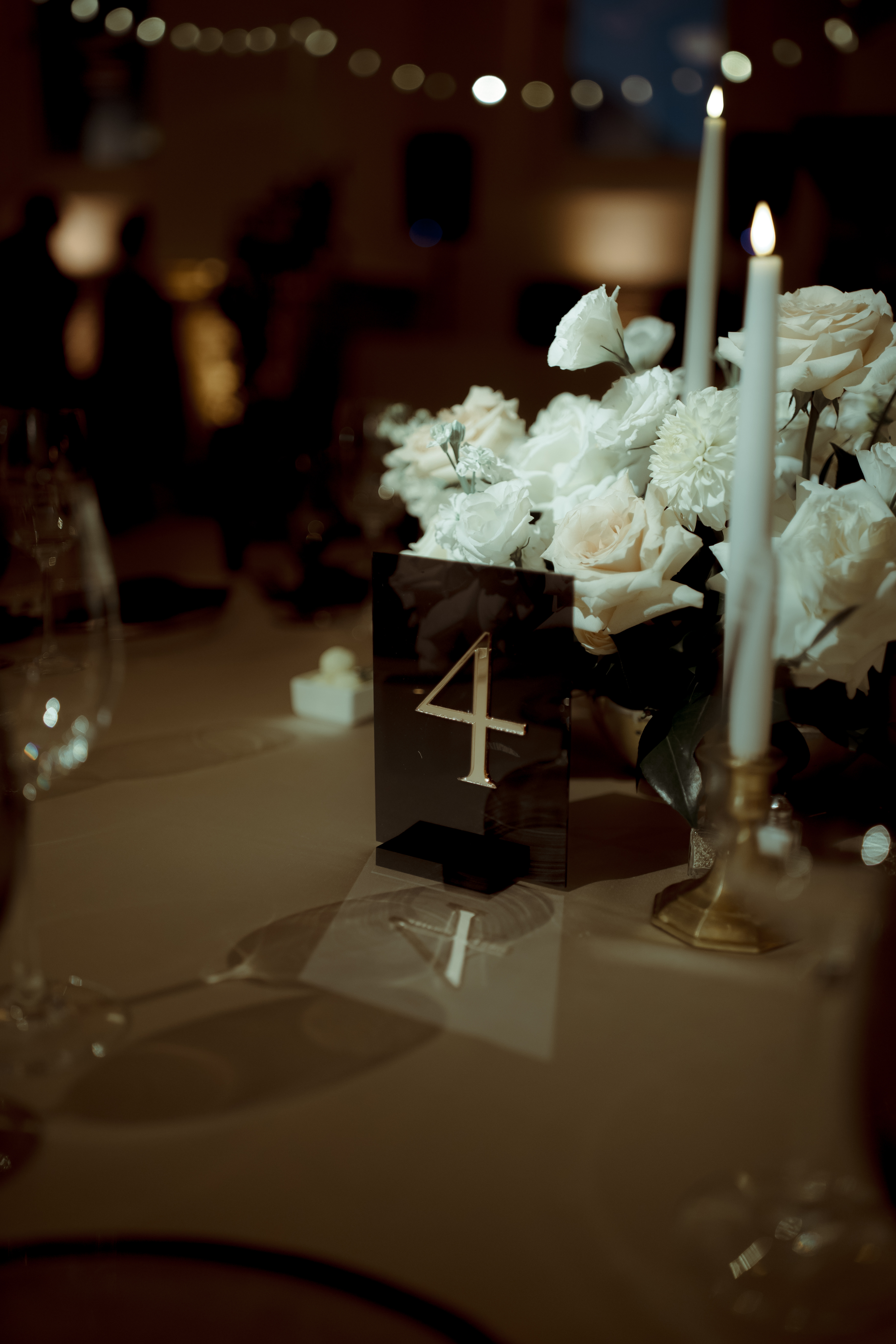
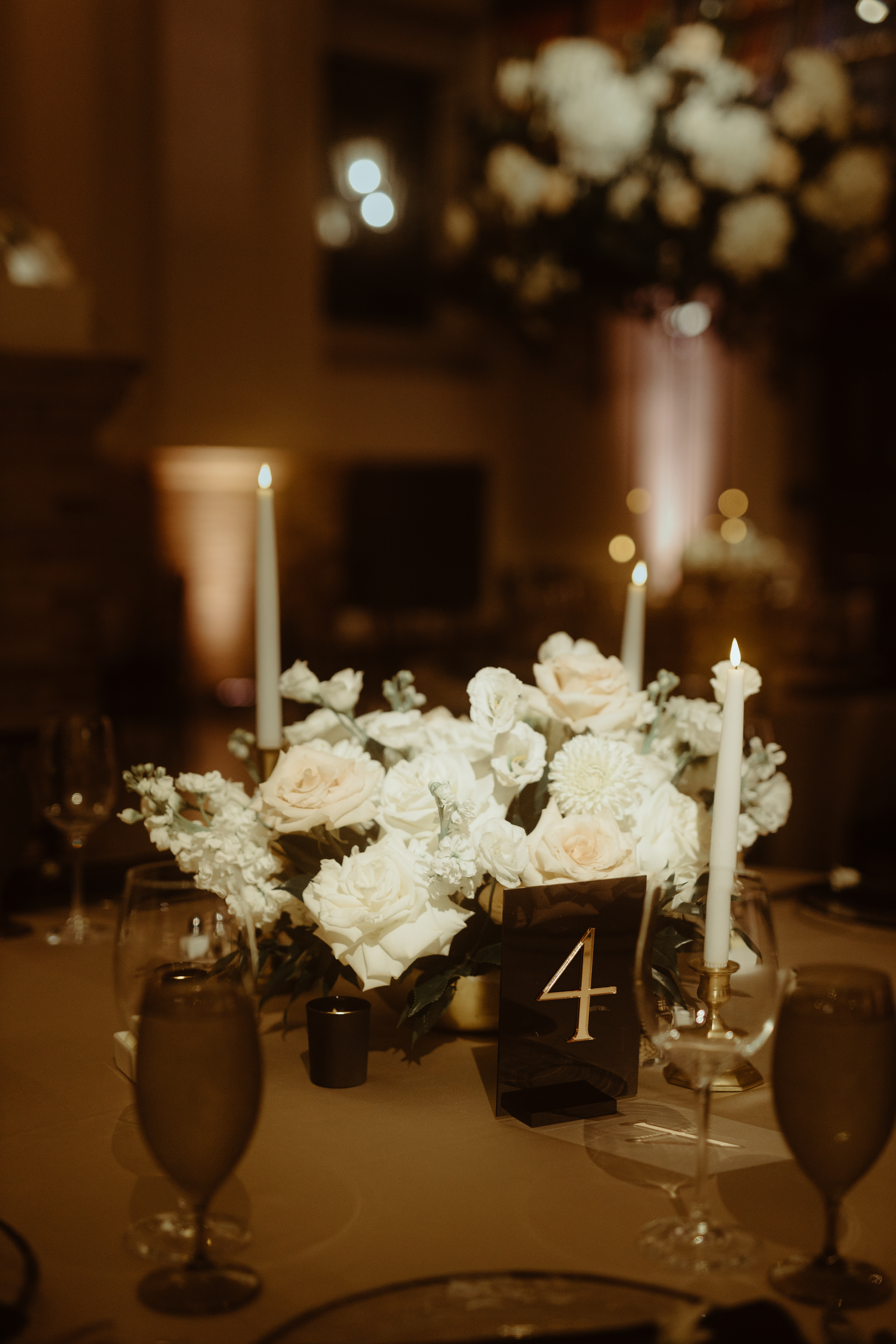
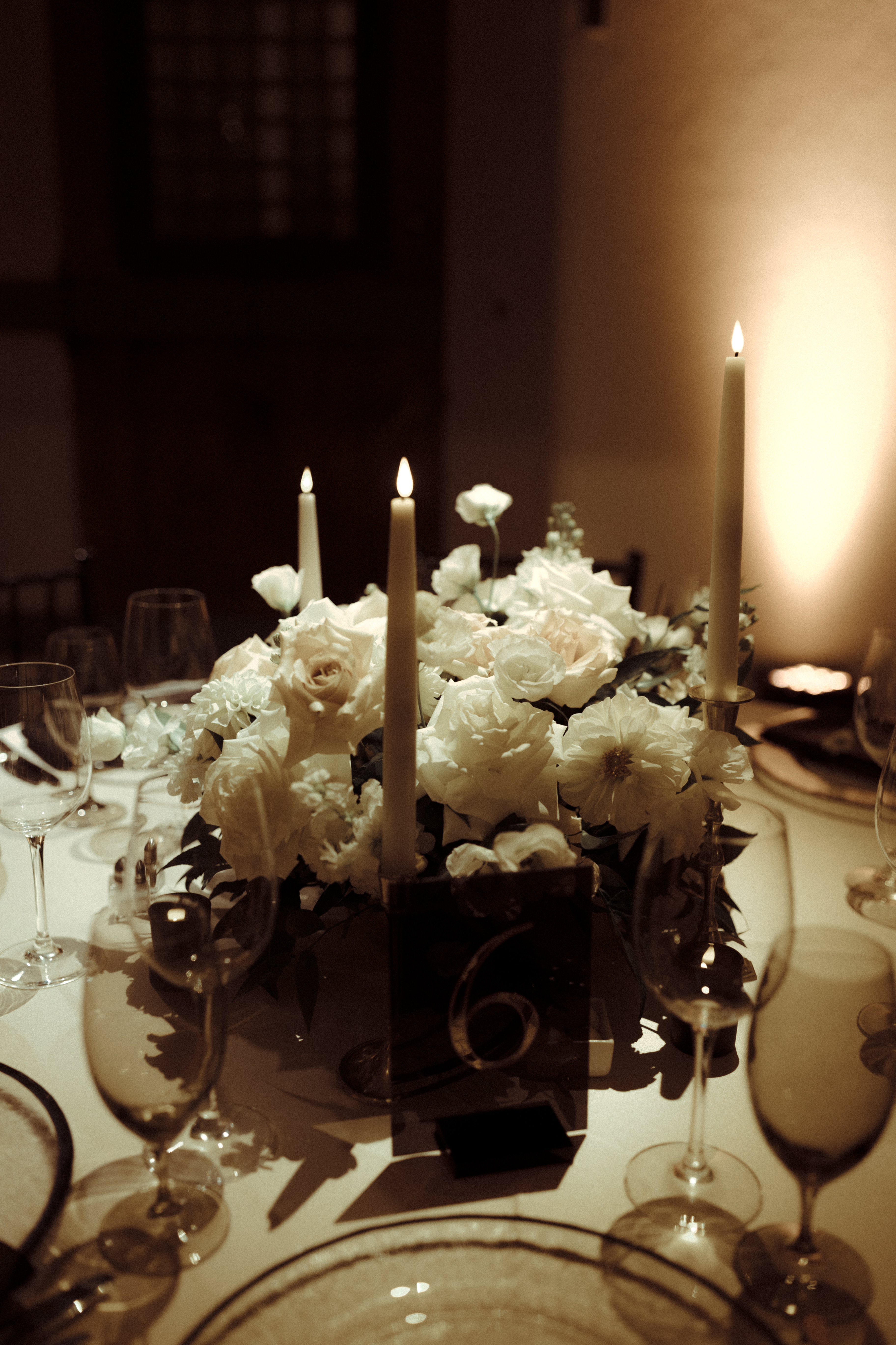
For Lauren and John, we were happy to flex our creative muscles to come up with these stunning table numbers for their reception. We surprised them with a frosted acrylic to match the vellum wrap we made for the invitations, as well as etched florals from the vellum wrap. We then mounted it against a laser-cut number in white acrylic to natural wood. Designer’s choice and a chef’s kiss.
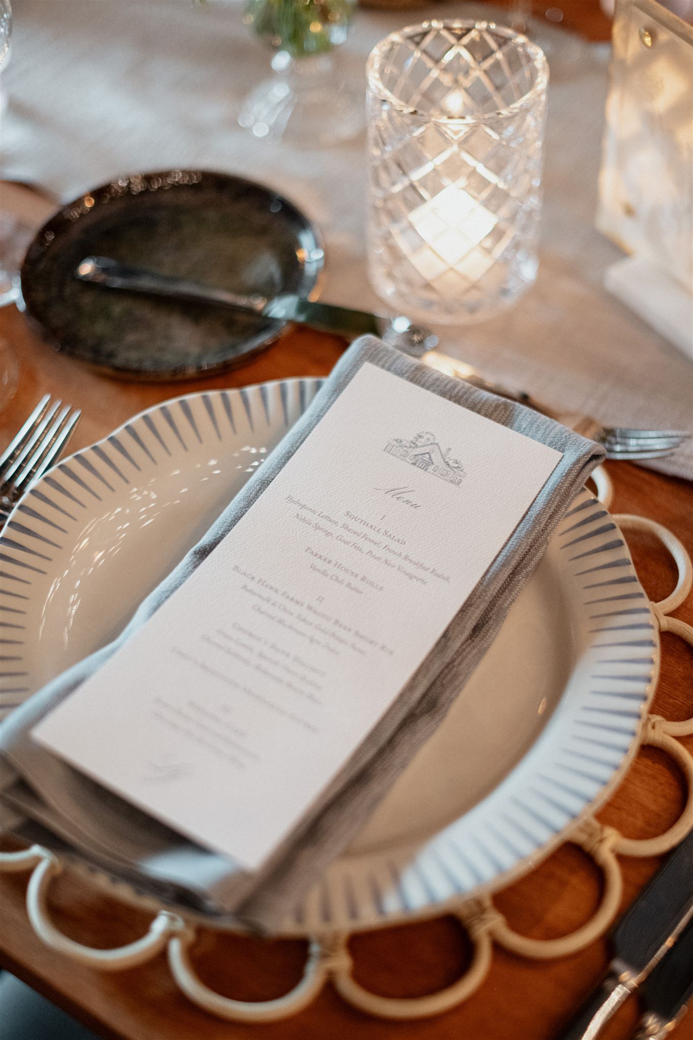
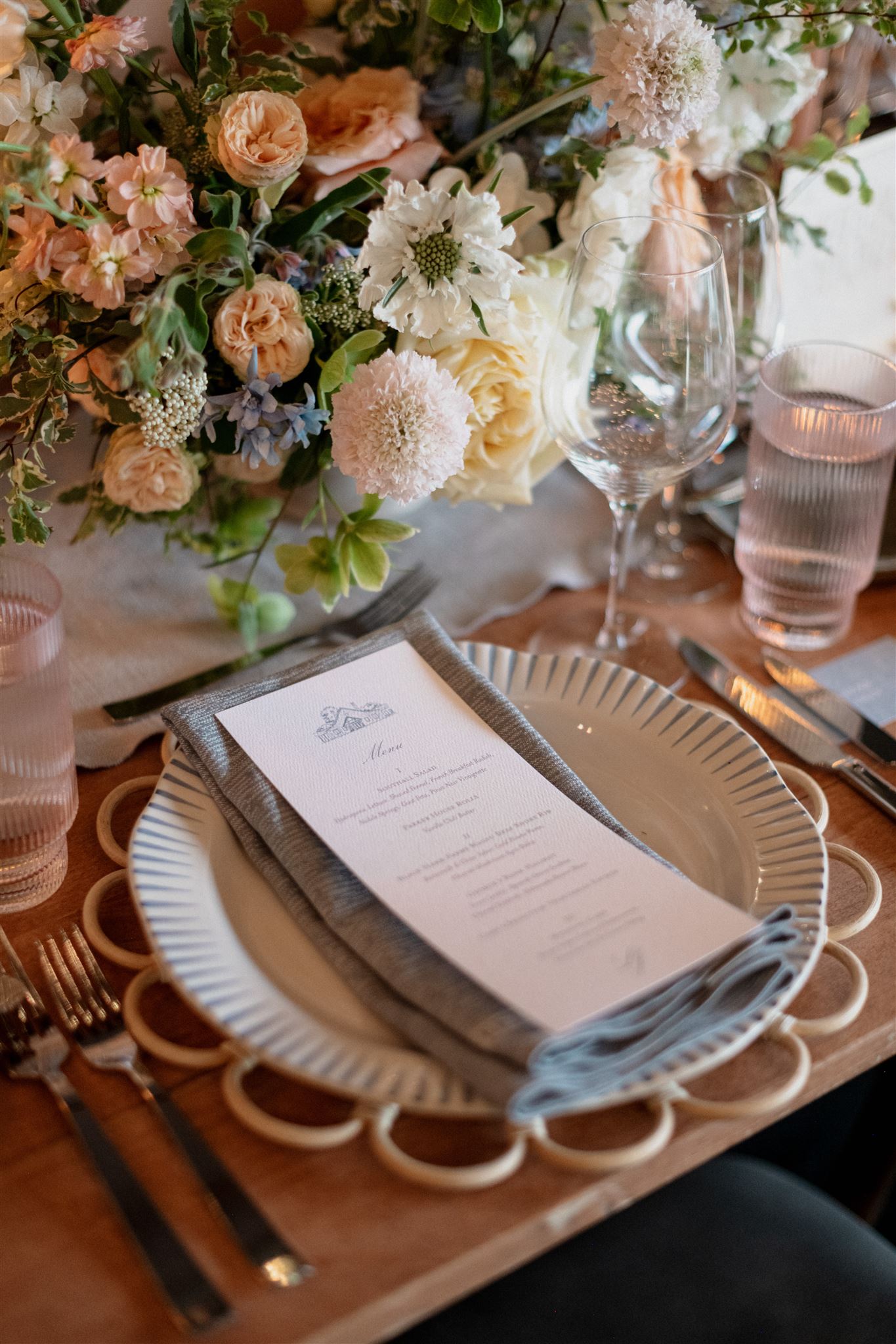
Menus are another great opportunity for brides and grooms tie in special details. Lauren and John chose the same letter press wording and hue of that of their wedding invites.
These menus were simply made for this tablescape as they tucked effortlessly against the napkins and place settings. Never stealing the show, only elevating it.
Lauren and John were a delight to work with from start to finish! It was an honor to be a part of their big day. The couple ensured that every guest felt special, and that every detail mattered. This is a wedding that will certainly be hard to forget. A toast to the happy couple- a toast to forever. Cheers!
If you’re looking to add custom, thoughtful touches to your wedding or event, we would love to help make your vision a reality. Reach out today to learn more about our full-service design offerings—we can’t wait to create something unforgettable for you!
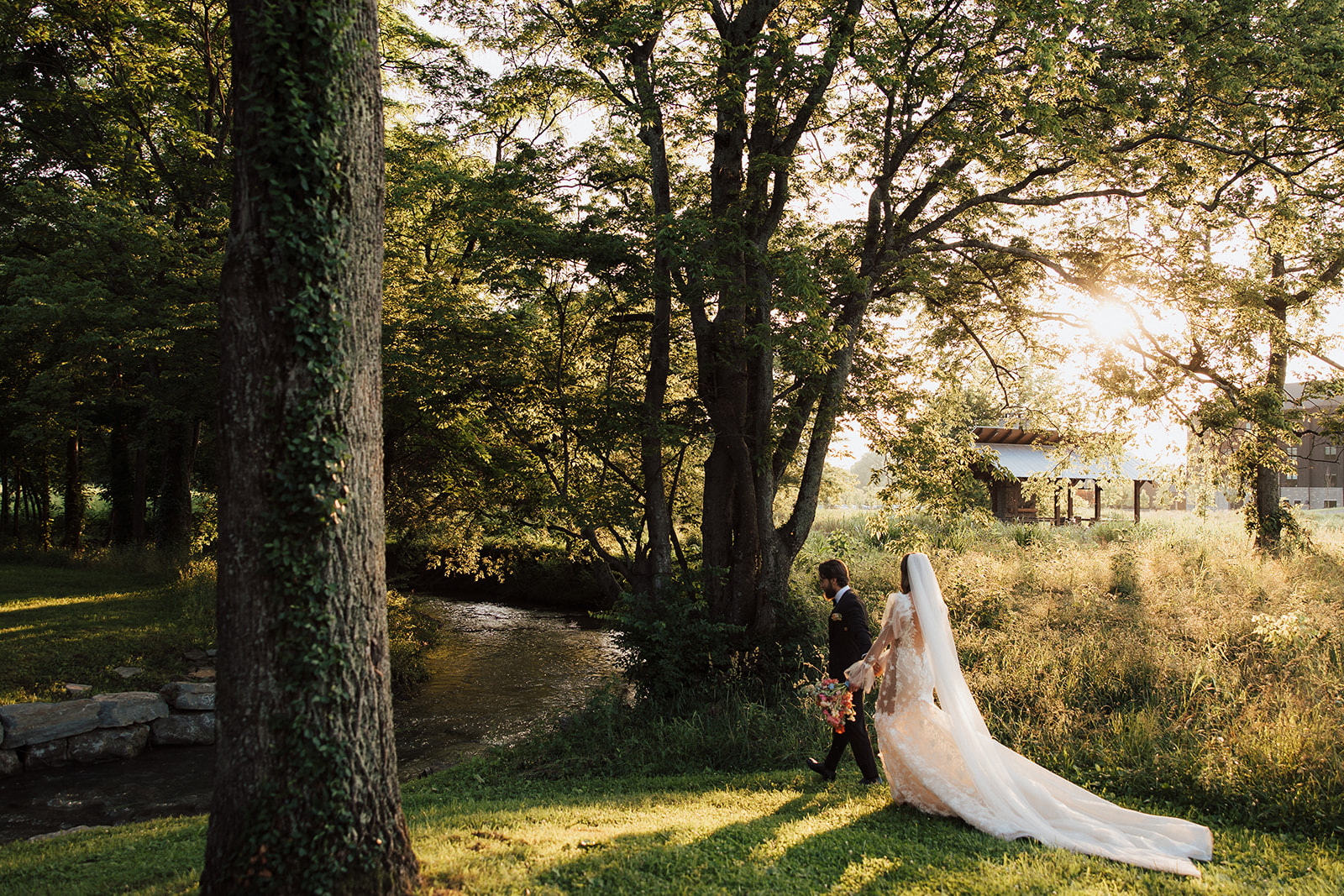
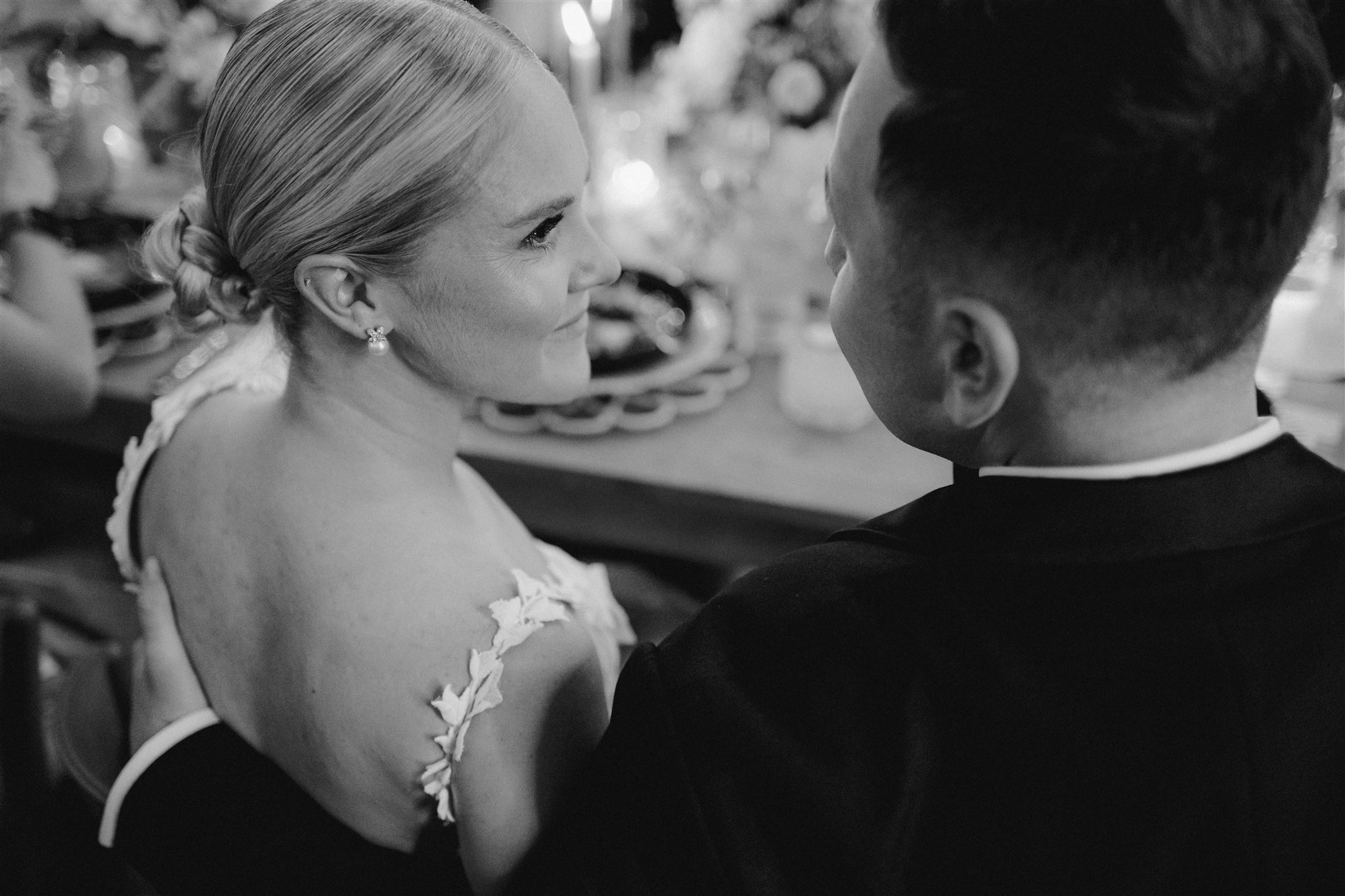
Turning to each other, hand in hand, looking at each other with the same soul-shaking stare, the kind of stare that fully surrenders to the excitement of the moment- that’s the part of a wedding that always gets me. Couples in THEIR moment, that small and mighty moment in each ceremony is the best part of the whole celebration. Our incredible couple, Padma and Sagar, were surrounded by their closest friends and family in one of the most stunning receptions we’ve been a part of. Their elegant winter wedding day included countless moments that will stay with us.
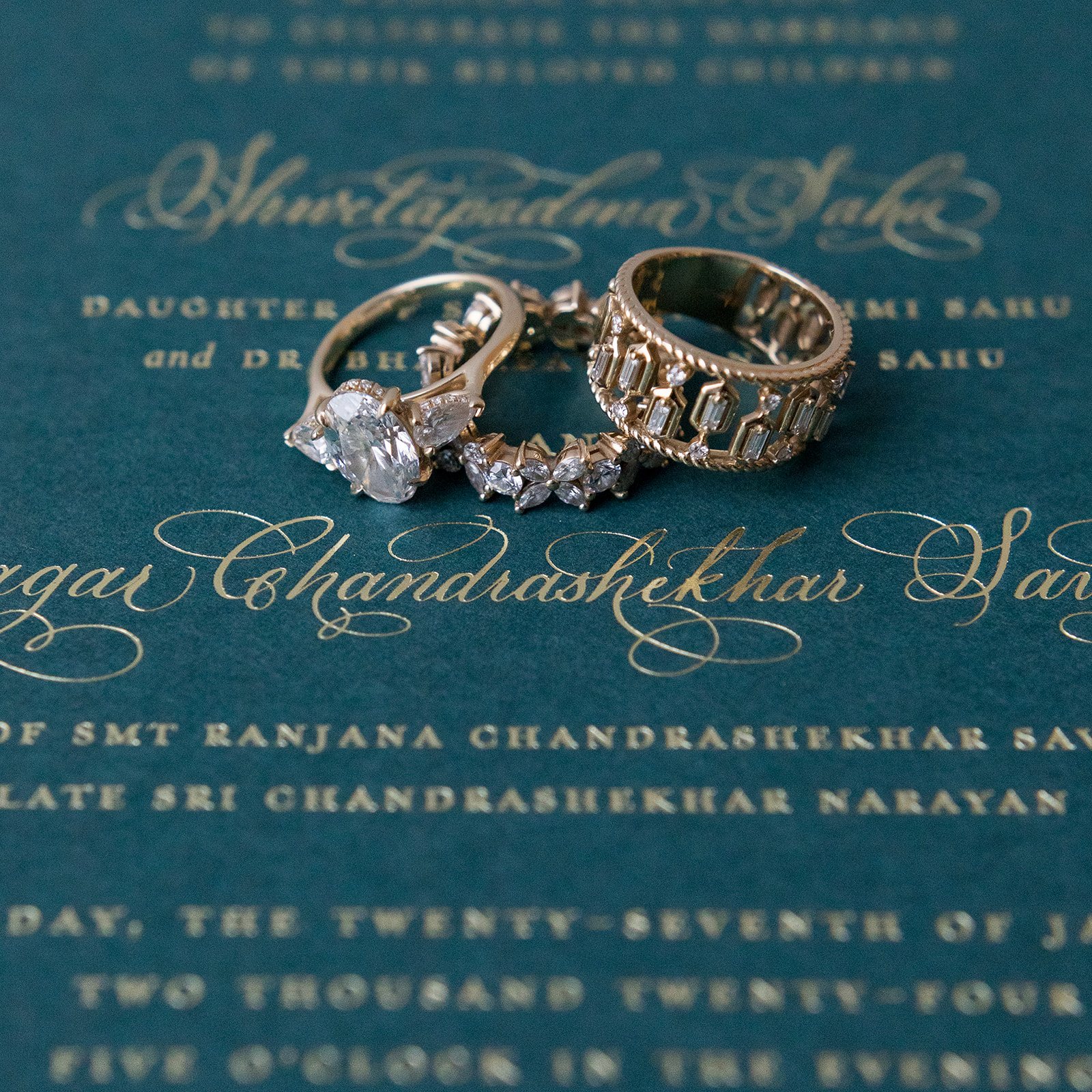
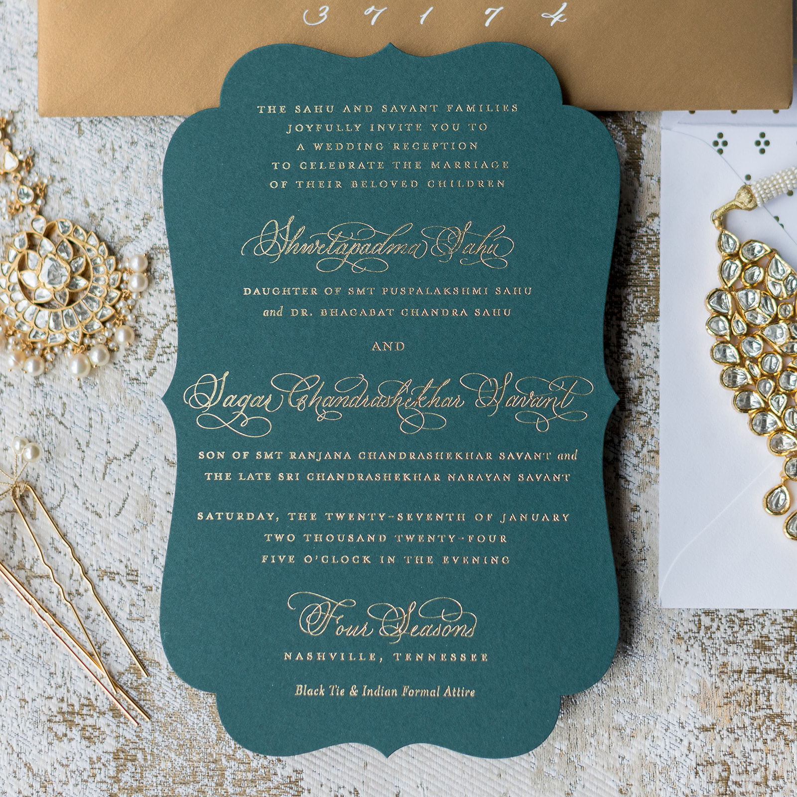
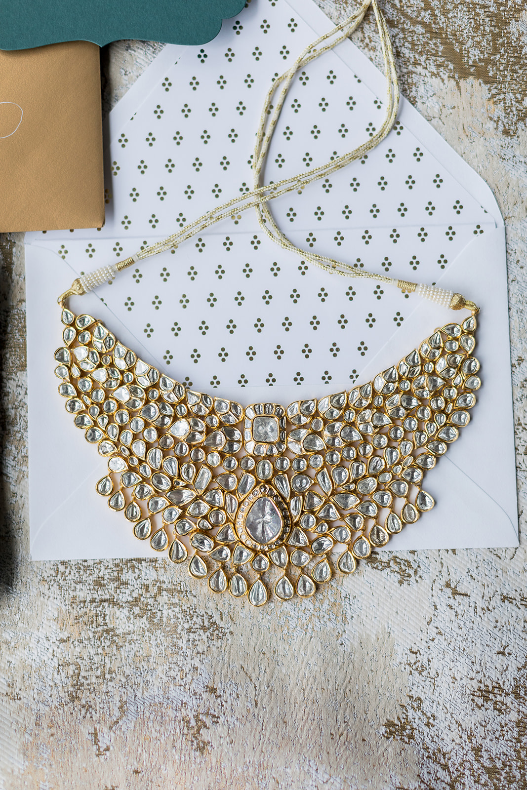
Dark Green Invites Enhanced with Gold Calligraphy
For starters, Padma and Sagar’s custom invitations boasted a deep green hue making the gold print and calligraphy pop right off of the paper. They chose the unique curved outline for the invite, making it an especially stunning piece for guests to enjoy. Your invites can encompass the style of an event beyond color and print! Using a detail like the shape of an invite is a great way to incorporate your style and vision.
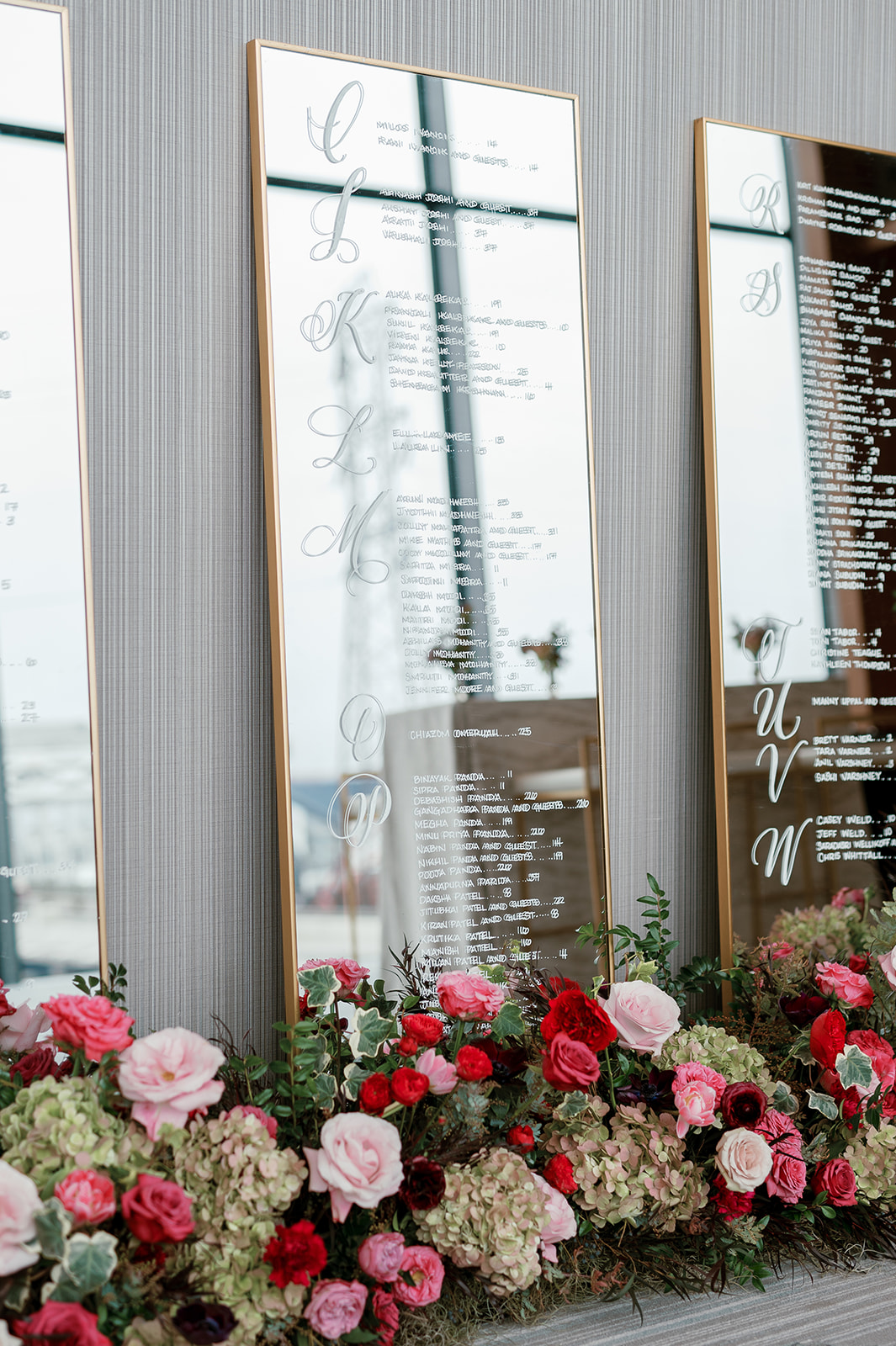
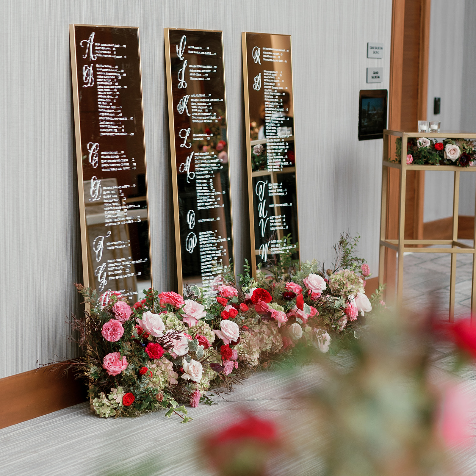
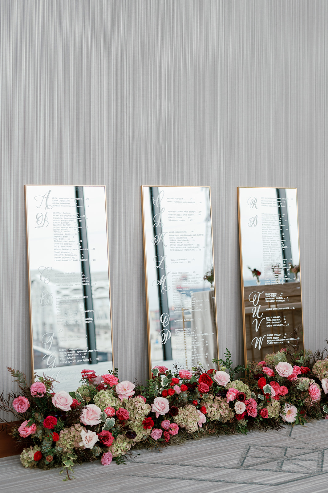
Whimsical Seating Chart
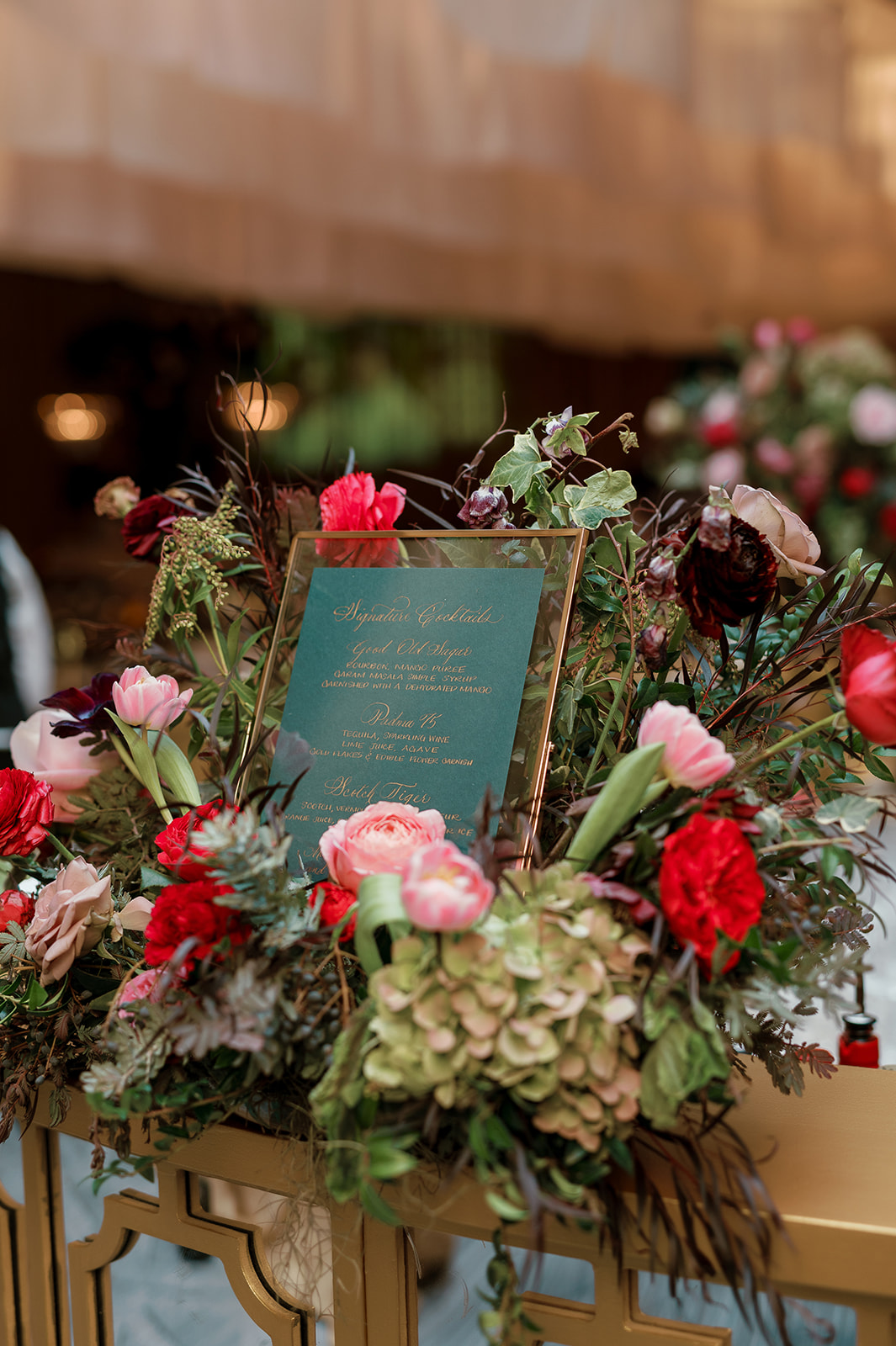
The whimsical seating chart display was a guest favorite. The sleek gold frames gently leaned against the wall while a bright array of florals surrounded their base was simply magical. I get excited when couples use florals to enhance the seating chart displays. It’s always a design win!
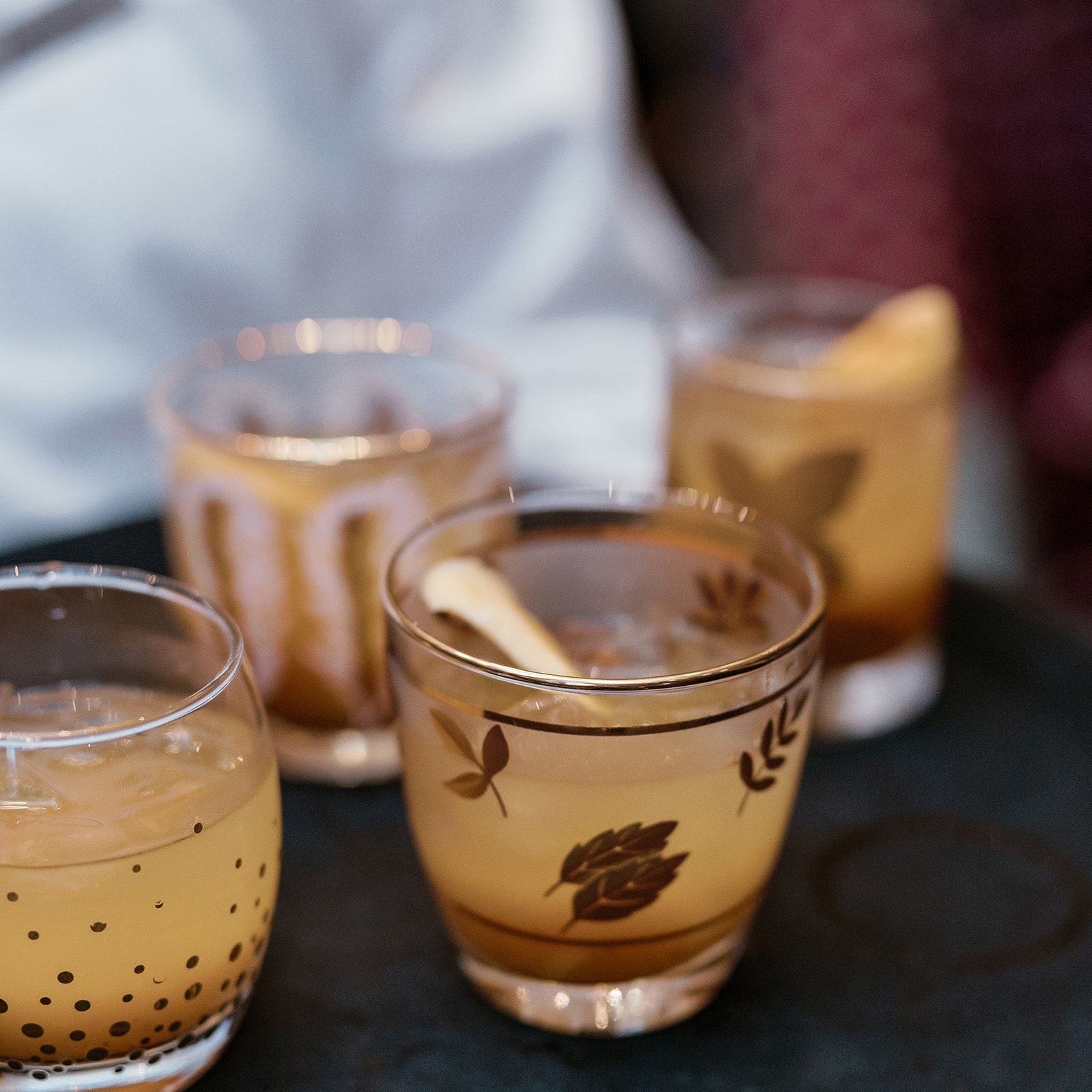
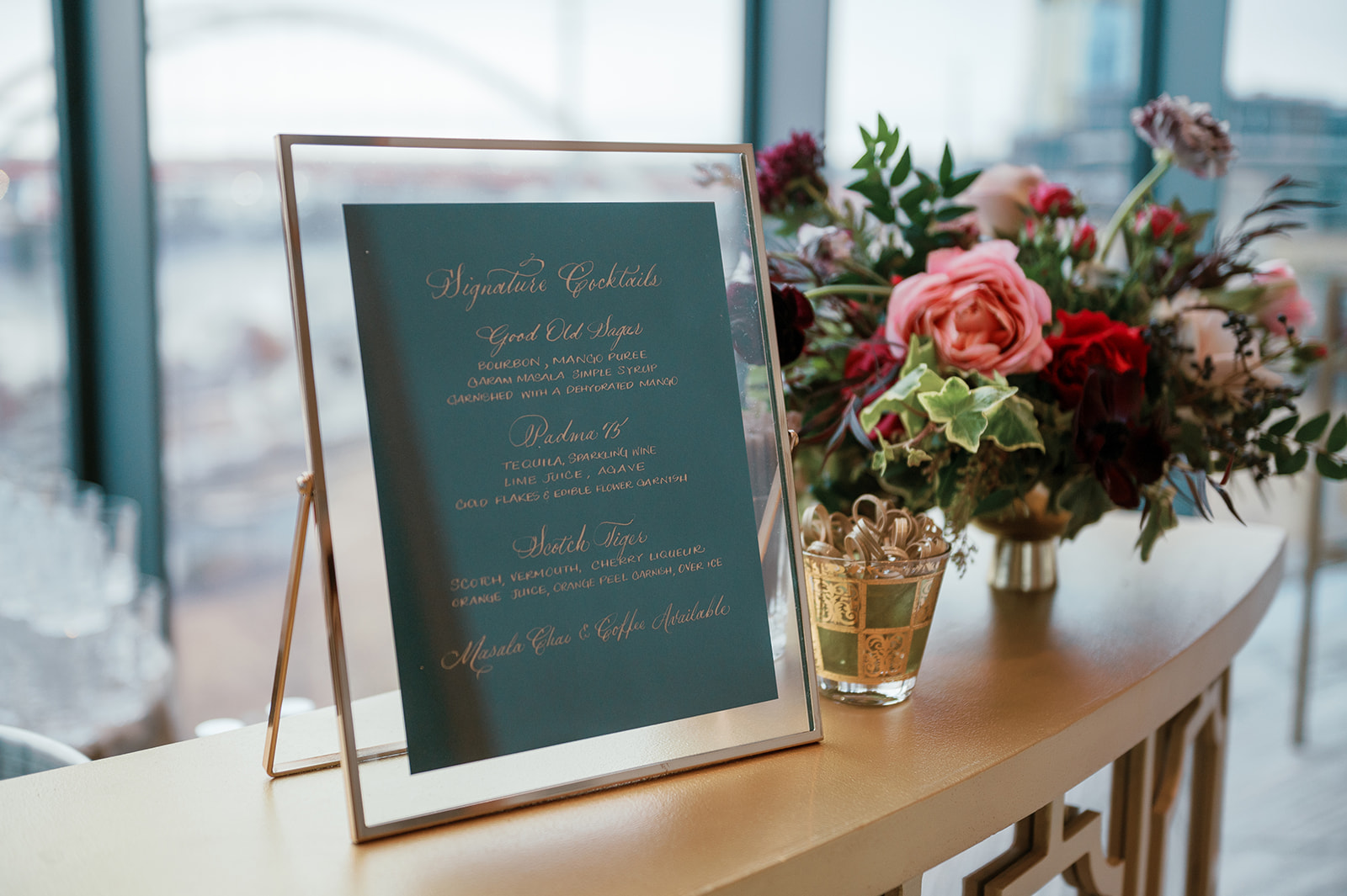
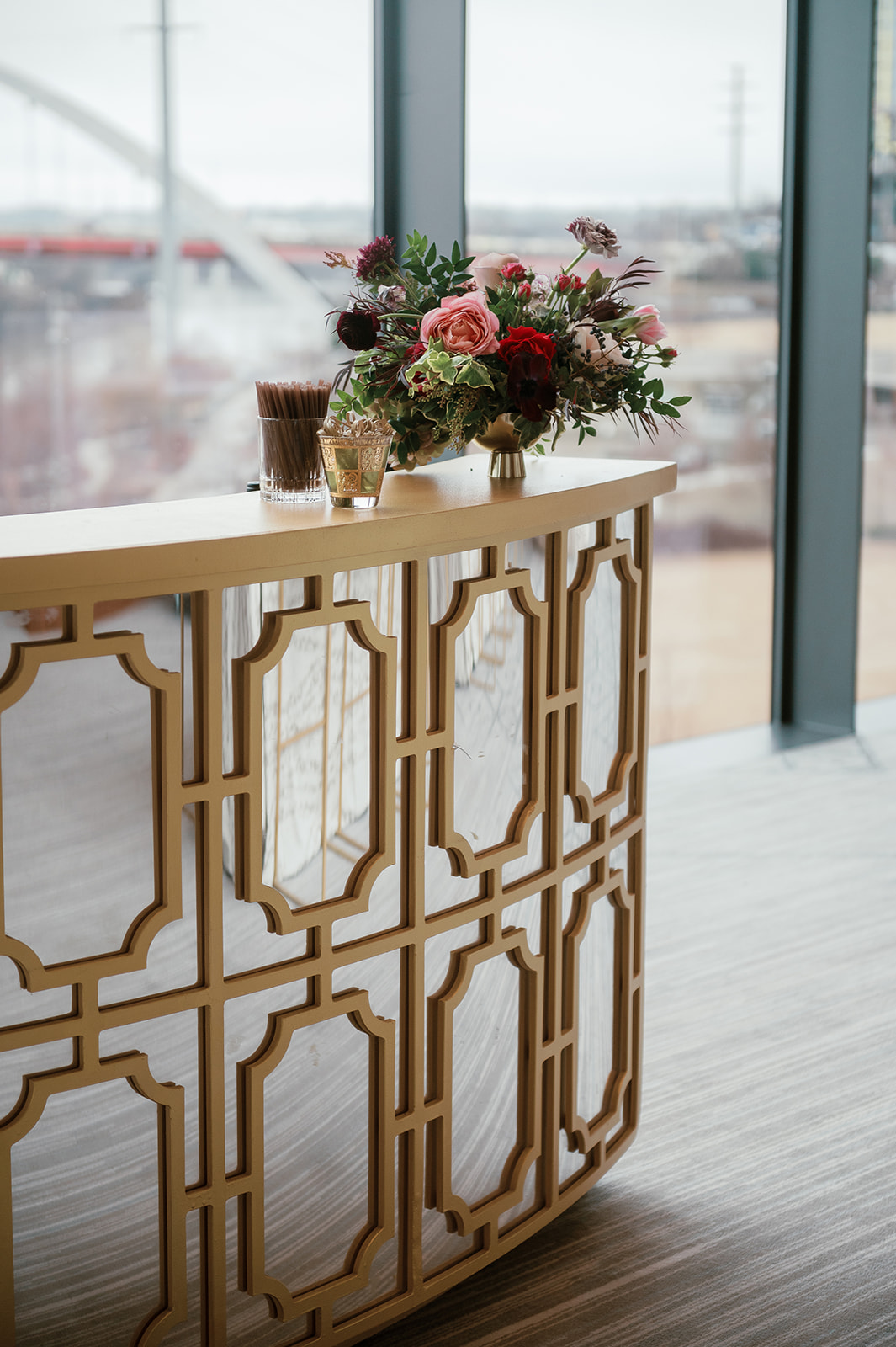
Elegant Winter Wedding Details
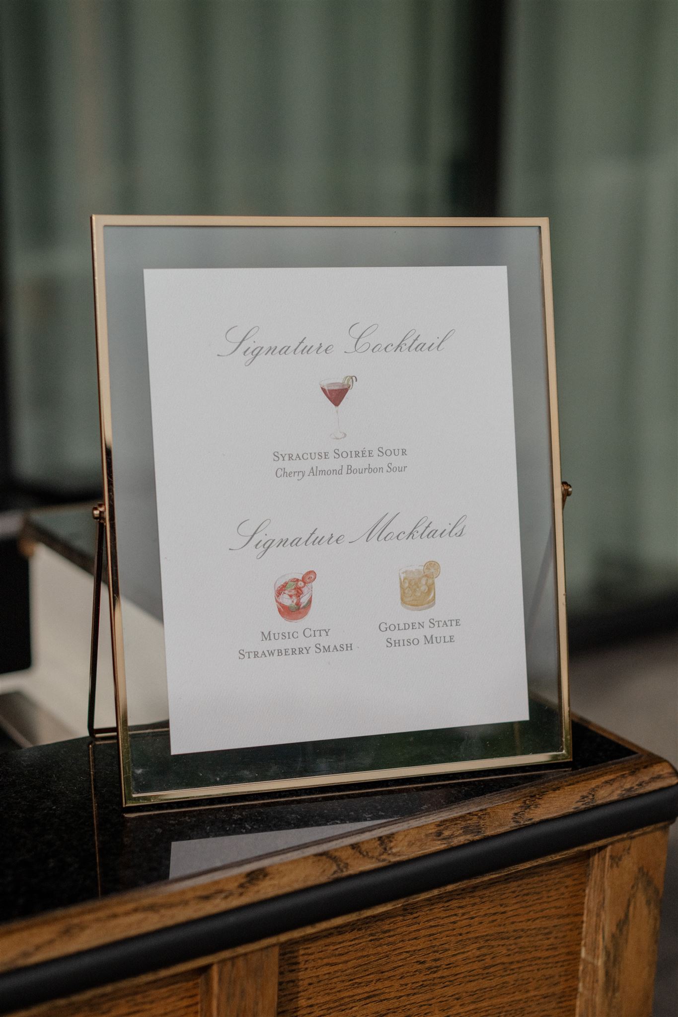
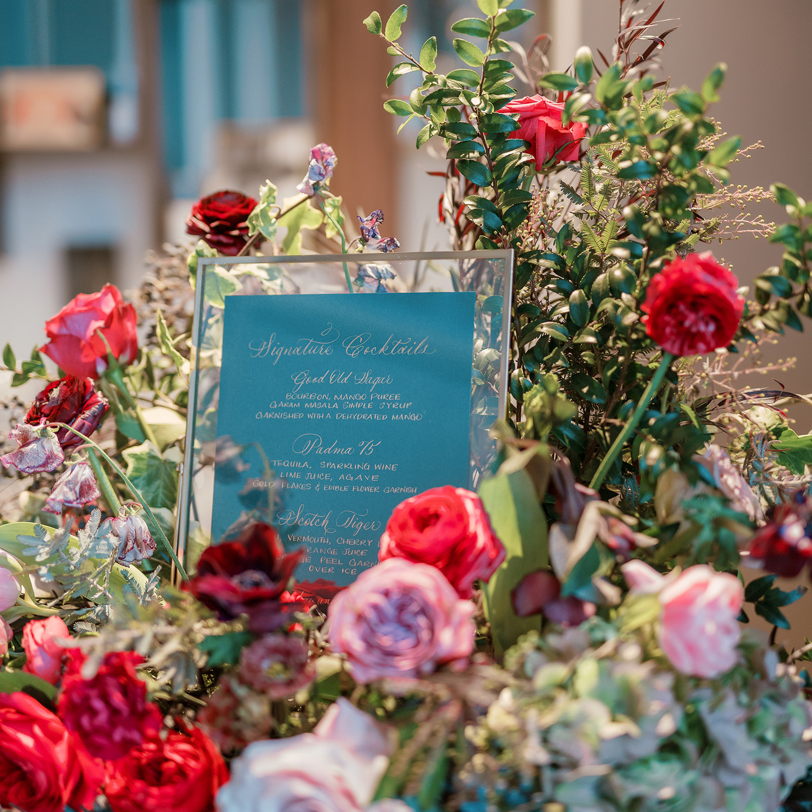
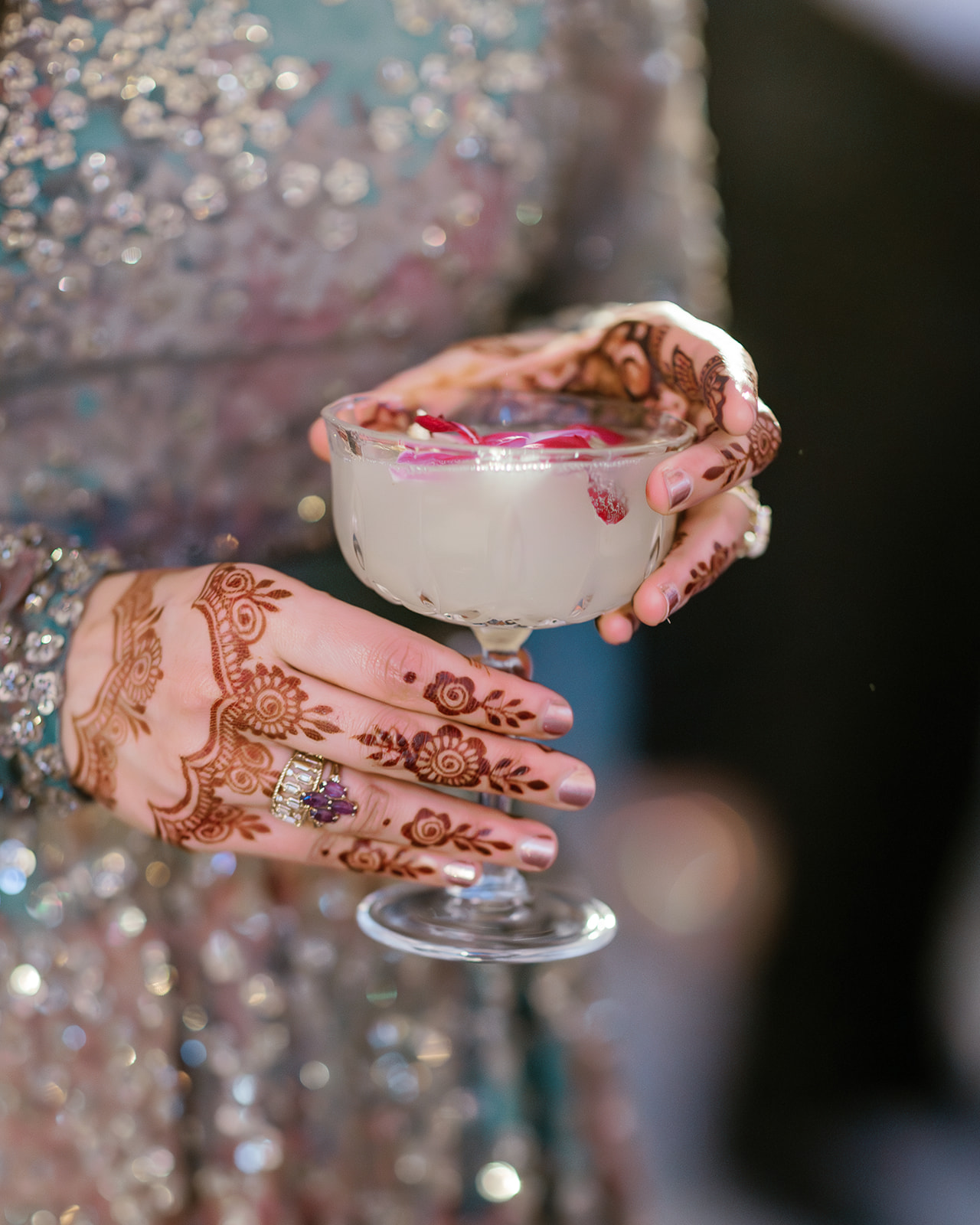
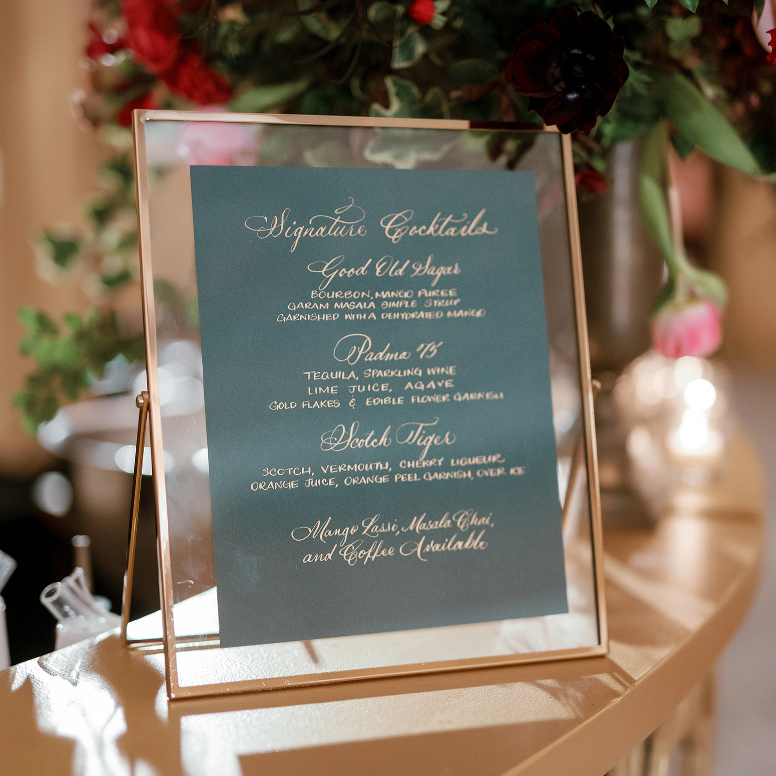
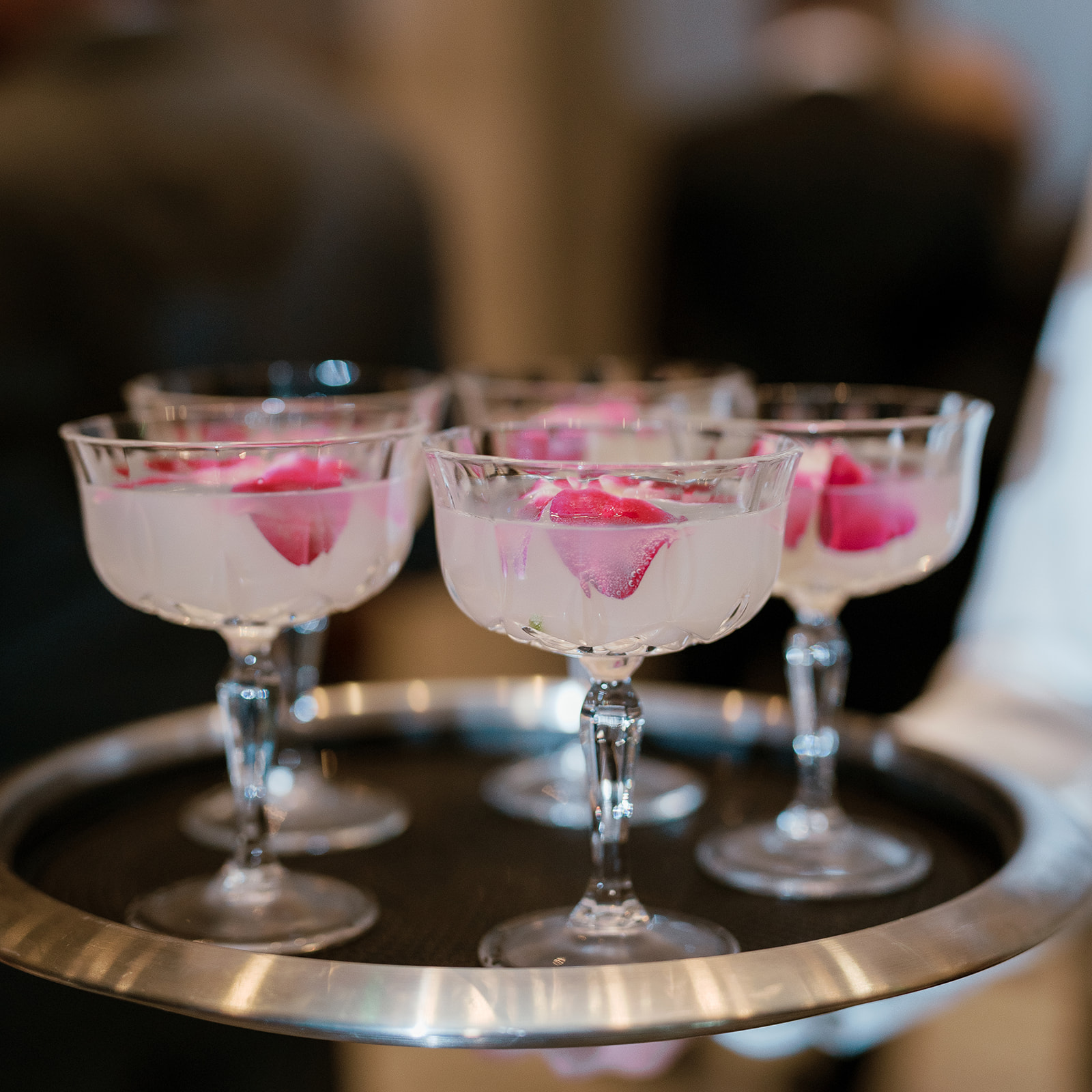
Well, this is about as stunning as it gets when styling your bar signage! Our team enjoyed creating the custom signature cocktails sign, which used the same paper color and gold ink as Padma and Sagar’s invites. The sign was styled with the same florals as the seating chart display. YES, to carrying details throughout your entire celebration! What an inviting display during cocktail hour!
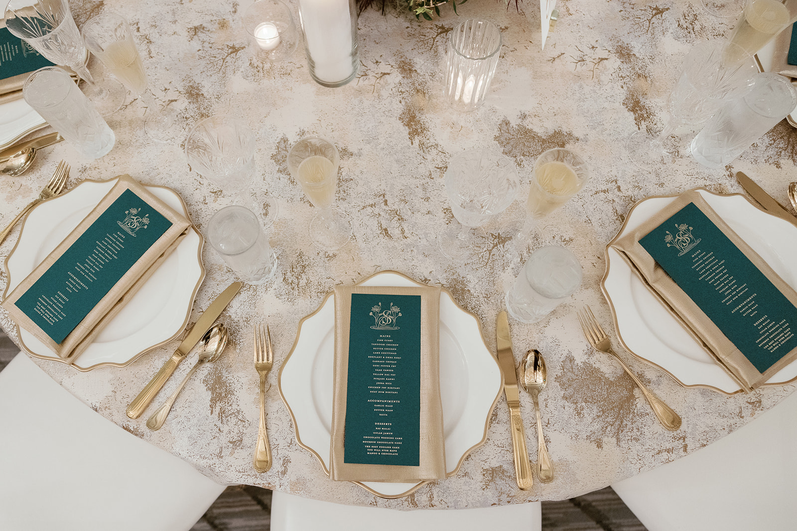
It was an honor to create Padma and Sagar’s dining menus to add to this incredibly stunning reception. Again, guests enjoyed the beautiful deep green hue found on the invites and bar signage. The gold print flowed perfectly with the gold-rimmed dining plates, gold napkins and goldware! An absolutely timeless motif.
White Ink is honored to be included in the excitement of our couples’ celebrations! We delight in the traditions, the love, and the people that each couple values. Bringing our couples’ individual vision to life is why we’re here and what we love to do! Cheers!
If you’re looking to add custom, thoughtful touches to your wedding or event, we would love to help make your vision a reality. Reach out today to learn more about our full-service design offerings—we can’t wait to create something unforgettable for you!
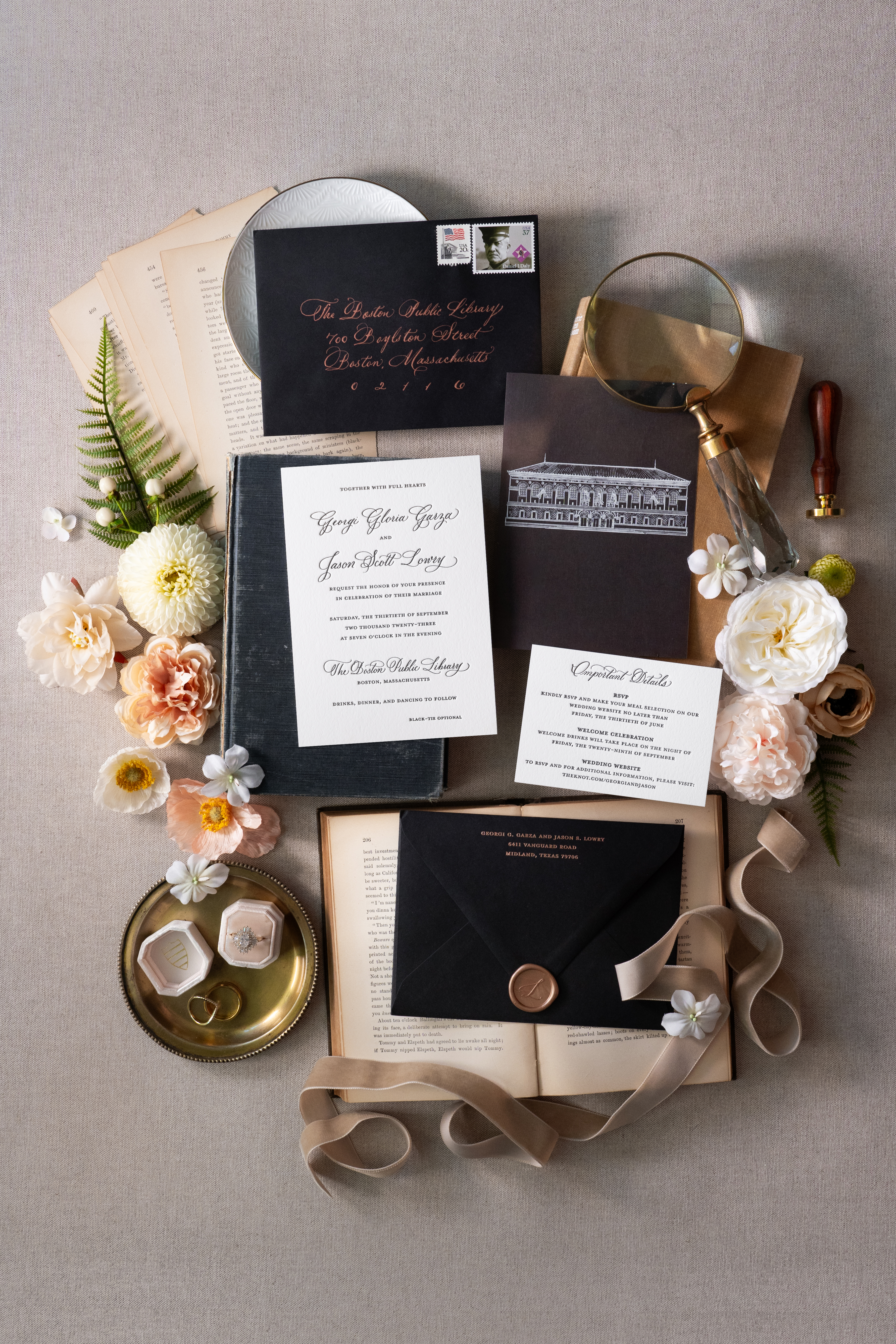
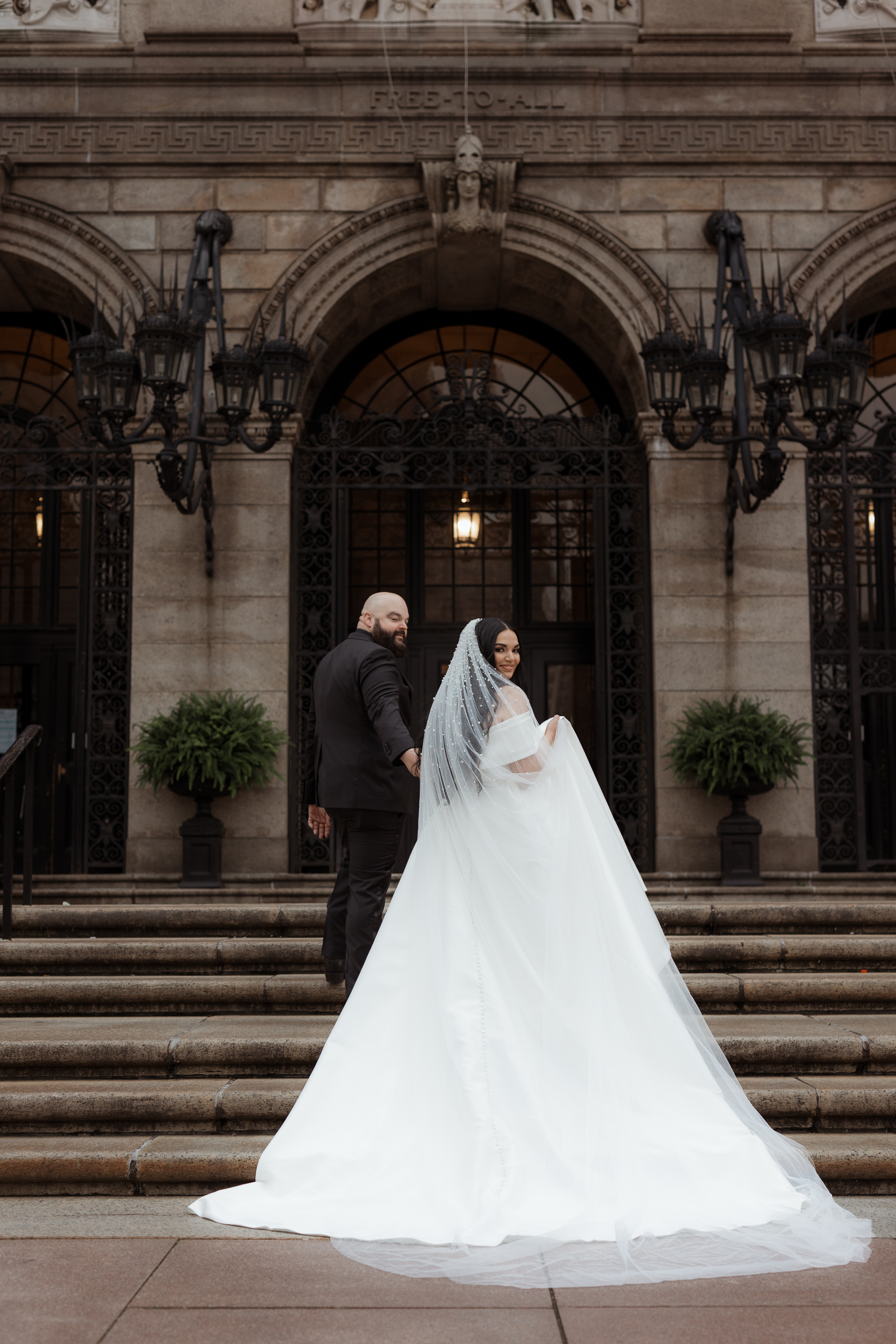
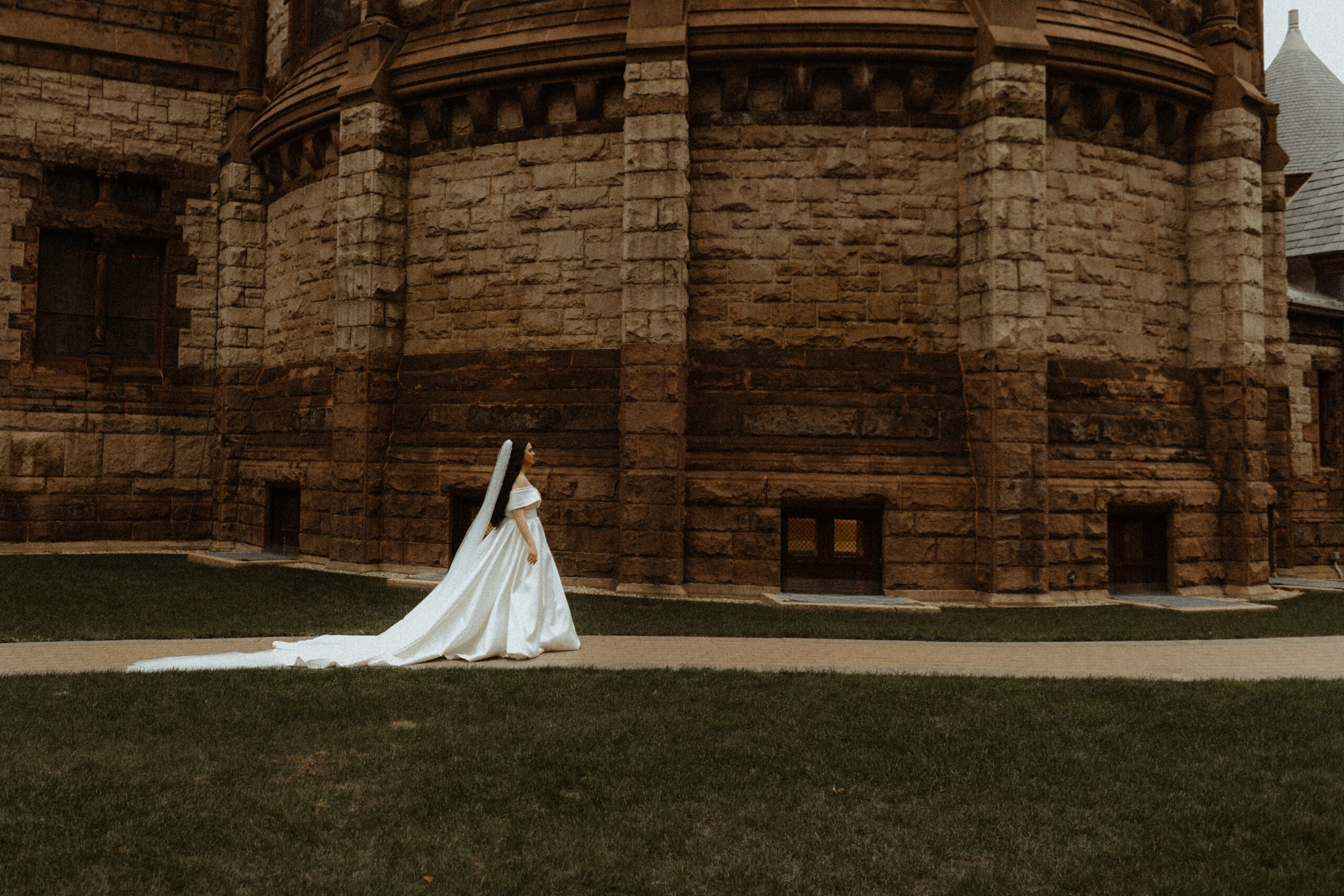
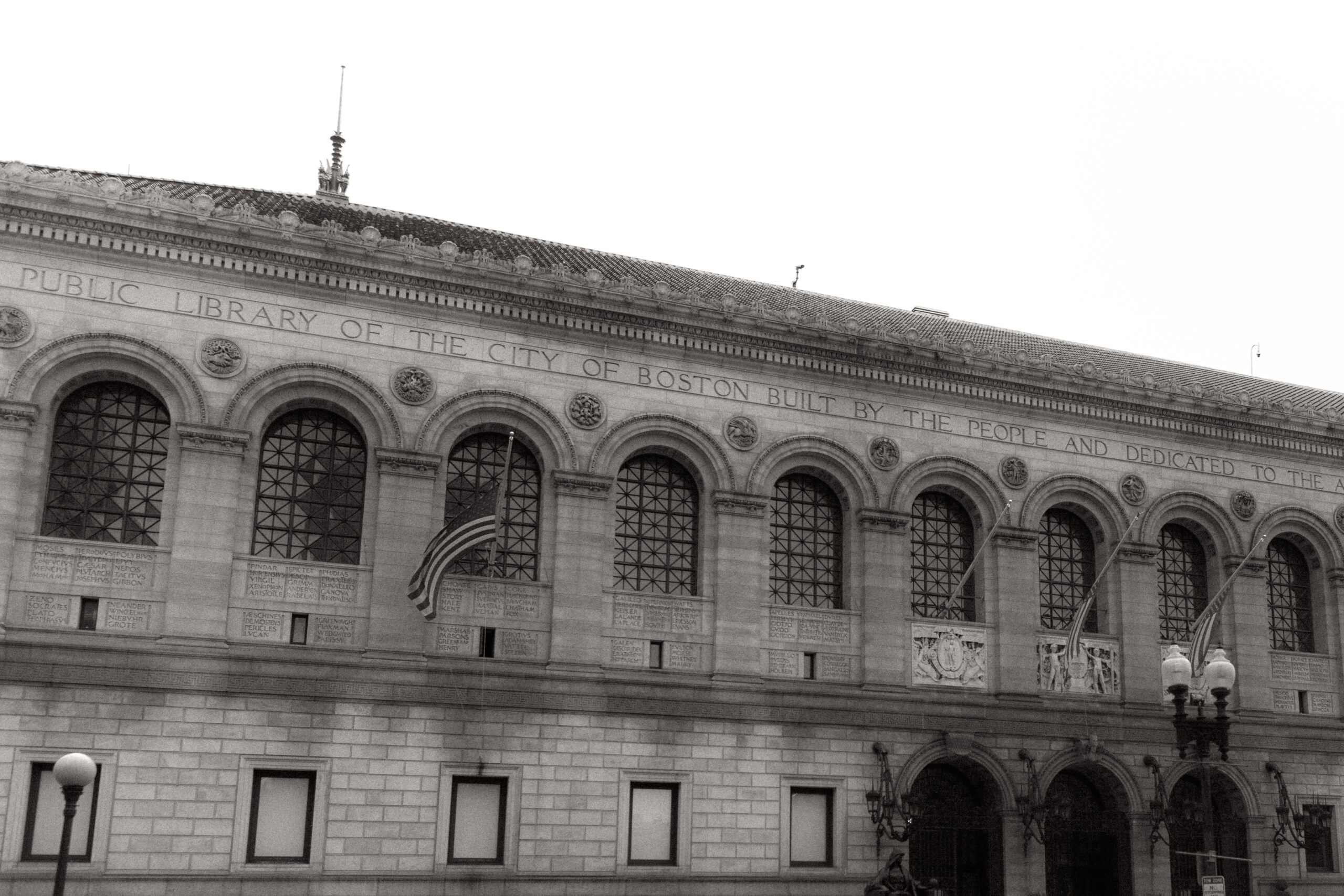
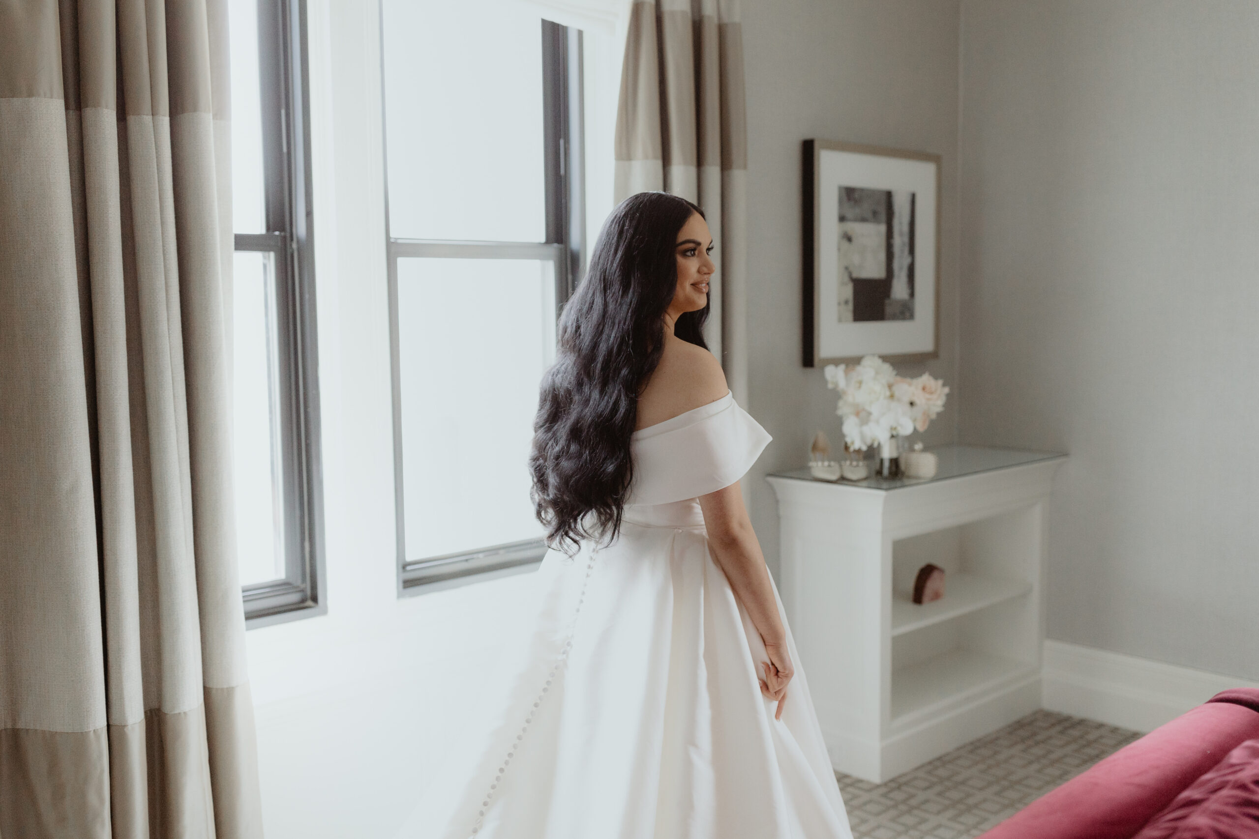
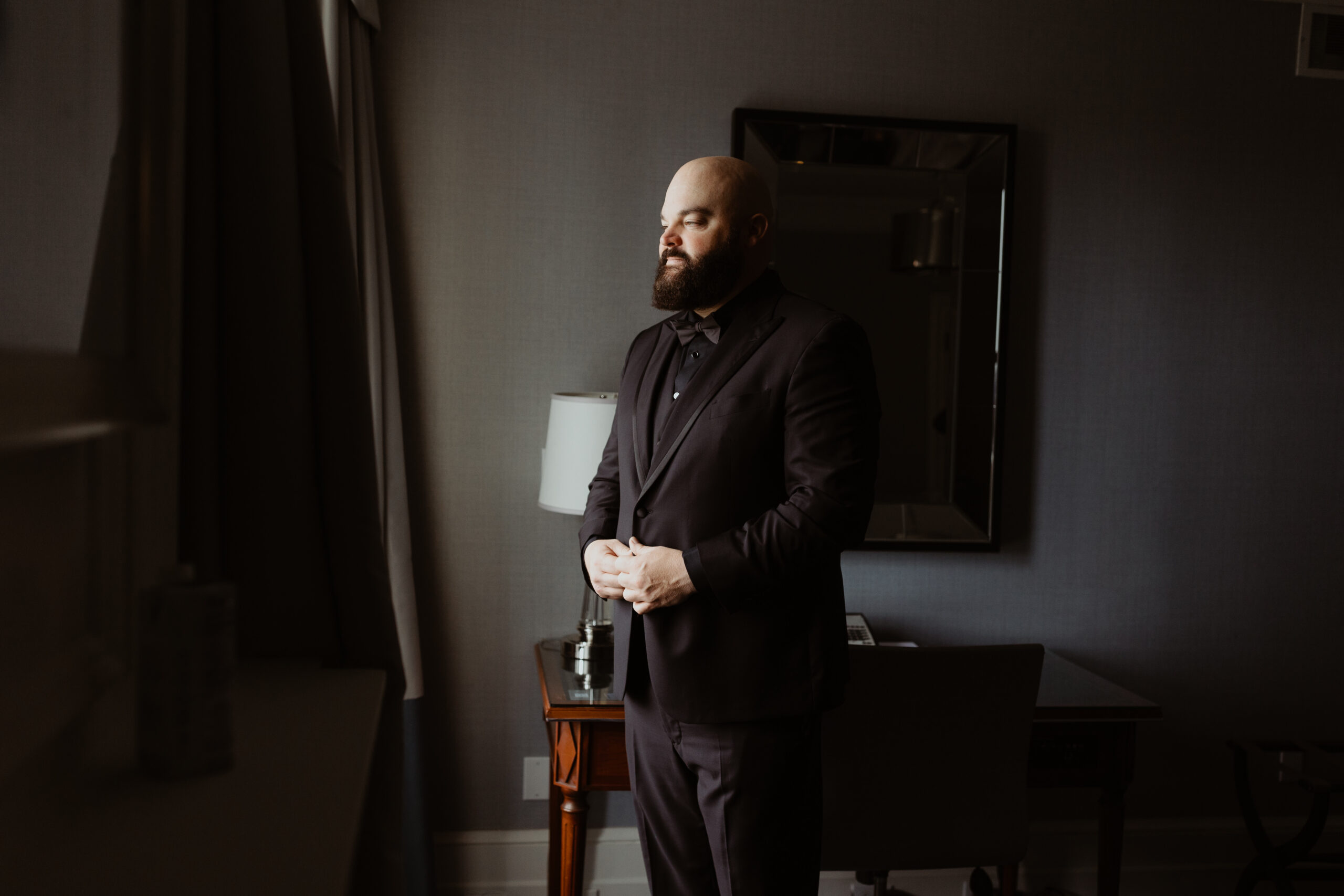
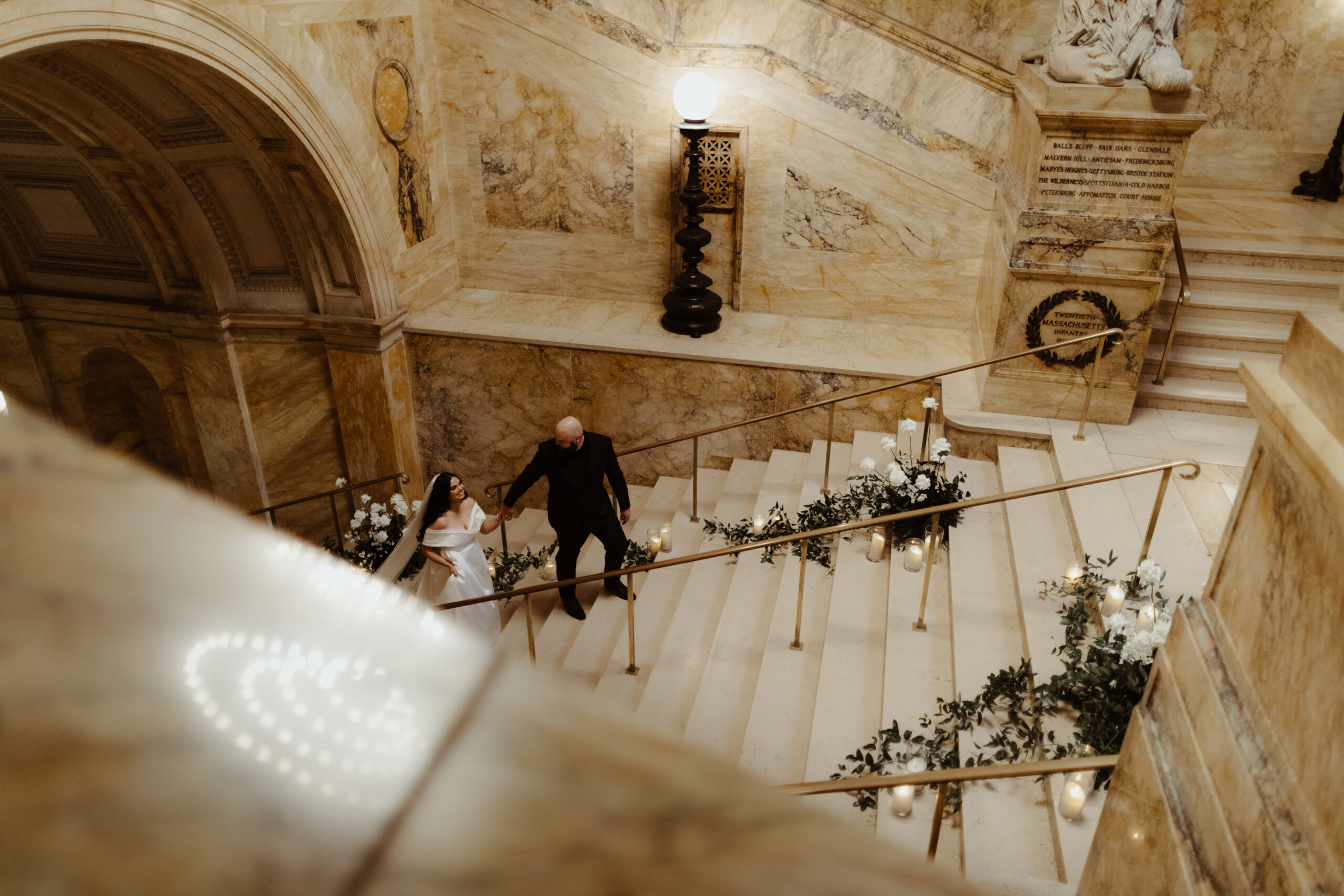
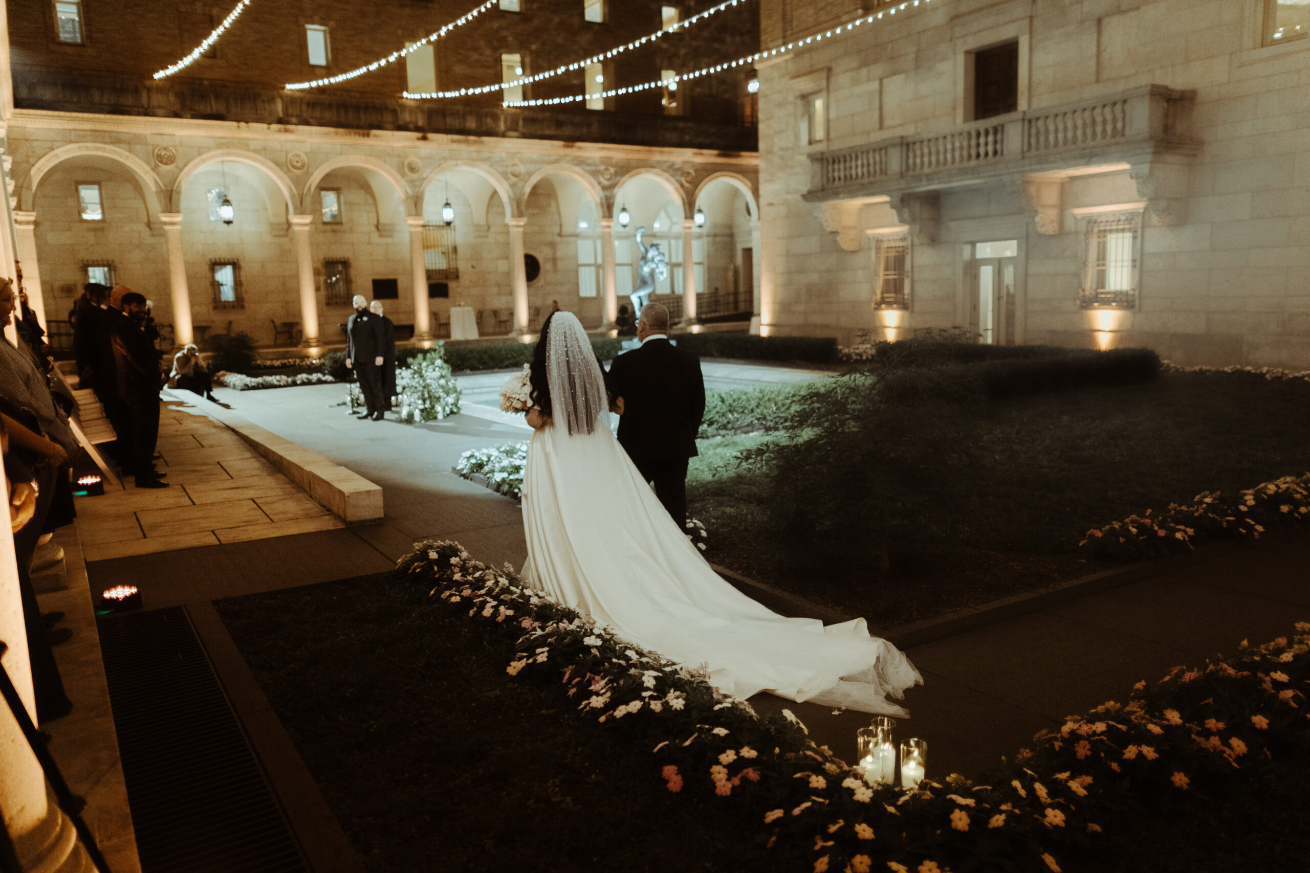
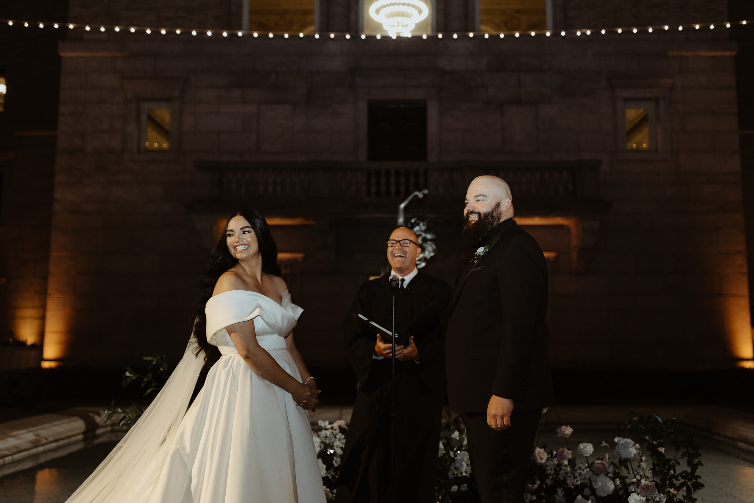
The September sky gave way to one of the most gorgeous and memorable weddings we’ve put our touch on, and it couldn’t have happened to a sweeter couple. Witnessing their Boston Public Library wedding day unfold was the cherry on top! Georgi and Jason put together an amazing wedding, and as thrilled as we were to be a part of it all, we hated to see the day come to an end. Couples like this, and weddings like this one, are something we keep close to our hearts.
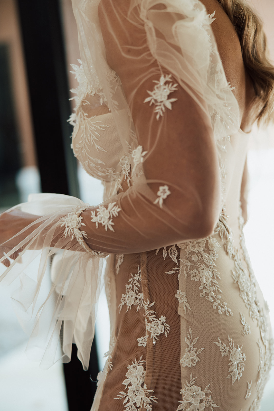
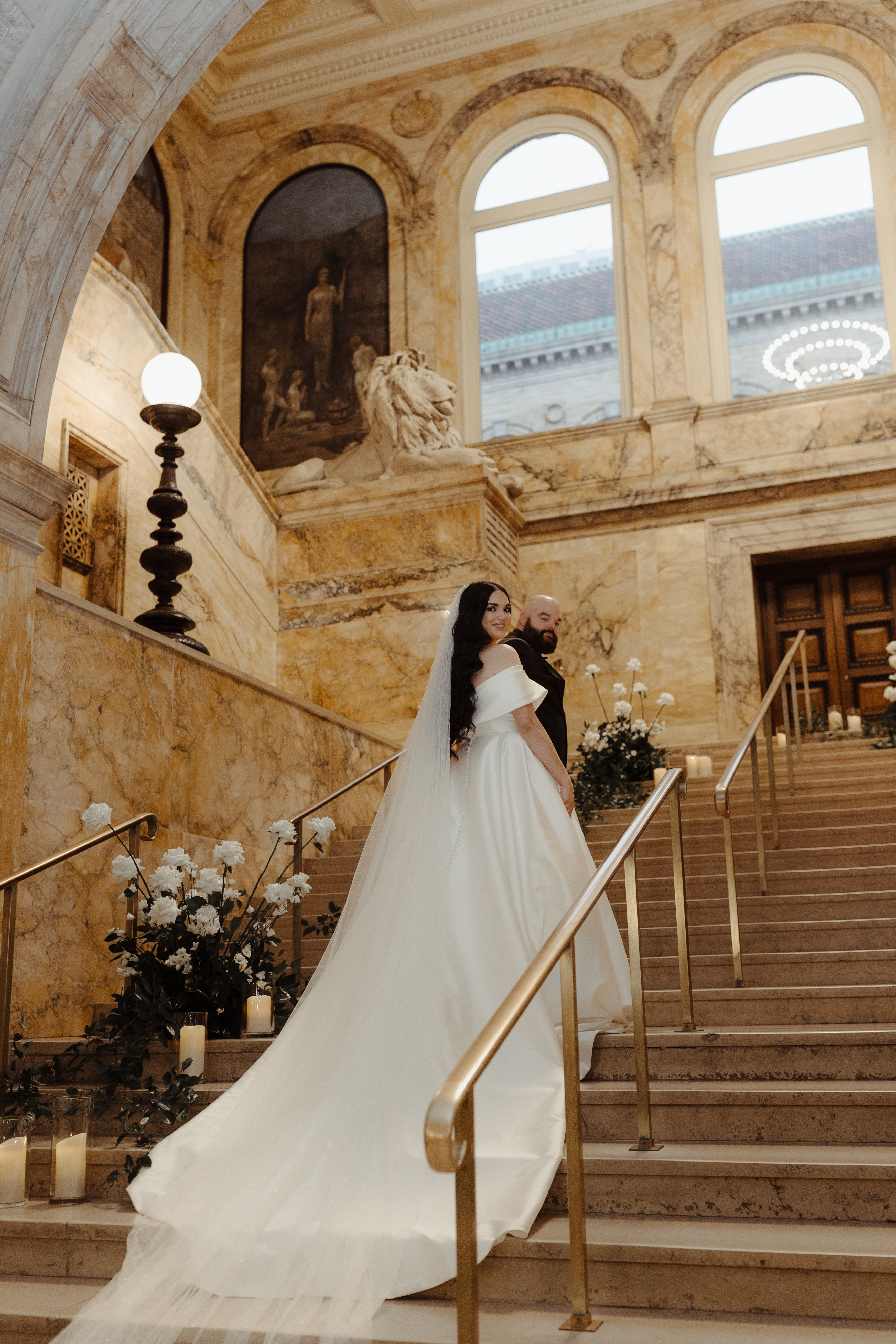
The detail that I just can’t get over- the veil! Georgi’s veil alone was enough to stop us in our tracks. Draped gently behind her long dark hair, this stunning piece needed its own moment!
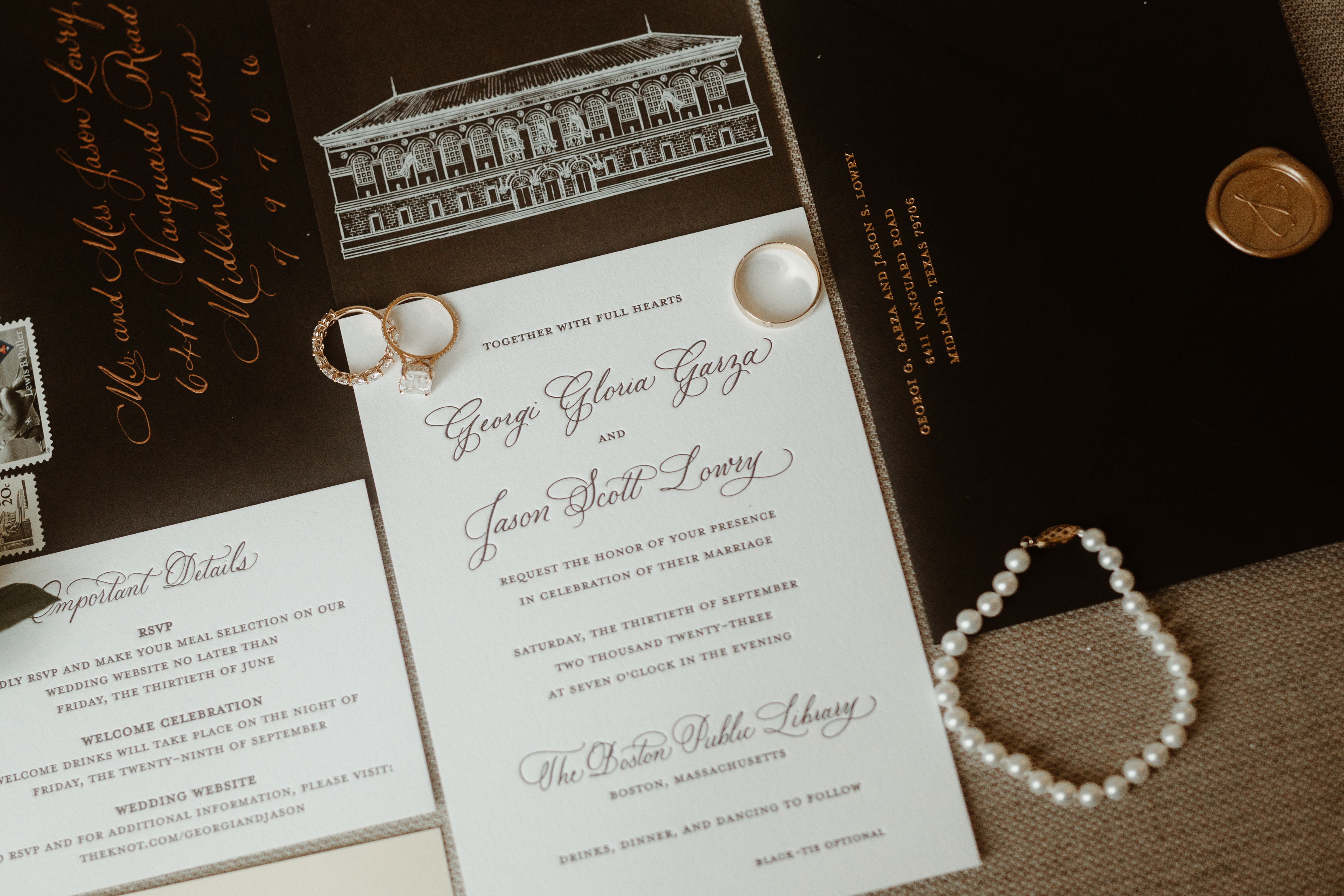
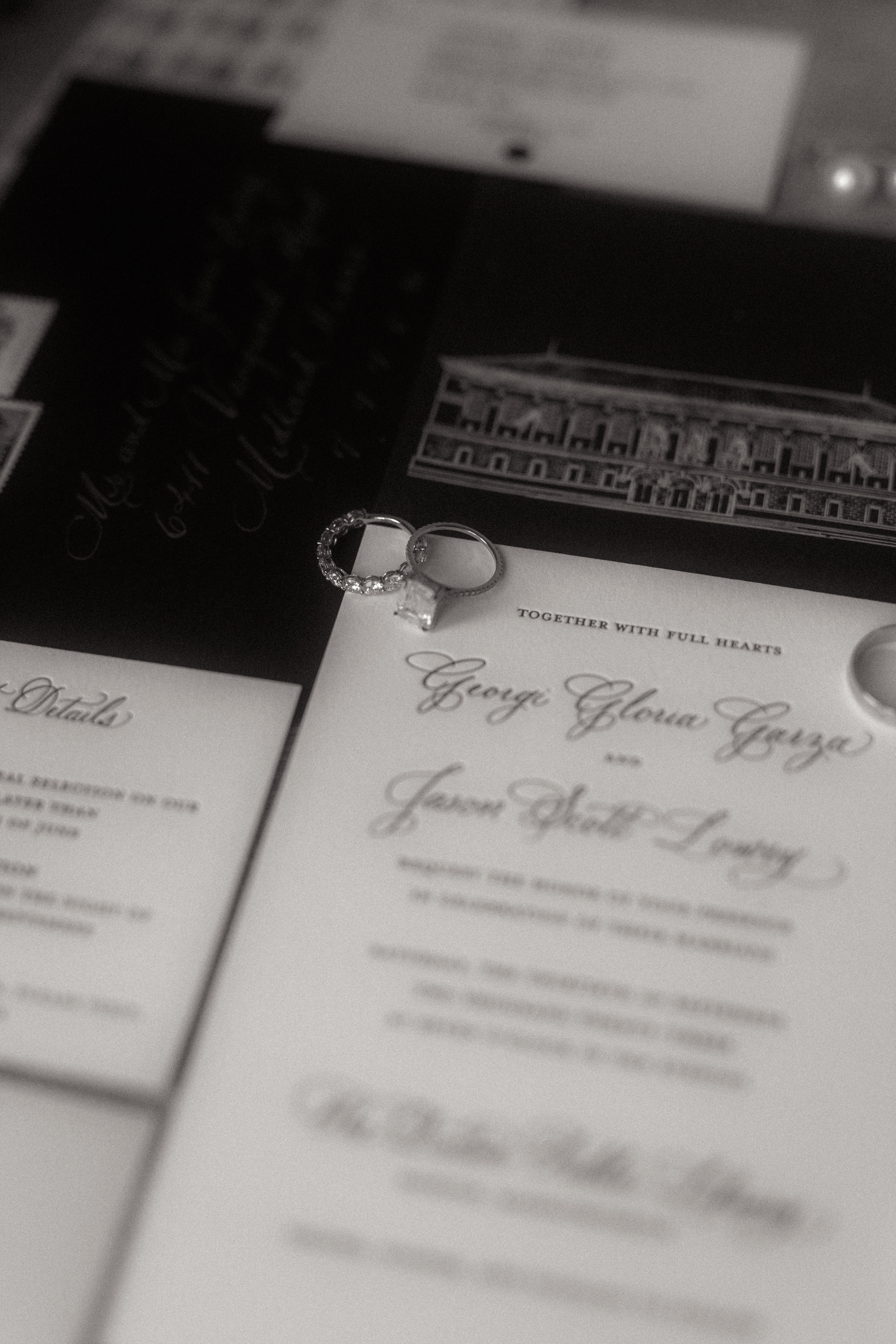
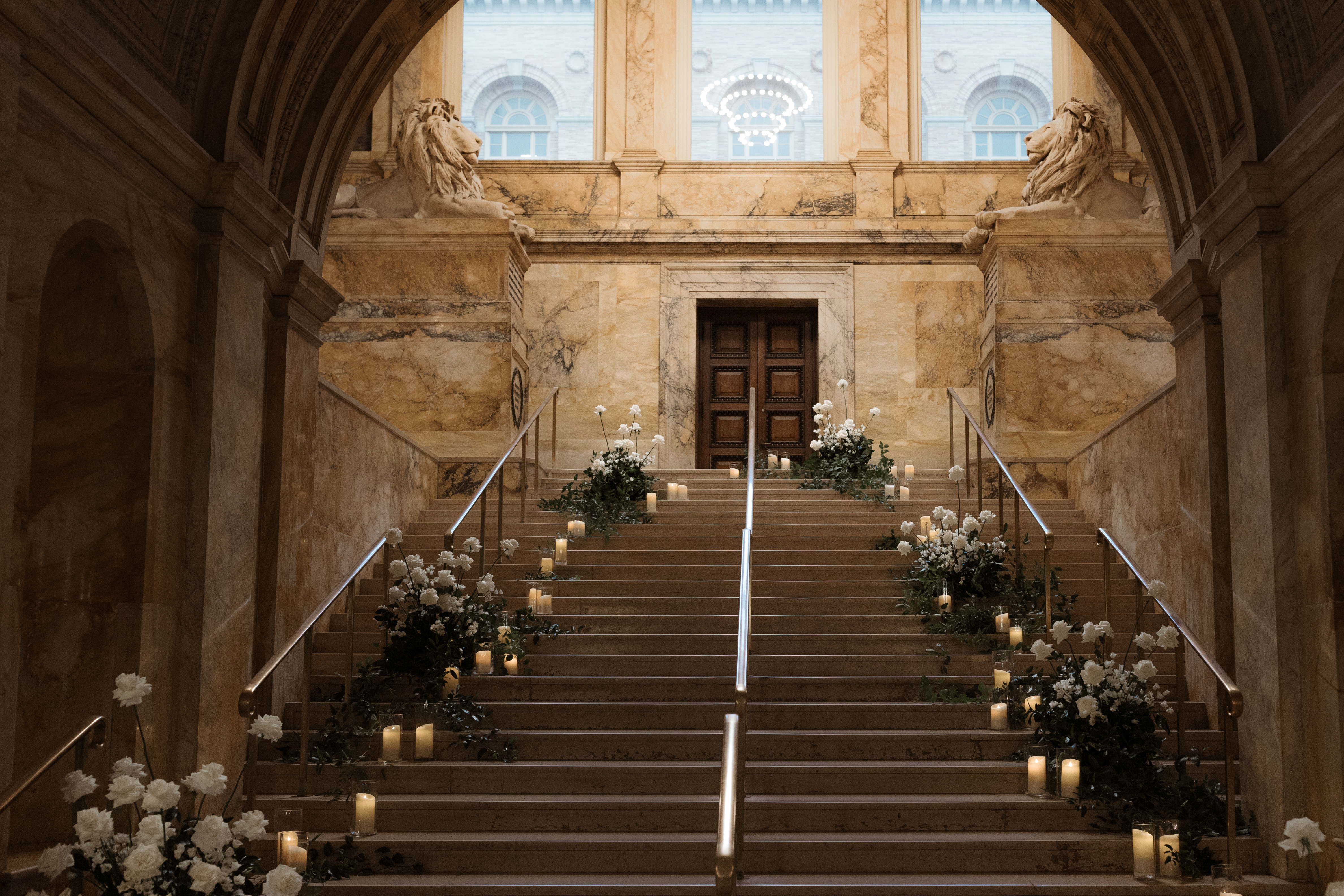
Boston Public Library Wedding Details
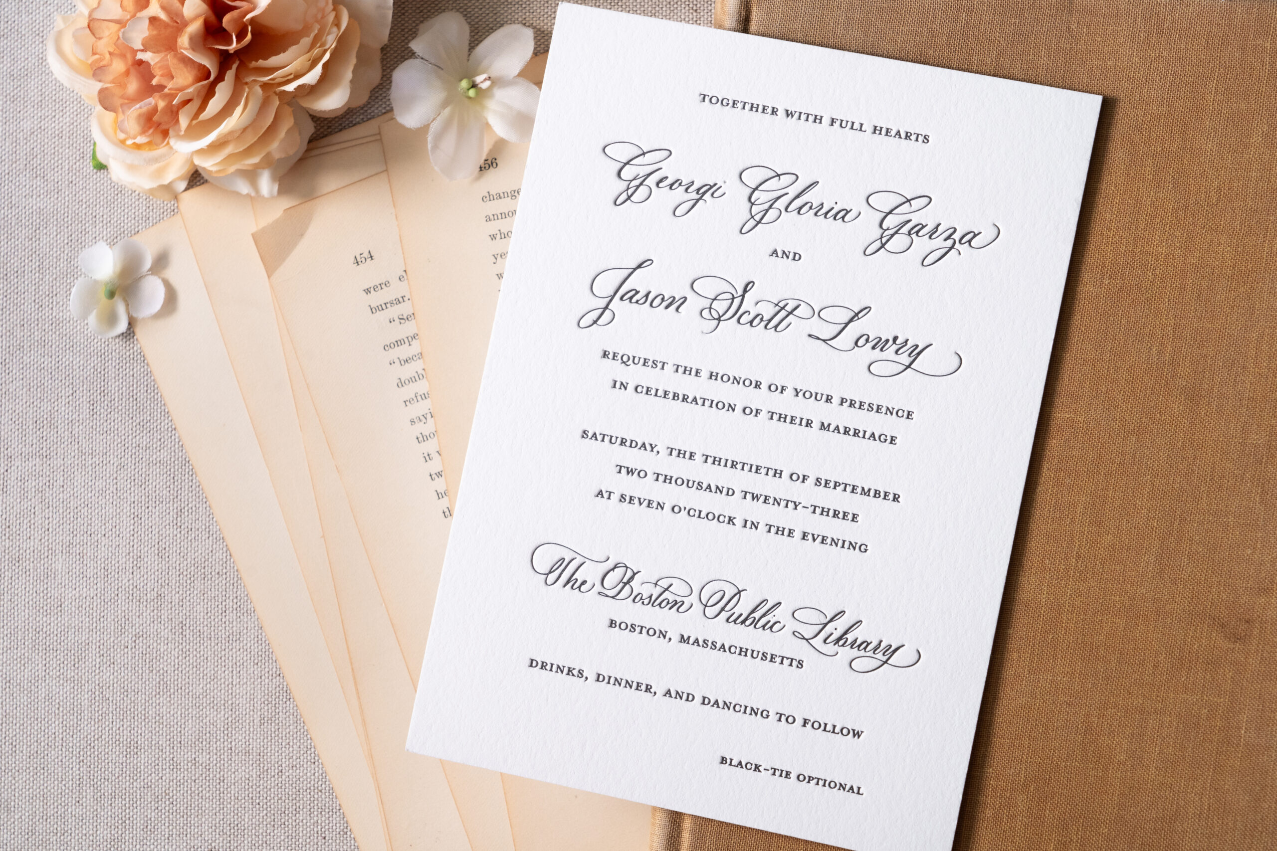
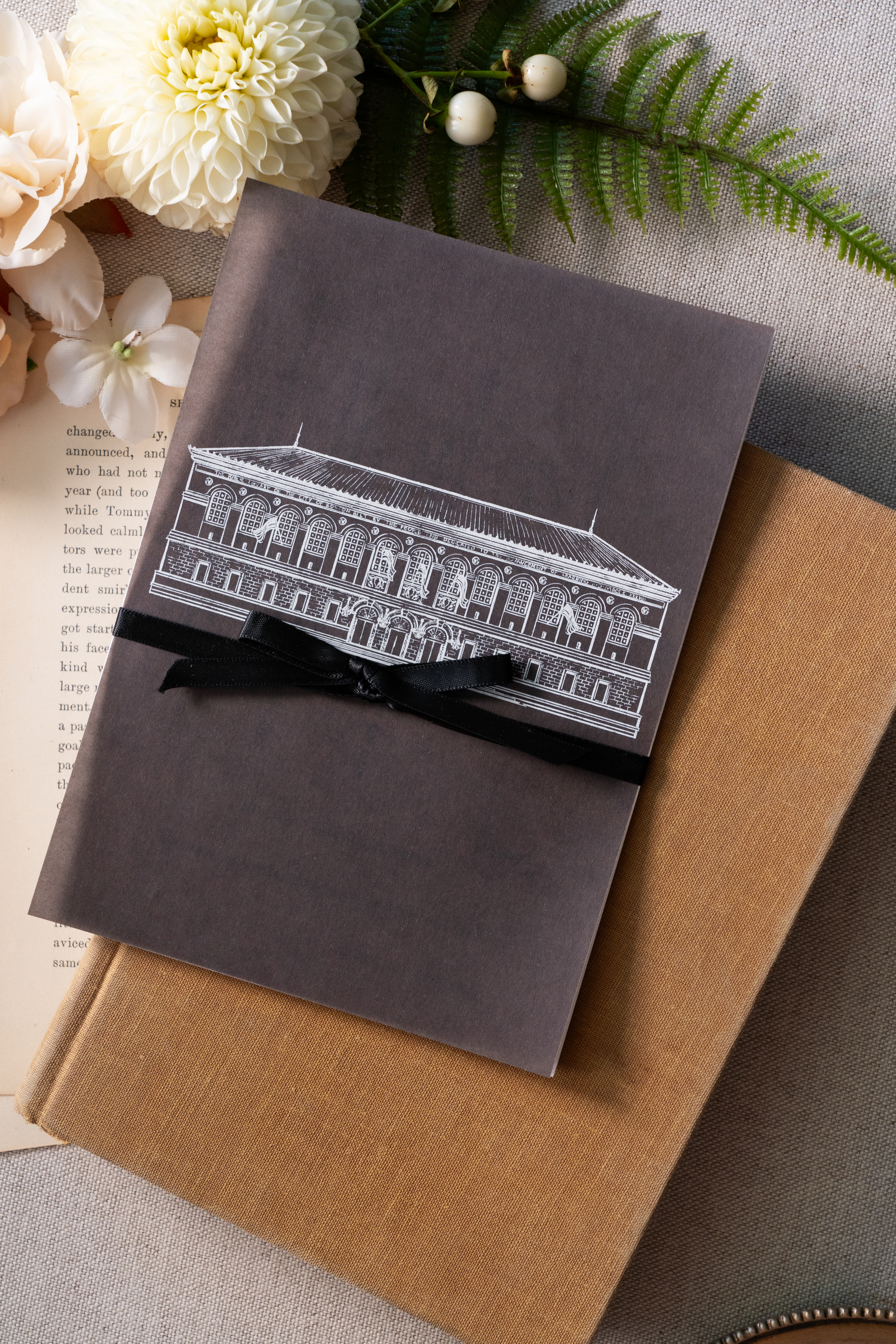
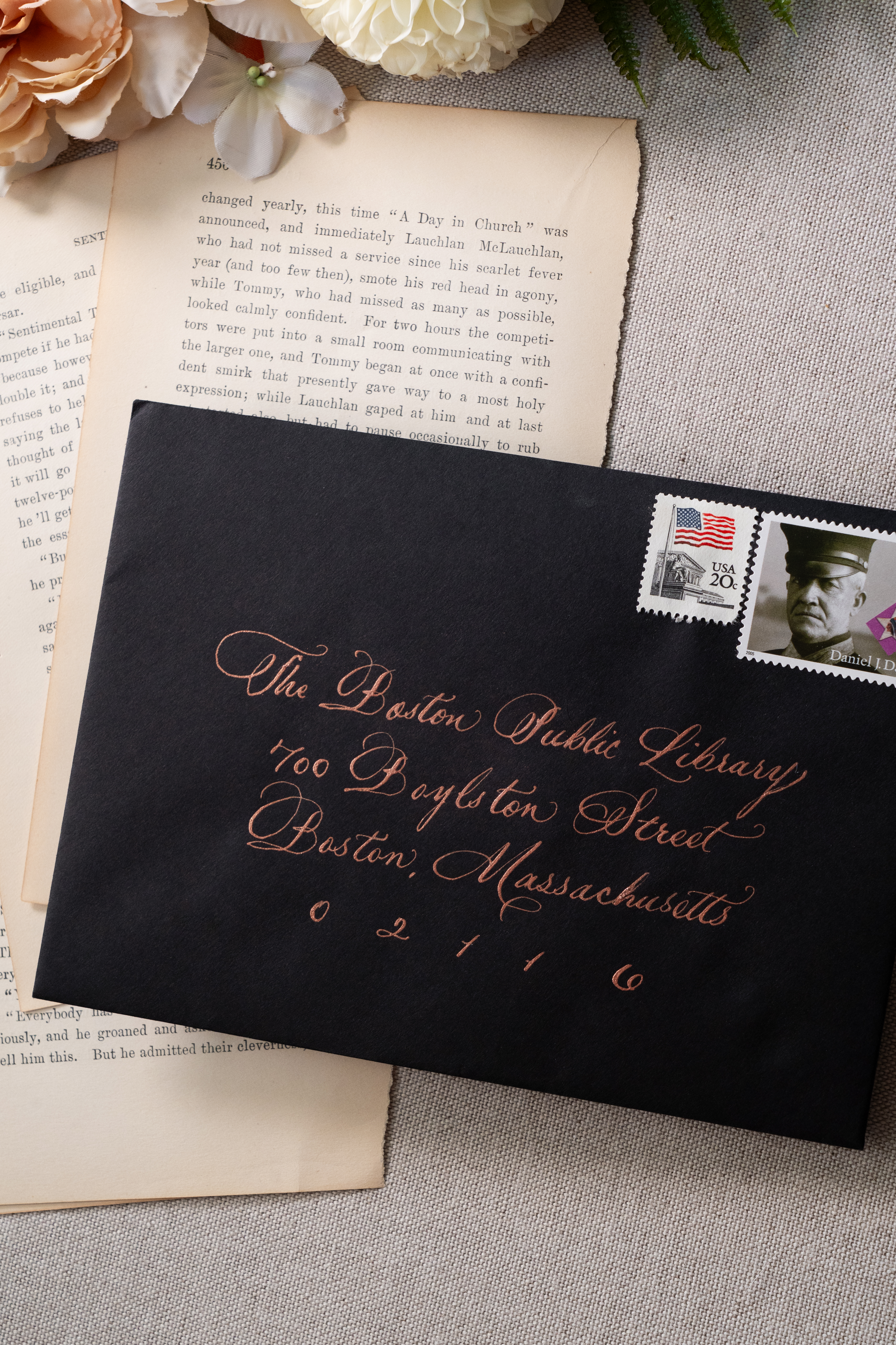
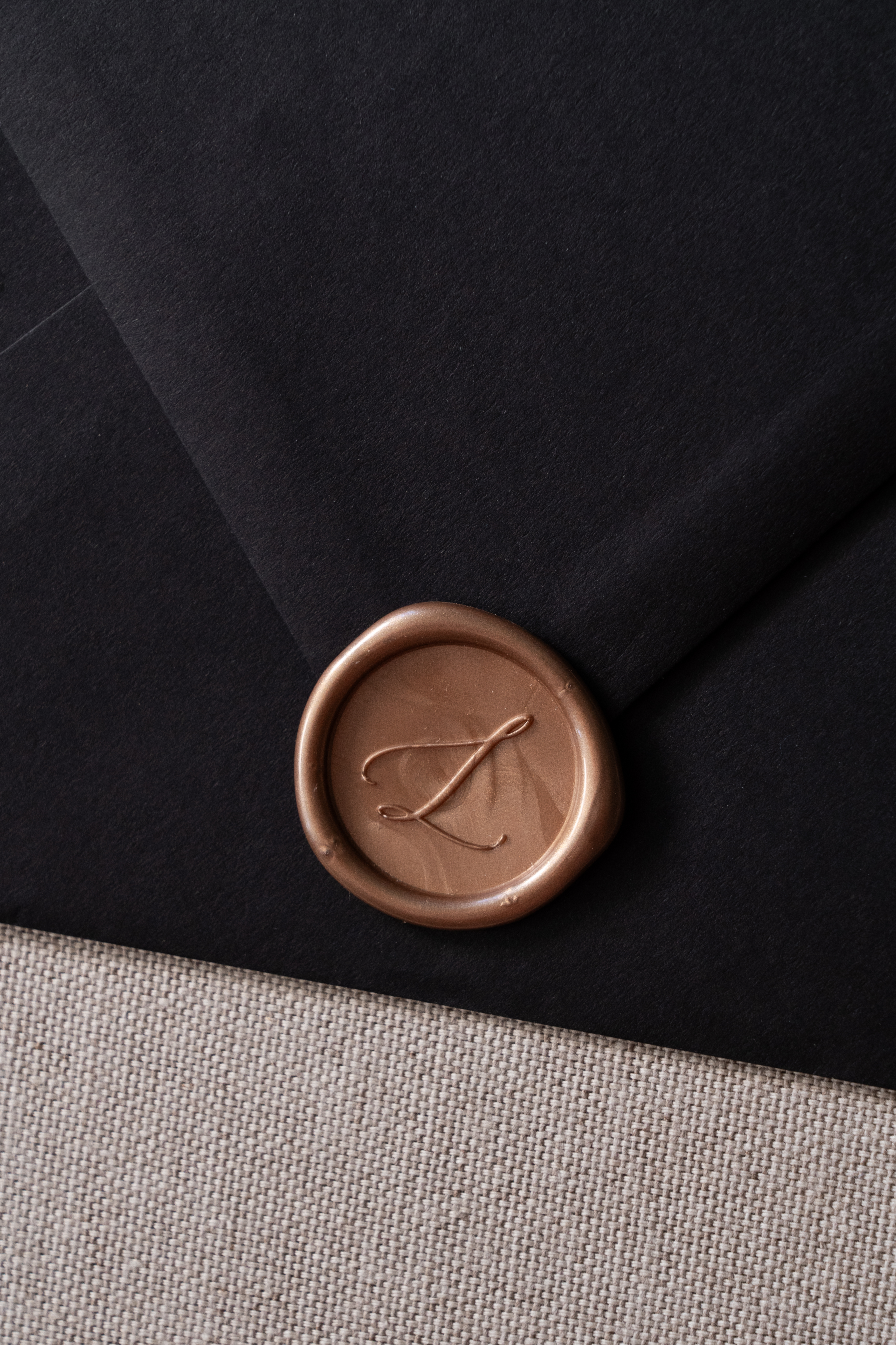
Georgi and Jason’s invitation suite boasted a seamless balance of delicate and bold features. Full calligraphy done in rose gold ink complimented the black envelopes beautifully. The invitation suite was letter-pressed with spot calligraphy on stock paper. A beautiful black, vellum overlay elevated the suite and included a custom sketch of the Boston Public Library! This was so much fun to create and one of my favorite details. Vintage postage and a custom rose gold wax seal completed this impeccable design.
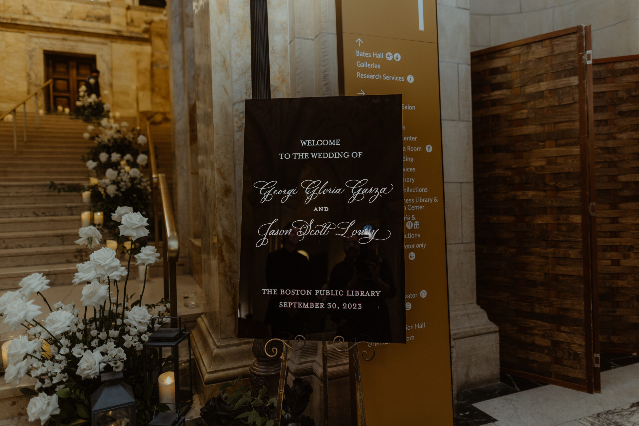
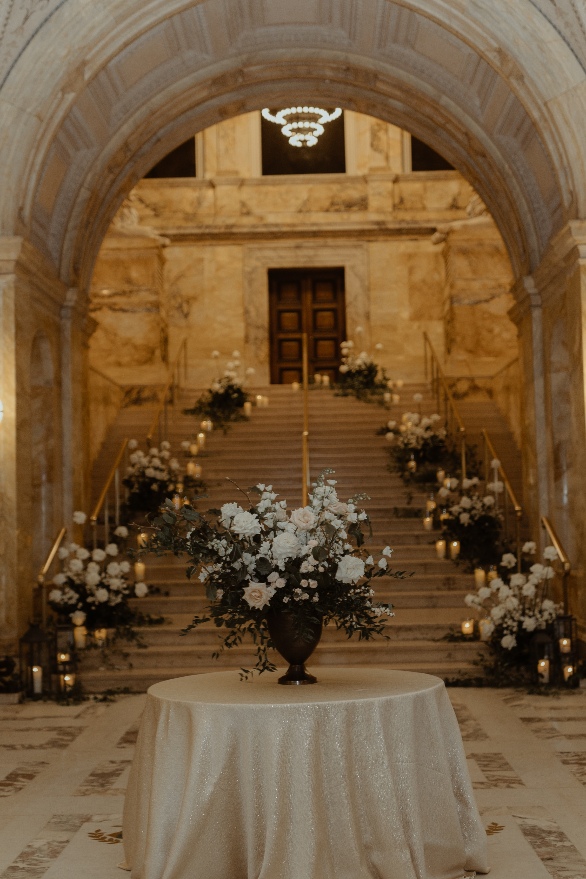
White Ink was honored to add to the breathtaking staircase entrance of this unforgettable venue. The sharp black wedding welcome sign topped with white lettering, stood out against an impressive array of florals and lit candles which demanded the attention of each guest as they passed by.
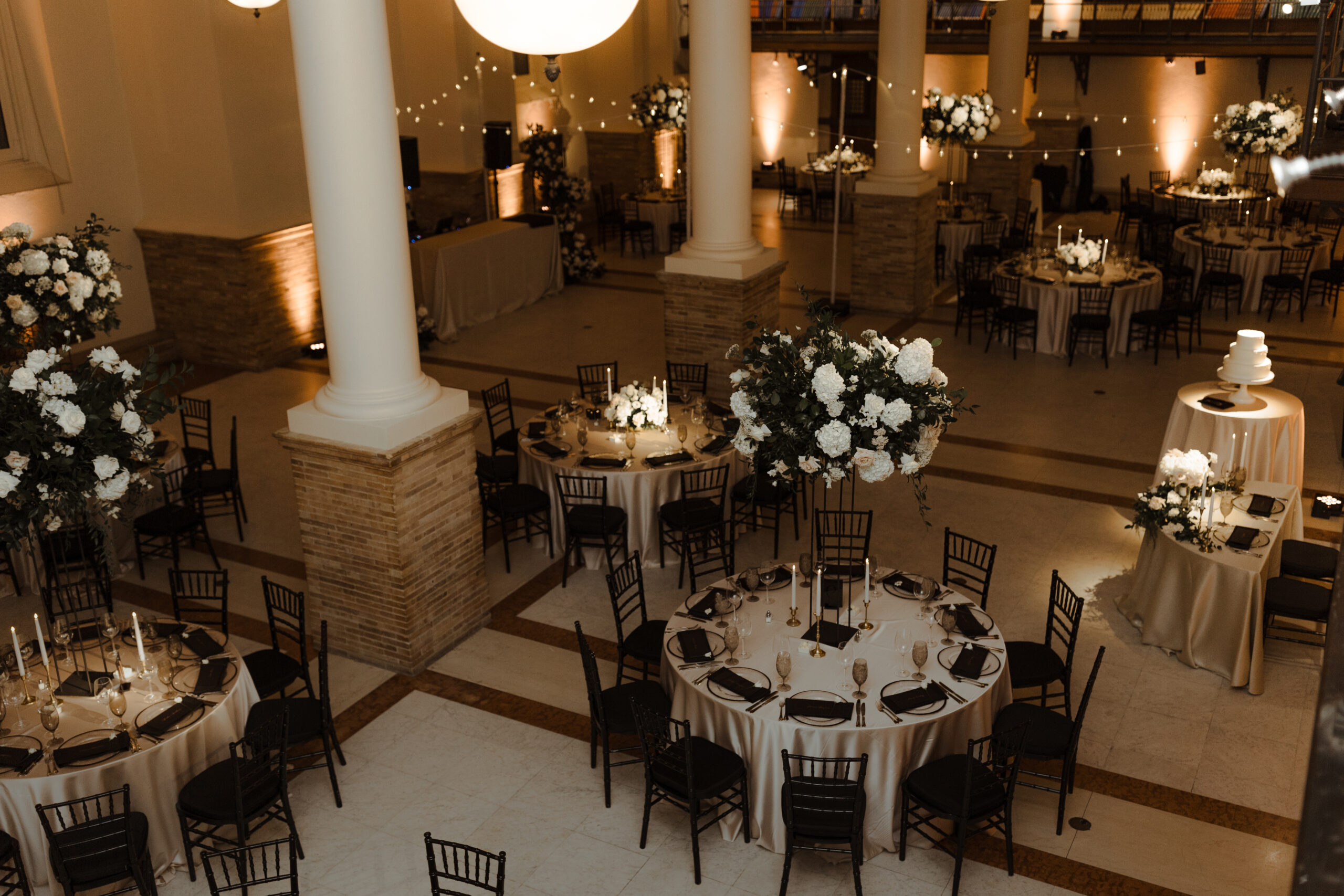
Elegant and Chic Reception Details
Just as Georgi and Jason’s invitation suite and wedding welcome sign harnessed a delicate boldness, so did the table numbers which sat perfectly within the elevated tablescape for their reception. There are times when table signage takes an unassuming role among the tablescape, but then there are moments when table signs play an important part in grabbing the guest’s attention. These sharp lines and block signage with gold numbers set against the soft florals and candles and white linen offered a uniquely formal taste and modern, chic appearance to the 170-year-old venue. A detail which was beautifully and purposefully done.
We love our Nashville couples, that’s no secret. However, the opportunity to meet our couples where they are is something we cherish. Finding ourselves at the Boston Public Library in the presence of Georgi and Jason along with their closest family and friends was an incredible moment. It was such an honor to have been a part of this incredible journey with the perfect couple. To Georgi and Jason, thanks for the memories that will last forever. Cheers!
If you’re looking to add custom, thoughtful touches to your wedding or event, we would love to help make your vision a reality. Reach out today to learn more about our full-service design offerings—we can’t wait to create something unforgettable for you!
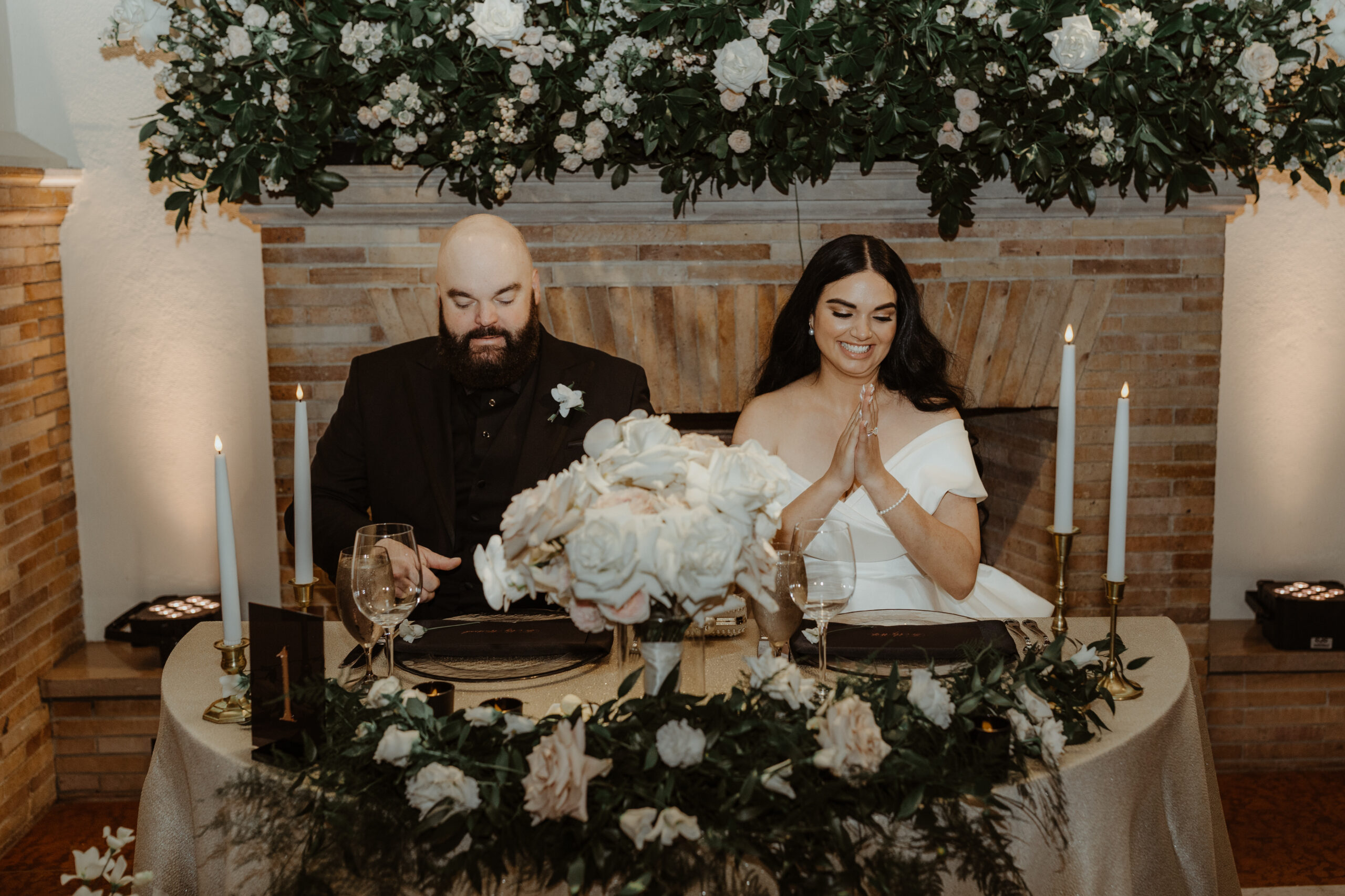
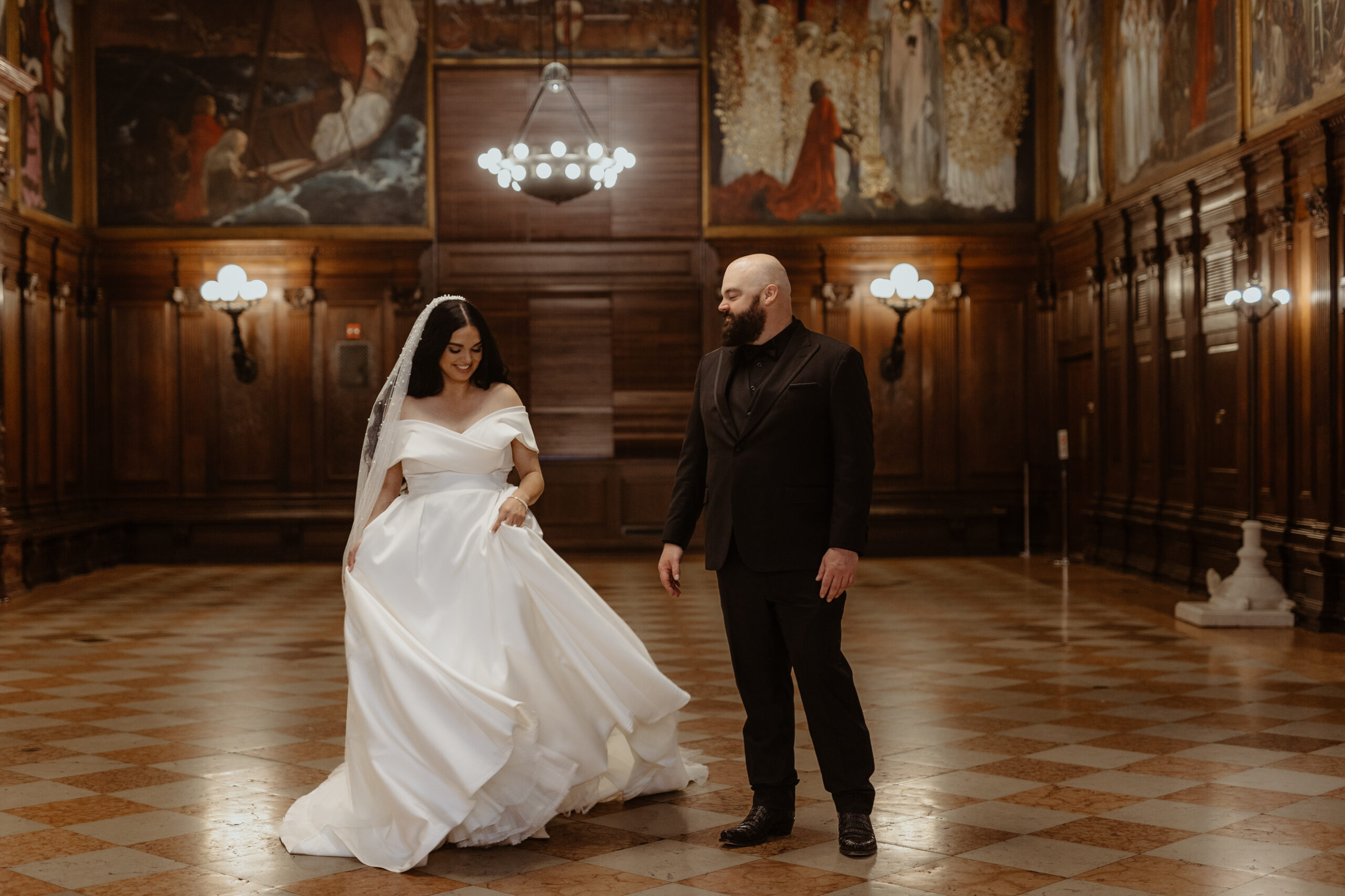
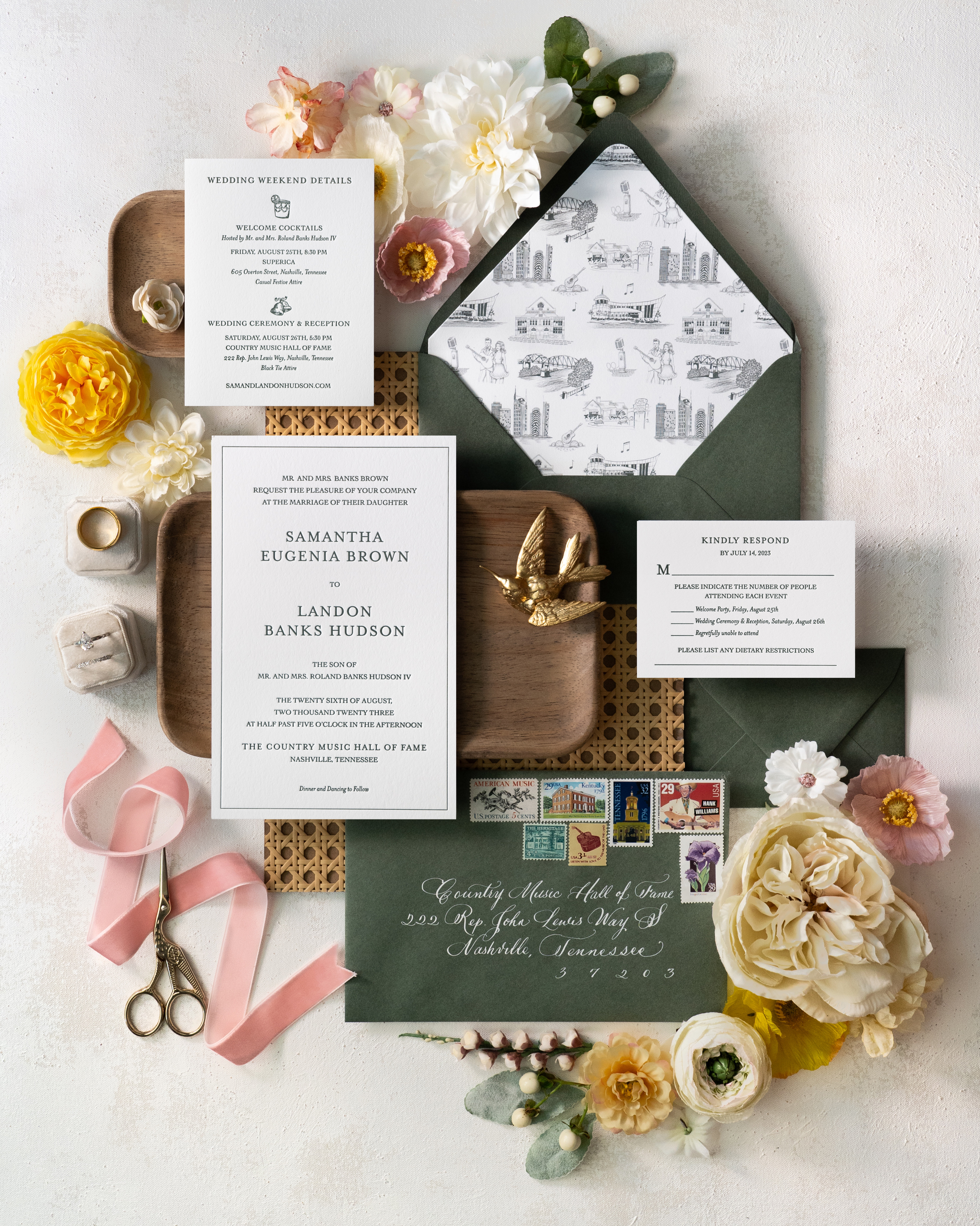
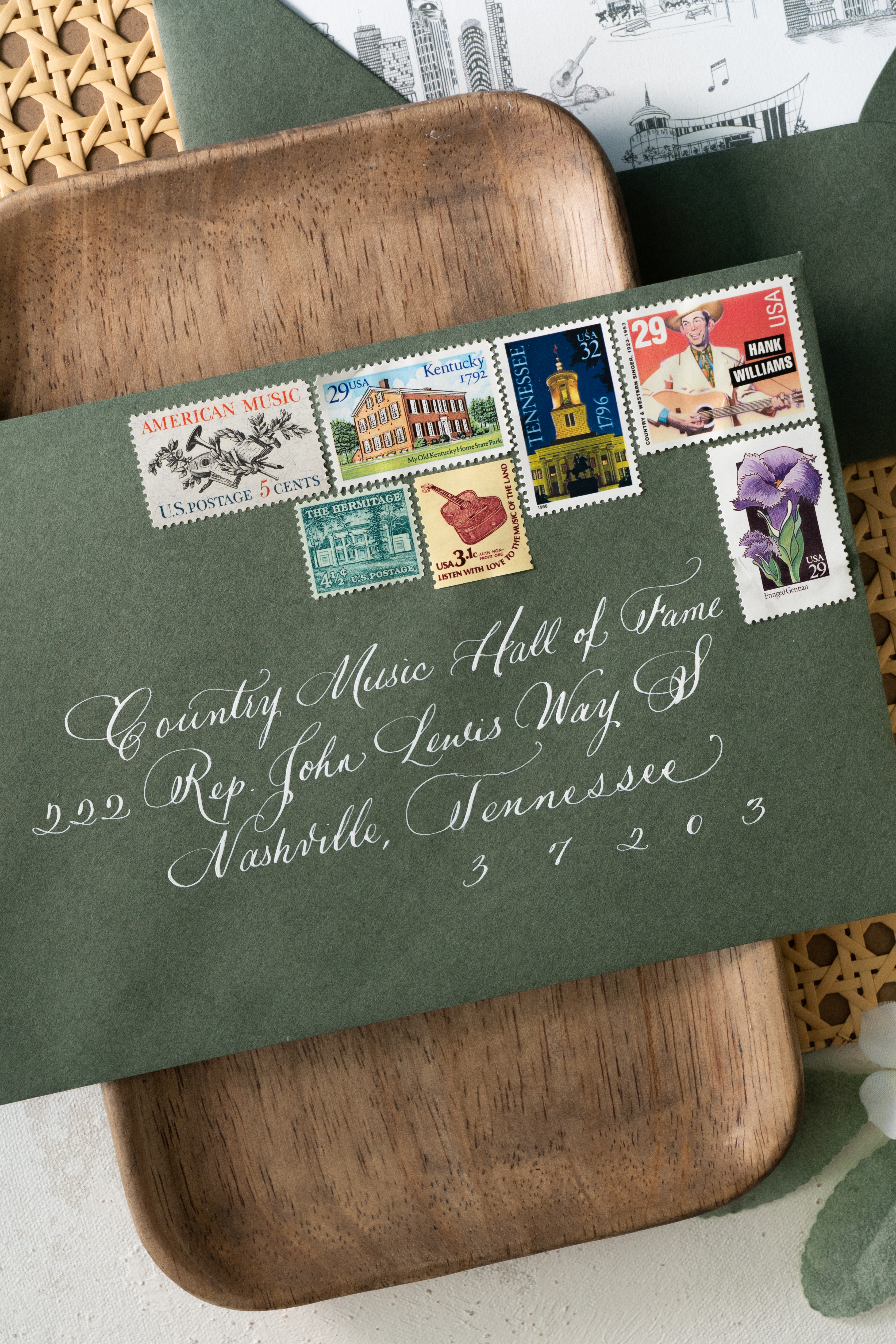
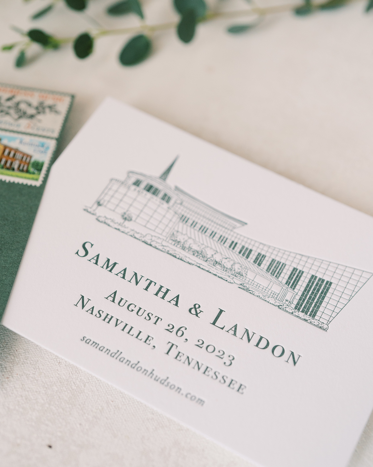
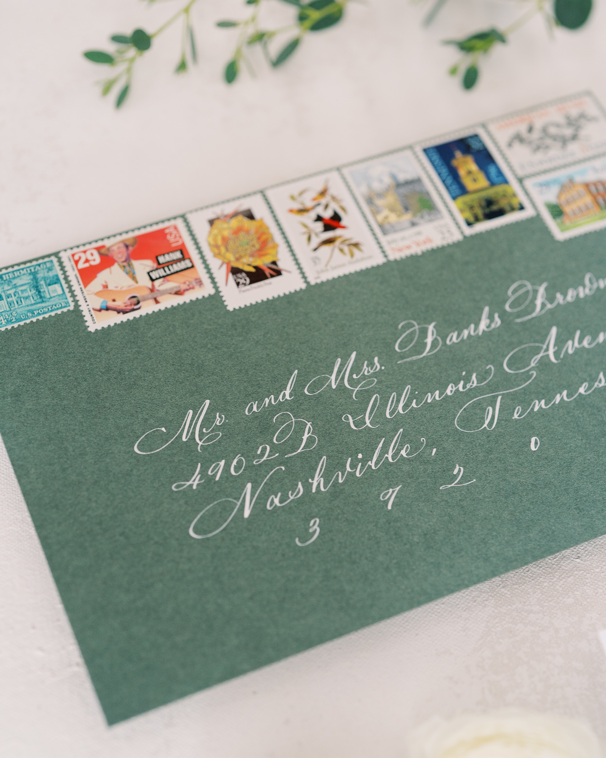
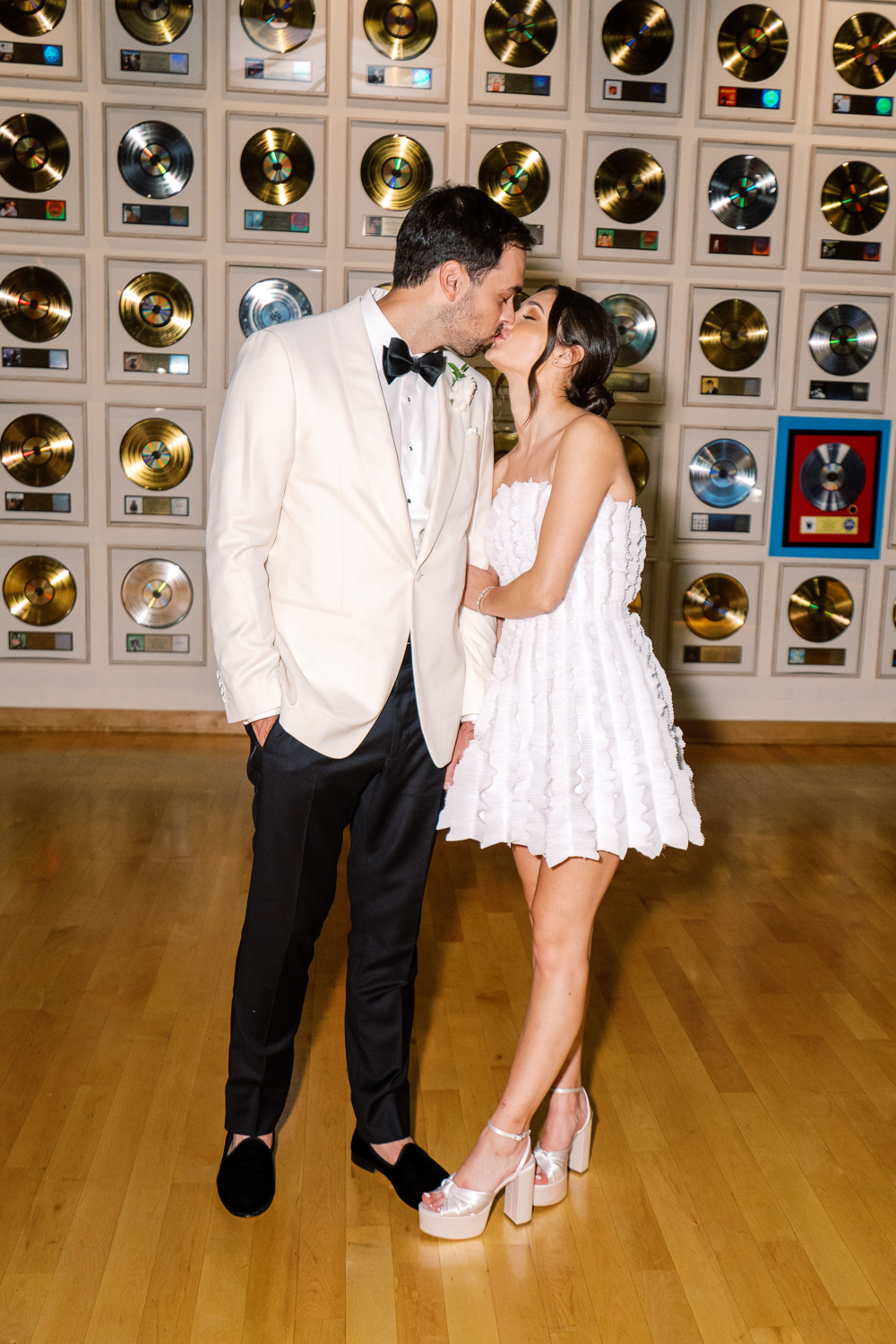
Sometimes, a client’s dream wedding turns into our dream wedding! The moment our sweet couple, Sam and Landon, asked White Ink to take part in elevating their Country Music Hall of Fame wedding details, I realized that this wedding was going to be incredibly memorable for our team. And indeed, it was! We had the honor of helping to showcase Sam and Landon’s style with purpose and authenticity by creating their custom Nashville wedding details.
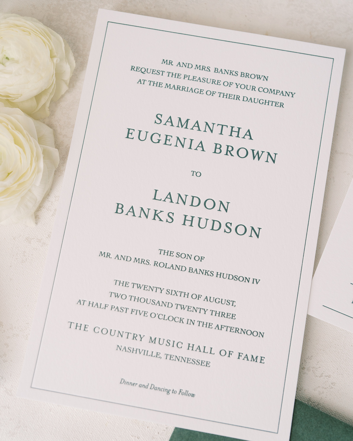
For starters, our couple’s wedding suite embraced a style that was bold and uniquely “Nashville.” I love the sharpness of the invite, complete with a heavy stock, wedding paper and letter pressed font.
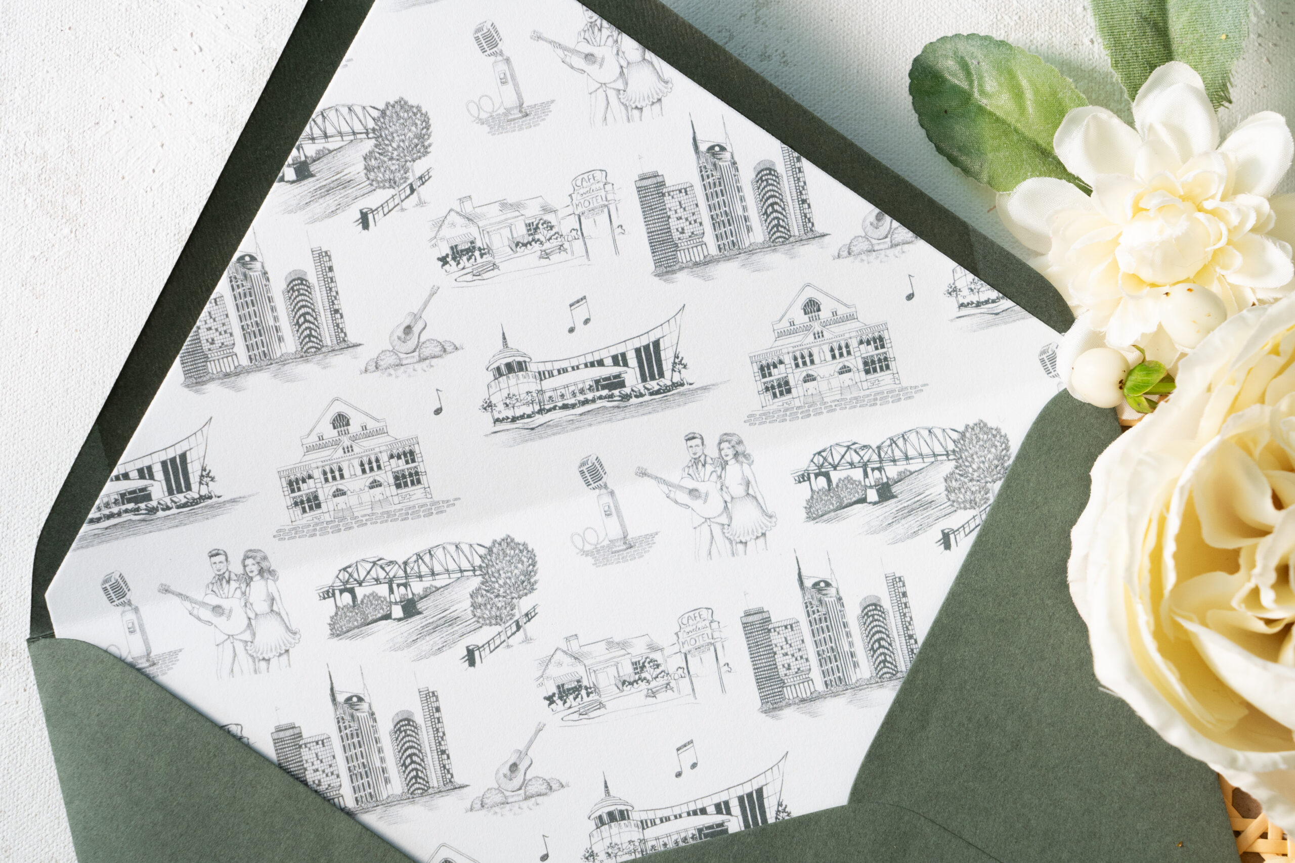
Take a moment to soak in the amazing work of the talented Katie Kime! She provided the custom artwork on the envelope liners which depict iconic Nashville favorites like Jonny and June, The Loveless Cafe, The Country Music Hall of Fame, and even the “Batman Building.” Details like this truly set the tone for your wedding guests and create a memorable experience. I just love this details!
Sam and Landon’s save-the-date boasted the same polished look as the invitation suite including the letter pressed font and print of the Country Music Hall of Fame. (Side note: I can never get enough of how beautiful the vintage postage is!)
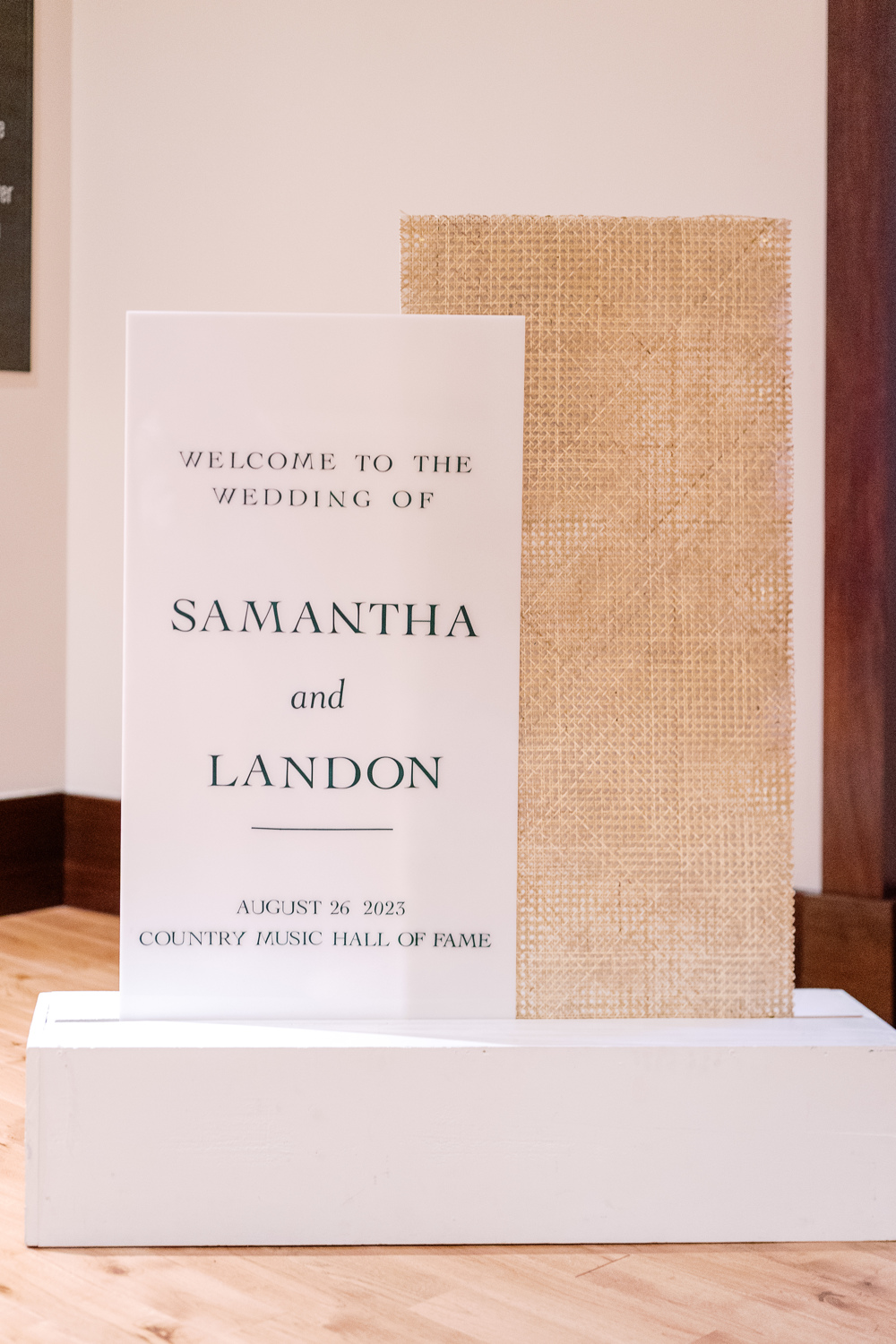
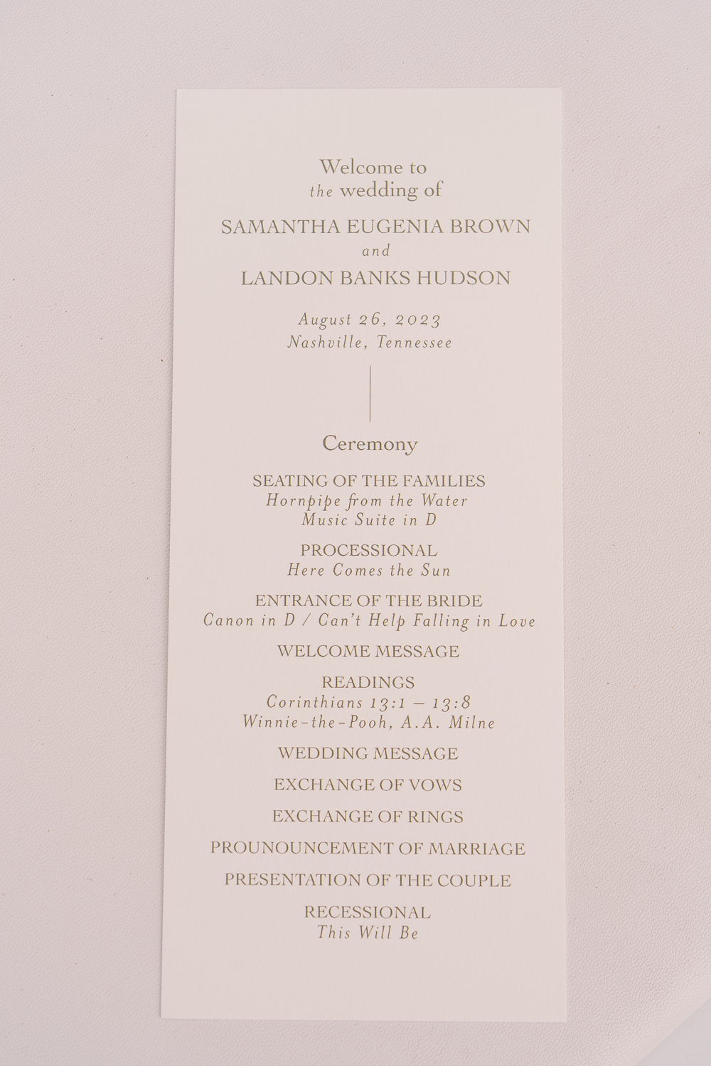
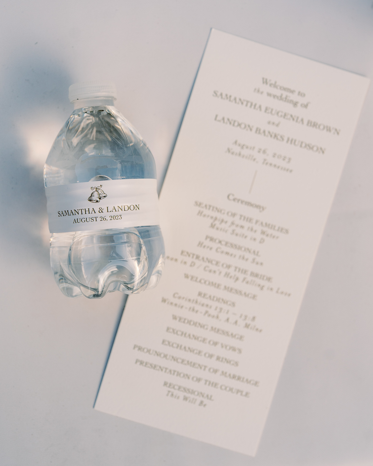
Wedding Welcome Sign and Program Details
This wedding welcome sign spoke volumes and was a complete showstopper. From the texture to the font to the overall framing of the display, this piece was impressive to say the least.
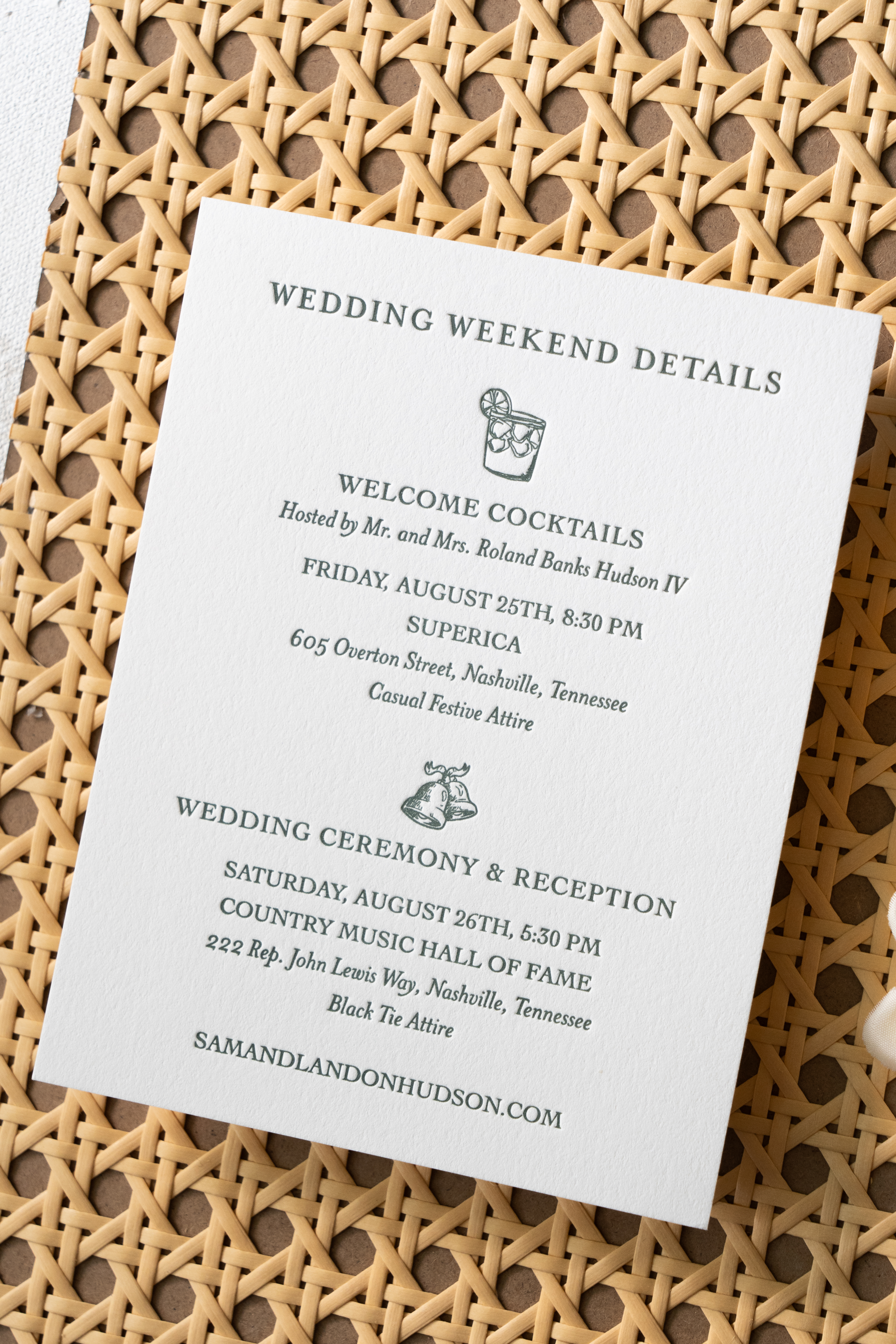
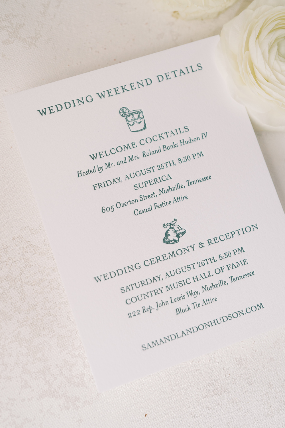
Simplicity goes a long way with these program details. A gentle font and color against a soft white paper was perfectly inviting for Sam and Landon’s guests. I love getting a peep of little details that are laced throughout the day like the cute little wedding bells on this custom water bottle. The same wedding bell print that we used for the wedding details card in the invitation suite.
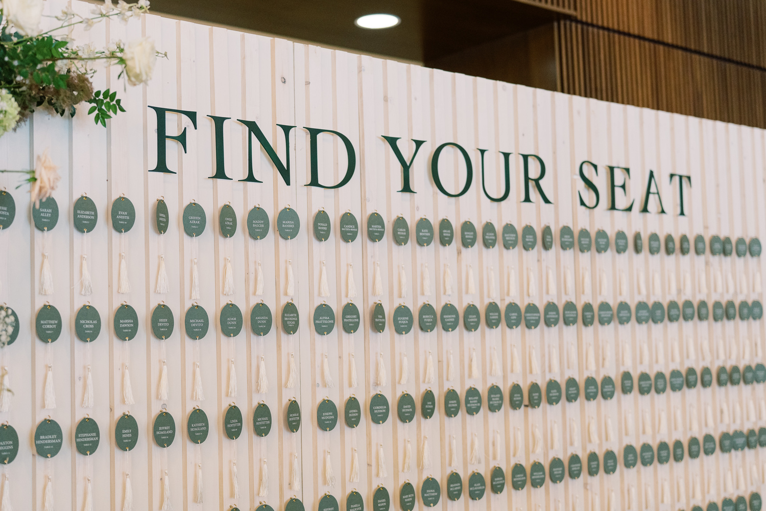
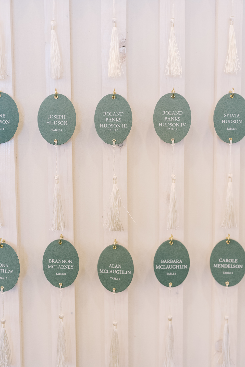
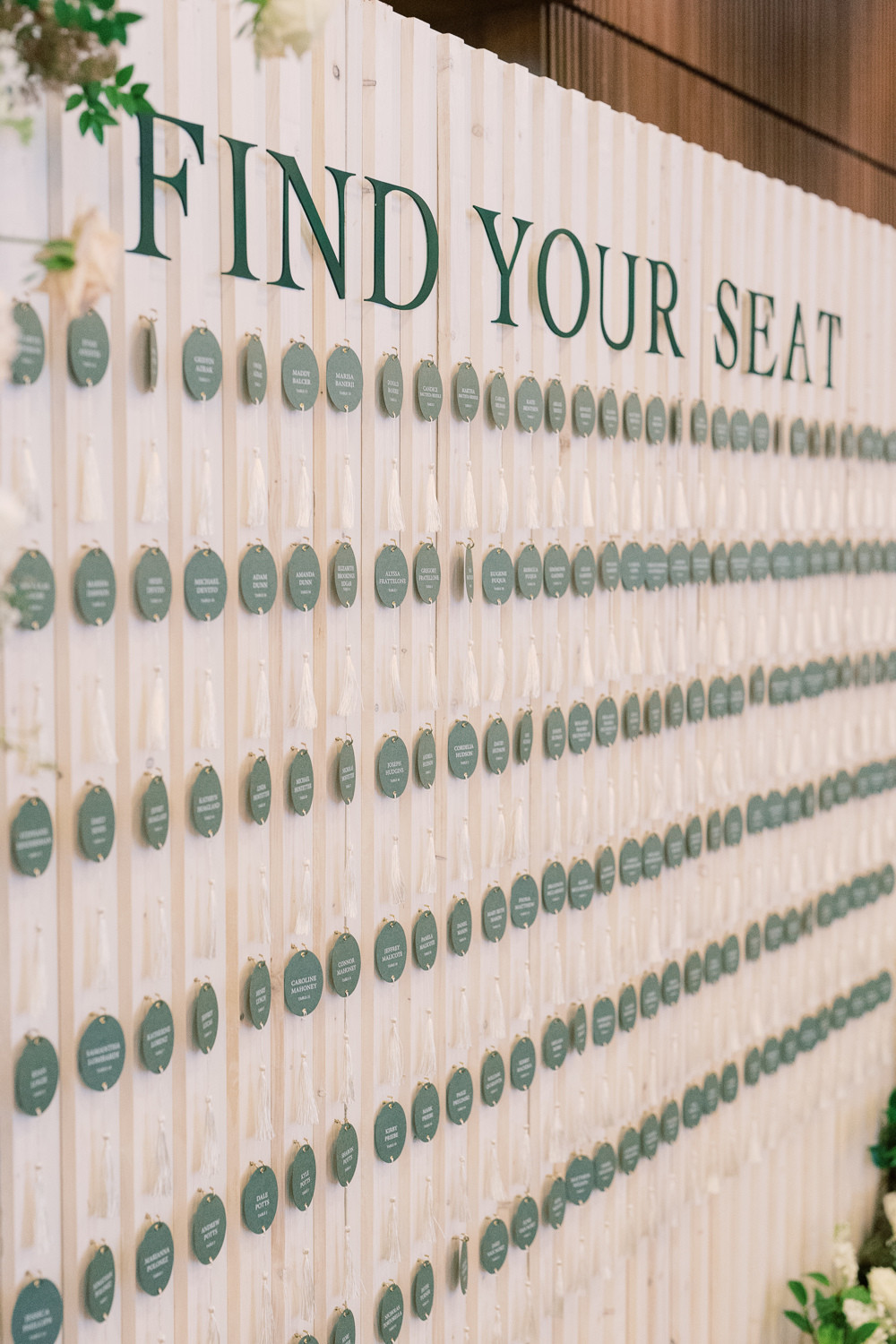
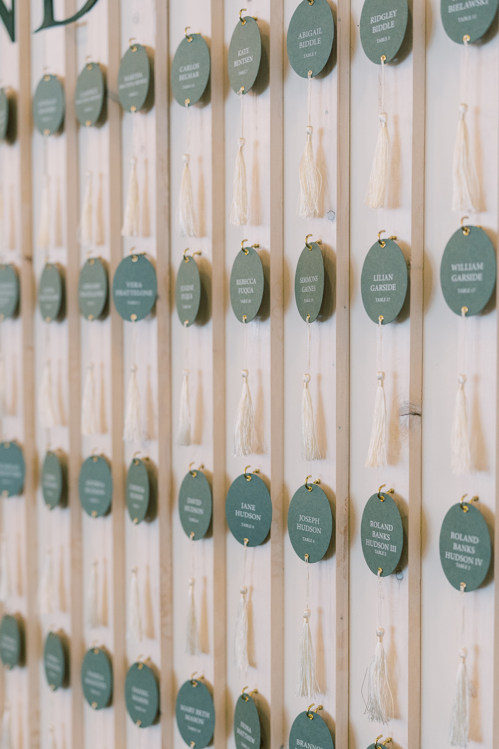
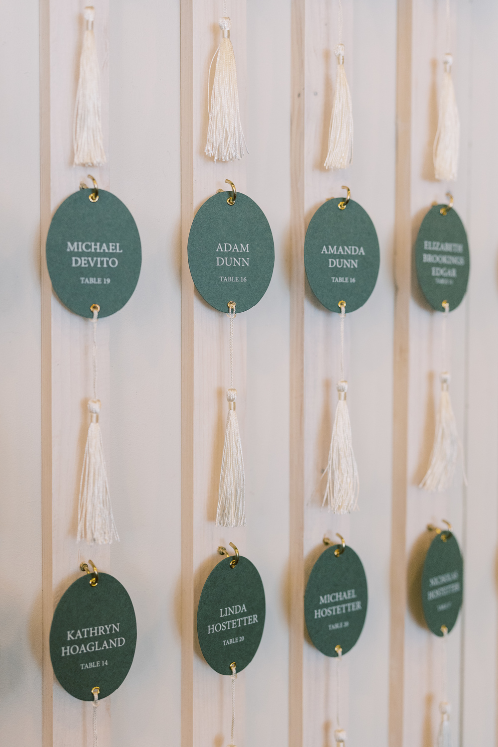
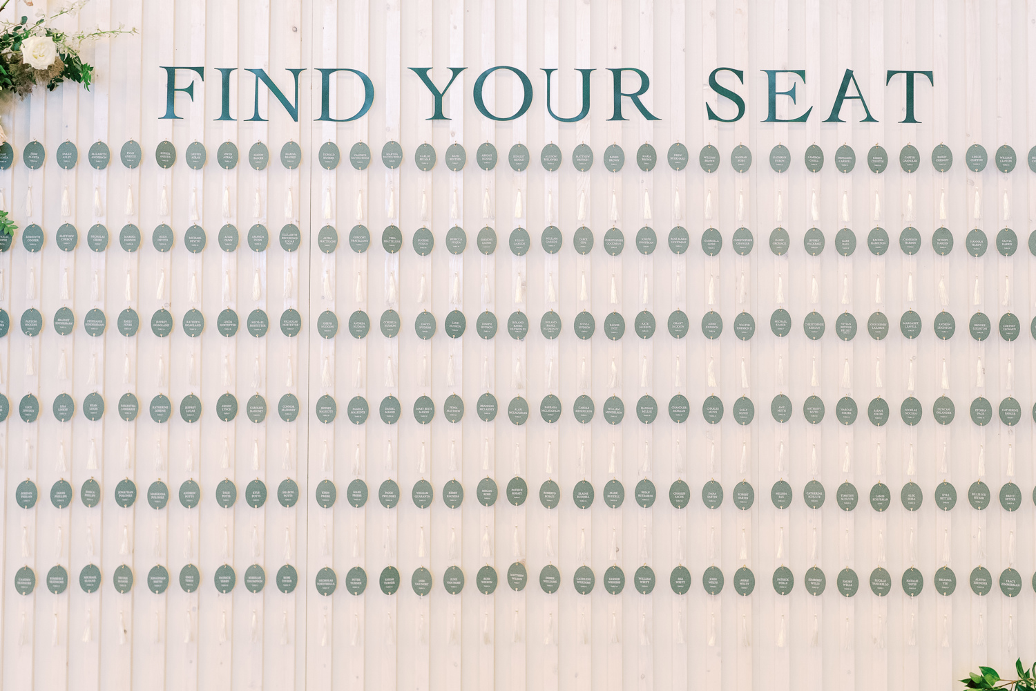
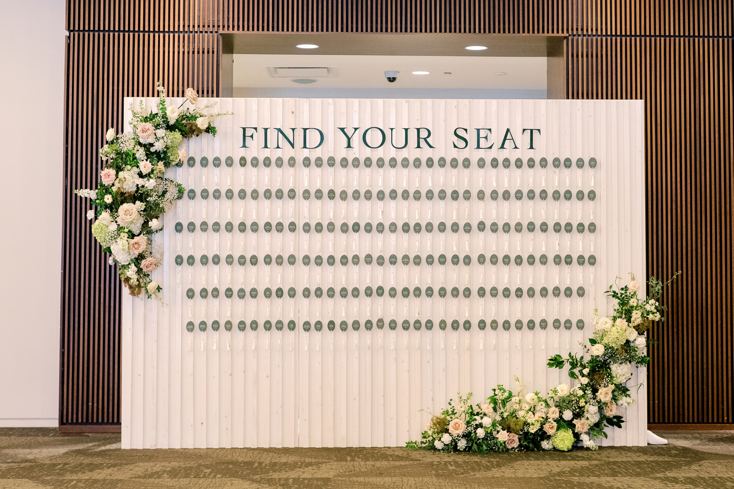
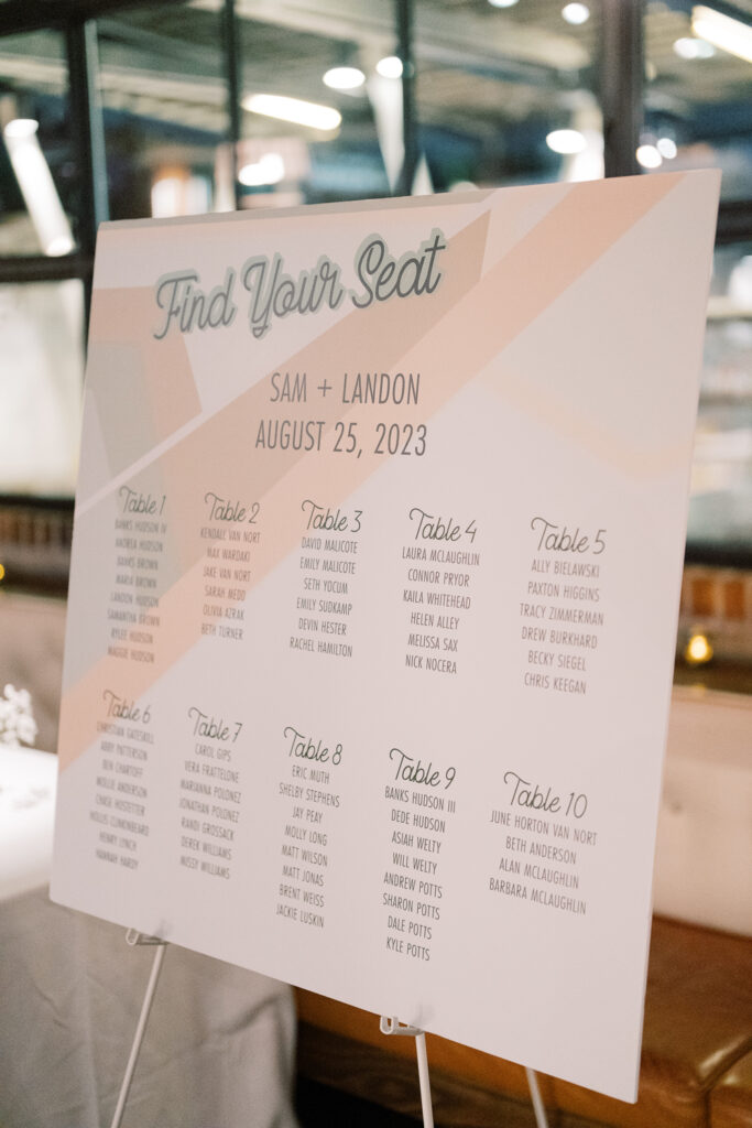
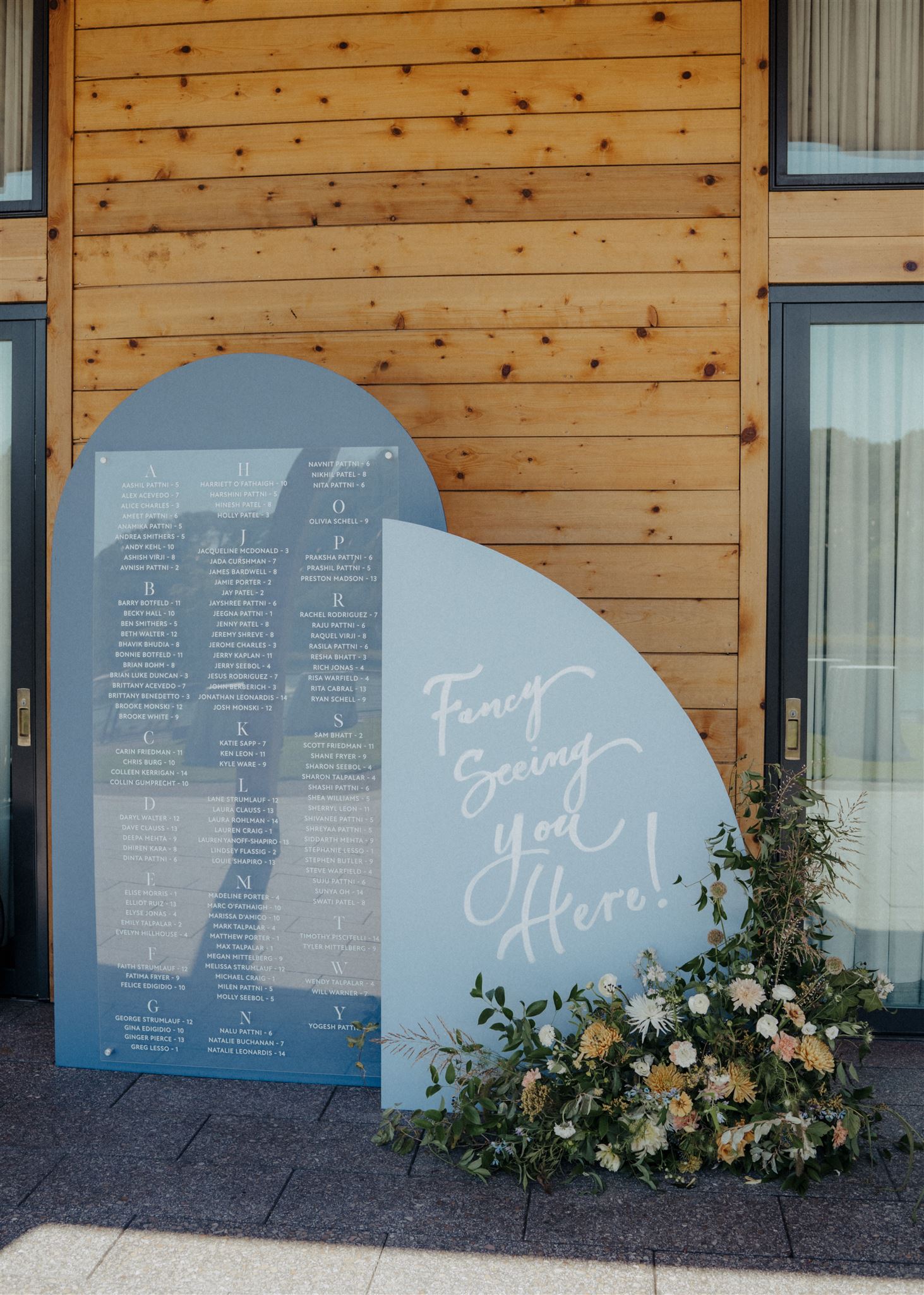
Elegant Seating Chart Display
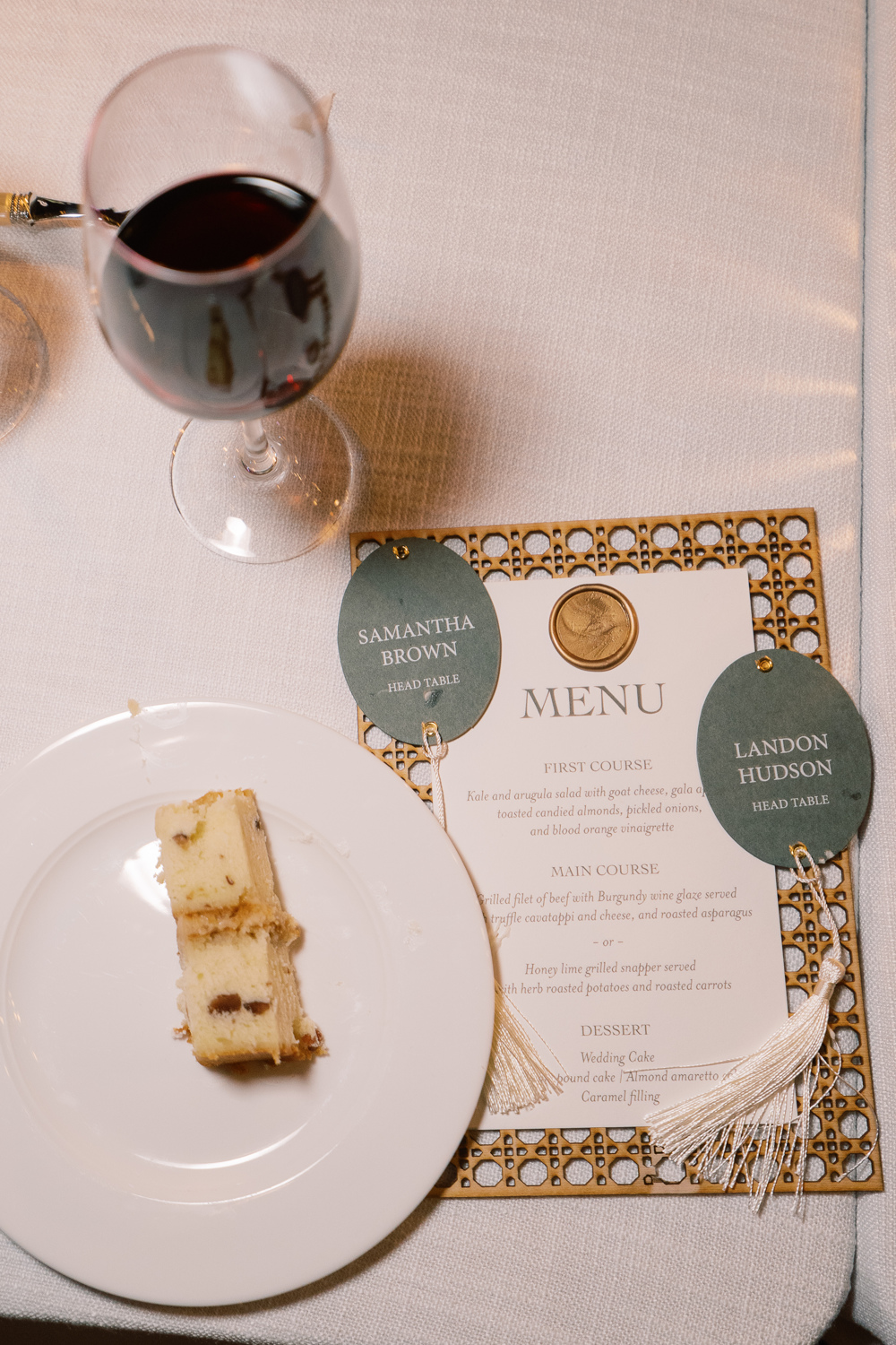
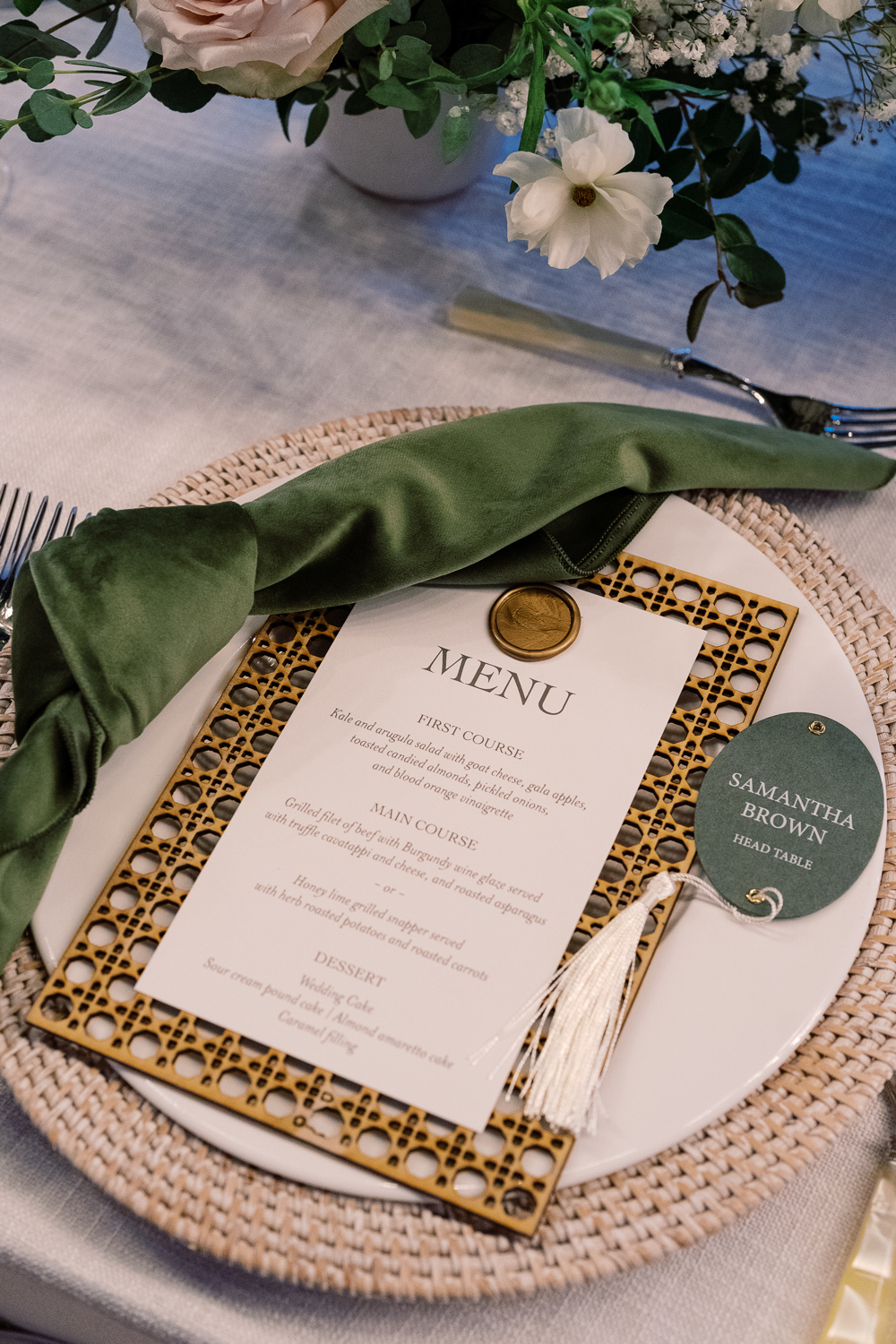
I am so happy to show off what my team created for Sam and Landon’s seating chart! Putting this seating chart wall together on site was an accomplishment. One that I adore! The sleek oval escort cards with hanging tassels were just so beautiful to see. This display wowed the guests and was yet another reflection of Sam and Landon’s elegant style.
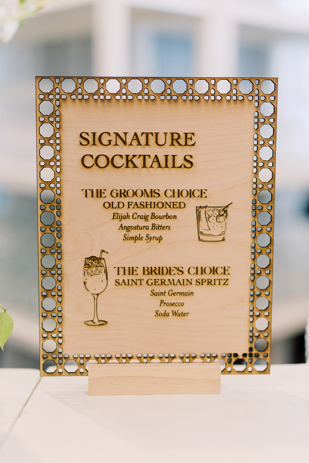
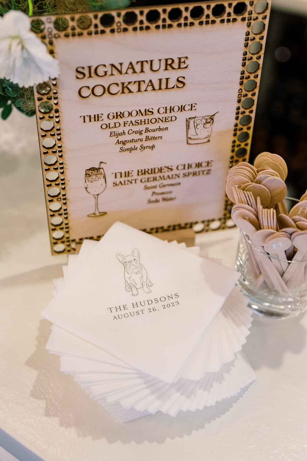
Custom Laser-Cut Signature Cocktail Signs
For cocktail hour, we rolled up our sleeves to do one of our favorite things: custom laser-cuts! We designed several table signs to add to the uniqueness of our couple’s unforgettable day. I love how this turned out and how well it fit into the style of the entire event.
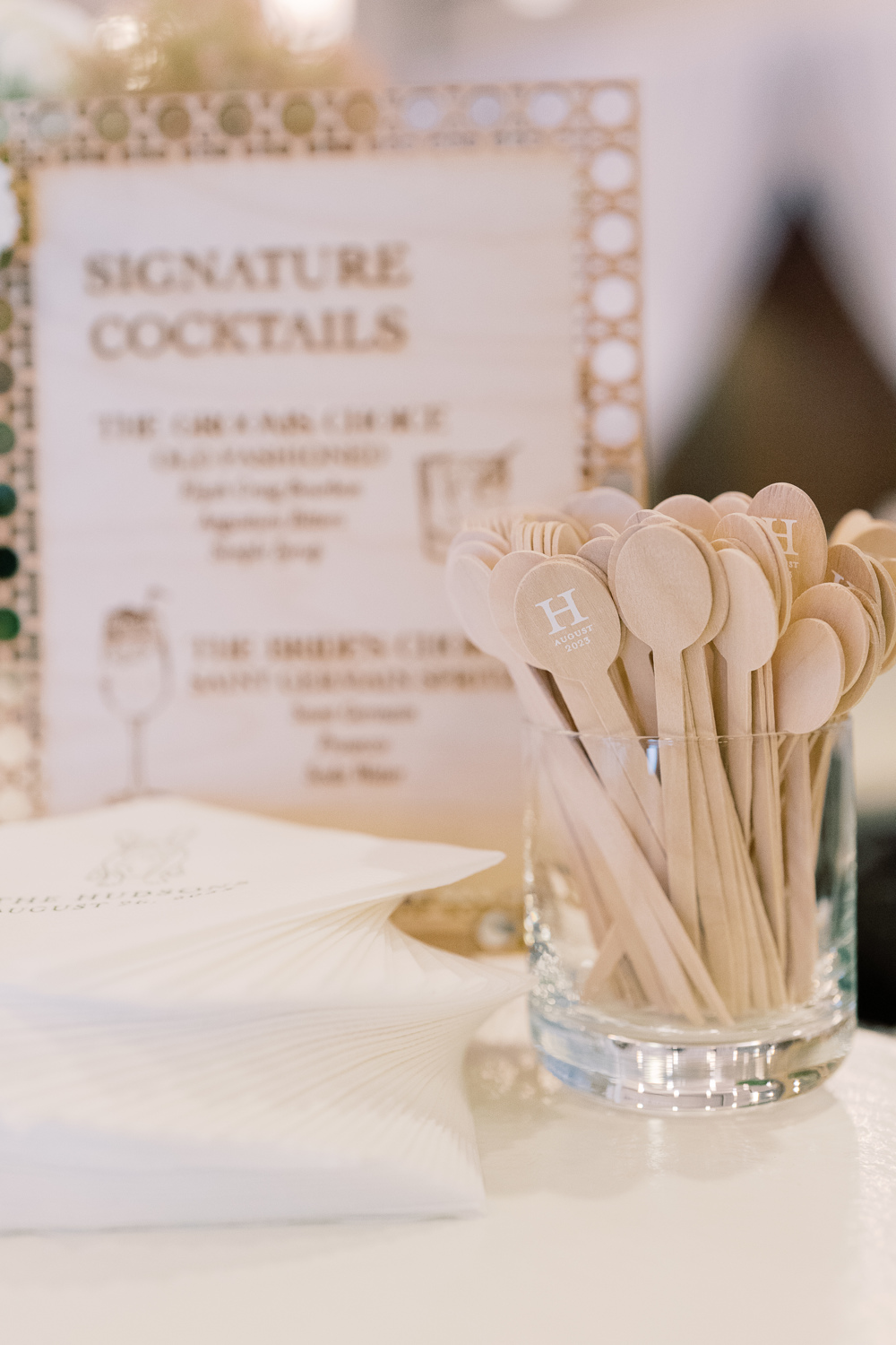
However, it’s the custom cocktail stirrers for me! These little guys were so fun to make. The “H” initial stands out so perfectly along with the date. This is a great example of a small detail that packs a huge punch. It’s things like this that your guests never forget!
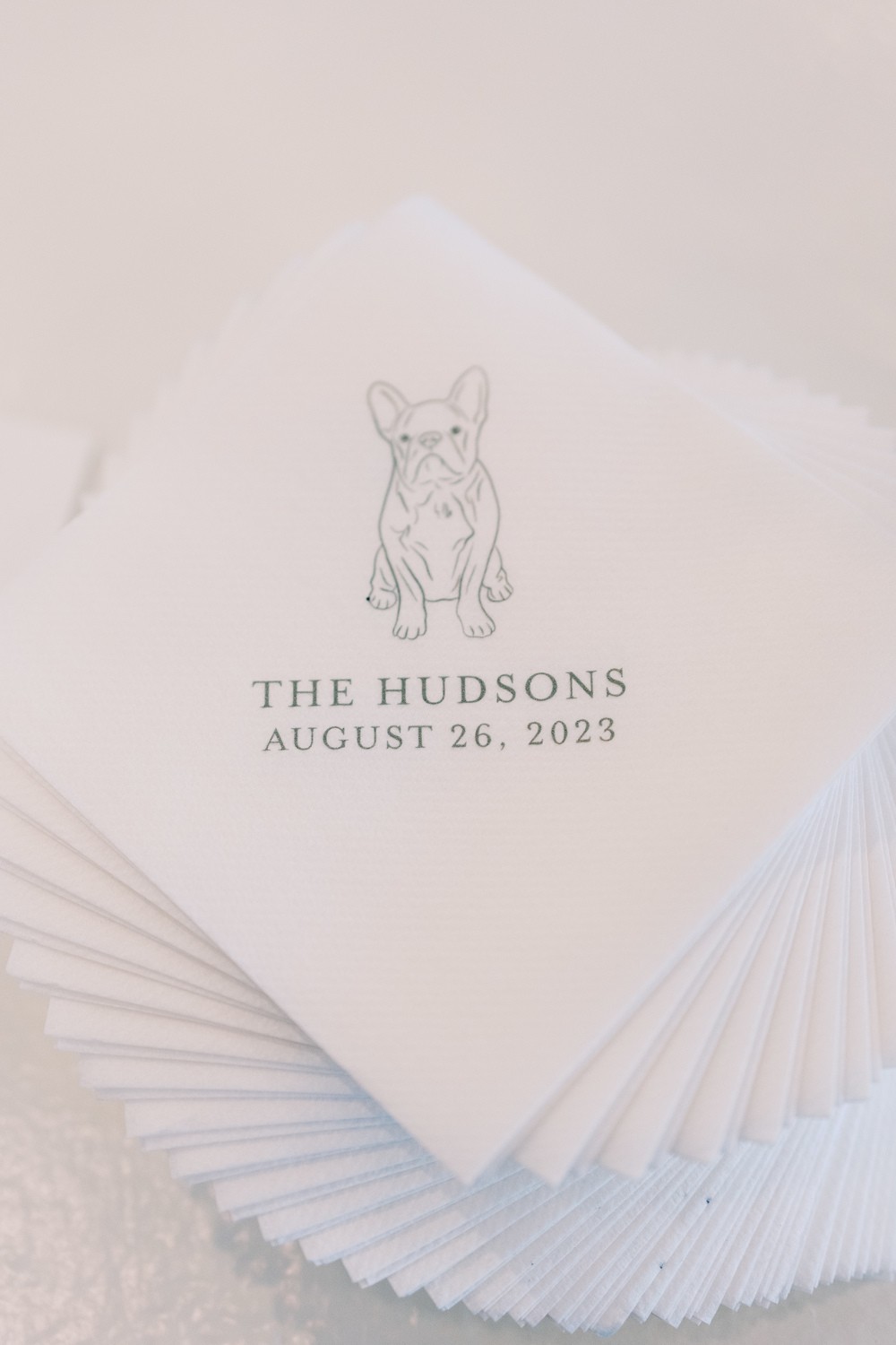
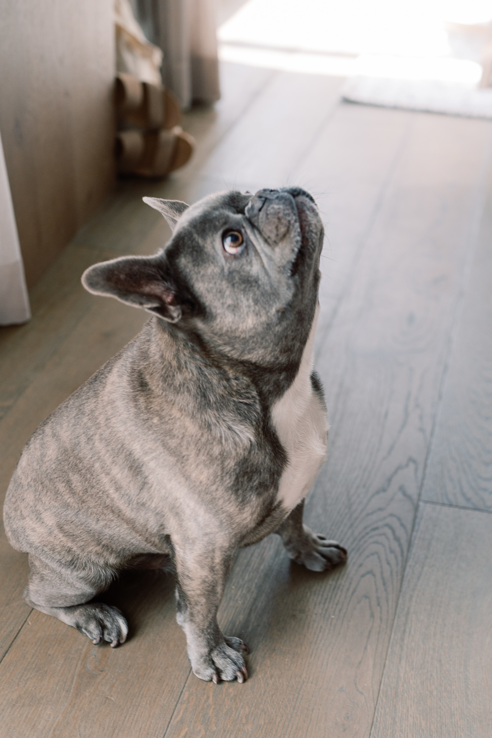
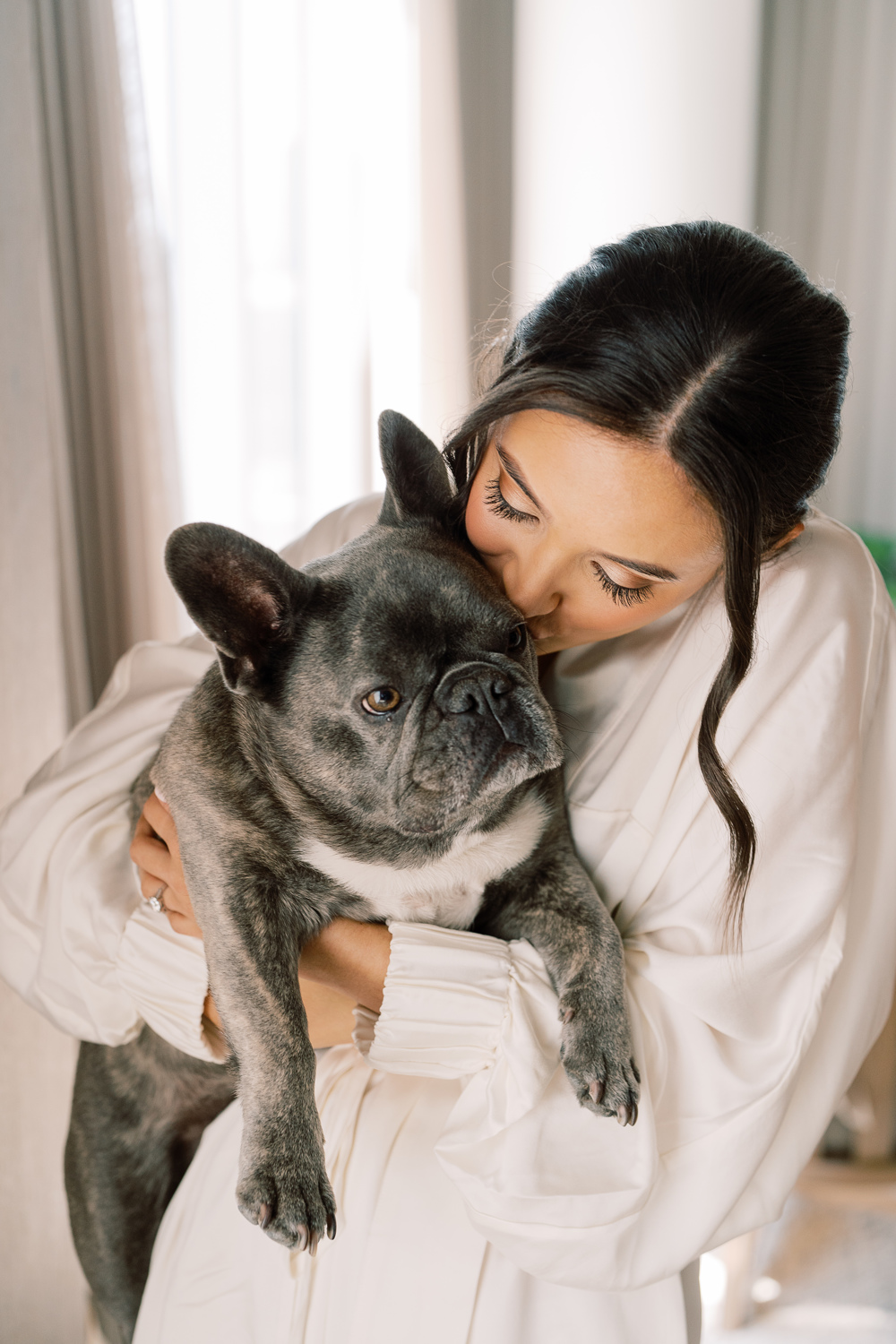
Can we all take a moment to appreciate how adorable Sam and Landon’s pup looks printed on these custom cocktail napkins? Cocktail hour is a great opportunity to pull in really special details of our lives- like pets! I could look at this face all day!
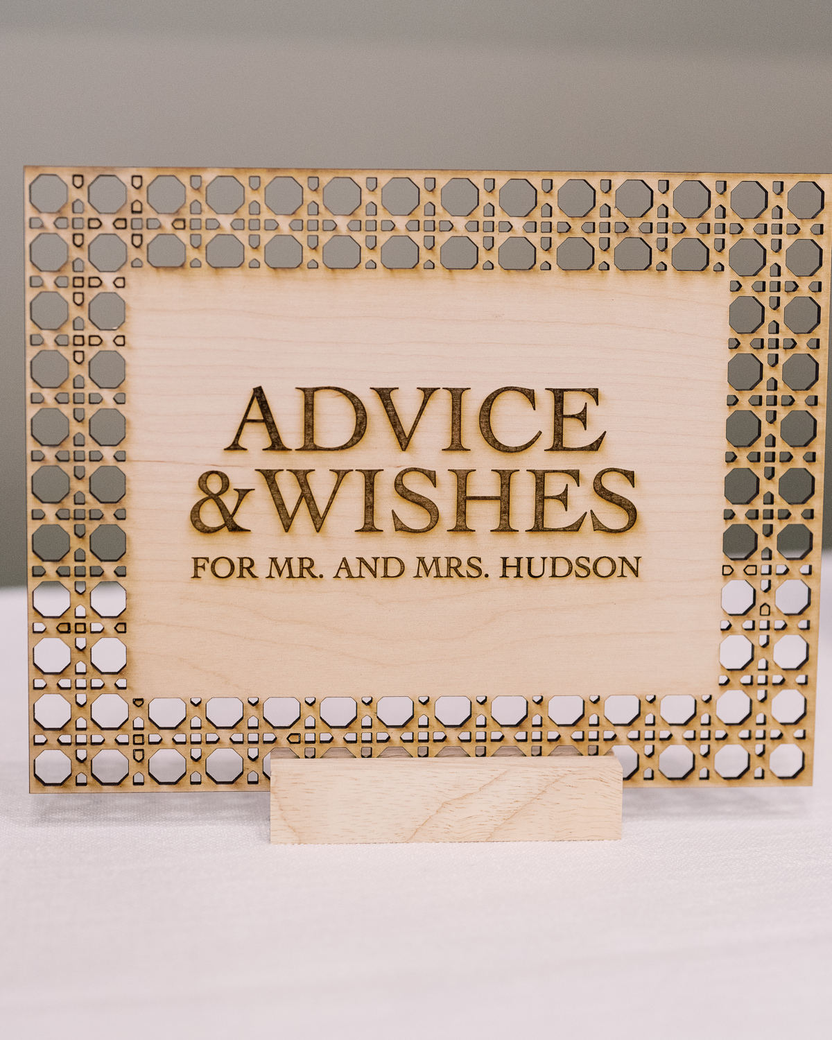
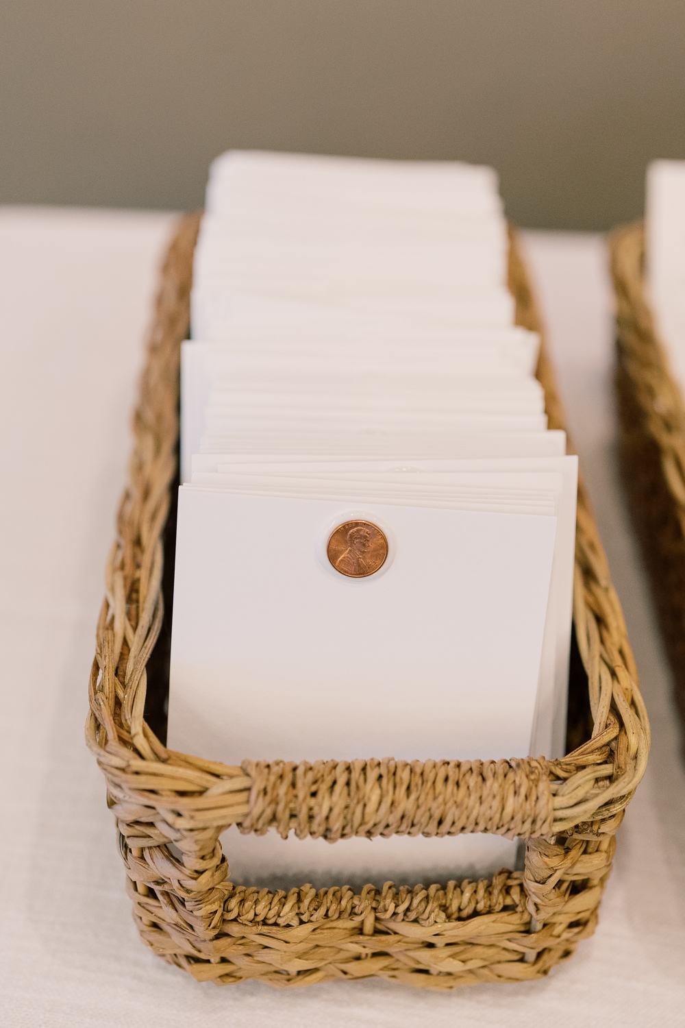
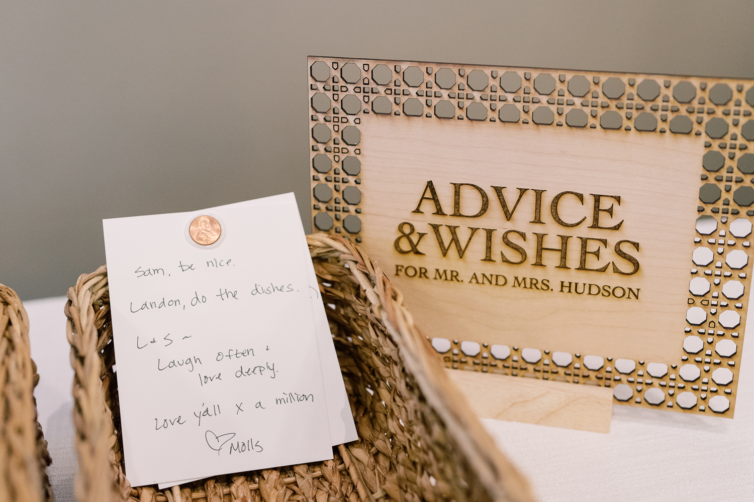
A Penny For Your Thoughts
Guests took the time to share their best advice on marriage and give well wishes as Sam and Landon created a space for “A penny for your thoughts.” This was a fun and clever way to include each guest as well as receive some welcomed advice from their closest friends and family! We were happy to be included by creating yet another one-of-a-kind laser-cut custom table sign.
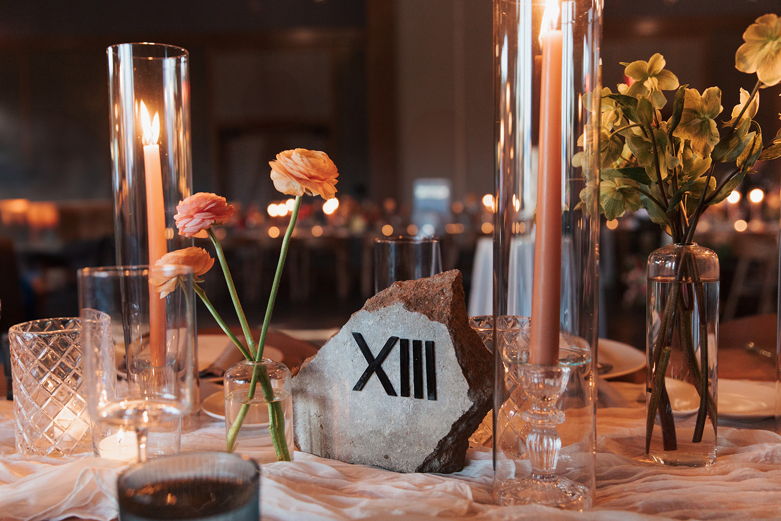
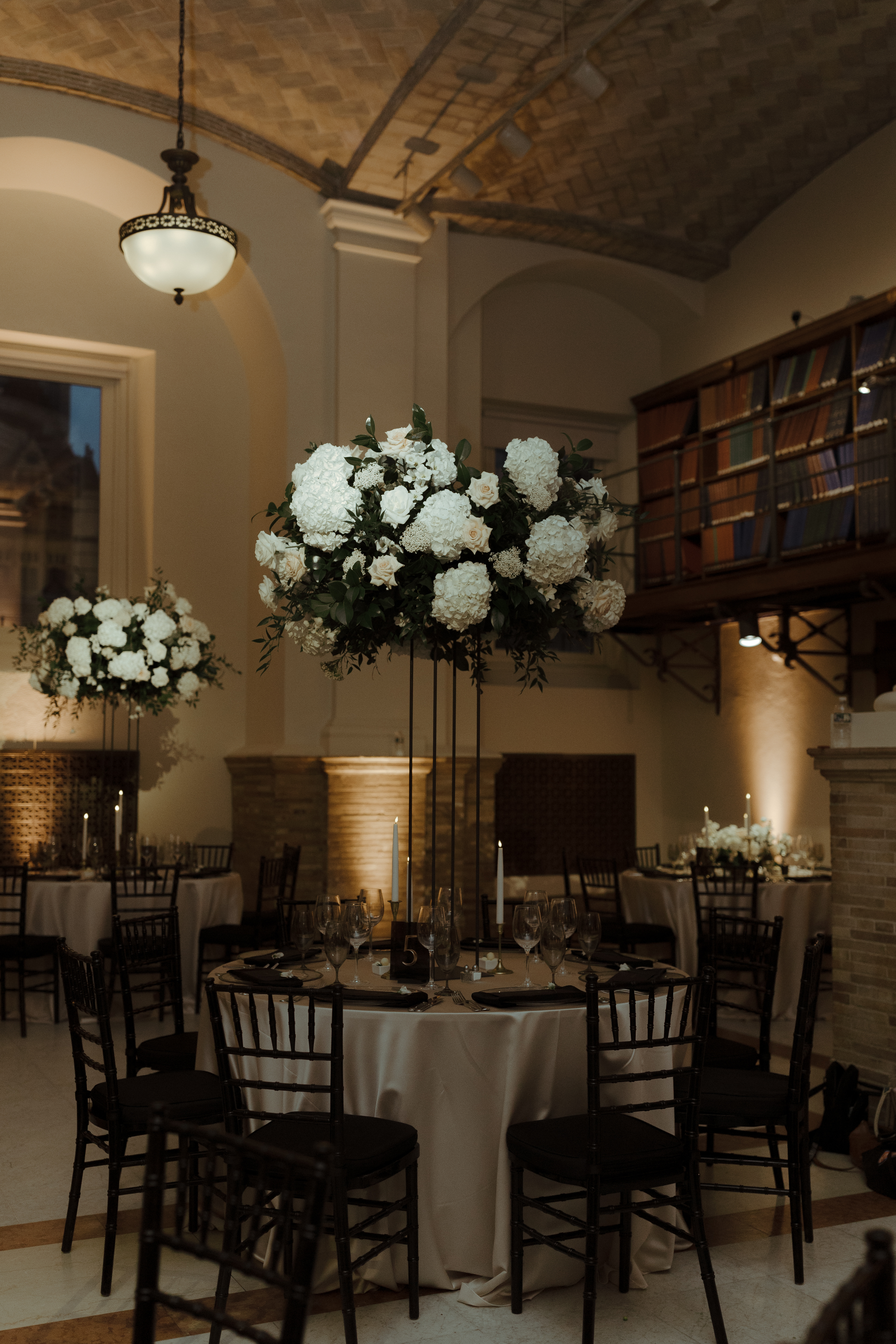
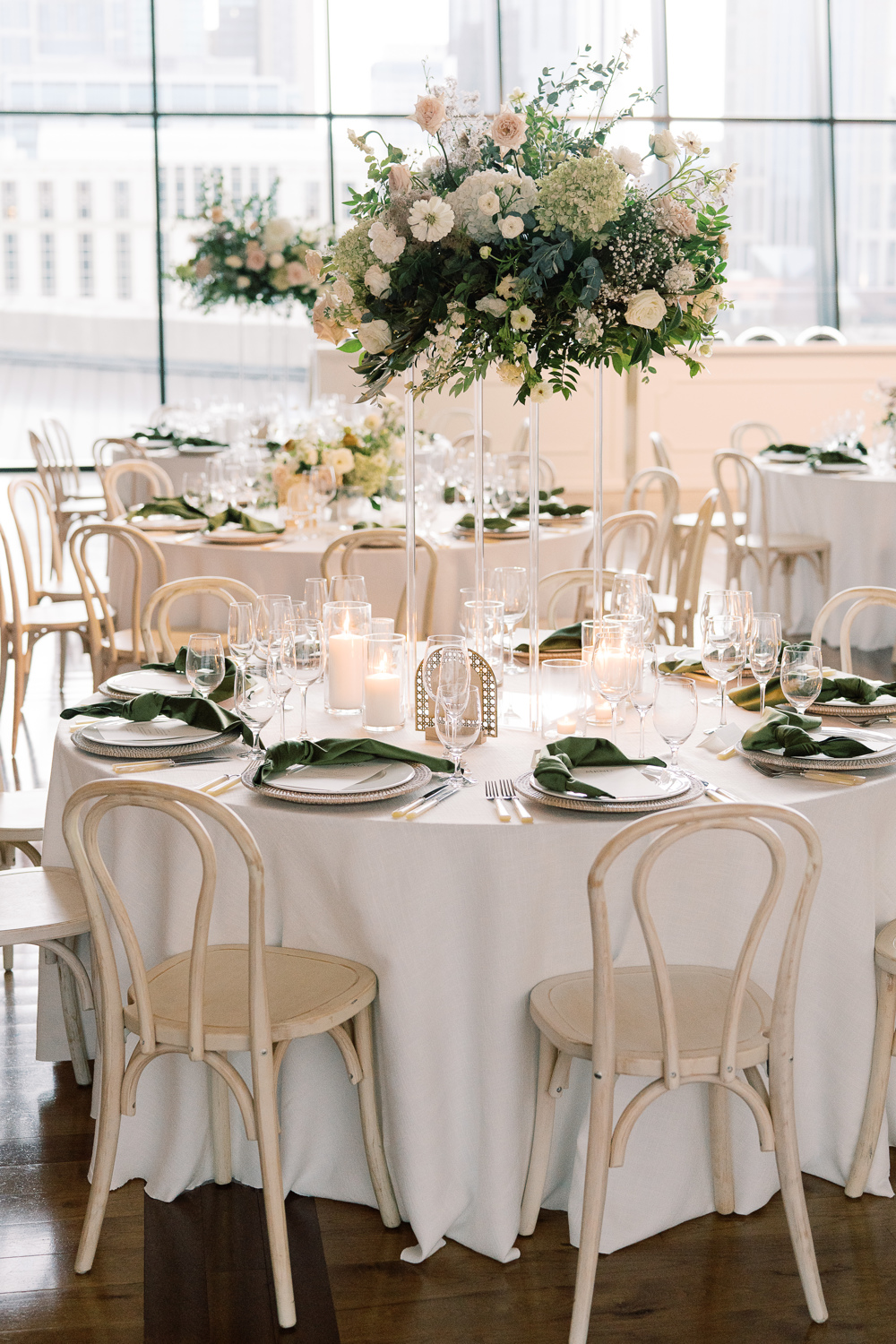
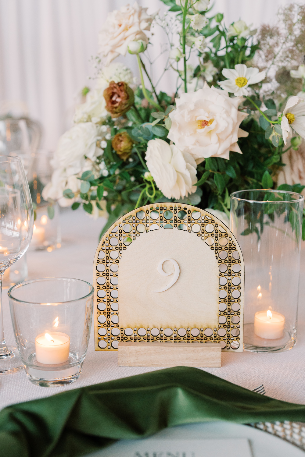
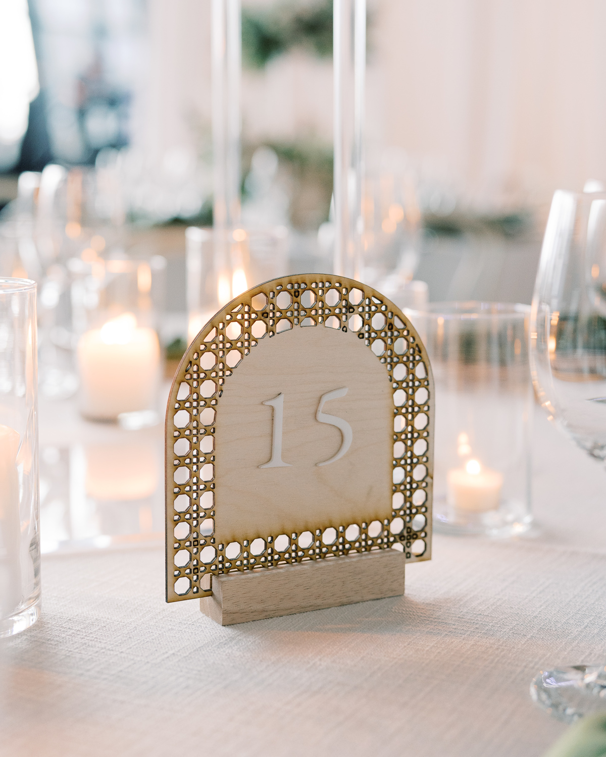
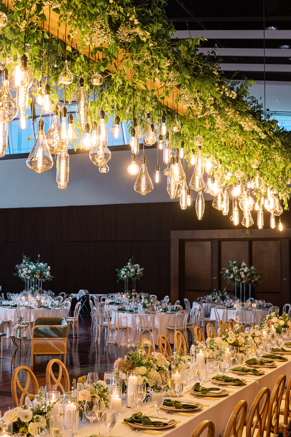
The custom signage was carried throughout the reception. Doing this can truly elevate the theme and help carry the tone of a room. The arched table numbers worked perfectly with the delicate tablescapes, and their texture offered a wonderful balance to the vibrant florals all around. Such an incredibly impressive look!
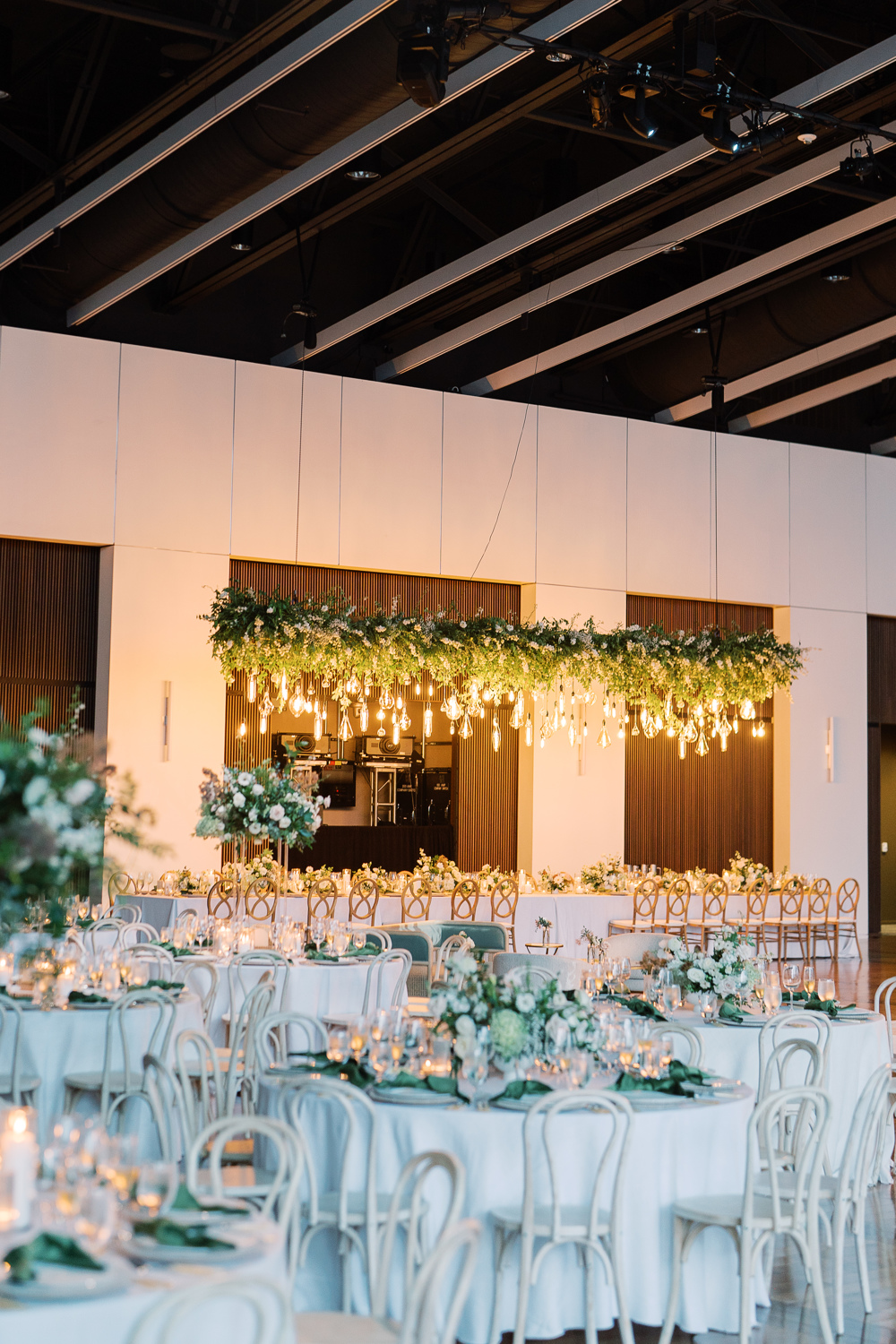
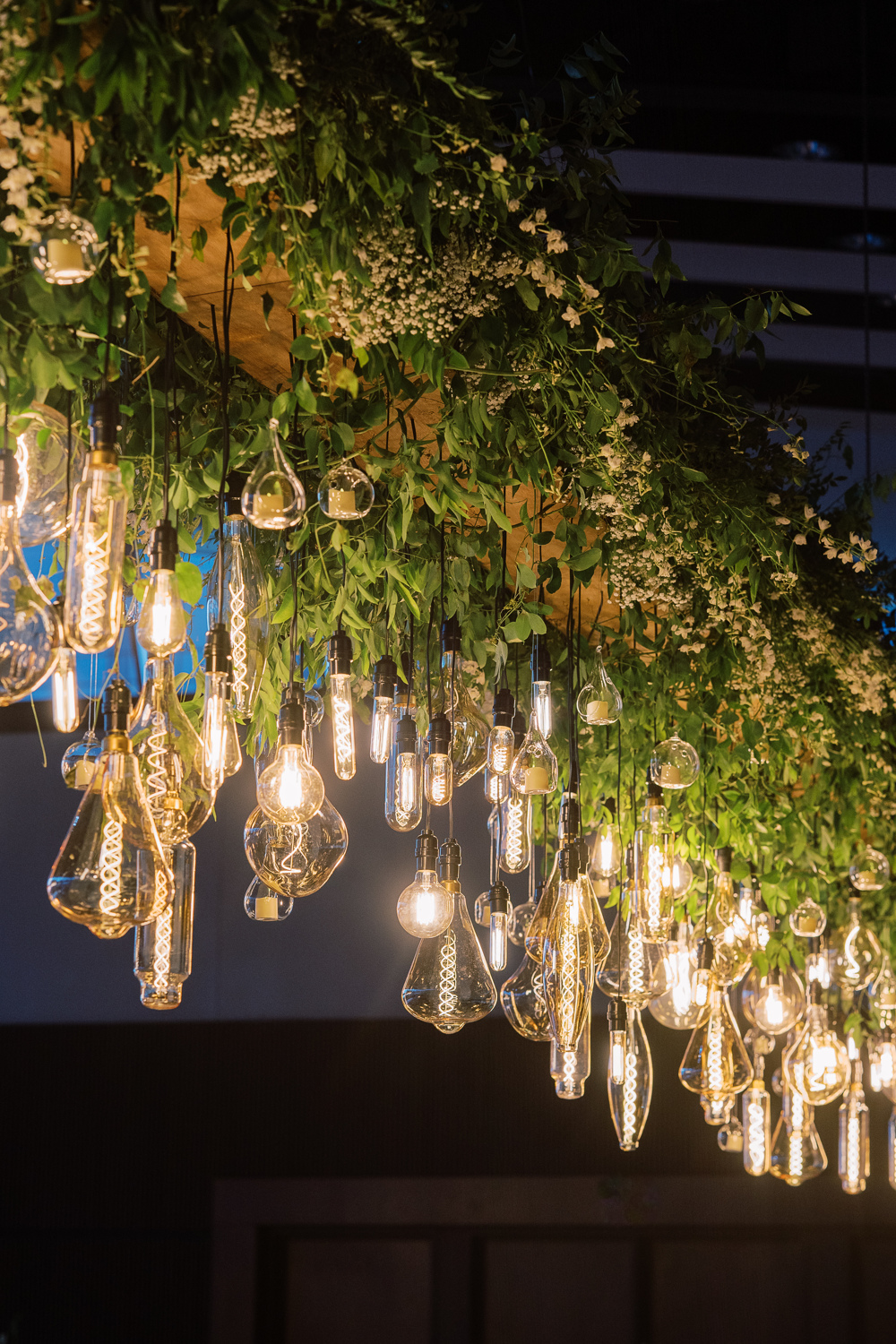
Sidenote: I still think about this floral chandelier more often than I care to admit. I mean, wow! This was such a stunning wedding in so many ways and this chandelier was a showstopper!
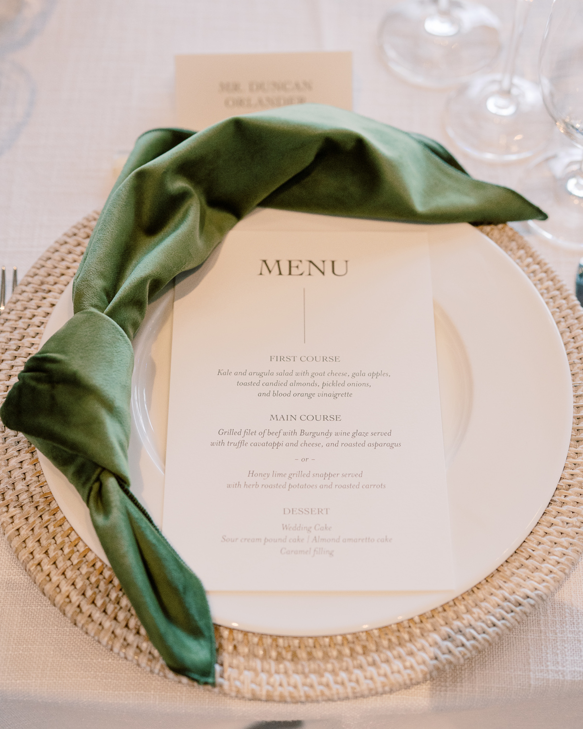
Custom Nashville Wedding Details
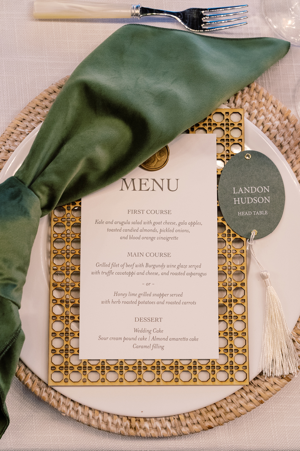
White Ink designed Sam and Landon’s reception menus that fit perfectly on top of the custom laser-cut settings we created as well! The gold wax seal to top the menu pulled this entire place setting together with the added bonus of the matching table numbers and table signage throughout. When it comes to lacing details throughout an event, THIS is how it’s done.
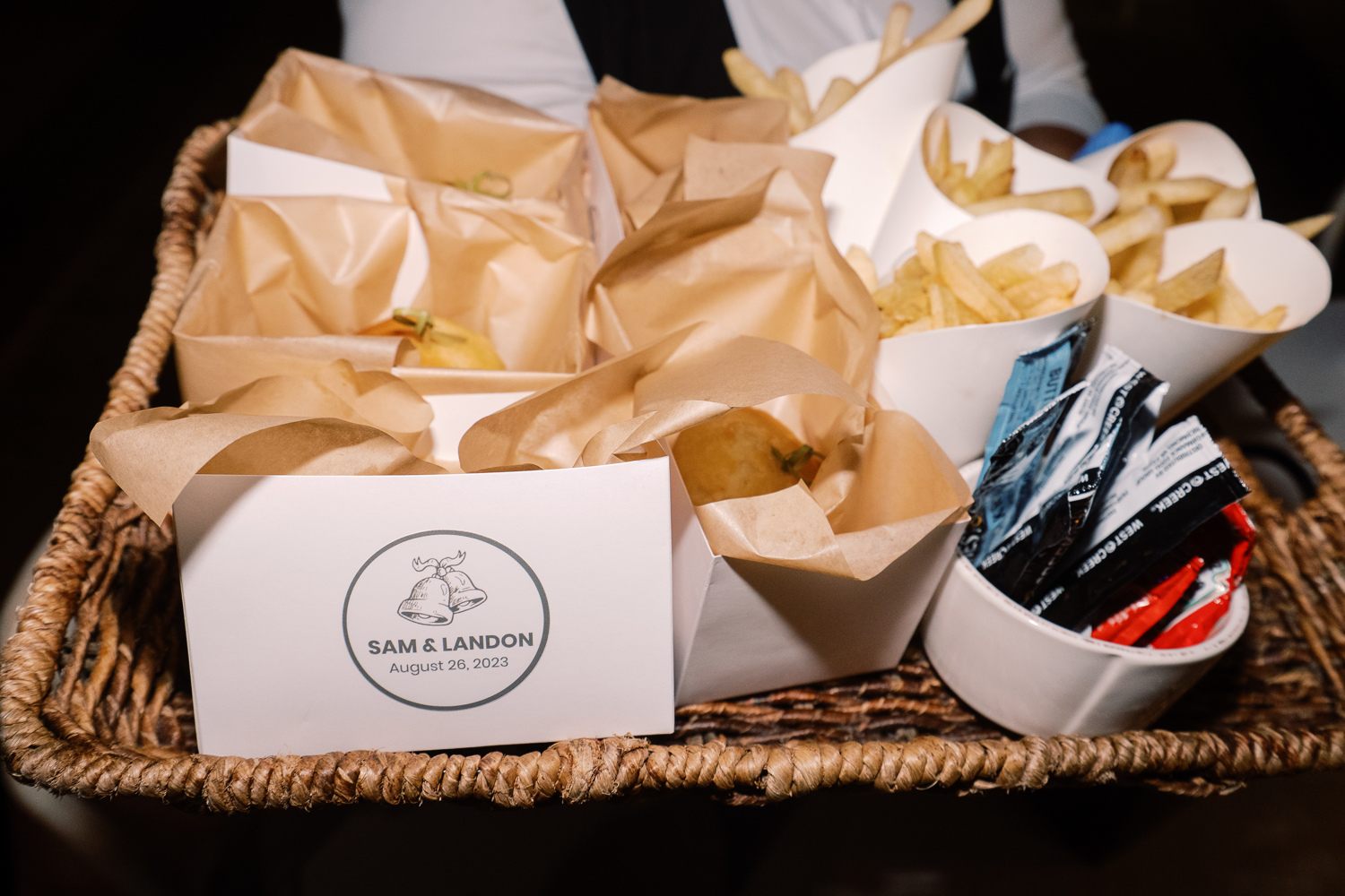
Peep the cute wedding bell prints making another appearance! This time, at the end of the night when guests were offered a yummy snack of burgers and fries. From invitation suite to burger box, this wedding bell print fit right in!
Wedding Welcome Party Details
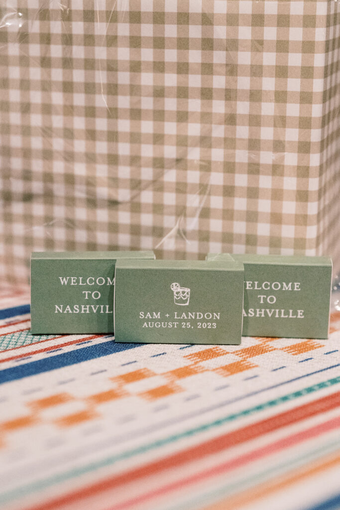
I don’t want to wrap up without showing you guys a couple of the day-before details that White Ink did for Sam and Landon’s Wedding Welcome Party. Wedding parties and wedding rehearsal dinners are the perfect time to have fun with details and create a more intimate tone.
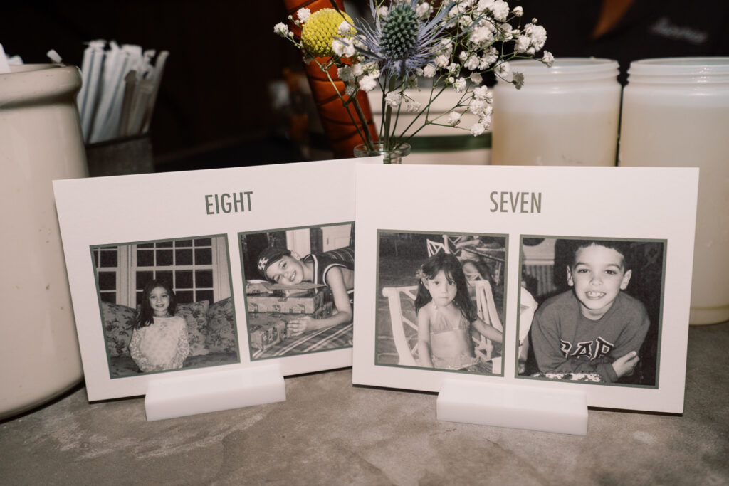
Sam and Landon wanted us to create table numbers for the welcome party that included pictures of them being the same age as the number on the sign. As you can see above, here are Sam and Landon at ages 7 and 8. Is this not the sweetest thing ever? It meant a lot to be able to provide these special table numbers for them!
We also created a few more day-before details for Sam and Landon’s wedding welcome party. It was an honor to create items like their seating chart and the most adorable little matchboxes for the guests to take along with them. Putting in the extra effort in these more intimate settings really shows those closest to you, that they are appreciated and that you were thinking of them, which is really special!
To the happy couple, we hope you enjoy lots of love and adventure, and continue soaking in all the finer details around you! Cheers to you both!
If you’re looking to add custom, thoughtful touches to your wedding or event, we would love to help make your vision a reality. Reach out today to learn more about our full-service design offerings—we can’t wait to create something unforgettable for you!
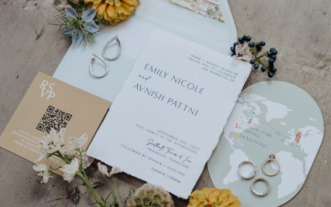
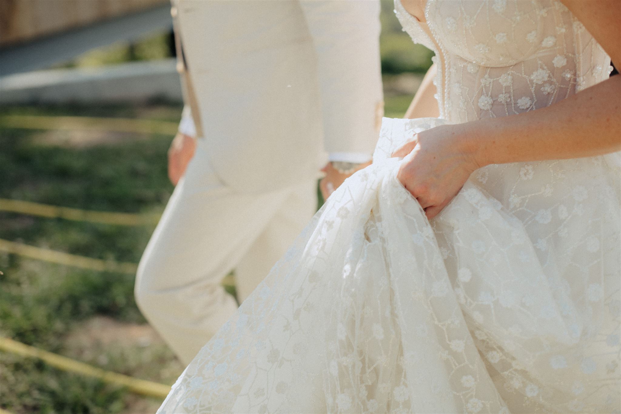
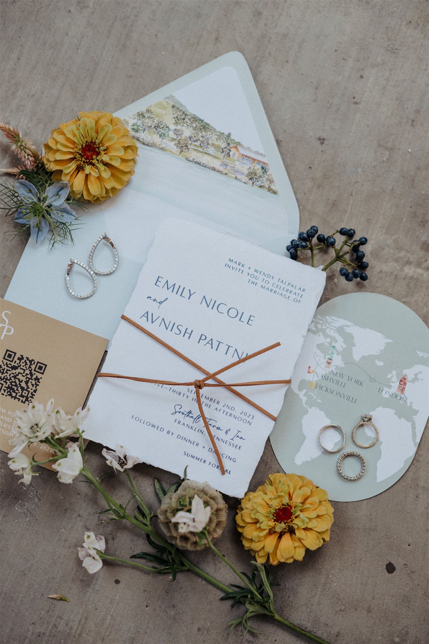
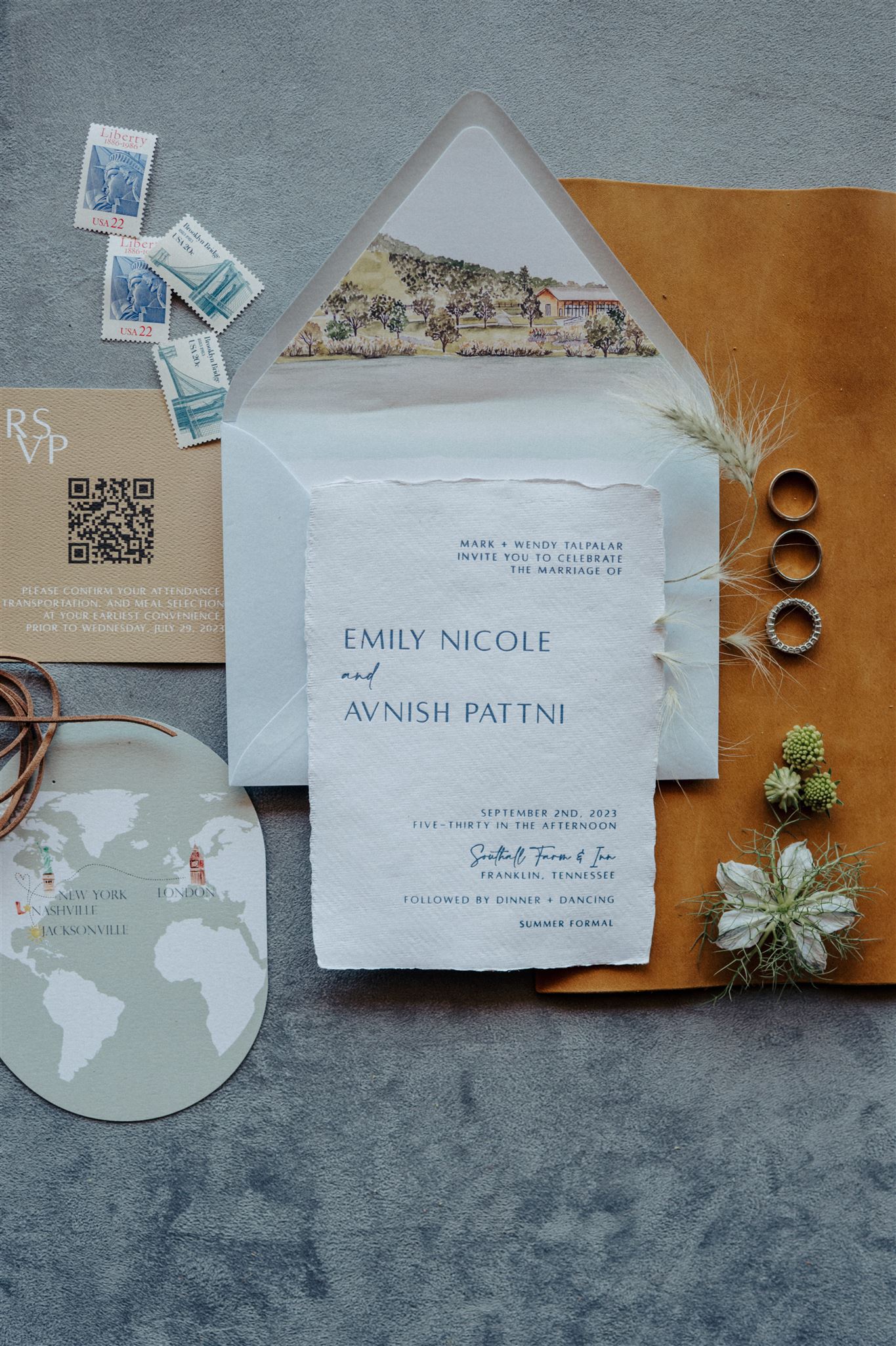
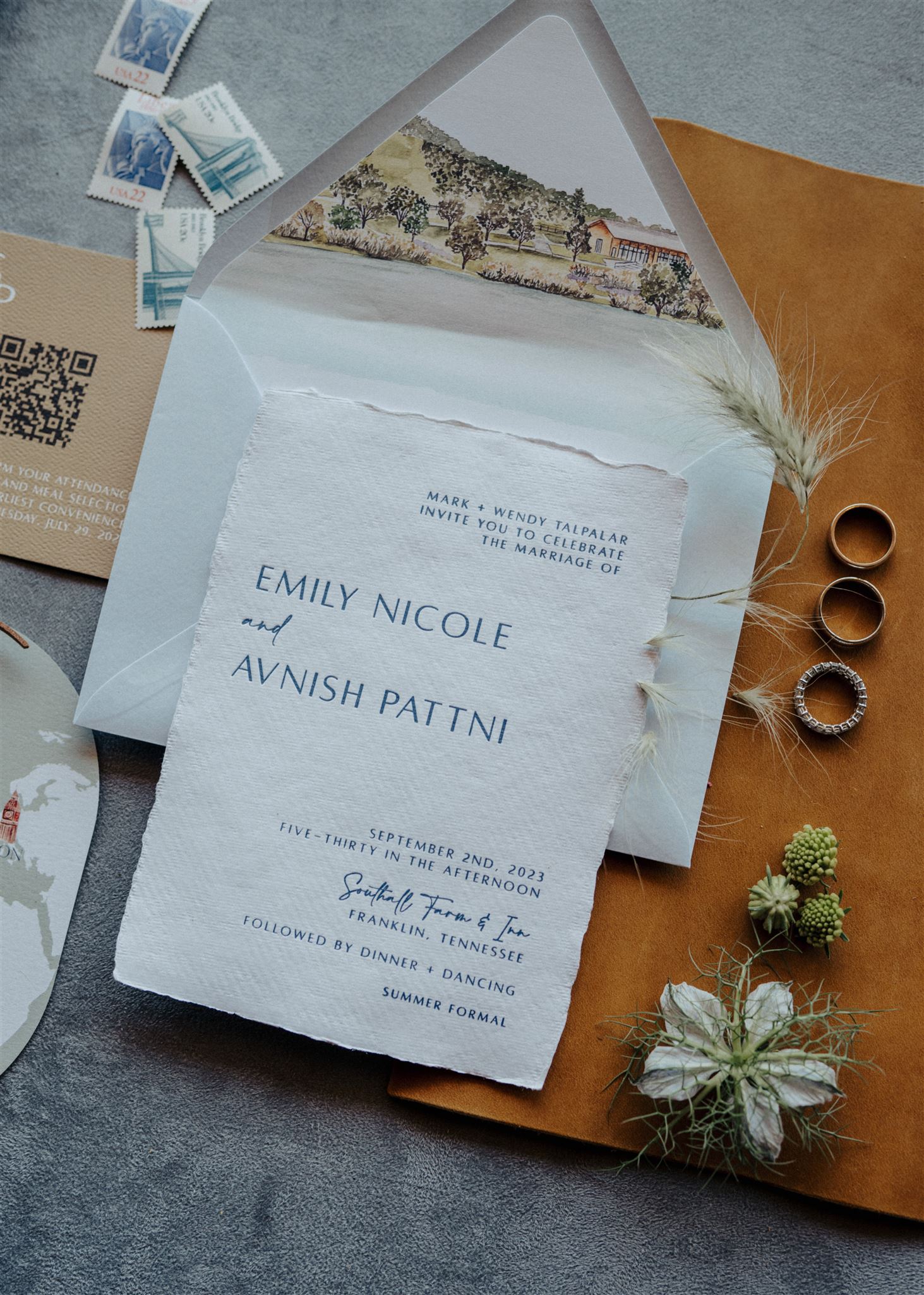
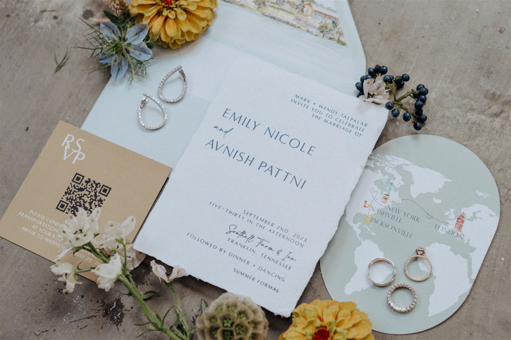
This picture-perfect fairytale wedding which took place at the breathtaking Southall Farm & Inn in historic Franklin, TN was one I will never forget. For starters, Emily and Avnish were the first clients that we worked with from the new White Ink Studio! That alone was a very special and meaningful moment for me and my team. It also didn’t hurt that this couple was an absolute delight to work with! They trusted us in creating some amazing multi-textured wedding details that I am so excited to share!
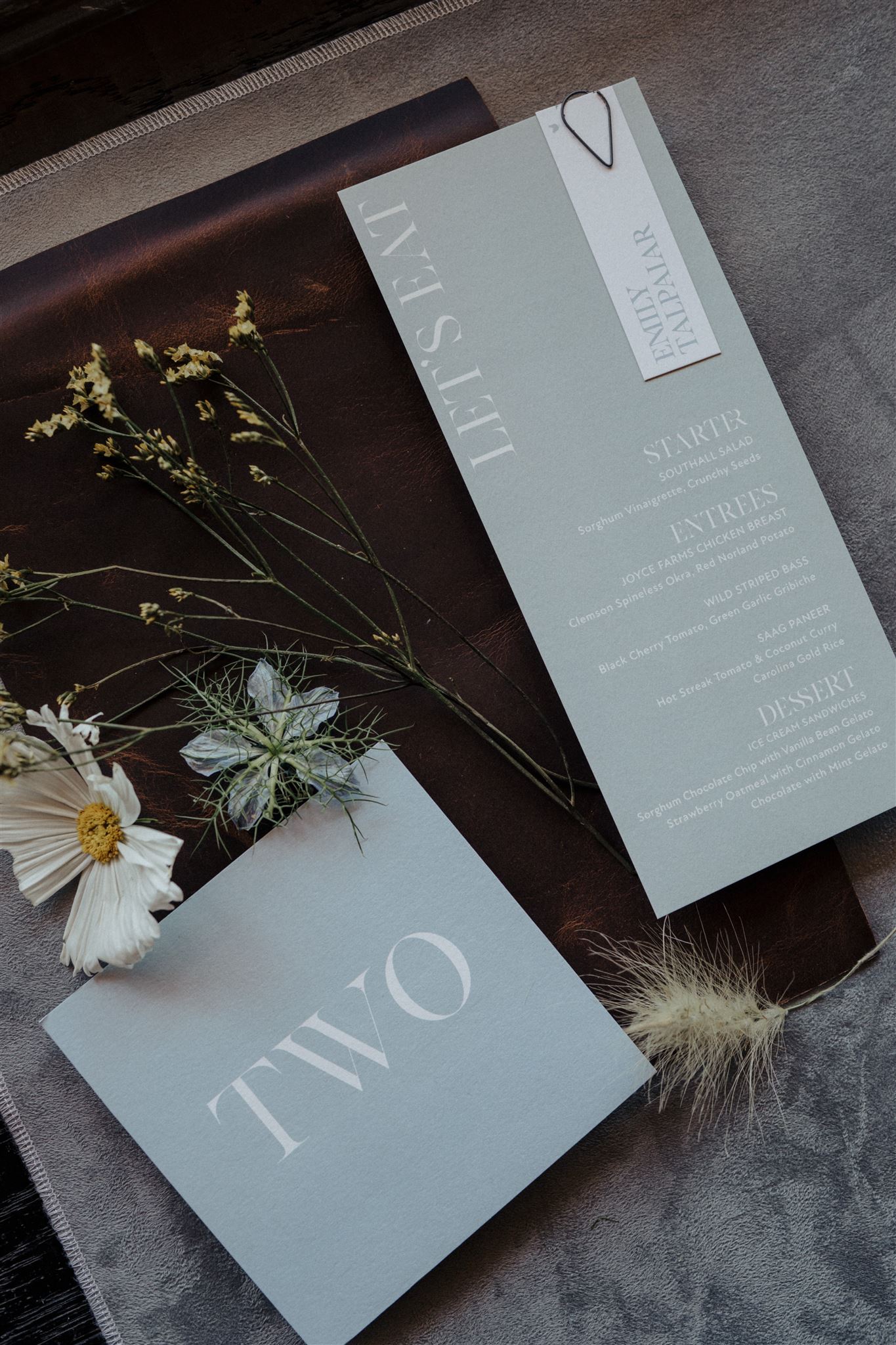
Bold + Textured Invitation Suite
Texture, Texture, Texture. It never fails. Emily and Avnish’s guest received this bold invitation suite that boasted hand-made paper, a custom map created for the details card, and a leather cord used to wrap up this suite into one, bright bundle of celebration.
White Ink also included a custom envelope liner which depicted the Southall property. Such a chic way of showing guests a little sneak peek of the venue!
One of my favorite parts of this invitation suite was the RSVP card that included a QR code with all of the info at the guests’ fingertips. It’s no secret that not everyone remembers to RSVP to events. This is a clever way to prompt and encourage guests to confirm their attendance. It’s a win, win.
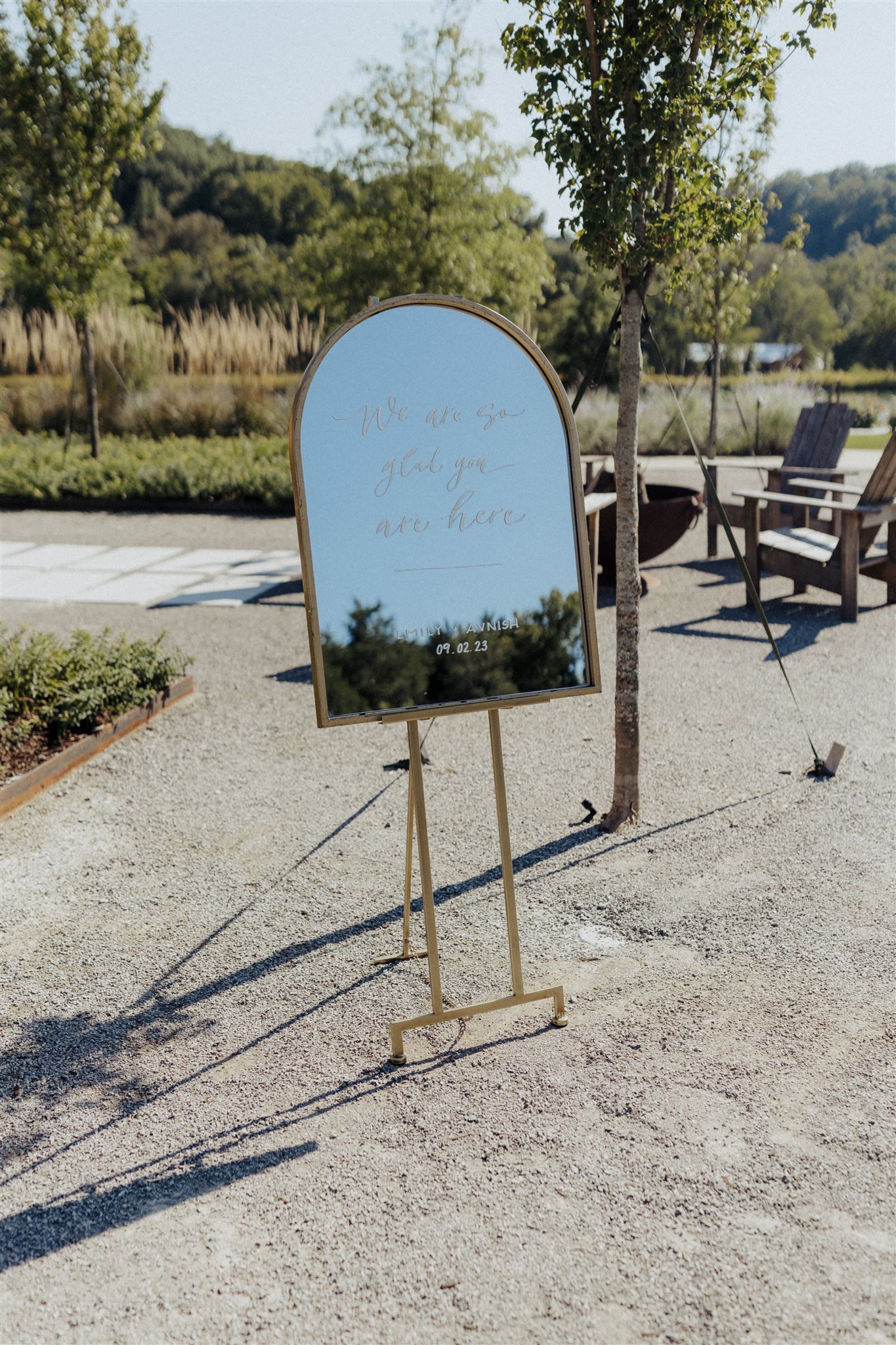
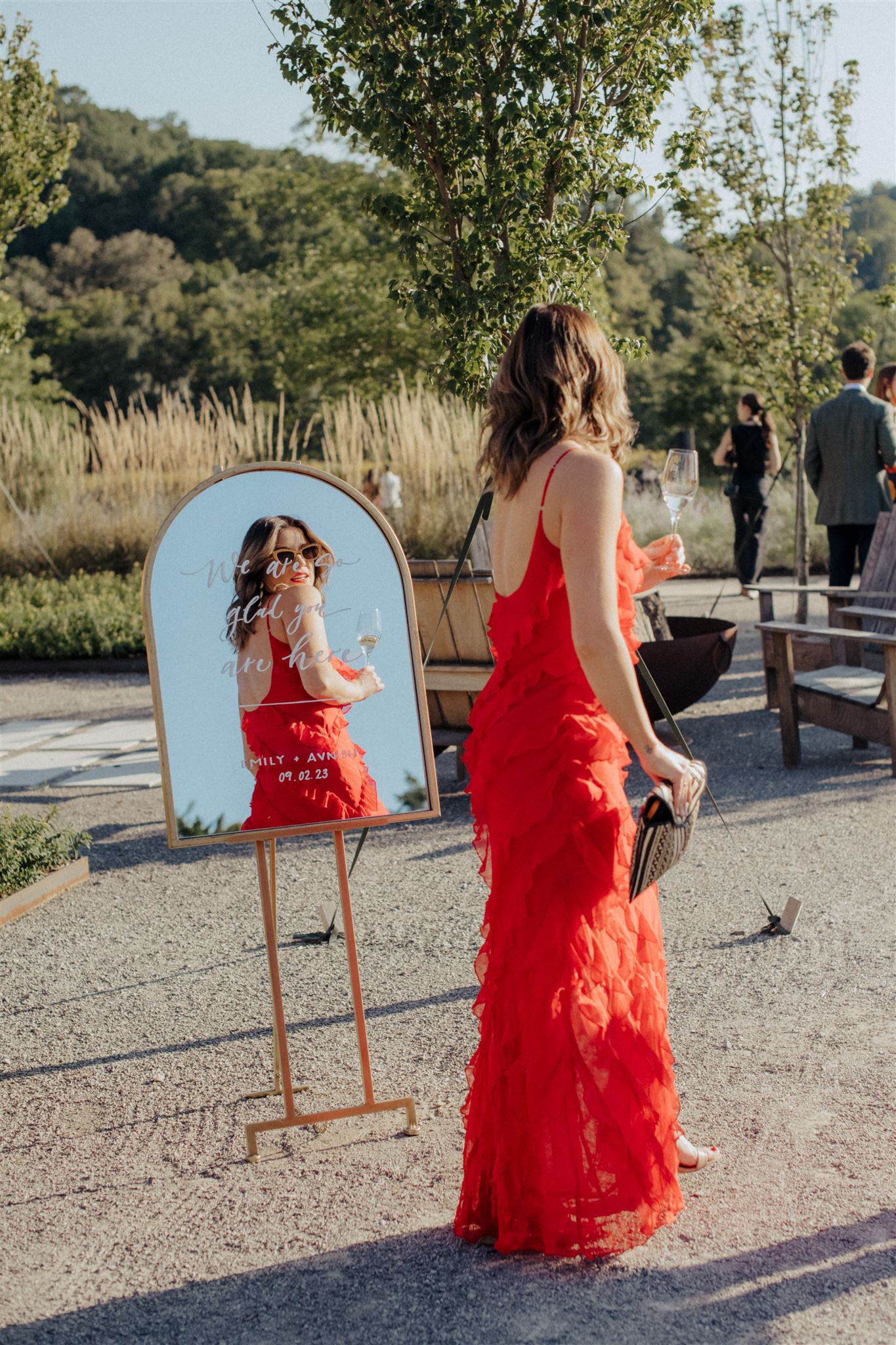
Modern Mirror Welcome Sign
With an abundance of mirrors to choose from in the White Ink Collection, I was excited that Emily and Avnish went with this arched, gold framed mirror for their wedding welcome sign. The modern touch complimented the natural serenity that Southall possesses. It stood out just enough for guests to take notice!
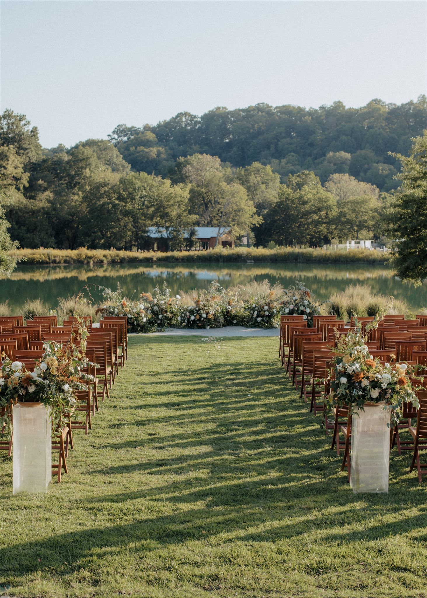
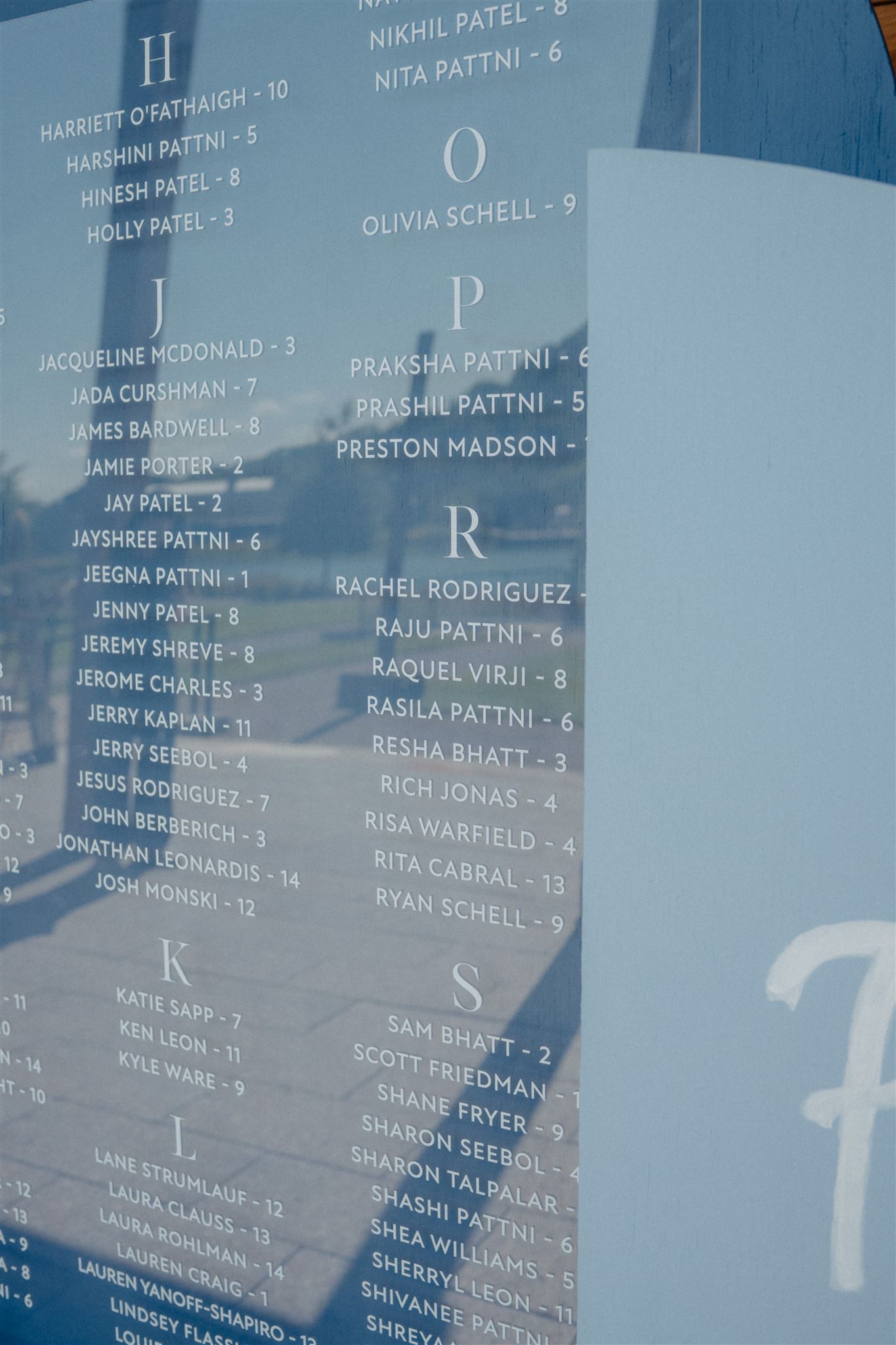
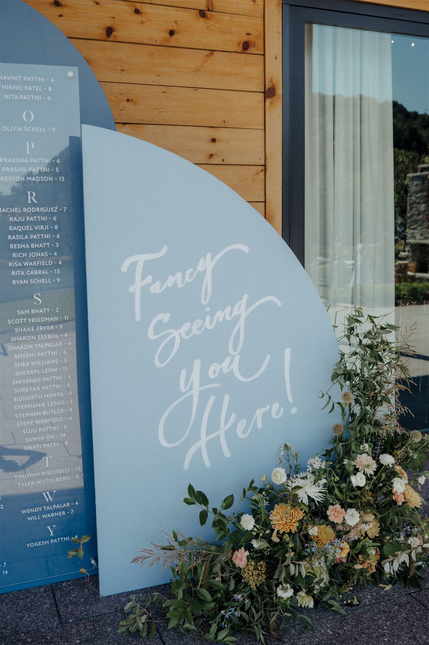
Multi-Textured Wedding Details
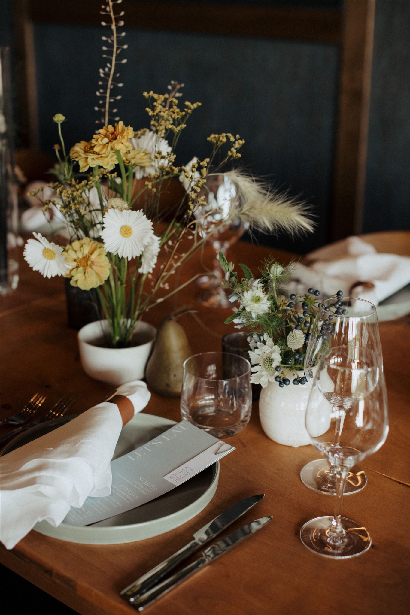
Tile seating chart, florals arrangements, wooden backdrop – are we starting to see a theme here? Yep, it’s texture. Using texture works so well because it is a feast for the eyes. The different feel, looks, and colors offer a compelling and exciting contrast that people can’t help but indulge in! Multi-textured design like this lends itself to a particularly beautiful and often unforgettable balance that is enjoyed by all!
Fun Fact: I hand painted this seating chart sign while onsite at Southall! A one-of-a-kind experience for a one-of-a-kind wedding!
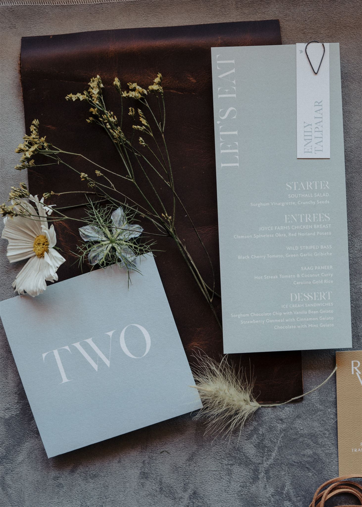
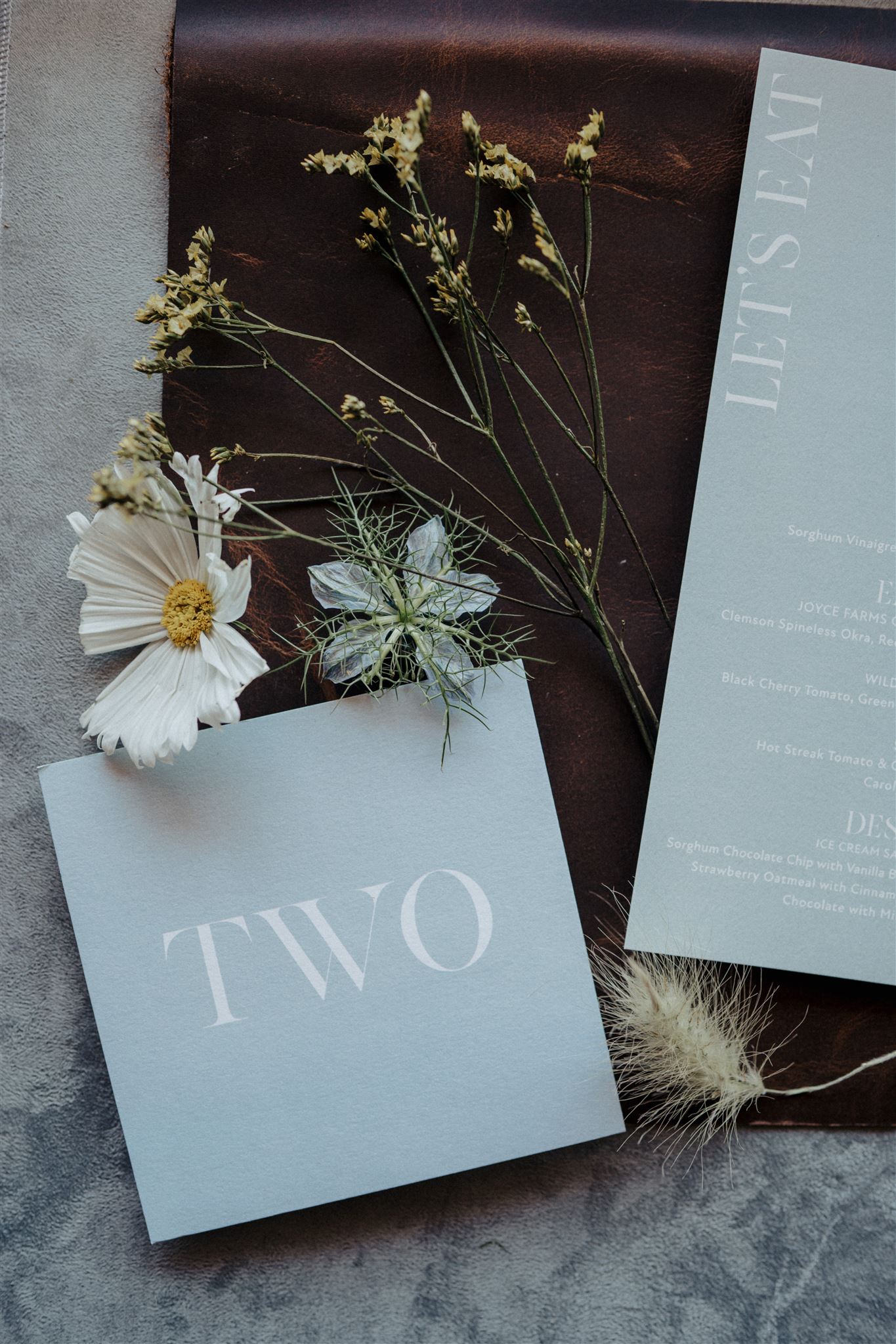
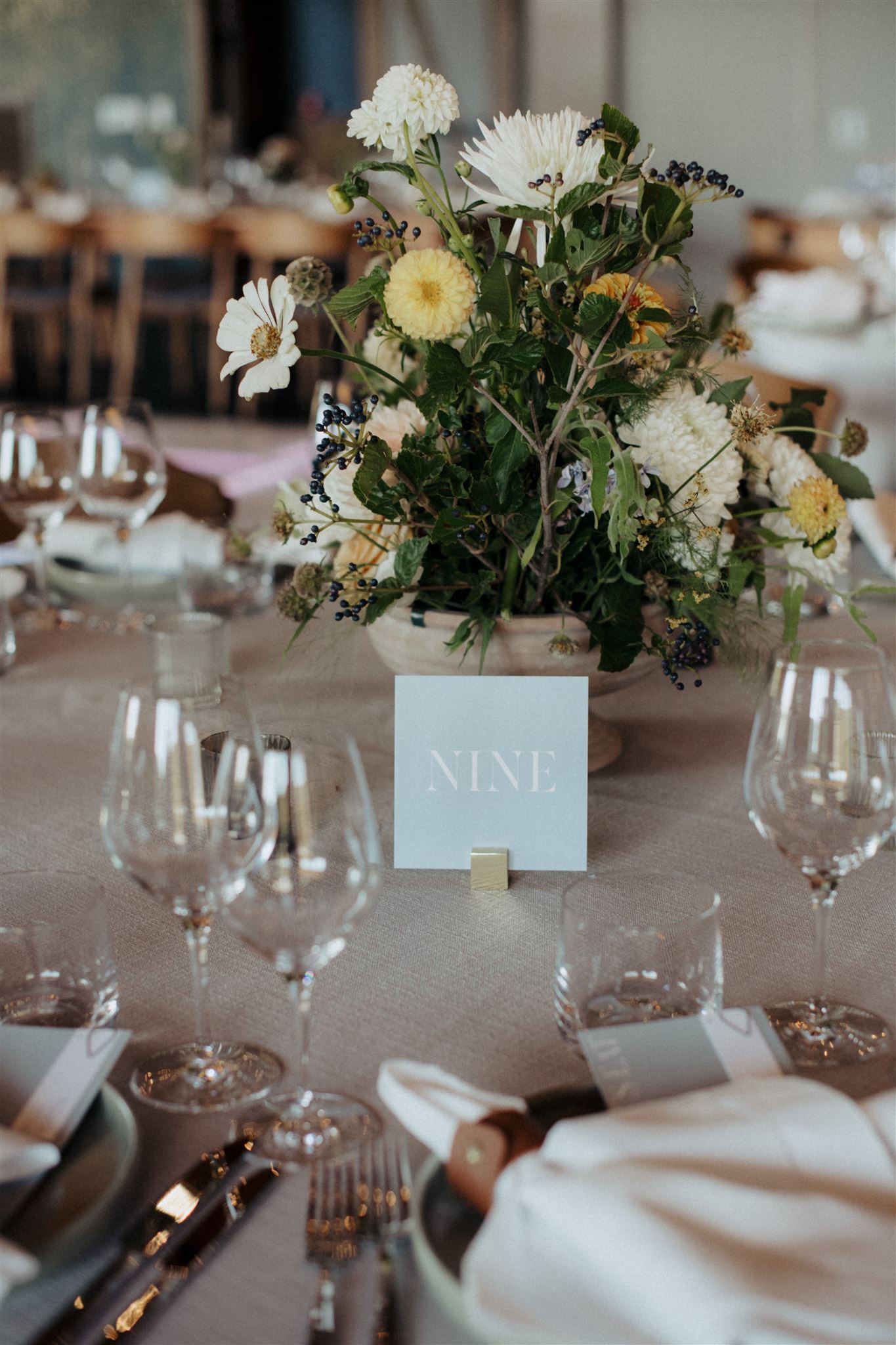
This sweet, dusty blue hue, which can be seen throughout the wedding details (including the invitation), looked gorgeous used with the menus and table numbers. Our stationary team did a fantastic job getting all the details that Emily and Avnish wanted for these. The place cards fastened to the menus are my favorite.
The table numbers were displayed using these super cute gold square bases, that are a part of our extensive collection. These versatile pieces can fit into nearly any style or theme. This little detail tied together our couple’s picturesque tablescape.
Getting to be onsite for Emily and Avnish’s wedding was truly a gift. One that I will always cherish. This couple will always hold a special place in our hearts as the first couple we hosted in our studio! Their trust in the work that we do here at White Ink was unmatched. Cheers to the happy couple and to their Franklin Fairytale!
If you’re looking to add custom, thoughtful touches to your wedding or event, we would love to help make your vision a reality. Reach out today to learn more about our full-service design offerings—we can’t wait to create something unforgettable for you!